
15: Elements of Color
- Page ID
- 126933

\( \newcommand{\vecs}[1]{\overset { \scriptstyle \rightharpoonup} {\mathbf{#1}} } \)
\( \newcommand{\vecd}[1]{\overset{-\!-\!\rightharpoonup}{\vphantom{a}\smash {#1}}} \)
\( \newcommand{\dsum}{\displaystyle\sum\limits} \)
\( \newcommand{\dint}{\displaystyle\int\limits} \)
\( \newcommand{\dlim}{\displaystyle\lim\limits} \)
\( \newcommand{\id}{\mathrm{id}}\) \( \newcommand{\Span}{\mathrm{span}}\)
( \newcommand{\kernel}{\mathrm{null}\,}\) \( \newcommand{\range}{\mathrm{range}\,}\)
\( \newcommand{\RealPart}{\mathrm{Re}}\) \( \newcommand{\ImaginaryPart}{\mathrm{Im}}\)
\( \newcommand{\Argument}{\mathrm{Arg}}\) \( \newcommand{\norm}[1]{\| #1 \|}\)
\( \newcommand{\inner}[2]{\langle #1, #2 \rangle}\)
\( \newcommand{\Span}{\mathrm{span}}\)
\( \newcommand{\id}{\mathrm{id}}\)
\( \newcommand{\Span}{\mathrm{span}}\)
\( \newcommand{\kernel}{\mathrm{null}\,}\)
\( \newcommand{\range}{\mathrm{range}\,}\)
\( \newcommand{\RealPart}{\mathrm{Re}}\)
\( \newcommand{\ImaginaryPart}{\mathrm{Im}}\)
\( \newcommand{\Argument}{\mathrm{Arg}}\)
\( \newcommand{\norm}[1]{\| #1 \|}\)
\( \newcommand{\inner}[2]{\langle #1, #2 \rangle}\)
\( \newcommand{\Span}{\mathrm{span}}\) \( \newcommand{\AA}{\unicode[.8,0]{x212B}}\)
\( \newcommand{\vectorA}[1]{\vec{#1}} % arrow\)
\( \newcommand{\vectorAt}[1]{\vec{\text{#1}}} % arrow\)
\( \newcommand{\vectorB}[1]{\overset { \scriptstyle \rightharpoonup} {\mathbf{#1}} } \)
\( \newcommand{\vectorC}[1]{\textbf{#1}} \)
\( \newcommand{\vectorD}[1]{\overrightarrow{#1}} \)
\( \newcommand{\vectorDt}[1]{\overrightarrow{\text{#1}}} \)
\( \newcommand{\vectE}[1]{\overset{-\!-\!\rightharpoonup}{\vphantom{a}\smash{\mathbf {#1}}}} \)
\( \newcommand{\vecs}[1]{\overset { \scriptstyle \rightharpoonup} {\mathbf{#1}} } \)
\(\newcommand{\longvect}{\overrightarrow}\)
\( \newcommand{\vecd}[1]{\overset{-\!-\!\rightharpoonup}{\vphantom{a}\smash {#1}}} \)
\(\newcommand{\avec}{\mathbf a}\) \(\newcommand{\bvec}{\mathbf b}\) \(\newcommand{\cvec}{\mathbf c}\) \(\newcommand{\dvec}{\mathbf d}\) \(\newcommand{\dtil}{\widetilde{\mathbf d}}\) \(\newcommand{\evec}{\mathbf e}\) \(\newcommand{\fvec}{\mathbf f}\) \(\newcommand{\nvec}{\mathbf n}\) \(\newcommand{\pvec}{\mathbf p}\) \(\newcommand{\qvec}{\mathbf q}\) \(\newcommand{\svec}{\mathbf s}\) \(\newcommand{\tvec}{\mathbf t}\) \(\newcommand{\uvec}{\mathbf u}\) \(\newcommand{\vvec}{\mathbf v}\) \(\newcommand{\wvec}{\mathbf w}\) \(\newcommand{\xvec}{\mathbf x}\) \(\newcommand{\yvec}{\mathbf y}\) \(\newcommand{\zvec}{\mathbf z}\) \(\newcommand{\rvec}{\mathbf r}\) \(\newcommand{\mvec}{\mathbf m}\) \(\newcommand{\zerovec}{\mathbf 0}\) \(\newcommand{\onevec}{\mathbf 1}\) \(\newcommand{\real}{\mathbb R}\) \(\newcommand{\twovec}[2]{\left[\begin{array}{r}#1 \\ #2 \end{array}\right]}\) \(\newcommand{\ctwovec}[2]{\left[\begin{array}{c}#1 \\ #2 \end{array}\right]}\) \(\newcommand{\threevec}[3]{\left[\begin{array}{r}#1 \\ #2 \\ #3 \end{array}\right]}\) \(\newcommand{\cthreevec}[3]{\left[\begin{array}{c}#1 \\ #2 \\ #3 \end{array}\right]}\) \(\newcommand{\fourvec}[4]{\left[\begin{array}{r}#1 \\ #2 \\ #3 \\ #4 \end{array}\right]}\) \(\newcommand{\cfourvec}[4]{\left[\begin{array}{c}#1 \\ #2 \\ #3 \\ #4 \end{array}\right]}\) \(\newcommand{\fivevec}[5]{\left[\begin{array}{r}#1 \\ #2 \\ #3 \\ #4 \\ #5 \\ \end{array}\right]}\) \(\newcommand{\cfivevec}[5]{\left[\begin{array}{c}#1 \\ #2 \\ #3 \\ #4 \\ #5 \\ \end{array}\right]}\) \(\newcommand{\mattwo}[4]{\left[\begin{array}{rr}#1 \amp #2 \\ #3 \amp #4 \\ \end{array}\right]}\) \(\newcommand{\laspan}[1]{\text{Span}\{#1\}}\) \(\newcommand{\bcal}{\cal B}\) \(\newcommand{\ccal}{\cal C}\) \(\newcommand{\scal}{\cal S}\) \(\newcommand{\wcal}{\cal W}\) \(\newcommand{\ecal}{\cal E}\) \(\newcommand{\coords}[2]{\left\{#1\right\}_{#2}}\) \(\newcommand{\gray}[1]{\color{gray}{#1}}\) \(\newcommand{\lgray}[1]{\color{lightgray}{#1}}\) \(\newcommand{\rank}{\operatorname{rank}}\) \(\newcommand{\row}{\text{Row}}\) \(\newcommand{\col}{\text{Col}}\) \(\renewcommand{\row}{\text{Row}}\) \(\newcommand{\nul}{\text{Nul}}\) \(\newcommand{\var}{\text{Var}}\) \(\newcommand{\corr}{\text{corr}}\) \(\newcommand{\len}[1]{\left|#1\right|}\) \(\newcommand{\bbar}{\overline{\bvec}}\) \(\newcommand{\bhat}{\widehat{\bvec}}\) \(\newcommand{\bperp}{\bvec^\perp}\) \(\newcommand{\xhat}{\widehat{\xvec}}\) \(\newcommand{\vhat}{\widehat{\vvec}}\) \(\newcommand{\uhat}{\widehat{\uvec}}\) \(\newcommand{\what}{\widehat{\wvec}}\) \(\newcommand{\Sighat}{\widehat{\Sigma}}\) \(\newcommand{\lt}{<}\) \(\newcommand{\gt}{>}\) \(\newcommand{\amp}{&}\) \(\definecolor{fillinmathshade}{gray}{0.9}\)Color is a basic element of art that involves light. It is produced when light waves (wavelength) strike an object and are reflected into our eyes. Each light wave has a distinct color. Objects appear to be different colors because some wavelengths are absorbed while others are reflected or transmitted. The art element color is made up of three properties: hue, value, and intensity. Intensity: quality of brightness and purity (high intensity= color is strong and bright; low intensity= color is faint and dull) Texture An element of art that refers to the way things feel, or look as if they might feel if touched. Color is a very complex and important subject in the visual arts field. Colors have extreme psychological effects on our brain. About 80% of all information received by our brain is visual. And anything “visual” in our world may be closely related to color. Color is important because it helps us to have better memories. According to ColorCom “color helps us store and process images more efficiently than colorless (black and white) scenes”, therefore we remember colorful images better. Children usually learn about color during their preschool years. ... Recognizing the colors and identifying the color names is an important part of a child's development. Early identification of colors helps to create the cognitive link between visual clues and words. Color affects your learning by the way your brain functions and uses color to develop pattern recognition, memory and absorbing new information. It can also visually guide you to locate, compare, understand and recall information faster.
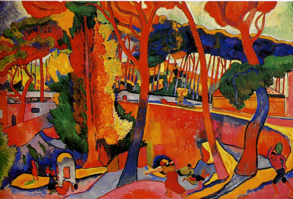
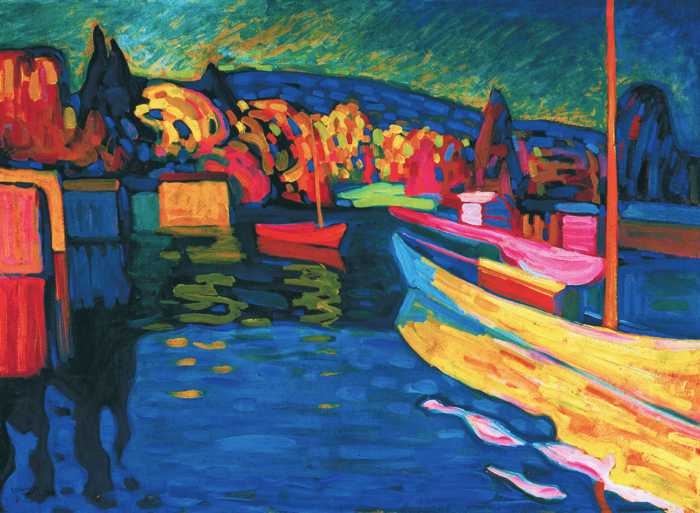
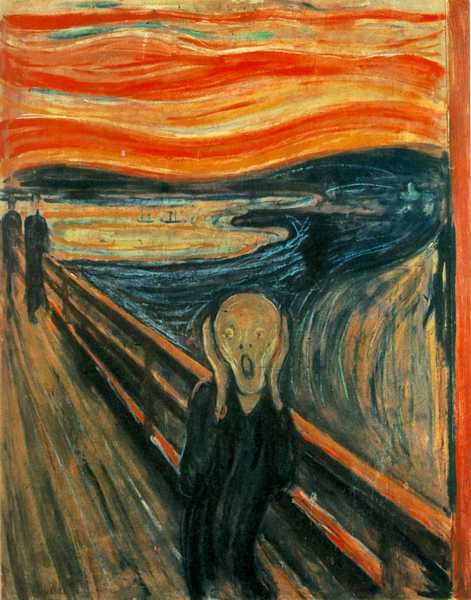
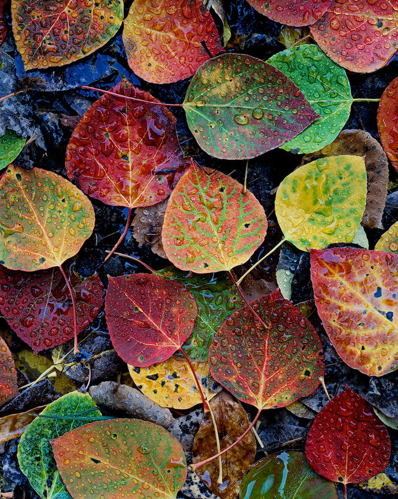
Warm colors like yellow, orange, red, and pink, can make a picture look brighter. Yellow is a more joyful color while red is a color that reminds us of the emotion anger. However, the way a work of art feels depends on how you use those colors. Although red makes us think of anger, take a look at this collage.
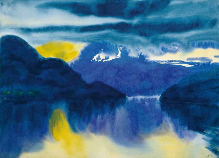
Artists use colors to create depth. Warm colors such as reds, yellows, oranges, and red-violets associated with the sun project toward the viewer. Cool colors such as blues, blue-greens, and blue-violets that are usually associated with bodies of water appear to recede into the distance.
Color is often deemed to be an important element of design as it is a universal language which presents the countless possibilities of visual communication. Hue, saturation, and brightness are the three characteristics that describe color. Hue can simply be referred to as "color" as in red, yellow, or green.
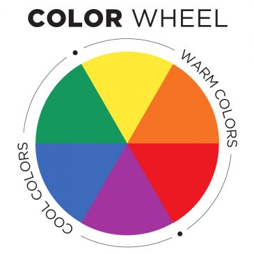
Color Wheel

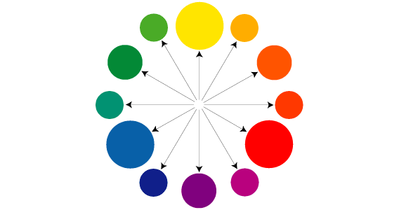
The color wheel is an organized system of colors based on color theory. The three primary colors have specific properties and form the core component of the wheel. These three primary colors are red, blue and yellow. They can not be created through mixing other colors, but must be created through pigments that are inherently that specific color. The three secondary colors are created by mixing two primary colors. These three secondary colors are orange, violet, and green. The color orange is created by mixing both red and yellow. Green is a mix of yellow and blue. Violet is a mix of blue and red.
Moving directly across the center of the color wheel reveals the complementary colors. Across from blue is the complement orange. Across the wheel from yellow is violet. Across the wheel from red is green. This concept of complementary colors is very important for artists and designers and was explored by painters in the 19th century. Complementary colors can be mixed together to create a neutral color such as a color used in the shadows of a form. This is called a color shade.
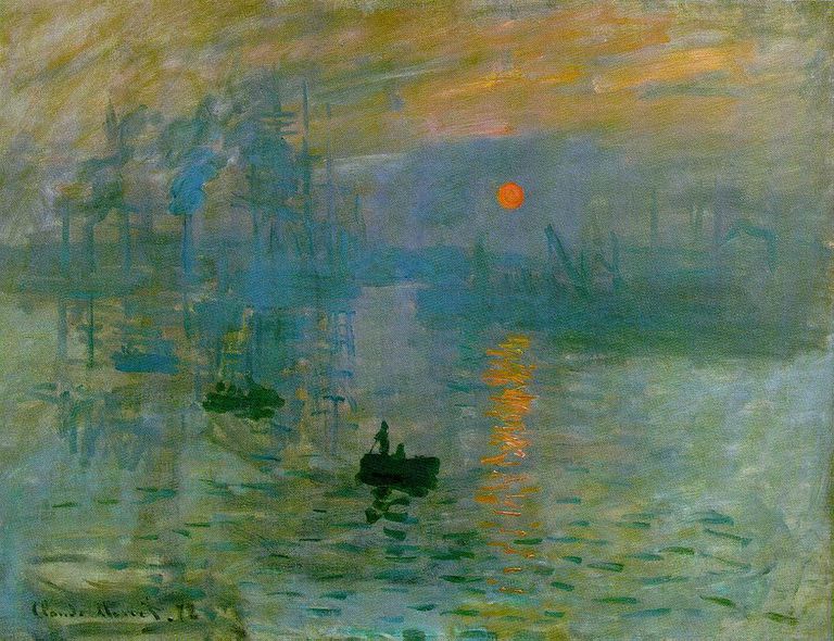
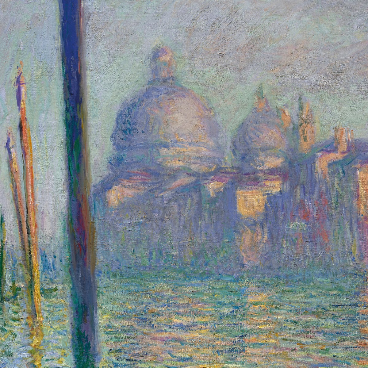
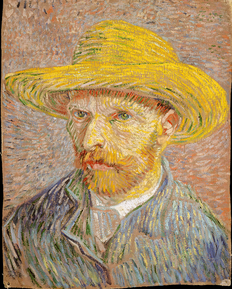
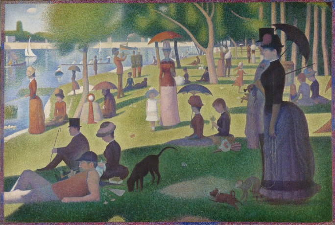
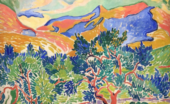
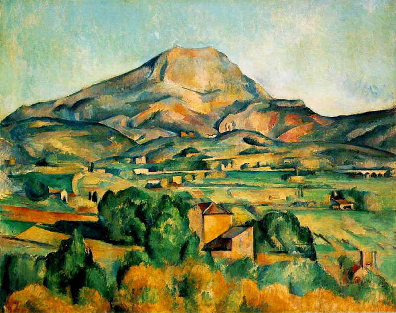
The Impressionist painters moved away from using black in mixing shades of a color and instead substituted the complementary color. This created paintings with vivid colors as well as cleaner shades and shadows. Color dynamics continued to be explored by many European painters in the late 19th century into the early 20th century. The use of saturated colors in the Fauvre painting style, as well as other modern art styles such as abstract expressionism, challenged the norms of academic painting and moved art in new and exciting directions. Many were angry with the paintings being produced at the time by artists like Matisse and Picasso. The term Fauvre is itself a derogatory French term referring to the painters as wild beasts. One of the most influential paintings of the period is Picasso's Les Demoiselles d'Avignon. This painting was so controversial at the time that some suggested that Picasso would be found hanging behind his canvas! https://en.Wikipedia.org/wiki/Les_De...es_d%27Avignon
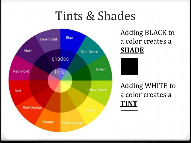
Remember that adding the complementary color also creates a shade of the color. However, using the complementary color will not dull down color in the same way as using black.
https://en.Wikipedia.org/wiki/Color_wheel
Components of Color
Read
Assignment
Part 1:
Create a Color Wheel in a creative way using cut paper and/or paint and cut photos in collage. Playful solutions may have banana representing yellow, red and green peppers, an orange, blueberries and violet eggplant representing both Primary and Secondary colors. The dimensions of the wheel should be around 12 inches in diameter. See figure B, page 135 for typical color wheel structure.
Part 2:
Project 1: Create an abstract composition using cut paper, photographic collage or paint using a Cool Color Palette. Pay great attention to the visual field and composition and the interaction of color shapes. See “cool color” images online and during lecture.
Project 2: Create an abstract composition using cut paper, photographic collage or paint using a Warm Color Palette. Pay great attention to the visual field and composition and the interaction of color shapes. See “warm color” images also in lecture.
Artistic craftsmanship is becoming more and more critical as the semester continues. Again, are you making progress and improving in this critical area?
This week’s assignments are three in total: 1. Color Wheel, 2. Cool Color Composition and 3. Warm Color Composition
Assignment: The Structure of Color
Read
Know the difference between Additive and Subtractive Color
Part 1:
Create a sophisticated design using complimentary colors. The dimensions of this design should measure a minimum of 11” x 14”. Media choices are cut paper, drawing with color pencils and paint.
Complimentary colors are often critical components in two-dimensional art forms. These colors have the ability to brighten the visual field. They also, when mixed, have the ability to darken in a way that often maintains more luminosity than the traditional form of darkening by adding black.
Part 2:
Create a small composition using a monochromatic color scheme. Add the compliment as a “spot color” to make the design “pop.” Media choices are the same as Part 1 above.
Artistic craftsmanship is becoming more and more critical as the semester continues. Again, are you making progress and improving in this critical area?