1.11: Modern Architecture
- Page ID
- 143487
\( \newcommand{\vecs}[1]{\overset { \scriptstyle \rightharpoonup} {\mathbf{#1}} } \)
\( \newcommand{\vecd}[1]{\overset{-\!-\!\rightharpoonup}{\vphantom{a}\smash {#1}}} \)
\( \newcommand{\dsum}{\displaystyle\sum\limits} \)
\( \newcommand{\dint}{\displaystyle\int\limits} \)
\( \newcommand{\dlim}{\displaystyle\lim\limits} \)
\( \newcommand{\id}{\mathrm{id}}\) \( \newcommand{\Span}{\mathrm{span}}\)
( \newcommand{\kernel}{\mathrm{null}\,}\) \( \newcommand{\range}{\mathrm{range}\,}\)
\( \newcommand{\RealPart}{\mathrm{Re}}\) \( \newcommand{\ImaginaryPart}{\mathrm{Im}}\)
\( \newcommand{\Argument}{\mathrm{Arg}}\) \( \newcommand{\norm}[1]{\| #1 \|}\)
\( \newcommand{\inner}[2]{\langle #1, #2 \rangle}\)
\( \newcommand{\Span}{\mathrm{span}}\)
\( \newcommand{\id}{\mathrm{id}}\)
\( \newcommand{\Span}{\mathrm{span}}\)
\( \newcommand{\kernel}{\mathrm{null}\,}\)
\( \newcommand{\range}{\mathrm{range}\,}\)
\( \newcommand{\RealPart}{\mathrm{Re}}\)
\( \newcommand{\ImaginaryPart}{\mathrm{Im}}\)
\( \newcommand{\Argument}{\mathrm{Arg}}\)
\( \newcommand{\norm}[1]{\| #1 \|}\)
\( \newcommand{\inner}[2]{\langle #1, #2 \rangle}\)
\( \newcommand{\Span}{\mathrm{span}}\) \( \newcommand{\AA}{\unicode[.8,0]{x212B}}\)
\( \newcommand{\vectorA}[1]{\vec{#1}} % arrow\)
\( \newcommand{\vectorAt}[1]{\vec{\text{#1}}} % arrow\)
\( \newcommand{\vectorB}[1]{\overset { \scriptstyle \rightharpoonup} {\mathbf{#1}} } \)
\( \newcommand{\vectorC}[1]{\textbf{#1}} \)
\( \newcommand{\vectorD}[1]{\overrightarrow{#1}} \)
\( \newcommand{\vectorDt}[1]{\overrightarrow{\text{#1}}} \)
\( \newcommand{\vectE}[1]{\overset{-\!-\!\rightharpoonup}{\vphantom{a}\smash{\mathbf {#1}}}} \)
\( \newcommand{\vecs}[1]{\overset { \scriptstyle \rightharpoonup} {\mathbf{#1}} } \)
\(\newcommand{\longvect}{\overrightarrow}\)
\( \newcommand{\vecd}[1]{\overset{-\!-\!\rightharpoonup}{\vphantom{a}\smash {#1}}} \)
\(\newcommand{\avec}{\mathbf a}\) \(\newcommand{\bvec}{\mathbf b}\) \(\newcommand{\cvec}{\mathbf c}\) \(\newcommand{\dvec}{\mathbf d}\) \(\newcommand{\dtil}{\widetilde{\mathbf d}}\) \(\newcommand{\evec}{\mathbf e}\) \(\newcommand{\fvec}{\mathbf f}\) \(\newcommand{\nvec}{\mathbf n}\) \(\newcommand{\pvec}{\mathbf p}\) \(\newcommand{\qvec}{\mathbf q}\) \(\newcommand{\svec}{\mathbf s}\) \(\newcommand{\tvec}{\mathbf t}\) \(\newcommand{\uvec}{\mathbf u}\) \(\newcommand{\vvec}{\mathbf v}\) \(\newcommand{\wvec}{\mathbf w}\) \(\newcommand{\xvec}{\mathbf x}\) \(\newcommand{\yvec}{\mathbf y}\) \(\newcommand{\zvec}{\mathbf z}\) \(\newcommand{\rvec}{\mathbf r}\) \(\newcommand{\mvec}{\mathbf m}\) \(\newcommand{\zerovec}{\mathbf 0}\) \(\newcommand{\onevec}{\mathbf 1}\) \(\newcommand{\real}{\mathbb R}\) \(\newcommand{\twovec}[2]{\left[\begin{array}{r}#1 \\ #2 \end{array}\right]}\) \(\newcommand{\ctwovec}[2]{\left[\begin{array}{c}#1 \\ #2 \end{array}\right]}\) \(\newcommand{\threevec}[3]{\left[\begin{array}{r}#1 \\ #2 \\ #3 \end{array}\right]}\) \(\newcommand{\cthreevec}[3]{\left[\begin{array}{c}#1 \\ #2 \\ #3 \end{array}\right]}\) \(\newcommand{\fourvec}[4]{\left[\begin{array}{r}#1 \\ #2 \\ #3 \\ #4 \end{array}\right]}\) \(\newcommand{\cfourvec}[4]{\left[\begin{array}{c}#1 \\ #2 \\ #3 \\ #4 \end{array}\right]}\) \(\newcommand{\fivevec}[5]{\left[\begin{array}{r}#1 \\ #2 \\ #3 \\ #4 \\ #5 \\ \end{array}\right]}\) \(\newcommand{\cfivevec}[5]{\left[\begin{array}{c}#1 \\ #2 \\ #3 \\ #4 \\ #5 \\ \end{array}\right]}\) \(\newcommand{\mattwo}[4]{\left[\begin{array}{rr}#1 \amp #2 \\ #3 \amp #4 \\ \end{array}\right]}\) \(\newcommand{\laspan}[1]{\text{Span}\{#1\}}\) \(\newcommand{\bcal}{\cal B}\) \(\newcommand{\ccal}{\cal C}\) \(\newcommand{\scal}{\cal S}\) \(\newcommand{\wcal}{\cal W}\) \(\newcommand{\ecal}{\cal E}\) \(\newcommand{\coords}[2]{\left\{#1\right\}_{#2}}\) \(\newcommand{\gray}[1]{\color{gray}{#1}}\) \(\newcommand{\lgray}[1]{\color{lightgray}{#1}}\) \(\newcommand{\rank}{\operatorname{rank}}\) \(\newcommand{\row}{\text{Row}}\) \(\newcommand{\col}{\text{Col}}\) \(\renewcommand{\row}{\text{Row}}\) \(\newcommand{\nul}{\text{Nul}}\) \(\newcommand{\var}{\text{Var}}\) \(\newcommand{\corr}{\text{corr}}\) \(\newcommand{\len}[1]{\left|#1\right|}\) \(\newcommand{\bbar}{\overline{\bvec}}\) \(\newcommand{\bhat}{\widehat{\bvec}}\) \(\newcommand{\bperp}{\bvec^\perp}\) \(\newcommand{\xhat}{\widehat{\xvec}}\) \(\newcommand{\vhat}{\widehat{\vvec}}\) \(\newcommand{\uhat}{\widehat{\uvec}}\) \(\newcommand{\what}{\widehat{\wvec}}\) \(\newcommand{\Sighat}{\widehat{\Sigma}}\) \(\newcommand{\lt}{<}\) \(\newcommand{\gt}{>}\) \(\newcommand{\amp}{&}\) \(\definecolor{fillinmathshade}{gray}{0.9}\)Building materials spawned by the Industrial Revolution, such as iron, steel, and sheet glass, determined new architectural techniques.
Key Points
- Among the common themes of modern architecture was the use of industrially produced materials.
- The Crystal Palace by Joseph Paxton, which housed the Great Exhibition of 1851, was an early example of iron and glass construction.
- Around 1900 a number of architects and designers around the world began developing new solutions to integrate traditional precedents (classicism or Gothic, for instance) with new technological possibilities.
Key Terms
- Industrial Revolution: The major technological, socioeconomic, and cultural change in the late 18th and early 19th century when the economy shifted from one based on manual labor to one dominated by machine manufacture.
- William Le Baron Jenney: (1832–1907) An American architect and engineer who is known for building the first skyscraper in 1884.
- Louis Sullivan: (1856-1924) An American architect who also pioneered urban steel-framed architecture and is also known, along with Jenney, as the Father of the Skyscraper and the Father of American Modernism. “Form follows function” is attributed to him although he credited the origin of the concept to an ancient Roman architect.
- Crystal Palace: A cast-iron and plate-glass building erected in Hyde Park, London, England, to house the Great Exhibition of 1851. More than 14,000 exhibitors from around the world gathered in the Palace’s 990,000 square feet (92,000 m2) of exhibition space to display examples of the latest technology developed in the Industrial Revolution. Designed by Joseph Paxton, the Great Exhibition building was 1,851 feet (564 m) long, with an interior height of 128 feet (39 m).
Modern Themes
Common themes of modern architecture include:
- The notion that ” form follows function,” a dictum originally expressed by Frank Lloyd Wright’s early mentor Louis Sullivan, meaning that the result of design should derive directly from its purpose
- Simplicity and clarity of forms and elimination of “unnecessary detail”
- Visual expression of structure (as opposed to the hiding of structural elements)
- The related concept of “truth to materials,” meaning that the true nature or natural appearance of a material ought to be seen rather than concealed or altered to represent something else
- Use of industrially produced materials
- Adoption of the machine aesthetic, particularly in International Style modernism
- A visual emphasis on horizontal and vertical lines
Application of Themes
With the Industrial Revolution, the increasing availability of new building materials such as iron, steel, and sheet glass drove the invention of equally new building techniques. In 1796, Shrewsbury mill owner Charles Bage first used his “fireproof” design, which relied on cast iron and brick with flagstone floors. Such construction greatly strengthened the structure of mills, which enabled them to accommodate much bigger machines. Due to poor knowledge of iron’s properties as a construction material, a number of early mills collapsed. It was not until the early 1830s that English engineer Eaton Hodgkinson introduced the section beam, leading to widespread use of iron construction.
This kind of austere industrial architecture and the rolling steel mills that filled the sky with black clouds of smoke and coal dust utterly transformed the landscape of northern Britain, leading the poet William Blake to describe places like Manchester and parts of West Yorkshire as “Dark satanic mills.” The Crystal Palace, designed by Joseph Paxton for the Great Exhibition of 1851, was an early example of iron and glass construction. It was followed in 1864 by the first glass and metal curtain wall. A further development was that of the steel-framed skyscraper in Chicago, introduced around 1890 by William Le Baron Jenney and Louis Sullivan.
Modernist Schools
Around 1900, a number of architects and designers around the world began developing new solutions to integrate traditional precedents (i.e. classic Greek and Roman style, or Gothic) with new technological possibilities. The work of Louis Sullivan and Frank Lloyd Wright in Chicago, Victor Horta in Brussels, Antoni Gaudi in Barcelona, Otto Wagner and the Vienna Secession in Austria, and Charles Rennie Mackintosh in Glasgow, among many others, can be seen as a common struggle between old and new. The work of some of these were a part of what is broadly categorized as Art Nouveau (“new art”).
Note that the Russian word for Art Nouveau, StilModern, and the Spanish word for Art Nouveau, Modernismo, are cognates of the English word “Modern,” though they carry different meanings. The aftermath of the First World War would result in additional experimentation and ideas. Following the experiments in Art Nouveau and its related movements around the world, modernism in architecture and design grew out of stylistic threads originating throughout the world.
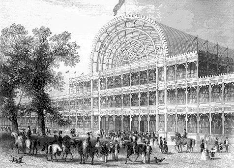
The Crystal Palace, 1851, was one of the first buildings to have vast amounts of glass supported by structural metal, foreshadowing trends in Modernist architecture.
Modern Architecture: Form Follows Function
Modern architecture adhered to Louis Sullivan’s famous precept, “form follows function,” which called for an absence of ornamentation beyond functional necessity.
A Revolution in Scale and Form
The great 19th century architect of skyscrapers, Louis Sullivan, promoted an overriding precept to architectural design: “Form follows function.” While the notion that structural and aesthetic considerations should be entirely subject to functionality was met with both approval and skepticism, it had the effect of introducing the concept of “function” in place of “utility.” “Function” came to be seen as encompassing all criteria of the use, perception, and enjoyment of a building, not only practical but also aesthetic, psychological, and cultural.
Modern architecture is generally characterized by simplification of form and by the creation of ornament from the structure and theme of the building. It is a term applied to an overarching movement, with its exact definition and scope varying widely. In a broader sense, early modern architecture began at the turn of the 20th century with efforts to reconcile the principles underlying architectural design with rapid technological advancement and the modernization of society. It would take the form of numerous movements, schools of design, and architectural styles, some in tension to one another, and often equally defying classification.
The Industrial Revolution introduced and popularized the use of steel, plate glass, as well as mass-produced components in architecture. These new materials opened up a new world for bold structural frames, with clean lines and plain or shiny surfaces. In the early stages of modern architecture, a popular motto was “decoration is a crime.” In Eastern Europe, the Communists rejected the West’s decadent ways, and modernism developed in a markedly more bureaucratic, somber, and monumental fashion.
Some historians regard Modernism as a matter of taste, a reaction against eclecticism and the lavish stylistic excesses of Victorian and Edwardian architecture. Around the turn of the 20th century, a general dissatisfaction with the emphasis on revivalist architecture and elaborate decoration of Arte Nouveau gave rise to many new lines of thought that served as precursors to Modern Architecture. Notable among these are the philosophies of the Deutscher Werkbund and the Bauhaus School.

The approach of the Modernist architects was to reduce buildings to pure forms, removing historical references and ornament in favor of functionalist details. Buildings displayed their functional and structural elements, exposing steel beams and concrete surfaces instead of hiding them behind decorative forms.
Chicago School of Architecture
The Chicago School of architecture is famous for promoting steel-frame construction and a modernist spatial aesthetic.
Key Points
- While the term ” Chicago School ” is widely used to describe buildings in the city during the 1880s and 1890s, Chicago buildings of the era displayed a wide variety of styles and techniques.
- One of the distinguishing features of the Chicago School is the use of steel- frame buildings with masonry cladding (usually terra cotta), allowing large plate-glass window areas and limiting the amount of exterior ornamentation.
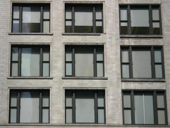
- The “Chicago window” originated in this school. It is a three-part window consisting of a large fixed center panel flanked by two smaller double-hung sash windows.
Chicago’s architecture is famous throughout the world and one style is referred to as the Chicago School. It is also known as Commercial style. In the history of architecture, the Chicago School was a school of architects active in Chicago at the turn of the 20th century. They were among the first to promote the new technologies of steel-frame construction in commercial buildings, and developed a spatial aesthetic that co-evolved with, and then came to influence, parallel developments in European Modernism.
While the term Chicago School is widely used to describe buildings in the city during the 1880s and 1890s, this term has been disputed by scholars, in particular in reaction to Carl Condit’s 1952 book The Chicago School of Architecture. Historians such as H. Allen Brooks, Winston Weisman, and Daniel Bluestone have pointed out that the phrase suggests a unified set of aesthetic or conceptual precepts, when, in fact, Chicago buildings of the era displayed a wide variety of styles and techniques. Contemporary publications used the phrase Commercial style to describe the innovative tall buildings of the era rather than proposing any sort of unified school.
One of the distinguishing features of the Chicago School is the use of steel-frame buildings with masonry cladding (usually terra cotta), allowing large plate-glass window areas and limiting the amount of exterior ornamentation. Sometimes elements of neoclassical architecture are used in Chicago School skyscrapers. Many Chicago School skyscrapers contain the three parts of a classical column. The first floor functions as the base, the middle stories, usually with little ornamental detail, act as the shaft of the column, and the last floor or so represent the capital, with more ornamental detail and capped with a cornice.
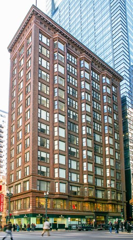
The Chicago Building by Holabird & Roche (1904–1905) : This steel frame building displays both variations of the Chicago window; its facade is dominated by the window area (limiting decorative embellishments) and it is capped with a cornice, elements that are all typical of the Chicago School.
The “Chicago window” originated in this school. It is a three-part window consisting of a large fixed center panel flanked by two smaller double-hung sash windows. The arrangement of windows on the facade typically creates a grid pattern, with some projecting out from the facade forming bay windows. The Chicago window combined the functions of light-gathering and natural ventilation; a single central pane was usually fixed, while the two surrounding panes were operable. These windows were often deployed in bays, known as oriel windows, that projected out over the street.
Architects whose names are associated with the Chicago School include Henry Hobson Richardson, Dankmar Adler, Daniel Burnham, William Holabird, William LeBaron Jenney, Martin Roche, John Root, Solon S. Beman, and Louis Sullivan. Frank Lloyd Wright started in the firm of Adler and Sullivan but created his own Prairie Style of architecture.

European Expressionist Architecture
Key Points
- The term Expressionist architecture initially described the activity of the German, Dutch, Austrian, Czech, and Danish avant-garde from 1910 until 1930.
- The style was characterized by an early modernist adoption of novel materials, formal innovation, and very unusual massing—sometimes inspired by natural biomorphic forms and sometimes by the new technical possibilities offered by the mass production of brick, steel, and glass.
- Expressionist architecture was individualistic and in many ways eschewed aesthetic dogma, but some aims common to its proponents include: the distortion of form, a striving for the new, the notion of architecture as a work of art, and the aim to express an inner experience.
Modern European Architecture
Expressionist architecture was an architectural movement that developed in Europe during the first decades of the twentieth century in parallel with the expressionist visual and performing arts. The term Expressionist architecture initially described the activity of the German, Dutch, Austrian, Czech, and Danish avant-garde from 1910 until 1930.
Subsequent redefinitions extended the term backwards to 1905 and also widened it to encompass the rest of Europe. Today the meaning has broadened even further to refer to architecture of any date or location that exhibits some of the qualities of the original movement such as: distortion, fragmentation, or the communication of violent or overstressed emotion.
Expressionism
The style was characterized by an early modernist adoption of novel materials, formal innovation, and very unusual massing—sometimes inspired by natural biomorphic forms and sometimes by the new technical possibilities offered by the mass production of brick, steel, and glass.
Many expressionist architects fought in World War I and their experiences, combined with the political turmoil and social upheaval that followed the German Revolution of 1919, resulted in a Utopian outlook and a romantic socialist agenda. Hence, ephemeral exhibition buildings were numerous and highly significant during this period.
Likewise, scenography for theater and films provided another outlet for the expressionist imagination, and provided supplemental incomes for designers attempting to challenge conventions in a harsh economic climate.
Features of Expressionist Architecture
Expressionist architecture was individualistic and in many ways eschewed aesthetic dogma. While the movement was very broad, some points can be found as recurring in works of Expressionist architecture, and are evident in some degree in each of its works.
- A distortion of form for an emotional effect.
- The subordination of realism to symbolic or stylistic expression of inner experience.
- An underlying effort at achieving the new, original, and visionary.
- A profusion of works on paper, and models, with discovery and representations of concepts being more important than pragmatic finished products.
- Often hybrid solutions, irreducible to a single concept.
- Themes of natural romantic phenomena, such as caves, mountains, lightning, crystal and rock formations.
- Utilizes the creative potential of artisan craftsmanship.
- A tendency towards the gothic than the classical.
- Draws as much from Moorish, Islamic, Egyptian, and Indian art and architecture as from Roman or Greek.
- Conceives architecture as a work of art.
Form also played a defining role in setting apart expressionist architecture from its immediate predecessor, art nouveau, or Jugendstil – the German version of arte nouveau. While art nouveau had an organic freedom with ornament, expressionist architecture strove to free the form of the whole building instead of just its parts.
An example of a built expressionist project that is formally inventive is Erich Mendelsohn’s Einstein Tower. This sculpted building shows a relativistic and shifting view of geometry: devoid of applied ornament, form and space are shaped in fluid concrete to express concepts of the architect and the building’s namesake.
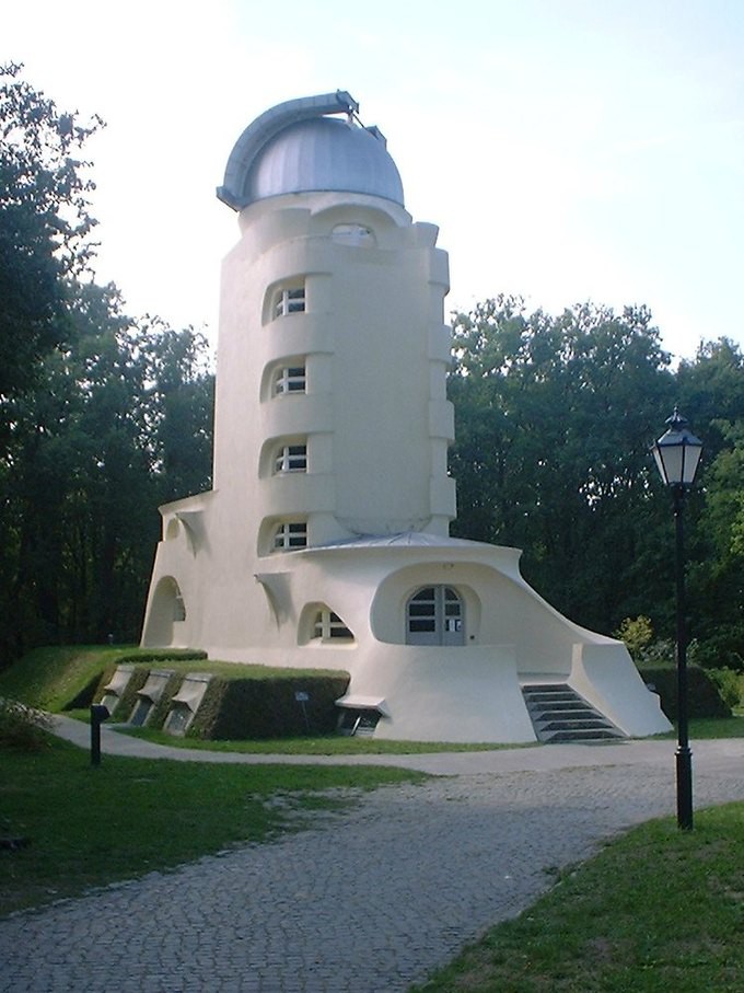
Expressionist architecture utilized curved geometries and a recurring form in the movement is the dome. Another expressionist motif was the emphasis on either horizontality or verticality for dramatic effect, which was influenced by new technologies like cruise liners and skyscrapers.
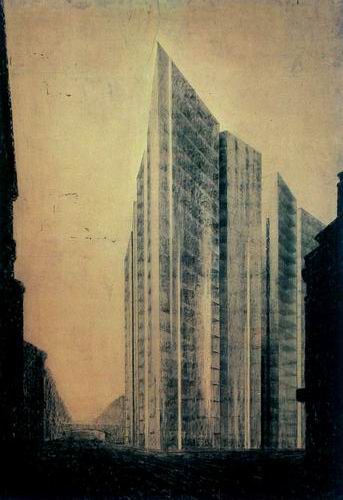
While the drawing of the design for a skyscraper by Mies van der Rohe is very much in keeping with German Expressionism, the actual skyscraper would also have been an expression of the new. The idea of a multistory building with glass cladding over a steel skeleton was new and daring in 1921. Even the steel-framed buildings of Louis Sullivan adhered to the convention of a solid masonry cladding which gave the public the feeling of solidity and reliability they were used to from 19th century materials.
Mies was interested in showing the load-bearing function of steel that allowed the exterior walls to be free of the support (non-load-bearing) and, in this case, translucent. His later work, like the Seagram Building in New York, would continue this idea of the glass curtain wall and would have an extraordinary influence on the cityscape of the 20th century.
American Art Deco Architecture
Art Deco and Streamline Moderne were two key styles of early 20th-century American architecture.
Key Points
- Art Deco emerged from the Interwar period and combines traditional craft motifs with Machine-Age imagery and materials.
- Art Deco can be recognized by its heavy ornament, bold geometric forms, and rich colors.
- Streamline Moderne was an aesthetic first created by industrial designers who stripped Art Deco design of its ornament in favor of the aerodynamic pure- line concept of motion and speed developed from scientific thinking: it is embodied in cylindrical forms and long, horizontal windowing.
- The Streamline Moderne was both a reaction to Art Deco and a reflection of austere economic times. Gone was unnecessary ornament: sharp angles were replaced with simple, aerodynamic curves.
Modern American architecture is usually divided into the two styles of Art Deco and Streamline Moderne. Art Deco, which emerged in the 1920s and flourished in the 1930s to 1940s, is an eclectic style that combines traditional craft motifs with Machine Age imagery and materials.
Streamline Moderne, also known as Art Moderne, was a late type of the Art Deco design style that emerged during the 1930s. Its architectural style emphasized curving forms, long, horizontal lines, and sometimes nautical elements.
Art Deco
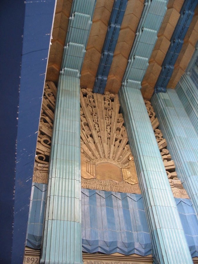
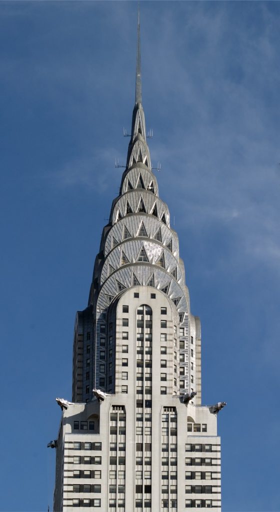
The Art Deco style is often characterized by its use of rich colors, symmetry, bold geometric shapes, simple composition, rectilinear rather than curvilinear shapes, and lavish ornamentation. Emerging during the Interwar period when rapid industrialization was transforming culture, one of the major attributes of Art Deco was its embrace of technology.
During its heyday, Art Deco represented luxury, glamor, exuberance, and faith in social and technological progress. The urban United States has many examples of Art Deco architecture, especially in New York, Chicago, and Detroit. The famous skyscrapers in these cities are the best known, but notable Art Deco buildings can be found in other neighborhoods.
Streamline Moderne
As the Great Depression decade of the 1930s progressed, Americans saw a new decorative element of the Art Deco style emerge in the marketplace: streamlining. Streamline Moderne was a concept first created by industrial designers, who stripped Art Deco design of its ornament in favor of the aerodynamic pure-line concept of motion and speed developed from scientific thinking.
This aesthetic was embodied through the use of cylindrical forms and long, horizontal windowing. An array of designers quickly ultra-modernized and streamlined the designs of everyday objects, such as toasters.
Streamline Moderne was both a reaction to Art Deco and a reflection of austere economic times. Gone was unnecessary ornament. Sharp angles were replaced with simple, aerodynamic curves. Exotic woods and stone were replaced with cement and glass.
Some common characteristics of Streamline Moderne include horizontal orientation, rounded edges, corner windows, glass blocks, porthole windows, chrome hardware, smooth exterior wall surfaces (usually stucco), horizontal wall grooves, and subdued colors.


However, Art Deco and Streamline Moderne were not necessarily opposites. Streamline Moderne buildings with a few Deco elements were not uncommon, and sometimes there is so much crossover that it can be difficult to differentiate between the two styles. Other examples of both Art Deco and Streamline Moderne can be found in New York, California, and especially Miami.
Europe in the 1920s was recovering from WWI. Many artists reacted to that cataclysm, some by searching for new forms that they hoped would help turn society away from the mistakes of the past and create a new utopian future. In architecture, Le Corbusier developed a style that would be highly influential.
International Style
The International Style would become the face of modern architecture for decades after Le Corbusier’s theories of the 1920s and 30s. The Getty Research Institute defines the primary attributes of International Style buildings as having an “emphasis on volume over mass, the use of lightweight, mass-produced, industrial materials, rejection of all ornament and color, repetitive modular forms, and the use of flat surfaces, typically alternating with areas of glass.”1
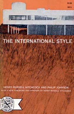
Corbusier published a number of texts on architecture in which his largely utopian ideas were established. In L’EspritNouveau (New Spirit, 1918-22) and Versunearchitecture (Toward an Architecture, 1920-23) he outlined his five points which made up his philosophy that “Une maison est une machine-à-habiter” (“A house is a machine for living in”).
These points were:
- Free façade
- Open floor plan
- Roof garden
- Pilotis which lift the living space off the ground
- Strip or ribbon windows
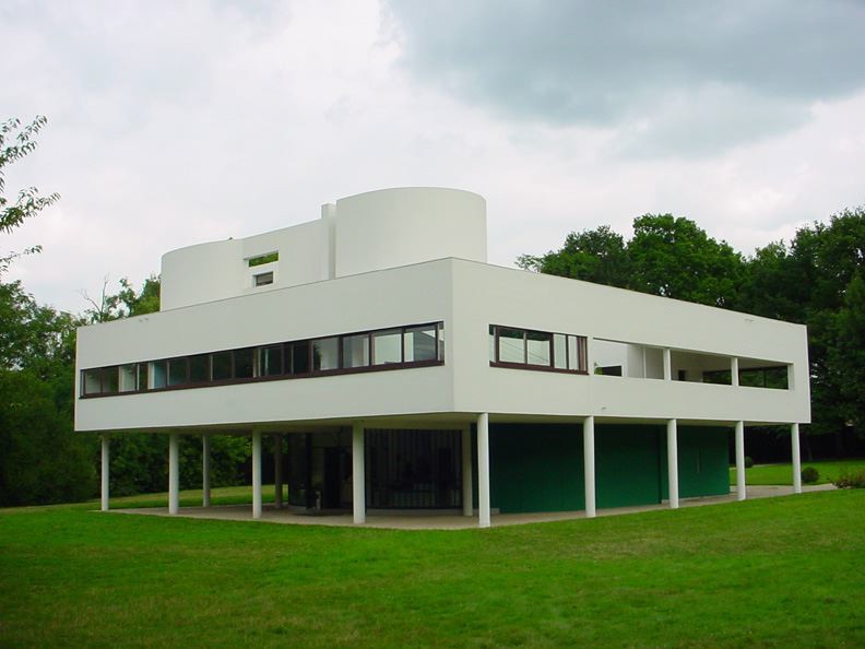
The Villa Savoye was begun in 1928 in a wooded landscape a short train ride from Paris. It was the summer retreat of a wealthy Parisian family and it gave Corbusier the freedom to express each of the five points exactly. The concrete pillars (pilotis) lift the house off of the unhealthy ground and open that footprint for access by cars and other practical uses. It also allowed the healthy breezes to circulate through the ribbon windows which are also located so that the view of the surrounding trees makes the house seem to be a kind of treehouse. The façade is not linked to obvious supports (free) and the interior walls are also able to be placed wherever they were needed without reliance on obvious structure. The roof of the Villa is a kind of garden or recreational space. The Villa Savoye was the cover illustration for the Museum of Modern Art’s architectural exhibition on what curators Hitchcock and Johnson would name the “International Style”.
American Modernism and Frank Lloyd Wright
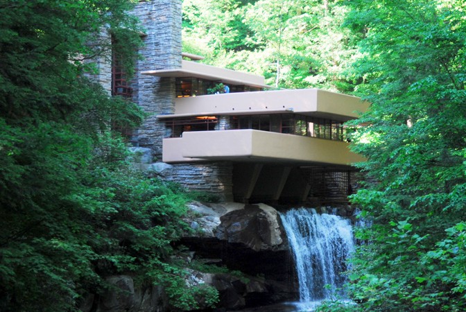
Frank Lloyd Wright is possibly the most significant architect of the first half of Amerca’s twentieth century. He was a prolific designer and had some 532 of his more than 1000 designs actually built. A student of Louis Sullivan, Wright would develop his own theories about what architecture should be – mainly that it should harmonize with human beings and with the landscape in which it was set. He called this organic architecture. While his forms were geometric like Corbusier’s, his materials were often taken from the area in which the building was itself sited and always with the idea of nature in mind. He also established a school at his estate called Taliesin in Wisconsin, and later at Taliesin West in Scottsdale, Arizona. Wright had a number of influences in his work including something of Sullivan, Japanese architecture, the English Arts and Crafts movement. However, nature was his greatest inspiration and his Prairie Houses, long low structures with cantilevered overhangs were meant to relate to the Midwestern landscape that inspired them.
One of his most famous houses, Fallingwater, at Mill Run in Pennsylvania was, like Corbusier’s Villa Savoye, a summer retreat for a wealthy merchant, Philadelphia department store mogul Edgar Kaufmann, Sr. and his family. The unexpected thing about Fallingwater was Wright’s genius in its siting. The conventional choice would have been to put the house on the other side of the water looking back toward the waterfall. Wright chose to locate it over the fall itself with open access to the water from the house and views of the water and nature beyond. Local materials were used in the construction along with Wright’s reinforced concrete cantilevered patios making nature an integral part of the design.
Postmodernism
During the 1960s, 70s, and 80s architects began to turn away from the stark lines of the International Style with a return to ornamentation. This was part of the cultural zeitgeist of the time which seemed to be a kind of general exhaustion with the forms of modernism. Francis Fukuyama’s essay The End of History, published in 1989, suggested that political systems had reached their final evolution with liberal democracies – Western culture had reached the end of history. This was echoed in Postmodern architecture by the incorporating, or appropriating, styles or ornament from the past and incorporating those forms onto new buildings. The idea of appropriation also made its way into painting and sculpture with artists literally using images already created by other artists and recreating them wholly or in part. Sherrie Levine rephotographed some of the iconic work of Edward Weston: https://smarthistory.org/sherrie-levine-untitled-after-edward-weston/
The Centre Georges Pompidou is in the Beaubourg area of the 4th arrondissement of Paris, near Les Halles, rue Montorgueil and the Marais and houses much of Paris’ contemporary art.
Pompidou Center, Paris, 1971-11. Renzo Piano, Richard Rogers and Gianfranco Franchini architects. Accessed on Vimeo, posted by EcoworldReactor. Visit site and video at https://vimeo.com/197148859
It was designed by the architectural team of Richard Rogers and Renzo Piano, along with Gianfranco Franchini. While more high tech than Postmodern, the Beaubourg, as it is called, does seem to be a building turned inside out with the structures that are usually hidden made the primary exterior architectural features. In that way it participates in the Postmodern idea of “deconstruction” made popular during the 1980s by French philosopher and semiotician Jacques Derrida. Derrida analyzed texts by close readings meant to question the relationship between structure and language and ultimately the impossibility of meaning in language as he saw it. It has become an important theoretical underpinning of many disciplines including architecture, art, and critical theory.
In America the architects Philip Johnson and Frank Gehry along with Michael Graves and others also turned to ideas of Postmodernism in building. Gehry’s work at the time is arguably more playful – another aspect of Postmodern architecture – but Johnson’s skyscraper on Madison Avenue in New York was both reviled and celebrated for its appropriation of the cornice of an 18th century Chippendale cabinet on the top of the building.


Green Architecture
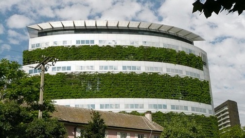
Contemporary architects have become as concerned with sustainability and environmental issues as they are with form and ornamentation. Buildings are being designed integrating literal green spaces – some can even vertically farm their own food. Issues of material that is recycled or naturally integrated with the environment can be the starting place for architecture in the 21st century, both domestic and commercial. Other buildings like tiny houses are created to leave as small a footprint on the land as possible, as well as being more affordable for an expanding population with shrinking resources for housing.
- 1 “International Style (modern European architecture style)”. Art and Architecture Thesaurus. Getty Research Institute. http://www.getty.edu/vow/AATFullDisplay?find=international+style&logic=AND¬e=&page=1&s ubjectid=300021472 ↵


