
6.5: Contemporary Figurative
- Page ID
- 174449

Introduction
Figurative art based on people and stories has become a dominant part of the art world. Although figurative work had been created centuries, the contemporary styles are new, innovative, and non-traditional. Global boundaries are gone, and the standards for European-Western art are jettisoned. Figures become reconstructed, paint jumps and slashes across the image, and colors are bright and conflicting. The designs, styles, and imagery vary; however, a few themes cross through all the work. One central theme resounding through the artwork is color; it is bright, colorful, and mixed. Another reverberating concept is the exploration of cultural identity, racism, and heritages. Since the early 2000s, figurative art has exploded worldwide, emphasizing identity politics.
Women artists are using the figure to challenge current old stereotypes and the sexual portrayal of women throughout history. Women now feel free to manipulate the image of the female body in their views. They use exaggerated features or contort the figure in ways understandable to other women. Much of their work is based on domestic settings and events in a woman's world. They use narratives in the contemporary culture, exploring sexuality, identity, and humanity. Artists of color seldom see images of their culture as significant figures in historical portraits. Now they are increasingly visible and changing the dialogue of figurative artwork to be inclusive and represent multiple cultures.
Kehinde Wiley
Kehinde Wiley (1977-) Wiley and his twin brother were born in California. Both Wiley and his brother went to after-school art lessons as children. He was even selected to study art in Russia when he was eleven and learned about portraiture. Wiley received a BFA from San Francisco Art Institute and an MFA from Yale University. He was always influenced by the style of the Old Masters and their realistic portrayals. Wiley paints his figures with a combined style of West African textile images, Rococo, local urban, and the realism of the Old Masters. He presents his black and brown figures in majestic poses of power, heroism, and spirituality using his unique style. Wiley travels the streets in America and different countries to find the people for his paintings. He poses the person in positions like someone in an old painting. For the backgrounds in his work, he finds decorative elements, wallpaper, a building façade, textiles, or other interesting objects.
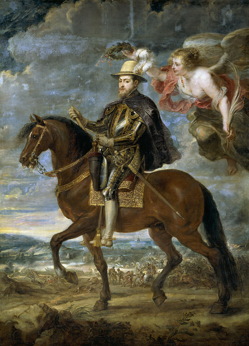
Equestrian Portrait of King Philip II (Michael Jackson) (8.5.1) is an image of the singer Michael Jackson. Wiley used the basic pose and style of Peter Paul Rubens's painting of King Phillip II as he sat on his horse. Wiley just uses the pose and essential information before developing his unique style in the painting. Michael Jackson sits astride the magnificent white horse with its excessively curled main and tail. His armor was embellished with gold, the blue cape blowing in the breeze.
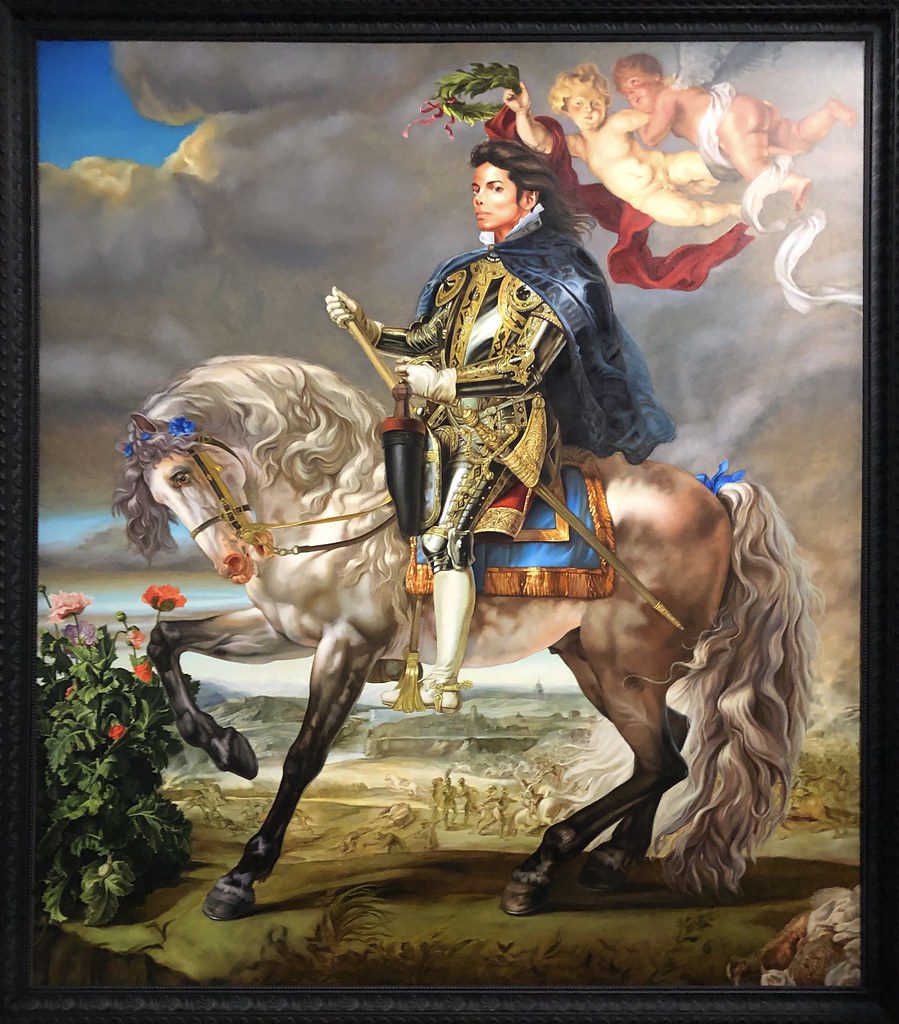
In Ruben's image, (8.5.2) the angel sits behind the king while Wiley has a pair of cherubs. Wiley seizes the concepts of power by white men and transfers the appearance of power to a modern black man.
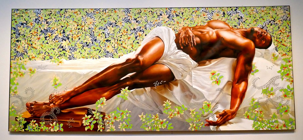
Images of figures sleeping are common themes throughout art history. Wiley's figure in Sleep (8.5.3) depicts a black man lying on a white, draped cloth like those found in funerary settings. The figure appears in a Christ-like position; his feet are resting on a plank, the feet stacked as though previously crucified. The man's arms are stretched out, his hands open and relaxed. Although the lustrous brown skin of the man dominates the painting, his physique is highly defined and expressed, giving the man a tender and almost vulnerable look. The background of light-colored flowers appears active, and the vines appear to grow as the man is sleeping, starting to encapsulate him. The painting contradicts the conception that black men are generally aggressive.
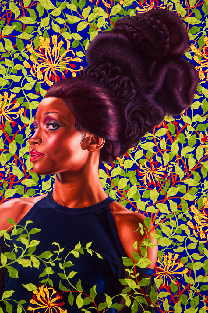
Wiley painted a series based on female models. He adorned them in opulent gowns by well-known designers, adding decorative accessories and extravagant fake hairstyles, almost Rococo in design. Most of the women Wiley painted were ordinary people he passed in the community. He posed and depicted them with a feeling of self-awareness. Wiley portrayed them surrounded with representations of black strength. Seen from the side view, Shantavia Beale II (8.5.4) turns her eye towards the viewer, a very self-assured look. Her head is stacked with elaborately arranged fake hair similar to the royal women in old European masterpieces. The background in the painting is covered with flowers, as Wiley adds to most of his work.
Amy Sherald
Born in Georgia, Amy Sherald (1973-) was drawing images from when she was a child. When she went to a museum on a school field trip, Sherald discovered art was a profession. Her mother wanted her to become a doctor, an idea that increased her determination to pursue art. Sherald was one of the few African Americans in her classes, and she became aware of race at an early age. As an artist, she wanted to create different chronicles of the lives of African Americans. Sherald received her BA from Clark Atlanta University and an MFA from Maryland Institute College of Art. She paints typical members of African American families in their day-to-day lives. Using a grisaille technique for just the skin colors, Sherald uses grey as the base and applies it in a very thin, watered-down technique with a brush. Adding small amounts of black, she creates the shadows and highlights to produce her distinctive portraits and black identity. Sherald paints with a vibrant palette for highly contrasted clothing. Her backgrounds are usually a single color and undefined, allowing the person to stand out. Each person is dramatically posed and looking directly at the viewer.
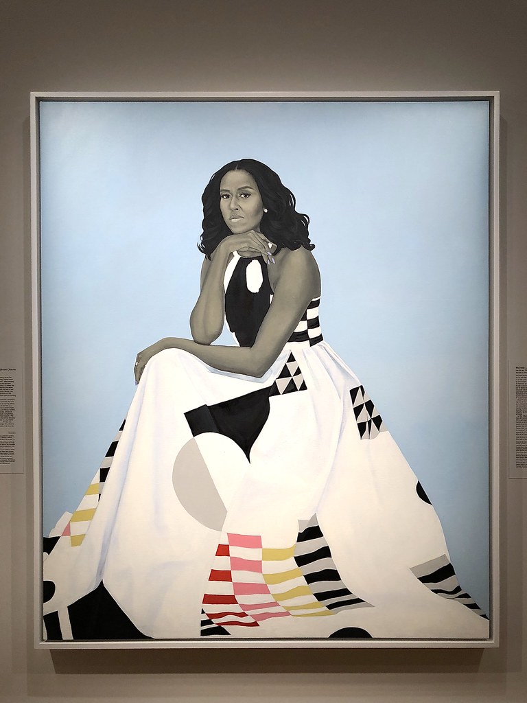
Michelle Obama was the First Lady of the United States from 2009 to 2017, and every first lady selects an artist to paint the official portrait for the Smithsonian's National Portrait Gallery. Obama chose Sherald to paint the official painting entitled First Lady Michelle Obama (8.5.5). Obama is sitting, looking at the camera in a reflective mood, her chin resting on her hand. The distinctive geometric patterned dress flows outward, almost filling the bottom part of the painting. The unique colors on the dress form quilt-like patterns like those made by the Gee's Bend quilters, the descendants of enslaved people. Sherald took photographs of Obama to use as a reference when she was painting. In a basic grayscale, she painted Obama's skin in her usual grisaille method. The bright robin's egg blue background brings a high contrast to Obama. The director of the National Portrait Gallery, Kim Sajet, stated, "Portraiture used to be seen as this old-fashioned, fuddy-duddy, really for dead white people kind of way of painting…and they've completely changed that and put it on its head."[1]
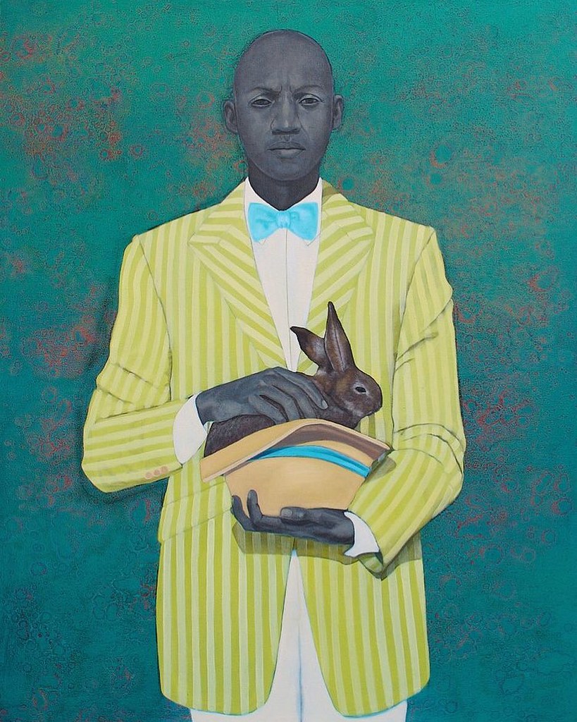
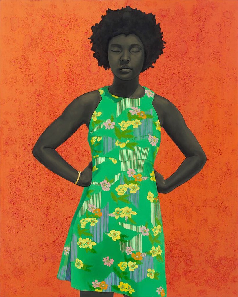
Sherald painted ordinary people and posed them for her unique portraits. In both The Rabbit in the Hat (8.5.6) and The Make Believer (Monet's Garden) (8.5.7), the people are posed straightforward-looking at the viewer. The man in his florescent striped jacket, bright turquoise blue tie, and impeccable white shirt and pants appears to be almost surrealistic as he oddly holds a rabbit in his hat. The mottled green background highly contrasts with his clothing while his face almost fades into the background. The woman is highly juxtaposed against the brilliant orange-red background in the other painting. Her bright green dress is covered with yellow and pink flowers resembling Monet's repetitive use of flowers. Her eyes are closed, perhaps resting, or maybe ignoring the viewer's look. With both paintings, the backgrounds give no clue about the person or where they may be standing, a trademark of Sherald.
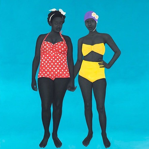
The Bathers (8.5.8) portray two women supposedly at the beach. They are wearing swimsuits, and the background is a vivid blue; however, their actual location is not evident. Western painters of people at the beach or pool always incorporated elements of their location; sand, waves, or splashing water. However, Sherald always sets her portraits against a single color, unknown background, leaving the viewer to imagine where the people are standing. Only the purple bathing cap on one woman's head divulges any clue about where they are. Both bathers are looking outward, waiting for the viewer to engage in conversation. Sherald chose her models from everyday life and stated, "When I choose my models, it's something that only I can see in that person, in their face and their eyes, that's so captivating about them."[2] When a portrait of the bathers is hung on the wall, it is low to the ground, so the viewer meets them at eye level.
Yue Minjun
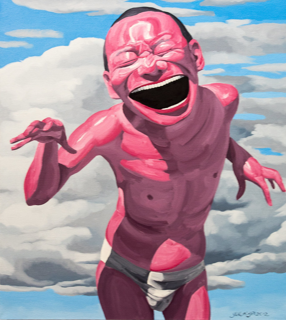
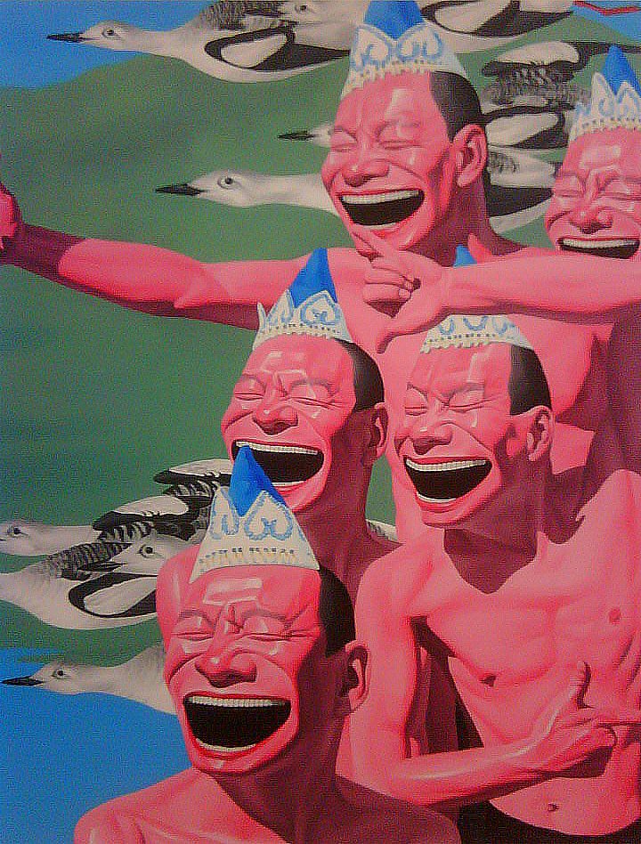
Yue Minjun (1962-) was born in China, where his family worked in the oil fields and constantly moved to follow the work. After high school, Yue became an electrician, painting when he had spare time. In 1990, he moved to Beijing in a district supporting an artist's village. China was changing from some of the older concepts to new postmodernity. The artists also were part of a revolution in the style of Chinese art. Yue worked in multiple disciplines, including sculpture, watercolor, and print. He became known for his unusual depiction of images frozen in laughter. Yue was also part of Cynical Realism's attitude in China, ridiculing the political and commercial views. Yue's paintings were usually based on self-portraits that were humorous and lighthearted. He frequently based a concept on well-known European compositions or iconic Chinese images Yue adapted to his aesthetics. Theorist Li Xianting described Yue's self-portraits as "a self-ironic response to the spiritual vacuum and folly of modern-day China."[3] Yue usually portrays his portraits all distorted and grotesque with bright pink skin and large toothy laughs. Laughter was a way to lighten pain and an antidote to the cruelties of life.
Free Sky No 1 (8.5.9) and Untitled (8.5.10) reflect Yue's exaggerated people images of himself frozen in laughter. In the first image, Yue thrusts himself forward in the scene, wearing only his very white underwear. In Untitled, he replicates himself five times, each person wearing a ludicrous crown. One projection viewed in his work is the concept a grand smile does not mean the person is happy. Yue used simple basic colors to high contrast with the overly bright pink people. The open mouth and a large set of teeth represent the boredom and emptiness of the Chinese people at the time. Yue's art was considered experimental, contrary to the traditional images of Chinese art and a reflection of Cynical Realism, an attitude ridiculing China's political and commercial position. His work mocked himself as well as the community at large, his faces a trademark of his work.
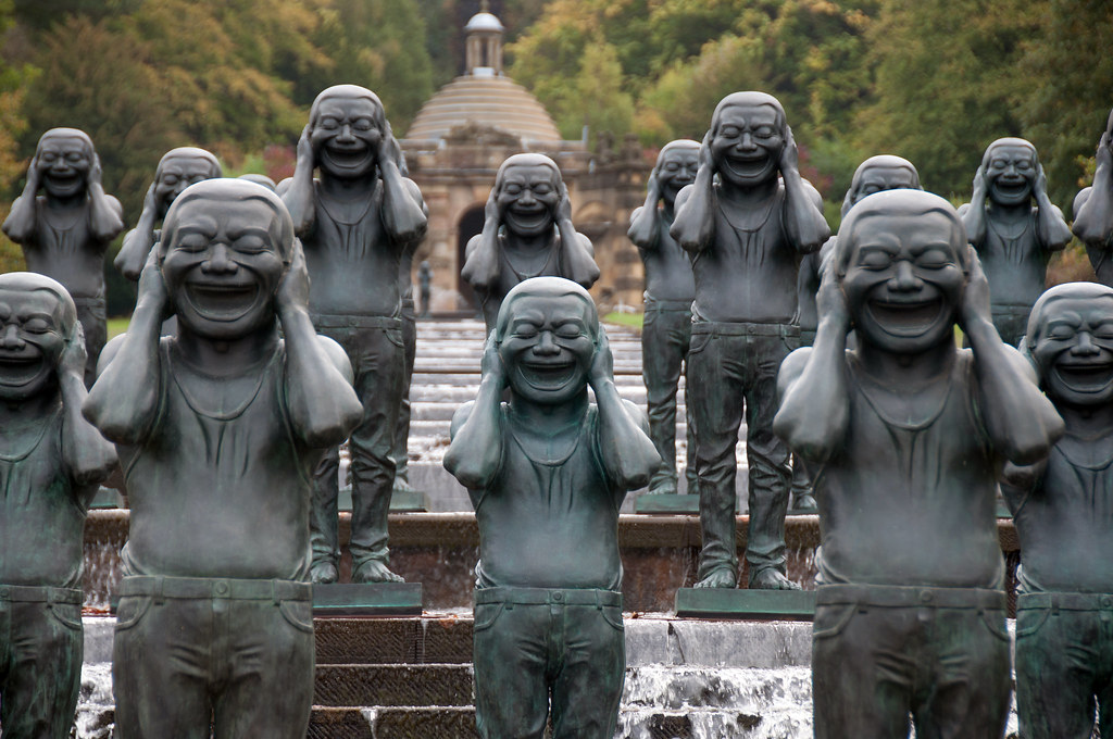
Yue made twenty-five Contemporary Terracotta Warriors (8.5.11) based on the legendary Terracotta Army. The thousands of Terracotta Warriors each had distinctive faces and clothing. Each statue in Yue's sculptures was based on Yue's self-portrait creating a group of laughing soldiers who are positioned and holding tightened fists, making a satirical gesture. He believed using the same image and expression displayed the loss of individuality more accurately than distinct portrayals. Yue believed laughter represented how helpless people were when their rights were taken away.
Fang Lijun
Fang Lijun (1963-) was born in China and attended the Children Cultural Place for schooling. He studied ceramics for three years at the Hebei Light Industry Technology and then changed his mind after becoming fascinated with oil painting. After studying painting at the Central Academy of Fine Arts, he moved to a small village with other artists like Yue Minjun. They were also part of the Cynical Realists who became disillusioned with China's policies after the actions at Tiananmen Square and the resulting powerlessness of people in the restricted societal structure. Fang was one of the artists who rebelled against traditional Chinese art and modern styles displaying his disenchantment and anguish. One of Fang's significant themes in his paintings was the bald protagonist and taking on the issues of human rights and political oppression.
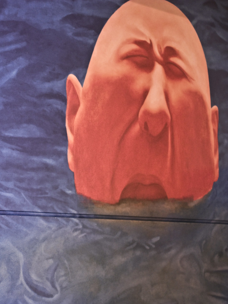
980815 (8.5.12) is an image of Fang's typical bald man appearing to be drowning in the water. Bald men in China were considered stupid. Painters were also looked down on at the time. Fang used the comparison to judge people based on their moral character instead of their occupation or appearance. He also used water in many of his paintings. A person drowning in water is like living in China with no voice and powerless in the governmental structure. Metaphorically, one can move through the water safely and speak for oneself or drown in the water or under societal rules.
Fang based his painting 30th Mary (8.5.13) on religious paintings found on the ceilings of European churches. The multiple, repetitive doll-like figures all display Fang's facial image. Unlike the church painting where the people are ascending into heavenly clouds, Fang painted stormy tornado-like clouds depicting cynicism instead of the ideological assurance of a savior. The small figures are wearing school uniforms, the spots of color adding to the motion. Each of the figures is bald as the apathetic or unintelligent followers of the Chinese government.
Njideka Akunyili Crosby
Njideka Akunyili Crosby (1983-) was born in Nigeria of Igbo descent. Her mother was a professor at the University of Nigeria, and her father was a doctor. When Crosby was in high school, the family obtained a green card for the United States. She and her sister came in 1999, studying for American tests before college. Crosby graduated from Swarthmore College, where she studied both biology and art. Initially, she planned to become a doctor until deciding to change to art in her senior year. Crosby creates her images based on the culture and social life of a Nigerian woman who lives in the United States. She incorporates fabric, paint, colored pencil, and printed photo transfers into her work to achieve different looks from her culture. Crosby regularly took photos of her family in Nigeria and used them to make the acetone-transfer prints. She also places women in the center of power during interactions with others, including the ideas from interracial marriage.
Before Now After (Mama, Mummy and Mamma) (8.5.14) depicts the interrelationships in her family. Her sister is sitting at the table in a bright pink shirt surrounded by images of her mother and grandmother. The paintings sit on the table instead of hanging on the empty wall, the wall a counterpoint to the opposite wall filled with pictures. The group of objects in the center of the table almost looks like a still-life, a second painting within the painting. Crosby uses a calm color palette with muted blues and pinks, brown bringing the two contrasting colors together.
The painting Nwantinti (8.5.15) is based on an Igbo love song. The two people in the painting appear in a private and silent moment, the man lying on his back, his head cradled on her lap. The image is one of Crosby herself and her husband presenting the mixture of race and gender, each wearing the style of clothing found comfortable by their cultural backgrounds. The painting is almost all tones of red and black. Only the blue on the photo transfers punctuates the room with spots of color. Crosby incorporated her personal images and photos into the bedspread, rug, and background collages. The strong trellis pattern on the paneled wall helps ground the floating images in most of the room.
In the painting 5 Umezebi St., New Haven, Enugun (8.5.16) depicts the family gathering. Crosby used her photo-transfer images to create the floor and wall, anchoring the bottom and side of the painting and providing the background. The photos in the window give depth to the image as though looking out the window and up the hill. The shirt and dress of the adults are also photo transfers, distinguishing them from the rest of the family. Crosby used yellow to pull the viewer across the portrait and examine what each person is actively doing. The orange pants of the seated man and the blue shirt of the boy consistently bring the viewer back to the center. Each person's activities convey a significant amount of movement to the painting.
Dana Schutz
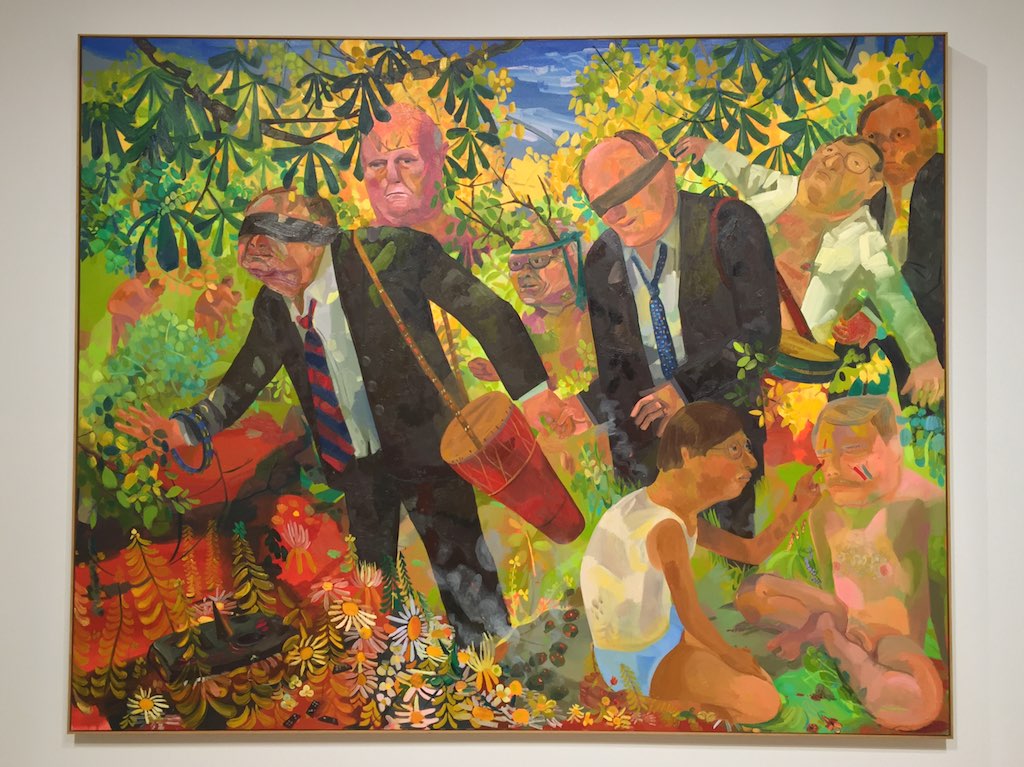
Dana Schutz (1976-) was born in Michigan. Both of her parents worked in the local schools. Schutz attended different art schools and received her BFA at Cleveland Institute of Art and her MFA from Columbia University. Her figurative paintings frequently portray people in awkward or controversial situations. Schutz's work is often ambiguous, emotional, and complete with complicated tensions. Her work is not just fantasy, as the images may become plausible realities as she adds abstraction to her figuration. Some of her figures are comical, while others are on the edge of violence. Schutz uses oil on canvas and acrylics with large, loose brushstrokes. Schutz is adventurous with color and uses an extensive color palette created for each painting. In Men's Retreat (8.5.17), Schutz imagined how the top executives in powerful corporations interact in the middle of the forest. Three men were still dressed in suits, although they had loosened their ties, some had changed to casual clothes, and a few had removed all clothing. The painting imagines how these prominent executives acted playing bongo drums, face painting, playing trust games, or the blind leading the blind. Schutz used a broad range of colors layered in transparency, suggesting the executives used to control now find themselves fumbling in the haze of the trees or flowers in an unfamiliar and uncontrolled environment.
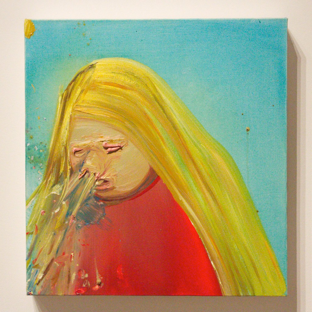
Sneeze (8.5.18) is typical of something everyone does; however, not so obvious or an uncontrolled scene of the high-velocity sneeze and repulsive drooling. Schutz exaggerated an embarrassing event giving the image an almost comedic interpretation. The person's nose is also exaggerated, enhancing the amount of snot propelling from the nose. Schutz used basic, bright colors drawing attention to the person and the disgusting debris now covering the red shirt. Thick rows of paint force the eyes closed, unable to see the disaster unfolding.
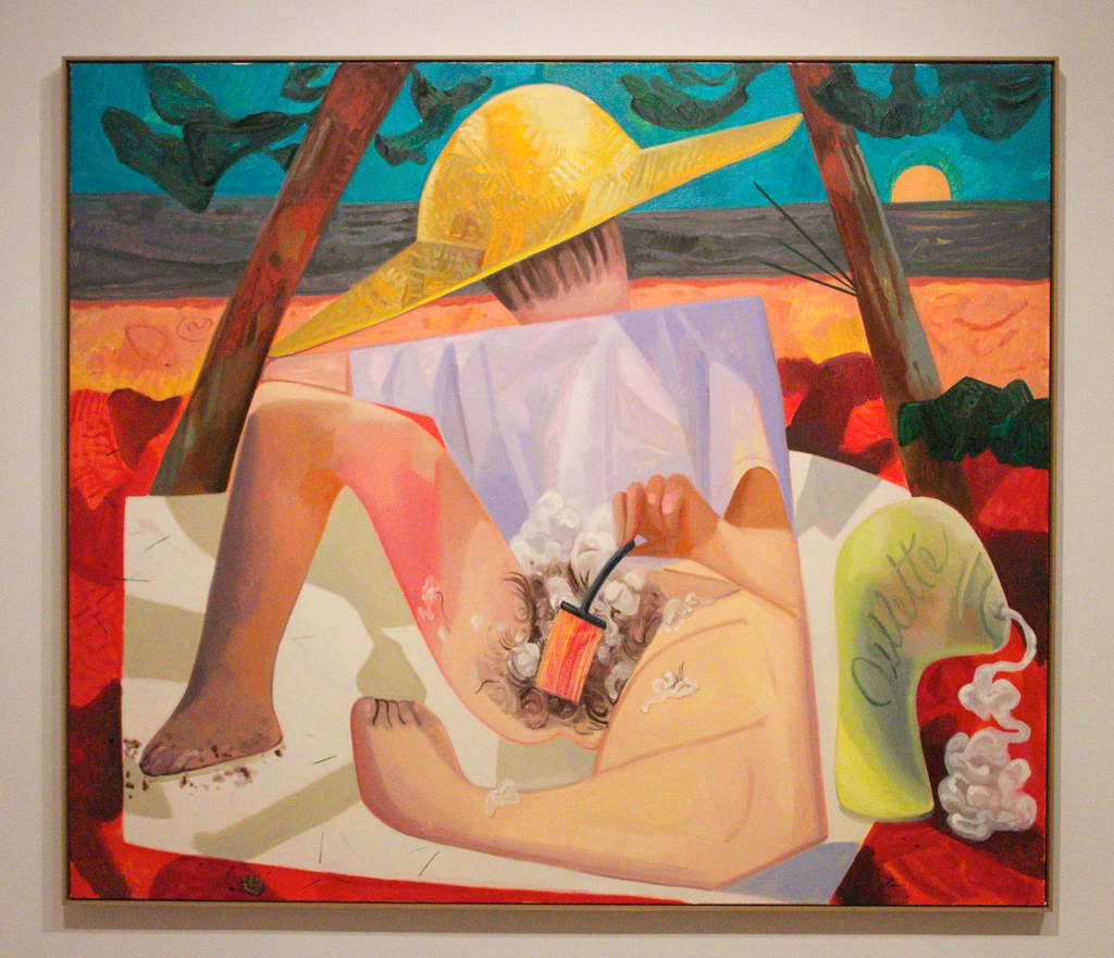
Shaving (8.5.19) portrays a woman shaving her pubic hair, an activity generally performed in private. In this image, the woman sits on a public beach, unworried about who is passing by. The painting is composed in a format similar to Cubism, only using rounded shapes and less fracturing. Almost comically, the woman's head is facing the opposite direction, watching the view of the ocean instead of where she is shaving. Schutz left the oversized container of shaving cream, spilling continuously. The woman is framed by the two tilting trees and the oversized yellow hat. The rounded body offsets the hard square lines of the shirt and blanket.
Nicole Eisenman
Nicole Eisenman (1965-) was born in France before her family moved to New York in 1970. She graduated with a BFA from the Rhode Island School of Design. Eisenmann taught at Bard College for six years. She is known for her figurative paintings based on conflicting themes of sexuality or comedy, sometimes humorous and other times dark. Although painting is her primary medium, she also creates different prints and sculptures. Eisenmann's paintings frequently have distortions of body parts like hands, feet, ears, or noses. Her work is energetic as she uses intense colors to create figures in groups or alone and often reflects on ourselves. Eisenmann identifies her work as gender-fluid and generally uses the pronoun "she" to subvert social norms. Eisenmann uses friends as models whose gender is not resolved at the pronoun level. [4]
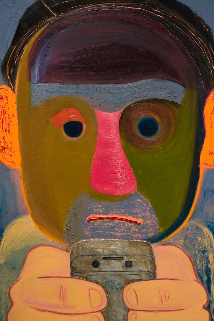
The Breakup (8.5.20) is an image of a cartoon-like figure looking at a phone in disgust and disbelief. The figure's ears burn with a bright orange, the mouth downturned. The phone is held directly in the viewer's face, blaming the phone for what happened. One eye appears alarmed and angry about the message, as the other eye is seemingly saddened.
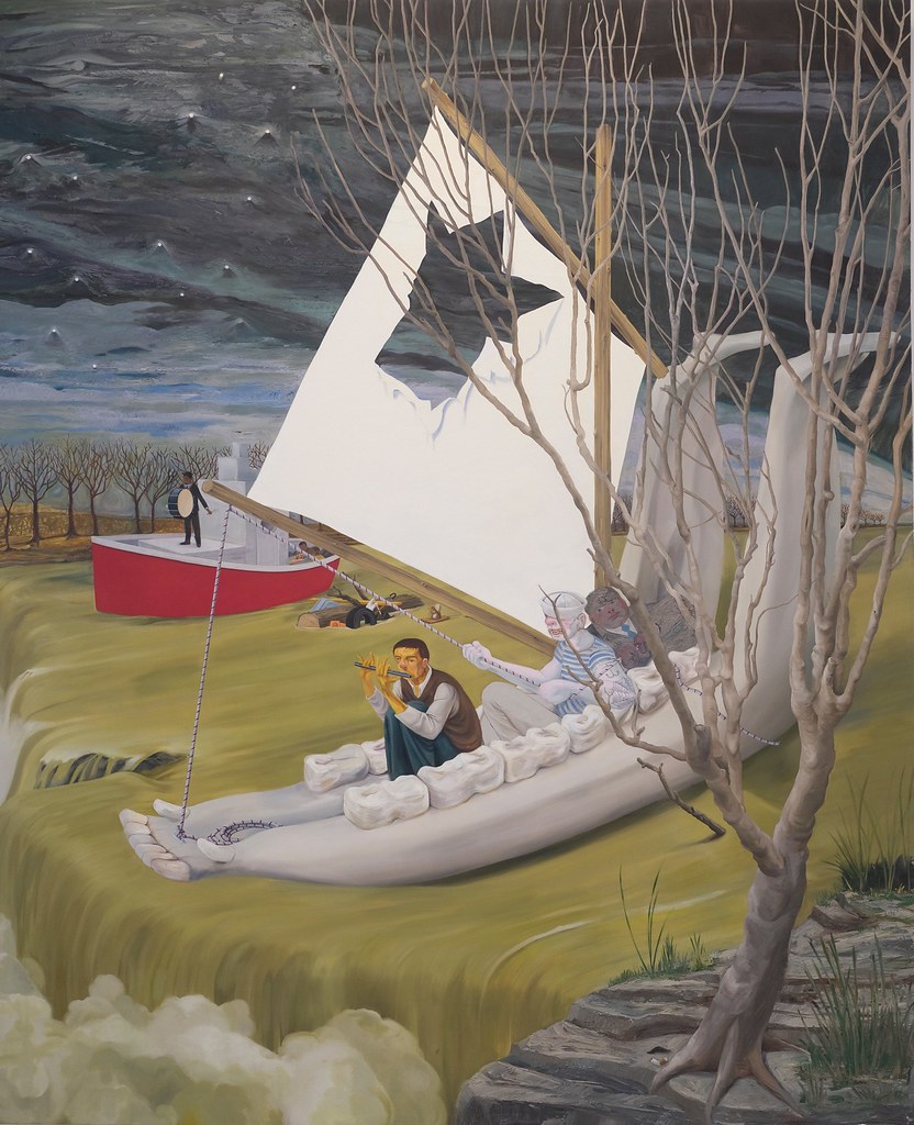
Heading Down River on the USS J-Bone of an Ass (8.5.21) is an immense portrayal of three men on a boat composed from the lower jawbone, the giant mandible. A quarter of the sail is torn away, leaving a gaping hole. The fast-flowing water moves the ship, soon dumped over the waterfall. The leading man in the boat is playing the flute, the second man pulls the rope hoping to use the nonfunctioning sail, and the third man sits in his suit. The red boat also floats towards the waterfall, the man standing and beating the drum. The ships on the decaying yellow-green water are filled with people focused on their interests as the entire country falls.
Wangechi Mutu
Wangechi Mutu (1972-) was born in Kenya and moved to New York in the 1990s. She received her BFA from Cooper Union for the Advancement of the Arts and Science and an MA from Yale. Her primary focus was on the female body, especially the violence and misrepresentations of today's Black women. Using multiple media and abstracted depictions, Mutu's figures may look otherworldly while displaying the objectification of the female. Mutu also examined the results of environmental destruction and natural beauty, creating fantastical landscapes. She wants viewers to look at her mythical images and discover different cultures and globalism interpretations. Mutu uses multiple mediums, including painting, sculptures, collage, and videos, and integrates the media.
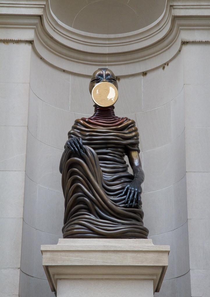
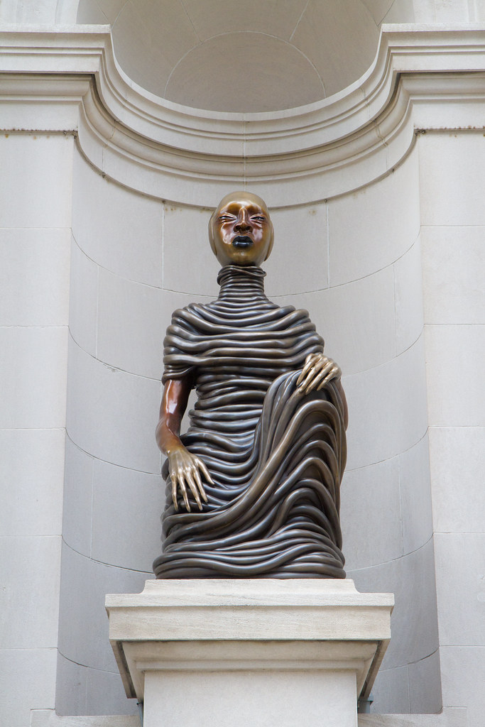
When the Metropolitan Museum of Art in New York City was enlarged 117 years ago, the façade on the front of the building included niches for statues. However, the museum did not have enough money to purchase anything, and the niches were empty for all those years. Mutu was commissioned to create statues, and she was interested in the caryatids or the carved female bodies used to support buildings. Mutu created four bronze figures entitled, The New Ones, Will Free Us, representing activists, environmentalists, immigrants, and others who bring new ideas to the world's problems. The Seated I (8.5.22) and The Seated III (8.5.23) are two of the four statues. The cast bronze figures were kneeling and encased with coils wrapping around their bodies; only the arms and head were free. Mutu used polished discs and positioned them on the face or elsewhere on the head. The discs resemble different embellishments African women wore as lip plates, necklaces, or another beading. Mutu liberated the women from the historical work of supporting others. "Belonging to no one time or place, The Seated I and III are stately, resilient, and self-possessed, announcing their authority and autonomy."[5]
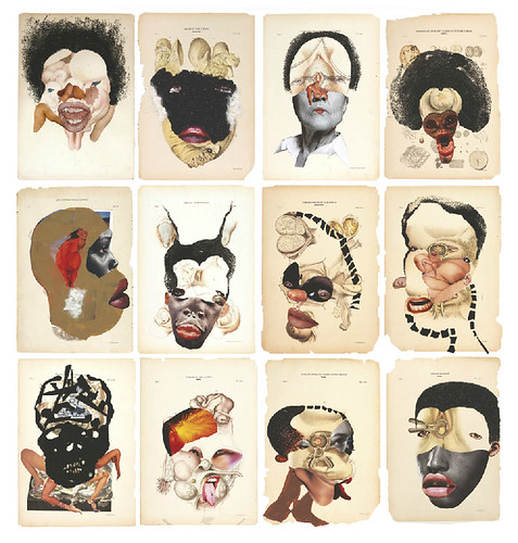
Mutu used unusual mixed media, including cutouts from medical newsletters, clothing magazines, ethnographic writings, and pornographic magazines. She took parts of the images and reassembled them. Histology of the Different Classes of Uterine Tumors (8.5.24) is composed of images from a nineteenth-century set of medical illustrations. The different images defined and illustrated diseases found in each female sex organ, the title from the medical book itself. Mutu used collage pieces, torn paper, tape, or glitter to make individual faces. The information in the original medical book was interpreted and written by men who knew little about women's issues, and the fantasy of the faces reflects that knowledge.
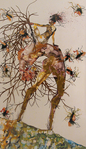
You tried so hard to make us away (8.5.25) was inspired by the religious hymn Amazing Grace. The song was written by a slave ship captain who later became a minister and supported the abolitionist movement. Mutu stated, "The important thing for me about Amazing Grace is that it is rooted in the mud and injustices of a dark, convoluted past and yet it has become the most redemptive and ubiquitous of hymns ever... thanks to colonization, missionaries, and the translation of the song into every imaginable language."[6] The work was based on the mangrove tree, a plant common along shorelines throughout the world. The mangrove grows in brackish waters where freshwater rivers flow into the seas. The tree has existed for thousands of years and survived hurricanes, winds, floods, excessive salt water, or other harsh conditions. The mangrove became a metaphor for Mutu and the survival and growth of African people sent to the Americas as part of the slave trade. The larger figure is rooted to the ground as another figure emerges, smaller figures flying away, like seeds taken by the wind to land and grow, the resilience of the people and the mangrove tree. Mutu uses ink and other multi-media materials for the image.
George Condo
George Condo (Born 1957-) was born in New Hampshire. At the University of Massachusetts, Condo studied both music theory and art history. After two years, Condo left to pursue his art and start a band. In the 1980s, he began painting in a style based on the Old European Masters changed to an American alternative pop method. At this period, Condo worked along with Jean-Michel Basquiat and Andy Warhol. Today, he creates complex and layered visual images. The images are frequently deconstructed with the influences of Cubism. Condo believes specific figures have haunted him for years, and he uses their images in his work. His figures are emotional, have multiple personalities, and communicate with people through their eyes, mouths, or body positions. Condo said he "explored the idea of a continuum of figures that were constantly metamorphosing into one form or another…they could be realistic and abstract simultaneously."[7]
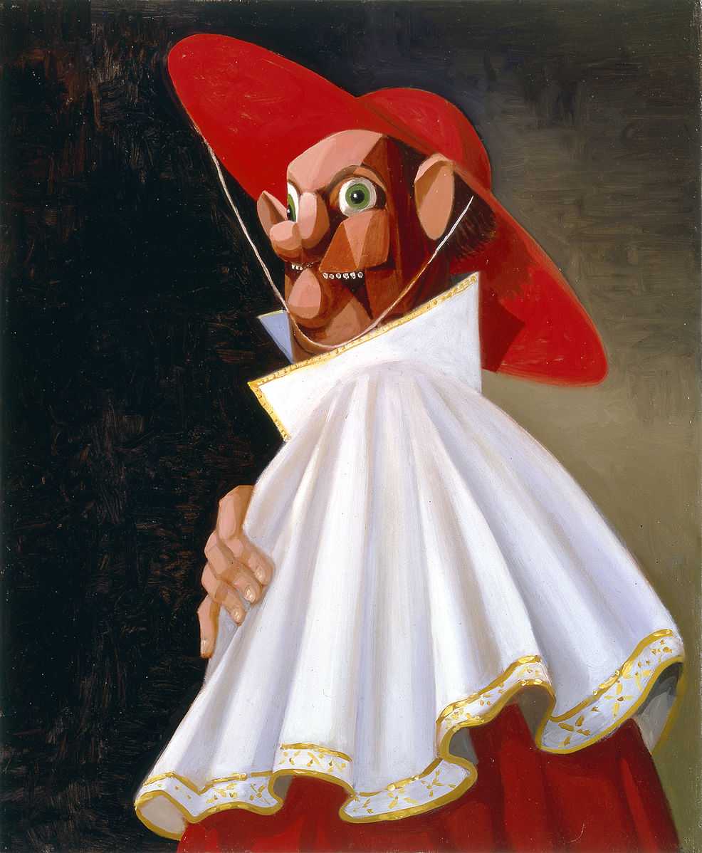
The Cracked Cardinal (8.5.26) is one of the different bizarre characters Condo painted. The cardinal, dressed in official clothing, has a face grotesquely distorted. His nose and mouth offset, an excessive number of teeth in his mouth. The red and white clothing highly contrasted against the dark background. His hat is held on his head by an elastic band, like a hat on small children.
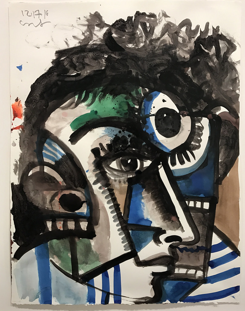
In the painting, Untitled (8.5.27), Condo depicts views of three people, a person with one eye and curly hair staring straight at the viewer. The middle person appears to be looking to the side based on the position of the nose; however, the eye is looking differently. A small person with undefined eyes looks more like an unhappy dog. Other parts of each person are recombined, the painting reminiscent of Cubism. Condo used a limited palette of blue and green to compliment the darker white and black.
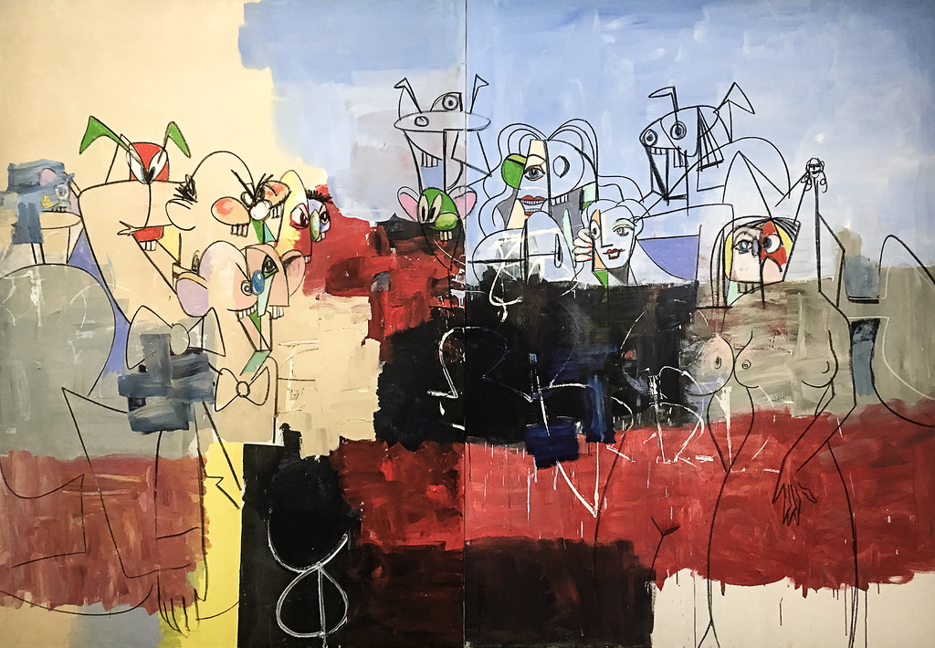
Downtown New York (8.5.28) is filled with typical Condo characters, some based on actual people and others from alien places. Condo does not design his work or make pre-painting drawings and just starts painting his canvas with black, and the individual characters begin to emerge. He develops a figure more completely as they appeal to him. Condo used spots of colors on the faces to add additional details. Then he used flat washes of light blue, sienna, black and red to define parts of the painting. In the areas of black and red, Condo used white to maintain the design. Some images have distorted, bulbous faces, as seen in The Cracked Cardinal, and others are fractured in Untitled.
Kerry James Marshall
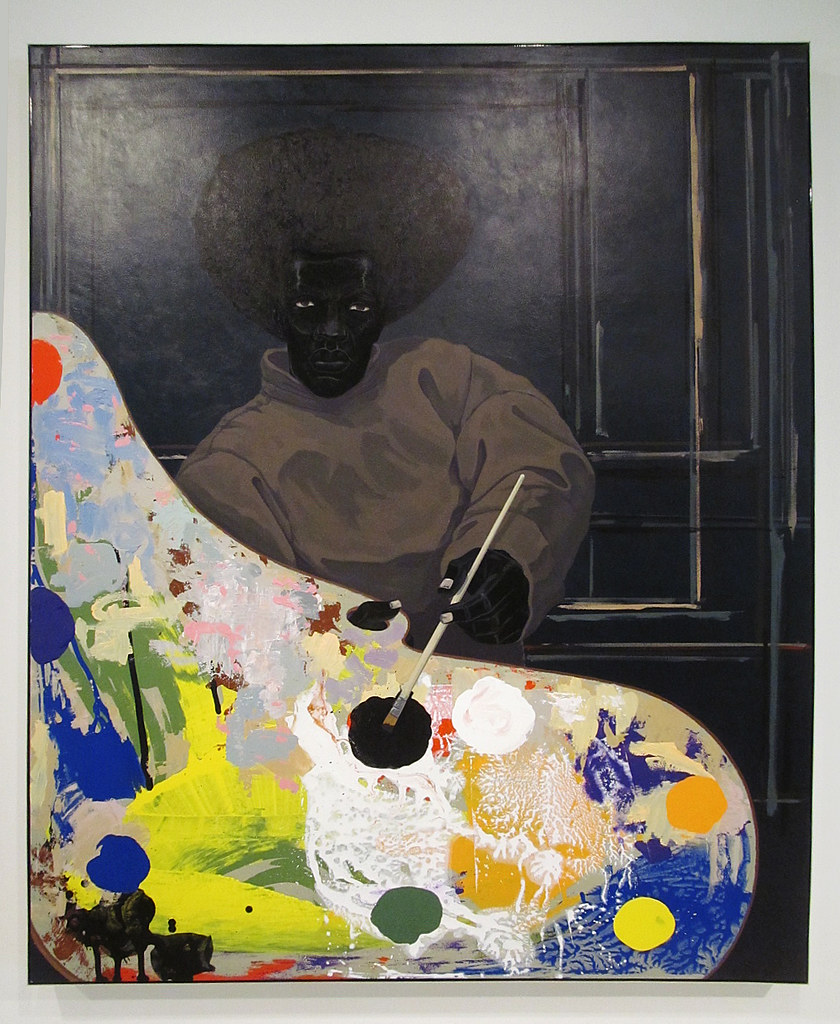
Born in Alabama, Kerry James Marshall (1955-) spent his childhood in Birmingham, Alabama, and Los Angeles, California. In Los Angeles, he lived near the headquarters of the Black Panther Party, a Black power group challenging police brutality. They also had a variety of community programs supporting health care and food injustices in the cities. Their work influenced Marshall, who incorporated social responsibility in his work. While Marshall was in high school, he was mentored by Charles White until Marshall received a BFA from Otis College of Art and Design. As he painted, Marshall taught at the University of Illinois. The civil rights movements significantly influenced Marshall's art, and he developed his style of painting his very black figures. Marshall mixes different types of black and creates subtle shades of black, starting with ivory black, and adds carbon black and iron oxide black. He incorporates small amounts of other colors when he has a proper mixture. People might have brown-colored skin yet referred to as black. Marshall calls his black skin color "rhetorical blackness," artistically representing people as they defined. His work is based on African American life and their cultural activities; he likes to include the black experience in history.
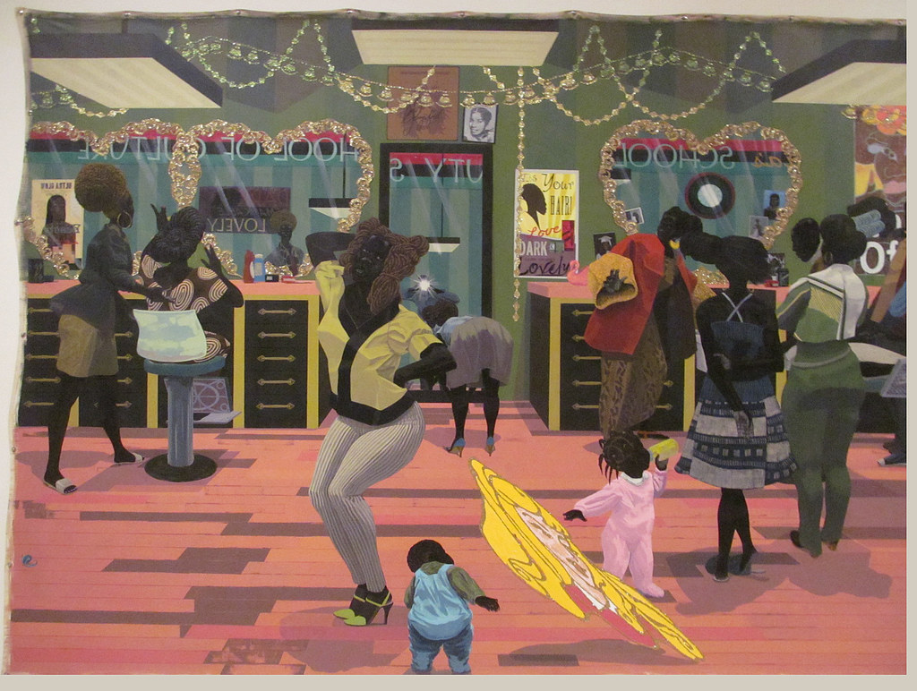
The School of Beauty, School of Culture (8.5.29) is a painting of the local beauty shop's activities, atmosphere, and importance. The women talk, examine the hairstyle, or even celebrate with dance and pleasure with the new hairstyle. Marshall added the blond, blue-eyed head of Disney's Sleeping Beauty, a comment America's standard of beauty based on a blond, white woman. Each person, including the children, has black skin typically found in Marshall's work. The painting is full of details, all of the clothing specifically expressed, decorations around the mirrors with pictures tucked in, or the little girl in the pink outfit with her hair carefully braided as she holds her bottle.
Most people don't think of black as any color except one; black. However, when Marshall mixes his paint for different blacks, he believes black can be chromatically different like other colors. In Marshall's painting, Untitled (Painter) (8.5.30), the person's hair, face, and wall are all black, yet each black color is distinct and visible based on his black mix. The bright set of colors on the painter's palette provides a vivid contrast helping develop the different types of black.
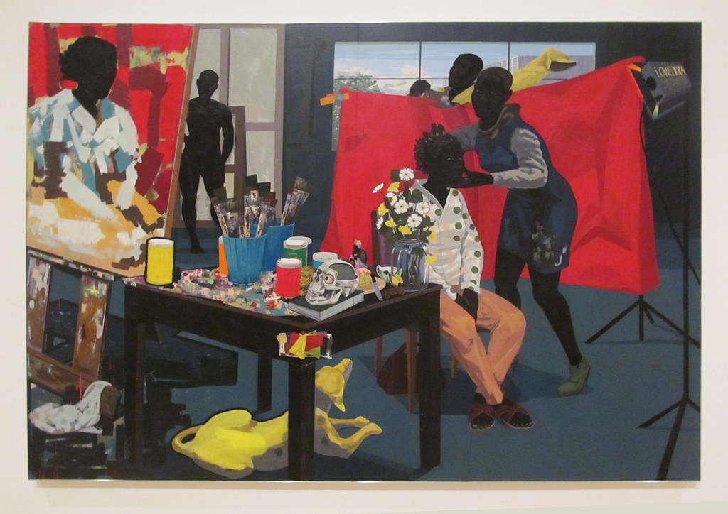
In Untitled (Studio) (8.5.31) Marshall challenged the historical concepts of who was allowed to paint, who was seen in the paintings, where were paintings shown, and who were the viewers. He expanded the idea of white control of the artist's realm; black painters were also successful artists. Inside the studio, the model is posing, one person positioning the head. One man in the background is putting on his yellow shirt, and the other man is nude, waiting for his turn to model. On the table is an assortment of the artist's tools and paint. On one corner of the table, Marshall added a skull, and in the other corner some flowers, both standard features in old European paintings. Marshall also reverses common European practice; in this painting, the women wear clothing, and the men are nude. Marshall included other details in the painting similar to European paintings.
Zeng Fanzhi
Zeng Fanzhi (1964-) was born in China during the Cultural Revolution. After dropping out of high school, he went to the Hubei Academy of Fine Arts. Zeng is one of China's most famous artists. He spent time in school studying the Expressionists, especially the German Expressionists. He developed his style based on unconventional standards and emotional, expressive images. Originally, Zeng was trained to paint portraits and other themes about the countryside. He became an expert in the human figure and facial expressions training, which developed his desire for figurative paintings. At the same time, he was supposed to portray the concepts of Socialist Realism and painted as required in a class, working on his emotional figurative work on his own.
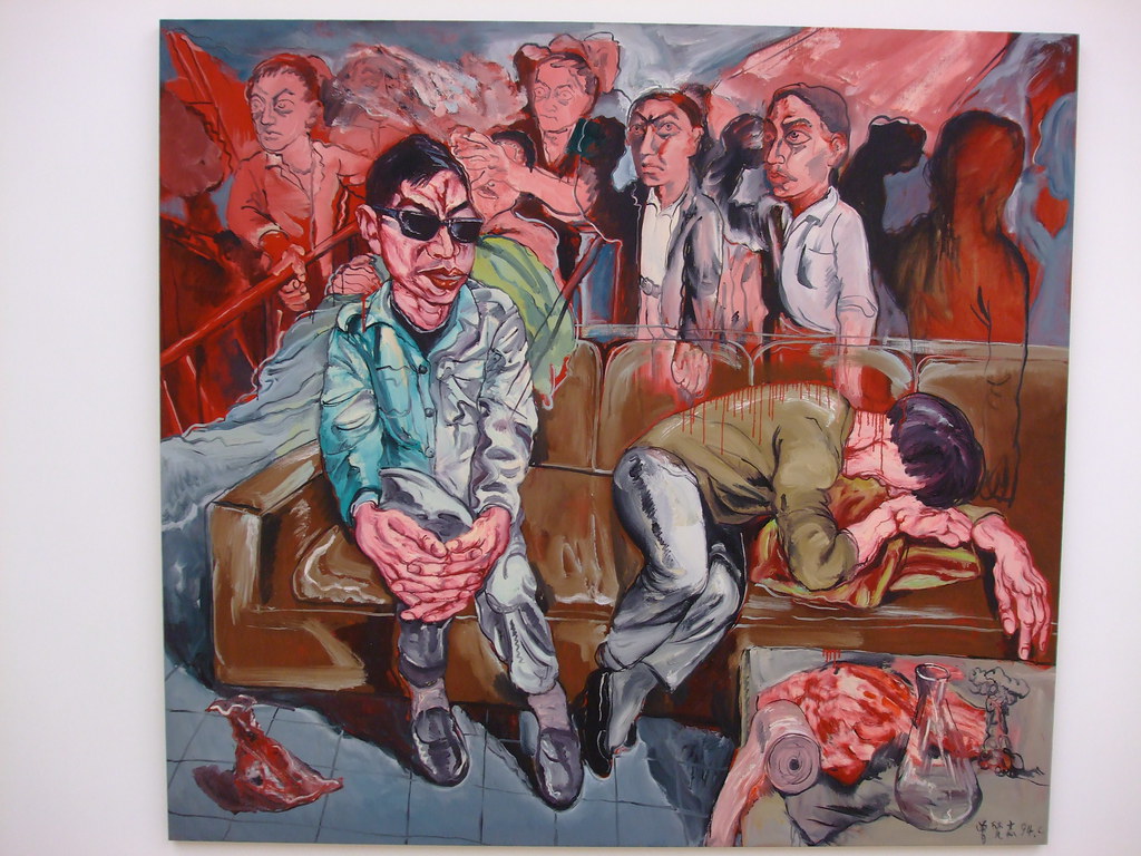
Zeng lived by a hospital and noticed the different problems afflicting people who were being treated when he walked by each day. Part of the events he noticed involved the suffering people encountered, and some of the time, Zeng found the indifference and hypocrisy of doctors and others towards the patients. His series depicted the consideration for the individual's health versus the requirements of the state. In the painting Hospital Series (8.5.32), the man in the green jacket is looking at the weeping person on the chair. In the background are the waiting patients, emotionlessly waiting for treatment. The pain and anguish in the room are apparent, primarily through Zeng's use of color. Through expressive brushstrokes, the use of red (the color of blood) and gray brings an immediate sense of depression and sadness to the room. Each person resides in their foggy mind; no one interacts or seems to care about another person. The eye of the viewer is constantly returned to the man in the green jacket, reducing the viewer's interest in anyone else.
Tiananmen (8.5.33) is an image of Tiananmen Square in the background overlaid by a portrait of Mao Zedong, one of the most famous leaders of the Chinese government. The conflicting image relates China's relationship with the recent history of 1989. The bright colors of the square demonstrate the optimism for a better future and the heroism of people to change the course of history. As thousands of people stood in the square to demonstrate for democracy and freedom, the tanks and guns of the military killed thousands. Zeng used a network of brush strokes to depict Moa, who dominates the scene, the lingering rule of a ghost from the past repressing the people.
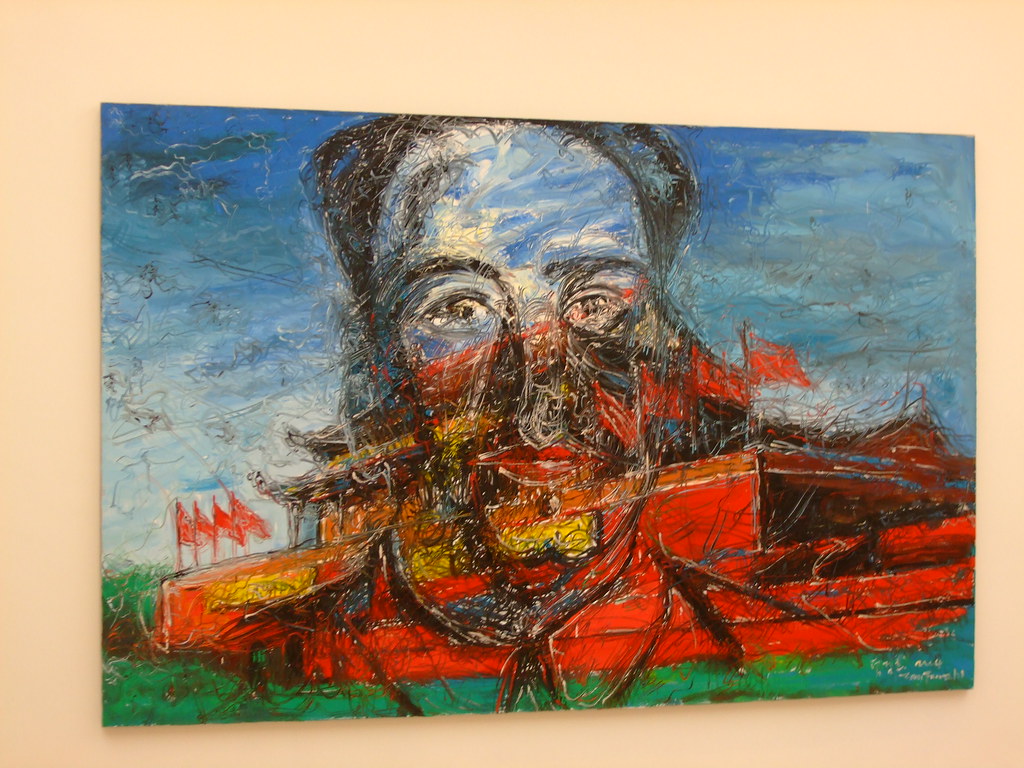 Figure \(\PageIndex{33}\): Tiananmen (2004, oil on canvas, 215 x 330 cm) by mr.push, CC BY-NC 2.0
Chantal Joffe
Chantal Joffe (1969-) was born in Vermont; her mother was also an artist. Joffe received her BA from Glasgow School of Art in Scotland and an MA from the Royal College of Art. She remained in England after school and lives in London. Joffe generally portrays women or girls in her work. She selects images from photographs, different types of magazine pages, or even self-portraits. Joffe's work is exceptionally big, conflicting with the intimate images she creates on the oversized canvases. The females in her paintings are honest, denying the ideals of female objectification. Many of the women in her work are young, on the edge of their potential, without giving them the expectations of the female form. Joffe adds patterns and stripes to the clothing in her paintings because she likes how it brings a sense of fashion to their clothes. Motherhood inspired Joffe to follow her daughter's life in paintings and how being a mother transformed her. As a mother, Joffe painted multiple intimate images of her daughter, herself, and the two of them together.
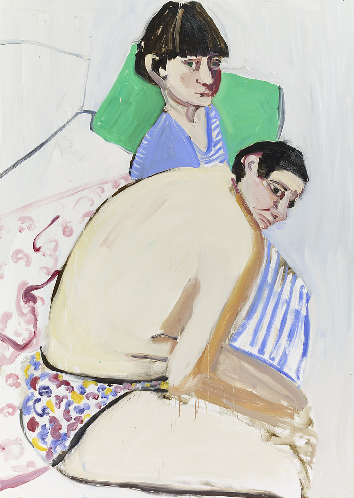
Joffe's extensive work requires her to use scaffolding to move the canvas as she used broad brushstrokes or drips to create drama. The Squid and the Whale (8.5.34) depicts an image of two people sitting on the bed; Joffe in the foreground only wears a pair of pants displaying the broad expanse of her pale back and undersized head. Her daughter Esme sits erectly wearing a blue dress with stripes. The room has moving focal points with the green pillow, the patterned underwear, and the pink blanket. The two have conflicting emotions; what are the issues the mother and daughter are discussing. Joffe described the image as the pain a mother begins to experience as the child matures, and the mother has to let go.
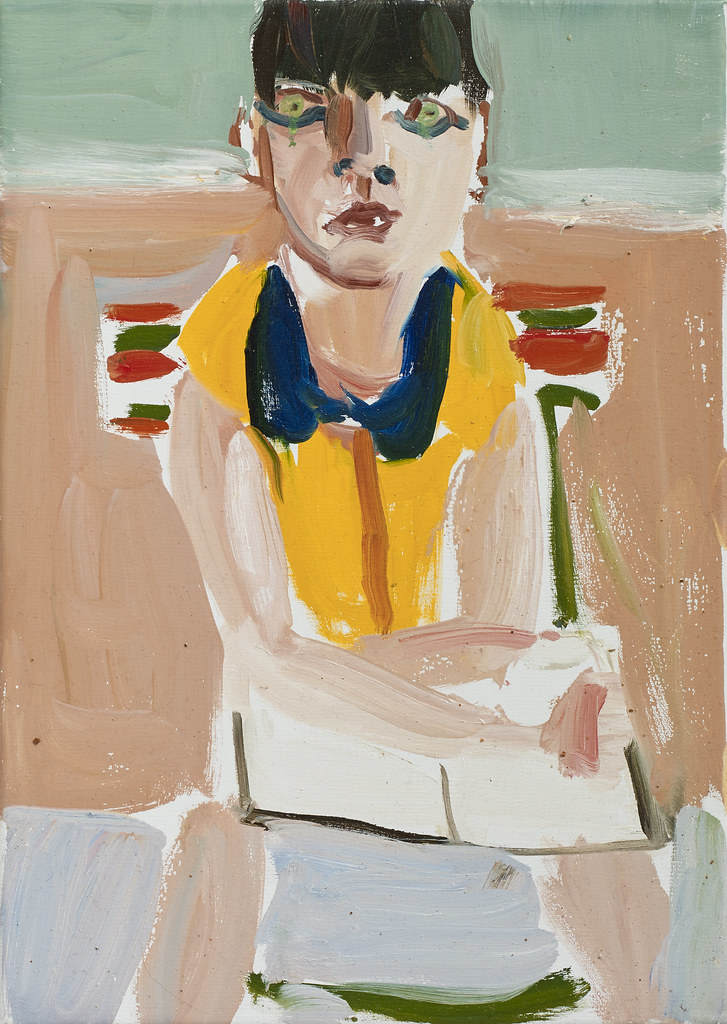
Esme in a Yellow Dress (8.5.35) is an image of Joffe's young daughter, Esme. She sits at the table, perhaps doing her homework as she stares outward at the viewer. Maybe the viewer is her mother, and Esme has the look of a girl who does not want to be sitting here. Joffe's broad brushstrokes are evident in this painting, with the face more detailed than the rest of the work. The yellow shirt with the black and red stripes of the chair back holds the viewers' attention on the girl's face—the rest of the painting in a muted palette.
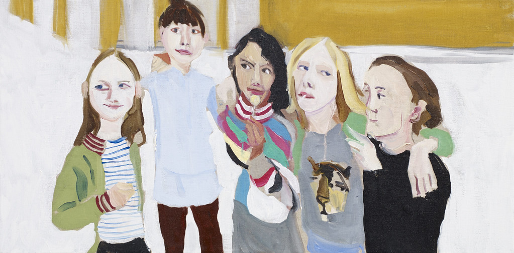
Poppy, Esme, Oleanna, Gracie, and Kate (8.5.36) is a painting of her daughter Esme and her friends. In her light blue shirt, Esme is the only one looking at the viewer as though showing off the people who are her friends. The girls are casually dressed, including Joffe's usual stripes. The minimal background has only two colors; the girls' clothing and faces create movement across the painting. The camaraderie of the girls was evident in their faces. Joffe said, "They'd just had the ears pierced, her and her friend. So it felt like a very definitive moment funnily, all about power relations and girls. They also look so grown up suddenly. The lollipop looks like a cigarette."[8]
Claire Tabouret
Claire Tabouret (1981-) was born in France and attended the Ecole des Beaux-Arts in Paris. She moved to Los Angeles to live and work, finding California a dynamic and challenging location. Tabouret's art was inspired by the passing of time and how time changed human relationships. She examines childhood and the events influencing a person's development or how a person acts alone or in a group. Tabouret uses loose brushstrokes, which became animated because she added water. Sometimes she uses a palette of natural tones and other synthetic hues of artificial ingredients. The flow of the paint develops transparency and opacity in her works. Sometimes the faces of the children or women are covered or disguised, their mute faces staring out at the viewer.
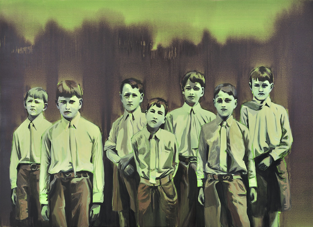
L'Affront (8.5.37) portrays rows of children. Tabouret uses old photographs; the children posed as though frozen in time. The troupe of boys is dressed in school attire, their shirts tucked in and ties knotted in place. Each of the boys maintains their personality, some looking defiantly, others hesitating to step into life. The tonalities of color are dark in color and theme; a fluorescent base layer establishes a moody environment. The landscape in the background presented a scary image; the children's future was also blurry and unknown, sometimes intimidating.
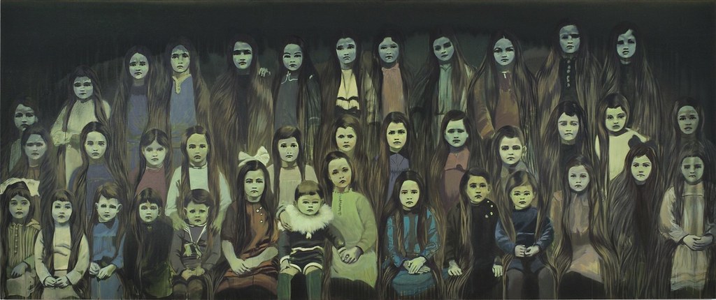
Les Sorciéres (The Witches) (8.5.38) is also based on a found photograph, each child bringing its future. The children are of different ages, the younger ones in the front row. The older the child, the more their face appears like a mask, having learned to hide their feelings. In the middle of the first row, the girl wears Tabouret's signature fluorescent green, centering the painting. Each girl has long, straight hair without variation, the mold young girls are forced to accept, few of them rebelling. One girl in the middle of the back row is wearing a bright scarf, and a few girls have bows in their hair, small tributes to walking their path. Tabouret used her watery wash of very dark gray to define the ominous-looking environment.
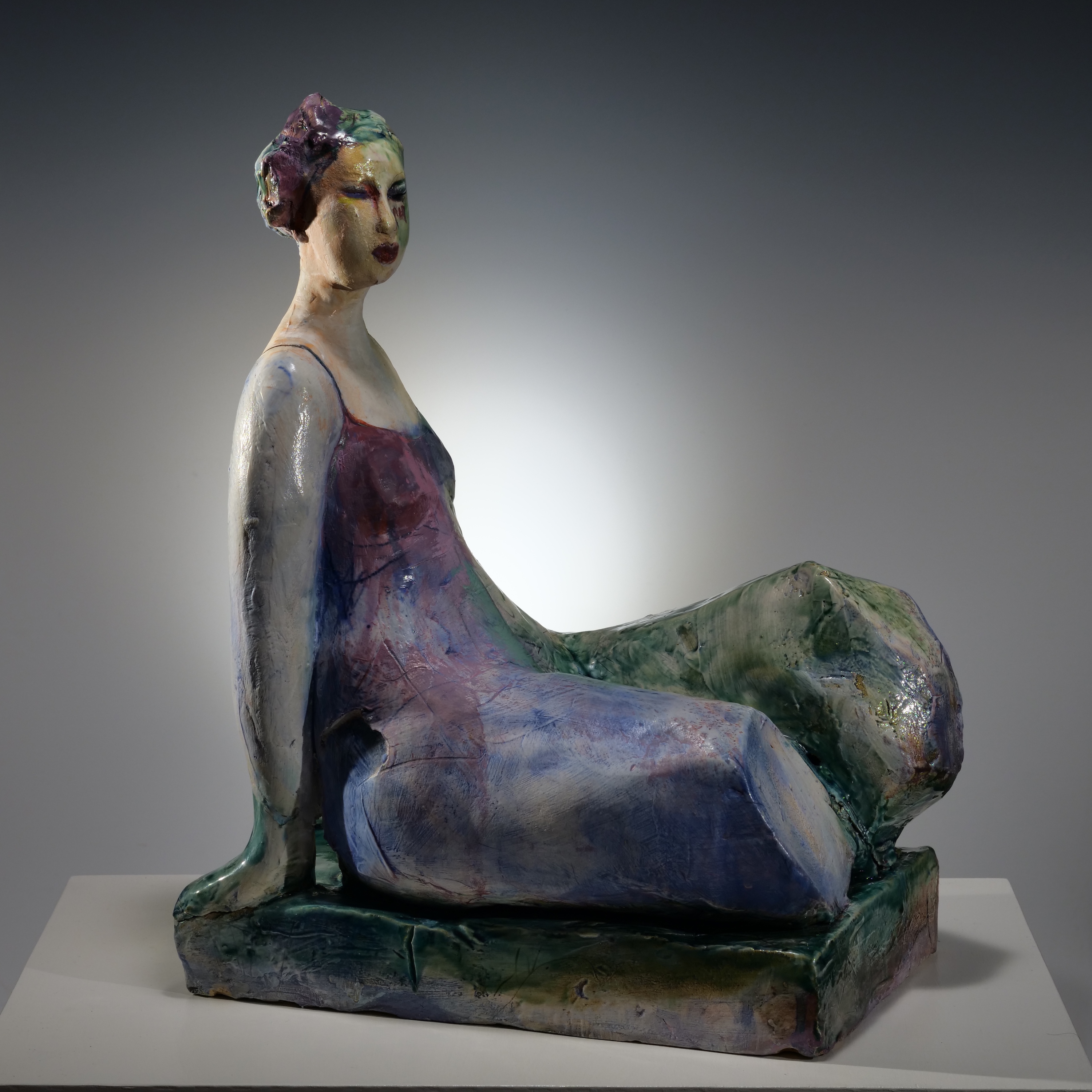
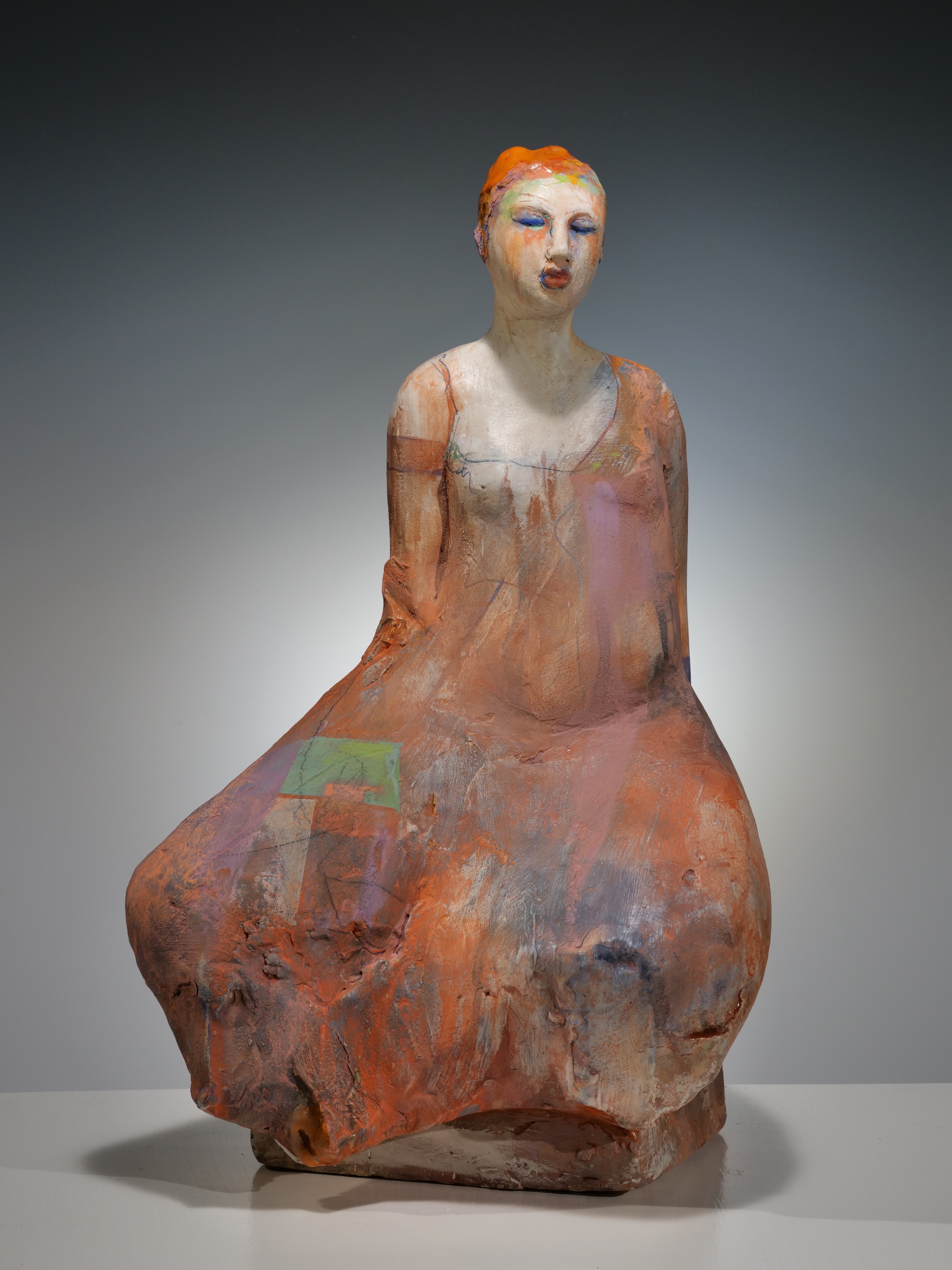
Michelle Gregor
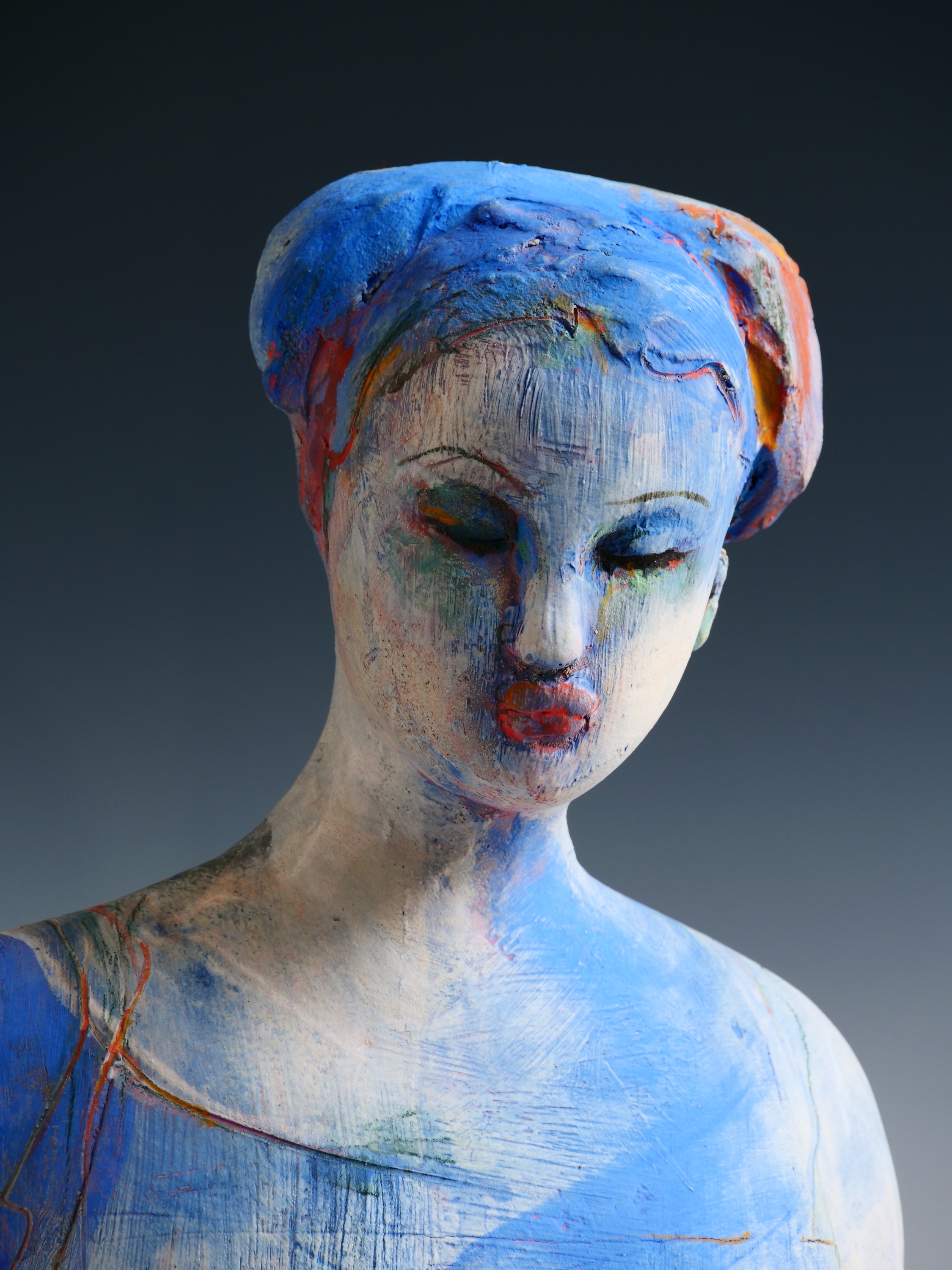
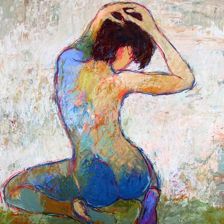
Michelle Gregor (1960-) was born in San Francisco and raised in Tahoe City by parents who believed in the academic exploration of the arts. Gregor was awarded a BFA from the University of Santa Cruz and an MFA in ceramics from San Francisco State University. She is a sculptor and painter working in the late-twentieth and early twenty-first-century continuum of the Bay Area Figurative Movement, continuing the legacies of artists Manuel Neri and Nathan Olivera. Well known for her abstracted figures, Gregor uses a complex layer of underglazes and glazes on her solid clay pieces. She slices them open after forming the clay and hollows them out before multiple firings. Gregor's feminist and queer identities manifest in the dignity and strength of her partially abstracted female figures. Perhaps most known for her mastery of color, she fires multiple successive layers of stains to achieve complex layers of nuanced surface. In Blue Figure (8.5.39), a seated figure with her hands behind the figure tilts her head slightly down, looking at the ground. The complex layers of glazes are finished in cobalt blue with orange in specific places like the hands, hair, and lines.
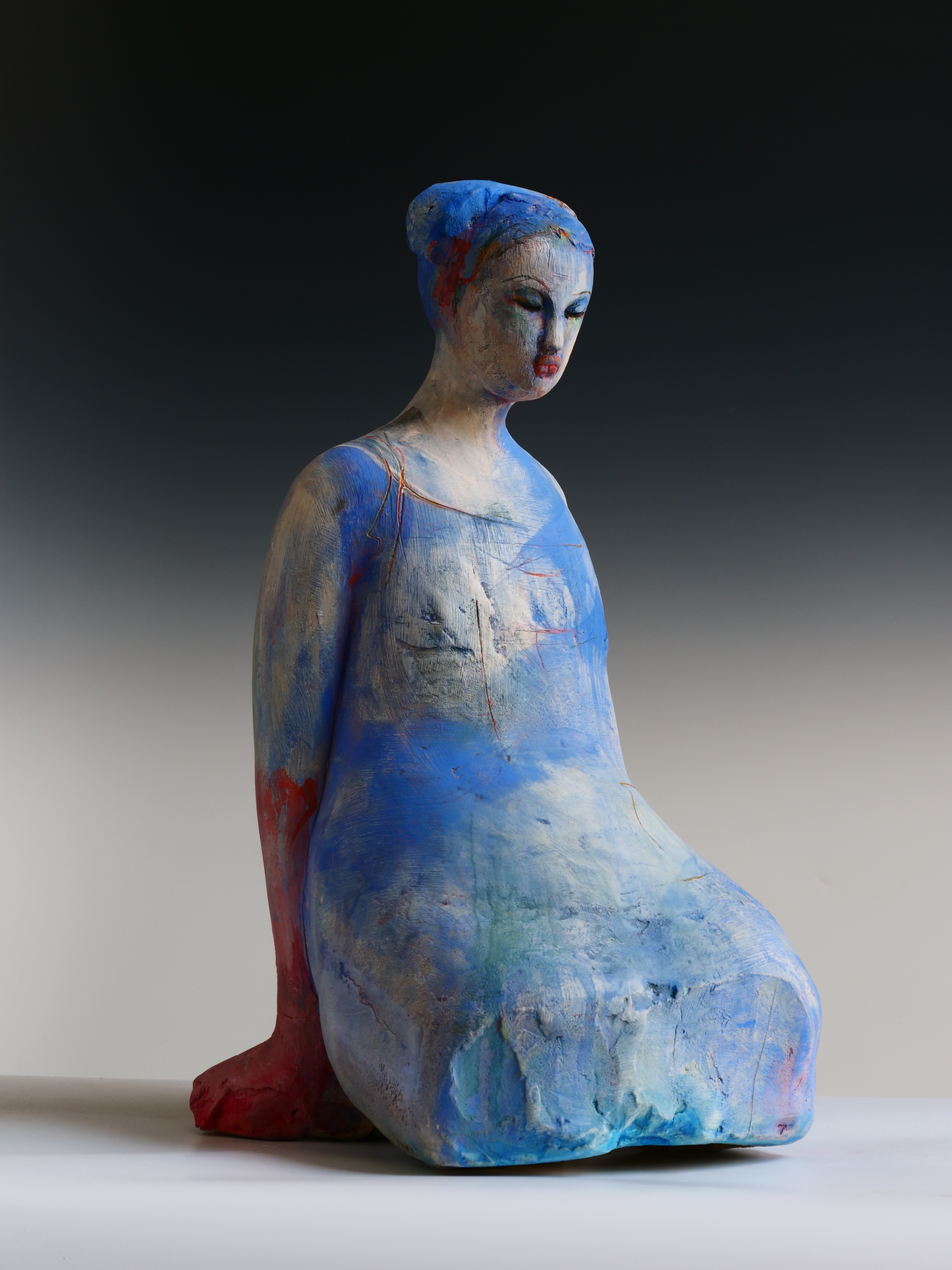
In the close-up (8.5.40), the figure's abstracted face with small, pursed lips, short flat nose, and closed eyes are visible. The different brush marks, sgraffito, layered stains, and glazes contribute to a nuanced and painterly surface. Areas of bright color exist alongside raw clay.
Art is a spiritual necessity. The creative spirit is the best a human being can reach for. It connects us to people in the present, the past, and the future—Gregor
Bari (8.5.41) expresses implied movement seen in the forward-leaning angle of this sculpture. Several marks are purposely left by the tools used to sculpt and shape the surface to create areas where slips and glazes collect and pool, creating texture. The analogous color palette unifies the form.
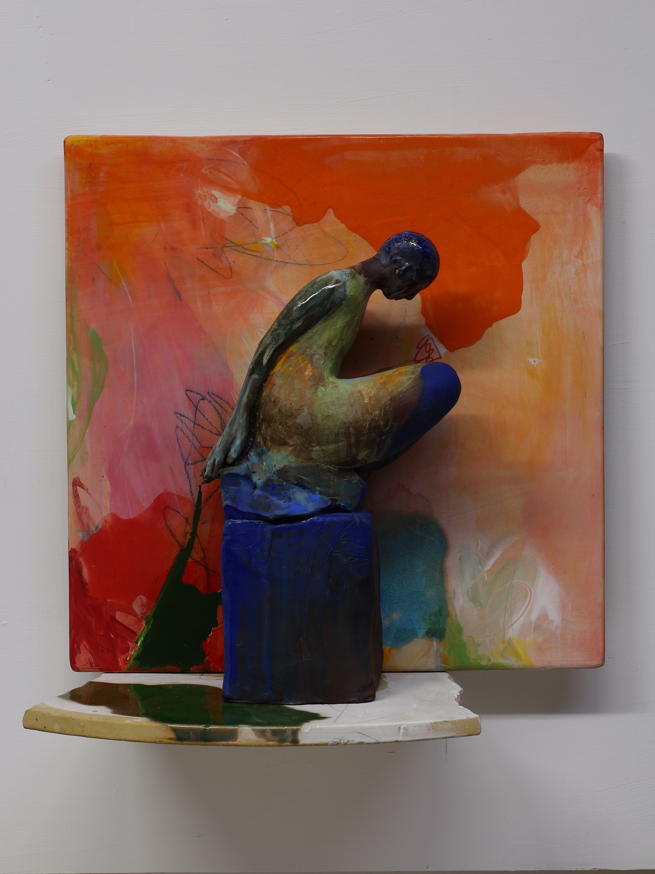
Corinth (8.5.42) is a fragmented seated figure on a rectangular base and exemplifies the nuanced and lush surfaces that Gregor is known for in her ceramic figures. Areas of gloss contrast with matte, marks from sculpture tools and brushes catch the color to create a varied texture. Using water as a medium, color is applied, and gravity pulls and pools to follow the contour of the form. The figure also demonstrates Gregor's oversized bottom half of a figure. The top half is delicate, and the bottom half is large, the two parts of the figure in conflict.
From the Figure and Ground series, Gregor unconventionally uses ceramic kiln shelves in the artwork titled, By The Shore (8.5.43). This wall-hung work has both painterly and sculptural elements with pooled glazes. The abstract marks and brilliant coloration coalesce within the composition. Gregor's painterly approach is evident here in areas of bright color, bringing emphasis to the head and knee of this figure. The multi-colored background, focusing on bright red, is balanced by the black block in the lower part of the background, bringing the figures' view to the hand down to the base. The black color is repeated in the base.
Jylian Gustlin
Jylian Gustlin (1960-) is a San Francisco Bay Area painter in a contemporary redefinition of the 1960s-70s San Francisco Bay Area Figurative artists, their styles, and techniques. She studied mathematics and computer science at San Jose State University and received a BFA from the Art Academy of San Francisco, where technology was emerging as an art medium. Gustlin's vibrant paintings explore the impact of new technologies on perception: though she uses traditional painterly techniques. Inspired by a lifelong love of the San Francisco Bay Area Figurative artists, mathematical theories such as the Fibonacci sequence, the resonant tones of Latin phrases, African masks, and antique Roman vessels, Gustlin's work is genuinely a modern hybrid between the past and the present.
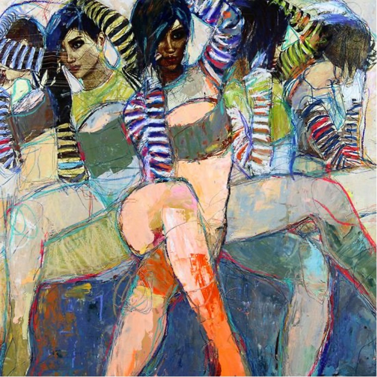
In Gustlin's paintings, the human body emerges from the background and moves through our emotions. The rich patterns of shapes and colors bring the figures to life and challenge our imagination. Interwoven color is the beauty and explosive atmosphere Gustlin brings to the human body. The moody yet qualitative emotions are expressed in her paintings as they emerge into the foreground, bringing the complex, layered textures of the figure into our space as we feel its presence and feelings. The figures become vibrant mixes of color and texture to transcend race, ethnicity, even evolutionary life form. Sirens 8 (8.5.44) brings five women, individually similar yet different. The stripes on their sleeves form motion, their crossed legs anchoring each person to the seating. The emotions portrayed by each person are hidden on faces.
Illustris 36 (8.5.45) and Illustris 25 (8.5.46) represent ethereal forms, one of a kind, the perfect body. Yet, the figures are deep in thought, contemplating the world around them and the meaning of life. Each figure is positioned to give the viewer their emotional interpretation of the image. Gustlin uses many colors on her figures, blurring racial lines. The figures are seated on interpretive lines as dark colors anchor the bottom of both images.
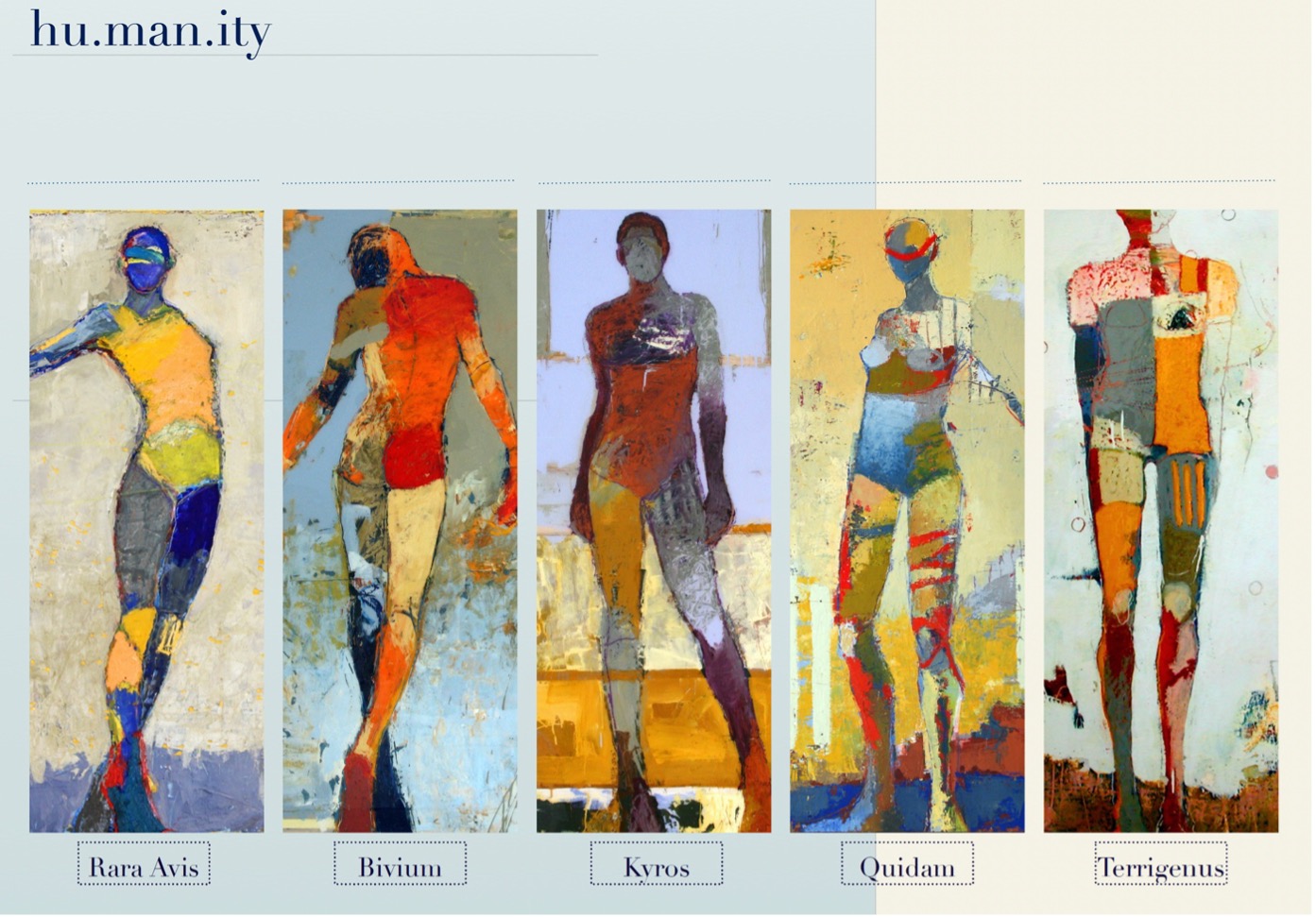
Civil rights and feminist movements in the last 100 years have created a new focus and concepts, opening up the world of art to women. In the 1960s, women's liberation movements were standing up for women's rights, and this is where the beginning of Jylian's life started, to fight for political and civil rights at protests. New generations of artists responded to the civil rights and women movements, demanding inclusion in the art world, though it was considered an exclusively white male pantheon. Hu.man.ity (8.5.47) is the response to the current state of the world and how we are all the same regardless of how we look. Each figure is from her earlier figurative series; Rara Avis, Bivium, Kyros, Quidam, and Terrigenus. The figures are unique unto themselves while still part of the common humanity. Gustlin's use of color defines the figures as members of any race or country, creating the uniqueness of every person.
Hollis Chatelain
Hollis Chatelain is an American quilt artist who graduated with a BA from Drexel University. Chatelain specializes in textile painting and quilting. She lived in West Africa for 12 years working for humanitarian organizations. Her experiences caused her to reflect on challenging social and environmental themes. Chatelain’s style was based on dream-like colors and imagery. The untold multi-cultural stories of people and the earth are depicted in her dye-painted scenes. Her work has been described as "easy to gaze at, but hard to forget." From dreams to reality, Chatelain often starts with a monochromatic dream. From there, she researches and looks for images describing what she dreamed. It is important the colors, faces, and plants are authentically what they could or should be. Chatelain has realized that her dreams often give insight into places and people she has never seen.
Just as my many colors of thread hold the layers of fabric and batting together, I feel that my creations can also pull people together. We are wrapped in cloth from birth through death. Thus, fabric creates a connection that suits the issues I address in a personal way.
Once the research is finished, she draws, using photos as inspiration. Often working from 30-40 photos, Chatelain will sketch many small thumbnails and then enlarge the small drawings onto large paper the size of the piece, creating the basic design. After transferring the design to fabric, she paints using fiber-reactive Procion dyes. The dyes are usually six values of one color (the color of the dream). Once the painting is finished, the dye is washed, and batting is added to prepare it for quilting. Often using more than 200 different colors and over 20,000 meters of thread in one piece, Chatelain adds contour, depth, and volume to her quilts. Chatelain creates textile paintings because she loves the tactile quality of the fabric, combining her love of photography, drawing, and painting. Viewers can see the detail and meaning of the pictures and the diversity of thread colors, creating intense images.
I choose to work in larger-than-life sizes so that when a piece is finally finished, viewers will be called from all distances to come closer and step into the story.
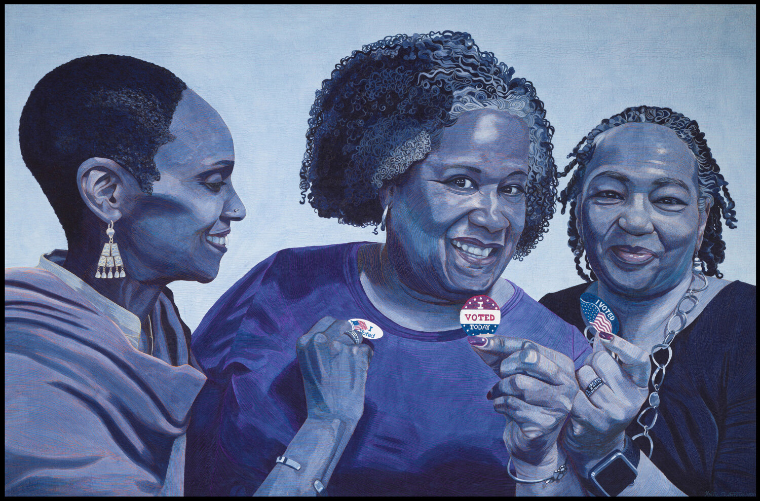 Figure \(\PageIndex{48}\): Dreams Realized (Courtesy of the Artist) (Hand dye-painted, machine quilted, 100% cotton fabric, polyester/wool batting, polyester threads, 106 x 162 cm)
African American women could not legally vote in every state until The Voting Rights Act was passed in 1965. Dreams Realized (8.5.48) portrays the women who are a force to be reckoned with in their communities across America. During elections, the women unite neighborhoods and take them to the polls to vote. The white fabric was painted with multiple shades of blue. The three red, white, and blues "I Voted" stickers stand out, demonstrating that every vote counts.
In February 2002, Chatelain dreamed Hope For our World (8.5.49). The dream was in purple, and Archbishop Tutu was standing in a field surrounded by children from around the world. Desmond Tutu represents hope for world peace and the future of children. The quilt was painted with thickened fiber reactive dyes using six values of purple dye on cotton fabric. Chatelain incorporated transparent white doves throughout the quilt, the doves as a symbol of peace.
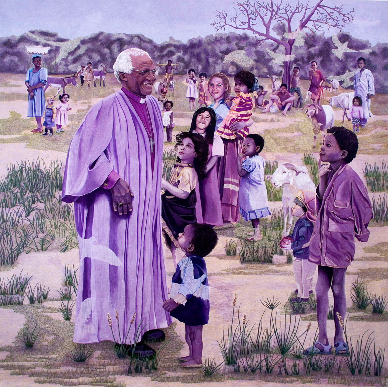 Figure \(\PageIndex{49}\): Hope for Our World (Courtesy of the Artist) (Hand dye-painted, machine quilted, cotton fabric, wool/polyester batting, 208 x 208 cm)
In the spring of 2000, Chatelain created a yellow piece about the continual droughts threatening so many places on our planet. Fresh water is precious and limited. It is a worldwide problem affecting us all, so the images represent four different continents. The farmer looks at the shriveled corn, a woman needing water to wash her food, the young boy drinking scarce water, and the kangaroo seeking water are all part of the intricate, overlapping scene. Precious Water (8.5.50) is painted with dyes using six values of yellow, then quilted with over 200 different colors of thread.
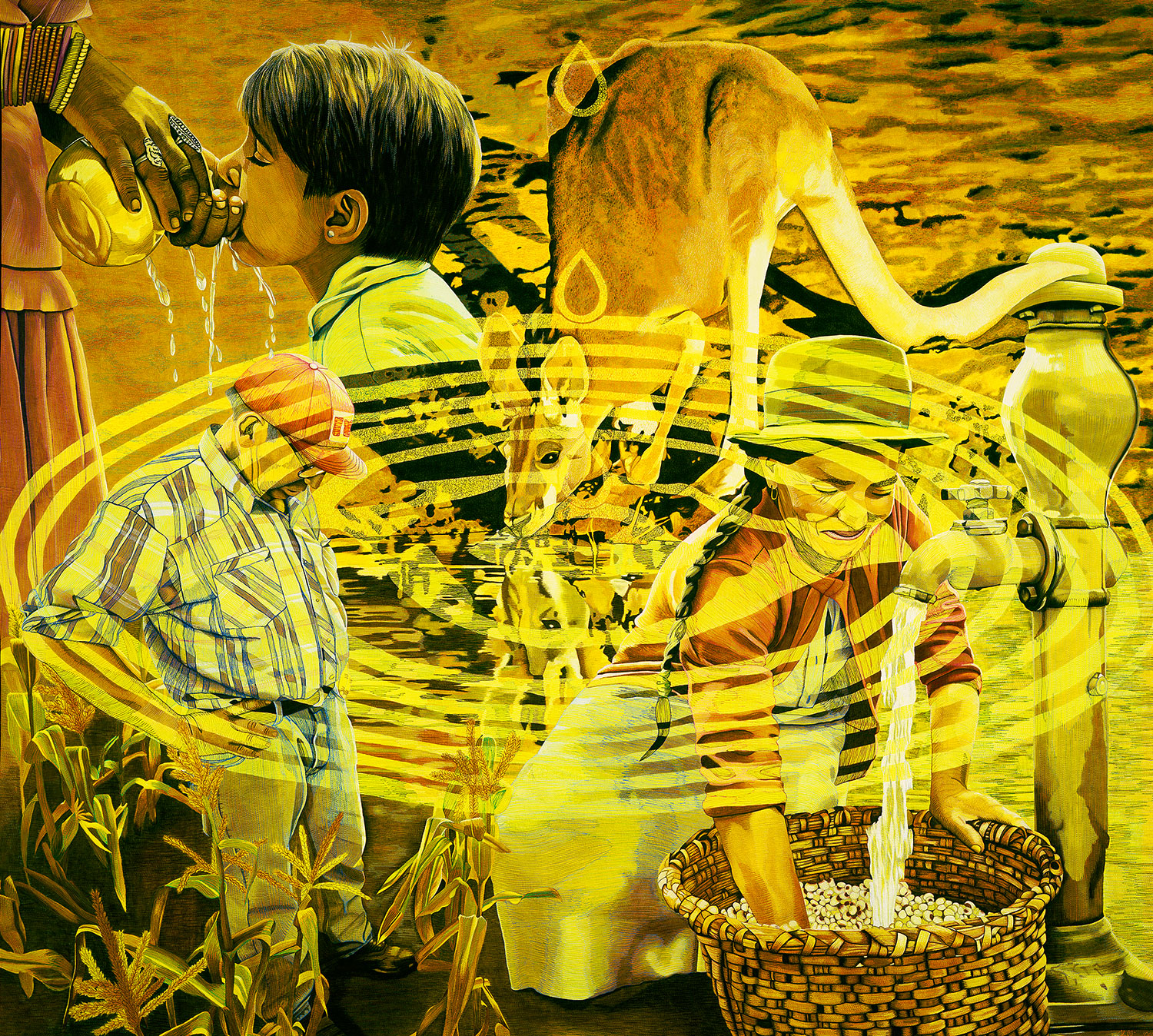 Figure \(\PageIndex{50}\): Precious Water (Courtesy of the Artist) (Hand dye-painted, machine quilted, 100% cotton fabric, polyester batting, 195 x 215 cm)
The Sahel is a region just south of the Sahara Desert where trees are scarce. One type of tree that grows in this region is the baobab tree, also called the "tree of life," because it provides food, medicine, and shade for the people who live there. The Fulani people are shown in the Sahel (8.5.51) are nomads and dependent on the food they can find, including the baobab tree. The tree is the center of the image and is painted in warm colors with a thick trunk and delicate small branches. The light blue colors of the sky bring a contrasting background to the tree.
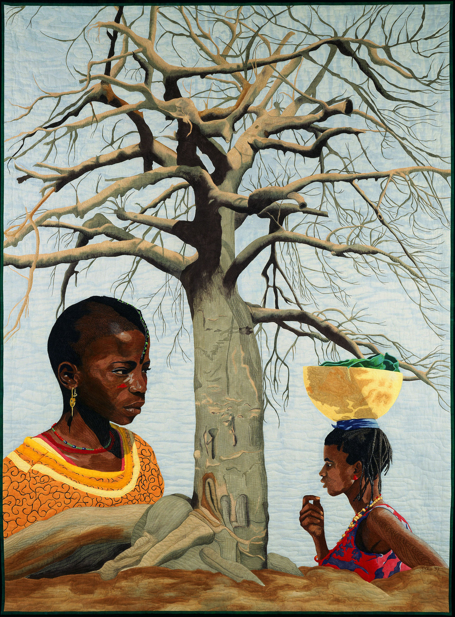 Figure \(\PageIndex{51}\): Sahel (Courtesy of the Artist) (Hand dye-painted, machine quilted, 100% cotton fabric, cotton/polyester batting, 203 x 152 cm)
Contemporary figurative art has become an important form in the twenty-first century, each artist bringing different styles and mediums to create their unique images. Figuration has moved from the predominately white male artist to include females and artists of color, bringing different narratives to their artwork. Contemporary figurative artists are now mixing the image of the human figure with other types of abstraction or narratives.
[1] Retrieved from https://www.npr.org/2020/02/07/80277...tour-next-year
[2] Retrieved from https://www.phillips.com/detail/amy-...ald/NY010720/1
[3] https://blancmagazine.com/art-culture/art/yue-minjun/
[4] Retrieved from https://brooklynrail.org/2016/07/art...-eisenman-2016
[5] Retrieved from https://www.metmuseum.org/art/collec.../search/830456
[6] Retrieved from https://www.pamm.org/collections/you...e-us-away-2005
[7] Retrieved from https://www.cnn.com/style/article/ge...iew/index.html
[8] Retrieved from https://www.bbc.com/news/entertainment-arts-44353961