
4.3: Color Field (1950s-1960s)
- Page ID
- 174427

Introduction
Color field painting is closely associated with Abstract Expressionism, a movement whose beginnings were centered in New York City. The style of the color field was based on large spaces of a solid color, color its objective, color divorced from the pursuit of a specific context, color, itself the subjective concept. Artists created a new style, freed from figuration without a background, exploiting the dominance of color over space, the background and foreground becoming one. The solidity of color, or the direction of a line, took precedent in their painting. Artists Mark Rothko, Clyfford Still, and Barnett Newman are credited for the beginnings of color field painting. Rothko believed his large blocks of color created patterns to appeal and communicate with a person's emotions. He stated,
"I'm not an abstractionist…. I'm not interested in relationships of color or form or anything else…. I'm interested only in expressing basic human emotions—tragedy, ecstasy, doom, and so on—and the fact that lots of people break down and cry when confronted with my pictures show that I communicate those basic human emotions…. The people who weep before my pictures are having the same religious experience I had when I painted them. And if you … are moved only by their color relationships, then you miss the point!"[1]
Still was known for his use of strong colors in a textural style, a bright, jagged juxtaposition of colors flashing across the canvas. He is thought of as the first color field painter. At the time, Newman was searching for the concept of absolute beauty instead of comparative beauty, and he painted broad areas of flat color punctuated by thin lines he viewed as streaks of cosmic light. Newman called his thin lines "zips." The carefully organized lines or zips delineated the spatial arrangement of his painting.
Artists started to focus on the consistency of their colors, eliminating any traces of brushstrokes. One of the characteristics defining color field art is the smoothness of the paint without texture. The basic technique was based on how the paint was applied on large, flat areas of color. Many artists employed a method of staining with diluted paint mixed in buckets and poured onto the raw canvas. The paint was also brushed, rolled, or sprayed on the canvas, each artist developing their procedures. Initially, mixing and diluting oil paint was challenging; however, acrylic paint became widely available during this period, making the paint easier to use and less damaging to the cotton duck canvas surface. Acrylics were a mixture of a binder, pigment, and water, the paint drying faster than oils, able to be thinned with water, and ideal for the staining technique.
Mark Rothko
Mark Rothko (Markus Yakovievich Rothkowitz) (1903-1970) was born in Latvia, part of the Russian Empire. His father, a pharmacist, was engaged in political activities, a dangerous activity for a Jew in Russia. In 1913, the family moved to the United States to avoid the problems erupting in Russia. Rothko did well in school, spoke four languages, and became active in issues supporting worker's rights. He spent two years at Yale University before dropping out. When Rothko went to New York, he noticed students drawing a model, became interested in art, and found a tutor to teach him painting. He became friends with local artists who convinced him to pursue art as a career, work disliked by his family who wanted Rothko to find an occupation with better monetary reward. He married in 1932 and held his first one-person show. Rothko became an American citizen in 1938 because he thought the rise of the Nazis and Hitler might provoke the United States to deport Jews back to Europe.
Although Rothko's early work was based on current art movements, he was always influenced by color, and his Surrealistic paintings in the 1940s incorporated his experimentation with color and color blocks. During this period, he divorced his wife. He journeyed to California, where he met Clyfford Still, an abstract painter who highly influenced Rothko, changing his style from Surrealism to his signature style, "multiforms." He painted large blocks of contrasting and complementary colors on large-scale canvases, wanting the viewer to be enveloped by the life-sized images with a feeling of intimacy and awe, a spiritual experience. He thought small paintings did not bring the involvement to the viewer. Rothko found great commercial success and commissions from major companies. Despite his artistic and critical success, he became deeply depressed, drank heavily, and left his wife. In 1970, plagued by alcoholism and depression, he committed suicide.
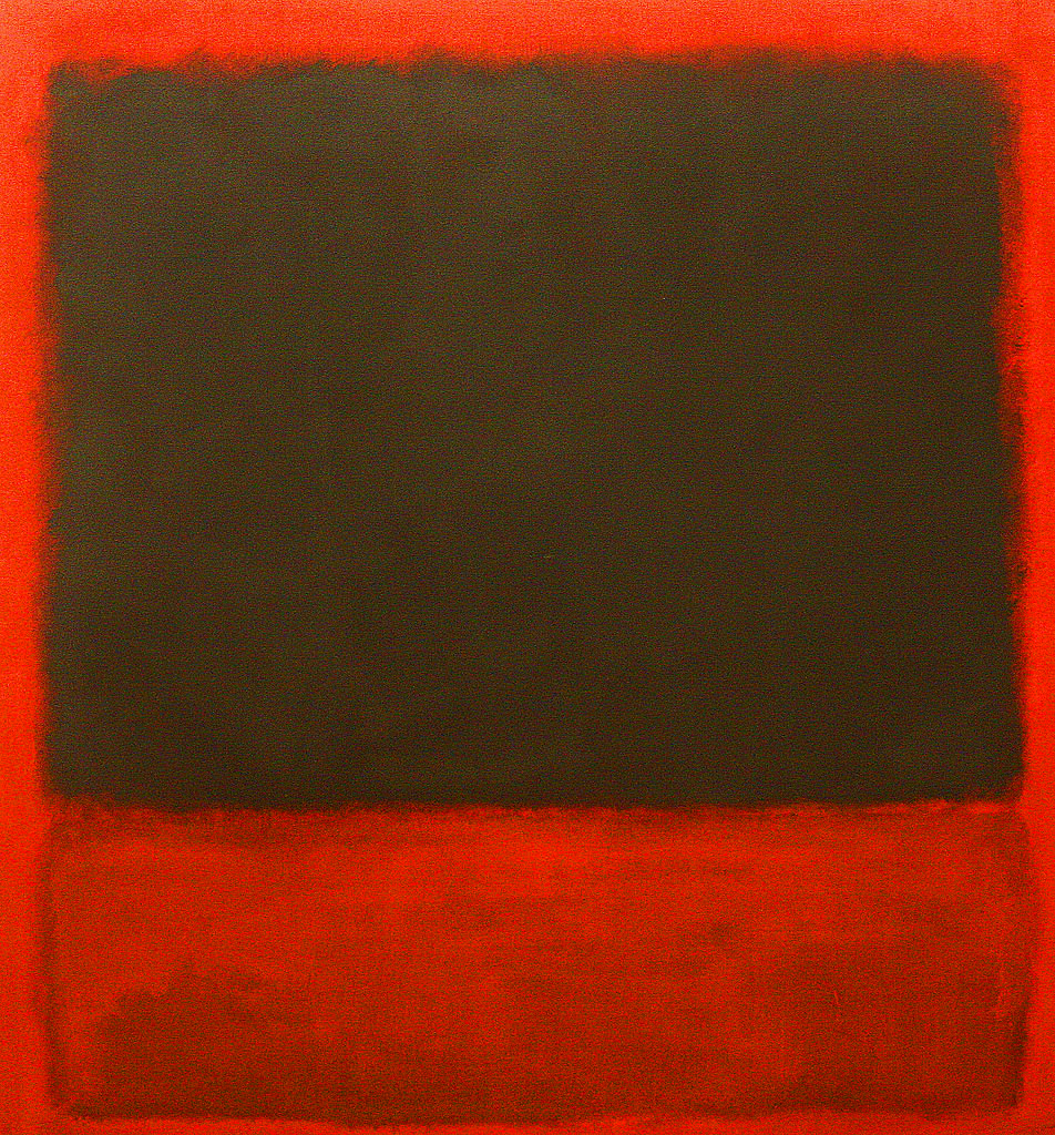
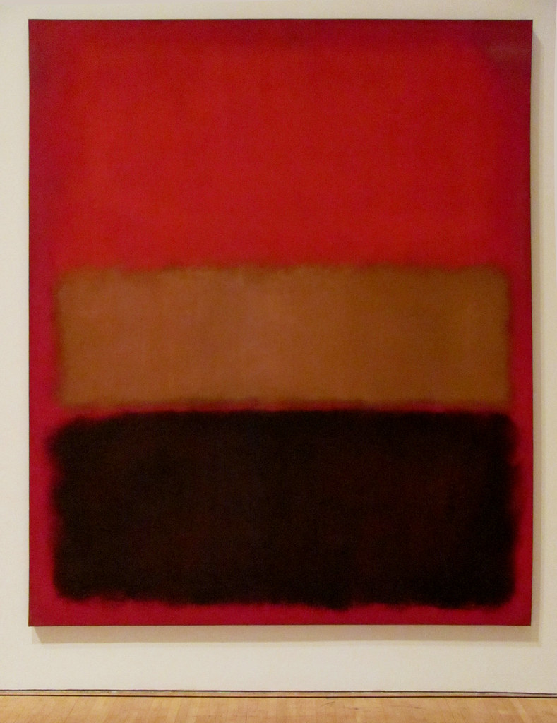
Rothko used a thin layer of pigment combined with a binder and applied it to bare canvas, followed by multiple thinned oil coatings. Using quick brushstrokes, he developed deep overlapping colors. Researchers, using modern techniques, revealed how he modified his paint. Rothko "used synthetic substances such as oil-modified alkyd and acrylic resins alongside traditional materials, including egg, glue, and dammar resin, which are fast-drying and allowed him to apply subsequent layers within hours."[2] He also added phenol-formaldehyde so the layers did not run together. Rothko created a compositional organization for his paintings based on two or three colors arranged in various horizontal bars. The strength of each color generated a "halo" effect around each color, developing a translucency. His diluted paint saturated the canvas and stained the fibers. Black, Red over Black on Red (6.3.1) and Black, Ochre, Red over Red (6.3.2) demonstrate his use of intense, juxtaposed colors. In the first painting, the black appears to float on top of the red/black background, and in the second painting, the ochre seems recessed into the background of the stronger colors.
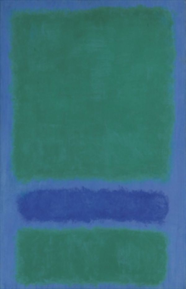
Green, Blue, Green on Blue (6.3.3) uses different colors with the same effects, the open question of which space is dominant or background or other relationships. Rothko named many of his color field paintings after the colors he used for a specific work.
No. 5/No. 22 (6.3.4) is an anomaly from Rothko's other color field paintings as the solid red band slashing across the canvas is broken by three undulating light lines. The horizontal lines were made by scraping through the paint with a blunt tool. When the painting was closely examined, researchers found the lines were repainted and re-scored numerous times, bunching in one area, stretching out on the edges, demonstrating Rothko's belief in the importance of how the lines were placed. Rothko always wanted to build emotion into the artwork and did not want his work viewed only for their spectral affiliations. He said, "If you are only moved by color relationships, then you miss the point. I'm interested in expressing the big emotions—tragedy, ecstasy, doom."[3]
Clyfford Still
Clyfford Still (1904-1980) was born in North Dakota and lived in Canada and Washington as a child and through his early years, receiving a Master of Fine Arts degree at Washington State College. He married around 1930 and had two daughters. In 1941, he moved to California, where he met Mark Rothko, who introduced him to the prestigious galleries and the world of Abstract Expressionism. He still went to New York for several years, divorced his wife, and remarried before moving to Maryland, where he lived the rest of his life relatively isolated from the art world. Although he was credited as the first significant artist to abandon figuration, he did not participate in the major city art scenes, preferring the isolation of Maryland. Still did not believe audiences were ready for his kind of art. The Still Museum Director, Dean Sobel, wrote, "He felt the art world was full of self-serving professionals who had become nothing but a drain on his creative energies."[4] Still frequently refused invitations to exhibit his work and turned down commissions, managing his career from Maryland, far from New York.
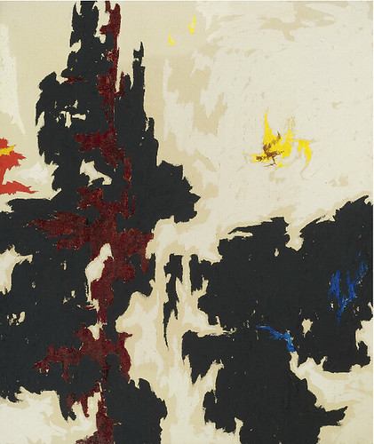
Still traveled between California and New York, he developed a unique style using large canvases covered with color punctuated by jagged shapes. The canvas had a dominant color of a deep impasto applied with a palette knife and a contrasting accent color to create tension and conflict. His paintings are reminiscent of the regions he lived in as a child, with vast terrain interspersed with craggy formations. Still referred to the irregular, vertical, linear forms as lifelines. 1947-Y-No. 2 (6.3.5) and 1949-A-No.1 (6.3.6) are examples of Still's use of color, high contrasted dark reds and black against areas of lighter yellow, white, or orange. The jagged lifelines flare throughout the painting.
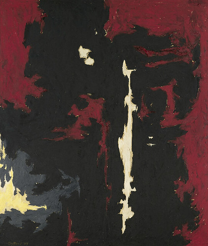
1952-A (6.3.7) and Untitled (6.3.8) follow Still's style with a significant change in palette. 1952-A was composed of robust colors and minimal contrast. The ragged blue lifeline formations are still visible in the thickly troweled dark paint. Untitled effectively used different tones of yellow over most of the canvas as a subtext to the striking black and red configuration dropping down from the corner. He left the canvas blank on the side of the painting except for the single dark, jagged lines. His strong vertical movement on the broad expanses of color brought a relentless force to Still's work.
Barnett Newman
Barnett Newman (1905-1970) was born in New York City; his parent's Jewish immigrants who came from Poland. Initially, he went to City College in New York and studied Philosophy, graduating in 1927. Newman worked as a teacher and writer, was considered an intellectual, and even tried to run for mayor. In the 1930s, Newman switched to painting, supposedly based on Expressionism; however, he destroyed the early work as obsolete and continued throughout his career to destroy any work not meeting his ideals. Newman's wife, whom he married in 1936, was an art teacher. In the 1940s, Newman's work had a surrealist style; then, he experimented with fields of color, originally variegated like the other Abstract Expressionists. However, he disregarded the more expressive brushwork for the flat, solid color paintings. Newman had to explain this new concept of solid, hard-edged areas of color, one of the first artists to use the techniques. He was not interested in how people labeled his work and had his view and claimed, "to start from scratch, to paint as if painting never existed before." Newman saw his work as forms of thought and the experience of being alive and individual.[5] In1945, he wrote about the theoretical goals of the proper abstract painter to move beyond earlier art movements, transcending the decorative elements of art into the abstraction of intellectual and conceptual art. Through one of the galleries, Newman became friends with Mark Rothko and Clyfford Still, all three influencing the abstract world of art.
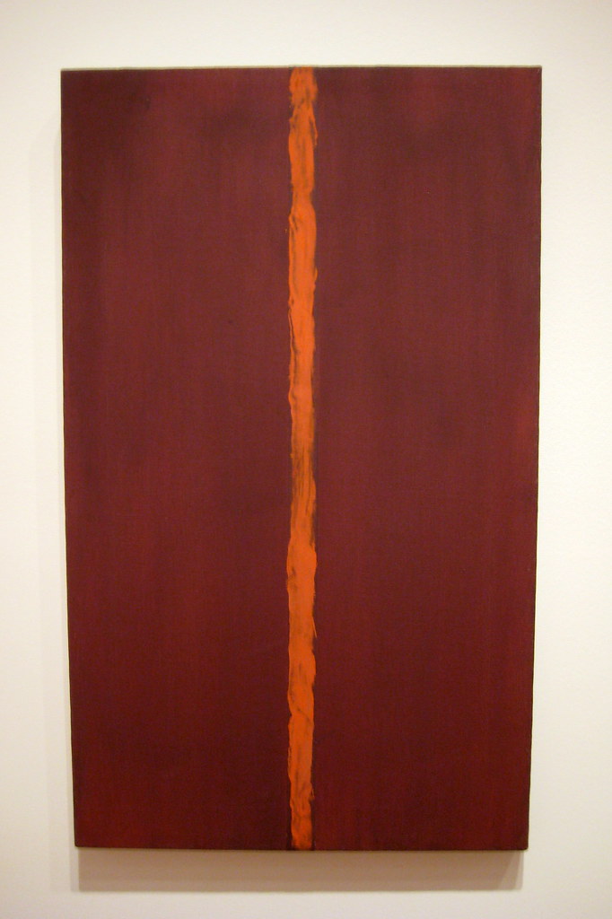
Working with flat, solid colors, Newman added thin vertical lines he titled "zips." Onement I (6.3.9) was one of his first color field paintings with the zip line, his signature mark, using the vertical line to create the spatial regions of the painting. The painting was a solid field of Indian Red intersected with a zip line of light cadmium red he applied with a palette knife.
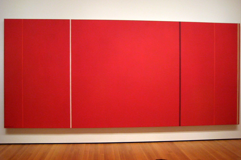
In Latin, Newman's title for his painting Vir Heroicus Sublimis (6.3.10) is translated, "Man, heroic and sublime." Newman created this oversized work to be sublime, wanted the viewer to stand near the painting to develop an experience similar to meeting someone. "It's no different, really, from meeting another person. One has a reaction to the person physically. Also, there's a metaphysical thing, and if a meeting of people is meaningful, it affects both their lives."[6] Newman used the impactful single color, letting the viewer respond to the color. His narrow zip bands intersected the color, the dark and light vertical stripe contrasting with the single massive color and giving scale to the painting.
Frank Stella
Frank Stella (1936-) was born in Massachusetts, attended elite schools, and graduated from Princeton University, where he majored in history, influenced by Stephen Greene, a legendary teacher. Stella was married twice and had five children with his second wife. He moved to New York in 1958 and was attracted to the new Abstract Expressionist paintings, especially Jasper John's work of flags. Stella wanted to experience the idea of painting full time. He was opposed to the concept of expressively using paint and instead focused on the idea of the flatter surfaces seen in Barnett Newman's work. Stella's Black Paintings gained him quick fame and new concepts of what art is and needs to include, excluding the essentials of religion, psychology, political views, and other human frailties. Stella always believed, "What you see is what you see,"[7] bringing the concept of minimalism to the world. In the sixties, Stella became a leader in the art world with his flamboyant color and reductive forms.
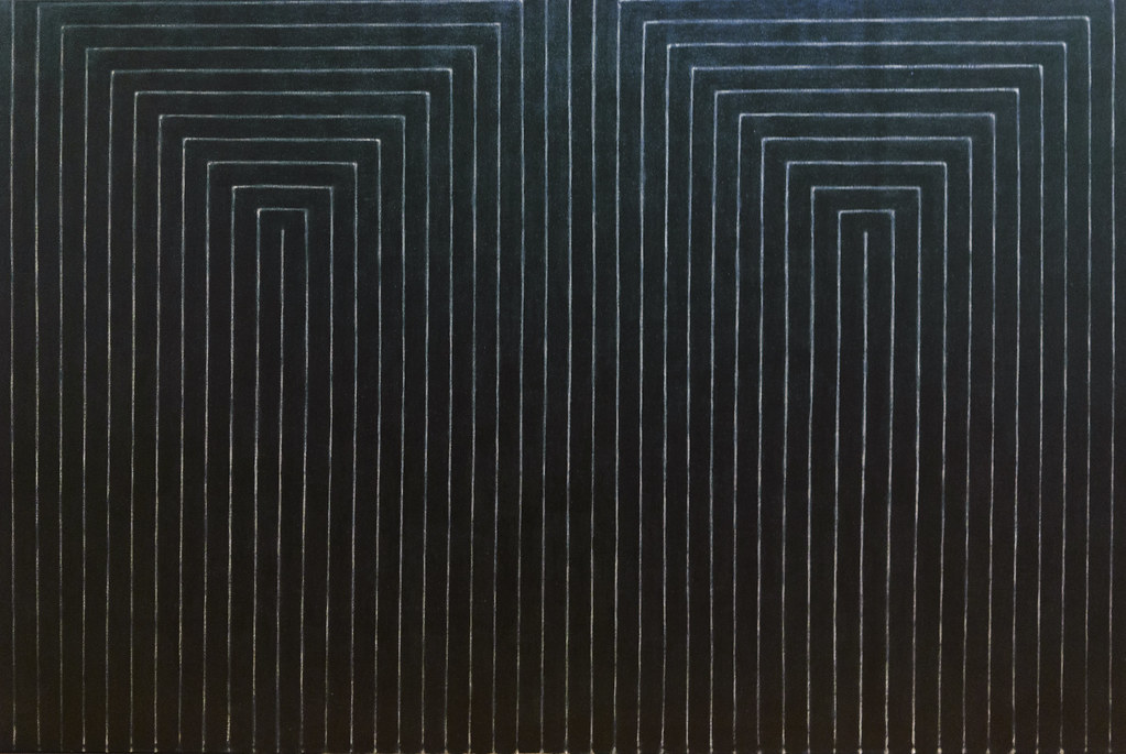
The Black Paintings were his first expression of the picture as the object instead of a representation. Stella applied flat matte black paint in bands with brushes used by house painters leaving fuzzy thin, U-shaped pinstripes unpainted on the canvas. Marriage of Reason and Squalor II (6.3.11) repeated the geometric patterns on a flat surface with minimal brushstrokes. The repetition of lines developed and emphasized two dimensions while shocking people with its simplicity. The Black Paintings repetitive geometric lines and the unembellished simplicity set the stage for the concept of minimalism and the idea of a viewer interacting with the artwork instead of a visual scene.
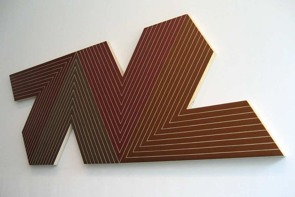
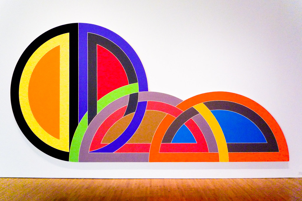
Empress of India (6.3.12), part of his Notched-V series, was created from four canvases shaped into chevrons with a simple color palette of browns and ochers. Stella said, "when you have four vectored V's moving against each other, if one jumps out, you dislocate the plane and destroy the whole thing entirely." [8] The limited palette and arrangement of the parts bring the interplay of movement while maintaining balance.
Stella produced his Protractor series in 1967, artwork with broad, sweeping arcs, intersecting and overlapping, changing the concept of the shape of traditional art. The glowing, bright acrylic paint followed the lines of the canvas arcs. The Protractor paintings were large, innovative, and sculptural, paintings playing with the illusion of space based on a very flat surface appearing to have multi-faceted dimensions. Stella had visited Iran and was interested in the patterns of the pathways found in the ancient cities, so he named the series after some of the ancient cities. He painted the series over three years, producing ninety-three paints based on thirty-one different configurations. Hagamatana II (6.3.13) was apportioned over five distinct sections, each adjoined by curved strips of intersecting colored lines. The brightly colored lines simultaneously belong to different sections, challenging the viewers. He also used color, changing the focal colors on each side from black to red, the center brown box bringing both sides together. The basic lines were drawn on a small scale with a protractor.
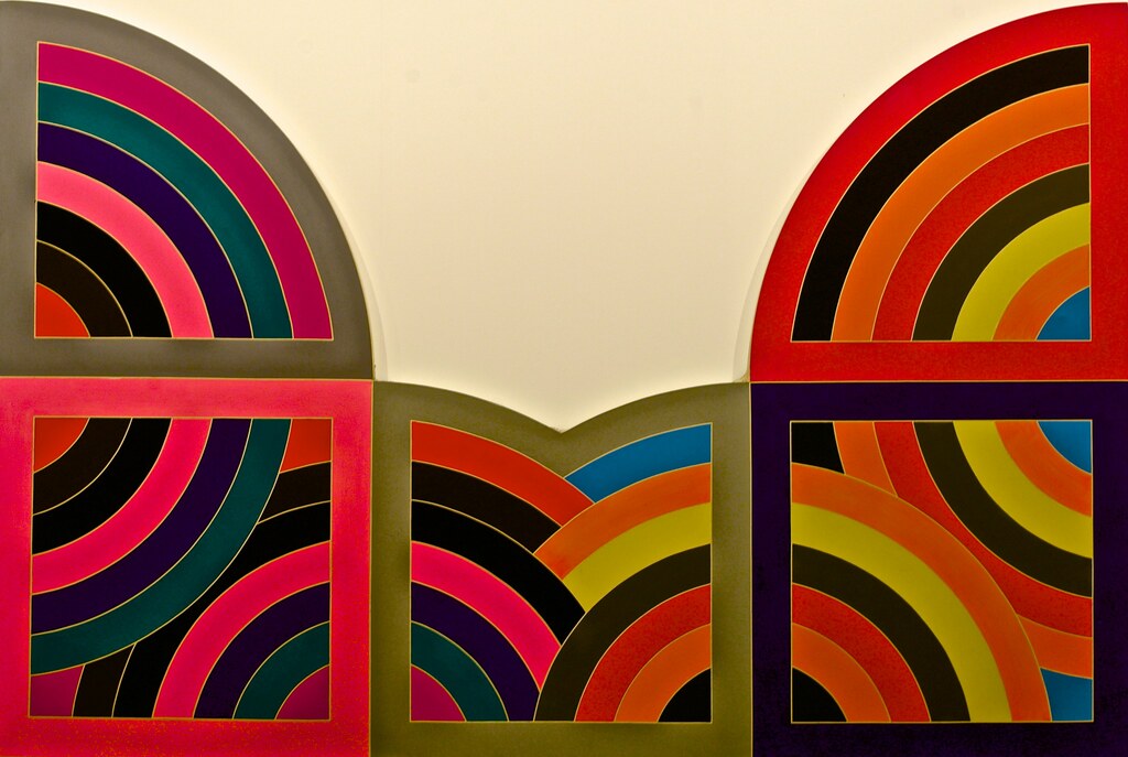
Clesiphon I (6.3.14) was named for a city near Baghdad, Iran. Stela used three unique designs: interlaces, rainbows, and fans based on their basic shapes; the half circle and circle in Clesiphon I became the primary units, the interlacing lines moving through the painting. The series was overly large and architectural as the bright fluorescent colors were usually applied in one coat.
Anne Truitt
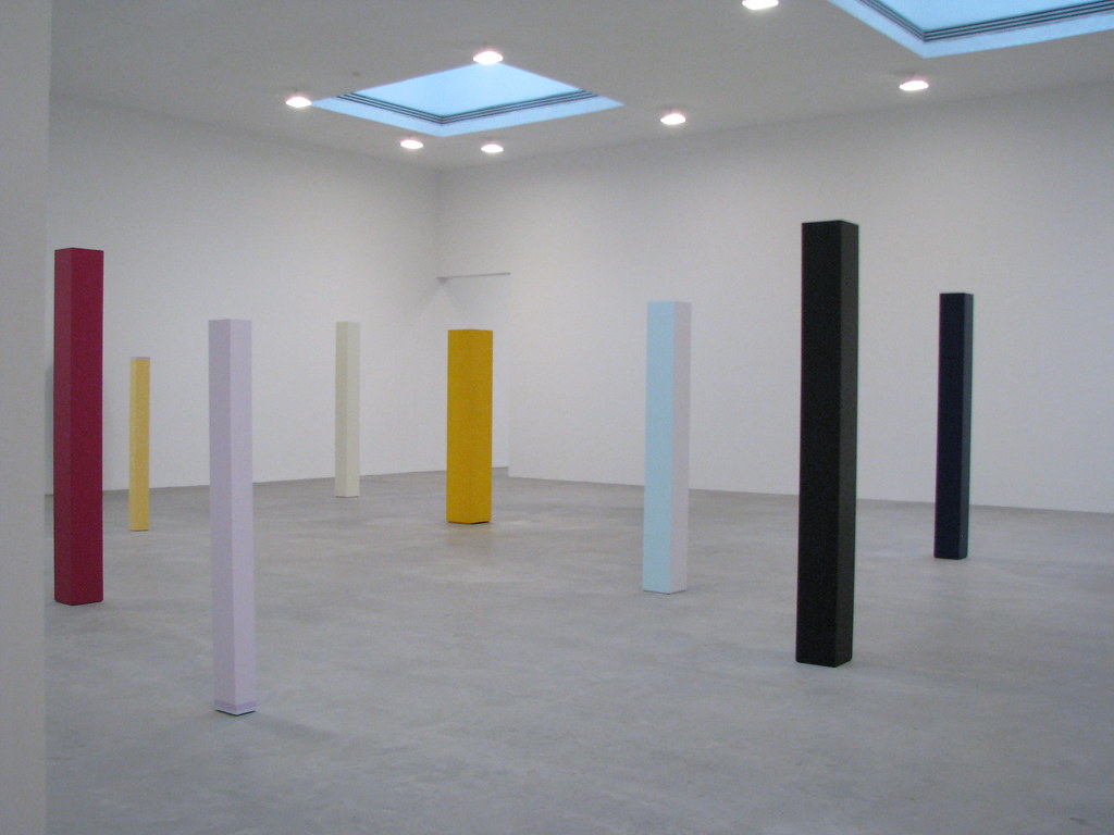
Anne Truitt (1921-2004) was born in Maryland before moving to North Carolina as a teenager. In college, she pursued a degree in psychology and graduated from Bryn Mawr College in 1943 before working in a hospital psychiatric ward. By the late 1940s, she decided to change careers and enrolled in art classes at the Institute of Contemporary Art in Washington, D. C. She married James Truitt in 1947 until 1971, when they were divorced. Truitt started her art career with figurative sculptures. At a museum, she encountered Barnett Newman's work and was inspired by the simplicity and subtlety of color modulation, a turning point for her career. Truitt's first sculptures were made of wood-based on forms of memories of fences in her childhood. Her sculptures were created from wood and then painted with multiple layers of acrylic in monochromatic color. The sculptures were usually hollow and weighted to maintain their positions. Her painting process was extensive and time-consuming; the first layer was gesso, followed by multiple layers of paint, sometimes over thirty layers. Truitt was careful with her brushstrokes; each application of paint alternated between horizontal and vertical, each layer sanded to achieve a purity of color and finish. Truitt also created a large set of pencil and ink drawings, wrote books, and taught at the University of Maryland.
Truitt's use of a broad color palette was reflected in the installation of In The Tower (6.3.15), ranging from deep colors of red and black to the paler yellow and lavender. She did not apply multiple layers of one color. Instead, she used different mixed colors, observing how translucent or opaque the color was and which layer to apply the color. She believed some base colors allowed the top colors to achieve perfection and become alive. The individual columns ranged in height and color, none of them exactly alike.
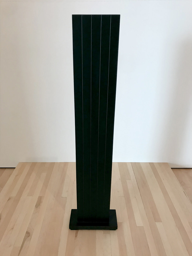
In Green: Five (6.3.16), Truitt used oil-based enamel on wood instead of acrylic. The tower appears black; however, multiple layers were applied to achieve the finished color. She mainly used yellow, scarlet, lavender, light blue, black and white, believing colors were organic and living, creating a feeling of "aliveness" in the colors.[9]
Jules Olitski
Jules Olitski (1922-2007) was born in Ukraine, as Jevel Demikovsky. His father was executed shortly before he was born, and the family relocated to America when he was a year old. When his mother remarried, he was given the last name of his stepfather. Olitski displayed his artistic abilities early, even winning an art prize in high school, continuing his education at the National Academy of Design and Beaux Arts Institute in New York. After his time in the army during World War II, he studied in Europe and returned to New York. He was married and started exhibiting in different shows; his work was based on heavily textured abstracts. In 1960, he began to use dyes, staining large regions of the canvas with bright colors. Five years later, he developed a technique of applying layers of color and then dragging portions of acrylic paint on the changed borders. He used spray paint to cover large areas, building multiple layers of a different color to progressively alter the hues and values, the chromatic shifts of color, and significant advances in spray and stain paintings. Initially, he applied the paint with rollers or brushes before using the spray gun to add thin layers of paint saturating the surface. Color in Voyage (6.3.17) is banded by circular forms, each color unique and contrasted with other segments. The bright blue in the center contends with each of the different bright colors.
Burn and Glitter (6.3.18) demonstrate Olitski's spray paint techniques to develop misty images. The multiple layers of thin, almost transparent colors helped create an opacity along with a transparent look. The possibility of the bright red is muted under the added layers of multiple colors, an open field filled with color from the outside inward.
Morris Louis
Morris Louis (1912-1962) was born in Maryland, his parents' emigrants from Russia. He attended school in Maryland and won an art competition and a four-year scholarship to the Art Institute. His first significant art project was helping on a Public Works Art Project in Baltimore before moving to New York in 1936. He consistently painted scenes of workers and the poverty surrounding him before returning to Baltimore in 1943. He married in 1947, a time he began to use the new type of paint called Magna, the only paint he ever used after that. He worked with the paint makers, and they created a special acrylic resin mixable with mineral spirits or turpentine. The paint was used by artists in stain painting, achieving specific effects by pouring colors directly from the can. Magna colors were vivid, bright, and more intense than standard water-based acrylics. Louis and the other color field artists had simplified the concept of what is a finished painting. He specifically eliminated any compositional representations and left large regions of the unfinished canvas. He used lines of fluid paint in a repetitive formation of solid planes
One of Louis' most famous series was Unfurled. He used unprimed canvas, adding the paint to flow down the surface without brushstrokes. He was one of the prominent artists to develop the flowing, thin pigment as the paint billowed in rivulets down the canvas. Delta Kappa (6.3.19) was part of the series on the oversized canvas. The multi-colored rivulets move from the sides of the canvas to the bottom, not meeting and leaving the center blank. The colors soaked into the canvas, maintaining the purity of the flat colors. The work was complex; the artist only had one pass to pour the lines and have them flow correctly.
Louis also created a series called Stripe, Pungent Distances (6.3.20), one of the paintings in the group. He generally hung the canvas on the wall and used turpentine-thinned paint as it flowed and soaked into the canvas. The adjacent, narrow stripes became more distinct as the color ran down the canvas. Louis represented color for its visual qualities, using an unpredictable method without brushes.
By the end of the late 1960s, color field painting was fragmenting into smaller definitions, each with unique characteristics, reducing artwork into severely minimalistic images. Color field became a starting point for the Minimalists who took the ideas of color and shapes into their pure basic form, eliminating any non-essential features.
[1] Doss, E. Makes Me Laugh, Makes Me Cry, Feelings and American Art, American Art, 25/3 (Fall 2011), p. 2.
[2] Qiu, J. Rothko's methods revealed. Nature 456, 447 (2008). https://doi.org/10.1038/456447a
[3] Retrieved from https://www.moma.org/collection/works/80566 (28 October 2020)
[4] Ichikawa, A., A New Clyfford Still Documentary Explores the Life and Work of the Enigmatic Abstract Expressionist, Art in America, March 25, 2020, retrieved from https://www.artnews.com/art-in-america/features/lifeline-clyfford-still-dennis-scholl-abstract-expressionism-1202680523/ (20 October 2020)
[5] John P. O’Neill, ed. Barnett Newman: Selected Writings and Interviews. (New York: Alfred A. Knopf, 1990), 192.
Retrieved from https://www.moma.org/artists/4285#fnref:2 (30 October 2020)
[6] Retrieved from https://www.moma.org/collection/works/79250 (30 October 2020)
[7] Retrieved from https://www.newyorker.com/magazine/2015/11/09/big-ideas-the-art-world-peter-schjeldahl (28 October 2020)
[8] Retrieved from https://www.moma.org/collection/works/79806 (29 October 2020)
[9] Retrieved from https://editions.lib.umn.edu/panorama/article/in-the-tower/ (30 October 2020)