
6.6: Pop Art (1950s-1960s)
- Page ID
- 124387
Introduction
Pop Art was a movement developed in England and the United States during the 1950s, challenging traditional art concepts, using ordinary objects including comic books, and advertising used in mass culture. After the war, a period of experimentation, along with amplified consumerism, artists were inspired by the new world around them. The growth of mass media expanded consumer goods, and the popular appeal of ordinary culture inspired artists to create art based on prevalent culture, an art known as Pop Art. The turbulent political climate and increased consumerism influenced artists, a mirror of the times. They focused on bright primary colors, frequently unmixed, and used techniques of printing and painting reflecting realism, unlike the Abstract Expressionists. The artists linked their work with the mass media of film, television, cartoons, or everyday mass-produced imageries. Because Pop Art focused on identifiable and mundane images, the style became one of the most recognized movements, blurring the lines of high-class art and low-class culture. The artists interconnected art with the media world surrounding ordinary people and developed art as a commodity. Many of the artists started their careers in the world of commercial art as magazine illustrators, graphic designers, and even sign painters.
In the United Kingdom, a group of artists began to examine the elements of movies, comics, technology, and even advertising, at first creating collages made of materials from the mass-produced world. Artists like David Hockney and others were interested in American media culture to expand their ideas of 'popular cultural art' while being distanced from American advertising. Simultaneously, in New York, the concepts of art based on widely seen cultural images created by Jasper Johns or Roy Lichtenstein continued to grow. American artists were surrounded by a sophisticated, bold, and complex mass-produced world. Although the artists were conscious of other movements and styles, they wanted to connect with the mass media of advertising, television, or film surrounding them. The challenge of merging methods and mass-produced materials led them to create art with new meanings.
Andy Warhol
The parents of Andy Warhol (1928-1987) migrated to the United States from Austria-Hungary (now Slovakia) after World War I and lived in Pennsylvania, where Warhol was born. In elementary school, he was diagnosed with Sydenham's chorea, a disease of the nervous system. Because he was confined to his bed, Warhol spent his time drawing and collecting images of movie stars. After high school, he went to Carnegie Mellon University, studied commercial art, and graduated with a Bachelor of Fine Art in 1949. His early career was based on advertising art, at first drawing shoes for magazine advertisements. In the 1950s, he started using silk screen printing and then embellished it when the ink was still wet by blotting the image. He could repeat one image multiple times with innumerable variations. By the 1960s, he used his methods to create well-known iconic people or objects. He was eclectic in his choice of subjects, ranging from mushroom clouds or Coca-Cola bottles to Marilyn Monroe or Mao Tse Tung. His work was famous although frequently controversial; some believed he was too commercialized; others thought the images were inappropriate, and some questioned the concept of his work as art. By the 1970s, he became more devoted to making money and sought those with commissions for portraits. A typical quote by Warhol was, "Being good in business is the most fascinating kind of art. Making money is art and working is an art and good business is the best art."[1] In 1987, Warhol had surgery for his gall bladder and died from an irregular heartbeat after the operation.
One of Warhol's early works was the infamous Marilyn Monroe painting. At the time, he had painted it and used drips similar to the Abstract Expressionists. As he expanded to other celebrities, he changed from hand painting to silk screening, tracing the image from slide projectors. He continued to develop and use different methods of printing, including; over-printing - adding one color to the top of a different color, registration – aligning different colors on an image, and experimenting with multiple combinations of day-color metallic colors. One of his earliest successful works was based on soup cans. He used mesh screens to apply the ink; the area was stenciled out to block the ink, repeating until the canvas was saturated.
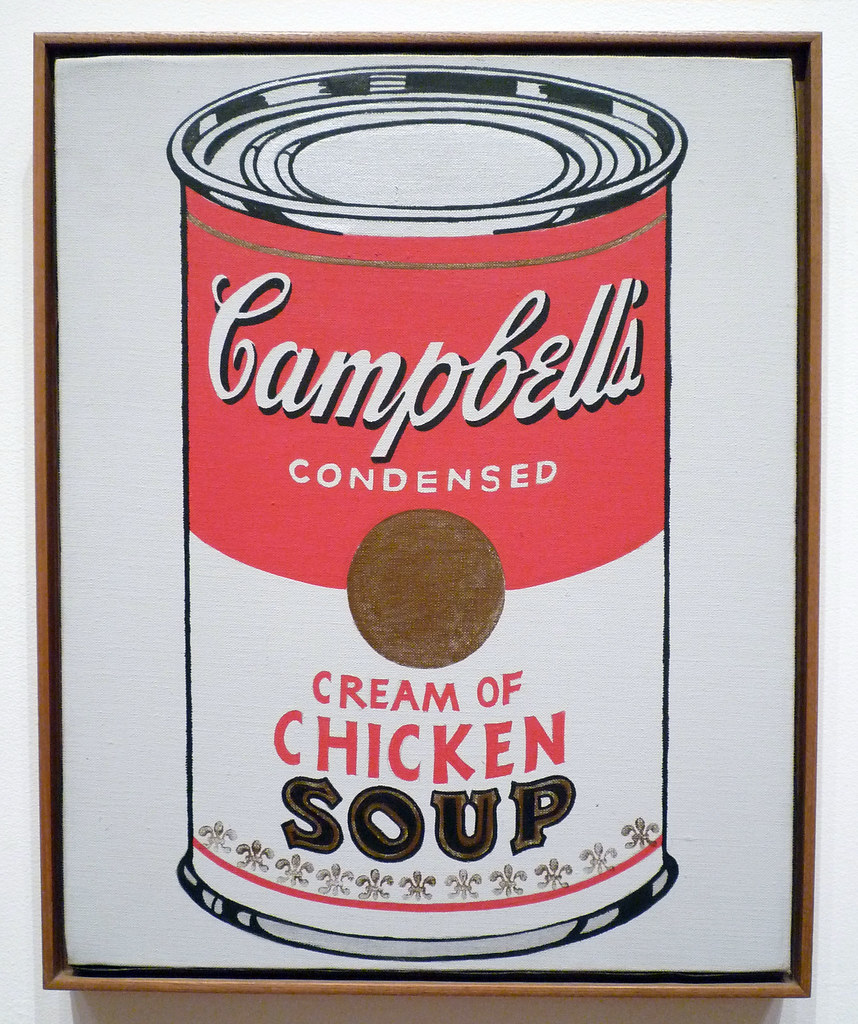
In searching for new imagery instead of the abstraction of other artists, the gallery owner, Muriel Latow, suggested Warhol paint ordinary everyday objects like soup cans. From that point on, he used easily recognizable subjects, glorifying consumption habits, and supporting the rising economy. When he first exhibited the soup cans (6.6.1), he hung 32 different canvases, side by side, corresponding to the 32 flavors of Campbell's Soup at the time. The canvases were hand-painted with synthetic polymer paint, a hand-stamped fleur de lys pattern at the bottom. He varied the front of each can with the name of the soup flavor. After Warhol finished the soup cans, he started using a more commercially viable photo-silkscreen procedure to mass-produce his images. He believed art should be for the masses, not the select few. Warhol produced multiple life-sized images of Elvis Presley, a 1950s singer and sex symbol made famous by the supposedly scandalous hip-shaking moves Presley made while singing.
In Double Elvis (6.6.2), the overlapping images of Elvis were based on a western movie he was making. Warhol first created a silver background on a long and continuous canvas, then layered multiple silkscreen images. When the canvas was dry, he cut each set of images into several paintings. The images appear to be moving back and forth, similar to a strip of film.
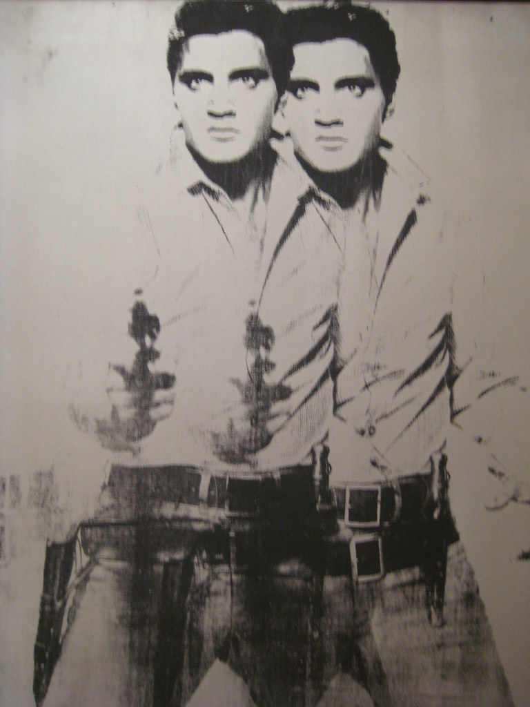 Figure \(\PageIndex{2}\): Double Elvis (1963, silkscreen ink on synthetic polymer paint on canvas, 210.8 x 134.6 cm) by wallyg, CC BY-NC-ND 2.0
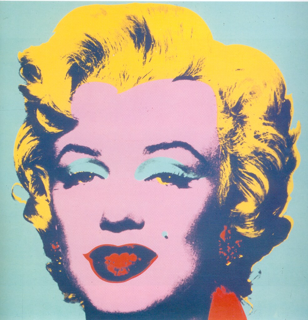
Marilyn Monroe (6.6.3) was Warhol's first celebrity series. He used five screens, one with the original photograph and four to represent the colors. Some of the prints are not in sync with the register marks, slightly offset. He made multiple images, each with different colors, to represent her effervescent personality. Warhol highlighted her trademark blond hair with various yellows in many of the prints and enhanced her iconic lips with bold reds. Although Monroe died five years before Warhol created the images, he defined and enshrined her unusual celebrity prominence. He understood the interest in celebrities by the public and frequently focused on female celebrities, none as famous as Marilyn Monroe.
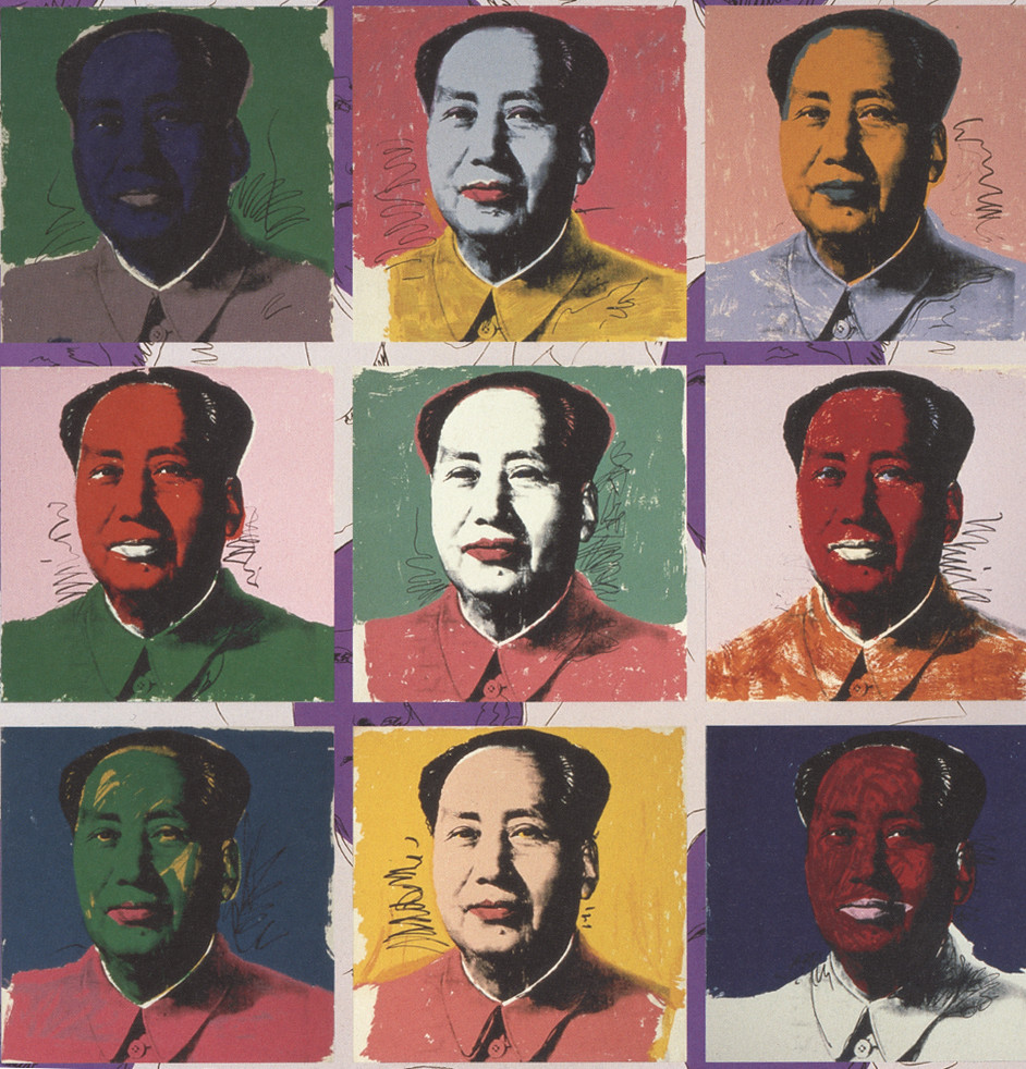
Mao Zedong was the leader of China, responsible for turning China into a communist country. Warhol used an official Chinese portrait for his print of Mao Tse Tung (6.6.4). As with the paintings of other celebrities, Warhol made multiple prints, varying the palette of colors to create a playful image of a serious world leader. Sometimes the garish colors gave Mao a theatrical, comic look, and other colors brought a more sinister appearance. In 1972, Richard Nixon went to China, opening up relationships between the two countries. With Warhol's painting, Mao became a popular icon.
Roy Lichtenstein
Born in New York, Roy Lichtenstein (1923-1997) was a child of upper-middle-class parents. In school, he was interested in music and art, frequently attending jazz concerts and sketching portraits of the musicians. Lichtenstein studied at Ohio State University until the Army drafted him during World War II. In the Army, he was trained in languages until the program was cut. Subsequently, he was sent to engineering school, and that program was eliminated, so he trained as a pilot until the program was also discontinued. Lichtenstein finally became a draftsman and was sent to Europe, where he studied the art of the masters until the end of the war when he went home. Lichtenstein returned to Ohio State, completing his bachelor's and master's degrees, teaching at the university for ten years. In 1957, Lichtenstein, his wife, and two sons moved back to upstate New York to teach at the university and work on his own Abstract Expressionism art. By 1960, he taught at Rutgers University and found an environment of pop imagery.
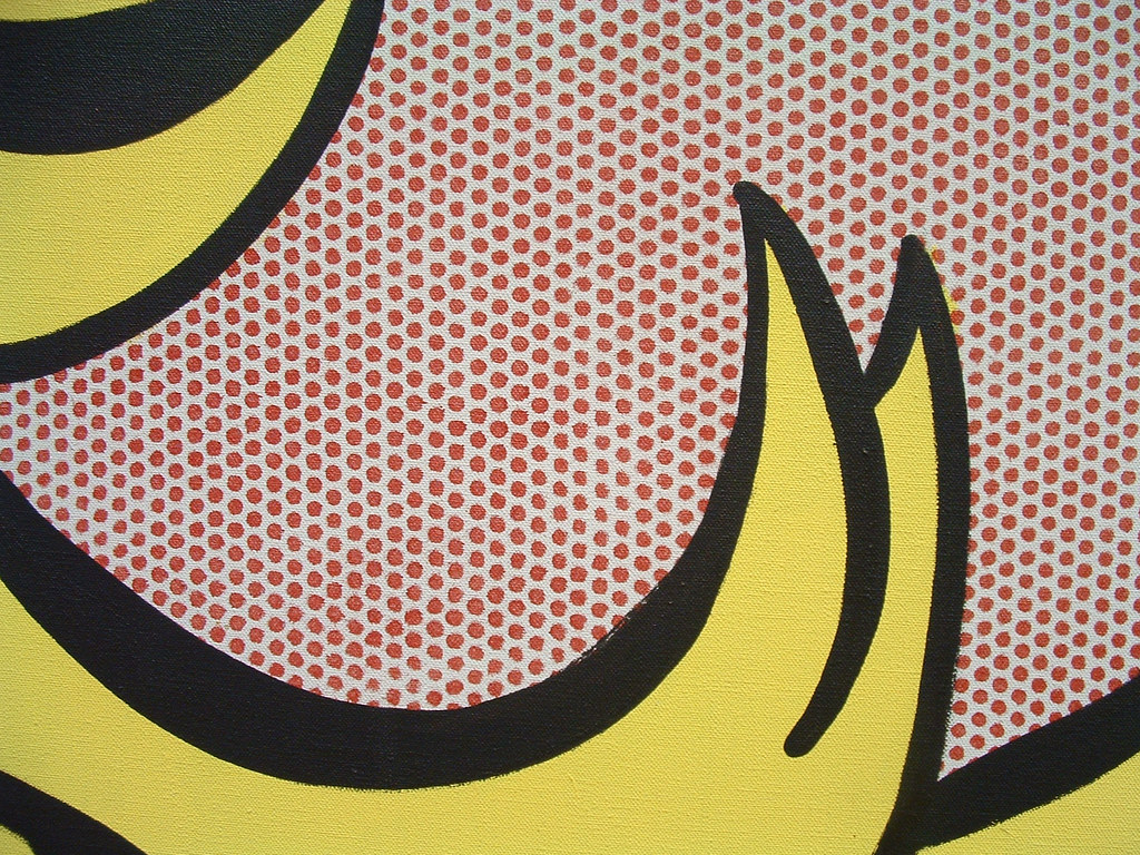
Lichtenstein created his first works based on comics and commercial advertising, even painting mundane items like tennis shoes and golf balls. The works were created by mirroring the crude printing methods used by newspapers. His success grew, and he painted some of his most famous and successful works, including Drowning Girl and Whaam. Much of his work was based on styles found in comic books and commercial art, initially not considered worthy of the standards found in fine art. Lichtenstein took the trivial and created art. His first break with the abstract world occurred when he inserted comic book characters into his abstracted backgrounds. Lichtenstein wanted to illustrate the comic world more closely. He started using Ben-Day dots (6.6.5), a tiny mechanical pattern generally found in engraving to represent texture and progressions of color. He created the dots by using perforated dot patterns in which his paintbrush would skim across the top and drop paint into the stencil circles. The dots were generally cyan, yellow, magenta, and black, their spacing and combinations used to produce different colors and shading. (The same concept used by modern computer printers.) His use of dots became a trademark. Lichtenstein copied a foundation image by hand, altering parts of the image, then tracing the drawing onto the canvas. He stated, "As directly as possible…From a cartoon, photograph, or whatever, I draw a small picture—the size that will fit into my opaque projector…I don't draw a picture to reproduce it—I do it in order to recompose it…I project the drawing onto the canvas and pencil it in and then I play around with the drawing until it satisfies me."[2] He manually applied the dots by hand, frequently using templates for different color patterns based on primary colors outlined with heavy black lines. Lichtenstein's subject matter and the use of dots brought the mechanical appearance of the commercial and comic world into the arena of fine art.
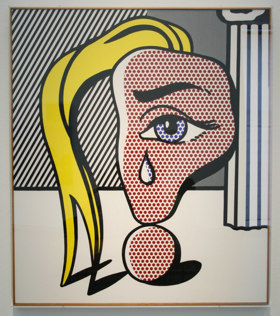
In Girl with Tear III (6.6.6), Lichtenstein used his dot process in a Surrealist setting. In one series, the incomplete face is focused on the eye, the origination of the tear, a parody of Dali or Picasso. He used red dots for the face against the slanted dark stripes in the background. The column mimics the stripes, except wider and vertical. The swoop of blond hair brings the different elements together. The single eye and tear focused outward in the center.
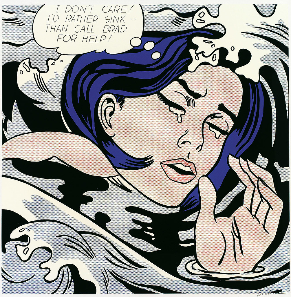
The Drowning Girl (6.6.7) was based on an original image by DC Comics, an image Lichtenstein altered significantly by altering the picture he created using Ben-Day dots. The girl's boyfriend was in the original as he clung to a boat. Lichtenstein cropped the image, so only the girl was visible, waves threatening to engulf her as she fights for survival. She appears to be emotionally distressed as tears flow from her eyes. Lichtenstein also changed the caption and the boy's name in the text bubble to amplify the girl's distress alone in the water. He used a cool palette and dark colors to represent the potential dangers of the waves and water.
Like Monet's set of paintings of the Rouen Cathedral, Lichtenstein also created a series based on photographs he viewed of Monet's work. Instead of painting the cathedrals in different lights and times of day, Lichtenstein's cathedrals (6.6.8) were divided into binary colors of dots. He wanted to use the concepts of Pop Art and its repetition with an iconic image, an image; "cheapened by overexposure, and reinvesting it with renewed, ironic vigor and relevance."[3] Lichtenstein used two colors in each painting; the red and yellow dots are interlocked to develop a clear image of the daylit cathedral (6.6.9, 6.6.10). The center painting is an illusion of a hazy morning, while the dark painting demonstrates the darkness of night. The Ben-Day dots reproduction dots, looking like the proofs from a printing press, create the symbolism of different light developed in mass reproduction. Monet investigated the various permutations of light on a single source, while Lichtenstein explored the reproductive values of the mass media.
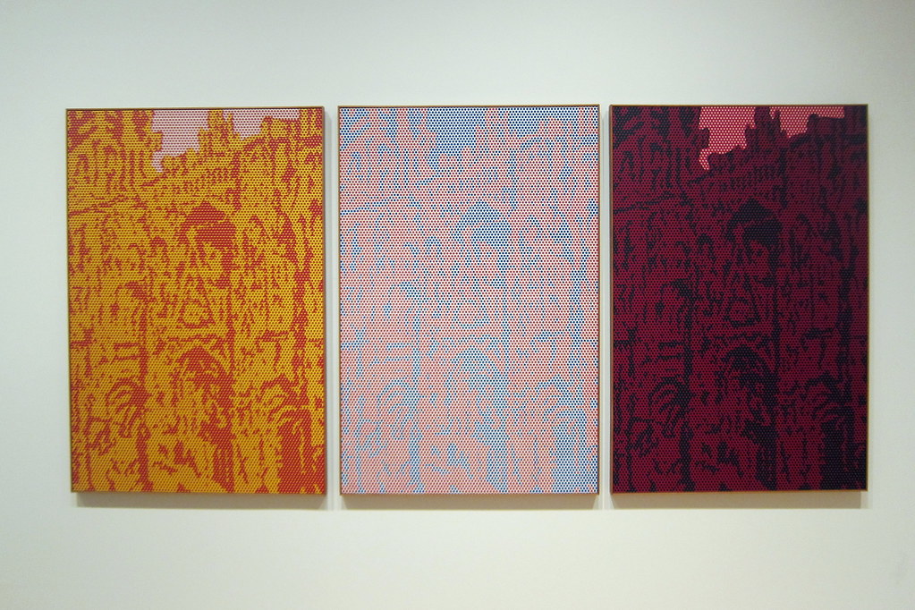
Figure \(\PageIndex{8}\): Rouen Cathedral (1969, oil and magna on canvas, 161.6 x 360.3 cm) by wallyg, CC BY-NC-ND 2.0
David Hockney
Born in England, David Hockney (1937-) was one of five children and educated at the Bradford College of Art and London's Royal College of Art. As part of an exhibition of Young Contemporaries, along with Peter Blake, the exhibit was considered the beginning of British Pop art. Hockney's reputation began to grow. However, the college did not issue him a diploma because he did not complete the assignment and write an essay about his painting. Hockney protested, saying his work should be centered on the art, not an essay about the art. Based on his ability and growing reputation, the college modified its rules and awarded Hockney his diploma. In 1964, he moved to Los Angeles, a city of swimming pools and an inspiration for his series on pools and the attendant vibrant colors. The atmosphere in his paintings reflected the excesses of life in the bohemian lifestyles of California, parties, and naked bathers. However, he stated, "I was never much of a party boy, I am a worker. An artist can approve of hedonism, but he can't be a hedonist himself."[4] Portraits were one of Hockney's significant inspirations, and he painted multiple images of friends and relatives, including himself. His early paintings were based on a grid format with vertical and horizontal lines to form structures, landscapes, or backgrounds. He was also known for his prints, and as a stage designer and photographer, Hockney divided his time between homes in London and Los Angeles, his works influenced by events and scenery in both locations.
Hockney was inspired to move to Los Angeles after he saw a magazine of homoerotic photography and believed he could find sexy, nude men posing beside houses. However, when he flew over Los Angeles, he noticed all the blue swimming pools by most homes, a luxury in England, common in Los Angeles because of the weather. Swimming pools became a significant representation in many of his paintings, helping establish the concepts of life in Southern California. His pool painting captured his ideals of gay freedom in a utopian place, a beautiful, carefree life. Hockney soon became interested in how to paint water, what color, and how to interpret the feel of water. Sometimes he used lines or variegated the color to indicate movement. In A Bigger Splash (6.6.11), one of three of the series, Hockney used flat vertical planes, focusing on the results of the swimmer's dive. He painted the blue of the water with a roller, using multiple brushes to portray the explosive splash of water caused by the diver. The splash is the only movement in an otherwise still painting.
During the 1960s, Hockney extended his stay in Los Angeles, where he designed stage sets and became acquainted with theater and movie industry people. He started painting a series of canvases, each a massive 213.3 x 304.8 cm known as the 'Double Portraits.' In the series, each painting depicted two people sitting apart, seemingly uninterested in each other. Hockney knew Geldzahler from New York, where he was a curator for the Metropolitan Museum of Art. They developed a friendship traveling through Europe together. Hockney took his Polaroid camera to Geldzahler's apartment and started taking pictures. In the painting Henry Geldzahler and Christopher Scott (6.6.12), Hockney positioned the oversized pink couch as the central focus adding part of the New York skyline in the background. He foreshortened the objects in the front leaving the two disconnected men to gaze at entirely different directions, the emotional link between the pair unknown.
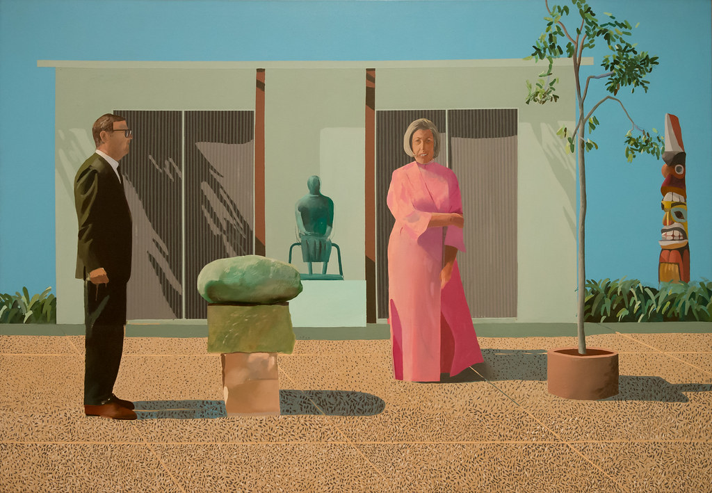
One of the most iconic of Hockney's Double Paintings was American Collectors (Fred and Marcia Weisman) (6.6.13), the couple depicted standing apart, each stiffly positioned in a different direction. Her distorted mouth is seen in the mouth on the totem pole as he stands with tightly clenched fists. Their shadows create horizontal movement as the tree and totem bring verticality. The whole scene is geometrically painted as the bright sunlight flattens the panorama. Hockney did not paint a close-up portrait of the couple; instead, he presented the entire environment. The Weisman's did not like Hockney's portrayal of them and rejected the painting.
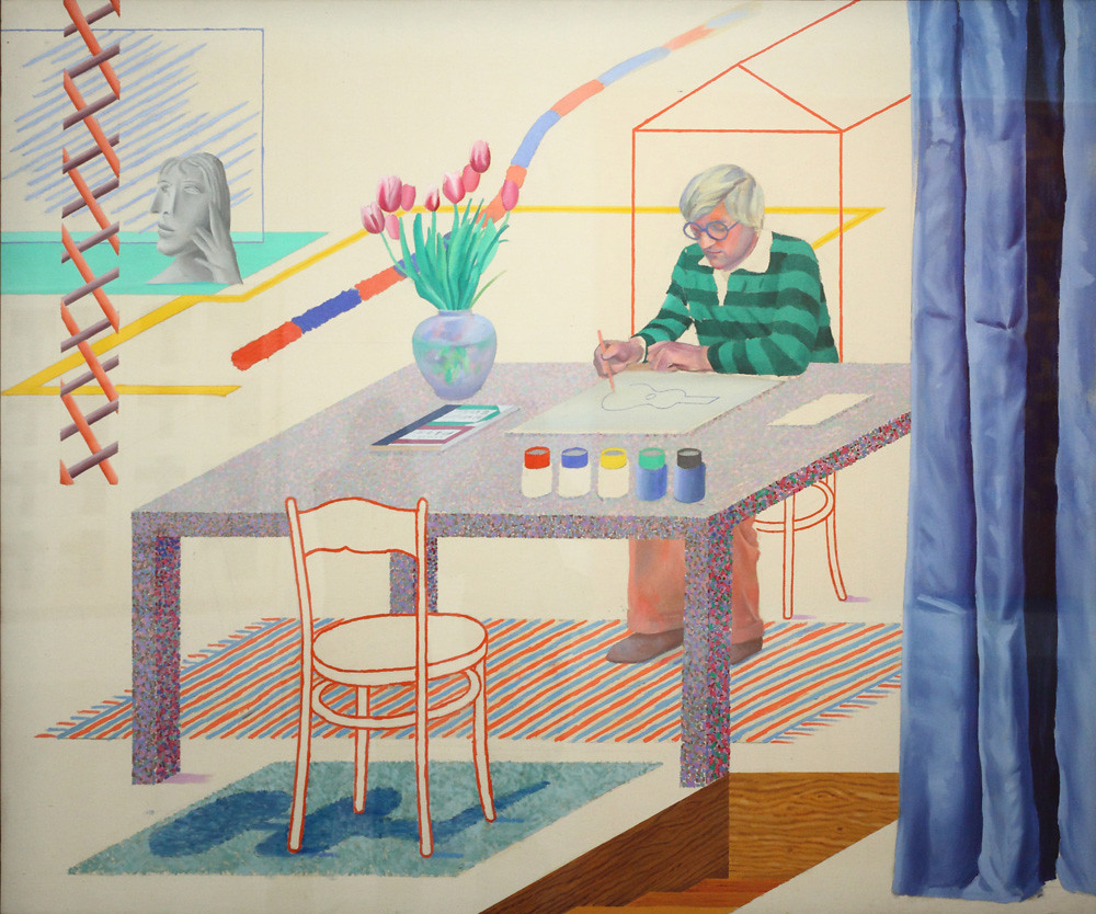
Hockney began to change his perception of flattened geometric images after listening to the poem The Man with the Blue Guitar by Wallace Stevens. In this painting, Self-Portrait with Blue Guitar (6.6.14), he paints himself at the table, covering the painting with colored dots. Many of the elements in the work are at an angle instead of vertical or horizontal. The blue curtain on the side anchors the image as though just opened to reveal Hockney at work. The curtain is more realistic, not flattened but appearing to have folded dimensions. His jars of paint sit on the edge of the table, seemingly waiting to be used. Hockney said he wasn't sure what the poem was about but believed it to be based on imagination, and he thought it forced him to break away from his previous style.
Jasper Johns
Jasper Johns (1930-) was born in Georgia, growing up in South Carolina, where he lived with his grandparents or aunt. He did not have any exposure to art or support as an artist. After graduation from high school, Johns attended the University of South Carolina for a few terms before moving to New York. He met Robert Rauschenberg, who became his long-term partner as they worked together on contemporary art concepts. Johns worked with multiple disciplines, including; painting, printing, and sculpting. He had aspects of Abstract Expressionism, Dada, and Pop Art, generally based on depictions of the American flag and other patriotic concepts. To create his multi-layered work, Johns started with flags, targets, numbers, alphabets, and other commonplace images. Johns used primary colors; his encaustic mixture gave the paintings an almost sculptural look.
Johns used the American flag as the mundane images defined Pop Art, using things already known to the mind and altering how the item was traditionally viewed. He painted the image of the Flag (6.6.15) a few years after leaving the US Army, the flag a common subject he frequently reused. Johns stated, "One night I dreamed that I painted a large American flag…and the next morning I got up, and I went out and bought the materials to begin it."[5] This painting of the flag was based on the period from 1912 to 1959, when there were 48 states. Johns sketched the outline of the flag or other objects and then dipped fabric or newsprint into the encaustic mixture.
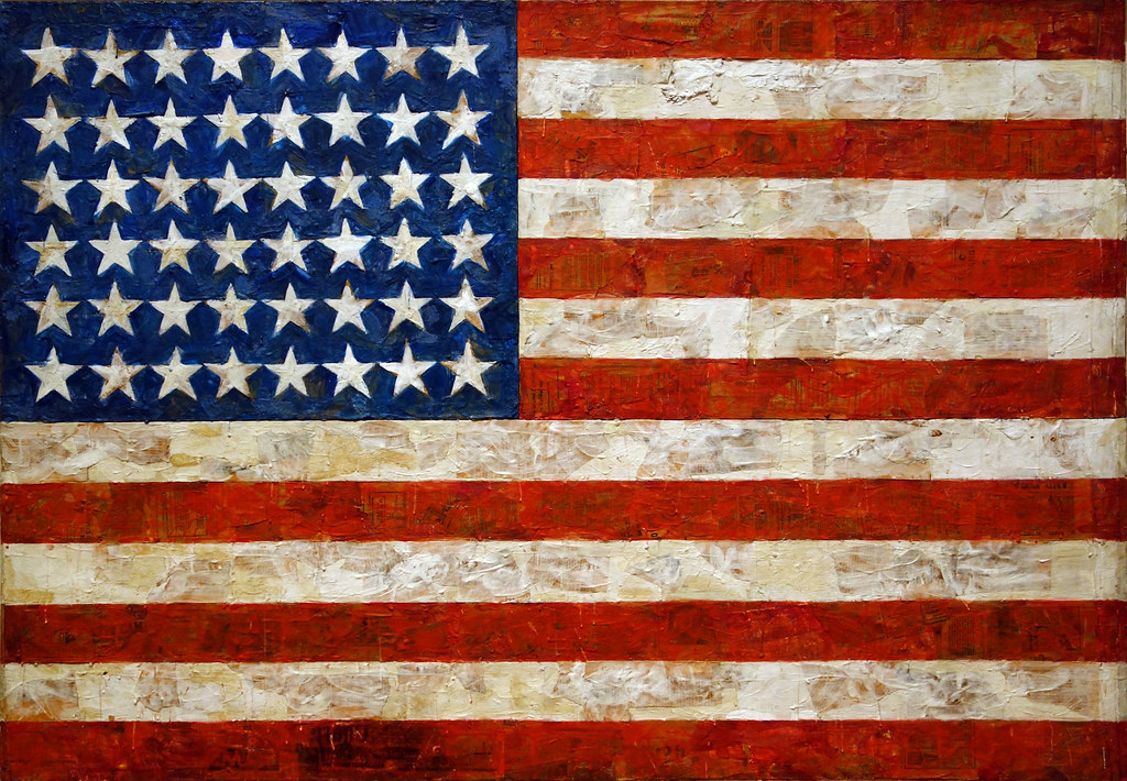
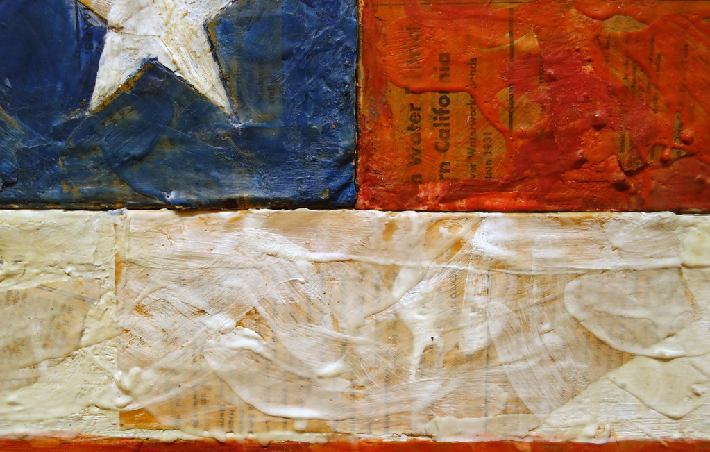
In the close-up (6.6.16), the thick encaustic rough surface is visible, the type on the newsprint sometimes perceptible through the paint drips and brushstrokes. All of the white stars are slightly different in shape on top of the dark blue background. Wavy red and white stripes, made from a mixture of pigment mixed with melted wax, gave the appearance of wind blowing. Johns created over forty paintings based on the theme of America's flags.
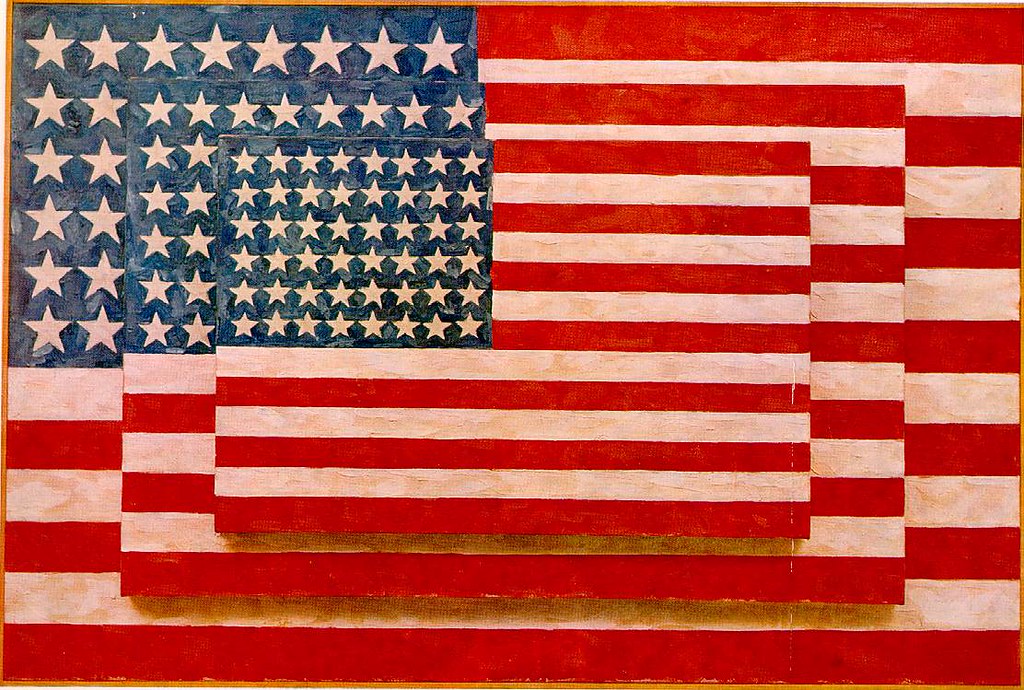
In the painting of Three Flags (6.6.17), Johns used his encaustic process of mixing pigment and melted beeswax together. Each flag reduced about twenty-five percent in scale as he stacked canvas flags, the largest one receding into the background. The congealed wax drippings gave the painting a dimensional sculptural appearance. The stripes grow smaller as the viewer's eye is forced to believe the flag is seemingly stacked boxes. The blue field and stars also grow smaller, adding to the illusion of three separate elements. The illusion allowed Johns to go beyond the representational image of a flag, offering the appearance of dissimilar canvas spaces.
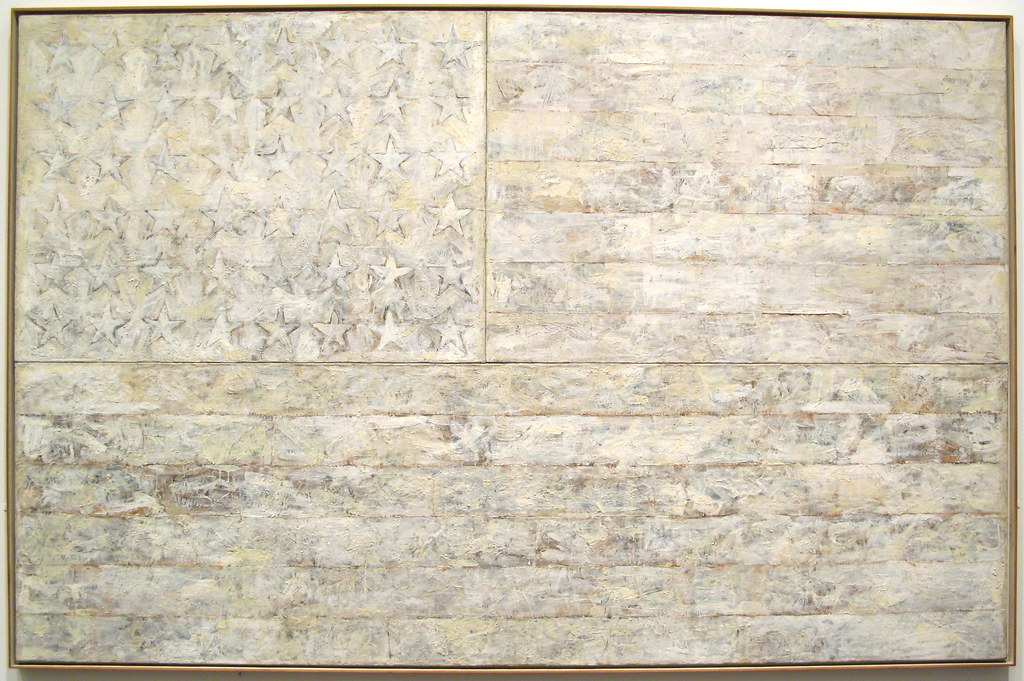
The White Flag (6.6.18) was another one of Johns flag series. He did not use the traditional red, white, and blue; instead, he created a ghostlike image of an old, faded, even bleached flag. He used the usual encaustic mixture of different light pigments mixed with wax and applied deep dripping brush strokes, defining the symbolic view of the stars and stripes. Even without color, this otherworldly-looking flag still presents an image of America.
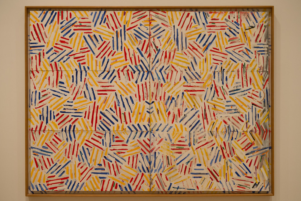
In the 1970s, Johns moved to a new theme based on crosshatched markings usually found in graphics. The crosshatching still displayed the characteristics he favored; repetitiveness, an almost obsessive feeling with little meaning. In Corpse and Mirror II (6.6.19), Johns repeated the concepts with different primary colors giving depth and movement to the image while maintaining the illusion of flatness and neutrality. The lines were gradated, closer lines made deeper shadows, and scanter lines brought light shadows. The pattern was orderly, yet not particularly geometric or displaying any meaning. He created a series of crosshatched paintings, each with small lines running in diverse directions.
Evelyne Axell
Evelyne Axell (1935-1972) was born in Belgium, her father was a silversmith and jeweler. Even as a small child Axell was defined as the local province's most beautiful baby. During World War II, her home was destroyed by bombs. However, she finished high school and studied pottery at a local art school before switching to drama school and becoming an actress. She married a film director, had a son, and worked as a television announcer. In 1964, she grew tired of acting and worked with René Magritte, learning to enhance her abilities in painting. As she was honing her skills, her husband filmed documentaries about Pop Art, an inspiration to Axell, who developed her pop style. She became one of Belgium's first pop artists, although still not accepted by galleries, and Axell began to use only her last name to overcome the perceptions of sexual discrimination. Her work was influenced by the political events of the 1960s, particularly women's liberation. Axell became known for her erotic works of nude females and multiple self-portraits.
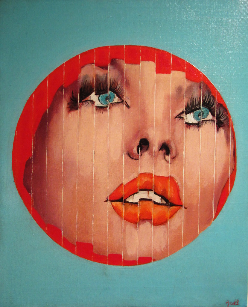
She frequently used partial body parts, as demonstrated in Portrait Fragment (6.6.20). In this painting, she portrays her face, slightly shattered into linear waves. The bright red circle around the face and her red lips contrast against the blue-green background. Her blue eyes are surrounded by white and black, forcing the viewer's focus on her eyes. In this painting, she used traditional oil paint. During this period, she also switched from canvas to plastic sheets and Plexiglas, sometimes applying auto enamel. She explored multiple mediums, including synthetic resin to form body fragments or layered painted plastic sheets. Sadly, her life was ended early in a car accident in Belgium.
Corita Kent
Corita Kent (1918-1986) was born in Iowa as Frances Elizabeth Kent. In 1936, be became a nun in the Sisters of the Immaculate Heart of Mary and changed her name to Sister Mary Corita. She completed her degree in art, a bachelor's degree from Immaculate Heart College, and a master's at the University of Southern California in 1951. She lived and worked as a num for thirty years, teaching art at Immaculate Heart College and known for her avant-garde teaching methods, attracting many prominent artists to her classes. During the 1960s, her work became more secular, supporting more humanitarian problems and protesting the Vietnam War. Her work was considered blasphemous by the Catholic church leaders, and she left her life as a nun to continue working for women's and civil rights and anti-war protests. She used silkscreen as her medium; her work at the time was not respected or treated as serious art. During the 1950s, most religious art demonstrated piety with white or blue flowing robes based on a pastel palette. Kent's art was primitive and abstracted, although dark at first. By the late 1950s, she began to illustrate text from popular writings. In the 1960s, she was widely exhibited, and her art was included in multiple magazines and newspapers; however, she still was not included in art history textbooks.
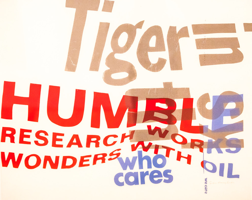
In the late 1960s, some of her work became more political and social and similar to Warhol. Kent used themes from pop culture for her inspiration, a mix of spiritual themes and American consumerism. She was a social activist and worked with current issues of poverty or racism, or war. Kent took any type of signs, tore out pieces, crumpled images, and photographed them to use as the basis for her silkscreens, all depicted by bold graphics and emotional texts. To construct the layouts for the printmaker, she layered the pieces of lettering or image using multiple sheets of paper. Based on the rise of commercial consumerism, "…she used words like 'tomato,' 'burger,' and 'goodness' and made them into messages about how we live, and about humanitarianism and how we care for others."[6] The colorful words on her silkscreens appeared simple while carrying a complex social meaning. We Care (6.6.21) and Enriched Bread (6.6.22) were made from assembled words printed on nonwoven synthetic fabric. Kent frequently used a specific word highlighted in red to convey part of the message; HUMBLE in the first image and WONDER in the other image, layering different messages to support her pursuit of social justice.
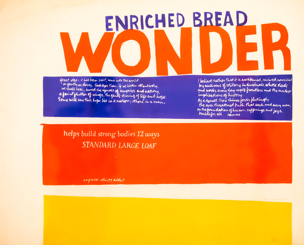
Kent also used words by different prominent authors and civil rights leaders. Enriched Bread contained the words of the French philosopher Albert Camus in his Flutter of Wings-Hope. Kent applied the words in script format with white on a highly contrasting royal blue.
Great ideas, it has been said, come into the world
as gently as doves. Perhaps then, is we listen attentively,
we shall hear, amid the uproar of empires and nations,
a faint flutter of wings, the gentle stirring of life and hope.
Some will say this hope lies in a nation; others, in a man.
I believe rather that it is awakened, revived, nourished
by millions of solitary individuals whose deeds
and works every day negate frontiers and the crudest
implications of history.
As a result, there shines forth fleetingly
the ever-threatened truth that each and every man,
on the foundation of his own sufferings and joys,
builds for all.
James Rosenquist
James Rosenquist (1933-2017) was born in North Dakota and raised in Minnesota, where he studied art at the University of Minnesota. His mother recognized his artistic talents when he was young and always encouraged him to study art. When he went to New York City, he studied for a while at the Art Students League. However, he was interested in painting murals and even joined the union of painters who created billboards. Rosenquist was successful in the endeavor until a friend died from a fall off the scaffolding, and he decided to develop his style of art. The graphic images he painted on billboards became the style he used as part of the Pop Art movement. Rosenquist wrote, "I painted billboards above every candy store in Brooklyn. I got so I could paint a Schenley whiskey bottle in my sleep."[7] Although Rosenquist was considered a leader in the Pop Art movement, he did not work with Andy Warhol or Roy Lichtenstein, only meeting them later in the 1960s. Rosenquist developed his images based on mass media, famous icons, or ordinary objects by dividing an image into parts and recombining them in a fragmented composition, a more mysterious concept than the other artists. He also focused on lines and shapes when combining segments of images, emphasizing his mastery of color. Because of his background in billboard painting, some of his works are colossal, covering an entire room. Rosenquist was excited by the different dimensions of painting versus advertising and wanted to use fragments of highly contrasted images sometimes opposed to each other. He liked to juxtapose people and objects along with symbols and text.
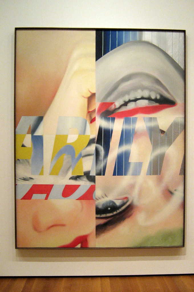
Rosenquist painted the movie icon Marilyn Monroe I (6.6.23) shortly after she committed suicide from a set of fragmented images. He positioned Monroe upside down, breaking apart her eyes, lips, and hands, reassembling the parts, and overlaid them with letters found in her name. He also included the 'Coca-Cola' trademark, representing popular cultural branding as Monroe was sexualized and sensationalized to become part of the mass media. Andy Warhol had made an image of Monroe as a sex symbol while Rosenquist created an image where she was hard to recognize, yet he still maintained her coquettishness as he randomly assembled the pieces. Rosenquist placed the red color in opposition to the two sides. Her blue eyes were enhanced by the blue lettering, while each of the different parts of Monroe was different colors.
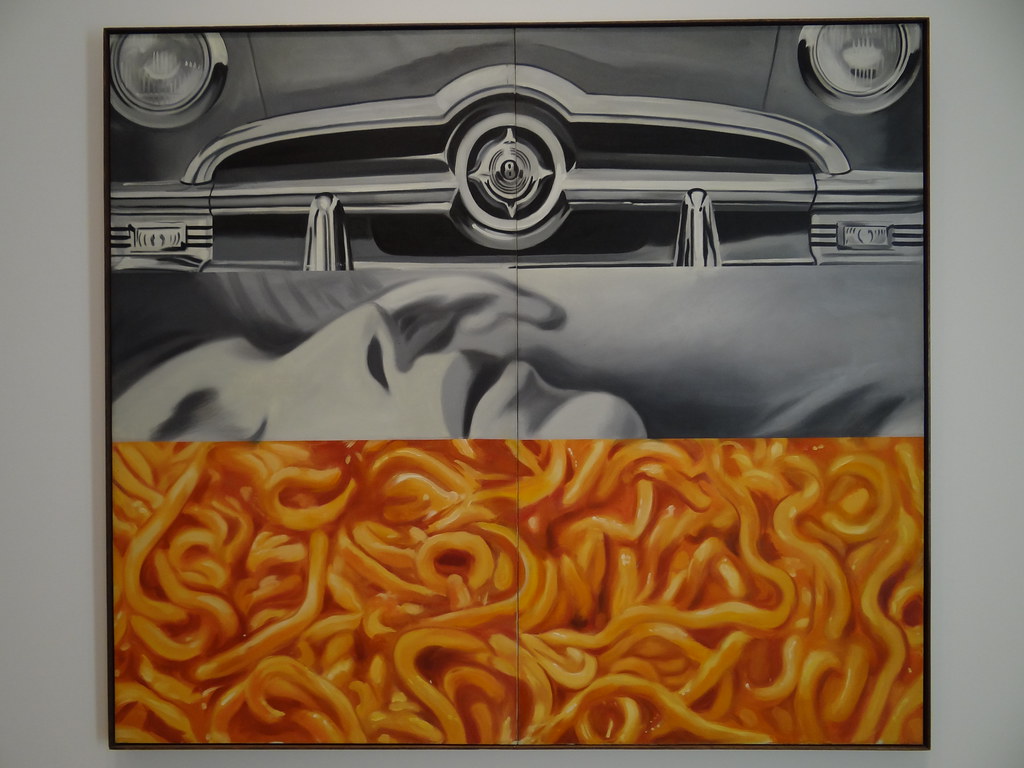
I Love You with My Ford (6.6.24) depicts the shiny chrome of a Ford muscle car, one of the important cultural status symbols of the 60s, a machismo icon. The second panel portrays a woman's face, an ear of her lover positioned near her mouth as he engages her, her eyes closed, lips partly open. Rosenquist adds pasta in tomato sauce in the bottom section, seemingly wriggling as the woman above might be with her passion. The squirming lines of the pasta oppose the unmoving lines of the car. The painting has three distinct layers or images, while he only used two major color palettes.
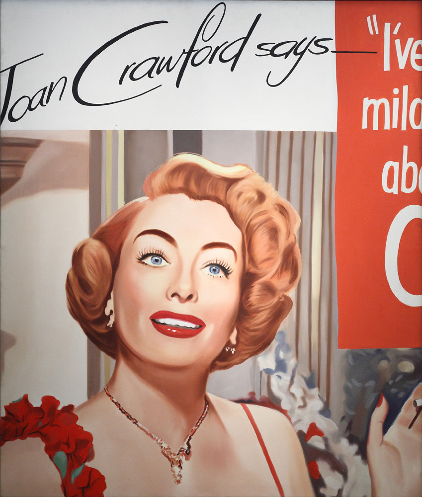
Untitled (Joan Crawford Says…) (6.6.25) portrays Joan Crawford appearing as the pretty girl in an advertisement. She is advertising cigarettes, although the cigarette is barely visible in her hand. Her face is flattened, similar to Andy Warhol's image of Marilyn Monroe; much of her face appears with a plastic smoothness, almost bland and unemotional. Rosenquist used a limited palette, mainly contrasting reds and grays.
"The Pop artists did images that anybody walking down Broadway could recognize in a split second—comics, picnic tables, men's trousers, celebrities, shower curtains, refrigerators, Coke bottles—all the great modern things that the Abstract Expressionists tried so hard not to notice at all."[8] Pop artists blurred the line between accepted art and familiar cultural images. While Abstract Expressionists searched for suffering in the soul, the Pop artists found the interconnections of life in their environment. Even today, Pop art immerses us in television, video, advertising, and other commercial enterprises. The availability of art in print or online makes art a common cultural commodity. The Pop artists opened the door that now envelopes our world.
[1] Retrieved from https://www.warhol.org/andy-warhols-life/ (16 July 2021)
[2] Lanchner, C. (2009). Roy Lichtenstein (MOMA Artist Series), The Museum of Modern Art, p. 5.
[3] Retrieved from https://www.lacma.org/art/exhibition/monetlichtenstein-rouen-cathedrals
[4] Retrieved fom https://www.theguardian.com/artanddesign/2015/may/09/david-hockney-interview-cheeky-serious
[5] Retrieved from https://www.moma.org/collection/works/78805
[6] Retrieved from https://www.theguardian.com/artanddesign/2018/apr/22/corita-kent-the-pop-art-nun
[7] https://www.theguardian.com/artanddesign/2017/apr/01/james-rosenquist-pop-artist-f-111-dies-83
[8] Carrier, D. (2008). Proust/Warhol: Analytical Philosophy of Art, Peter Lang Inc., International Academic Publishers, p. 47.