10.13: Postwar European art
- Page ID
- 67560
\( \newcommand{\vecs}[1]{\overset { \scriptstyle \rightharpoonup} {\mathbf{#1}} } \)
\( \newcommand{\vecd}[1]{\overset{-\!-\!\rightharpoonup}{\vphantom{a}\smash {#1}}} \)
\( \newcommand{\dsum}{\displaystyle\sum\limits} \)
\( \newcommand{\dint}{\displaystyle\int\limits} \)
\( \newcommand{\dlim}{\displaystyle\lim\limits} \)
\( \newcommand{\id}{\mathrm{id}}\) \( \newcommand{\Span}{\mathrm{span}}\)
( \newcommand{\kernel}{\mathrm{null}\,}\) \( \newcommand{\range}{\mathrm{range}\,}\)
\( \newcommand{\RealPart}{\mathrm{Re}}\) \( \newcommand{\ImaginaryPart}{\mathrm{Im}}\)
\( \newcommand{\Argument}{\mathrm{Arg}}\) \( \newcommand{\norm}[1]{\| #1 \|}\)
\( \newcommand{\inner}[2]{\langle #1, #2 \rangle}\)
\( \newcommand{\Span}{\mathrm{span}}\)
\( \newcommand{\id}{\mathrm{id}}\)
\( \newcommand{\Span}{\mathrm{span}}\)
\( \newcommand{\kernel}{\mathrm{null}\,}\)
\( \newcommand{\range}{\mathrm{range}\,}\)
\( \newcommand{\RealPart}{\mathrm{Re}}\)
\( \newcommand{\ImaginaryPart}{\mathrm{Im}}\)
\( \newcommand{\Argument}{\mathrm{Arg}}\)
\( \newcommand{\norm}[1]{\| #1 \|}\)
\( \newcommand{\inner}[2]{\langle #1, #2 \rangle}\)
\( \newcommand{\Span}{\mathrm{span}}\) \( \newcommand{\AA}{\unicode[.8,0]{x212B}}\)
\( \newcommand{\vectorA}[1]{\vec{#1}} % arrow\)
\( \newcommand{\vectorAt}[1]{\vec{\text{#1}}} % arrow\)
\( \newcommand{\vectorB}[1]{\overset { \scriptstyle \rightharpoonup} {\mathbf{#1}} } \)
\( \newcommand{\vectorC}[1]{\textbf{#1}} \)
\( \newcommand{\vectorD}[1]{\overrightarrow{#1}} \)
\( \newcommand{\vectorDt}[1]{\overrightarrow{\text{#1}}} \)
\( \newcommand{\vectE}[1]{\overset{-\!-\!\rightharpoonup}{\vphantom{a}\smash{\mathbf {#1}}}} \)
\( \newcommand{\vecs}[1]{\overset { \scriptstyle \rightharpoonup} {\mathbf{#1}} } \)
\(\newcommand{\longvect}{\overrightarrow}\)
\( \newcommand{\vecd}[1]{\overset{-\!-\!\rightharpoonup}{\vphantom{a}\smash {#1}}} \)
\(\newcommand{\avec}{\mathbf a}\) \(\newcommand{\bvec}{\mathbf b}\) \(\newcommand{\cvec}{\mathbf c}\) \(\newcommand{\dvec}{\mathbf d}\) \(\newcommand{\dtil}{\widetilde{\mathbf d}}\) \(\newcommand{\evec}{\mathbf e}\) \(\newcommand{\fvec}{\mathbf f}\) \(\newcommand{\nvec}{\mathbf n}\) \(\newcommand{\pvec}{\mathbf p}\) \(\newcommand{\qvec}{\mathbf q}\) \(\newcommand{\svec}{\mathbf s}\) \(\newcommand{\tvec}{\mathbf t}\) \(\newcommand{\uvec}{\mathbf u}\) \(\newcommand{\vvec}{\mathbf v}\) \(\newcommand{\wvec}{\mathbf w}\) \(\newcommand{\xvec}{\mathbf x}\) \(\newcommand{\yvec}{\mathbf y}\) \(\newcommand{\zvec}{\mathbf z}\) \(\newcommand{\rvec}{\mathbf r}\) \(\newcommand{\mvec}{\mathbf m}\) \(\newcommand{\zerovec}{\mathbf 0}\) \(\newcommand{\onevec}{\mathbf 1}\) \(\newcommand{\real}{\mathbb R}\) \(\newcommand{\twovec}[2]{\left[\begin{array}{r}#1 \\ #2 \end{array}\right]}\) \(\newcommand{\ctwovec}[2]{\left[\begin{array}{c}#1 \\ #2 \end{array}\right]}\) \(\newcommand{\threevec}[3]{\left[\begin{array}{r}#1 \\ #2 \\ #3 \end{array}\right]}\) \(\newcommand{\cthreevec}[3]{\left[\begin{array}{c}#1 \\ #2 \\ #3 \end{array}\right]}\) \(\newcommand{\fourvec}[4]{\left[\begin{array}{r}#1 \\ #2 \\ #3 \\ #4 \end{array}\right]}\) \(\newcommand{\cfourvec}[4]{\left[\begin{array}{c}#1 \\ #2 \\ #3 \\ #4 \end{array}\right]}\) \(\newcommand{\fivevec}[5]{\left[\begin{array}{r}#1 \\ #2 \\ #3 \\ #4 \\ #5 \\ \end{array}\right]}\) \(\newcommand{\cfivevec}[5]{\left[\begin{array}{c}#1 \\ #2 \\ #3 \\ #4 \\ #5 \\ \end{array}\right]}\) \(\newcommand{\mattwo}[4]{\left[\begin{array}{rr}#1 \amp #2 \\ #3 \amp #4 \\ \end{array}\right]}\) \(\newcommand{\laspan}[1]{\text{Span}\{#1\}}\) \(\newcommand{\bcal}{\cal B}\) \(\newcommand{\ccal}{\cal C}\) \(\newcommand{\scal}{\cal S}\) \(\newcommand{\wcal}{\cal W}\) \(\newcommand{\ecal}{\cal E}\) \(\newcommand{\coords}[2]{\left\{#1\right\}_{#2}}\) \(\newcommand{\gray}[1]{\color{gray}{#1}}\) \(\newcommand{\lgray}[1]{\color{lightgray}{#1}}\) \(\newcommand{\rank}{\operatorname{rank}}\) \(\newcommand{\row}{\text{Row}}\) \(\newcommand{\col}{\text{Col}}\) \(\renewcommand{\row}{\text{Row}}\) \(\newcommand{\nul}{\text{Nul}}\) \(\newcommand{\var}{\text{Var}}\) \(\newcommand{\corr}{\text{corr}}\) \(\newcommand{\len}[1]{\left|#1\right|}\) \(\newcommand{\bbar}{\overline{\bvec}}\) \(\newcommand{\bhat}{\widehat{\bvec}}\) \(\newcommand{\bperp}{\bvec^\perp}\) \(\newcommand{\xhat}{\widehat{\xvec}}\) \(\newcommand{\vhat}{\widehat{\vvec}}\) \(\newcommand{\uhat}{\widehat{\uvec}}\) \(\newcommand{\what}{\widehat{\wvec}}\) \(\newcommand{\Sighat}{\widehat{\Sigma}}\) \(\newcommand{\lt}{<}\) \(\newcommand{\gt}{>}\) \(\newcommand{\amp}{&}\) \(\definecolor{fillinmathshade}{gray}{0.9}\)Postwar European art
European artists responded to the devastation of World War II with new subjects and methods.
1945 - 1980
France
Jean Dubuffet
Dubuffet, A View of Paris: The Life of Pleasure
by DR. STEPHANIE CHADWICK
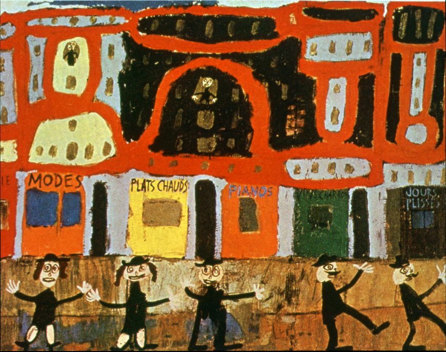
Perhaps the first response to Dubuffet’s A View of Paris: The Life of Pleasure is the sense that it could have been painted by a child. In fact, Dubuffet looked to children’s art as a model of unbridled creativity and he emulated it in his work, marking his canvases with scribbles, smears, and crudely rendered figures. Dubuffet was not the first European artist to mimic children’s art. Many artists in the earlier decades of the twentieth century had turned to children’s drawings for inspiration—and to breathe fresh life into European painting. The efforts of these early twentieth-century painters to infuse their art with the seemingly innocent expression of children’s drawing were so successful that they created an artistic revolution. Overturning the rigorous craftsmanship dictated by academic convention in favor of free and expressive rendering became an important step for modern artists. As many painters turned their backs on their formal artistic training, their work demonstrated both an urge to rebel against convention and a desire to tap into what was seen as the unfettered, even primal creativity of childhood.
Irony and discontent
Dubuffet’s style was seen as a particularly aggressive expression of his discontent with Western culture. The Second World War was just ending in France as he painted this canvas and everywhere he was surrounded by its destruction and its implications. One would hardly guess this extreme historical context, given the childlike qualities of the rendering and Dubuffet’s title, which presents Parisian life as a “life of pleasure.” The irony becomes apparent by looking closer at the painting.
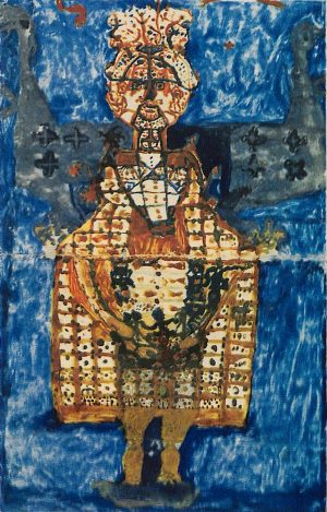
Vacillating between joyful and jarring, Dubuffet’s bright reds appear garish in the context of war-torn Paris, which had suffered many hardships while occupied by German forces. Similarly, Dubuffet’s painting style, characterized by roughly handled paint and crude, thick marks, leans more toward unrestrained forcefulness than the presumed innocence of children’s art. Another important source for Dubuffet was art produced by societal outsiders, including those with psychiatric disorders. Dubuffet had begun researching and collecting such art, which he called Art Brut (roughly translated as raw art) at the end of World War II. His interest had begun as early as the 1920s, when he and other modern artists became fascinated with the book, Artistry of the Mentally Ill by the German psychiatrist and art historian Hans Prinzhorn (above, left). Just as they had looked to children for imaginative forms, these artists emulated what they took as the crude, forceful expressiveness of the mentally ill. In this art, they saw creativity untamed by Western cultural traditions. Dubuffet became so fascinated with this art that he started a collection that is now in a museum in Lausanne, Switzerland. Although Dubuffet claimed that he did not directly copy the art produced by the mentally ill, or the art of children, their impact on this painting is undeniable.
Fashions
Dubuffet’s painting, A View of Paris: The Life of Pleasure, is a great example of his efforts to change the way people view and think about art. On the one hand, the painting makes use of multiple perspectives to create a forceful visual impact. Parisian storefronts shift between a frontal elevation seen from street level and a plan, or bird’s eye view, seen from above. Dubuffet used this dislocating strategy in many of his paintings of the mid-1940s.
Dubuffet was a wine wholesaler who sold his own version of pleasure—wine—before becoming a full time artist during the war. He was concerned that art and culture had been overtaken by market forces. Dubuffet also had a contentious relationship high culture and used playful double entendres in his art to parody these forces. One example in this painting is the sign at left that reads “Modes,” the French word for fashion. At first glance this sign simply advertises a clothing store, but “modes” also translates as “ways” as in the ways that something is done. Dubuffet was interested, not in the ways the market drove artistic fashions, but with doing away with the idea of artistic styles and trends altogether. Instead, Dubuffet sought to create art that spoke to the viewer’s memories of childhood adventure and discovery. He wanted art to be freed from rules and other forces that he believed stifled creative expression.
Dubuffet’s painting is both a parody of high culture and also a celebration of the energy of the city and its inhabitants. The people on the street recall stick figures drawn by children, nevertheless they suggest action. The three at the bottom left address the viewer directly with outstretched arms, and the two at right march stiffly off the side of the canvas, as if leading a carnivalesque parade. Carnivals, circuses, and parades also intrigued Dubuffet, and he saw them as sites where childlike playfulness, cultural transgression, and creativity collide. This was the collision he hoped to convey in this painting, and with which he hoped to inspire the viewer.
Additional Resources
Jean Dubuffet, Asphyxiating Culture and other Writings, trans. Carol Volk (New York: Four Walls, 1986).
Mildred Glimcher, Jean Dubuffet: Towards an Alternative Reality (New York: Pace Publications, 1987).
Michael Hall, D. E. W. Metcalf, and Roger Cardinal, The Artist Outsider: Creativity and the Boundaries of Culture (Washington: Smithsonian Institution Press, 1994).
Hans Prinzhorn, Bildnerei der Geisteskranken: ein Beitrag zur Psychologie und Psychopathologie der Gestaltung (Berlin, 1922)
Jean Dubuffet, Childbirth
by DR. STEPHANIE CHADWICK
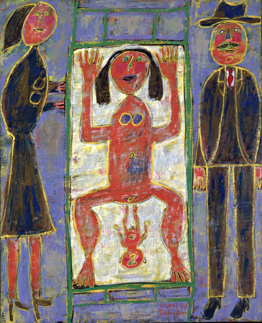
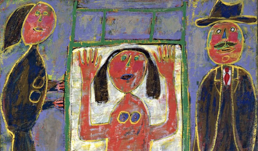
Jean Dubuffet’s Childbirth is a particularly striking work of art, but not because it’s aesthetically pleasing. In fact, Dubuffet intended quite the opposite. He wanted his art to disturb his viewers. Perhaps, the most jarring aspect of this painting is the central image of a mother giving birth. The figure has been flattened and tilted forward toward the picture plane (the surface of the canvas). Her hands are raised, as if gesturing “STOP!” or as if signaling shock or fear. Also arresting are the figure’s rounded eyes, which open wide to gaze confrontationally toward the viewer, or alternately, off into space, suggesting an image of trauma. Dubuffet used these compositional strategies, combined with rough looking brushwork, pronounced outlines, and both murky and vivid colors to achieve this unnerving impact. He wanted his painting to be so agitating that it would change the way people look at art, the way people feel about art, and even the ways we define what art is. Dubuffet believed art was a liberating encounter that had been suppressed by museums, commercial art galleries, and other cultural institutions.
Art Brut
Dissatisfied with artistic practices that had persisted since the Italian Renaissance, many painters in the early twentieth century sought to invigorate their art with pictorial forms that challenged the European tradition. When Dubuffet began painting professionally during WWII, he turned for inspiration to radically alternative imagery, including children’s drawings, the art of the mentally ill, and other marginalized artists. He coined the term Art Brut (raw art) to describe the raw, untrained qualities he wanted to emulate in his painting. Like other artists of this period, Dubuffet also drew on various types of non-Western art for inspiration.
The desire to infuse art with primal creativity led artists like Dubuffet to erroneously conflate the art of children, mental patients, and non-Western cultures. They lumped together the pictorial forms these sources inspired and called them “primitivist” Primitivism became a loosely defined style, characterized by the visual contrast to established artistic conventions; and works such as Dubuffet’s were either celebrated by fans or derided by hostile critics for their apparent crudeness. Although people today acknowledge primitivism’s Eurocentricism (primitivism critiques Western culture while nevertheless privileging it), it is important to note that for these artists, “primitive” meant art that is essentially free from, and subversive to, Western cultural traditions. For Dubuffet, this was what art should really be about—a primal creative act.
Primal creation
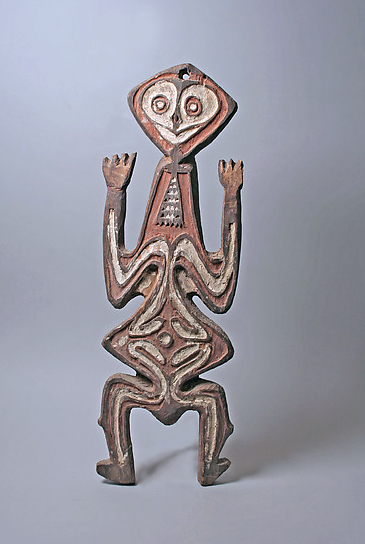
The painting Childbirth is filled with references to non-Western art, particularly the art of the Pacific Islands. French Surrealist artists with whom Dubuffet associated, believed such art was an expression of primal creativity. For example, the central figure with raised arms is a motif seen in art from Papua New Guinea (above) that can sometimes refer to fertility and kinship. Dubuffet’s used the image both for its subject, which may have signaled the primal creative act of childbirth for the artist, but also for its formal qualities, particularly the linear design and flattened forms. By emphasizing the flat canvas surface, Dubuffet reminds the viewer that the painting is a representation of reality, in contrast to Renaissance painters who relied on the illusionism of linear perspective (an artistic device used to create the illusion of depth in a painting) to create idealized scenes as though seen through a window.
Dubuffet plays with the notion of framing in his composition. The flattened figures of the mother and child have been tipped up so that the white rectangle of the hospital gurney presses forward rather than receding back into space, with its legs shown parallel to the floor. This is one of the ways Dubuffet subverts Renaissance perspective by calling attention to the canvas surface. Bluish colored rectangles surround the white rectangle of the gurney, creating planes occupied by the figures on the left and right that frame the child’s birth.
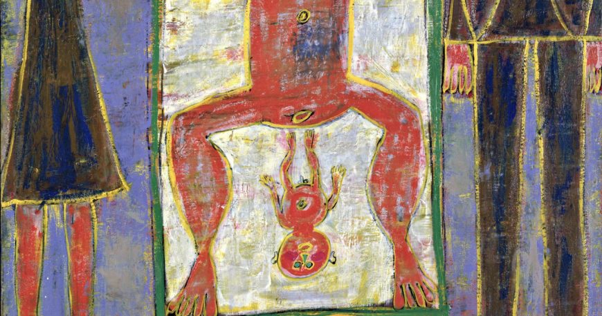
In Dubuffet’s painting, these outside figures could represent a mother and father (perhaps the woman’s parents) or perhaps the father of the child and another female participant, such as a sister or midwife. These figures are also crudely rendered, and may symbolize parenthood in general. A key difference is that these visitors wear Western garb whereas both mother and child are nude, a more natural state that that represents the act of childbirth.
Additional Resources
Jean Dubuffet, “Anticultural Positions,” in Dubuffet and the Anticulture (New York: R. L. Feigen & Co, 1969).
Mildred Glimcher, Jean Dubuffet: Towards an Alternative Reality (New York: Pace Publications, 1987).
Suzanne Greub, Art of Northwest New Guinea: From Geelvink Bay, Humboldt Bay, and Lake Sentani (New York: Rizzoli, 1992).
Michael Hall, D. E. W. Metcalf, and Roger Cardinal, The Artist Outsider: Creativity and the Boundaries of Culture (Washington: Smithsonian Institution Press, 1994).
Switzerland
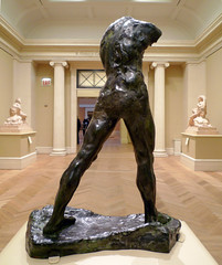
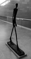
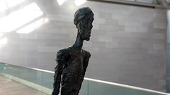
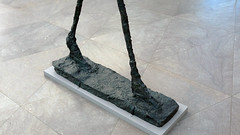
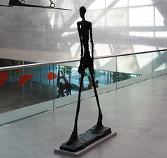
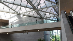
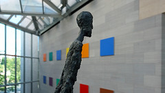
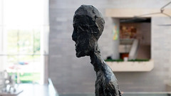
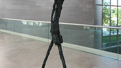
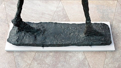
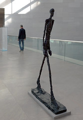
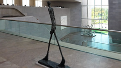
Alberto Giacometti, Walking Man II
by DR. BETH HARRIS and DR. STEVEN ZUCKER
Video \(\PageIndex{2}\): Alberto Giacometti, Walking Man II, 1960, bronze, 188.5 × 27.9 × 110.7 cm (National Gallery of Art, Washington)
Smarthistory images for teaching and learning:

Germany
Can there be art after Auschwitz? German artists contended with this difficult question in various ways.
1945 - 1980
Joseph Beuys
Smarthistory images for teaching and learning:
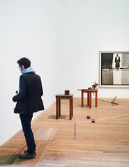
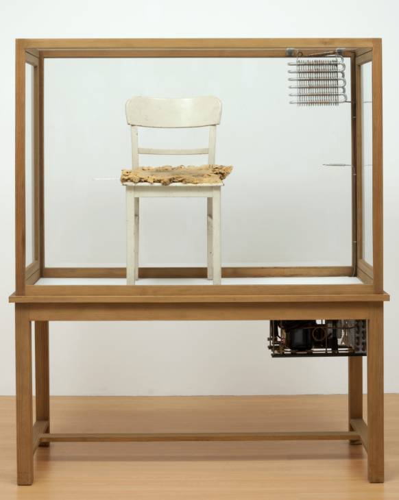
Joseph Beuys, Fat Chair
The artist as “shaman”
The first encounter with a work by Joseph Beuys is often surprising. Look, for example, at Fat Chair. It is composed of an old, rather ordinary chair with fat placed on the seat. Keep in mind all of the features that fat possesses as a material, and it is clear that a lot of fat and an old chair are not meant to produce feelings of aesthetic pleasure. Other materials that Beuys uses in his work: wax, filth, animal hair, and blood, possess similar qualities. Each is a natural material but none are very pleasant in their appearance, structure or smell. Why should artwork be like that? Shouldn’t art be “fine” or “beautiful” in some sense?
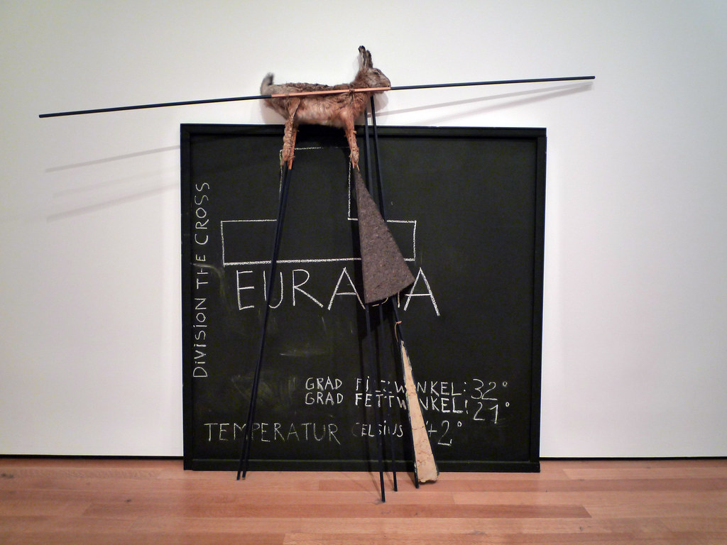
These works of art are part of Beuys’ broader artistic strategy, which can be called “shamanism.” Beuys often used natural materials and cult-like ceremonies through which he tried to underline the importance of the irrational and mystical in human beings. With this practice, Beuys tried to oppose the “rational” in contemporary society. He perceived his art as a social mission, needed to heal post-war German society. He wanted to heal, first of all, those who built Auschwitz—that terrible symbol of Nazi horror. This task required an even deeper reform–since in Beuys’ eyes, the real source of National Socialism was found in the extreme rationality of modern society.
For Beuys, extreme rationality, efficiency and technocracy, defined the modern era; and although seemingly good, he viewed these trends as extremely dangerous. The Holocaust was only possible because of Germany’s rationality, efficiency and functionality coupled with its specific ideological premises. Beuys sought to contrast the Holocaust’s rationality with the irrationality he believed could be found in so-called “primitive societies.” Irrationality, understood in this way, focused on concrete people, not on abstract or theoretical principles. Beuys suggested that only this could prevent human destruction. “Shamanism” was a part of this “primitive” practice of healing human beings physically, morally, and spiritually.
This shamanistic use of natural materials is meant to underscore man’s relation to nature and to a concrete human community in which the practice of healing takes place. These practices do not have an aesthetic purpose and the materials used by Beuys do not pretend to be anything other than what they are—unpleasant, rough natural materials. They are real and do not mislead and this truthfulness yields a kind of beauty.
Additional resources:
Walker Art Center biography of the artist
Walker Art Center article on the materials Beuys used and their meaning
Smarthistory images for teaching and learning:
Joseph Beuys, Feet Washing and Conceptual Performance
“Every man is an artist”
What can art be? Can a lecture or a public discussion be art? The 20th century has taught us that almost everything can be used as art. The photographs that record the teaching and discussion practices of Joseph Beuys force us to think about the borders of art.

We are also compelled to ask “what does it mean?” and even “why is it art at all?” Does it mean that everyone can be an artist? Can everything be art? According to Beuys, “everyone is an artist.” But to grasp the full meaning of this statement, one must look closely at the context of Beuys’ thought, which represents a general framework in which particular artwork appears.
For Beuys, there should be no clear demarcation between art and life. Human life means life in a community, with other people. Therefore, artistic activities (should) have a direct social impact. Beuys does not have in mind any kind of “applied arts” in service of a society, nor does he speak simply of “making society better.” He sees rather a metaphysical significance of human creative capacities and, consequently, art. Each human being has a creative potential in Beuys’ eyes. This potential is to be realized in communion with others. So the particular activities of individuals do matter but gain full meaning only if they lead to building a new society based on solidarity, creativity and freedom. In such a communion, man can reach his/her real identity, not only as a social atom, but as a person. This is the reason that Beuys perceives society as the greatest work of art, a “total work of art” (Gesamtkunstwerk).
This is what Beuys called the “social sculpture” (Soziale Plastik). This concept should not be understood in terms of aesthetics. “Social sculpture” does not mean that a society should adopt the aesthetic properties of, let’s say, sculpture, in order to become a total work of art. On the contrary, it is insistence on the very human capacity of freedom and creativity that should form the new society. In such a society, human beings will not just live “better” but will come to a broader exercising of their own humanity. In this sense, they will not only live a better life; they will also be able to be in a more fundamental sense. Here we see what the phrase “every man is an artist” (jeder Mensch ist ein Kuenstler) really means.
Beuys did not think that each human being should paint or produce particular things we call “art.” He rather sees creativity as a universal human capacity which enables man to be what he/she really is. Thus one’s existence becomes the same as artistic creation. The form of this creation is not of particular importance. This is the reason why Beuys can teach, give public lectures, or engage in political action and consider these activities “art.”
Another aspect of the idea of the “social sculpture” consists in Beuys’ critique of the modern society not only as an extremely rationalized but also as a highly individualized one. His understanding of the society as a “sculpture” is based on the concept of community in which people are tied by personal relations not by laws or any force.
Imitatio Christi
In his work Feet Washing (1971), Beuys is performing an action which reminds us of a famous story from the Gospel. It is the story when Christ washed the feet of his disciples showing his humility and demonstrating the principle “let the greatest among you become as the youngest, and the leader as one who serves.”

In this action, Beuys represents Christ himself, giving a lecture on modesty and service instead of dominance. The action also shows one of the principal Christian virtues—rejection of individuality and selfishness in order to make room for God in human souls. In this example, we can see the impact of Christianity on the formation of Beuys’ artistic concepts, not only as a symbol or illustration of Biblical stories but to which connect the artist’s work with his understanding of the Christian tradition. These relations touch on some of Beuys’s basic ideas on the world and art.
Beuys speaks of “the essence of Christ” (das Wesen des Christus) suggesting that every human being must be, potentially at least, “a kind of Christ.” Stressing creativity and freedom as fundamental values, Beuys sought a means to build a new society in which “every man is an artist.”
Additional resources:
This work at the Wichita Art Museum
Smarthistory images for teaching and learning:

Sigmar Polke
Sigmar Polke, Bunnies
by KATRINA KLAASMEYER

Multi-colored dots swirl throughout the picture plane. Smudges, blurs, irregularities—all are intentional. The artist, Sigmar Polke, delights in imperfections. Stand too close to the canvas and you are immersed within the erratic whirl of dots. Take a step back, and the imagery coheres into the loosest arrangement, merely suggesting specific forms and thereby hindering the usual intent of a picture of Playboy bunnies—clarity and the illusion of proximity. Blurring forms and subverting content is a trademark of this artist who is known for his experimental methods. The repetitive dots may bring to mind the comic book style of Pop artist Roy Lichtenstein, with his neatly arranged Ben-Day dot patterns, but this is not a bad imitation of American Pop Art. It is something else entirely.

Crucible of the Cold War
In the mid-1960s, Sigmar Polke was an art student in Düsseldorf, West Germany; however, he was born and lived in the Eastern Bloc until he was 12 (Polke’s birthplace, Silesia, is now part of Poland). The Cold War was then at its height, and Germany was a microcosm of the conflicts that then divided Europe. Likewise, the differences between the zones of this divided country were substantial. By 1970 West Germany had one of the world’s largest economies, and its citizens enjoyed increasing financial prosperity and a steady rise in the standard of living. Conversely, in East Germany, coffee, beer, and cigarettes remained luxuries, and the average household did not have modern appliances such as refrigerators and color televisions, items that had become common in the West.
Moving from the Communist East to the capitalist West had a profound effect on Polke. Yet importantly, he took a distanced view of the West’s glittering facade of consumer paradise.

The visual arts were different as well. West Germany looked to the radical art movements occurring in New York—Abstract Expressionism and later Pop Art. In contrast, East Germany, which was controlled by the Soviet Union, dictated that art should portray an idealized future, and should serve the people as a means of education and inspiration. This was the basis of East German Socialist Realist art.
Capitalist Realism
In the mid-1960s, Sigmar Polke applied the label “Capitalist Realism” to his work. This term was conceptualized with his fellow students Gerhard Richter, one of the most highly regarded contemporary artists, and Konrad Lueg, whose later career as a gallerist (under his proper name Konrad Fischer) influenced the course of art in Europe.
This term mocks East German Socialist Realism, critiques capitalism, and distinguishes the art made by these young Germans from American Pop Art. Capitalist Realism is characterized by ambiguity, the banality of its representations, and a dialogue between traditions in the fine arts and popular consumer culture. These artists were not mimicing Pop Art, but were searching for a way to express the complexities of the dual political and socioeconomic systems in Germany.
Polke’s early painting, Bunnies, is an example of the artist’s ability to simultaneously distance the viewer while immersing them within the imagery. The painting may have been based on an advertisement for membership into Hugh Hefner’s Playboy Clubs. The first of these clubs opened in 1960 and the original image would have functioned as more than just a photograph of beautiful women meant to evoke physical desire, it was also a tantalizing portrayal of a lifestyle that could be purchased. Polke dissolves these sex symbols into clusters of dots and smudges exposing the image’s seductive illusion. Polke frustrates the viewer’s desire by emphasizing the materiality of the image at the expense of the clarity and individuality of the women.
In the end, the label “Capitalist Realism” was simply a tool for Lueg, Polke, and Richter at the start of their careers. The artists abandoned it quickly, refusing to be limited by even this self-imposed term.

Rasterbilder
In his rasterbilder (paintings that overtly mimic printing) such as Bunnies, Polke often used photographs taken from the newspaper. In recognition of this inexpensive printing process, Polke’s color rasterbilder are composed entirely of four colors—cyan, magenta, yellow, and black—the standard process colors of commercial printing. Polke composed this work by overlapping layers of paint, which he applied through a stencil simulating halftone dots. It was important to Polke for the hand of the artist to be visible. In other words, Polke wanted to make it obvious that this was a painting produced by an artist, and not by mechanical reproduction despite the references he was making. He accomplished this in two ways.

First, he meticulously hand-painted dots of varying sizes and shapes; some are full and rounded, others are square and only partly formed. Distances between the dots lengthen and shorten with no regular pattern and varies in intensity. Next, he experimented with color gradations and intensity. Sometimes the dots are multi-colored with a white background. Sometimes the dots are white against a multi-colored background.

Roy Lichtenstein’s process was very different. The American artist would project a drawing onto a canvas and then stencil uniform dots using large, pre-cut metal screens. He also used heavy, dark lines to enclose this orderly system of dots. Lichtenstein’s paintings articulate the original image with crisp legibility and glamorize the mass media. In contrast, Polke plays games of concealment and revelation.
What then is the subject of the painting Bunnies? Is it the women, or the painted dots that refuse to define them? For Polke’s work, the question may be more important than the answer.
Sigmar Polke, Watchtower series
by KATRINA KLAASMEYER
In the early 1980s, Sigmar Polke returned to painting. The ever-evolving artist had spent the previous decade experimenting with photography, inspired perhaps by his extensive travels through Asia and Australia. His interest in photography centered on the chemical processes of the darkroom and their potential for unpredictable results. Like his earlier rasterbilder (works that exposed the raster-dot technique of printing, such as Bunnies), Polke continued to delight in exposing the artistic process. As he began to use unconventional materials and chemicals across various media, viewers could see the artwork literally developing and changing in front of their eyes. These experiments have earned him the designation of alchemist—the ancient practitioner of magic, altering substances at the most fundamental levels.
Alchemy in painting

We can see Polke’s play with alchemy in the series of five works centered on the watchtower theme completed from 1984-1988. Taken as a whole, the watchtower series consistently presents a tenuous balance between imagery that evokes both the ominous and the everyday.
In Watchtower (1984), we see the watchtower clearly with its distinctive white outline against the darker background fabrics. Gestural swirls of yellow paint add to the dreamlike haziness of the image. Two styles of textile have been used: on the left, a repetitive geometric pattern similar to a basketweave; on the right, large stylized flowers of yellow, red, and purple. These fabrics are nothing special—in fact, their very banality is what appealed to the artist. Rather than use the sanctified canvas of high art, Polke has instead chosen “bargain-bin” consumer textiles. Polke’s use of these textiles alludes to a subtle type of alchemy: the transformation of a simple material widely available into the foundation for the genius of artistic expression. Through his manipulation, the fabric previously worth only dollars upon the yard has now transmuted into an artwork worth millions.
Polke’s alchemical practices are most apparent in Watchtower II (1984-85, Carnegie Museum of Art) where he used silver oxide to create a ghost-like, hazy outline, resulting in a muted image. From certain angles, the watchtower is barely visible. We see another variant on this theme in Watchtower with Geese (1987-88, Art Institute of Chicago). Polke has prominently placed a gaggle of geese atop a fabric printed with beach umbrellas and sunglasses. In this context, the function of the watchtower becomes ambiguous. The fabric alludes to the beach, thereby suggesting this symbol could be a lifeguard tower, whereas the geese allude to hunting, providing yet another possibility for the tower—a hunter’s blind. Indeed, the original German title Hochsitz translates literally to “perch” (as in a high vantage point) and typically refers to the hunter’s blind, an elevated seat used in the German countryside as a lookout for hunting fowl. Ambiguity, banality, alchemical transformations—with these recurrent themes present in this series, Polke is consistent in his inconsistency.
Art after Auschwitz
Without question, the central symbol in this series evokes the horrific realities of concentration camps, the Nazi past, and government surveillance in a divided nation. As Germany struggled with reunification in the 1980s, the military watchtowers continued to stand, near the wall separating the communist East from the democratic West. For some Germans, these towers were part of everyday reality. By layering the watchtower symbol within the banal imagery of the preprinted textiles, Polke is symbolizing a layering of consciousness, disparate realities within a divided nation. Many artists have confronted these themes of postwar reality and the healing of wide-spread cultural trauma, most notably Joseph Beuys in his shamanistic workings with felt and fat, and Anselm Kiefer’s massive canvases exploring history and myth.
Polke addressed the issues of surveillance and slaughter in this watchtower series, as well as in his ominous painting Camp (1982, Museum of Fine Arts, Boston), where the viewer is placed within a black mist set between two inwardly curving fences of barbed wire against a dark yellow sky. In these paintings, Polke does not diminish or attempt to hide the horrific realities of these symbols, yet he enshrouds them in dark uncertainties. The ghost-like haziness and mysterious mist are unpredictable and unbounded, forcing a shifting of perspective. Polke does not wish to erase the past, but perhaps something so complex can only be approached through the magic of alchemy, with its transformative powers and limitless potential.
Additional Resources:
Watchtower at the Museum of Modern Art
Watchtower II at the Carnegie Museum of Art
Watchtower with Geese at the Art Institute Chicago
Polke on the the Metropolitan Museum of Art’s Heilbrunn Timeline of Art History
Gerhard Richter
Gerhard Richter, Uncle Rudi

“I can’t see it…is it me?” I watched a young woman step closer to the canvas titled, Uncle Rudi. She was now physically closer and she was looking hard, but the image kept its distance.
Refusing Style
Meaning in Gerhard Richter’s art can also keep its distance. The elusiveness of meaning is, in some ways, a central subject of Richter’s art. Since the early 1950s, Richter has painted a huge number of subjects in wildly conflicting styles. For most artists, one style emerges and evolves slowly, almost imperceptibly, over the course of their career. This is because artists often continue to work through problems that remain relevant and perhaps, because they achieve a degree of recognition and the market then demands that style. In other words, collectors often want what is known. Artists who abandon their signature style do so at some risk to future sales. Still, some artists do push in startlingly new directions. Willem de Kooning abandoned abstraction for the figure against the advice of his dealer, and Pablo Picasso famously pursued opposing styles simultaneously—think of his volumetric, even bloated Neoclassicism compared to the collages where he pressed flat every volume in sight.
The Impossibility of Meaning
During Richter’s long career, he has produced art in an unprecedented number of conflicting styles starting with the propagandistic Social Realist art he made as a student at the Dresden Art Academy in Communist East Germany. After his move in 1961 to Düsseldorf in the West (via Berlin—the wall was begun the same year), he co-founded a German variant of Pop art which he, somewhat jokingly, termed Capitalist Realism. Since then he has painted high-pitched realism (sometimes blurred just enough to soften the image, or sometimes wiped or scraped beyond all recognition) and produced representations of abstraction (as opposed to abstraction itself). He has explored many of the most pressing visual issues of our time, the relationship of photography to painting, memory and the image, art’s role in the representation of war and politics, and perhaps most importantly, the impossibility of fixed meaning.
Image and Ideology
Richter was born in Dresden, Germany on the eve of the Second World War. His two uncles were killed in the war and his father served, but survived. His schizophrenic aunt, Marianne, was murdered by the Nazis as part of their drive to euthanize the sick. Less than a week after his thirteenth birthday, Richter heard some 3,600 British and American planes drop more than half-a-million bombs on Dresden (he then lived just outside the city). 25,000 people were killed in these raids and the Soviets would quickly occupy Eastern Germany. Unlike the idealized, classicized nudes that Adolf Hitler had promulgated, the young Richter was taught Social Realism at the Dresden academy, a celebration of the heroism of communist workers. Once in the West, Richter found that the relationship between image and ideology reversed yet again. Here, images in advertising and popular culture celebrated material wealth and the culture of capitalism. Under the Nazis, under the Soviets, and in the West, Richter saw art used to express political ideology. His art, while deeply concerned with politics and morality, rejects the very possibility of answers, even of the idea that we can know.
Uncle Rudi
Uncle Rudi, the painting the woman had stepped closer to see, is painted in the grays of a black and white photograph. It is small and has the intimacy of a family snapshot. We see a young man smiling proudly and awkwardly. He is clearly self-conscious as he poses in his new uniform. One has the sense that a moment before he was talking to the person behind the camera, likely a friend or family member. Rudi would die fighting soon after the photograph that is the basis for this painting was taken. This is the artist’s uncle, the man his grandmother favored and the adult the young Richter was to model himself after. But nothing in this painting is clear. Not the relationship between the artist and his uncle, not the tension between Rudi’s innocent awkwardness and his participation in Nazi violence, not even in the relationship between the photograph and Richter’s painting. The artist has drawn a dry brush across the wet surface of the nearly finished painting, and by doing this, he obscures the clarity of the photograph, denying us the easy certainty we expect. Richter reminds us that Uncle Rudi, like all images, promise and then fail to bring us closer to the people, things or places represented.
Gerhard Richter, Betty
by SAL KHAN and DR. STEVEN ZUCKER
Video \(\PageIndex{4}\): Gerhard Richter, Betty, 1988, oil on canvas, 102 x 72cm (Saint Louis Art Museum)
Gerhard Richter, September
Video \(\PageIndex{5}\): Robert Storr talks about Gerhard Richter’s September, 2005, oil on canvas, 52 cm x 72 cm (Museum of Modern Art, New York)
Gerhard Richter, The Cage Paintings (1-6)
Video \(\PageIndex{6}\): Robert Storr talks about Gerhard Richter’s Cage paintings.
Anselm Kiefer, Shulamite

Black milk of morning we drink you at night
we drink you at noontime Death is a gang-boss aus Deutschland
we drink you at dusktime and dawntime
we drink and drink Death is a gang-boss aus Deutschland his eye is blue
he shoots you with leaden bullets his aim is true
there’s a man in this house your golden hair Margareta
he sets his dogs on our trail he gives us a grave in the sky
he cultivates snakes and he dreams Death is a gang-boss aus Deutschland
your golden hair Margareta
your ashen hair Shulamite
—the final lines of Paul Celan’s poem, “Death Fugue,” published 1947 (trans. Jerome Rothenberg)
Breaking postwar silence
Born in Germany just months shy of the end of World War II, Anselm Kiefer came of age in the late 1960s when the silence surrounding the crimes of the Nazi regime was ruptured by a vocal younger generation horrified by their collective German “past,” struggling to reconcile such shame and redefine what it meant to be German in a post-Nazi world.
For Kiefer, who had studied with the artists Peter Dreher in Karlsruhe and Joseph Beuys in Dusseldorf, painting became the arena to vocalize and elucidate his contempt for the Nazis and their reprehensible legacy, instilling every brush stroke with palpable rage, grief, and shame. In the 1970s, Kiefer developed a signature style that was influenced in part by the Neo-expressionist style of Georg Baselitz, but also by his teacher Beuys, particularly Beuys’s tendency to use commonplace materials, such as fat and felt within his artistic practice. Kiefer augmented his thick layers of impasto with lead, glass, straw, wood, dried flowers, and more, yielding highly textured, viscous surfaces. As his list of materials grew, so too did the scale of his canvases, which though large and formidable, felt ephemeral and fragile as a result of the materials he utilized.
A thick impasto
All of the canonical elements of Kiefer’s work are present in Shulamite—a thick impasto resulting from a hardened mixture of oil, acrylic, emulsion, and shellac; a brittle, textured surface infused with commonplace materials (in this case, straw and ash); mythological or biblical references (Shulamite refers to the heroine in the Song of Solomon); a literary reference (Celan’s “Death Fugue”); and a historical subject or location (a Nazi Memorial Hall in Berlin).

Kiefer’s hall is not a memorial to great men with patriotic flags waving boldly, but a gateway to damnation, a dark and foreboding road to hell, enclosed by low arches and paved with massive stones —the whole mise-en-scène (a stage set that tells a story) suggestive of an oven (immediately bringing to mind the hyperactivity of the crematoria at the Nazi death camps). Sulamith, is inscribed in the upper left hand corner, a graffiti-like testament in white paint upon the stone, to Celan’s brave young Jewish girl consumed by this living hell, who came to her death in a chamber such as this because she had not the golden hair of Aryan Margarete but the dark “ashen hair” of Shulamite. Kiefer transformed architecture meant to honor Nazi heros into a memorial for their victims.
Emotional honesty
Comparisons to Jackson Pollock in terms of both scale and expressive, gestural style are understandable, but for me Kiefer’s paint handling is even more reminiscent of Vincent van Gogh, in terms of raw beauty and emotional honesty. Just as van Gogh’s paint can transport me into the Dutch or French countryside and fill my nose with the smell of fresh sunflowers or irises, so too can Kiefer transport me to another place in time and space—but rather than a hayfield in Holland it is the dark abyss of a concentration camp with the stomach-churning smell of burning flesh sullying the air.
Special thanks to Sandy Heller, The Heller Group, LLC
Additional Resources:
Nicolas Wroe, “Life in Art: Anselm Kiefer,” essay in the Guardian Newspaper, March 18 2011
Britain
Francis Bacon and Lucian Freud returned to the academic tradition of figure painting—but with wholly different goals.
1945 - 1980
Sheltered by the sea, Barbara Hepworth’s Pelagos
by DR. BETH HARRIS and DR. STEVEN ZUCKER
Video \(\PageIndex{9}\): Dame Barbara Hepworth, Pelagos, 1946, elm and string on oak base, 43 x 46 x 38.5 cm (Tate Britain). Pelagos is the word for “sea” in Greek.
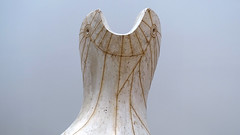
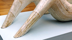
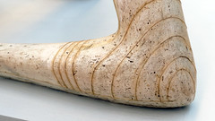
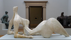
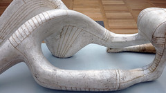
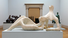
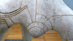
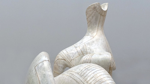
Describing what you see: Sculpture, Henry Moore’s Reclining Figure
by DR. BETH HARRIS and DR. STEVEN ZUCKER
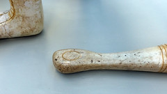
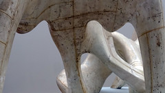
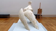
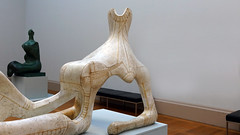
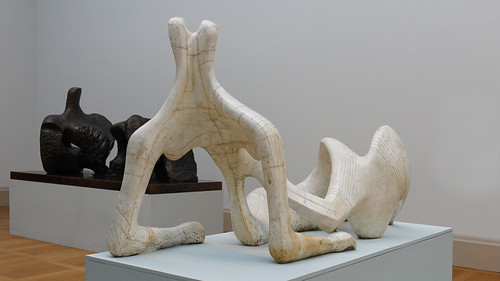
Video \(\PageIndex{10}\): Describing what you see: Sculpture, Henry Moore’s Reclining Figure, 1951, plaster and string, 105.4 x 227.3 x 89.2 cm (Tate Britain) © The Henry Moore Foundation.
This plaster was the result of a commission from the Arts Council of Great Britain for the Festival of Britain. A single bronze was cast from it.
Additional resources
Smarthistory images for teaching and learning:

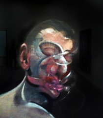
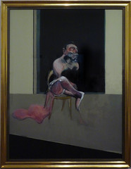
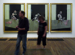
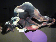
Francis Bacon, Triptych – August 1972
by DR. BETH HARRIS and DR. STEVEN ZUCKER
Video \(\PageIndex{11}\): Francis Bacon, Triptych – August 1972, 1972, oil on canvas, 72 x 61 x 22″ / 183 x 155 x 64 cm, (Tate Modern, London)
Smarthistory images for teaching and learning:
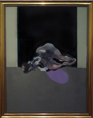
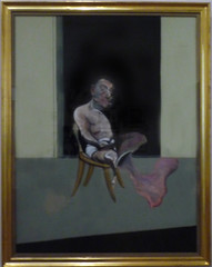
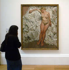
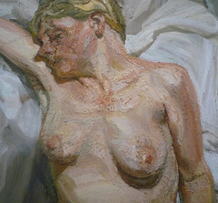
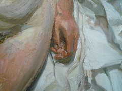
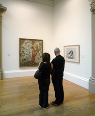
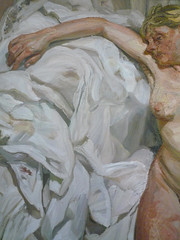
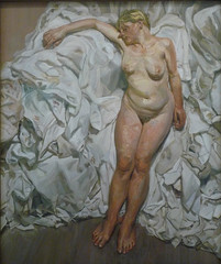
Lucian Freud, Standing by the Rags
by DR. BETH HARRIS and DR. STEVEN ZUCKER
Video \(\PageIndex{12}\): Lucian Freud, Standing by the Rags, 1988-89, oil on canvas, 66.5 x 54.5″ / 168.9 x 138.4 cm (Tate Britain, London)
Smarthistory images for teaching and learning:
Poland
Magdalena Abakanowicz, Androgyne III
Becoming: Between myself and the material with which I create, no tool intervenes. I select it with my hands. I shape it with my hands. My hands transmit energy to it. In translating idea into form, they always pass on to it something that eludes conceptualization. They reveal the unconscious.
– Magdalena Abakanowicz
War and childhood
At the beginning of World War II, Abakanowicz, then a young girl, witnessed German tanks enter her family’s estate. At one point, a drunken soldier burst into her house and, in Abakanowicz’s presence, shot off her mother’s arm. In 1944, the family was forced to flee the advance of the Soviet army and ended up in Warsaw, where the artist still lives and works. As a teenager, Abakanowicz worked as a nursing assistant in a makeshift hospital caring for the wounded while also finishing her high school education. Her family lost everything during the war and had to hide their aristocratic roots when the nobility became the enemy in postwar Communist Poland. Abakanowicz remembered, “…we, as family, lost our identity. We were deprived of our social position and…thrown out of society. We were punished for being rich. So I had to hide my background. I had to lie. I had to invent.”[1]

Magdalena Abakanowicz was born in 1930 and and spent her early years on the family’s estate about 200 miles east of Warsaw. There, she often played in the nearby forest, an experience that later influenced the materials she uses in her work. Her family had both Tartar and aristocratic roots (the term Tartar has a complex history but in this case the artist’s father was a descendant of Abaqa Khan, a thirteenth-century Il-khan of Persia). Who were Abaqa Khan, Il-khan, and Ghengis Khan?
After the war
Abakanowicz graduated the Academy of Fine Arts in Warsaw in in 1955. Post-war Poland was part of the Soviet bloc and had a Communist government. Social Realism was the style taught in art schools during this era and initially Abakanowicz experimented with textiles and weaving in order to avoid it. Social Realism demanded images of smiling workers and a perfected society and although Abakanowicz disliked the style, she was ultimately required to adopt it in order to obtain a degree and enter the Polish Artists Union—a step required of all professional sculptors. What is Socialist Realism?
Throughout her life Abakanowicz has continued to live in Poland despite the communist government that held power there until 1989 and the hardships that she and her fellow Poles endured. After Joseph Stalin’s death in 1953 there was considerable hardship in Warsaw but also a flourishing of the arts. Abakanowicz attended gatherings of artists, intellectuals, scientists, and politicians in the one-room apartment of the Polish Constructivist painter Henryk Stażewski. Who was Joseph Stalin?

Unconventional materials
In 1967 Abakanowicz began creating forms made with fabric and tapestry. She became well known for work she called Abakans (left), a series of monumental fiber sculptures that created the framework for her later work. The Abakan sculptures refer to clothing but are not functional. They hang from the ceiling and although they allude to human figures, they also reference the natural world. Some gently swing, suggesting the rocking of underwater vegetation, or the flight of birds.
In the 1970s, Abakanowicz began to experiment with other materials including burlap, string, and cotton gauze. In 1974, she began to form figures by dipping burlap and string into resin, which she then pressed into a plaster mold. Sometimes she took a cast from the body of a friend for these forms. The figures are hollow and repetitious as can be seen in Seated Figures (1974-79) and Backs (1976-80).
Androgyne III
The body as a structure became increasingly important to Abakanowicz and she visited laboratories to learn more about dissection and the construction of the human body. The effect of Seated Figures and Backs can be chilling and is often understood as expressing dehumanization in the twentieth century. In these works, the same shape is repeated but the surface of each figure has an individual texture, the result of Abakanowicz’s unique handling of the materials.[2]

Androgyne III uses the same molded-torso shell that Abakanowicz employed in her sculpture series Backs (1976-1980). The piece is made of burlap, resin, wood, nails, and string. Unlike the Back series, however, in which the figures sat directly on the floor, the Androgyne torsos are seated on low stretchers of wooden logs, perhaps filling in for lost legs.
Abakanowicz’s figures are mostly androgynous, with their sexual characteristics de-emphasized. The artist wants the viewer to focus on the humanity of the figures rather than their gender. At the same time, the fragmentary nature of the figures is important, perhaps a reflection of the time she spent helping in the hospital during World War II and her memories of the attack on her mother. A distinguishing feature of all of the burlap casts is the wrinkled skin and the implication of backbones, musculature and veins. The bodies, or body parts, more accurately, are intended to be seen in the round as the hollow interior is as much a part of the piece as the molded exterior. Space is as significant as mass in these works.
Abakanowicz draws on her personal history, but her sculptures possess an ambiguity that encourages multiple interpretations that speak broadly to human experience. Androgyne III alludes to the brutality of war and the totalitarian state. The body is a husk without arms, legs or a head. It is an expression of suffering, both mournful and disturbing.
[1] Michael Brenson, “Abakans,” Art Journal. spring 95, volume 54, issue 1, p. 59
[2] Mara Witzling, ed., Voicing Today’s Visions: Writings by Contemporary Women Artists, New York, NY: Universe Publishing, 1994, p. 92
Additional resources:
This sculpture at The Metropolitan Museum of Art
http://www.abakanowicz.art.pl/about/-about.php.html
Magdalena Abakanowicz at the National Museum of Women in the Arts
Michael Brenson, “Abakans.” Art Journal, Spring 1995, vol. 54, issue 1, pp. 56-62.
Michael Brenson, “Survivor Art,” The New York Times Magazine, November 1991, vol 142, issue 49165, pp. 46-53.
John Dornberg, Smithsonian Magazine, April 85, Vol. 16 Issue 1, pp. 110-119.
Joanna Inglot, The Figurative Sculpture of Magdalena Abakanowicz: Bodies, Environments, and Myths, (Berkeley: University of California Press, 2004).
Mara Witzling, ed., Voicing Today’s Visions: Writings by Contemporary Women Artists (New York, NY: Universe Publishing, 1994).


