10.3: Fauvism + Expressionism
- Page ID
- 65566

\( \newcommand{\vecs}[1]{\overset { \scriptstyle \rightharpoonup} {\mathbf{#1}} } \)
\( \newcommand{\vecd}[1]{\overset{-\!-\!\rightharpoonup}{\vphantom{a}\smash {#1}}} \)
\( \newcommand{\dsum}{\displaystyle\sum\limits} \)
\( \newcommand{\dint}{\displaystyle\int\limits} \)
\( \newcommand{\dlim}{\displaystyle\lim\limits} \)
\( \newcommand{\id}{\mathrm{id}}\) \( \newcommand{\Span}{\mathrm{span}}\)
( \newcommand{\kernel}{\mathrm{null}\,}\) \( \newcommand{\range}{\mathrm{range}\,}\)
\( \newcommand{\RealPart}{\mathrm{Re}}\) \( \newcommand{\ImaginaryPart}{\mathrm{Im}}\)
\( \newcommand{\Argument}{\mathrm{Arg}}\) \( \newcommand{\norm}[1]{\| #1 \|}\)
\( \newcommand{\inner}[2]{\langle #1, #2 \rangle}\)
\( \newcommand{\Span}{\mathrm{span}}\)
\( \newcommand{\id}{\mathrm{id}}\)
\( \newcommand{\Span}{\mathrm{span}}\)
\( \newcommand{\kernel}{\mathrm{null}\,}\)
\( \newcommand{\range}{\mathrm{range}\,}\)
\( \newcommand{\RealPart}{\mathrm{Re}}\)
\( \newcommand{\ImaginaryPart}{\mathrm{Im}}\)
\( \newcommand{\Argument}{\mathrm{Arg}}\)
\( \newcommand{\norm}[1]{\| #1 \|}\)
\( \newcommand{\inner}[2]{\langle #1, #2 \rangle}\)
\( \newcommand{\Span}{\mathrm{span}}\) \( \newcommand{\AA}{\unicode[.8,0]{x212B}}\)
\( \newcommand{\vectorA}[1]{\vec{#1}} % arrow\)
\( \newcommand{\vectorAt}[1]{\vec{\text{#1}}} % arrow\)
\( \newcommand{\vectorB}[1]{\overset { \scriptstyle \rightharpoonup} {\mathbf{#1}} } \)
\( \newcommand{\vectorC}[1]{\textbf{#1}} \)
\( \newcommand{\vectorD}[1]{\overrightarrow{#1}} \)
\( \newcommand{\vectorDt}[1]{\overrightarrow{\text{#1}}} \)
\( \newcommand{\vectE}[1]{\overset{-\!-\!\rightharpoonup}{\vphantom{a}\smash{\mathbf {#1}}}} \)
\( \newcommand{\vecs}[1]{\overset { \scriptstyle \rightharpoonup} {\mathbf{#1}} } \)
\(\newcommand{\longvect}{\overrightarrow}\)
\( \newcommand{\vecd}[1]{\overset{-\!-\!\rightharpoonup}{\vphantom{a}\smash {#1}}} \)
\(\newcommand{\avec}{\mathbf a}\) \(\newcommand{\bvec}{\mathbf b}\) \(\newcommand{\cvec}{\mathbf c}\) \(\newcommand{\dvec}{\mathbf d}\) \(\newcommand{\dtil}{\widetilde{\mathbf d}}\) \(\newcommand{\evec}{\mathbf e}\) \(\newcommand{\fvec}{\mathbf f}\) \(\newcommand{\nvec}{\mathbf n}\) \(\newcommand{\pvec}{\mathbf p}\) \(\newcommand{\qvec}{\mathbf q}\) \(\newcommand{\svec}{\mathbf s}\) \(\newcommand{\tvec}{\mathbf t}\) \(\newcommand{\uvec}{\mathbf u}\) \(\newcommand{\vvec}{\mathbf v}\) \(\newcommand{\wvec}{\mathbf w}\) \(\newcommand{\xvec}{\mathbf x}\) \(\newcommand{\yvec}{\mathbf y}\) \(\newcommand{\zvec}{\mathbf z}\) \(\newcommand{\rvec}{\mathbf r}\) \(\newcommand{\mvec}{\mathbf m}\) \(\newcommand{\zerovec}{\mathbf 0}\) \(\newcommand{\onevec}{\mathbf 1}\) \(\newcommand{\real}{\mathbb R}\) \(\newcommand{\twovec}[2]{\left[\begin{array}{r}#1 \\ #2 \end{array}\right]}\) \(\newcommand{\ctwovec}[2]{\left[\begin{array}{c}#1 \\ #2 \end{array}\right]}\) \(\newcommand{\threevec}[3]{\left[\begin{array}{r}#1 \\ #2 \\ #3 \end{array}\right]}\) \(\newcommand{\cthreevec}[3]{\left[\begin{array}{c}#1 \\ #2 \\ #3 \end{array}\right]}\) \(\newcommand{\fourvec}[4]{\left[\begin{array}{r}#1 \\ #2 \\ #3 \\ #4 \end{array}\right]}\) \(\newcommand{\cfourvec}[4]{\left[\begin{array}{c}#1 \\ #2 \\ #3 \\ #4 \end{array}\right]}\) \(\newcommand{\fivevec}[5]{\left[\begin{array}{r}#1 \\ #2 \\ #3 \\ #4 \\ #5 \\ \end{array}\right]}\) \(\newcommand{\cfivevec}[5]{\left[\begin{array}{c}#1 \\ #2 \\ #3 \\ #4 \\ #5 \\ \end{array}\right]}\) \(\newcommand{\mattwo}[4]{\left[\begin{array}{rr}#1 \amp #2 \\ #3 \amp #4 \\ \end{array}\right]}\) \(\newcommand{\laspan}[1]{\text{Span}\{#1\}}\) \(\newcommand{\bcal}{\cal B}\) \(\newcommand{\ccal}{\cal C}\) \(\newcommand{\scal}{\cal S}\) \(\newcommand{\wcal}{\cal W}\) \(\newcommand{\ecal}{\cal E}\) \(\newcommand{\coords}[2]{\left\{#1\right\}_{#2}}\) \(\newcommand{\gray}[1]{\color{gray}{#1}}\) \(\newcommand{\lgray}[1]{\color{lightgray}{#1}}\) \(\newcommand{\rank}{\operatorname{rank}}\) \(\newcommand{\row}{\text{Row}}\) \(\newcommand{\col}{\text{Col}}\) \(\renewcommand{\row}{\text{Row}}\) \(\newcommand{\nul}{\text{Nul}}\) \(\newcommand{\var}{\text{Var}}\) \(\newcommand{\corr}{\text{corr}}\) \(\newcommand{\len}[1]{\left|#1\right|}\) \(\newcommand{\bbar}{\overline{\bvec}}\) \(\newcommand{\bhat}{\widehat{\bvec}}\) \(\newcommand{\bperp}{\bvec^\perp}\) \(\newcommand{\xhat}{\widehat{\xvec}}\) \(\newcommand{\vhat}{\widehat{\vvec}}\) \(\newcommand{\uhat}{\widehat{\uvec}}\) \(\newcommand{\what}{\widehat{\wvec}}\) \(\newcommand{\Sighat}{\widehat{\Sigma}}\) \(\newcommand{\lt}{<}\) \(\newcommand{\gt}{>}\) \(\newcommand{\amp}{&}\) \(\definecolor{fillinmathshade}{gray}{0.9}\)Fauvism and Expressionism
These two movements opened the way for even greater experimentation with color and abstract form.
c. 1900 - 1930
Fauvism
Henri Matisse is the best known of this colorful, innovative group of painters.
c. 1905 - 1910
Fauvism, an introduction
Distinctive brushwork
Fauvism developed in France to become the first new artistic style of the 20th century. In contrast to the dark, vaguely disturbing nature of much fin-de-siècle, or turn-of-the-century, Symbolist art, the Fauves produced bright cheery landscapes and figure paintings, characterized by pure vivid color and bold distinctive brushwork.
“Wild beasts”
When shown at the 1905 Salon d’Automne (an exhibition organized by artists in response to the conservative policies of the official exhibitions, or salons) in Paris, the contrast to traditional art was so striking it led critic Louis Vauxcelles to describe the artists as “Les Fauves” or “wild beasts,” and thus the name was born.
One of several Expressionist movements to emerge in the early 20th century, Fauvism was short lived, and by 1910, artists in the group had diverged toward more individual interests. Nevertheless, Fauvism remains significant for it demonstrated modern art’s ability to evoke intensely emotional reactions through radical visual form.
The expressive potential of color
The best known Fauve artists include Henri Matisse, André Derain, and Maurice Vlaminck who pioneered its distinctive style. Their early works reveal the influence of Post-Impressionist artists, especially Neo-Impressionists like Paul Signac, whose interest in color’s optical effects had led to a divisionist method of juxtaposing pure hues on canvas. The Fauves, however, lacked such scientific intent. They emphasized the expressive potential of color, employing it arbitrarily, not based on an object’s natural appearance.

In Luxe, calm et volupté (1904), for example, Matisse employed a pointillist style by applying paint in small dabs and dashes. Instead of the subtle blending of complementary colors typical of the Neo-Impressionist painter Seurat, for example, the combination of fiery oranges, yellows, greens and purple is almost overpowering in its vibrant impact.
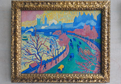
Similarly, while paintings such as Vlaminck’s The River Seine at Chatou (1906) appear to mimic the spontaneous, active brushwork of Impressionism, the Fauves adopted a painterly approach to enhance their work’s emotional power, not to capture fleeting effects of color, light or atmosphere on their subjects. Their preference for landscapes, carefree figures and lighthearted subject matter reflects their desire to create an art that would appeal primarily to the viewers’ senses.
Paintings such as Matisse’s Bonheur de Vivre (1905-06) epitomize this goal. Bright colors and undulating lines pull our eye gently through the idyllic scene, encouraging us to imagine feeling the warmth of the sun, the cool of the grass, the soft touch of a caress, and the passion of a kiss.
Like many modern artists, the Fauves also found inspiration in objects from Africa and other non-western cultures. Seen through a colonialist lens, the formal distinctions of African art reflected current notions of Primitivism–the belief that, lacking the corrupting influence of European civilization, non-western peoples were more in tune with the primal elements of nature.
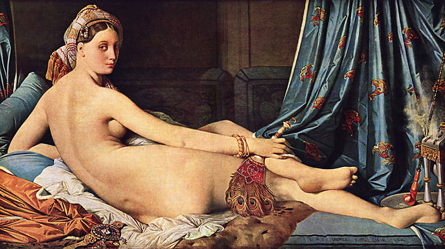
Blue Nude (Souvenir of Biskra) of 1907 shows how Matisse combined his traditional subject of the female nude with the influence of primitive sources. The woman’s face appears mask-like in the use of strong outlines and harsh contrasts of light and dark, and the hard lines of her body recall the angled planar surfaces common to African sculpture. This distorted effect, further heightened by her contorted pose, clearly distinguishes the figure from the idealized odalisques of Ingres and painters of the past.
The Fauves’ interest in Primitivism reinforced their reputation as “wild beasts” who sought new possibilities for art through their exploration of direct expression, impactful visual forms and instinctual appeal.
Additional resources:
Fauvism at The Metropolitan Museum of Art’s Timeline of Art History
African Influences in Modern Art at The Metropolitan Museum of Art’s Timeline of Art History
Smarthistory images for teaching and learning:
Fauve Landscapes and City Views
by DR. CHARLES CRAMER and DR. KIM GRANT
Bright color and simplified form
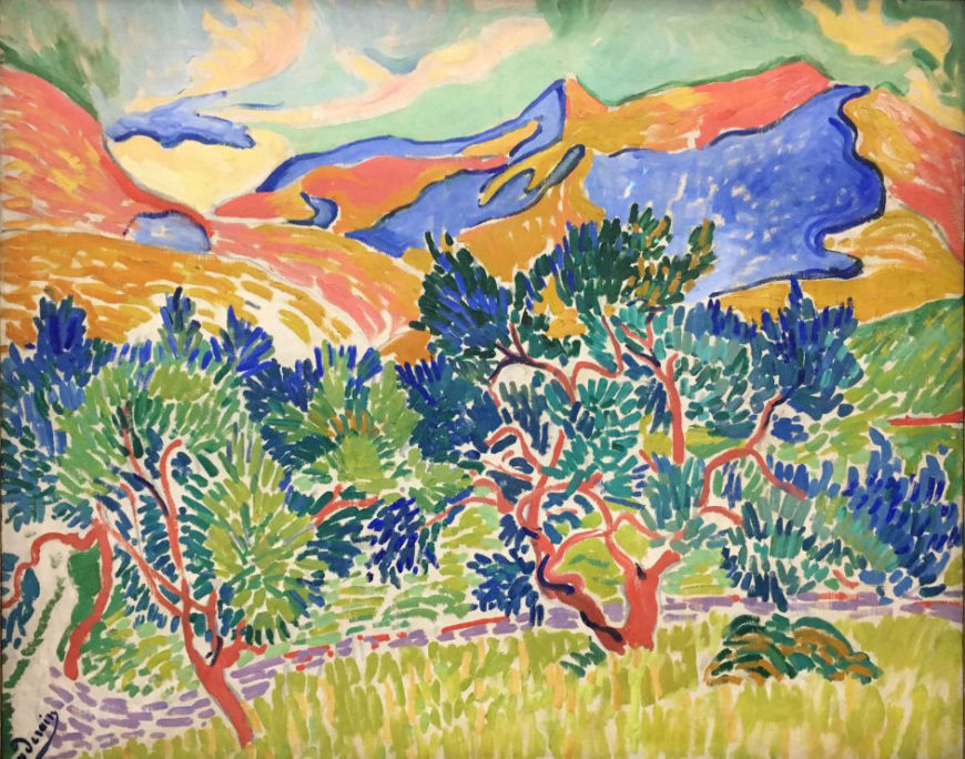
Varied patterns of brushstrokes define the landscape in André Derain’s Mountains at Collioure. Vivid blues and greens burst like fireworks from the twisted red branches of two trees rising up from a field of yellow-green vertical brushstrokes. A flowing horizontal line of blocky lilac strokes suggests a path or wall behind the trees, and diagonal strokes of green indicate a field rising towards the foothills. The mountains in the background are roiling forms painted in bright red, yellow, and blue under a pale green and yellow sky. Colors do not fade with distance according to the rules of atmospheric perspective. Their undiminished intensity makes the scene appear flat and decorative, just colors arranged in patterns on the surface of the canvas.
Made in the summer of 1905 when Derain was painting in the south of France with Henri Matisse, Mountains at Collioure is a quintessentially Fauve landscape with its bright, unmodulated color and simplified forms. Both painters developed styles that synthesized the work of their Post-Impressionist predecessors. Matisse had previously used a technique of regularized brushstrokes derived from the Neo-Impressionists in Luxe, Calme et Volupté. He abandoned this technique for the more liberated and suggestive approach of Landscape at Collioure, in which the paint is applied in loosely patterned and widely separated brushstrokes to raw canvas.
A greater degree of abstraction
Derain’s Mountains at Collioure is more carefully structured than Matisse’s contemporary landscape. Both paintings use brilliant color and visible brushstrokes to create surface patterns, but Derain distinguished foreground from background by distinct differences in paint application. The foreground trees with their thickly painted, regular patterns of leaves were depicted in the style of van Gogh, while the undulating flat colored planes of the background mountains echoed Gauguin’s abstraction of landscape forms.
Like the Post-Impressionists, Derain and Matisse intensified or even disregarded local colors in their landscapes while emphasizing surface patterns and textures. What distinguished their paintings from their predecessors and prompted an art critic to call them “Fauves” (wild beasts) was their use of more simplified color palettes, more liberated and inconsistent brushwork, and a greater degree of abstraction in both form and color.
Scenes of modern leisure
Landscapes and city views were the favored subjects of the Fauve painters. They followed the Impressionists and Post-Impressionists in depicting popular vacation spots and scenes of modern leisure. These included the Paris suburbs and beach resorts of Normandy favored by the Impressionists, as well as Mediterranean towns in the south of France painted by Cézanne, van Gogh, and Gauguin. Many of their compositions of these vacation spots are very similar to contemporary postcard views of the same locations. Their paintings are, however, far from photographic. All of the Fauve painters used a liberated style to create paintings that seem to celebrate the pleasures of painting as much as the pleasures of life. They embraced both the decorative qualities of painting — the abstract arrangement of colors and shapes—and the employment of liberated, expressive brushwork.
The wildest Fauve
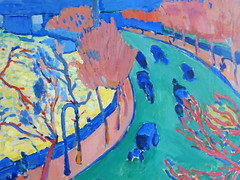
Maurice Vlaminck is often considered the most truly Fauve painter of the group. A close friend of Derain’s, he was largely self-taught and a devoted admirer of van Gogh’s work. He painted the small towns and landscapes near the Paris suburb of Chatou where he lived. His use of intense color, thick paint, and simplified forms is very similar to van Gogh’s style. Vlaminck, however, applies paint much more randomly and chaotically than van Gogh, who meticulously organized his canvases into regularly textured patterns of repeating brushstrokes.
In Vlaminck’s The Banks of the Seine at Chatou, the blocky red tree trunks rise up from ochre, red, and bright blue stripes of long grass. Small patches of vibrant color pepper the upper portion of the canvas like a mosaic suggesting a tangle of branches and leaves swirling above the gleaming river on a bright windy day.
Fauve painters tended to use a limited range of colors, emphasizing the brightest shades of the primaries (red, blue, and yellow) as well as the secondaries green and orange. Vlaminck took this restricted palette further than Derain and Matisse, and often used his colors straight out of the tube without mixing them. In Bougival he organizes the landscape in broad color areas: red for the foreground field, yellow leaves for the middle ground, green trees in the background, and blue hills and water in the distance. The paint is applied with simple, blunt strokes to create a powerful image of a fall day in the countryside.
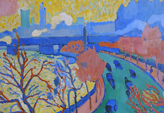
London views
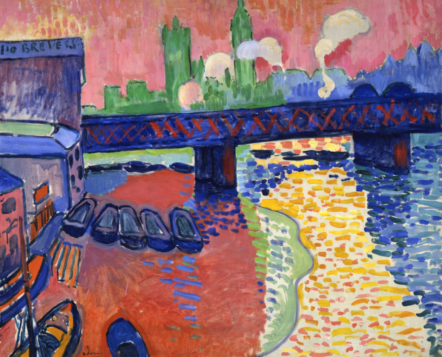
Derain’s Charing Cross Bridge is one of a series of paintings he was commissioned to make of London views. Claude Monet had recently exhibited an Impressionist series of London scenes, and Derain painted many of the same subjects in an aggressive Fauve style.
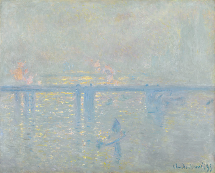
Consistent with the Impressionist interest in recording specific atmospheric effects, Monet’s Charing Cross Bridge depicts the boats, bridge, and buildings dissolving into a bright haze of foggy light and visible brushstrokes. Derain’s painting, in stark contrast, makes no attempt to convey the effects of light in a realistic manner; instead, it is a riotous celebration of color and free brushwork. Bright reds, blues, and yellows dominate, with a glowing pale green shape indicating the distant Houses of Parliament.
Monet used delicate, textured brushstrokes to depict touches of light on the water, clouds of steam and swirls of fog. Derain’s brushstrokes are like colored bricks representing the patterns of light and reflections on the water’s rough surface. The sky, rendered with tightly packed vertical brushstrokes, is an apocalyptic orange-red, while the left side of the river is an even more intense shade of deep red with scattered light and dark blue strokes suggesting reflections.
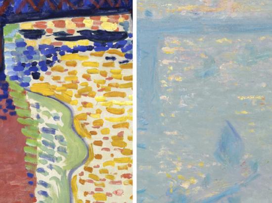
Deep and bright blues outline the boats and buildings, and the bridge itself is a deep blue marked with a row of red of X’s that slashes across the upper portion of the canvas. An area of yellow and orange brushstrokes on bare canvas creates a visual path of light on the river flowing under the bridge to the distant horizon. Flat pale clouds of smoke rise above the bridge like cartoon bubbles. The subject is recognizable, but the colors and simplifications of form render it hallucinatory. Next to Derain’s wildly exaggerated vision, Monet’s Impressionist view looks extremely refined and even old-fashioned with its nuanced rendering of reflected light and color.
Busy street scenes
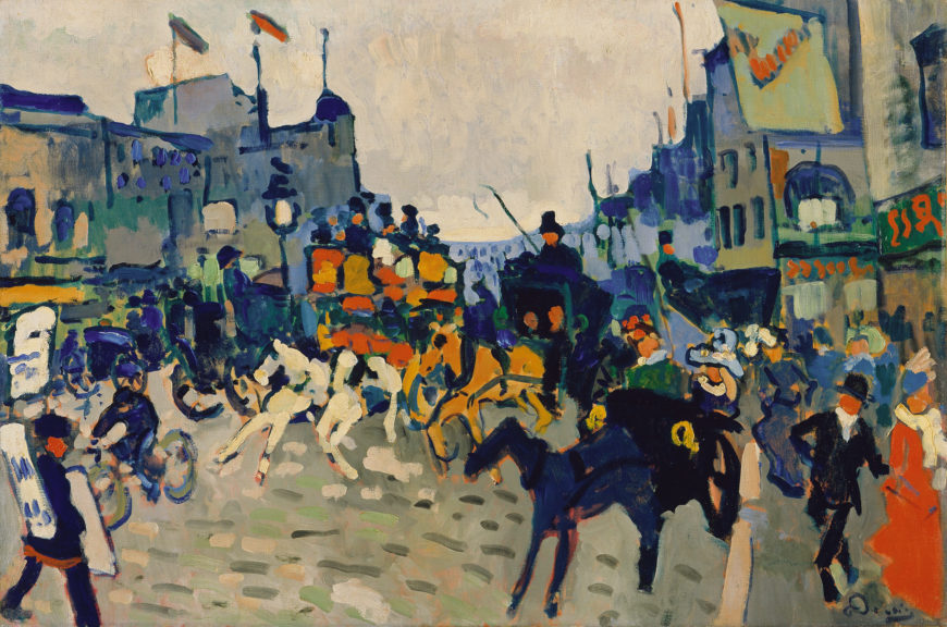
Most of Derain’s London paintings depict river views, but he also painted a crowded shopping street. In Regent Street the simplifications of color and form create a compelling image of the city’s commercial district. Horse-drawn carriages, a bicycle, and pedestrians fill the roadway. We see shop signs and posters, flags and street lights. A man wearing advertising posters dominates the lower left corner, while fashionably dressed shoppers occupy the right as they move down the sidewalk towards us. Derain’s Fauve colors and shapes are here an effective means to render the chaos of the modern city.
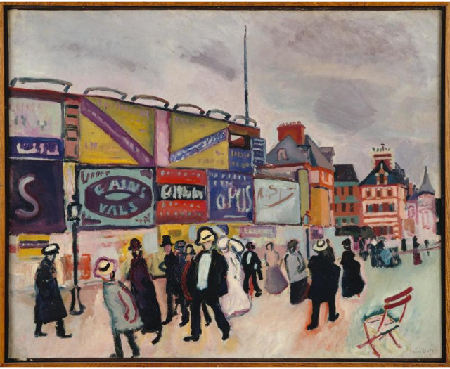
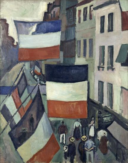
Raoul Dufy painted many scenes of the beach resorts in Normandy with bright colors and simplified forms. Rather than using the intense, often non-naturalistic colors of the leading Fauves — Matisse, Derain and Vlaminck — Dufy chose subjects that were themselves brightly colored, such as advertising billboards and the flag-decorated streets of Bastille Day. His approach was closer to Impressionism, but like his fellow Fauves he embraced simplified form, brilliant colors and direct visible brushwork.
André Derain, The Dance
by DR. CHARLES CRAMER and DR. KIM GRANT
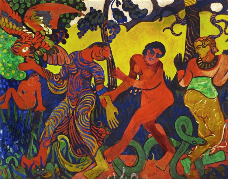
André Derain’s The Dance is an ambitious and remarkably eclectic painting that combines references to multiple European and non-European sources. The highly saturated palette of the primary colors (red, blue, and yellow), with the addition of the secondary green, is characteristic of Fauvism, a pictorial style associated with wild and unrestrained expression. In its attempt to synthesize a disparate collection of sources and references, The Dance testifies to the multi-layered, hybrid approach modern artists adopted as they attempted to create art works imbued with so-called primitive qualities.
Exotic and primitive motifs
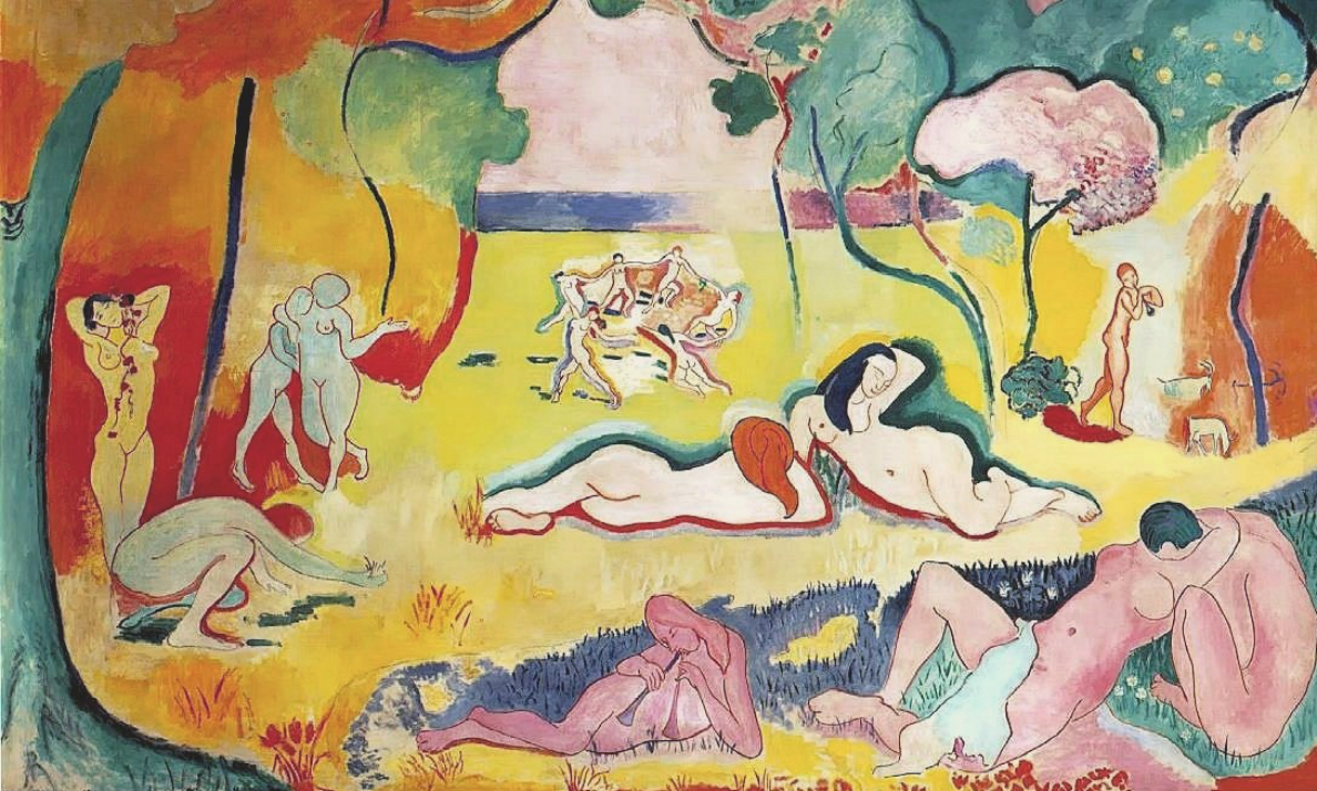
At seven and a half feet wide, The Dance is as large as Henri Matisse’s Fauve masterpiece Bonheur de Vie/Joy of Life, painted the same year. The subjects of the two paintings, female figures cavorting in an imaginary landscape, are similar, and both paintings suggest a fundamental union between humans and nature. Matisse’s references are, however, classical and Arcadian, while Derain’s are more exotic and primitive.
The Dance echoes the paintings of Paul Gauguin in both style and subject matter. Like Gauguin, Derain uses simplified forms and unmodulated areas of bright color in a composition that emphasizes flat, decorative qualities. The subject is overtly exotic with nude and partially nude women displayed in a fantastic landscape along with a huge scarlet macaw and a green snake. These creatures allude to both their non-European native habitats and to an Edenic world where humans live in harmony with nature.
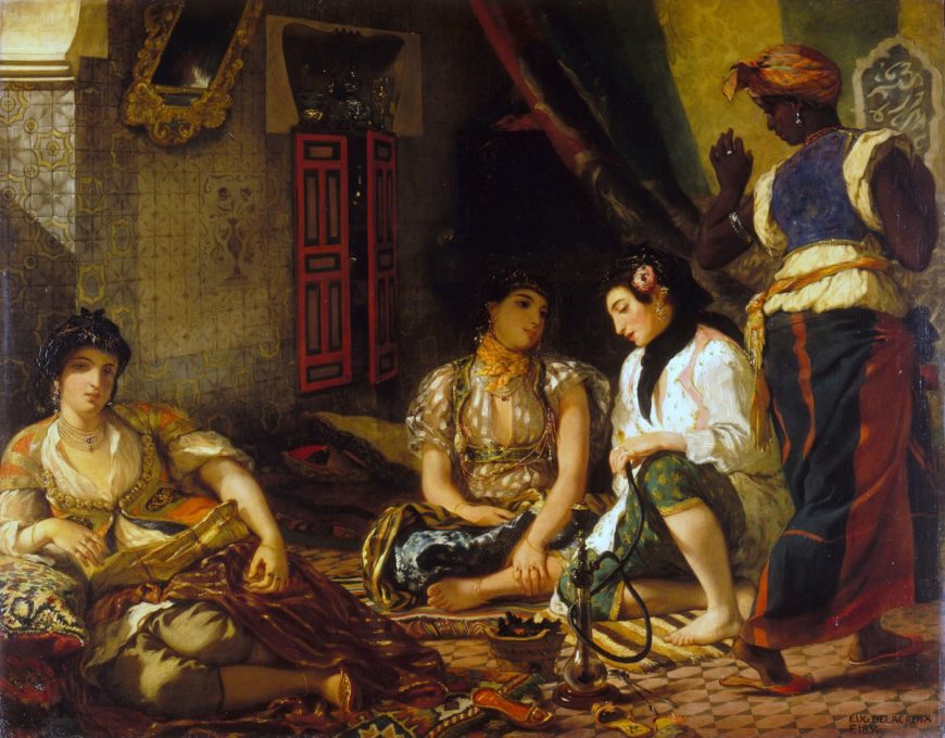
Derain also followed Gauguin in his eclectic combination of cultural references. However, unlike his predecessor, whose primitivist pastiches resulted from a sincere commitment to the discovery of universal symbols and spiritual forms, Derain’s eclecticism is a more superficial adoption of varied exotic motifs. Art historians have identified references to Indian carved reliefs, African masks, Romanesque sculptures, European folk art, and Japanese prints in The Dance. The figure on the right is directly derived from another painting of “exotic” non-European women, Eugène Delacroix’s Women of Algiers. The black woman on the right in Delacroix’s imagined harem scene has become a racially ambiguous, mostly nude blonde woman with multi-colored skin in Derain’s Fauve painting.
New and exotic forms of dance
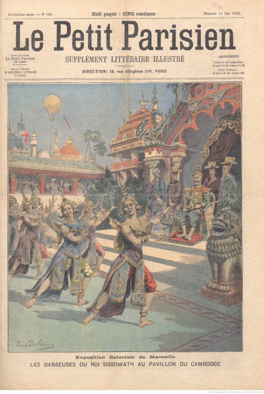
The Dance belongs to a well-established tradition of imagined primitivist scenes in European art that feature sexualized images of non-European women. It is also specifically of its time in its focus on dance. At the turn of the 20th century there was widespread interest in non-western dance forms. International expositions often included performances of traditional court and folk dances from non-western countries. Derain saw the Cambodian court dancers at the 1906 Colonial Exposition in Marseille around the time that he painted The Dance.
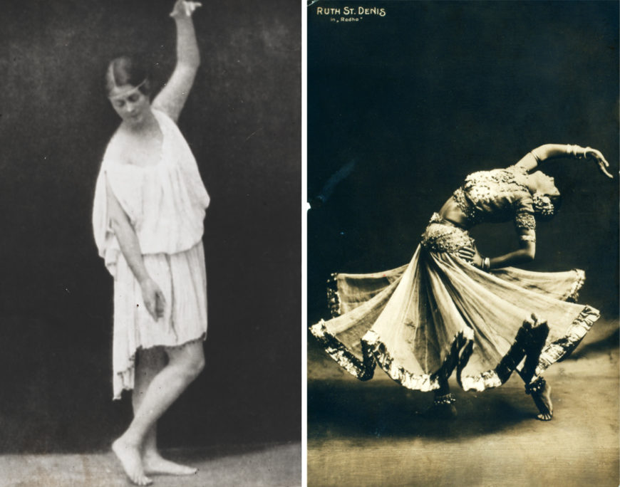
Modern dance also had its origins during this period. Dancers such as Loïe Fuller and Isadora Duncan rejected the stylized forms of classical ballet and focused on the body as a vehicle of direct, unfettered expression. Duncan saw her dancing as an expression of universal natural forces linked to Ancient Greece. Another popular dancer of the period, Ruth St. Denis, created “exotic” dances loosely based on Indian, Egyptian, and Babylonian mythology.
Fauvism and African art
Cultural eclecticism is a hallmark of European modern art in the early years of the 20th century, and Derain and his fellow Fauves Maurice Vlaminck and Henri Matisse were significant contributors to the trend. They were among the first modern artists to acquire African masks and sculptures, and Derain visited ethnographic collections in Paris and London to see non-western artifacts. These became increasingly available for purchase during this period as a consequence of Europe’s escalating investment in its overseas colonies.
With its combination of references to many different cultures and styles, Derain’s The Dance is a prime example of the period’s cultural eclecticism. Aggressive primary colors, simplified non-naturalistic forms, and an emphasis on decoration combines with eroticized images of women in nature to signify the primitive.
For many modern artists the use of intense colors and rudimentary forms was considered a means to regain contact with the natural energies of the universe and express themselves directly. Their appreciation of the non-western works they collected was primarily formal (in other words, concerned with their appearance, and not their cultural context), and they adopted similar abbreviated and simplified forms in their own works.
Matisse remarked on the difference between the European approach to sculpting the human body and the African sculptures he saw in a Paris curio shop around 1905. European sculptors were interested in the naturalistic representation of musculature, while the African sculptures were “made in terms of their material, according to invented planes and proportions.\(^{[1]}\)”
Primitivist styles and subjects
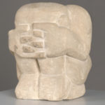
Both Matisse and Derain made sculptures of human figures that radically abstracted the body in response to the African sculptures they encountered. Derain’s roughly-carved sandstone Crouching Man simplifies and reduces the human figure to a cube, using exaggerated forms to convey a mood of introspective despair.
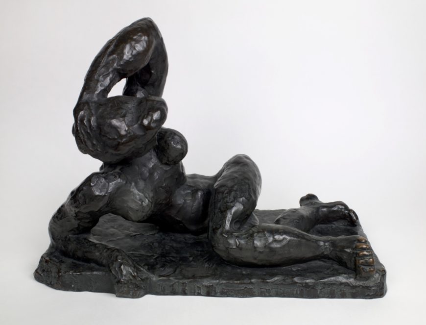
Matisse’s more conventional Reclining Nude also uses simplification and exaggeration of body parts, as well as twisting the angle of the head, to explore alternative strategies for representing the human figure.
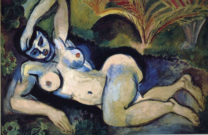
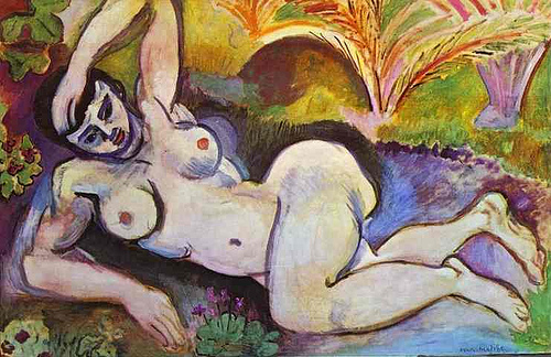
Matisse’s painting The Blue Nude was developed from similar formal concerns. The traditional European subject of the reclining nude, often associated with Orientalist fantasies in the 19th century, is here situated outdoors in a vaguely exotic setting suggested by the palm-like plants in the background. As in Matisse’s sculpture, the shapes of the body are simplified and exaggerated to emphasize the buttocks and breasts.
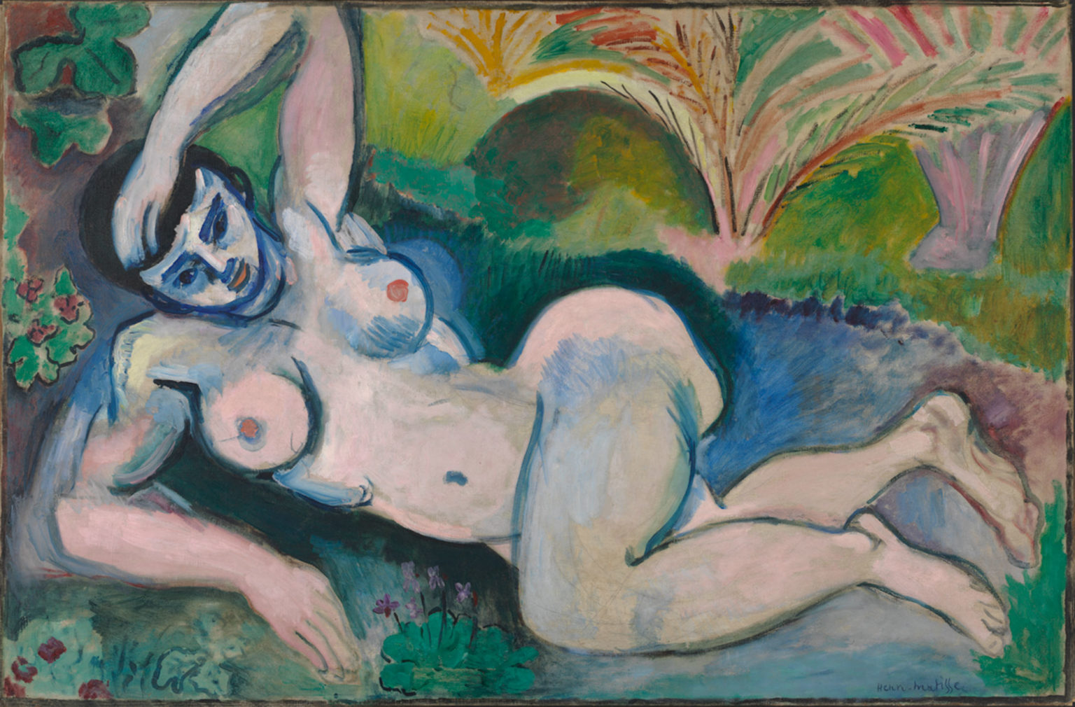
Matisse’s materials—paint on canvas—are emphasized, as is the artist’s labor. We see his brushstrokes and, in places, the canvas underneath the paint. Matisse has not covered up changes he made to the figure, giving us the sense that we are seeing a work still in progress — further enhancing our awareness of the painting’s materiality. Subtitled Memory of Biskra, after a town in Algeria Matisse had visited, the painting is the result of an encounter between European erotic fantasy and abstracted forms derived from African sculpture.
In Blue Nude and The Dance, Matisse and Derain used a liberated Fauve approach to color and form to depict female figures in an exotic setting. They combined what was considered a crude and primitive style with references to so-called primitive cultures. The paintings demonstrate how closely the Fauve painters’ concerns were bound up with both primitivist fantasies of enjoying leisure and women in tropical landscapes and the formal qualities associated with primitivism — simplified drawing, flattened space, and bright decorative color.
Notes:
- Quoted in Sarah Whitfield, Fauvism (London: Thames and Hudson, 1991), page 161.
Henri Matisse
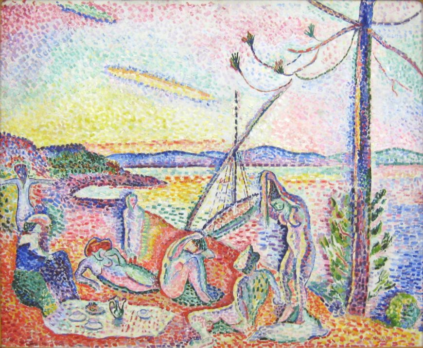
Henri Matisse, Luxe, calme et volupté
by DR. BETH HARRIS and DR. STEVEN ZUCKER
Video \(\PageIndex{1}\): Henri Matisse, Luxe, calme et volupté, 1904, oil on canvas, 37 x 46″ (Museé d’Orsay, Paris)
Key points:
- Luxe, calme et volupté borrows from the Neo-Impressionist style in its brushwork, but does not adopt Neo-Impressionism’s approach to color.
- Rather, this painting anticipates the Fauves’s imaginative use of expressive color.
- Color and form are key ways that early 20th-century artists began to abandon representation for abstraction.
Painted while the artist stayed with the pointillist painter, Signac, at his home in Saint-Tropez on the Côte d’Azur. Matisse’s title comes from Charles Baudelaire’s poem, “L’invitation au voyage (Invitation To A Voyage)” from his collection, The Flowers of Evil. “Luxe, calme et volupté” translates just as it sounds in English: “Luxury, calm, and voluptuous(ness).”
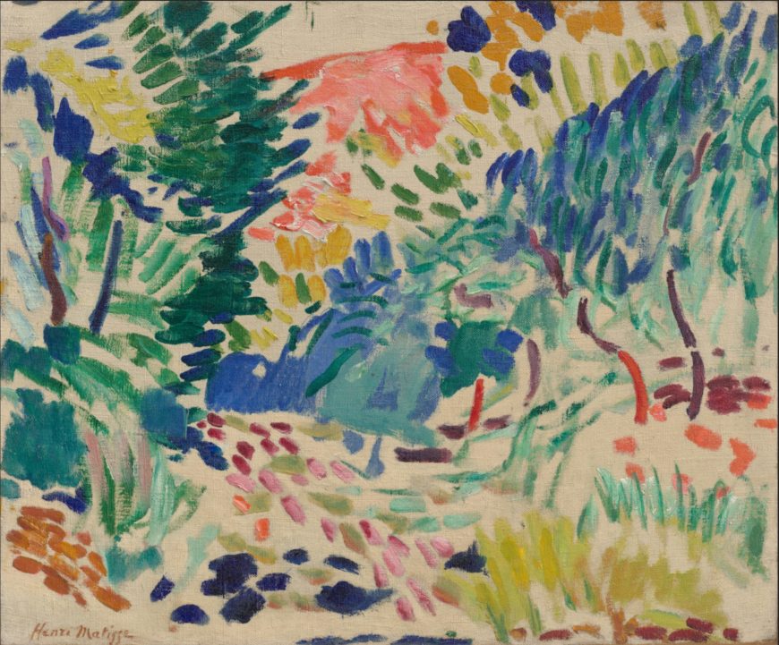
Henri Matisse, Open Window, Collioure
by DR. CHARLES CRAMER and DR. KIM GRANT

An explosion of color
In Henri Matisse’s Open Window, Collioure the casements of a large French window project toward us to reveal an explosion of brilliant Mediterranean color. The paint is applied very loosely; even in reproduction we can see almost every brushstroke. The painting looks as if it were made yesterday, and in some places (like the lower right where bare canvas is visible), seems unfinished. We can envision Matisse’s working process brushstroke by brushstroke, and we are there with him responding with excitement to the wealth of color and light at a Mediterranean seaside town in summer.
Although the style implies a rapid or even slipshod painting process, Open Window, Collioure was carefully orchestrated in every aspect, from the composition to the color relationships and the paint application. The window is placed slightly off center to the left, which gives the composition a casual feeling, in keeping with the slapdash quality of the brushstrokes. Underpinning this seeming casualness, however, is a calculated structure of repeating and nested rectangles that creates both a strong surface pattern and a series of internal “windows.”
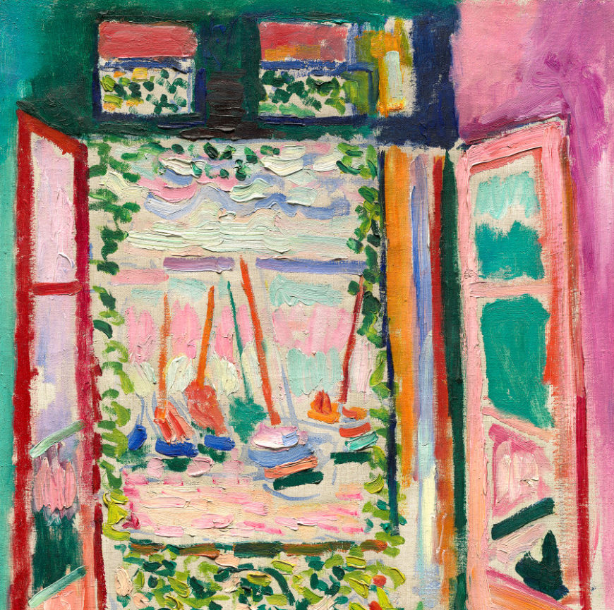
The brightest area of the painting, the central view of boats in harbor, is framed by some of the painting’s darkest tones in both the literal window frame and a pattern of green leafy vines. Surrounding this central view are multiple subsidiary window panes. Two transom windows at the top frame more views of the porch window and vines. Glass panes in the casement windows reflect both the view outside the French window and the colors of the walls.
Brilliant colors ricochet and echo across the canvas. Matisse uses complementary color contrasts throughout, setting off his glowing reds and pinks with cool greens. The walls are fuchsia and green, and the upper window panes of the casements reflect the opposing wall’s color, enhancing the intensity of the hues by contrast. A similar mutually intensifying contrast of colors appears where the vertical stripe of vivid orange paint, perhaps representing a curtain, is brushed next to the dark ultramarine strip of the window frame. Varied patterns of pale pink and turquoise brushstrokes represent sea and sky in the view out the window.
Denying the illusion of depth
Open Window, Collioure engages with, and ultimately undermines, the post-Renaissance conception of a painting being like a window. Matisse’s drawing of the window emphasizes its role as a framing device located in a three-dimensional space. The casements open inward, creating a perspectival view leading to the window opening. The balcony with flower pots on the floor is a shallow intermediate space between the room and the view of the harbor, which reaches to the horizon. However, all of these indications of spatial depth are negated by color and paint application, which emphasize the flat surface of the canvas and fail to create a convincing illusionistic scene. We never forget that we are looking at a painting and not out a window.
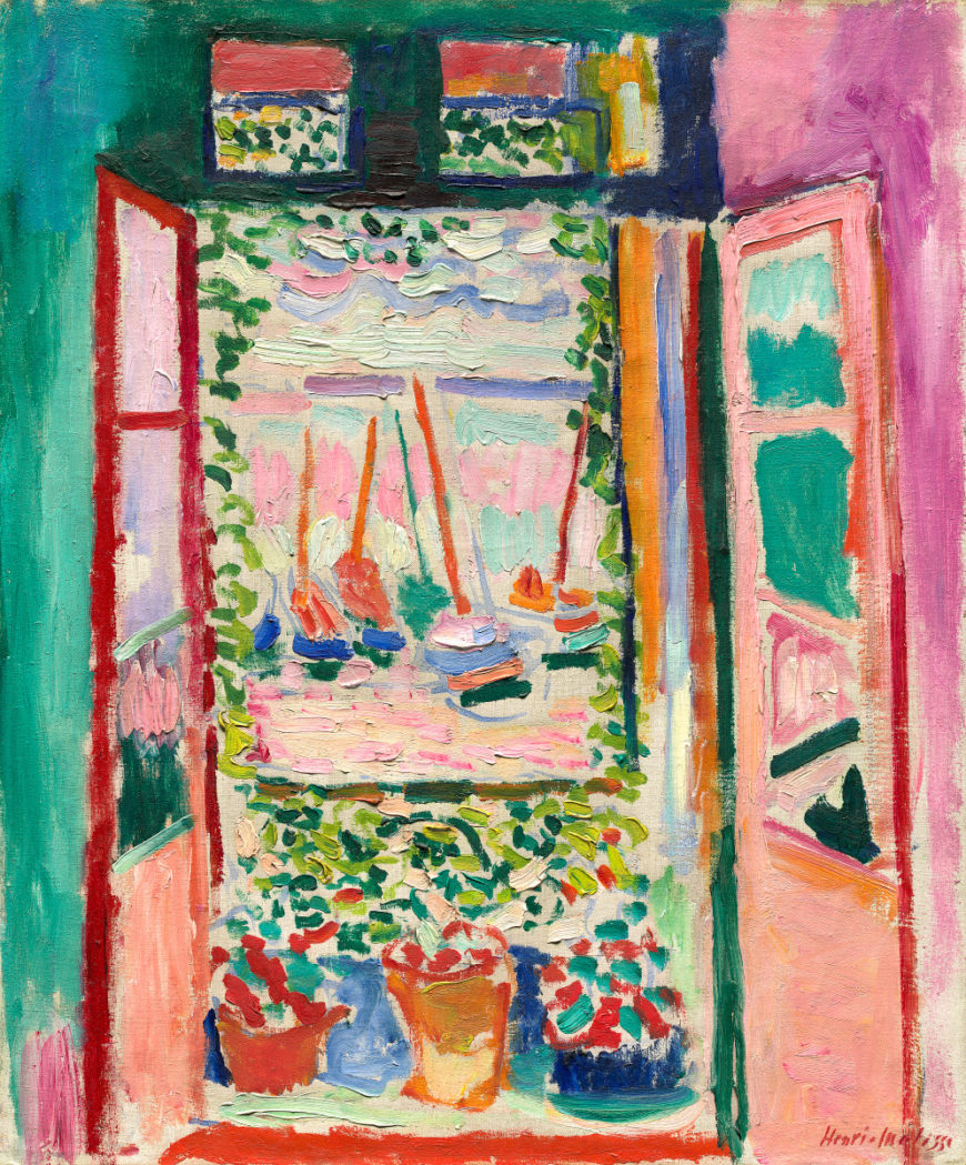
The highly visible brushstrokes and areas of unpainted canvas are the most obvious way Matisse denies us the illusion of reality, but his use of color is also important. Not only is it extremely bright and flat, lacking the chiaroscuro modulations traditionally used to suggest volume and depth, it also repeatedly subverts clear differentiation of foreground and background. For example, the distant masts of the boats in the harbor and the much closer verticals of the window frames create a surface pattern of bright orange and red verticals. The more distant reds and oranges are not muted to indicate depth through atmospheric perspective. Similarly, the dark blue and green brushstrokes depicting the hulls of the boats are echoed by the dark blue and green paint strokes used to indicate edges of the window frames and various objects in the foreground.
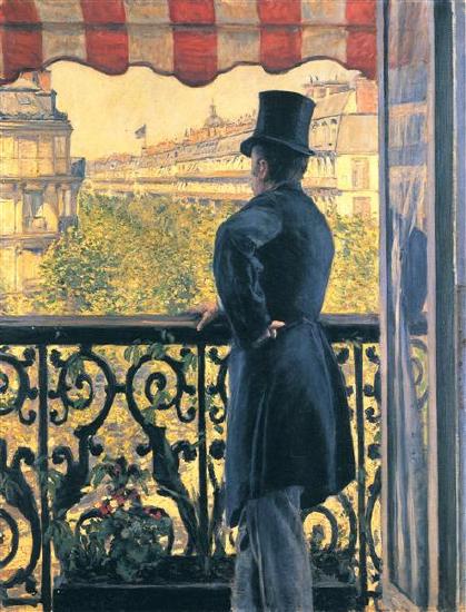
A glance at Gustave Caillebotte’s compositionally similar Man on a Balcony: Boulevard Haussmann shows how completely Matisse undermines the depiction of perspectival depth. Caillebotte’s naturalistic scene clearly distinguishes between the darker dominating foreground space of the balcony and the vista of sunlit buildings receding down the boulevard. In Matisse’s Open Window, Collioure, the distant harbor view dominates, and it is framed by the window as if it were itself a painting. It has no defined spatial relationship to the foreground, unlike Caillebotte’s vista down the boulevard where we can determine the relation of the balcony to the view with precision.
The 1905 Salon d’Automne
Open Window, Collioure was one of several paintings Matisse exhibited with a group of friends at the 1905 Salon d’Automne in Paris. A sympathetic art critic, Louis Vauxcelles, inadvertently named the group when he described the effect of their brilliantly colored paintings hanging on the walls surrounding two classicizing sculptures as being like Donatello among the fauves (wild beasts). The name came to reflect the extreme public reaction to the paintings, which were widely considered disturbing and outrageous. Conservative critics mocked the paintings in the press, but the Fauve painters ultimately profited from the notoriety and found dealers, critics and collectors who supported their work.
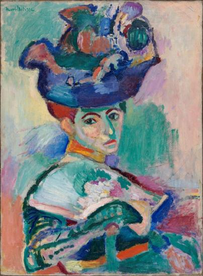
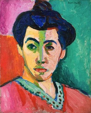
Matisse was the leader of the group, and his Woman with a Hat was considered the most scandalous painting in the “fauve cage” at the exhibition. The use of brilliant complementary colors, prominent brushwork and seemingly unfinished areas is very similar to Open Window, Collioure, but their effect in this traditionally-composed portrait of a woman was unsettling.
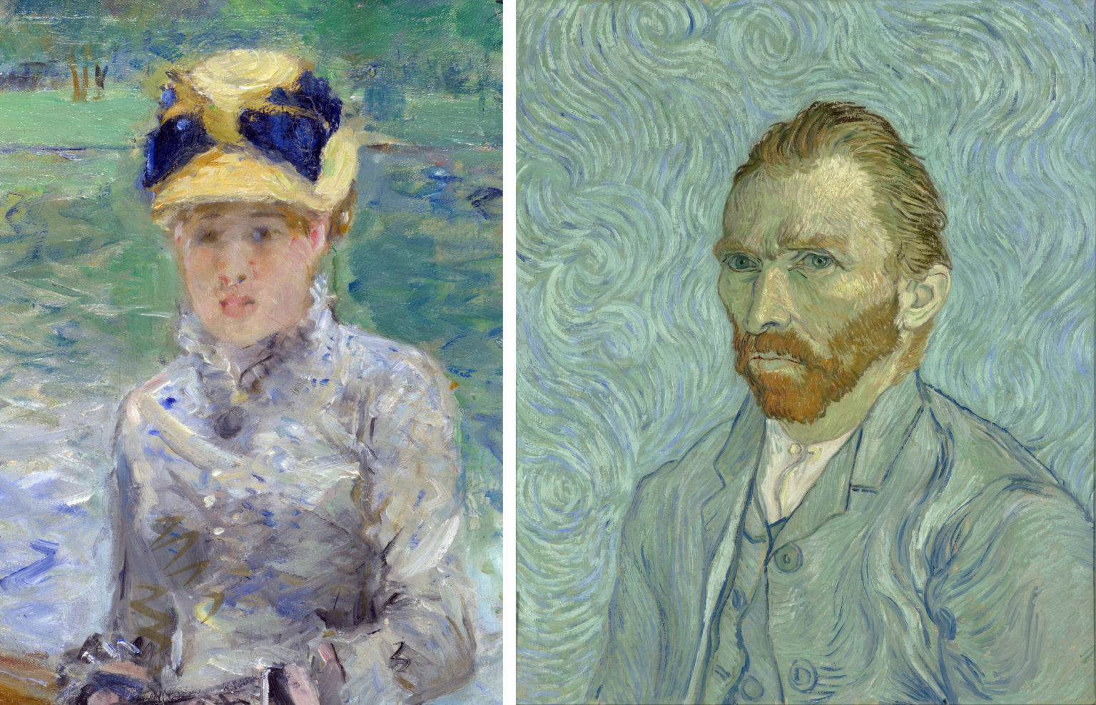
The crude dabs of paint, harsh simplified features, and the rendering of the shadows on the face in brilliant turquoise were all startling, even for viewers used to the painterly abbreviations and bright colors of Impressionism and Post-Impressionism. The faces in Morisot’s Impressionist Summer’s Day, and van Gogh’s Post-Impressionist Self-Portrait lack realistic detail and call attention to the artists’ brushstrokes, but the color used in both paintings remains well within the range of naturalistic depiction compared to Matisse’s Woman with a Hat.
In addition to the aggressively non-naturalistic tones in the face, Matisse’s style in The Woman with the Hat is raw and disjunctive. The painting looks unfinished and unresolved, with some parts painted in heavy impasto and others barely brushed in. The Salon jury tried to persuade him to retract the painting from his submission, but Matisse refused, indicating that he believed the painting to be finished and ready for exhibition.
The expressive potential of color
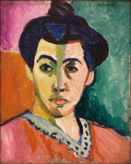
Matisse’s paintings in the 1905 Salon d’Automne with their disjunctive brushwork and tempestuous color were his most radical Fauve works. After the exhibition, Matisse continued to use bright non-naturalistic color, but his paint application became more consistent and his colors less chaotic. In Portrait of Mme. Matisse: The Green Line and Bonheur de Vivre the brilliant colors are organized into larger areas to maximize their intensity. Over the course of the next few years he became increasingly concerned with pictorial harmony.
In his 1908 “Notes of a Painter” Matisse wrote:
The entire arrangement of my picture is expressive . . .. Composition is the art of arranging in a decorative manner the diverse elements at the painter’s command to express his feelings. In a picture every part will . . . play its appointed role. . . . A work of art must be harmonious in its entirety. . . .Henri Matisse, “Notes of a Painter,” [1908] trans. J. D. Flam, in Charles Harrison and Paul Wood, eds., Art in Theory 1900-2000 (London: Blackwell, 2003), pp. 70-71.
Throughout his career Matisse was dedicated to the expressive potential of color: “My choice of colors is based on observation, on sensitivity, on felt experiences. . . . I simply try to put down colors which render my sensation . . . a moment comes when all the parts have found their definite relationships . . ..”\(^{[1]\)
Although “Notes of a Painter” was written some years after Matisse painted Open Window, these passages indicate that he was balancing three different projects. He was attempting to be responsive to (1) the perceptual information he received from the motif, (2) the feelings that he got from it, and (3) the decorative formal qualities of the work of art itself. Keeping all three in play allows The Open Window to read simultaneously as a window into real space, a flat plane covered with harmonious color, and an expression of the joyful warmth of a Mediterranean day.
The Open Window was one of Matisse’s most radical Fauve paintings, but it is also an example of his enduring dedication to expressive color and pictorial harmony. Matisse painted many windows throughout his career, including The Blue Window and The Piano Lesson, and they reflect the variations in his style over time. The Open Window of 1905 represents the barely restrained exuberance of his Fauve period, while a second version of Open Window at Collioure painted in September 1914 just after the start of World War I conveys the mood of those dark days.
Notes:
- Henri Matisse, “Notes of a Painter” [1908], trans. J. D. Flam, in Charles Harrison and Paul Wood, eds., Art in Theory 1900-2000, (London: Blackwell, 2003), pp. 70-71.
Additional resources:
The Open Window, Collioure at the National Gallery of Art, Washington DC
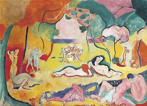
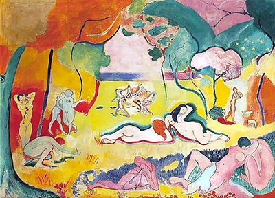
Henri Matisse, Bonheur de Vivre
by DR. BETH HARRIS and DR. STEVEN ZUCKER
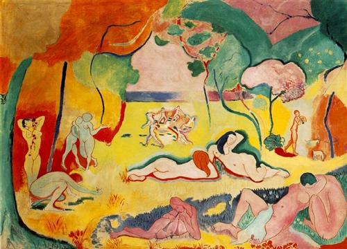
The Joy of Life
In 1906, Henri Matisse finished what is often considered his greatest Fauve painting, the Bonheur de Vivre, or the “Joy of Life.” It is a large-scale painting depicting an Arcadian landscape filled with brilliantly colored forest, meadow, sea, and sky and populated by nude figures both at rest and in motion. As with the earlier Fauve canvases, color is responsive only to emotional expression and the formal needs of the canvas, not the realities of nature. The references are many, but in form and date, Bonheur de Vivre is closest to Cézanne’s last great image of bathers.
Matisse and his sources
Like Cézanne, Matisse constructs the landscape so that it functions as a stage. In both works trees are planted at the sides and in the far distance, and their upper boughs are spread apart like curtains, highlighting the figures lounging beneath. And like Cézanne, Matisse unifies the figures and the landscape. Cézanne does this by stiffening and tilting his trunk-like figures. In Matisse’s work, the serpentine arabesques that define the contours of the women are heavily emphasized, and then reiterated in the curvilinear lines of the trees.
Matisse creates wildly sensual figures in Bonheur de Vivre, which show how he was clearly informed by Ingres’s odalisques and harem fantasies.
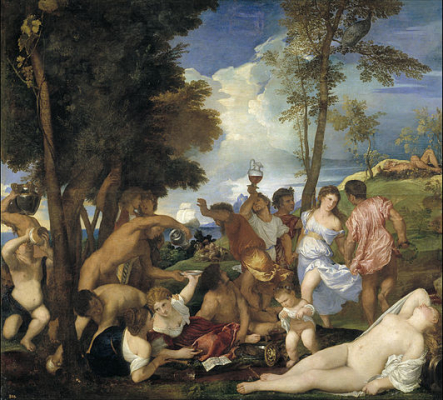
Additionally, Matisse references Titian. For like Titian’s Bacchanal of the Andrians, the scene depicted in Bonheur de Vivre is an expression of pure pleasure. Here is a place full of life and love and free from want or fear. Instead of a contemporary scene in a park, on the banks of the Seine, or other recognizable places in nature, Matisse has returned to mythic paradise.
Radicalism, or how to color outside the lines
But do not be misled by his interest in myth—Matisse is not joining in with Bouguereau or any other Salon artist. This is the epitome of Fauvism, a radical new approach that incorporate purely expressive, bright, clear colors and wildly sensual forms. Matisse’s painting s perhaps the first canvas to clearly understand Cézanne’s great formal challenge, and to actually further the elder master’s ideas. In fact, despite its languid poses, Bonheur de Vivre was regarded as the most radical painting of its day. Because of this, Matisse became known, briefly, as the most daring painter in Paris.
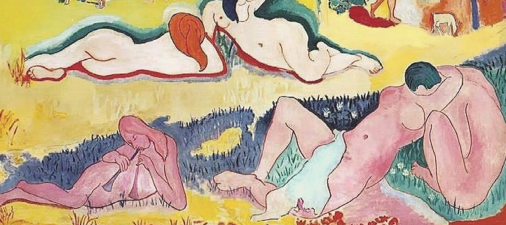
So what was daring about this canvas? Here is one key issue: unlike the paintings by Cézanne, Ingres, or Titian, Matisse’s work does not depict forms that recede in the background and diminish in scale. If you study the figures in the foreground and the middle ground of Bonheur de Vivre, you will notice that their scale is badly skewed. The shift of scale between the player of the double flute (bottom center) and the smooching couple (bottom right) is plausible, if we take the musician to be a child, but what of the giants just behind them? Compared to the figures standing in the wings, who are obviously mature women (middle ground left), these center women are of enormous proportion. They are simply too big to make sense of within the traditional conventions of Western painting.
Perspective, patronage and Picasso
So why has Matisse done this? How could these shifts of scale make sense? Have we seen anything like this before? Well, in a sense we have. Cézanne’s painting ruptured forms in order to accurately explore vision as experienced through time and space—in other words, forms look different depending on where we are in relation to them.
In fact, this exploration of vision through space is the key to understanding Matisse’s work. By incorporating shifting perspectives, he brought this idea to a grand scale. Put simply, Matisse’s shifting scale is actually the result of our changing position vis-à-vis the figures. As a result of his experimentation with perspective, the viewer relates differently to the painting and is required to “enter” the scene. It is only from the varied perspectives within this landscape that the abrupt ruptures of scale make sense.
The painting was purchased by a wealthy expatriate American writer-poet named Gertrude Stein and her brother, Leo Stein, who shared a home filled with modern art at 27 Rue de Fleurus, in Paris. This was also the location for Gertrude Stein’s weekly salon. Here, Matisse, Apollinaire, the young and largely unknown Picasso and other members of the avant-garde came together to exchange ideas.
Stein was able to attract such a crowd not only because of her literary skills but because she often provided financial support to these nearly destitute artists. In fact, the Steins bought Matisse’s Bonheur de Vivre soon after its completion and hung it in their dining room for all to see. One person who saw it there was Picasso. By all accounts the painting’s fame was too much for the terribly competitive young Spaniard. He determined to out do Matisse, and he did with his 1907 canvas, Demoiselles d’Avignon (MoMA).
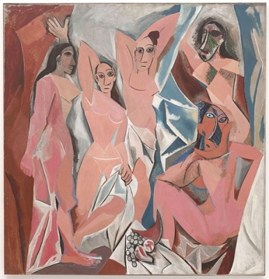
Picasso turned Matisse’s sensuality into violent pornography. Matisse in turn responds to the challenge of what was then called “primitivism” with his own brand of aggression in his Blue Nude.
Additional resources:
This painting at The Barnes Foundation
The Fauves from the National Gallery of Art Online Tour
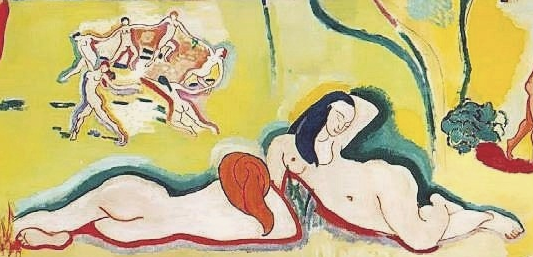
Henri Matisse, Dance I
by DR. BETH HARRIS and DR. STEVEN ZUCKER
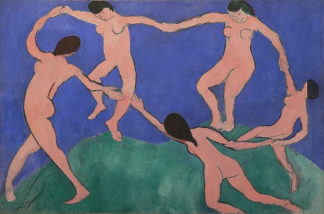
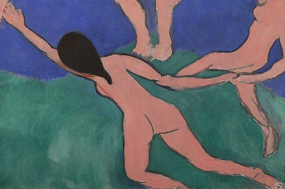
In 1909 Matisse received an important commission. An extremely wealthy Russian industrialist named Sergei Shchukin asked Matisse for three large scale canvases to decorate the spiral staircase of his mansion, the Trubetskoy Palace, in Moscow. The large and well loved painting, Dance I at MoMA, is somewhat disingenously titled. Although it is full scale and in oil, Matisse did not consider it more than a preparatory sketch. Yet a comparison between the initial and final versions is instructive. Matisse borrowed the motif from the back of the 1905-06 painting Bonheur de Vivre, although he has removed one dancer.

In Dance I, the figures express the light pleasure and joy that was so much a part of the earlier Fauve masterpiece. The figures are drawn loosely, with almost no interior definition. They have been likened to bean bag dolls because of their formless and unrestricted movements. The bodies certainly don’t seem to be restrained by way. But don’t let this childlike spontaneity fool you. Matisse works very hard to make his paintings seem effortless. Imagine for a moment, that instead of this childlike style, Matisse had decided to render this figures with the frozen density of Jacques Louis David. Would the sense of pure joy, the sense of play have been as well expressed? Matisse has done something that is actually very difficult. He has unlearned the lessons of representation so that he can create an image where form matches content.
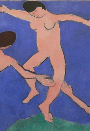
The dancers inhabit a brilliant blue and green field. But what exactly does the green represent? Many people would quickly reply, “a grassy hilltop.” Okay, but what then is the blue intended to represent? If I were lecturing at MoMA, as I often do, many listeners would offer that “the blue is the sky that rises above the hill.” But others in my group might begin to look frustrated. One might then say, “that’s not what I see, the blue is really water moving back into the distance.”
What Matisse has done here, even in seemingly simple rendering, is use spatial ambiguity to explore one of the key issues in modern painting, the conflict between the illusion of depth and an acknowledgment of the flatness of the canvas. One final point here, did you notice the break in the circle? The hands of the two front dancers are parted. Matisse has been careful to allow this break only where it overlaps the knee so as not to interrupt the continuity of the color. Why do this? The part is often interpreted in two ways, as a source of tension that requires resolution or, as an invitation to us the viewer to join in, after all, the break is at the point closest to our position.
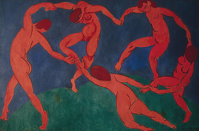
The final version of Dance has a very different emotional character. It has been described as forbidding, menacing, tribal, ritualistic, even demonic. Drum beats almost seem to be heard as the simple pleasure of the original is overwhelmed. What causes these dramatic changes in mood? Beyond the color shift, which is pretty obvious, the figures of the 1910 canvas are drawn with more interior line, line which often suggests tension and physical power. See for instance, the back left figure. Another more subtle change occurs where the two back figures touch the ground. In the 1909 canvas, the green reaches up to the feet of the two back most dancers, in the 1910 canvas, something else happens, the green seems to compress under the dancer’s weight. This subtle change creates either a sense of lightness or a sense of weight and contributes to the way we perceive each painting. So be careful before concluding that Matisse was actually drawing like a child, he knew exactly what he was doing.
Additional resources:
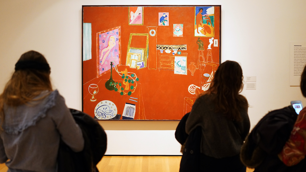
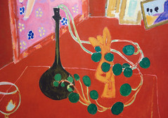
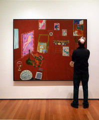
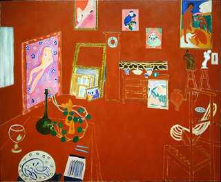
Henri Matisse, The Red Studio
by DR. BETH HARRIS and DR. STEVEN ZUCKER
Video \(\PageIndex{2}\): Henri Matisse, The Red Studio, 1911, oil on canvas, 181 x 219.1 cm (Museum of Modern Art, New York). Speakers: Dr. Steven Zucker and Dr. Beth Harris
Dismantling spatial illusion
Since Manet (and Degas, Monet, and Cezanne), artists have sought to undermine the illusion of space that had ruled painting since about 1425. Spatial illusion was increasingly seen as a defect that reduced the integrity of painting. But as the earlier painters of the avant-garde have shown, ridding a painting of illusion is almost impossible. The audience is trained to expect three dimensional space and sees it given the opportunity. This is Matisse’s challenge. He meets this challenge–the destruction of spatial illusion, in three stages.
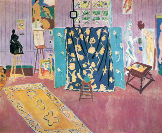
The color red
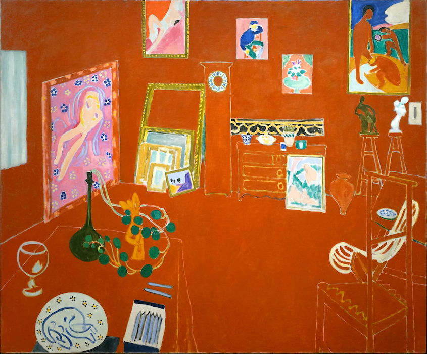
Red is often thought of as the most aggressive color. It has the most punch, and that’s what Matisse needed here. This canvas was a part of a series, there is, for instance, a Pink Studio too. But that canvas was concerned with different issues. Here, the red is an attempt to find a color that is forceful enough to resist the illusion of deep space by pushing to the surface. The red is, of course painted onto the flat canvas but actually fails to remain there visually. Instead, the red becomes the walls and furnishing of the room seen in space. Illusion triumphs–Matisse is thwarted.
Illusionism
This triumph of illusion is due in part to the linear perspective that defines the table, chairs, and the walls and floor of the studio. But look! Matisse has constructed some of the worst linear perspective ever seen. Receding lines should converge, but look at the chair on the lower right. The lines widen as they go back. And look to rear left corner of the room. The corner is defined by the edge of the pink canvas but above that painting, the line that must define the corner is missing! Matisse is literally dismantling the perspective of the room but it makes no difference, we still see the room as an inhabitable space. Illusion still triumphs.
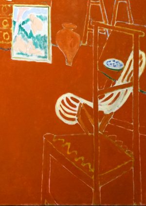
Figure-Ground Relationship
Although it is very difficult to see in reproduction, if seen in person at MoMA, it is clear that the whitish lines that define form in the red field are not painted on top of the red. Instead, they are reserve lines. In other words, the white lines are actually the canvas below. Matisse painted the red planes up to the line on either side, leaving a narrow gap of white canvas in between. This is really IMPORTANT. Stay with me on this. The white line is actually emerging from below the red. It is beneath. The red is of course painted on top of the white canvas.
Okay, now pay attention. Matisse has realized that illusion is almost certain to triumph no matter how aggressively he tries to undermine it. We, as the audience, will see space if given the slightest opportunity. So if we see illusion at such a basic level, what hope does Matisse have of destroying it? In fact, his reserve line are his really brilliant solution. The chairs, the dresser, the clock, each object, or figure in The Red Studio is constructed out of the canvas below. At the same time, the ground which supports those figures, is constructed out of a plane of red that is physically above the canvas. What Matisse has done then is reverse the figure ground relationship. He has made the figure out of the ground (the canvas) and made the ground out of the figure (the red paint on top). When seen in person, the recognition of this does finally destroy illusion, Matisse triumphs!
Additional resources:
Smarthistory images for teaching and learning:
Henri Matisse, The Blue Window
by THE MUSEUM OF MODERN ART
Video \(\PageIndex{3}\): Video from The Museum of Modern Art.
Additional resources:
Henri Matisse, Goldfish
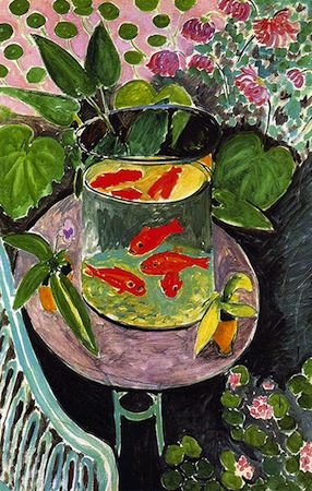
Goldfish were introduced to Europe from East Asia in the 17th century. From around 1912, goldfish became a recurring subject in the work of Henri Matisse. They appear in no less than nine of his paintings, as well as in his drawings and prints. Goldfish, 1912 belongs to a series that Matisse produced between spring and early summer 1912. However, unlike the others, the focus here centers on the fish themselves.
Color
The goldfish immediately attract our attention due to their color. The bright orange strongly contrasts with the more subtle pinks and greens that surround the fish bowl and the blue-green background. Blue and orange, as well as green and red, are complementary colors and, when placed next to one another, appear even brighter. This technique was used extensively by the Fauves, and is particularly striking in Matisse’s earlier canvas Le Bonheur de vivre. Although he subsequently softened his palette, the bold orange is reminiscent of Matisse’s fauvist years, which continued to influence his use of color throughout his career.
Golden age
But why was Henri Matisse so interested in goldfish? One clue may be found in his visit to Tangier, Morocco, where he stayed from the end of January until April 1912. He noted how the local population would day-dream for hours, gazing into goldfish bowls. Matisse would subsequently depict this in The Arab Café, a painting he completed during his second trip to Morocco, a few months later.
In a view consistent with other Europeans who visited North Africa, Matisse admired the Moroccans’ lifestyle, which appeared to him to be relaxed and contemplative. For Matisse, the goldfish came to symbolize this tranquil state of mind and, at the same time, became evocative of a paradise lost, a subject—unlike goldfish—frequently represented in art. Matisse was referring back to artists such as Nicolas Poussin (for example, Et in Arcadia ego), and Paul Gauguin (who painted during his travels to places like Tahiti).
The paradise theme is also prevalent in Matisse’s work. It found expression in Le Bonheur de vivre (The Joy of Life), and the goldfish should be understood as a kind of shorthand for paradise in Matisse’s painting. The mere name “gold-fish” defines these creatures as ideal inhabitants of an idyllic golden age, which it is fair to say Matisse was seeking when he travelled to North Africa. It is also likely that Matisse, who by 1912 was already familiar with the art of Islamic cultures, was interested in the meaning of gardens, water and vegetation in Islamic art—as well as symbolizing the beauty of divine creation, these were evocations of paradise.
Metaphor for the studio
However, Goldfish was not painted in Morocco. Henri Matisse painted it at home, in Issy-les-Moulineaux, near Paris. Matisse had moved to Issy in September 1909 to escape the pressures of Parisian life. So what you see here are Matisse’s own plants, his own garden furniture, and his own fish tank. The artist was drawn to the tank’s tall cylindrical shape, as this enabled him to create a succession of rounded contours with the top and bottom of the tank, the surface of the water and the table. Matisse also found the goldfish themselves visually appealing. Matisse painted Goldfish in his garden conservatory, where, like the goldfish, he was surrounded by glass.
Contemplation
Matisse distinguished predatory observation from disinterested contemplation, the latter being his preferred approach. Goldfish invites the viewer to indulge in the pleasure of watching the graceful movement and bright colors of the fish. Matisse once wrote that he dreamt of “an art of balance, of purity and serenity, devoid of troubling or depressing subject matter, an art that could be […] a soothing, calming influence on the mind, something like a good armchair that provides relaxation from fatigue.” This is precisely what Matisse wanted Goldfish to provide for the viewer.
Constructing pictorial space
The painting contains a tension created by Matisse’s depiction of space. The fish are seen simultaneously from two different angles. From the front, the goldfish are portrayed in such a way that the details of their fins, eyes and mouths are immediately recognizable to the viewer. Seen from above, however, the goldfish are merely suggested by colorful brushstrokes. If we then look at the plants through the transparent glass surface, we notice that they are distorted compared to the ‘real’ plants in the background.
Matisse paints the plants and flowers in a decorative manner. The upper section of the picture, above the fish tank, resembles a patterned wallpaper composed of flattened shapes and colors. What is more, the table-top is tilted upwards, flattening it and making it difficult for us to imagine how the goldfish and flowerpots actually manage to remain on the table. Matisse constructed this original juxtaposition of viewpoints and spatial ambiguity by observing Paul Cézanne’s still-life paintings. Cézanne described art as “a harmony parallel to nature”. And it is clear here that although Matisse was attentive to nature, he did not imitate it but used his image of it to reassemble his own pictorial reality. Although this can be confusing for the viewer, Matisse’s masterful use of color and pattern successfully holds everything together.
This painting is an illustration of some of the major themes in Matisse’s painting: his use of complimentary colors, his quest for an idyllic paradise, his appeal for contemplative relaxation for the viewer and his complex construction of pictorial space.
Additional Resources:
Matisse’s Goldfish and Sculpture, MoMA
Matisse’s Young Woman before an Aquarium, Barnes Foundation
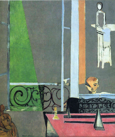
Henri Matisse, The Piano Lesson
by DR. STEVEN ZUCKER and DR. BETH HARRIS
Video \(\PageIndex{4}\): Henri Matisse, The Piano Lesson, 1916 (MoMA)
Key points:
- With its austere geometries and structured sense of balance, The Piano Lesson is sometimes seen as Matisse’s answer to Cubism.
- The composition opposes the sensual, suggested by the sculpture in the left foreground, to discipline and order, implied by the geometric image of a woman in the upper right.
- This painting could serve as an allegory on art making, which requires balance between emotional expression and intellectual understanding.
This highly abstract painting is important because of its relation to the Cubist grid developed by Pablo Picasso and Georges Braque, because of its biographical aspects, and especially due to its thoughtful iconography (symbolic content).
A nostalgic image
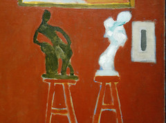
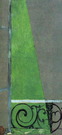
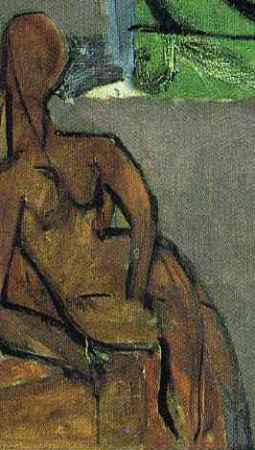
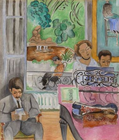
This large flat gray painting can be a bit confusing at first. Let’s begin with the boy in the lower right. He is the artist’s son, Pierre Matisse, who grows up to become a famous art dealer in New York in the 1940s. It’s worth remembering that 1916 was during world war one, the most devastating conflict Europe had yet known. When Henri painted this image, Pierre was actually mobilized. The painter did not know if his son would return. In a way then, this is a nostalgic image, Matisse has painted his son much younger then he actually was, perhaps recalling happier times. Maybe happy isn’t really the right word since Pierre looks pretty miserable. Maybe I’m just remembering my own childhood piano lessons, but his is a look of worried concentration. A portion of his face even seems to reflect that instrument of the devil, commonly known as a metronome. Pierre sits at the piano well off to the side, trapped in the house even as the open French window (a floor-to-ceiling hinged window that opens onto a wrought iron railing) beckons. Finally, what is that very abstract truncated triangle of green? Often it is interpreted as ray of sun reaching across the lawn outside.
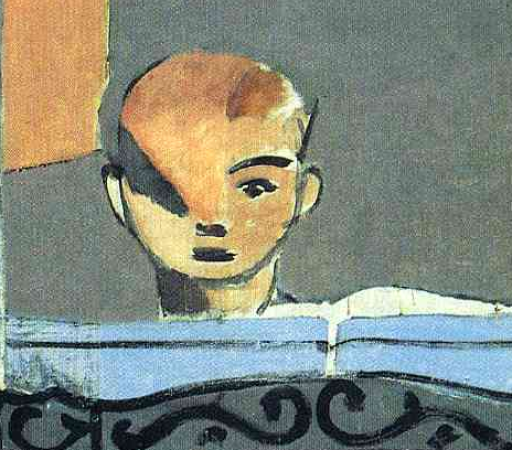
You can see why poor little Pierre is so attentive. His music teacher literally hovers above him, cold, distant, and aloof. What a wonderful contrast to the other female figure in the painting.While the teacher represents discipline through her rigid rectilinear form, the small bronze nude at the lower left is virtually all curves. This small sculpture by Matisse is meant to represent the creative spirit while the teacher represents discipline, and like two boxers between rounds, each is in her corner. But wait! Is the teacher really there? Space is so ambiguous that it is hard to tell if there is really a distant room for her to inhabit. In fact, there is not and she is not. This is Matisse’s house in the suburb Issey-les-Moulineaux and this is a wall. The “teacher” is actually a painting by Matisse titled, Woman on a High Stool (Germaine Raynal), 1914 (MoMA).
Matisse has transformed the original painting in order that Raynal play the part of the strict instructor, Matisse often created variations on themes that he had already treated. So, in fact, Matisse has created a painting of a painting and a painting of a sculpture. This suggests that perhaps The Piano Lesson is not only about Pierre and his childhood experiences but more importantly, the act of creation itself. Is Pierre actually a stand in for Henri? After all, music is a common metaphor for the visual arts.
A visual equivalent of music
Is Matisse then saying that art is the result of both sensual creativity (the sculpture) and strict discipline (the painting)–is the metronome that swings between the two, a mediator? And then what of the odd inclusion of the carved music stand which contains the brand of the piano, “PLEYEL” (which is read backwards as we see it)?
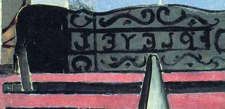
As you can see from the later and less abstract painting Music Lesson, Matisse has removed everything that is not essential from the 1916 canvas. So why then retain these letters? And why retain the playful swirling wrought iron fence? According to Jack Flam, a leading Matisse scholar and an old instructor of mine (and by the way, not very strict nor rectilinear), Matisse wants us to read the letters from right to left and then continue to read past the music stand by jumping to the curving iron fence which he believes to be an abstract expression or visual equivalent of the music (art) that is being produced.
Smarthistory images for teaching and learning:
Henri Matisse, the illustrated book Jazz
by THE METROPOLITAN MUSEUM OF ART
Video \(\PageIndex{5}\): Video from The Metropolitan Museum of Art
Expressionism
The term "Expressionism" first emerged as a way to classify new types of art that emphasized emotional impact over descriptive accuracy.
c. 1905 - 1914
Expressionism, an introduction
by SHAWN ROGGENKAMP
Imagine a painting where the magentas scream, the greens glare, and coarse brushstrokes become more ominous the longer you look at them. Paintings like this, where the artist uses color, line, and visible techniques to evoke powerful responses from the viewer date from the early twentieth century but continue expressive traditions that can be found throughout art’s history (see, for example, work by Francisco Goya). When capitalized as “Expressionism,” however, the term refers more specifically to an artistic tendency that became popular throughout Europe in the early twentieth century. Like many categories in art history, Expressionism was not a name coined by artists themselves. It first emerged around 1910 as a way to classify art that shared common stylistic traits and seemed to emphasize emotional impact over descriptive accuracy. For this reason, artists like Edvard Munch straddle the line between Post-Impressionist developments in late 19th century painting and early 20th century Expressionism. Likewise, the Fauves in France exhibited similar characteristics in their work and are often linked to Expressionism.
Expressionism in Germany
Though many artists of the early twentieth century can accurately be called Expressionists, two groups that developed in Germany, Die Brücke (The Bridge) and Der Blaue Reiter (The Blue Rider), are among the best known and help to define the style. Influenced in part by the spiritual interests of Romanticism and Symbolism, these artists moved further from the idealized figures and smooth surface of 19th century academic painting that can be seen in paintings by Lawrence Alma-Tadema, for example. Instead of depicting the visible exterior of their subjects, they sought to express profound emotional experience through their art. German Expressionists, like other European artists of the time, found inspiration in so-called “primitive” sources that included African art, as well as European medieval and folk art and others untrained in Western artistic traditions. For the Expressionists, these sources offered alternatives to established conventions of European art and suggested a more authentic creative impulse.
Die Brücke
In 1905, four young artists working in Dresden and Berlin, joined together, calling themselves Die Brücke (The Bridge). Led by Ernst Ludwig Kirchner, the group wanted to create a radical art that could speak to modern audiences, which they characterized as young, vital, and urban. Drawn from the writings of Friedrich Nietzsche, the nineteenth-century German philosopher, the name “Die Brücke” describes their desire to serve as a bridge from the present to the future. While each artist had his own personal style, Die Brücke art is characterized by bright, often arbitrary colors and a “primitive” aesthetic, inspired by both African and European medieval art. Their work often addressed modern urban themes of alienation and anxiety, and sexually charged themes in their depictions of the female nude.
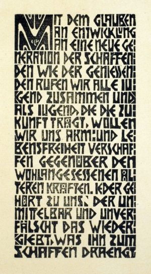
Their first exhibition was held in the showroom of a lamp factory in Dresden in 1906 for which they published a program of woodcut prints reflecting their interest in earlier traditions of German art. In the introductory broadsheet (above left), Kirchner made clear the group’s revolutionary intentions. He proclaimed,
With faith in progress and in a new generation of creators and spectators we call together all youth. As youth, we carry the future and want to create for ourselves freedom of life and of movement against the long established older forces.\(^{1}\)
This optimism was not long-lived. Internal squabbling caused the group to dissolve in 1913 just prior to the start of the First World War.
Der Blaue Reiter
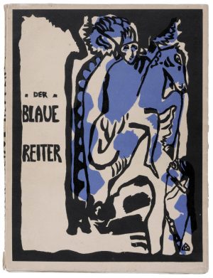
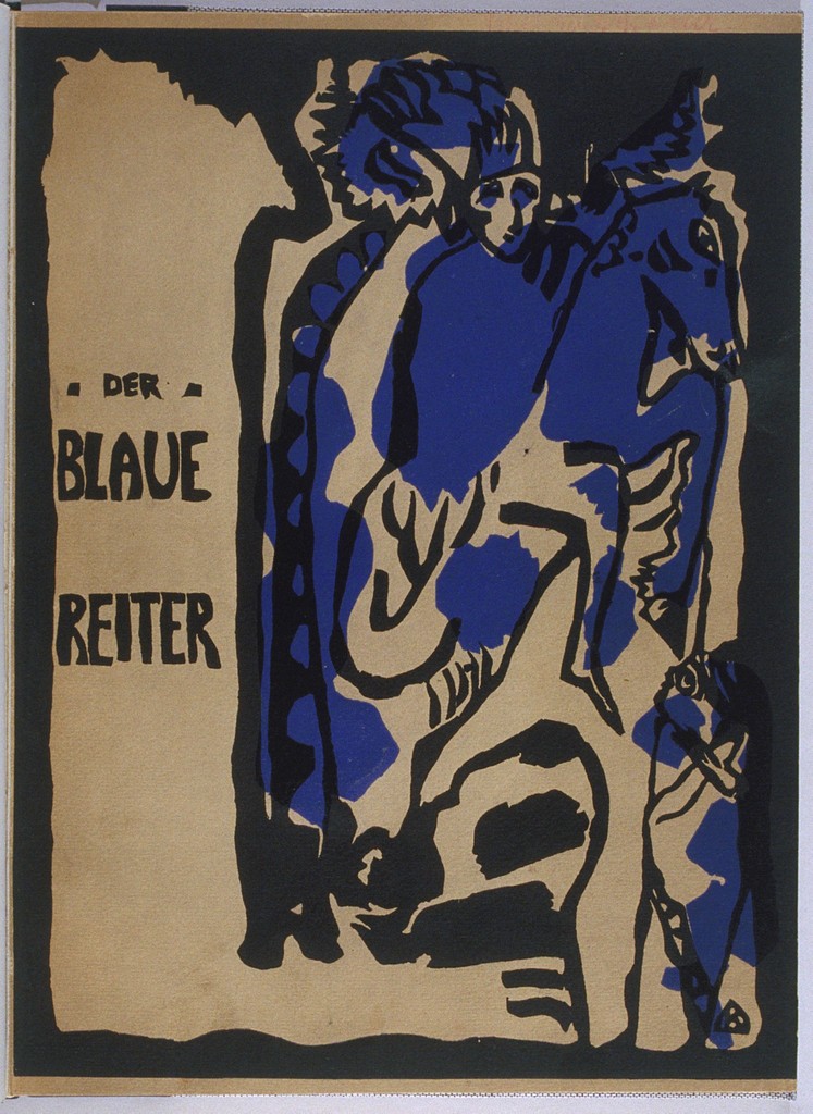
Based in the German city of Munich, the group known as Der Blaue Reiter lasted only from their first exhibition at the Galerie Thannhausen in 1911 to the outbreak of World War I in 1914. Created as an alternative to Kandinsky’s previous group, the more conservative Neuen Künstlervereinigung München (New Artists Association of Munich or NKVM), Die Blaue Reiter took its name from the motif of a horse and rider, often used by founding member Vasily Kandinsky.
This motif appeared on the cover of the Blue Rider Almanac (left), published in May 1912, and reflects Kandinsky’s interest in medieval traditions and the folk art of his Russian homeland. In contrast to Die Brücke, whose subjects were physical and direct, Kandinsky and other Die Blaue Reiter artists explored the spiritual in their art, which often included symbolism and allusions to ethereal concerns. They thought these ideas could be communicated directly through formal elements of color and line, that, like music, could evoke an emotional response in the viewer. Conceived by Kandinsky and Franz Marc, the almanac included essays by themselves and other German and Russian artists, musical compositions by Expressionist composers, such as Arnold Schönberg, and Kandinsky’s experimental theater piece, “Der gelbe Klang” (The Yellow Sound). This range of content shows Der Blaue Reiter’s efforts to provide a philosophical approach not just for the visual arts, but for culture more broadly. These ideas would become more fully developed at the Bauhaus where Kandinsky taught after the war (Marc died during the Battle of Verdun in 1916).
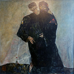
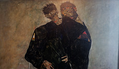
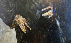
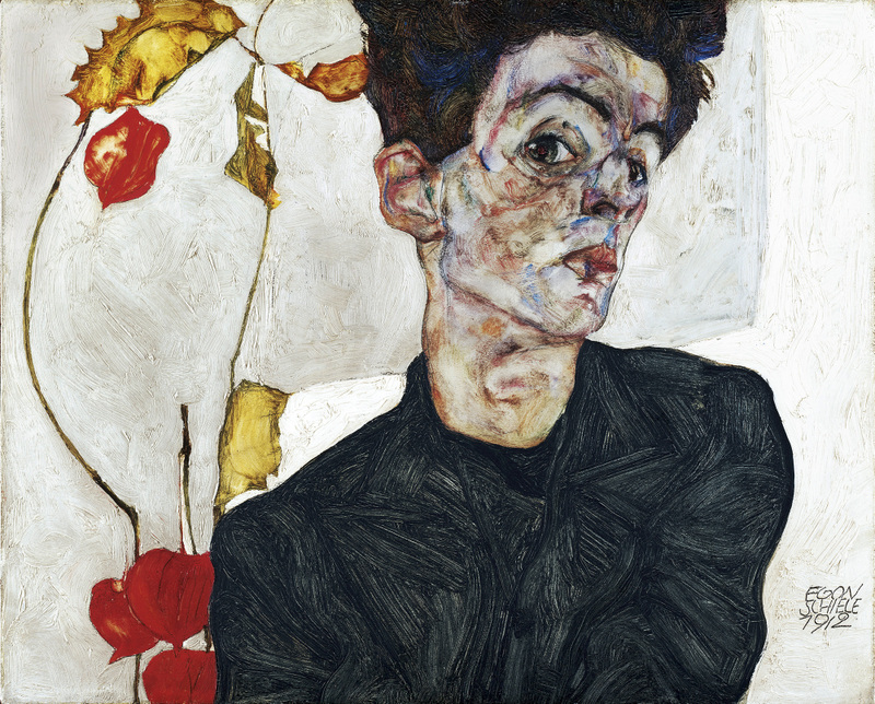
Austrian Expressionism
While the Die Brücke and Der Blaue Reiter groups had relatively defined memberships, Expressionist artists also worked independently. In Vienna, Oskar Kokoschka and Egon Schiele stand out for paintings that show intense, often violent feeling and for their efforts to represent deeper psychological meaning.
In the aftermath of the First World War, many artists in Germany felt that the forceful emotional style of Expressionism that had been so progressive before the war but had become less appropriate. Neue Sachlichkeit (New Objectivity) arose as a direct response to pre-war stylistic excess.
\(^{1}\)Translated excerpt from Charles Harrison and Paul Wood, Art in Theory, 1900-2000: An Anthology of Changing Ideas, Oxford: Blackwell Publishing, 1993, page 65
Additional resources
Artists of Brücke: Themes in German Expressionist Prints (MoMA)
Der Blaue Reiter Almanac (MoMA)
Brücke Museum, Berlin (in German)
Fauvism on the Metropolitan Museum of Art’s Heilbrunn Timeline of Art History
Expressionism as Nordic?
by DR. CHARLES CRAMER and DR. KIM GRANT
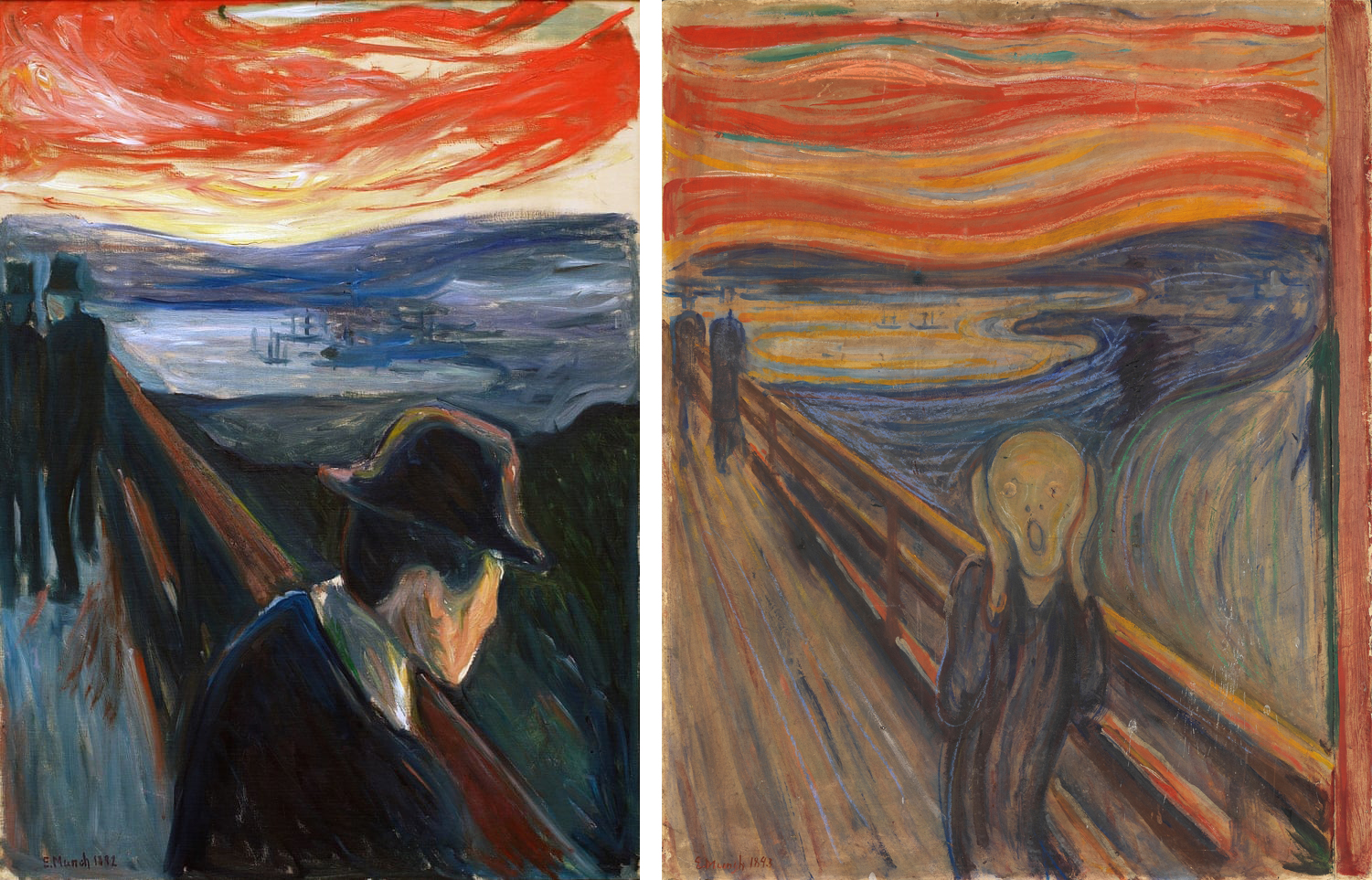
Edvard Munch’s The Scream is recognized from Toledo to Timbuktu as a powerful visual expression of anxiety, but it had its genesis in a very specific place. As the artist recollected in a diary entry of 22 January 1892:
I was walking along the road with two friends – the sun went down – I felt a gust of melancholy – suddenly the sky turned a bloody red. I stopped, leaned against the railing, tired to death – as the flaming skies hung like blood and sword over the blue-black fjord and the city – My friends went on – I stood there trembling with anxiety – and I felt a vast infinite scream [tear] through nature.\(^{[1]}\)
Munch was deeply affected by this incident and depicted it several times: first as Despair in 1892, and then in several different versions in different media under the title The Scream.
Munch’s moment of anxiety occurred on a road along Ekeberg Hill overlooking Oslo. The wooden railing visible in the paintings and mentioned in his diary lined the steep cliffside of the fjord protecting Oslo’s port. There is even some evidence that the famous blood-red, undulating sky that Munch associated with this feeling may also have been geographically specific. It closely resembles the pattern formed by polar stratospheric clouds visible almost exclusively in Northern Europe during the winter dusk.
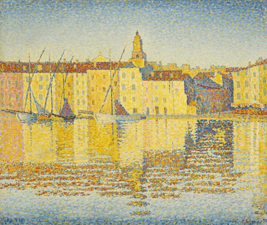
Munch’s vivid diary entry occurred in a very different location, however: Nice, in the south of France, where the artist was vacationing at the time. Even the relative warmth and bright sunshine of the French Mediterranean, evoked in this contemporary painting of Saint-Tropez by Neo-Impressionist artist Paul Signac, could not relieve Munch of the deep anxiety he remembered experiencing in the cold north.
Climatic determinism
This contrast between Norway and the south of France in terms of temperament as well as temperature illustrates what was once a commonplace of cultural geography: the idea that climate significantly shapes the psychological characteristics, not just of individuals, but of whole societies. Although this idea is currently discredited by its association with racist pseudo-science, it had widespread currency during the late nineteenth and early twentieth centuries. It was commonly believed that there was a major cultural divide in Europe between the sun-filled south, associated with temperate, Classical rationality, and the cold north, which was riddled with spiritual angst and melancholy.
Even today, Expressionist art is primarily associated with northern Europe. Many Scandinavian and German Expressionist artists took great pride in their Nordic or Teutonic heritage and attempted to define and revive a distinctly Northern European artistic tradition that was fundamentally different from Mediterranean Classicism.
Classical versus Gothic
One champion of this idea was the German art historian Wilhelm Worringer, whose book Form Problems in the Gothic (1910) provided an important theoretical framework for German Expressionism. For Worringer, the Gothic was more than just a late Medieval style. There was a “latent Gothic” in the art of the Germanic tribes (called Goths) that fought against Rome, running through the distinctively Northern versions of the Renaissance and Baroque periods, and continuing into his own time. This tradition had, however, been overshadowed by Mediterranean Classicism, which had long been considered the aesthetic ideal. Northern Gothic art was seen as an incompetent attempt at naturalism, rather than a distinct tradition of its own.
Worringer described Mediterranean Classical art as rational, beautiful, joyful, and tranquil, while he saw the Northern Gothic tradition as more spiritual and as having greater “depth, grandeur, and power.”\(^{[2]}\) In a particularly vivid passage, Worringer contrasts the type of line preferred by each of these traditions. Classicism tends toward “beautiful, round, organically tempered curves” where the Gothic prefers a “stiff, angular, repeatedly interrupted, jagged line of [the] strongest expressive force.” This difference in style results from different temperaments of the Germanic versus Latin peoples:
As those line scrawls seem merely the release of an inner spiritual pressure, so the excitement, the convulsiveness, the fever, of northern drawing unquestionably throws a flashlight upon the heavily oppressed inner life of northern humanity.\(^{[3]}\)
For Worringer, artistic style reveals the inner, psychological state, not just of the individual artist, but of an entire culture.
Woodcut prints and Expressionism
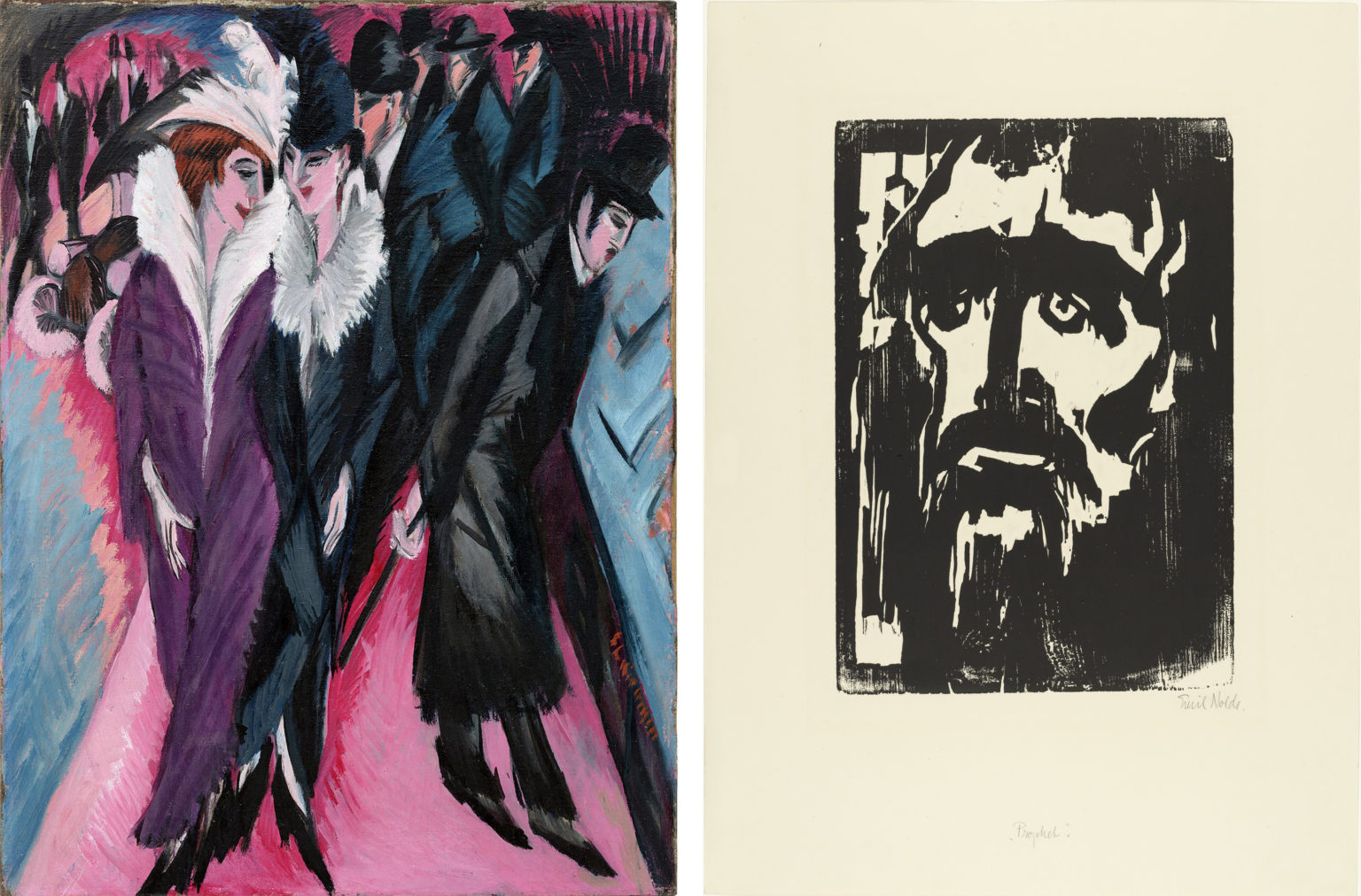
According to Worringer, even Nordic artists who adopted some Italian Classical characteristics, such as the German Renaissance printmaker Albrecht Dürer, remain fundamentally Gothic in their approach. Dürer’s woodcut prints embody the jagged, angular linearity and flat space that is characteristic of Worringer’s Gothic.
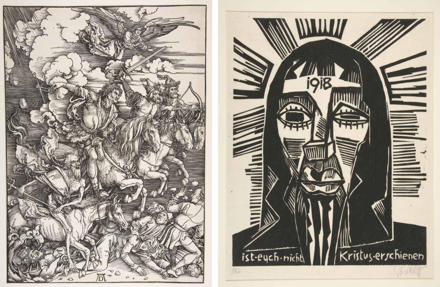
The German Expressionists deliberately revived the technique of woodcut printing because of this relatively crude, expressive style, as well as its nationalistic association with great German artists such as Dürer. Like Worringer, the German Expressionists saw a jaggedly angular, flat style as an authentic expression of their national tradition.
Both of these prints, furthermore, radiate the spiritual angst that Worringer associated with Nordic psychology. Dürer’s shows the four horsemen of the Apocalypse wreaking havoc in the world, while Schmidt-Rottluff’s Christ confronts the viewer with a face swollen and misshapen by torment. On his forehead the year 1918 is emblazoned in order to connect Christ’s suffering with the contemporary state of the world, then enmeshed in the first World War.
Emil Nolde and Expressionist nationalism
The German Expressionist Emil Nolde was particularly explicit in linking himself to a Nordic tradition. In his autobiography, Nolde wrote:
Glory be to our strong, healthy German art. [I much prefer] the holy German madonnas, invested with the soul of Grünewald and others, over the Latin, superficially presentable paintings of Raphael . . . All the arts of all the Mediterranean people share certain qualities . . . Our German art has glorious qualities of its own. We respect the art of the Latins; German art has our love. The Edda, the Isenheim Altar, Goethe’s Faust, Nietzsche’s Zarathustra . . . these proud, sublime works of Nordic Germanic peoples! These are eternal truths.\(^{[4]}\)
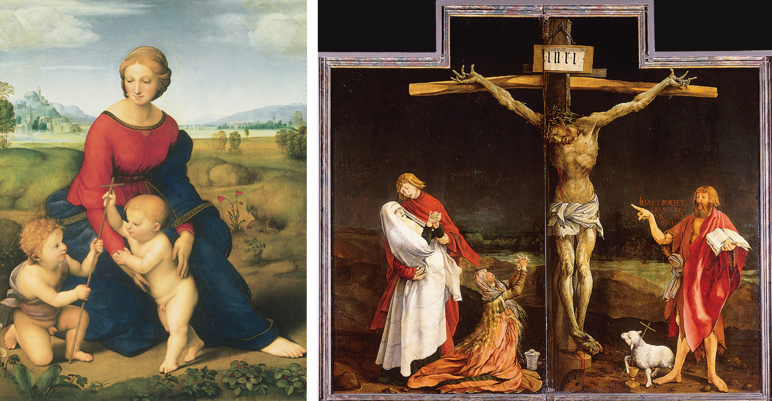
The psychological contrast that Nolde suggests between Matthias Grünewald’s Isenheim Altarpiece and a Raphael Madonna could not be more pronounced. Not only is the latter, showing a Virgin and Child in a meadow, an inherently more tranquil subject than Grünewald’s harrowing Crucifixion, we can also recognize some of Worringer’s distinctions between Latin and Gothic forms. Raphael’s painting emphasizes deep space, soft curves, and idealization, whereas Grünewald’s altarpiece features flattened space, jagged, angular shapes, and dark, gruesome realism.
Coda: Expressionism and National Socialism
It is one of the great ironies of art history that the best-known propagandists of German nationalism, the Nazi party of the 1930s and 40s, supported Mediterranean Classicism rather than the Northern “Gothic” artistic tradition identified by Worringer and the Expressionists. Far from being celebrated as a native hero by the Nazis, Emil Nolde was issued a Malverbot (German for “forbidden to paint”), and 27 of his works were featured in the Degenerate Art exhibition that Hitler sponsored in 1937.
It should also be noted that these distinctions between “Mediterranean” and “Gothic” style depend upon a careful selection of examples, and that the extrapolation of those distinctions into temperamental, spiritual, or “racial” differences tends to be ideologically motivated. Regional differences can be identified in the history of art, but art historians today more commonly attribute them to conventional cultural traditions, rather than innate or climatologically-determined psychological or spiritual differences.
Notes:
- Edvard Munch, entry from the ‘Violet Diary,’ Nice, 22 January 1892, as translated by Ingeborg Owesen in Charles Harrison and Paul Wood, eds., Art in Theory, 1815-1900 (Oxford: Blackwell, 1998), p. 1044.
- Wilhelm Worringer, Form Problems of the Gothic, unknown translator, (New York: G. E. Stechert, [1920]), pp. 43, 35.
- Ibid., pp. 49-50.
- Emil Nolde, Jahre der Kämpf (Berlin, 1934), as translated by Ernest Mundt in Herschel B. Chipp, ed., Theories of Modern Art (Berkeley, L.A. and London: University of California Press, 1968), p. 151.
Der Blaue Reiter
by DR. CHARLES CRAMER and DR. KIM GRANT
The 1912 art book Der Blaue Reiter (The Blue Rider) was originally intended to be a yearly “almanac” published by a Munich-based artists’ collective of the same name. It is a fascinating document of the early-twentieth century Expressionist art scene, featuring a dozen essays on topics ranging from so-called primitive masks to the stage direction for an experimental “color-tone drama” called The Yellow Sound. Particularly interesting is the eclectic variety of its illustrations, which combine the work of modern artists such as Ernst Ludwig Kirchner, Vincent van Gogh, Paul Cézanne, and Pablo Picasso with African statues, Chinese ink painting, German folk art, Renaissance woodcuts, and Medieval sculpture.
An inner Renaissance
One of the editors of the book, the Russian artist Vasily Kandinsky, wrote of Der Blaue Reiter’s intent, “We aim to show by means of the variety of forms represented how the inner wishes of the artist are embodied.”\(^{[1]}\) This emphasis on the “inner” or subjective mental states of the artist, as opposed to the “outer” or objective experience of nature, is a central theme of Expressionist art theory.
In a preface to the group’s first exhibition, Kandinsky similarly detects in his fellow artists “the signs of a new inner Renaissance.”\(^{[2]}\) The word “inner” distinguishes this new Renaissance from the Italian Renaissance of the 1400s, which saw the rise of a naturalistic style of representation that, many Expressionist artists contended, was only concerned with representing the outer appearances of material reality. The crude, almost childlike simplicity of the cover art for the Almanac, along with its Christian medieval imagery of the blue rider as Saint George, is a visual emblem of two of the groups’ main themes that will be explored here: primitivism and spirituality.
An artists’ collective
The members of the Blaue Reiter group, including Gabriele Münter, Franz Marc, Auguste Macke, Vasily Kandinsky, and Alexej von Jawlensky, banded together because they felt that the art establishment had shut them out of opportunities. In the modern period, like-minded artists would often form such cooperatives to sponsor their own exhibitions free from conservative art juries, as well as to provide for mutual support and the exchange of ideas. Among the art movements that got their start in this way were the Impressionists, the Vienna Secession, the Fauves, and another German Expressionist group, Die Brücke.
The name Der Blaue Reiter, as Kandinsky later somewhat flippantly suggested, was chosen because fellow artist Franz Marc liked horses and Kandinsky liked riders, and they both liked the color blue. The group’s emblem was the Roman Christian soldier Saint George, who slew a dragon that was demanding human sacrifices.
The figure of the Blue Rider thus embodied the spiritual focus of the group as well as their belief that art plays an important social role in the struggle between good and evil. The intensified color and simple, almost childlike rendering of the same story by Auguste Macke is characteristic of the group’s style, although as Kandinsky noted above, they recognized the great variety of ways in which “inner” states could be expressed.
Primitivism and spirituality
In addition to work by its members, the Almanac and the group’s exhibitions featured works by Medieval, non-European, and untrained folk artists — all of which would have been identified at the time as “primitive.’” For example, the illustrations accompanying the first essay, “Spiritual Possessions” by Franz Marc, include a 15th-century German woodcut, a Chinese painting of cats, two drawings by children, and a German folk art glass painting alongside a recent Cubist painting by Pablo Picasso.
As Kandinsky suggested, what all of these disparate works have in common is their rejection or lack of knowledge of the post-Renaissance Western tradition, with its emphasis on artistic naturalism, scientific knowledge, and technological progress. Starting in the 1700s, a growing number of artists and thinkers saw modern science, technology, and urban life as a threat to humankind’s true spiritual vocation. The simple, even crude works of so-called “primitive” artists were seen as exemplars of an approach to both art and life that emphasized higher spiritual aims.
“I did not need nature to prompt me”
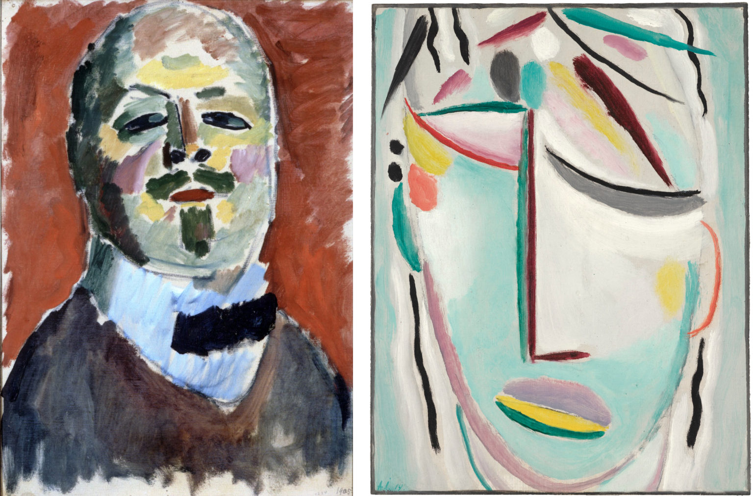
Although he studied painting with the Russian Realist Ilya Repin, Alexei von Jawlensky deliberately rejected his training in favor of a childlike simplicity and directness in his later works. For example, his 1905 Self-Portrait, while painterly and simplified, is a convincing likeness of the artist, with naturalistic proportions and chiaroscuro modeling. The coloring is bright, but based on close observation — warmer red tones appear on the cheeks, nose, and forehead, and cooler tones define the eyes, temples, and jawline.
The later work, Savior’s Face, was part of a series of portraits called “mystical” or “abstract heads,” which the artist noted were not executed from nature:
I sat in my studio and painted, and I did not need Nature to prompt me. It was enough for me to immerse myself in myself, to pray and prepare my soul to attain a religious state.
Cited in Jürgen Schultze, Alexej Jawlensky (Cologne, 1970), p. 39.
Here, the childlike simplicity of the work serves as a guarantor of the artist drawing, with naive directness, from an inner, mystical vision he has of the savior’s face, rather than depicting external appearances.
Folk art
Many of the Blaue Reiter artists were particularly interested in folk artists who had no professional training in art. Kandinsky and Gabriele Münter encountered a common Eastern European type of folk art, Bavarian glass painting, when they left Munich for the small town of Murnau.
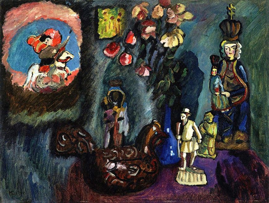
Münter’s Still-Life with St George is a composition of folk-art objects that she had collected. A theme of nature emerges in the flowers, chicken, and figurines of what appear to be walking peasants, while spiritual notes are sounded by the two statuettes of the Virgin Mary holding the Christ child, as well as Saint George in the upper left.
The style of the work reinforces these themes. Münter’s blunt, heavy brushwork and crude drawing style matches the rough-hewn simplicity of the folk art objects she admired, while the highly saturated colors in the flowers, Saint George, and the rightmost Virgin Mary glow almost supernaturally against the dark, earthy tones of the rest of the work.
Music
The group’s belief that art had to go beyond merely representing material reality also took inspiration from music. Several of the essays in the Almanac were about music, including one by experimental composer Arnold Schönberg, and the sheet music for three compositions was included at the end of the Almanac.
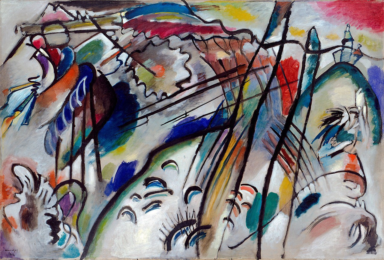
Kandinsky in particular admired the way that music stirred inner emotional and spiritual states through abstract means, by combinations and sequences of sound, without attempting to imitate nature. Seeking a visual equivalent, Kandinsky theorized that painters could do the same by creating compositions of pure color and form. Although it would take several years before he was confident enough to produce pure-abstract works on this principle, Kandinsky gave his works musical titles such as “composition” and “improvisation” in order to encourage viewers to ignore their apparent subject matter and concentrate on their color harmonies.
The Blaue Reiter group was highly eclectic both in its influences and its output, but the core of the movement was based around the desire for a new Renaissance in art, one dedicated to expressing inner emotional and spiritual states, rather than simply reproducing the outer appearances of material objects. “Primitive” folk art and abstract musical compositions provided key models for their quest.
Notes:
- Translated in Kenneth C. Lindsay and Peter Vergo, eds., Kandinsky: Complete Writings on Art (New York: Da Capo Press, 1994), p. 113.
- Ibid.
Additional resources:
Read more about reverse-glass painting and Der Blaue Reiter artists
Ernst Ludwig Kirchner
Ernst Ludwig Kirchner, Self-Portrait As a Soldier
by SHAWN ROGGENKAMP
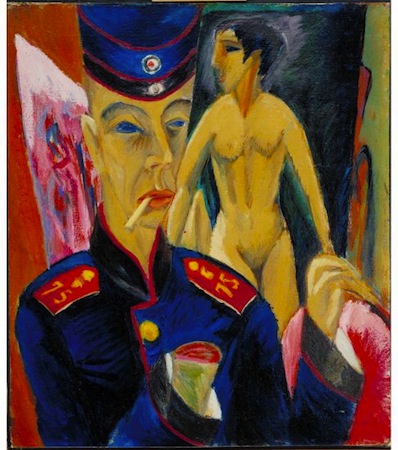
Ernst Ludwig Kirchner’s Self-Portrait As a Soldier is a masterpiece of psychological drama. The painting shows Kirchner dressed in a uniform but instead of standing on a battlefield (or another military context), he is standing in his studio with an amputated, bloody arm and a nude model behind him. It is in this contrast between the artist’s clothing and studio space that we can read a complicated coming of age for an idealistic young artist.
Die Brücke
In 1905, Kirchner, together with several other young artists from Dresden founded the German Expressionist group Die Brücke (The Bridge). Kirchner created their manifesto, a woodblock print that was to be widely disseminated as a call to arms: “We call all young people together, and as young people, who carry the future in us, we want to wrest freedom for our actions and our lives from the older, comfortably established forces.”
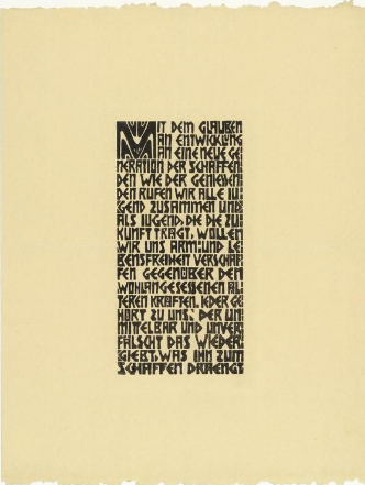
Spurred on by their confidence and their belief that they lived in an age of great change, the Brücke artists set about creating an entirely new way of being artists. Kirchner was a great admirer of the German philosopher Friedrich Nietzsche. Nietzsche’s book, Thus Spoke Zarathustra uses the bridge as a metaphor for the connection between the barbarism of the past and the modernity of the future. The Brücke artists considered themselves the inheritors of this idea, and created art that looked to the past and the future at once.
Another important influence on the Die Brücke artists was so-called “primitive” art (art and ritual objects from ancient cultures or nonwestern societies, particularly in Africa and Central Asia). This art was perceived to be more honest and direct, more natural than work produced by artists from industrialized Western European nations. There was also interest in the so-called “folk art” of Europe, particularly the art and craft found among rural populations. It is important to note that Germany remained a major colonial power in Africa through the First World War. There is, therefore, a complex heirarchy that frames this cultural appropriation. While uncomfortable from the perspective of the 21st century, it is nevertheless undeniable that this “primitive” aesthetic (despite the fact that it is a modernist construction), had a strong impact on Expressionist art.
The Brücke artists were inspired to adopt the “natural” state that they perceived in “primitivism” in their lives and their art. Paintings created outside, in nature, together with the unidealized nudes were hallmarks of the group’s work. The roughly sketched, long forms and tapered limbs of the nude model in Self-Portrait as a Soldier is representative of the style of Kirchner’s nudes from this period and can be seen in his prints as well as paintings.
Although the Brücke disbanded in 1913, two years before Self-Portrait As a Soldier, each artist continued to develop individually and Kirchner’s Self-Portrait dates from one of his most highly regarded periods of artistic production. Just a few years earlier he painted his iconic and dark Berlin street scenes (Potsdamer Platz and Street, Berlin), which employ a similar “primitive” style jarringly set into a modern metropolis. The young artist was coming into his own, but everything in Kirchner’s world was about to be interrupted by a cataclysmic event: the First World War.
Kirchner and the War
Kirchner volunteered to serve as a driver in the military in order to avoid being drafted into a more dangerous role. However, he was soon declared unfit for service due to issues with his general health, and was sent away to recover. Self-Portrait was painted during that recovery. These circumstances distinguish the 1915 canvas from other avant-garde projects of the period such as Otto Dix’s print series The War (1924), in which the artist depicted the horrors he had witnessed first hand. Kirchner never fought, and this painting is instead an exploration of the artist’s personal fears.
The severed hand in Self-Portrait As a Soldier is not a literal injury, but a metaphor. This differentiates it in important ways from other depictions of wartime amputees, such as Dix’s many representations of wounded veterans designed to shame politicians with a grotesque view of the soldiers who were abandoned when they were no longer considered “useful” to the nation. Kirchner’s is a metaphoric, self-amputation—a potential injury, not to the body—but to his identity as an artist.
Self-Portrait As a Soldier can perhaps be best understood by comparing it with an earlier painting by the artist with similar subject-matter, his Self-Portrait with Model (1907/26). Here, a rounder, healthier-looking Kirchner stands confidently in his studio in a jaunty striped robe. He holds a brush and palette and seems to be wearing less clothing than the model seated behind him, clearly suggesting a sexual relationship. Even the warm colors give the work a sensuous atmosphere. This is the artist at the height of youthful confidence. Compare that with the sallow, angular artist we see in the Self-Portrait as a Soldier. The later painting features darker, colder colors, and the glassy-eyed model looks more like a carved statue than an actual person. Even the skinny, limp cigarette seems to stand in opposition to the robust pipe that the artist smokes in the earlier portrait. Kirchner the soldier stands impotently in his studio, surrounded with everything he would need to make art, were he able to do so.
The Aftermath
During the war, Kirchner suffered from alcoholism and drug abuse and for a time his hands and feet were partially paralyzed. In a sense his fears about the war were self-fulfilling. Kirchner recovered and his work was exhibited internationally to much acclaim during the interwar period.
Adolf Hitler persecuted artists who painted in a style that he considered outside of the Aryan ideal soon after he became Chancellor of Germany in 1933. The Degenerate Art (Entartete Kunst) exhibition of 1937 was a grand spectacle that the Nazis organized to mock the modernist art they hated. This was a humiliating time for Kirchner. At least thirty-two of his works were exhibited in the Degenerate Art exhibition. In addition, more than 600 of his works were removed from public collections. He committed suicide in 1938.
Additional Resources:
This painting at the Allen Memorial Art Museum
A biography of the artist from Oxford University Press at MoMA
Ernst Ludwig Kirchner, Street, Dresden
by DR. JULIANA KREINIK, DR. STEVEN ZUCKER and DR. BETH HARRIS
Video \(\PageIndex{6}\): Ernst Ludwig Kirchner, Street, Dresden, oil on canvas, 1908 (Museum of Modern Art, New York)
Key points:
- Street, Dresden emphasizes the dynamism of urban life in Germany in the early twentieth century, depicting the swirling crowds and electric lights of the modern city.
- It recalls the isolation and psychological angst explored by earlier nineteenth-century artists, but reflects the twentieth-century move toward greater expressionism in color and open brushwork.
- Kirchner and other Die Brücke artists were influenced by Nietzsche’s ideas about breaking apart morality and conventions in modern Germany.
Additional resources:
Smarthistory images for teaching and learning:

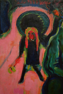
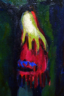
Ernst Ludwig Kirchner, Street, Berlin
Video \(\PageIndex{7}\): Video from The Museum of Modern Art
Additional resources:
Emil Nolde, Young Couple
Video \(\PageIndex{8}\): Video from The Museum of Modern Art
Alexej von Jawlensky, Young Girl in a Flowered Hat
by DR. STEVEN ZUCKER and DR. BETH HARRIS
Video \(\PageIndex{9}\): Alexej von Jawlensky, Young Girl in a Flowered Hat, 1910, oil on cardboard (Albertina, Vienna)
Key points:
- This painting exemplifies the open brushwork, bright and jarring colors, bold outlines, and simplified forms that characterize Expressionism.
- Similar to Gauguin and Kandinsky, Jawlensky believed rural and folk culture were more authentic than established European traditions.
- Painted on cardboard, Young Girl in a Flowered Hat contrasts the raw, unaffected quality of Jawlensky’s technique to the delicate sophistication of his modern subject.
Vasily Kandinsky
Kandinsky, Apocalypse, Abstraction
by DR. CHARLES CRAMER and DR. KIM GRANT

At first glance, Vasily Kandinsky’s Small Pleasures appears to be an abstract painting of organic lines and blotches of bright primary and secondary colors. At the center of the composition is an inverted U surrounded by undulating, serpentine lines that frame amorphous shapes and bursts of color. What are we to make of this?
One clue is found in a painting Kandinsky made three years earlier, in which we see the same basic composition with much clearer subject matter. The inverted U is a hill, on top of which is a city with tall towers capped by onion domes (common in Kandinsky’s homeland of Russia). Waves (in blue) and fires (in yellow and orange) surge around the base, where a couple lies on the ground. Three horsemen ride up the left-hand side of the hill, while on the right three men attempt to flee in a red rowboat.
Apocalypse
This imagery is identifiable as a scene from the Apocalypse, the end of the world as described in the biblical Book of Revelation. According to St. John the Divine, before the second coming of Christ ushers in a spiritual paradise there will be a period of terrible destruction. Angels will sound their trumpets, the four horsemen of the apocalypse (war, plague, famine, and death) will be loosed, the sun will be blacked out, and the moon will become bloody. A hail of fire will burn the world, while a flood of bitter waters will drown its inhabitants (Revelation 6-9). This is what is depicted, albeit obliquely, in Small Pleasures. Between 1909 and 1913, Kandinsky painted the Apocalypse a number of times.
In All Saints I, we can easily discern an angel on the left sounding a trumpet, flood waters rising, and fires raging, while souls emerge from their graves to be judged. Saint George, the emblem of Kandinsky’s art group Der Blaue Reiter, appears just below the angel’s arm with a number of Eastern Orthodox Christian saints, including Vladimir, Boris, and Gleb.
Out of this devastation, signs of new hope and new life emerge. A dove under the angel’s trumpet refers to the story of Noah’s flood, a prior destruction of the world by God in an attempt to purify it. Christ on the cross in the background promises resurrection after death, as do a phoenix and butterfly on the far right. (According to legend, the phoenix emerges from the ashes of its dead parent, and butterflies emerge reborn from the cocoon of the caterpillar).
In the upper left, we see a walled city with dome-capped towers next to another emblem of rebirth: the rising sun. This city is the “new Jerusalem” (Revelation 21:2), the “shining city on the hill” mentioned in Christ’s Sermon on the Mount, an echo of the promise that in the afterlife, the meek shall inherit the earth and reign with him in heaven (Matthew 5; Psalm 37).
Kandinsky’s interest in apocalyptic subject matter is related to his belief that humankind was on the verge of a cataclysmic change from the current, materialistic epoch to an “Epoch of the Great Spiritual.” Such millenarian beliefs were not uncommon at the time, particularly within the occult spiritualist movement of Theosophy.
Primitivism
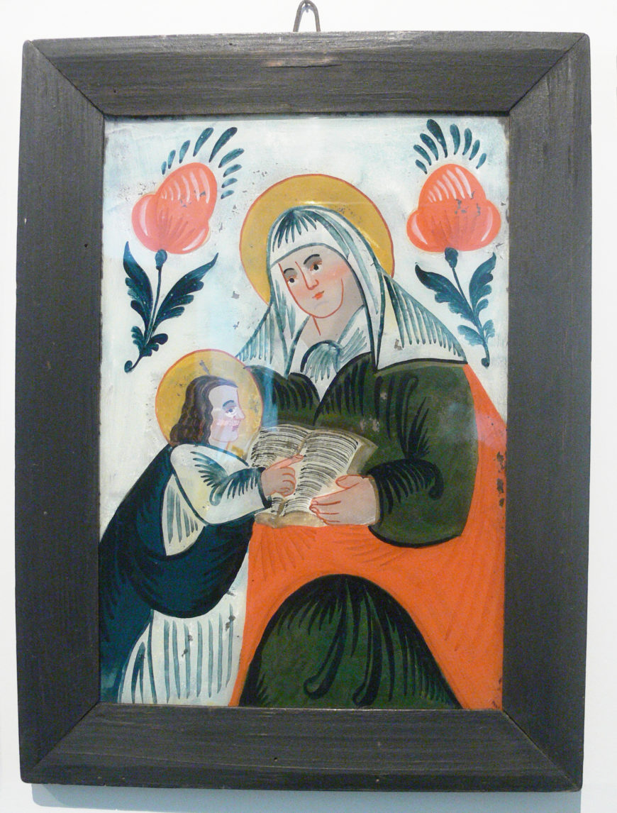
Another influence on Kandinsky’s work at this time was primitivism. Both All Saints I and With Sun were hinterglasmalerei, or paintings executed on the underside of glass. This technique was unusual for professional artists, but was common in folk art in Russia and southern Germany, where Kandinsky was living at the time. Kandinsky was introduced to Russian folk art when he went on an ethnological expedition to the Vologda region in northern Russia in the 1890s. He continued to look to art by amateur, Medieval, non-western and other so-called primitive artists for examples because he felt that the naturalistic style taught in professional art academies was suited only to representing the external appearances of things.
Kandinsky believed that the artist should act as a sort of shaman (originally a Russian-Siberian concept, it is worth noting) — a channel to the spiritual realm, and ultimately a guide to help lead society into the coming Epoch of the Great Spiritual. He found in folk art such as icon painting and hinterglasmalerei a non-naturalistic style better suited to his spiritual themes and ambitions.
This devotion to art associated with primitivism and spirituality also helps to explain Kandinsky’s preference for a very simplified drawing style. In hinterglasmalerei, objects are rendered in an almost childlike fashion: easily recognizable, but highly schematic, with no effort to imitate the exact appearances of what is represented.
Toward abstraction
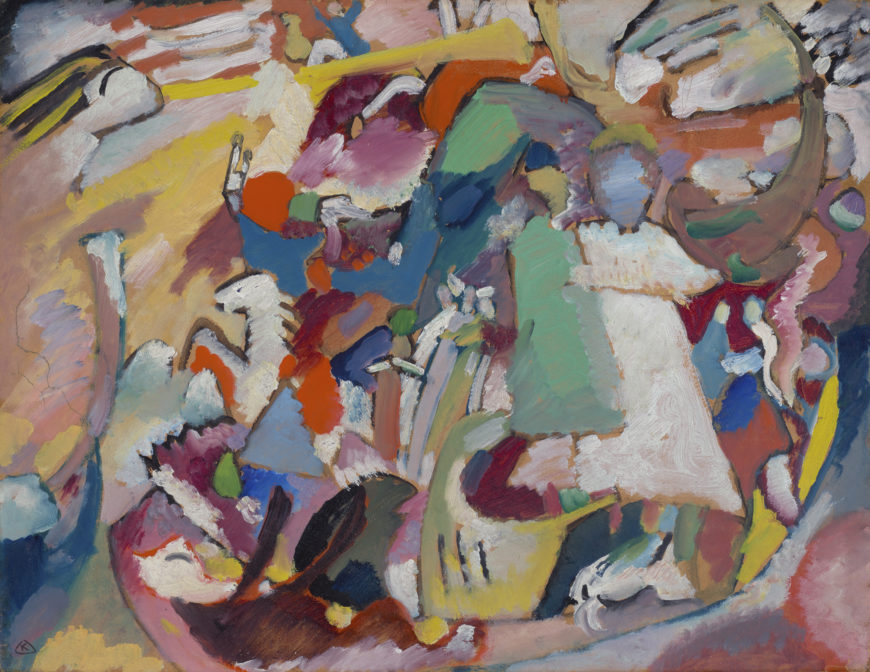
There is a second, oil and gouache on board version of All Saints I that is much more abstract than the earlier version on glass. In this second painting we can barely recognize any of the subject matter, except by comparing it to the original version. Usually artists work from a quick sketch to increasingly refined detail. Why did Kandinsky do the opposite? If these paintings are intended to be about the apocalypse, why does he make their subject matter so difficult to see?
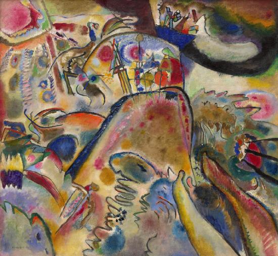
The answer is twofold. First, Kandinsky hides his imagery because recognizing the objects depicted in a painting keeps the viewer’s mind anchored in our current, materialistic world of things. Stripping away the representational details of objects and reducing them to simpler, abstracted forms helps to prepare viewers for the new, spiritual epoch.
At the same time, however, Kandinsky recognizes that viewers need guidance. The purely spiritual would be incomprehensible to those who have lived all of their lives in the material world. So, in effect, he tries to have it both ways. He starts with depictions of recognizable objects and uses universal themes from mythology and religion in the comforting style of folk painting for the sake of familiarity. Then he abstracts that imagery until the psychological process of recognizing material objects in the work becomes secondary, or even subconscious. For Kandinsky, the real content of the painting should come from the work’s formal qualities: its use of color, line, and compositional rhythms.
Color vibrations
In his treatise Concerning the Spiritual in Art, Kandinsky gives special attention to color’s ability to communicate, not just sensually, but also spiritually:
Generally speaking, color is a power which directly influences the soul. Color is the keyboard, the eyes are the hammers, the soul is the piano with many strings. The artist is the hand which plays, touching one key or another, to cause vibrations in the [viewer’s] soul.
Vasily Kandinsky, Concerning the Spiritual in Art, trans. M. T. H. Sadler (New York 1977), p. 25.
The analogy to music here is telling. Kandinsky believed that music was a more advanced form of art than painting precisely because it was more “abstract.” Music moves us emotionally and spiritually through pure form (sound vibration), without directly representing any real-world content. He believed visual artists could do the same through color vibrations, and make painting a truly spiritual art form.
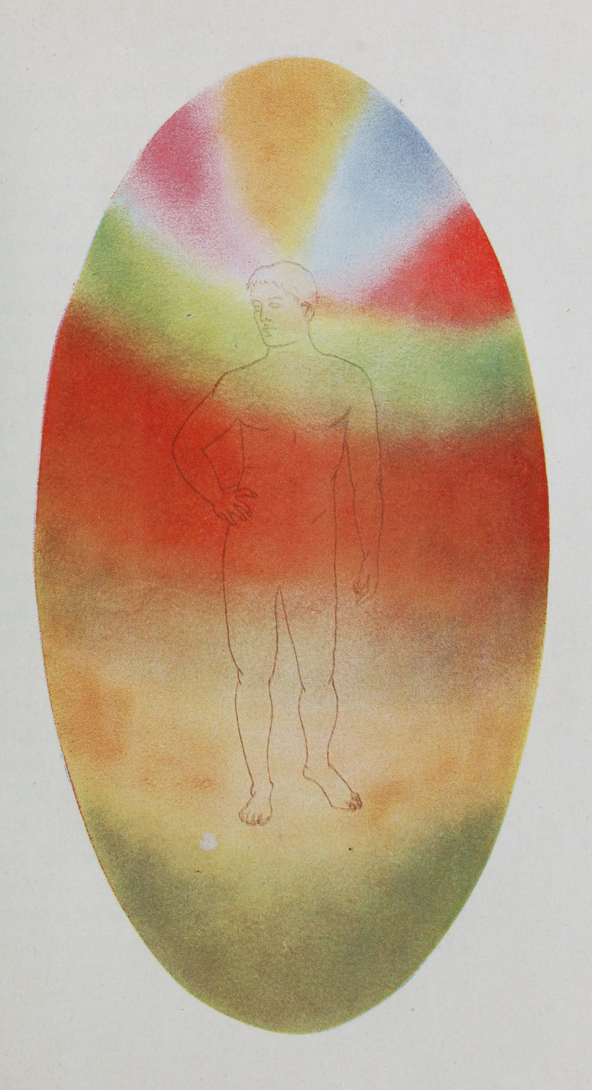
The notion that spiritual states can be conveyed through color patterns would have been familiar to many people in the early-twentieth century. Theosophists believed that certain privileged seers were able to perceive color auras that show a person’s emotional and spiritual condition. The illustration above represents the “astral body” surrounding an “ordinary lower middle-class man,” for example.
Synesthesia
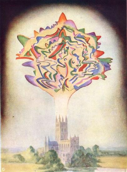
For Kandinsky, the close connections and even transferability among color, music, and spirituality were probably enhanced because he experienced a phenomenon known as synesthesia. This is a condition where sensory “wires” in the brain are in effect crossed, so that a person may experience a color as a sound, or taste as a texture. The English language recognizes this phenomenon in phrases such as “loud color” or “sharp cheese.” In another Theosophical treatise on spiritual auras, there is a striking illustration of synesthesia in the form of an abstract cloud of color emerging from a church tower, illustrating the color equivalent of what is being sung within, “a ringing chorus by [the composer Charles] Gounod.”

When we look at Kandinsky’s Small Pleasures, then, we may subconsciously recognize some of the apocalyptic imagery, and that may help guide us to the spiritual content of the work. But according to Kandinsky, we should not be distracted by any material objects represented. The higher, spiritual content of the work is better communicated through pure form, through the color vibrations he carefully orchestrated to resonate in our souls.
Additional resources:
Read Man Visible and Invisible at the Internet Archive
Vasily Kandinsky, Improvisation 28 (second version)
by DR. BETH HARRIS and DR. STEVEN ZUCKER
Video \(\PageIndex{10}\): Vasily Kandinsky, Improvisation 28 (second version), 1912, oil on canvas, 111.4 x 162.1 cm (Solomon R. Guggenheim Museum, New York)
Smarthistory images for teaching and learning:
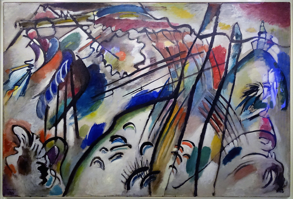
Vasily Kandinsky, Klänge (Sounds)
Video \(PageIndex{11}\): Video from The Museum of Modern Art.
Additional resources:
Franz Marc and the animalization of art
by DR. CHARLES CRAMER and DR. KIM GRANT
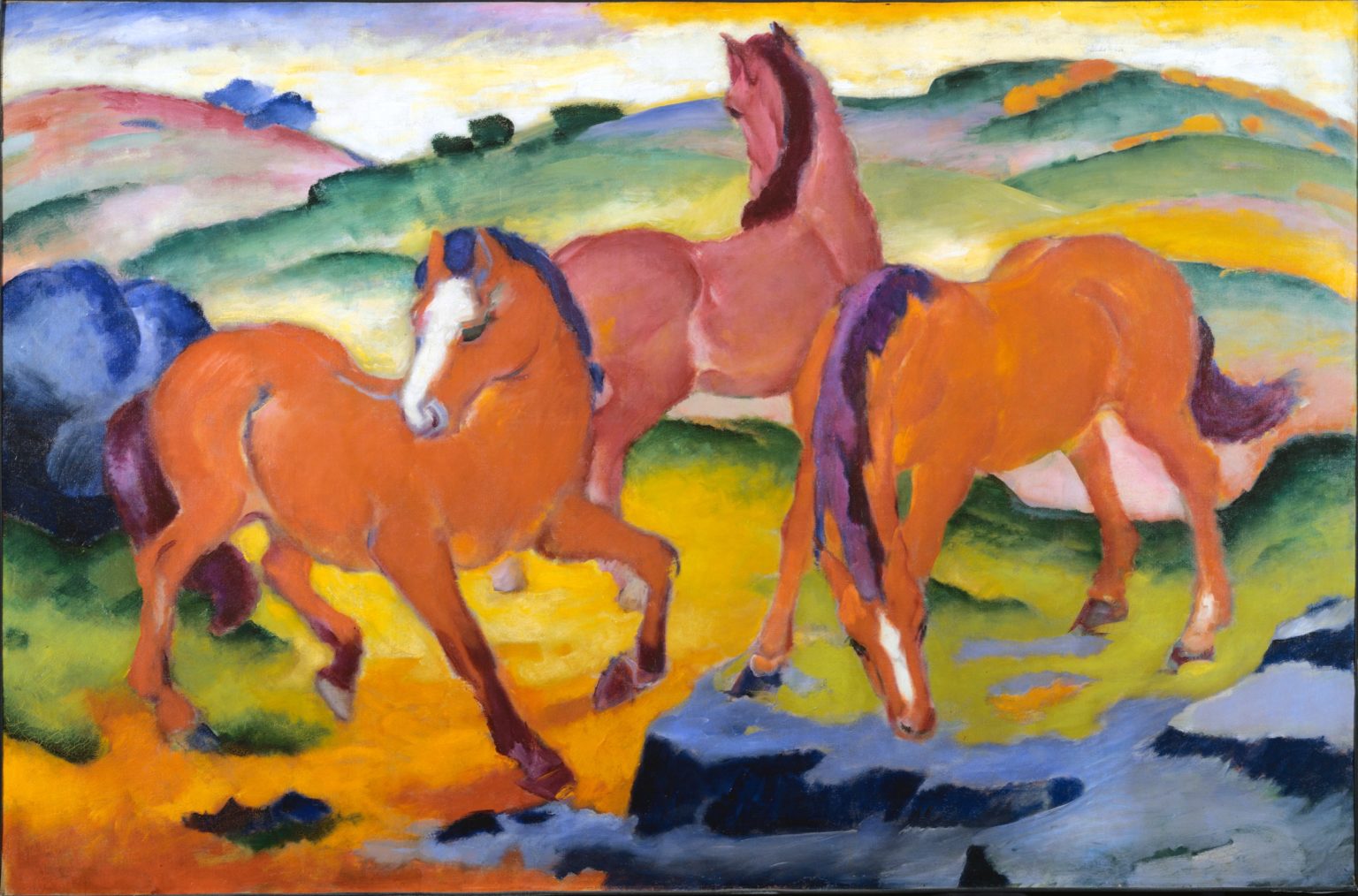
I am trying to heighten my sense of the organic rhythm of all things, trying to empathize pantheistically with the shivering and coagulating of blood in nature, in trees, in animals, in the air … I see no happier means to the animalization of art than the animal painting.Franz Marc, “Über das Tier in der Kunst,” translated in Vivian Endicott Barnett, ed., Franz Marc and August Macke 1909-1914 (Munich, London and New York, 2018), p. 48.
Franz Marc’s 1910 call for the “animalization of art” stakes out the ground that he would harvest for the most fertile and productive years of his career. Before his early death in World War I, Marc used animal paintings to express a pantheistic vision of the harmony between animals and their natural environment.
Pantheism
Pantheism (literally “all-God-ism”) is the belief that God is not separate from the universe that he created, but identical with it, immanent within it like “shivering and coagulating blood in nature, in animals, in the air.” Probably the most famous statement of the pantheist creed is that of the English Romantic poet William Wordsworth. In his 1798 poem Lines written a few miles above Tintern Abbey, Wordsworth notes his feeling of a presence “deeply interfused” in nature “that impels / All thinking things, all objects of all thought, / And rolls through all things.”
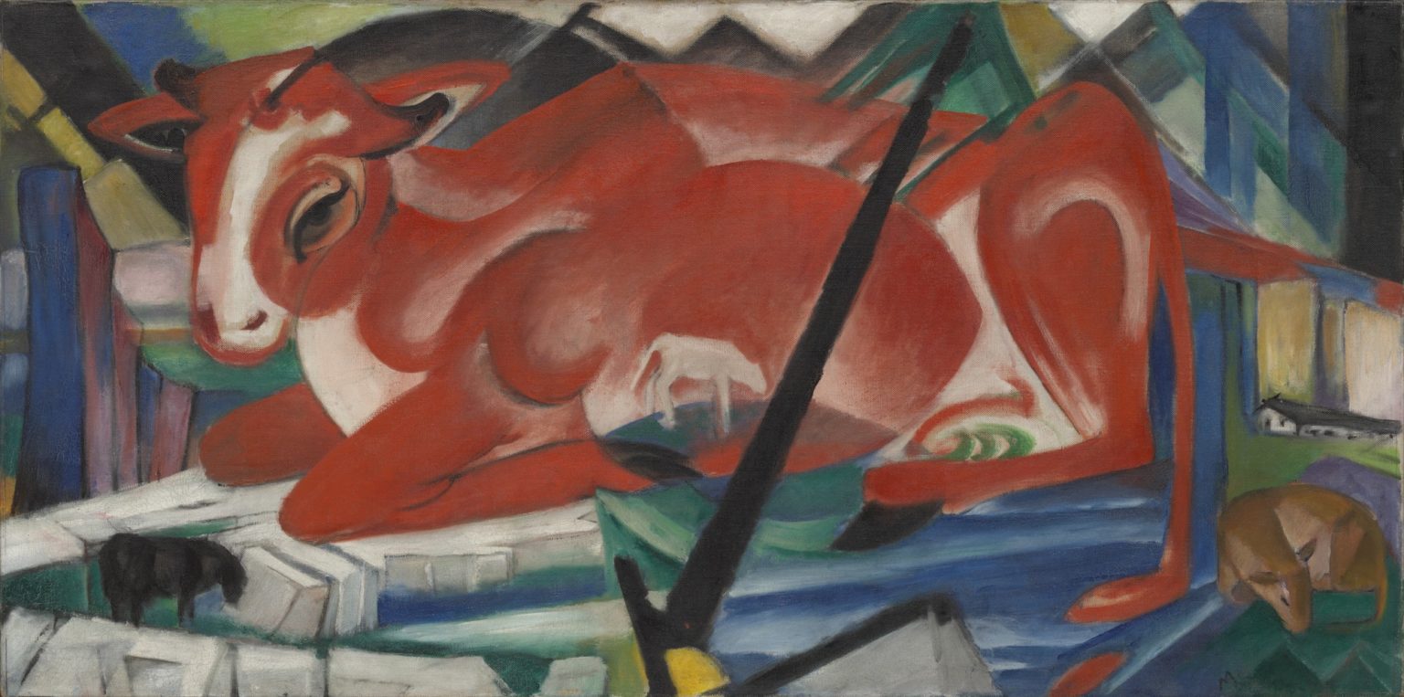
As Marc noted in a 1915 letter to his wife, his own pantheism arose specifically from his disgust with modernity and human beings. Lamenting the “progress-hungry spirit of modern centuries,” Marc wrote: “People with their lack of piety, especially men, never touched my true feelings. But animals with their virginal sense of life awakened all that is good in me.”[1] Marc’s form of primitivism went further than that of his fellow Expressionists. They looked to the lives of peasants and so-called primitive cultures for inspiration; Marc looked all the way back to a state of nature before humankind even existed.
Expression through color and form
Marc’s animalization of art did not simply entail naturalistic paintings of animals in unspoiled landscapes. Already in The World Cow and Grazing Horses IV, we can see Marc intensifying the color and simplifying the drawing of his subjects, a tactic he takes even further in Large Blue Horses.
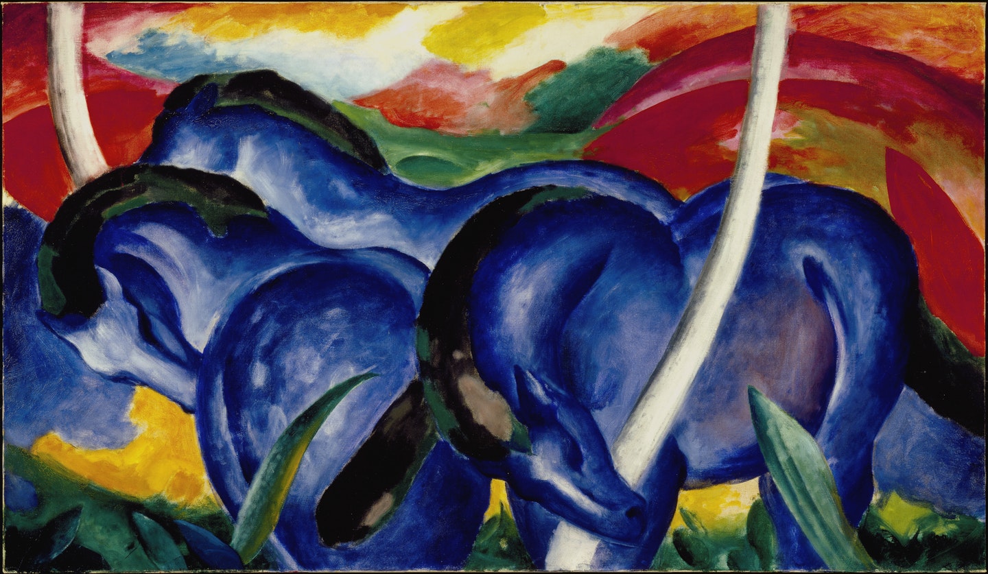
In all of these works, Marc uses primary and secondary colors in their most intensely saturated state. Bright red or blue animals graze in vibrant pastures of reds, greens, and yellows underneath rainbow skies. While the proportions, anatomy, and postures of the animals are accurate (he made a living teaching animal anatomy for a time), Marc has increasingly abstracted their forms toward basic, almost geometric shapes that echo into the distant landscape.
These are pictorial strategies that Marc initially picked up in encounters with works of the Impressionists and Van Gogh while on a trip to Paris in 1907, and then with Robert Delaunay’s Simultanist works in a subsequent trip in 1912. However, where Delaunay celebrated modern subjects, Marc avoided them. And despite the stylistic similarities between the two artists, there are crucial differences in intent.
How does a deer see the world?
The fracturing and fragmentation in Delaunay’s works are reflective of human perceptual tendencies: the way present sense-experiences awaken simultaneous echoes of past viewings in the mind. Marc expressly wished to avoid making paintings about human perception. Why reject painting corrupt human beings, and then execute works that reflect a specifically human way of looking at the world? In an essay entitled, “How does a Horse see the World?” Marc asks,
What does the doe have in common with the view of the world as it appears to people? Does it make any reasonable or artistic sense to paint the doe as it appears on our retina — or in the manner of the Cubists because we feel the world to be cubistic? Who says the doe feels the work to be cubistic? It’s the doe that feels, therefore the landscape must be “doelike.”\(^{[2]}\)
It is of course impossible to know how a deer sees the world, but the distortion of form and intensification of color may be an attempt to represent the world as a deer sees it — as continuous with (and not separate from) herself. These more rectilinear, faceted works still reflect Marc’s desire to integrate animal and landscape. The angular fragments that make up the bodies of the three deer extend and echo into the surrounding forest, with the blue, red, green, and yellow colors scattered prismatically throughout.
Color and energy
Another way to look at Marc’s project is not in terms of objects or the perception of them, but rather in terms of energy and forces. Marc’s description of pantheism as an “organic rhythm,” as “the shivering and coagulating of blood in nature” suggests that the animals and landscape elements themselves are just temporary “coagulations” of matter and energy that are in a constant cycle of birth, life, death, decay, and rebirth. What is permanent and what permeates is the energy coursing through this cycle, expressed in the vibrancy of Marc’s color and the rhythms of his compositions.
Marc’s color theory, as inchoate as he acknowledged it to be, suggests such a reading:
Blue is the male principle, severe and spiritual. Yellow is the female principle, gentle, cheerful and sensual. Red is matter, brutal and heavy, the color that has to come into conflict with, and succumb to the other two. For instance, if you mix blue — so serious, so spiritual — with red, you intensify the red to the point of unbearable sadness, and the comfort of yellow, the color complementary to violet, becomes indispensable …\(^{[3]}\)
The gendering of colors, and especially the association of male with spiritual and female with sensual, is obviously sexist. It is also dubious to assert that colors have such specific and absolute meanings. Red surely signifies something very different in Edvard Munch’s The Scream than it does in Henri Matisse’s Joy of Life.
But we can generalize Marc’s theory to a series of coherent underlying propositions. Colors are not necessarily gendered, but they are generative in the sense that they can be endlessly recombined into new colors or new creations. Viewing colors and color combinations can induce sensations and moods: cheerfulness, heaviness, sadness, and so on. These colors and moods are sometimes harmonious, but sometimes clashing and in conflict.
It is a painter’s job to deploy the emotive and generative qualities of colors in order to produce formal tensions and harmonies that convey various psychological states. This provides an interesting new way to look at his work: one more focused on abstract qualities of design than the subject matter.
Toward abstraction
In the same letter where he talks about how he turned to animals as a more pure subject than humankind, Marc continues, “But then I discovered in [animals], too, so much that was ugly and unfeeling … Trees, flowers, the earth all showed me every year more and more of their deformity and repulsiveness — until now, suddenly, I have become fully conscious of nature’s ugliness and impurity.” In response to this new consciousness, Marc says his art changed as well: “Instinctively, by an inner compulsion, my presentation became more schematic or abstract.”\(^{[4]}\)
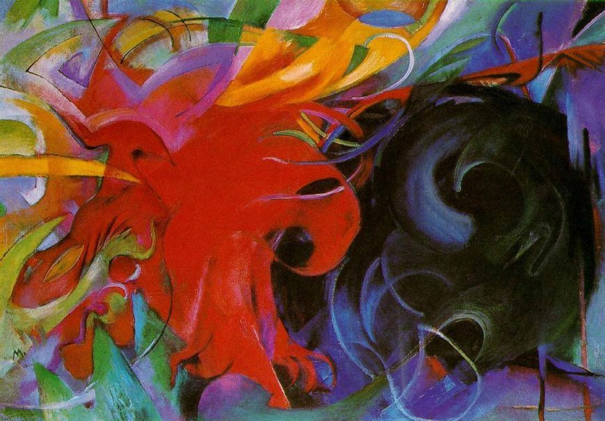
In his last major works, the representational content is almost impossible to identify, and Marc’s paintings read as abstract interactions between primal spiritual forces, embodied in form and color. Titles such as Fighting Forms and Playful Forms reinforce this reading.
When World War I broke out in 1914, Marc was drafted into the German army as a cavalryman. Because of his painting skills, he was put to work for a time camouflaging artillery, and he amused himself by developing patterns inspired by Manet and Kandinsky. Unfortunately, he was later sent to the front, and died in the battle of Verdun on 4 March 1916 — ironically just days before orders came to withdraw him from combat as a notable artist.
Notes:
- Franz Marc, letter, 12 April 1915, as translated in Herschel B. Chipp, Theories of Modern Art (Berkeley, L.A. and London, 1968), p. 182.
- Franz Marc, “How does a Horse see the World?” translated in Herschel B. Chipp, Theories of Modern Art (Berkeley, L.A. and London, 1968), pp. 178-79.
- As translated in Shearer West, The Visual Arts in Germany, 1890-1937: Utopia and despair (Manchester and New York, 1988), p. 71.
- As translated in Chipp, p. 182.
Egon Schiele
Egon Schiele, Seated Male Nude (Self-Portrait)
by DR. STEVEN ZUCKER and DR. BETH HARRIS
Video \(\PageIndex{11}\): Egon Schiele, Seated Male Nude (Self-Portrait), 1910, oil and gouache on canvas, 152.5 × 150 cm (Leopold Museum, Vienna)
Key points:
- Schiele’s choice to paint himself in such expressive terms demonstrates his interest in focusing on the self and subjective experience.
- The expressive contortions of the body reflect sculptural traditions of the past, but Schiele’s figure lacks the heroicism of male nudes by artists such as Michelangelo.
- His depiction of the fragmented and emaciated body in Seated Male Nude, as well the red details and the lack of any surrounding context, suggest a heightened intensity of the figure’s physical and psychological experience.
Smarthistory images for teaching and learning:
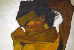
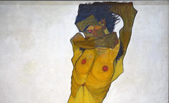
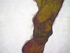
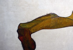
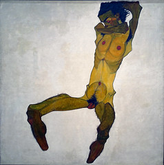
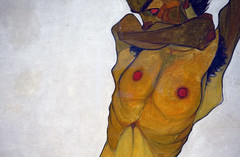
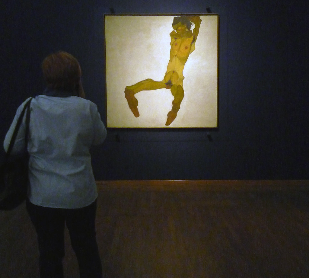
Nazi looting: Egon Schiele’s Portrait of Wally
by DR. ERIN THOMPSON and DR. BETH HARRIS
Video \(\PageIndex{12}\): Egon Schiele, Portrait of Wally Neuzil, 1912, oil on panel, 32 × 39.8 cm (Leopold Museum, Vienna) Speakers: Dr. Erin Thompson and Dr. Beth Harris
Additional resources:
“Two Schiele Drawings Ordered Returned to Heirs of Nazi Victim,” The New York Times, April 6, 2018
Egon Schiele, The Hermits
by DR. STEVEN ZUCKER and DR. BETH HARRIS
Video \(\PageIndex{13}\): Egon Schiele, The Hermits, 1912, oil on canvas, 71-1/4 x 71-1/4″ (Leopold Museum, Vienna)
Key points:
- The use of gold and fractured appearance of the background recall religious art of the medieval period, uniting the spiritual concerns of the past with the psychic interests of the modern age.
- Schiele’s visible use of paint creates an agitated feeling, reflecting Expressionism’s interest in our inner states of anxiety and tension.
- The figure on the right could reference the older Austrian artist Gustave Klimt. Since he has no eyes, he may also symbolize a prophet who possesses inner vision.
- Schiele described The Hermits as a poetic summary of his own experience, perhaps implying that the artist serves as a prophet in the modern age.
Smarthistory images for teaching and learning: