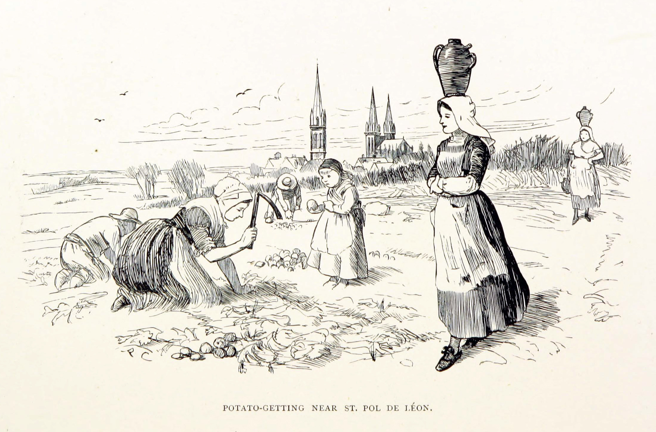
8.8: Post-Impressionism
- Page ID
- 74689

\( \newcommand{\vecs}[1]{\overset { \scriptstyle \rightharpoonup} {\mathbf{#1}} } \)
\( \newcommand{\vecd}[1]{\overset{-\!-\!\rightharpoonup}{\vphantom{a}\smash {#1}}} \)
\( \newcommand{\dsum}{\displaystyle\sum\limits} \)
\( \newcommand{\dint}{\displaystyle\int\limits} \)
\( \newcommand{\dlim}{\displaystyle\lim\limits} \)
\( \newcommand{\id}{\mathrm{id}}\) \( \newcommand{\Span}{\mathrm{span}}\)
( \newcommand{\kernel}{\mathrm{null}\,}\) \( \newcommand{\range}{\mathrm{range}\,}\)
\( \newcommand{\RealPart}{\mathrm{Re}}\) \( \newcommand{\ImaginaryPart}{\mathrm{Im}}\)
\( \newcommand{\Argument}{\mathrm{Arg}}\) \( \newcommand{\norm}[1]{\| #1 \|}\)
\( \newcommand{\inner}[2]{\langle #1, #2 \rangle}\)
\( \newcommand{\Span}{\mathrm{span}}\)
\( \newcommand{\id}{\mathrm{id}}\)
\( \newcommand{\Span}{\mathrm{span}}\)
\( \newcommand{\kernel}{\mathrm{null}\,}\)
\( \newcommand{\range}{\mathrm{range}\,}\)
\( \newcommand{\RealPart}{\mathrm{Re}}\)
\( \newcommand{\ImaginaryPart}{\mathrm{Im}}\)
\( \newcommand{\Argument}{\mathrm{Arg}}\)
\( \newcommand{\norm}[1]{\| #1 \|}\)
\( \newcommand{\inner}[2]{\langle #1, #2 \rangle}\)
\( \newcommand{\Span}{\mathrm{span}}\) \( \newcommand{\AA}{\unicode[.8,0]{x212B}}\)
\( \newcommand{\vectorA}[1]{\vec{#1}} % arrow\)
\( \newcommand{\vectorAt}[1]{\vec{\text{#1}}} % arrow\)
\( \newcommand{\vectorB}[1]{\overset { \scriptstyle \rightharpoonup} {\mathbf{#1}} } \)
\( \newcommand{\vectorC}[1]{\textbf{#1}} \)
\( \newcommand{\vectorD}[1]{\overrightarrow{#1}} \)
\( \newcommand{\vectorDt}[1]{\overrightarrow{\text{#1}}} \)
\( \newcommand{\vectE}[1]{\overset{-\!-\!\rightharpoonup}{\vphantom{a}\smash{\mathbf {#1}}}} \)
\( \newcommand{\vecs}[1]{\overset { \scriptstyle \rightharpoonup} {\mathbf{#1}} } \)
\(\newcommand{\longvect}{\overrightarrow}\)
\( \newcommand{\vecd}[1]{\overset{-\!-\!\rightharpoonup}{\vphantom{a}\smash {#1}}} \)
\(\newcommand{\avec}{\mathbf a}\) \(\newcommand{\bvec}{\mathbf b}\) \(\newcommand{\cvec}{\mathbf c}\) \(\newcommand{\dvec}{\mathbf d}\) \(\newcommand{\dtil}{\widetilde{\mathbf d}}\) \(\newcommand{\evec}{\mathbf e}\) \(\newcommand{\fvec}{\mathbf f}\) \(\newcommand{\nvec}{\mathbf n}\) \(\newcommand{\pvec}{\mathbf p}\) \(\newcommand{\qvec}{\mathbf q}\) \(\newcommand{\svec}{\mathbf s}\) \(\newcommand{\tvec}{\mathbf t}\) \(\newcommand{\uvec}{\mathbf u}\) \(\newcommand{\vvec}{\mathbf v}\) \(\newcommand{\wvec}{\mathbf w}\) \(\newcommand{\xvec}{\mathbf x}\) \(\newcommand{\yvec}{\mathbf y}\) \(\newcommand{\zvec}{\mathbf z}\) \(\newcommand{\rvec}{\mathbf r}\) \(\newcommand{\mvec}{\mathbf m}\) \(\newcommand{\zerovec}{\mathbf 0}\) \(\newcommand{\onevec}{\mathbf 1}\) \(\newcommand{\real}{\mathbb R}\) \(\newcommand{\twovec}[2]{\left[\begin{array}{r}#1 \\ #2 \end{array}\right]}\) \(\newcommand{\ctwovec}[2]{\left[\begin{array}{c}#1 \\ #2 \end{array}\right]}\) \(\newcommand{\threevec}[3]{\left[\begin{array}{r}#1 \\ #2 \\ #3 \end{array}\right]}\) \(\newcommand{\cthreevec}[3]{\left[\begin{array}{c}#1 \\ #2 \\ #3 \end{array}\right]}\) \(\newcommand{\fourvec}[4]{\left[\begin{array}{r}#1 \\ #2 \\ #3 \\ #4 \end{array}\right]}\) \(\newcommand{\cfourvec}[4]{\left[\begin{array}{c}#1 \\ #2 \\ #3 \\ #4 \end{array}\right]}\) \(\newcommand{\fivevec}[5]{\left[\begin{array}{r}#1 \\ #2 \\ #3 \\ #4 \\ #5 \\ \end{array}\right]}\) \(\newcommand{\cfivevec}[5]{\left[\begin{array}{c}#1 \\ #2 \\ #3 \\ #4 \\ #5 \\ \end{array}\right]}\) \(\newcommand{\mattwo}[4]{\left[\begin{array}{rr}#1 \amp #2 \\ #3 \amp #4 \\ \end{array}\right]}\) \(\newcommand{\laspan}[1]{\text{Span}\{#1\}}\) \(\newcommand{\bcal}{\cal B}\) \(\newcommand{\ccal}{\cal C}\) \(\newcommand{\scal}{\cal S}\) \(\newcommand{\wcal}{\cal W}\) \(\newcommand{\ecal}{\cal E}\) \(\newcommand{\coords}[2]{\left\{#1\right\}_{#2}}\) \(\newcommand{\gray}[1]{\color{gray}{#1}}\) \(\newcommand{\lgray}[1]{\color{lightgray}{#1}}\) \(\newcommand{\rank}{\operatorname{rank}}\) \(\newcommand{\row}{\text{Row}}\) \(\newcommand{\col}{\text{Col}}\) \(\renewcommand{\row}{\text{Row}}\) \(\newcommand{\nul}{\text{Nul}}\) \(\newcommand{\var}{\text{Var}}\) \(\newcommand{\corr}{\text{corr}}\) \(\newcommand{\len}[1]{\left|#1\right|}\) \(\newcommand{\bbar}{\overline{\bvec}}\) \(\newcommand{\bhat}{\widehat{\bvec}}\) \(\newcommand{\bperp}{\bvec^\perp}\) \(\newcommand{\xhat}{\widehat{\xvec}}\) \(\newcommand{\vhat}{\widehat{\vvec}}\) \(\newcommand{\uhat}{\widehat{\uvec}}\) \(\newcommand{\what}{\widehat{\wvec}}\) \(\newcommand{\Sighat}{\widehat{\Sigma}}\) \(\newcommand{\lt}{<}\) \(\newcommand{\gt}{>}\) \(\newcommand{\amp}{&}\) \(\definecolor{fillinmathshade}{gray}{0.9}\)Post-Impressionism
Cézanne, Seurat, Van Gogh, and Gauguin are all Post-Impressionists, though their styles vary widely.
c. 1880 - 1900
A beginner's guide
Introduction to Neo-Impressionism, Part I
by DR. CHARLES CRAMER and DR. KIM GRANT
Just a dozen years after the debut of Impressionism, the art critic Félix Fénéon christened Georges Seurat as the leader of a new group of “Neo-Impressionists.” He did not mean to suggest the revival of a defunct style — Impressionism was still going strong in the mid-1880s — but rather a significant modification of Impressionist techniques that demanded a new label.
Fénéon identified greater scientific rigor as the key difference between Neo-Impressionism and its predecessor. Where the Impressionists were “arbitrary” in their techniques, the Neo-Impressionists had developed a “conscious and scientific” method through a careful study of contemporary color theorists such as Michel Chevreul and Ogden Rood. [1]
A scientific method
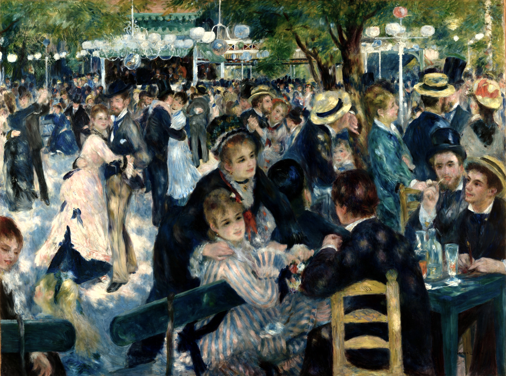
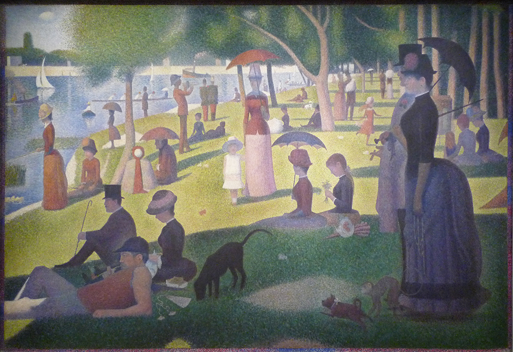
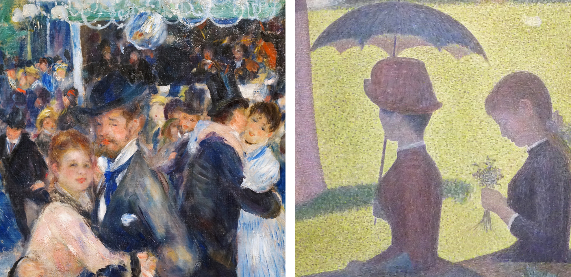
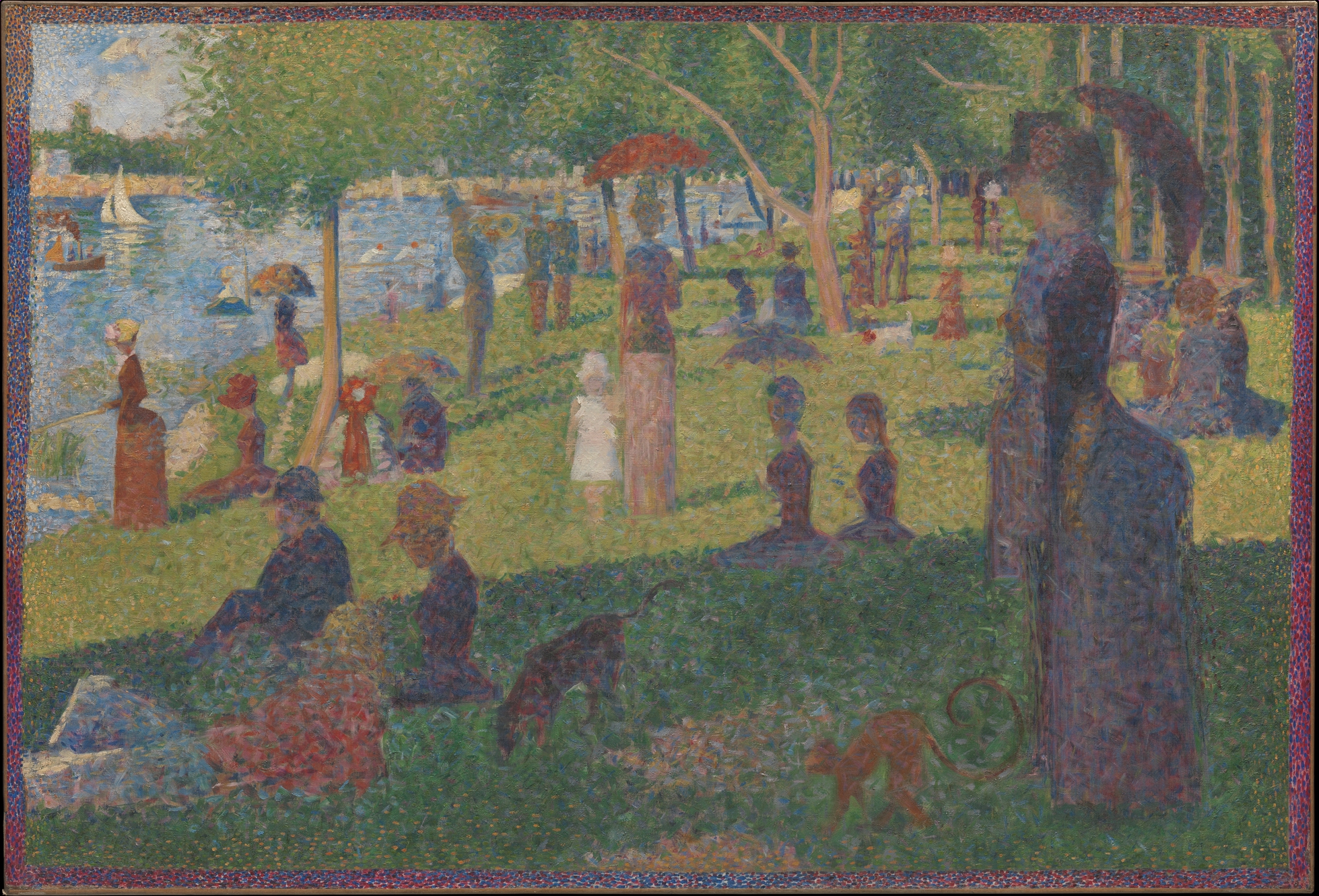
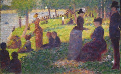
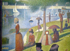
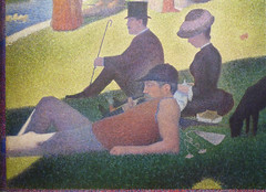
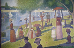
This greater scientific rigor is immediately visible if we compare Seurat’s Neo-Impressionist Grande Jatte with Renoir’s Impressionist Moulin de la Galette. The subject matter is similar: an outdoor scene of people at leisure, lounging in a park by a river or dancing and drinking on a café terrace. The overall goal is similar as well. Both artists are trying to capture the effect of dappled light on a sunny afternoon. However, Renoir’s scene appears to have been composed and painted spontaneously, with the figures captured in mid-gesture. Renoir’s loose, painterly technique reinforces this effect, giving the impression that the scene was painted quickly, before the light changed.
By contrast, the figures in La Grande Jatte are preternaturally still, and the brushwork has also been systematized into a painstaking mosaic of tiny dots and dashes, unlike Renoir’s haphazard strokes and smears. Neo-Impressionist painters employed rules and a method, unlike the Impressionists, who tended to rely on “instinct and the inspiration of the moment.” [2]
Pointillism and optical mixture
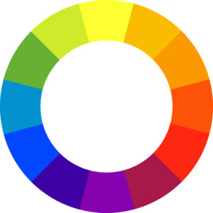
One of these rules was to use only the “pure” colors of the spectrum: violet, blue, green, yellow, orange, and red. These colors could be mixed only with white or with a color adjacent on the color wheel (called “analogous colors”), for example to make lighter, yellower greens or darker, redder violets. Above all, the Neo-Impressionists would not mix colors opposite on the color wheel (“complementary colors”), because doing so results in muddy browns and dull grays.
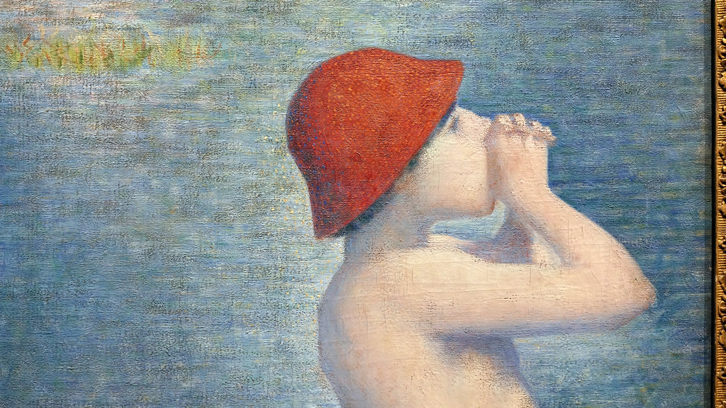
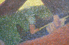
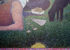
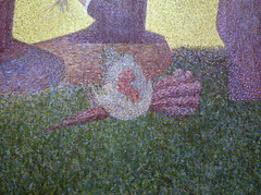
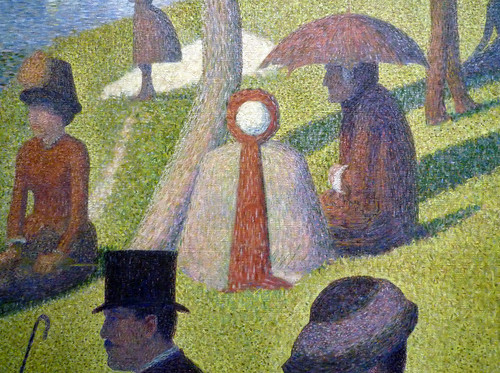
More subtle color variations were produced by “optical mixture” rather than mixing paint on the palette. For example, examine the grass in the sun. Seurat intersperses the overall field of yellow greens with flecks of warm cream, olive greens, and yellow ochre (actually discolored chrome yellow). Viewed from a distance these flecks blend together to help lighten and warm the green, as we would expect when grass is struck by the yellow-orange light of the afternoon sun. It was this technique of painting in tiny dots (“points” in French) that gave Neo-Impressionism the popular nickname”Pointillism” although the artists generally avoided that term since it suggested a stylistic gimmick.
For the grass in the shadows, Seurat uses darker greens intermixed with flecks of pure blue and even some orange and maroon. These are very unexpected colors for grass, but when we stand back the colors blend optically, resulting in a cooler, darker, and duller green in the shadows. This green is, however, more vibrant than if Seurat had mixed those colors on the palette and applied them in a uniform swath.
Similarly, look at the number of colors that make up the little girl’s legs! They include not only the expected pinks and oranges of Caucasian flesh, but also creams, blues, maroons, and even greens. Stand back again, though, and “optical mixture” blends them into a convincing and luminous flesh color, modeled in warm light and shaded by her white dress. (For more technical information on this topic, see Neo-Impressionist color theory).
Compositional rigor
The Neo-Impressionists also applied scientific rigor to composition and design. Seurat’s friend and fellow painter Paul Signac asserted,
The Neo-Impressionist … will not begin a canvas before he has determined the layout … Guided by tradition and science, he will … adopt the lines (directions and angles), the chiaroscuro (tones), [and] the colors (tints) to the expression he wishes to make dominant.Paul Signac, Delacroix to Neo-Impressionism, in Nochlin, ed., p. 121.
Numerous studies for La Grande Jatte testify to how carefully Seurat decided on each figure’s pose and arranged them to create a rhythmic recession into the background. This practice is very different from the Impressionists, who emphasized momentary views (impressions) by creating intentionally haphazard-seeming compositions, such as Renoir’s Moulin de la Galette.
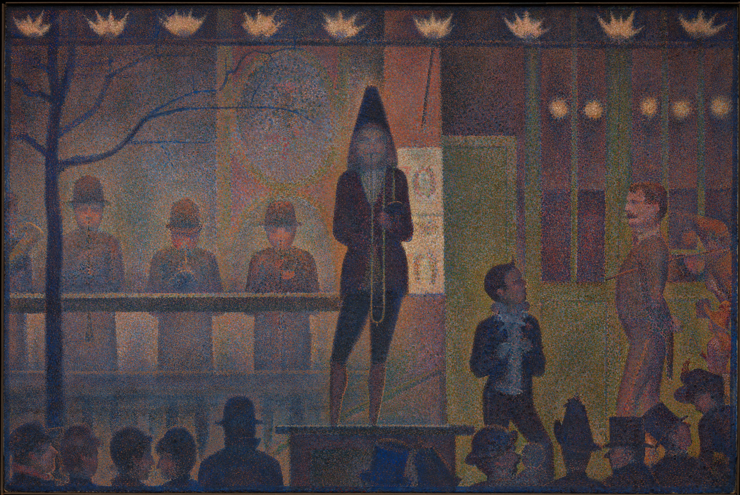
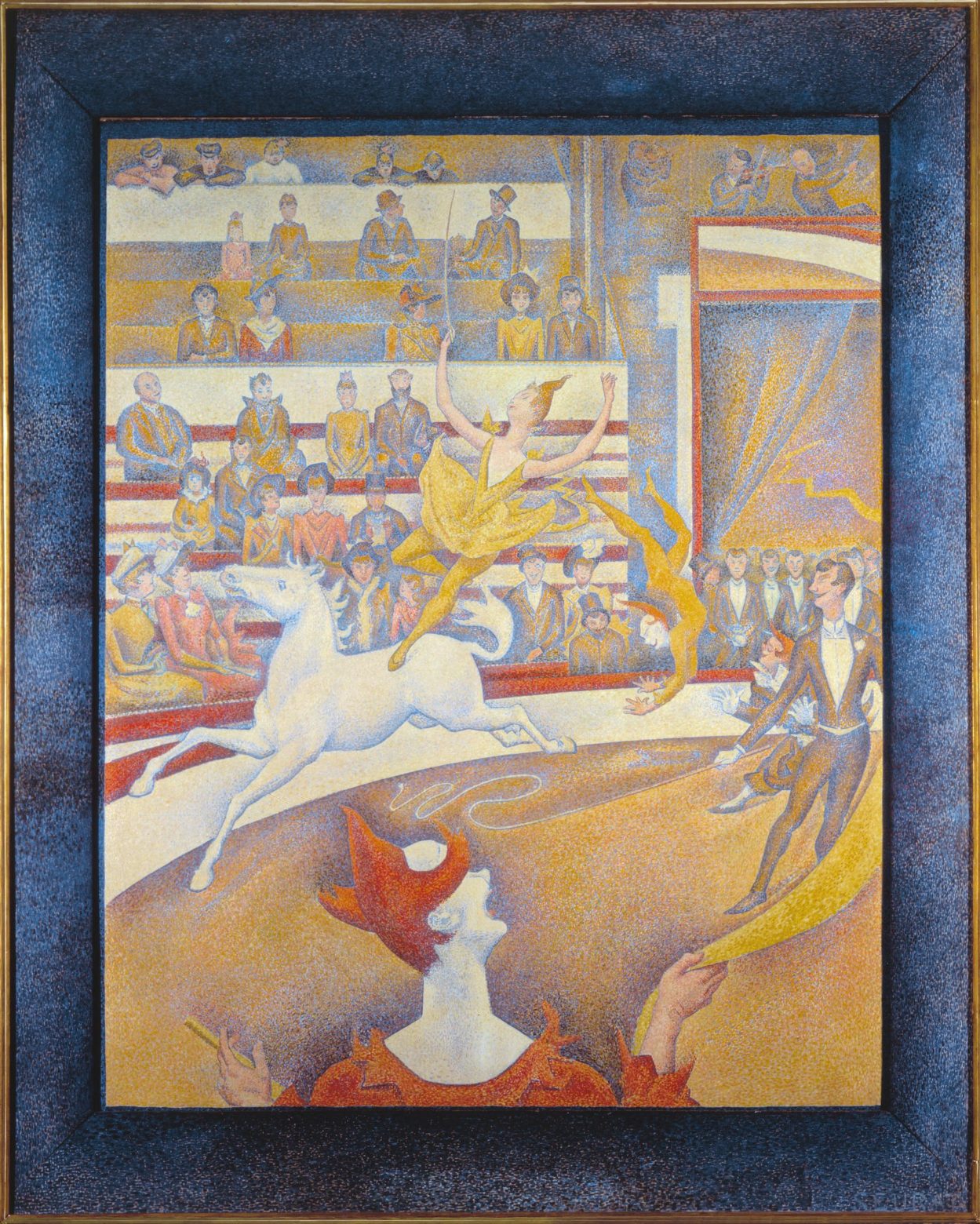
Seurat’s Parade de cirque is even more rigorously geometrical. It is dominated by horizontal and vertical lines, and the just slightly off-rhythmic spacing of the figures and architectural structure creates a syncopated grid. Scholars have debated whether the composition is based on the Golden Section, a geometric ratio that was identified by ancient Greek mathematicians as being inherently harmonious.
Systematized expression
The Neo-Impressionists also attempted to systematize the emotional qualities conveyed by their paintings. Seurat defined three main expressive tools at the painter’s disposal: color (the hues of the spectrum, from warm to cool), tone (the value of those colors, from light to dark), and line (horizontal, vertical, ascending, or descending). Each has a specific emotional effect:
Gaiety of tone is given by the dominance of light; of color, by the dominance of warmth; of line, by lines above the horizontal. Calmness of tone is given by an equivalence of light and dark; of color by an equivalence of warm and cold; and of line, by horizontals. Sadness of tone is given by the dominance of dark; of color, by the dominance of cold colors; and of line, by downward directions.
Georges Seurat, Letter to Maurice Beaubourg, August 28, 1890, in Nochlin, ed., p. 114 (translation modified for clarity).
Seurat’s Chahut (Can-Can) seems designed to exemplify these rules, employing mostly warm, light colors and ascending lines to convey a mood of gaiety appropriate to the dance.
The Neo-Impressionist style had a relatively brief heyday; very few artists carried on the project into the 20th century. However, a great many artists experimented with it and took portions of its method into their own practice, from van Gogh to Henri Matisse. More broadly, the Neo-Impressionist desire to conform art-making to universal laws of perception, color, and expression echoes throughout Modernism, in movements as diverse as Symbolism, Purism, De Stijl, and the Bauhaus.
So far we have concentrated on the style of Neo-Impressionism. In Part 2, we will examine the subject matter favored by the artists, and discuss its relation to the social and political context of the late-nineteenth century.
Notes:
- Félix Fénéon, “Les Impressionnistes en 1886,” as translated in Linda Nochlin, ed., Impressionism and Post-Impressionism, 1874-1904: Sources and Documents (Englewood Cliffs, N.J.: Prentice-Hall, 1966), p. 108.
- Paul Signac, From Eugène Delacroix to Neo-Impressionism (1899), as translated in Nochlin, ed., p. 122.
Introduction to Neo-Impressionism, Part II
by DR. CHARLES CRAMER and DR. KIM GRANT
In Part 1 of this introduction to Neo-Impressionism we examine the style of the movement, concentrating on the artists’ attempt to systematize a method for painting according to scientific laws of perception, color, composition, and expression. Here, we will turn to the kind of subject matter typically chosen by the Neo-Impressionists and discuss its relation to late-nineteenth century social and political history.
Scenes of leisure
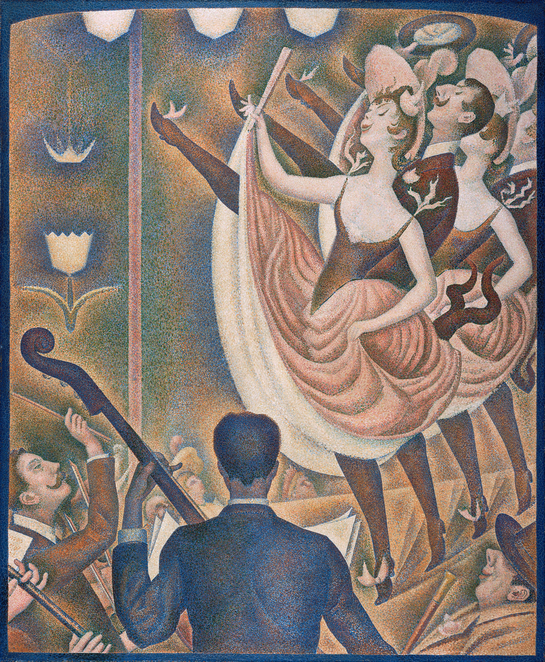
For the most part, the Neo-Impressionists continued to depict the kinds of subjects preferred by the Impressionists: landscapes and leisure scenes. In addition to his famous painting of people lounging in the park on the island of La Grande Jatte, many of Georges Seurat’s paintings portrayed entertainments such as the circuses and music halls that contributed to Paris’s reputation for mass spectacles in the late nineteenth century.
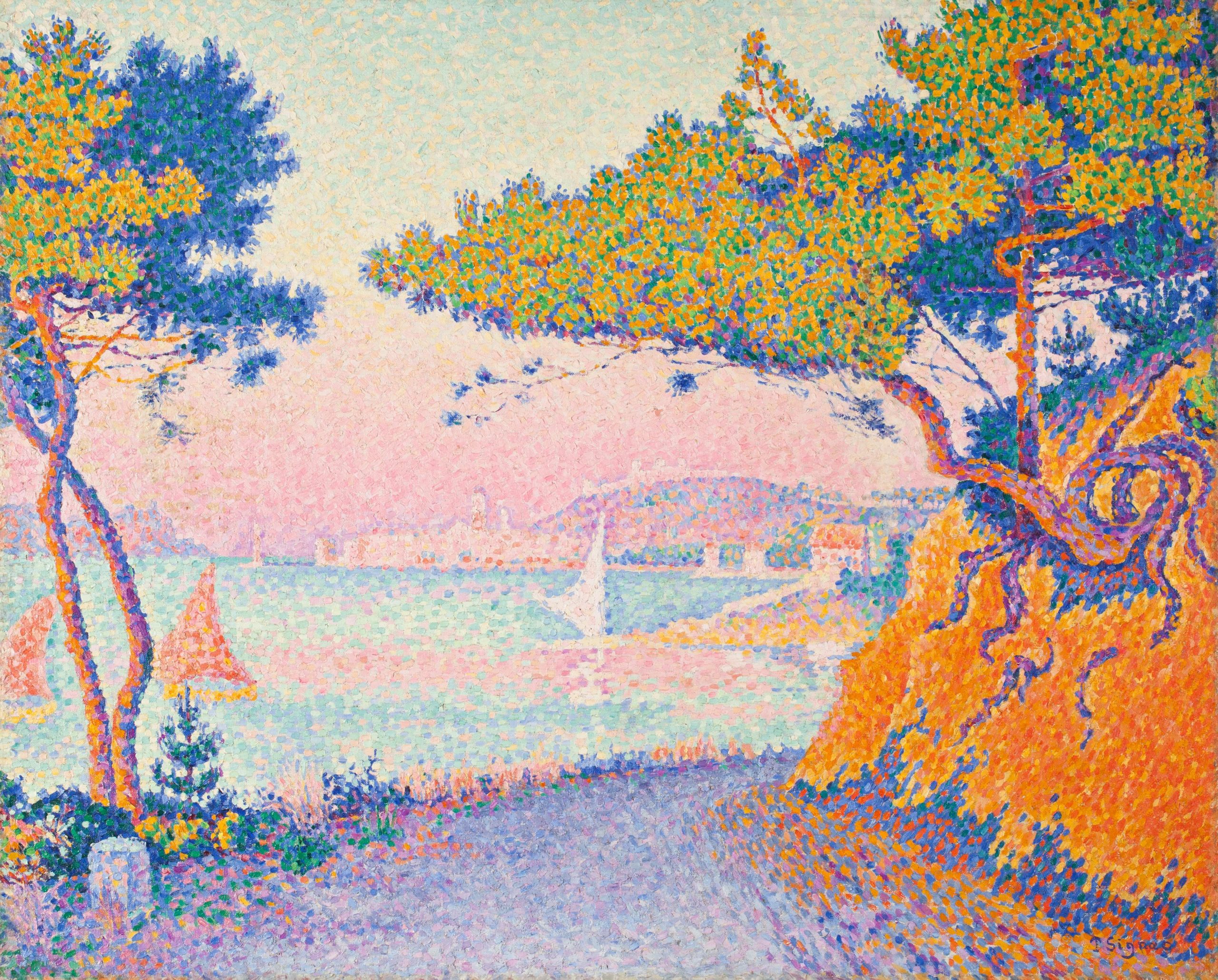
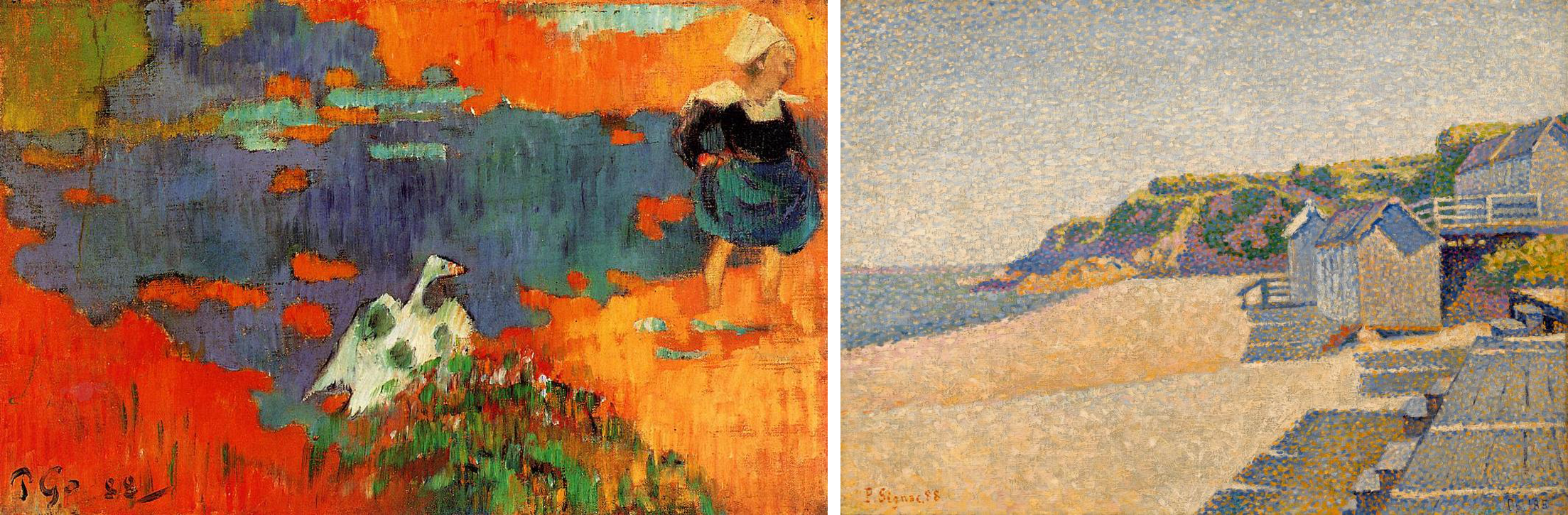
Paul Signac’s landscape paintings similarly reveal a concentration on leisure scenes. A sailor himself, Signac painted dozens of harbor scenes dominated by the sails and masts of small pleasure craft. The Mediterranean coast of France, where Signac spent his summers, had a reputation both for the quality of its light — a key interest of the Neo-Impressionists generally — and for a laid-back, sun-filled lifestyle. In Signac’s canvases, the bright colors favored by the Neo-Impressionists perfectly complement this reputation.
Social inequality
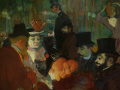
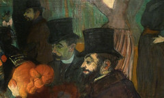
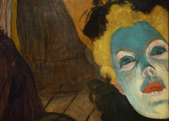
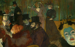
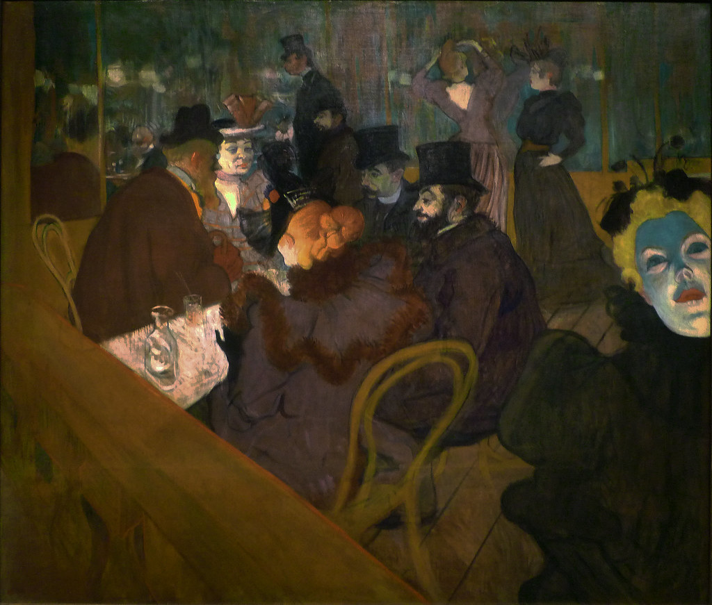
Although these subjects suggest carefree pleasure, there are undertones of social criticism in some Neo-Impressionist paintings. Seurat’s Circus shows the strict class distinctions in Paris both by location, with the wealthier patrons seated in the lower tiers, and by dress and posture, which gets markedly more casual the further the spectators are from ringside.
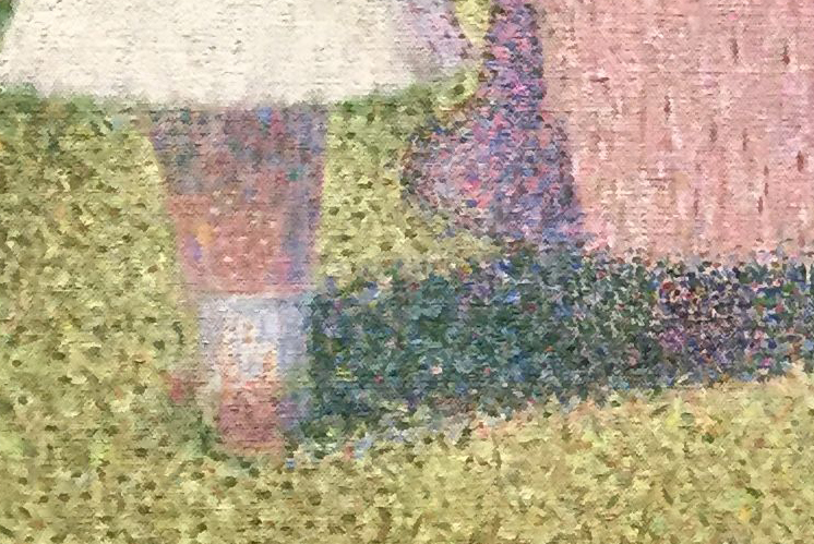
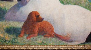
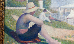
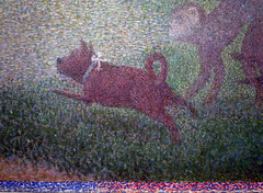
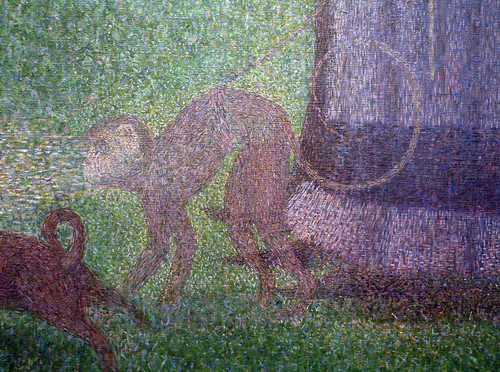
One contemporary critic also remarked that the rigidity of the poses in Seurat’s La Grande Jatte reminded him of “the stiffness of Parisian leisure, prim and exhausted, where even recreation is a matter of striking poses.” [1] As we examine the characters in La Grande Jatte in detail, there are some surprising inclusions and juxtapositions. In the left foreground, a working-class man in shirtsleeves overlaps a much more formally-dressed middle-class gentleman in a top hat holding a cane. A trumpet player in the middle-ground plays directly into the ears of two soldiers standing at attention in the background. A woman with an ostentatiously eccentric pet monkey on the right and another fishing on the left have been interpreted as prostitutes, one of whom is casting out lures for clients. Between them, a toy lap-dog with a pink ribbon leaps toward a rangy hound whose coat is as black as that of the bourgeois gentleman with the cane.
Despite these provocative juxtapositions and overlaps, very few of the figures actually seem to be interacting with each other; each is lost in their own world. Unlike the mood of convivial good-fellowship between the classes and sexes in Auguste Renoir’s Moulin de la Galette, Seurat’s Grande Jatte sets up a dynamic of alienation and tension.
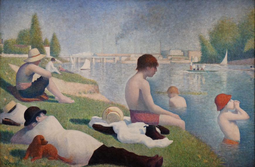
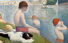
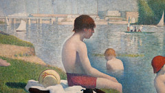
La Grande Jatte forms an implicit pair with an earlier painting of the same size by Seurat, Bathers at Asnières. Asnières was an industrial suburb of Paris, just across the river Seine from La Grande Jatte. Unlike that island’s largely middle-class patrons in their top hats and bustle skirts, here we see more working-class and lower-middle-class figures in shirtsleeves and straw hats or bowlers. In the background the smokestacks of the factories at Clichy serve as a reminder of labor, even during the men’s leisure time.
As in the painting of La Grande Jatte, all of the figures are isolated in their own world, but a sense of implicit tension is raised by their insistent gaze across the river at their wealthier compatriots. A middle-class couple being rowed by a hired oarsman in a boat with a prominent French flag further adds to the class tensions raised by the work.
Political revolutionaries?
Perhaps it was this odd sense of unresolved class tensions that caused Signac to suggest that even Seurat’s paintings of “the pleasures of decadence” are about exposing “the degradation of our era” and bearing witness to “the great social struggle that is now taking place between workers and capital.” [2] Seurat’s own politics were unclear, but Signac was a social anarchist, as were several other Neo-Impressionists, including Camille Pissarro and his son Lucien, as well as Maximilian Luce, Theodore van Rysselberghe, Henri Cross, and the critic Felix Fénéon. Social anarchists reject a strong centralized government in which the state owns the means of production and guides the economy; they believe that social ownership and cooperation will emerge naturally in a stateless society.
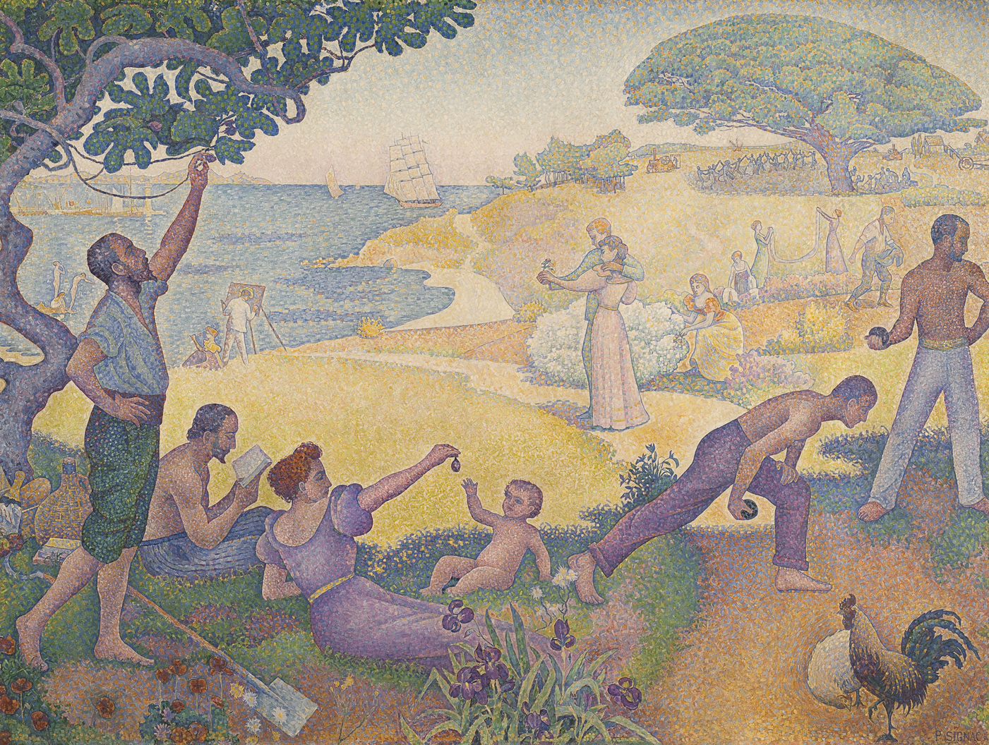
Signac’s In the Time of Harmony was originally titled In the Time of Anarchy, but political controversy forced a change. Between 1892 and 1894 there were eleven bombings in France by anarchists, and a very public trial of suspected anarchists that included Fénéon and Luce.
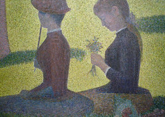
Signac’s painting was intended to show that, despite its current revolutionary tactics, the aim of anarchism was a peaceful utopia. In the foreground, workers lay down their tools for a picnic of figs and champagne while others play at boules. A couple in the center contemplates a posy, while behind them a man sows and women hang laundry. Although the mood is timeless — with different clothing, this painting could be a Classical pastoral scene — in the distance modern mechanical farm equipment reinforces the painting’s subtitle, “The Golden Age is Not in the Past, it is in the Future.”
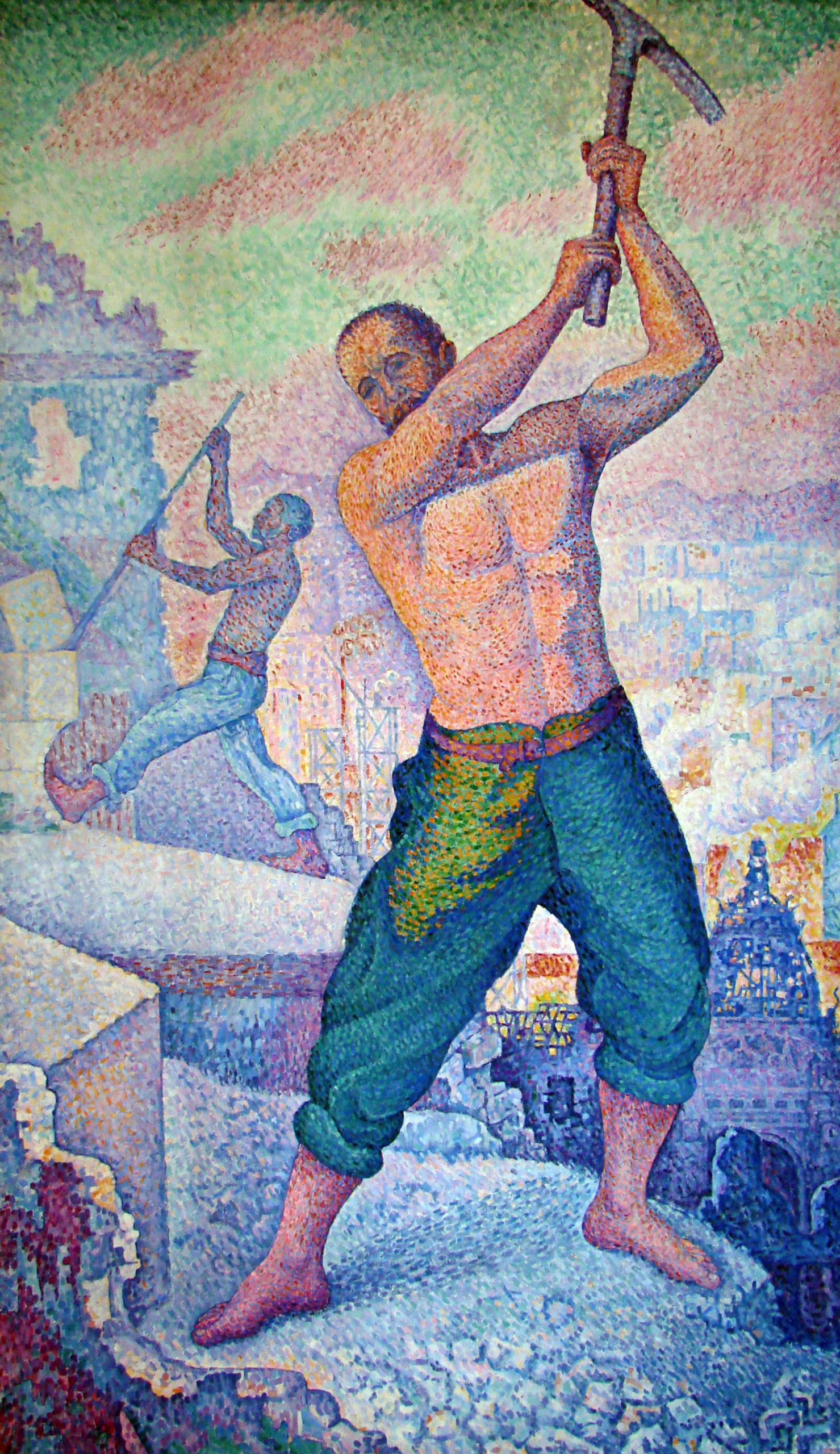
Relatively few Neo-Impressionist paintings are so overtly allegorical and political. Signac argued that it was the Neo-Impressionists’ technique, not any directly socialist or anarchist subject matter, that was most in tune with the political revolutionaries. The Neo-Impressionists’ rigorous appeal to hard science, rather than dead conventions, along with their uncompromising will to “paint what they see, as they feel it,” will help “give a hard blow of the pick-axe to the old social structure” and promote a corresponding social revolution. [3]
Notes:
- Henri Fèvre, “L’Exposition des Impressionnistes,” in Étude sur le Salon de 1886 et sur l’exposition des impressionnistes (Paris, 1886), p. 43 (our translation).
- Paul Signac, “Impressionists and Revolutionaries,” La Révolte, June 13-19, 1891, as translated in Nochlin, ed., p. 124.
- ibid., p. 124.
Neo-Impressionist Color Theory
by DR. CHARLES CRAMER and DR. KIM GRANT
In 1899, the artist Paul Signac rejected the “Pointillist” label and asserted, “The Neo-Impressionist does not dot, he divides.” He laid out a four-part argument outlining how division achieves the goals of “luminosity” and “harmony” by means of:
- The optical mixture of solely pure pigments (all the tints of the prism and all their tones);
- The separation of the different elements (local color, color of the lighting, their interactions, etc.);
- The equilibration of these elements and their proportions (according to the laws of contrast, of gradation, and of irradiation);
- The choice of a brushstroke commensurate with the dimensions of the painting. [1]
Signac’s argument is dense with the technical vocabulary of late-nineteenth century color theory. The Neo-Impressionists prided themselves on bringing scientific rigor to the hitherto largely intuitive Impressionist project. By understanding the contemporary meanings of Signac’s terms, we can trace how scientific color theory affected Neo-Impressionist practice.
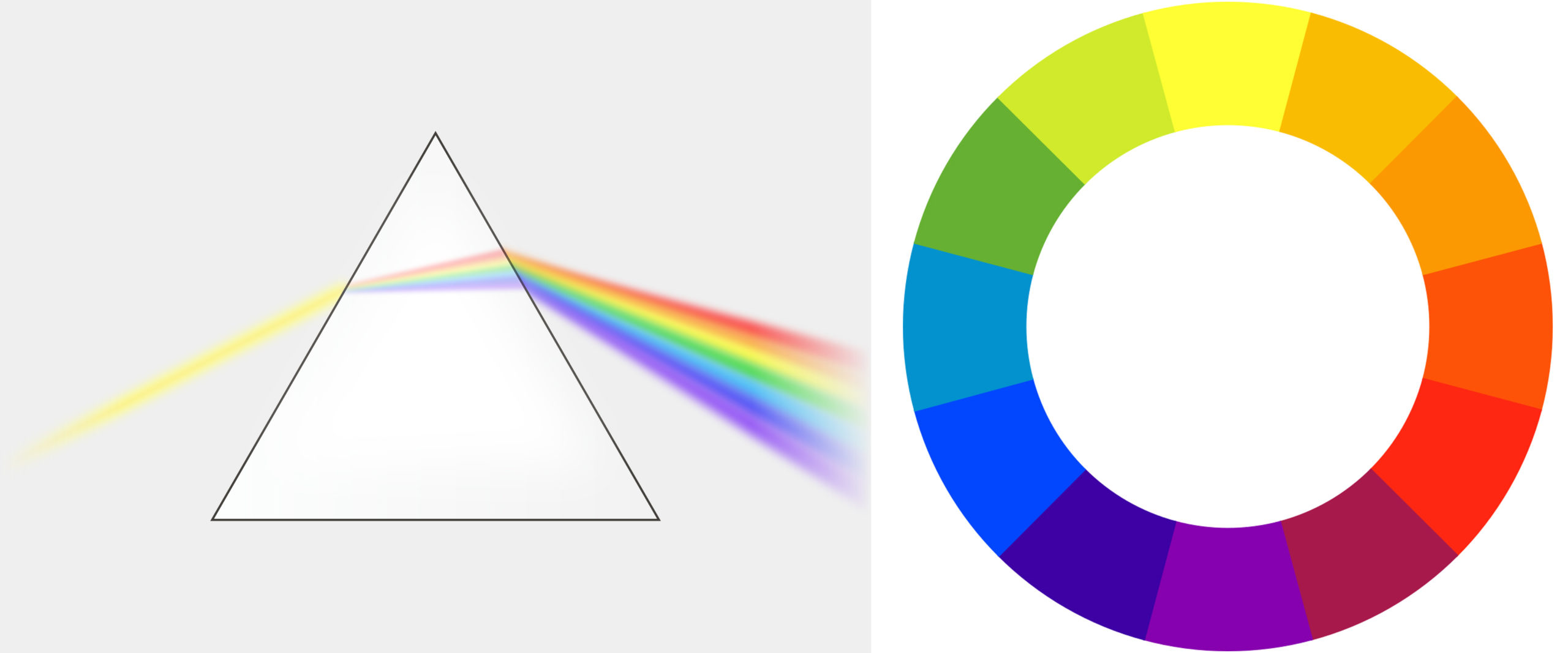
The Neo-Impressionist uses “solely pure pigments,” which Signac specifies as the colors of the “prism.” This wording already suggests a scientific basis for Neo-Impressionist color usage. In the seventeenth century the English physicist Sir Isaac Newton used a glass prism to separate white light into a rainbow. In painters’ terms, the colors of the prism correspond to the primary colors red, yellow, and blue, the secondary colors orange, green, and violet, and the tertiary colors blue-violet, blue-green, yellow-green, etc.
The Neo-Impressionists would mix these hues or “tints” only with white to produce different values or “tones” (all the gradations of blue from light to dark, for example). Above all, they avoided the muddy earth colors that dominated European painters’ palettes before the late-nineteenth century.
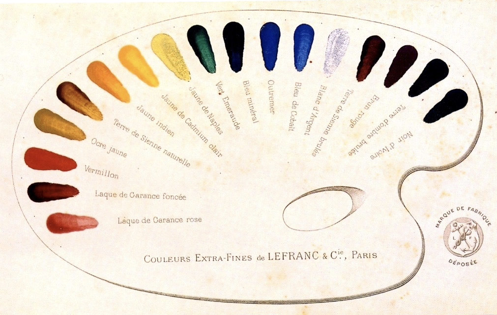
In their quest for pure, bright colors, the Neo-Impressionists were aided by new pigments created through chemical synthesis, as opposed to the ground-up minerals or organic matter of traditional pigments. Analysis has shown that Seurat’s palette of 1889-90 consisted of many colors that were not available before the 19th century, including chrome yellow (invented 1797), cobalt blue (1803-04), cadmium orange (1820s), french ultramarine (1826), and manganese violet (1860s).
Brushstroke and optical mixture
The nickname “Pointillism” was given to the movement because of the artists’ tendency to paint in small dots (points in French). Signac objected to the term because it suggests a stylistic gimmick, but executing paintings in small, discrete brushstrokes was crucial to another key concept of the movement that he mentions above: optical mixture.
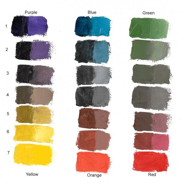
As any painter quickly realizes, whenever you blend two pigments, the resulting mixture is duller than either of the original pigments. This dulling effect is magnified the farther apart the colors are on the color wheel. Mixing blue and green results in a fairly bright blue-green, but mixing blue and orange creates dull grays and muddy browns.
Rather than mixing colors on the palette, the Neo-Impressionists would juxtapose them on the canvas in small dots. Seen from a suitable distance, these dots mix in the eye, and achieve the intended effects without losing the chromatic intensity of the original pigments.
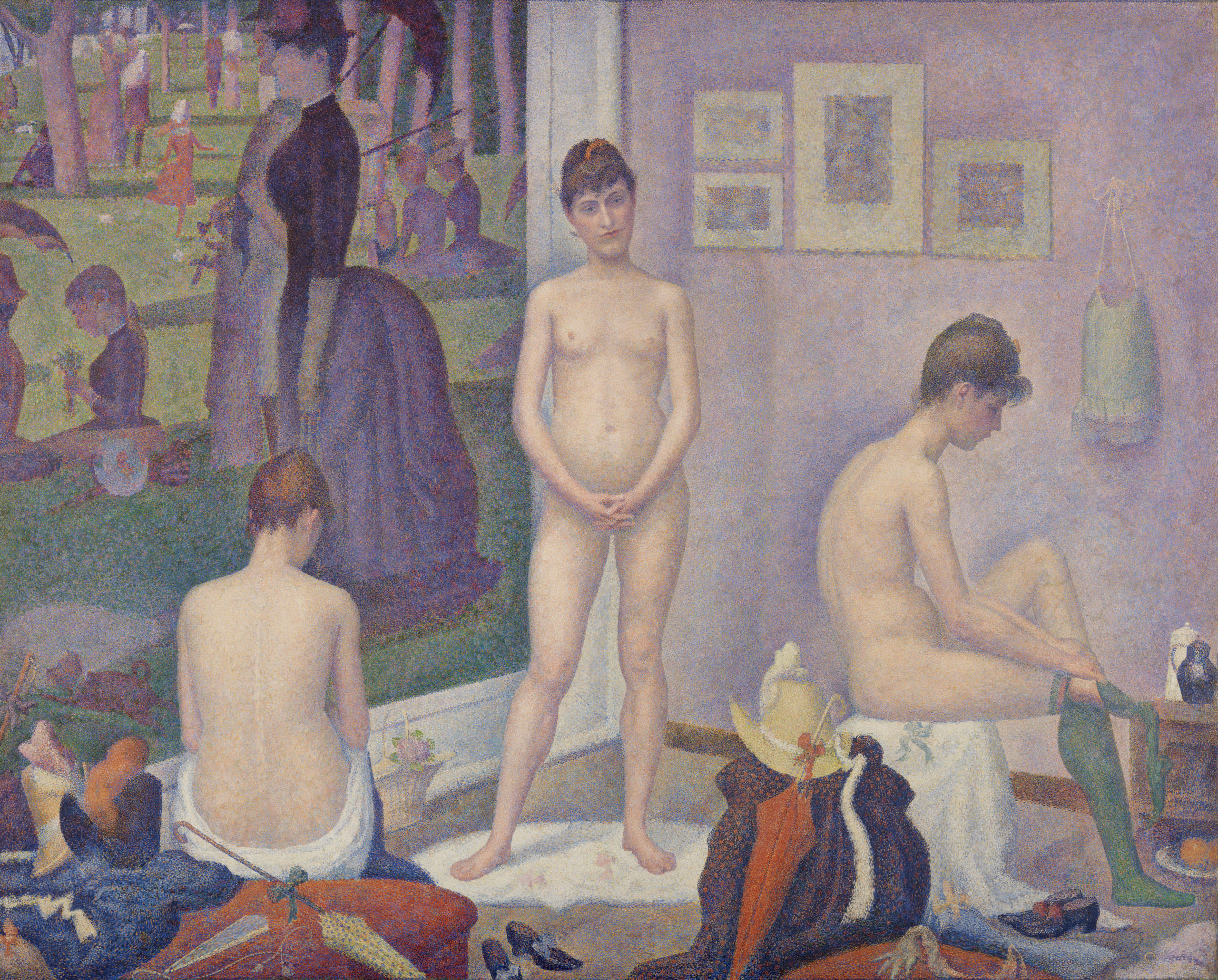
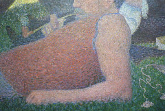
For example, the flesh of the women in Seurat’s The Models is made up of thousands of tiny dots of colors ranging from the expected light yellows, peaches, and pinks, to surprising blues, violets, and greens. Viewed from a sufficient distance, these colors blend in the eye to create a convincing and very luminous representation of the play of light and shadow across the models’ bodies.
The dots of color must be quite small in order for optical mixture to occur, although as Signac notes, their size could vary relative to the size of the painting. A mural meant to be read from a distance of several meters could use larger dots than a small landscape meant to be viewed up close.
Local color vs. perceived color
Signac’s preferred term “division” refers to the way the artist isolates all the component influences that contribute to a given perceived color. In the excerpt above, he lists the two main components: local color and the color of the light, along with “their interactions, etc.” Local color is what we think of as the actual color of the object itself: a yellow bus, a red apple, a white shirt. But simply painting an object in its local color ignores the effects of light on the object.
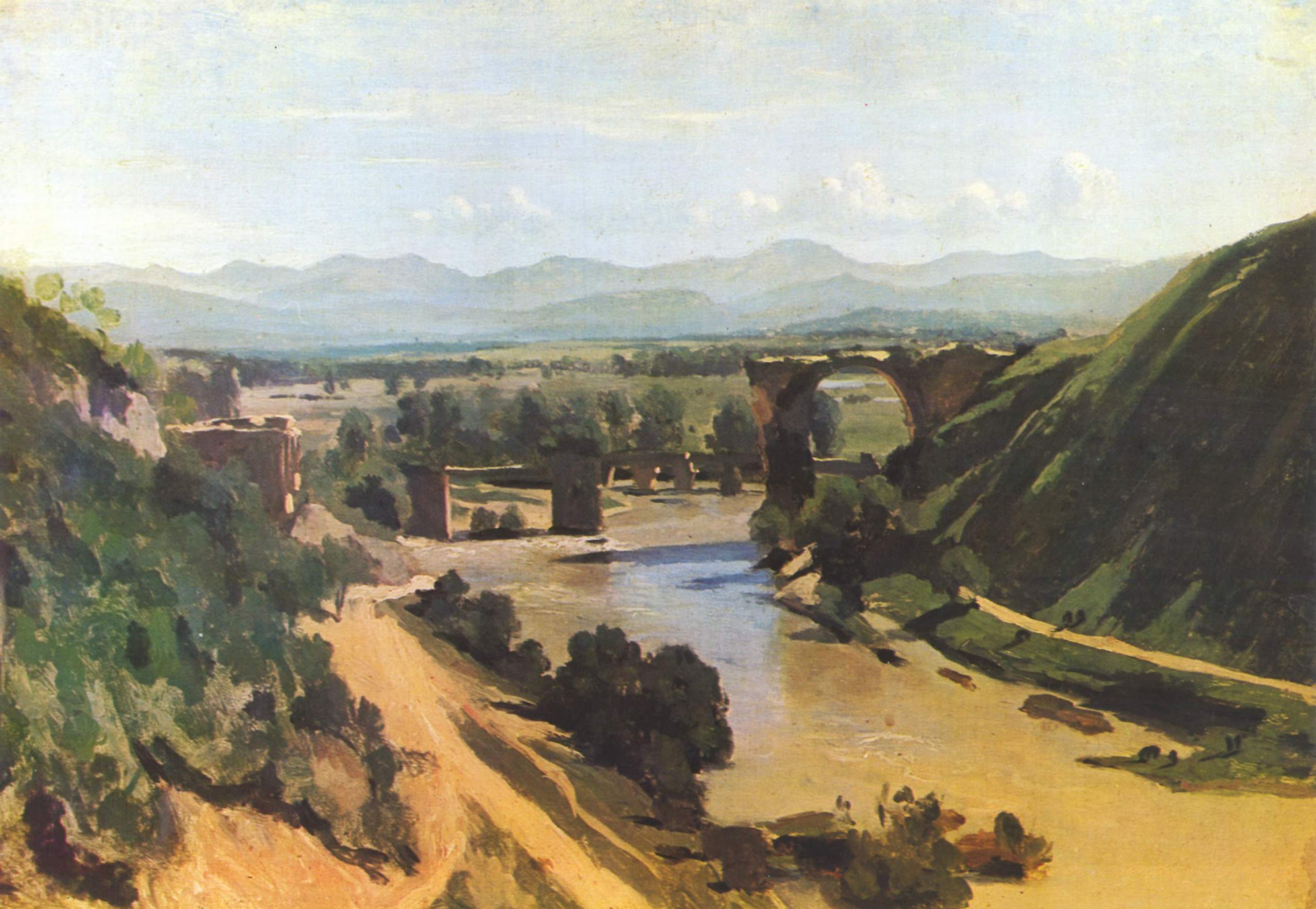
One of the effects of light is of course chiaroscuro: parts of the object struck by light are lighter than the parts in shadow. Camille Corot’s Bridge at Narni is a good example of a traditional landscape painted in local color and chiaroscuro. The bulk of the painting is in three basic colors: the green of the grass, the reddish tan of the dirt and bridge (and muddy water), and the blue of the sky and distant mountains. Corot has mixed darker and lighter values of each of these colors to show how the scene is affected by light coming from the sun in the upper right.
What Corot doesn’t emphasize, however, is what is called the color temperature of the light itself. A white shirt seen in a warm light will appear to be yellowish-orange, while viewed under cool light it will be tinted blue-violet.
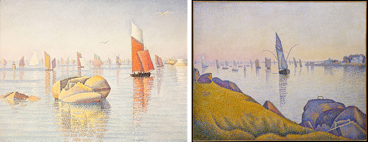
The color temperature of outdoor light is affected by the time of day, the season, and the weather. In these two paintings executed in the French coastal town of Concarneau, Signac pays close attention not just to the local colors of the objects, but also to their perceived colors — the colors that we actually see as they are affected by the temperature of the light. A palette based on orange and light blue depicts the bright, clear qualities of morning light, while a pinkish-yellow atmosphere with heavy, violet shadows conveys the effect of twilight.
Divisionism
The perceived color of any given object is the result of multiple factors, including the local color of the object, the color temperature of the light striking that object, possible reflected color from nearby objects, atmospheric perspective (which makes distant objects appear more blue-gray) and, as we shall see, the effect of “simultaneous contrast” with adjacent colors. Instead of blending all of these factors together, divisionism keeps them separate. The foreground grass in Signac’s Evening Calm includes dots of yellow and orange — the color of the light— to show how the greens are warmed by the light of the evening sun.
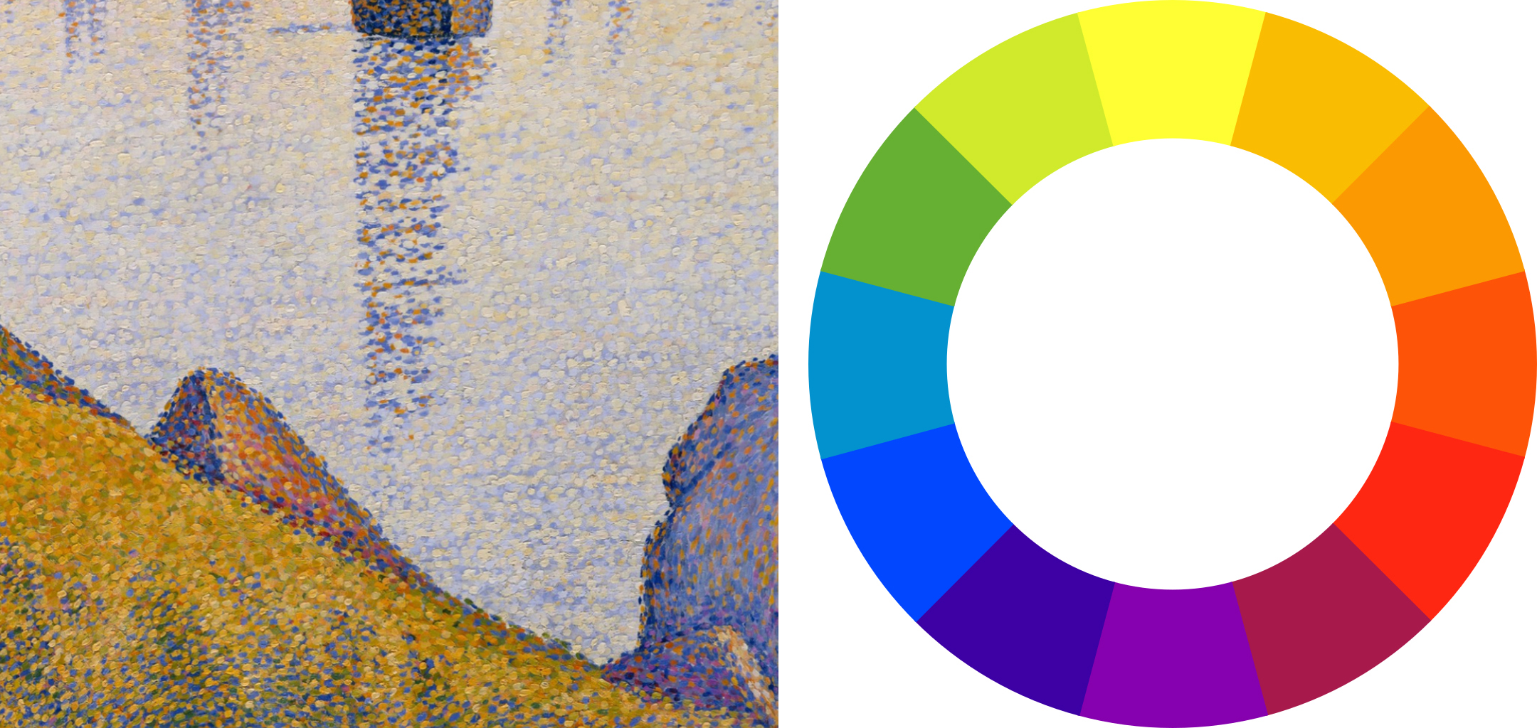
In the shadowed portions of the grass, Signac intersperses the greens with dots of cerulean and ultramarine blue. This is because shadow colors are the “complement” of the color of the light. Complementary colors are colors opposite one another on the color wheel, so the yellow-orange evening light produces violet-blue shadows.
This effect is even more strongly marked in the triangular rock jutting up from the center foreground, the lit side of which is shown glowing in the sunset through dots of orange, yellow, and rose. The shadowed side is dotted with mostly dark ultramarine blue, the complement of orange, although some interspersed oranges and even crimsons show the warm reflected light received from the grass. Rather than blending these complementary colors together, which would produce a dull muddy gray, Signac keeps them separate or divided, maintaining an overall intensity of color. Despite the improbable component colors, viewed from a proper distance, optical mixture produces a very convincing overall illusion of a rock bathed in warm evening light.
The law of contrast
Signac also mentions the artist’s need to take into account “the laws of contrast, of gradation, and of irradiation.” These “laws” refer to principles of color interaction discovered by nineteenth-century theorists such as Michel Chevreul, Ogden Rood, and Charles Henry, which seemed to promise that the entirety of art could be subsumed to rigorous scientific principles.
Chevreul’s most famous contribution to color theory is the “law of simultaneous contrast,” which takes account of how our perception of color changes relative to adjacent colors. Look at how different the same color swatch of blue appears against a field of bright green versus a field of dull orange, for example.
The general form of the law of simultaneous contrast is that two juxtaposed colors will appear maximally different from one another. Thus the blue appears both darker and duller when it is seen in a field of light, high-chroma yellow-green on the left, and it appears lighter and higher in chromatic intensity when seen against a field of dark, dull orange on the right.
Viewed against a white field, a swatch of color will actually gain a “halo” of its complementary color as a result of this effect. For example, if you gaze at the green swatch without focusing for several seconds, you will begin to see magenta edges emerge around it.
Seurat records this effect in his painting The Models. Notice how the seated model on the right has a dark, violet-blue halo around the light orange flesh of her back, and a light halo against the dark blue-violet shadowed side of her stomach and upper arm. This natural “irradiation” effect is exaggerated by Seurat in order to help intensify colors and values by juxtaposition with their opposites through simultaneous contrast.
Color perception, color harmony, color expression
We have concentrated here on how the Neo-Impressionists used color theory to help duplicate perceptual effects. They employed divisionism to keep their paintings as luminous as possible while recording how perceived color is affected by factors such as the temperature of the light, reflected color, and simultaneous contrast with adjacent colors.
The aims of the Neo-Impressionists went beyond perceptual accuracy to also include the purely aesthetic effects of color: how they can be used to create pleasing color harmonies based on certain principles. Signac’s “laws of contrast and gradation” evokes two of these principles: “gradation” is the aesthetic harmony produced by gentle transitions between largely analogous colors, and “contrast” is produced by the sharper juxtaposition of opposites. Later works by Signac seem more concerned with such harmonies than with perceptual accuracy.
The Neo-Impressionists also recognized that color has expressive effects. Signac claimed that “joy” is evoked by paintings with dominant warm and light tones, while “sorrow” is evoked by dominant cool and dark colors. [2] Ideally, a Neo-Impressionist painting will take into account all three qualities: perceptual accuracy, formal harmony, and emotional expression. The artists believed that all of these were susceptible to rigorous scientific laws that were just being recognized and systematized in their period.
Notes:
- Paul Signac, From Eugene Delacroix to Neo-Impressionism, as translated in Linda Nochlin, ed., Impressionism and Post-Impressionism, 1874-1904: Sources and Documents (Englewood Cliffs, N.J.: Prentice-Hall, 1966), p. 118. This passage is very close to Georges Seurat’s own formulation of his method in a letter to Maurice Beaubourg of August 28, 1890: “The means of expression is the optical mixture of tones and colors (both of local color and of the illuminating color–sun, oil lamp, gas lamp, etc.), i.e., of the lights and their reactions (shadows) according to the laws of contrast, gradation, and irradiation” (in Nochlin, ed., p. 114).
- Ibid., p. 121.
Additional resources:
Georges Seurat
Georges Seurat, Bathers at Asnières
by DR. BETH HARRIS and DR. STEVEN ZUCKER
Video \(\PageIndex{1}\): Georges Seurat, Bathers at Asnières, 1884, oil on canvas, 6.6 x 9.8 ft (National Gallery, London)
Smarthistory images for teaching and learning:
Georges Seurat, A Sunday on La Grande Jatte – 1884
by DR. STEVEN ZUCKER and DR. BETH HARRIS
Video \(\PageIndex{2}\): Georges Seurat, A Sunday on La Grande Jatte – 1884, 1884-86, oil on canvas, 81-3/4 x 121-1/4 inches (207.5 x 308.1 cm) (The Art Institute of Chicago)
Smarthistory images for teaching and learning:
Vincent van Gogh
The Potato Eaters
by DR. BETH HARRIS and DR. STEVEN ZUCKER
What should a peasant painting smell like? Van Gogh has an opinion…
Video \(\PageIndex{3}\): Vincent van Gogh, The Potato Eaters, 1885, oil on canvas, 82 x 114 cm (Van Gogh Museum, Amsterdam, Vincent van Gogh Foundation). A conversation with Dr. Beth Harris and Dr. Steven Zucker.
Additional resources:
Another version of this painting at the Kröller-Müller Museum
Van Gogh as a peasant painter — from the Van Gogh Museum
French Paintings of the 19th Century from The National Gallery of Art
Linda Nochlin and Dan Karlholm, “Misery, Beauty, and Other Issues: Linda Nochlin in Conversation with Dan Karlholm”
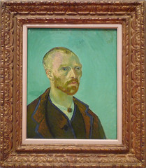
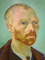
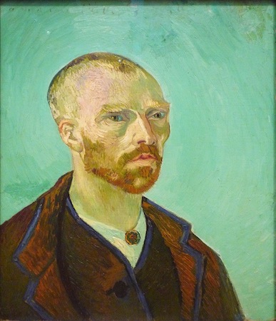
Vincent van Gogh, Self-Portrait Dedicated to Paul Gauguin
by DR. BETH HARRIS and DR. STEVEN ZUCKER
Video \(\PageIndex{4}\): Vincent van Gogh, Self-Portrait Dedicated to Paul Gauguin, 1888, oil on canvas, 24 x 19-11/16″ (Fogg, Harvard Art Museums, Cambridge, Massachusetts)
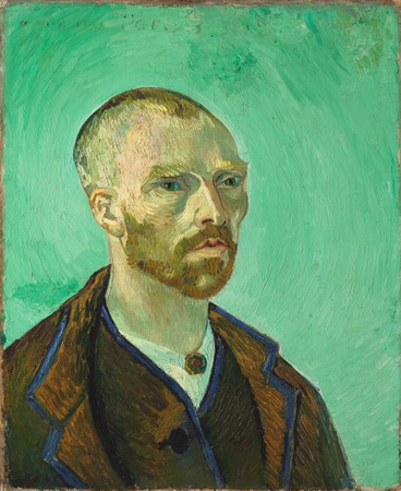
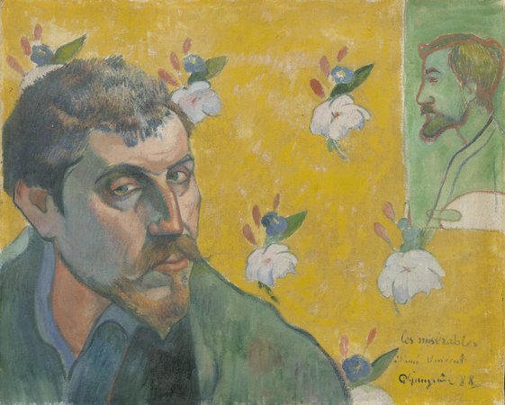
This self portrait was painted for Paul Gauguin as part of swap between the artists. Van Gogh chose to represent himself with monastic severity. The other painting is Paul Gauguin’s Self-Portrait Dedicated to Vincent van Gogh (Les Misérables). Gauguin’s title is a reference to the heroic fugitive, Jean Valjean, in Victor Hugo’s novel Les Misérables. Gauguin’s painting also contains a portrait of Emile Bernard that was painted not by Gauguin but by Bernard within Gauguin’s painting.
The following is a letter by Van Gogh to his brother Theo about the painting exchange with Gauguin dated October 7, 1888:
My dear Theo,
Many thanks for your letter. How glad I am for Gauguin; I shall not try to find words to tell you – let’s be of good heart.
I have just received the portrait of Gauguin by himself and the portrait of Bernard by Bernard and in the background of the portrait of Gauguin there is Bernard’s on the wall, and vice versa.
The Gauguin is of course remarkable, but I very much like Bernard’s picture. It is just the inner vision of a painter, a few abrupt tones, a few dark lines, but it has the distinction of a real, real Manet.
The Gauguin is more studied, carried further. That, along with what he says in his letter, gave me absolutely the impression of its representing a prisoner. Not a shadow of gaiety. Absolutely nothing of the flesh, but one can confidently put that down to his determination to make a melancholy effect, the flesh in the shadows has gone a dismal blue.
So now at last I have a chance to compare my painting with what the comrades are doing. My portrait, which I am sending to Gauguin in exchange, holds its own, I am sure of that. I have written to Gauguin in reply to his letter that if I might be allowed to stress my own personality in a portrait, I had done so in trying to convey in my portrait not only myself but an impressionist in general, had conceived it as the portrait of a bonze, a simple worshiper of the eternal Buddha.
And when I put Gauguin’s conception and my own side by side, mine is as grave, but less despairing. What Gauguin’s portrait says to me before all things is that he must not go on like this, he must become again the richer Gauguin of the “Negresses.”
I am very glad to have these two portraits, for they finally represent the comrades at this stage; they will not remain like that, they will come back to a more serene life.
And I see clearly that the duty laid upon me is to do everything I can to lessen our poverty.
No good comes the way in this painter’s job. I feel that he is more Millet than I, but I am more Diaz then he, and like Diaz I am going to try to please the public, so that a few pennies may come into our community. I have spent more than they, but I do not care a bit now that I see their painting—they have worked in too much poverty to succeed.
Mind you, I have better and more saleable stuff than what I have sent you, and I feel that I can go on doing it. I have confidence in it at last. I know that it will do some people’s hearts good to find poetic subjects again, “The Starry Sky,” “The Vines in Leaf,” “The Furrows,” the “Poet’s Garden.”
So then I believe that it is your duty and mine to demand comparative wealth just because we have very great artists to keep alive. But at the moment you are as fortunate, or at least fortunate in the same way, as Sensier if you have Gauguin and I hope he will be with us heart and soul. There is no hurry, but in any case I think that he will like the house so much as a studio that he will agree to being its head. Give us half a year and see what that will mean.
Bernard has again sent me a collection of ten drawings with a daring poem – the whole is called At the Brothel.
You will soon see these things, but I shall send you the portraits when I have had them to look at for some time.
I hope you will write soon, I am very hard up because of the stretchers and frames that I ordered.
What you told me of Freret gave me pleasure, but I venture to think that I shall do things which will please him better, and you too.
Yesterday I painted a sunset.
Gauguin looks ill and tormented in his portrait!! You wait, that will not last, and it will be very interesting to compare this portrait with the one he will do of himself in six months’ time.
Someday you will also see my self-portrait, which I am sending to Gauguin, because he will keep it, I hope.
It is all ashen gray against pale veronese (no yellow). The clothes are this brown coat with a blue border, but I have exaggerated the brown into purple, and the width of the blue borders.
The head is modeled in light colours painted in a thick impasto against the light background with hardly any shadows. Only I have made the eyes slightly slanting like the Japanese.
Write me soon and the best of luck. How happy old Gauguin will be.
A good handshake, and thank Freret for the pleasure he has given me. Good-by for now.
Ever yours,
Vincent.
Letter courtesy of Web Exhibits
Additional resources:
This painting at the Harvard Museums
Paul Gauiguin’s Self Portrait with Portrait of Émile Bernard at the Van Gogh Museum
Smarthistory images for teaching and learning:

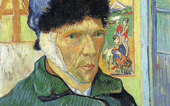
Vincent van Gogh, Self-Portrait with Bandaged Ear
by BEN POLLITT
The unfortunate man
The following report appeared in the Arles journal Le Forum Republicain on December 30, 1888:
Last Sunday, at 11:30 in the evening, Vincent Vaugogh [sic], a painter of Dutch origin, called at the Brothel No. 1, asked for a woman called Rachel and handed her … his ear, saying: ‘Guard this object with your life’. Then he disappeared. When informed of the action, which could only be that of a pitiful madman, the police went the next day to his house and discovered him lying on his bed apparently at the point of death. The unfortunate man has been rushed to hospital.
Accounts of what took place that night vary. Whatever the exact circumstances, though, whatever underlying motivations could have compelled van Gogh to do it, the episode effectively put an end to one of the most famous working relationships in the history of art, as Paul Gauguin boarded the train to Paris the next day.
For nine weeks they had lived together sharing lodgings in the Yellow House, just outside the old town walls of Arles in the South of France, spurring each other on as collaborators and as rivals too. The dream had been to set up “a studio in the South,” as van Gogh put it, a community of artists, with himself and Gauguin, the founding fathers, all working in harmony with nature and, as he hoped, with each other.
A brave face?
The painting, completed two weeks after the event, is often read as a farewell to that dream. For Steven Naifeh and Gregory White Smith, the most recent biographers of the artist, however, the portrait was first and foremost a plea to van Gogh’s doctors.

It shows the artist in three-quarter profile standing in a room in the Yellow House wearing a closed coat and a fur cap. His right ear is bandaged. It was in fact his left ear that was bandaged, the painting being a mirror image. To his right is an easel with a canvas on it. Barely visible, a faint outline underneath reveals what looks to be a still-life which appears to have been painted over. The top of the easel has been cropped by the edge of the canvas and the sitter’s hat so as to form a fork-like shape. To his left is a blue framed window, and partly obscured by the gaunt ridge of his cheek, a Japanese woodblock print shows two geishas in a landscape with Mount Fuji in the background.
Naifeh and White Smith argue that van Gogh, following his release from hospital, was anxious to persuade his doctors that he was indeed perfectly fit and able to take care of himself and that, despite his momentary lapse, it would not be necessary for them to have him committed, as had been suggested, to one of the local insane asylums; hence the winter coat and hat, to keep warm as they had advised, and with the window ajar still getting that much-needed fresh air into his system. The bandage too, which would have been soaked in camphor, suggests that he both accepts what has happened and is happy, literally, to take his medicine. The same note of stoic optimism, if one wishes to read the painting this way, is also found in the letters to his brother Theo, in which van Gogh, far from abandoning his dream of a “studio in the South,” talks of continuing the project, expressing the desire for more artists to come to Arles, even proposing that Gauguin and he could “start afresh.”
Yet, of course, whether or not van Gogh was willing to admit to it, the project had most definitely reached its end. And though for a short time he did get to carry on living in the Yellow House, within a few weeks, acting on a petition handed in to the local authorities and signed by 30 of his neighbors, he was forcefully removed and taken to Arles Hospital where he was locked in an isolation cell. In May van Gogh committed himself to the private asylum in Saint-Remy a small town north of Arles and in a little over a year he was dead.
An obsession with Japanese Art
Though Naifeh and White Smith’s argument is convincing, how the artist accounts for himself in his letters and how he expresses himself in paint, are different things. For my own part, what is most interesting about the image is what it reveals about van Gogh’s artistic practice and particularly his obsession with Japanese art: “All my work to some extent is based on Japanese art,” he wrote in July, 1888.
Three years earlier, while in the port city of Antwerp in Belgium, he would wander through the markets there where woodblock prints of the Ukiyo-e school, the so-called “artists of the floating world” were readily available and could be bought for just a few centimes. These first glimpses into the art of Japan came at a pivotal moment in the artist’s career: half way between his native Holland where he had schooled himself in the Realist tradition of artists such as Jozef Israëls, with his dark, earthy palette and sympathy for the rural poor, and Paris where he would encounter the colorful urbanity of the Impressionists.
For van Gogh, the artists of Japan offered the perfect meeting-point of theory and practice. The most famous of them was Hokusai, “the Dickens of Japan,” who shared the Dutchman’s passion for depicting the lives of the poor. It was this compassionate dimension of Japanese art that van Gogh hoped to bring to Impressionism, a movement that—by the time he arrived in Paris in 1886—had already absorbed the visual inventiveness of the Ukiyo-e school.
As time went on, the links went still further. In his two-year sojourn in Paris, the city of strangers, it was fellowship above all else that he yearned for, and so he came to imagine the Impressionists, among whose ranks he claimed to belong, to be as he imagined the Japanese, a united body of artists, sharing the same goals and ideals. It was this that prompted the journey south. On arriving in Arles he wrote to his brother, declaring his hope that “other artists will rise up in this lively country and do for it what the Japanese have done for theirs.” And again, while decorating his new house with paintings of sunflowers, he wrote to Theo: “Come now, isn’t it almost a true religion which the simple Japanese teach us, who live in nature as though they themselves were flowers.”
It was in Arles that he read Pierre Loti’s novel Madame Chrysanthème, best known today as the literary source for Puccini’s opera Madame Butterfly. While its self-sacrificing heroine worked her graceful way into van Gogh Orientalist fantasies, Loti’s description of Buddhist priests inspired his own Self-Portrait (Dedicated to Paul Gauguin), a painting that draws out the direction he hoped the two artists would follow.
How very different Self-Portrait with Bandaged Ear is to this earlier portrait. With its formal setting; the repeated triangles, for example, in the form of his coat, the top of the easel and the view offered of Mount Fuji itself, lending the painting it’s aspirational quality, its upward thrust. And yet the dominant feeling is surely conveyed by the internal frames: the window, the canvas and print, each of which appears condensed and somewhat forced into the painting, as though hemming the sitter in.

The Japanese print as van Gogh painted it in Self-Portrait with Bandaged Ear differs from the original. Comparing them we see how van Gogh shifted the composition to the right, deliberately discarding one of the figures in favour of the heron, whose razor-sharp beak rears up as if to stab at the artist’s ear. Opposite it, the canvas squeezed in to the left with its ghostly imprint of flowers surmounted by the fork of the easel sets up a formally satisfying but psychologically unsettling parallel. Is there a hint in all this, albeit unconsciously expressed, that the dream of an artist’s community in Arles has turned against him?
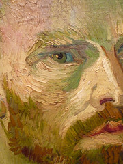
Perhaps, but then of course there is always van Gogh’s color—the joyous application of pigment onto canvas, the glorious use of impasto, thick and swift; that fabulous hatching technique, in places evoking the textures it depicts, the weave of the coat, the threads of the bandage, the fur of the hat. And note the tonal array of strokes that make up the face: violet, green, red, brown, orange, straw yellow; the blacks centered in those piercing pupils.

A yearning to be proved sane or a heartfelt cry of anguish, whatever we may read in the image about van Gogh the man, from a purely art historical point of view, it is here in his brushwork and in his palette that one discovers the source of André Derain’s “deliberate disharmonies.” How fitting then that it was while on holiday in the South of France, a favorite haunt of that early Modernist movement to which he belonged—the Fauves—that Derain painted his friend and fellow artist Matisse; enough perhaps to say that Van Gogh’s hope and prediction that “other artists will rise up in this lively country” was not so wildly off the mark after all.
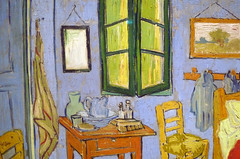
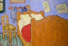
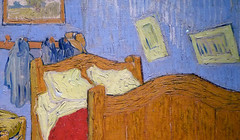
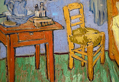
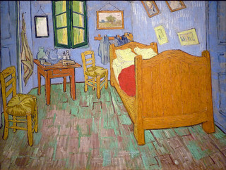
Vincent van Gogh, The Bedroom
by DR. STEVEN ZUCKER and DR. BETH HARRIS
Video \(\PageIndex{5}\): Vincent van Gogh, The Bedroom, 1889, oil on canvas, 29 x 36-5/8 inches ( 73.6 x 92.3 cm) (Art Institute of Chicago)
Smarthistory images for teaching and learning:
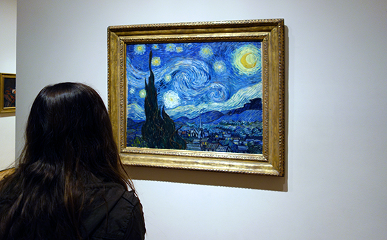
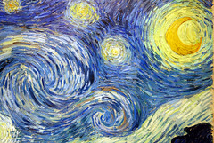
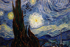
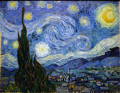
Vincent van Gogh, The Starry Night
by DR. NOELLE PAULSON
A rare night landscape
The curving, swirling lines of hills, mountains, and sky, the brilliantly contrasting blues and yellows, the large, flame-like cypress trees, and the thickly layered brushstrokes of Vincent van Gogh’s The Starry Night are ingrained in the minds of many as an expression of the artist’s turbulent state-of-mind. Van Gogh’s canvas is indeed an exceptional work of art, not only in terms of its quality but also within the artist’s oeuvre, since in comparison to favored subjects like irises, sunflowers, or wheat fields, night landscapes are rare. Nevertheless, it is surprising that The Starry Night has become so well known. Van Gogh mentioned it briefly in his letters as a simple “study of night” or ”night effect.”
His brother Theo, manager of a Parisian art gallery and a gifted connoisseur of contemporary art, was unimpressed, telling Vincent, “I clearly sense what preoccupies you in the new canvases like the village in the moonlight… but I feel that the search for style takes away the real sentiment of things” (813, 22 October 1889). Although Theo van Gogh felt that the painting ultimately pushed style too far at the expense of true emotive substance, the work has become iconic of individualized expression in modern landscape painting.

Technical challenges
Van Gogh had had the subject of a blue night sky dotted with yellow stars in mind for many months before he painted The Starry Night in late June or early July of 1889. It presented a few technical challenges he wished to confront—namely the use of contrasting color and the complications of painting en plein air (outdoors) at night—and he referenced it repeatedly in letters to family and friends as a promising if problematic theme. “A starry sky, for example, well – it’s a thing that I’d like to try to do,” Van Gogh confessed to the painter Emile Bernard in the spring of 1888, “but how to arrive at that unless I decide to work at home and from the imagination?” (596, 12 April 1888).
As an artist devoted to working whenever possible from prints and illustrations or outside in front of the landscape he was depicting, the idea of painting an invented scene from imagination troubled Van Gogh. When he did paint a first example of the full night sky in Starry Night over the Rhône (1888, oil on canvas, 72.5 x 92 cm, Musée d’Orsay, Paris), an image of the French city of Arles at night, the work was completed outdoors with the help of gas lamplight, but evidence suggests that his second Starry Night was created largely if not exclusively in the studio.

Location
Following the dramatic end to his short-lived collaboration with the painter Paul Gauguin in Arles in 1888 and the infamous breakdown during which he mutilated part of his own ear, Van Gogh was ultimately hospitalized at Saint-Paul-de-Mausole, an asylum and clinic for the mentally ill near the village of Saint-Rémy. During his convalescence there, Van Gogh was encouraged to paint, though he rarely ventured more than a few hundred yards from the asylum’s walls.

Besides his private room, from which he had a sweeping view of the mountain range of the Alpilles, he was also given a small studio for painting. Since this room did not look out upon the mountains but rather had a view of the asylum’s garden, it is assumed that Van Gogh composed The Starry Night using elements of a few previously completed works still stored in his studio, as well as aspects from imagination and memory. It has even been argued that the church’s spire in the village is somehow more Dutch in character and must have been painted as an amalgamation of several different church spires that van Gogh had depicted years earlier while living in the Netherlands.
Van Gogh also understood the painting to be an exercise in deliberate stylization, telling his brother, “These are exaggerations from the point of view of arrangement, their lines are contorted like those of ancient woodcuts” (805, c. 20 September 1889). Similar to his friends Bernard and Gauguin, van Gogh was experimenting with a style inspired in part by medieval woodcuts, with their thick outlines and simplified forms.
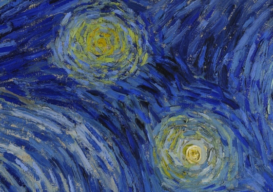
The colors of the night sky
On the other hand, The Starry Night evidences Van Gogh’s extended observation of the night sky. After leaving Paris for more rural areas in southern France, Van Gogh was able to spend hours contemplating the stars without interference from gas or electric city street lights, which were increasingly in use by the late nineteenth century. “This morning I saw the countryside from my window a long time before sunrise, with nothing but the morning star, which looked very big” 777, c. 31 May – 6 June 1889). As he wrote to his sister Willemien van Gogh from Arles,
It often seems to me that the night is even more richly colored than the day, colored with the most intense violets, blues and greens. If you look carefully, you’ll see that some stars are lemony, others have a pink, green, forget-me-not blue glow. And without laboring the point, it’s clear to paint a starry sky it’s not nearly enough to put white spots on blue-black.
(678, 14 September 1888)
Van Gogh followed his own advice, and his canvas demonstrates the wide variety of colors he perceived on clear nights.
Invention, remembrance and observation

Arguably, it is this rich mixture of invention, remembrance, and observation combined with Van Gogh’s use of simplified forms, thick impasto, and boldly contrasting colors that has made the work so compelling to subsequent generations of viewers as well as to other artists. Inspiring and encouraging others is precisely what Van Gogh sought to achieve with his night scenes. When Starry Night over the Rhône was exhibited at the Salon des Indépendants, an important and influential venue for vanguard artists in Paris, in 1889, Vincent told Theo he hoped that it “might give others the idea of doing night effects better than I do.” The Starry Night, his own subsequent “night effect,” became a foundational image for Expressionism as well as perhaps the most famous painting in Van Gogh’s oeuvre.
Additional resources:
Smarthistory images for teaching and learning:
The Pont-Aven School and Synthetism
by DR. CHARLES CRAMER and DR. KIM GRANT
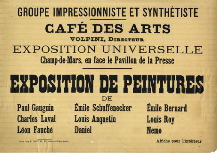
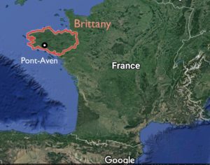
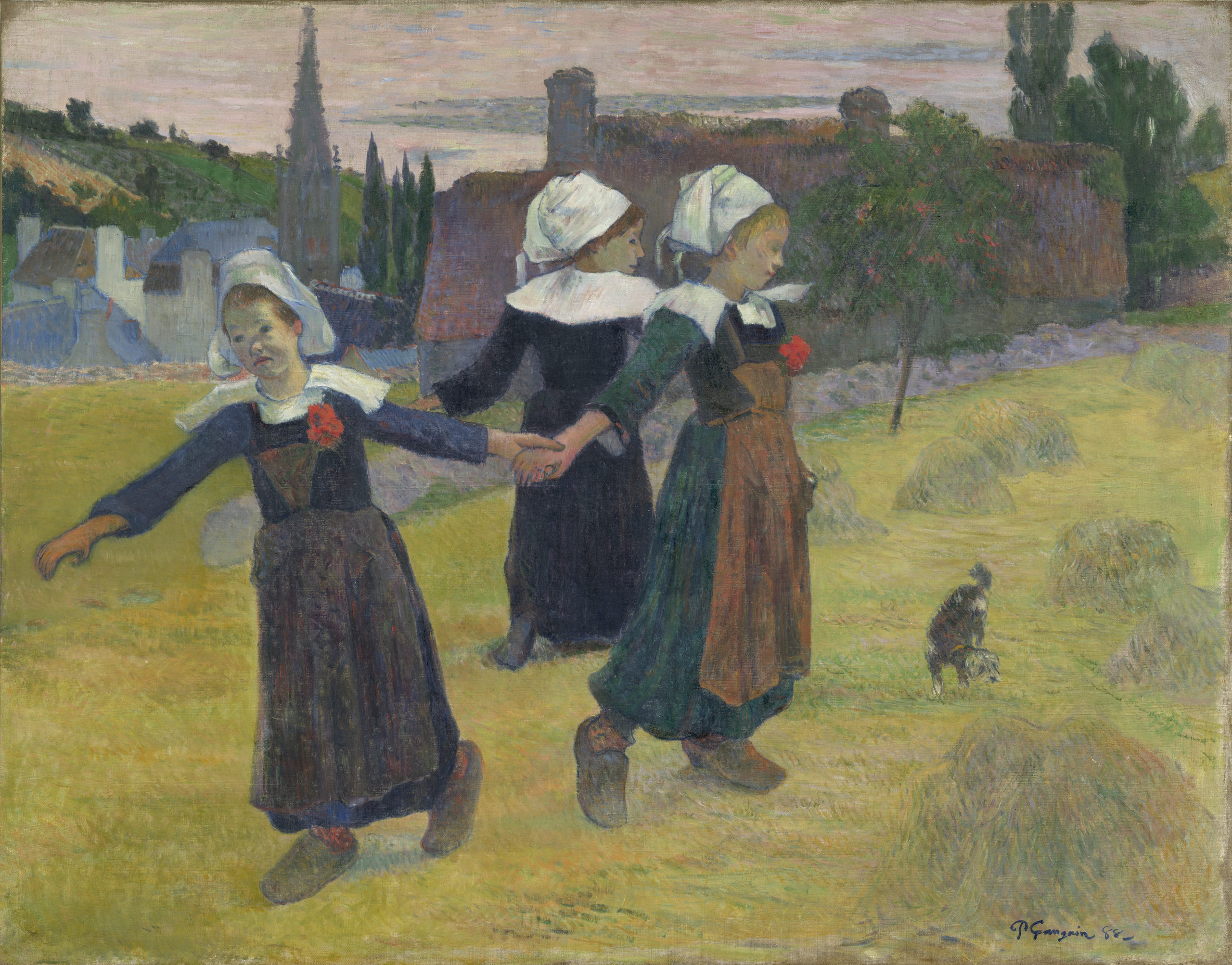
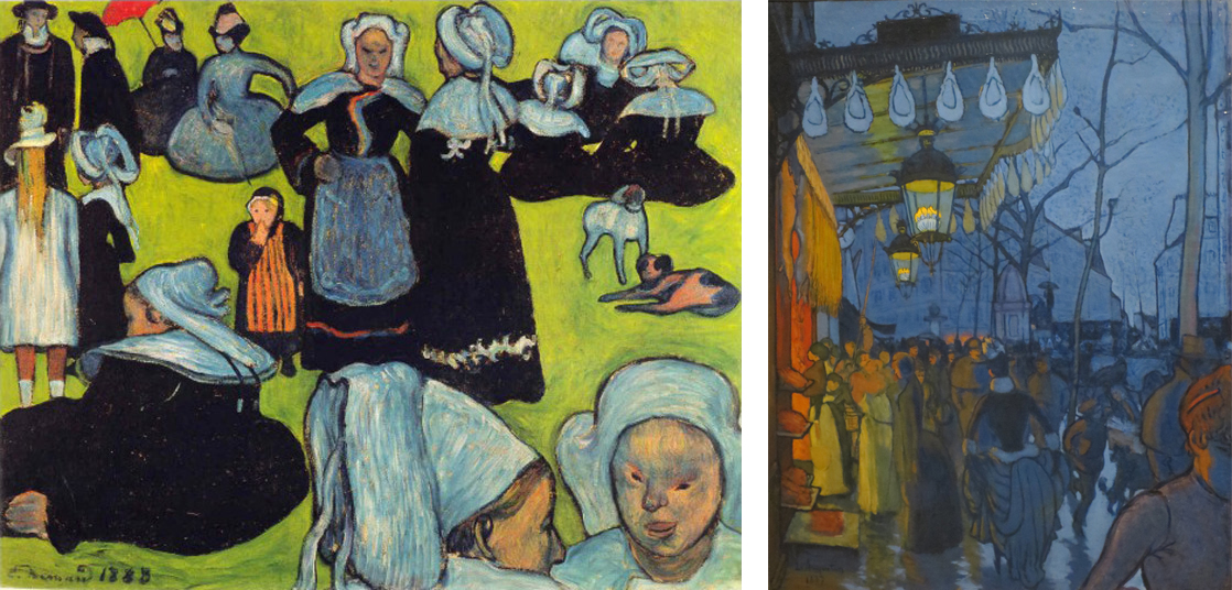
When the mirrors intended to decorate the walls of the Café des Arts in Paris did not arrive in time for its opening in 1889, the owner agreed to an improvised art exhibition instead. The artists, including Paul Gauguin, Emile Bernard, Charles Laval, and Emile Schuffenecker, called themselves the “Groupe Impressioniste et Synthétiste,” but they are better known today as the Pont-Aven School, after a town in the French province of Brittany where many of the artists painted.
At the exhibition Gauguin showed a painting of three Breton girls dancing in a meadow outside of Pont-Aven, with the steeple of St. Joseph’s church in the background. This painting exhibits two key characteristics of the Pont-Aven School: “primitivist” themes featuring rural and peasant subject matter, and a “synthetist” style consisting of simplified drawing, clearly-defined contours, intensified colors, and flattened space.
“The land of the painter”
Brittany had been a popular destination for tourists since the first railway line from Paris was completed in the 1860s. It was famous not only for its rugged landscape but also for its picturesque inhabitants, especially the Breton peasant women in their starched white caps. A popular English guidebook of the time titled Breton Folk described Brittany as “the land of the painter,” and it commended the region’s particular attraction for artists “in search of picturesque costume and scenes of pastoral life.” [1]
Rustic and peasant subjects were popular with French artists and patrons starting with the Barbizon School and French Realist painters of the mid-nineteenth century. Such “timeless” rural scenes offered a reassuring sense of tradition and continuity during a time marked by rapid industrialization and urbanization.
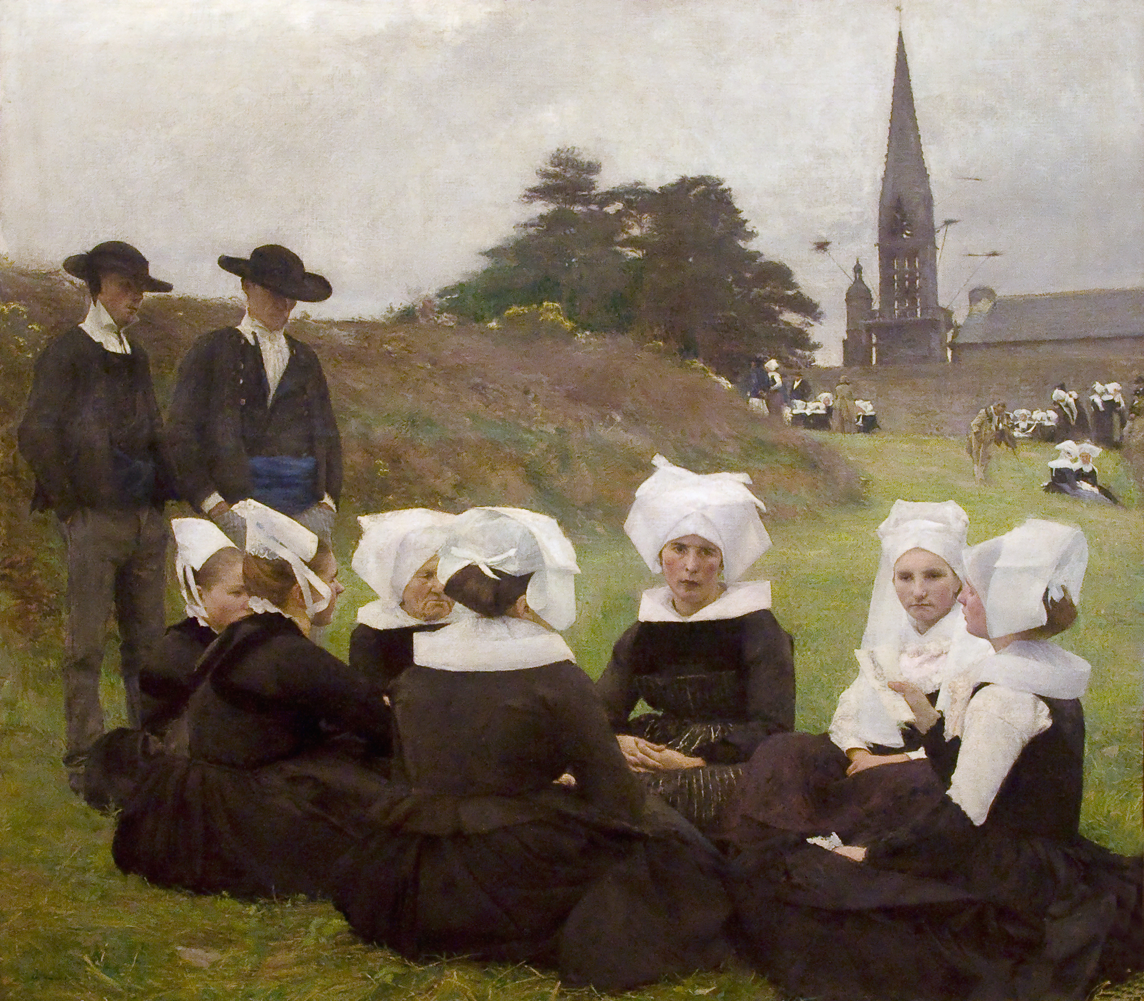
Pascal Dagnan-Bouveret’s Breton Women at a Pardon, shown in the French Salon of 1889, demonstrates the popularity of Breton subjects in a conventional Academic style. It shows a group of Breton peasants gathered in the foreground listening to a woman read. The background depicts a characteristic Breton ritual called a Pardon, in which penitents process barefoot or on their knees around the church to earn absolution for their sins. To a middle-class urban viewer, the Breton peasants would have seemed quaint and old-fashioned, but also admirable for their piety and authenticity.
Synthetism
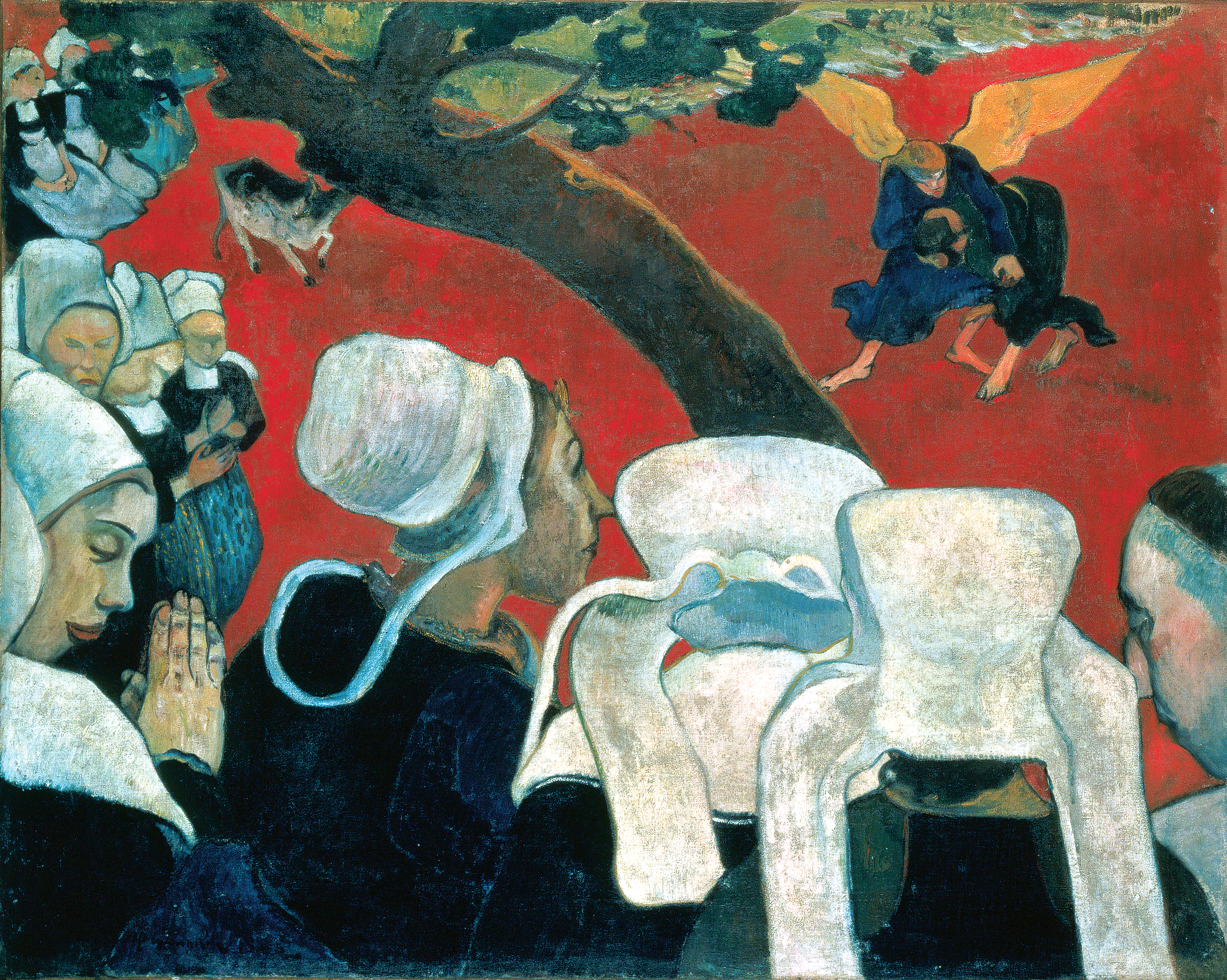
Like Dagnan-Bouveret’s painting of the previous year, Gauguin’s famous Vision after the Sermon also depicts the profound religious faith of the Breton people. A group of women in the foreground file out of church, having just heard a sermon on Jacob wrestling an angel (Genesis 32:24-32). So great is their faith that they literally “see” the Biblical scene in front of the church, right next to a prosaically grazing cow.
The style of the two works is very different, however. Gauguin’s color is bright and unnatural compared to Dagnan-Bouveret’s muted grays and earth tones, and next to the Academic artist’s meticulous naturalism Gauguin’s technique appears downright incompetent. The drawing is crude, the anatomy of the women’s faces is almost childish, the flat planes of their clothing utterly fail to convey a sense of the bodies underneath, and the red ground stands up like a wall rather than receding into space.
Far from incompetent, however, Gauguin’s simplified, even somewhat crude, technique was a conscious choice. A young artist named Paul Sérusier who studied with Gauguin recounted the older artist’s advice while they were out painting together on the bank of a river near Pont-Aven:
How do you see these trees? They’re yellow; so put some yellow. This shadow, it’s rather blue, paint it with pure ultramarine. Those red leaves? Put vermillion. [2]
Gauguin tells Sérusier to both simplify and intensify what he is seeing. Rather than seeking subtle nuances of color and tone within the yellowish autumn leaves, Sérusier paints them in pure, unmodulated yellow. The cool gray trunks of the trees are similarly rendered as strokes of ultramarine mixed with white, against a background of vermilion red. Each color is intensified, and the drawing and composition are simplified into a flat pattern. Elsewhere, Gauguin advised artists to paint from memory rather than directly from nature, because memory automatically discards extraneous detail and distills perceptions down to their essence.
This process of distilling multiple, complex elements into a simplified whole is what the group meant when they called themselves “Synthetists” at the Café des Arts exhibition. Insisting on the process of synthesis was a deliberate contrast to the highly scientific and analytic process of Neo-Impressionism. The two paintings above were executed in the same year just a few miles apart in Brittany. Whereas the Neo-Impressionists worked to analyze or carefully break down all the separate components that make up complex color sensations and then rendered them in innumerable tiny dots, the Synthetists distilled them into broad areas of pure color.
The Synthetist style was sometimes called “Cloisonnism,” after the cloisonné technique used to decorate objects by melting colored enamel between wire outlines. It also has similarities to Japanese prints, which were popular at the time, as well as Medieval colored woodcuts and stained glass. Synthetism was somewhat antithetically associated with both sensual/decorative qualities and religious/spiritual qualities, but whatever its genesis or purpose, it forms a sharp contrast to both the Academic naturalist style of Dagnan-Bouveret and the Neo-Impressionist style of Signac.
Primitivism
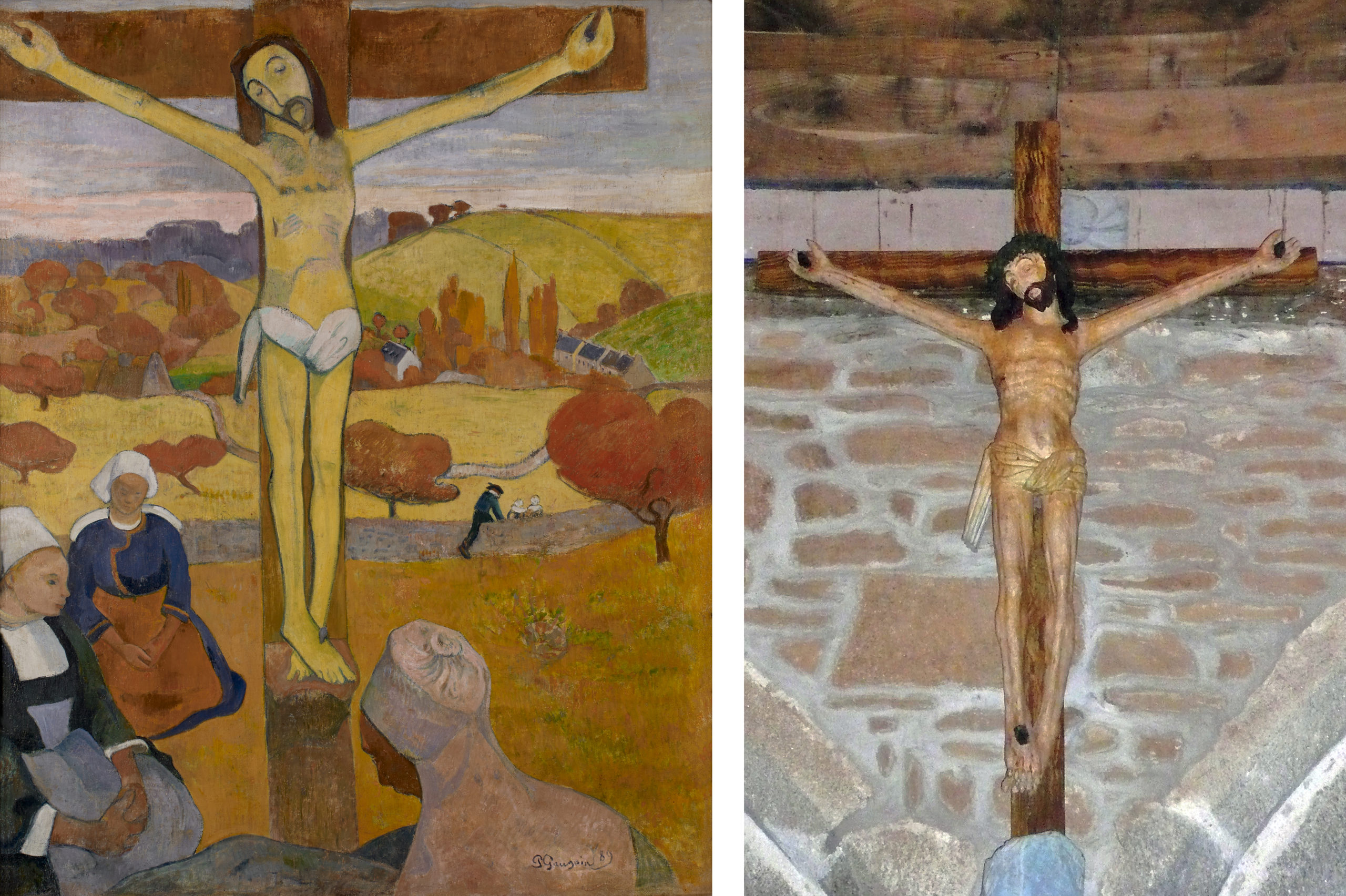
There is a logic in depicting peasant life with this simplified style. The bright colors and crude drawing of Synthetism have much in common with rural folk art. Gauguin implicitly acknowledges this similarity of style in his painting The Yellow Christ of 1889, which shows a group of Breton women kneeling in prayer around a wooden crucifix in a field. The crucifix is a representation of one by an anonymous seventeenth-century artist that Gauguin saw a small chapel set in the fields outside of Pont-Aven. Although the work’s crude carving and stiff anatomy do not demonstrate technical facility, they seem to guarantee the simple and sincere faith of the anonymous sculptor who created it.
Instead of setting the crucifix in the chapel, Gauguin transports it into a field to further connect Christ’s life to the timeless cycles of nature that drive the traditional lives of Breton peasants. The light in the sky marks the time as early evening, and the color of the foliage denotes fall. Both suggest an ending, but an ending that holds promise of a new beginning. Christ, just like the sun and the fall harvest grains, will rise again.
Both the simplified folk style and the peasant subject matter exemplify primitivism, a turning backwards to an earlier way of life (pre-industrial, pre-scientific, and pre-urban) as a way of seeking greater authenticity and a higher purpose in life. Gauguin wrote in a letter to his friend Emile Schuffenecker, “I love Brittany. I find a certain wildness and primitiveness here. When my clogs resound on this granite soil, I hear the dull, matte, powerful tone I seek in my painting.” [3] Unlike Dagnan-Bouveret, who represented Breton folk life with the sophisticated technique and scientific eye of a thoroughly modern Parisian, Gauguin aspired to “go primitive,” as exemplified by his adoption of peasant clogs (sabots) as well as the simple folk-art style of his paintings.
Authenticity or fantasy?
It is easy to romanticize the Pont-Aven School’s project of celebrating the simple rural life and folk traditions of the Breton peasants. Many tellings of Gauguin’s biography eulogize his act of giving up a career as a stockbroker, along with all of the pleasures and conveniences of modern life, in order to live as poor painter among the peasants of Brittany and later on the South Sea island of Tahiti.
More recent scholarship has problematized both that biography and that project, however. The vision of Pont-Aven in Gauguin’s paintings is largely a romantic fantasy. Brittany was rapidly modernizing, and the folk traditions and costumes that Gauguin admired were vanishing or put on display only for holidays and tourists. The 1880 guidebook already notes that
In the shops and on the promenades [of Brittany] the majority of women are dressed as in Paris … Every year more white caps are thrown aside … and each year the markets of St. Malo and St. Servan have less individuality of costume. [4]
Gauguin’s paintings of Brittany are, in the end, more fantasies than accurate images of an authentic peasant culture.
It is also worth asking why the main protagonists of Gauguin’s paintings are women, both in Brittany and later in Tahiti. In Vision after the Sermon as in The Yellow Christ and The Green Christ, it is women whose quaint costumes provide the antithesis to modern fashionability, women whose profound religious faith provides the antidote to modern science and skepticism, and women whose adherence to tradition provides a respite from the constant, disruptive innovations of modern life. While this does elevate women to a place of honor, it also reinforces commonplace stereotypes, suggesting that women preserve the faith and folk traditions simply because they are less suited than men to the new world of science, technology, and constant change.
Notes:
- Henry Blackburn and Randolph Caldecott, Breton Folk: An Artistic Tour in Brittany (Boston, 1881), p. 3.
- Gauguin’s advice to Sérusier was recorded by his friend Maurice Denis, “Paul Sérusier, sa vie, son oeuvre,” in Sérusier, L’ABC de la peinture (Paris: Floury, 1942), p. 42.
- Letter, Gauguin to Schuffenecker, February 1888, in M. Malingue, ed, Lettres de Gauguin à sa femme et à ses amis (Paris, 1946), p. 322 (our translation).
- Blackburn, Breton Folk, p. 10.
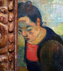
Gauguin, Self-Portrait with Portrait of Émile Bernard (Les misérables)
by DR. BETH HARRIS and DR. STEVEN ZUCKER
Video \(\PageIndex{6}\): Paul Gauguin, Self-Portrait with Portrait of Émile Bernard (Les misérables), 1888, oil on canvas, 44.5 x 50.3 cm (Van Gogh Museum). Speakers: Dr. Steven Zucker and Dr. Beth Harris
Paul Gauguin, Vision after the Sermon (or Jacob Wrestling with the Angel)
by DR. STEVEN ZUCKER and DR. BETH HARRIS
Video \(\PageIndex{7}\): Paul Gauguin, Vision after the Sermon (or Jacob Wrestling with the Angel), 1888, oil on canvas, 2′ 4 3/4″ x 3′ 1/2″ (National Gallery of Scotland, Edinburgh)
Paul Gauguin, Nevermore
by RACHEL ROPEIK, DR. BETH HARRIS and DR. STEVEN ZUCKER
Video \(\PageIndex{8}\): Paul Gauguin, Nevermore, 1897, oil on canvas (Courtauld Gallery, London)
Smarthistory images for teaching and learning:
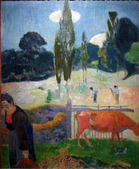
Paul Gauguin, The Red Cow
by DR. STEVEN ZUCKER and DR. BETH HARRIS
Video \(\PageIndex{9}\): Paul Gauguin, The Red Cow, 1889, oil on canvas (LACMA)
Note: though the video states that the cypress trees suggest this canvas may have been painted in the south, it was painted in Le Pouldu near Pont-Aven in Brittany.
Smarthistory images for teaching and learning:

Paul Gauguin, Spirit of the Dead Watching
by BEN POLLITT

Be mysterious
“Soyez mysterieuses,” (be mysterious), Gauguin said. Perhaps he had this command in mind when he produced the most significant painting—by his own reckoning—to come out of his first stay in Tahiti, The Spirit of the Dead Watching. Few critics would doubt the importance of this work. Its mysteriousness and openness to interpretation has secured for it a position among Gauguin’s key works.
Gauguin made his first visit to Tahiti (a French colony) in March 1891, returning to Paris in May 1893. It was a hugely productive period in Gauguin’s career. “In the two years I have spent here,” he wrote, “with only a few months lost, I have produced sixty-six more or less fine canvases and a number of ultra-primitive sculptures. That is enough for any one man.”
A background of terror
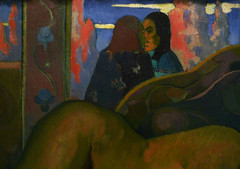
To herald his return to Europe and also to rescue his family from penury, with the help of his Danish wife, Mette, Gauguin organized an exhibition of his work in Copenhagen. Among the nine canvases he sent from Tahiti was The Spirit of the Dead Watching, carrying with it an asking price—the most expensive in the sale—of between 1,500 and 2,000 francs. Clearly highly prized by Gauguin, the best of two years’ worth of “fine” canvases, the painting depicts an adolescent girl (the model was Gauguin’s Tahitian girlfriend Tehura, who was only fourteen years old), lying belly down on a bed, her face staring out at the viewer with a fearful expression. The bed is covered with a blue pareo (a wraparound skirt worn by Tahitians) and a light chrome-yellow sheet. Behind the bed, silhouetted and in profile, a woman watches over the child.
Gauguin created a haunting, supernatural quality by exploiting what he considered to be the emotional potential of color. When describing the painting to Mette, he points out how the shades of purple on the wall create “a background of terror” and how the sheet “must be yellow, because, in this color, it arouses something unexpected for the spectator.” Using colors to arouse feelings was very much in line with the work of other Post-Impressionist artists, such as Gauguin’s contemporary and friend, Vincent van Gogh.
The spirit of the dead
Aside from color, the composition is itself unsettling, particularly the relationship between the girl and the old woman behind her whose simplified form and disproportionate scale suggest Tahitian statuary or tiki. If she is a carved statue of wood, though, what or who does it signify? If not, then is she real or otherworldly? Is this the spirit of the dead watching that the title refers to? And if she is imagined, then by whom? Is all that surrounds the girl the conjurings of her own haunted imagination? Or is it what she looks out at—the space we ourselves inhabit—that is the source of her terror? Could it be, then, that we are the spirit of the dead watching? The Tahitian language certainly allows for such ambiguities. The expression, manao tupapau means either watching the spirit of the dead or the spirit of the dead watching.
Other formal features of the painting seem to enhance this ambivalence. Notice, for example, the complex vantage point we hold. Our gaze is level with the luminous eyes of the old woman, while at the same time, we look down at the figure of the young woman.

A slightly indecent study of a nude
We can also consider this painting within the tradition of the female nude and recall Manet’s Olympia (1865). Manet’s work provided a template for younger artists, one that rejected long-established conventions in the representation of the nude and challenged the moral values of the bourgeoisie. Gauguin, for one, admired Olympia enough to have produced a copy of it in 1891.

He was keen to shock the bourgeoisie and certainly his own nude in The Spirit of the Dead Watching—”a slightly indecent study” as he described it—is in many ways as radical as Manet’s. The body is awkwardly positioned and disproportionate. The feet overhang the bed and the hands are larger than the feet. And most shocking of all, is the age of the model.

Equally disturbing is the fear she exhibits. Gauguin described this in letters to his wife, Mette. Having walked that day to a neighboring village, Gauguin didn’t return to his house until the early morning. On entering, he found Tehura naked on the bed staring at him in terror. The reason for her fear, according to Gauguin, was that Tehura believed in tupapaus, the spirits of the dead who in Tahitian mythology inhabit the interior of the island and whose presence illuminates the forest at night.

Gauguin was skeptical about this belief, holding that these phosphorescent night glows that Tahitians took for spirits were in fact a type of fungus that grows on dead trees. Either way, for Tehura, to walk through the interior after sundown risked disturbing the tupapaus with potentially disastrous consequences; hence her fear and so too those glimmering spectral forms that feature in the background of the painting and that Gauguin stated stood for the tupapaus themselves.
Critical readings
Given his construction of Tahitian culture as “primitive,” Gauguin’s version of these events has been scrutinized by art historians who have cast doubt on whether Tehura would have actually held these beliefs (since she was a practicing Christian). Gauguin is thus accused of projecting his own primitivist preconceptions onto his subject.
Another critique comes from the art historian, Nancy Mowll Mathews, who argues that it was not the spirits that Tehura was frightened of, but Gauguin himself, the middle-aged, white, male colonialist against whom, as a sexual predator, she had little power to resist. This reading gives a disturbing twist to the image with Gauguin taking sadistic pleasure in depicting the fear that he himself caused. It’s worth noting that in Gauguin’s account, seeing her in this state moved him to declare that she never looked so beautiful, and that he was drawn to comfort her, promising never to leave her again.

The critic Stephen Eisenman takes a different line of argument, describing the painting as “an assault upon the tradition of the European nude.” Of particular interest for Eisenman is the viewer’s uncertainty regarding the sex of the figure, the large hands and narrow hips suggesting a male rather than a female form. “The posture and anatomy of Tehura, which emphasizes her boyishness, is derived from various androgynous and hermaphroditic prototypes,” Eisenman argues, citing the Borghese Hermaphrodite as one of them. Seen in this light, the painting, far from being an image of patriarchal dominion over the colonized body, is instead a subversive attack on that patriarchy and all the gendered values that it maintains.
However we choose to look at the painting, it provokes endless questioning, in which we are forced to encounter the other, whether that be in terms of age, faith, gender, spirituality, ethnicity, sexuality, culture, whatever you will, it is a painting that explores the heterogeneous nature of identity, asking profound questions as to who and what we are.
Paul Gauguin, Oviri
by BEN POLLITT

Gauguin’s return to Paris from his first stay in Tahiti in August 1893 did not go quite as he had hoped: no fanfare, no hero’s welcome, and most disappointingly of all no sales.
Gauguin and “art pottery”
Despite some critical interest in his work, success still seemed to elude him. What was more, after years of support, his wife Mette cut off any ties with him. Broke and without a family, he went to Brittany where living costs were cheaper, but readjusting to life in “civilized” France proved a challenge. A drunken brawl with a bunch of Breton sailors shattered his ankle, an injury from which he would never completely recover. Enough was enough, apparently. In June 1895 he departed for Tahiti never to return. It is in this tempestuous period that he produced arguably his masterpiece in the medium of ceramics: Oviri.
From wood-carvings and ceramics to highly finished marble works, sculpture was integral to Gauguin’s artistic practice. His works in clay, all produced in Paris in the mid-80’s to the mid-90’s, owe much to the great ceramist Ernest Chaplet who offered Gauguin assistance in firing and glazing as well as access to his kiln in Rue Blomet, Montparnasse. Oviri was the largest and the last of these series.
Ceramics appealed to him for several reasons; the first was financial, not only is clay cheap, but given its practical usages, Gauguin hoped, misguidedly as it turned out, that his pottery would attract more buyers than his painting. Then there was his famous love of non-European art, such as the Inca and pre-Columbian pottery he encountered in his Peruvian childhood. Gauguin viewed such works—both decorative and utilitarian—as capable of expressing profound emotions as much so-called high art, hence the term “art pottery” he used to describe them.
Gauguin was not entirely alone in wishing to elevate this humble medium. Towards the end of the nineteenth century there was a noticeable crumbling of the hierarchies that had separated the fine artist from the craftsman, the distinction say between the liberal and the mechanical artist which had held sway since the Renaissance. In Tahitian culture there were no such fine distinctions, instead, the craftsman/artist was defined quite differently, as Gauguin came to discover, being neither warrior/hunter nor homemaker/carer, over there he was neither fully male nor fully female but occupied, socially speaking, an androgynous middle ground somewhere between the two. This ambiguous sense of gendered identity appealed to Gauguin’s subversive spirit. Certainly the creative potential of androgyny intrigued him and is often commented on in discussions of Oviri.
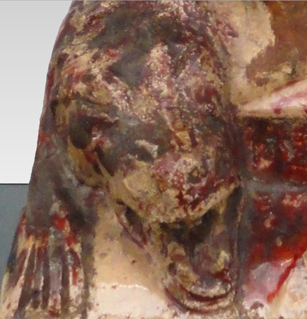
Oviri
A shortened form of Oviri-moe-aihere (the savage who sleeps in the wild forest), the Tahitian goddess of death and mourning, the name itself fascinated Gauguin: savage, brutal, bloodthirsty. He used it, like a nom de guerre, to refer to himself, as though taking on the goddess’s terrible aspects.
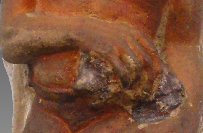

Here she stands, then: under her feet a dead she-wolf; in her hands the crushed form of its cub; the red glaze suggestive of the trickling flow of their blood. There is no known source for the episode, which was probably Gauguin’s invention. This left the way open for various interpretations: that the wolves represent the savagery of the goddess herself; that by killing them she is somehow absorbing their violent capabilities; even that they are Gauguin himself. In a number of letters he draws the comparison, recalling, for instance, how Degas once described him as “the hungry wolf without a collar.” Others see a veiled allusion to the practice of infanticide, outlawed by the time of Gauguin’s arrival, that was carried out by the Areoi, Tahiti’s priestly elite. The image evokes notions of sacrifice or perhaps stories of the vengeful mother archetype, drawing connections between Oviri and Delacroix’s Medea About to Kill Her Children of 1838.

Whatever story it tells, its earliest manifestations in terms of design can be traced to a work produced two years earlier during his first stay in Tahiti, Where Are You Going? It is here, in the stocky, sculptural and distinctly androgynous frame of the foreground figure, carrying in her arms a wolf-cub that we get our first glimpse of Oviri.
How different the ceramic is to the painting, though. Perhaps due to the personal crisis that he experienced on his return to Paris or perhaps due to the medium itself with its direct contact between hand and clay. Oviri is a far more radical departure, an atavistic assault on the canons of grace, harmony and beauty. Ugly seems hardly adequate to describe this twisted and condensed avatar of primal, destructive forces, the huge goggle eyes floating inhumanly around her disproportioned head.

The block-like figure, lacking any piercings or projecting parts, like Egyptian statuary, commands a frontal view. When seen from the back, though, we are presented with a wholly different image, another work of art almost. What had looked from the front to be hair appears now as a cocoon-like covering, the chrysalis underneath, incipient, on the point of breaking out. The contrast with Oviri, the murderess, is striking.
From this angle, the work also bears a striking likeness to Rodin’s Balzac, a sculpture he had been working on since 1891. Although not exhibited publicly until 1898, Gauguin certainly knew of the commission and perhaps was aware of the direction Rodin was taking with it. In both works we find the same dramatic reduction of form, rejecting any reference to the classical past, tapping instead into a more primordial impulse, in Oviri’s case a force at once female and male, in which the destructive, death-wielding act of crushing the wolf-cub finds its creative, life-giving antithesis in the organic, bud-like form of its reverse.
A grave marker
It was this confounding of the ultimate boundary, that between death and life, that might well have prompted Gauguin in 1900, knowing that he had not long to live, to ask a friend to send him his Oviri from Paris intending it for his tombstone. His friend never got round to it; a merciful oversight given the stoneware would not have weathered well in that tropical climate. Instead it went on to feature in the artist’s retrospective of 1906, an exhibition Picasso saw and most probably drew inspiration from when composing his Les Demoiselles d’Avignon.
In 1978, a bronze cast was made of the sculpture, which was placed before Gauguin’s grave in the Marquesas. Acknowledged as a masterpiece, in 1987 the original entered the collection of the Musée d’Orsay.
Additional resources:
This sculpture at the Musée d’Orsay
Barbara Landy, “The Meaning of Gauguin’s ‘Oviri’ Ceramic,” Burlington Magazine, vol. 109 (1967), pp. 242, 244-246. (JSTOR)
Paul Gauguin, Where do we come from? What are we? Where are we going?
by DR. NOELLE PAULSON

Where do we come from? What are we? Where are we going? is a huge, brilliantly colored but enigmatic work painted on rough, heavy sackcloth. It contains numerous human, animal, and symbolic figures arranged across an island landscape. The sea and Tahiti’s volcanic mountains are visible in the background. It is Paul Gauguin’s largest painting, and he understood it to be his finest work.
Where are we going? represents the artist’s painted manifesto created while he was living on the island of Tahiti. The French artist transitioned from being a “Sunday painter” (someone who paints for his or her own enjoyment) to becoming a professional after his career as a stockbroker failed in the early 1880s. He visited the Pacific island Tahiti in French Polynesia staying from 1891 to 1893. He then returned to Polynesia in 1895, painted this massive canvas there in 1897, and eventually died in 1903, on Hiva Oa in the Marquesas islands.
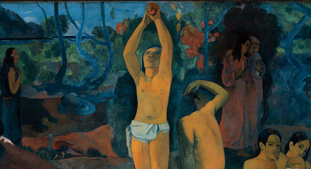
Gauguin wrote to his friend Daniel de Monfried, who managed Gauguin’s career in Paris while the artist remained in the South Pacific, “I believe that this canvas not only surpasses all my preceding ones, but [also] that I shall never do anything better, or even like it.” Gauguin completed Where are we going? at a feverish rate, allegedly within one month’s time, and even claimed to de Monfried that he went into the mountains to attempt suicide after the work was finished. Gauguin—ever the master of self-promotion and highly conscious of his image as a vanguard artist—may or may not have actually poisoned himself with arsenic as he alleged, but this legend was quite pointedly in line with the painting’s themes of life, death, poetry, and symbolic meaning.

Gauguin himself provided a telling description of the painting’s esoteric imagery in the same letter to de Monfried, written in February 1898:
It is a canvas four meters fifty in width, by one meter seventy in height. The two upper corners are chrome yellow, with an inscription on the left and my name on the right, like a fresco whose corners are spoiled with age, and which is appliquéd upon a golden wall. To the right at the lower end, a sleeping child and three crouching women. Two figures dressed in purple confide their thoughts to one another. An enormous crouching figure, out of all proportion and intentionally so, raises its arms and stares in astonishment upon these two, who dare to think of their destiny. A figure in the center is picking fruit. Two cats near a child. A white goat. An idol, its arms mysteriously raised in a sort of rhythm, seems to indicate the Beyond. Then lastly, an old woman nearing death appears to accept everything, to resign herself to her thoughts. She completes the story! At her feet a strange white bird, holding a lizard in its claws, represents the futility of words….So I have finished a philosophical work on a theme comparable to that of the Gospel.¹
Not only does Gauguin’s text clarify some of the painting’s abstruse, idiosyncratic iconography, it also invites us to “read” the image. Gauguin suggests that the figures have mysterious symbolic meanings and that they might answer the questions posed by the work’s title. And, in the manner of a sacred scroll written in an ancient language, the painting is to be read from right to left: from the sleeping infant—where we come from—to the standing figure in the middle—what we are—and ending at the left with the crouching old woman—where we are going.

Stylistically, the composition is designed and painted to recall frescoes or icons painted on a gold ground. The upper corners have been painted with a bright yellow to contribute to this effect, and the figures appear out of proportion to one another—“deliberately so” as Gauguin wrote—as if they were floating in space rather than resting firmly upon the earth.

These stylistic features, along with Gauguin’s enigmatic subject contribute to the painting’s “philosophical” quality. And as is common with other Symbolist works of this period, precise, complete interpretations of Where do we come from? remain out of reach. The painting is a deliberate mixture of universal meaning—the questions asked in the title are fundamental ones that address the very root of human existence—and esoteric mystery. Although Where do we come from? is painted on a large scale similar to the decorative public panels created by the French artist Pierre Puvis de Chavannes (an artist Gauguin admired), Where do we come from? is essentially a private work whose meaning was likely known only to Gauguin himself.
A few months after completing the painting, Gauguin sent it to Paris along with several other works of art, intending that they should be exhibited together in a gallery or an artist’s studio. He sent de Monfried careful instructions about how Where do we come from? should be framed (“a plain strip of wood, 10 centimeters wide, and white-washed to resemble a mural”) and who should be invited to the exhibition (“in this way, instead of crowds one can have whom one wants, and thus gain connections that cannot harm you.”) The concern Gauguin reveals in the details indicates his continued awareness of the Parisian art market, which remained a central focus even as he exiled himself on a small tropical island on the other side of the globe.

In November and December 1898, the group of Tahitian paintings was displayed at the gallery of Ambroise Vollard, a former law student turned art dealer who specialized in vanguard artists. Vollard seems to have had difficulty selling the “large picture,” as Gauguin called it. Efforts by the artist’s Parisian friends to collectively acquire the painting and donate it to the French state were never realized. Where do we come from? shuttled between galleries and private collections in France and Norway until the Museum of Fine Arts, Boston, purchased it in 1936.
1. “The Wisdom of Paul Gauguin—Artist,” International Studio, volume 73, number 291, 69.
Gauguin and Laval in Martinique
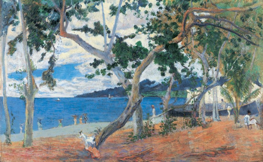
When you think of Paul Gauguin, you probably think of exoticized visions of the South Pacific or colorful scenes of the Breton countryside. What you most likely do not immediately think of is the Caribbean. However, before he painted famous works like Vision after the Sermon and Spirit of the Dead Watching, the artist spent several months in Martinique, a French possession in the Lesser Antilles. While on the island, Gauguin painted numerous works that portray Martinique as a lush landscape filled with local women and tropical fruits. These colorful works provide an unexpected link to Caribbean art and can serve as a case study in the history of travel and depictions of Martinique in the nineteenth century.
From Panama to Martinique
Gauguin’s journey began on April 10, 1887, when he and his friend Charles Laval boarded the steamship Canada heading for Panama. Both were artists searching for something new, beyond what they viewed as the constraints of modern life in France. Gauguin—whose finances were running low—was particularly fed up with life in Paris, which he called “a desert for a poor man.”[1]
In Panama, the pair hoped to find employment that would offer them new horizons in which to create. Unfortunately, Panama did not match their idealistic expectations: the landscape had been drastically altered by the construction of the Panama Canal, disease was rampant, and stable work was hard to find. After many difficult weeks, Gauguin and Laval left Panama for Martinique hoping to find more ideal conditions. They arrived on June 11, 1887 and rented a hut on a sugar plantation, near the island’s cultural and economic capital of Saint-Pierre.
People, Fruits, and Landscapes
Although they were close to the city, the two artists focused on the tropical landscape, as seen in Gauguin’s The Mango Trees, Martinique. Here, Gauguin depicts a group of women picking fruit in a grove of trees. Gauguin uses short strokes and varying shades of green and orange to paint the tropical vegetation which includes a recognizable papaya tree in the left foreground. The women wear traditional clothing: long, loose dresses or skirts, beaded necklaces, and madras headscarves.
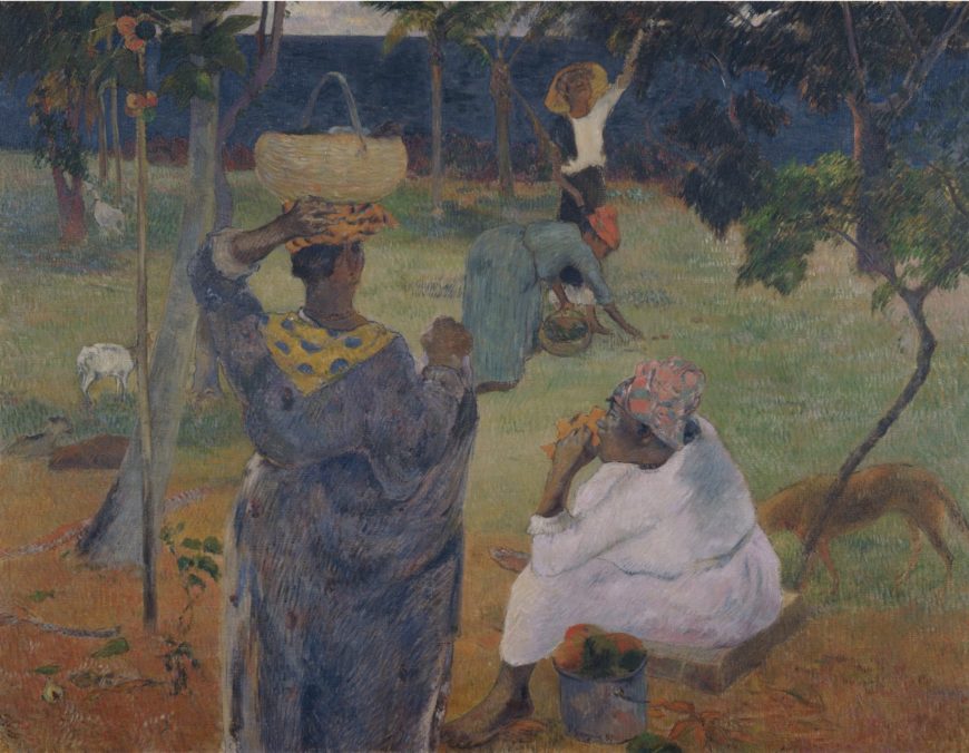
All of the figures in the scene are of African descent, reflecting a major demographic on the island. Like many Caribbean islands, Martinique was shaped by a plantation economy fueled by the forced labor of people who were kidnapped and transported from Africa during the transatlantic slave trade. Although slavery was abolished in 1848, descendants of enslaved people formed a large part of the island’s working class, including plantation workers, who worked alongside new arrivals from Africa and Asia in often wretched conditions.
Near the center of the composition, a woman balances a basket on her head, a practice that fascinated those visiting the Caribbean. In Martinique, the women who carried goods from the countryside to markets this way were known as porteuses. These women were a popular subject for artists and writers traveling to Martinique—including Gauguin and Laval. Because of where they lived, the artists would have seen many local women picking fruits or passing through on their way to Saint-Pierre.
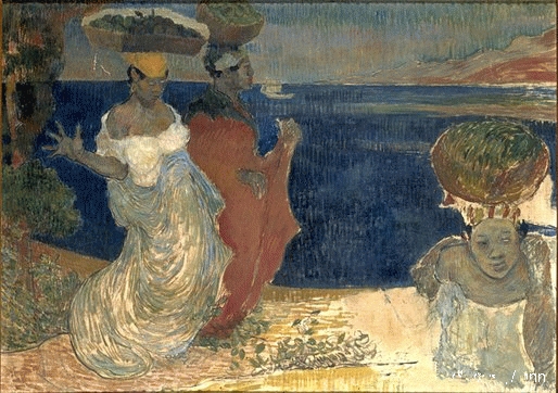
Charles Laval’s Women by the Sea also shows a group of porteuses walking along the coast. As in The Mango Trees, the women in the scene wear traditional dresses, skirts, and headscarves. Rather than a grove of trees, Laval provides a clear view of the Bay of Saint-Pierre with the Mount Pelée volcano rising in the distance. Laval also builds his composition using directional strokes of paint, but animates his figures in a more dramatic way. The porteuse on the left extends her forearm and fingers, while her tray of fruits bends under its own weight—a contrast to Gauguin’s peaceful figures.
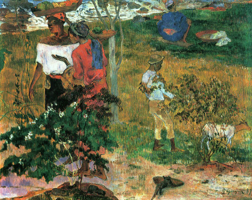
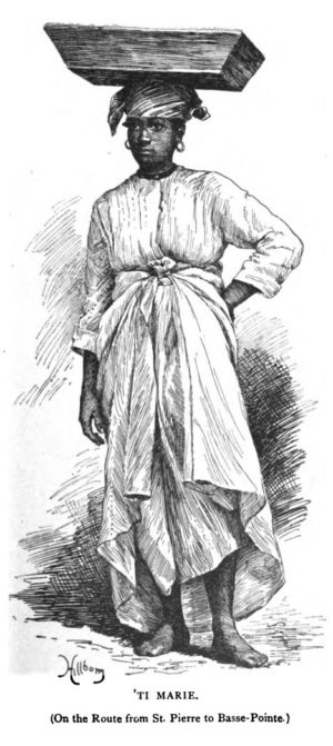
Idealized Caribbean Labor
A common element in Gauguin and Laval’s work in Martinique is the depiction of working Afro-Caribbean women—notably porteuses. Although they certainly were a part of contemporary Martinique, both artists overwhelmingly favored them in their paintings. A recent exhibition catalogue noted that the artists created a vision of an island inhabited almost entirely by porteuses.[2]
Images of these figures were popular well before Gauguin and Laval arrived. Eighteenth- and nineteenth-century painters depicted porteuses in bustling cityscapes and as staffage (small figures included in landscape paintings, often to mark scale) in picturesque views for elite local patrons and audiences in France. In the second half of the nineteenth century, Caribbean travel books and magazines featured images of porteuses in their illustrations, which were seen by thousands of readers in France and the United States. Two Years in the French West Indies (published in 1890) by American travel writer Lafcadio Hearn included an entire chapter on porteuses, which featured an engraved illustration. Like the figures depicted by Gauguin and Laval, the barefoot woman wears a loose, long dress, madras turban, and balances a tray on her head.
The popularity of porteuses may be due to the unfamiliar and seemingly idealized nature of their labor. Although in reality they travelled dozens of miles along mountainous paths with heavy loads on their heads, porteuses could be viewed as independent workers in harmony with nature—arguably heightened by the animals in the compositions. Compared to depictions of work on sugar plantations—which incidentally are largely absent from images depicting Martinique—the porteuses offered a female subject that would please audiences and cast the island as an exotic idyll.
Gauguin, Laval, and the Conventions of Depicting Martinique
Although Gauguin and Laval adhered to certain conventions of depicting Martinique, their work also stands out. The artists’ chose to focus exclusively on Afro-Martiniquan people. Many paintings, photographs, and engravings emphasized the ethnic diversity on the island, especially varying shades of skin tone. Illustrated books often featured images of different (mostly female) “ethnic types,” from dark-skinned negresses to light-skinned mulâtresses (note that these terms have derogatory connotations in English, but are more descriptive—if still problematic—in a French Caribbean context). In contrast, Gauguin and Laval largely avoided the depiction of different racial “types” and depicted an exclusively dark-skinned population. Whether this was a conscious choice or for another reason, the artists’ figures go beyond the tradition of the ethnic showcase.
While Gauguin’s choice to focus on women is hardly surprising, the fact that the figures are not blatantly eroticized is also significant, given the artist’s reputation. Unlike the lounging, nude figures Gauguin later painted in Tahiti, the Martiniquan figures are fully clothed, working women. In the Martinique landscape paintings, they seem to inhabit a tropical Arcadia that are also genre scenes depicting work and rest.
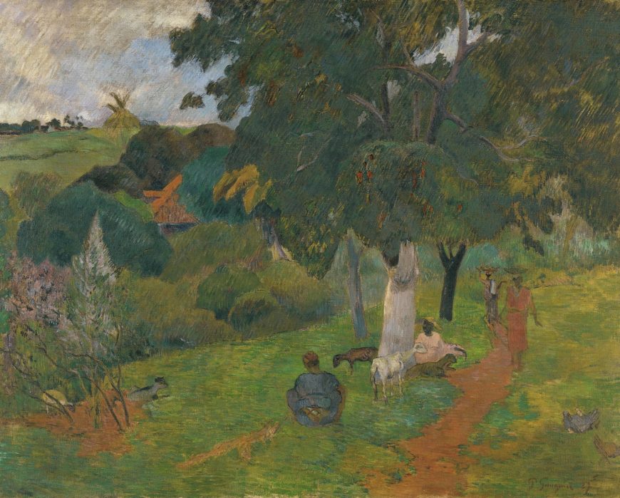
Conclusion
Gauguin and Laval’s journey to Martinique is a lesser-known chapter in the history of nineteenth-century French painting that connects to the country’s Caribbean colonies. Like many artists who travelled to Martinique, the two artists depicted porteuses and lush tropical landscapes. However, the unique style of their works, as well as their nearly exclusive focus on Afro-Caribbean figures stands out. While Gauguin will likely continue to be remembered for his colorful (and increasingly problematized) views of the Pacific, maybe next time you hear his name you’ll think of a small French island in the Caribbean.
Notes:
- Paul Gauguin, Letters to His Wife and Friends, ed. Maurice Malingue, trans. Henry J. Stenning (Boston: MFA Publications, 2003), p. 75.
- Joost van der Hoeven, “Martinique Experienced,” Gauguin and Laval in Martinique (Bussum: Thoth Publishers, 2018), p. 68.
Additional Resources
“Gauguin and Laval in Martinique,” Van Gogh Museum
Maite van Dijk, Joost van der Hoeven, et al. Gauguin and Laval in Martinique (Bussum: Thoth Publishers, 2018).
Paul Gauguin, Letters to His Wife and Friends, ed. Maurice Malingue, trans. Henry J. Stenning (Boston: MFA Publications, 2003).
Lafcadio Hearn, Two Years in the French West Indies (New York: Harper & Brothers, 1890).
Kay Dian Kriz, Slavery, Sugar, and the Culture of Refinement: Picturing the British West Indies, 1700–1840 (New Haven: Yale University Press, 2008).
Joost van der Hoeven, “Martinique Experienced,” Gauguin and Laval in Martinique (Bussum: Thoth Publishers, 2018), pp. 58–75.
Paul Cézanne
An introduction to the painting of Paul Cézanne
by DR. BETH HARRIS and DR. STEVEN ZUCKER

Categorizing the style of Paul Cézanne’s (Say-zahn) artwork is problematic. As a young man he left his home in Provence in the south of France in order to join with the avant-garde in Paris. He was successful, too. He fell in with the circle of young painters that surrounded Manet, he had been a childhood friend of the novelist, Emile Zola, who championed Manet, and he even showed at the first Impressionist exhibition, held at Nadar’s studio in 1874.

Out of place in Paris
However, Cézanne didn’t quite fit in with the group. Whereas many other painters in this circle were concerned primarily with the effects of light and reflected color, Cézanne remained deeply committed to form. Feeling out of place in Paris, he left after a relatively short period and returned to his home in Aix-en-Provence. He would remain in his native Provence for most of the rest of his life. He worked in the semi-isolation afforded by the country, but was never really out of touch with the breakthroughs of the avant-garde.

Working outdoors, but with a different purpose
Like the Impressionists, he often worked outdoors directly before his subjects. But unlike the Impressionists, Cézanne used color, not as an end in itself, but rather like line, as a tool with which to construct form and space. Ironically, it is the Parisian avant-garde that would eventually seek him out. In the first years of the 20th century, just at the end of Cézanne’s life, young artists would make a pilgrimage to Aix, to see the man who would change painting.
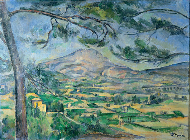
Influence
Paul Cézanne is often considered to be one of the most influential painter of the late 19th century. Pablo Picasso readily admitted his great debt to the elder master. Similarly, Henri Matisse once called Cézanne, “…the father of us all.” For many years The Museum of Modern Art in New York organized its permanent collection so as to begin with an entire room devoted to Cézanne’s painting. The Metropolitan Museum of Art also gives over an entire large room to him. Clearly, many artists and curators consider him enormously important.
Additional resources:
Cézanne’s Still Life with Apples at the MoMA
Biography of the artist from Grove Art on MoMA.org
Cézanne in Provence
Smarthistory images for teaching and learning:
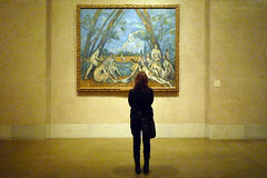
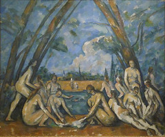
Paul Cézanne, The Bather
by DR. BETH HARRIS and DR. STEVEN ZUCKER

A figure in space
The picture is of a single male in an ambiguous landscape. The figure is pushed up to the front of the canvas and he fills it almost from top to bottom. Behind him, deep space is defined, but there is something of a visual tug-of-war going on. Cézanne has, as is traditional, defined both the near and distant ground planes. Unusually though, he leaves out the middle plane, which intensifies the distance between the fore and back-grounds. The trouble begins when he collapses the two.

Look closely at the contour that defines the edge of the figure. Don’t look inside the line that defines the edges of his body, look just outside (see especially beside the right leg). Cézanne has changed the brushwork and color just slightly. It appears that after the background and the figure were finished, he went back and reworked the part of the atmosphere surrounding the bather. The result is an odd shift in distance.
Rupturing illusion
The illusion of depth that allows our eye to travel back in space is ruptured as the reworked paint seems to cling to the foreground figure. It is as if the background is lifted forward, attaching itself to the edge of the man like a frame.
Why would Cézanne want to destroy the spacial relationships that he has carefully rendered? This sounds like something Edouard Manet might do. Like Manet, it is as if Cézanne wants the viewer to try to account for this distortion—and to engage actively in the picture and its construction.
Asymmetry
Such questions becomes even more insistent if we look at the rendering of the figure. Clearly this is not the work of Raphael nor of the refined academic technicians associated with the 19th-century Salon. It fact, the figure is a mess. Beyond being generalized, the parts do not seem to belong together. Look at the arms, for instance. The left doesn’t pair with the one on the right. The same is true of the chest and even the face. The legs are particularly awkward. Although one is forward, it is nevertheless far too long in relation to the other.

What is the careful observer to think? Has The Museum of Modern Art made a terrible mistake? Have museums around the world given over precious wall space to a charlatan? Cézanne could draw accurately when he chose, but in this instance he consciously chose to disregard tradition and represent space in a manner that invites the viewer to acknowledge both the illusion of depth and the dismantling of that illusion.
Additional resources:
Paul Cézanne from The Metropolitan Museum of Art’s Timeline of Art History
Michael Kimmelman, “Cezanne, in All His Magnificent Mystery,” New York Times, 6/9/96
Smarthistory images for teaching and learning:
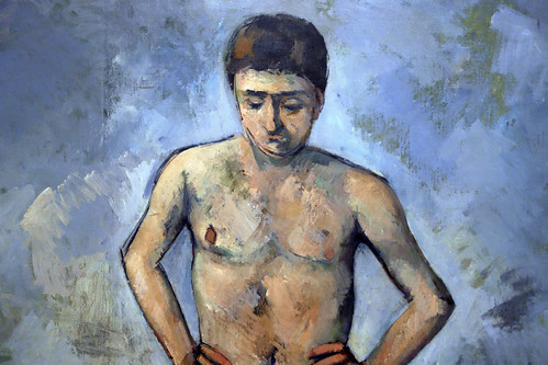
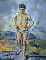
Paul Cézanne, The Basket of Apples
by DR. BETH HARRIS and DR. STEVEN ZUCKER
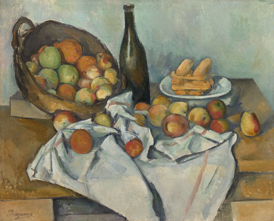
In David’s Neo-Classical era, still life was considered the least important subject type. Only minor artists bothered with what was then seen as the most purely decorative and trivial of painting subjects. The hierarchy of subjects went roughly from the most important—historical and religious themes (often very large in scale); to important—portraiture (usually of moderate scale); less important—landscape & genre (themes of common life, usually of modest scale); to least important— still life (generally small canvases).

A hopeless subject
There had been one significant historical exception. In the 17th century in Northern Europe and particularly in the Netherlands, still life blossomed. But this period was brief and had little impact in France other than in the work of Chardin. So why would Cézanne turn so often to this discredited subject?
It was the very fact that still life was so neglected that seems to have attracted Cézanne to it. So outmoded was the iconography (symbolic forms and references) in still life that this rather hopeless subject was freed of virtually all convention. Here was a subject that offered extraordinary freedom, a blank slate that gave Cézanne the opportunity to invent meaning unfettered by tradition. And Cézanne would almost single-handedly revive the subject of still life making it an important subject for Picasso, Matisse, and others in the 20th century.

The image at the top of this page looks simple enough, a wine bottle, a basket tipped up to expose a bounty of fruit inside, a plate of what are perhaps stacked cookies or small rolls, and a tablecloth both gathered and draped. Nothing remarkable, at least not until one begins to notice the odd errors in drawing. Look, for instance, at the lines that represent the close and far edge of the table. I remember an old student of mine remarking to the class, “I would never hire him as a carpenter!” What she had noticed was the odd stepping of a line that we expect to be straight.
Purposeful errors
But that is not all that is wrong. The table seems to be too steeply tipped at the left, so much so that the fruit is in danger of rolling off it. The bottle looks tipsy and the cookies are very odd indeed. The cookies stacked below the top layer seem as if they are viewed from the side, but at the same moment, the two on top seem to pop upward as if we were looking down at them. This is an important key to understanding the questions that we’ve raised about Cézanne’s pictures so far.
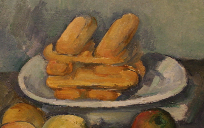
Like Edouard Manet, from whom he borrowed so much, Cézanne was prompted to rethink the value of the various illusionistic techniques that he had inherited from the masters of the Renaissance and Baroque eras. This was due in part to the growing impact of photography and its transformation of modern representation. While Degas and Monet borrowed from the camera the fragmenting of time, Cézanne saw this mechanized segmentation of time as artificial and at odds with the perception of the human eye. By Cézanne’s era, the camera did shatter time into fragments as do non-digital cameras that can be set so that the shutter is open to light for only 1/1000 of a second.
Sight and memory
Cézanne pushed this distinction between the vision of the camera and of human vision. He reasoned that the same issues applied to the illusionism of the old masters, of Raphael, Leonardo, Caravaggio, etc. For instance, think about how linear perspective works. Since the Early Renaissance, constructing the illusion of space required that the artist remain frozen in a single point in space in order maintain consistent recession among all receding orthogonals. This frozen vantage point belongs to both the artist and then the viewer. But is it a full description of the the experience of human sight? Cézanne’s still life suggests that it is not.
If a Renaissance painter set out to render Cézanne’s still life objects (not that they would, mind you), that artist would have placed himself in a specific point before the table and taken great pains to render the collection of tabletop objects only from that original perspective. Every orthogonal line would remain consistent (and straight). But this is clearly not what Cézanne had in mind. His perspective seems jumbled. When we first look carefully, it may appear as if he was simply unable to draw, but if you spend more time, it may occur to you that Cézanne is, in fact, drawing carefully, although according to a new set of rules.
Seemingly simple, Cézanne’s concern with representing the true experience of sight had enormous implications for 20th century visual culture. Cézanne realized that unlike the fairly simple and static Renaissance vision of space, people actually see in a fashion that is more complex, we see through both time and space. In other words, we move as we see. In contemporary terms, one might say that human vision is less like the frozen vision of a still camera and more akin to the continuous vision of a video camera except that he worked with oil on canvas which dries and becomes static.
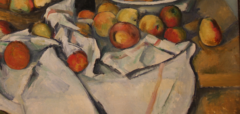
Purposeful destruction
So very tentatively, Cézanne began the purposeful destruction of the unified image. Look again at the cookies, or whatever they are, stacked upon the plate in the upper right. Is it possible that the gentle disagreements that we noted result from the representation of two slightly different view points? These are not large ruptures, but rather, they suggest careful and tentative discovery. It is as if Cézanne had simply depicted the bottom cookies as he looked across at them and then as he looked more slightly down at the top cookies after shifting his weight to his forward leg. Furthermore, I’m not sure that he was all that proud of these breaks that allow for more than a single perspective. Look, for instance, at the points where the table must break to express these multiple perspectives and you will notice that they are each hidden from view. Nevertheless, in doing this, Cézanne changed the direction of painting.
Additional resources:
This painting at the Art Institute of Chicago
Still Life tour from the National Gallery of Art
Selection on The Basket of Apples from Richard Brettell, Post-Impressionists. Chicago (1987, p. 67
Paul Cézanne, Still Life with Plaster Cupid
by RACHEL ROPEIK, DR. BETH HARRIS and DR. STEVEN ZUCKER
Video \(\PageIndex{10}\): Paul Cézanne, Still Life with Plaster Cupid, c.1895, oil on canvas (Courtauld Gallery, London)

René Descartes
I want to raise Cartesian philosophy here. The word is capitalized because it refers to the philosophy of the proto-Enlightenment thinker René Descartes. Even if you have never heard of this great rationalist, it is likely that you will recognize one of his phrases such as “I think, therefore, I am.” This odd sentence is the result of his effort to find irrefutable proof that he actually existed. Philosophers often ask questions that are meant to reveal fundamental truths. Can you imagine for a moment asking yourself this very question–How can I actually prove that I exist? Descartes realized an elegant solution, his very ability to ask the question was the proof of independent consciousness and therefore, of his existence.
With such questions, Descartes raised many considerations that would shape the modern world. Sometimes these questions raised, in turn, conclusions seemingly at odds with each other, such as his skepticism of both perception and of self-evident assumption
Objective and subjective knowledge
Ironically, such thoughts would eventually lead to a reappraisal of our confidence in society’s scientific empiricism. Empiricism relies upon objectivity. You will remember that the word “objective” means a truth that is beyond personal experience. In contrast, the word “subjective” is directly linked to personal experience.
Here is an example. Imagine a minor accident between a taxi and a city bus. A patrolman comes along to reconstruct the event. Does he only ask the cab driver what took place or does he also ask the passenger in the back of the cab and the bus driver and the riders on the bus? The cop’s goal is the reconstruct what “actually” happened. But if we take a post-Cartesian position we might ask whether there really was a single actual (objective) event or whether there were actually multiple (subjective) truths, each the result of each witness’s perspective. Let’s take a more directly applicable example. Look about the room that you are currently in. It probably has six sides: four walls, a floor, and a ceiling. When an architect drew a diagram of your room, he/she would have conceptually stepped outside of the space so that it could be understood in total.
But is this objective view a false one? Now in the built room, you cannot see its totality in a single moment. We can only see bits and pieces of the room at any one time and must rely upon memory to understand the room as a whole. Your more subjective experience has historically been considered less important than the architect’s objective conception even though you experience directly and the architect knows the room only theoretically.
Cézanne and subjective experience
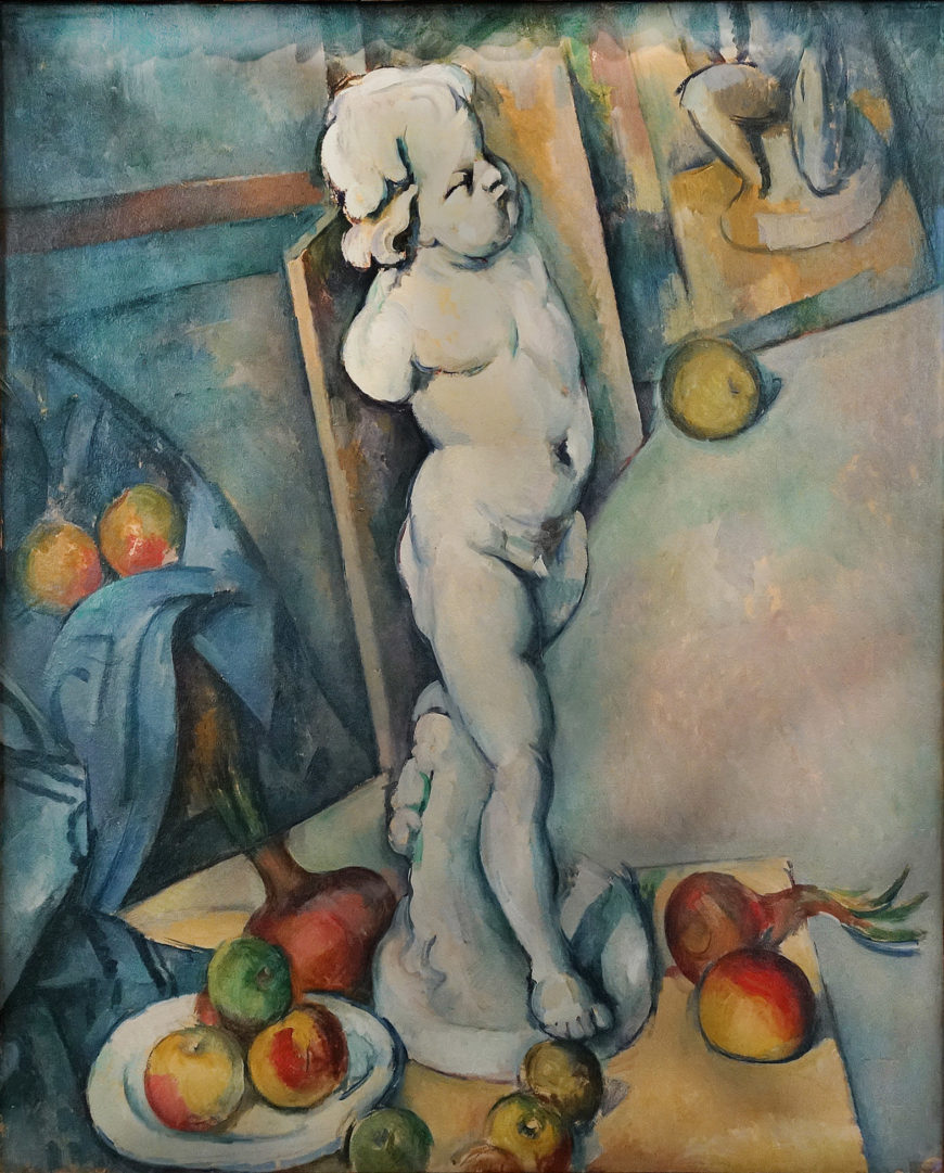
Regarding the traditional hierarchical relationship between objective and subjective, Cézanne seems to ask, “which is more true?” and his conclusion mirrors an important development of modernism. In Still Life with Plaster Cupid, it is the subjective view that constructs the space. Cézanne has placed a plaster cast (copy) of an ancient Roman sculpture of a cupid (the son of Venus) on a tabletop so that it dominates the composition.
To an artist of the 19th century such classical sculpture would refer to the great humanist triumph of the Greeks and Romans and the birth of naturalism. In fact, one of the most prominent features of such sculpture would be its contrapposto (you remember this: axial shifts responding to weight borne by one leg). Actually, Cézanne’s li’l god-ling is also twisting at the waist, creating a subtle spiral torsion. Again, the space is odd, the floor especially, seems to rise up too steeply with the stacked canvases forming its uneven perimeter. Have you noticed that the canvases that line the floor, shape the space of the room and that this “shaping” is related to the twisting of the cupid? Let do this point by point. The right foot of the sculpture points roughly towards us and aligns, more or less, with the receding orthogonal of the table. The figure’s hips have turned. They are aligned with the plane of the canvas at the extreme left that is partly hidden behind the blue tablecloth. The Cupid’s shoulders are turned even further and align with the canvas that rests behind the godling’s torso.
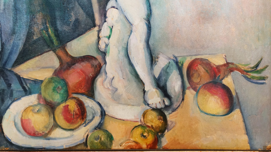
This is clearly not the objective space of the architect. Cézanne has clearly sought to match the perception of space to the movement of the the body. But isn’t that what we really experience? When you walk into a room, do you see the room as an objective whole? No. We can only see a fragment at a time. But as we’ve already established, we don’t actually see in fragments; we see continuously and space is shaped by our continuous movement through it. Try it. Focus on any straight line in the room you are now in. Lean forward, and as you might expect, the angles of the room shift. In Still Life with Plaster Cupid, we see Cézanne’s attempt to render true human vision, vision that is subjective, continuous, and informed by memory.
Additional resources:
This painting at the Courtauld Gallery
Smarthistory images for teaching and learning:
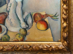
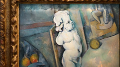

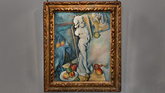
Paul Cézanne, The Red Rock
by DR. STEVEN ZUCKER and DR. BETH HARRIS
Video \(\PageIndex{11}\): Paul Cézanne, The Red Rock, c. 1895, oil on canvas, 91 x 66 cm (Musée de l’Orangerie, Paris)
Smarthistory images for teaching and learning:
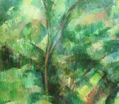
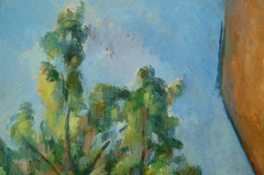
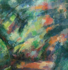
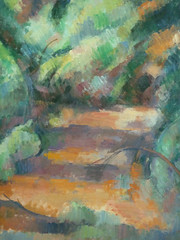
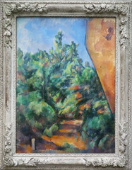
Paul Cézanne, Turning Road at Montgeroult
by DR. STEVEN ZUCKER and DR. BETH HARRIS

Recently acquired
Here is a painting recently acquired by The Museum of Modern Art. It was considered one of the few great canvases by Cézanne still in a private collection. It was given to the museum by Mr. and Mrs. John Hay Whitney along with six other masterpieces by van Gogh, Matisse, and Picasso. Some gift. Still, the painting is a bit difficult to understand. At first, the structure of space is straight-forward. As expected, there is a foreground (the green foliage at the bottom), a middleground (the road and houses) and an area of deep recession (the sky).
Spatial distortion
Each of these zones are largely defined by color; green for the bushes in front, a warm ocher for the middle plane (road and houses), and blue for the sky. It is here that Cézanne begins to play tricks. Having rejected clear linear or atmospheric perspective as a means of constructing recessionary illusion, Cézanne relies on the clues afforded by scale, overlapping, and color. Yet for all this, the space in Turning Road at Montgeroult seems awkward.

Even as we see the three zones of space in relation to each other, the painting seems oddly flat, as if the sky were pulled forward and the foreground were pushed back. Of course we still see the illusion, but even as we see the space that Cézanne’s line insists upon, the painting looks too much like three flat planes resting atop each other and the painting begins to remind us that it is, in fact, a vertical curtain.

There are two means by which Cézanne has sabotaged the space of this canvas (unfortunately the effect is muted in reproduction and even more so on the computer screen–so trust me on this). The first is brushwork. In an Old Master landscape, the greatest detail and the most delicate brushwork exist in the foreground. The movements of the brush get broader and more generalized as space moves back. Here, however, the artist has treated the entire canvas with a consistent level of clarity, or lack there of, leveling the sense of near and far.

Secondly, Cézanne has understood the potential of color, as opposed to chiaroscuro and linear perspective to structure or destabilize space. Have you noticed that in the middle of the sky, just to the left of the church steeple and the tree, there is a small smudge of brown paint. It is the same ocher used to render the shadows in the road and on the roofs. What is this? Have you ever seen a dense brown smudge just floating in the sky? I don’t think so.
Mistakes on purpose
So what are we as the viewer to make of it? Is it a mistake? Was Cézanne a dottering old man by 1898, who accidentally hit the canvas as his arms flailed about and then was too lazy to wipe it out and repaint that section? No. So what is it then? Well, when you look at the ochre smudge, what happens to the deep space of the sky? Do you notice how the ochre smudge refuses to sit back in deep space but instead pushes forward toward the middle plane of the houses?
When seen in person, the brown paint that hangs in the sky actually brings the sky with it, denying the illusion of deep space entirely. Also, note the bright sky blues in the foreground bushes. Just as the ochre spot in the sky forces the sky forward, so the clear blues that oddly appear within the viewer’s reach, punch holes in the solidity of the foreground. The brown in the back pushes forward and the blue in the front pushes back. The result is a flattening of space or perhaps a more honest expression of the true flatness of the canvas.
Smarthistory images for teaching and learning:
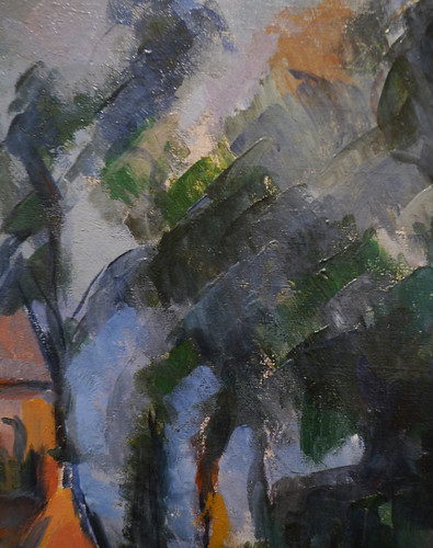
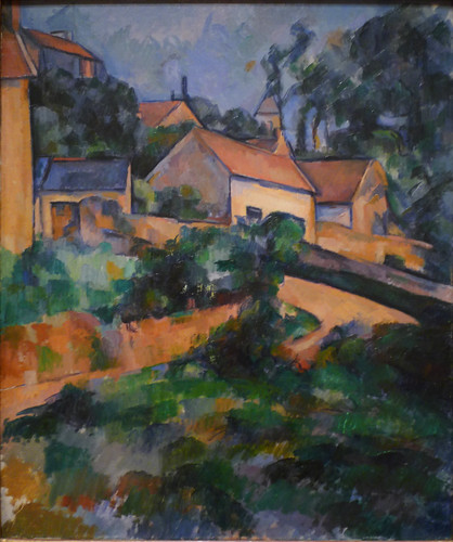
Paul Cézanne, Mont Sainte-Victoire
by DR. BEN HARVEY
Video \(\PageIndex{12}\): Paul Cézanne, Mont Sainte-Victoire, 1902-04, oil on canvas, 73 x 91.9 cm (Philadelphia Museum of Art)
Speakers: Dr. Steven Zucker and Dr. Beth Harris
It can be difficult to estimate, by eye, just how far away a mountain lies. A peak can dominate a landscape and command our attention, filling our eyes and mind. Yet it can come as something of a shock to discover that such a prominent natural feature can still be a long distance from us.
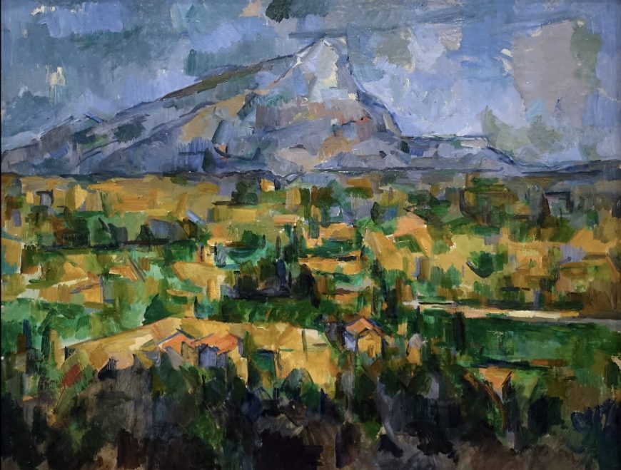
A mountain
At 3317 feet (1011 meters) high, the limestone peak of Mont Sainte-Victoire is a pigmy compared to the giants of, say, Mount Fuji and Mount Rainier. But, like them, it still exercises a commanding presence over the country around it and, in particular, over Aix-en-Provence, the hometown of Paul Cézanne. Thanks to his many oil paintings and watercolors of the mountain, the painter has become indelibly associated with it. Think of Cézanne and his still-lifes and landscapes come to mind, his apples and his depictions of Mont Sainte-Victoire.

Steeped in centuries of history and folklore, both classical and Christian, the mountain—or, more accurately, mountain range—only gradually emerged as a major theme in Cézanne’s work. In the 1870s, he included it in a landscape called The Railway Cutting, 1870 (Neue Pinakothek, Munich) and a few years later it appeared behind the monumental figures of his Bathers at Rest, 1876-77 (The Barnes Foundation, Philadelphia), which was included in the Third Impressionist Exhibition of 1877. But it wasn’t until the beginning of the next decade, well after his adoption of Impressionism, that he began consistently featuring the mountain in his landscapes. Writing in 1885, Paul Gauguin was probably thinking of Mont Sainte-Victoire when he imagined Cézanne spending “entire days in the mountains reading Virgil and looking at the sky.” “Therefore,” Gauguin continued, “his horizons are high, his blues very intense, and the red in his work has an astounding vibrancy.” Cézanne’s legend was beginning to emerge and a mountain ran through it.
A series
Cézanne would return to the motif of Mont Sainte-Victoire throughout the rest of his career, resulting in an incredibly varied series of works. They show the mountain from many different points of view and often in relationship to a constantly changing cast of other elements (foreground trees and bushes, buildings and bridges, fields and quarries). From this series we can extract a subgroup of over two-dozen paintings and watercolors. Dating from the very last years of the artist’s life, these landscapes feature a heightened lyricism and, more prosaically, a consistent viewpoint. They show the mountain as it can be seen from the hill of Les Lauves, located just to the north of Aix.

A walk from the studio
Cézanne bought an acre of land on this hill in 1901 and by the end of the following year he had built a studio on it. From here, he would walk further uphill to a spot that offered a sweeping view of Mont Sainte-Victoire and the land before it. The painter Emile Bernard recalled accompanying Cézanne on this very walk:
Cézanne picked up a box in the hall [of his studio] and took me to his motif. It was two kilometers away with a view over a valley at the foot of Sainte-Victoire, the craggy mountain which he never ceased to paint[…]. He was filled with admiration for this mountain.
Cézanne consciously cultivated his association with the mountain and perhaps even wanted to be documented painting it. When they visited Aix in 1906, the artists Maurice Denis and Ker-Xavier Roussel found themselves being led to the same location. In an oil painting by Denis and in some of Roussel’s photographs, we see Cézanne standing before his easel and painting the mountain. Again! It was the view we can see in most of Cézanne’s late views of Mont Sainte-Victoire, including the painting that concerns us here, which is now in the Philadelphia Museum of Art.
The painting in Philadelphia
In this work, Cézanne divides his composition into three roughly equal horizontal sections, which extend across the three-foot wide canvas. Our viewpoint is elevated. Closest to us lies a band of foliage and houses; next, rough patches of yellow ochre, emerald, and viridian green suggest the patchwork of an expansive plain and extend the foreground’s color scheme into the middleground; and above, in contrasting blues, violets and greys, we see the “craggy mountain” surrounded by sky. The blues seen in this section also accent the rest of the work while, conversely, touches of green enliven the sky and mountain.
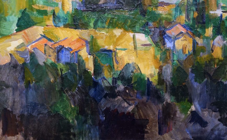
Subtle adjustments
In other words, Cézanne introduced subtle adjustments in order to avoid too simple a scheme. So the peak of the mountain is pushed just to the right of center, and the horizon line inclines gently upwards from left to right. In fact, a complicated counterpoint of diagonals can be found in each of the work’s bands, in the roofs of the houses, in the lines of the mountain, and in the arrangement of the patches in the plain, which connect foreground to background and lead the eye back.
Flatness and depth
Cézanne evokes a deep, panoramic scene and the atmosphere that fills and unifies this space. But it is absolutely characteristic of his art that we also remain acutely aware of the painting as a fairly rough, if deftly, worked surface. Flatness coexists with depth and we find ourselves caught between these two poles—now more aware of one, now the other. The mountainous landscape is both within our reach, yet far away.
A comparison
Comparing the Philadelphia canvas with some of Cézanne’s other views of Mont Sainte-Victoire and with photos of the area can help us to grasp some of the perceptual subtleties and challenges of the work. Take the left side of the mountain. Though the outermost contour is immediately apparent, inside of it one can also discern a second line (or, more accurately, a series of lines and edges). The two converge just shy of the mountaintop. The area between this outer contour and the interior line or ridge demarcates a distinctive spatial plane; this slope recedes away from us and connects to the larger mountain range lying behind the sheer face. Attend to this area, and the mountain seems to gain volume. It becomes less of an irregular triangle and more of a complicated pyramid.
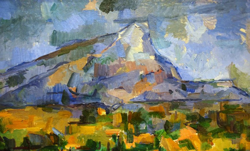
Or look again at the painting’s most obvious focus of interest, the top of the mountain. Cézanne’s other works show that the mountain has a kind of double peak, with a slightly higher point to the left side and a lower one to the right. At first glance, the Philadelphia canvas seems to contradict this: the mountain’s truncated apex appears to rise slightly from left to right. But a closer look reveals that Cézanne does respect topography. The small triangular patch of light gray—actually the priming of the canvas—can be read as belonging to the space immediately above the mountain or perhaps as a cloud behind it. Thus it is the gray and light blue brushstrokes immediately below this patch that describe the downward slant of the mountain top.
Curiously, in one respect, our point-of-view is actually a little misleading. At an elevation of 3104 feet (946 meters), the left peak is not the highest point, but merely appears to so from Les Lauves. A huge iron cross—la croix de Provence—was erected on this spot in the early 1870s, the fourth to be placed there. Though visible from afar, the cross appears in none of Cézanne’s depictions of the mountain.
Cézanne had presumably stood on this summit, or these summits, several times. He had thoroughly explored the countryside around Aix, first during youthful rambles with his friends and later as a plein-air artist in search of motifs. And we know for certain that he had climbed to the top of the mountain as recently as 1895. Armed with these experiences, he could have estimated the distance from Les Lauves to the top of Mont Sainte-Victoire with some accuracy—it’s about ten miles (16 kilometers) as the crow flies.
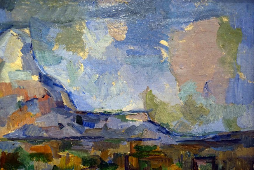
When he stood on the mountain in 1895 Cézanne had, so to speak, entered into one of his own landscapes. As he stood there, perhaps he paused to recall some of the paintings of Mont Sainte-Victoire he had already made. But, to return to Gauguin’s language, could he possibly have dreamt of the works he would go on to paint in the following decade—works like the Philadelphia landscape, with its high horizon, intense blues, and astounding vibrancy?
Paul Cézanne, The Card Players
by DR. BEN HARVEY

A new direction
Writing near the end of his life, Paul Cézanne told an art critic that “one does not put oneself in place of the past, one only adds a new link.” [1] In other words, through his art he wanted to engage with art history but also to modify it and take it in a new direction. It is a sentiment beautifully exemplified in the artist’s five paintings of card players, which he had worked on about a decade earlier, in the early-to-mid 1890s.

In terms of its subject matter, the series owes a clear debt to earlier depictions of card and game players by Baroque and Rococo artists such as Caravaggio (above), de la Tour, the Le Nain brothers, and Chardin; within Cézanne’s own lifetime, the theme had been taken up anew by Daumier, Meissonier, Degas, and Caillebotte.
Cézanne’s “new link” lies in the way he steers the subject away from its obvious symbolic and dramatic potential: clubs and hearts, winners and losers, the cheaters and the cheated. All of this had been thoroughly explored already. Instead, Cézanne attends to other aspects of the activity. He stresses the shared social space of the card game, intimate and familiar, and the attention and concentration the game demands. Not coincidentally, these are the same psychological states demanded by the acts of making and looking at art.
The version at the Met
The version of the card players at Metropolitan Museum of Art (image at the top of the page) is now generally thought to be the earliest of the five paintings in the series. It depicts somewhat eccentrically-proportioned figures surrounding a table: three play cards and a fourth merely observes the game, his pipe indicative of his contemplative attitude. These are rural laborers quietly and sociably passing the time in a tavern or room. Like the other works in the series, the setting in the Met’s canvas is sparse. We see a table and three chairs (two of them more implied than fully described); a full pipe rack and a swag of yellow fabric hang from the room’s rear wall. The tabletop creates a clear focus of attention within the larger work. It supports the players’ arms and hands, which, in turn, provide a frame for some objects: a pipe, cards, and a prominent grey rectangle—perhaps a tobacco pouch or another card.

Although this would have been a familiar scene to Cézanne, we should not imagine him setting up his easel in front of an actual card game. Instead, the artist’s surviving preparatory works indicate that he studied his figures independently, one by one, and then incorporated these studies into his multi-figure compositions. Cézanne made oil studies for two of the figures in the Met’s painting (see above for one example), and both models have been identified as farm hands who worked at the Cézanne family’s estate near Aix-en-Provence, the Jas de Bouffan. Even while they share the same space, Cézanne’s figures retain a sense of independence and self-containment. They are engaged, as one art historian aptly put it, in a game of “collective solitaire.”
And yet one detail in the Met’s painting points, albeit subtly, to a sequence of events and thus to the logic of an actual game. The figure on the left of the work (modelled by one Paulin Paulet) appears to be on the verge of extending his index finger (see detail below), as though about to pick up a card from the table. It’s a gesture that connects thought to action, the contemplation of a hand of cards to the movement of a hand. Similar actions, although more emphatically rendered, can be found in an earlier depiction of card players by Gustave Caillebotte (below), who was both Cézanne’s colleague in the impressionist group and a collector of his work.

Formal elements trump narrative considerations
The particular logic of any card game determines the value of any given card within it, and so Caillebotte provides us an important clue in his title (The Bezique Game) and even allows his viewer to discern the colors and ranks of a few cards in his painting (a red ace, a black seven). In contrast, Cézanne’s instinct is to withhold all such information—to keep his cards close to his chest. On his table, there is an upturned card holding three roughly rectangular patches of red pigment (see detail below). But these patches do not closely resemble diamonds and, as though to lessen any resemblance, the card also contains similar patches of white and bluish paint.
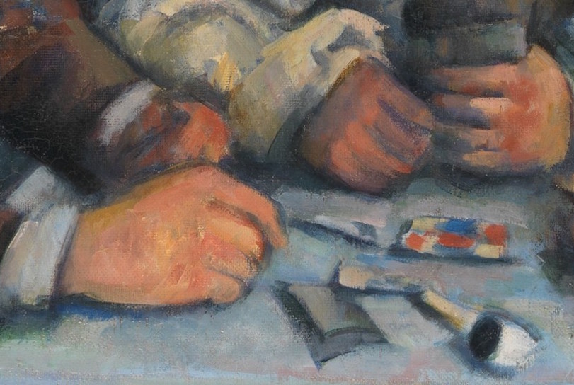

The tricolor of colors is picked up elsewhere in the composition, in the blue of the workers’ clothes, the white of their pipes and shirts, and in the red of the standing man’s cravat (left). With their vivid color combinations and flat forms, playing cards may even have had aesthetic significance to Cézanne, suggesting a model for his own practice. As early as 1876, he told Camille Pissarro about a landscape motif he was working on: “It’s like a playing-card,” he wrote. “Red roofs over the blue sea.” [2]
For Cézanne, the formal elements (color, shape, texture, composition) ultimately trumped narrative considerations. The marks we see on the card create a grid of compositional elements, and this places the card in relationship to two analogous grids. The first consists of the larger collection of objects on the table, where the objects and the spaces between them form a kind of tic-tac-toe pattern. The second is made up of the four figures themselves, each of whom occupies one of three distinct spatial zones (foreground, middle-ground, background) as well as one of three different lateral positions (left, center, right).
This connection between objects and figures is even more evident in the largest work in the series of card players now at the Barnes Collection in Philadelphia (see below), which Cézanne probably made soon after the Met’s painting. By adding a fifth figure at the back right, the figures now repeat the X schema formed by the objects on the table.

Other works in this series
The three remaining works in the series (Courtauld Gallery—see below, Musée d’Orsay, and a private collection) contain just two card players confronting each other in strict profile, a compositional idea that first appeared in the two foreground figures in the Met’s work. In these later paintings, the table is narrower and cleared of all objects, with the exception of a centrally placed wine bottle. The two men study their cards intently, but no movement or move appears imminent. The details of the game have receded still further and life has been stilled. Cézanne’s card players, like many of his figures, occupy a space somewhere between the painting of figures and the painting of objects. They drift between different genres.

A New Yorker cartoon exploits this drift to humorous effect. In it, Robert Mankoff lets still-life elements and game-playing details flood back into one of the artist’s two-figure works. He fills up the card players’ arms and table with piles of apples, reminding us of Cézanne’s close association with the fruit. “I see your Granny Smith,” runs the caption, “and I raise you a Golden Delicious” (view image here) Cézanne’s famous apples are now a specific type, as though straight from a supermarket. His figures are now not merely poker-faced: they are poker players.
Though no money seems to be at stake in Cézanne’s card games, commerce was certainly involved in the creation of the piece. By the 1890s, Cézanne was independently wealthy; he could comfortably afford to pay his models to pose and the resulting works were made out of industrially produced pigments usually applied to commercially manufactured, standard-size canvases (a “no. 25” in the case of the Met’s work). Around the same time he finished the series, the artist struck up a relationship with a Parisian picture dealer, Ambroise Vollard, who then became the first owner of the Met’s canvas. Vollard’s business ledgers record that he made a tidy profit from the work, buying it for 250 francs and, in early 1900, selling it for 4,500. The enduring appeal of Cézanne’s card players, though, may owe something to the way the five paintings provide a distinct contrast to the modern capitalism that surrounded their creation. If life can seem increasingly fast, superficial, and mercenary, then perhaps some consolation can be found here—in our prolonged engagement with handmade canvases showing a timeless, rooted, and sociable pastime.
[1] Letter to Roger Marx, January 23, 1905, as quoted in John Reward (editor), Paul Cézanne, Letters(Da Capo Press, 1995), p. 313.
[2] Letter to Camille Pissarro, July 2, 1876, as quoted in John Reward (editor), Paul Cézanne, Letters(Da Capo Press, 1995), p.146.
Paul Cézanne, Bathers (Les Grandes Baigneuses)
by DR. STEVEN ZUCKER and DR. BETH HARRIS
Video \(\PageIndex{13}\): Paul Cézanne, Bathers (Les Grandes Baigneuses), c. 1894-1905, oil on canvas, 127.2 x 196.1 cm (The National Gallery, London)
Paul Cézanne, The Large Bathers
by DR. STEVEN ZUCKER and DR. BETH HARRIS
Video \(\PageIndex{14}\): Paul Cézanne, The Large Bathers, 1906, oil on canvas, 82-7/8 x 98-3/4″ / 210.5 x 250.8 cm (Philadelphia Museum of Art)
Smarthistory images for teaching and learning:
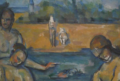
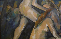
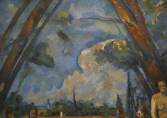
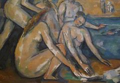
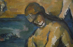
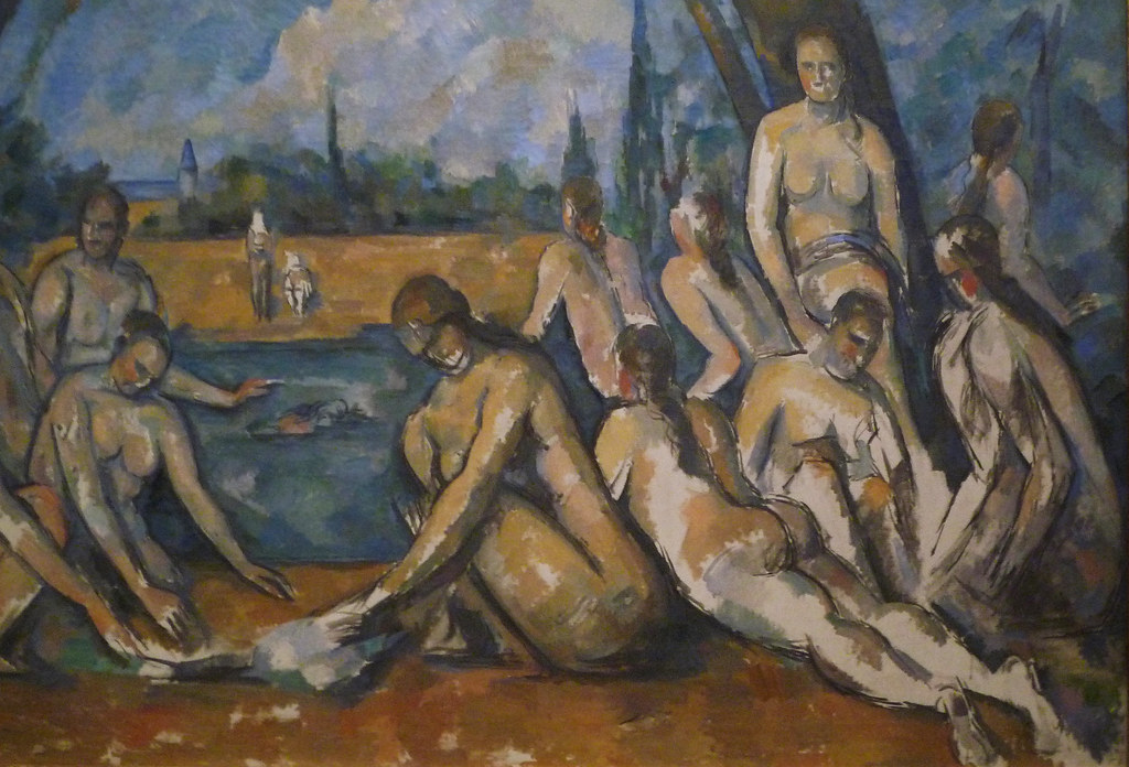
Why Is This Woman in the Jungle? Henri Rousseau’s The Dream
Video \(\PageIndex{15}\)
Artist Henri Rousseau painted The Dream in 1910, and it’s imagery of a woman lounging on a sofa in the middle of a jungle was as surreal then as it is today. What is it about this artwork that captivated audiences then and now?
Henri de Toulouse-Lautrec, At the Moulin Rouge
by DR. STEVEN ZUCKER and DR. BETH HARRIS
Video \(\PageIndex{16}\): Henri de Toulouse-Lautrec, At the Moulin Rouge, 1893-95, oil on canvas, 48-1/2 x 55-1/2 inches (123 x 141 cm) (Art Institute of Chicago)
Smarthistory images for teaching and learning: