8.7: Impressionism
- Page ID
- 74688
\( \newcommand{\vecs}[1]{\overset { \scriptstyle \rightharpoonup} {\mathbf{#1}} } \)
\( \newcommand{\vecd}[1]{\overset{-\!-\!\rightharpoonup}{\vphantom{a}\smash {#1}}} \)
\( \newcommand{\dsum}{\displaystyle\sum\limits} \)
\( \newcommand{\dint}{\displaystyle\int\limits} \)
\( \newcommand{\dlim}{\displaystyle\lim\limits} \)
\( \newcommand{\id}{\mathrm{id}}\) \( \newcommand{\Span}{\mathrm{span}}\)
( \newcommand{\kernel}{\mathrm{null}\,}\) \( \newcommand{\range}{\mathrm{range}\,}\)
\( \newcommand{\RealPart}{\mathrm{Re}}\) \( \newcommand{\ImaginaryPart}{\mathrm{Im}}\)
\( \newcommand{\Argument}{\mathrm{Arg}}\) \( \newcommand{\norm}[1]{\| #1 \|}\)
\( \newcommand{\inner}[2]{\langle #1, #2 \rangle}\)
\( \newcommand{\Span}{\mathrm{span}}\)
\( \newcommand{\id}{\mathrm{id}}\)
\( \newcommand{\Span}{\mathrm{span}}\)
\( \newcommand{\kernel}{\mathrm{null}\,}\)
\( \newcommand{\range}{\mathrm{range}\,}\)
\( \newcommand{\RealPart}{\mathrm{Re}}\)
\( \newcommand{\ImaginaryPart}{\mathrm{Im}}\)
\( \newcommand{\Argument}{\mathrm{Arg}}\)
\( \newcommand{\norm}[1]{\| #1 \|}\)
\( \newcommand{\inner}[2]{\langle #1, #2 \rangle}\)
\( \newcommand{\Span}{\mathrm{span}}\) \( \newcommand{\AA}{\unicode[.8,0]{x212B}}\)
\( \newcommand{\vectorA}[1]{\vec{#1}} % arrow\)
\( \newcommand{\vectorAt}[1]{\vec{\text{#1}}} % arrow\)
\( \newcommand{\vectorB}[1]{\overset { \scriptstyle \rightharpoonup} {\mathbf{#1}} } \)
\( \newcommand{\vectorC}[1]{\textbf{#1}} \)
\( \newcommand{\vectorD}[1]{\overrightarrow{#1}} \)
\( \newcommand{\vectorDt}[1]{\overrightarrow{\text{#1}}} \)
\( \newcommand{\vectE}[1]{\overset{-\!-\!\rightharpoonup}{\vphantom{a}\smash{\mathbf {#1}}}} \)
\( \newcommand{\vecs}[1]{\overset { \scriptstyle \rightharpoonup} {\mathbf{#1}} } \)
\(\newcommand{\longvect}{\overrightarrow}\)
\( \newcommand{\vecd}[1]{\overset{-\!-\!\rightharpoonup}{\vphantom{a}\smash {#1}}} \)
\(\newcommand{\avec}{\mathbf a}\) \(\newcommand{\bvec}{\mathbf b}\) \(\newcommand{\cvec}{\mathbf c}\) \(\newcommand{\dvec}{\mathbf d}\) \(\newcommand{\dtil}{\widetilde{\mathbf d}}\) \(\newcommand{\evec}{\mathbf e}\) \(\newcommand{\fvec}{\mathbf f}\) \(\newcommand{\nvec}{\mathbf n}\) \(\newcommand{\pvec}{\mathbf p}\) \(\newcommand{\qvec}{\mathbf q}\) \(\newcommand{\svec}{\mathbf s}\) \(\newcommand{\tvec}{\mathbf t}\) \(\newcommand{\uvec}{\mathbf u}\) \(\newcommand{\vvec}{\mathbf v}\) \(\newcommand{\wvec}{\mathbf w}\) \(\newcommand{\xvec}{\mathbf x}\) \(\newcommand{\yvec}{\mathbf y}\) \(\newcommand{\zvec}{\mathbf z}\) \(\newcommand{\rvec}{\mathbf r}\) \(\newcommand{\mvec}{\mathbf m}\) \(\newcommand{\zerovec}{\mathbf 0}\) \(\newcommand{\onevec}{\mathbf 1}\) \(\newcommand{\real}{\mathbb R}\) \(\newcommand{\twovec}[2]{\left[\begin{array}{r}#1 \\ #2 \end{array}\right]}\) \(\newcommand{\ctwovec}[2]{\left[\begin{array}{c}#1 \\ #2 \end{array}\right]}\) \(\newcommand{\threevec}[3]{\left[\begin{array}{r}#1 \\ #2 \\ #3 \end{array}\right]}\) \(\newcommand{\cthreevec}[3]{\left[\begin{array}{c}#1 \\ #2 \\ #3 \end{array}\right]}\) \(\newcommand{\fourvec}[4]{\left[\begin{array}{r}#1 \\ #2 \\ #3 \\ #4 \end{array}\right]}\) \(\newcommand{\cfourvec}[4]{\left[\begin{array}{c}#1 \\ #2 \\ #3 \\ #4 \end{array}\right]}\) \(\newcommand{\fivevec}[5]{\left[\begin{array}{r}#1 \\ #2 \\ #3 \\ #4 \\ #5 \\ \end{array}\right]}\) \(\newcommand{\cfivevec}[5]{\left[\begin{array}{c}#1 \\ #2 \\ #3 \\ #4 \\ #5 \\ \end{array}\right]}\) \(\newcommand{\mattwo}[4]{\left[\begin{array}{rr}#1 \amp #2 \\ #3 \amp #4 \\ \end{array}\right]}\) \(\newcommand{\laspan}[1]{\text{Span}\{#1\}}\) \(\newcommand{\bcal}{\cal B}\) \(\newcommand{\ccal}{\cal C}\) \(\newcommand{\scal}{\cal S}\) \(\newcommand{\wcal}{\cal W}\) \(\newcommand{\ecal}{\cal E}\) \(\newcommand{\coords}[2]{\left\{#1\right\}_{#2}}\) \(\newcommand{\gray}[1]{\color{gray}{#1}}\) \(\newcommand{\lgray}[1]{\color{lightgray}{#1}}\) \(\newcommand{\rank}{\operatorname{rank}}\) \(\newcommand{\row}{\text{Row}}\) \(\newcommand{\col}{\text{Col}}\) \(\renewcommand{\row}{\text{Row}}\) \(\newcommand{\nul}{\text{Nul}}\) \(\newcommand{\var}{\text{Var}}\) \(\newcommand{\corr}{\text{corr}}\) \(\newcommand{\len}[1]{\left|#1\right|}\) \(\newcommand{\bbar}{\overline{\bvec}}\) \(\newcommand{\bhat}{\widehat{\bvec}}\) \(\newcommand{\bperp}{\bvec^\perp}\) \(\newcommand{\xhat}{\widehat{\xvec}}\) \(\newcommand{\vhat}{\widehat{\vvec}}\) \(\newcommand{\uhat}{\widehat{\uvec}}\) \(\newcommand{\what}{\widehat{\wvec}}\) \(\newcommand{\Sighat}{\widehat{\Sigma}}\) \(\newcommand{\lt}{<}\) \(\newcommand{\gt}{>}\) \(\newcommand{\amp}{&}\) \(\definecolor{fillinmathshade}{gray}{0.9}\)Impressionism
These artists broke new ground with sketchy, light-filled canvases shown in independent exhibitions.
c. 1874 - 1886
Impressionism: A beginner’s guide
The Impressionists are now widely appreciated, but they originally struggled for recognition.
c. 1874 - 1886
Impressionism, an introduction

Apart from the salon
The group of artists who became known as the Impressionists did something ground-breaking in addition to painting their sketchy, light-filled canvases: they established their own exhibition. This may not seem like much in an era like ours, when art galleries are everywhere in major cities, but in Paris at this time, there was one official, state-sponsored exhibition—called the Salon—and very few art galleries devoted to the work of living artists. For most of the nineteenth century then, the Salon was the only way to exhibit your work (and therefore the only way to establish your reputation and make a living as an artist). The works exhibited at the Salon were chosen by a jury—which could often be quite arbitrary. The artists we know today as Impressionists—Claude Monet, August Renoir, Edgar Degas, Berthe Morisot, Alfred Sisley (and several others)—could not afford to wait for France to accept their work. They all had experienced rejection by the Salon jury in recent years and felt that waiting an entire year between exhibitions was too long. They needed to show their work and they wanted to sell it.
The artists pooled their money, rented a studio that belonged to the photographer Nadar, and set a date for their first collective exhibition. They called themselves the Anonymous Society of Painters, Sculptors, and Printmakers and their first show opened at about the same time as the annual Salon in May 1874. The Impressionists held eight exhibitions from 1874 through 1886.
The impressionists regarded Manet as their inspiration and leader in their spirit of revolution, but Manet had no desire to join their cooperative venture into independent exhibitions. Manet had set up his own pavilion during the 1867 World’s Fair, but he was not interested in giving up on the Salon jury. He wanted Paris to come to him and accept him—even if he had to endure their ridicule in the process.
Lack of finish
Monet, Renoir, Degas, and Sisley had met through classes. Berthe Morisot was a friend of both Degas and Manet (she would marry Édouard Manet’s brother Eugène by the end of 1874). She had been accepted to the Salon, but her work had become more experimental since then. Degas invited Morisot to join their risky effort. The first exhibition did not repay the artists monetarily but it did draw the critics, some of whom decided their art was abominable. What they saw wasn’t finished in their eyes; these were mere “impressions.” This was not a compliment.

The paintings of Neoclassical and Romantic artists had a finished appearance. The Impressionists’ completed works looked like sketches, fast and preliminary “impressions” that artists would dash off to preserve an idea of what to paint more carefully at a later date. Normally, an artist’s “impressions” were not meant to be sold, but were meant to be aids for the memory—to take these ideas back to the studio for the masterpiece on canvas. The critics thought it was absurd to sell paintings that looked like slap-dash impressions and to present these paintings as finished works.
Landscape and contemporary life
Courbet, Manet and the Impressionists also challenged the Academy’s category codes. The Academy deemed that only “history painting” was great painting. These young Realists and Impressionists questioned the long established hierarchy of subject matter. They believed that landscapes and genres scenes (scenes of contemporary life) were worthy and important.
Light and color
In their landscapes and genre scenes, the Impressionist tried to arrest a particular moment in time by pinpointing specific atmospheric conditions—light flickering on water, moving clouds, a burst of rain. Their technique tried to capture what they saw. They painted small commas of pure color one next to another. When viewer stood at a reasonable distance their eyes would see a mix of individual marks; colors that had blended optically. This method created more vibrant colors than colors mixed as physical paint on a palette.
An important aspect of the Impressionist painting was the appearance of quickly shifting light on the surface of forms and the representation changing atmospheric conditions. The Impressionists wanted to create an art that was modern by capturing the rapid pace of contemporary life and the fleeting conditions of light. They painted outdoors (en plein air) to capture the appearance of the light as it flickered and faded while they worked.
Reception
By the 1880s, the Impressionists accepted the name the critics gave them, though their reception in France did not improve quickly. Other artists, such as Mary Cassatt, recognized the value of the Impressionist movement and were invited to join. American and other non-French collectors purchased numerous works by the Impressionists. Today, a large share of Impressionist work remains outside French collections.
Additional resources:
Art Institute of Chicago’s Exploring Impressionism at the Google Art Project
Impressionism: Art and Modernity at The Metropolitan Museum of Art’s Timeline of Art History
Smarthistory images for teaching and learning:
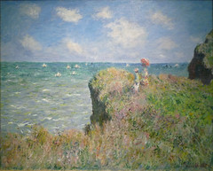
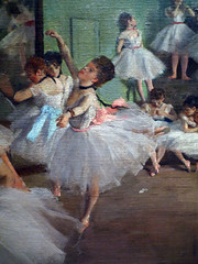
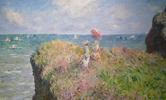
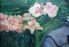
What does “Impressionism” mean?
by DR. CHARLES CRAMER and DR. KIM GRANT
Brushwork, light, and atmosphere
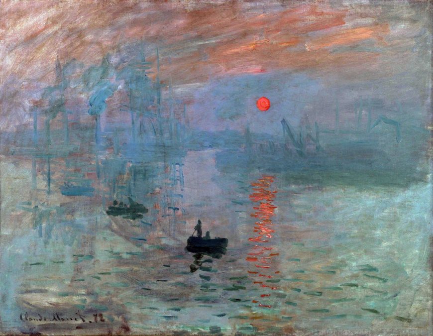
Claude Monet’s Impression: Sunrise is an exemplary Impressionist painting in several ways, not least of which is its title. It depicts a misty harbor scene at Le Havre (a port city in Northern France) in which boats and figures are reduced to flat, shadowy silhouettes, while the red light of the sun reflected on the water takes on tangible form in highly visible brushstrokes.
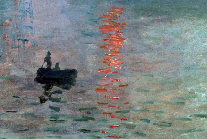
What we see when we look at the painting is unquestionably painted; Monet made no effort to develop his suggestive image into a more detailed and finished rendering of the scene. The loosely sketched silhouettes of boats exemplify the difficulty of seeing objects in the mist with the sun rising behind them. Monet embraced this difficulty, using it as an occasion to display a painterly rendering that says more about the momentary light and atmospheric conditions than it does about the objects in the scene.
Ask yourself: is there anything in the painting that tells you this is Le Havre? In an interview Monet acknowledged the failure of the painting to depict a recognizable place. When he was asked for the title of the painting for the catalog of what later became known as the first Impressionist exhibition he said: “I couldn’t very well call it a view of Le Havre. So I said: ‘Put Impression.” With this decision Monet unwittingly named an art movement, and this work’s emphasis on brushwork, light, and atmosphere at the expense of the clear representation of objects became a hallmark of the Impressionist style.
Impressionism was not always so well-loved
It may be surprising to know that an art movement so well-loved today—highly successful at auction, the subject of numerous blockbuster exhibits, and a vast number of popular publications—was subjected to a good deal of scorn and ridicule in its early years. Even the term “Impressionism” was first used pejoratively in relation to the new art first exhibited in 1874 by the Société anonyme cooperative d’artistes peintres, sculpteurs, etc. (Anonymous cooperative society of artists, painters, sculptors, etc.). These artists used the term “anonymous” quite intentionally—they wanted to avoid imposing a restrictive label or common agenda on their group, whose members employed a variety of styles and painting techniques. Ultimately, they staged eight exhibitions between 1874 and 1886.
The group included a number of artists who became the most famous Impressionists: Gustave Caillebotte, Mary Cassatt, Edgar Degas, Claude Monet, Berthe Morisot, Camille Pissarro, Pierre Renoir, and Alfred Sisley, as well as many other artists (some of whom are now associated with later modern art movements such as Post-Impressionism or Symbolism). Despite their eclecticism, contemporary viewers and the critics who reviewed the Société anonyme’s exhibitions expected the group to share common goals and characteristics, and the label “Impressionism” soon came to identify a new artistic movement, with some of the artists of the Société anonyme at its core.
A mere impression
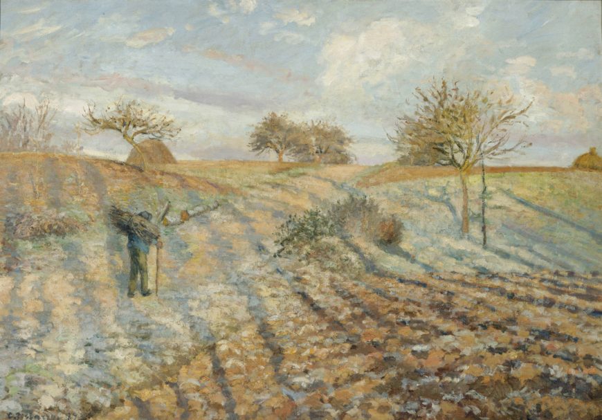
The critic Louis Leroy was the first to emphasize the term “impression” in relation to the new painting, adopting it from Monet’s Impression: Sunrise in a satirical dialogue entitled “Exhibition of the Impressionists” that was published in the popular illustrated magazine Le Charivari. Leroy found Monet’s use of “Impression” in his painting’s title particularly appropriate because it suggested that the work was unfinished according to Academic conventions of representation; that is, it represented a mere impression of the scene, rather than a fully structured and completed work of art. Leroy repeatedly emphasized the term “impression” in the dialogue and described many of the paintings by Monet and his fellow exhibitors as sloppy and slapdash, going so far as to compare Monet’s Impression: Sunrise to embryonic wallpaper and Pissarro’s Hoarfrost to paint scraped off of a dirty palette.
Despite this prominent early critical association of the term “impression” with sloppiness, two years later “Impressionism” and “Impressionist” were being widely used to label the new art by its supporters as well as its detractors. It was undoubtedly the flexibility of the term that allowed it to be so widely adopted, but with that flexibility came a certain amount of confusion about the aims of the movement.
Leroy’s usage suggests a hasty and inaccurate “first impression,” but the term also has a very precise and technical connotation as a scientific word designating the stimulation of the optical or other sensory nerves. This scientific definition implies a project of careful observation and objective documentation, but the term is also used for a more subjective and individual response, as when one gives one’s own “impressions” of a person, place, or thing. Hasty generalization or precise observation? Objective documentation or subjective interpretation? All of these contradictory qualities have been associated with the Impressionist movement.
How useful is the term “Impressionism”?
The complex significance of Impressionism expands further when we examine the characteristics emphasized in scholarly and popular writings about the movement. Two quite different artistic projects and sets of characteristics are commonly associated with Impressionism:
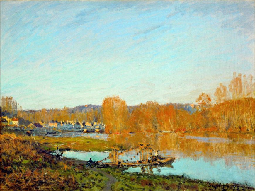
First, a painting is called Impressionist if it exhibits a certain style, consisting of patchy brushwork and a light pastel color scheme that aims to capture transient effects of atmospheric lighting, as can be seen in Sisley’s Autumn: Banks of the Seine near Bougival.
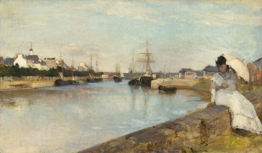
Second, a painting is called Impressionist if it exhibits a certain type of subject matter, typically plein-air (painted out-of-doors) scenes of middle-class men and women at leisure: drinking in cafés, boating, swimming, attending horse races, promenading in gardens, and similar activities.
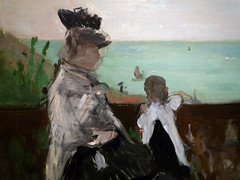
Berthe Morisot’s paintingThe Harbor at Lorient, which was shown in the first exhibition of the Société anonyme, exemplifies this second characteristic. We see a very well-dressed bourgeoise woman resting while out for a stroll in the town of Lorient in France. The figure’s white dress and parasol appear somewhat incongruous on the dirty stone wall overlooking a working harbor.
However, not all of the art works shown by members of the Société anonyme exhibit both of these characteristics; in fact, some exhibited neither. The works of Camille Pissarro are typically in the Impressionist style, but as his painting Hoarfrost indicates, he frequently painted the working class at labor rather than the middle classes at leisure. Edgar Degas and Gustave Caillebotte frequently painted the middle classes at leisure, but did not employ the characteristic Impressionist style.
This terminological confusion has led some historians to wish to discard the term Impressionism altogether, but whatever label or labels are attached to them, these two projects—capturing the evanescent effects of atmospheric lighting, and depicting scenes of contemporary middle-class leisure—were significant artistic tendencies in Paris and, slightly later, in the wider Euro-American scene starting in the 1860s and 70s. Rather than attempt to limit the definition of the Impressionist project, we embrace the flexibility of the term.
Additional resources:
Primary source: Louis Leroy, “Exhibition of the Impressionists, Le Charivari (April 25, 1874)
Smarthistory images for teaching and learning:


How the Impressionists got their name
by DR. BETH HARRIS and DR. STEVEN ZUCKER
The First Impressionist Exhibition, 1874
Although the idea originated with Claude Monet, Degas is largely responsible for organizing the very first Impressionist exhibition. After much debate, the artists—including Degas, Monet, Renoir, Morisot, Pissarro, Sisley, Boudin, and even the young Cézanne—along with many other lesser-known figures, chose to call themselves the Société Anonyme des Artistes. This group included painters, sculptors, printmakers, and others.
The exhibition opened in Paris on April 15, 1874. It was held at 35 Boulevard des Capucines, on the top floor and former studio of the photographer, Gaspard-Félix Tournachon, better known as Nadar. He was a friend of several of the artists and well-known for his portraits of the Parisian literati.

Serious criticism or tongue-in-cheek?
Although the first Impressionist exhibition was well attended, the critics were merciless. Trained to expect the polished illusions of the Salon painters, they were shocked by the raw, unblended, ill-defined paint used by Degas, Renoir, Monet and company. The satirical magazine, Le Charivari published an account of a visit with Joseph Vincent, an accomplished and conservative painter:
Upon entering the first room, Joseph Vincent received an initial shock in front of the Dancer by M. Renoir.
‘What a pity,’ he said to me, ‘that the painter, who has a certain understanding of color, doesn’t draw better; his dancer’s legs are as cottony as the gauze of her skirts.’…
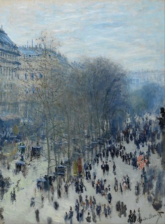
Unfortunately, I was imprudent enough to leave him [Joseph Vincent] in front of the “Boulevard des Capucines,” by [Monet].
‘Ah-ha! he sneered…. Is that brilliant enough, now!’ ‘There’s impression, or I don’t know what it means.’ ‘Only be so good as to tell me what those innumerable black tongue-lickings in the lower part of the picture represent?’
‘Why, those are people walking along,’ I replied.
‘Then do I look like that when I’m walking along the Boulevard Capucines?’ ‘Blood and Thunder!’ ‘So you’re making fun of me!’ ‘…What does that painting depict?’ ‘Look at the Catalogue.’ ‘Impression Sunrise.’ ‘Impression–I was certain of it. I was just telling myself that, since I was impressed, there had to be some impression in it…and what freedom, what ease of workmanship! Wallpaper in its embryonic state is more finished than that seascape!'”¹

And on it goes, ever more sarcastically. The article was titled, “Exhibition of the Impressionists,” and the term stuck. From then on, these artists were called Impressionists.
1. Linda Nochlin, Impressionism and Post-Impressionism, 1874-1904: Sources and Documents (Englewood Cliffs: Prentice-Hall, 1966), pp. 10-13.
Additional resources:
Impressionism: Art and Modernity from The Metropolitan Museum of Art’s Timeline of Art History
Martha Ward, “Impressionist Installations andn Private Exhibitions,” Art Bulletin, vol. 73 no. 4 (1991) pp. 599-622 (JSTOR)
Smarthistory images for teaching and learning:


Impressionism: painting modern life
by DR. CHARLES CRAMER and DR. KIM GRANT
Aggressively modern
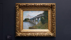
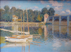
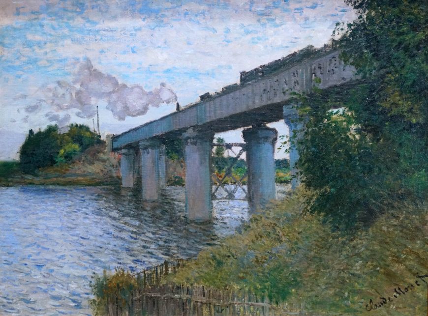
This is one of many paintings by Monet of the railroad bridge leading to Argenteuil, a small town on the outskirts of Paris where the artist lived in the 1870s. The painting demonstrates the Impressionists’ well-known interest in depicting nature and the effects of weather and light, seen here in the expanse of white clouds in blue sky and the reflections in the rippling surface of the river. Highly textured dark green bushes and grass are built up with visible brushstrokes and anchor the painting’s composition on left and right. The subject of the painting, however, is not a timeless rural scene (these were popular with the public — see, for example, this painting by Corot), but an aggressively modern one of a railroad bridge with a train heading over the river.
The bridge was rebuilt at the beginning of the decade after its predecessor was destroyed in the Franco-Prussian war, and its parts were forged at the local ironworks. The steam engine racing across the bridge creates its own billowing gray steam clouds, competing with the natural ones. The sweeping perspective of the bridge suggests the speed and dynamism of modern transportation technology, but Monet also shows that technology as integrally connected to the natural world. The rickety wooden fence in the foreground creates a contrast between old construction materials and the massive concrete and iron pylons supporting the new bridge. Old and new strain to integrate in the modern landscape.
Subjects that matter
Until the last decades of the twentieth century the scholarship on Impressionism paid relatively little attention to the subject matter chosen by the artists. Before then, art historians mostly concentrated on the style of the works and the way Impressionist innovations in form heralded or consolidated what seemed to them to be the most significant feature of modern art: the liberation of the artist from the constraints of convention, and the “evolution” of art toward flatness and abstraction. In recent decades, however, art historians have seriously considered the subject matter represented in Impressionist paintings and how this subject matter would have been understood by contemporary viewers.
Painting modern life
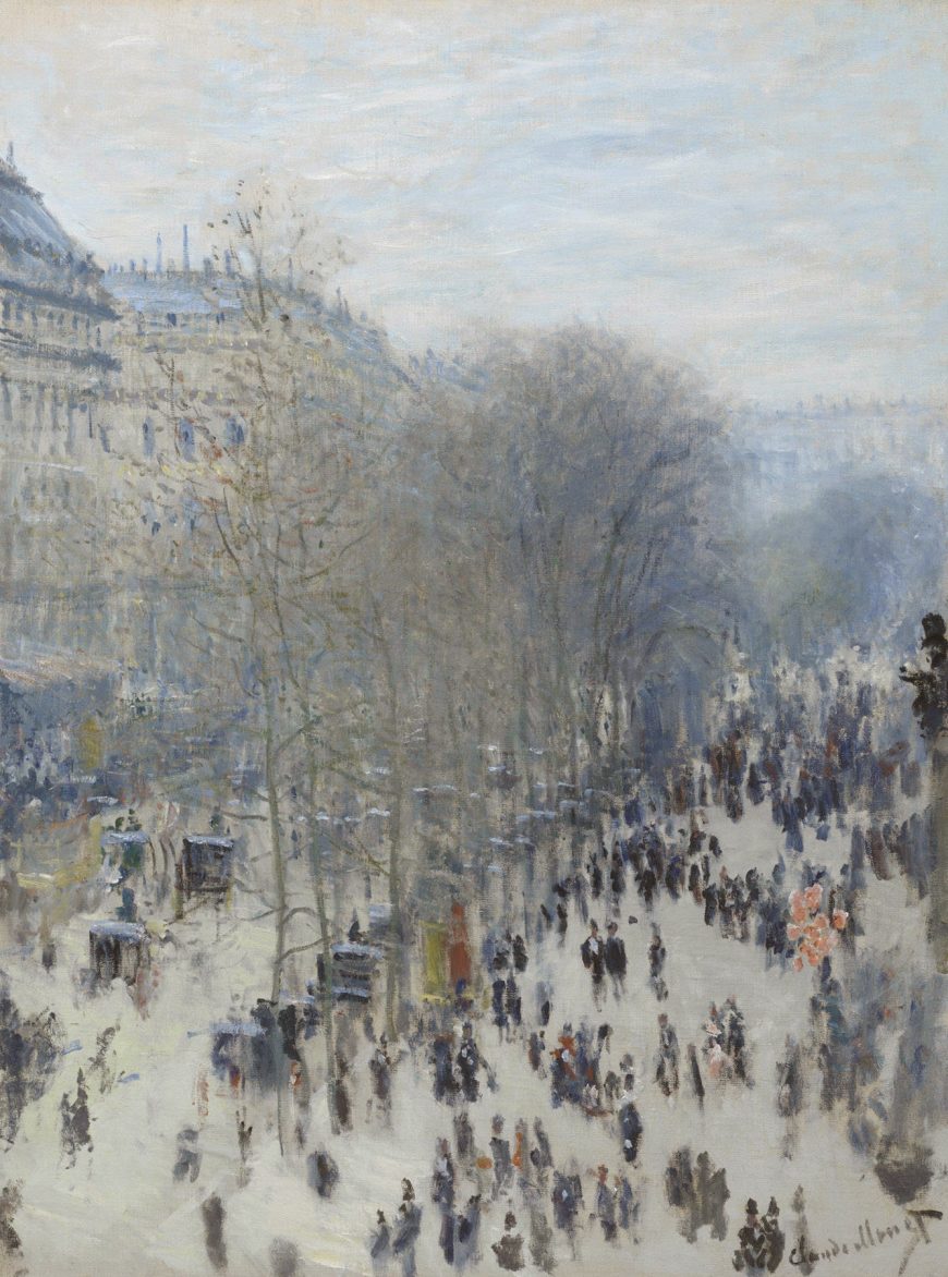
The Impressionist style can, of course, be applied to any subject matter, but Impressionist artists concentrated on a surprisingly limited range of subjects: typically, middle-class leisure in modern urban or suburban environments such as the Paris boulevard depicted in Monet’s Boulevard des Capucines or Railroad Bridge at Argenteuil. In one sense, the Impressionists continued the tradition of earlier nineteenth-century Realists like Jean-François Millet (for example in his painting L’Angélus) in their insistence on painting scenes from contemporary life. They rejected historical, mythological, and other exotic subjects and took as their dictum, “Il faut être de son temps,” “one must be of one’s own time.”
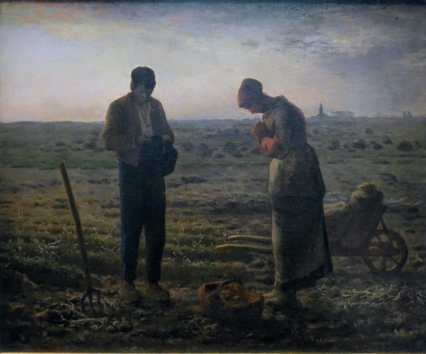
However, for the Impressionists, unlike the Realists, contemporary subjects typically did not mean rural or provincial scenes, which often suggested timeless forms of life and labor (as in Millet’s L’Angélus), but rather urban and suburban subjects that were changing rapidly. In this they are among the first artists to examine an important change in human geography that had significantly transformed the human experience: the shift of populations from primarily rural to urban areas that accompanied the Industrial Revolution and its large-scale economic shift from agricultural to industrial production.
In 1863, the poet and art critic Charles Baudelaire wrote an influential essay titled “The Painter of Modern Life” that called for an artist who would stroll through the new spaces of the city, keenly observing the actions of its inhabitants and viewing the streets and crowds as though they constituted a sort of improvised theater put on for his observation. Monet’s Boulevard des Capucines presents a characteristically modern scene of the broad, tree-lined boulevards that were cut across the older, less regular streets and alleys of Paris, offering a sweeping perspective that was not previously available in the city.
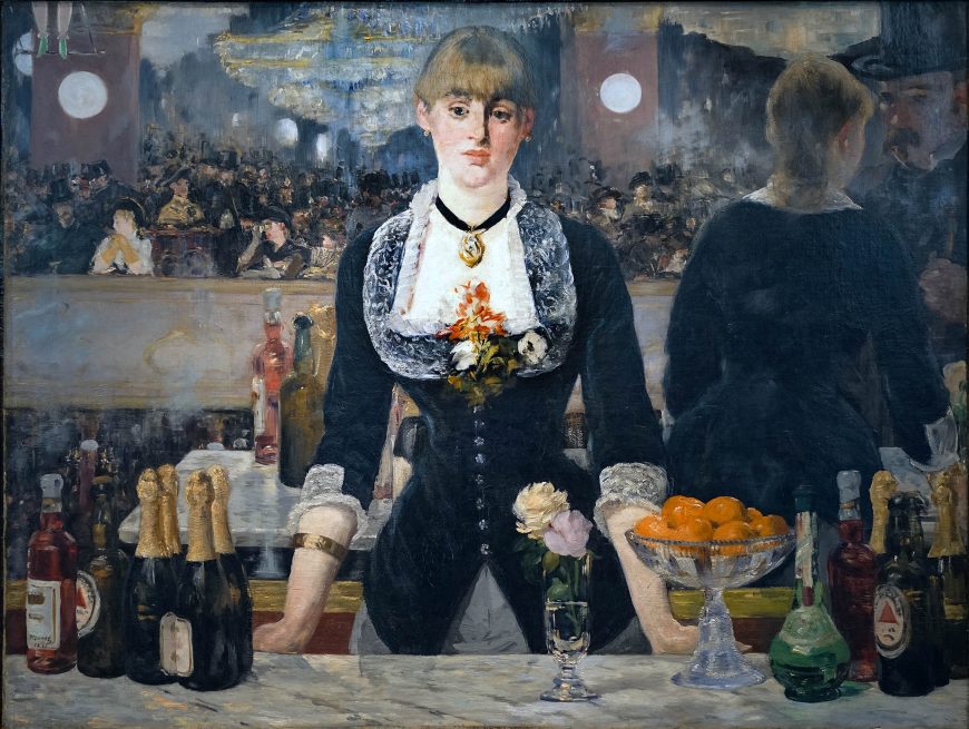
Although they did not insist upon technological subjects as much as later modern art movements such as Italian Futurism or American Precisionism did, the Impressionists had a recognizable predilection for painting the spaces of Paris as it had been transformed within the past few decades. Along with the more stereotypical plein-air garden and landscape subjects, the Impressionists also frequently turned to scenes of contemporary urban experience. They painted Parisian cafés and beer halls; they painted the large theaters, opera houses, and cabarets of the city’s night-life, illuminated by the eerie green glow of the new gas lighting; they painted the bridges and grand boulevards of modern urban planning; they painted the new train stations, glass-and-iron cathedrals to modern technology and its promise of rapid movement of goods and ease of travel; and they painted the suburban restaurants, racetracks, beach resorts, and parks where the rising middle classes spent their leisure hours. These subjects may appear charmingly quaint to our eyes, but at the time they were as aggressively contemporary as paintings of skyscrapers, airports, highway rest areas, and office parks would be today.
Middle-class leisure
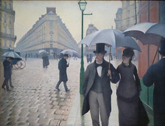
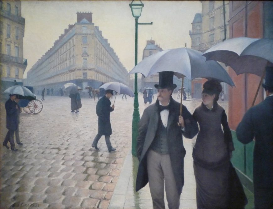
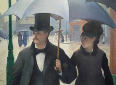
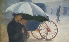
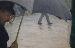
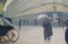
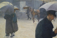
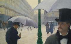
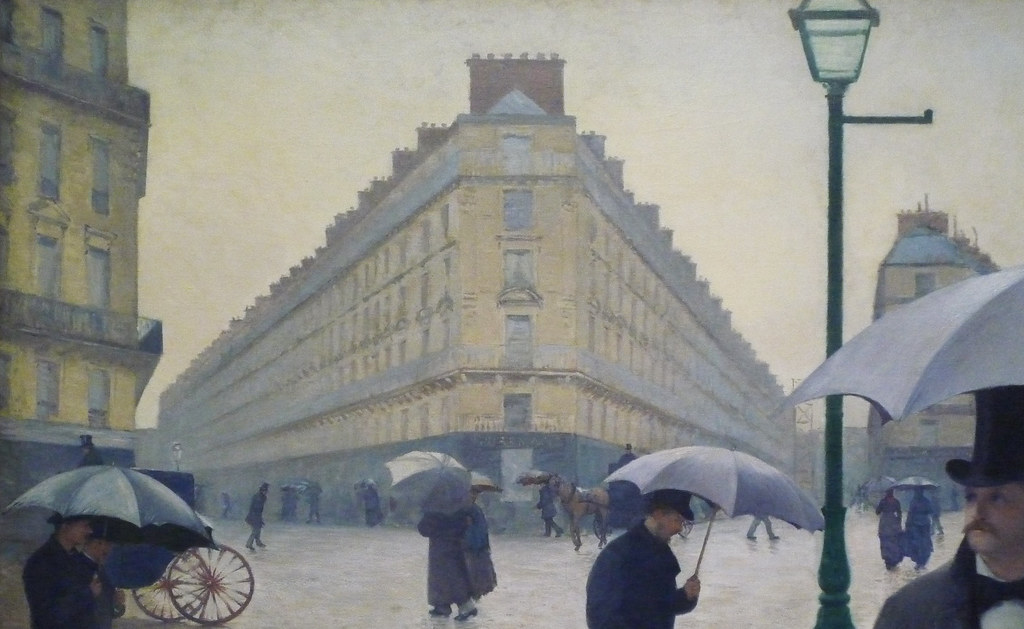
Also unlike the Realists, the Impressionists tended to paint middle class leisure rather than lower class labor. This is a somewhat surprising limitation. Living alongside affluent urban professionals and moving through the same streets were thousands of poor manual laborers. But when we examine a panoramic street scene such as Gustave Caillebotte’s Paris Street; Rainy Day—another view of a modern boulevard—it is surprising to note there is only one person on the street whose dress marks him as lower class and whose occupation signals active labor: a distant man carrying a ladder, easily overlooked just to the right of the foreground man’s head. The exceptions to this general rule that the Impressionists painted bourgeois leisure rather than lower-class labor actually help to prove the rule. Impressionist paintings that show lower-class labor tend to depict the support industries of middle-class leisure: café waiters, beer-hall waitresses, cabaret singers, ballet dancers, laundresses, milliners, and prostitutes (and not the labor necessary to maintain the infrastructure of the city and the basic needs of its inhabitants). Even the paintings of lower class labor are fundamentally about middle class leisure.
Additional resources:
T.J. Clark, The Painting of Modern Life: Paris in the Art of Manet and his Followers (Princeton University Press, 1999).
Robert Herbert, Impressionism: Art, Leisure, and Parisian Society (Yale University Press, 1991).
Impressionist color
by DR. KIM GRANT and DR. CHARLES CRAMER
Yellow, blue-gray, and violet skin
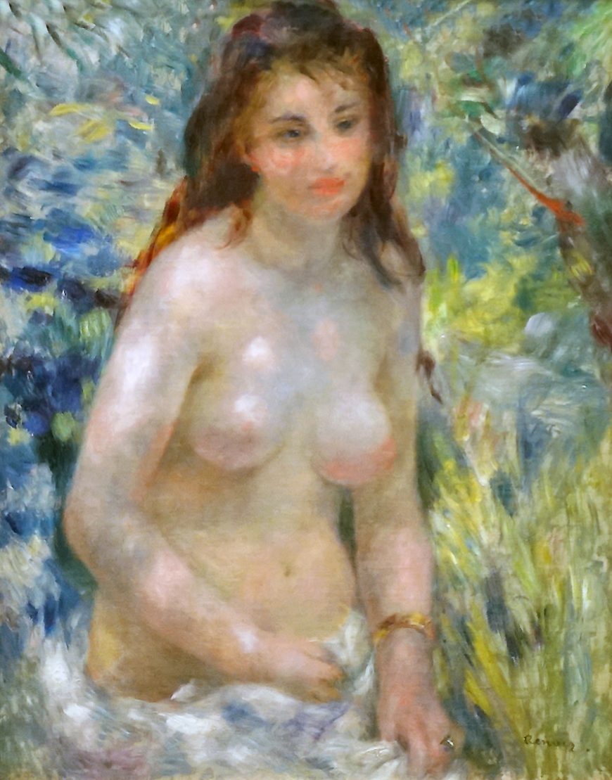
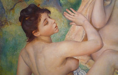
Renoir’s Study: Torso, effect of sun depicts a relatively traditional subject in a conventional three-quarters pose, but the color and brushwork is highly unusual by the standards of traditional naturalism. In addition to flesh tones, the model’s skin exhibits a striking range of colors, from peaches and yellows to pinks, blue-grays, and even violets; and the bit of white drapery covering her lap includes hastily brushed passages of blue and rose.
The critic Albert Wolff disparaged the use of color in this painting in graphic terms: “Try to explain to Renoir that a woman’s torso is not a mass of decomposing flesh with the purplish-green splotches that denote the final stages of putrefaction in a corpse!”
Wolff’s criticism stems from a common assumption that the use of color in painting can only be “local”—the actual color of the object as it would appear in neutral white light. Local color is the approach to color used in traditional art since the Renaissance.
Local color versus the color we perceive
In an earlier work of much the same subject (Bather with a Griffon Dog), Renoir’s approach to color is more in line with this tradition. The flesh of this nude is rendered in the peachy-orange flesh tones characteristic of ethnic Europeans, modeled in a smoothly gradated chiaroscuro from light to dark in order to define the volumes of the torso, limbs, and head. The other objects in the painting are also rendered in what we easily recognize as their local colors: the grass is green, the water is blue, the dress is white with dark stripes. All the objects are modeled in lighter and darker tones of their local colors in order to show volume and the direction and intensity of the light illuminating the scene.
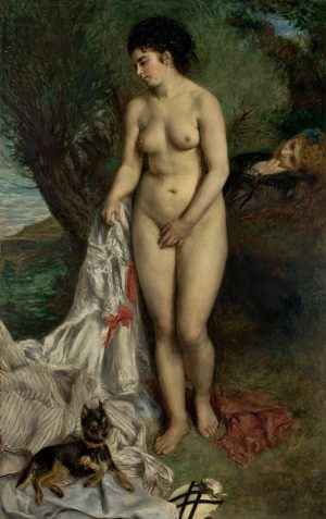
Renoir’s radical change in color usage in the later painting is related to the Impressionists’ interest in the divergence between the local color of the object and the color actually perceived by the eye under specific lighting and atmospheric conditions. Compare two identical pieces of white paper, one lit by a “soft white” light bulb (2700 Kelvin) and the other by a “daylight” light bulb (5000-6000K). The local color of the two pieces of paper is the same, but the perceived color is very different: the first will appear much more warm and yellow and the second more cool and blue-green because what is called the “color temperature” of the two sources of light is different. Newer LED lightbulbs are often labeled with how “warm” or “cool” (yellow-orange or blue-green) the light is, but this is not a novel technological phenomenon. The color temperature of light coming from the sun changes constantly during the day, in different seasons, and in different weather conditions, because of the angle of the sun and the amount and quality of atmosphere that the light is passing through.
The effect of lighting on the color of objects is sometimes very counter-intuitive. We would expect the shadow cast on a white object to be rendered in a shade of gray, since gray is a darker tone of the local color white. Renoir adheres to this expectation in rendering the shadows in the folds and pleats of the woman’s dress in his earlier painting. But in fact shadows cast on white objects are frequently blue.
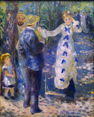
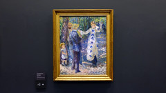
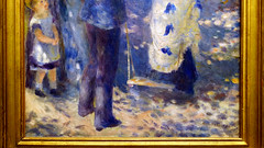
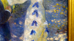
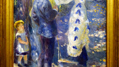
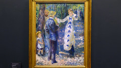
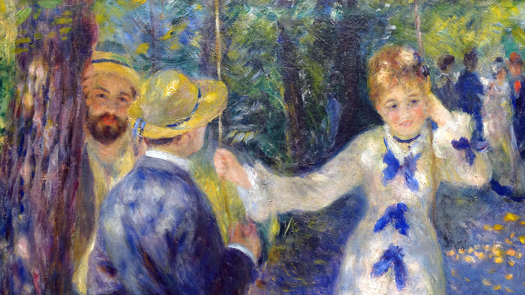
This effect is particularly noticeable when we observe fresh snow on a sunny day, but it is also clearly evident in Renoir’s The Swing (1876). Not only are the shadows on the woman’s white dress distinctly bluish in hue, but the path behind her in the dappled sunlight is rendered in hues of blue and orange so intense that you wouldn’t believe they could work. But they do because, in fact, our eyes are used to perceiving such odd effects: it is just that our brains typically ignore them. Once such variations come to our attention, it is easy to see them, and it would be inaccurate to suggest that the Impressionists were the first to notice these effects. However, where most previous artists had muted or rejected the effects of lighting on the color of objects as trivial accidents that did not contribute anything significant to the painting, many of the Impressionists—Monet and Renoir foremost among them—chose to seek out and emphasize such phenomena.

New techniques
This attention to the counter-intuitive, but observable, effects of different qualities of light on objects led the Impressionists to some novel technical practices that are clearly visible in their paintings:
First, they tended to paint en plein air, in the open air, rather than in the studio, because they needed to be able to observe colors outside the artificial setting of the studio. While earlier nineteenth-century landscape artists had established a practice of making sketches and even color studies outdoors, the Impressionists made this practice central to their work. Monet even famously asserted that he had no studio at all.
Second, where Academic artists tended to begin their paintings by covering the entire canvas with a medium-dark reddish-brown undercoating or “ground,” against which they would work up to lighter tones and down to darker ones, the Impressionists tended to paint on a light-colored ground. Because oil paint is semi-transparent, this light underpainting helped to intensify the brightness of the colors, allowing the Impressionists to produce works that look saturated in light.
Third, although color usage varies considerably among the Impressionists, it is generally true that they tended to avoid the dark earth colors such as umbers, siennas, and lamp black that had dominated the color palettes of traditional painting. They chose instead to render entire scenes in hues closer to the colors of the light spectrum: violet, indigo, blue, green, yellow, orange, and red, mixed with generous amounts of white. Walking chronologically through a museum, it is surprising how much more intense and colorful paintings become with Impressionism, after the very earthy colors found in so much Renaissance and Baroque art.
Fourth, the Impressionists tended to use what are called “complementary colors” next to one another, rather than mixing them. Complementary colors are opposite one another on a color wheel, such as red and green, violet and yellow, and blue and orange. If two complementary colors are mixed, they produce a dull brown or gray color. If, however, they are placed adjacent, they have the effect of intensifying one another: next to orange, blue appears brighter and more intense, and vice-versa. In his Autumn Effect at Argenteuil, Monet relies heavily on a complementary color scheme to create the intense luminosity of a clear fall day. Like painting on a light-colored ground, the use of complementary colors helped the Impressionists to increase the apparent brightness of their paintings.
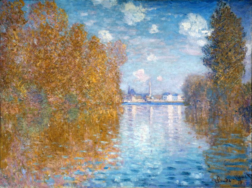
These technical innovations made Impressionist paintings look significantly different from the traditional naturalistic representations to which the public and critics were accustomed, hence the great suspicion with which the works were greeted when they were first exhibited. Nevertheless, contemporary art critics sympathetic to the Impressionists justified the artists’ use of color, like their rendering of space (see “Impressionist Pictorial Space”), as a more accurate representation of reality than the conventional naturalistic style that had hitherto been understood as objectively correct.
If it’s different, then it’s bad
In a salute to the realism of the new art, Theodore Duret castigated the public and critics of his day for clinging to false conventions, and praised the Impressionists for their meticulous and truthful observation of colors under specific lighting and atmospheric conditions:
The Impressionist sits on the river bank and depending on the condition of the sky, the angle of vision, the hour of the day, the calm or agitation of the atmosphere, the water takes on all colors. Unhesitatingly, he paints water with all these colors. . .the sun sets and darts its rays into the water, to fix these effects the Impressionist covers his canvas with yellow and red. Then the public starts to laugh.
Winter comes, the Impressionist paints snow. He sees that in sunlight the shadows cast on the snow are blue; unhesitatingly, he paints blue shadows. Now the public laughs harder. . . .Under the summer sun, in the reflections of green foliage, skin and clothing take on a violet hue, the Impressionist paints people under violet woods. Then the public flies into a complete rage; the critics shake their fists and call the painter “communist” and villain.
The poor Impressionist vainly protests his complete sincerity, declares that he only reproduces what he sees, that he remains faithful to nature; the public and critics condemn him. . . .For them only one thing matters: what the Impressionists put on their canvases does not correspond to what is on the canvases of previous painters. If it’s different, then it’s bad. [1]
In this passage, Duret refers to “blue” snow and “violet” tinted flesh, which sounds ridiculous when we think of the local color of those things. He justifies the Impressionists’ use of those seemingly inappropriate colors by asserting that the specific lighting conditions at the time transformed their appearances. It is not the Impressionists but the traditional critics and public who are at fault, for they have mistaken the conventions of past paintings for the truth of nature.
Notes:
[1] As quoted in Joel Isaacson, Claude Monet, observation and reflection (Phaidon, 1978), p. 11.
Additional resources:
Laura Anne Kalba, Color in the Age of Impressionism: Commerce, Technology, and Art (Penn State University Press, 2017)
Impressionist pictorial space
by DR. CHARLES CRAMER and DR. KIM GRANT

Modern Paris
Monet’s Boulevard des Capucines depicts one of the grand boulevards of Paris. The boulevard was designed by Baron Haussmann in the mid-19th century to cut through the tightly packed medieval center of the city. The unusually high viewpoint of the painting is taken from one of the new multistory, mixed-use commercial and apartment buildings that lined these boulevards. The painting is modern in the very simple sense that its subject would not have been possible fifty years earlier.
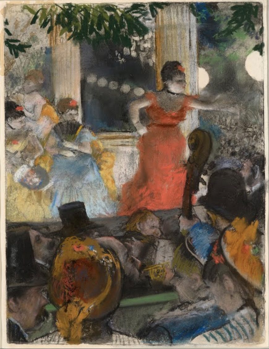
Similarly, Degas’s Café-Concert aux Ambassadeurs shows a scene in one of the new nightclubs for which Paris became famous in the late nineteenth century. Starting as occasional musical acts in what were called café-concerts, these nightclubs quickly evolved into massive cabarets, often with multiple stages, that included dance revues and acrobatics as well as large orchestras. Degas situates us in the crowded pit of one of these cabarets, looking through a forest of fancy hats and musical instruments at the performers on stage, who glow in the modern gas footlights. Both of these works typify the Impressionists’ exploration of the new spaces of Paris, as well as the new vantage points and ways of seeing that these spaces allowed.
A change in pictorial space
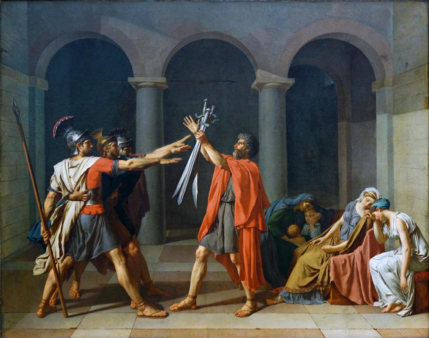
The Impressionists’ treatment of pictorial space was also often unusual. Traditional Academic artists tended to favor centered, closed, and balanced compositions such as David’s Oath of the Horatii, in which the action is carefully staged for the viewer at a measured distance back from the picture plane.
Although we can infer our viewpoint in Monet’s Boulevard des Capucines, it is unusual in that the artist gives us no clear place to stand in the work, and the orthogonal lines of the boulevard sweep off the right-hand side of the canvas, as though we were leaning perilously out a window or over a balcony railing. Similarly, Degas’s Le Café-Concert aux Ambassadeurs is remarkable for its failure to use any perspectival techniques to create space for its thicket of bodies, which emphasizes the sense of being jostled in the middle of a crowd.
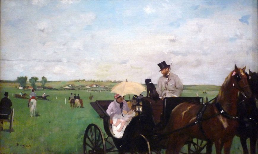
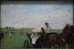
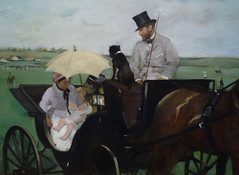
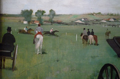
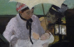
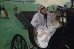
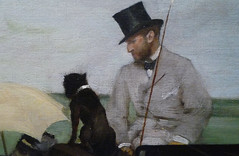
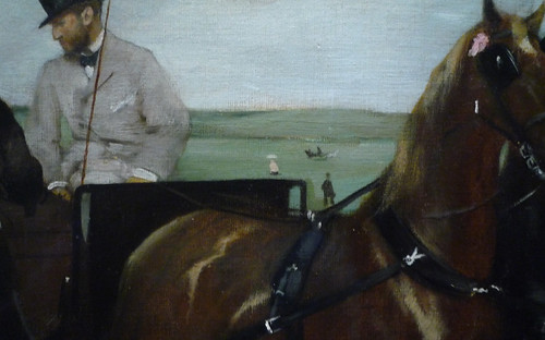
Even more unusual is Degas’s treatment of pictorial space in his painting At the Races in the Countryside, a scene set at one of the racetracks situated on the outskirts of Paris. The main focus of the work is obvious: the wet nurse and child, who are framed by the carriage door below and by a yellow parasol above, and who are the focus of attention of the child’s mother, the driver of the carriage (Paul Valpinçon, the child’s father), and their dog. This focal point is placed at the exact horizontal center of the canvas, as we might expect, but Degas appears to have achieved this placement at considerable cost to the rest of the composition. The work is egregiously unbalanced, the right hand side being crowded with heavy, dark shapes and the left hand side relatively light and empty. Furthermore, one of the horses is cropped awkwardly at the nose; the legs of both horses and the wheels of the carriage are abruptly truncated; and the carriage on the left, which is already leaning perilously to the right, has had its left supporting wheel cut off by the edge of the canvas. The work has the appearance of an amateur photographic snapshot, where subjects are frequently centered but little attention is paid to what is happening at the edges of the composition.
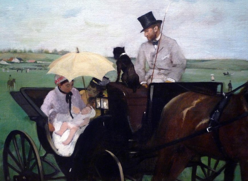
Unlike a photograph, however, a painting cannot be executed in a fraction of a second, and it would have been remarkably careless if Degas had trapped himself into this unbalanced composition and these odd truncations of the figures by beginning his work in the wrong place or at the wrong scale—or if, when he saw what was happening, he did not correct it. We must conclude that Degas actively sought the effects of imbalance and seemingly arbitrary cropping, no matter how unusual or awkward they may seem. Why? In a review of the second exhibition of the Société anonyme (1876), the critic Edmond Duranty justified these and similar violations of conventional pictorial space and carefully organized compositions by asserting their greater truth to lived visual experience:
People and things have a thousand ways of being unexpected in reality. Our point of view is not always in the middle of a room with two side walls receding toward the back wall; it does not always arrange the lines and angles of cornices with mathematical symmetry. . . .[One’s viewpoint] is sometimes very high, sometimes very low, sometimes it misses the ceiling, views objects from their undersides, unexpectedly cuts off the furniture. . . .
A man in a room or on a street is not always standing in a straight line at an equal distance from two parallel objects; he is likely to be situated on one side of the space. He is never in the center of the canvas or in the center of the setting. He is not always shown as a whole; sometimes he appears cut off at mid-leg, or half-length, or sliced longitudinally. Sometimes, one sees him very close-up, at full size, while very tiny, far back in the the distance appears a crowd in the street or groups assembled in a public place. [1]
Old systems fall apart and new ones take their place
Notice that Duranty justified the radical spatial and compositional effects of Impressionism by describing the new artists’ paintings as more accurate than the established conventions of academic painting. Our views as we move through the world are not always centered and balanced; nor does space always recede with the mathematical regularity typical of traditional academic paintings. The systematic perspectival techniques that had dominated Western art since the Italian Renaissance, and which had been formulated to help make paintings look more true to life, are revealed to be mere artifices. The type of argument Duranty employed becomes a commonplace not only of Impressionism but of other movements as well: surprising new pictorial effects, which at first sight appear to be errors, are justified as being more accurate than the established conventions of past art. In this way modern art can sometimes remind us that what we think of as “realistic” or “natural” really only describes the social and artistic conventions to which we are so habituated that we accept them without question.
Notes:
[1] As quoted in Linda Nochlin, Impressionism and Post-Impressionism, 1874-1904: Sources and Documents (Prentice Hall, 1966), p. 6.
Additional resources:
T.J. Clark, The Painting of Modern Life: Paris in the Art of Manet and his Followers (Princeton University Press, 1999).
Robert Herbert, Impressionism: Art, Leisure, and Parisian Society (Yale University Press, 1991).
Mary Tompkins Lewis, ed., Critical Readings in Impressionism and Post-Impressionism: An Anthology (University of California Press, 2007).
Japonisme
by DR. CHARLES CRAMER and DR. KIM GRANT
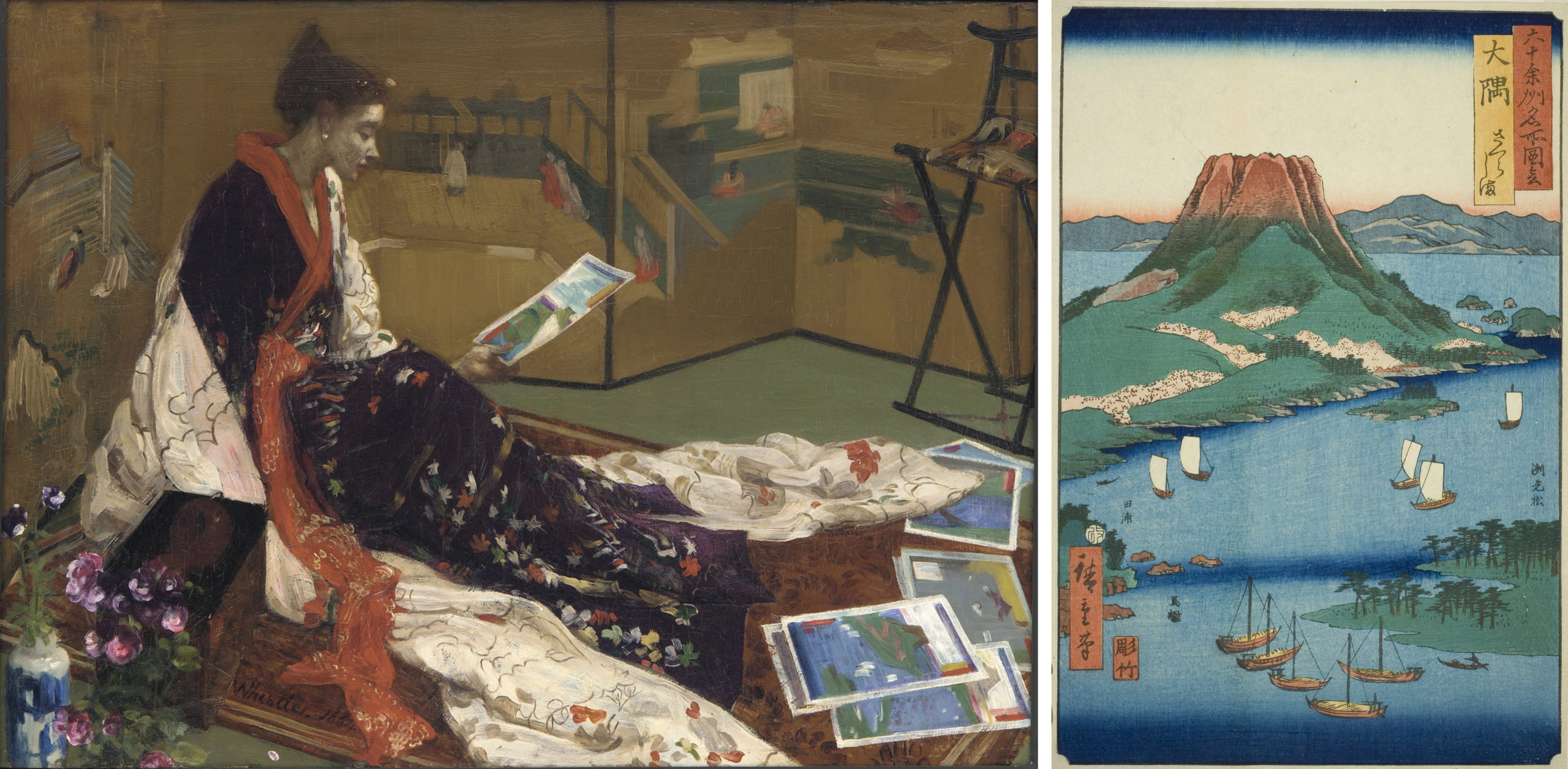
James McNeill Whistler’s Caprice in Purple and Gold is an early example of Japonisme, a term coined by the French art critic Philippe Burty in 1872. It refers to the fashion for Japanese art in the West and the Japanese influence on Western art and design following the opening of formerly isolated Japan to world trade in 1853. In Whistler’s painting, a European woman sits on the floor wearing richly embroidered silks like those of a Japanese courtesan while she studies a set of woodblock prints by the Japanese artist Hiroshige. Decorative objects from both Japan and China surround her, including a large gold Japanese folding screen.
A decorative art fashion
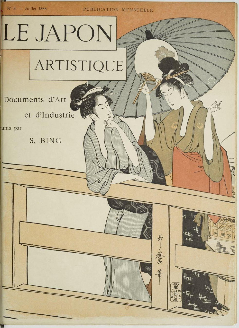
The late-nineteenth century Western fascination with Japanese art directly followed earlier European fashions for Chinese and Middle Eastern decorative arts, known respectively as Chinoiserie and Turquerie. The art dealer Siegfried Bing was one of the earliest importers of Japanese decorative arts in Paris. He sold them in his shop La Porte Chinoise, as well as promoting them in his lavish magazine Le Japon Artistique, published from 1888-1891. Bing was also a major supporter of Art Nouveau, a fin-de-siècle decorative style greatly influenced by Japonisme.
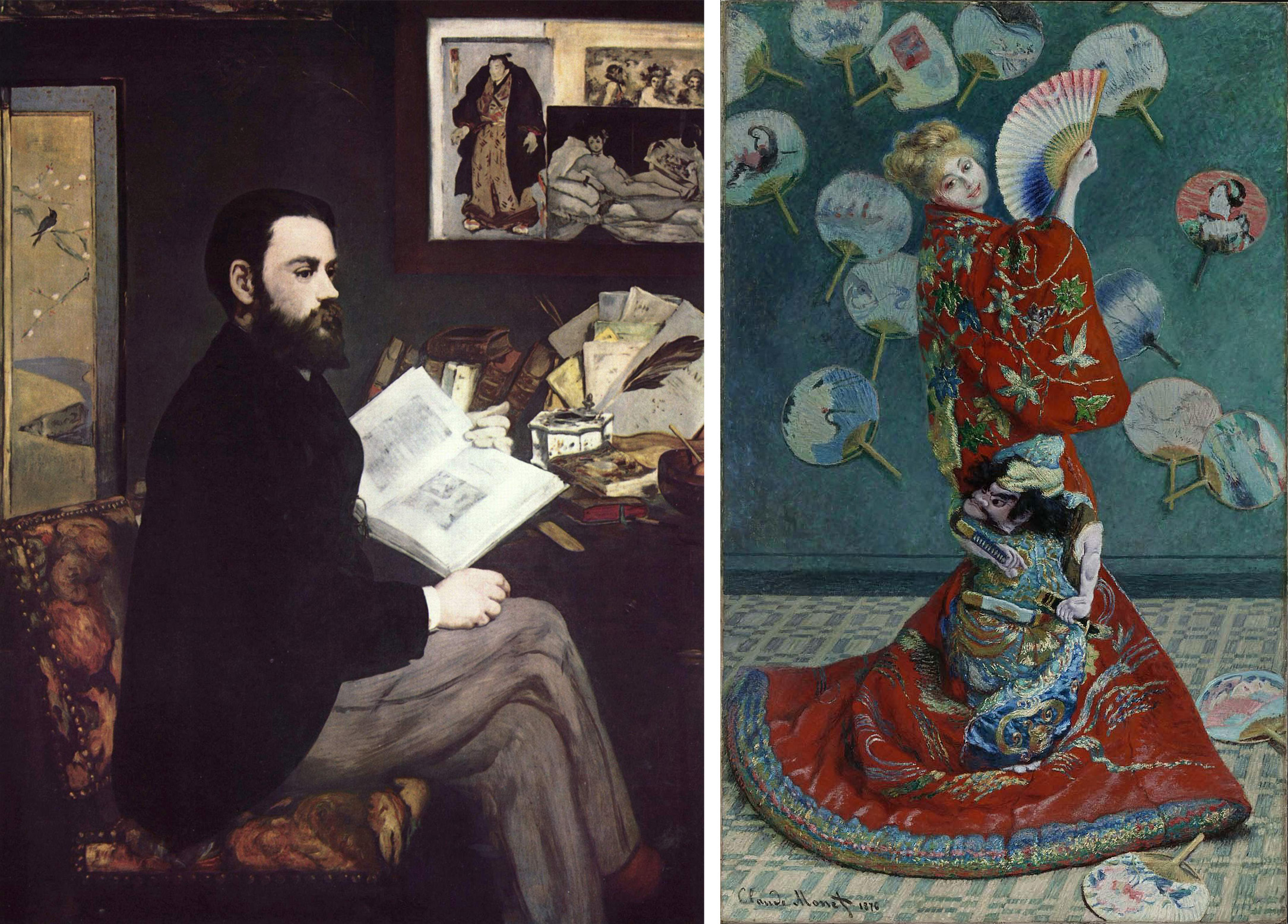
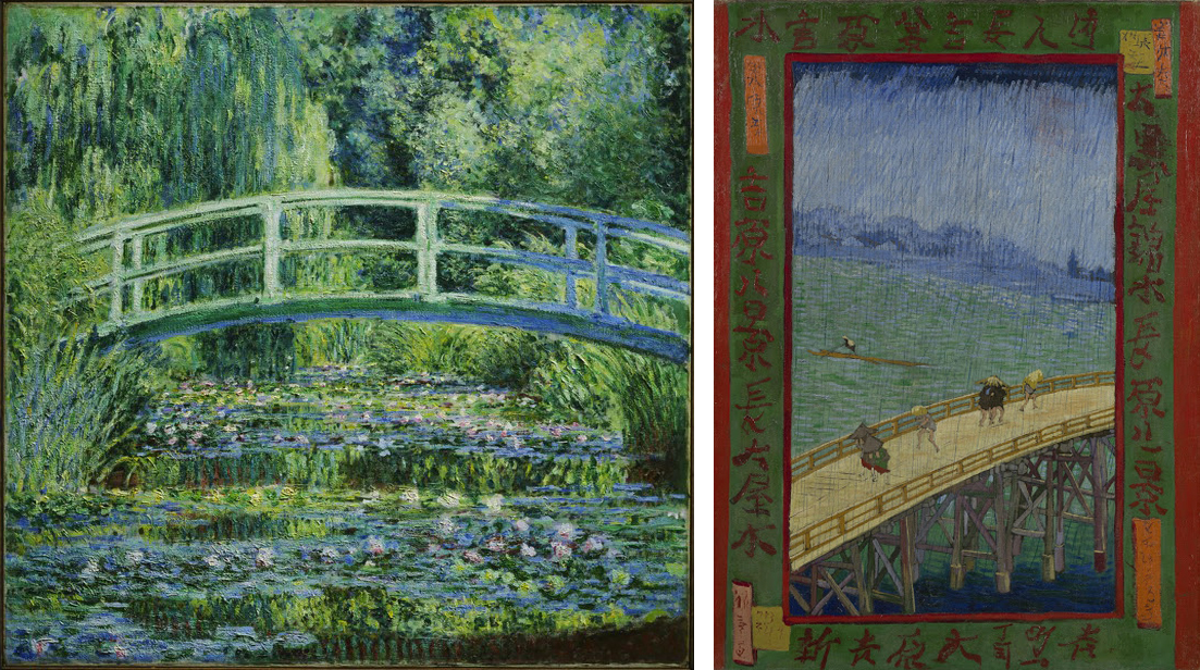
Works by prominent artists associated with Impressionism and Post-Impressionism bear witness to the late 19th-century fashion for Japanese art and decorative objects. In Manet’s portrait of Emile Zola the novelist and art critic sits at his overflowing desk. Immediately noticeable among the artworks surrounding him are a Japanese woodblock print of a wrestler and a Japanese gold screen. Monet portrayed his wife Camille dressed in a Japanese kimono surrounded by Japanese fans, and his water garden at Giverny was inspired by Japanese gardens depicted in prints and included a Japanese-style wooden bridge. In addition to painting copies of several Japanese woodblock prints, such as Bridge in the Rain (After Hiroshige), Vincent van Gogh depicted them in the background of several portraits.
A source for modern artists
Japonisme coincided with modern art’s radical upending of the Western artistic tradition and had significant effects on Western painting and printmaking. In this regard, Japanese art affected modern art in much the same way that encounters with African and Oceanic art and artifacts did a few decades later. Many late-19th century modern artists not only admired and collected Japanese prints, they derived and adopted both compositional and stylistic approaches from them.
Japanese woodblock prints called ukiyo-e, or “pictures of the floating world,” were a cheap popular art form in Japan during the Edo Period (1615-1868). They were associated with urban entertainment districts (the so-called floating world) in Japan and typically portrayed famous actors, courtesans, and wrestlers, as well as landscape views of well-known sites. Ukiyo-e prints first appeared in Europe as packaging material used to protect valuable imported porcelain objects, but they attracted the interest of European artists and art collectors and were soon imported for their own sake.
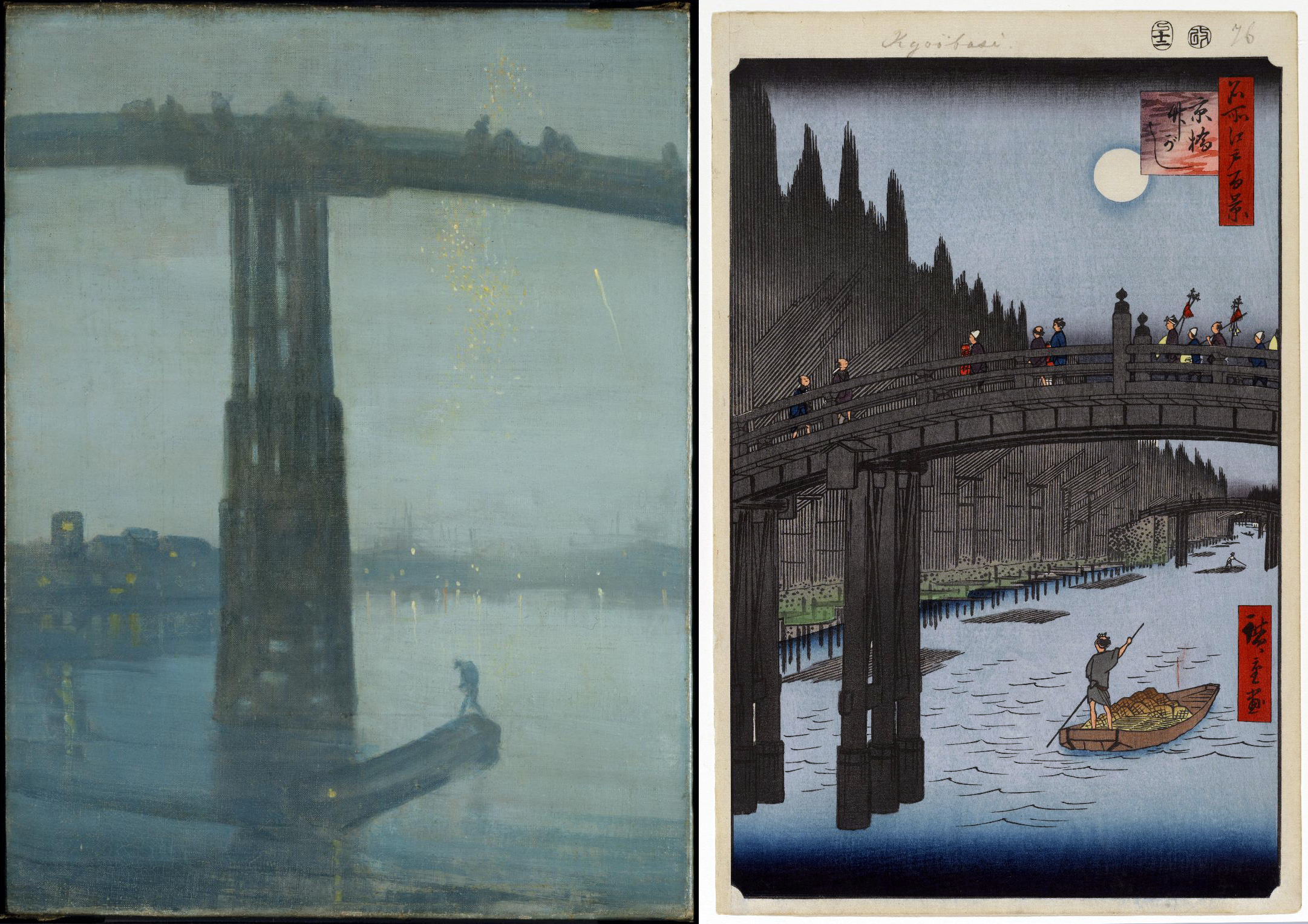
In addition to depicting Japanese decorative objects, Whistler used both subjects and compositional strategies derived from Hiroshige’s prints of notable views in Japan. One of his most innovative and well-known paintings, Nocturne in Blue and Gold: Battersea Bridge, echoes Hiroshige’s Kyobashi Bridge in both its nighttime subject and the abruptly cropped view of the bridge in the foreground. The large areas of flat colors typical of Japanese woodblock prints may also have influenced Whistler’s simplified forms and reduced color range.
Impressionism
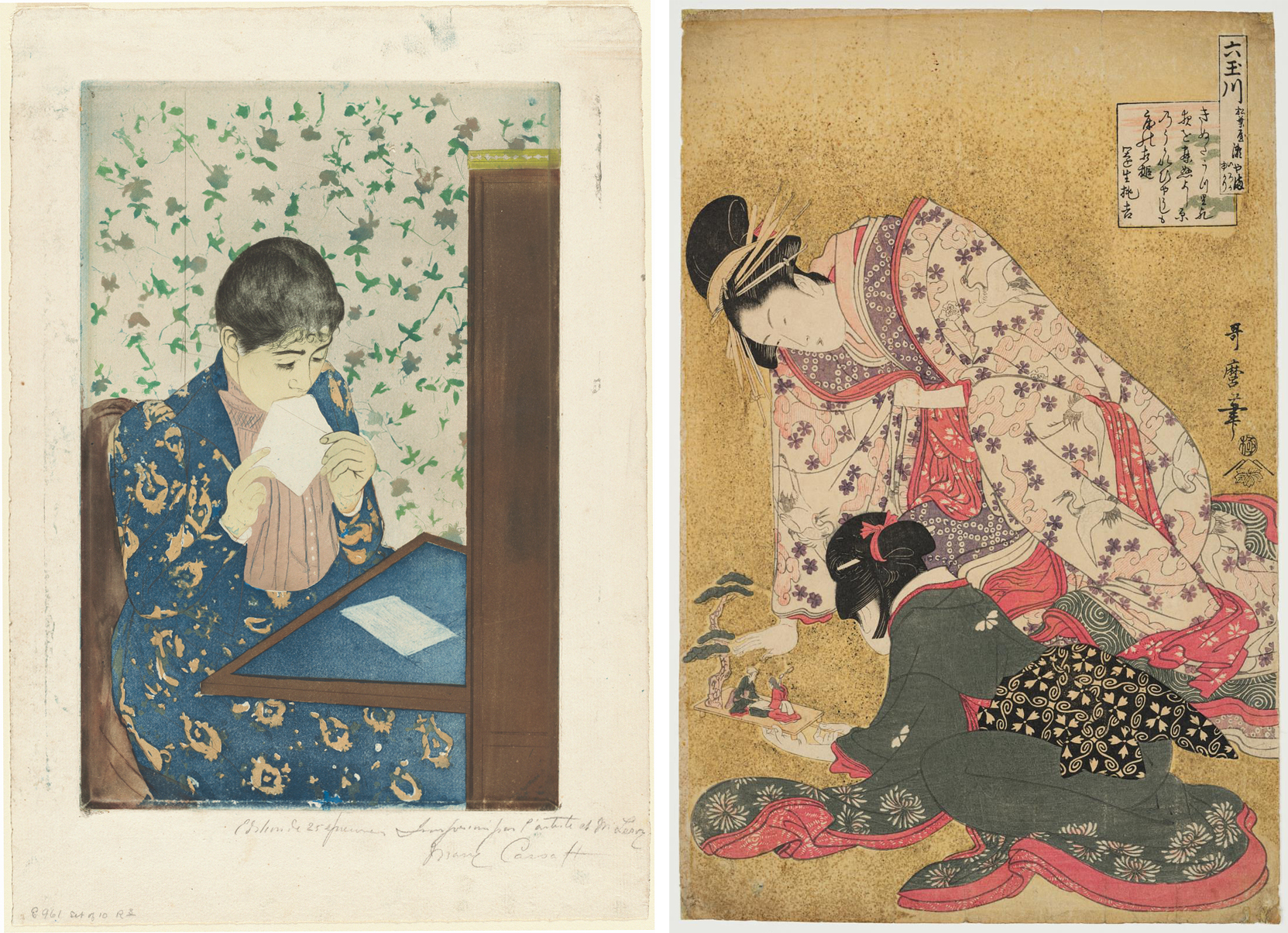
The Impressionists were also interested in Japanese prints. After visiting an 1890 exhibition of ukiyo-e prints in Paris, Mary Cassatt employed similar decorative patterns, flattened spaces and simplified figures in a series of color etchings that includes The Letter. Cassatt’s favored subjects, women in domestic interiors playing with children or grooming themselves, were common in ukiyo-e prints, a fact that undoubtedly contributed to her interest in them.
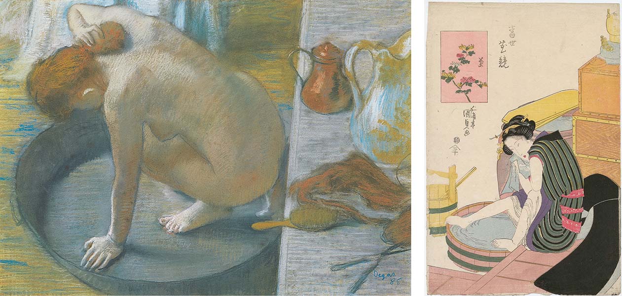
Cassatt’s friend Edgar Degas used Japanese compositional devices to depict women bathing. In The Tub a woman sponging her neck is shown from an elevated vantage point that emphasizes the flat shapes and patterns created by her body and the surrounding objects. The curve of the tub is continued in the woman’s back, while the vertical of her left arm parallels the edge of the shelf on the right side of the painting. Thus, although Degas uses traditional chiaroscuro shading to define three-dimensional forms, abstract pattern and surface design dominate the image, flattening the space and rendering it ambiguous.
Like Degas’ The Tub, Kunisada’s Chrysanthemum shows a bathing woman surrounded by ordinary household objects — note the water heater and scrub brush in the upper right corner. Although the viewing angle is not as high as that in Degas’ work, we see the woman from above, and Kunisada uses the space and objects surrounding her to construct a visual frame for the figure rather than clearly defining an interior space. The repetition of colors and simplified shapes creates a strong surface pattern, as does the lack of chiaroscuro shading.
Post-Impressionism
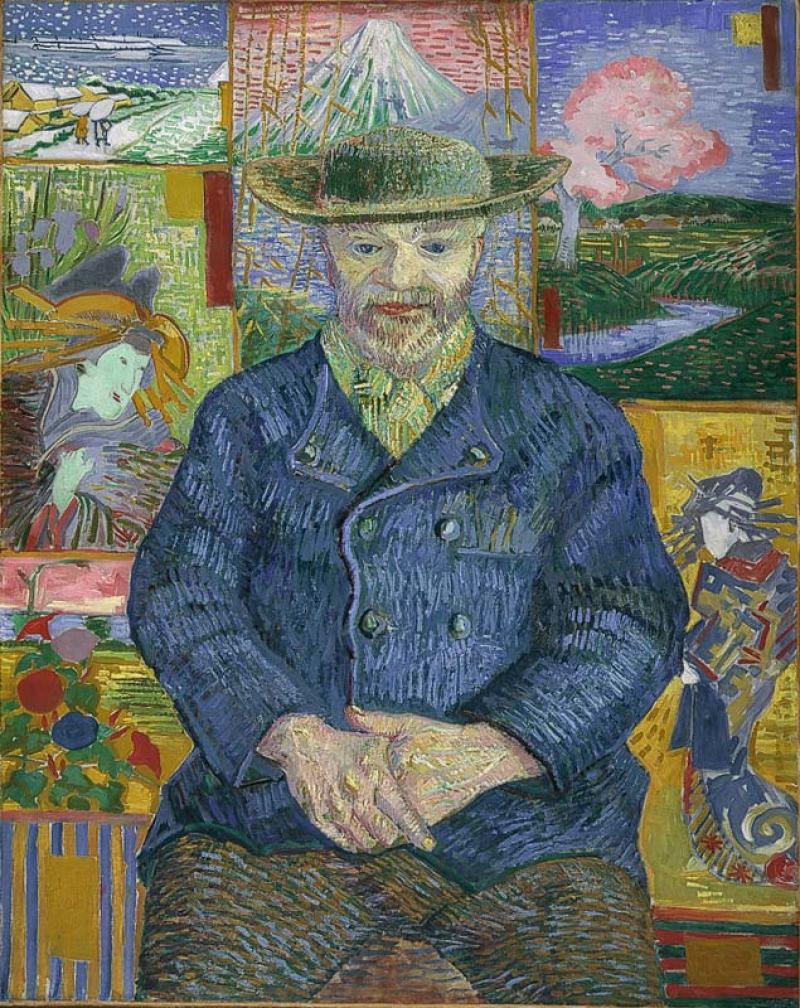
Among the Post-Impressionists, van Gogh was especially passionate about Japanese art and traditions, although his understanding of Japanese culture was limited and often more personal fantasy than based on real knowledge. He amassed a collection of hundreds of Japanese prints, and they influenced the development of his style, notably his vivid colors, simplified planar forms, and use of decorative surface patterns. In 1888 he wrote his brother Theo, “All my work is based to some extent on Japanese art . . ..”
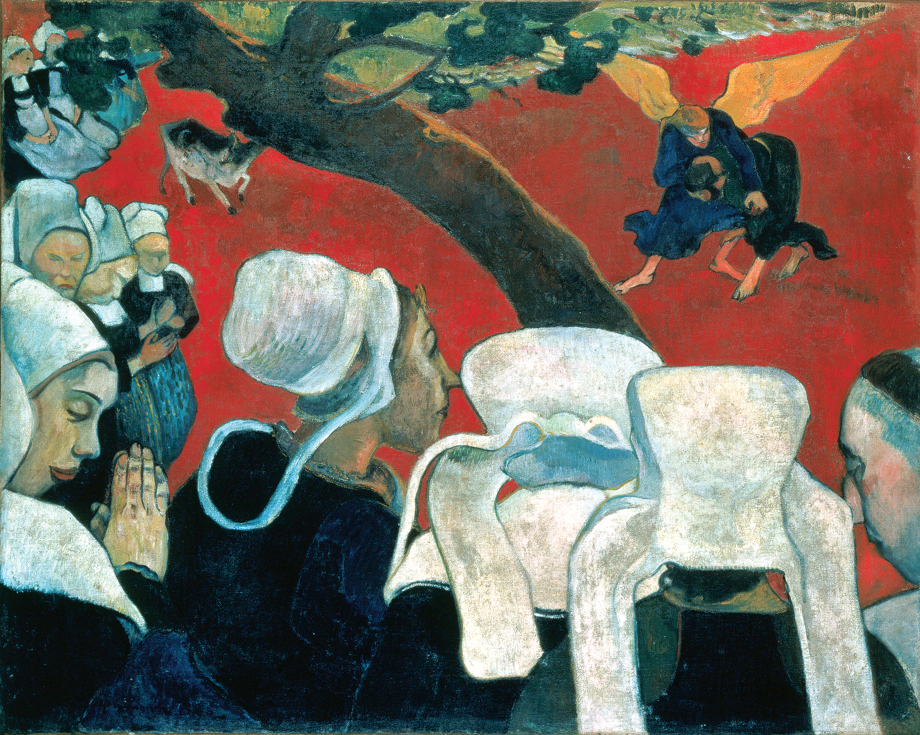
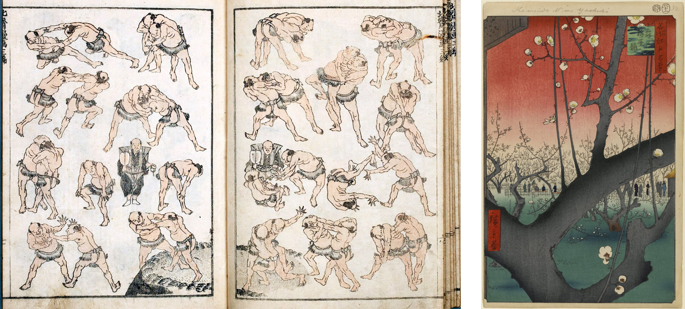
Gauguin borrowed directly from Japanese art early in his eclectic and wide-ranging embrace of non-Western cultures and art forms. The bright colors and flat forms of his cloisonnist paintings were greatly indebted to Japanese prints. In Vision after the Sermon Gauguin used two specific Japanese sources. The figures of Jacob and the angel in the upper right are derived from Hokusai’s prints of sumo wrestlers, while the overall composition with its flat red ground and abruptly arcing tree branch echoes Hiroshige’s woodblock print of a blossoming plum tree, a print van Gogh also copied.
Decorative approaches
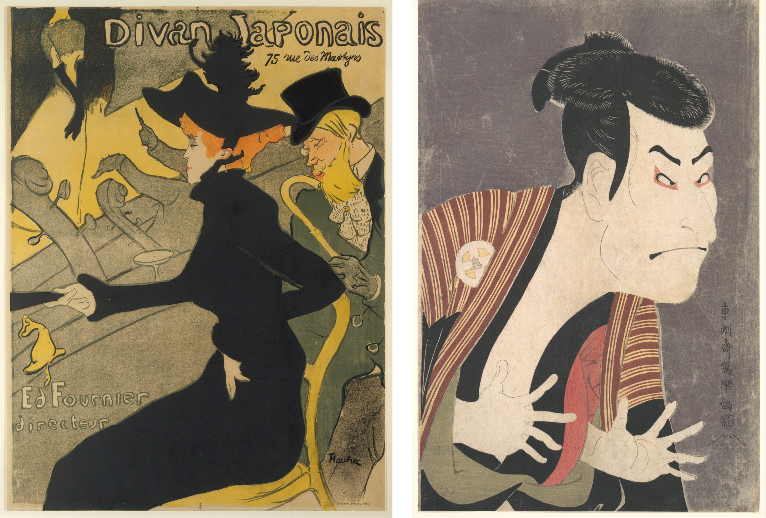
Like many artists associated with Art Nouveau, Henri de Toulouse-Lautrec was greatly affected by Japanese art and design. His posters, such as the one for a café-concert club called Divan Japonais, show the strong influence of Japanese prints of Kabuki actors in their flat forms, powerful contour design, and dramatic use of black shapes. Unlike the paintings we have looked at thus far in this essay, Toulouse-Lautrec’s posters served a similar role to that of the Japanese woodblock prints; they were a cheap, mass-produced form of publicity for the entertainment industry.
The Nabis, a group of French Post-Impressionist artists affiliated with both Pont-Aven and Symbolism, were great admirers of Japanese art. They were dedicated to the decorative arts and closely associated with Siegfried Bing’s gallery Maison de l’Art Nouveau. In addition to creating paintings, they designed many decorative objects including folding screens and stained glass windows.
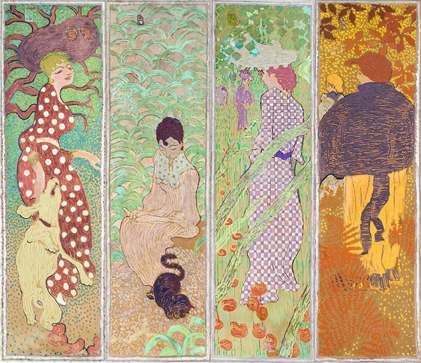
Pierre Bonnard, the most Japanese-influenced of the group, painted a set of four narrow vertical panels, initially intended to be part of a Japanese-style folding screen, showing women in stylized garden settings. The subject as well as the detailed patterns and flat decorative forms were directly inspired by Japanese prints and painted screens. His later paper lithograph screen, Nannies’ Promenade, is even more noticeably influenced by Japanese design in its diagonal composition and its use of a restricted color range and patterned silhouettes on an expanse of white paper.
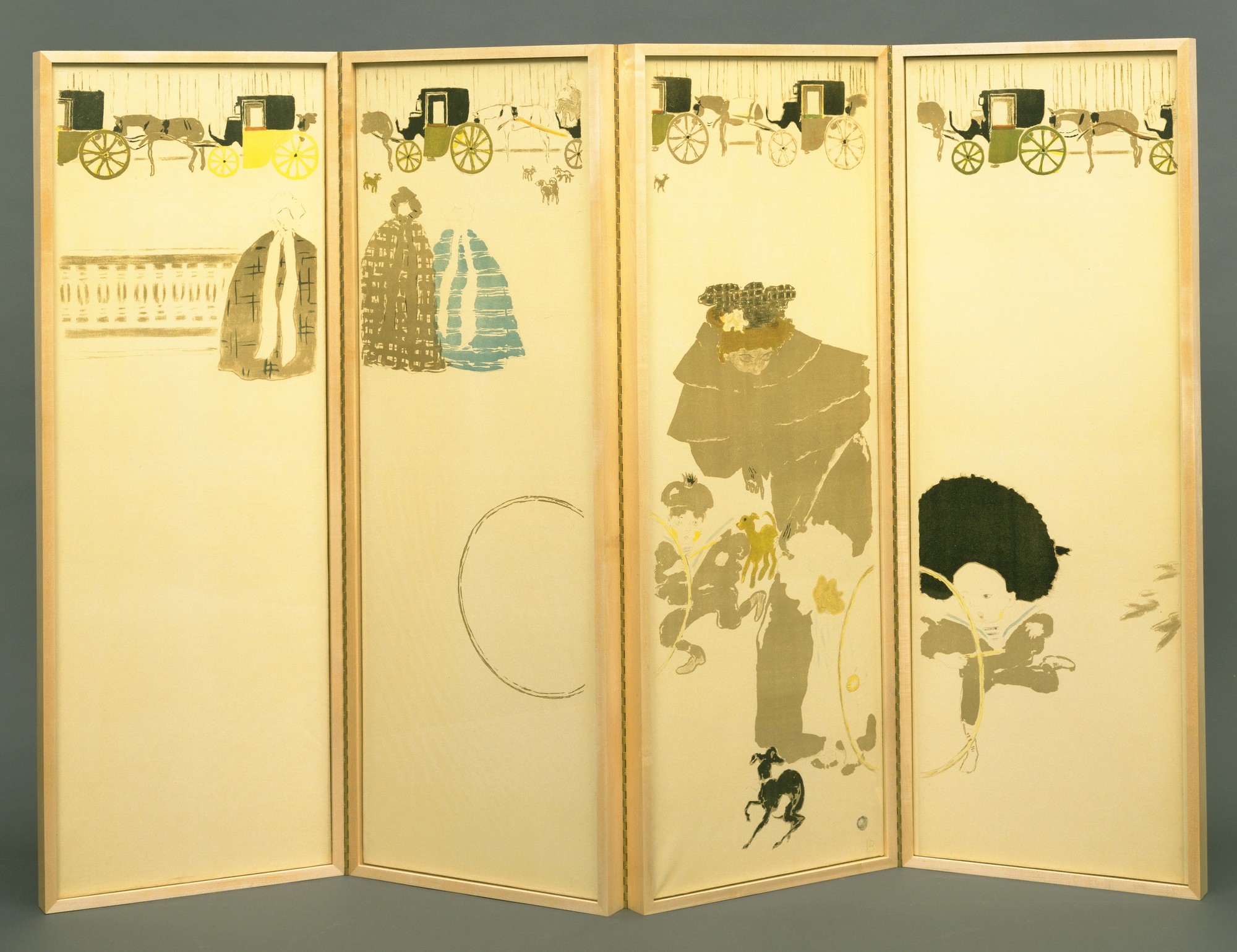
Japanese art had significant effects on both Western decorative arts and the evolution of new artistic styles associated with Modern art. The distinctive qualities of Japanese art — decorative use of color, surface patterning, and asymmetrical compositions — offered striking new approaches to modern artists developing alternatives to the Western tradition of naturalistic representation.
Additional resources:
Looking east: how Japan inspired Monet, Van Gogh and other Western artists
by ASIAN ART MUSEUM
Video \(\PageIndex{1}\): Video from the Asian Art Museum.
Edgar Degas
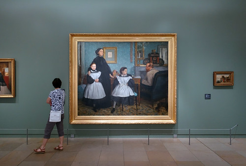
Edgar Degas, The Bellelli Family
by DR. BETH HARRIS and DR. STEVEN ZUCKER
Video \(\PageIndex{2}\): Edgar Degas, The Bellelli Family, 1858-67, oil on canvas, 78-3/4 x 98-1/2″, 200 x 250 cm (Musée d’Orsay, Paris)
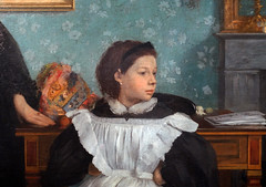
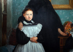
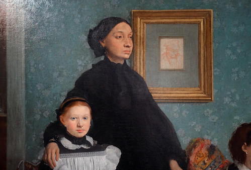
Degas was in his mid-twenties when he painted this canvas. It depicts, from left to right, the ten-year-old Giovanna; her mother (and the artist’s paternal aunt) Laura; her younger daughter, Giula, age 7; and the Baron Gennaro Bellelli. Preperatory sketches for the painting may have been made in Florence where the family was living—the Baron had been exiled from Naples. The picture may have been completed in Paris.
Smarthistory images for teaching and learning:
Edgar Degas, At the Races in the Countryside
by DR. STEVEN ZUCKER and DR. BETH HARRIS
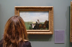
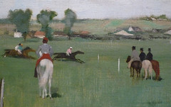
Video \(\PageIndex{3}\): Edgar Degas, At the Races in the Countryside, 1869, oil on canvas, 36.5 x 55.9 cm / 14-3/8 x 22 inches (Museum of Fine Arts, Boston)
Smarthistory images for teaching and learning:

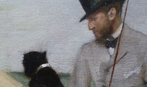
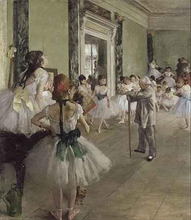
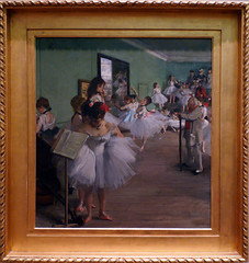
Edgar Degas, The Dance Class
by DR. STEVEN ZUCKER and DR. BETH HARRIS
Video \(\PageIndex{4}\): Edgar Degas, The Dance Class,, 1874, oil on canvas, (Metropolitan Museum of Art, New York)
Smarthistory images for teaching and learning:

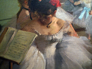
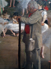
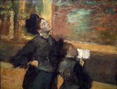
Edgar Degas, Visit to a Museum
by DR. STEVEN ZUCKER and DR. BETH HARRIS
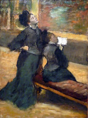
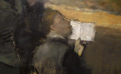
Video \(\PageIndex{5}\): Edgar Degas, Visit to a Museum, c. 1879–90, oil on canvas, 91.8 x 68 cm / 36-1/8 x 26-3/4″ (Museum of Fine Arts, Boston)
Smarthistory images for teaching and learning:
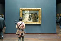
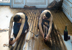
Gustave Caillebotte
Gustave Caillebotte, The Floor Scrapers (Les raboteurs de parquet)
by DR. PARME GIUNTINI and DR. ROBERT SUMMERS
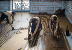
Video \(\PageIndex{6}\): Gustave Caillebotte, The Floor Scrapers (Les raboteurs de parquet), 1875, oil on canvas, 102 x 146.5 cm (Musée d’Orsay, Paris). This video was made in cooperation with Otis College of Art and Design.
Smarthistory images for teaching and learning:

Gustave Caillebotte, Paris Street; Rainy Day
by DR. STEVEN ZUCKER and DR. BETH HARRIS
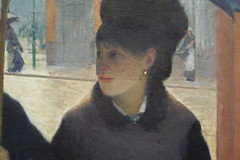
Video \(\PageIndex{7}\): Gustave Caillebotte, Paris Street; Rainy Day, 1877, oil on canvas 83-1/2 x 108-3/4 inches (212.2 x 276.2 cm) (The Art Institute of Chicago)
Smarthistory images for teaching and learning:

Gustave Caillebotte, Man at his Bath
by DR. PARME GIUNTINI and DR. ROBERT SUMMERS
Video \(\PageIndex{8}\): Gustave Caillebotte, Man at his Bath, 1884, oil on canvas, 57 x 45″ / 144.8 x 114.3 cm, (Private Collection, on loan to the National Gallery, London). This video was produced in cooperation with Otis College of Art and Design.
Berthe Morisot
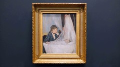
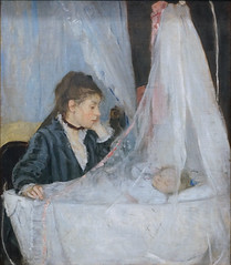
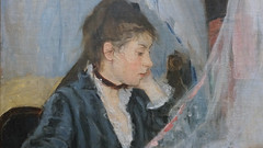
Berthe Morisot, The Cradle
by DR. BETH HARRIS and DR. STEVEN ZUCKER
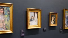
Video \(\PageIndex{9}\): Berthe Morisot, The Cradle, 1872, oil on canvas, 56 x 46 cm (Musée d’Orsay, Paris)
Smarthistory images for teaching and learning:
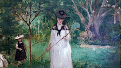
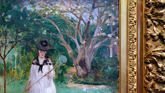
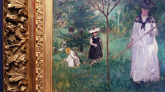
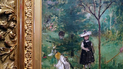
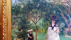
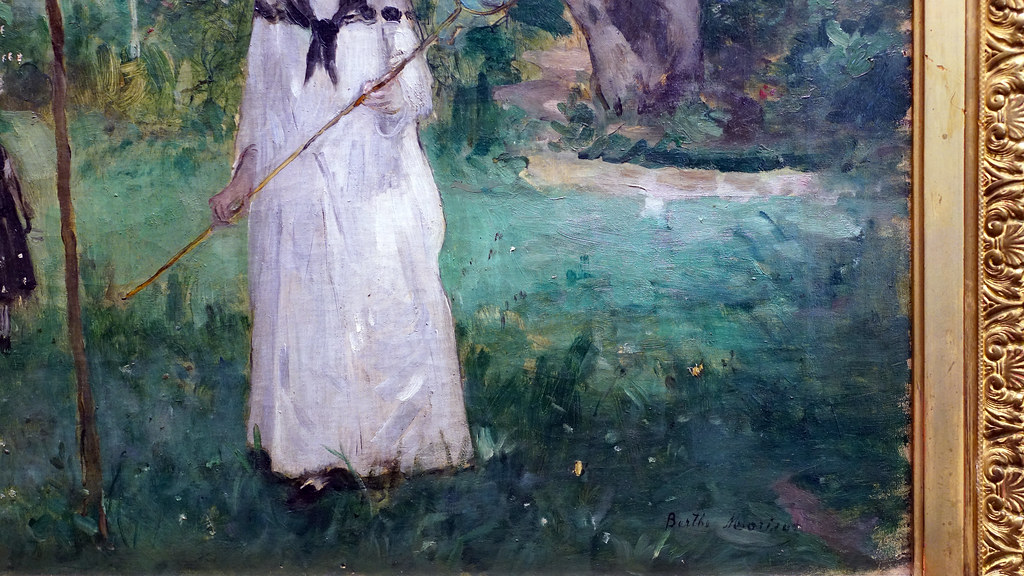
A summer day in Paris: Berthe Morisot’s Hunting Butterflies
by DR. BETH HARRIS and DR. STEVEN ZUCKER
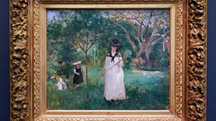
Video \(\PageIndex{10}\): Berthe Morisot, Hunting Butterflies, 1874, oil on canvas, 46 x 56 cm (Musée d’Orsay, Paris).
Smarthistory images for teaching and learning:

Pierre-Auguste Renoir
How to recognize Renoir: The Swing
by DR. BETH HARRIS and DR. STEVEN ZUCKER
Video \(\PageIndex{11}\): Pierre Auguste Renoir, The Swing (La balançoire), 1876, oil on canvas, 92 x 73 cm (Musée d’Orsay, Paris)
Speakers: Dr. Beth Harris and Dr. Steven Zucker
Smarthistory images for teaching and learning:
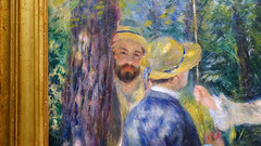

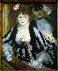
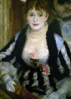
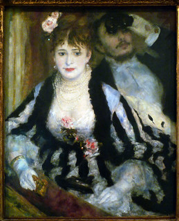
Auguste Renoir, La Loge
by DR. BETH HARRIS and RACHEL ROPEIK
Video \(\PageIndex{12}\): Auguste Renoir, La Loge, 1874, oil on canvas, 31 1/2 x 24 5/8″ / 80 x 63.5 cm (Courtauld Gallery, London)
This painting was exhibited by Renoir at the first Impressionist exhibition in Paris (1874).
Smarthistory images for teaching and learning:
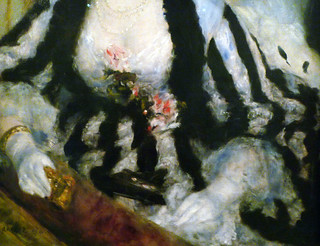
Auguste Renoir, The Grands Boulevards
by DR. STEVEN ZUCKER and DR. BETH HARRIS
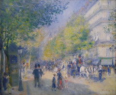
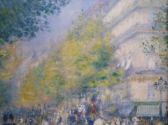
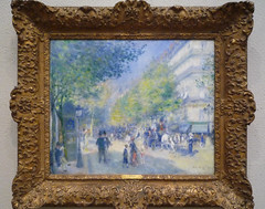
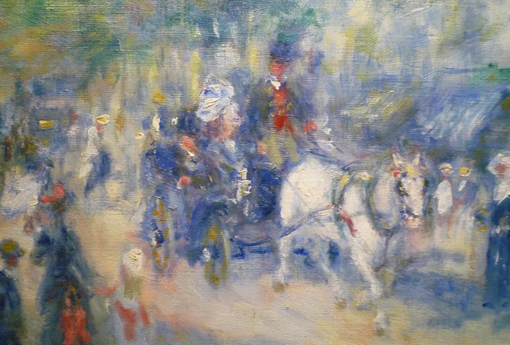
Video \(\PageIndex{13}\): Auguste Renoir, The Grands Boulevards, 1875, oil on canvas, 20-1/2 x 25″ / 52.1 x 63.5 cm (Philadelphia Museum of Art)
Smarthistory images for teaching and learning:

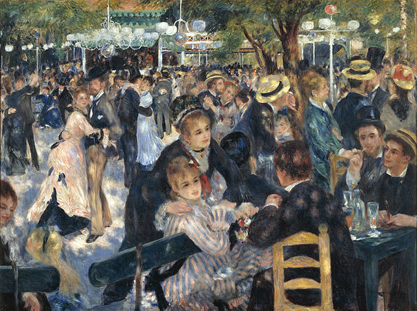
Auguste Renoir, Moulin de la Galette
by DR. STEVEN ZUCKER and DR. BETH HARRIS
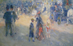
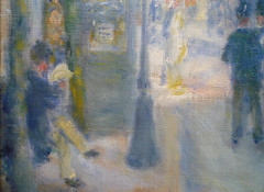
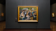
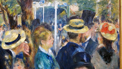
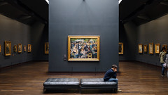
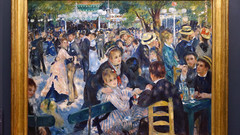
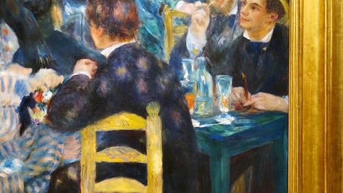
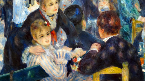
Video \(\PageIndex{14}\): Pierre-Auguste Renoir, Moulin de la Galette, 1876, oil on canvas, 51 1/2 x 68 7/8 in. (131 x 175 cm), (Musée d’Orsay, Paris)
Smarthistory images for teaching and learning:
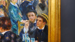
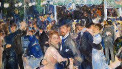
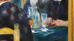
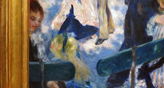
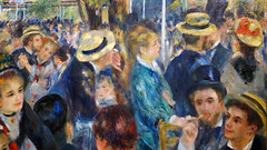
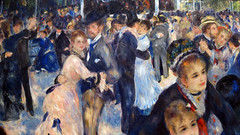
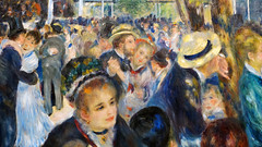
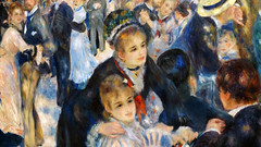
Pierre-Auguste Renoir, Portrait of Madame Charpentier and Her Children
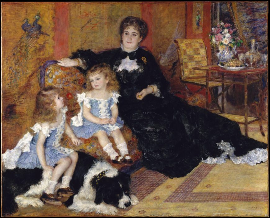
What do clothes reveal about the wearer?
When artists like Pierre-Auguste Renoir painted portraits of real people, their work became embedded with clues about cultural beliefs at a particular moment in time — including notions of beauty, propriety, status, and gender. In this portrait by Renoir, the artist captured the likeness of Madame Charpentier with her two children in an intimate setting within the family’s elegant Parisian townhouse.
This work is one of several commissioned by Georges Charpentier, an influential publisher and an early collector of Renoir’s work. In this portrait, Renoir depicts Marguérite Charpentier seated on a richly patterned settee alongside her two children and the family’s large Newfoundland dog in a small room filled with precious objects including Japanese screens, crystal and porcelain. Renoir’s palette is lush and his brushwork confident; the careful composition with its strong diagonals invites the viewer into this private space.
Gender and status
This large-scale work received favorable reviews when it was exhibited in a prominent position at the Salon of 1879 in Paris, and Renoir later acknowledged the efforts of Madame Charpentier in helping him gain subsequent portrait commissions. However, in the decades after its initial reception, viewers have often been surprised to learn that one of the children is a boy, since both children are dressed alike. This essay analyzes the garments and accessories worn by Madame Charpentier and her children as markers of status and gender at that time in history. Gender —the cultural construction of identity that distinguishes man from woman and boy from girl —is typically represented through the fashioning of the body, including the clothing and accessories, the styling of the hair and the wearing of makeup or other body modifications.
The fashionable Parisienne
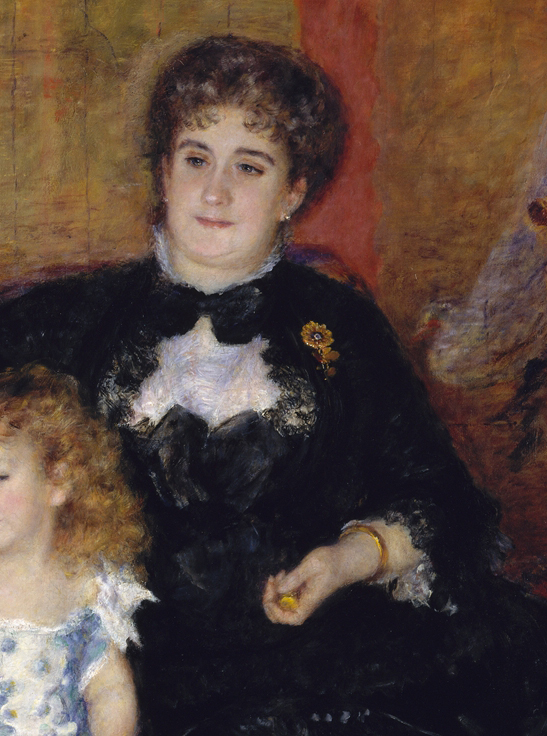
In this portrait, Madame Charpentier is dressed in a long-sleeved black silk afternoon dress expansively trimmed with lace. Each element of her dress is indicative of her stature as the wife of a wealthy man.
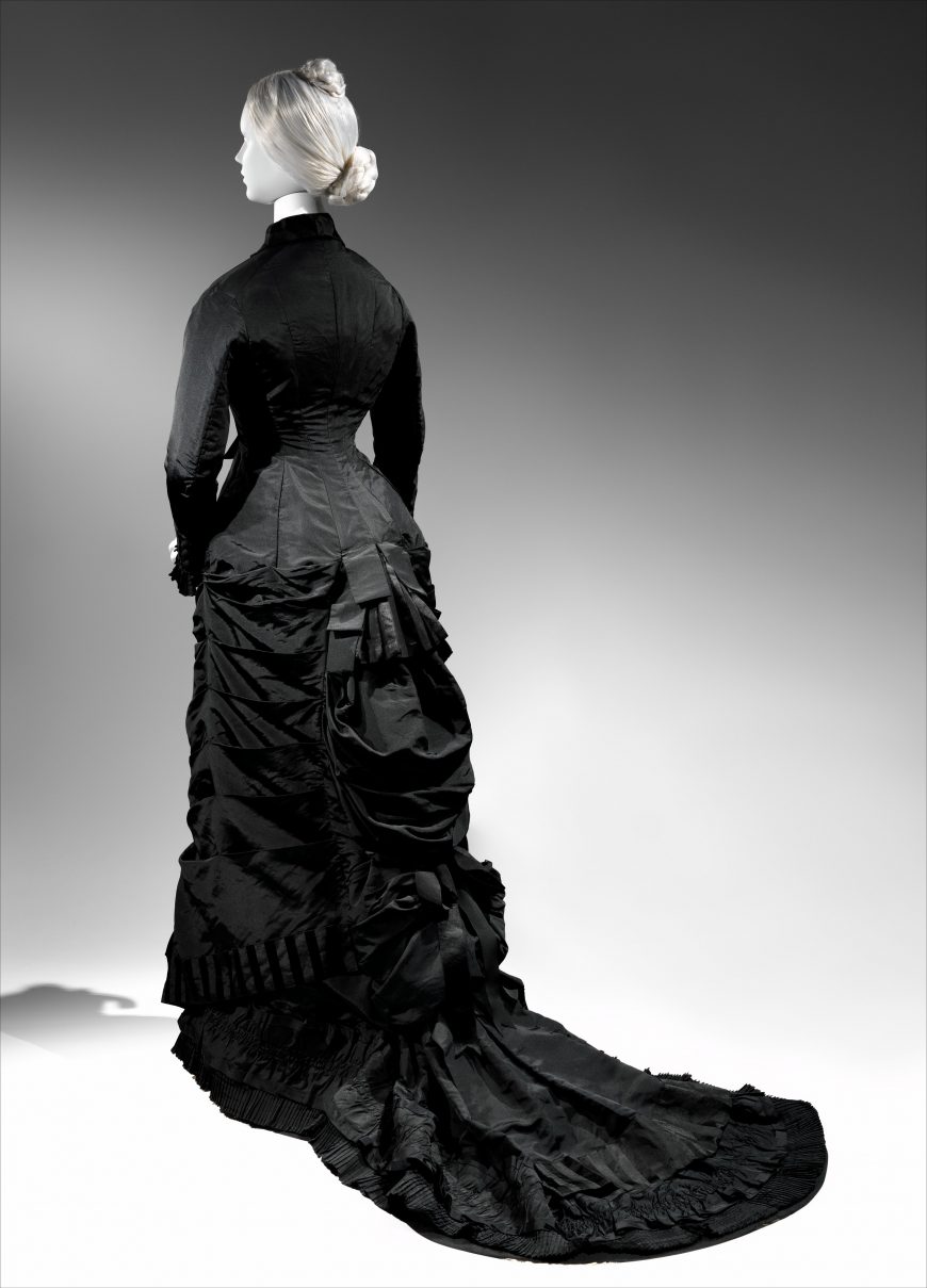
Her close-fitting dress is floor length, with a train that pools on the floor beside her to reveal her white ruffled underskirt. The dress has no bustle, but rather is flat-backed; this style of dress was in fashion for a brief interval of two or three years towards the end of this decade, and this small detail marks the wearer as a close follower of fashion.
Marguerite has added several pieces of jewelry to her ensemble to signal the family’s wealth, including pearl earrings, a daisy brooch pinned to her left shoulder, two heavy gold bangles on both wrists, and several rings on her fingers.
The color of the dress signals chic, rather than mourning; black was a fashionable color for an elegant afternoon dress that would be worn to receive visitors or go visiting in one’s social circle. Madame Charpentier was known for her sophisticated literary salons in which she entertained writers like Flaubert and Zola, and this formal daywear dress would be suitable for just such a gathering. Similar dresses from 1878 can be found in museum collections, and an example is shown below.
Dressing children in the nineteenth century
In Renoir’s portrait, the children — Georgette, age six, and Paul, age three — are dressed in identical sleeveless, open-neckline, dropped-waist short dresses made of pale blue moiré silk trimmed with white silk. Both children have similar hairstyles with shoulder-length wavy hair. The only discernible difference in their attire is their footwear; Georgette wears shoes with a small heel, while Paul wears flat shoes with a mid-foot strap. These children, dressed alike in their expensive and elegantly trimmed silk frocks, are fashionable accessories for their elegant mother.
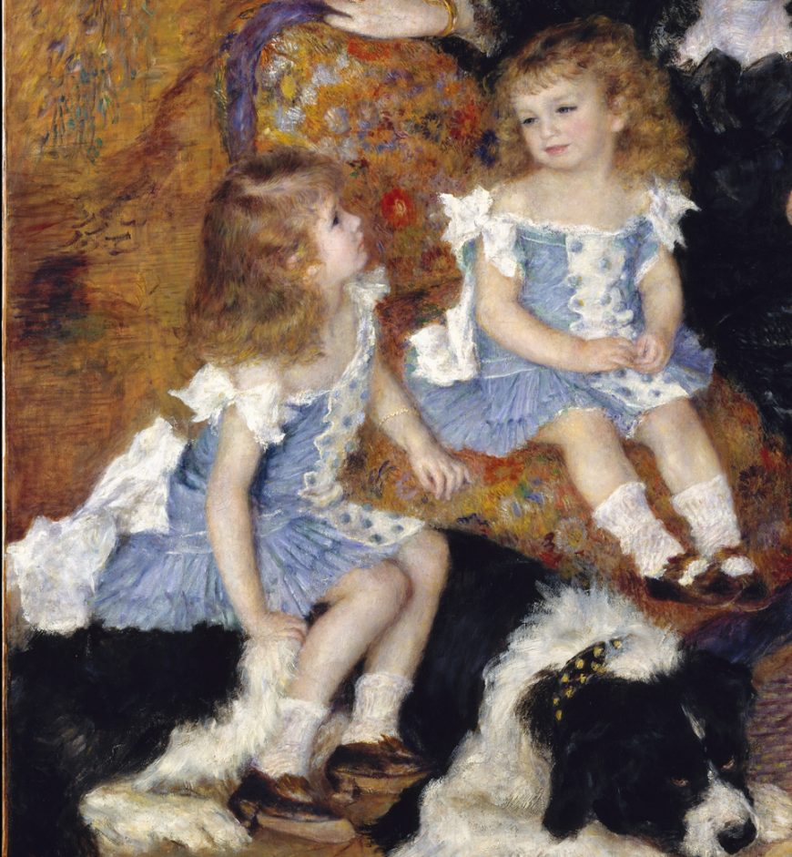
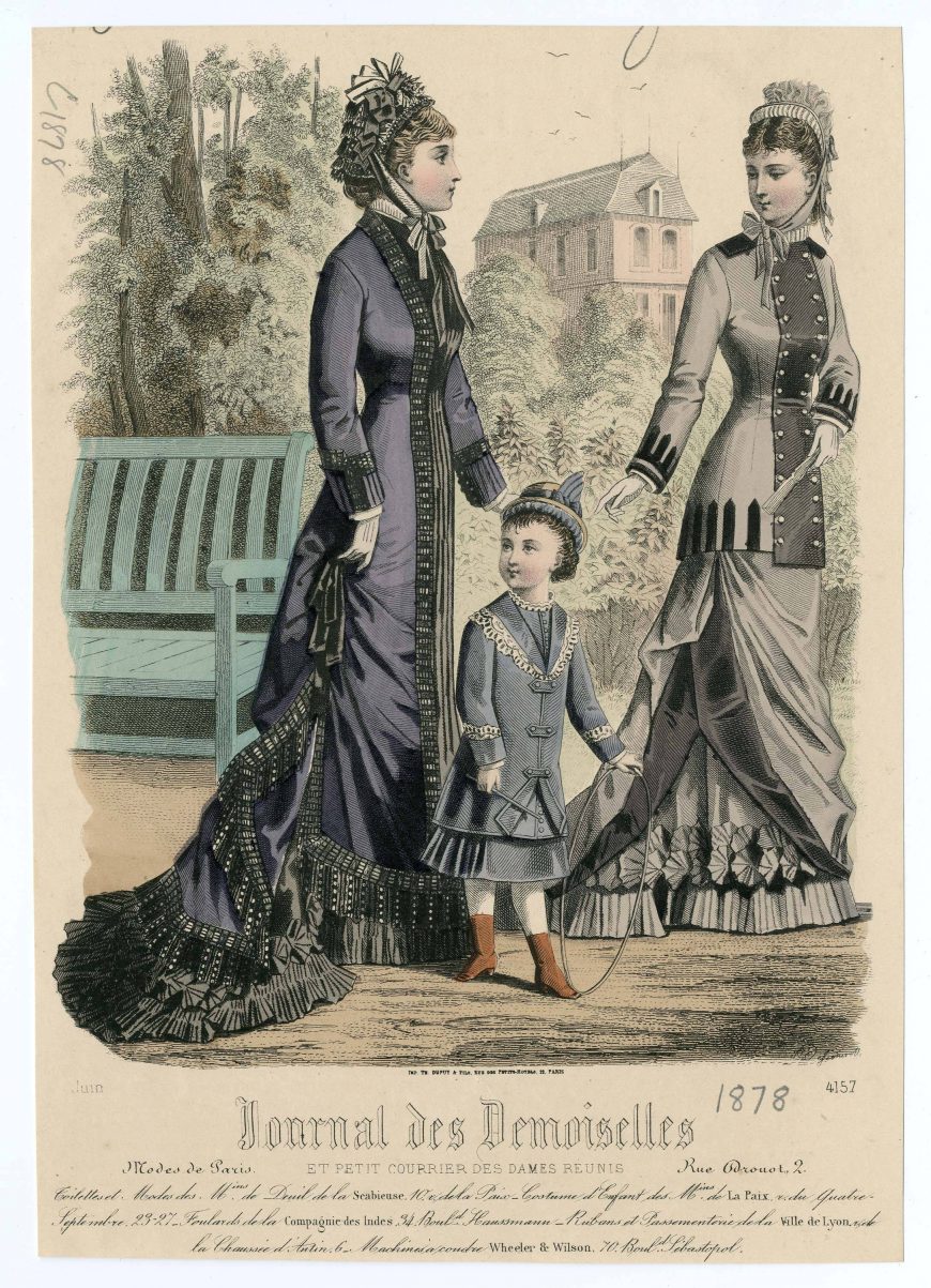
The identical dresses worn by the Charpentier children in this painting reveal a little-known aspect of nineteenth-century western dress codes in which infants and young children were dressed alike in dresses or petticoats until about age four or five. At this time in history, when doing laundry was a tedious and lengthy process, having young children wear petticoats or frocks until they were toilet-trained made sense from a practical standpoint. As well, infants and young children were seen as asexual beings and for this reason were dressed alike. For example, in the fashion plate shown below, the child is dressed in a jacket and skirt that could be worn by either boy or girl.
Photographs from the time also capture many young boys dressed in petticoats or a tunic and skirt, including this undated photo of two young boys. The younger boy is wearing a checked ensemble consisting of a tunic and a skirt trimmed in velvet while his older brother wears a wool suit consisting of a jacket worn with knickerbockers.
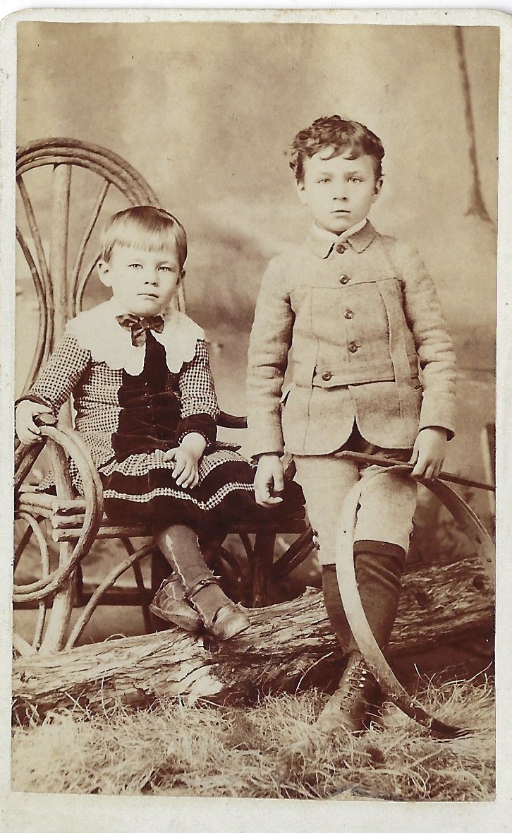
The transition from petticoats and dresses into short pants and then trousers took on symbolic importance as a rite of passage for a boy, but the age at which this occurred was a matter of individual choice,
…as every mother is desirous that her little ones should be seen at their best, it will be her pride and pleasure to exercise her taste and judgement in this direction.As quoted by Clare Rose, “Age-related clothing codes for boys in Britain, 1850-1900,” Critical Studies in Men’s Fashion, vol. 2 (2015), pp.139.
Tailoring guides from this time reveal an age-related progression of attire for boys from petticoats indicated before age 3; jackets with skirts suggested for ages 3 to 6; tunic over trousers for boys aged 6-12; short wool jackets and trousers for ages 12-15; and suits for boys over age 15.
With the emergence of department stores and mass-production methods for clothing in the latter part of the nineteenth century, the options for boys expanded, but there was also a significant shift in ideals of masculinity that resulted in a marked restriction in the types of clothing and the colors available for boys. As historians including Jo Paoletti have observed, by about 1920, it was seen as highly inappropriate for boys to wear dresses, lace, ruffles, and other feminine-coded garments details or colors.
Our own biases
Renoir’s portrait of the Charpentier family reminds us that the dress codes that signal gender are linked to culture as well as a specific time and place in history. The idea that boys do not wear dresses dates back only about a century. Gender is a culturally specific notion — something that is learned rather than innate. Interpreting a painting such as this one by Renoir requires careful observation and reflection of the inherent biases of our own standpoint in culture.
Additional resources:
Colin B. Bailey, Renoir’s Portraits: Impressions of an Age (Yale University Press: New Haven and London in association with National Gallery of Canada, Ottawa, 1997).
Anne Buck, Clothes and the Child (New York: Holmes & Meier, 1996).
Judith Butler, Gender Trouble: Feminism and the Subversion of Identity (New York and London: Routledge, 2007 [1990]).
Ingrid E. Mida, Reading Fashion in Art (London and New York: Bloomsbury Academic, forthcoming 2020).
Jo B. Paoletti, Pink and Blue: Telling the Boys from the Girls in America (Bloomington: Indiana University Press, 2012).
Clare Rose, “Age-related clothing codes for boys in Britain, 1850-1900.” Critical Studies in Men’s Fashion, vol. 2 (2015), pp.127-142.
Valerie Steele, Paris Fashion: A Cultural History (New York: Bloomsbury, 2017).
Barbara Ehrlich White, Renoir: An Intimate Biography (New York: Thames & Hudson, 2017).
Auguste Renoir, Luncheon of the Boating Party
by DR. BETH HARRIS and DR. STEVEN ZUCKER
Video \(\PageIndex{15}\): Auguste Renoir, Luncheon of the Boating Party, 1880-81, oil on canvas, 130.2 x 175.6 cm (Phillips Collection, Washington, D.C.)
Smarthistory images for teaching and learning:
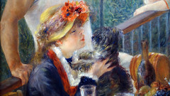

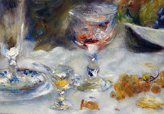
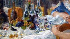
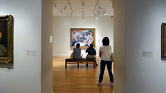
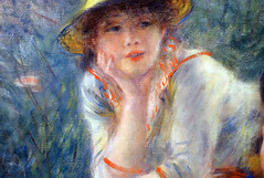
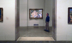
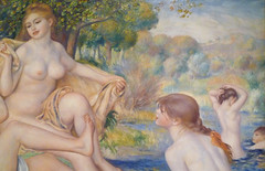
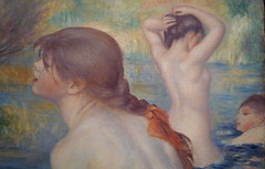
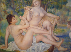
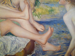
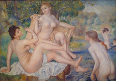
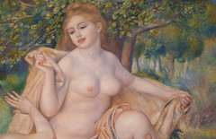
Auguste Renoir, The Large Bathers
by DR. STEVEN ZUCKER and DR. BETH HARRIS
Video \(\PageIndex{16}\): Auguste Renoir, The Large Bathers, 1884-87, oil on canvas, 46-3/8 x 67-1/4″ / 117.8 x 170.8 cm (Philadelphia Museum of Art)
Smarthistory images for teaching and learning:
Claude Monet
Impressionism as optical realism: Monet
by DR. CHARLES CRAMER and DR. KIM GRANT
More realistic?
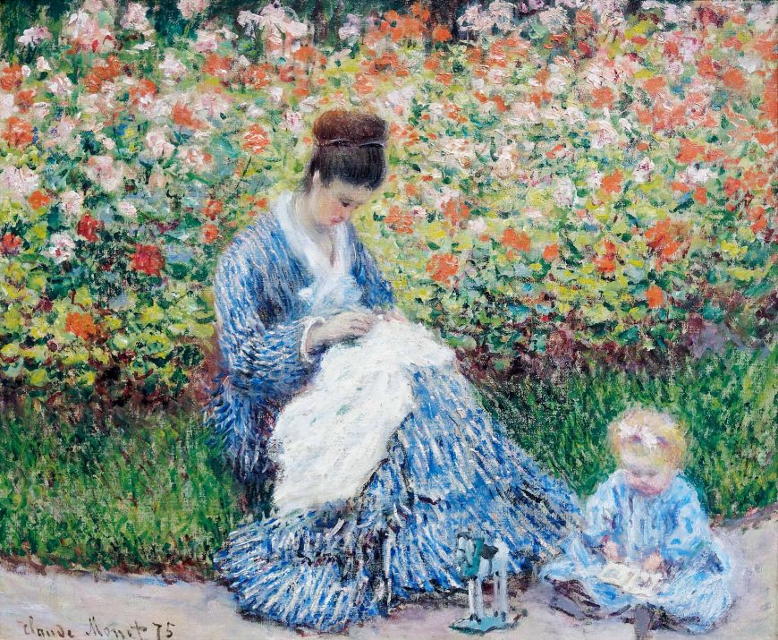
The subject of Monet’s 1875 painting of his wife Camille Monet and a Child in the Artist’s Garden at Argenteuil is immediately recognizable. Both figures are clad in blue striped garments and are absorbed by an activity: Camille sews, the child gazes down at a book. A toy horse stands in the foreground, and a virtual wall of green foliage and blooming red and pink flowers rises behind them.
The viewer is given enough visual information to recognize the main components of the scene, but rather than supplying fine details that would provide more specifics, Monet emphasizes his brightly colored brushstrokes. If we want to know what kind of fabric the garments depicted are made of, what kind of flowers are blooming, or even the texture of the figures’ skin, we can’t find out by looking closely. Close study of the painting will only teach us more about Monet’s brushwork, not more about the depicted scene.
As a result, if we evaluate the painting’s truth to nature in terms of the careful representation of details, it is not very realistic. However, Impressionist paintings like this one were often described by sympathetic critics as realistic representations, and sometimes even as more realistic than traditional academic paintings with meticulously detailed figures and scenes. How so?
Truth to reality
Impressionism raises complex and interesting questions about realistic representation. Although we tend to have powerful reflexive judgments about what is realistic in art and what is not, the basis for such judgments is frequently unclear. Supporters of Impressionist painting subtly but substantially shifted the criteria for judging truth to reality in painting. In traditional Renaissance and Academic naturalism, truth to reality entailed the inclusion not only of what we see, but also prominent visible evidence of properties of touch and space: the mass of objects, their textures, and the three-dimensional terrain in which they are located. Because paintings cannot literally reproduce space, mass, and texture, they must give an illusion of those qualities—and they frequently exaggerate the visual evidence that contributes to that illusion.

The more orthogonal lines are included in a painting, the more convincingly the ground in a painting appears to recede like a floor, rather than standing upright like a wall—hence the French Academic painter Jacques-Louis David includes a tile floor and masonry walls with many orthogonal lines in The Oath of the Horatii. Effects of chiaroscuro in traditional naturalism are also frequently exaggerated relative to what we actually see in order to assert the tangible volume of what are actually only two-dimensional renderings. The dramatic contrast created by the starkly lit figures against the very dark shadows and background in David’s painting heightens the illusion of three dimensional forms in space.
Only what we see, not what we know
The relation of figures to space in Monet’s Camille Monet and a Child in the Artist’s Garden is markedly different. There is no use of chiaroscuro to define the forms of the figures or linear perspective to define the space in which they are situated. The figures sit directly in front of the foliage, creating a very shallow space, which is further flattened by the prominent textured brushstrokes throughout the entire painting. The light source is diffused, and there is very little modeling of the figures, only a few dark areas in the clothing that distinguish the arms from the torsos.
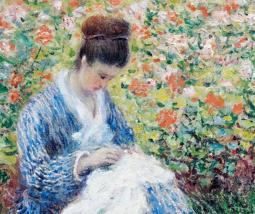
The Impressionist style as exemplified here by Monet consists in rendering only optical data, reproducing only what we see, not what we know about space, mass, and the other physical details of the world. In 1883, the critic Jules Laforgue suggested, “The Impressionist sees and renders nature as it is—that is, wholly in terms of color vibrations. No drawing, no light, no modeling, no perspective, no chiaroscuro, none of those puerile classifications: all these become vibrations of color and must be represented on the canvas by means of color vibrations.” There is some sleight-of-hand in this appeal to the greater truth of Impressionism, of course. Laforgue states that the Impressionist “renders nature as it is [telle qu’elle est],” but he should perhaps more accurately say that the Impressionist concentrates on rendering nature as it appears to the eyes. In this sense, the Impressionists both limited the project of painting to a narrower goal than that pursued by traditional naturalism, and increased its accuracy with regard to that goal.
Shifting patterns of color
The full import of this notion for the Impressionist approach to painting is clear in the American artist Lilla Cabot Perry’s recollection of Monet’s advice to her:
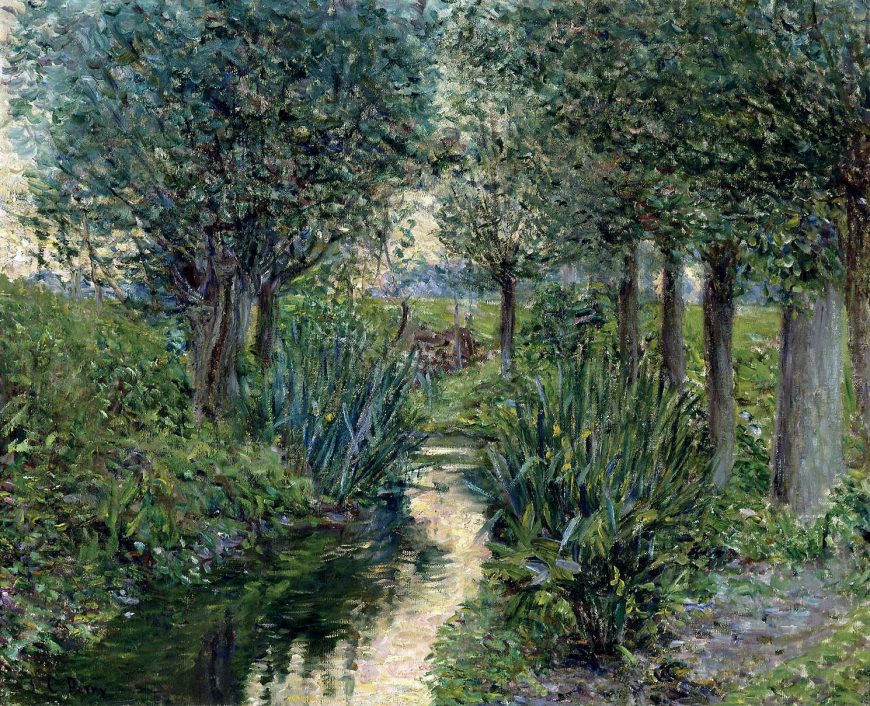
“When you go out to paint, try to forget what objects you have before you—a tree, a house, a field, or whatever. Merely think, Here is a little square of blue, here an oblong of pink, here a streak of yellow, and paint it just as it looks to you, the exact color and shape, until it gives your own naïve impression of the scene before you….” [Monet] said he wished he had been born blind and then had suddenly gained his sight so that he could have begun to paint in this way without knowing what the objects were that he saw before him.
Lilla Cabot Perry, “Reminiscences of Claude Monet from 1889 -1909,” The American Magazine of Art, vol. 18, no. 3 (1927), p. 120.
Monet here expresses a desire for an impossible separation of the immediate sensation of his vision from the subsequent processing of visual data by his mind. Imagine a baby’s first visual experience. She does not know that the color patterns she is experiencing correspond to substantial objects out there in a tangible world; nor does she know where one object ends and another begins; nor the distinction between near or far. An infant or a blind person suddenly gaining their sight would see only a shifting pattern of color. Accordingly, Monet advises Perry not to think about the objects that she is painting, but to see only a pattern of color: a “square of blue,” an “oblong of pink,” a “streak of yellow.”
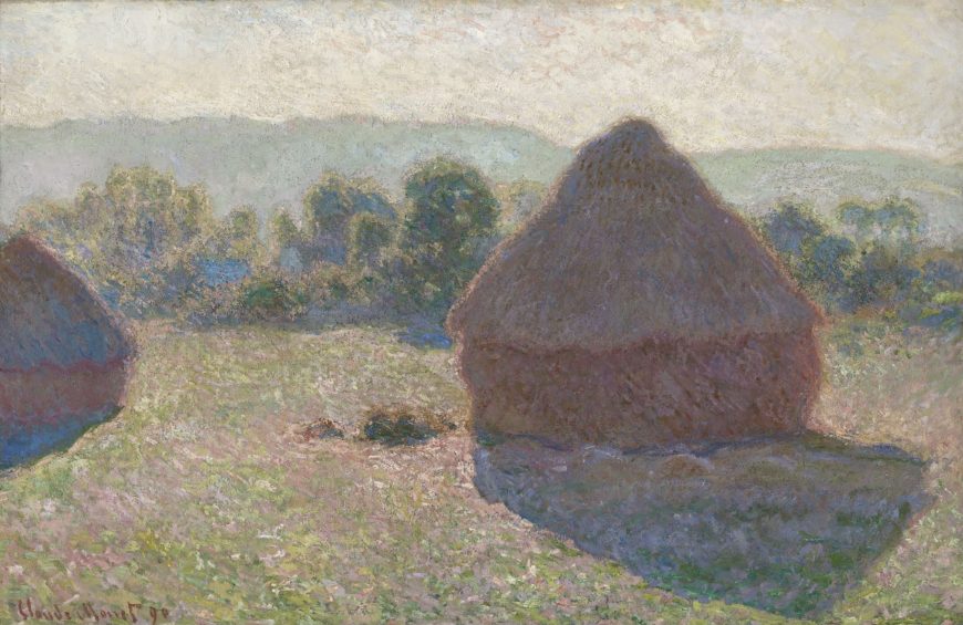
Painting light
Monet’s advice to Perry also begins to account for the radical brushwork of the Impressionists, which disturbed many critics. Impressionist artists constructed their paintings in color patches in the way Monet described, as though painting the optical world as they experienced it on the surface of their retinas, rather than attempting to create an illusion of the space, mass, and textures of the tactile world. Critics also observed that the patchy brushwork of the Impressionist style simulated flickering patterns of light and color. The apparent rapidity of the brushwork indicated the rapidly shifting lighting conditions, which changed before the artist had time to smooth the surface of the work with a traditional Academic finish.

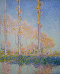
Monet’s series paintings of the 1880s and 1890s represent the culmination of this optical-scientific aspect of Impressionism. In these series Monet recorded the changing appearance of a single subject—haystacks in Giverny, Rouen cathedral, a bank of poplars—at different times of day, in different weather, and in different seasons. Since the quality of light changed rapidly, Monet could work on a given canvas for a limited time, taking it up again only when lighting conditions were similar. Perry reported that one particular light effect in the Poplars series lasted only seven minutes, until the sunlight hit a certain leaf.
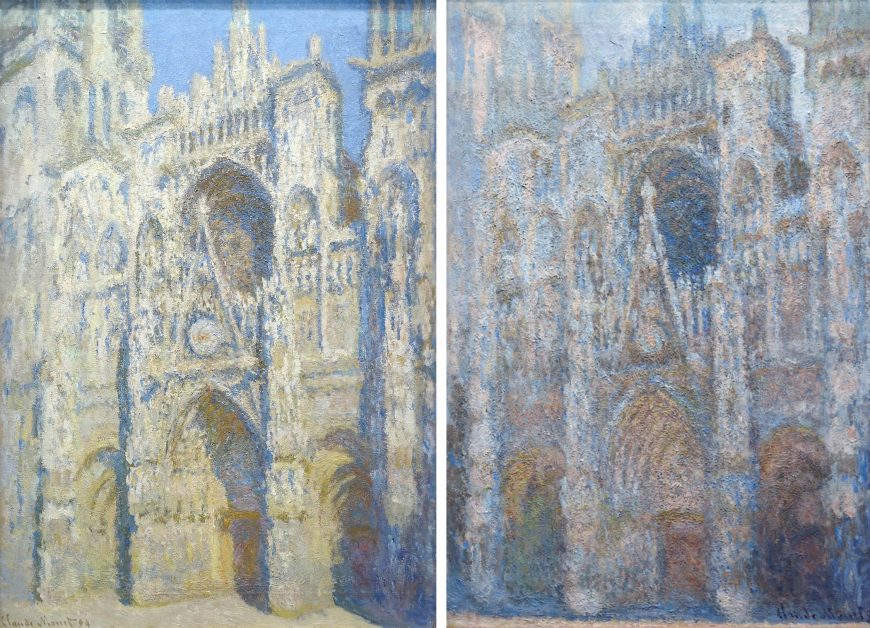
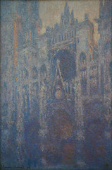
Although the subject matter is identical, the radically different colors used in the approximately thirty views that Monet painted of Rouen Cathedral in 1893-94 demonstrate the changes in the appearance of the scene over the course of time. Within the nominally grayish-tan local color of the masonry, Monet finds a surprising variety of colors. The first work records a painting time around noon on a sunny day, and the dominant color is bright yellow, with flickers of blue for the shadows around the carved façade. The second records an early morning observation, with the entire façade cast in shade and rendered in blues, violets, and pinks. In both works reflected light bounces up from the ground in front of the cathedral onto the underside of the deeply-carved arches of the portals, which are rendered in bright orange—very far indeed from the local color of the stone. (For an explanation of the terms “local color’” and “perceived color,” see Impressionist color.)
Living up to its name
For supporters of the movement, the name Impressionism is singularly apt, even though it was originally applied as a term of derision. “Impression” can be used as a scientific term for the stimulation of the sensory nerves, as for example the effect on the retinal nerves of light reflecting off objects. Strictly speaking, the term isolates this purely physical stimulus from any subsequent mental or emotional reaction to it. The retinal impression consists only of a pattern of colors, before the mind interprets what it is seeing and deduces information about mass, space, and texture, and before the viewer reacts emotionally. For some of its critics and practitioners, Impressionism had the aura of an objective scientific project, informed by and contributing to a wealth of contemporary discoveries in the science of light and color.
How to recognize Monet: The Basin at Argenteuil
by DR. STEVEN ZUCKER and DR. BETH HARRIS
Video \(\PageIndex{17}\): Claude Monet, The Basin at Argenteuil, c. 1872, oil on canvas, 60 x 80.5 cm (Musee d’Orsay, Paris). Speakers: Dr. Steven Zucker and Dr. Beth Harris
The town of Argenteuil lies on the banks of the Seine eleven kilometers to the northwest of Paris, a fifteen-minute train ride from the capital’s Gare Saint-Lazare. With its railway line and factories, residences and river walks, it is in many ways typical of the suburban towns on the outskirts of Paris. Yet the contribution it made to the evolution of modern French painting sets it apart from neighboring villages. During the 1870s and 1880s Argenteuil became an important source of inspiration for the impressionist artists, who immortalized its river views, bridges, streets, and gardens in their groundbreaking paintings.
(from The National Gallery of Art)
Additional resources:
Claude Monet on The Metropolitan Museum of Art’s Heilbrunn Timeline of Art History
Paul Hayes Tucker, Monet at Argenteuil (Yale University Press, 1984)
Smarthistory images for teaching and learning:
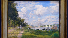
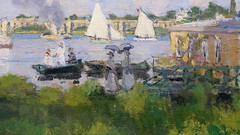
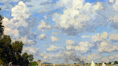
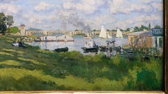
Claude Monet, The Argenteuil Bridge
by DR. BETH HARRIS and DR. STEVEN ZUCKER
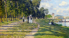
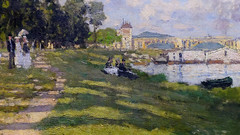
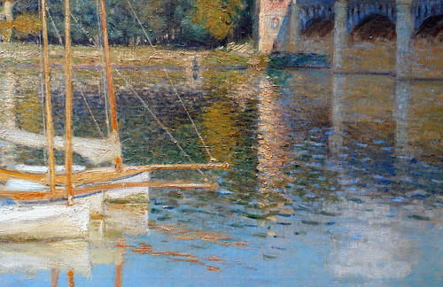
Video \(\PageIndex{18}\): Claude Monet, The Argenteuil Bridge, 1874, oil on canvas, 60.5 x 80 cm (Musée d’Orsay, Paris)
Please note that there is significant background chatter in this video. The Musée d’Orsay is happily a very busy museum and this painting is hung in a relatively small room.
Smarthistory images for teaching and learning:

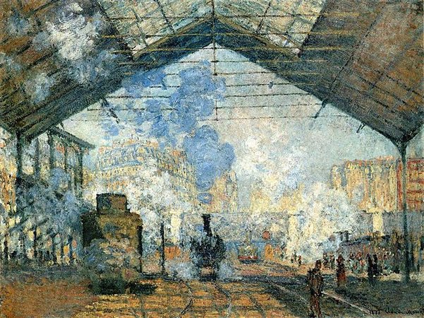
Monet, The Gare Saint-Lazare
by DR. TYLER E. OSTERGAARD
Video \(\PageIndex{19}\): Speakers: Dr. Steven Zucker and Dr. Beth Harris
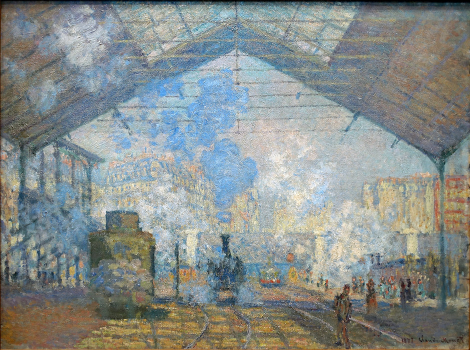
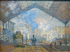
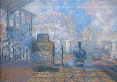
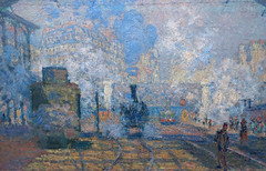
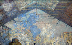
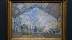
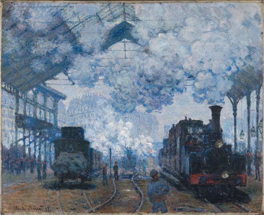
Monet’s painting, The Gare Saint-Lazare, overwhelms the viewer not though its scale (a modest 29 ½ by 41 inches), but through the deep sea of steam and smoke that envelops the canvas. Indeed, as one contemporary reviewer remarked somewhat sarcastically, “Unfortunately thick smoke escaping from the canvas prevented our seeing the six paintings dedicated to this study.”[1]
The Gare Saint-Lazare (also known as Interior View of the Gare Saint-Lazare, the Auteuil Line), depicts one of the passenger platforms of the Gare Saint-Lazare, one of Paris’s largest and busiest train terminals. The painting is not so much a single view of a train platform, it is rather a component in larger project of a dozen canvases which attempts to portray all facets of the Gare Saint-Lazare. The paintings all have similar themes—including the play of light filtered through the smoke of the train shed, the billowing clouds of steam, and the locomotives that dominate the site. Of these twelve linked paintings, Monet exhibited between six and eight of them at the third Impressionist exhibition of 1877, where they were among the most discussed paintings exhibited by any of the artists.
Light and steam
Light—the dominant formal element in so many Impressionist paintings—is given particularly close attention in The Gare Saint-Lazare, the Auteuil Line. Here, as in many of the Impressionists’ most celebrated paintings, Monet shows a bright day and labors to reproduce the closely observed effects of pure sunlight. The billowing clouds of steam add to the effect, creating layers of light that fill the canvas. Here however, we must pause as The Gare Saint-Lazare, the Auteuil Line is an exception within the full group—it is one of only two paintings of the train station shown on a bright bright, sunny, day. In contrast, the other ten paintings (for example the one at the Harvard Art Museums, above) show dark, hazy views of the Gare Saint-Lazare. Though an exception and anomaly in terms of its interest in sunlight, The Gare Saint-Lazare, the Auteuil Line shares a great deal in common with the other paintings at least in terms of subject and view.
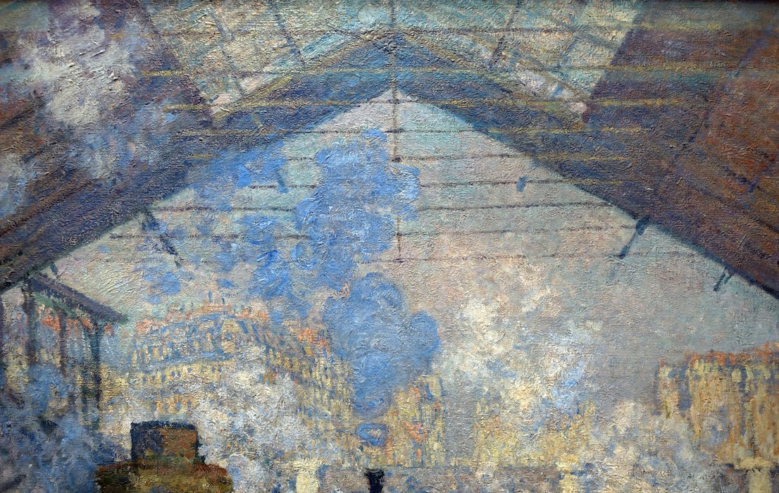
Monet’s achievement is extraordinary, and The Gare Saint-Lazare, the Auteuil Line has rightfully been singled out as among the most impressive paintings of Impressionism. Monet renders the steam with a range of blues, pinks, violets, tans, grays, whites, blacks, and yellows. He depicts not just the steam and light—which fill the canvas—but also their effect on the site—the large distant apartments, the Pont de l’Europe (a bridge that overlooked the train station), and the many locomotives—all of which peak through, and dematerialize into a thick industrial haze.
Train and shed as subject
Against the bright background, Monet represents the station’s vast iron roof in copper and tan tones that stand out against The Gare Saint-Lazare, the Auteuil Line’s low key palette, with its swirling blue, gray and purple background. The trains—here represented by no less than three locomotives and a large box car—are shown as both the source of the steam and distinct from it. However, in 1877, a number of critics were worried the smoke would completely engulf them. Gorges Maillard, writing in the conservative journal Le Pays, made just this point, describing the paintings as “the rails, lanterns, switchers, wagons, above all, always these flakes, these mists, clouds of white steam, are so thick they sometimes hide everything else.”[2]

The Gare Saint-Lazare, the Auteuil Line and the other paintings of the Gare Saint-Lazare by Monet are hardly an isolated moment in the artist’s oeuvre. In the 1870s Monet—along with most of the other major Impressionists including, Caillebotte, Pissarro, Renoir, Degas, Guillaumin, Raffaëlli, and even Manet—had shown a steady interest in the railroad as a subject within their paintings of modern of life. In fact, the six to eight paintings Monet exhibited at the Third Impressionist Exhibition were shown along with Caillebotte’s monumental Le Pont de l’Europe (below) that likewise shows the train yards of the Gare Saint-Lazare. Caillebotte’s painting though shows the site from the great iron bridge that crossed over the yards—the Pont de l’Europe. Interestingly, Caillebotte’s painting of genteel strollers set in the bourgeois world of Paris’s grand boulevards drew praise, while Monet’s paintings of trains, steam and industrial activity were severely criticized.
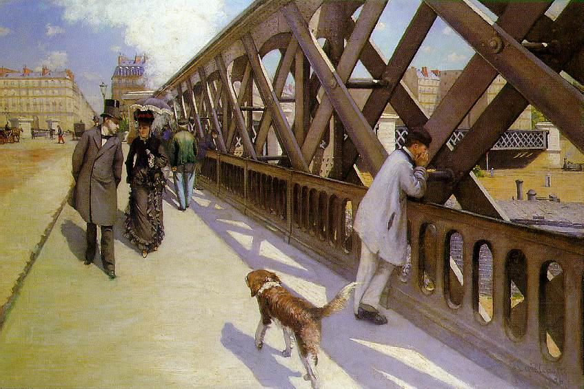
Perhaps the criticism is due to the fact that Monet shows the locomotives as the main subject, rather than as background elements. He shows them unapologetically, in their natural element, among the steam, workers and activity of the bustling train station. Four paintings in the set of twelve, including The Gare Saint-Lazare, the Auteuil Line, show the large and distinctive cast iron spans that covered the platforms. However, the other paintings show the exterior, the yards, workers, tunnels, switches, sheds, and engines of the station. Indeed, even in The Gare Saint-Lazare, the Auteuil Line and the other so-called interiors of the of the train shed, Monet includes workers, steam, and industrial machines. In fact, what he does not show is the grand hotel, lavish entrance or sculpture of the station’s impressive façade. Even in the interiors, the paintings are very much the business end of the station.
A series?
These common subjects—train, steam, and industrial activity—raise the question of whether the works should be regarded as series. Though scholars have frequently discussed the works, and particularly the four interiors, as part of series, only two of the works show a repeated (or serial) view. When taken as a whole the group does not seem to be the manifestation of an interest in serial painting or an exploration of subtle changes only evident in repeated views (as Monet will later do with his series of grain stacks) bur rather as an effort to capture the varied aspects of the station by rendering its many faces in paint.
In The Gare Saint-Lazare, the Auteuil Line Monet shows his keen interest in light, color, and paint handling, yet The Gare Saint-Lazare, the Auteuil Line cannot be divorced from its subject—the locomotives, the steam, and the yard of the Gare Saint-Lazare. In this bright scene Monet gives us a new vision of modern life that does not shy away from its industrial side.
[1] Descubes, A. “L’Exposition des impressionnistes” Gazette des lettres, des sciences et des arts, vol. 1, no. 12 (20 April 1877), pp. 185-188.
[2] Maillard, “Chronique: Les Impressionnistes” Le Pays (April 9, 1877), pp. 2-3.
Claude Monet, Cliff Walk at Pourville
by DR. STEVEN ZUCKER and DR. BETH HARRIS
Video \(\PageIndex{20}\): Claude Monet, Cliff Walk at Pourville, 1882, oil on canvas, 26-1/8 x 32-7/16 inches (66.5 x 82.3 cm) (Art Institute of Chicago)
Smarthistory images for teaching and learning:

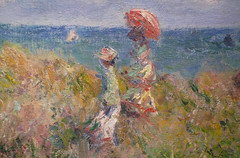

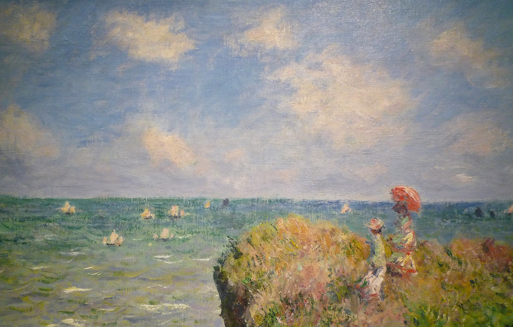
Claude Monet, Poplars
by DR. STEVEN ZUCKER and DR. BETH HARRIS
Video \(\PageIndex{21}\): Claude Monet, Poplars, 1891, oil on canvas, 36-5/8 x 29-3/16″ / 93 x 74.1 cm (Philadelphia Museum of Art)
Smarthistory images for teaching and learning:
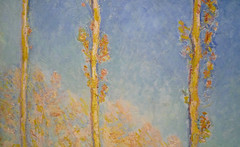
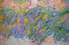
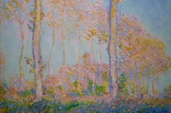

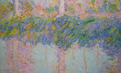
Claude Monet, Rouen Cathedral Series
by DR. BETH HARRIS and DR. STEVEN ZUCKER
Video \(\PageIndex{22}\): Claude Monet, Rouen Cathedral (The Portal, Grey Weather), 1894, oil on canvas, 100 x 65 cm; Rouen Cathedral (The Portal and the Tour d’Albane, Morning Effect), 1894, oil on canvas, 106 x 73 cm; Rouen Cathedral (The Portal, Harmony in Blue), 1894, oil on canvas, 91 x 63 cm ; Rouen Cathedral (The Portal and the Tour d’Albane in the Sunlight), 1894, oil on canvas, 107 x 73 cm (Musée D’Orsay, Paris)
Claude Monet painted more than 30 canvases depicting Rouen cathedral between 1892 and 1894. This video discusses four paintings in the collection of the Musée d’Orsay in Paris.
Smarthistory images for teaching and learning:
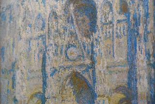
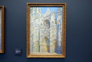
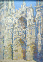
Claude Monet, Les Nymphéas (The Water Lilies)
by DR. BETH HARRIS and DR. STEVEN ZUCKER
Clouds, oil on three canvas panels, 200 x 1275 cm, c. 1918-26 Green Highlights, oil on two canvas panels, 200 x 850 cm, c. 1918-26 Sunset, oil on canvas, 200 x 600 cm, c. 1918-26 Room 2: Reflection of Trees, oil on two canvas panels, 200 x 850 cm, c. 1918-26 The Morning Light, the Willows, oil on three canvas panels, 200 x 1275 cm, c. 1918-26 The Morning Willows, oil on three canvas panels, 200 x 1275 cm, c. 1918-26 The Two Willows, oil on four canvas panels, 200 x 1700 cm, c. 1918-26
Smarthistory images for teaching and learning:
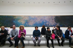

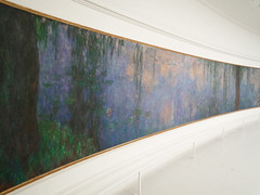
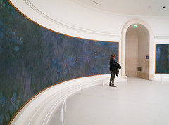
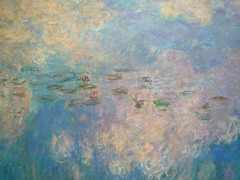
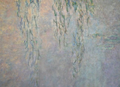
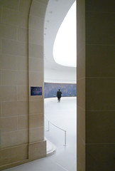
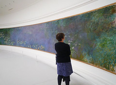
Mary Cassatt
Mary Cassatt, In the Loge
by DR. BETH HARRIS and DR. STEVEN ZUCKER
Video \(\PageIndex{24}\): Mary Cassatt, In the Loge, 1878, oil on canvas, 81.28 x 66.04 cm (32 x 26 inches) (Museum of Fine Arts, Boston)
Smarthistory images for teaching and learning:
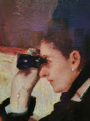

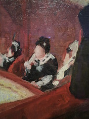
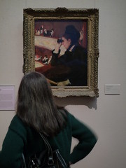
Mary Cassatt, Little Girl in a Blue Armchair
by BEN POLLITT

A citizen of the world
If, as one art historian¹ recently stated, Camille Pissarro was the glue that held Impressionism together, then Mary Stevenson Cassatt had similarly adhesive qualities. Giving the lie to the stereotype that Americans were provincial—even barbarous—in their artistic tastes, Cassatt was anything but that; a cultured woman, educated in London, Paris and Berlin and fluent in French and German, she spent four years at the Pennsylvanian Academy of the Fine Arts before studying in France under Jean-Leon Gérôme, Thomas Couture and others.
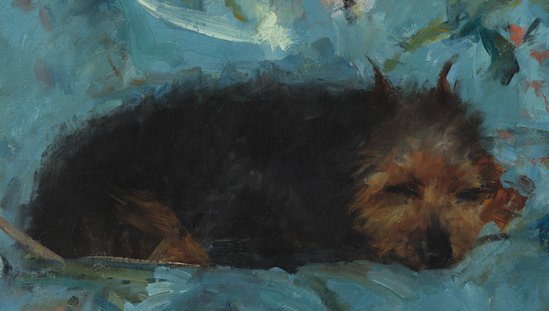
After the outbreak of the Franco-Prussian war she continued her travels, spending time in Italy and Spain, before settling in Paris once again in 1874, the year of the first Impressionist Exhibition. In the Salon of that year she exhibited a work that Degas, for one, admired. Over the following years, though, Salon success eluded her, largely, or so she judged, due to the prejudices of the all male selection jury.
It is understandable then that by 1877, when Degas invited her to join them, Cassatt would be drawn to this group of artists who were exhibiting independently and for whom gender did not appear to be a barrier for inclusion; certainly the quantity and quality of Berthe Morisot’s works in the first exhibitions were a match to those of the men. The same too can be said for the eleven paintings that Cassatt would exhibit in the fourth Impressionist Exhibition—included among them are some of her most celebrated paintings, notably Reading Le Figaro, Woman in a Loge, In the Loge and Little Girl in a Blue Armchair.
Little Girl in a Blue Armchair
Produced in 1878, it shows a girl sprawled on a blue armchair in a room with three other chairs of a matching design. She stares at the floor unaware or unconcerned about the portrait that is being painted of her. On the chair opposite her a lapdog dozes, a dark patch that neatly balances the dark tones of her clothing. There are no tables or ornaments, nothing to offer the viewer or the girl, who appears tired and bored, any distractions, only two large windows that are closed and heavily cropped by the upper edge of the canvas.

The dominance of the overstuffed furniture with its vibrant blue upholstery captures an odd sense of restlessness and languorousness, both matched by the girl’s pose. A parent would tell her to sit up properly and there is a rebellious, devil-may-care attitude in her comfortably lounging form. She has been dressed with due observance to fashion, the tartan shawl matching her socks and the bow in her carefully arranged hair; her shoes are spotless and the buckles sparkle; literally dolled up. All this primness however is of absolutely no concern to the girl whose unselfconscious pose presents as Petra Chu puts it: “a radically new image of childhood.”
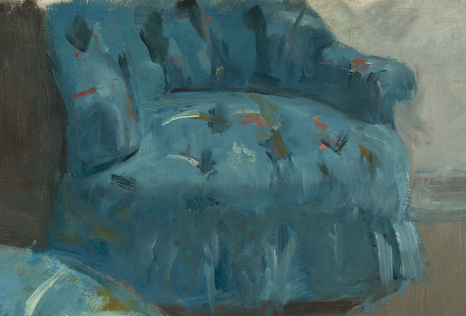
That a woman produced the image is, of course, no coincidence. The nursery in middle class homes was a space that was rarely if ever visited by men; child-rearing being an exclusively female occupation, little wonder then that few male artists painted babies or young children. But, of course, it is not in a nursery that we find ourselves, but a drawing room, clean to the point of sanitized, a room in which, just like her costume, the girl seems out of place, swamped by the massive abundance of chairs, a point emphasized compositionally in that each overlaps the other. The upshot of all this is to create a feeling—if not so extreme as alienation—then certainly a sense of disorientation, one that seems to capture, as subtly and incisively as any artist before her, the huffing and puffing tiresomeness a child feels within the social constraints of an adult’s world, a world that seems almost oppressively gendered.

The girl herself was the daughter of a friend of Degas’s and the painting is often cited as an example of Degas’s influence on Cassatt. The two certainly had much in common, if only in terms of their backgrounds. Both were born into the upper-middle-class, the children of bankers, and both had strong connections to America, Degas’s mother and grandmother were American and he had stayed with his family in New Orleans in 1872-3.
The similarities in their work, certainly in this period, are also striking. In its asymmetrical composition, the casual, unposed treatment of the sitter, the weightiness and solidity of its forms in contrast to that grey mercurial dollop of negative space, its use of cropping and loose brushwork, as well as the interest in the private moment that we find so often in his pastels, the hallmarks of Degas’s work can clearly be found in Little Girl in a Blue Armchair.
Japanese prints
The influence of Japanese prints is also a shared feature. Notice how in Degas’s famous L’Absinthe our eye is led in and up through the opposing diagonals of the marble-topped tables which seem almost to be floating. A similar effect is created by Cassatt in the blue furniture, to such an extent that we are left uncertain whose point of view we are looking from—a child’s at eye level or an adult’s from above. The composition, however, still coheres, the space and its various junctures having been carefully conceived to create a balanced whole.

These startling similarities may be accounted for by the fact that Degas had a hand in painting the background, a practice that seems shocking today. Cassatt seemed not to mind, though, writing several years later of how Degas “advised me on the background, he even worked on the background.” The last part she underlined suggesting that she even considered it a privilege. It was common practice for male artists to take a patronizing approach to their female counterparts. “Manet sermonizes me”, Berthe Morisot complained to her sister Edma. It is inconceivable, however, to think that either Degas or Manet, whose influence is certainly in evidence in Cassatt’s lavish use of cobalt blue and in the tonal treatment of the girl’s legs, would or could have painted such an image.
The splendid legacy
Like Manet and Degas, Cassatt spent time in Italy copying the great works there, including, in her case, those of Correggio. Perhaps there is something of that old master’s dreamy bambini in the pose of the little girl too. Either way, running alongside her distinctly modern artistic vision, the classical tradition she was trained in is never far away. She could be quite snobby about it in fact. She thought little of Paul Durand-Ruel, for instance, the greatest of the Impressionist dealers, for knowing next to nothing about Italian art. This did not put her off providing him with contacts when he traveled to New York with Impressionist works, including two of her own, which he exhibited in the spring of 1886. “Had it not been for Durand-Ruel, caviar would have been a good deal rarer,” Renoir once said to his son.
Yet, in the international success story of Impressionism, Cassatt is also owed her due. For among the contacts she gave Durand-Ruel was the sugar magnate Henry O. Havemeyer, whose wife Lousine was a close friend of hers, having studied art together in Paris. As the couple’s artistic consultant for the rest of her life Cassatt played a central role in the development of one of the greatest private collections ever amassed in America. Today New York’s Metropolitan holds hundreds of paintings bequeathed by the Havemeyer family, including, the Museum claims, “the most complete group of Degas’s works ever assembled” and twenty works by Mary Cassatt, a woman remarkable not only for helping shape contemporary tastes in American connoisseurship, but also, over the course of her long artistic career, for producing work of extraordinary quality that helped transform American art itself into a world-class enterprise.
1. Waldemar Januszcak
Additional resources:
This painting at the National Gallery
Mary Cassatt on The Metropolitan Museum of Art’s Heilbrunn Timeline of Art History
Susan Fillin Yeh, Mary Cassatt’s Images of Women, Art Journal (1976)
Norma Broude, Mary Cassatt: Modern Woman or the Cult of True Womanhood?, Woman’s Art Journal (2000)
Mary Cassatt, Woman with a Pearl Necklace in a Loge
by DR. STEVEN ZUCKER and DR. BETH HARRIS
Video \(\PageIndex{25}\): Mary Cassatt, Woman with a Pearl Necklace in a Loge, 1879, oil on canvas, 32 x 23-1/2 inches or 81.3 x 59.7 cm (Philadelphia Museum of Art)
Smarthistory images for teaching and learning:
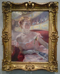
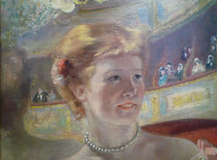
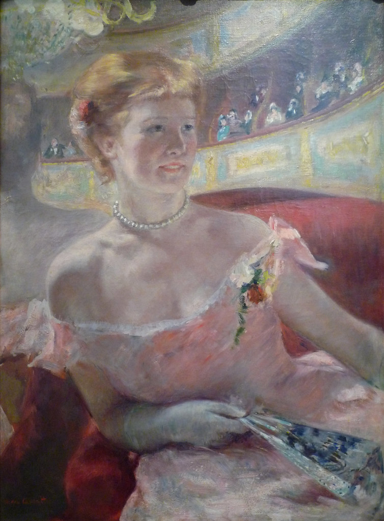
Mary Cassatt, The Child’s Bath
by DR. STEVEN ZUCKER and DR. BETH HARRIS
Video \(\PageIndex{26}\): Mary Cassatt, The Child’s Bath, 1893, oil on canvas, 39-1/2 x 26 inches (100.3 x 66.1 cm) (Art Institute of Chicago)
Smarthistory images for teaching and learning:

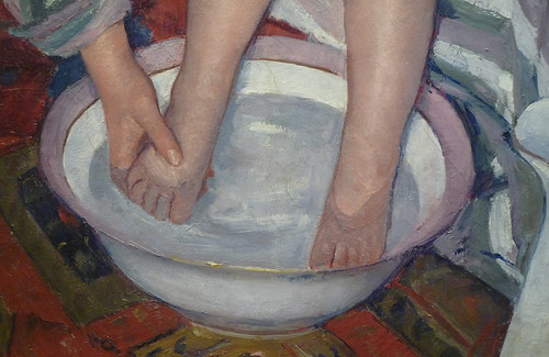
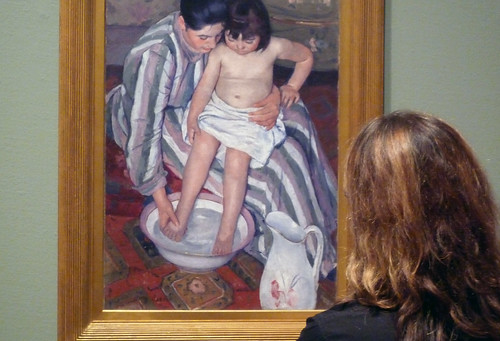
Mary Cassatt, The Coiffure


In April of 1890, the École des Beaux-Arts (School of Fine Arts) in Paris showcased an exhibition of Japanese woodblock prints. These ukiyo-e images, “pictures of the floating world,” as they were evocatively called, were comprised mostly of scenes of urban bourgeois pleasure—geishas, beautiful women, sumo wrestlers, kabuki actors—and pictures of the natural beauty around Edo (present day Tokyo)—the mists of Mount Fuji, cherry blossoms, rain showers, and surging waves along the port of Kanagawa.
Ever since Commodore Matthew C. Perry helped to open imperial Japan to Western trade in 1853, Europe had become fascinated with Japanese culture. Artists like Edgar Degas, Camille Pissaro, Claude Monet (recall Monet’s Japanese bridge in his gardens at his estate in Giverny), Vincent van Gogh, and James Abbott McNeill Whistler, were among the many who incorporated elements of Japanese design into their work. Some of them also frequented the bustling antique shop on the Rue de Rivoli, La Porte Chinoise, that specialized in Japanese woodblock prints, jades, lacquers, and porcelains. The craze of Japonisme went to such heights that in 1885, the English opera team of W.S. Gilbert and Arthur Sullivan staged their most popular show, a comic opera set entirely in imperial Japan, The Mikado.

Among the audience at the exhibition at the École des Beaux-Arts that April was the American expatriate painter, Mary Cassatt. Cassatt’s close friend, Edgar Degas, was a great admirer of Japanese art and had recently seen the exhibition with Camille Pissaro. Cassatt was spellbound. In a letter written that week to her friend, the painter Berthe Morisot, she wrote, “You who want to make color prints wouldn’t dream of anything more beautiful. I dream of doing it myself and can’t think of anything else but color on copper…P.S. You must see the Japanese—come as soon as you can.”¹
This drypoint etching, The Coiffure, of a woman adjusting her hair is one of the hundreds that Mary Cassatt made in her in-home studio in the summer and fall of 1890 and in the winter of 1891. It was inspired in part by a woodblock print in her personal collection, Kitagawa Utamaro’s boudoir image of the daughter of a prosperous Edo businessman, Takashima Ohisa Using Two Mirrors to Observe Her Coiffure (above). La Coiffure also has its art historical roots in Old Master paintings of women bathing and the odalisque though it departs from those conventional models to become a tightly crafted exercise in form and composition.
The word “la coiffure” evokes a precise image, one of wealthy women in glamorous settings. The ritual of grooming, dressing, and preparing one’s hair from the seventeenth and eighteenth century court days of Anne of Austria and Marie Antoinette was passed down to nineteenth-century ideals of femininity and beauty.

To wear an elaborate hairstyle such as those depicted in this magazine illustration by George Girard, one needed to have a maid to help with one’s hair. “La coiffure” was part of a specific lifestyle. Yet the woman in Cassatt’s print is tending to her hair alone. Perhaps what we are seeing is a working woman getting ready to start her day. The counterpoint of the print’s title and the reality of its subject matter characterizes the ironic tension within the image.
The woman in Cassatt’s La Coiffure sits in a plush armchair in front of mirror, her head focused downward, her back arched, as she adjusts her bun. The voyeuristic element to the scene is drawn from precedents in works by Rembrandt (Bathsheba at Her Bath, 1654) and Ingres (La Grand Odalisque, 1814), which Cassatt studied at the Louvre when she was a young student in the mid 1860s.

The woman in La Coiffure, unlike Rembrandt’s Bathsheba or Ingres’ Odalisque, is not sexualized. Though her breasts are exposed, her chest and the details of her body are deliberately muted into an overall structure of curves and crisp lines. This is an exercise in clarity and tone where the subject, the woman’s body, is a compositional element in the picture—as vividly realized as the other significant patterns of the room—the wallpaper, the fabric of the armchair, and the carpet.
As the viewer, we are placed at a slight leftward angle from the woman in the chair so that we see her through her reflection in the mirror while she is looking away from it. The downward gaze is similar to that of the model in the Utamaro, is done partly in homage to the modesty of the female subject in the ukiyo-e prints (artists were always aware that their works were made for a male-dominated market and designed them to be enticing) and partly as a study of shape and line, so that the viewer, realizing that he or she is not looking at a psychological portrait, could focus more intently on the compositional elements of the work. The prints provided artists with an opportunity to showcase their skill in concision—using no more than is necessary to convey an idea—the way a haiku poet showcases similar skill within the three lines and seventeen syllables of the poem
The curve of the woman’s sloping back and neck echoes the curves of the chair which stand in contrast to the vertical lines of the mirror—a compositional counterpoint that further enhances the tension within the tight composition. The limited color palette of shades of rose, brown, and white, enables us to focus closely on the form and clarity of line. It also mimics the quality of pastels, which Cassatt, like her friend Edgar Degas, often liked to use. Through the process of the drypoint and aquatint etching, La Coiffure combines Cassatt’s propensity for hazy shading and soft tones with a bold sharpness in line allowing the artist to integrate the qualities of two disparate media.

Her desire to emulate the haziness, sensual, and suggestive possibilities of pastels is what motivated Cassatt not to use woodblock printing but intaglio. First, Cassatt carved her designs onto a smooth copper plate with a fine metal needle. Then the plate would be dusted with a powdered resin and heated until the resin melted in tiny mounds that hardened as they cooled. Acid was then added on to the metal plate biting the channels along the resin droplets. The deeper penetration of acid produced richer, darker tones, while a lighter application of acid produced lighter shades of color and a variety of nuanced gradients could be generated within a single print. Once Cassatt had replicated a certain number of images from a plate, she would incise the plate with a needle so that no one could use the same image again.

The companion piece to La Coiffure is Woman Bathing, another image of a woman, bare-chested and half-dressed, grooming before a mirror.
Cassatt was inspired in part by some of Degas’ pastels of women grooming. In Cassatt’s prints, the time-honored boudoir scenes we see in Titian and Bellini become de-eroticized and re-appropriated as skilled exercises in form, shading, and line. In the spirit of ukiyo-e and Impressionism, these prints capture fugitive, fleeting moments of the busy lives of the Parisian bourgeois and working class.
Cassatt’s motivation in making the prints was to make her art more accessible for a large audience. She believed that everyone, regardless of income or social position, should be able to experience art and to own works they enjoy:
I believe [nothing] will inspire a taste for art more than the possibility of having it in the home. I should like to feel that amateurs in America could have an example of my work, a print or an etching, for a few dollars. That is what they do in France. It is not left to the rich alone to buy art; the people—even the poor—have taste and buy according to their means, and here they can always find something they can afford.²
This philosophy of art for the masses wasn’t always popular with Mary Cassatt’s contemporaries, like John Singer Sargent and the art historian Vernon Lee (Violet Paget), who viewed Cassatt’s printmaking as a dilution of her precious talent. Yet Cassatt understood that as the world was changing with the twentieth century’s new industries and technology, more and more people would have the income, education, and ability to experience art in ways they hadn’t been able to before. The proliferative possibilities of the print and its evocative potential to convey so much in such a small space was just the art form to reach a wider audience.
[1] As quoted in Introduction: Cassatt’s Influence from Japanese Art
[2] As quoted in Nancy Mowll Mathews, Mary Cassatt: A Life, Yale University Press, 1998, p. 234.
Additional resources:
This work at the National Gallery of Art
Mary Cassatt on The Metropolitan Museum of Art’s Heilbrunn Timeline of Art History
Mary Cassatt at the National Gallery of Art


