8.5: Realism
- Page ID
- 67085
\( \newcommand{\vecs}[1]{\overset { \scriptstyle \rightharpoonup} {\mathbf{#1}} } \)
\( \newcommand{\vecd}[1]{\overset{-\!-\!\rightharpoonup}{\vphantom{a}\smash {#1}}} \)
\( \newcommand{\dsum}{\displaystyle\sum\limits} \)
\( \newcommand{\dint}{\displaystyle\int\limits} \)
\( \newcommand{\dlim}{\displaystyle\lim\limits} \)
\( \newcommand{\id}{\mathrm{id}}\) \( \newcommand{\Span}{\mathrm{span}}\)
( \newcommand{\kernel}{\mathrm{null}\,}\) \( \newcommand{\range}{\mathrm{range}\,}\)
\( \newcommand{\RealPart}{\mathrm{Re}}\) \( \newcommand{\ImaginaryPart}{\mathrm{Im}}\)
\( \newcommand{\Argument}{\mathrm{Arg}}\) \( \newcommand{\norm}[1]{\| #1 \|}\)
\( \newcommand{\inner}[2]{\langle #1, #2 \rangle}\)
\( \newcommand{\Span}{\mathrm{span}}\)
\( \newcommand{\id}{\mathrm{id}}\)
\( \newcommand{\Span}{\mathrm{span}}\)
\( \newcommand{\kernel}{\mathrm{null}\,}\)
\( \newcommand{\range}{\mathrm{range}\,}\)
\( \newcommand{\RealPart}{\mathrm{Re}}\)
\( \newcommand{\ImaginaryPart}{\mathrm{Im}}\)
\( \newcommand{\Argument}{\mathrm{Arg}}\)
\( \newcommand{\norm}[1]{\| #1 \|}\)
\( \newcommand{\inner}[2]{\langle #1, #2 \rangle}\)
\( \newcommand{\Span}{\mathrm{span}}\) \( \newcommand{\AA}{\unicode[.8,0]{x212B}}\)
\( \newcommand{\vectorA}[1]{\vec{#1}} % arrow\)
\( \newcommand{\vectorAt}[1]{\vec{\text{#1}}} % arrow\)
\( \newcommand{\vectorB}[1]{\overset { \scriptstyle \rightharpoonup} {\mathbf{#1}} } \)
\( \newcommand{\vectorC}[1]{\textbf{#1}} \)
\( \newcommand{\vectorD}[1]{\overrightarrow{#1}} \)
\( \newcommand{\vectorDt}[1]{\overrightarrow{\text{#1}}} \)
\( \newcommand{\vectE}[1]{\overset{-\!-\!\rightharpoonup}{\vphantom{a}\smash{\mathbf {#1}}}} \)
\( \newcommand{\vecs}[1]{\overset { \scriptstyle \rightharpoonup} {\mathbf{#1}} } \)
\(\newcommand{\longvect}{\overrightarrow}\)
\( \newcommand{\vecd}[1]{\overset{-\!-\!\rightharpoonup}{\vphantom{a}\smash {#1}}} \)
\(\newcommand{\avec}{\mathbf a}\) \(\newcommand{\bvec}{\mathbf b}\) \(\newcommand{\cvec}{\mathbf c}\) \(\newcommand{\dvec}{\mathbf d}\) \(\newcommand{\dtil}{\widetilde{\mathbf d}}\) \(\newcommand{\evec}{\mathbf e}\) \(\newcommand{\fvec}{\mathbf f}\) \(\newcommand{\nvec}{\mathbf n}\) \(\newcommand{\pvec}{\mathbf p}\) \(\newcommand{\qvec}{\mathbf q}\) \(\newcommand{\svec}{\mathbf s}\) \(\newcommand{\tvec}{\mathbf t}\) \(\newcommand{\uvec}{\mathbf u}\) \(\newcommand{\vvec}{\mathbf v}\) \(\newcommand{\wvec}{\mathbf w}\) \(\newcommand{\xvec}{\mathbf x}\) \(\newcommand{\yvec}{\mathbf y}\) \(\newcommand{\zvec}{\mathbf z}\) \(\newcommand{\rvec}{\mathbf r}\) \(\newcommand{\mvec}{\mathbf m}\) \(\newcommand{\zerovec}{\mathbf 0}\) \(\newcommand{\onevec}{\mathbf 1}\) \(\newcommand{\real}{\mathbb R}\) \(\newcommand{\twovec}[2]{\left[\begin{array}{r}#1 \\ #2 \end{array}\right]}\) \(\newcommand{\ctwovec}[2]{\left[\begin{array}{c}#1 \\ #2 \end{array}\right]}\) \(\newcommand{\threevec}[3]{\left[\begin{array}{r}#1 \\ #2 \\ #3 \end{array}\right]}\) \(\newcommand{\cthreevec}[3]{\left[\begin{array}{c}#1 \\ #2 \\ #3 \end{array}\right]}\) \(\newcommand{\fourvec}[4]{\left[\begin{array}{r}#1 \\ #2 \\ #3 \\ #4 \end{array}\right]}\) \(\newcommand{\cfourvec}[4]{\left[\begin{array}{c}#1 \\ #2 \\ #3 \\ #4 \end{array}\right]}\) \(\newcommand{\fivevec}[5]{\left[\begin{array}{r}#1 \\ #2 \\ #3 \\ #4 \\ #5 \\ \end{array}\right]}\) \(\newcommand{\cfivevec}[5]{\left[\begin{array}{c}#1 \\ #2 \\ #3 \\ #4 \\ #5 \\ \end{array}\right]}\) \(\newcommand{\mattwo}[4]{\left[\begin{array}{rr}#1 \amp #2 \\ #3 \amp #4 \\ \end{array}\right]}\) \(\newcommand{\laspan}[1]{\text{Span}\{#1\}}\) \(\newcommand{\bcal}{\cal B}\) \(\newcommand{\ccal}{\cal C}\) \(\newcommand{\scal}{\cal S}\) \(\newcommand{\wcal}{\cal W}\) \(\newcommand{\ecal}{\cal E}\) \(\newcommand{\coords}[2]{\left\{#1\right\}_{#2}}\) \(\newcommand{\gray}[1]{\color{gray}{#1}}\) \(\newcommand{\lgray}[1]{\color{lightgray}{#1}}\) \(\newcommand{\rank}{\operatorname{rank}}\) \(\newcommand{\row}{\text{Row}}\) \(\newcommand{\col}{\text{Col}}\) \(\renewcommand{\row}{\text{Row}}\) \(\newcommand{\nul}{\text{Nul}}\) \(\newcommand{\var}{\text{Var}}\) \(\newcommand{\corr}{\text{corr}}\) \(\newcommand{\len}[1]{\left|#1\right|}\) \(\newcommand{\bbar}{\overline{\bvec}}\) \(\newcommand{\bhat}{\widehat{\bvec}}\) \(\newcommand{\bperp}{\bvec^\perp}\) \(\newcommand{\xhat}{\widehat{\xvec}}\) \(\newcommand{\vhat}{\widehat{\vvec}}\) \(\newcommand{\uhat}{\widehat{\uvec}}\) \(\newcommand{\what}{\widehat{\wvec}}\) \(\newcommand{\Sighat}{\widehat{\Sigma}}\) \(\newcommand{\lt}{<}\) \(\newcommand{\gt}{>}\) \(\newcommand{\amp}{&}\) \(\definecolor{fillinmathshade}{gray}{0.9}\)Realism
As people moved to the cities in search of work, the countryside took on new meaning.
c. 1840 - 1900
A beginner’s guide to Realism
Realism and the painting of modern life

The Royal Academy supported the age-old belief that art should be instructive, morally uplifting, refined, inspired by the classical tradition, a good reflection of the national culture, and, above all, about beauty.
But trying to keep young nineteenth-century artists’ eyes on the past became an issue!
The world was changing rapidly and some artists wanted their work to be about their contemporary environment—about themselves and their own perceptions of life. In short, they believed that the modern era deserved to have a modern art.
The Modern Era begins with the Industrial Revolution in the late eighteenth century. Clothing, food, heat, light and sanitation are a few of the basic areas that “modernized” the nineteenth century. Transportation was faster, getting things done got easier, shopping in the new department stores became an adventure, and people developed a sense of “leisure time”—thus the entertainment businesses grew.
Paris transformed
In Paris, the city was transformed from a medieval warren of streets to a grand urban center with wide boulevards, parks, shopping districts and multi-class dwellings (so that the division of class might be from floor to floor—the rich on the lower floors and the poor on the upper floors in one building—instead by neighborhood).
Therefore, modern life was about social mixing, social mobility, frequent journeys from the city to the country and back, and a generally faster pace which has accelerated ever since.

How could paintings and sculptures about classical gods and biblical stories relate to a population enchanted with this progress?
In the middle of the nineteenth century, the young artists decided that it couldn’t and shouldn’t. In 1863 the poet and art critic Charles Baudelaire published an essay entitled “The Painter of Modern Life,” which declared that the artist must be of his/her own time.
Courbet

Gustave Courbet, a young fellow from the Franche-Comté, a province outside of Paris, came to the “big city” with a large ego and a sense of mission. He met Baudelaire and other progressive thinkers within the first years of making Paris his home. Then, he set himself up as the leader for a new art: Realism—“history painting” about real life. He believed that if he could not see something, he should not paint it. He also decided that his art should have a social consciousness that would awaken the self-involved Parisian to contemporary concerns: the good, the bad and the ugly.
Additional resources:
Courbet Exhibition at The Metropolitan Museum of Art
Comic Art: The Paris Salon in Caricature from the J. Paul Getty Museum
Smarthistory images for teaching and learning:
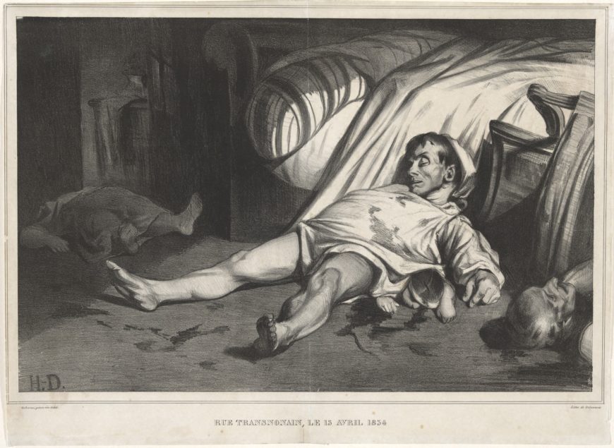
Daumier, Rue Transnonain
The massacre
Everyone in Paris knew what had happened in the apartment building. It was on the corner of two streets—rue Transnonain and rue de Montmorency. On the night of April 13, 1834, soldiers of the civil guard entered the building going from apartment to apartment. Workers in the neighborhood had protested against the repression of a silk workers’ revolt in the city of Lyon. The soldiers then entered the apartment building in response to shots fired from the top floor during the protest. Years later, survivors recalled hearing pounding on the apartment doors as the soldiers made their way in shooting, bayonetting, and clubbing the hapless residents.
Monsieur Thierry was killed while still in his bedclothes, Monsieur Guettard and Monsieur Robichet met the same fate. A recipient of the French Legion of Honor, Monsieur Bon was killed while trying to hide under a table. They killed Monsieur Daubigny, a paralyzed man, in his bed and left his wife and child for dead. Monsieur Bréfort was killed as soon as he opened his door and Monsieur Hue and his four-year old child met the same fate. The conservative papers talked of a nest of assassins firing on soldiers, the more liberal papers offered detailed accounts of the victims.
Parisians had lived with political repression enforced by the police and civil guard for years and street battles were nothing new. The Revolution of 1830, inspiration for Delacroix’s painting Liberty Leading the People, had overthrown the repressive monarchy that followed Napoleon’s rule. The new ruler, Louis-Philippe called himself the King of the French and was supposed to be more liberal. Instead, he clamped down on public dissent and the press much like his predecessors. Those who wanted the freedoms promised by the French Revolution of 1789 attempted another rebellion in June 1832. The writer, Victor Hugo, memorialized that insurrection which left over 100 dead on the streets of central Paris, in his book Les Miserables. Somehow, what happened on rue Transnonain was different.
Soldiers had entered people’s homes.
Today, such an event would still be covered by newspapers, but also on social media and on cell phone cameras, but in 1834 it fell to Paris’s renowned printmaker, Honoré Daumier, to show the Parisians just what had happened. But how? How do you show a massacre? And what would be the risk of publishing a print that challenged the government so directly?
Working class artist
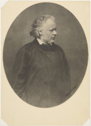
Honoré Daumier came to Paris as a child when his father, a glazier and frame maker, moved his family to pursue his literary ambitions. The family was never well-off and Daumier worked from the age of twelve for booksellers and as an errand boy for a law firm to help support them. A friend of the family, the antiquarian and archeologist Alexandre Lenoir, gave young Daumier informal drawing lessons because the family could not afford any formal training for the gifted young artist.
Daumier continued to draw and study on his own, visiting the Louvre to draw sculpture and the Académie Suisse, an inexpensive studio without an instructor, where he could draw from the nude. Although he became a widely respected artist in Paris, Daumier never stepped away from his working-class origins, and perhaps this gave him the immense empathy found in his portrayal of those who perished on rue Transnonain.
The print is a lithograph—it used limestone and oil-based inks to create light and shadow similar to drawing or painting. Daumier experimented with this technique as a young teenager and later held a job working for a printmaker. By 1834, he had established himself as a caricaturist and political cartoonist, working for the publisher Charles Philipon by creating lithographs for his satirical, illustrated journals La Caricature and, after 1835, Le Charivari. Over his career, Daumier published well over 3,000 lithographs.
How to show a massacre
Among these many lithographs, Rue Transnonain stands alone for its brutal tone and unflinching commentary on what had only recently occurred. Daumier brings together a group of four bodies in one space, and extreme areas of light and darkness, to give the viewer one image that summed up the violence of that night.

A dead man in his bloody nightshirt, just roused out of the rumpled bed, lies prone across the composition with his body resting atop a bludgeoned child. The child’s head and chubby hands just emerge from beneath the man. Perhaps these bodies, foreshortened and moving toward the viewer, allude to Monsieur Hue and his child. To the left of the man and the child, an older man’s head enters the scene from the edge of the paper, in front of a toppled chair. These bodies, lit with a dramatic light, complement the darker portion of the composition on the other side of the sheet where a woman’s dead body moves away from the viewer into the darkness at the back of the apartment. Dark marks, likely smears of blood, litter the floor. The print is not a documentary image but one designed to evoke the brutality of the event in the starkest terms. There is no action or drama here; instead, Daumier leaves the viewer with only the stillness and silence of death.
Daumier knew the risk
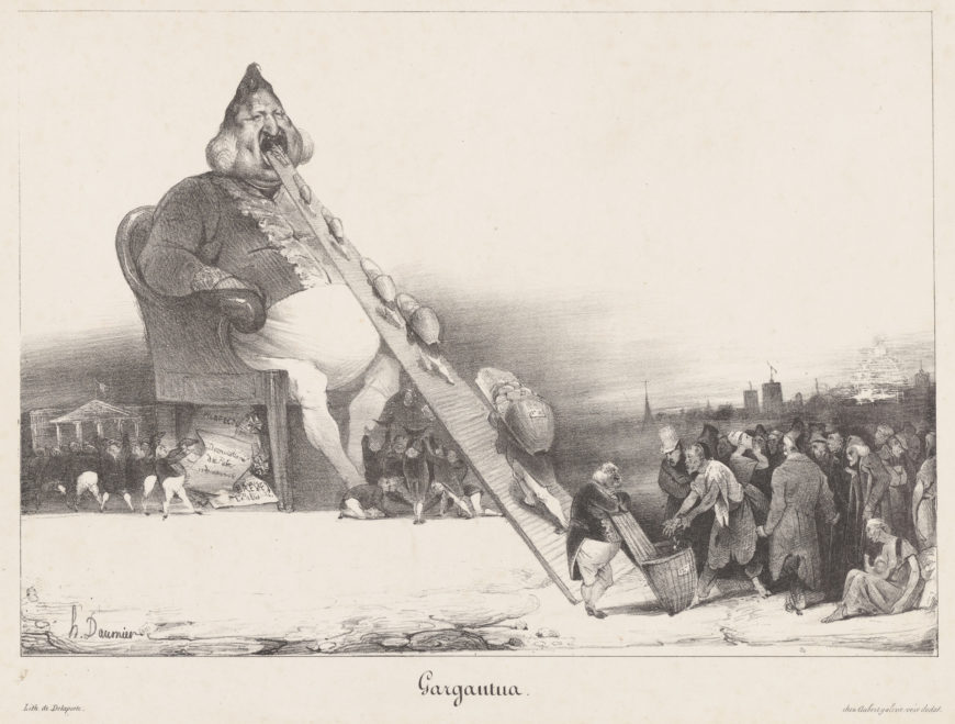
In the years surrounding the publication of Rue Transnonain, journalists, publishers, and printmakers could face criminal charges, fines, and even imprisonment for their publications. In 1831, Daumier had created a print titled Gargantua depicting Louis-Philippe, the King of the French, as a corpulent blob with an oversized conveyor belt tongue consuming money provided by the laborers of France (Gargantua is also the name of a giant in a series of novels written in the 16th century by Rabelais). For this work, Daumier and his publisher Philipon were charged, tried, and sentenced to six months in prison. As he began work on the print, Rue Transnonain, Daumier understood the risk he was taking.
Daumier created Rue Transnonain for the print subscription, L’Association Mensuelle Lithographique and published it in August 1834. Founded by Philipon, while he was serving time in prison for the publication of Gargantua, L’Association Mensuelle distributed caricatures to subscribers on a monthly basis and the funds raised supported freedom of the press and helped to pay off Philipon’s government fines.
Rue Transnonain was the last lithograph published in that series. Although government censors had approved the print, when it was exhibited in the window of a print seller, the police took note and quickly attempted to track down as many copies as they could. The police also confiscated the lithographic stone so that no more prints could be made. The remaining original prints of Daumier’s Rue Transnonain are among the most valued of Daumier’s works. After they published Rue Transnonain, Daumier and Philipon avoided prosecution but the ultimate cost was high. The government passed a new law restricting freedom of the press and proscribed political caricature. As a result, Daumier changed his subject matter, turning his eye away from direct political critique and toward social commentary.
Additional Resources:
This print at the Metropolitan Museum of Art
Interactive web exhibit from the Minneapolis Institute of Art
Bruce Laughton, Honoré Daumier (New Haven: Yale UP, 1996).
Gustave Courbet
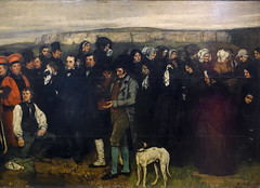
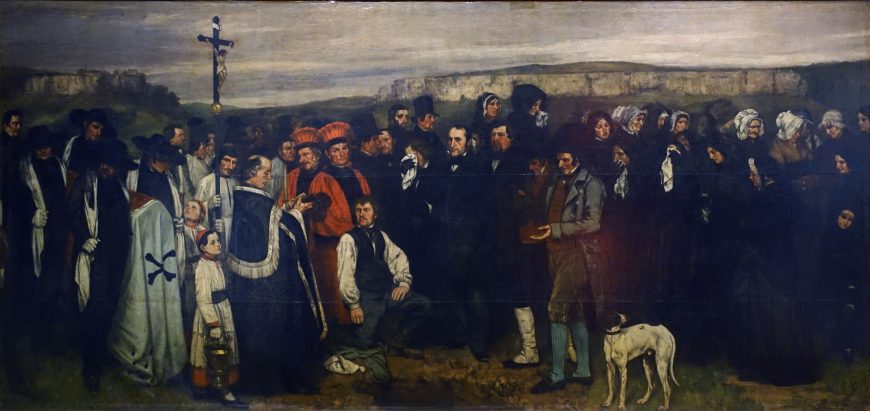
Gustave Courbet, A Burial at Ornans
by DR. BETH HARRIS and DR. STEVEN ZUCKER
Video \(\PageIndex{1}\): Gustave Courbet, A Burial at Ornans, begun late summer 1849, completed 1850, 124 x 260″, oil on canvas (Musée d’Orsay, Paris)
Smarthistory images for teaching and learning:
Gustave Courbet, The Stonebreakers
by DR. BETH HARRIS and DR. STEVEN ZUCKER

Realism and reality
If we look closely at Courbet’s painting The Stonebreakers of 1849 (painted only one year after Karl Marx and Friedrich Engels wrote their influential pamphlet, The Communist Manifesto) the artist’s concern for the plight of the poor is evident. Here, two figures labor to break and remove stone from a road that is being built. In our age of powerful jackhammers and bulldozers, such work is reserved as punishment for chain-gangs.
Unlike Millet, who, in paintings like The Gleaners, was known for depicting hard-working, but idealized peasants, Courbet depicts figures who wear ripped and tattered clothing. And unlike the aerial perspective Millet used in The Gleaners to bring our eye deep into the French countryside during the harvest, the two stone breakers in Courbet’s painting are set against a low hill of the sort common in the rural French town of Ornans, where the artist had been raised and continued to spend a much of his time. The hill reaches to the top of the canvas everywhere but the upper right corner, where a tiny patch of bright blue sky appears. The effect is to isolate these laborers, and to suggest that they are physically and economically trapped. In Millet’s painting, the gleaners’ rounded backs echo one another, creating a composition that feels unified, where Courbet’s figures seem disjointed. Millet’s painting, for all its sympathy for these poor figures, could still be read as “art” by viewers at an exhibition in Paris.
Courbet wants to show what is “real,” and so he has depicted a man that seems too old and a boy that seems still too young for such back-breaking labor. This is not meant to be heroic: it is meant to be an accurate account of the abuse and deprivation that was a common feature of mid-century French rural life. And as with so many great works of art, there is a close affiliation between the narrative and the formal choices made by the painter, meaning elements such as brushwork, composition, line, and color.
Like the stones themselves, Courbet’s brushwork is rough—more so than might be expected during the mid-nineteenth century. This suggests that the way the artist painted his canvas was in part a conscious rejection of the highly polished, refined Neoclassicist style that still dominated French art in 1848.
Perhaps most characteristic of Courbet’s style is his refusal to focus on the parts of the image that would usually receive the most attention. Traditionally, an artist would spend the most time on the hands, faces, and foregrounds. Not Courbet. If you look carefully, you will notice that he attempts to be even-handed, attending to faces and rock equally. In these ways, The Stonebreakers seems to lack the basics of art (things like a composition that selects and organizes, aerial perspective and finish) and as a result, it feels more “real.”
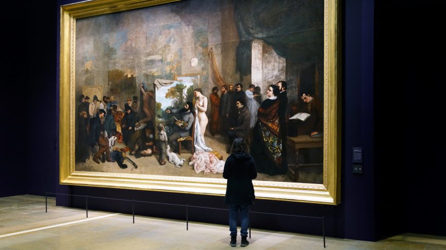
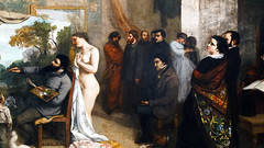
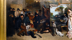
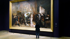
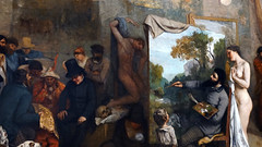
Gustave Courbet, The Painter’s Studio: A Real Allegory Summing Up Seven Years of My Life as an Artist
by DR. BETH HARRIS and DR. STEVEN ZUCKER
Video \(\PageIndex{2}\): Gustave Courbet, The Painter’s Studio: A Real Allegory Summing Up Seven Years of My Life as an Artist, 1854-5, oil on canvas, 361 x 598 cm (Musée d’Orsay)
A real allegory? Courbet’s contradiction
The title of Courbet’s painting contains a contradiction: the words “real” and “allegory” have opposing meanings. In Courbet’s earlier work, “real” could be seen as a rejection of the heroic and ideal in favor of the actual. Courbet’s “real” might also be a coarse and unpleasant truth, tied to economic injustice. The “real” might also point to shifting notions of morality.
In contrast, an “allegory” is a story or an idea expressed with symbols. Is it possible that Courbet is using his title to alert the viewer to contradictions and double meanings in the image? Look, for instance, at the dim paintings that hangs on the rear wall of his Paris studio. These large landscapes seem to form a continuous horizon line from panel to panel. They dissolve enough so that we are not sure if they are paintings, or if they are perhaps windows that frame the landscape beyond. Is it “real” or is it a representation? Courbet seems to muddy the distinction and allow for both possibilities.

The artist
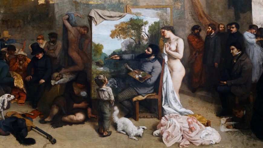
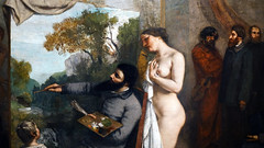
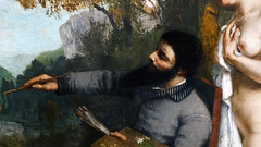
The artist is immediately recognizable in the center of the canvas. His head is cocked back and his absurd beard is thrust forward at the same haughty angle seen in Bonjour Monsieur Courbet. But here he is assessing and just possibly admiring the landscape that he is in the process of painting. The central composition is a trinity of figures (four, if you count the cat).
Model as muse
To Courbet’s right stands a nude model. Note that her dress is strewn at her feet. There is nothing exceptional here; after all, this is an artist’s studio, and models are often nude. However, Courbet does not look in her direction, as he would if she were actually posing for him. He doesn’t need to. He is, after all, painting an unpopulated landscape. Oddly, the direction of the gaze is reversed. The model directs her attention to align with Courbet’s, not vice-versa. She gazes at the landscape he paints. In the realm of the “real,” she functions as the model, but as “allegory,” she may be truth or liberty according to the political readings of some scholars and she may be the muse of ancient Greek myth, a symbol of Courbet’s inspiration.

Youth as innocence
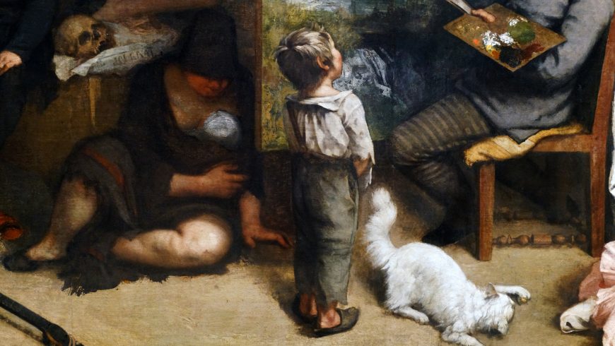
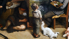
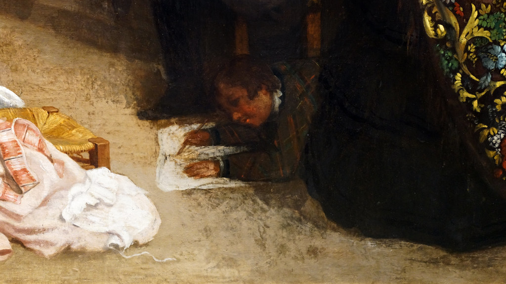
The boy to the left of the artist is also a reference. The smallest of the three central figures, he looks up (literally) to Courbet’s creation with admiration. The boy is unsullied by the illusions of adulthood—he sees the truth of the world—and he represented an important goal for Courbet—to un-learn the lessons of the art academy. The sophistication of urban industrial life, he believed, distanced artists from the truth of nature. Above all, Courbet sought to return to the pure, direct sight of a child. The cat, by the way is often read as a reference to independence or liberty.
Cast of characters
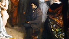
The entire, rather crowded canvas, is divided into two large groups of people. In the group on the left, we see fairly rough types described. They are a cast of stock characters: a woodsman, the village idiot, a Jew, and others. There are several other allusions, such as the inclusion of the current ruler of France, Louis-Napoléon, but let’s focus on the larger theme at hand. Here then, are the country folk whom Courbet faces.
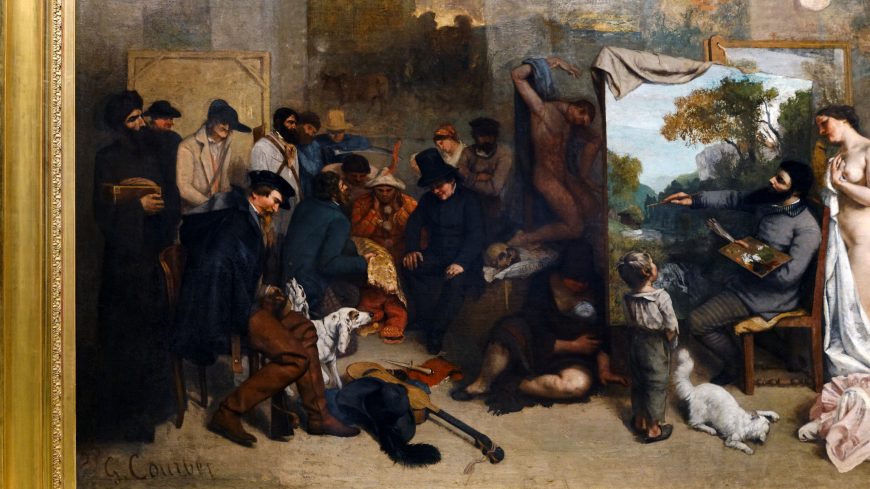
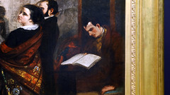
On the opposite side of the canvas are, in contrast, a far more handsome and well-dressed party. Gathered at the right lower corner of the painting are Courbet’s wealthy private collectors and his urbane friends. At the canvas’s extreme right sits Charles Baudelaire, the influential poet who was a close friend of the painter.
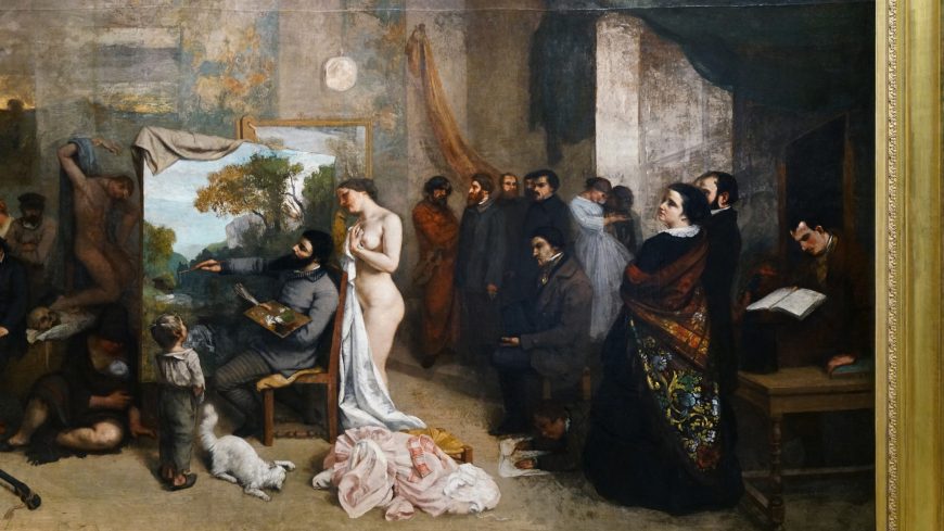
Is this composition familiar? Courbet is engaged in the act of painting, or as we might say, he is creating a landscape. Could the reference be to God the creator? The composition seems directly related to the traditional composition of the New Testament story, the Last Judgment. Think of Giotto’s Last Judgment fresco on the back wall of the Arena Chapel in Padua (1305-06), or Michelanglo’s Last Judgment painted on the altar wall of the Sistine Chapel (1534-42). In those paintings, the blessed (those that were on their way to heaven) were on the right side of Christ (our left), and the damned (those on their way to Hell) were shown on Christ’s left (our right).

Courbet the creator
Courbet has placed himself in the position of creator. But does he want us to use a capital “C”? What then of the model/muse? In the place of the blessed on the left are the country folk, a reference to the morality of nature? On the right side in place of the damned are the urban sophisticates—the notion of the corruption of the city. And in the bottom right corner, where Michelangelo placed Satan himself, we find, amusingly, Courbet’s close friend, the poet Baudelaire, author of The Flowers of Evil.

Finally, note the crucified figure partly hidden behind the easel. Indeed, Courbet referred to himself as a kind of martyr (look at such paintings as Self-portrait as Wounded Man). He created these satirical portrayals of himself as a martyred saint perhaps because of his metaphorical “suffering” at the hands of the French art critics.
Additional resources
This painting at the Musée d’Orsay, Paris
Demonstration of Gustave Courbet’s Painting Techniques at The J. Paul Getty Museum
Smarthistory images for teaching and learning:

Gustave Courbet, Bonjour Monsieur Courbet
by DR. BETH HARRIS and DR. STEVEN ZUCKER
Arguably the most influential artist of nineteenth century French Realism, Gustave Courbet (goos-tav core-bay), is the first major figure that we can identify as avant-garde (ahh-vahhnt guard). This was originally a French military term subsequently adopted for certain radical artists and thinkers. “Avant” means advance or forward, and “garde” is similar to the English guard or soldier, so the original phrase referred to the vanguard or the troops that pushed ahead of the main battalions at great personal risk. In the art world, avant-garde refers to those artists willing to risk their reputations in search of new methods of visual expression that break down old, ineffective approaches to art-making. The avant-garde is always ahead of the pack, but their new ideas, if ultimately successful, are often adopted by the masses.
Introducing Courbet

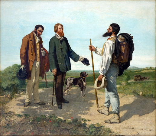
In his canvas The Meeting or, Bonjour Monsieur Courbet, of 1854, Courbet has painted himself on the right side. This self-portrait offers a number of significant clues as to how the artist thought of himself or perhaps how he wished to be seen. Rather like dressing in the morning or applying makeup (if you do), a self-portrait allows for a degree of control over the way that others perceive you.
Courbet, then, is announcing who he is. Our job is to read the clues that this image offers. Looking closely at the painting, Bonjour Monsieur Courbet, what visual cues help identify each person? Before you say to yourself, “I don’t know how to do this,” remember that you are in fact an expert in reading the clues given by the people around you. Everyday you respond to body language, types and styles of clothing, facial expression, hand gesture, and environmental context. Those judgments are based upon your quick, and quite sophisticated assessment of these sorts of clues. So look at these figures as actors on a stage or, as Courbet has suggested, people that you’ve run across as you stroll a country road. What do the costumes, the props, and the interactions express?
Clothing as costume
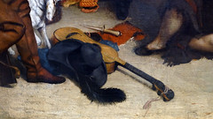
The man in the green jacket beside the dog is very well dressed indeed. But is the man in brown next to him? He wears a suit, but it is worn and ill-fitting. His name is Calas and he serves the man beside him. The rich man in the center is flanked by both his servent Calas and his dog. Is Courbet trying to draw a connection between this man and the dog as well as a distinction between himself and the group of three? Do you see this as a chance meeting? And what of the angle of the heads?

Look closely at the angle of Courbet’s head in relation to the angle of the servant. The fellow in green is the son of a banker, an industrialist named Alfred Bruyas who is one of Courbet’s patrons and had himself been a painter. Bruyas has also removed his right glove, presumably to shake Courbet’s hand, Courbet has not returned the gesture. The patron and artist, though, are unfairly matched, since Bruyas is on Courbet’s turf.
We know that Courbet came from Ornans in eastern France, quite outside of the orbit of Paris where he had moved. But here, Courbet is self-sufficient, and carries on his back a folding easel that contains everything he needs (paint, canvas, palette, oil, turpentine, and rags) to paint directly from nature. Bruyas, on the other hand, must be trailed by a servant and carries only a small cane. One can imagine that Bruyas and his servant had been transported by the carriage in the background, ill-prepared as they are for the countryside, while Courbet had evidently been making his way on foot.

The meeting between the two men represents the vitality of the countryside in contrast to the mannered style of the city. Even the different treatment of Bruyas and Courbet’s beards, though related to each man’s true likeness, further underscores the contrast of the stuffy aesthete to the “worker-artist.” The issue we’ve discussed before–the exaltation of the countryside as the Industrial Revolution progressed–sees its full expression in this work. This, then, really is Courbet’s manifesto. Here is the artist, a man of the country who goes his own way.
Courbet’s politics
Unlike the other great painters of rural life and labor, such as the French Realist Jean-François Millet, the artist Gustave Courbet was very politically active. In 1848, he witnessed and read about a series of unsuccessful uprisings in France, England, and Germany. These revolts had been inspired by earlier enlightenment thinking. Unlike the American and French Revolutions of the eighteenth century, however, these more modern actions were fueled by the depravations and mass dislocations caused by the industrialization of Western Europe. Laissez-faire capitalism of the nineteenth century built both massive fortunes and the slums of the wretchedly poor. And life was indeed wretched for most.
When we think of the economic system currently employed in the United States, we think of modern capitalism. After all, the planned socialist economies of the “Iron Curtain” (the Soviet Union and its allies), have been discredited. However, before we come to feel too smug, we should remember that our system is actually is a highly socialized capitalism, which is a very good thing. As stated earlier, pure capitalism is brutal. This period saw young children chiseling coal from tunnels too narrow for adults and the common use of poisonous substances without even rudimentary safeguards required for workers. There was no safety net beyond one’s family and church. Many died of neglect, starvation, and disease.
Rosa Bonheur
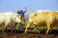
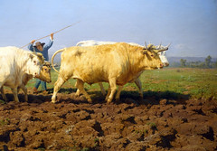
Rosa Bonheur, Plowing in the Nivernais (or The First Dressing)
by DR. BETH HARRIS and DR. STEVEN ZUCKER
Video \(\PageIndex{3}\): Rosa Bonheur, Plowing in the Nivernais (or The First Dressing), 1849, oil on canvas (Musée d’Orsay, Paris)
Smarthistory images for teaching and learning:

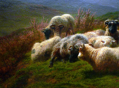
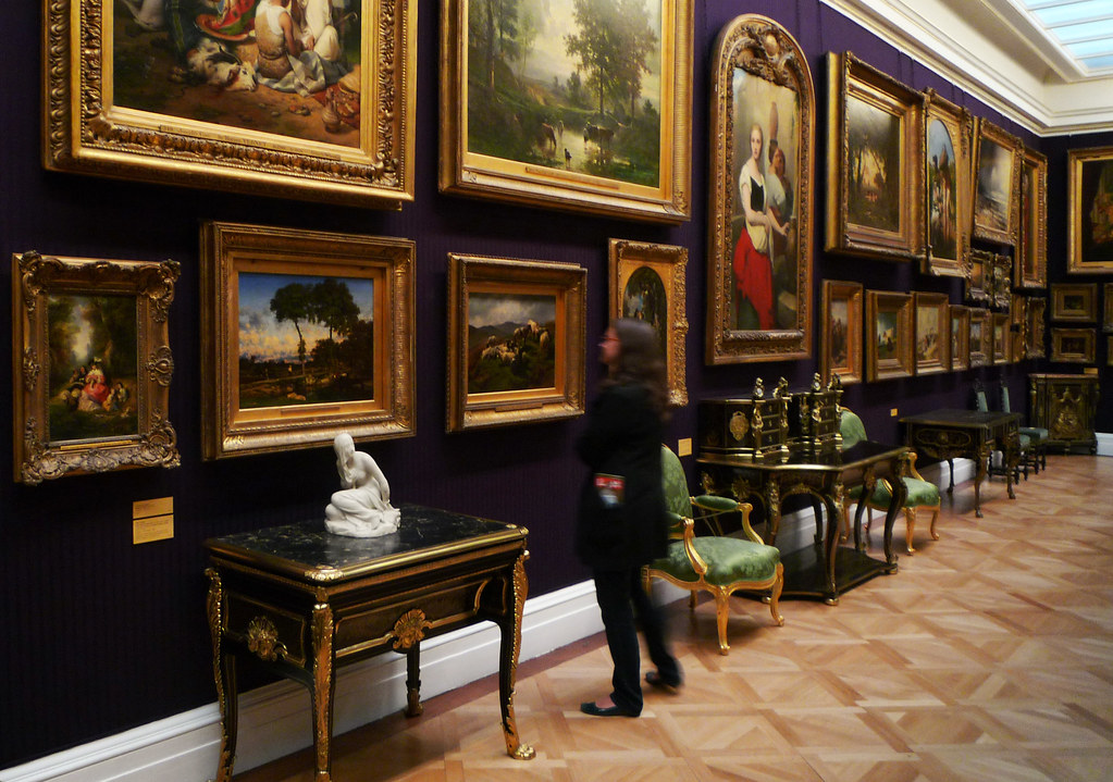
Rosa Bonheur, Sheep in the Highlands
by DR. BETH HARRIS and DR. STEVEN ZUCKER
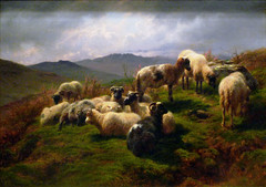
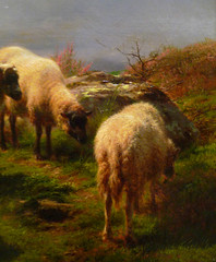
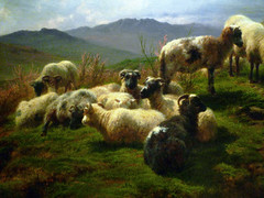
Video \(\PageIndex{4}\): Rosa Bonheur, Sheep in the Highlands, 1857, oil on canvas, 46 x 65 cm (Wallace Collection, London)
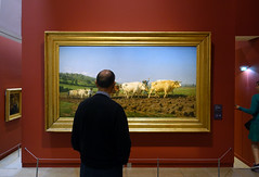
The Wallace Collection suggests that this painting is likely the result of a trip that the artist made to Scotland the previous year.
Smarthistory images for teaching and learning:


Jean-François Millet
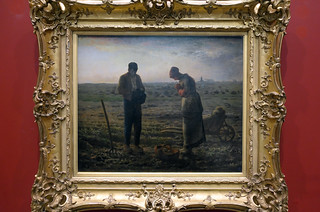
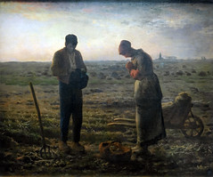
Jean-François Millet, L’Angélus
by DR. BETH HARRIS and DR. STEVEN ZUCKER
Video \(\PageIndex{5}\): Jean-François Millet, L’Angélus, c. 1857-1859, oil on canvas, 21 x 26 (53.3 × 66.0 cm) (Musée d’Orsay, Paris)
Smarthistory images for teaching and learning:
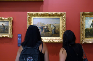
Jean-François Millet, The Gleaners
by DR. BETH HARRIS and DR. STEVEN ZUCKER
Video \(\PageIndex{6}\): Jean-François Millet, The Gleaners, 1857, oil on canvas, 33 x 43″ / 83.5 x 110 cm (Musée d’Orsay, Paris)
Smarthistory images for teaching and learning:


Édouard Manet
Édouard Manet, Music in the Tuileries Gardens
by BEN POLLITT

Music in the Tuileries
The writer Emile Zola described Manet as “an analytic painter” and rarely are his powers of analysis displayed more dazzlingly than in Music in the Tuileries Gardens.
First exhibited in 1862 at Manet’s one-man show in the Galerie Martinet, the chorus of gibes it was met with was to set the tone for the later drubbings he received for those larger Salon submissions, Déjeuner sur l’Herbe in 1863 and Olympia in 1865 (the Salon was the official art exhibition).
For the modern viewer, perhaps, it is difficult to see at first what all the fuss was about. The painting, a medium-sized group portrait. It depicts a crowd of music-lovers in the Tuileries Gardens and might seem to us quaint—old-fashioned even, evoking a fine day spent near the Louvre where concerts were performed twice weekly, and attracted the fashionable elite of the Second Empire.

After Velazquez
Shortly before Music, Manet made a copy after a painting then attributed to Velazquez, entitled Les Petits Cavaliers, depicting a meeting of Seventeenth-Century Spanish artists. The parallels with Music in the Tuileries Gardens are intriguing. Manet too surrounds himself with the great and the good of the contemporary art scene; including the composer Offenbach (seated to the right with top hat, moustache and glasses), the novelist and critic Champfleury (seated to the left), and the painter Bazille (standing centre left with the round grey hat).
Also, like Velazquez, Manet situates himself to the far left of the painting, prompting comparisons between himself and the man famous for bringing a greater psychological complexity to art, for scrutinising in paintings such as his masterpiece, Las Meninas, the relationship between the observer and the observed. The suggestion perhaps is that Manet’s own work plays with similar concerns. As in Las Meninas where the viewer stands in the place of the King and Queen whose portraits Velazquez is painting, here we occupy a similarly fictionalised space, seemingly where the musicians in the orchestra should be. Where else is the music of the title coming from if not us? It is a pleasing conceit, one which Velazquez himself might have been proud.

Composition & style
In keeping with the refined gentility of the subject, the composition has been carefully ordered, reflecting gender attitudes of the time: the women—grounded and passive—are mostly pictured seated, while the men—mobile and active—stand. The iron chairs in the foreground help set up this structure, introducing a color scheme repeated in the curvy female forms of the composition: the ladies’ golden and corn-coloured hats and dresses. The gentlemen meanwhile are largely dressed in blacks, echoing the dark vertical lines created by the trees, their top hats and frock coats merging with the trunks. This gendering of space is far from radical and can be found in the works of any number of nineteenth century artists. What is it about then that provoked such outrage?

There are certainly some stylistically interesting decisions, such as the reduction of the sky to a paltry triangle of blue, or the insistence of that tree trunk, off-center, that slices through the picture plane, as one finds in Japanese prints, disrupting the horizontal axis and in turn the illusion of depth. The technique too is startling, the extraordinarily sketchy handling of paint with dabs of color that in places barely suggest discernible forms. All this would certainly have jarred exhibition visitors of the day.
Baudelaire and “The Painter of Modern Life”
What was probably most shocking though was the subject matter itself. We have grown so used to scenes of contemporary life in art that it is hard to imagine that in 1862, while acceptable in print illustrations for journals and newspapers, the depiction of modern urban life was not considered, certainly by the French Academy, a fitting subject for high art. By exhibiting it as such, Manet was taking a radical stance, one that would have been fully supported by his friend Charles Baudelaire.
In the early 1860s, Manet and the poet and critic Baudelaire met daily at the Tuileries. Baudelaire’s early essay “The Salon of 1846: On the Heroism of Modern Life” argued that modern life was as heroic and as worthy a subject as any taken from the classical world, that men in frock coats were as brave in their own way as gladiators were in Roman times. He developed and refined this idea in his 1863 essay “The Painter of Modern Life.”
A key concept in this essay is that not only should modern life be the artist’s favored subject, but that painting, rather than, for example, literature, is the ideal medium to express modernity. The visual experience of the city, the spectacle of the city, conveyed its essence, and integral to this is the crowd. After all, people made the city and set its pace, and with a population explosion unprecedented in history, life in Paris in the mid-Nineteenth Century had never been faster nor more crowded.
The flâneur
Not surprisingly, given their close association at the time, critics have been keen to draw links between Manet’s Music and Baudelaire’s essays. One observation that is cited relates to Baudelaire’s idea of the flâneur.

An artist wishing to record the hustle and bustle of this new city life, according to Baudelaire, needed to be at once a part of its crowds and possessed with the means, both intellectual and financial, to remain aloof from them; this artistic type he christened the flâneur, meaning “stroller” or “loafer.” By placing himself in the extreme left of the painting, critics have argued, Manet is deliberately identifying himself as a flâneur, the gentleman-dandy situated both within and removed from the crowd.
Baudelaire’s painter of modern life should capture, with just a few brush strokes, the carriage, expression and gesture of an individual, suggesting that to do so he would have to work at speed, mastering a sort of visual short-hand, simplifying forms to something not unlike caricature. This is certainly true of the loose, spontaneous brushwork used to render Music.
Modernity is the fleeting
The painting’s concern with modernity is distinctly Baudelairean. “Modernity is the transient, the fleeting, the contingent,” he famously wrote and capturing the fleeting moment is surely one of the main features of Music.
Light flickers between the trees, conjuring up chord progressions and the music referenced in the title. The treatment of space is even more intriguing. We notice, for instance, that some figures are more clearly defined than others, not in an orderly way such as in the Renaissance technique, aerial perspective where colors and form lose their clarity the further they are from us. Instead, Manet applies an arbitrary or “contingent” system that flouts these conventions.

Notice how sketchy the children closest to us are when compared to others in the composition such as the Realist painter Henri Fantin-Latour shown with the beard and top hat to the left of the tree (pictured below). In doing this, Manet, it seems, attempted to capture or rather reconstruct not simply a crowd but the optical experience of looking at a crowd.
The figure to the right of Fantin-Latour, whose face has become a mere blur of a profile, is Baudelaire himself. We might expect him to be more clearly depicted. That he isn’t suggests the depth of the affinity between these two men. By chance it is Fantin-Latour who has caught our eye and not Baudelaire. A moment later, it might have been different.

The transient, the fleeting and the contingent, these are the elements that Manet delights in—and by doing so, he willingly discards image-making techniques that had dominated Western art since the time of Leonardo.
New perspective
This new form of perspective, both focused and fuzzy, may be likened to the way a camera mirrors the way the eye works. It is thought that Manet used portrait photographs as visual aids when composing the painting in his studio. Rather than slavishly copying these photographs, however, Manet has analyzed and abstracted the principles that underpin this new technology, creating what, as yet, only painting can achieve, an effective visual rendering of the passing of time.
“Almost all our originality comes from the stamp that ‘time’ imprints upon our feelings”, wrote Baudelaire and herein lies Music’s greatness, a painting that has been somewhat overshadowed by the success of the scandal of Déjeuner sur l’Herbe and Olympia, but which nevertheless has a fair claim to being the first modern painting in Western art.
Additional resources:
Édouard Manet, Olympia
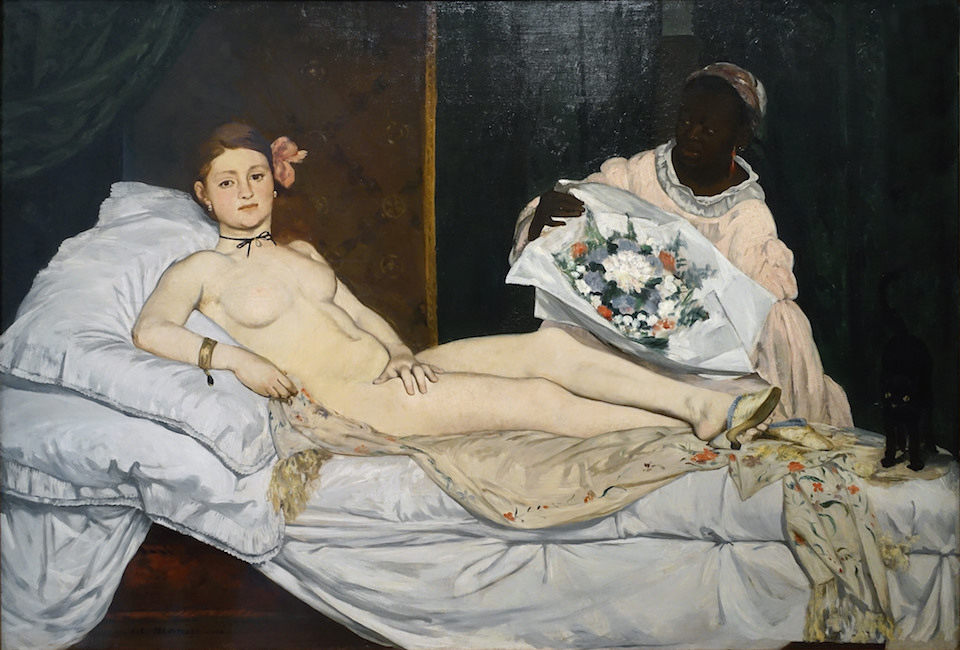
Video \(\PageIndex{7}\): Édouard Manet, Olympia, oil on canvas, 1863,130 x 190 cm (Musée d’Orsay, Paris) (Speakers: Dr. Beth Harris and Dr. Steven Zucker)
“They are raining insults upon me!”
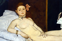
Manet’s complaint—”They are raining insults upon me!” to his friend Charles Baudelaire pointed to the overwhelming negative response his painting Olympia received from critics in 1865. Baudelaire (an art critic and poet) had advocated for an art that could capture the “gait, glance, and gesture” of modern life, and, although Manet’s painting had perhaps done just that, its debut at the salon only served to bewilder and scandalize the Parisian public.
Mocking the classical past
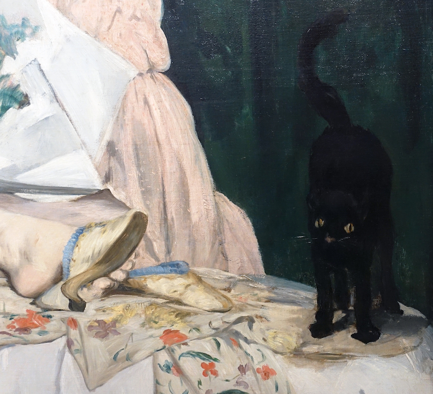
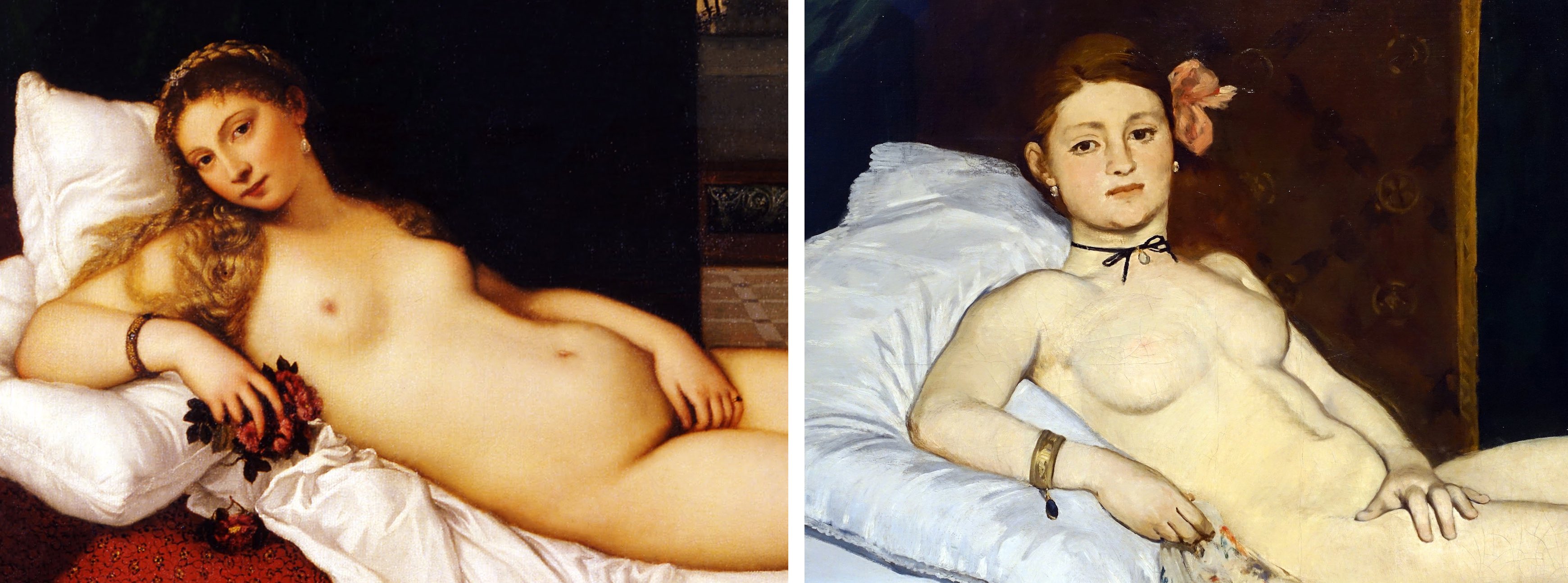
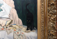
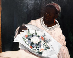
Olympia features a nude woman reclining upon a chaise lounge, with a small black cat at her feet (image above), and a black female servant behind her brandishing a bouquet of flowers (image below). It struck viewers—who flocked to see the painting—as a great insult to the academic tradition. And of course it was. One could say that the artist had thrown down a gauntlet. The subject was modern—maybe too modern, since it failed to properly elevate the woman’s nakedness to the lofty ideals of nudity found in art of antiquity —she was no goddess or mythological figure. As the art historian Eunice Lipton described it, Manet had “robbed,” the art historical genre of nudes of “their mythic scaffolding…”[1] Nineteenth-century French salon painting (sometimes also called academic painting—the art advocated by the Royal Academy) was supposed to perpetually return to the classical past to retrieve and reinvent its forms and ideals, making them relevant for the present moment. In using a contemporary subject (and not Venus), Manet mocked that tradition and, moreover, dared to suggest that the classical past held no relevance for the modern industrial present.
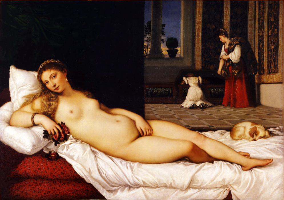
As if to underscore his rejection of the past, Manet used as his source a well-known painting in the collection of the Louvre—Venus of Urbino, a 1538 painting by the Venetian Renaissance artist Titian (image above)—and he then stripped it of meaning. To an eye trained in the classical style, Olympia was clearly no respectful homage to Titian’s masterpiece; the artist offered instead an impoverished copy. In place of the seamlessly contoured voluptuous figure of Venus, set within a richly atmospheric and imaginary world, Olympia was flatly painted, poorly contoured, lacked depth, and seemed to inhabit the seamy, contemporary world of Parisian prostitution.
Why, critics asked, was the figure so flat and washed out, the background so dark? Why had the artist abandoned the centuries-old practice of leading the eye towards an imagined vanishing point that would establish the fiction of a believable space for the figures to inhabit? For Manet’s artistic contemporaries, however, the loose, fluid brushwork and the seeming rapidity of execution were much more than a hoax. In one stroke, the artist had dissolved classical illusionism and re-invented painting as something that spoke to its own condition of being a painted representation.
The birth of modernist painting
It was for this reason Manet is often referred to as the father of Impressionism. The Impressionists, who formed as a group around 1871, took on the mantle of Manet’s rebel status (going so far as to arrange their own exhibitions instead of submitting to the Salon juries), and they pushed his expressive brushwork to the point where everything dissolved into the shimmering movement of light and formlessness. The 20th century art critic Clement Greenberg would later declare Manet’s paintings to be the first truly modernist works because of the “frankness with which they declared the flat surfaces on which they were painted.”[2]
Manet had an immediate predecessor in the Realist paintings of Gustave Courbet, who had himself scandalized the Salons during the 1840s and ‘50s with roughly worked images of the rural French countryside and its inhabitants. In rejecting a tightly controlled application of paint and seamless illusionism—what the Impressionists called the “licked surfaces” of the paintings of the French Academy—Manet also drew inspiration from Spanish artists Velasquez and Goya, as well as 17th century Dutch painters like Frans Hals, whose loosely executed portraits seem as equally frank about the medium as Manet’s some 200 years later. But Manet’s modernity is not just a function of how he painted, but also what he painted. His paintings were pictures of modernity, of the often-marginalized figures that existed on the outskirts of bourgeois normalcy. Many viewers believed the woman at the center of Olympia to be an actual prostitute, coldly staring at them while receiving a gift of flowers from an assumed client, who hovers just out of sight (Manet here puns on the way French prostitutes often borrowed names of classical goddesses). The model for the painting was actually a salon painter in her own right, a certain Victorine Meurent, who appears again in Manet’s The Railway (1873) and Auguste Renoir’s Moulin de la Galette (1876).

Disturbingly familiar but startlingly new
Manet had created an artistic revolution: a contemporary subject depicted in a modern manner. It is hard from a present-day perspective to see what all the fuss was about. Nevertheless, the painting elicited much unease and it is important to remember—in the absence of the profusion of media imagery that exists today—that painting and sculpture in nineteenth-century France served to consolidate identity on both a national and individual level. And here is where the Olympia’s subversive role resides. Manet chose not to mollify anxiety about this new modern world of which Paris had become a symbol. For those anxious about class status (many had recently moved to Paris from the countryside), the naked woman in Olympia coldly stared back at the new urban bourgeoisie looking to art to solidify their own sense of identity. Aside from the reference to prostitution—itself a dangerous sign of the emerging margins in the modern city—the painting’s inclusion of a black woman tapped into the French colonialist mindset while providing a stark contrast for the whiteness of Olympia. The black woman also served as a powerful emblem of “primitive” sexuality, one of many fictions that aimed to justify colonial views of non-Western societies.

If Manet rejected an established approach to painting that valued the timeless and eternal, Olympia served to further embody, for his scandalized viewers, a sense of the modern world as one brimming with uncertainty and newness. Olympia occupies a pivotal moment in art history. Situated on the threshold of the shift from the classical tradition to an industrialized modernity, it is a perfect metaphor of an irretrievably disappearing past and an as yet unknowable future.
[1] Eunice Lipton, “Manet: A Radicalized Female Imagery,” Artforum (March, 1975)
[2] Clement Greenberg, “Modernist Painting,” in The Collected Essays and Criticism, Volume 4: Modernism with a Vengeance, 1957-1969 (University of Chicago Press, 1995), p. 86.
Smarthistory images for teaching and learning:

Additional resources:
The painting at the Musée d’Orsay
Édouard Manet on The Metropolitan Museum of Art’s Heilbrunn Timeline of Art History
Olympia (zoomable) at the Google Cultural Institute
Charles Baudelaire, “The Painter of Modern Life,” 1863.
Eunice Lipton, “Manet: A Radicalized Female Imagery,” Artforum (March 1975).
T. J Clark, The Painter of Modern Life: Paris in the Art of Manet and His Followers (Princeton University Press, 1999, revised).
Clement Greenberg, “Modernist Painting,” 1961 in Harrison and Wood, Art in Theory, 1900-1990 (Oxford University Press, 1982).
Édouard Manet, Le déjeuner sur l’herbe (Luncheon on the Grass)
by DR. BETH HARRIS and DR. STEVEN ZUCKER
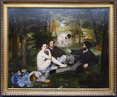
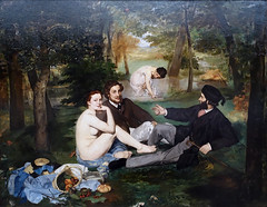
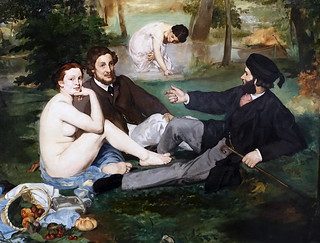
Video \(\PageIndex{8}\): Édouard Manet, Le déjeuner sur l’herbe (Luncheon on the Grass), oil on canvas, 1863 (Musée d’Orsay, Paris)
Additional resources:
This painting at the Musée d’Orsay
Manet on the Metropolitan Museum of Art’s Heilbrunn Timeline of Art History
“London version of Manet’s Le déjeuner sur l’herbe predates the bigger picture in Paris,” The Art Newspaper (November 25, 2016)
Smarthistory images for teaching and learning:
Édouard Manet, The Railway
by BEN POLLITT
Video \(\PageIndex{9}\): Édouard Manet, The Railway, 1872-73, oil on canvas (National Gallery of Art)
The railway
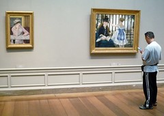
The Railway, also known as Gare Saint-Lazare, is surely one of the most inscrutable paintings of the nineteenth century. Manet began work on it in the autumn of 1872, the year of Victor Hugo’s L’Année Terrible, a collection of poems outlining the catastrophic events of 1870-1: France’s defeat by the Prussians, Bismarck’s devastating siege of Paris, and the violence that saw out the Paris Commune in the summer of 1871; a truly terrible year in which, all told, through combat, starvation or civil strife, almost 200,000 French lost their lives.

The painting, Manet’s first major canvas since the outbreak of war, went on show in the Paris Salon of 1874, the year of the first Impressionist exhibition, heralding the ascendancy of a style of art that stood for leisure, pleasure, spontaneity, freedom and nature. Situated between these two historical moments, Manet’s work stands on the crossroads: both serious and playful, unfettered and restrained.
The people
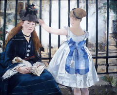
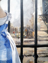
The painting shows two figures, a seated woman and a standing child, in front of a set of iron railings; behind them are railway tracks, a barely perceptible group of workers next to a shed, an iron bridge and, furthest away, the facades of residential houses. The woman’s cropped dress and the subtle diagonals of the structural setting create a sense of uncertainty, as though chance has had a hand in framing the scene, as though we have somehow stumbled upon it? Her reading interrupted, by us or by her own thoughts, a finger placed to mark her page, the woman looks at us directly. Who is she and who are we to her?

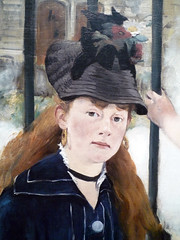
The model is Victorine Meurent, Manet’s muse of the 1860’s who posed for both Olympia and the nude figure in Déjeuner sur l’Herbe. Here she exudes a sense of middle-class propriety, fashionably dressed in a deep blue dress with large, light blue buttons, wide cuffs and collars. In her lap a puppy doses, the child’s pet perhaps, the red fan behind it finding echoes in the flowers in her hat, the girl’s pendant earring and the rail worker’s shirt to the left. The black hat is a clever device, tilted forwards as was the fashion and held in place with a tie-back bow. Not only does it elevate the figure to a level slightly higher than the girl, it also neatly emphasizes the flatness of the picture plane, an effect enhanced further of course by the iron railings. The interplay of flatness and depth is one of Manet’s most daring innovations, inspired perhaps by his growing familiarity with Japanese woodblock prints.
Used expertly here, the technique sets off perfectly the ambiguous relationships between the two principle figures. Both connected and oddly detached, we sense they belong together, the matching colours of their dresses suggesting the fact, but quite how remains unclear. Is she her daughter, her niece, her sister? Is she a governess and the girl her ward?
To confound us further, the child – who was in fact the daughter of Manet’s painter friend Alphonse Hirsch—has her back turned to us, a compositional device known as the Rückenfigur. Just as we cannot see her face, whatever has grabbed her attention, a departing train we might imagine, is obstructed from view.
The Place

One thing we can be certain of is the location it depicts, an area in and around the Place de l’Europe, a sort of grandiose traffic island next to the Gare Saint-Lazarre from which a network of streets radiate, each named after a European capital, the rue de Rome, the rue de Madrid and so on. The iron gridwork and large masonry pillars of the bridge to the right belong to the Pont de l’Europe, the orthogonals of which lead the eye into the background creating an area of interest to counter the dominance of the seated woman to the left. Behind her on the other side of the tracks two doorways are visible, the one in clear view being the entrance to 4 rue de St Pétersbourg, which served as Manet’s studio from 1871 to 1877.

For some art historians, Manet’s choice in depicting this new quarter of Paris, built according to the utilitarian principles of logic, order and efficiency that underpinned Baron Haussmann’s major renovation of Paris in the 1850’s and 60’s, would suggest that the artist was very much at home in the modern world. The constant commotion of rail transport was, according to contemporary accounts, a part of the artist’s daily life; visitors to his new studio commented on how the floor would tremble as the trains passed beneath.
An aerial view of the Place de l’Europe illustrates the complex network of roads running through it and tracks running under it. Painted at the hub of this frenetic intersection and with his studio proudly featured in it, The Railway then might reasonably stand as a homage to the wonders of modern transport, capturing something of the optimism of Paris in the Third Republic.

Others have seen the painting more as an examination of the impact of industrialization. The fracture between the foreground figures and background setting being the focus of many such discussions of the work, particularly the cage-like quality of the railings. A contemporary cartoonist re-titled the work: “The Railway. Two madwomen, gripped by incurable mono-manet-ia, watch the rail cars through the bars of their cell.” The prison or asylum analogy, played on comically here, has been adopted by other, more serious-minded critics.
Robert L. Herbert¹, for instance, notes how the middle-class figures are artificially caged off from the railway workers, reflecting the rigid divisions of labor brought about by industrialization. The railings in this sense suggest an artificial imposition of order, both in terms of the organization of pictorial space and the social relations operating within it. The sense of fracture and dislocation is felt in the title itself, for the railway seems surprisingly peripheral – marked by a few shadowy streaks of paint – as compared to the solid bulk of the railings. Nor for that matter is the train actually made visible, its presence only suggested by the steam.
The steam
Describing The Railway as an “as essay on consciousness,” the critic Harry Rand² argues that the psychological complexity of the painting owes much to the friendship Manet struck up during this period with the symbolist poet Stéphane Mallarmé, one of the greatest literary figures of his age. A fellow resident of the rue de Saint-Pétersburg, the two met daily for almost a decade.

Rand likens Mallarmé’s poetic concerns, his love of the playful and the dreamlike, of finding beauty in uncertainty and chance, to Manet’s painterly concerns in The Railway. That hazy plume of steam, for instance, set against the metallic bulk of the railings, is quintessentially symbolist, the insubstantiality and intangibility of the steam standing, ironically perhaps, as a symbol for the powerfully solid train, while at the same time the steam obscures the background we imagine lies beyond it, blurring the space between foreground and background. Like so much else in the painting, therefore, it serves both to reveal and to conceal. In fact, the more one looks at it, the more essential it becomes, to the point where, with T.J. Clark³, we might reasonably declare that it is less the railway or chemin de fer (road of iron), but the steam itself that is the painting’s “great subject”.
Final thoughts

The painting is famously open to interpretation. I have touched on just a narrow selection of readings here. Broadly speaking, each highlights the fact that in the world of the painting, though localized and particular, nothing is fixed and certain. It is a theme that would be taken up by the Impressionists. Monet’s Boulevard des Capucines, for instance, presents a view from the window of Nadar’s studio where that first exhibition took place in 1874. Visitors would look at the painting hanging on the wall, then step to the balcony to inspect the scene for themselves. However, the correlation between the two was not a literal or mimetic one, a fact that provoked consternation at the time. Though we have may grown accustomed to such distortions in art, they still seem remarkably fresh and resonant, these great works, our continued love for them explained no doubt by how effectively they evoke our relationship with this strange world in which we live and which strangely lives in us.
- Robert L. Herbert, Impressionism: Art, Leisure, and Parisian Society, 1988, Yale University Press: 29
- Harry Rand, Manet’s Contemplation at the Gare Saint-Lazarre, 1987, Berkeley, California: 763.
- T.J. Clark, “Modernism, Postmodernism, and Steam,” October, vol. 100 (Spring 2002): 158-9
Additional resources:
This painting at the National Gallery of Art
Web feature at the National Gallery of Art
Introduction to a Painting: Manet’s The Railway from the National Gallery of Art
Video from the National Gallery of Art’s Children’s Tour
Manet from An Introduction to Nineteenth Century Art at Routledge
Smarthistory images for teaching and learning:
Édouard Manet, Émile Zola
by DR. BETH HARRIS and DR. STEVEN ZUCKER
Video \(\PageIndex{10}\): Édouard Manet, Émile Zola, 1868, oil on canvas, 57 x 45″ / 146.5 x 114 cm (Musée d’Orsay, Paris)
This portrait was painted in appreciation for the support Zola gave to Manet in his 1866 essay in La Revue du XXe siècle and during Manet’s independent exhibition held alongside the Universal Exposition in 1867.
Édouard Manet, The Balcony
by DR. BETH HARRIS and DR. STEVEN ZUCKER
Video \(\PageIndex{11}\): Édouard Manet, The Balcony, 1868-69, oil on canvas, 66-1/2 x 44-1/4″ (Musée d’Orsay, Paris)
The three principal figures depicted are each friends of the artist. From left to right they are: the painters Berthe Morisot and Jean Baptiste Antoine Guillemet, and Fanny Claus, a violinist. Some have suggested that the fourth figure, barely visible in the shadows, is the young Leon Leenhoff, the son of Manet’s wife.
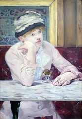
Édouard Manet, Plum Brandy
by DR. STEVEN ZUCKER and DR. BETH HARRIS
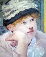
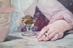
Video \(\PageIndex{12}\): Édouard Manet, Plum Brandy, c. 1877, oil on canvas (National Gallery of Art)
Smarthistory images for teaching and learning:
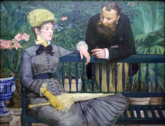
Édouard Manet, In the Conservatory
by DR. STEVEN ZUCKER and DR. BETH HARRIS
Video \(\PageIndex{13}\): Édouard Manet, In the Conservatory, 1878-1879, oil on canvas, 115 x 150 cm (Alte Nationalgalerie, Staatliche Museen zu Berlin)
Smarthistory images for teaching and learning:

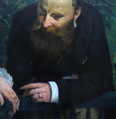
Édouard Manet, Corner of a Café-Concert
by DR. BETH HARRIS and DR. STEVEN ZUCKER
Video \(\PageIndex{14}\): Édouard Manet, Corner of a Café-Concert, 1878-80, 97.1 x 77.5 cm (National Gallery, London)
Édouard Manet, A Bar at the Folies-Bergère
by DR. BETH HARRIS and DR. STEVEN ZUCKER
Video \(\PageIndex{15}\): Edouard Manet, A Bar at the Folies-Bergère, oil on canvas, 96 x 130 cm (Courtauld Gallery, London)
Smarthistory images for teaching and learning:
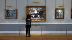
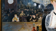
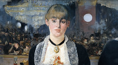
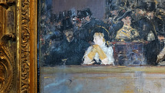
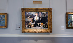
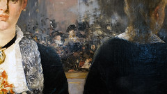
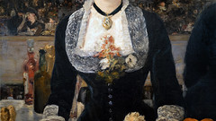
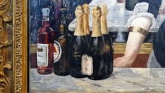
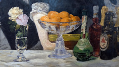
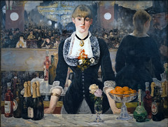
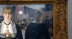
Better Know: Manet’s Bar
Video \(\PageIndex{16}\): You’ve likely seen this glassy-eyed late 19th Century barmaid before, but what can we make of this painting today?
Griselda Pollock unpacks some of the questions raised by Manet’s enigmatic last masterpiece.
Eva Gonzàles, A Loge at the Théâtre des Italiens
by BEN POLLITT

A garland of flowers
Eva Gonzàles must have captivated Manet, at that time the most controversial artist of his day. They met in 1869, introduced by the English artist Alfred Stephens, shortly after which Manet accepted her as his first and only student. He was approaching forty and with her admiration and eagerness to learn from him, it would have been hard for him to resist. Just as appealing, though, were her family connections. Her father Emmanuel Gonzàles, a noted journalist and writer was president of the Société des Gens de Lettres and Manet, who was still struggling to gain Salon recognition might have felt he needed the protection and support of just such an establishment figure. And then, of course, she was also Spanish and Manet was one of Paris’s most notable Hispanophiles.
After her apprenticeship, the two remained friends and correspondents for the rest of their lives. Sadly, they died within three days of each other; first Manet from syphilis and then Gonzàles aged 34 after childbirth. It is said that when news reached her sickbed of her old master’s death, she sat up and weaved a garland of flowers for his grave. Despite, or perhaps partly because of this touching tale of devotion, much of what has been written about her as an artist and indeed as a character seems somewhat dismissive. The problem, it seems, is that she was just too good a student. But then what about Artemisia Ghentilleschi? The first great woman artist, also known as La Donna Caravaggista (the woman follower of Caravaggio). To follow a master is not necessarily a bad thing. More to the point, perhaps, is who she was up against at the time; this was, after all, the age of Mary Cassatt and Berthe Morisot, beside whom Gonzàles’s work does seem somewhat tame.
Still, while it is true to say that she is not an artist of the first rank, her few surviving works are nevertheless both beautiful and intriguing and in the case of her most famous, A Loge at the Théâtre des Italiens, offer an alternative view on a world that has largely been colored by our encounters with more famous, largely male artists.
A Loge at the Théâtre des Italiens
Framed by the lush red velvet and gold rope tassels of the curtain and a slightly curving hand rest, the artist’s sister Jeanne Gonzàles sits accompanied by the standing figure of Henri Guérard, the man whom Eva would later marry in a box at the Théâtre des Italiens, the venue for the grandest of opera productions by the likes of Mozart, Rossini and Verdi. A lithograph of the theatre from 1843 shows not just the popularity of these performances, but also how close the curtained boxes, such as the one the painting shows, were to the stage as well as how exposed those that occupied them were to the gaze of the public.

The couple appear detached, the man in profile, the woman posed frontally staring ahead of her, a large pair of opera glasses in one hand. Her expression seems at once alert and relaxed, suggesting that sort of entranced look one has when watching an opera. A particularly spine-tingling aria is being sung perhaps and Jeanne, her hands lowered, simply listens. Perpendicular to her, the man leans back, his elbow resting on the velvet covered rest, his body language expressive of the poise and detachment of the flâneur.
The vogue for the loge
The subject of the loge, or theatre box, was one that was favored by the Impressionists. Aside from the natural frame the box supplies, it also offers opportunities to explore some interesting themes such as the relationship between artifice and nature, appearance and reality and of course the near universal concern of Impressionist artists, the spectacle of modern life. In a space at once public and private, the sitter is conscious of both watching and of being watched, a phenomenon that was a key feature of nineteenth-century Parisian life in which the streets themselves became like a stage and the passers-by actors on it. In the loge, however, one is removed from the chaos of the crowd and taken to a far more privileged space. Given these associations with wealth and status, the subject might well have appealed to the aspiring bourgeoisie and a canny artist would certainly have had a sale in view when producing such an image.
Another feature of the loge is its ability to imply metapictorial narratives—events that are taking place outside of the picture frame. The directions of the gazes of two figures is in this sense certainly curious. Imagining the loge to be slightly to the left of the stage, Jeanne’s eyes are clearly leveled at the performance, while Guérard’s, on the other hand, follows the opposite direction. What is it that he is looking at? The audience perhaps, or possibly, given that it was common for the doors to these theatre boxes to be opened, even during a performance, and for social activity to take place in the corridor outside them, perhaps some event or spectacle taking place there, off-offstage as it were, has captured his attention.
Whatever solutions we may come up with, however, these conflicting gazes still remain puzzling. Do they reflect their personal relationship, that the two of them are somehow heading in different directions, or can one draw from it more general comments about gender roles within Parisian society, the man looking out, engaged in the world about him, the woman taking a more unworldly, reflective stance? Certainly, unlike Guérard, Jeanne is no flâneur, or flâneuse to use the feminine term, begging the question whether it was possible at a time when women were so socially constrained for such a phenomenon to exist. (For a discussion of the flâneur, read this essay on Manet’s Music in the Tuileries Gardens.)
Knowing who the models are is useful. Guérard being Eva’s beau and not Jeanne’s, we can reasonably discount the possibility that they are romantically involved. It is also useful to note that at this time a woman of Jeanne’s class would not be seen out alone. Instead, so as not to compromise her respectability, a member of the family or a trusted friend would accompany her, acting as her chaperone. Perhaps it is for this reason Guérard remains aloof, keeping his distance from perhaps the underlying purpose of Jeanne’s presence in the theatre, namely, as a young woman of marriageable age, a débutante, she is formally presenting herself to society. Though very much in her element, as one would expect from the daughter of a celebrated writer, clearly a great deal of thought has been taken in how best she can offer the image of herself to the public. The flowers that face us and which offer a perfect match to the dress and accessories she wears suggest this sense of ritualized display while the chair next to her is empty, signaling perhaps her availability.
What a contrast then to Renoir’s La Loge, painted in the same year. Here the model, a working-class girl called Nini, has been dressed up by the artist in a far more lavish fashion. Dripping ermine and pearls, she is placed conspicuously in the front of the box, her purpose it seems being little other than decorative—a trophy or adornment for the man behind her who looks up with almost grotesquely large binoculars.

The understatement of Gonzàles’s work, on the other hand, with its Manet-esque economy of expression, exudes elegance and refinement and, indeed, just the sort of poise and detachment that characterize the dispassionate gaze of the flâneur. In it we discover a slice of Parisian life that is presented in ways that record in a more sensitive and nuanced way than Renoir, I think, the manners and mores of the time.
Additional resources:
This painting at the Musée d’Orsay


