
4.7: Op Art (1960s – 1970s)
- Page ID
- 174431
Introduction
Op Art was a new form based on the exploitation of illusions and different optical effects of how an image was perceived. Op Art is the short form of Optical Art, a style of abstraction challenging the viewer's visual acuity. In 1957, neuroscientist Donald M. MacKay created the illusion based on a series of radial lines (MacKay rays), producing the perception of shimmering motion from the angled lines. The artist Victor Vasarely, one of the originators of the style, studied science and art and combined the concepts of color and optics to create images appearing to move, alter or expand. At first, Vasarely experimented with visual tricks like trompe-l'oeil before moving to geometric abstraction and recognition as the grandfather of Op Art.
The form was usually mathematically based, using repetitive color and arrangements to develop into vibrating, changing effects. The background and foreground relationships became chaotic with exaggerated 3-dimensional depths. Op Art pushed the concepts of perception, confusing the eye through multiple optical effects, angles, and materials. The artist used precise calculations and measurements based on geometric forms to produce the illusionary perception in an image. Color, grids, and patterns defined and created the illusional positive space and negative areas. Many of the images were based on black and white, as others used bright contrasting colors to develop the illusional motion of static patterns. Artists used straight or curved lines to establish the idea of undulation, volume, or spiraling movement. Op Art used optical illusions and incorporated the concepts of kinetics; the static work moved from a seemingly fixed position into a dimensional and moving object by interacting with the viewer's eye and perceptions in the retina.
Victor Vasarely
Victor Vasarely (1906-1997), born in Hungary, studied at medical school before transferring to art school and enrolling in the private school Mühely (workshop) based on Bauhaus concepts. In 1930, he married another student and had two sons. Shortly after they married, they moved to Paris, where he worked as a graphic designer. He experimented with different designs and ideas using geometric forms, multiple materials, colors, and perspectives. One of his first images depicted two zebras intertwined, their black and white stripes against the black background became the earliest example of Op Art. Although Vasarely experimented with other styles and movements, by 1947, he focused on the geometric abstraction of shapes, lines, color, and perspective. One reviewer of Vasarely's work stated, "The Moving eye in the moving body must work to pick out and interpret a variety of changing, juxtaposed orders, like the shifting configurations of a Victor Vasarely painting. It is the unity that maintains but only just maintains, control over the clashing elements which compose it. Chaos is very near, its nearness, but its avoidance gives force."[1] Vasarely developed a methodology of using a set of colors and then creating lines and shapes for the color system he termed his 'artistic alphabet.' Each series was based on a different alphabet or color plan.
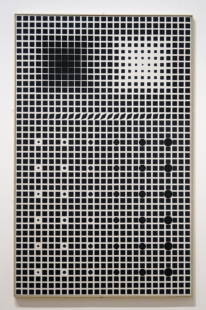
Supernovae (6.7.1) is an early work of Vasarely, a vertical, abstract painting in black and white. Supernovae were stars constantly changing, an idea he used for his series of black and white canvases, altering the viewer's perception based on geometric principles and movement. He created 1,161 black squares inside the grid of thin white lines.[2] At the top left of the image, the black squares shift and form a black cruciform, while on the upper right side, the black squares are smaller and from a white diagonal cross. Some parts of the work have circles inside the squares, the circles increasing in size as they move across the painting. About a third of the way from the top, one row contains black rhomboids appearing to float. Supernovae appear to be moving and changing, optical changes based on the chromatic density and shapes seen by the viewer's eye. Vasarely believed the perception of motion was achieved by the aggressive ways the geometric structures appear to the retina.
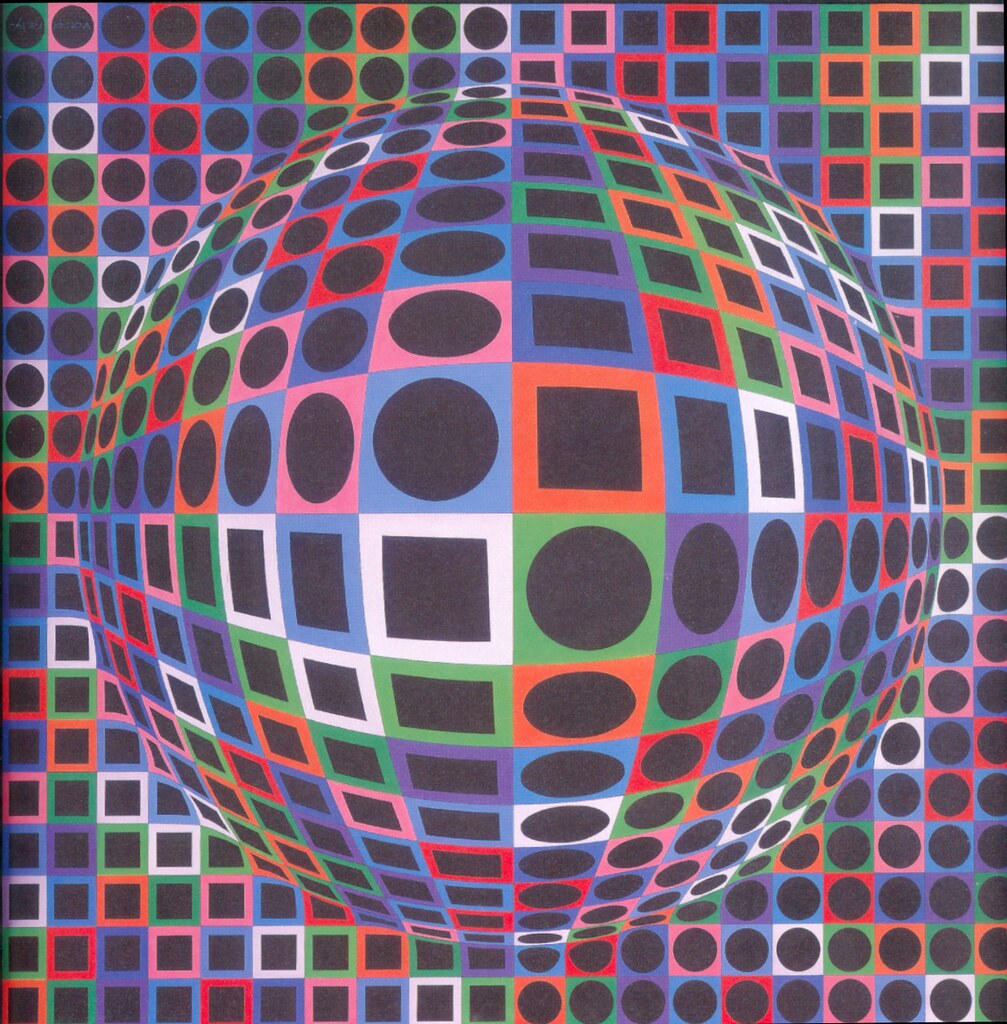
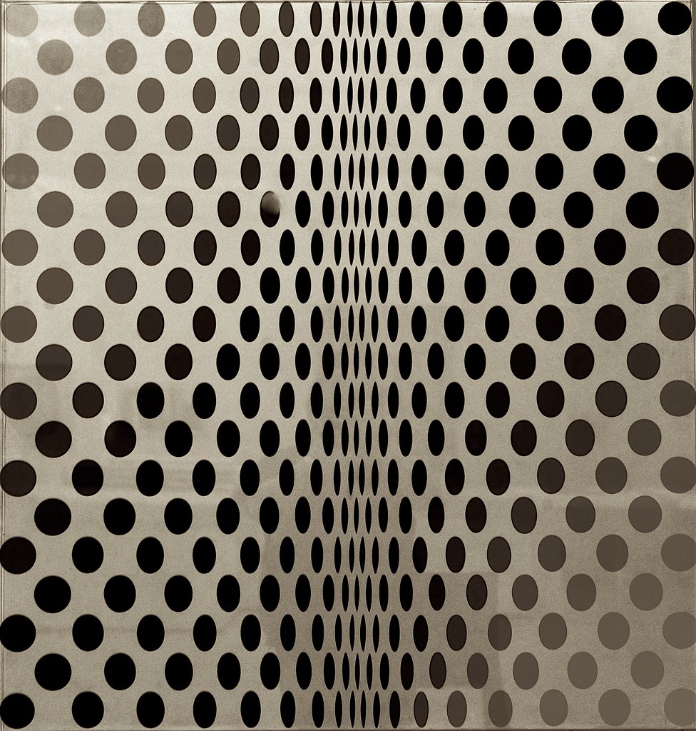
Vasarely aggressively incorporated color into his optically illusionary paintings in the 1960s with vivid squares and luminous circles, creating images appearing concave and rotating or convex and moving in waves, all becoming part of the signature patterns of Vasarely and Op Art. He named many of his series after distant galaxies, stars, or constellations. In the Vega series, he used convex and concave distortions, combining cubes and squares into grid-like patterns to bring the pulsating rhythm of the nighttime skies. Vasarely used the two-dimensional platform of a primary grid to create three-dimensional images by reducing or expanding the grid sections, transforming squares and circles into rhombuses and ellipses. Vega-gyongly-2 (6.7.2) appears as a rotating ball in the middle of the flat grid. Vasarely added additional movement with the white squares the viewer chases throughout the painting. Changing the size of the circles or squares created the multi-dimensional view of a surface appearing to be warped.
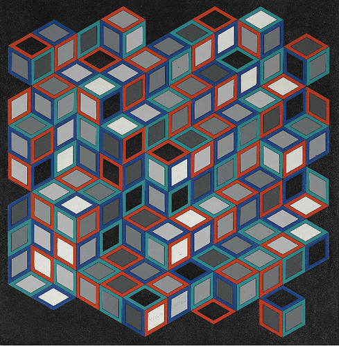
Sange 3076 (6.7.3) was based on squares to form cubes. Vasarely used his color system or alphabet to define the patterns. The color palette is simple and set against a dark background. The color and position represent each unit, red appearing the dominant color as used only to define the square, or is white the prominent color as it bounces around the image. The eye also moves to the small black squares devoid of color. Vasarely used color to move the viewer around the painting and the dimensional cubes stacked in multiple combinations adding to the numerous location changes of the cubes.
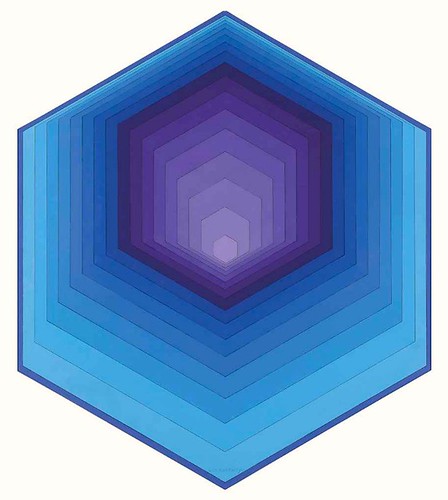
Vasarely's Gestalt series was a reflection of his fascination with hexagons. The paintings have an ethereal yet three-dimensional design based on cellular-like forms and structures. Axens (6.7.4) uses two prominent basic colors of blue and purple. The colors varied as they moved through space to create the illusion of a deep concave area, a light at the end of a tunnel. The only shape he used was the hexagon, each one smaller in progression. The broader dimensions of the bottom sides of the blue hexagons and the smaller sizes of the bottom of the purple hexagons create the deep depth of the image. Vasarely explored geometry, shapes, depth, movement, and color throughout his life, whether he was painting, sculpting, or planning architectural structures. As technology and computers developed, he exploited the programs to assist his designs ahead of his time. He worked into his old age, continuing to invent and generate new ideas.
Bridget Riley
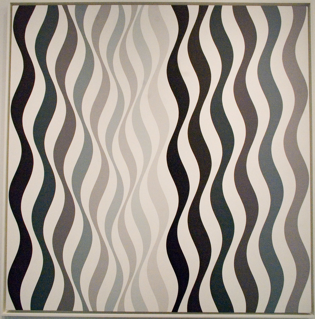
Bridget Riley (1931-) was born in London, England. Her father owned his own printing business before World War II when he served in the army. As with many families during the war, Riley, her mother, and her sister moved to the countryside in Cornwall to avoid the blitz. She liked to explore the coastline noting how reflections occurred in rock pools and the effects of the sunlight on the changing colors of the water. After the war, Riley studied art at Cheltenham Ladies' College, Goldsmiths College, and the Royal College of Art. Riley worked as an illustrator for an advertising agency when her father was seriously injured in a car accident, and she suffered a mental breakdown. Riley moved back to London, taught art at a girl's school, and explored different art styles. She experimented with figurative, Impressionist, and Pointillist art styles before developing her signature style of Op Art in the 1960s. Riley focused on using black and white for her geometric patterns creating images to disorient the eye into seeing movement and color. In addition to black and white, she used gray tones and placed the geometric shapes in curves, adding movement and optical variances. Riley traveled to multiple countries, favoring the bright colors and patterns found in Egypt and India. By 1967, Riley incorporated color in lines to produce a shimmering effect in tessellating patterns, highly contrasting colors. She thought of her work as inspired by nature, not in realistic forms; instead, as she said, "For me nature is not landscape, but the dynamism of visual forces-an event rather than an appearance."
Metamorphosis (6.7.5) presents an ambiguity to the viewer of the progressive movement as the circles are applied with different gray tones against the white background. Using circles, she changes the shapes as the circles move across the image. Riley carefully designed the shape of each circle and cut the patterns to ensure accurate proportions. Op Art became a significant part of the 1960s culture, the patterns, and illusions integral to the fashion and design industries. Riley was one of England's celebrity artists. She was not inspired by realism and stated, "I started studying squares, rectangles, triangles and the sensations they give rise to…The marks on the canvas are sole and essential agents in a series of relationships which form the structure of the painting"[3] During the early 1960s, Riley only used black and white to create imaginative and sensory images.
In Arrest 2 (6.7.6), Riley uses lines and multiple tones of black to white to bring the illusion of movements. The pale gray lines in the middle of the painting are bordered by heavy dark lines, forming the appearance of a channel to some viewers. In her black and white works, she wanted to eliminate any concept of representational art instead of using visual shapes to excite the retinal emotions.
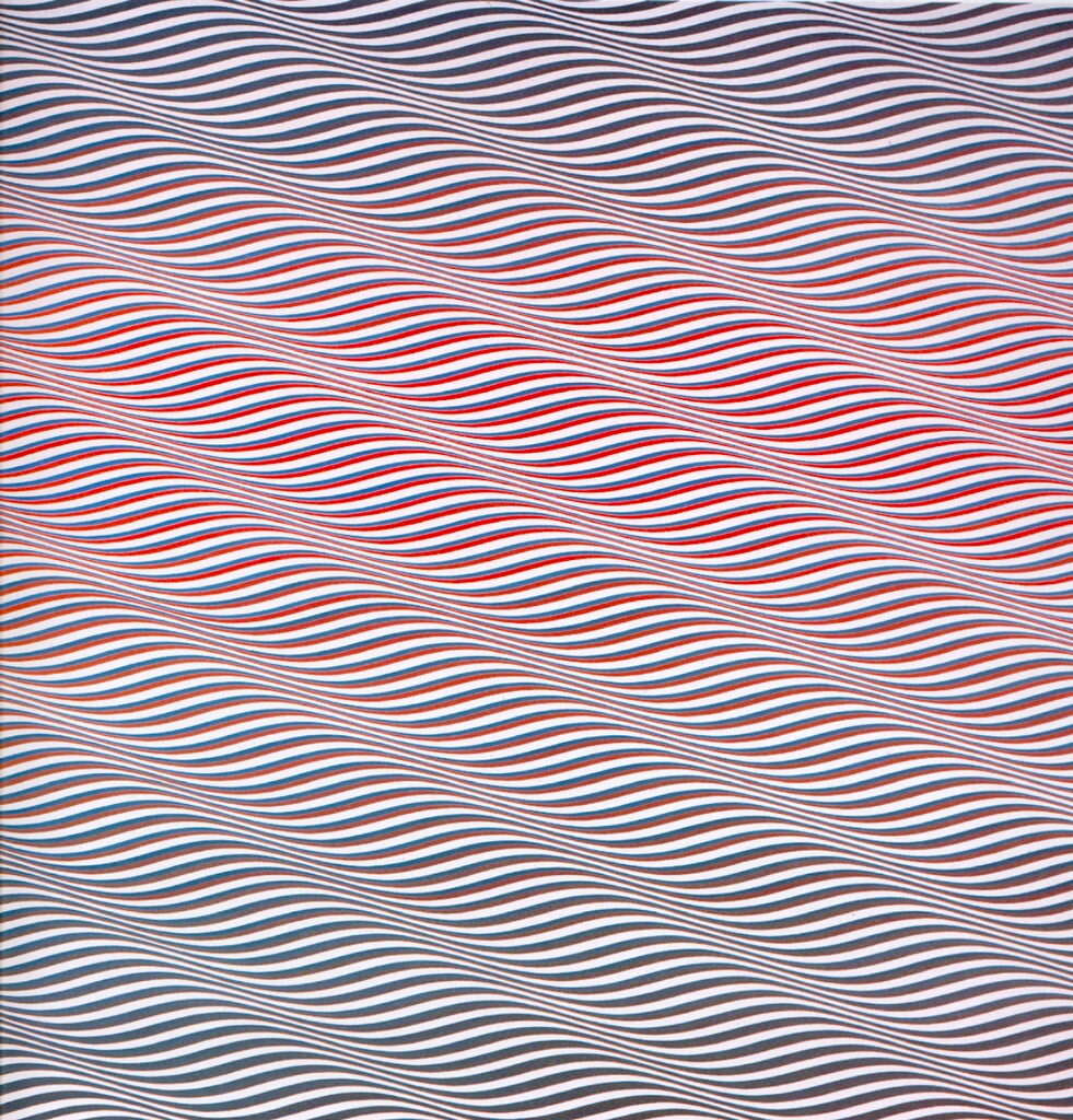
In 1967, Riley began to introduce color into her work, using the relationships of color and its changing qualities as a basis for her work. Her series in color was Cataract, and she described how difficult the move to color was; geometric shapes were constant, and color brought a sense of instability based on the presentation of adjunct colors. In Cataract 3 (6.7.7), Riley used lines, a stable shape, to position the color to produce the illusion of movement. The broad or thin lines appear as ribbons waving across the canvas. She used two extreme colors of turquoise and vermilion for contrast, positioning the colors to bring a luminosity to the rippling image through the center; grays at the top and bottom accent the movement through the middle of the work. Although Riley's black and white images were internationally respected, she wanted to continue to explore the use of color. She spent time studying Georges Seurat's use of Pointillism and how adjunct colors affect each other.
Orient IV (6.7.8) was based on her expanded sense of color and how linear structures of different colors next to each other created the concept of motion when viewed by the viewer's eye. She also began using stripes in most of her paintings, believing stripes allowed color to constantly change the viewer's perception. Riley usually made a pattern with small strips of paper to test different color combinations before painting on a large canvas, evaluating how the colors brought the feeling of motion.
Edna Andrade
Edna Andrade (1917-2008), born in Virginia, was encouraged from an early age to draw and paint and graduated from the University of Pennsylvania with a degree in Fine Arts. After World War II, she went to Europe and learned the modernism of the Bauhaus movement, concepts that influenced her designs and abstractions. Andrade married in 1941, and they moved to Philadelphia, where Andrade lived and painted. Early in her career, she created abstract landscapes before working on propaganda material during World War II for the organization that became the CIA, work she considered mundane and expected of women at the time. Andrade talks about herself as the unliberated housewife of the period. Andrade divorced her husband in 1960 and only then began painting the works she is known for, fully engaging in her ideas of illusionary or Op Art, geometrical shapes generally based on squares and unique color juxtapositions. Some of her work is almost psychedelic appearing, seemingly lines moving on the painting. Andrade felt her work was a visual experience without any particular story and believed the eye was easily upset when viewing conflicting color spectrums and sophisticated geometric patterns. Andrade's use of contrasting and repeated colors placed next to each other defined the rhythm and movement of the painting, almost a hypnotic sensation. She moves the eye around the painting in constant motion, no place to rest.
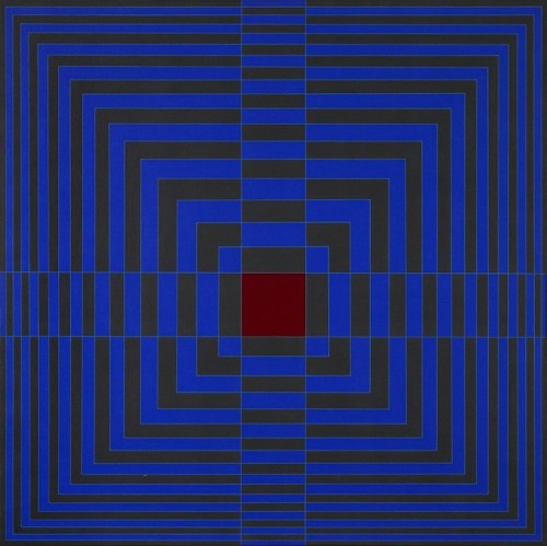
Blue Cross with Red (6.7.9) assaults the eye with the deep blue background filled with broken lines of deep red. The lines bend to move the viewer around the painting while continually returning to the strength of the red square in the middle. Andrade believed only a few basic shapes in combination with color develop symmetry and rhythm in the painting.
Untitled (Metallic Square 3) (6.7.10) demonstrates her belief in the symbolic significance of fundamental shapes. The simple line, bent and moved at incremental positions combined with basic opposing colors, generates the perspective of orderly movement in a chaotic environment.
While Blue Cross with Red appears as lines generating out from the middle square and Untitled has a maze-like appearance, Turbo 1-65 (6.7.11) uses what seems to appear as lightning bolts radiating from the center. The bright red lines against the opposing green give the perception the lines bend and expand as they move outwards, the bold contrasting colors conveying the rhythmic patterns.
Richard Anuszkiewicz
Richard Anuszkiewicz (1930-2020) was born in Pennsylvania; his father, a Polish immigrant, worked in a paper mill. Anuszkiewicz first studied art at the Cleveland Institute of Art before attending Yale University, where he received a Master of Fine Arts. He is viewed as one of the early proponents and founders of Op Art. In a gallery show in New York, an art reviewer stated, "The drama-and that feels like the right work-is in the subtle chemistry of complementary colors, which makes the geometry glow as if light were leaking out from behind it."[4] Anuszkiewicz used highly concentrated colors to define his geometric figures, frequently based on nested rectangular or square forms. He believed applying different intensive and juxtaposed colors created the effect of optically changing colors, his shapes appearing to pulsate.
Anuszkiewicz used patterns and parallel colored lines to form his illusionary images based on perceptive ambiguity. In Orange, Rose, Magenta Knot (6.7.12), the variegated colors create their relationships, accenting the geometric patterns integrated with the slender, thin lines. The magenta delineating lines are spaced closely together near the boundaries, the contrasting color bringing a shimmering perspective to the work. Each fluted line is meticulously aligned as they move closer or farther from each other, giving an illusion of a curved surface.
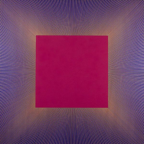
Deep Magenta Square (6.7.13) is from a series of works he painted based on a large square as the central image, the lines emanating from behind the square, giving the square the appearance of floating. The complementary colors of purple and yellow lines vibrate against one another developing the impression of a light source behind the solid square. The highly contrasted colors adjacent to each other give the colors added intensity. Anuszkiewicz liked the square as a focal point on his canvases and stated: "I think any time you put something right in the middle of the canvas, it gives people a sort of contemplative experience drawing in and coming out."[5]
Marina Apollonio
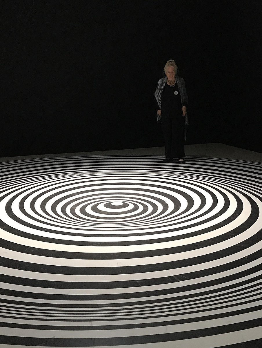
Marina Apollonio (1940-) was born in Trieste before she moved to Venice as a child. She attended the Accademia di Belle Arti di Venezia to study art, creating her first work in 1963. She preferred the depersonalization of Op Art instead of the more expressive Abstract Expressionism, using industrial metal materials for her artwork. Apollonio produced her work based on the concepts and relationships of parallel lines, using combinations of elementary forms and mathematical rigor. The two-dimensional work became imaginative three-dimensional of concentric circles appearing to fluctuate and spin in motion. Her large work is laid on the floor, the flat surface of strong parallel lines drawing the viewer physically into the painting. Much of her work was black and white; however, she also used contrasting colors. Spazio Ad Attivazione Cinetica 6B (6.7.14) demonstrates Apollonio’s use of mathematics, geometry and visual materials. Using the contrasting colors of black and white, the overly large work invites the viewer inside the painting; the flat surface appears to undulate into mini hills, slowly spinning. The Guggenheim Museum stated: "After choosing a primary shape, for instance, a circle, the artist would study its structural possibilities so that she could make it active, all the while striving to garner the maximum result via minimal means. This process was not at all tainted by subjectivity."[6] By the 1980s, Apollonio no longer made new artwork, only dedicating her time to research and writing.
In the 1960s, the vertigo-inducing artworks became the rage. The illusionistic paintings filled the galleries and museums, yet abruptly, Op Art was no longer in vogue, almost a craze tumbling into disfavor. Some critics called the art gimmicky and shallow, not serious. However, Op Art outlasted these critics, and analysis of the works demonstrates a unique ability to perceive patterns, geometric shapes, and juxtaposed, highly contrasting colors to create spectacular work involving the viewers in the dynamics of the paintings.
[1] August Heckscher, The Public Happiness, New York: Antheneum Publishers, 1962, p. 289
Found in Voelker, W. (1982). Behind the False Fronts: Alleys Come Out of Hiding. Landscape Architecture, 72(6), 71-73. Retrieved November 9, 2020, from http://www.jstor.org/stable/44671485
[2] Retrieved from https://www.tate.org.uk/art/artworks...ernovae-t00676
[3] Retrieved from http://www.op-art.co.uk/bridget-riley/
[4] Cotter, H., Art in Review; ‘Something Happened’, New York Times, Section E, December 15, 2000, p. 4
[5] Retrieved from https://www.theartstory.org/artist/anuszkiewicz-richard/artworks/
[6] Retrieved from https://burnthewater.org/2016/05/29/marina-apollonio-spazio-ad-attivazione-cinetica-6b/
(16 December 2020)