
6.8: Minimalism (1960 – early 1970)
- Page ID
- 124389
\( \newcommand{\vecs}[1]{\overset { \scriptstyle \rightharpoonup} {\mathbf{#1}} } \)
\( \newcommand{\vecd}[1]{\overset{-\!-\!\rightharpoonup}{\vphantom{a}\smash {#1}}} \)
\( \newcommand{\dsum}{\displaystyle\sum\limits} \)
\( \newcommand{\dint}{\displaystyle\int\limits} \)
\( \newcommand{\dlim}{\displaystyle\lim\limits} \)
\( \newcommand{\id}{\mathrm{id}}\) \( \newcommand{\Span}{\mathrm{span}}\)
( \newcommand{\kernel}{\mathrm{null}\,}\) \( \newcommand{\range}{\mathrm{range}\,}\)
\( \newcommand{\RealPart}{\mathrm{Re}}\) \( \newcommand{\ImaginaryPart}{\mathrm{Im}}\)
\( \newcommand{\Argument}{\mathrm{Arg}}\) \( \newcommand{\norm}[1]{\| #1 \|}\)
\( \newcommand{\inner}[2]{\langle #1, #2 \rangle}\)
\( \newcommand{\Span}{\mathrm{span}}\)
\( \newcommand{\id}{\mathrm{id}}\)
\( \newcommand{\Span}{\mathrm{span}}\)
\( \newcommand{\kernel}{\mathrm{null}\,}\)
\( \newcommand{\range}{\mathrm{range}\,}\)
\( \newcommand{\RealPart}{\mathrm{Re}}\)
\( \newcommand{\ImaginaryPart}{\mathrm{Im}}\)
\( \newcommand{\Argument}{\mathrm{Arg}}\)
\( \newcommand{\norm}[1]{\| #1 \|}\)
\( \newcommand{\inner}[2]{\langle #1, #2 \rangle}\)
\( \newcommand{\Span}{\mathrm{span}}\) \( \newcommand{\AA}{\unicode[.8,0]{x212B}}\)
\( \newcommand{\vectorA}[1]{\vec{#1}} % arrow\)
\( \newcommand{\vectorAt}[1]{\vec{\text{#1}}} % arrow\)
\( \newcommand{\vectorB}[1]{\overset { \scriptstyle \rightharpoonup} {\mathbf{#1}} } \)
\( \newcommand{\vectorC}[1]{\textbf{#1}} \)
\( \newcommand{\vectorD}[1]{\overrightarrow{#1}} \)
\( \newcommand{\vectorDt}[1]{\overrightarrow{\text{#1}}} \)
\( \newcommand{\vectE}[1]{\overset{-\!-\!\rightharpoonup}{\vphantom{a}\smash{\mathbf {#1}}}} \)
\( \newcommand{\vecs}[1]{\overset { \scriptstyle \rightharpoonup} {\mathbf{#1}} } \)
\(\newcommand{\longvect}{\overrightarrow}\)
\( \newcommand{\vecd}[1]{\overset{-\!-\!\rightharpoonup}{\vphantom{a}\smash {#1}}} \)
\(\newcommand{\avec}{\mathbf a}\) \(\newcommand{\bvec}{\mathbf b}\) \(\newcommand{\cvec}{\mathbf c}\) \(\newcommand{\dvec}{\mathbf d}\) \(\newcommand{\dtil}{\widetilde{\mathbf d}}\) \(\newcommand{\evec}{\mathbf e}\) \(\newcommand{\fvec}{\mathbf f}\) \(\newcommand{\nvec}{\mathbf n}\) \(\newcommand{\pvec}{\mathbf p}\) \(\newcommand{\qvec}{\mathbf q}\) \(\newcommand{\svec}{\mathbf s}\) \(\newcommand{\tvec}{\mathbf t}\) \(\newcommand{\uvec}{\mathbf u}\) \(\newcommand{\vvec}{\mathbf v}\) \(\newcommand{\wvec}{\mathbf w}\) \(\newcommand{\xvec}{\mathbf x}\) \(\newcommand{\yvec}{\mathbf y}\) \(\newcommand{\zvec}{\mathbf z}\) \(\newcommand{\rvec}{\mathbf r}\) \(\newcommand{\mvec}{\mathbf m}\) \(\newcommand{\zerovec}{\mathbf 0}\) \(\newcommand{\onevec}{\mathbf 1}\) \(\newcommand{\real}{\mathbb R}\) \(\newcommand{\twovec}[2]{\left[\begin{array}{r}#1 \\ #2 \end{array}\right]}\) \(\newcommand{\ctwovec}[2]{\left[\begin{array}{c}#1 \\ #2 \end{array}\right]}\) \(\newcommand{\threevec}[3]{\left[\begin{array}{r}#1 \\ #2 \\ #3 \end{array}\right]}\) \(\newcommand{\cthreevec}[3]{\left[\begin{array}{c}#1 \\ #2 \\ #3 \end{array}\right]}\) \(\newcommand{\fourvec}[4]{\left[\begin{array}{r}#1 \\ #2 \\ #3 \\ #4 \end{array}\right]}\) \(\newcommand{\cfourvec}[4]{\left[\begin{array}{c}#1 \\ #2 \\ #3 \\ #4 \end{array}\right]}\) \(\newcommand{\fivevec}[5]{\left[\begin{array}{r}#1 \\ #2 \\ #3 \\ #4 \\ #5 \\ \end{array}\right]}\) \(\newcommand{\cfivevec}[5]{\left[\begin{array}{c}#1 \\ #2 \\ #3 \\ #4 \\ #5 \\ \end{array}\right]}\) \(\newcommand{\mattwo}[4]{\left[\begin{array}{rr}#1 \amp #2 \\ #3 \amp #4 \\ \end{array}\right]}\) \(\newcommand{\laspan}[1]{\text{Span}\{#1\}}\) \(\newcommand{\bcal}{\cal B}\) \(\newcommand{\ccal}{\cal C}\) \(\newcommand{\scal}{\cal S}\) \(\newcommand{\wcal}{\cal W}\) \(\newcommand{\ecal}{\cal E}\) \(\newcommand{\coords}[2]{\left\{#1\right\}_{#2}}\) \(\newcommand{\gray}[1]{\color{gray}{#1}}\) \(\newcommand{\lgray}[1]{\color{lightgray}{#1}}\) \(\newcommand{\rank}{\operatorname{rank}}\) \(\newcommand{\row}{\text{Row}}\) \(\newcommand{\col}{\text{Col}}\) \(\renewcommand{\row}{\text{Row}}\) \(\newcommand{\nul}{\text{Nul}}\) \(\newcommand{\var}{\text{Var}}\) \(\newcommand{\corr}{\text{corr}}\) \(\newcommand{\len}[1]{\left|#1\right|}\) \(\newcommand{\bbar}{\overline{\bvec}}\) \(\newcommand{\bhat}{\widehat{\bvec}}\) \(\newcommand{\bperp}{\bvec^\perp}\) \(\newcommand{\xhat}{\widehat{\xvec}}\) \(\newcommand{\vhat}{\widehat{\vvec}}\) \(\newcommand{\uhat}{\widehat{\uvec}}\) \(\newcommand{\what}{\widehat{\wvec}}\) \(\newcommand{\Sighat}{\widehat{\Sigma}}\) \(\newcommand{\lt}{<}\) \(\newcommand{\gt}{>}\) \(\newcommand{\amp}{&}\) \(\definecolor{fillinmathshade}{gray}{0.9}\)Introduction
Minimalism became one of the important art forms during the 1960s, using primary color and sleek geometric contours without decorative embellishments. The movement started in New York with young artists challenging the boundaries of traditional media, perceived emotions, and overt symbolism. By the 1970s, the movement spread across the United States and Europe, and artists used industrial materials, changing the concept of sculptures and painting. They created pure objective elements of simplistic shapes made from commercial materials.
Minimalist artists seldom used traditional materials; instead, they incorporated methodologies found in commercial manufacturing and fabrication. Using abstracted construction removed the artists' emotion, expression, and feelings found in brushstrokes, patterns, or color. The artists generally used house paint, cement, or fiberglass instead of oil paint, canvas, or clay. A part of Minimalism was to incorporate the contiguous space into their artwork and bring the viewer into the space through multiple points of view. Industrial materials allowed artists to integrate characteristics of weight, light, size, or even gravity in their work.
The Minimalist sculptors were a significant part of the movement and created three-dimensional forms using fiberglass, plywood, plastic, sheet metal, and aluminum.[1] Sculptures were no longer elevated on platforms and sat directly on the floor with repetitive geometric shapes. Minimalist painters used geometric forms in repeated patterns and specific horizontal and vertical lines to delineate space. Some artists worked with light, using fluorescent tubes to form patterns of color and shapes. They focused on how the light affected the perception of the viewer's concept of shapes formulated by light.
Donald Judd was one of the first artists to reject traditional art forms and experiment with new minimalist concepts. An exhibition at the Jewish Museum in New York became one of the new art style's significant places. The artist displayed their geometric and properly simplistic work, only representing precisely what it was, absent personal feelings. The exhibition opened a new way to express ideas, relying on the result, not the artist's expression.
Donald Judd
Donald Judd (1928-1994) was born in Missouri and enlisted in the Army right after World War II. Afterward, he received a bachelor's degree from Columbia University in philosophy. For a while, Judd tried printing and then woodcutting. In the early 1960s, he wrote articles for art magazines and experimented with materials and style. Judd developed his classic boxes, stacks, rectangles, and squares, all formed into progressions. He used basic materials of concrete, wood, or metal as well as Plexiglass. Some of his early works were wall-mounted, others free-standing. In 1968, Judd purchased a five-story building in New York, turning it into a residence and studio. He also started designing permanent installations instead of the temporary gallery or museum exhibitions used by most artists. Judd believed permanence brought importance to artwork instead of the transient nature of a temporary display. By 1971, he and his family moved to Texas, where he purchased large tracts of land and buildings, giving him room to build large and complex installations. Judd taught at several universities across the country and wrote extensively about art and artists for different publications.
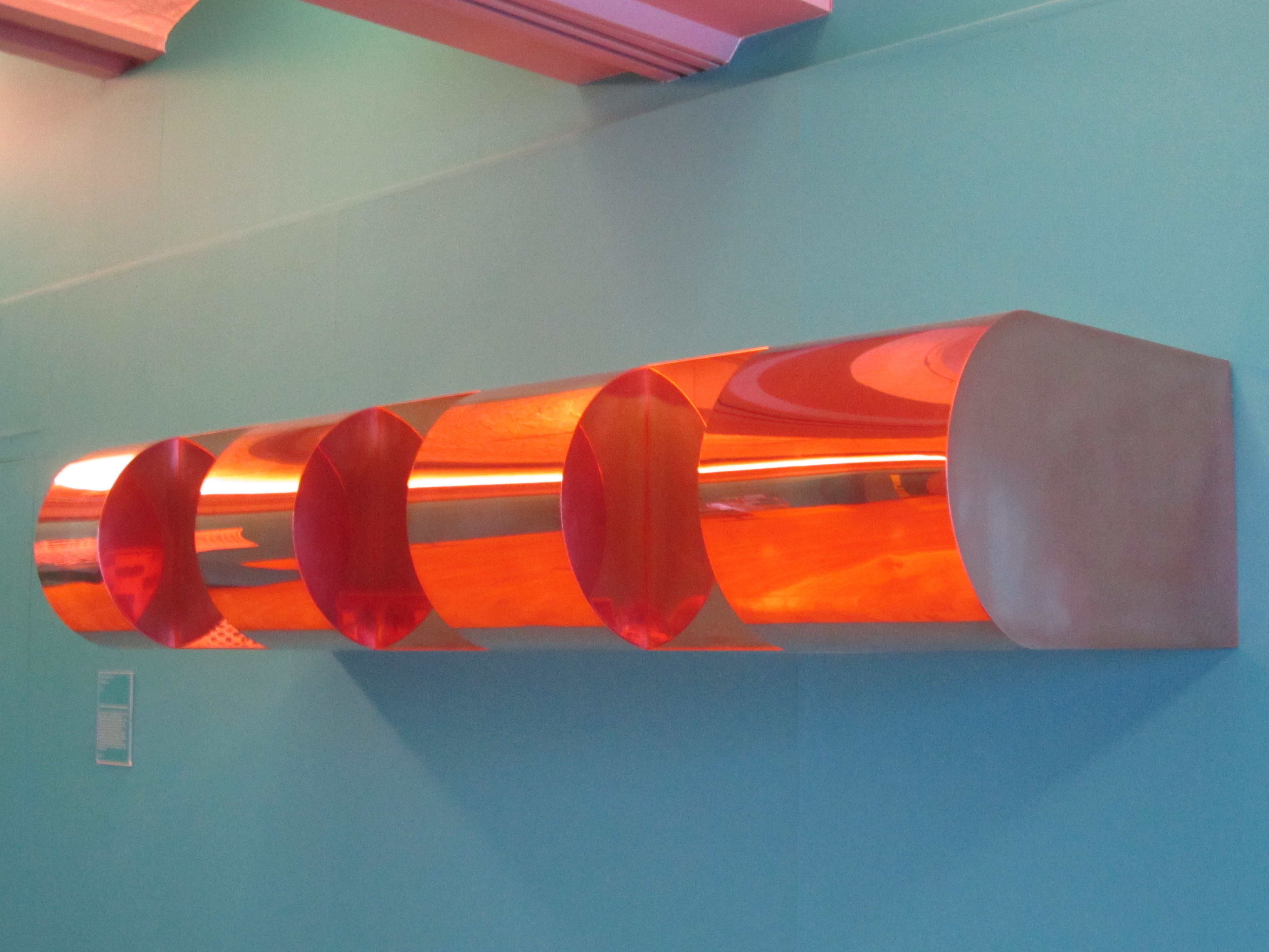
Judd created several different series of artwork. From 1964 to the 1970s, he created a series based on "progression," each of the various pieces based on the previous one. The works were fabricated from different materials, colors, and sizes. Untitled (6.8.1) was made from copper, metal with a reflective surface when polished. Judd fabricated four pieces, each progressively larger, increasing in width by 3.8 centimeters moving from left to right. He also used spacing in the reverse progression.
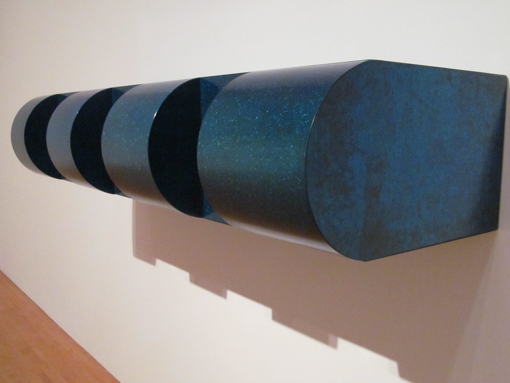
Untitled (6.8.2) was constructed from painted galvanized iron. Judd used similar progressives spacing, the widest space on the left side and progressing to the narrower spacing on the right side.
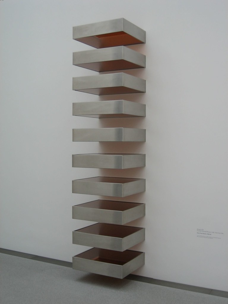
Judd's Untitled (Stack) (6.8.3) hangs on the wall and projects almost 91.4 centimeters from the wall. Each of the boxes is made from galvanized iron and equal in size, maintaining the importance of every single box. Every box is 22.6 centimeters high, and they are placed in the formation of a ladder as they move upward, retaining the 22.6 centimeter spacing between them. Different numbers of boxes are displayed depending on the height of the wall space. In this stack, the sides of the boxes are unpainted and shiny. The shape of a box was a form Judd frequently used because he believed it did not represent any specific thing and was neutral in shape.
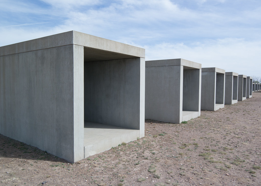
Judd created fifteen boxes Untitled (6.8.4) made of concrete he cast and constructed them from 1980 through 1984. Each separate unit was 2.5 x 2.5 x 5 meters, and each slab side was 25 centimeters thick. He installed each unit equally distanced from the other. An installation could be composed of different numbers of boxes as the scrubby desert land provided the perfect place for his concrete boxes. The various buildings and surrounding space still display much of his artwork today. Judd always believed the artwork stood by itself and stated, "A shape, a volume, a color, a surface is something itself. It shouldn't be concealed as part of a fairly different whole"[2]
Dan Flavin
Dan Flavin (1933-1996) was born in New York. After school, he and his twin brother enlisted in the Air Force during World War II. When the war ended, he studied art, including at Columbia University. Flavin married twice; the second marriage was held at the Guggenheim Museum. He started drawing and painting and, in 1959, began to make mixed media assemblages, finding objects on the streets of New York. By 1961, Flavin started experimenting with lights, including fluorescent and incandescent bulbs of all types and sizes, attaching the different lights to boxlike wooden structures. By 1963, Flavin found the medium he liked and focused on fluorescent tubes. At first, he used the standard white color. Flavin progressed to a palette of standard colors available, red, blue, green, pink, yellow, ultraviolet, and the full range of different whites found in commercial fluorescent lights.
He focused on the artistic variations achievable with the unusual commercial material throughout his career, exploiting the utilitarian use of light and the variable changes of color, shape, and position. He turned banal hardware into art and stated, "One might not think of light as a matter of fact, but I do. And it is, as I said, as plain and open and direct an art as you will ever find."[3] Flavin used perishable, readymade materials, forming them into objects he did not consider sculptures. He wanted his art to respond to the specific architectural setting.
Generally, he used straight lines in his work, running horizontal or vertical. Occasionally, he placed the bulbs at an angle or used a rare circular system. Flavin always tried to place the commercial stamps marking each bulb so they were visible. He did not like to refer to his works as Minimalism, although he and Donald Judd were great friends and his work paralleled Judd's ideas of objects. Flavin used the simple light tube in geometric formations, letting the light provide the colors of the walls; he wanted the walls to glow and form illusions.
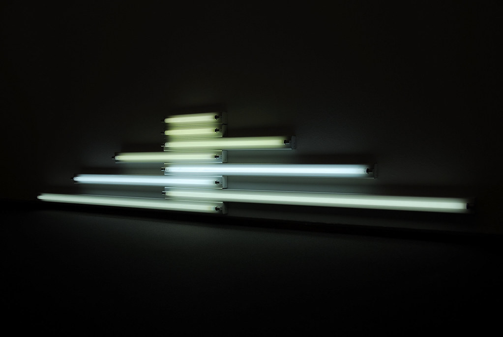
Monument for V. Tatlin (6.8.5) is one of several combinations Flavin created using different lengths of standard white fluorescent tubes. Most of them were horizontal and resembled a tower or monument. The arrangement of the tubes was balanced and symmetrical, creating bright regions and more subtle light reflections. In this image, the length of each horizontal light is balanced, the center equally anchored.
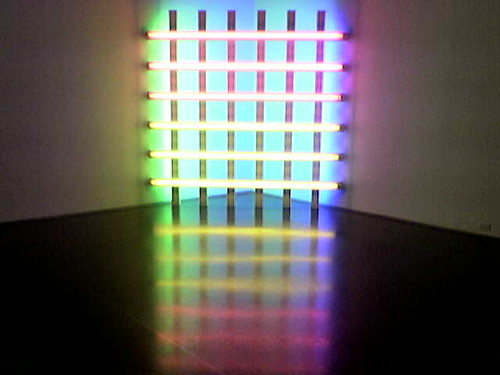
Untitled (in honor of Harold Joachim) 3 (6.8.6) forms a perfect square positioned across the corner of a room. The pink, yellow, green, and blue lights grid creates a soft glow reflected across the floor. To develop each artwork, Flavin drew multiple images before he achieved the look and feel he wanted. In this work, he used multiple green and blue tubes grouped vertically with spaces between them. Single tubes formed the thinner horizontal look.
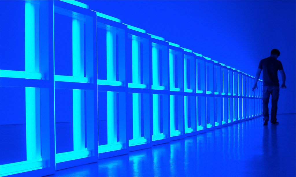
One of Flavin's major artworks was Untitled (To Helga and Carlos, With Respect and Affection) (6.8.7), a large-scale sculpture extending over the space and forming a barrier. The extensive work bathed the room with light, seemingly infinitely expansive. Flavin created a series of barrier-style work, modular pieces to change depending on the space available. The different blue colors emit light and a feeling of calm, or maybe it seems eerie. The spaces between the rows are open, like windows leaving the viewer to wonder what might be on the other side.
Ellsworth Kelly
Born in New York, Ellsworth Kelly (1923-2015) lived in New Jersey as a child. His grandmother taught him about ornithology when he was growing up, and Kelly became fascinated with John James Audubon and his bird illustrations. Audubon's colors and forms later influenced his career. Kelly was always interested in art; however, his parents only wanted him to pursue technical education, so he went to the Pratt Institute until he was drafted into the army in 1943. Kelly served alongside other artists working on different camouflages for military equipment. After the war, he studied art, including Paris, where he stayed for six years and was inspired by French abstracted art. He returned to New York City for a few years, showing at a few galleries before moving to New York.
Kelly developed his early artwork based on the world around him, a window, shadows from the staircase, and a hidden door. He stated, "I realized I didn't want to compose pictures…I wanted to find them. I felt that my vision was choosing things out there in the world and presenting them…There was so much to see, and it all looked fantastic to me."[4] He combined the simple forms around him with the concepts of a pure and uncluttered form, spatial unity, and bold use of color. His canvases were different shapes and sizes, frequently joined together, the canvas itself becoming part of the work. Kelly covered the canvas with basic lines and geometric forms in vibrant colors. He usually started by applying multiple coats of white paint before adding color.
By 1959, Kelly started using non-rectilinear forms and embrace Minimalism in his painting Running White (6.8.8). He applied white first and then added coats of black on top. At this point, Kelly was still using a standard canvas format, the running line escaping off the sides of the panel. When Kelly was visiting friends in a French village, he saw a flight of stairs and noticed how the sun created different shadows from the steps and balustrade. He took several photographs of the scene, even at different times of the day, noting the changes in shadows as the sun moved.
Kelly used the photographs to create a series entitled La Combe. One of the series' paintings is La Combe III (6.8.9), the lines on the painting are arranged to imply steps and the shadows cast by each step. The shadows did not match a photograph; Kelly reconstructed the lines over the multiple panels in the series.
In Spectrum IV (6.8.10), Kelly arranged the simple lines of color in the style of a rainbow, starting and ending with yellow. Individual colors stand-alone yet blend into the neighboring color. Each color is also a separate canvas, with thirteen panels to form the square. The long lengths of yellow on each side stand out against the white wall creating greater contrast.
In Spectrum V (6.8.11), Kelly made single panels for each color. He used the same colors and sequence of colors in each work of the series, varying the panels' size and placement. In Spectrum V, each color is influenced by the contrast of the white wall instead of the color next to it, softening the hues, less bold as seen in Spectrum IV.
Agnes Martin
Agnes Martin (1912-2004) was born in Canada and lived in Vancouver during her childhood. She went to college in Washington, received a bachelor's degree in education, and moved to New York City. There, Martin became interested in modern art and took several classes before attending the University of New Mexico, followed by earning a master's degree in art at Columbia University. In 1957, she moved back to New York in a local art community. Martin struggled with mental illness, including electric shock treatment. In 1967, she disappeared from New York and spent time crossing the United States and Canada, camping in different places. Martin finally settled in New Mexico, where she built her home and studio and eventually began to paint again.
Martin's work strongly resembles the rural and desert landscape she found in Canada's vast plains and New Mexico's dry, scrubby desert. Her palette was relatively monochromatic and unadorned. Martin destroyed her early works before adopting pure abstraction and Minimalist form. She focused on lines and grids with soft, subtle colors. Martin used mathematically divided lines, a regularity found in her work. Some of the lines were thin and pencil-like; others were wider and more painterly. Her addition of muted color gave her work the reflection of her beliefs in Eastern philosophy and timelessness. Martin's works were generally based on one concept with variations. She wanted them to convey to the viewers a broad range of emotions and experiences. Art reviewers consider her work in totality, with quiet contemplation of the relationships between the fine lines and soft colors.
In her painting, White Flower (6.8.12), Martin explained how the image was about a mental understanding, not the concept of an actual white flower. She wanted people to react to the painting as they would to the organic flower. The grid was made from white horizontal and vertical lines shaped into rectangles. Inside the small rectangles were proportioned white dashes resembling fabric. The actual white flowers she contemplated were based on the small white flowers with edible berries growing on the plains of Canada.
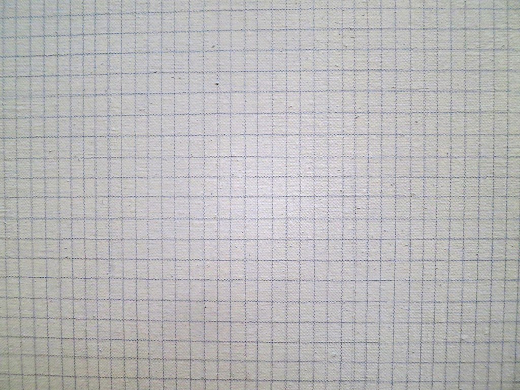
Untitled #12 (6.8.13) displays a graphite grid against the light background. Many art historians view the image as one of her more spiritual works and a balance between sensual and austere. Martin remarked, "Work like mine describes the subtle emotions that are beyond words, like music."[5]
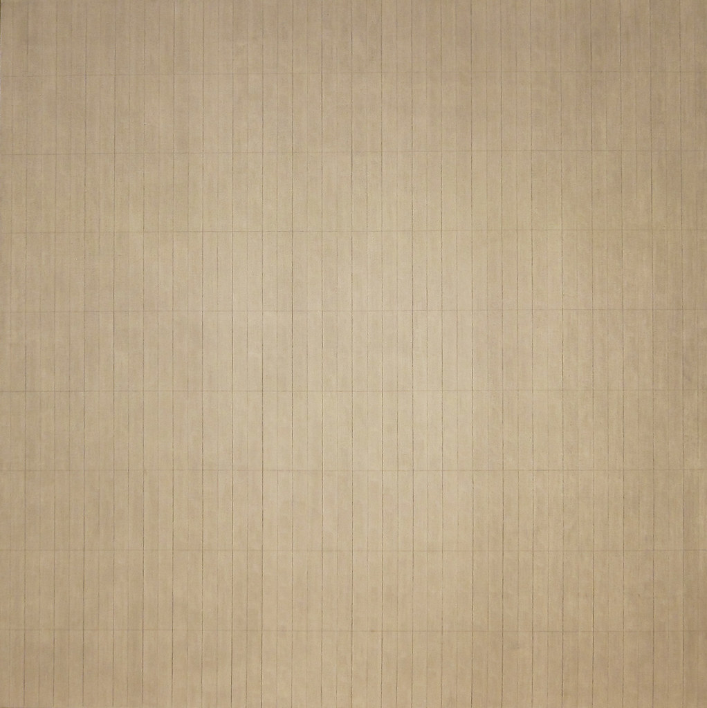
In Untitled #14 (6.8.14), Martin used ink, pencil, and paint, multiple types of material, a common thing she frequently included in her work. By using numerous materials, Martin obtained different looks in each of her paintings. In #14, she applied gesso on the canvas before adding the lines and color, building a distinctive texture. The darker line against the light gray background demonstrated her use of the signature grid pattern. Martin used this basic grid and varied it with texture, width between lines, color, or materials. Although Minimalism relied on a more rigid formula of lines, Martin's grid use was not systematic, only coordination of lines from space to space.
Eva Hesse
Eva Hesse (1936-1970) achieved success as an artist despite a difficult life. She was born in Germany to a Jewish family in 1936. The family tried to leave Germany as the war was starting and sent Hesse and her sibling on one of the last Kindertransport trains. The trains were loaded with small children bound for the Netherlands to escape the brutal roundup by the Nazis. Her parents escaped six months later, and the family emigrated to New York. After World War II, her parents divorced, and her mother committed suicide. Hesse attended Yale University, graduating with a bachelor's degree. After college, she returned to New York and worked with some of the other new Minimalist artists. Hesse was married for a few years before she divorced. In 1969, she developed a brain tumor, had multiple unsuccessful operations, and died at 34. However, Hesse's short artistic career was very successful.
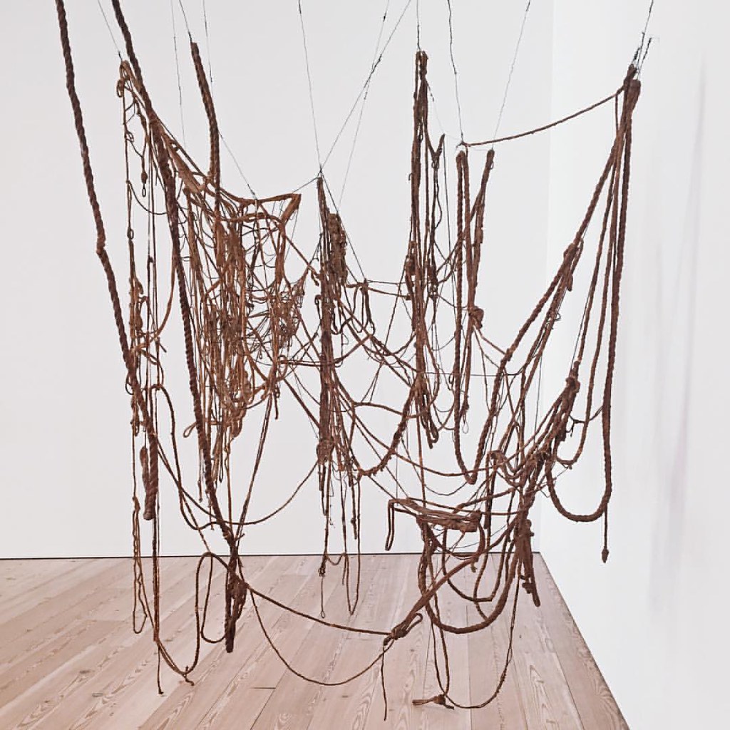
Hesse worked with three-dimensional and industrial materials, primarily focusing on latex and fiberglass because latex could be molded or cast, and hardened. Hesse belonged to a group experimenting with new synthetic materials and even invented her own method of rubberizing fabric. Her sculptures were usually grouped together or placed in a grid-like formation, minimally based on simple formations and a reduced color palette. The works were generally wrapped, wound, or threaded. Hesse's work was abstract while frequently referring to male or female bodies, contradictory illusions, or interpretations. Untitled (6.8.15) changed the rigid straight lines used by Minimalist artists to irregular, softer organic lines. Hesse knotted different pieces of rope together and soaked them in liquid latex. When the rope hardened, she assembled the parts into a sculpture of twisted, arching lines. The work is attached to the ceiling and wall, flexible enough to support variable installations. In her conceptual drawing of the work, Hesse wrote, "hung irregularly tying knots as connections really letting it go as it will. Allowing it to determine more of the way it completes itself."[6]
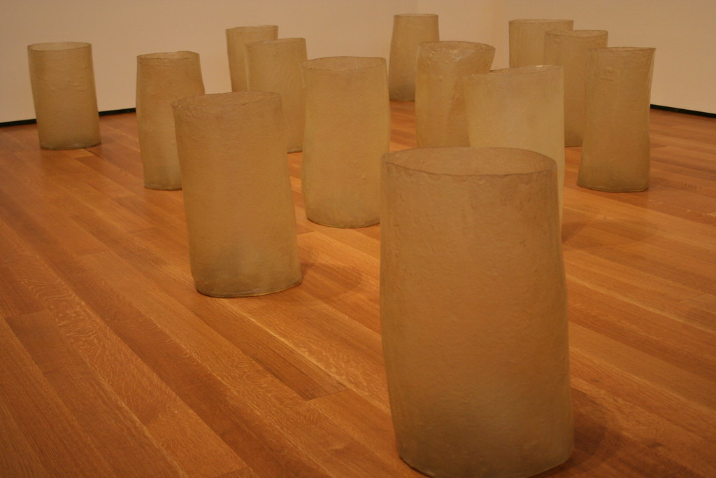
Repetition Nineteen III (6.8.16) is an installation of nineteen round, translucent forms shaped similar to a bucket. The forms are twenty inches high and hand-formed instead of manufactured, so they are irregular and can be arranged in any formation. Hesse used fiberglass and resin, two materials with a tendency to discolor or deteriorate over time, a phenomenon happening in her work today. She always said, "Life doesn't last; art doesn't last. It doesn't matter." [7]
Hang Up (6.8.17) was made in 1966 when Hesse decided to stop painting and concentrate on sculptural works. She wrapped the blank canvas made from bed sheets on a frame and added an excessively long tube made from steel and covered with a cord to protrude into the viewer's space. Hesse thought this image was one of her most important because it was so absurd, blurring the line between paintings and sculptures.
Hesse's work, Not Yet (6.8.18), reflected her desire to create forms interpreted as almost human parts, however just an erotic resemblance. She used cotton netting and plastic drop cloths to make the image, materials found in any artist's studio. Hesse used repetitive forms like the Minimalists. However, she used forms that were uneven and irregular. Instead of manufactured materials, she handmade her shapes. Historians often explain Hesse's work as the reflection of her anxieties stemming from a painful childhood.
Carmen Herrera
Carmen Herrera (1915-) was born in Havana, Cuba, one of seven children. Her father was part of the Cuban intellectual elite, a captain in the army liberating Cuba from Spain. Her mother was an author and journalist. Herrera had private art education when she was young, even going to school in Paris at fourteen. She studied architecture at the Universidad de la Habana for one year, quitting because of the continual fighting in the streets and the unstable ability of the university to remain open. Herrera married a teacher from New York and moved there where she studied art before moving to Paris. Refining her art, Herrera focused on her straight-line, hard-edge style, a technique she developed similar to Ellsworth Kelly, who lived in Paris during the same period. When she returned to New York, she continued to face rejection as an artist, a problem Herrera attributed to prejudice against women. She was not allowed to exhibit at one gallery because she was female and received little recognition until the 2000s. She did not sell a painting until she was eighty-nine and did not attain acknowledgment until 2009 when a large exhibition of her work was held in the United Kingdom.
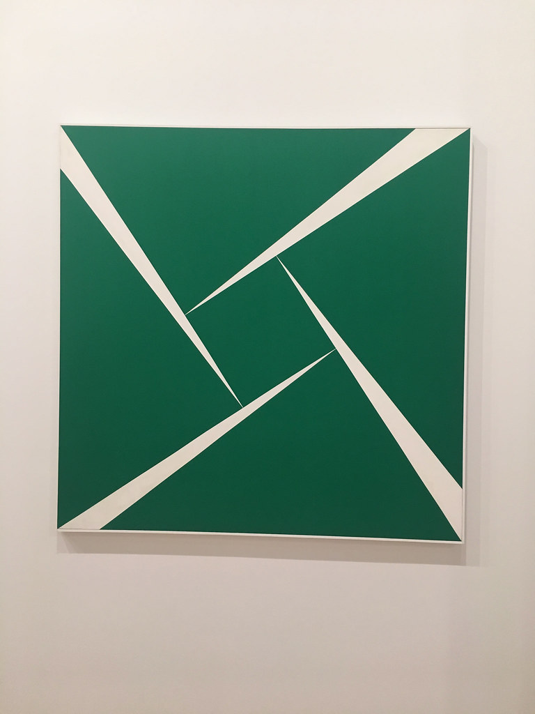
Herrera's training as an architect influenced her concepts and focused on lines and color within the lines, a limited color palette, and simplistic geometric shapes. She developed a process of painting she still used today. She started by drawing a concept and then recreated the idea on vellum, where she added colors with paint markers. On the final canvas, Herrera marked her lines with tape before applying layers of paint. "I like straight lines, I like angles, I like order. In this chaos that we live in, I like to put order. I guess that's why I am a hard-edged painter, a geometric painter"[8] Untitled (6.8.19) was one of her breakthrough paintings, establishing her style and gaining recognition. She also asserted her love for straight lines. The painting looks like a W; however, she changed the lines by reversing the black and white colors on the four panels to create the visual effect.
Amarillo Dos (6.8.20) demonstrated her use of line and color to convey movement. The perceived two parts of the painting appear to be tilting; however, the top and bottom are still level. Herrera developed a sense of instability using the bold yellow color with the symmetrical and yet asymmetrical image.
Green and White (6.8.21) also have irregular shapes, not quite fitting together, the white sections generating different spatial balance with the negative space. Herrera used a bold contrasting color to enhance the feeling of unbalance. She created her innovative body of work in the 1960s and 1970s and went unrecognized. She was now thought of as a woman ahead of her time.
By the end of the 1970s, the ideals of Minimalism were accepted in galleries by art dealers and influential publications. The use of industrial and readymade materials became common for artists giving viewers new experiences of the appearance of weight and height, the influence of line, geometric forms, and pure separated colors. The concepts of Minimalism and the use of manufactured materials continue in artwork today.
[1] Retrieved from https://magazine.artland.com/minimalism/
[2] Retrieved from https://www.theartstory.org/movement/minimalism/
[3] Retrieved from https://www.nga.gov/features/slidesh...ospective.html
[4] Retrieved from https://en.wikipedia.org/wiki/Ellsworth_Kelly. Based on “A Giant of the New Surveys His Rich Past”. The New York Times. October 13, 1996.
[5] Retrieved from https://www.artic.edu/artworks/89403/untitled-12
[6] Retrieved from https://whitney.org/collection/works/5551
[7] Retrieved from https://www.moma.org/learn/moma_lear...teen-iii-1968/
[8] Retrieved from https://whitney.org/audio-guides/51?...&page=1&stop=1