
9: Color
- Page ID
- 177924

\( \newcommand{\vecs}[1]{\overset { \scriptstyle \rightharpoonup} {\mathbf{#1}} } \)
\( \newcommand{\vecd}[1]{\overset{-\!-\!\rightharpoonup}{\vphantom{a}\smash {#1}}} \)
\( \newcommand{\dsum}{\displaystyle\sum\limits} \)
\( \newcommand{\dint}{\displaystyle\int\limits} \)
\( \newcommand{\dlim}{\displaystyle\lim\limits} \)
\( \newcommand{\id}{\mathrm{id}}\) \( \newcommand{\Span}{\mathrm{span}}\)
( \newcommand{\kernel}{\mathrm{null}\,}\) \( \newcommand{\range}{\mathrm{range}\,}\)
\( \newcommand{\RealPart}{\mathrm{Re}}\) \( \newcommand{\ImaginaryPart}{\mathrm{Im}}\)
\( \newcommand{\Argument}{\mathrm{Arg}}\) \( \newcommand{\norm}[1]{\| #1 \|}\)
\( \newcommand{\inner}[2]{\langle #1, #2 \rangle}\)
\( \newcommand{\Span}{\mathrm{span}}\)
\( \newcommand{\id}{\mathrm{id}}\)
\( \newcommand{\Span}{\mathrm{span}}\)
\( \newcommand{\kernel}{\mathrm{null}\,}\)
\( \newcommand{\range}{\mathrm{range}\,}\)
\( \newcommand{\RealPart}{\mathrm{Re}}\)
\( \newcommand{\ImaginaryPart}{\mathrm{Im}}\)
\( \newcommand{\Argument}{\mathrm{Arg}}\)
\( \newcommand{\norm}[1]{\| #1 \|}\)
\( \newcommand{\inner}[2]{\langle #1, #2 \rangle}\)
\( \newcommand{\Span}{\mathrm{span}}\) \( \newcommand{\AA}{\unicode[.8,0]{x212B}}\)
\( \newcommand{\vectorA}[1]{\vec{#1}} % arrow\)
\( \newcommand{\vectorAt}[1]{\vec{\text{#1}}} % arrow\)
\( \newcommand{\vectorB}[1]{\overset { \scriptstyle \rightharpoonup} {\mathbf{#1}} } \)
\( \newcommand{\vectorC}[1]{\textbf{#1}} \)
\( \newcommand{\vectorD}[1]{\overrightarrow{#1}} \)
\( \newcommand{\vectorDt}[1]{\overrightarrow{\text{#1}}} \)
\( \newcommand{\vectE}[1]{\overset{-\!-\!\rightharpoonup}{\vphantom{a}\smash{\mathbf {#1}}}} \)
\( \newcommand{\vecs}[1]{\overset { \scriptstyle \rightharpoonup} {\mathbf{#1}} } \)
\(\newcommand{\longvect}{\overrightarrow}\)
\( \newcommand{\vecd}[1]{\overset{-\!-\!\rightharpoonup}{\vphantom{a}\smash {#1}}} \)
\(\newcommand{\avec}{\mathbf a}\) \(\newcommand{\bvec}{\mathbf b}\) \(\newcommand{\cvec}{\mathbf c}\) \(\newcommand{\dvec}{\mathbf d}\) \(\newcommand{\dtil}{\widetilde{\mathbf d}}\) \(\newcommand{\evec}{\mathbf e}\) \(\newcommand{\fvec}{\mathbf f}\) \(\newcommand{\nvec}{\mathbf n}\) \(\newcommand{\pvec}{\mathbf p}\) \(\newcommand{\qvec}{\mathbf q}\) \(\newcommand{\svec}{\mathbf s}\) \(\newcommand{\tvec}{\mathbf t}\) \(\newcommand{\uvec}{\mathbf u}\) \(\newcommand{\vvec}{\mathbf v}\) \(\newcommand{\wvec}{\mathbf w}\) \(\newcommand{\xvec}{\mathbf x}\) \(\newcommand{\yvec}{\mathbf y}\) \(\newcommand{\zvec}{\mathbf z}\) \(\newcommand{\rvec}{\mathbf r}\) \(\newcommand{\mvec}{\mathbf m}\) \(\newcommand{\zerovec}{\mathbf 0}\) \(\newcommand{\onevec}{\mathbf 1}\) \(\newcommand{\real}{\mathbb R}\) \(\newcommand{\twovec}[2]{\left[\begin{array}{r}#1 \\ #2 \end{array}\right]}\) \(\newcommand{\ctwovec}[2]{\left[\begin{array}{c}#1 \\ #2 \end{array}\right]}\) \(\newcommand{\threevec}[3]{\left[\begin{array}{r}#1 \\ #2 \\ #3 \end{array}\right]}\) \(\newcommand{\cthreevec}[3]{\left[\begin{array}{c}#1 \\ #2 \\ #3 \end{array}\right]}\) \(\newcommand{\fourvec}[4]{\left[\begin{array}{r}#1 \\ #2 \\ #3 \\ #4 \end{array}\right]}\) \(\newcommand{\cfourvec}[4]{\left[\begin{array}{c}#1 \\ #2 \\ #3 \\ #4 \end{array}\right]}\) \(\newcommand{\fivevec}[5]{\left[\begin{array}{r}#1 \\ #2 \\ #3 \\ #4 \\ #5 \\ \end{array}\right]}\) \(\newcommand{\cfivevec}[5]{\left[\begin{array}{c}#1 \\ #2 \\ #3 \\ #4 \\ #5 \\ \end{array}\right]}\) \(\newcommand{\mattwo}[4]{\left[\begin{array}{rr}#1 \amp #2 \\ #3 \amp #4 \\ \end{array}\right]}\) \(\newcommand{\laspan}[1]{\text{Span}\{#1\}}\) \(\newcommand{\bcal}{\cal B}\) \(\newcommand{\ccal}{\cal C}\) \(\newcommand{\scal}{\cal S}\) \(\newcommand{\wcal}{\cal W}\) \(\newcommand{\ecal}{\cal E}\) \(\newcommand{\coords}[2]{\left\{#1\right\}_{#2}}\) \(\newcommand{\gray}[1]{\color{gray}{#1}}\) \(\newcommand{\lgray}[1]{\color{lightgray}{#1}}\) \(\newcommand{\rank}{\operatorname{rank}}\) \(\newcommand{\row}{\text{Row}}\) \(\newcommand{\col}{\text{Col}}\) \(\renewcommand{\row}{\text{Row}}\) \(\newcommand{\nul}{\text{Nul}}\) \(\newcommand{\var}{\text{Var}}\) \(\newcommand{\corr}{\text{corr}}\) \(\newcommand{\len}[1]{\left|#1\right|}\) \(\newcommand{\bbar}{\overline{\bvec}}\) \(\newcommand{\bhat}{\widehat{\bvec}}\) \(\newcommand{\bperp}{\bvec^\perp}\) \(\newcommand{\xhat}{\widehat{\xvec}}\) \(\newcommand{\vhat}{\widehat{\vvec}}\) \(\newcommand{\uhat}{\widehat{\uvec}}\) \(\newcommand{\what}{\widehat{\wvec}}\) \(\newcommand{\Sighat}{\widehat{\Sigma}}\) \(\newcommand{\lt}{<}\) \(\newcommand{\gt}{>}\) \(\newcommand{\amp}{&}\) \(\definecolor{fillinmathshade}{gray}{0.9}\)It could be said that illusion is central to theatrical production and, therefore, something designers try to create. Scenic painting is the artful application of paint to create visual illusions on the surfaces it covers. Whether it is mimicking a material surface such as wood or stone or adding artificial depth to a 2-D surface through painted shadows, scenic painting is the process of creating a visual illusion. The French use the term “trompe d l’oeil,” translated as “fools the eye,” to refer to the art of painted illusions. Set designers deliver paint renderings to the scenic artists who execute the designs on a much larger scale. There may be several meetings with the designer and samples may be painted before the exact methods and colors for executing the scenic painting can be established. Common painting methods are described later in this Module, but to appreciate this art we must first have an understanding of some of the basic theories regarding color that rule over the art of theatrical illusions.
Color plays a central role in creating a convincing environment and effectively transporting the audience into the world of the story. Color is found in the sets, the costumes, and the lighting, but the audience's perception of all color is influenced by the lighting. This is happens in part because the choice of color filters on the lights will affect what the audience will be able to reference as “white." We perceive most of the natural world under white light (full-spectrum light), and when we are presented with a situation in which that light is filtered, our perceptions of color are altered. The lighting designer closely controls the audience's perception of color in the sets and costumes by selecting color filters for the lights. The coordination of the lighting these elements is a central concern for the entire creative team.
There’s More to Know How our eyes perceive color: Our eyes receive light energy waves, and through the excitement the eye’s receptors, translate this light energy, which is either emitted by or reflected by an object, into the electrochemical information our brains then interpret for image and color. The light is received through two groups of nerves in our eyes: rods, which receive faint light waves and help us to see in low-light situations and at night, and cones, which receive higher energy light and respond to the specific wavelengths of red, blue, and green light.
Our sun produces an intensely bright light that is made up of a variety of color wavelengths of light. Combined, these wavelengths fall over our planet as full-spectrum “white light.” We have all seen a rainbow, and most of us have experimented with a prism and understand that it is possible to divide white light into its constituent colors. When fullspectrum light hits a colored object, the object absorbs a portion of the light energy. The portions absorbed are the wavelengths that do not resemble the inherent color of the object.
The portions of the light energy that are akin to the inherent color of the object are reflected off of the object, and those waves are reflected into our eyes, and onto our rods and cones, which interpret the image. So, if full-spectrum sunlight hits a red playground ball, the red wavelengths of that light are reflected to our eyes, and we see a red ball. The other wavelengths (all other colors) are absorbed by the ball and not reflected. This is also why darker colored objects, like a black car, become hotter when left under the sun. They absorb a lot of light energy that becomes heat energy. If we can only perceive an object’s color when the corresponding wavelength of light is available to reflect off its surface, then in an environment where full-spectrum light is not available all color information can be affected. A theatrical lighting designer controls the colors an audience perceives during a show by filtering all of the available light. You have probably noticed that it is difficult to perceive color in relative darkness. When light is limited, our cones cannot receive the levels of energy reflecting off of objects to interpret their color information. Our eyes must instead rely on our rods to interpret the light minus the color information, which makes things look a bit grey.
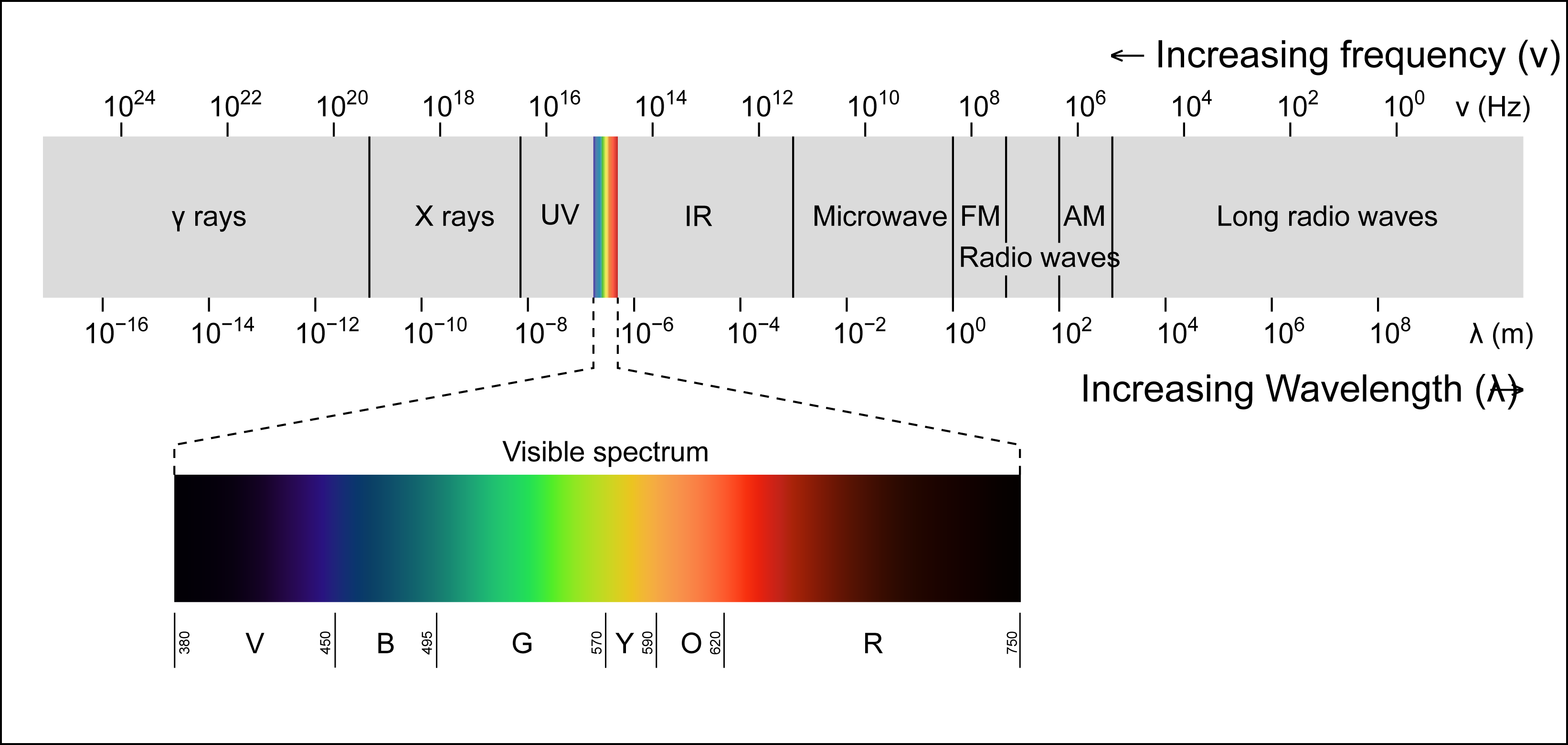
Image Credit: Philip Ronan, CC BY-SA 3.0, via Wikimedia Commons
We have all studied color throughout our entire lives. We learned in art classes how to mix a variety of colors from a few primary colors, but much of how we are affected by color may be innate to us. Our associations of color fall into two main categories: natural associations and cultural associations. Natural associations are those that we are born with and are survival-based associations. Red is a color of warning; a red object may be hot or possibly poisonous, and red is the color of spilled blood. Green is the color of vegetation, our food. Blue is the color of lifegiving water. It is beneficial to our survival to recognize the dangers these colors communicate. Other associations are cultural and are based on how we grew up and where we live. In the United States, green may be associated with money, while in other cultures green may be associated with luck or even fertility. Both natural and cultural associations are powerful in affecting all of us. We rely heavily on our visual senses to interpret the world around us, and color is an important factor in that interpretation.
Color terminology
Hue: A color or the qualities that differentiate one color from another.
Saturation (also Chroma): Relative percentage of a hue within a color mixture.
Value: The relative lightness or darkness of a color.
Tint: A high-value color achieved by adding white pigment or light.
Shade: A low-value color achieved by adding several hues or black.
Tone: A medium value color achieved by adding black and white, or by mixing it with its’ complimentary hue.
There’s More to Know
Color Temperature:
All color has an association with temperature; we regularly refer to cool colors and warm colors. Color temperatures are based on a scientific notion of what temperature a theoretical “black body” would have to be to emit light of a given color. A Kelvin scale provides the units of measure for color temperature. Cool colors like blues are rated at over 5000 K, while warmer colors fall between 2700-3000 K. Photography and videography is greatly affected by the color temperature of the light on their subjects, and theatrical lighting may not always appear as intended when recorded in these mediums. Theatre lighting fixtures generally use tungsten-based filaments, which burn at a fairly low color temperature even before being filtered. When film or video are used to capture theatrical presentations, the temperature of the light may need to be adjusted for the device to capture what our eyes see naturally.
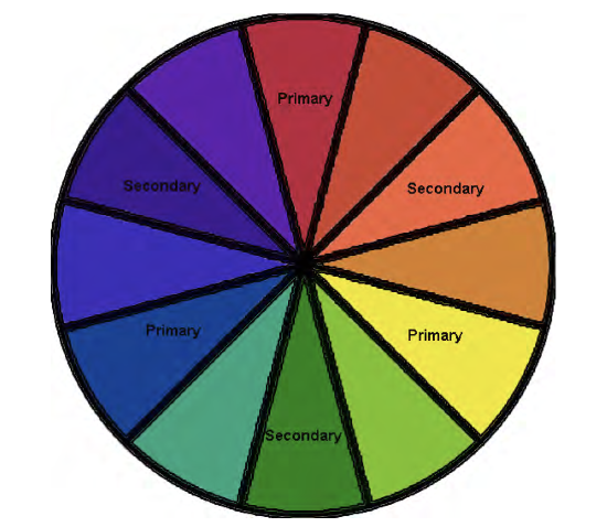
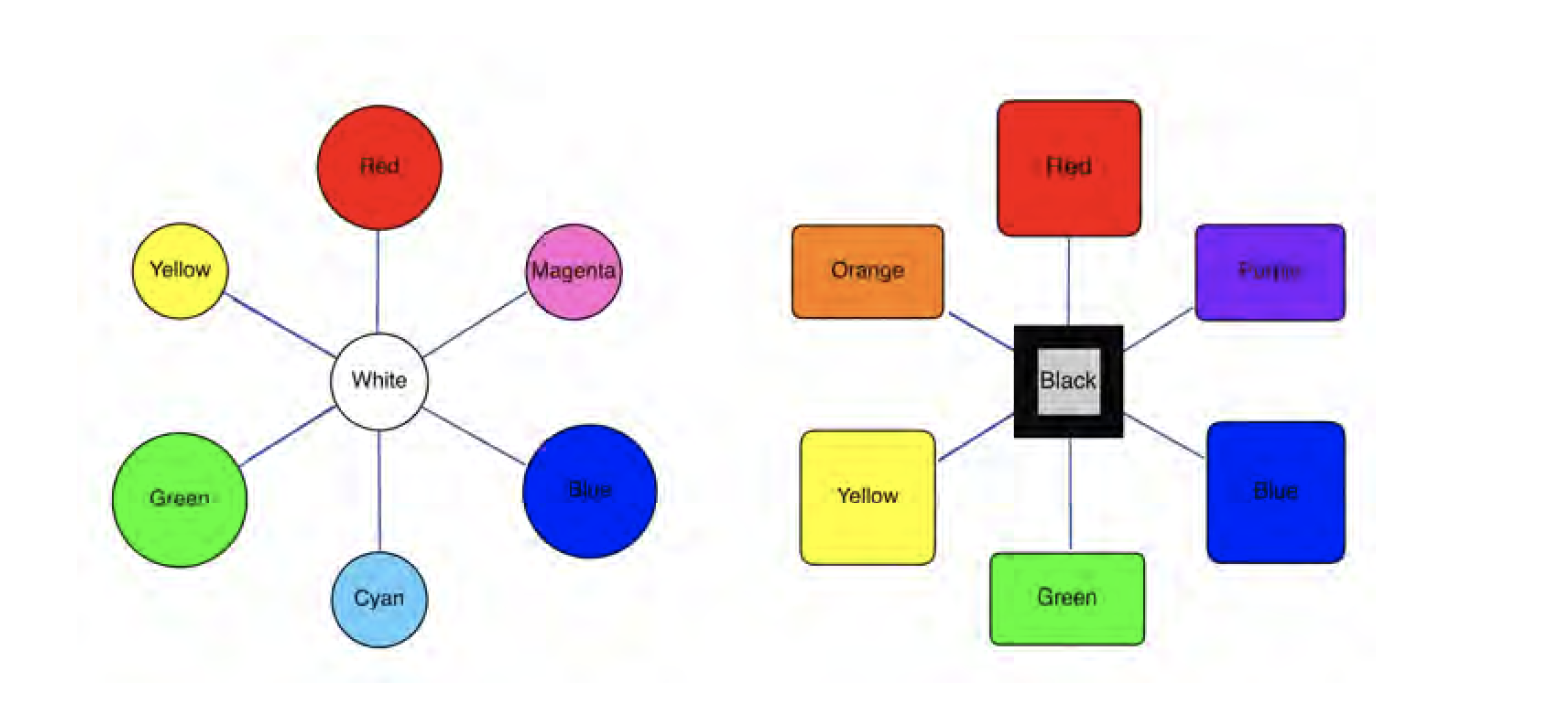
You probably remember from grade school lessons that there are three primary colors: red, blue, and yellow. What you might not have learned is those are the three primary colors for pigment, but not for light. There is a separate color wheel that represents how color of light is organized and mixed. The difference between pigment and light is partly due to our eyes and how we, as humans, perceive color though our eyes. We have receptors in our eyes that interpret red, blue, and green light. Our brains use these three colors of light to interpret our visual perceptions of the world.
From art class, we know we can mix two primary pigment colors together to make a new color. Mixing two primary colors will result in a secondary color. In pigment mixing the secondary colors are orange, green, and purple. If we combine a secondary color with the primary color that it neighbors on the color wheel, we create a new tertiary color. In this system of pigment colors, if we additively mix colors together, they become darker as we add hues, and will eventually appear near black as we continue to add colors.
Light has its own color wheel; its primary colors include green rather than yellow. The color wheel for light is based on the human reception of visual information. Our eyes do not have a specific receptor for yellow, so when we see a yellow object our eyes read the wavelengths of the red and green light, and, in sensing a small amount of each wavelength, our brains interpret the impulse as yellow. While pigments additively mix toward black, a variety of colored lights additively mix toward white as all of the various wavelengths combine to fill in the spectrum to approach a “white” light. Through the use of color filters, lighting designers remove portions of the spectrum from an individual light that would otherwise broadcast a full-spectrum. This is called subtractive coloring. The combination of a number of these individually filtered lights onto an object additively mixes together the available light that will strike that object. If we filter all red light from an environment, then a red object will not appear red to our eyes since no red wavelengths are available to be reflected back to them. If all the light on the red object is a green wavelength, it will appear a dark color that looks grey to black because the green light is a complementary color to the red object. This kind of control over what the audience sees allows a lighting designer to affect all the colors on a stage through their choice of lighting filters.
Lighting filters (gels)
As we have learned, theatrical lighting instruments emit a full-spectrum, white light. Designers then use a color filters, or gels, to limit parts of the spectrum projected from the light. These filters are thin colored sheets of translucent polycarbonate or polyester that are placed in front of the light source. Only the part of the spectrum of light that is akin to the color of the filter is allowed through. All other parts of the spectrum are absorbed by the filter, resulting in the projection of a limited wavelength of light. Because all other wavelengths are absorbed (as heat) darker filters do not last as long as lighter filters and may melt or fade with time. The relative strength of a light is greatly affected by how much energy is transmitted through a given filter. Transmission is the term that describes the percentage of source light that passes through a given filter. Sample decks of colored filter swatches are available from manufactures and generally list the percentages of transmission for each color filter. A darker color filter may have a transmission of only 10-20%. Color filters are used individually in an instrument because stacking two filters only serves to diminish the amount of light that passes through the filters since each individual filter removes all wavelengths of light other than those akin to it. Lighting designers use the color wheel of light to develop a color palette that will color the production’s world as intended. A designer creates a look specific to the production by picking three or more filter colors in a triad configuration on the color wheel, putting them on three separate lights, and blending them together in a single projection area where they combine to create the show’s “reference white.” The use of just two complementary color filters (those directly opposite on a color wheel) can appear to mix toward white since their opposition on the color wheel allows greater coverage of the apparent spectrum. As theatre fixtures are quite bright and can feel harsh, a mixed white light will always appear richer and more vibrant to an audience than using unfiltered full-spectrum, white light.
Color Neutralization with the Integrated Color Wheel
In order to fully understand color, we have to understand how light and color interact. We know that placing a gel in front of a white light creates light of that gel color (a form of subtractive color mixing). However, what happens when we project colored light on a surface of a different color? To better clarify the relationships of color and light we can use the Integrated color wheel, a color wheel that integrated both the colors of light and pigment together. Because all of the traditional primary colors do not have the same value, we can arrange twelve principal hues of similar values together in one graphic.
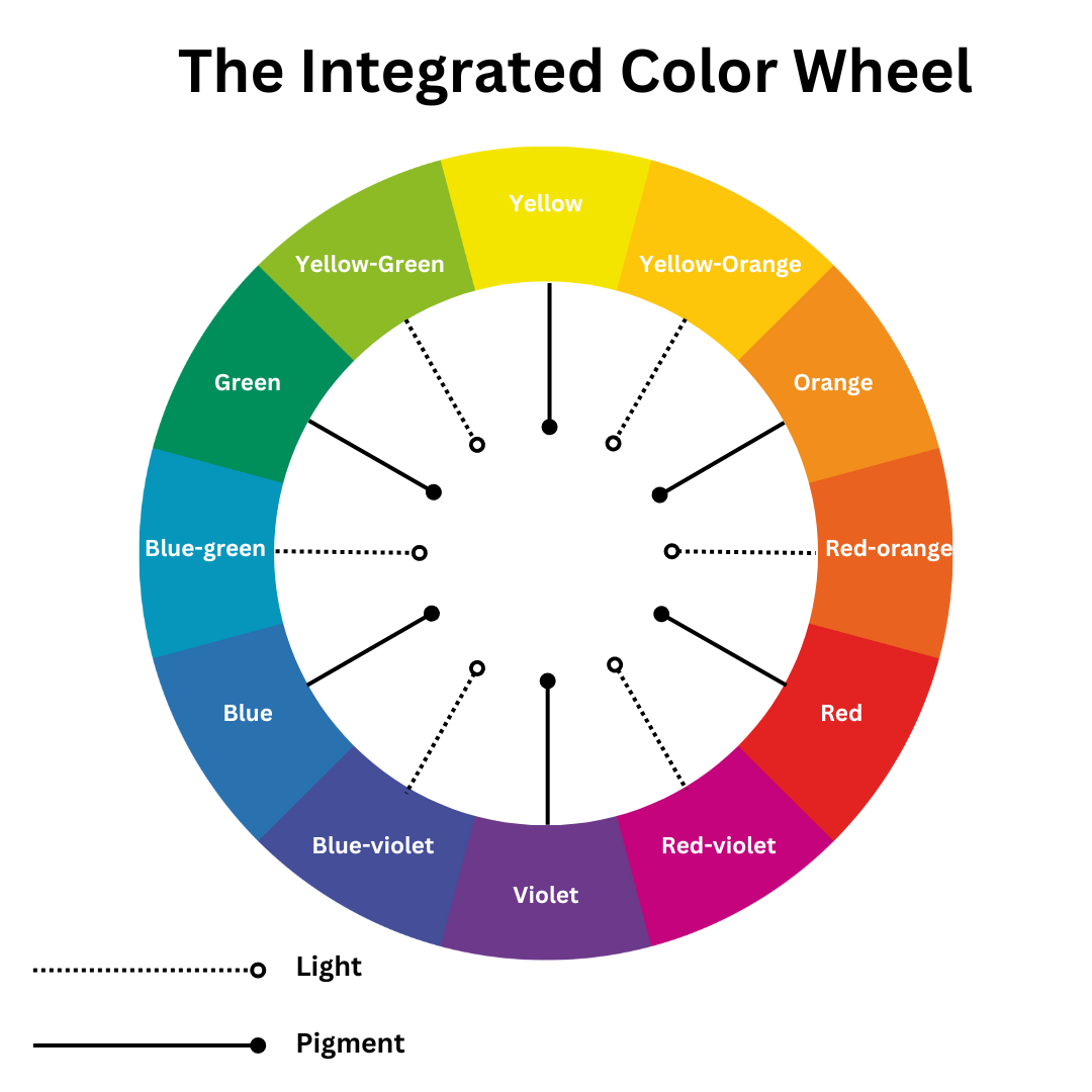
Figure \(\PageIndex{4}\): The Integrate Color Wheel
Knowing that white light is the combination of all colors of light, and black pigment is the combination of all colors of pigment, the two systems seem to be at odds. Colors opposite each other on the color wheel are complimentary colors, but if one is a color of light and the other is a color of pigment they will have no interaction at all. Let’s look at two examples of a red wall: 1) a wall painted red and illuminated by white light, is reflecting red light towards your eyes. 2) Similarly, a wall painted white, with a red light projected on it also reflects red light towards your eyes. However when we begin to work with complimentary colors of light and pigment Neutralization occurs when mixing colors of the same value. If we have a wall that is painted red, but we project a green (or sometimes blue) light on that wall no light will reflect back to our eyes. Because the pigment of red has no green in the pigment, there is no pigment available to reflect that color of light off of its surface. By using subtractive color mixing and color neutralization, designers can control the very colors of objects that the audience sees. Visit The American Meuseum of Natural History to explore how colors mix and overlap.
For Further Exploration M.A, Associate Professor William H. Pinnell B. A. 2008. Theatrical Scene Painting: A Lesson Guide. Carbondale: Southern Illinois University Press. Sherwin, Stephen G. 2006. Scene Painting Projects for Theatre. Boston: Focal Press. “Color Matters.” n.d. Accessed August 16, 2018. https://colormatters.com/.
This chapter was updated and remixed from content created by
