
Chapter 2: Document Design
- Page ID
- 179210
\( \newcommand{\vecs}[1]{\overset { \scriptstyle \rightharpoonup} {\mathbf{#1}} } \)
\( \newcommand{\vecd}[1]{\overset{-\!-\!\rightharpoonup}{\vphantom{a}\smash {#1}}} \)
\( \newcommand{\dsum}{\displaystyle\sum\limits} \)
\( \newcommand{\dint}{\displaystyle\int\limits} \)
\( \newcommand{\dlim}{\displaystyle\lim\limits} \)
\( \newcommand{\id}{\mathrm{id}}\) \( \newcommand{\Span}{\mathrm{span}}\)
( \newcommand{\kernel}{\mathrm{null}\,}\) \( \newcommand{\range}{\mathrm{range}\,}\)
\( \newcommand{\RealPart}{\mathrm{Re}}\) \( \newcommand{\ImaginaryPart}{\mathrm{Im}}\)
\( \newcommand{\Argument}{\mathrm{Arg}}\) \( \newcommand{\norm}[1]{\| #1 \|}\)
\( \newcommand{\inner}[2]{\langle #1, #2 \rangle}\)
\( \newcommand{\Span}{\mathrm{span}}\)
\( \newcommand{\id}{\mathrm{id}}\)
\( \newcommand{\Span}{\mathrm{span}}\)
\( \newcommand{\kernel}{\mathrm{null}\,}\)
\( \newcommand{\range}{\mathrm{range}\,}\)
\( \newcommand{\RealPart}{\mathrm{Re}}\)
\( \newcommand{\ImaginaryPart}{\mathrm{Im}}\)
\( \newcommand{\Argument}{\mathrm{Arg}}\)
\( \newcommand{\norm}[1]{\| #1 \|}\)
\( \newcommand{\inner}[2]{\langle #1, #2 \rangle}\)
\( \newcommand{\Span}{\mathrm{span}}\) \( \newcommand{\AA}{\unicode[.8,0]{x212B}}\)
\( \newcommand{\vectorA}[1]{\vec{#1}} % arrow\)
\( \newcommand{\vectorAt}[1]{\vec{\text{#1}}} % arrow\)
\( \newcommand{\vectorB}[1]{\overset { \scriptstyle \rightharpoonup} {\mathbf{#1}} } \)
\( \newcommand{\vectorC}[1]{\textbf{#1}} \)
\( \newcommand{\vectorD}[1]{\overrightarrow{#1}} \)
\( \newcommand{\vectorDt}[1]{\overrightarrow{\text{#1}}} \)
\( \newcommand{\vectE}[1]{\overset{-\!-\!\rightharpoonup}{\vphantom{a}\smash{\mathbf {#1}}}} \)
\( \newcommand{\vecs}[1]{\overset { \scriptstyle \rightharpoonup} {\mathbf{#1}} } \)
\(\newcommand{\longvect}{\overrightarrow}\)
\( \newcommand{\vecd}[1]{\overset{-\!-\!\rightharpoonup}{\vphantom{a}\smash {#1}}} \)
\(\newcommand{\avec}{\mathbf a}\) \(\newcommand{\bvec}{\mathbf b}\) \(\newcommand{\cvec}{\mathbf c}\) \(\newcommand{\dvec}{\mathbf d}\) \(\newcommand{\dtil}{\widetilde{\mathbf d}}\) \(\newcommand{\evec}{\mathbf e}\) \(\newcommand{\fvec}{\mathbf f}\) \(\newcommand{\nvec}{\mathbf n}\) \(\newcommand{\pvec}{\mathbf p}\) \(\newcommand{\qvec}{\mathbf q}\) \(\newcommand{\svec}{\mathbf s}\) \(\newcommand{\tvec}{\mathbf t}\) \(\newcommand{\uvec}{\mathbf u}\) \(\newcommand{\vvec}{\mathbf v}\) \(\newcommand{\wvec}{\mathbf w}\) \(\newcommand{\xvec}{\mathbf x}\) \(\newcommand{\yvec}{\mathbf y}\) \(\newcommand{\zvec}{\mathbf z}\) \(\newcommand{\rvec}{\mathbf r}\) \(\newcommand{\mvec}{\mathbf m}\) \(\newcommand{\zerovec}{\mathbf 0}\) \(\newcommand{\onevec}{\mathbf 1}\) \(\newcommand{\real}{\mathbb R}\) \(\newcommand{\twovec}[2]{\left[\begin{array}{r}#1 \\ #2 \end{array}\right]}\) \(\newcommand{\ctwovec}[2]{\left[\begin{array}{c}#1 \\ #2 \end{array}\right]}\) \(\newcommand{\threevec}[3]{\left[\begin{array}{r}#1 \\ #2 \\ #3 \end{array}\right]}\) \(\newcommand{\cthreevec}[3]{\left[\begin{array}{c}#1 \\ #2 \\ #3 \end{array}\right]}\) \(\newcommand{\fourvec}[4]{\left[\begin{array}{r}#1 \\ #2 \\ #3 \\ #4 \end{array}\right]}\) \(\newcommand{\cfourvec}[4]{\left[\begin{array}{c}#1 \\ #2 \\ #3 \\ #4 \end{array}\right]}\) \(\newcommand{\fivevec}[5]{\left[\begin{array}{r}#1 \\ #2 \\ #3 \\ #4 \\ #5 \\ \end{array}\right]}\) \(\newcommand{\cfivevec}[5]{\left[\begin{array}{c}#1 \\ #2 \\ #3 \\ #4 \\ #5 \\ \end{array}\right]}\) \(\newcommand{\mattwo}[4]{\left[\begin{array}{rr}#1 \amp #2 \\ #3 \amp #4 \\ \end{array}\right]}\) \(\newcommand{\laspan}[1]{\text{Span}\{#1\}}\) \(\newcommand{\bcal}{\cal B}\) \(\newcommand{\ccal}{\cal C}\) \(\newcommand{\scal}{\cal S}\) \(\newcommand{\wcal}{\cal W}\) \(\newcommand{\ecal}{\cal E}\) \(\newcommand{\coords}[2]{\left\{#1\right\}_{#2}}\) \(\newcommand{\gray}[1]{\color{gray}{#1}}\) \(\newcommand{\lgray}[1]{\color{lightgray}{#1}}\) \(\newcommand{\rank}{\operatorname{rank}}\) \(\newcommand{\row}{\text{Row}}\) \(\newcommand{\col}{\text{Col}}\) \(\renewcommand{\row}{\text{Row}}\) \(\newcommand{\nul}{\text{Nul}}\) \(\newcommand{\var}{\text{Var}}\) \(\newcommand{\corr}{\text{corr}}\) \(\newcommand{\len}[1]{\left|#1\right|}\) \(\newcommand{\bbar}{\overline{\bvec}}\) \(\newcommand{\bhat}{\widehat{\bvec}}\) \(\newcommand{\bperp}{\bvec^\perp}\) \(\newcommand{\xhat}{\widehat{\xvec}}\) \(\newcommand{\vhat}{\widehat{\vvec}}\) \(\newcommand{\uhat}{\widehat{\uvec}}\) \(\newcommand{\what}{\widehat{\wvec}}\) \(\newcommand{\Sighat}{\widehat{\Sigma}}\) \(\newcommand{\lt}{<}\) \(\newcommand{\gt}{>}\) \(\newcommand{\amp}{&}\) \(\definecolor{fillinmathshade}{gray}{0.9}\)Learning Objectives
What is Document Design?
Professional writing applies design practices to signal professionalism and to make documents more easily accessible to readers. Effective design can also make a document’s organization more visible, thus emphasizing important content and supporting the overall purpose of the message. Additionally, effective document design can communicate a tone suited to your purpose—formal, creative, dry, i.e.
By the end of this chapter you should be able to:
- Understand and apply basic principles of document design
- Understand how professional design helps readers navigate a document.
- Apply design principles using appropriate digital technologies.
How Readers Navigate a Document
Before discussing design principles, it helps to get a sense of how readers navigate a document so we can understand how design can help or hinder a reader. Readers navigating a document written in English will read from left-to-right and from top-to-bottom unless certain design elements “pull” their eyes elsewhere. On documents like tri-fold brochures where sections (columns) are implied by the folds in the page, readers will tend to move from top to bottom on the leftmost column and then move to the top of the next.
Additionally, workplace documents are often read with limitations on time, and they are also often written for varied workplace audiences with differing needs. In order to accommodate these needs, document design elements like contrast in headings help readers jump to needed information while skipping information that isn’t essential to them.
You can see a few simple design strategies that support organization below.
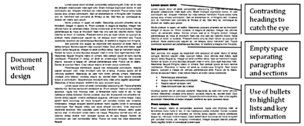
Figure 8. Design practices (right) sorts groups of information into visually distinct blocks, uses contrasting headings, and lists to make information more accessible than paragraph structure alone could make it.
The page structure on the left works well for patient readers—like individuals reading a novel who will read every word. And yet, the page on the left might also seem overwhelming to a reader looking for select information under workplace time constraints.
The structure on the right can help readers to more easily skim headings and topic sentences to quickly find needed information, skimming past information that they don’t need but that may be needed by other potential audiences.
We all wish that workplace documents could be kept short to make information easy to find, but that’s not often a realistic solution. Some documents, like manuals and formal reports, need to communicate great quantities of information to a multitude of different audiences. Design can help each different audience more effectively use the document.
Principles of Design
When you design your documents, you should apply four basic principles of professional design: contrast, proximity, alignment, and consistency.
- Contrast is creating clear visual differences between elements of a document. Elements with contrast draw the eye, so you can use contrast to emphasize important features.
- Proximity (also called chunking or grouping) is placing elements close together so that readers know they are related, or moving them farther apart to show they are less related. Leaving empty (or white) space between elements helps readers to recognize chunks of information as distinct.
- Alignment is creating a structured visual arrangement and hierarchy that help readers understand the relationship between ideas and the sequence they should be read in.
- Consistency (also called repetition) is repeating a design feature continuously throughout the document. Establishing and repeating design patterns can help readers quickly identify familiar features so that they can easily process information. Consistency in design also establishes a sense of professionalism and communicates attention to detail.
Elements that you might manipulate when applying these design principles include:
- Layout: block paragraphs or indented, columns, spacing, alignment
- Typography: font type, font size, font style (bold, italics, etc.)
- Color or transparency
Contrast
In professional writing, contrast or differences are often used to draw attention to important features in a document, like headings, or helpful visuals. Contrast helps readers to see what’s important, and it can be an effective way to help busy readers to skim a document or locate important information.
For example, you can help a reader recognize the structure of a document through headings so that they may more quickly process the information. It’s even easier for a reader to recognize headings if they appear in a contrasting font or color compared to the rest of the document.
To make your headings stand out easily to readers, create contrast between the font style of the body text and the font style of the headings.
- Pair serif and sans-serif fonts.
- Bold or italicize your headings.
- Increase the size of the heading font.
- Align the heading further left than the body font.
The résumé excerpt below shows a few of these strategies applied to make the main section heading more noticeable.
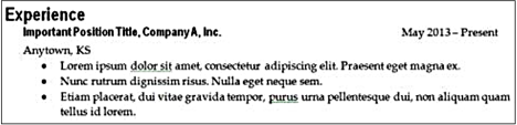
Figure 9. The “Experience” heading in this résumé is offset from the body text using a contrasting sans-serif font, bold style, larger size, and a different alignment.
Using the “Styles” tool to designate your heading levels in Microsoft Word or Google Docs allows you to:
- maintain more consistent and professional document design
- test different styles more easily
- generate a Table of Contents for long documents
You can learn about using the styles tool by searching “styles Microsoft Word” on YouTube.com.
Once you apply effective design to a heading to make sure readers see it, you also want to make sure the language of a heading assures the heading is clear to help readers navigate to the sections most important to them and skip sections they’re less interested in reading.
Writing Accurate Headings
Write and/or revise your headings after you finish writing a section. This assures accuracy, i.e. if you’re writing a procedures manual and you had planned to write a section called “Table Setting Procedure,” but then you also wrote about clearing tables, you would need to rewrite the heading to make clear that the section covered both setting and clearing tables.
Also, to ensure your headings are effective, make sure they are descriptive, parallel, and a reasonable length.
- Descriptive (not vague, and accurately describes the content)
- Vague— “Eating Crickets”
- More Specific— “Raising Crickets for Human Consumption”
- Parallel in structure
- Weak—”Market Opportunities,” “Possible Investors,” “What a Location Needs”
- Better— “Market Analysis,” “Possible Investors,” “Location Requirements”
- A reasonable length for quick scanning
- Too Long— “Ways to Raise Crickets and Costs Associated with Each”
- Better— “Cricket Raising Methods”
In this case, you might create subheadings for each method and a heading under each of those methods called “costs” so that the reader can still see those details upcoming.
Proximity
To help audiences quickly understand how ideas and points relate to one another, you should visually group information, keeping closely related content in close proximity.
You can also chunk content into manageable pieces of information by creating empty space between chunks—that way readers can see each chunk of information as a distinct block. Your chunks of content are groups of information and empty space is how you separate the chunks from each other. You can adjust the empty space to indicate different degrees of relationship between chunks through relative proximity.
In the résumé below, you can see varied degrees of empty space applied to indicate the relationship between chunks of content.

Figure 10. Larger empty spaces are used to separate major sections and smaller empty spaces are used to separate subsections.
How close or far each chunk is visually depends on how related the information is. There is little space between the description bullets because that’s closely related information. Between each position, there is a little more space. Finally, the largest amount of space appears between sections.
When you use empty space to separate paragraphs, it’s called block paragraph format. This format is common in correspondence and on web pages. It’s the most frequently used formatting structure in workplace communication because it applies proximity (via empty space) to make each paragraph a visually distinct unit.
Block paragraph format is the default for electronic documents and the web because of the way readers scan electronic documents and the web, and the spaces between paragraphs help readers to mentally sort each paragraph into its own information chunk.
Difference from Writing in School
What many of us think about when writing for school assignments is to use double-spaced paragraphs with an indentation at the start of each paragraph. This is called manuscript format. When printed as a hard copy, it leaves enough space for commenting and marking on the draft—hence its popularity in school settings.
You won’t see manuscript format frequently in the workplace unless you work in a specialized area, like publishing, where it is used to revise a work before converting it to a different style for publication.
Alignment
Alignment helps readers to know the order that they should read information, and it helps readers to see the relationships between pieces of information.
In a résumé for example, alignment helps readers to navigate the document. While most of the text is left-aligned, the person’s name may be centered. That contrast in alignment helps the name to stand out. Additionally, the content under headings and subheadings is indented, to show it falls under the heading. This is called nesting.
Nesting helps to make a document easy to skim, and is commonly applied to make lists more accessible.
Accessible Lists
Lists are easy to skim, so they’re encouraged in professional writing to support the needs of busy readers. Use numbered lists when sequence is important, like with steps within instructions. Use bullets when sequence is not essential, and try to arrange your information by order of importance or hierarchy.
Additionally, you should be very careful to make sure your lists are parallel. A parallel list uses consistent structure from one item to the next. Repeating the structure helps readers to absorb the information more readily.
For example, in a résumé job descriptions are nested under the position and company name to make clear they are a subset of information. Additionally, these descriptors are formed into a list and each typically starts with a verb (or action) in order to be parallel in structure—that’s the conventional pattern. Readers expect to see that pattern.
|
Non-parallel List |
Parallel List (Preferred) |
|
Office Assistant, ABC, Inc. | Manhattan, KS
|
Office Assistant, ABC, Inc. | Manhattan, KS
|
Figure 11. In a parallel list you would repeat phrase structures so that readers can anticipate the structure and read more efficiently.
While readers can likely still understand the information provided in the non-parallel list, they may find skimming this list more difficult than it needs to be. Readers could skim more quickly if the pattern of phrasing were consistent. Readers often recognize patterns in writing and use those patterns to anticipate what’s coming up next and read more quickly. Because the pattern of phrasing in the example is inconsistent, readers will struggle to skim as effectively.
Consistency
Consistency is about sticking with a design element once you start using it. For example, if you indent your first paragraph, readers will expect all of the other paragraphs to be indented too. If you use a particular style for your headings, readers will expect that style to continue throughout the document.
While it’s not a comprehensive list, here are some things to check for consistency when you’re revising a document:
- Font choice
- Paragraph style
- Use of white space
- Use of color or images
- Bullets used in a list
Keeping features consistent within a document takes time and care, so having a document with consistent design is an indicator of professional work. Having consistent and effective design will often increase your credibility with readers.
Consistency in design also helps readers navigate your document. With consistent design, once readers have identified some features, like what a heading and subheading look like, then they can quickly locate other headings and subheadings in the document.
Style Sheets
When working on larger documents or when working with multiple authors, creating a style sheet can help maintain consistency in a document. A style sheet is a separate document that a writer (or editor) creates to detail what design features are used in a document.
Basically, they detail what aspects of contrast, proximity, and alignment will be used and how they will appear in a document. A style sheet might list how far lists and bullet points are indented or if a particular default style in a word processor is used. They may also detail what citation style or style manual will be used as a reference for things not covered on the style sheet (APA, Chicago, etc).
Style sheets are also used to maintain consistency in spelling on words and terms that may have more than one form. This is often in a section called “terms” and presented alphabetically. For example, will you use the term “part time” or hyphenate it to be “part-time”? Both are acceptable, but using both forms might make readers wonder if you are assuming a subtle difference in meaning between the two. Rather than creating the list all at once, you can often update it as you come across terms that have different representations.
Some companies will have style sheets or style guides that all employees are supposed to follow. This is particularly true when writing for external audiences. It wouldn’t be unusual for a company style guide to detail different looks for internal vs. external communication.
Incorporating Visuals
Visuals can be important to a document because they can clarify complex information, reinforce important points, and break up a text-heavy page.
Visuals effectively draw and hold readers’ attention, so when you decide to integrate a visual, you should make sure the visual contributes meaningful messages that reinforce and emphasize important points in your text. You don’t want to drop in a vaguely related visual just to fill space because it may distract your reader if it doesn’t support the important messages.
Visuals that you might consider include:
- Graphs (bar, line, pie, etc.)–often useful to show comparisons or trends
- Tables–useful for sharing complex information with minimal repetition
- Flow charts–helpful for clarify processes
- Icons–helpful for drawing attention to important features in a text, like warnings
When you incorporate a visual into the text, you may need to frame your visual into the document:
- Introduce the visual in the text before you show it.
- Share the visual with features that help to clarify its purpose: captions, titles, labels, etc.
- Explain the visual in the text that follows.
Framing a visual into a document in this way assures that the reader knows when to look at the visual and that they know how to interpret the visual.
Activities
- Pick up a copy of your local school newspaper. What design elements do you see being used consistently throughout?
- Find a website that you feel has effective design. In groups or as a class discuss what features of the website relate to contrast, proximity, alignment, and consistency. Do you see any room for improvement?
- Find a brochure or flyer that you feel was poorly designed and bring it to class. What changes would you make to improve the document?
- As a class discuss what design features you feel would work best in workplace communication. Create a style sheet for the class to follow on the next assignment. Be sure to include what style manual you will use for reference and any deviations from the manual you will make.
- Below you can see three lists of sample headings, each with a weakness. Revise each list to resolve the problem.
|
Descriptive |
Parallel |
Length |
|
|
Samsung Infinity GS3 Wireless Speeds and Interface, LG Fomorian ZX2 Product Specifications and Use |
√ |
× |
Too Long |
|
Flavor 1, Flavor 2, Flavor 3 |
× |
√ |
Too Short |
|
Mutual Fund Risks, Benefits of Mutual Funds |
√ |
× |
Good |
Media Attributions
- Document without design
- Experience
- White space

Chapter 2: Document Design by Anna Goins; Cheryl Rauh; Danielle Tarner; and Daniel Von Holten is licensed under a Creative Commons Attribution-NonCommercial-ShareAlike 4.0 International License, except where otherwise noted.