
17.1: "Reading" Images
- Page ID
- 141526

\( \newcommand{\vecs}[1]{\overset { \scriptstyle \rightharpoonup} {\mathbf{#1}} } \)
\( \newcommand{\vecd}[1]{\overset{-\!-\!\rightharpoonup}{\vphantom{a}\smash {#1}}} \)
\( \newcommand{\dsum}{\displaystyle\sum\limits} \)
\( \newcommand{\dint}{\displaystyle\int\limits} \)
\( \newcommand{\dlim}{\displaystyle\lim\limits} \)
\( \newcommand{\id}{\mathrm{id}}\) \( \newcommand{\Span}{\mathrm{span}}\)
( \newcommand{\kernel}{\mathrm{null}\,}\) \( \newcommand{\range}{\mathrm{range}\,}\)
\( \newcommand{\RealPart}{\mathrm{Re}}\) \( \newcommand{\ImaginaryPart}{\mathrm{Im}}\)
\( \newcommand{\Argument}{\mathrm{Arg}}\) \( \newcommand{\norm}[1]{\| #1 \|}\)
\( \newcommand{\inner}[2]{\langle #1, #2 \rangle}\)
\( \newcommand{\Span}{\mathrm{span}}\)
\( \newcommand{\id}{\mathrm{id}}\)
\( \newcommand{\Span}{\mathrm{span}}\)
\( \newcommand{\kernel}{\mathrm{null}\,}\)
\( \newcommand{\range}{\mathrm{range}\,}\)
\( \newcommand{\RealPart}{\mathrm{Re}}\)
\( \newcommand{\ImaginaryPart}{\mathrm{Im}}\)
\( \newcommand{\Argument}{\mathrm{Arg}}\)
\( \newcommand{\norm}[1]{\| #1 \|}\)
\( \newcommand{\inner}[2]{\langle #1, #2 \rangle}\)
\( \newcommand{\Span}{\mathrm{span}}\) \( \newcommand{\AA}{\unicode[.8,0]{x212B}}\)
\( \newcommand{\vectorA}[1]{\vec{#1}} % arrow\)
\( \newcommand{\vectorAt}[1]{\vec{\text{#1}}} % arrow\)
\( \newcommand{\vectorB}[1]{\overset { \scriptstyle \rightharpoonup} {\mathbf{#1}} } \)
\( \newcommand{\vectorC}[1]{\textbf{#1}} \)
\( \newcommand{\vectorD}[1]{\overrightarrow{#1}} \)
\( \newcommand{\vectorDt}[1]{\overrightarrow{\text{#1}}} \)
\( \newcommand{\vectE}[1]{\overset{-\!-\!\rightharpoonup}{\vphantom{a}\smash{\mathbf {#1}}}} \)
\( \newcommand{\vecs}[1]{\overset { \scriptstyle \rightharpoonup} {\mathbf{#1}} } \)
\(\newcommand{\longvect}{\overrightarrow}\)
\( \newcommand{\vecd}[1]{\overset{-\!-\!\rightharpoonup}{\vphantom{a}\smash {#1}}} \)
\(\newcommand{\avec}{\mathbf a}\) \(\newcommand{\bvec}{\mathbf b}\) \(\newcommand{\cvec}{\mathbf c}\) \(\newcommand{\dvec}{\mathbf d}\) \(\newcommand{\dtil}{\widetilde{\mathbf d}}\) \(\newcommand{\evec}{\mathbf e}\) \(\newcommand{\fvec}{\mathbf f}\) \(\newcommand{\nvec}{\mathbf n}\) \(\newcommand{\pvec}{\mathbf p}\) \(\newcommand{\qvec}{\mathbf q}\) \(\newcommand{\svec}{\mathbf s}\) \(\newcommand{\tvec}{\mathbf t}\) \(\newcommand{\uvec}{\mathbf u}\) \(\newcommand{\vvec}{\mathbf v}\) \(\newcommand{\wvec}{\mathbf w}\) \(\newcommand{\xvec}{\mathbf x}\) \(\newcommand{\yvec}{\mathbf y}\) \(\newcommand{\zvec}{\mathbf z}\) \(\newcommand{\rvec}{\mathbf r}\) \(\newcommand{\mvec}{\mathbf m}\) \(\newcommand{\zerovec}{\mathbf 0}\) \(\newcommand{\onevec}{\mathbf 1}\) \(\newcommand{\real}{\mathbb R}\) \(\newcommand{\twovec}[2]{\left[\begin{array}{r}#1 \\ #2 \end{array}\right]}\) \(\newcommand{\ctwovec}[2]{\left[\begin{array}{c}#1 \\ #2 \end{array}\right]}\) \(\newcommand{\threevec}[3]{\left[\begin{array}{r}#1 \\ #2 \\ #3 \end{array}\right]}\) \(\newcommand{\cthreevec}[3]{\left[\begin{array}{c}#1 \\ #2 \\ #3 \end{array}\right]}\) \(\newcommand{\fourvec}[4]{\left[\begin{array}{r}#1 \\ #2 \\ #3 \\ #4 \end{array}\right]}\) \(\newcommand{\cfourvec}[4]{\left[\begin{array}{c}#1 \\ #2 \\ #3 \\ #4 \end{array}\right]}\) \(\newcommand{\fivevec}[5]{\left[\begin{array}{r}#1 \\ #2 \\ #3 \\ #4 \\ #5 \\ \end{array}\right]}\) \(\newcommand{\cfivevec}[5]{\left[\begin{array}{c}#1 \\ #2 \\ #3 \\ #4 \\ #5 \\ \end{array}\right]}\) \(\newcommand{\mattwo}[4]{\left[\begin{array}{rr}#1 \amp #2 \\ #3 \amp #4 \\ \end{array}\right]}\) \(\newcommand{\laspan}[1]{\text{Span}\{#1\}}\) \(\newcommand{\bcal}{\cal B}\) \(\newcommand{\ccal}{\cal C}\) \(\newcommand{\scal}{\cal S}\) \(\newcommand{\wcal}{\cal W}\) \(\newcommand{\ecal}{\cal E}\) \(\newcommand{\coords}[2]{\left\{#1\right\}_{#2}}\) \(\newcommand{\gray}[1]{\color{gray}{#1}}\) \(\newcommand{\lgray}[1]{\color{lightgray}{#1}}\) \(\newcommand{\rank}{\operatorname{rank}}\) \(\newcommand{\row}{\text{Row}}\) \(\newcommand{\col}{\text{Col}}\) \(\renewcommand{\row}{\text{Row}}\) \(\newcommand{\nul}{\text{Nul}}\) \(\newcommand{\var}{\text{Var}}\) \(\newcommand{\corr}{\text{corr}}\) \(\newcommand{\len}[1]{\left|#1\right|}\) \(\newcommand{\bbar}{\overline{\bvec}}\) \(\newcommand{\bhat}{\widehat{\bvec}}\) \(\newcommand{\bperp}{\bvec^\perp}\) \(\newcommand{\xhat}{\widehat{\xvec}}\) \(\newcommand{\vhat}{\widehat{\vvec}}\) \(\newcommand{\uhat}{\widehat{\uvec}}\) \(\newcommand{\what}{\widehat{\wvec}}\) \(\newcommand{\Sighat}{\widehat{\Sigma}}\) \(\newcommand{\lt}{<}\) \(\newcommand{\gt}{>}\) \(\newcommand{\amp}{&}\) \(\definecolor{fillinmathshade}{gray}{0.9}\)By the end of this section, you will be able to:
- Define the key concepts and elements of visual rhetoric.
- Interpret visual information using the language of visual rhetoric.
- Interpret images differently based on cultural considerations.
- Choose digital and visual media according to the rhetorical situation and cultural context when writing for different audiences.
- Make informed decisions about intellectual property issues regarding images.
To compose an effective essay or a strong visual, a creator works with a number of elements that are remarkably similar from one medium to the other. Both stories and pictures contain information presented by a creator who has a particular point of view and arranges the work in two-dimensional space. The information is likely to be open to multiple interpret, which may or may not be justified by the text. Although the sharing of personal opinions and beliefs has value, the focus here is on interpreting or analyzing texts in combination with your personal experiences.
Interpreting Visual Information
Both words and pictures convey information, but each does so in different ways that require interpretation. Interpretation is the sense a person makes of a piece of communication—textual, oral, or visual. It includes personal experience, the context in which the communication is made, and other rhetorical elements. (See Glance at Genre: Relationship Between Image and Rhetoric for a list of key terms related to visual elements and rhetoric.) By the time readers get to college, they have internalized strategies to help them critically understand a variety of written texts.
Images present a different set of challenges for critical readers. For example, in a photograph or drawing, information is presented simultaneously, so viewers can start or stop anywhere they like. Because visual information is presented in this way, its general meaning may be apparent at a glance, while more nuanced or complicated meanings may take longer to figure out and likely will vary from one viewer to another.
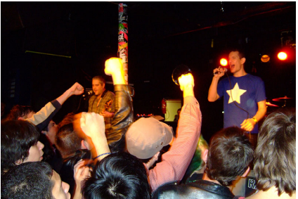
Figure \(\PageIndex{2}\): Naked Raygun performance, 2007 (credit: “Naked Raygun” by Greg Dunlap/flickr, CC BY 2.0)
Some images, however, do not really lend themselves to interpretation. Before trying to engage in rhetorical discourse about an image, be sure it contributes something of value. For example, Figure \(\PageIndex{2}\): shows a punk rock concert featuring the band Naked Raygun with several concertgoers in the foreground. Such pictures are common forms of memorabilia that serve an archival function. The features common to visual rhetoric—point of view, arrangement, color, and symbol—do not inspire much in the way of discussion in this particular image. Parts are blurry, some of the figures are obscure, and the picture’s purpose is unclear. Therefore, any analysis of the image may be guided more by personal opinion than by critical thinking. Such images are not the focus of this chapter.
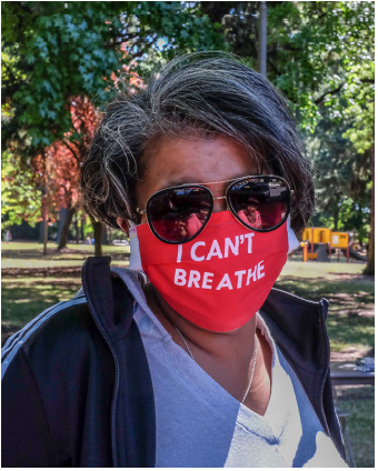
Figure \(\PageIndex{3}\): (credit: “DSCF1343” by K. Kendall, Portland, OR, USA/Wikimedia Commons, CC BY 2.0)
Figure \(\PageIndex{3}\): , in contrast, depicts not merely a moment in time for the sake of memory, although it certainly does that. It contains a central, dominant figure. The color red is bold and centers the figure, giving the image weight. It also conveys several political messages, both obvious and nuanced. The woman in the picture is wearing a mask, as people were either asked or mandated to do during the COVID-19 pandemic. The slogan on her mask reads “I can’t breathe,” words that were made infamous after Eric Garner (1970–2014) died as the result of an illegal chokehold inflicted by a New York City police officer during arrest. These words were repeated by George Floyd (1973–2020) in an 8-minute, 46-second video showing his murder by a Minnesota police officer who knelt on Floyd’s neck. The phrase became one of several slogans of the Black Lives Matter (BLM) movement, symbolizing the struggle that people of color endure when living in an implicitly and explicitly racist culture. Breathing—like blood—is fundamental, essential. Without breath, there is no life. Thus, this slogan draws attention to the fact that people of color may be brutalized for no reason other than their existence.
Placing the slogan on a mask is a design choice likely to provoke those who have argued against mandated mask wearing as an assault on personal liberty and who have proclaimed they could not breathe while wearing masks. Juxtaposition, or placing contrasting elements close together, is a technique that image creators often use for a variety of purposes: humor, irony, sarcasm, or—as in this case—disgust or outrage. The juxtaposition of the mask with a slogan referencing literal asphyxiation emphasizes the wearer’s view that state violence against people of color is a more serious threat to her existence than a mask. Thus, the image is open to multiple interpretations.
Thinking Critically
To think critically about visual information, first identify the objects, facts, processes, or symbols portrayed in the image. Taking all the information together, ask whether there is a main or unifying idea. Is the meaning open to multiple interpretations? Is it suggested but not stated? Is it clear and unambiguous? Are there multiple levels of meaning, both stated and unstated? When you view an image, pausing to answer such questions will sharpen your critical faculties, increase your understanding of the visual information you encounter, and help you use images more meaningfully in texts you create.
Visual Rhetoric
Written texts rely on strategies such as thesis statements, topic sentences, paragraphing, tone, and sentence structure to communicate their message to their audience. Images rely on different strategies, including point of view, arrangement, color, and symbol. When writing about images or including them in your writing, think critically about the visual strategies they use and the effect they will have on your audience.
Using these techniques may or may not make you a proficient artist or creator of images. However, familiarity with the technical language of the visual arts will certainly enable you to describe what you observe as you build the evidence that allows you to interpret an image, reflect on it, analyze it, and make persuasive arguments about it.
Point of View
In written texts, point of view refers to the “person” from whose vantage point the information is delivered, either a character in the story or a narrator outside the story. However, in photographs, drawings, and paintings, point of view refers to the place from which the image creator looks at the subject—where the photographer places their camera or the artist their easel.
Photographs that haven’t been manipulated in a darkroom or digitally by a computer only reproduce the subject in front of the camera, as it exists in the moment the shutter opens and closes. They do not show anything to the left or right, above or below, or what comes before or after. A camera aimed to the east omits information from the north, west, and south. In other words, any photograph is the result of placing a camera in a certain location, at a certain height and distance, at a specific time of day and using a particular lens, film, and perhaps a filter. All of these decisions about where, when, and how to place the camera create the visual point of view.
You can find good examples of these kinds of limited truths in real-estate advertisements featuring photographs of houses for sale. The photograph might not reveal a landfill next door or a factory across the street—though you might infer such limitations from a low selling price or confirm them by driving past the house.
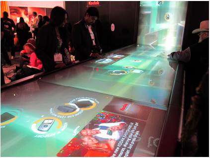
Figure \(\PageIndex{4}\): (credit: “Kodak Digital Waterfall” by Nan Palmero/flickr, CC BY 2.0)
The creator of Figure \(\PageIndex{4}\): chooses to highlight the digital waterfall with its seductive lighting and colors. Meanwhile, the people interacting with the computer are barely visible, standing off to the side, some nearly out of the frame. The silhouetted profiles and darkened faces lack identifying details. These features are emphasized by the blurred people in the background. These figures, too, are unidentifiable and are looking out of the frame, uninterested. The effect is to imply that the waterfall and its computer interface dominate human interaction and possibly even human existence.
To think critically about point of view, answer the following questions:
- From what place or stance does the image creator view the subject?
- What effect does this particular point of view have on the way viewers may think or feel about the subject?
- What would happen if the vantage point were elsewhere—above or below, left or right?
- What would change in the image if the point of view were changed?
Arrangement
In addition to point of view, artists use arrangement to signal an image’s significance to the reader. The term arrangement in visual texts might be compared to terms such as order, organization, and structure in verbal texts, though the differences are substantial. While writers arrange, or put together, a story, essay, or poem to take place over time—that is, the time readers need to follow the text, line by line, through a number of pages—image creators arrange pictures in the two-dimensional space of their viewfinder, paper, or canvas to invite viewers to read in space rather than time. This difference is also evident in sculpture and other three-dimensional works, which require viewers to move around them to read them spatially. In visual texts, then, arrangement refers to the ways in which the various parts of a picture come together to present a single coherent experience for the viewer.
In contrast to static images, which are read spatially, videos and some types of multimodal texts—those incorporating more than one genre, discipline, or literacy (for example, GIFs that incorporate pictures or videos with language)—combine elements of both time and space. That is, they invite viewers to examine an image in motion that changes over time. Video creators often mimic linear time by telling a story, or they repeat key images to be interpreted differently after being seen in various contexts within the video.
One element to examine is the use of pattern—predictable, repeated elements within the visual field that the eye notices and seems attracted to. Just as sonnets, sestinas, and haiku follow patterns of lines, so do visual compositions. But in these, patterns are created by light and color rather than words. Documentary and commercial photographers often use visual patterns to lead viewers to an intended meaning. Patterns are especially prominent in street art, where the elements of surrounding architecture and infrastructure interact with the work, as shown in Figure \(\PageIndex{5}\): .
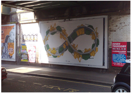
Figure \(\PageIndex{5}\): Gaza Strip mural in Prague, Czech Republic, by Blu (credit: “Gaza Strip” by Tom Hughes-Croucher/ flickr, CC BY 2.0)
Many patterns are suggested by mathematics. For example, the Möbius strip is both a mathematical construct and a visual enigma. It has one side and one boundary curve. It looks like a spiral, but it does not intersect itself. Thus, it gives the impression of being infinite. In Figure \(\PageIndex{5}\): , the artist capitalizes on these features of the Möbius strip, using it to depict the seemingly endless cycle of destruction (green tanks) and reconstruction (yellow steamrollers) in one of the world’s most contested pieces of real estate: the Gaza Strip.
Ownership and control of the Gaza Strip are disputed. Approximately two million people live there, many in refugee camps. Since the mid-20th century, the region has been fought over by Israel, Egypt, and Palestinian Arabs. As you contemplate the mural, think about the way its creator uses pattern and repetition to convey various ideas and emotions. The following questions may help:
- Which elements within the mural are repeated?
- Where is its center of gravity or weight?
- Where do patterns of light/dark, large/small, and color lead the eye?
- How do pattern and balance contribute to meaning in a two-dimensional image?
- What does the arrangement suggest about the meaning of the image?
Color and Symbol
Pattern and arrangement are controlled by the image creator and intended to guide the viewer. Color and symbol allow the viewer greater latitude in interpreting the image, in part because particular colors suggest specific moods. Think about your personal reactions to different colors. What color might you select to paint your bedroom? What is your favorite color for, say, clothing or cars? While these may differ according to personal preference, traditional symbolic values are attached to different colors in literature and art. Why, for instance, does red often symbolize anger or war on the one hand and romance or passion on the other? Why does black often suggest danger or death? And why does white often stand for innocence or purity? Are the reasons for these associations arbitrary, cultural, or logical?
Particular colors also suggest or reinforce social and political ideas. What, for example, is suggested by adding a red, white, and blue American flag to a magazine advertisement for an American automobile, political poster, or bumper sticker? What is the meaning of a yellow ribbon tied to a tree in front of a house or an image of a yellow ribbon sticker attached to the tailgate of a pickup truck? By themselves, colors do not specify political positions, arguments, or ideas, but used in conjunction with specific words or forms—a flag or ribbon, for example—the emotional power of color can be influential.
Color associations globally are complicated and highly nuanced. The following overview is brief and simplified, to be considered merely as an introduction or starting point for your research and investigations into individual artistic expressions. When you interpret an artist’s use of color, one place to start is with the hues found in the natural world. Because blood is red, the color is often associated with life, heat, and passion. Yellow and green appear with the new growth of spring, so these colors often symbolize new beginnings, freshness, and hope. Both the sea and the sky are blue. Although these elements can be turbulent, many people find peace and tranquility as they reflect on them, and thus they are often associated with these emotions.
Regardless of colors’ natural associations, people from around the world understand colors differently. In China, for example, red is a celebratory color associated with holidays, feasts, and the giving of gifts, whereas in some parts of Africa the color may symbolize the sacrifice necessitated by the fight for independence. In the Western world, white can represent purity or innocence and is often worn by young women at their weddings. However, in parts of Asia, white is a color of mourning.
The colors mentioned so far are mostly primary colors: red, yellow, and blue. The secondary colors—orange, green, and purple—carry more complex meanings. Both orange and the bright shade of green called neon or chartreuse are easy to see in all light conditions. Therefore, they are often used for safety purposes, on caution signs or uniforms of emergency workers. The color orange is associated with the robes of Buddhist monks, thus representing in Buddhist cultures that which is holy, whereas in the Netherlands, orange is the color of the royal family and used for patriotic purposes.
In addition to connotations of spring, the color green is also associated with Islam. In the Christian tradition, yellow and gold are colors associated with riches and abundance. Holiness is also associated with the color blue in Egyptian, Hindu, and Christian cultures (in which blue has other associations as well). Because purple has traditionally been a difficult color to manufacture, its rarity meant that only the very wealthy, often nobility or royalty, could afford to wear it—hence its association with royals and even gods. However, some cultures, such as Thai, Brazilian, and Italian cultures, associate purple with bad luck or death. Again, this overview of colors’ different interpretations and associations is not intended as a guide for interpreting color in a visual image. Instead, consider all of the different ways in which color can be understood, some ways that the artist might intend for color to be interpreted, and the associations that colors have for you when you view a visual or digital image.
In this chapter, you have begun learning about how to interpret visual information through the lens of rhetoric. Color and its related symbolism help viewers interpret images.

Figure \(\PageIndex{6}\): State flag of Mississippi (https://openstax.org/r/State-flag), 1894–2020. This is the 1894 version, without the white stripe added in 1996. (credit: “Flag of Mississippi (1894–1906)” by Wikimedia Commons/Public Domain)

Figure \(\PageIndex{7}\): The current state flag of Mississippi was adopted 2021. (credit: “Flag of Mississippi” by Rocky Vaughan, et al./Wikimedia Commons, Public Domain)
Symbols
Like colors, symbols are interpreted differently by individuals on the basis of their personal and cultural experiences. Here is an example of two state flags with very different symbolism: Figure \(\PageIndex{6}\): depicts the state flag of Mississippi that was adopted in 1894; Figure \(\PageIndex{7}\): depicts the one adopted in 2021. In 2021, under pressure from numerous organizations and in the wake of the Black Lives Matter movement, Mississippi replaced its state flag. The 1894 flag included the battle flag of the Confederacy, referencing Mississippi’s history of secession and violence during the Civil War (1861–1865); the single blue, white, and red bands were a reference to the stripes on the American flag. This historical allusion, coupled with the state’s history of enslavement and segregation, meant that the 1894 flag served as a stark reminder of efforts to silence Black Mississippians. In fact, Mississippi did not formally ratify the Thirteenth Amendment to the Constitution—proposed in 1865 to abolish slavery—until 2013, and the state remained segregated long after the Supreme Court outlawed the practice.
Mississippi continued to use the 1894 flag throughout the Reconstruction (1865–1877) and the Jim Crow laws (ca. 1877–c. 1950) and civil rights (1950s and 1960s) eras despite multiple and sustained efforts to remove any reference to the Confederate flag. In 2020, the increasing prominence of the Black Lives Matter movement created the context in which state lawmakers were forced to consider these problems as mainstream and urgent. Further, the state came under pressure from numerous organizations, including the Southeastern Conference athletics organization (SEC), which threatened to boycott the state by no longer holding major events there if the flag were not changed.
Submitted to the legislature by Starkville-based graphic designer Rocky Vaughan (b. ca. 1977) and collaborators Sue Anna Joe, Kara Giles, and Dominique Pugh, the new flag took effect in January 2021 after voters approved it and the governor ratified it. The current flag (Figure \(\PageIndex{7}\): ) features a central vertical band of blue, flanked by two thin gold bands and encompassed by two broader red ones. The flag’s center is dominated by a single magnolia flower, crowned by a single gold star and encircled by 20 white ones. Beneath the flower are emblazoned the words “In God We Trust.”
The gold coloring is intended to celebrate Mississippi’s contributions to the world of art, music, and literature. The white stars symbolize Mississippi’s status as the 20th state of the Union; thus, the new flag symbolizes the state’s reintegration into the Union without reference to its seditious acts in the 19th century or lingering loyalty to the beliefs that motivated them. In addition, the single gold star honors the state’s indigenous people; no reference is made to the state’s history of enslavement and racism.
Thinking critically about color and symbol, ask yourself these questions:
- Does the color enhance or distort the reality of the image?
- Imagine the image in shades of black, white, and gray. What would be lost and what would be gained if color were subtracted?
- Does the color work with or against the other compositional elements?
- What symbols are incorporated into the image? How might those symbols be interpreted in various contexts?
- What, if any, is the significance of referencing Indigenous but not Black Americans on the current flag?
Selecting and Incoporating Digital and Visual Media
In addition to analyzing visual and digital media, you may be asked to find, create, or manipulate such materials for a variety of situations and audiences. Following are some considerations to keep in mind, including copyright issues, appropriate selections, and technical manipulations.
Intellectual property laws are complicated, change frequently, and vary by country. Sharing an image is similar to quoting a text, with one exception: you must not only cite the author in a reference list or bibliography but also secure permission to use the image. To be safe, unless an image explicitly states that you are free to share it (public domain), assume it is protected by copyright.
The texts you write will have varying degrees of formality and require different levels of diction (word choice), syntax (sentence structure), content, and tone. Similarly, the images you select should reflect the tone, or attitude, that you wish to convey in your text. Ask yourself these questions to decide whether an image is appropriate for your text:
What is the image’s purpose? Include images only if they add to or supplement the text. Do not add images simply as “filler” or for audience entertainment. Such materials are more likely to confuse or distract readers than they are to enlighten or inform them.
Is the image humorous or sarcastic? Humor has value as entertainment by keeping the audience interested and engaged in your text and making it more memorable. However, determining what makes something funny is deeply personal. An image you find funny could be read with confusion or even offense by someone else. In formal communications, humor and sarcasm are better avoided because of the risk of misunderstanding. In creative contexts, you have greater latitude.
Does the image include text? Because you are already creating a text, you may wish to question the value of inserting an image with text. Consider what information the image provides in addition to the text. For example, in Figure \(\PageIndex{3}\): , the text “I can’t breathe” is enhanced by its placement on a mask and, further, by the mask’s presence on a Black woman. These details make the image with its text a valuable addition to a discussion or analysis.
Consider also the language of the text. You may be fluent in multiple languages, so an image with text in Spanish, French, or Japanese could have meaning for you. Will it have meaning for your audience? The same applies to images that include slang, jargon, or slogans with a limited shelf life. If you have to explain the image’s meaning before your readers understand it, the image is probably not worth including.
What is the image’s context? Where and when the image is placed can affect the viewer’s understanding and interpretation. A picture of poverty in one country is likely to look very different from poverty in another country. Some images can be considered universal, meaning they depict situations that have significance for all people, regardless of culture, ethnicity, or historical context. For example, an image of a mother and an infant is easily recognized by anyone anywhere and is likely to evoke similar thoughts and emotions.
What digital or technical requirements or manipulations are needed? Finally, when you think about including an image, you’ll need to consider the digital and technical requirements and manipulations necessary to do so. Aspects to consider include compatibility requirements, visibility on different devices and platforms, sizing, and placement. The technical details associated with these considerations are changing rapidly, so this chapter makes no recommendations regarding software programs or specifications. However, if an image is blurred or distorted—or invisible—the result will be confusion and frustration on the part of your reader.
Selecting an Appropriate Image
To practice selecting appropriate images, imagine you are writing an informational webpage about the Environmental Protection Agency (EPA) and its responsibilities in relation to the Clean Water Act. To illustrate those responsibilities, which of the following images would you use? Why? (Suggested answers follow.)

Figure \(\PageIndex{8}\): Sample image 1: EPA flag with logo (credit: “Environmental Protection Agency building” by USEPA Environmental-Protection-Agency/flickr, Public Domain

Figure \(\PageIndex{9}\): Sample image 2: Water pouring from a faucet into a clear glass (credit: “Water pouring from a faucet into a clear glass cup” by USEPA Environmental-Protection-Agency/Wikimedia Commons, Public Domain)
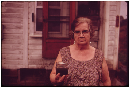
Figure \(\PageIndex{10}\): Sample image 3: Woman holding a cup of brown liquid (credit: “Safe Drinking Water Act” by Erik Calonius/USEPA Environmental-Protection-Agency/Wikimedia Commons, Public Domain)
Suggested Answers
- Sample image 1 seems like an obvious choice. It depicts the name and logo of the agency you are writing about, and nothing about it is likely to be considered controversial. However, by itself, it does not convey any useful information, so its purpose is unclear.
- Sample image 2 depicts safe, clean drinking water from the tap. The glass emphasizes the clarity of the water, and its proximity to the tap shows the intimate role that water plays in daily life. It features no characters or setting, so it is not restricted by any obvious contextual clues. It is perfect for this piece.
- Sample image 3 is emotionally powerful. It depicts a woman, older and likely with a low income, holding a jar of brownish liquid. The image appears to be old, based on the coloring of the photograph, the woman’s dress, and the home in the background. Its age could help make the rhetorical point that the EPA’s enforcement of the Clean Water Act, passed in 1972, has been effective. However, its context is unclear, raising questions about its composition. When and where was the photo taken? Is it set in the United States? And what is the liquid in the jar—water? Oil? Moonshine? The image raises too many questions to be useful in this context.