10.17: Architecture and design
- Page ID
- 67858
\( \newcommand{\vecs}[1]{\overset { \scriptstyle \rightharpoonup} {\mathbf{#1}} } \)
\( \newcommand{\vecd}[1]{\overset{-\!-\!\rightharpoonup}{\vphantom{a}\smash {#1}}} \)
\( \newcommand{\dsum}{\displaystyle\sum\limits} \)
\( \newcommand{\dint}{\displaystyle\int\limits} \)
\( \newcommand{\dlim}{\displaystyle\lim\limits} \)
\( \newcommand{\id}{\mathrm{id}}\) \( \newcommand{\Span}{\mathrm{span}}\)
( \newcommand{\kernel}{\mathrm{null}\,}\) \( \newcommand{\range}{\mathrm{range}\,}\)
\( \newcommand{\RealPart}{\mathrm{Re}}\) \( \newcommand{\ImaginaryPart}{\mathrm{Im}}\)
\( \newcommand{\Argument}{\mathrm{Arg}}\) \( \newcommand{\norm}[1]{\| #1 \|}\)
\( \newcommand{\inner}[2]{\langle #1, #2 \rangle}\)
\( \newcommand{\Span}{\mathrm{span}}\)
\( \newcommand{\id}{\mathrm{id}}\)
\( \newcommand{\Span}{\mathrm{span}}\)
\( \newcommand{\kernel}{\mathrm{null}\,}\)
\( \newcommand{\range}{\mathrm{range}\,}\)
\( \newcommand{\RealPart}{\mathrm{Re}}\)
\( \newcommand{\ImaginaryPart}{\mathrm{Im}}\)
\( \newcommand{\Argument}{\mathrm{Arg}}\)
\( \newcommand{\norm}[1]{\| #1 \|}\)
\( \newcommand{\inner}[2]{\langle #1, #2 \rangle}\)
\( \newcommand{\Span}{\mathrm{span}}\) \( \newcommand{\AA}{\unicode[.8,0]{x212B}}\)
\( \newcommand{\vectorA}[1]{\vec{#1}} % arrow\)
\( \newcommand{\vectorAt}[1]{\vec{\text{#1}}} % arrow\)
\( \newcommand{\vectorB}[1]{\overset { \scriptstyle \rightharpoonup} {\mathbf{#1}} } \)
\( \newcommand{\vectorC}[1]{\textbf{#1}} \)
\( \newcommand{\vectorD}[1]{\overrightarrow{#1}} \)
\( \newcommand{\vectorDt}[1]{\overrightarrow{\text{#1}}} \)
\( \newcommand{\vectE}[1]{\overset{-\!-\!\rightharpoonup}{\vphantom{a}\smash{\mathbf {#1}}}} \)
\( \newcommand{\vecs}[1]{\overset { \scriptstyle \rightharpoonup} {\mathbf{#1}} } \)
\(\newcommand{\longvect}{\overrightarrow}\)
\( \newcommand{\vecd}[1]{\overset{-\!-\!\rightharpoonup}{\vphantom{a}\smash {#1}}} \)
\(\newcommand{\avec}{\mathbf a}\) \(\newcommand{\bvec}{\mathbf b}\) \(\newcommand{\cvec}{\mathbf c}\) \(\newcommand{\dvec}{\mathbf d}\) \(\newcommand{\dtil}{\widetilde{\mathbf d}}\) \(\newcommand{\evec}{\mathbf e}\) \(\newcommand{\fvec}{\mathbf f}\) \(\newcommand{\nvec}{\mathbf n}\) \(\newcommand{\pvec}{\mathbf p}\) \(\newcommand{\qvec}{\mathbf q}\) \(\newcommand{\svec}{\mathbf s}\) \(\newcommand{\tvec}{\mathbf t}\) \(\newcommand{\uvec}{\mathbf u}\) \(\newcommand{\vvec}{\mathbf v}\) \(\newcommand{\wvec}{\mathbf w}\) \(\newcommand{\xvec}{\mathbf x}\) \(\newcommand{\yvec}{\mathbf y}\) \(\newcommand{\zvec}{\mathbf z}\) \(\newcommand{\rvec}{\mathbf r}\) \(\newcommand{\mvec}{\mathbf m}\) \(\newcommand{\zerovec}{\mathbf 0}\) \(\newcommand{\onevec}{\mathbf 1}\) \(\newcommand{\real}{\mathbb R}\) \(\newcommand{\twovec}[2]{\left[\begin{array}{r}#1 \\ #2 \end{array}\right]}\) \(\newcommand{\ctwovec}[2]{\left[\begin{array}{c}#1 \\ #2 \end{array}\right]}\) \(\newcommand{\threevec}[3]{\left[\begin{array}{r}#1 \\ #2 \\ #3 \end{array}\right]}\) \(\newcommand{\cthreevec}[3]{\left[\begin{array}{c}#1 \\ #2 \\ #3 \end{array}\right]}\) \(\newcommand{\fourvec}[4]{\left[\begin{array}{r}#1 \\ #2 \\ #3 \\ #4 \end{array}\right]}\) \(\newcommand{\cfourvec}[4]{\left[\begin{array}{c}#1 \\ #2 \\ #3 \\ #4 \end{array}\right]}\) \(\newcommand{\fivevec}[5]{\left[\begin{array}{r}#1 \\ #2 \\ #3 \\ #4 \\ #5 \\ \end{array}\right]}\) \(\newcommand{\cfivevec}[5]{\left[\begin{array}{c}#1 \\ #2 \\ #3 \\ #4 \\ #5 \\ \end{array}\right]}\) \(\newcommand{\mattwo}[4]{\left[\begin{array}{rr}#1 \amp #2 \\ #3 \amp #4 \\ \end{array}\right]}\) \(\newcommand{\laspan}[1]{\text{Span}\{#1\}}\) \(\newcommand{\bcal}{\cal B}\) \(\newcommand{\ccal}{\cal C}\) \(\newcommand{\scal}{\cal S}\) \(\newcommand{\wcal}{\cal W}\) \(\newcommand{\ecal}{\cal E}\) \(\newcommand{\coords}[2]{\left\{#1\right\}_{#2}}\) \(\newcommand{\gray}[1]{\color{gray}{#1}}\) \(\newcommand{\lgray}[1]{\color{lightgray}{#1}}\) \(\newcommand{\rank}{\operatorname{rank}}\) \(\newcommand{\row}{\text{Row}}\) \(\newcommand{\col}{\text{Col}}\) \(\renewcommand{\row}{\text{Row}}\) \(\newcommand{\nul}{\text{Nul}}\) \(\newcommand{\var}{\text{Var}}\) \(\newcommand{\corr}{\text{corr}}\) \(\newcommand{\len}[1]{\left|#1\right|}\) \(\newcommand{\bbar}{\overline{\bvec}}\) \(\newcommand{\bhat}{\widehat{\bvec}}\) \(\newcommand{\bperp}{\bvec^\perp}\) \(\newcommand{\xhat}{\widehat{\xvec}}\) \(\newcommand{\vhat}{\widehat{\vvec}}\) \(\newcommand{\uhat}{\widehat{\uvec}}\) \(\newcommand{\what}{\widehat{\wvec}}\) \(\newcommand{\Sighat}{\widehat{\Sigma}}\) \(\newcommand{\lt}{<}\) \(\newcommand{\gt}{>}\) \(\newcommand{\amp}{&}\) \(\definecolor{fillinmathshade}{gray}{0.9}\)Architecture and design
The architecture of the 20th century responded to radically new ways of living and working.
1900 - 1980
Vienna Secession
Otto Wagner, Postal Savings Bank

A truly modern architecture
“What is impractical can never be beautiful.” – Otto Wagner
In his 1896 manifesto Modern Architecture, Wagner expressed his ideal of practical and efficiently designed architecture. The purpose of beauty, he argued, was to give artistic expression to function. Extraneous ornament, therefore, was not only impractical and inefficient, it was also decidedly unmodern. In elucidating his theory, Wagner applied the metaphor of fashion to building design. The daily attire of the modern businessman or athlete provided a model for architecture in that they were stylish yet sleek, comfortable, well-made and practical for a wide range of uses. “A man in a modern traveling suit,” he noted, “fits very well with the waiting room of a train station with sleeping cars, with all our vehicles.” Such sportswear was an easy complement to the industrialized and rapidly growing society of late-nineteenth- and early-twentieth century Austria, and by Wagner’s light, was categorically distinguished from the “costumes” of past generations. “It is simply an artistic absurdity,” he believed, for a man to spend his “life in interiors executed in the styles of past centuries.”

Realized in two phases, the first in 1904 – 1906 and the second in 1910 – 1912, the Postal Savings Bank was Otto Wagner’s first major building commission and allowed him to realize his “functional” principles of architecture for the first time.
Functionalist design
Polished marble, ebonized beech-wood, nickel-plated and aluminum detailing, and everywhere broad panels of curved and beveled glass. This is not what one immediately associates with “functionalist design,” yet, within Otto Wagner’s Austrian Postal Savings Bank, it is the very materiality of the finely crafted stone, concrete, glass, wood, and metal that makes the building decidedly “functional.”
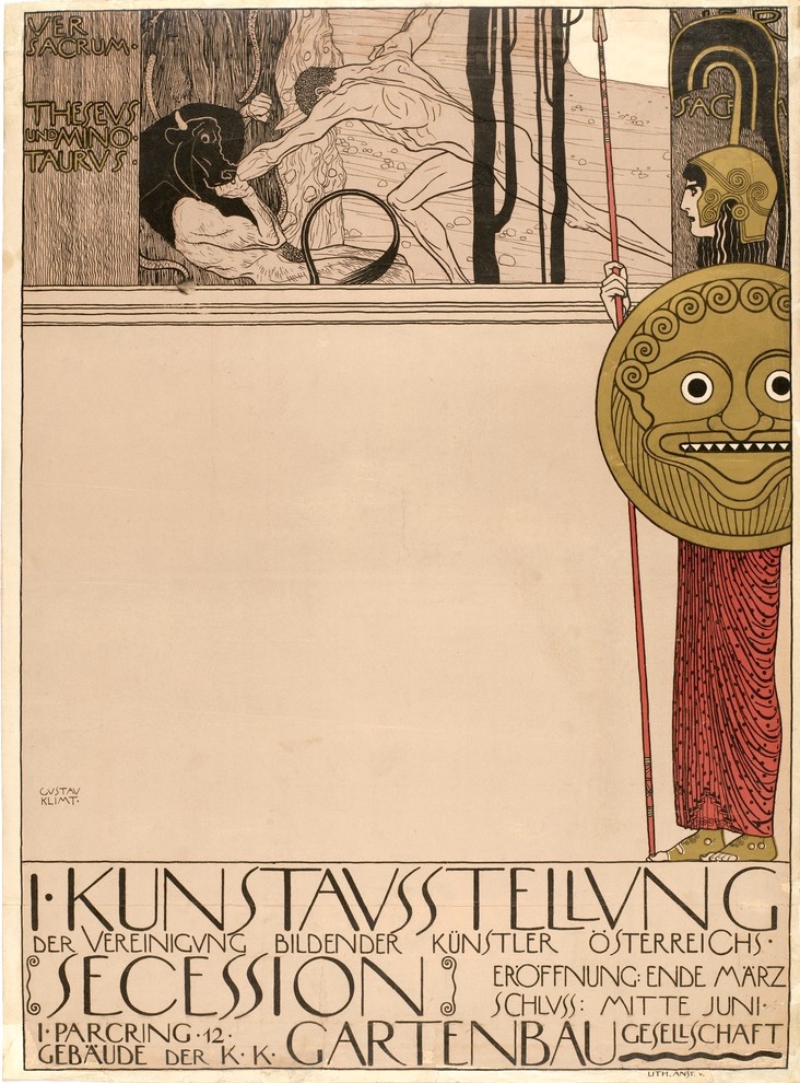
Wagner’s approach to design was closely tied to that of the Secession—a progressive group of Austrian artists, architects and designers who pursued artistic rejuvenation in combining quality building processes with new materials and technologies, and expressive modernist forms. Secessionist architects, including Josef Hoffmann and Joseph Maria Olbrich, were drawn to the idea of Gesamtkunstwerk—or the “total work of art”—in which all aesthetic elements are subordinated to the whole effect. In practice, this concept promoted artistic craftsmanship across a wide spectrum of disciplines and favored collaborative models of creation over individual authorship. In 1903, the craftsmen cooperative called the Wiener Werkstätte (Vienna Workshop) was developed by a group of Secessionists to facilitate this end. Bringing together designers of fashion, furniture and books, with architects, sculptors, painters, ceramists, and jewelers, the Werkstätte elevated the status of the craftsman while at the same time facilitating the unification of artistic endeavors in single fully-designed products.
The Postal Savings Bank might well be considered a Gesamtkunstwerk, and perfectly epitomizes Wagner’s comprehensive approach to building design. Rising seven-stories and occupying an entire city block, the Savings Bank is one of the many monumentally-scaled civic buildings erected in Vienna in the years 1880 – 1910, a period in which the historical city was transformed into a modern metropolis.

Plan

In plan, the bank is nearly trapezoidal. The rectilinear central block is occupied by the main banking hall, and is symmetrically flanked by triangular building wings, each perforated by a courtyard, in which dozens of bank offices neatly align along the structure’s perimeter. The linearity and systematized quality of the plan is echoed in the building’s façade—an austere yet artful interpretation of the building-as-machine. Here, thin profiled sections of white Sterzing marble are punctuated by aluminum bolts, precisely placed so as to create a mechanized aesthetic across the building’s surface. The functional necessity of the bolts is not only left unconcealed, but is actually emphasized as the façade’s primary ornament.
But it is the bank’s interior—and in particular, the central top-lit banking hall (image near top of page) and adjacent office spaces—that most deftly asserts Wagner’s functionalist approach to total building design. Framed by a riveted steel superstructure, the central banking hall takes the form of a glass atrium, and every surface—wall, counter, door, window or pillar—bears the trace of the craftsman. In laying out the interior spaces, Wagner’s sought to maximize efficiency and minimize the amount of daily cleaning and future repair. Wide hallways, elevator lifts, telephone lines, and a pneumatic tube system were installed to facilitate internal communication, and within the offices, adjustable partitions allowed bank employees to reform their workspaces according to desire and need.
Materials and furnishings
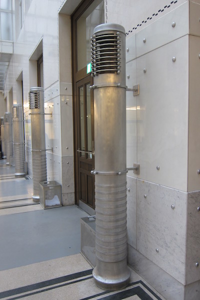
Materials were selected due to their durability, economy and functionality. For the flooring, glass-block, porcelain tile and linoleum was laid over asphalt to create insulated, easily cleaned and long lasting surfaces. In high traffic areas, marble wall paneling thwarts wear and prevents the need for repainting, and aluminum hot-air blowers are not only sleek and sanitary, but occupy minimal floor space.
The bank’s furniture and detailing were also under Wagner’s purview and he developed an entire catalogue of standard-design furnishings that allowed for maximum economic and functional flexibility, depending on the respective location and use of each piece. With the exception of the chief executive’s office—where brass, velour and mahogany was used in the furniture—light fixtures were made of aluminum, porcelain and nickel, and the wood used in desks, cabinets, counters and chairs was artfully-treated beech.
Thus, from its light fixtures to its systematic building plan, The Postal Savings Bank is both a manifestation of Otto Wagner’s ideal of modern “functionalist” architecture and an exemplary work of Secessionist design. In its austere lines, simple construction, and minimal use of materials, exemplifies Wagner’s belief that “The architect always has to develop the art-form out of construction.”
Backstory
When it was built at the turn of the last century, Otto Wagner’s building appeared strikingly modern compared to the baroque architecture that characterized most of central Vienna at the time. Today, though, it makes up part of the historic urban fabric that led UNESCO to inscribe the city’s center into the World Heritage List in 2001:
…its architectural and urban qualities and layout…illustrate [Vienna’s] three major phases of development—medieval, Baroque, and the Gründerzeit—that symbolize Austrian and central European history. The Historic Centre of Vienna has also maintained its characteristic skyline.
It is Vienna’s skyline that is now a cause for concern by UNESCO and others. A project by a private developer to create a hotel, conference center, and ice rink on the edge of the city’s historic district prompted UNESCO to put Vienna on its List of World Heritage in Danger in 2017. The design for the hotel entailed the remodeling of an existing International Style tower that was built in 1964, as well as the construction of an additional apartment tower that exceeded the average height of the surrounding buildings (though it still complied with the city’s planning rules). UNESCO and ICOMOS strongly condemned the project, as well as the city’s new planning policies with regard to height limits, drawing on the language of the Vienna Secession to argue for the tower’s incompatibility with the cityscape:
Today, the mass of the Intercontinental Hotel still creates a contrast with the “Gesamtkunstwerk” character of the close surrounding context which, as a manifestation of late 19th century’s architecture, is an attribute of the property “Historic Centre of Vienna.”
The architect and developer, on the other hand, argued that the new plans highlighted important phases of the city’s architectural history:
Like no other part of [historical Vienna], the area surrounded by the Vienna Concert Hall (built in 1913), the Vienna Ice Skating Club (WEV) (established in 1899) and the InterContinental Vienna (built in 1964) documents the (architectural) history of Vienna in the 20th century.
Urban development is a growing threat to cultural heritage around the globe. In some places, sites need strict protections to ensure that historically important structures are not built over or encroached upon by newer ones. However, in this case, UNESCO and other organizations are arguing for something more subtle: the preservation of the historic character of a particular neighborhood. The developer and city planners in Vienna are interested in economic growth, and value the history of 20th-century architecture as a valid part of the city’s story. Organizations like UNESCO (as well as local groups) would prefer to preserve the city as it looked in the nineteenth century and earlier. These differing points of view reveal how “preservation” and “heritage” are not stable concepts: they grow and change over time as societies themselves change. Balancing these ideas—and the tensions between history and modernity—while still allowing for growth is a difficult task faced around the world by city planners and preservationists, not only in high-risk zones, but in wealthy metropolises like Vienna, as well.
Backstory by Dr. Naraelle Hohensee
Additional resources:
UNESCO webpage for the Historical Center of Vienna
“Historic Centre of Vienna inscribed on List of World Heritage in Danger,” UNESCO, July 6, 2017
“Isay Weinfeld high-rise puts Vienna UNESCO world heritage site under threat,” Dezeen, November 22, 2017
Otto Wagner, Postal Savings Bank, Vienna (video)
Kenneth Frampton, Modern Architecture. A Critical History (London: Thames and Hudson, 1980).
Nicholas Powell, The Sacred Spring. The Arts in Vienna 1898 – 1918 (London: Studio Vista, 1974).
Otto Wagner, Modern Architecture, trans. Harry F. Mallgrave *Santa Monica: The Getty Center for the History of Art and the Humanities, 1988).
Mark Wigley, “White-out: Fashioning the Modern (Part 2),” Assemblage 22 (1993), pp. 6-49.
Christian Witt-Dörring, ed. Vienna Art and Design: Klimt, Schiele, Hoffmann, Loos (Victoria: National Gallery of Victoria, 2011).
Chicago School
Louis Sullivan, Carson, Pirie, Scott Building

Walking amidst the endless crowd of tall buildings in Chicago’s downtown neighborhoods, the twenty-first century viewer, overwhelmed by the colossal Hancock Tower (1970) almost misses the comparatively stocky, whole-block office buildings and stores in Chicago’s Loop that first gave rise to the term “skyscraper” in the late nineteenth century. At the intersection of State and Madison Streets, however, one building with large glass windows and a rounded corner entryway covered with lavish decoration stands out. In contrast to its relatively plain neighbors, the pedestrian’s eye is immediately attracted to the structure’s bronze-colored ground floor and broad white façade stretching twelve stories above it. This is Louis Sullivan’s Carson, Pirie, Scott building, a department store constructed in two stages in 1899 and 1903-04.

Sullivan’s building is an important example of early Chicago skyscraper architecture, and can also be seen as a fascinating indicator of the relationship between architecture and commerce. The firm of Adler & Sullivan first became known in Chicago in the early 1880s for the design of the Auditorium Building (see below) and other landmarks utilizing new methods of steel frame construction and a uniquely American blend of Art Nouveau decoration with a simplified monumentality.

By the mid-1890s, Sullivan struck out on his own and wrote his treatise on skyscraper architecture, “The Tall Office Building Artistically Considered.” In it, Sullivan analyzed the problem of high-rise commercial architecture, arguing with his famous phrase “form must ever follow function” that a building’s design must reflect the social purpose of a particular space.

Sullivan illustrates this philosophy by describing an ideal tripartite skyscraper. First, there should be a base level with a ground floor for businesses that require easy public access, light, and open space, and a second story also publicly accessible by stairways. These floors should then be followed by an infinite number of stories for offices, designed to look all the same because they serve the same function. Finally, the building should be topped with an attic storey and distinct cornice line to mark its endpoint and set it apart from other buildings within the cityscape. For Sullivan, the characteristic feature of a skyscraper was that it was tall, and so the building’s design should serve that goal by emphasizing its upward momentum.

By the turn of the century, Sullivan adapted these ideas to a new context, a department store for the Schlesinger & Mayer company that was soon purchased by Carson, Pirie, Scott. In contrast to Sullivan’s earlier office buildings (like the 1891 Wainwright Building in St. Louis—image left), Carson, Pirie, Scott in downtown Chicago was intended to meet its patron’s needs in a much different way. Instead of emphasizing the beehive of identical windows meant to reflect the identical work taking place in each individual office, in the Carson Pirie Scott building, Sullivan highlighted instead the lower street-level section and entryway to draw shoppers into the store. This was done in a number of ways. The windows on the ground floor, displaying the store’s products, are much larger than those above. The three doors of the main entrance were placed within a rounded bay on the corner of the site, so that they are visible from all directions approaching the building.

The corner entryway and the entire base section are differentiated from the spare upper stories by a unified system of extremely ornate decoration. The cast-iron ornament contains the same highly complicated, delicate, organic and floral motifs that had become hallmarks of Sullivan’s design aesthetic. For Sullivan, the decorative program served a functional project as well, to distinguish the building from those surrounding it, and to make the store attractive to potential customers.

The upper parts of the Carson, Pirie, Scott building also reflect Sullivan’s adaptation of his skyscraper theory to a department store. Each successive story of the white terra-cotta façade contains identical windows, in this case the three-sectioned “Chicago” window common to late nineteenth-century skyscrapers in the city. There is an overhanging cornice at the very top that seems to signify the end of the building’s ascent, and makes the slightly set-back attic level distinct from the broad mid-section and the dark cast-iron decoration of the base level.

Unlike Sullivan’s office buildings, however, the building’s primary thrust is horizontal rather than vertical. Sullivan’s design emphasizes the long, uninterrupted lines running under each window from each side of the building towards the entry bay, while the decorative base at the bottom and the cornice line at the top flow seamlessly around the corner.

The wide rectangular window frames and relatively squat twelve-story frame were intended to meet the specific requirements of a department store, whose mission called for expansive open spaces to display products to customers, not endless individual offices.

Some later critics like Lewis Mumford and Sigfried Giedion viewed the lower, ornamental section of Sullivan’s Carson Pirie Scott building as an uncomfortable disruption to the otherwise stripped-down, planar style they favored. Nevertheless, the building’s continuous operation well into the twenty-first century speaks not only to the prestige of Sullivan’s name, but also to the sustained value of architecture as a corporate symbol.

With its elaborate decorative program and attention paid to the functional requirements of retail architecture, Sullivan’s design was a remarkably successful display for the department store’s products, even if it diverged from the wholly vertical effect of his earlier skyscrapers.
Additional resources:
Louis Sullivan, “The Tall Office Building Artistically Considered,” 1896
New York skyscrapers & landmarks
New York City
This iconic city is home to some of the world's most memorable architecture, but people have had to fight to preserve some of it.
1900 - 1980
Cass Gilbert, Woolworth Building

A New Skyline
Given the colossal buildings that now cover downtown Manhattan, it can be hard to understand just how distinctive Cass Gilbert’s Woolworth Building appeared in relation to the skyline when it was new, one hundred years ago.
Skyscrapers emerged in Chicago the 1880s as a way to concentrate commercial office functions within the limited space downtown. New engineering technologies like safety elevators and steel-frames allowed Chicago’s buildings to stretch across massive city blocks and rise to ten or twelve stories high. In New York after the turn of the century, a second generation of skyscrapers translated the Chicago School’s innovations into an entirely different, even more monumental aesthetic. The Woolworth, standing on Broadway at the southwest corner of City Hall Park, is a key example of the New York style that developed in the first decades of the twentieth century.
Frank Woolworth conceived of his new corporate headquarters as the ultimate advertising campaign, a luxurious tower that would reflect his own personal wealth and the success of his five-and-dime stores. Perhaps viewing himself as an heir to the great merchant princes of medieval Italy, Woolworth sought bold architecture and economic advantage, including rental income from tenants. Woolworth hired the architect Cass Gilbert, then known primarily for his Beaux-Arts style civic buildings and art museums, to turn this dream into reality.
World’s Tallest

Gilbert utilized the most advanced steel-frame construction techniques of the time allowing the Woolworth to soar 57 stories to 792 feet—the world’s tallest building until 1930.
In contrast to the relative horizontality of Chicago skyscrapers and the sharp divisions between base and tower of earlier New York skyscrapers like the Singer Building (1908), every aspect of the Woolworth’s composition and decoration is oriented up, creating a continuous vertical thrust.
The tower sits flush on the Broadway side of the large V-shaped block that contains City Hall Park. This means you can view Woolworth from a distance and see its full height with an unobstructed view, rare in such a densely built area. The result is that the tower seems to move endlessly upwards. The building’s white-glazed terra-cotta tiles accentuate the piers that run from base to top with few interruptions from cornices or the window spandrels.

Gargoyles
The building’s decorative neo-Gothic program only adds to this sense of monumentality. On the exterior, ornate sculptural arches, finials, and gargoyles over-scaled enough to be read from street-level, refer directly to European medieval architecture, and draw the eye towards the heavens in the same manner as a High Gothic cathedral.

Inside the building’s barrel-vaulted lobby, walls covered with lavish mosaics and stained glass allude to even earlier examples of Christian art and architecture. Yet, as contemporary critics noted, the Woolworth was a tribute not to religion, but to capitalism.
The form of the New York skyscraper would soon shift again with a 1916 zoning law. This regulation used a building’s “footprint” to ensure that sunlight and breezes would reach the city’s narrow streets far below. The “1916 Setback Law” led to the “wedding cake” massing and streamlined style of the Chrysler Building (1930) and Rockefeller Center’s RCA Building (1933), among many others. Just as with Woolworth, skyscrapers continue to serve as important symbols for the corporations that commissioned them.
Additional Resources:
New York City Landmarks Preservation Commission Designation Report (PDF)
Essay from the Skyscraper Museum
Cass Gilbert biography, National Museum of American History, Smithsonian Institution (archives)
Van Alen, The Chrysler Building

With its sky-piercing spire, its sleek, metallic ornament poking out over the streetscape, and its luxurious marble- and metal-lined interiors, the Chrysler Building epitomizes its time: an era of concentrated wealth, industrial power, and large-scale city building. It is often said that architecture is a measure of civilization. If so, there may be few better artifacts of the short-lived epoch called the Roaring Twenties than the Chrysler Building. Ironically, the Art Deco Chrysler Building also marked the end of that dizzying period.
Race to the top
In 1927, Architect William Van Alen received a commission for an office tower from real-estate developer William H. Reynolds. It was to be 808 feet tall with a crowning glass dome meant to “give the effect of a great jeweled sphere.” With mounting costs, Reynolds sold the lease in late 1928 to Walter P. Chrysler, who had formed his automobile manufacturing company in Detroit three years earlier and wanted to make a visible statement about his newfound prominence in business—he said the building would be “dedicated as a sound contribution to business progress.” Chrysler asked Van Alen to make his tower the tallest building in the world, but this was no singular act of hubris on Chrysler’s part. Both men had an interest in making the Chrysler Building as tall, glamorous, and unique as possible.
In the late 1920s, New York’s architects and developers were caught in a race to construct ever-taller buildings. By 1929, the Bank of Manhattan Trust Building on Wall Street (927 feet tall) was set to become the world’s tallest, displacing Cass Gilbert’s Woolworth Building (792 feet tall), which had held the honor since 1913. Several other buildings going up in the late 1920s near Wall Street also aimed for distinction and height.
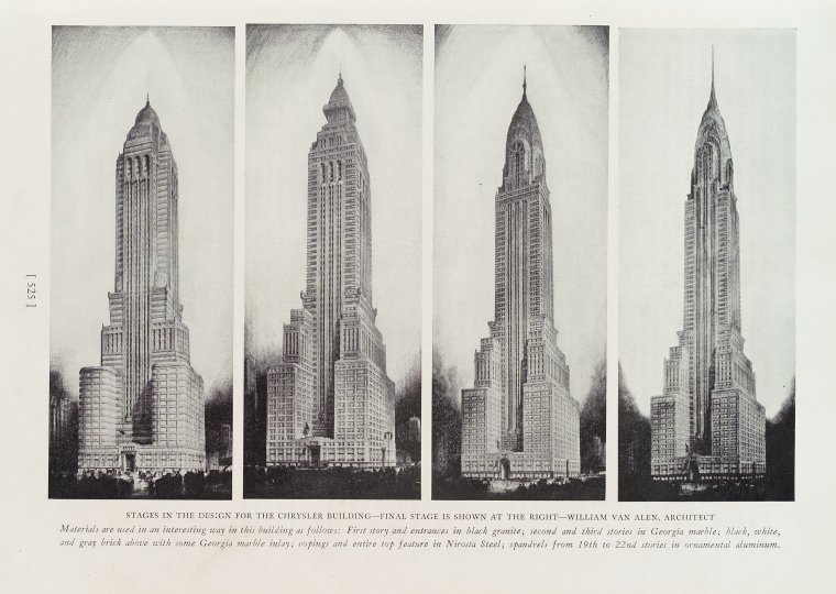
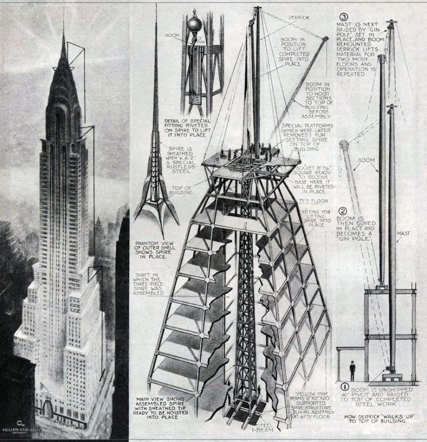
The competition for the tallest building was fiercest between Van Alen and his former business partner, Craig Severance (architect of the Bank of Manhattan Trust Building along with Yasuo Matsui). In the end, Van Alen triumphed: in secret, he had the 185-foot spire of the Chrysler constructed in sections and assembled inside the building, then hoisted up and through the top (diagram right) only after Severance’s Bank of Manhattan Trust tower had reached its full height in November 1929. With the spire, the Chrysler now reached 1,046 feet. It claimed the title of world’s tallest building from its official completion on May 27, 1930, until the completion of the Empire State Building on April 11, 1931.
The Chrysler Building’s overall shape and composition put it into a distinctive local tradition of skyscraper design. New York architects developed a particular way of handling New York City’s 1916 zoning resolution known as the “setback” law. Although not all skyscrapers followed the model, it was a popular formula: a broad base on top of which rose a slender tower, often incorporating setbacks at multiple levels, all topped by a pyramidal cap or spire. Important examples include the Manhattan Life Insurance Building (completed 1894), the Singer Building (1908), the Metropolitan Life Insurance Tower (1909), the Woolworth Building (1913), and, of course, the Bank of Manhattan Trust (1930), Chrysler (1930), and Empire State Building (1931).
Art Deco
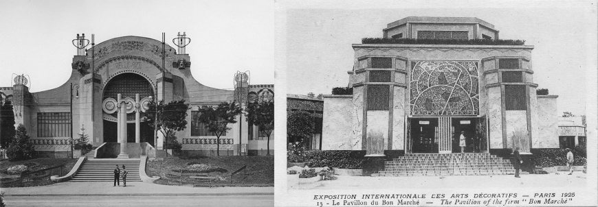
The Chrysler Building’s style—Art Deco—was considered modern, urbane, and luxurious. The term itself originated from the Exposition internationale des Arts Décoratifs et industriels modernes (International Exhibition of Modern Decorative and Industrial Arts), held in Paris in 1925 (above right), but the roots of the style went back further. Art Deco could describe everything from the style of a corporate office tower (such as the Chrysler Building), to the decorative pattern on furniture, murals, and tilework. The style incorporated chevron, sunburst, fountain, and arc motifs, endless varieties of geometric patterns, and, in later instances especially, cubic and machine-like forms. It was generally more rectilinear than the swirling floral and vegetal patterns common in the earlier Art Nouveau (above left), and was quite distinct from the forms and details of classical Beaux-Arts architecture and ornament, which was prominent in the early twentieth century.
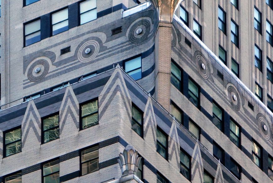
It would be an exaggeration to say that Art Deco fully rejected the Art Nouveau or the Beaux-Arts styles; instead, Art Deco designers synthesized and abstracted earlier motifs and patterns to create a decorative layer on buildings laid out in otherwise conventional ways. In New York, Art Deco exteriors ran a spectrum from the ornate to the spare (the Chrysler falls in the middle range of that spectrum). Interiors, however, tended to be colorful and lively, with marble and metal details in color schemes dominated by gold, silver, black, red, and green.
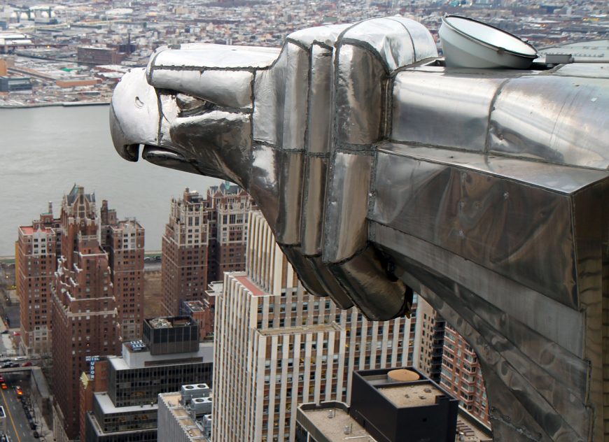
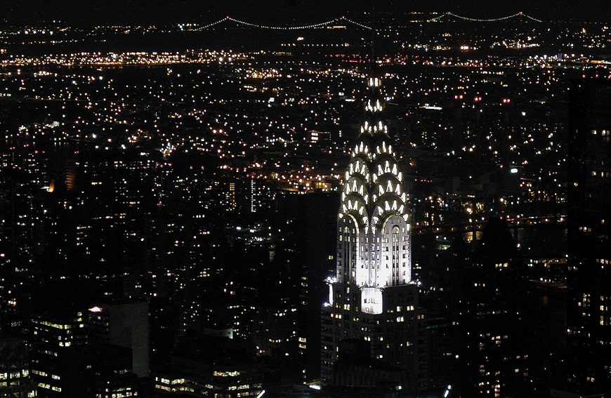
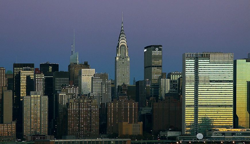
At the Chrysler Building, the distinctive elements of Art Deco include the horizontal black-and-white stripes between floors, the geometric decoration concentrated at each of the setbacks, the streamlined eagle heads and radiator caps with wings (referencing the hallmark Chrysler car ornaments) jutting out from the corners, and, above all, the great crown with its seven layers of crescent setbacks inset with triangular windows. Brightly lit at night, the crown is still one of the most distinctive elements on the New York City skyline. Although the ground-level experience is often described as lackluster, the building’s contribution to the skyline is its true achievement. It made the Chrysler Building a symbol of urban modernity, of New York’s business dynamism, and of the vibrant nightlife of the world’s newest metropolis.
Depression and Modernity
The stock market crashed on October 29, 1929, in the midst of the Chrysler Building’s construction. This initial shock did not immediately lead to the economic ruin of the Great Depression—that set in a few years later. However, the glamour, economic growth, and optimism associated with the Roaring Twenties was over. For some, the Chrysler Building came to be a symbol of a lost, hedonistic era, having resulted from the same supposedly rational economic decisions that had led to the market crash. However, some commentators in the 1930s also suggested the building’s lights and upward thrust be seen as symbols of hope for a better future.
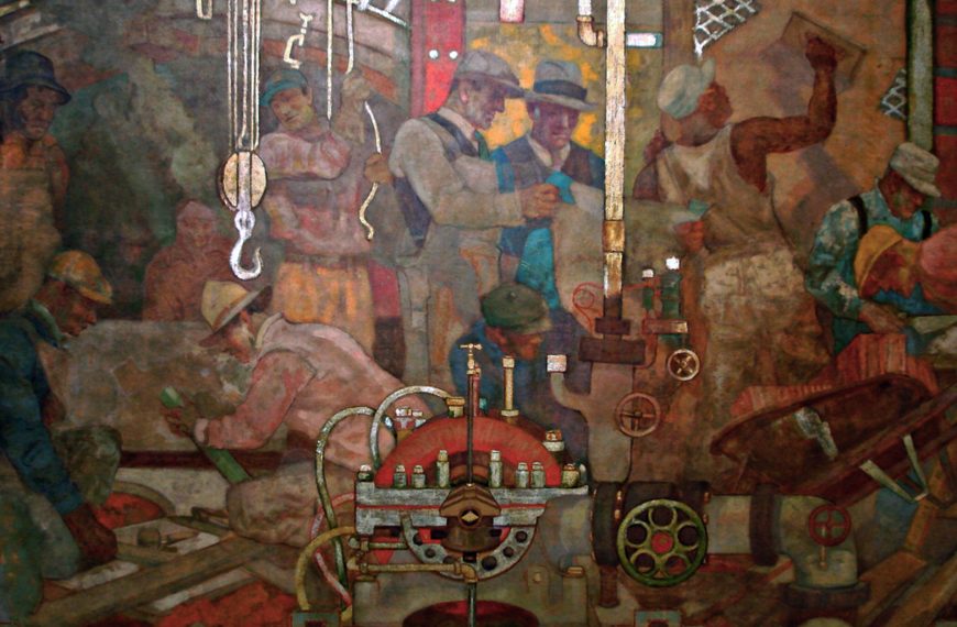
The 1920s was a decade of great wealth disparities. Rich bankers and industrialists, including Walter Chrysler, had done very well. They used their patronage of architecture to convey their high status and the power some believed rightly accrued to those who had prospered in the system of American industrial capitalism. One could argue that the Chrysler Building’s height, glamour, and prestige was concocted to celebrate one man whose wealth was the result of huge profits he accrued at the expense of poorly paid laborers and other workers.
But few buildings are only about one person. A huge building like the Chrysler cannot help but also be a monument in the city that surrounds it, and as such it helped fix for decades to come New Yorkers’ understanding of their city as stylish and forward-looking. After the depression and World War II, New York City became the world’s foremost cultural center. And the Chrysler Building was still there, glimmering high above almost everything else as a beacon and symbol of the city’s persistent optimism.
Additional Resources:
NYC Landmarks Preservation Commission designation report
1916 NYC Building Zone Resolution “set-back law”
Abramson, Daniel. Skyscraper Rivals: The AIG Building and the Architecture of Wall Street. New York: Princeton Architectural Press, 2001.
Bayer, Patricia. Art Deco Architecture: Design, Decoration, and Detail from the Twenties and Thirties. New York: Thames & Hudson, 1999.
Stern, Robert A.M., Gregory Gilmartin, and Thomas Mellins. New York 1930: Architecture and Urbanism between the Two World Wars, 587-615. New York: Rizzoli, 1994.
Stravitz, David. The Chrysler Building: Creating a New York Icon, Day by Day. New York: Princeton Architectural Press, 2002.
Rockefeller Center
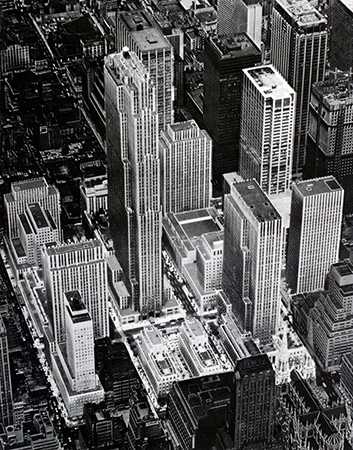
Rockefeller Center is a complex of skyscrapers and theaters in New York City developed by John D. Rockefeller, Jr. in the 1930s and designed by a talented committee of architects and planners. It superbly demonstrates how tall buildings can be seamlessly integrated into the horizontal tangle of the city below.
An investment
First conceived in 1927, Rockefeller Center was intended as a mixed use complex that would house the Metropolitan Opera and assorted retail establishments. The opera later withdrew, and was replaced with the Radio Corporation of America (RCA) and its fledgling subsidiary, NBC. Rockefeller wanted a sound return on his investment, but he also wanted to build something that could serve the public good. He was passionate about architecture and he felt responsible for contributing to the urban quality of New York.

The design of Rockefeller Center is the product of collaboration between architects with expertise in a variety of fields. Real estate developer John R. Todd, who had been involved in several speculative office projects around nearby Grand Central Terminal, oversaw the project. Todd appointed the firm Reinhard and Hofmeister as general architects, since they had extensive experience designing economic floor plans. Also on the team was the noted architect Harvey Wiley Corbett. Corbett was keenly interested in issues of city planning and traffic flow, and had been involved in the Regional Plan Association’s proposals for urban expansion around the New York region. Working with him was Wallace K. Harrison, who would later collaborate on a number of modern ensembles in New York, including the United Nations and Lincoln Center. Rounding out the group was Raymond Hood, with many skyscrapers under his belt already, including the Gothic revival Chicago Tribune Tower (1922), the elaborate American Radiator Building (1924), and the more restrained Daily News plant (1929). By early 1930, the architects had established the basic setup of Rockefeller Center: a tall building anchoring the middle of the development, fronted by a plaza and flanked by shorter buildings around the periphery of the site.

Cool, unfussy elegance
Raymond Hood’s RCA building (since renamed the GE building and popularly known as 30 Rock) dominates Rockefeller Center. This skyscraper exudes a cool, unfussy elegance. Its limestone façade rises above its neighbors in a series of stepped verticals. Aluminum spandrels create a vertical pattern of lines that emphasize the building’s height. Hood had used a similar approach in his Daily News building, but the striped effect was more subtle here, and the overall proportions more delicate. The building’s profile shifts according to the viewer’s perspective—its north and south façades stretch wide, while its east and west ends present slender fronts to the street. The main approach lies on the east via the long and narrow Channel Gardens (a walk that separates buildings dedicated to France and Britain) that slope gently downward, allowing an unobstructed view as the tower soars upward like the prow of a huge ship.


The profile of the RCA building was unusual in New York at the time. The city’s zoning regulations required height setbacks, which usually resulted in stepped ziggurat profiles. The slab shape here was relatively new, though it would become more widespread in the city during the postwar period.
Streamlined moderne
The building was as efficient as it was elegant, with floor plans designed to maximize rental values. Proximity to windows was important—tenants demanded daylight and ventilation in their office spaces. Careful planning minimized the distance between windows and hallways. Elevators were brought to the center of the building in order to conserve valuable floor space along the perimeter. New high-speed elevators meant fewer banks and thus more rentable floor space. Roof gardens occupied the setbacks below the sixteenth floor—an inexpensive way to add a touch of luxury to the offices, and collect higher rent from those spaces.
The streamlined moderne1 lines of the RCA building typified the style that dominated Rockefeller Center. The towers of the complex cannot be described as avant garde, but they are modern in their simplicity. Their minimalism was due more to cost cutting than architectural experimentation, but nevertheless resulted in a restrained and cohesive complex that primarily relies on massing and proportion for effect.
Art and architecture
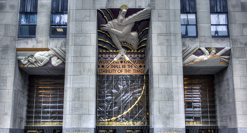
The architects did, however, welcome the addition of sculpture and paintings to their buildings, both inside and out. To name but a few examples, Lee Lawrie’s rich Art Deco panels on the RCA building depicted allegorical figures of light and sound; Hildreth Meiere’s panels on Radio City Music Hall rendered stylized theatrical muses in bold colors. Lawrie collaborated with sculptor Rene Chambellan on the figure of Atlas in front of the International Building, and Paul Manship’s golden Prometheus lounges in the sunken plaza at the base of the RCA building.

The most famous work in the center no longer exists—Diego Rivera’s frescoes in the lobby of the RCA building were destroyed when the Mexican muralist refused to tone down the anti-capitalist images of his paintings. Rockefeller’s son Nelson had approved the commission; he was an enthusiastic patron of contemporary artists (in this regard, he took after his mother, Abby Aldrich, one of the founders of MoMA). This time, though, his affinity for the avant garde backfired.

A “city within a city”
At its heart, Rockefeller Center excels at integrating the vertical city with the horizontal one. It offers layered paths of circulation for the pedestrian and vehicular traffic generated by its many tenants. Small private streets cut into the larger grid of Manhattan to facilitate pedestrian circulation around the crowded plaza. Also crucial to keeping people moving is the Center’s underground concourse, which links every building in the complex to a subterranean shopping center and, ultimately, the subway. Rockefeller Center’s planners envisioned a “city within a city,” and the shops in the concourse meant that office workers could get what they needed without venturing far. The presence of the subway was deliberate too. The center’s transportation committee worked with the city so that its new Sixth Avenue subway line could serve the huge numbers of workers commuting to the complex. Finally, an elaborate network of garages and underground ramps accommodates trucks, facilitating shipments without further congesting the bustling streets of midtown Manhattan.
1. Streamlined moderne is an austere architectural style that grew out of Art Deco
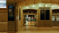
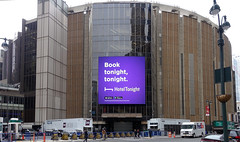
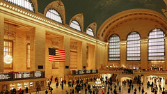
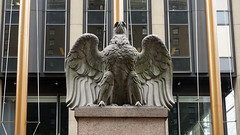
A Landmark Decision: Penn Station, Grand Central, and the architectural heritage of NYC
by DR. MATTHEW A. POSTAL and DR. STEVEN ZUCKER
Video \(\PageIndex{1}\): Dr. Matthew A. Postal and Dr. Steven Zucker discuss landmarks preservation in New York City while visiting: Charles Luckman Associates’s Madison Square Garden and Pennsylvania Station, the former site of Charles McKim for McKim Mead, & White, Pennsylvania Station (New York City), 1910 and then visiting Reed & Stem, Warren & Wetmore’s Grand Central Terminal, 1912
Additional resources:
Smarthistory images for teaching and learning:
The International style
Begun in Europe before World War II, this style became the leading approach to global commercial architecture after 1945.
c. 1920 - 1980
Peter Behrens, Turbine Factory
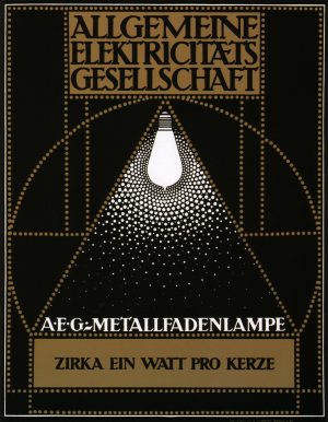
The establishment and evolution of AEG—the initials for the German Allgemeine Elektricitäts-Gesellschaft, or General Electric Company—was quintessentially linked to the rise of modernism. Founded in Berlin in 1883, AEG pioneered modern, large-scale industrial development. In 1887, having purchased several patents from Thomas Edison, the firm began producing electric light bulbs. Just over a decade later, AEG was not only one of the fastest growing companies in Germany, but a world-leader in the production of generators, cables, transformers, motors, light bulbs, and arc lamps.
Behrens and AEG
How exactly Peter Behrens—a painter turned graphic designer—came to receive his first commissions from AEG in 1907 remains somewhat unclear. But the credentials Behrens’ brought to this appointment were substantial, and his success within the industrial powerhouse was immediate. Prior to his tenure at AEG, Behrens had acted as artist-in-residence at the Darmstadt Artist’s Colony, headed the Kunstgewerbeschule (“School of arts and crafts”) in Düsseldorf, and with Hermann Muthesius, Josef Hoffmann, and Joseph Maria Olbrich, among others, was a founding member of the Deutscher Werkbund (German Association of Craftsmen).
Behrens’ first assignment for AEG involved the re-design of arc lamps—utilitarian hanging lamps intended for factories, warehouses, railway stations, and other public buildings. In his work in Darmstadt and Düsseldorf, Behrens had advocated for a functionally-guided approach to industrial design. “Design,” he wrote, “is not about decorating functional forms—it is about creating forms that accord with the character of the object and that show new technologies to advantage.” Thus while there was little about the existing AEG lamps that could be functionally improved, Behrens succeeded in formally enhancing them. He made the lamp’s joints as few as possible, streamlined their moldings and contours, and adjusted their overall sculptural properties and proportions according to artistic principles. The new lamps were so successful that AEG promptly invited him to design the AEG trademark, as well as its kettles, coffee pots, fans, clocks, a dentist’s drill, and even factory buildings.

The impact of design
Today, the idea of an artist designing commercial, mass-produced objects or housewares is unremarkable. Numerous celebrity designers have product lines with major retailers like Target and Walmart, and as consumers, we are conditioned to look for names and labels. We associate labels with a standard of design and quality, and our fundamental reliance on “name brands” simplifies daily shopping. But this was not yet the case at the turn of the twentieth-century. The European industrial revolution had led to the rise of the factory and systematized mass-production, and at the same time had contributed to the demise of the artisan and individualized production. Retailers no longer sold what they themselves had produced. Rather, they sold the anonymous, white-label products that had been manufactured in factories and hawked by wholesalers. Thus when shopping for a kettle, for example, the consumer could find the same, standardized product in a dozen of different stores. But he had no choice in terms of the kettle’s design, material or make. Moreover, because there were no labels or name brands, it was nearly impossible for him to distinguish a good-quality kettle from an inferior model.
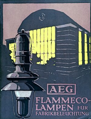
AEG was one of the first major manufacturers to develop a label as a means to distinguish their products from those of their competitors. Beyond this, AEG was the first firm to invest in the art of industrial design. It wanted to sell not only the best-functioning kettles, but also the most streamlined, aesthetically pleasing kettles. AEG changed the nature of mass-production not only in its decision to hire talented artists like Behrens, but also its immense size and ever-increasing economic power.
AEG’s introduction of design to industrial production heralded a new age of capitalism. It also created a new role for the artist within the industrial marketplace. According to Behrens, the role of the artist was to give form to the culture in which he lived. In the age of industry and modernization, therefore, the artist was not to replicate historical models and age-old forms, but was to create designs that expressed the spirit and rhythm of the moment. Still, good design was never to sacrifice aesthetics in favor of functionality. This was also the case in architecture. In designing highly functional factory buildings for AEG in Berlin, Peter Behrens chose not to emphasize pure functionalism. Rather, he sought to contextualize his modern constructions within the ever-evolving political and social milieu of early-twentieth-century Europe.
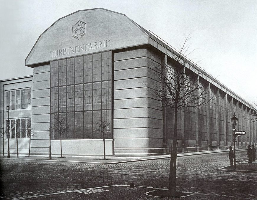
AEG Turbine Factory
Located in the Moabit district of Berlin, the AEG Turbine Factory was Behrens’ first factory design. The structure was to house the production of steam turbines—engines that use pressurized steam to generate electricity—a rapidly growing industry in the early-20th century Germany, as the country’s maritime power developed in rivalry with that of Britain. The essential contours of the factory—a steel-frame rectangular structure, approximately 122 meters long, 40 meters wide and 26 meters tall—were specified by AEG’s turbine fabrication director Oscar Lasche. The main assembly hall had to accommodate two large cranes, capable of lifting 100 tons and installed at such a height that the largest turbine parts could be lifted over the machines on the assembly floor. Smaller, flanking constructions were also necessary for storage and secondary manufacturing operations, and it was imperative that railroad cars enter directly into the work space.
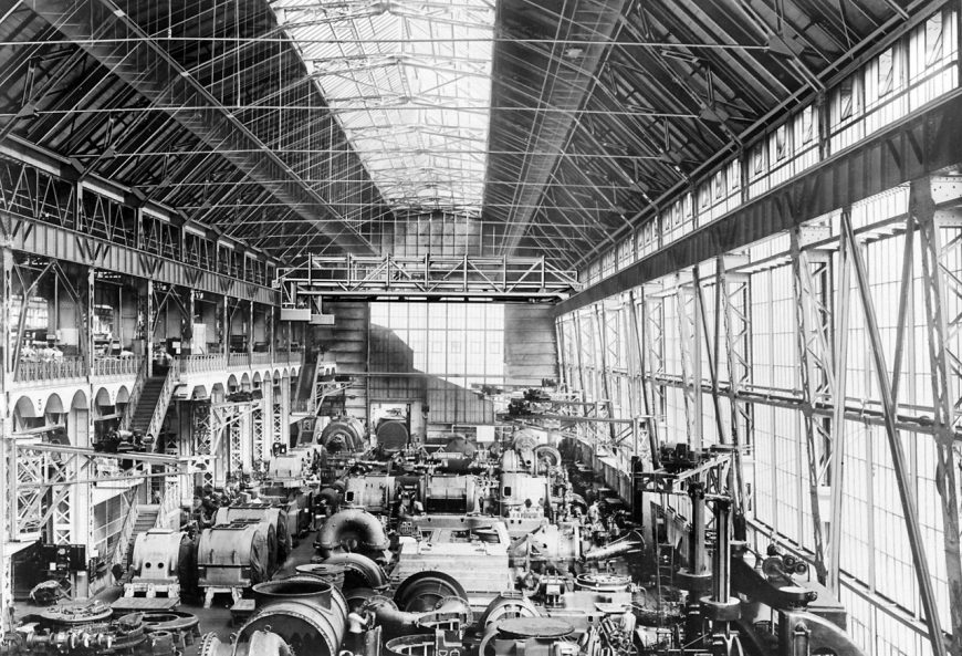
As a self-taught architect, untrained in engineering, Behrens was willingly reliant on the expertise of Lasche and other talented engineers when it came to the building’s materials and structural dimensions. But as an artist, Behrens was able to give form and meaning to the factory in way that eluded the engineers. Behrens saw the Turbine Factory as a symbol of modernism, and its attributes of speed, noise and power. He wanted to make the interior and exterior as simple as possible, and in collaboration with the engineers chose to use fewer, but more massive girder frames than was commonly employed in such a large building. The AEG Turbine Factory was to be a temple dedicated to a new age of production. The classicism evoked in its reinforced concrete, pedimented façade was not of bygone traditions, but a new classicism that expressed the industrial advances that were reshaping contemporary life.
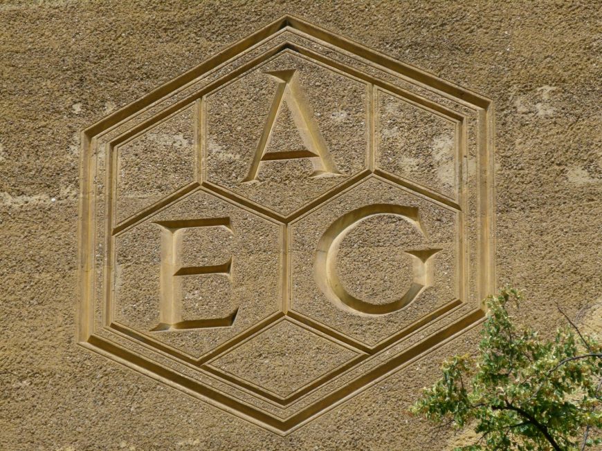
The monumental iconic façade—at the center of which stood Behren’s hexagonal logo for the AEG—was also to become the company’s corporate face. It is here that we can best recognize how Behrens used symbolically-charged forms to create new functions. In its materiality, the concrete façade serves no structural purpose. But in its mass, it accomplishes what the elongated steel beams of the structure’s skeleton does not. The Turbine factory was not Germany’s first major iron and glass building, nor was it the country’s first industrial construction. It was unprecedented because it served as a cultural icon of modern industrial power. It expanded the realm of the architect’s work and established new guidelines for mass-production.
Additional resources:
Stanford Anderson, Peter Behrens and a New Architecture for the Twentieth Century,
Cambridge: The MIT Press, 2000.
Tilmann Buddensieg, Industriekultur: Peter Behrens und die AEG, 1907 – 1914 (Berlin: Gebr.
Mann, 1990).
Frederic Schwartz, “Commodity Signs: Peter Behrens, the AEG, and the Trademark,” Journal
of Design History, vol. 9 (1996), pp. 153–184.
Alan Windsor, Peter Behrens. Architect and Designer (London: The Architectural Press, 1981).
Le Corbusier, Villa Savoye
“The house is a box in the air,…”
—Le Corbusier, Précisions
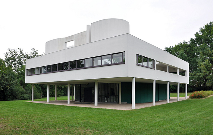
The Villa Savoye at Poissy, designed by Le Corbusier in 1929, represents the culmination of a decade during which the architect worked to articulate the essence of modern architecture. Throughout the 1920s, via his writings and designs, Le Corbusier (formerly Charles-Edouard Jeanneret) considered the nature of modern life and architecture’s role in the new machine age. His famous dictum, that “The house should be a machine for living in,” is perfectly realized within the forms, layout, materials, and siting of the Villa Savoye.
Located just outside Paris, the Villa Savoye offered an escape from the crowded city for its wealthy patrons. Its location on a large unrestricted site allowed Le Corbusier total creative freedom. The delicate floating box that he designed is both functional house and modernist sculpture, elegantly melding form and function.
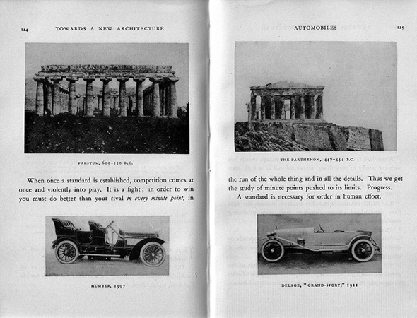
Le Corbusier had been developing his theories on modern architecture throughout the previous decade. In 1920, he founded the journal L’Esprit Nouveau, and many of the essays he published there would eventually be incorporated into his landmark collection of essays, Vers une architecture (Toward an Architecture) in 1923. This book celebrated science, technology, and reason, arguing that modern machines could create highly precise objects not unlike the ideal platonic forms valued by the ancient Greeks. Le Corbusier lavished praise on the totems of modernity—race cars, airplanes, and factories—marveling at the beauty of their efficiency. However, he also argued that beauty lay not only in the newest technology but in ancient works such as the Parthenon, whose refined forms represented, in his view, the perfection of earlier Archaic systems. Le Corbusier sought to isolate what he called type forms, which were universal elements of design that can work together in a system. He found these across time and across the globe, in the fields of architecture and engineering. The many images embedded throughout the text drew striking visual parallels and eloquently expressed his search for modern perfection through universal forms.

During the 1920s, Le Corbusier designed a series of houses (above) which allowed him to develop his ideas further. By 1926, he had devised his Five Points of Architecture, which he viewed as a universal system that could be applied to any architectural site. The system demanded pilotis (slender columns) to raise the building off the ground and allow air to circulate beneath; roof terraces, to bring nature into an urban setting; a free plan that allowed interior space to be distributed at will; a free façade whose smooth plane could be used for formal experimentation; and ribbon windows, which let in light but also reinforced the planarity of the wall.

The Villa Savoye incorporated these principles, and also realized many of the concepts expressed in Vers une Architecture. Made of reinforced concrete, the ground floor walls are recessed and painted green so that the house looks like a box floating on delicate pilotis. Visitors arrive by car, in true machine-age fashion. The stark white exterior wall, with its strips of ribbon windows, has a remarkably smooth, planar quality. This stands in contrast to the fluidity of the interior, which is organized by a multistory ramp that leads the viewer on a gently curving path through a building that is nearly square. The contrast between the sharp angles of the plan and the dynamism of the spaces inside charge the house with a subtle energy.
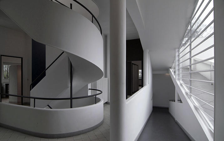
The ramp winds from the entrance up to the salon, a formal interior space that flows seamlessly into the roof terrace outside. Corbu, as he is also known, treated the terrace as a room without walls, reflecting his desire to fully integrate landscape and architecture. The ramp finally culminates in the curved solarium crowning the house, whose rounded enclosure appears to be an abstract sculpture when viewed from below. Seen from the roof terrace, the ramp and cylinder of the solarium echo the forms of the ocean liners lauded in Vers une Architecture. Le Corbusier and Madame Savoye believed in the health benefits of fresh air and sunshine, and considered leisure time spent outdoors one mark of a modern lifestyle. The Villa Savoye’s integration of indoor and outdoor spaces allowed the family to spend time outdoors in the most efficient way possible—the house was, in a sense, a machine designed to maximize leisure in the machine age.
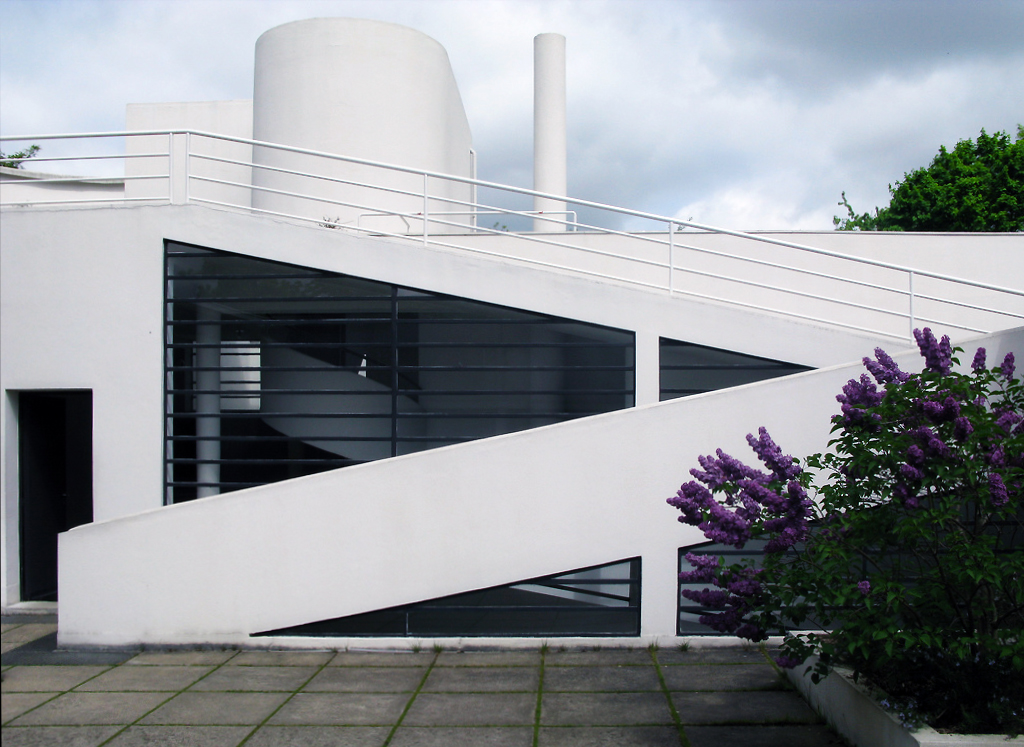
The Villa Savoye can be understood as Le Corbusier’s refinement of his architectural system, his own personal Parthenon. Its essential geometric volumes embody his concept of the type form, and its careful consideration of procession and proportion connect the building to Classical ideals. At the same time, its clean simplicity and its use of concrete evoke the precisely-calibrated works of engineering so admired by the architect. The Villa Savoye represents Le Corbusier’s re-conception of the very nature of architecture, his attempt to express a timeless classicism through the language of architectural modernism.
Additional resources:
Centre des monuments nationaux
Columbia University interactive
Model at The Museum of Modern Art
Le Corbusier, Toward an Architecture, trans. John Goodman (Los Angeles: Getty Research Institute, 2007).
Frank Lloyd Wright
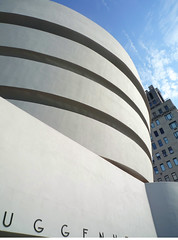
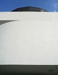
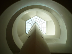
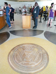
Frank Lloyd Wright, Solomon R. Guggenheim Museum, New York City
by DR. MATTHEW A. POSTAL and DR. STEVEN ZUCKER
Video \(\PageIndex{2}\): Frank Lloyd Wright, Solomon R. Guggenheim Museum, 1942-1959, New York City
Smarthistory images for teaching and learning:


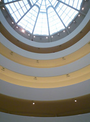
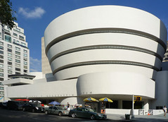

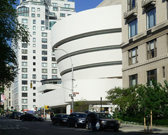
Frank Lloyd Wright, Fallingwater
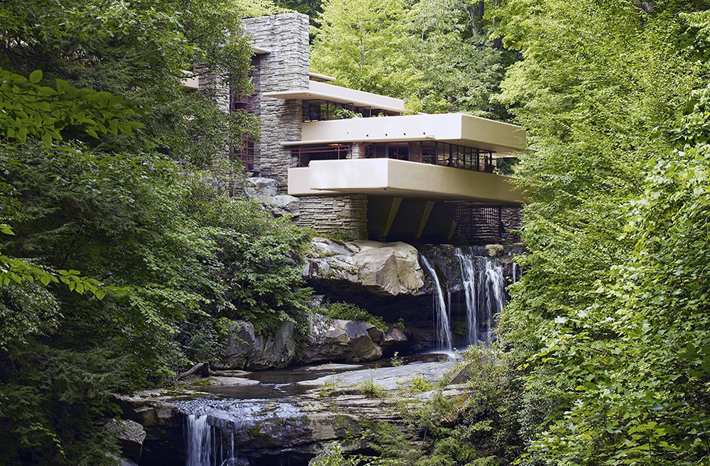
Perched above a mountain cataract on a rocky hillside deep in the rugged forest of Southwestern Pennsylvania, some 90 minutes from Pittsburgh, is America’s most famous house. The commission for Fallingwater was a personal milestone for the American architect Frank Lloyd Wright, since it clearly marked a turning point in his career. After this late-career triumph, the sixty-seven year old would go on to create a series of highly original designs that would validate his claim as “The world’s greatest architect.”
“The greatest architect of the nineteenth-century” —Philip Johnson
The mid-1930s were among the darkest years for architecture and architects in American history; the country’s financial system had collapsed with the failure of hundreds of banks. Almost no private homes were built. Many of the architectural projects started during the boom of the late 1920s were halted for lack of funds. Now in his sixties, Wright and his new wife Olgivanna were struggling to keep Taliesin, his Wisconsin home and studio, out of foreclosure. Worse still, his peers were beginning to regard Wright as an irrelevant anachronism whose time had passed.
In 1932 Henry-Russell Hitchcock and Philip Johnson opened the “Modern Architecture: International Exhibition” at the newly founded Museum of Modern Art in New York and simultaneously published the book International Style. This was, perhaps, the most influential architectural exhibit ever mounted in the United States and the book became a manifesto for modern architecture and would profoundly affect almost every major architectural project worldwide for the next 30 years. It focused on the work of four great “European functionalists” Walter Gropius, Ludwig Mies van der Rohe, Le Corbusier and J.J.P. Oud. Wright was largely snubbed.
Hitchcock had praise for his early work, for its “many innovations,” but he condemned Wright for a “[l]ack of continuity in his development and his unwillingness to absorb the innovations of his contemporaries and his juniors in Europe.” Hitchcock insulted Wright further by characterizing him as “a rebel by temperament… [who] refused even the discipline of his own theories.” The catalogue calls Wright a “half-modern” throwback, one of the “last representatives of Romanticism.” Wright responded by denigrating European Modernism as an “evil crusade,” a manifestation of “totalitarianism.”
A fellowship and a commission
The Wrights devised an architectural apprenticeship program that came to be known as the “fellowship.” And among the first candidates was Edgar Kaufmann Jr. who became enamored with Wright after reading his biography. Kaufmann was the son of Pittsburgh department store tycoon Edgar Kaufmann Sr.; whose thirteen story downtown Pittsburgh emporium was reported to be the largest in the world. Kaufmann senior was no stranger to architectural pursuits—he was involved in numerous public projects and built several stores and homes. Kaufmann let Wright know that he had several civic architectural projects in mind for him. He and his wife Liliane were invited to Taliesin and were duly impressed.


There are varying accounts regarding the circumstances that brought Kaufmann to offer Wright a chance to design a “weekend home” in the country; but we know that Wright made his first trip to the site on Bear Run, Pennsylvania in December, 1934. Wright’s apprentice Donald Hoppen has spoken of Wright’s “uncanny sense of…genius loci”1 (Latin for “spirit of the place”) and from the very beginning, the architect rejected a site that presented a conventional view of the waterfall; instead, he audaciously offered to make the house part of it, stating that the “visit to the waterfall in the woods stays with me and a domicile takes shape in my mind to the music of the stream.” The South-southeast orientation gives the illusion that the stream flows, not alongside the house, but through it.
Fastest draw in the Midwest
Perhaps the most famous tale to come out of the lore of Fallingwater is the improbable story that Wright, after receiving the commission procrastinated for nine months until he was forced to draw up the complete plans while his patron was driving the 140 miles from Milwaukee to Taliesin. However, the essential story is validated by several witnesses. Apprentice Edgar Taffel recalled that after talking with Kaufmann on the phone, Wright “briskly emerged from his office…sat down at the table set with the plot plan and started to draw…The design just poured out of him. ‘Liliane and E.J. will have tea on the balcony…they’ll cross the bridge to walk in the woods…’ Pencils being used up as fast as we could sharpen them….Erasures, overdrawing, modifying. Flipping sheets back and forth. Then, the bold title across the bottom ‘Fallingwater.’ A house has to have a name.”2 There seems to be agreement that the whole process took about two hours.

Organic architecture
Edgar Kaufmann Jr. pointed out that Wright’s famous concept of “Organic Architecture” stems from his Transcendentalist background. The belief that human life is part of nature. Wright even incorporated a rock outcropping that projected above the living room floor into his massive central hearth, further uniting the house with the earth. “Can you say” Wright challenged his apprentices “when your building is complete, that the landscape is more beautiful than it was before?”3
In his book, Fallingwater Rising: Frank Lloyd Wright, E. J. Kaufmann, and America’s Most Extraordinary House, Franklin Toker wrote that,
this delicate synthesis of nature and the built environment probably counts as the main reason why Fallingwater is such a well-loved work. The contouring of the house into cantilevered ledges responds so sympathetically to the rock strata of the stream banks that it does make Bear Run a more wondrous landscape than it had been before.4
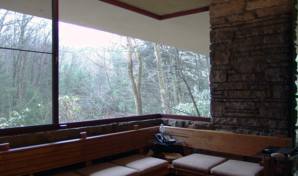
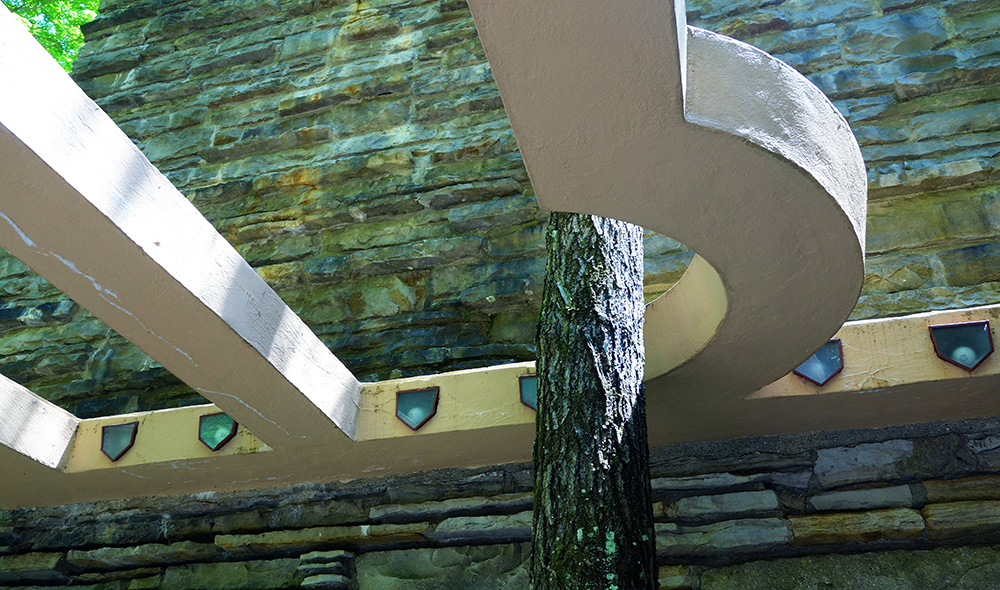
Wright further emphasizes the connection with nature by liberal use of glass; the house has no walls facing the falls, only a central stone core for the fireplaces and stone columns. This provides elongated vistas leading the eye out to the horizon and the woods. Vincent Scully has pointed out that this reflects “an image of Modern man caught up in constant change and flow, holding on…to whatever seems solid but no longer regarding himself as the center of the world.”5 The architect’s creative use of “corner turning windows” without mullions causes corners to vanish. Wright even bows to nature by bending a trellis beam to accommodate a pre-existing tree.
Influences
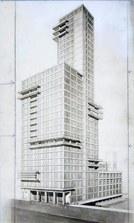
Although he denied it, Wright was influenced by every conceivable architectural style, but Fallingwater owes little to his previous designs (the only exceptions being perhaps the use of irregular stones that are also found on Taliesin and his interest in strong horizontal lines). At Fallingwater, he appears to be more concerned with responding to the European Modernist design that he had in part inspired—but that had since eclipsed him. In effect, he set out to beat the Europeans at their own game, using elements of their idiom. We see, for example, inspiration drawn from the balconies of Gropius’ design for the Chicago Tribune Tower competition, though instead of the stark white of the International Style, he paints his balconies a warmer, earthen tone in deference to nature and perhaps the Adobe dwellings of the American Southwest.
Fallingwater falling down?
The Kaufmanns loved Wright’s radical proposal to literally suspend the house over the waterfall. But Edgar Kaufmann Sr., ever the pragmatic business man (who had also studied engineering for a year at Yale) prudently sent a copy of Wright’s blueprints to his engineer; who found the ground unstable and did not recommend that he proceed with the house. Wright was not happy with his client’s lack of faith, but permitted an increase in the number and diameter of the structure’s steel reinforcements—Kaufmann agreed to proceed. Its worth noting that the engineer’s warnings later proved valid, an issue that “haunted” Wright for the rest of his life.

Wright is famous for pushing the architectural envelope for dramatic effect. We see this is in the vast cantilevered wooden roof of Robie House in Chicago. In Fallingwater he chose ferro-concrete for his cantilevers, this use of reinforced concrete for the long suspended balconies was revolutionary. He boldly extended the balcony of the second floor master bedroom soaring six feet beyond the living room below.

However, due to the lack of proper support, cracks began appearing in the balcony floors soon after they were poured. Over the years since, cracks have been repeatedly repaired as the cantilevers continued to sag. By 2001 some of the 15 foot cantilevers had fallen more than 7 inches. To avoid a complete collapse, an ingenious system was devised using tensioned cables to correct the problem and stabilize Wright’s masterwork.
Almost from the day of its completion, Fallingwater was celebrated around the world. The house and its architect were featured in major publications including the cover of Time Magazine. Over the years its fame has only increased. According to Franklin Toker, Fallingwater’s most important contribution to Modern Architecture is surely the “acceptance of Modern architecture itself.”
1. Donald W. Hoppen, The Seven Ages of Frank Lloyd Wright: The Creative Process, Dover Publications: New York, 1993, page 23.
2. Edgard Tafel, Years with Frank Lloyd Wright: Apprentice to Genius, Courier Dover Publications, 1979.
3. Hoppen, page 97.
4. Franklin Toker, Fallingwater Rising: Frank Lloyd Wright, E. J. Kaufmann, and America’s Most Extraordinary House, Alfred A. Knopf: New York, 2003, np.
5. Meryle Secrest, Frank Lloyd Wright: A Biography, University of Chicago Press: Chicago, 1992, page 168.
Gordon Bunshaft for Skidmore Owings and Merrill, Lever House
by DR. MATTHEW A. POSTAL and DR. STEVEN ZUCKER
Video \(\PageIndex{3}\): Gordon Bunshaft for Skidmore Owings and Merrill, Lever House, 1951-52, 390 Park Avenue, New York City
Smarthistory images for teaching and learning:
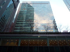
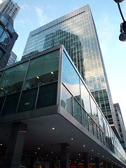
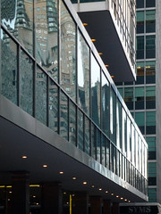
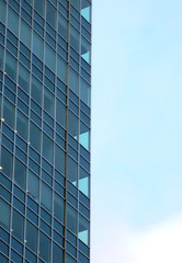
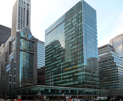
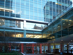
Ludwig Mies van der Rohe, Seagram Building, New York City
by DR. MATTHEW A. POSTAL and DR. STEVEN ZUCKER
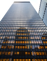
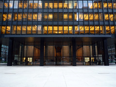
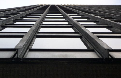
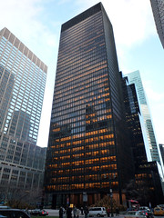
Video \(\PageIndex{4}\): Ludwig Mies van der Rohe, Seagram Building, 1958, 375 Park Avenue, New York City
Note: In the video we call Le Corbusier a French architect, but he was born in Swizerland and became a French citizen in 1930.
Smarthistory images for teaching and learning:
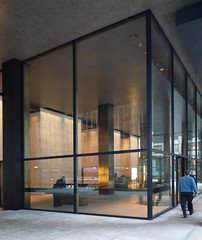



Negotiating the past in Berlin: the Palast der Republik
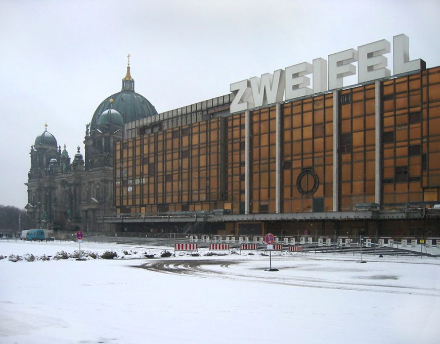
On a frigid February day in 2005, an art installation consisting of seven giant, illuminated letters that spelled out the German word Zweifel (doubt, in English) appeared on the roof of a monumental modernist building in the center of Berlin called the Palast der Republik (“Palace of the Republic”). The building was by then an empty shell, slated for demolition, and the letters—each 8 meters (about 26 feet) high, were big enough to be seen a mile away.
Glowing brightly into the dim Berlin winter night, the massive letters were an embodiment of the doubts that many Berliners had about the future of both the Palast der Republik and their recently-reunited city. The building had been a symbol of the East German government’s dictatorial rule and hypocrisy, but despite this association, many felt it was important to preserve the physical traces of the regime’s past in Berlin, its former capital. Soon after the Germany’s reunification in 1990, the government had quickly decided to demolish the building, but protests and debates over its preservation went on for 13 years before the Palast der Republik was finally erased from the city’s historic center. The contention over this site shows how architectural preservation is often about much more than just the building itself—the real issues are often about the memory and identity of the people who create and use them.
Wounded by bombs, destroyed by politics
The Palast der Republik was especially contentious because it stood on the site where Berlin’s royal palace, the home of the Prussian monarchs, had formerly existed.
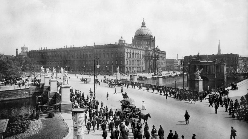
This palace (or Stadtschloss) had been established in the 15th century and by the 17th century, it had become a splendid baroque palace and an important symbol of the Prussian royalty and its power. The Stadtschloss was damaged by bombs in World War II, but it was still standing when, in 1949, Berlin, and Germany as a whole, were divided up and reconstituted as East and West.
Video \(\PageIndex{5}\): U.S. Air Force footage of central Berlin in July of 1945. The remains of the Stadtschloss can be seen beginning at 0:40. (Source: United States Army Air Forces, public domain)
The postwar division lines meant that the royal palace, as well as the rest of the historic city center, became part of East Berlin, capital of the German Democratic Republic (the official name for East Germany, abbreviated as “the GDR”). This border would later become the path of the Berlin Wall, which was located just a mile west of the royal palace.
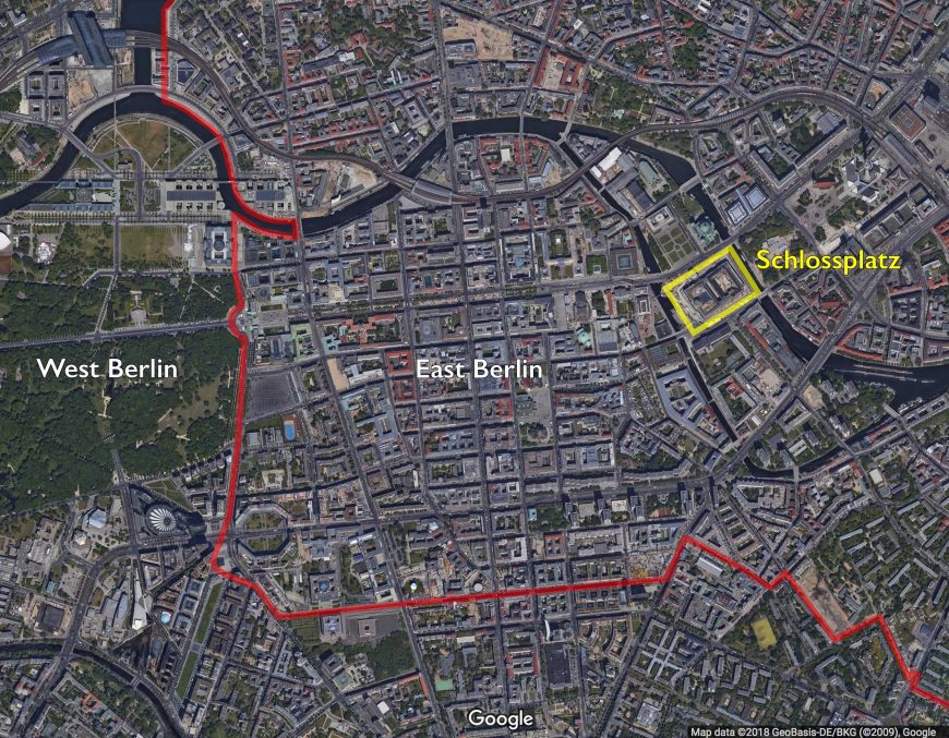
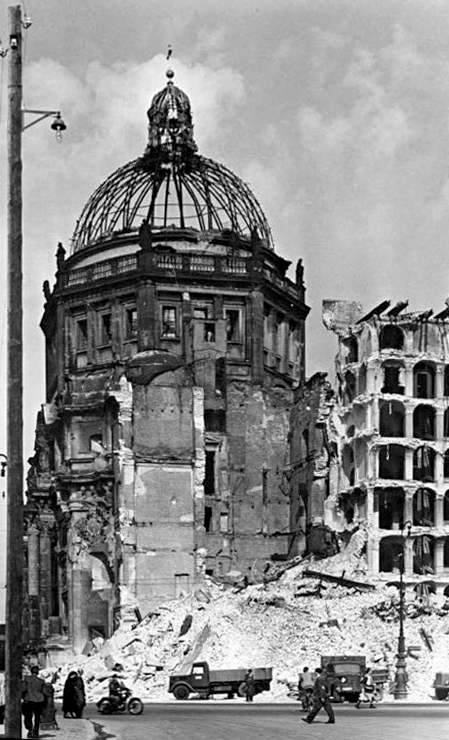
The communist government of East Germany recognized the importance of the Stadtchloss, but they saw it as a corrupt symbol of monarchical power. Wanting to show their disdain for the Prussian monarchy and its history, they demolished it to make way for a set of monumental modernist buildings organized around a central plaza designed to hold official political events.
However, because of the GDR’s limited budget, the new plan was never entirely realized, and until the early 1970s, the site where the palace had stood remained a barren parking lot where tanks made U-turns during state-sponsored parades.
Erich’s Lamp Shop
In the early 1970s, Erich Honecker became the leader of East Germany. The economy was struggling, and one of his goals was to raise the standard of living for people in the GDR through what he called Konsumsozialismus (consumer socialism). East Germans—and especially East Berliners, who could easily pick up TV and radio signals from West Berlin—were painfully aware of the goods and other amenities available in the West, and Honecker sought to prove that the same level of luxury was available in a communist society.
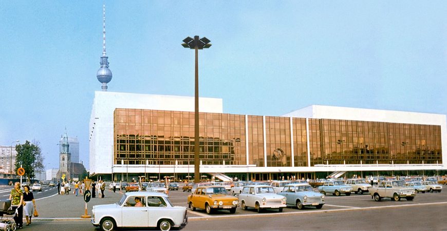
It was under his leadership that the massive Palast der Republik was finally constructed on the site of the old royal palace. This new “palace” housed parts of the East German government, with spaces for parliament and party meetings, but it was chiefly a palace of pleasure—with three restaurants, a bowling alley, a movie theater, a concert hall, and numerous shops, all accessible to the public. Though it might seem like a strange combination, the idea of mixing an entertainment and shopping center with governmental meeting rooms was an attempt to show the East German people that the leaders of the GDR were interested in their citizens’ everyday welfare and happiness.
The exterior of the Palast der Republik recalls American shopping malls and office buildings from the 1960s. This is because the Palast’s designers, a collective of architects led by Heinz Graffunder, were taking their cues from the latest commercial architectural styles in the West. With its warmly-tinged reflective glass surrounded by long strips of white marble, the Palast der Republik combined the approaches of mid-20th-century modernist design (appearing sleek, repetitive, and monolithic, using new materials like tinted glass) with shapes, lines, and masses that recall the former royal palace (which had featured neoclassical columns and sumptuous materials like marble). The glass façade was designed to symbolize governmental transparency—though this was a deeply hypocritical message, since East Germany was, in reality, a repressive police state.
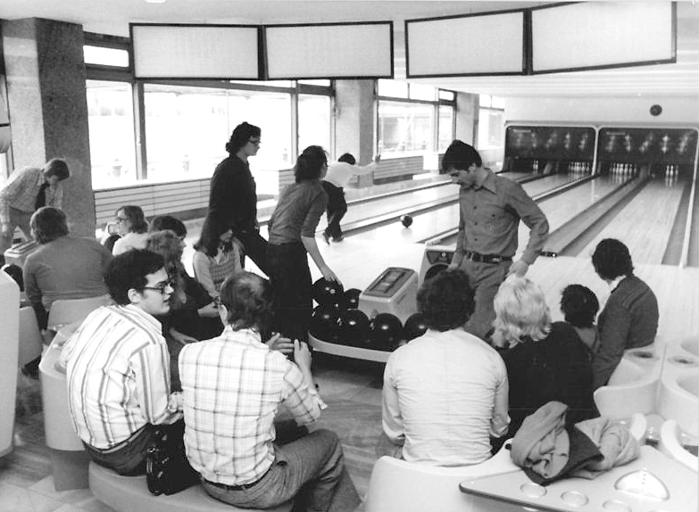
East Germans were not completely satisfied with the government’s attempts to appear more open or to fulfill its people’s desire for consumer goods. Most East Germans had, as a matter of survival, learned to effectively manage the stark difference between state ideology and their own private lives. Even though the Palast became a GDR tourist destination, it also quickly acquired cheeky nicknames such as “Ballast der Republik” and “Erich [Honecker]’s Lamp Shop.” The Palast came to symbolize the GDR’s hypocrisy, but it also presented citizens with opportunities for personal enjoyment—and they made ample use of them.
A doubtful future
By the late 1980s, protests across the Eastern Bloc culminated in the fall of the Soviet Union and the opening of the Berlin Wall in November of 1989. As home to the GDR parliament, the Palast der Republik was the site of the East German government’s historic final vote in 1990 to join the Federal Republic of (West) Germany. The reunified federal government immediately found the Palast der Republik to be uninhabitable due to asbestos contamination, and closed the building.
It was clear that the Palast had to be either renovated or replaced. In the early 90s, the center of Berlin was in the midst of a building boom, and the Schlossplatz was prime real estate. Soon, proposals by prominent architects appeared: on the one hand, the original East German architect of the building, Hans Graffunder, proposed the addition of a reconstruction of the Stadtschloss to the existing building; while on the other, a group of wealthy and influential figures from the West began to advocate for the complete demolition of the Palast in order to make way for a full reconstruction of the earlier baroque building. Groups rallied around each of these sides, with protests, campaigns, and debates that reached from the streets to the floor of the German parliament.
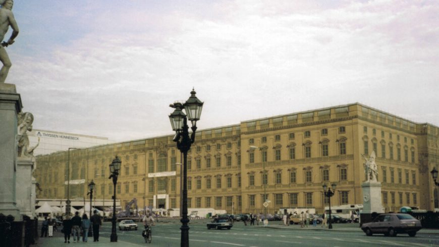
Just as the GDR had justified its demolition of the Stadtschloss by connecting that building to the monarchy, the advocates of rebuilding the Stadtschloss claimed that the Palast der Republik was ruining the city’s historic fabric with its “totalitarian” forms. To illustrate their proposed “healing” of the city, the supporters of the Stadtschloss reconstruction erected canvas on scaffolding that functioned as a trompe l’oeil, mimicking the old baroque façade along the edge of the parking lot next to the Palast der Republik, and creating the illusion for passersby that the Prussian palace had actually been rebuilt.
East Berliners had never loved the Palast, but as soon as it was slated for demolition, many started to recognize the building’s value as a tangible expression of the nation’s fraught history. [1] All over former East Berlin, GDR buildings—the buildings they had grown up with—were being torn down and replaced by shiny new office towers. Why not keep the Palast as a memorial to the city’s and country’s tumultuous past? Most buildings from the 20th century, including the United Nations complex in New York, were constructed using large amounts of asbestos, and many had been effectively remodeled. Surely the Palast der Republik did not have to go.
A symbol for the reunified capital?
The political battle over whether to tear down the Palast der Republik, and what to build in its place, lasted for more than a decade. The government heard endless debates at both the city and federal level, and multiple councils of experts were designated to make recommendations about what to do with the site. Fundraising and marketing campaigns were launched by those who sought to reconstruct the Baroque palace, and protests were staged by those in favor of safeguarding the East German building. Finally, in 2003, the federal government voted to demolish the Palast and to construct a new version of the Stadtschloss. This new structure was to be named the “Humboldt Forum,” and would function as both a museum and public space. The result would be the architectural restoration of the Baroque character of Berlin’s historic inner city and an extension of the cluster of museums that already existed just to the north of the palace on “Museum Island”—arguably Berlin’s biggest tourist attraction aside from the Berlin Wall.
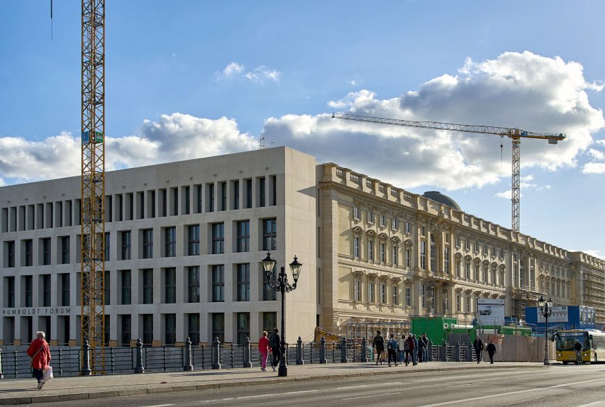
After years of funding delays, construction began on the Humboldt Forum in 2015. Its baroque exterior is a faithful reconstruction of the Prussian palace on three of its sides, with the fourth side featuring a flat, stripped-down design that resembles the office buildings recently constructed elsewhere in Berlin’s city center. Inside, enclosed courtyards provide access to the building’s various exhibition spaces, which will house objects currently in Berlin’s Ethnological Museum and its Museum for Asian Art.
Political and cultural power, it seems, will always be a prominent issue on the site of the Stadtschloss. With the destruction of the Palast der Republik, the site of the royal palace continues its long history as the central showplace for state-sponsored projections of national identity. In November of 2006, official marketing banners appeared outside the partially-demolished Palast der Republik, proclaiming in German and English: “Eine demokratische Entscheidung – A democratic decision.” The democratic German government did make the choice to tear down the Palast der Republik, but the decision reveals the deep societal rifts that still exist between the former East, where unemployment is high and many people feel underrepresented, and the West, which is still the center of financial and political power. Architecture—even that which is deemed ugly—can be important to the people who have lived with it.
Notes:
- Advocates included both former East Berliners and people from West Germany and the international community who saw the building as not only being of historic value, but as a potential site for experimental public events.
Additional resources:
Lars Ø Ramberg, description of “Palast des Zweifels”
American design
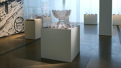
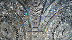
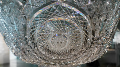
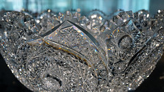
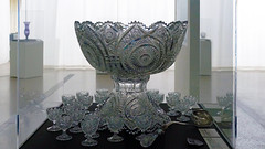
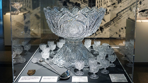
American brilliance at the St. Louis World’s Fair: Libbey’s Punch Bowl
by DIANE C. WRIGHT, TOLEDO MUSEUM OF ART and DR. BETH HARRIS
Video \(\PageIndex{6}\): Libbey Glass Company, Punch Bowl and stand with 23 cups, 1904, thick colorless glass, 54.6 x 60.6 x 60.6 cm, 134 pounds (Toledo Museum of Art)
Additional resources
Smarthistory images for teaching and learning:
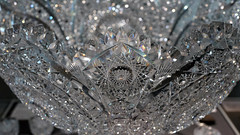

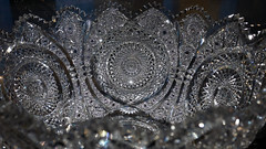
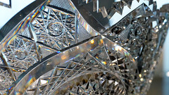
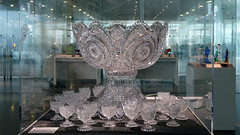



Connecticut Klan robe
by DR. WILLIAM FRANK MITCHELL, THE AMISTAD CENTER FOR ART & CULTURE AT THE WADSWORTH ATHENEUM MUSEUM OF ART and DR. STEVEN ZUCKER
Video \(\PageIndex{7}\): Ku Klux Klan robe, c. 1928 (The Amistad Center for Art & Culture at the Wadsworth Atheneum Museum of Art, Hartford)
Additional resources:
The Amistad Center for Art & Culture at the Wadsworth Atheneum Museum of Art
Russel Wright, “American Modern” Pitchers

Democratizing design and stimulating the economy
Industrial designer Russel Wright released a line of dinnerware in 1939 that he called “American Modern,” a name that encapsulated much of his design philosophy. Wright was looking to create a distinctively American product that brought fresh, modern design to a wide public, all of which constituted innovative thinking in the 1930s.
Wright was one of a small group of designers, many of whom (like Wright) had started in set design for theater or movies, and were forging the new profession of designing for American industrial production. With the motto “good design is for everyone,” Wright, along with his fellow industrial designers, sought to democratize design by creating inexpensive, mass-produced objects for the American home. As the economy was struggling to recover from the Great Depression in the 1930s, industrial design became more than an aesthetic enterprise, it was also seen as a way to stimulate consumer spending and thereby pull America out of its economic malaise.
Simple shapes, unostentatious materials
Before the dinnerware line, Wright had designed “American Modern” furniture (1935), which was launched in complete display rooms—a novel marketing concept—at Macy’s in New York. In this furniture group’s design, Wright found the formula that was to inform his work from then on. Simple shapes and unostentatious materials, carefully modulated for human use, and straightforward in form: Wright’s work in all media, from the mid-1930s until he closed his office in the mid-1960s, bears this consistent design philosophy.
“American Modern” dinnerware, introduced in 1939, became the best-selling dinnerware line of all time. It quickly made Wright literally a household name, as he, along with his wife/business partner Mary, originated the idea of stamping the designer’s signature into the bottom of each mass-produced piece produced. The success of “American Modern” furniture and dinnerware catapulted Wright to national prominence as a designer, and a multiplicity of commissions followed. In the course of a thirty-year career, Wright designed hundreds of objects including furniture, lamps, glassware, metalware, and textiles for the home, as well as occasional school and outdoor furniture, appliances and other commercial applications. Quaker plainness and pioneer ruggedness distinguish his designs, along with a particularly American delight in the newest materials and their possibilities, such as plastics, the most exciting material in the post-World War II era.

American forms
A rootedness in American forms and sensibility was a hallmark of Wright’s work. His use of distinctively American materials like solid rock maple; his straightforward, unadorned forms; and his simple dignity of line recalled American artisans such as the Shakers, Gustav Stickley, and the Greene brothers. The pitcher in the “American Modern” line incorporates these concepts, while its high-arching spout invites comparison to a utilitarian object like a coal scuttle.
Honesty and simplicity were not the only qualities Wright was evoking in his “American Modern” designs. He, along with his fellow industrial designers at the time, such as Charles and Ray Eames, Eero Saarinen, Henry Dreyfuss, and Raymond Loewy, picked up the banner of Modernism that had begun in Europe and transferred it to an American audience. Clean, simple forms and an avoidance of applied extraneous ornament were hallmarks of an ideology that sought to create a wholly new, non-referential, abstracted kind of design for the modern world. In objects like the “American Modern” pitcher, Russel Wright was credited with bringing an approachable Modernism to the American public, who were leery of the spare hard edges they associated with avant-garde European design. This was a synthesis for popular consumption, or as Macy’s phrased it for its buying public, “not quaint Colonial, nor dizzy modern.”
Informality—an American attribute
Not content merely to provide Americans with the kind of objects they should have for the 20th century, Wright and his wife Mary wrote a book in 1950 that verbalized ideas of a new informal lifestyle, one they considered consistent with the national character and with the times. Guide to Easier Living showed the country how to live more simply in a post-servant world, to have buffet suppers and design their homes with open kitchen/living/dining rooms, bring the children into the living room, and put their feet on the coffee table. Informality, the Wrights believed, was American, and this distinction from European tradition and decorum appealed to the increasingly urgent desire of Americans to distinguish themselves from the Old World politically, economically, and socially.

From oven to table
Tableware like the “American Modern” line allowed buyers to choose their own combinations of colors and types, and it featured the ability to go from oven to table, to reduce dish-washing. Multi-purpose pieces were also part of the line, with handled bowls that could be used for a variety of foods, and the pitcher’s generic form allowed it to be used for all kinds of liquids. In the postwar era, issues such as consumer choice, color variety, mid-point pricing, and practicality were to become important characteristics of the plethora of goods produced for the voracious American middle class.
Russel Wright’s “American Modern” pitcher is emblematic of the innovative designs that spoke to the preoccupations of the country in the pre- and post-war years. This inexpensive, mass-produced earthenware with curving, organic forms and softly-toned glazes was an introduction to the modern world in design and lifestyle for millions of Americans in the mid-twentieth century.
Additional Resources:
Albrecht, Donald, Robert Schonfeld, and Lindsay Stamm. Shapiro. Russel Wright: Creating American Lifestyle. New York: H.N. Abrams, 2001.
Albrecht, Donald, and Dianne Pierce. Russel Wright: The Nature of Design. New Paltz, NY: Samuel Dorsky Museum of Art, 2012.
Hennessey, William J., and Russell Lynes. Russel Wright, American Designer. Cambridge, MA: MIT, 1983.
Glass Chair at the 1939 New York World’s Fair
by DR. EMILY ORR and DR. STEVEN ZUCKER
Video \(\PageIndex{8}\): Chair, c. 1948, attributed to Henry Turchin, design direction by Louis Dierra, manufactured by the Pittsburgh Plate Glass Company (Pittsburgh, Pennsylvania, USA), slumped plate glass, metal, woven textile (Cooper Hewitt, Smithsonian Design Museum, New York City)
This video was produced in cooperation with the Cooper Hewitt, Smithsonian Design Museum.
Smarthistory images for teaching and learning:
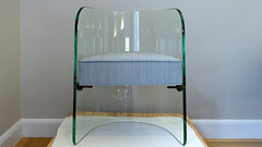

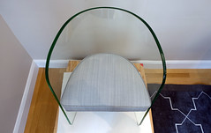
Late Modernism and post-modernism
As the International Style spread across the globe, architects looked to break free of the "glass box."
c. 1960 - present
The Berlin Wall as a political symbol
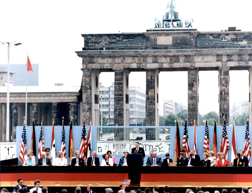
“Mr. Gorbachev, tear down this wall!”
— U.S. President Ronald Reagan
When Ronald Reagan addressed these words to Soviet leader Mikhail Gorbachev in June of 1987, few believed that just two years later the Berlin Wall would actually be dismantled. It seemed like a permanent fixture, symbolizing the irreparable divide between the Cold War powers. But by 1990, all but a few traces of the wall were gone.

Dividing a nation and a city
After Germany’s defeat in World War II, the Allied Powers each took control of a section of the country. By 1949, two Germanys emerged from this occupation. The Federal Republic of Germany (commonly known as West Germany) was an independent, democratic nation formed out of the British, French, and American zones. The German Democratic Republic (or GDR, commonly known as East Germany), was a socialist state under the leadership of the Soviet Union.
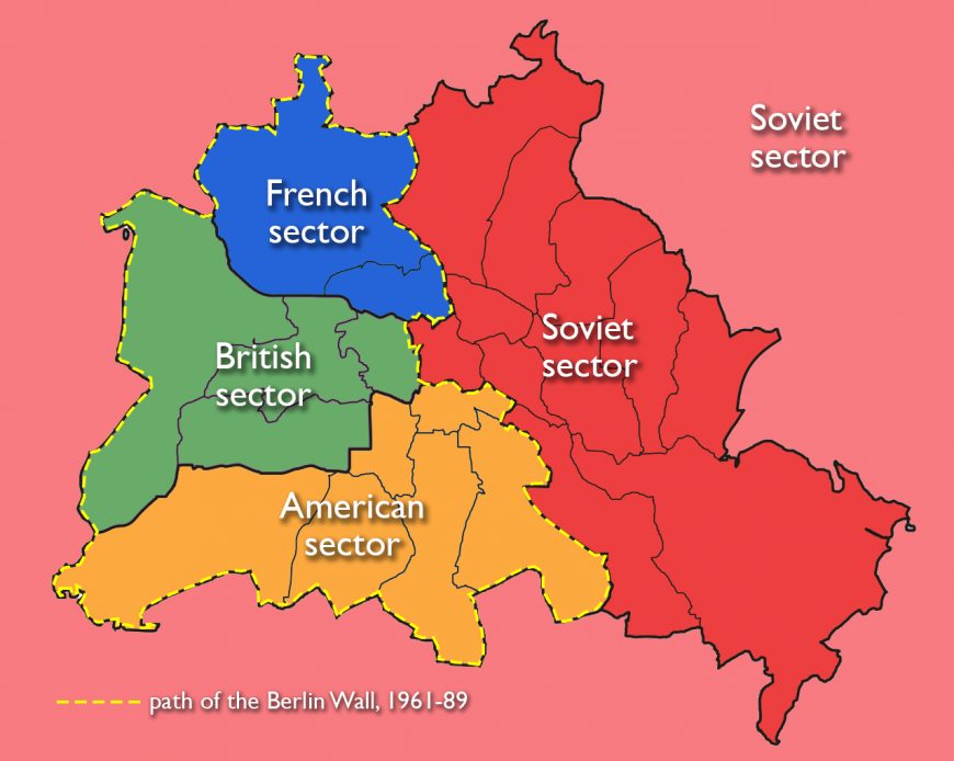
Berlin lay deep within what became East Germany, but as the former capital of Hitler’s empire, it received special treatment. The city itself was divided between the four Allied powers after the war, and so it, too, was divided into two parts once East and West Germany were created. East Berlin remained the capital of the GDR, while a new West German capital was established far to the west, in Bonn. West Berlin, formed from the British, French, and American sectors of the city, effectively became a tiny West German outpost in the midst of East Germany.
It may be surprising to learn that during the first decade after the country’s division, the border between East and West Berlin remained completely open. Aside from using different currencies, East and West Berlin were relatively indistinguishable—city trams still ran between the two halves, and people could visit friends and relatives on the other side of the city.
Outside of Berlin, though, the differences between the two countries were becoming increasingly stark. West Germany experienced an “economic miracle” or “Wirtschaftswunder” thanks to subsidies from the Western powers, while East Germany struggled economically. Over the course of the 1950s, several million people chose to leave for West Germany to seek jobs and a better quality of life. In response, the East German government—afraid of losing its labor force, but also ashamed of the increasing tide of emigration—imposed continuously stricter limits on travel.
As leaving East Germany became increasingly difficult, West Berlin, with its open internal border to East Berlin, remained one of the only exit routes for those who wished to emigrate. It also operated as a “show-window for the West” (that is, a beacon of Western consumerism and liberal democracy placed prominently alongside the capital of communist East Germany). Most importantly, Berlin was a major site of political confrontation between the United States and Soviet Union, whose leaders were threatening one another with nuclear war. The city became a heated microcosm of Cold War politics.
Constructed overnight
On the morning of August 13, 1961, Berliners awoke to find that overnight, soldiers had used barbed wire to completely close the border between the two halves of the city—catching almost everyone by surprise. No warning had been given: trams stopped in their tracks, people headed to shop or visit friends on the other side of the city were turned back, and deadly force was employed to keep people from crossing. Over the next 25 years, the GDR fortified this border by erecting a series of solid walls and barbed-wire barriers, as well as a “death strip” of cleared land with tripwires and mines, all to prevent people from escaping. Over the next four decades, more than 140 people were killed in connection with the Berlin Wall.
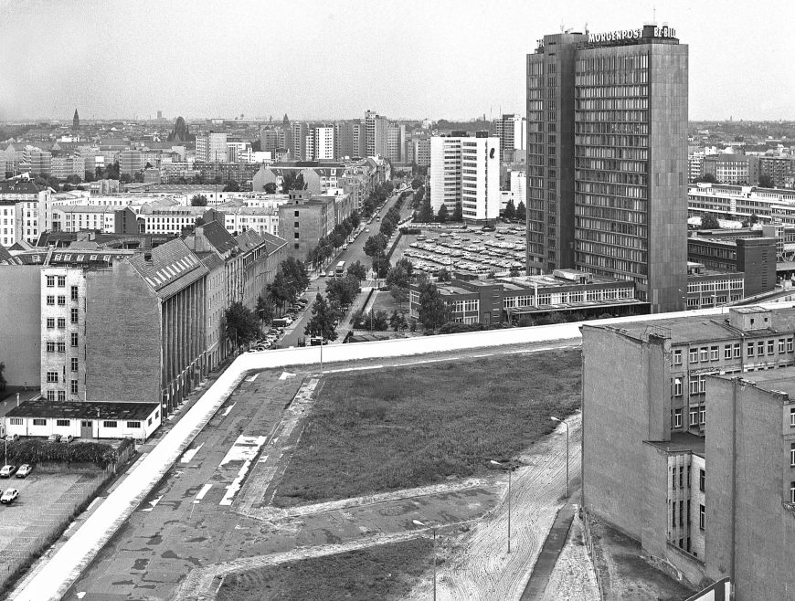
The Berlin Wall not only prevented people from moving across the city—it also fundamentally changed how the two halves of the city functioned. Systems like water, electricity, sewer, and public transportation had to be separated. [1] Because the Berlin Wall went through the center of the city, urban development on each side began to focus elsewhere. What had been the city’s glittering, historic baroque city center was now located on the western outskirts of East Berlin, along the wall. It became virtually a forgotten wasteland, as new centers sprang up to the east and west.
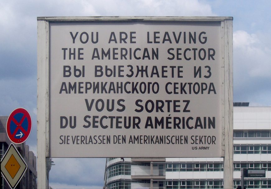
A political symbol
Over time, particular points along the Berlin Wall became well-known symbols of the division. Checkpoint Charlie, a border crossing between the former American and Soviet regions of the city, was famous for its sign that boldly stated, “You are leaving the American sector.” The section of wall in front of the Brandenburg Gate, Berlin’s monumental baroque triumphal arch, was also often photographed. Potsdamer Platz, which had been a busy commercial center during the Weimar years but was left barren and desolate after heavy bombing in World War II, was one of the largest open areas next to the Berlin Wall. The viewing platform that was installed there on the western side became a popular destination for tourists.
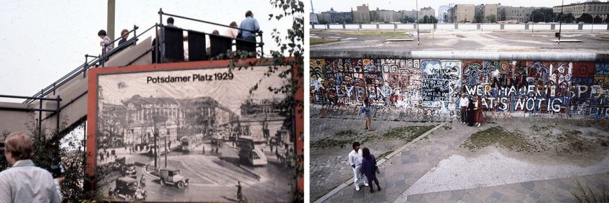
These often-photographed sites functioned as both objects of curiosity for Westerners, and symbols of the cruelty and repression imposed by the GDR and the Soviet Union. Their nearness to democratic West Berlin brought the Cold War conflict home: as opposed to wars happening “elsewhere” (such as the proxy wars that the United States and USSR were fighting in Vietnam and Afghanistan), this one was taking place on the doorstep of Western Europe.
The Berlin Wall also became a potent symbol through the art that appeared on its western side. As a political outpost, West Berlin became a place that many social radicals and artists called home. In the late 1970s and 1980s, the East German government replaced the hodge-podge of barriers that had been constructed over the years with a single, more defensible, 12-foot-high wall. The western side of this new enclosure provided the perfect surface for graffiti, and street artists from around the world flocked to Berlin to make their mark on it.
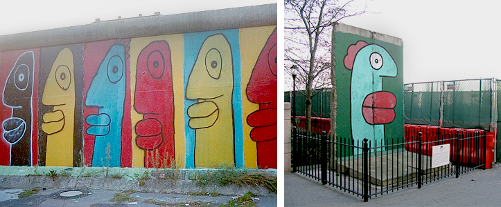
Thierry Noir is one of the best-known artists to have painted the Berlin Wall in the 1980s. Today he continues to produce murals in his signature style, often featuring cartoonish, elongated heads with enlarged lips, on the remaining pieces of the Wall and elsewhere. Well-known international artists like Keith Haring also created murals on the Berlin Wall during this time.
Graffiti on the Berlin Wall was only visible to those on the West Berlin side. In East Germany, it was officially called an “Antifaschistischer Schutzwall,” or “anti-fascist protection barrier.” Despite the fact that those who tried to cross this border were killed or imprisoned and tortured, GDR propaganda claimed that the Berlin Wall was not a way to keep East Germans in, but a way to keep the forces of fascism out. Because even approaching the wall was dangerous, most East Berliners chose to ignore its existence in their daily lives.
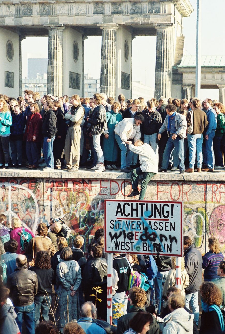
The fall of the wall
Throughout the 1980s, the Soviet Union gradually loosened many of its policies as well as its control over the countries behind the Iron Curtain. By 1989, Hungary (also a Soviet satellite state, like East Germany) had opened its border, allowing a path for thousands of East Germans to leave for the West. Protests against the Communist government began to take place throughout East Germany. Finally, on November 9th, officials rather abruptly announced that the border between East and West was open—effective immediately.
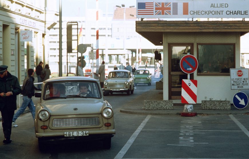
The news was broadcast across Germany and the world, and with a combination of euphoria and bewilderment, East Berliners streamed through the checkpoints, greeted by jubilant West Berliners. Soon, people began hacking away at the wall, and its “fall” became yet another Cold War symbol: this time of the fall of the Iron Curtain.
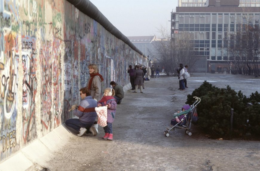
Within a year, most of the Berlin Wall had been dismantled and sold—either unofficially, by “Mauerspechte” (“wall-peckers”), who chipped off pieces as souvenirs, or by the bulldozers and cranes of the East German government. The two halves of the nation and its capital city were legally reunified the following year, on October 3, 1990. [2]
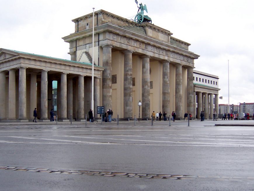
Where is the Berlin Wall?
Thirty years after its fall, the Berlin Wall is still the landmark most visitors look for when they come to Berlin. Most of the barrier has been erased from the urban landscape, but a few remaining sites pay tribute to its existence. The city of Berlin installed a line of double cobblestones in the ground to mark the wall’s former route.
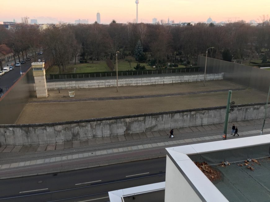
Informational boards and memorial markers have been installed throughout the city center to explain the history of the wall and honor those who died trying to cross it. Just north of the city center, one strip of the border system has been carefully preserved, including a guard tower and a “death strip,” accompanied by a small museum and information center.
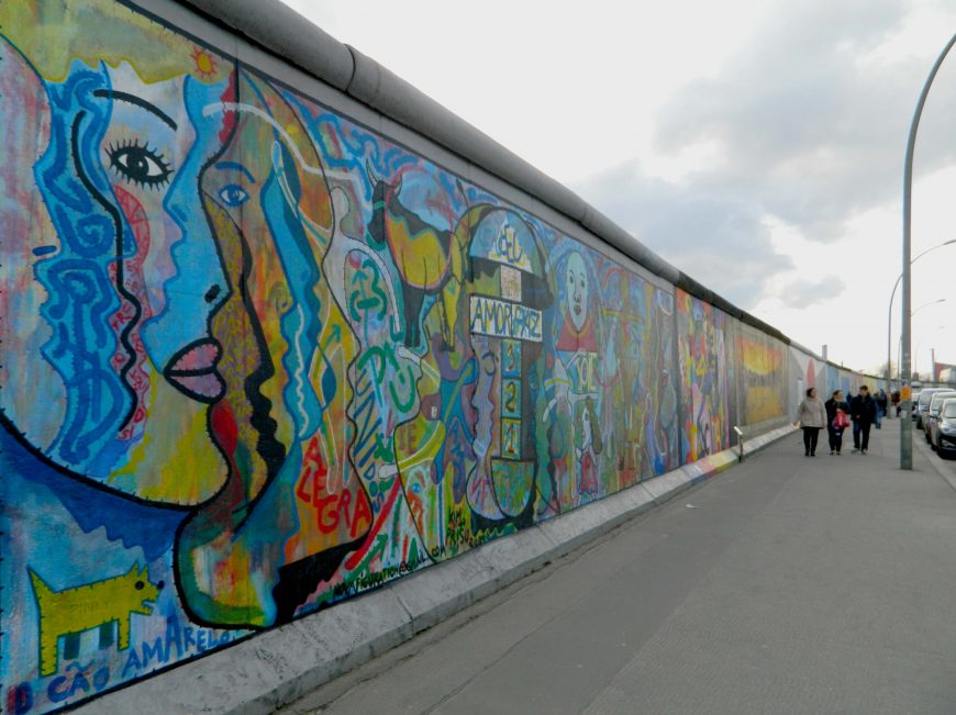
By far the most visible and most frequently visited piece of the wall in Berlin today is the East Side Gallery, a long strip of the wall covered in murals. Located at the end of the former East Berlin neighborhood of Friedrichshain, it stretches along the Spree River for over 1.3 km (0.8 miles). It was painted by a collaborative of international artists in 1990 on its eastern side (hence the name “East Side Gallery”) shortly after the opening of the border. (Painting on this side would not have been allowed when the GDR existed.) This section of the Berlin Wall was landmarked in 1991, though vandalism and development have had an impact. [3]
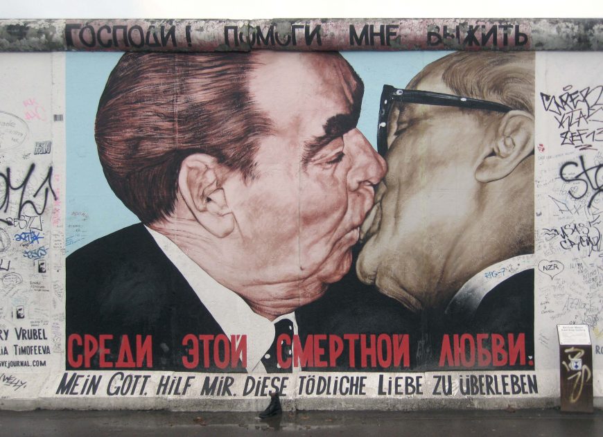
Several of the East Side murals (there are currently 101) have become especially famous. My God, Help Me to Survive This Deadly Love by Russian artist Dmitri Vrubel is based on a photograph of USSR and GDR leaders Leonid Brezhnev and Erich Honecker kissing each other on the lips. The mural at first shocks many viewers with its large-scale portrayal of two older men locked in a seemingly romantic embrace. This “fraternal kiss” had taken place in 1979, on the 30th anniversary of the GDR. The image alludes directly to the political intimacy between East Germany and the Soviet Union, while the title of the painting, appearing above and below the figures in Russian and German, adds a critical or satirical tone to the piece: who is hoping to “survive,” and why is this love “deadly”? One might surmise that the words are the voice of East Germany, for whom a relationship with the Soviet Union was ultimately both politically and economically destructive.
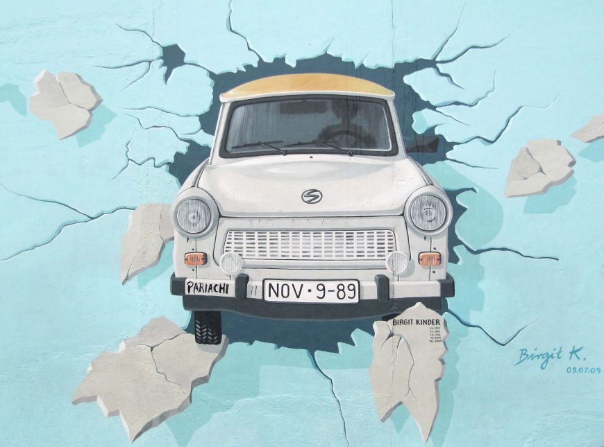
Another famous East Side Gallery mural is Birgit Kinder’s Test the Best, which depicts an East German Trabant (virtually the only brand of car available in the GDR) breaking through the Berlin Wall. Kinder painted a companion mural depicting the back of the car on another section of the Wall, which is now preserved in the State Ministry for the Environment.
Perhaps the most lasting, and problematic, legacy of the Berlin Wall is not physical at all, however. It is the so-called “Wall in the Head” that still separates former East Germans (“Ossis”) from West Germans (“Wessis”). The former East is still plagued by high unemployment and poverty today. Though Berlin has been put back together, the ongoing social and economic division between the two halves of the country has yet to be healed, and the Berlin Wall remains an important symbol for both the history and future of the nation, Europe, and the world.
Notes:
- The two cities had been gradually separating their systems of governance as well as services (like police departments) and infrastructure (phone lines and transportation) since the end of the war, but the construction of the Wall in 1961 required that this process be swiftly and thoroughly completed.
- After East and West Germany reunited, it was still not clear whether the capital of the nation would be located in Bonn or Berlin. The parliament voted to locate the new capital in Berlin in 1991.
- The artists of the murals that make up the East Side Gallery have had to make numerous requests for additional funds from the city to clean and restore the murals because of frequent vandalism, and nearby development has resulted in the demolition of a few parts of the wall.
Additional resources:
Information on the Berlin Wall and its memorials from the city of Berlin
Keith Haring’s mural on the Berlin Wall
Thierry Noir’s account of painting the Berlin Wall
Photographs of the Berlin Wall in the 1980s by Edward Murray
Website of the East Side Gallery
An overview of Berlin history from Berlin.de
Emily Pugh, Architecture, Politics, and Identity in Divided Berlin (University of Pittsburgh Press, 2014)
Brian Ladd, The Ghosts of Berlin (University of Chicago Press, 1998)
Janet Ward, Post-Wall Berlin: Borders, Space and Identity (Palgrave Macmillan, 2011)
Breuer, The Whitney Museum of American Art (now The Met Breuer)
by DR. STEVEN ZUCKER and DR. NARAELLE HOHENSEE
Video \(\PageIndex{9}\): Marcel Breuer, The Whitney Museum of American Art (now The Met Breuer), 1963-66, Madison Avenue at East 75th Street, New York City
Maya Lin, Vietnam Veterans Memorial
by DR. BETH HARRIS and DR. STEVEN ZUCKER
Video \(\PageIndex{9}\): Maya Lin, Vietnam Veterans Memorial, 1982, granite, 2 acres within Constitution Gardens, (National Mall, Washington, D.C.)
Smarthistory images for teaching and learning:


Robert Venturi, House in New Castle County, Delaware
That Post-Modern moment
Robert Venturi’s New Castle County House offers a modest but instructive example of the Post-Modern style set in rural north Delaware. An influential teacher and theorist, Venturi studied architecture at Princeton University and attended the American Academy in Rome during the mid-1950s, where he developed a “partiality” towards post- Renaissance architecture, particularly works built during the Mannerist and Baroque periods in Italy.
In 1966, The Museum of Modern Art in New York published his first book Complexity and Contradiction in Architecture. Written while he was teaching at the University of Pennsylvania, it contains dozens of small black-and-white photographs of Western architecture from ancient times to the present day, as well as examples of the architect’s early work.

A gentle manifesto

Venturi used the first chapter, sub-titled “A Gentle Manifesto,” to express his strongly held belief that orthodox Modern architecture and city planning had run its course. Rather than continue in the disciplined, austere footsteps of European architects Le Corbusier (below) and Mies van der Rohe, he highlighted historic structures that exhibit a “messy vitality over obvious unity”—seen, for example, in his inclusion of a “contradictory” Byzantine capital from Hagia Sophia in Istanbul.
Complexity and Contradiction in Architecture was well-received by contemporary critics, particularly Yale University professor Vincent Scully, who wrote in the introduction that Venturi presented a fresh approach to looking at architecture, preferring complexity and contradiction over abstraction and what Venturi called the “fairy stories” of modernist purity. His follow-up, the marvelously-titled Learning From Las Vegas, co-authored in 1972 with his wife and partner Denise Scott Brown and partner Steven Izenour, highlighted the way buildings are experienced from a distance while traveling along the gaudy Sunset Strip. For Venturi, how buildings look, and are perceived, was far more important than the techniques, systems, and theories used to plan and construct them.
Vanna Venturi House
The New Castle County House dates to an important period in Venturi’s career and Post Modernism. Though some of his peers designed buildings that respectfully imitate the past, he was no mere revivalist.

Rather than copy a specific style, he borrowed freely, juxtaposing, collaging, and reinterpreting forms from distinct periods and places. This was particularly true in the Vanna Venturi House (above). Built in the Philadelphia suburbs, this famous house is located at the end of a driveway and resembles a child’s drawing. Viewed through the lens of classicism and 1960s Pop Art, his witty design incorporates a large gable, recessed porch, and noticeably off-center chimney.

American vernacular
The New Castle County House was built for a family of three and sits comfortably in nature. In contrast to Andrea Palladio’s Villa Rotonda or Le Corbusier’s Villa Savoye (above), it neither crowns a hilltop nor hovers above a well-trimmed lawn. Instead, the house sits surrounded by rolling fields, beside a thickly-wooded forest. Like many traditional American farmhouses and barns, the painted siding is white and the intersecting gables are clad with unstained wood shingles. It may look conventional and familiar but on closer inspection the exterior is enlivened by a diverse array of mischievous and sometimes perplexing architectural features.

Form as sign
Of particular interest is how Venturi treated the “front” and “rear” facades. In Learning from Las Vegas, the authors celebrated the concept of the “decorated shed”– buildings that exploit easily recognizable two-dimensional elements to generate visual interest and meaning. The “front” façade of the New Castle County House incorporates a floating arched screen that, like a highway billboard, rises somewhat awkwardly from the lower edge of the gable (below). Though Venturi claimed this curved feature had Austrian Baroque origins, like a garden gate or eyebrow dormers found on some Victorian houses, it functions as a sign, identifying the structure as a residence. Furthermore, since the owners enjoyed bird watching it may also have doubled as a blind, camouflaging the large windows behind it.


The “rear” facade is even more curious and complex (left). While it, too, is dominated by a prominent arched screen, this screen is framed by the edges of the gabled roof. Supported by what appears to be a Doric colonnade, the four stubby columns are, in fact, almost flat. Thin as the outer walls, these cut-outs carry little weight and enclose the recessed porch. While the column on the far right grows seamlessly out of the adjoining wall, the left column appears split in half by the addition of an aluminum drain pipe. Classical in derivation yet slightly cartoonish, this somewhat awkward assemblage gives the house a simultaneously grand and whimsical appearance.
Playfully challenging
In photographs dating from the time of the building’s completion the spacious interiors appear simple and comfortable, with wood decorations inspired by various 19th century design traditions. The painted arches in the vaulted music room (below), the quirky chandeliers, and perforated wall patterns exhibit a straight-forward craftsman-like quality, as if cut by hand or jigsaw. Conspicuously two dimensional, their fanciful silhouettes evoke the Carpenter Gothic and Queen Anne styles.

Venturi never liked the stylistic term Post Modern, but his buildings and critical writings helped propel late 20th-century architecture in a new direction. This private residence remains a playfully challenging work expressing a refreshingly pluralistic view of architecture and design.
Additional resources:
Website of Venturi, Scott, Brown
Robert Venturi, Complexity and Contradiction in Architecture (New York: Museum of Modern Art Press, 1966)
Robert Venturi, Denise Scott Brown and Steven Izenour, Learning from Las Vegas (The MIT Press, 1972)
Frank Gehry, Guggenheim Bilbao

Gehry’s Guggenheim
Prior to the mid-20th century, art museums in Europe and the United States were mostly designed in variants of the neo-classical style. From the Louvre in Paris to the National Gallery of Art in Washington, D.C. (below left), large and small cultural institutions commissioned stately stone structures, distinguished by pedimented fronts, long colonnades, and lofty rotundas. Axial and processional, exhibition galleries were traditionally arranged in rows, with understated decorative treatments that complement the artworks.
What is a pediment, colonnade, and rotunda
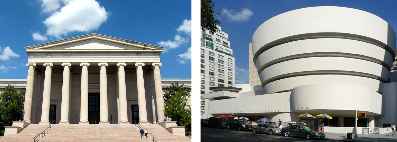
The 1959 Solomon R. Guggenheim Museum (originally the Museum of Non-Objective Art), with its spiraling concrete ramps, was one of the first museums to challenge this tradition. By the 1980s it had outgrown its Frank Lloyd Wright-designed Fifth Avenue home in New York (above right) and Thomas Krens, the museum’s director, began developing plans to expand the museum’s reach though the establishment of satellite branches funded by foreign governments.

Among these projects, the 1997 branch in Bilbao, Spain, has been the most highly regarded. Not only did it provide the Guggenheim with a large exhibition venue for 20th century and contemporary art but it shifted the direction of museum design. At this point in his prolific career, Frank Gehry had a number of cultural institutions to his credit and was developing an international reputation for producing consistently innovative work. Born in Toronto, Canada, in 1929, this Los Angeles-based architect received the prestigious Pritzker Architecture Prize in 1989. Important early projects by Gehry include his remodeled bungalow (begun 1977) in Santa Monica, California, the Vitra Design Museum (1989) in Germany (below) and the Frederick R. Weisman Art Museum (1990-93) at the University of Minnesota, which was under construction when he received the Guggenheim commission.

The Guggenheim Bilbao was also part of an ambitious urban renewal program conceived by the Basque regional government. An aging port and industrial center, the city had entered a period of significant economic decline during the 1980s. Various well-known architects were invited to design new structures, including Santiago Calatrava from Spain and Norman Foster from England. Though initial discussions focused on converting an existing industrial structure into an art museum, Krens convinced local officials to provide a more central and flexible location, a site on the banks of the Nerviron River.

Comparisons to the Guggenheim Museum in New York would be inevitable. Krens urged Gehry to “make it better than Wright” and the Bilbao museum recalls the earlier building in various subtle ways. From the absence of historical references to the focus on a central rotunda or atrium—albeit in Bilbao on a much larger scale—both architects produced unrestrained modern spaces of great architectural force and energy.

A personal aesthetic
Gehry, who started his career in the 1960s, developed a personal aesthetic gradually, discovering exhilarating ways to shatter and re-assemble architectural forms. As most architects do, he began with the structure’s most basic program. After determining the size and shape of the interiors, he melded the forms together, arranging them into a lively sculptural whole.
Though his earlier work, sometimes categorized as Deconstructivism, featured everyday building materials like chain link, corrugated metal and plywood, by the late 1980s Gehry had refined his vision, using more costly surfaces to produce unexpectedly sensuous designs. Aided by sophisticated computer software, his most daring projects evoke aspects of the Italian Baroque style. Like the drapery folds that animate some pieces of 17th century figurative sculpture, Gehry’s more striking works juxtapose elements that bend, ripple and unfurl.
Most photographs depict the Guggenheim Bilbao from across the river. Although this view is arguably the most dramatic and satisfying, the main entrance is on the opposite side of the building, at the foot of a narrow residential street, the Iparraguirre Kalea (above left). Arriving visitors cross over concealed railroad tracks and descend through a broad stepped limestone plaza passing from a slender notch into a soaring 165-foot atrium. A complex and somewhat chaotic interior, this twisting glass-and-steel volume combines irregularly-shaped limestone and plaster walls, glazed elevator shafts, and vertigo-inducing catwalks.


The central atrium (left) serves as a circulation hub and orientation gallery, providing access to approximately 20 galleries on three levels. While the sequence of “classic” galleries are predictably rectangular, other exhibition spaces have surprising shapes, with angled or curving walls and occasional balconies. Particularly memorable is the so-called “boat gallery.” Though Gehry compares the shape to a fish (a reoccurring motif in his work), this enormous column-free space (above) extends more than 400 feet along the river-front promenade and beneath the adjoining bridge. Ideal for large works of sculpture, this vast space contains an installation by Richard Serra.
A “miracle” in Bilbao
The Guggenheim Bilbao opened to the public in 1997. The reception to Gehry’s unorthodox design was nothing less than ecstatic, drawing international acclaim from fellow architects and critics, as well as from tourists who throng here from throughout the world. Herbert Muschamp, The New York Timesarchitecture critic called the undulating structure a “miracle.”[1] The benefit to the city’s local economy was immediate and substantial and numerous cities have tried (but not always succeeded) to match its success, commissioning similarly dynamic structures from high-profile “starchitects.”

[1] Herbert Muschamp, “The Miracle in Bilbao,” The New York Times, September 7, 1997.
Additional resources:
Guggenheim Museum Bilbao
Richard Copans and Julien Donada, Architectures : Le Musée Guggenheim de Bilbao, Melbourne: EnhanceTV, 2009 (video)
Smarthistory images for teaching and learning:
