10.9: Latin American Modernism
- Page ID
- 66960
\( \newcommand{\vecs}[1]{\overset { \scriptstyle \rightharpoonup} {\mathbf{#1}} } \)
\( \newcommand{\vecd}[1]{\overset{-\!-\!\rightharpoonup}{\vphantom{a}\smash {#1}}} \)
\( \newcommand{\dsum}{\displaystyle\sum\limits} \)
\( \newcommand{\dint}{\displaystyle\int\limits} \)
\( \newcommand{\dlim}{\displaystyle\lim\limits} \)
\( \newcommand{\id}{\mathrm{id}}\) \( \newcommand{\Span}{\mathrm{span}}\)
( \newcommand{\kernel}{\mathrm{null}\,}\) \( \newcommand{\range}{\mathrm{range}\,}\)
\( \newcommand{\RealPart}{\mathrm{Re}}\) \( \newcommand{\ImaginaryPart}{\mathrm{Im}}\)
\( \newcommand{\Argument}{\mathrm{Arg}}\) \( \newcommand{\norm}[1]{\| #1 \|}\)
\( \newcommand{\inner}[2]{\langle #1, #2 \rangle}\)
\( \newcommand{\Span}{\mathrm{span}}\)
\( \newcommand{\id}{\mathrm{id}}\)
\( \newcommand{\Span}{\mathrm{span}}\)
\( \newcommand{\kernel}{\mathrm{null}\,}\)
\( \newcommand{\range}{\mathrm{range}\,}\)
\( \newcommand{\RealPart}{\mathrm{Re}}\)
\( \newcommand{\ImaginaryPart}{\mathrm{Im}}\)
\( \newcommand{\Argument}{\mathrm{Arg}}\)
\( \newcommand{\norm}[1]{\| #1 \|}\)
\( \newcommand{\inner}[2]{\langle #1, #2 \rangle}\)
\( \newcommand{\Span}{\mathrm{span}}\) \( \newcommand{\AA}{\unicode[.8,0]{x212B}}\)
\( \newcommand{\vectorA}[1]{\vec{#1}} % arrow\)
\( \newcommand{\vectorAt}[1]{\vec{\text{#1}}} % arrow\)
\( \newcommand{\vectorB}[1]{\overset { \scriptstyle \rightharpoonup} {\mathbf{#1}} } \)
\( \newcommand{\vectorC}[1]{\textbf{#1}} \)
\( \newcommand{\vectorD}[1]{\overrightarrow{#1}} \)
\( \newcommand{\vectorDt}[1]{\overrightarrow{\text{#1}}} \)
\( \newcommand{\vectE}[1]{\overset{-\!-\!\rightharpoonup}{\vphantom{a}\smash{\mathbf {#1}}}} \)
\( \newcommand{\vecs}[1]{\overset { \scriptstyle \rightharpoonup} {\mathbf{#1}} } \)
\(\newcommand{\longvect}{\overrightarrow}\)
\( \newcommand{\vecd}[1]{\overset{-\!-\!\rightharpoonup}{\vphantom{a}\smash {#1}}} \)
\(\newcommand{\avec}{\mathbf a}\) \(\newcommand{\bvec}{\mathbf b}\) \(\newcommand{\cvec}{\mathbf c}\) \(\newcommand{\dvec}{\mathbf d}\) \(\newcommand{\dtil}{\widetilde{\mathbf d}}\) \(\newcommand{\evec}{\mathbf e}\) \(\newcommand{\fvec}{\mathbf f}\) \(\newcommand{\nvec}{\mathbf n}\) \(\newcommand{\pvec}{\mathbf p}\) \(\newcommand{\qvec}{\mathbf q}\) \(\newcommand{\svec}{\mathbf s}\) \(\newcommand{\tvec}{\mathbf t}\) \(\newcommand{\uvec}{\mathbf u}\) \(\newcommand{\vvec}{\mathbf v}\) \(\newcommand{\wvec}{\mathbf w}\) \(\newcommand{\xvec}{\mathbf x}\) \(\newcommand{\yvec}{\mathbf y}\) \(\newcommand{\zvec}{\mathbf z}\) \(\newcommand{\rvec}{\mathbf r}\) \(\newcommand{\mvec}{\mathbf m}\) \(\newcommand{\zerovec}{\mathbf 0}\) \(\newcommand{\onevec}{\mathbf 1}\) \(\newcommand{\real}{\mathbb R}\) \(\newcommand{\twovec}[2]{\left[\begin{array}{r}#1 \\ #2 \end{array}\right]}\) \(\newcommand{\ctwovec}[2]{\left[\begin{array}{c}#1 \\ #2 \end{array}\right]}\) \(\newcommand{\threevec}[3]{\left[\begin{array}{r}#1 \\ #2 \\ #3 \end{array}\right]}\) \(\newcommand{\cthreevec}[3]{\left[\begin{array}{c}#1 \\ #2 \\ #3 \end{array}\right]}\) \(\newcommand{\fourvec}[4]{\left[\begin{array}{r}#1 \\ #2 \\ #3 \\ #4 \end{array}\right]}\) \(\newcommand{\cfourvec}[4]{\left[\begin{array}{c}#1 \\ #2 \\ #3 \\ #4 \end{array}\right]}\) \(\newcommand{\fivevec}[5]{\left[\begin{array}{r}#1 \\ #2 \\ #3 \\ #4 \\ #5 \\ \end{array}\right]}\) \(\newcommand{\cfivevec}[5]{\left[\begin{array}{c}#1 \\ #2 \\ #3 \\ #4 \\ #5 \\ \end{array}\right]}\) \(\newcommand{\mattwo}[4]{\left[\begin{array}{rr}#1 \amp #2 \\ #3 \amp #4 \\ \end{array}\right]}\) \(\newcommand{\laspan}[1]{\text{Span}\{#1\}}\) \(\newcommand{\bcal}{\cal B}\) \(\newcommand{\ccal}{\cal C}\) \(\newcommand{\scal}{\cal S}\) \(\newcommand{\wcal}{\cal W}\) \(\newcommand{\ecal}{\cal E}\) \(\newcommand{\coords}[2]{\left\{#1\right\}_{#2}}\) \(\newcommand{\gray}[1]{\color{gray}{#1}}\) \(\newcommand{\lgray}[1]{\color{lightgray}{#1}}\) \(\newcommand{\rank}{\operatorname{rank}}\) \(\newcommand{\row}{\text{Row}}\) \(\newcommand{\col}{\text{Col}}\) \(\renewcommand{\row}{\text{Row}}\) \(\newcommand{\nul}{\text{Nul}}\) \(\newcommand{\var}{\text{Var}}\) \(\newcommand{\corr}{\text{corr}}\) \(\newcommand{\len}[1]{\left|#1\right|}\) \(\newcommand{\bbar}{\overline{\bvec}}\) \(\newcommand{\bhat}{\widehat{\bvec}}\) \(\newcommand{\bperp}{\bvec^\perp}\) \(\newcommand{\xhat}{\widehat{\xvec}}\) \(\newcommand{\vhat}{\widehat{\vvec}}\) \(\newcommand{\uhat}{\widehat{\uvec}}\) \(\newcommand{\what}{\widehat{\wvec}}\) \(\newcommand{\Sighat}{\widehat{\Sigma}}\) \(\newcommand{\lt}{<}\) \(\newcommand{\gt}{>}\) \(\newcommand{\amp}{&}\) \(\definecolor{fillinmathshade}{gray}{0.9}\)Beginner's guide
Latin American art, an introduction

Why is it important to study Latin American art today?
The study of Latin America and Latin American art is more relevant today than ever. In the United States, the burgeoning population of Latinos—people of Latin American descent—and consequently the rise of Spanish (and Spanglish) speakers, Latino musical genres, literature, and visual arts, require that we better understand the cultural origins of these diverse communities. Even beyond our borders, Latin American countries continue to exert influence over political and economic policies, while their artistic traditions are everyday made more and more accessible at cultural institutions like art museums, which regularly exhibit the work of Latin American artists. In many ways, Latin American and Latino culture is an inescapable reality, thus it is up to us, for the benefits of appreciation and integration, to tackle the difficult question of what it means to be from Latin America.
For many of us Latin America is not an entirely foreign concept, in fact our knowledge of it is most likely defined by a particular country, food, music, or artist, and sadly, it is also sometimes clouded by cultural stereotypes. What many of us often overlook, is the diversity of what it means to be Latin American and Latino. Interestingly, Latin America is not as different from the United States as we tend to think, since we both share in the history of conquest and imperialism, albeit from different perspectives. Thus the study of Latin American art should not necessarily be thought of as a narrative that is entirely separate from that of the United States, but rather as one that is shared.
What do we mean by Latin America?
Latin America broadly refers to the countries in the Americas (including the Caribbean) whose national language is derived from Latin. These include countries where the languages of Spanish, Portuguese, and French are spoken. Latin America is therefore a historical term rooted in the colonial era, when these languages were introduced to the area by their respective European colonizers. The term itself, however, was not coined until the nineteenth century, when Argentinean jurist Carlos Calvo and French engineer Michel Chevalier, in reference to the Napoleonic invasion of Mexico in 1862, used the term “Latin” to denote difference from the “Anglo-Saxon” people of North America. It gained currency during the twentieth century when Mesoamerican, Central American, Caribbean, and South American countries sought to culturally distance themselves from North America, and more specifically from the United States.

Today, Latin America is considered by many scholars to be an imprecise and highly problematic term, since it prescribes a collective entity to a conglomerate of countries that remain vastly different. In the case of countries that share the same language their cultural bond is much stronger, since despite their potentially different pre-conquest origins, they continue to share collective colonial histories and contemporary postcolonial predicaments. Spanish-speaking countries are therefore known as Spanish America or Hispanoamérica, while those that were colonized by the Iberian countries of Spain and Portugal, fall under the broader category of Iberoamérica, thus including Brazil. In addition to these Latin-derived languages, indigenous tongues like Quechua, spoken by more than 8 million people in South America, are still preserved today. When discussing countries such as the French-speaking Haiti and Spanish-speaking Mexico, the similarities become much harder to articulate.
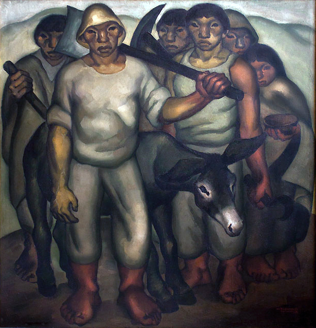
That said, the collective experiences of the conquest, slavery, and imperialism—and even today, those of underdevelopment, environmental degradation, poverty, and inequality—prove to be an undeniable unifying force, and as the artworks of these countries demonstrate, the idea of both a collective and local experience exists among the selected countries. For the purposes of clarity, the term Latin America is used loosely, whether referring to the pre- or post-conquest era. At the same time however, this term will be challenged in order to demonstrate both the limitations and benefits of thinking of Latin American art as a shared artistic tradition.
It is anachronistic to discuss a Latin American artistic tradition before independence, and as a result pre-Columbian and colonial art are discussed according to specific regions. However, it is best to approach the art of the 19th and 20th centuries as a whole, in large part due to the emergence of Latin Americanism and Pan-Americanism (a twentieth-century movement that rallied all American countries around a shared political, economic, and social agenda). Contemporary artists working in a globalized art world and often times outside of their country of origin give new meaning to what it means to not necessarily be a Latin American artist, but rather a global one.
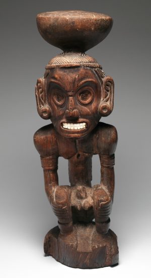
Geography
While the countries of Latin America can be categorized by language, they can also be organized by region. Before 1492 C.E., the regions of Mesoamerica, the Isthmus (or Intermediate) Area, the Caribbean, and the Andes shared certain cultural traits, such as the same calendars, languages, and sports, as well as comparable artistic and architectural traditions. After colonization, however, the borders shifted somewhat with the creation of the viceroyalties of New Spain, Peru, New Granada, La Plata, and Brazil. After independence (and still today), the countries stretching from Mexico to Honduras form part of the region of Mesoamerica (also known as Middle America since the Greek word “meso” means “middle”). Parts of Honduras and El Salvador, Nicaragua, Costa Rica, and Panama, which lie to the south of Middle America, make up Central America, while all the countries to the south of Panama form part of South America. The Caribbean is sometimes considered part of Central America or at times entirely excluded. The United States also factors into this discussion of Latin American art—through the work of Latino, Chicano, and Nuyorican artists.
Lastly, it is important to note that when discussing specific Latin American countries, the geographical scope in question will correspond to the current, rather than former borders. While these linguistic and geographical parameters lend clarity to the study of Latin American art, they often obscure cultural differences that are not border specific. The coastal cultures of Colombia and Venezuela for instance, are closer to those of the Caribbean than to their mainland counterparts. This is reflected not only in the similar climate, diet, and customs of these particular areas, but also in their artistic production. The islands of the Caribbean, however, are also a geographical region (delineated by the Caribbean Sea), thus the distinction between regions depends on how and where you draw the borders—reminding us of the flexibility and variety of labels that can be employed to describe the same region.
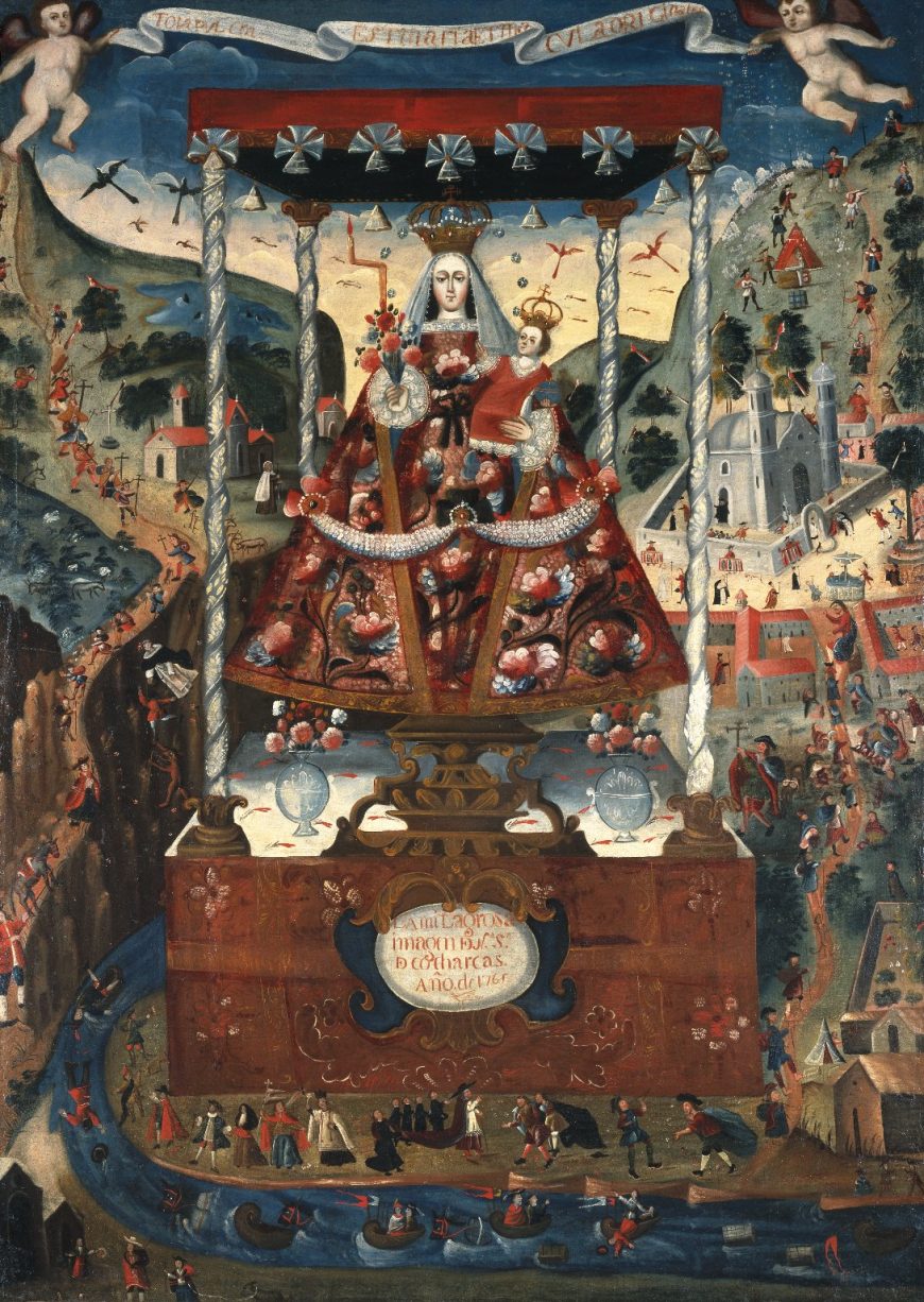
A similar distinction occurs in South America, where cultures vary greatly not necessarily across countries, but rather according to geographical landmarks, the two most prominent of which are the Andes Mountains and the Amazon Rainforest. Stretching from Chile to Venezuela, the Andes traverse the western portion of South America. At impressive heights and in snow-covered peaks, the Andean cultures of South America share irrigation techniques, textile traditions, and native languages, such as Quechua, the former language of the Incas that is today spoken by millions, that continue to this day. The Amazon, the world’s largest tropical rainforest, is contained mostly in Brazil, although it stretches into the bordering countries of Bolivia, Peru, Ecuador, Colombia, Venezuela, Guyana, Suriname and French Guiana. Just these two landmarks, without mentioning the Pacific and Atlantic coastal cultures of South America, reveal the geographical, and thus cultural diversity of the area.Latin America is a useful, but by no means perfect term to describe a vast expanse of land that is historically, culturally, and geographically diverse.
From networks of exchange to a global trade network
From as early as the pre-Columbian era, there existed networks of exchange among the early civilizations of Latin America, through trade networks that stretched from Mesoamerica to South America. Limited by technology and transportation, forms of indigenous contact were mainly restricted to the American continent. With the arrival of European conquistadores (Spanish for “conquerors”), the panorama changed entirely. Starting in the sixteenth century, and now exposed to Africa, through the Atlantic Slave Trade, and Asia, through the trade network of the Manila Galleon, Latin America entered into an era of global contact that continues to this day.
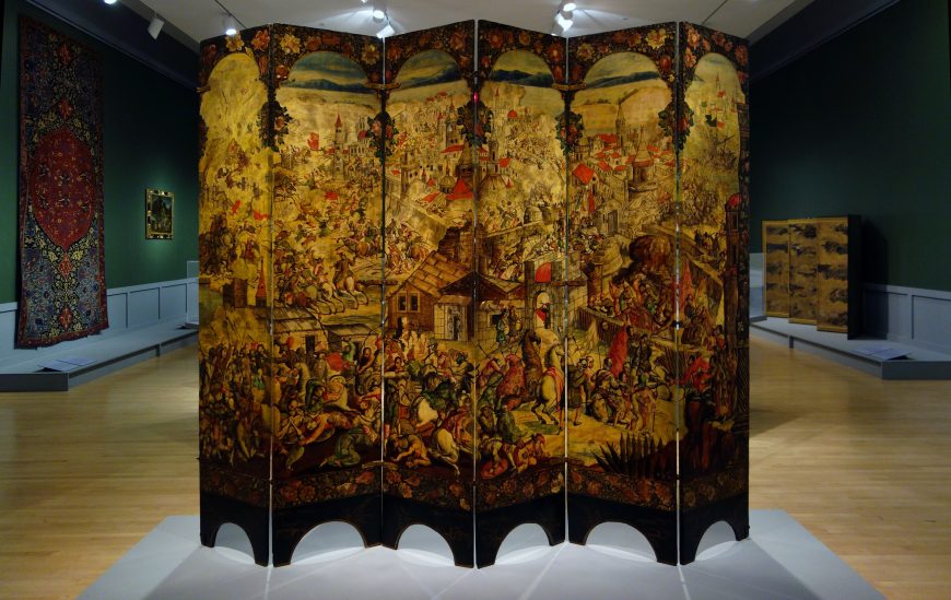
With the nineteenth-century struggles for independence, collaborations across countries increased, not to mention alliances were formed, that although unsuccessful, nevertheless tried to articulate the idea of a collective Latin American entity. During the twentieth and twenty-first centuries, namely as a result of socio-political transformations, migration, exile, and diaspora (the dispersion of people from their homeland), travel became a trademark of modern art, further contributing to the internationalism of Latin American art. As a result of these networks of exchange, which began before colonization and continue to this day, Latin American art is difficult to categorize. It is in fact hybrid and pluralistic, the product of multi-cultural conditions.
“Non-Western” art?
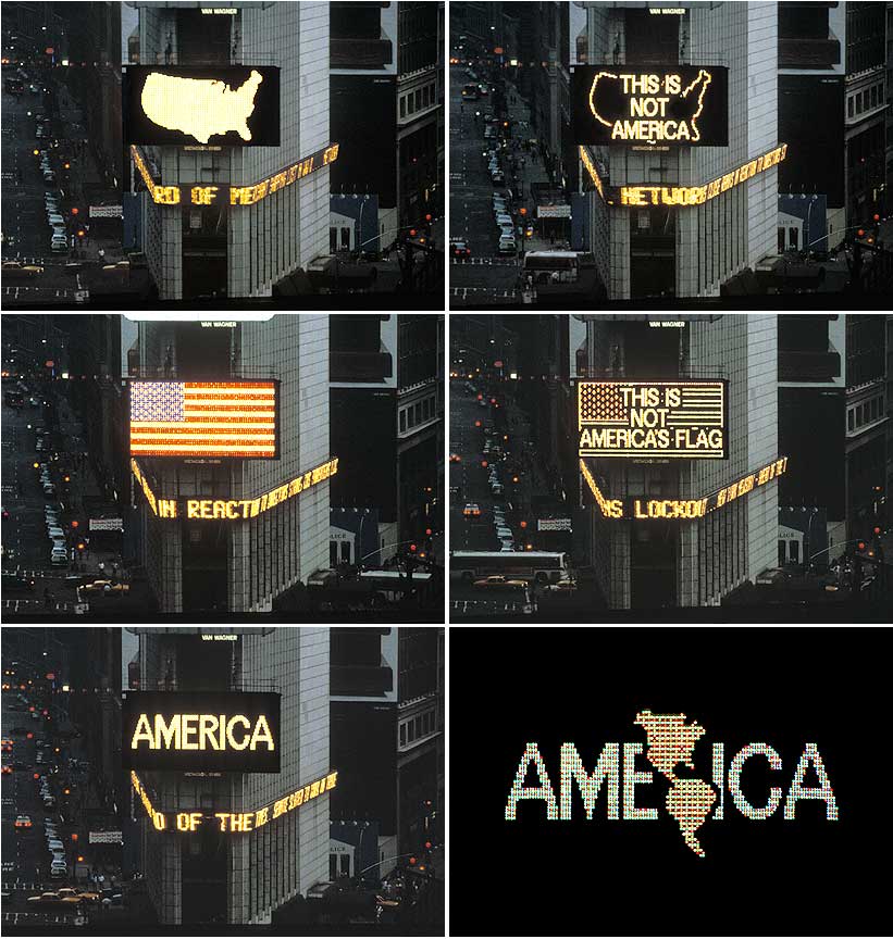
It is critical to also consider the negative impact of the artificial insertion of Latin American art into Western and non-Western narratives. While the term “Western art” refers largely to Europe and North America, whose artistic tradition looks back to the Classicism of the ancient Greeks and Romans, the term “non-Western art” includes everything else. This distinction has plagued Latin American art, since—except for pre-Columbian art—it mostly fits in the category of Western art history. This categorization however, is debatable, with some scholars positing that Latin American art is a non-Western artistic tradition that owes more to its pre-Columbian roots, than to its European influences. Often, when Latin American art is discussed in a Western context, it is usually presented as derivative of European or North American art, or simply treated as the “other,” meaning different from the artistic mainstream.

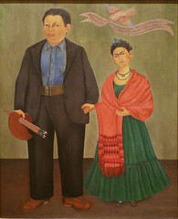
This notion can be countered by exposing the many ways that artists adopted, rather than imitated, these outside influences, and by demonstrating the manner through which these forms of exchange were reciprocal—rather than unilateral—as is usually discussed. A case in point can be seen in the work of Diego Rivera and Frida Kahlo (right), who are usually included in textbooks on either Western or Modern art, but whose presence is marginalized in comparison to their European and North American counterparts.
A survey of non-Western art would surely include indigenous Latin American art, but it might not include any artworks from the sixteenth century (conquest) onwards. As a result—and depending on the context in which you study Latin American art—one can end up with an entirely different and fragmented view of its artistic tradition. This is even made more complicated when considering the artistic selections in the pre-Columbian and Colonial sections versus those in the Modern sections, as evidenced by the number of ritual objects (considered artworks as a result of their aesthetic qualities and craftsmanship). Only from the broader perspective of Latin American art can individual artistic traditions be better appreciated. The plurality of meaning and the inability to neatly title or categorize Latin American art is precisely what makes this area of study so unique, and therefore interesting. A living and constantly evolving field of study, Latin American art will continue to surprise you with its multifaceted and multilayered history.
Mexican muralism
Celebrating the Mexican people’s potential to craft the nation’s history was a key theme in Mexican muralism.
c. 1920 - 1960
Mexican Muralism: Los Tres Grandes—David Alfaro Siqueiros, Diego Rivera, and José Clemente Orozco
by DR. DORIS MARIA-REINA BRAVO

Siqueiros and Mexican History
At the National Autonomous University of Mexico (UNAM) in Mexico City visitors enter the rectory (the main administration building), beneath an imposing three-dimensional arm emerging from a mural. Several hands, one with a pencil, charge towards a book, which lists critical dates in Mexico’s history: 1520 (the Conquest by Spain); 1810 (Independence from Spain); 1857 (the Liberal Constitution which established individual rights); and 1910 (the start of the Revolution against the regime of Porfirio Díaz). David Alfaro Siqueiros left the final date blank in Dates in Mexican History or the Right for Culture (1952-56), inspiring viewers to create Mexico’s next great historic moment.
The Revolution
From 1910 to 1920 civil war ravaged the nation as citizens revolted against dictator Porfirio Díaz. At the heart of the Revolution was the belief—itself revolutionary—that the land should be in the hands of laborers, the very people who worked it. This demand for agrarian reform signaled a new age in Mexican society: issues concerning the popular masses—universal public education and health care, expanded civil liberties—were at the forefront of government policy.
Mexican Muralism
At the end of the Revolution the government commissioned artists to create art that could educate the mostly illiterate masses about Mexican history. Celebrating the Mexican people’s potential to craft the nation’s history was a key theme in Mexican muralism, a movement led by Siqueiros, Diego Rivera, and José Clemente Orozco—known as Los tres grandes. Between the 1920s and 1950s, they cultivated a style that defined Mexican identity following the Revolution.
The muralists developed an iconography featuring atypical, non-European heroes from the nation’s illustrious past, present, and future—Aztec warriors battling the Spanish, humble peasants fighting in the Revolution, common laborers of Mexico City, and the mixed-race people who will forge the next great epoch, like in Siqueiros’ UNAM mural. Los tres grandes crafted epic murals on the walls of highly visible, public buildings using techniques like fresco, encaustic, mosaic, and sculpture-painting.
One of the earliest government commissions for a post-Revolution mural was for the National Preparatory School, a high school in Mexico City affiliated with UNAM. During the 1920s Los tres grandes and other artists completed works throughout the school’s expansive exteriors and interiors.
Destruction of the old order
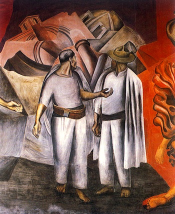
Orozco painted nearly two dozen murals at the school including Destruction of the Old Order, 1926. It depicts two figures in peasant attire who watch nineteenth-century neoclassical structures fracture into a Cubist-like pile, signaling the demise of the past. Just as Siqueiros’ UNAM murals anticipate an unrealized historic event, the “new order” implied in Orozco’s work is the world these men will encounter once they turn to face the viewer. These anonymous men are unlikely heroes given their modest attire, yet they represent a new age where the Revolution has liberated the masses from centuries of repression.
Murals for the Palace of Fine Arts
In 1934 the government inaugurated the Palace of Fine Arts Mexico City, which soon became the nation’s most important cultural institution. The Palace’s Museum, Mexico’s first art museum, opened the same year with works by two of Los tres grandes: Rivera’s Man, Controller of the Universe, 1934, a recreation of Man at the Crossroads (painted at Rockefeller Center and destroyed the year before), and Orozco’s Catharsis, 1934.

The title of Orozco’s painting dates to 1942, when an art historian speculated that the fire at the top of the composition symbolized catharsis, and thus “the only possibility of saving and purifying civilization” as it succumbed to the excesses of moral depravity. The laughing central figure jerks the viewer into an immoral world, where the malevolent aspects of modern life—senseless warfare, destructive technology, and prostitution—run rampant.

In Torment and Apotheosis of Cuauhtémoc, 1950-51, another mural at the Museum of the Palace of Fine Arts, Siqueiros explores the violent period of the Conquest. In this mural Spanish soldiers torture the Mexican tribal leader for information on the location of the treasure they seek. The Mexican motherland, symbolized by the blood-stained female figure, stretches her arms protectively over his still figure. Siqueiros’ penchant for sinewy limbs, showcased in the UNAM murals and exemplified here in the bodies of Cuauhtémoc and his praying companion, underscore the tension in this encounter.
The Mexican Revolution was a watershed moment in the twentieth century because it marked a true break from the past, ushering in a more egalitarian age. With its grand scale, innovative iconography, and socially relevant message, Mexican muralism remains a notable compliment to the Revolution. The way the muralists reoriented history, recovered lost stories, and drafted new narratives continues to stir audiences and inspire artists, like the Chicano muralists that emerged in the U.S. Southwest. The fact that their in-situ masterpieces can still be seen publicly in Mexico and beyond is a testament to their relevance, popularity, and the power of their didactic message.
Additional resources:
For instructors: related lesson plan on Art History Teaching Resources
Smarthistory images for teaching and learning:
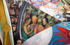
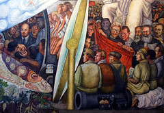
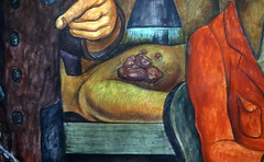
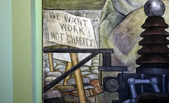

Diego Rivera
Diego Rivera’s Sugar Cane
by DR. MATTHEW AFFRON and DR. STEVEN ZUCKER
Video \(\PageIndex{1}\): José Diego María Rivera, Sugar Cane, 1931, fresco, 145.1 × 239.1 cm © 2014 Banco de México Diego Rivera Frida Kahlo Museums Trust, Mexico, D.F. (Philadelphia Museum of Art)
Diego Rivera, Man at the Crossroads
by DR. DORIS MARIA-REINA BRAVO
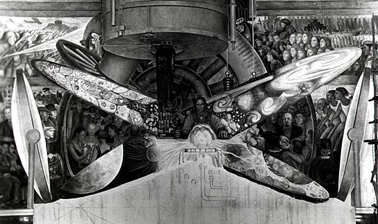
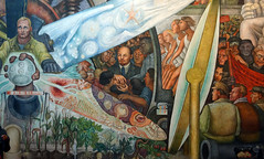
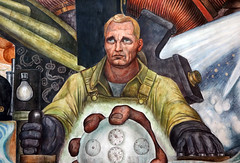
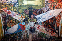
When the Museo del Palacio de Bellas Artes opened on November 29, 1934 in Mexico City, the general public finally had a chance to see Diego Rivera’s Man, Controller of the Universe. At 15.75 x 37.5 feet, this epic work demands attentive viewing. Less than ten months earlier Rivera’s first version—originally titled Man at the Crossroads—was destroyed at Rockefeller Center in New York City after months of controversy.
Rivera was in the midst of a prolific period when he began this mural. His retrospective exhibition at MoMA opened in December 1931 to positive reviews and contemporaneous mural projects in San Francisco and Detroit enhanced his celebrity as one of the greatest Mexican muralists. Yet something went amiss with the Rockefeller commission: whether it was censorship, a miscommunication or something in between, Rivera’s Man at the Crossroads became one of the most infamous artworks that never was.

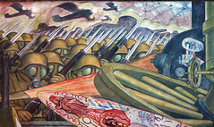
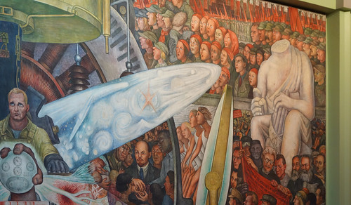
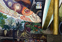
In the later (surviving) version at the Museo del Palacio de Bellas Artes, Man, Controller of the Universe, a worker at the center directs an enormous machine at the crossroads of the political ideologies dominating this period: capitalism (to the figure’s right) and communism (to the figure’s left).

Though the composition is bursting with activity, Rivera establishes order by using the central figure as a vertical axis: if we fold the scene down the middle, spaces and objects (like the two giant magnifying glasses) align.

This arrangement encourages comparisons between the two sides.
For example, at the top of the capitalist side (on our left, the central figure’s right) the brutalities of World War I are on display. Rivera underscores how capitalist nations use technology (poison gas, machine guns, and warplanes) as destructive forces.
By contrast, the top of the communist side (our right, the central figure’s left) highlights the glories of the Russian Revolution, whose momentum overflows into the lower part of the composition.
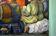
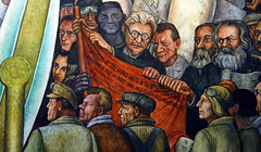
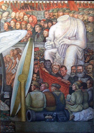
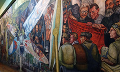
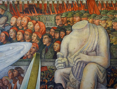
If we continue to focus on the right side, we see key figures in the worker’s movement (León Trotsky, Friedrich Engels, and Karl Marx) standing at the foot of a headless classical sculpture brandishing a swastika. As our gaze moves to the lower right, we realize workers are seated on the sculpture’s decapitated head.
On the other side of the composition, Rivera places another classical sculpture (this one anachronistically wears a Christian cross). Though the figure lacks hands, his face and lightning bolt reveal him as Zeus, the supreme Greek god.
By defacing these classical sculptures, Rivera critiques traditional art history (and its seemingly rarefied tastes) as well as the political elite (from the empires of Antiquity to the Catholic Church and Fascists) that—in his view—had repressed the popular masses throughout human history.
Through this symbolic beheading, the communists have replaced the dominant ideology in Europe with a new way of thinking. Though the statue on the other side holds a ray of lightning, his handless state renders him powerless amidst the turmoil in capitalist countries: behind the sculpture’s base workers in New York City fight against the police while the wealthy (whose ranks include a bespectacled Nelson Rockefeller), indulge in debauchery between the magnifying glass on the left and the central worker. The “pie slice” across from this scene features Vladimir Lenin holding the hands of workers of distinct races. Despite being a small fragment of the mural, this tableau is at the heart of the controversy Rivera faced in the United States.
Though Rivera enjoyed tremendous success, he also faced harsh controversy, for both his political beliefs and artistic practice. Though he considered his murals at the Detroit Institute of Arts (1932-33) among his greatest works, his work there faced opposition due to the depiction of men of different races working together.
The most notorious controversy of his career came as he painted Man at the Crossroads, the mural for Rockefeller Center’s Radio Corporation of America (RCA) building in 1933 (the fresco that he later based Man, Controller of the Universe on). Of the hundreds of characters in Man at the Crossroads, Lenin caused the most debate. An April 24th headline from the New York World-Telegram stated “Rivera Perpetrates Scenes of Communist Activity for RCA Walls—And Rockefeller, Jr. Foots Bill.” Ten days later Nelson Rockefeller, Rivera’s patron and member of a famously wealthy family, asked the artist to remove Lenin. When Rivera refused, he was paid in full and dismissed. The murals were covered up and later destroyed, as Rivera’s supporters rallied to save the work. E.B. White’s “I Paint What I See,” written in protest, poignantly highlights this meeting of differing political ideologies:
I paint what I paint, I paint what I see,
I paint what I think, said Rivera […] I’ll take out a couple of people drinkin’
And put in a picture of Abraham Lincoln; […] But the head of Lenin has got to stay!
It’s no good taste in a man like me,
Said John D’s grandson, Nelson. […] For this, as you know, is a public hall.
And people want doves, or a tree in fall,
And tho your art I dislike to hamper,
I owe a little to God and Gramper.
And after all,
It’s my wall…
We’ll see if it is, said Rivera.1
As White predicted, Rivera had the last laugh. Eight decades later his mural exists in two places: physically, in the Museo; and, as befitting a censored work, thriving in art history scholarship.
1. As quoted from E.B. White, “I Paint What I See” (The New Yorker, May 1993)
Additional Resources:
Palacio de Bellas Artes, Mexico City
Detroit fresco cycle
Smarthistory images for teaching and learning:
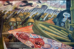
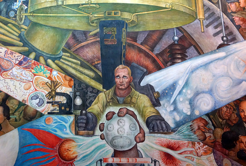
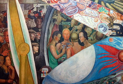
Diego Rivera, Man Controller of the Universe
by DR. BETH HARRIS and DR. STEVEN ZUCKER
Video \(\PageIndex{2}\): Diego Rivera, Man Controller of the Universe (or Man in the Time Machine), 1934, fresco, 4.85 x 11.45 m in the Palacio de Bellas Artes, Mexico City
Smarthistory images for teaching and learning:
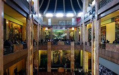


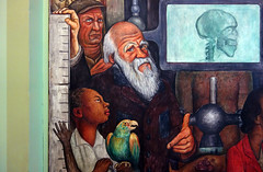


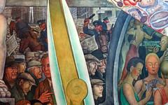
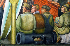


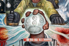
Diego Rivera, Detroit Industry Murals
by LINDA DOWNS

The impact of the Great Depression
When the Mexican artist Diego Rivera arrived in Detroit in 1932 to paint these walls, the city was a leading industrial center of the world. It was also the city that was hit the hardest by the Great Depression. Industrial production and the workforce were a third of what they had been before the 1929 Crash.
Rivera arrived days after an infamous Hunger March where thousands of unemployed workers walked from downtown Detroit to the gates of the Ford Motor Company River Rouge plant to demand employment. Armed Ford security guards met them, panicked, shot into the marchers and killed six people. This confrontation became known as the Battle of the Overpass. The workers were shut out of the Ford factories, but Rivera put them to work in the heart of the museum.

East wall
The space he was given to paint was aligned on an east/west/north/south axis. Rivera utilized this architectural orientation in a symbolic way. On the east wall, the direction of the sunrise, beginnings, new life, he represented a child in the bulb of a plant cradled by two plowshares and framed on either side by hefty nudes holding grain and fruit—symbolizing bountiful harvests. These panels introduce some of the world’s earliest technology in agriculture.
North and south walls
The manufacture of the 1932 Ford V-8 at the Ford Motor Company’s River Rouge plant is captured in the two major panels on the north and south walls.

On the north wall, the direction of darkness, and the interior of things—Rivera captured all the processes related to the assembly of the motor. The blast furnace glows orange and red at extreme temperatures to make molten steel that is poured into molds to make ingots that are then milled into sheets. All the major processes related to the manufacture of the motor of the car from mold-making in the upper left to the final assembly of the motor on the assembly line in the foreground are accurately rendered with engineering precision. The artist wove the processes together through the use of the serpentine conveyors and assembly lines. The composition is grounded by two rows of white milling machines that stand as sentinels in the center of the wall and march into the background to the blast furnace.


On the south wall, the wall of light, the exterior of things, Rivera painted the assembly of the body of the car on the south automotive panel. The parts stamped out at the stamping press on the right then are welded in the welding buck in the upper center. Surrounding this image are painting, upholstering and the final assembly where the chassis is joined to the body. At the end of the assembly line is a finished tiny red car.
The only machine that has been slightly altered is the stamping press because Rivera saw in it a resemblance physically and symbolically to the famous and feared ancient Aztec statue that was believed to have caused death and destruction when it was unearthed in Mexico City in the 18th century. It is now known as the representation of Coatlicue, the creation goddess. Cuatlicue was both a creator and destroyer of life. She was fed human hearts in order to maintain the order of the universe. The Coatlicue/stamping press presides over the sacrifice of workers through repetitive and physically demanding factory jobs.

On the upper north and south panels Rivera painted gigantic red, black, yellow and white figures symbolic of the diverse workforce. Each has one of the raw materials that form the basis for the automobile industry—iron ore, coal/diamonds, sand and limestone. Rivera attributed the tensile strength of the raw materials with his conception of the character of each race. The red race he associated to iron ore; the black race to coal and diamonds; the yellow race with malleable sand; and the white race with the building material of limestone.

The west wall
The west wall, the direction of sunsets, endings, and last judgments, Rivera painted passenger planes and bombers. Here the constructive and destructive uses of technology are clearly presented. The panels below the planes depict a dove and a hawk to underscore the theme.
Controversy
The most controversial panel in 1932 was this small right hand panel on the north wall. Here a child is vaccinated in a medical laboratory surrounded by the animals that provided the serum. Rivera took this composition from Christian nativity scenes where the baby Jesus is attended to by Mary and Joseph and honored by three wise men. To Rivera, medical technology would be the new savior of mankind. He based the image of the child on the kidnapped Lindberg baby, Mary is based on the popular movie star of the time, Jean Harlow, and the doctor is a portrait of the museum director, William Valentiner. The three scientist/wise men he referred to as a Catholic, Protestant and a Jew—ecumenical wise/medical men.
A major controversy was sparked when the murals were publicly unveiled. Thousands of people signed petitions to either destroy or save them. The Catholic Church sparred with factory workers and college students and the press wrote articles for weeks. The museum held public speak-outs. The Detroit City Council considered a vote to whitewash them. In the end Edsel Ford publicly accepted them for the museum collection. The Detroit Industry murals remain today one of the most engaging, major modern works of the twentieth century.
Additional Resources:
These frescoes at the Detroit Institute of Arts
Rivera’s materials and techniques from MoMA
Diego Rivera, Calla Lilly Vendor (Vendedora de Alcatraces)
by DR. BETH HARRIS and DR. STEVEN ZUCKER
Video \(\PageIndex{3}\): Diego Rivera, Calla Lilly Vendor (Vendedora de Alcatraces), 1942, oil on masonite, (Banco Nacional de Mexico, Mexico City)
Diego Rivera, Dream of a Sunday Afternoon in Alameda Central Park
by DR. DORIS MARIA-REINA BRAVO

Dream or nightmare
In Dream of a Sunday Afternoon in Alameda Central Park, hundreds of characters from 400 years of Mexican history gather for a stroll through Mexico City’s largest park. But the colorful balloons, impeccably dressed visitors, and vendors with diverse wares cannot conceal the darker side of this dream: a confrontation between an indigenous family and a police officer; a man shooting into the face of someone being trampled by a horse in the midst of a skirmish; a sinister skeleton smiling at the viewer. What kind of dream, or nightmare, is this?

Surreal quartet
In the spirit of Surrealism, this is a complex dream. For Surrealists, like Salvador Dalí, dreams were the principal subject matter. Since dreams are so personal and strange, this allowed artists to juxtapose unrelated matter, like clocks and ants for Dalí. Though Rivera never officially joined the Surrealists, he uses this approach in Dream of a Sunday Afternoon in Alameda Central Park as he cobbles together a scene composed of disparate historical personages, including Hernán Cortés (the Spanish conqueror who initiated the fall of the Aztec Empire), Sor Juana (a seventeenth-century nun and one of Mexico’s most notable writers), and Porfirio Díaz (whose dictatorship at the turn of the twentieth century inspired the Mexican Revolution).

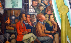
Perhaps the most striking grouping is a central quartet featuring Rivera, the artist Frida Kahlo, the printmaker and draughtsman José Guadalupe Posada, and La Catrina. “Catrina” was a nickname in the early twentieth century for an elegant, upper-class woman who dressed in European clothing.
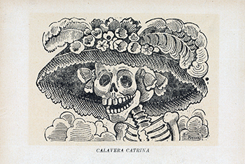
This character became infamous in Posada’s La Calavera de la Catrina (The Catrina Skeleton), 1913. Here, the renowned printmaker depicted La Catrina as a skeleton in order to critique the Mexican elite. In Dream of a Sunday Afternoon in Alameda Central Park, Rivera reproduces the original Posada print and adds an elaborate boa—reminiscent of the feathered Mesoamerican serpent god Quetzalcóatl—around her neck.
La Catrina unites two great Mexican artists in this mural: she holds Rivera’s hand as her other arm is held by Posada. Though Posada died in obscurity in 1913, artists later brought attention to his work and he was a significant influence on the Mexican muralists. The fourth character in this quartet is Kahlo. She stands behind a child-version of her husband, with one hand protectively on his shoulder as her other holds a Yin and Yang object.

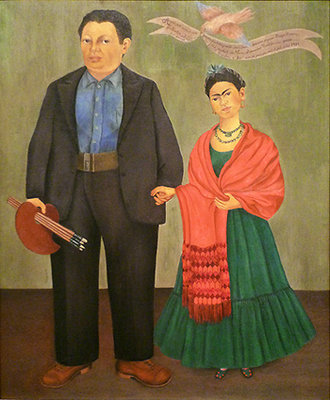
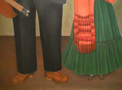
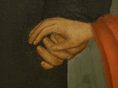
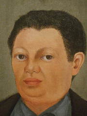
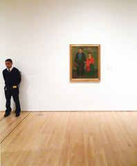
In Chinese philosophy, Yin and Yang refers to opposite yet interdependent forces, like day and night. Within the name of this concept is perhaps the most fundamental duality in humanity: female (“Yin”) and male (“Yang”). Thus, this Chinese symbol becomes a metaphor for Rivera and Kahlo’s complex relationship: Rivera began as Kahlo’s mentor; they then married, separated, and got back together; they were political comrades; and they painted each other frequently. Their double-portraits often reflect the state of the couple’s relationship at that moment. In Frieda and Diego Rivera (1931) Kahlo subtly plays with the couple’s stature in order to emphasize Rivera’s influence on her. Kahlo was ill as Rivera worked on this mural and his diminished size may reflect his feelings of helplessness.
Reading Mexican history
Stepping away from the center, if one reads the mural like a text, a chronology emerges: the left side of the composition highlights the conquest and colonization of Mexico, the fight for independence and the revolution occupy the majority of the central space, and modern achievements fill the right. For some art historians the central area is a snapshot of bourgeois life in 1895—as refined ladies and gentlemen promenade in their Sunday best, under the watchful eye of Porfirio Díaz in his plumed military garb. One gets a sense of the inequality that stirred average Mexicans to overthrow their dictator and initiate the Mexican Revolution which lasted from 1910 until 1920.
In this light we can appreciate the dreams and nightmares within each epoch. To the left of the balloons the nightmares of the conquest and religious intolerance during the colonial-era give way to the dream of a democratic nation during the nineteenth century, represented by the over-sized figure of Benito Juárez, who restored the republic after French occupation and attempted to modernize the country as president. On the right of the composition, beyond the bandstand, the battles of the revolution give way to a society where “land and liberty,” as championed by the workers’ flags, becomes a tangible reality.

Histories normally edited out
More often than not history is written by the victor and thus reflects an incomplete story. Dream of a Sunday Afternoon in Alameda Central Park is an antidote to this: Rivera guarantees that histories normally edited out (the stories of the indigenous and the masses) have a place in this grand narrative. The artist reminds the viewer that the struggles and glory of four centuries of Mexican history are due to the participation of Mexicans from all strata of society.
José Clemente Orozco, Dive Bomber and Tank

Humanity
José Clemente Orozco painted the mural Dive Bomber and Tank in front of visitors at The Museum of Modern Art in 1940. The fresco was made in conjunction with the exhibition, “Twenty Centuries of Mexican Art,” and Orozco captivated his audience over a frantic ten-day period through his performance and his powerful imagery.
Against the backdrop of World War II and the infamous blitzkriegs of the Nazis, Orozco depicted the effects of modern warfare on humanity. Interestingly however, and because weapons of war dominate most of the composition, any hint of the human figure is lost, except for three human legs that sprout from the debris, and upon close inspection three metallic human faces—or masks—chained to the debris. These faces are buried under large, heavy, industrial weapons, that include tank treads and the disassembled parts of a bomber. Through this superimposition, Orozco makes clear the triumph of war over humanity, or as he put it “the subjugation of man by the machines of modern warfare."\(^{1}\)
Abstraction

For all the certainty of this statement, there is significant ambiguity in the painting. The upturned legs could be those of helpless victims or those of the bomber pilots. The artist purposely leaves these questions unanswered, offering little narrative detail or visual clarity. Indeed Orozco claimed that these panels could be arranged in any order (a Surrealist strategy), and not necessarily in sequential order (as they are usually shown at MoMA). As a result of their interchangeability, the panels each function independently though collectively they create multiple abstract compositions.
His interest in abstraction distinguished Orozco from his closest contemporaries, Diego Rivera and David Alfaro Siqueiros (together these muralists were known as los tres grandes, “the three great ones”). These abstract tendancies can be seen in Dive Bomber and Tank in the relative lack of detail, expressionist brushstrokes, repetition of form, and monochromatic palette.
The attention to the circular forms of the chain links and metallic bolts, and the rectangular shape of the tank treads create a composition that is at once representational and abstract. The fact that these forms are disconnected from each other, a result of the dismembered state of the bomber and tank, and the logistical arrangement of the panels, render the mural even more abstract.
War
While Orozco stated that this mural had “no political significance,” war was the dominant reality in 1940 and focused the attention of other artists at the time. Pablo Picasso had documented the effects of the Spanish Civil War in his painting Guernica in 1937—the same year that David Alfaro Siqueiros painted the powerful Echo of a Scream. Picasso’s Guernica had been on exhibit at MoMA from late 1939 to January 1940 and the Siqueiros had been in MoMA’s collection since 1937. Together these artists articulated a clear anti-war message that rivaled the more traditional heroic narratives common in history painting. Devoid of the geographical specificity that characterized Picasso’s Guernica, Orozco—like Siqueiros—represented a condemnation of war that can be easily applied to any place or people, fitting given that violence was now world-wide. The fact that Dive Bomber and Tank lacks any specific political symbols or historical details makes the mural that much more universal.
1. James Oles, Mexican Muralists: Orozco, Rivera, Siqueiros, New York: The Museum of Modern Art, 2011, page 44.
Surrealism in Latin America
Begun in Europe, Surrealism soon crossed the Atlantic and took on a new life in Latin America.
c. 1925 - 1950
Frida Kahlo
Frida Kahlo, introduction
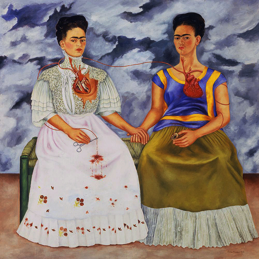
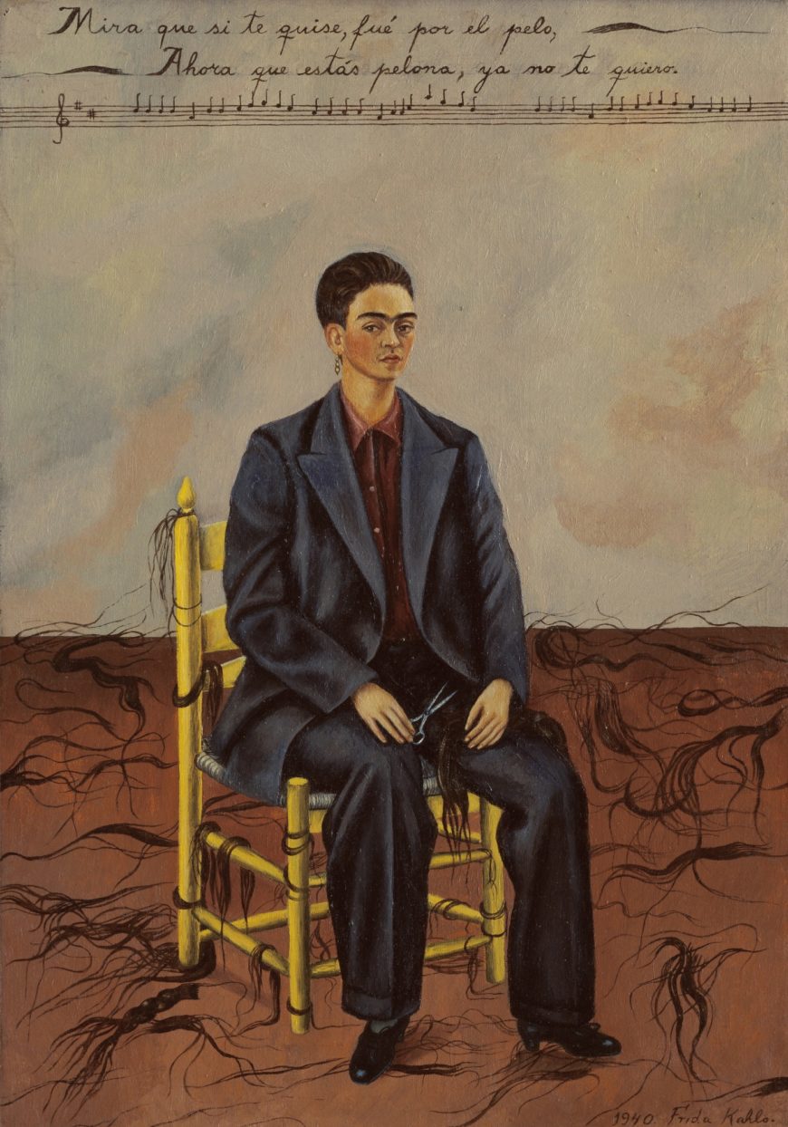
Sixty, more than a third of the easel paintings known by Frida Kahlo are self-portraits. This huge number demonstrates the importance of this genre to her artistic oeuvre. The Two Fridas, like Self-Portrait With Cropped Hair, captures the artist’s turmoil after her 1939 divorce from the artist Diego Rivera. At the same time, issues of identity surface in both works. The Two Fridas speaks to cultural ambivalence and refers to her ancestral heritage. Self-Portrait With Cropped Hair suggests Kahlo’s interest in gender and sexuality as fluid concepts.
Kahlo was famously known for her tumultuous marriage with Rivera, whom she wed in 1929 and remarried in 1941. The daughter of a German immigrant (of Hungarian descent) and a Mexican mother, Kahlo suffered from numerous medical setbacks including polio, which she contracted at the age of six, partial immobility—the result of a bus accident in 1925, and her several miscarriages. Kahlo began to paint largely in response to her accident and her limited mobility, taking on her own identity and her struggles as sources for her art. Despite the personal nature of her content, Kahlo’s painting is always informed by her sophisticated understanding of art history, of Mexican culture, its politics, and its patriarchy.
The Two Fridas
Exhibited in 1940 at the International Surrealist Exhibition, The Two Fridas depicts a large-scale, double portrait of Kahlo, rare for the artist, since most of her canvases were small, reminiscent of colonial retablos, small devotional paintings. To the right Kahlo appears dressed in traditional Tehuana attire, different from the nineteenth century wedding dress she wears at left and similar to the one worn by her mother in My Grandparents, My Parents, and I (Family Tree) (1936).
Whereas the white dress references the Euro-Mexican culture she was brought up in, in which women are “feminine” and fragile, the Tehuana dress evokes the opposite, a powerful figure within an indigenous culture described by some at the time as a matriarchy. This cultural contrast speaks to the larger issue of how adopting the distinctive costume of the indigenous people of Tehuantepec, known as the Tehuana, was considered not only “a gesture of nationalist cultural solidarity,” but also a reference to the gender stereotype of “la india bonita.” [1] Against the backdrop of post-revolutionary Mexico, when debates about indigenismo (the ideology that upheld the Indian as an important marker of national identity) and mestizaje (the racial mixing that occurred as a result of the colonization of the Spanish-speaking Americas) were at stake, Kahlo’s work can be understood on both a national and personal level. While the Tehuana costume allowed for Kahlo to hide her misshapen body and right leg, a consequence of polio and the accident, it was also the attire most favored by Rivera, the man whose portrait the Tehuana Kahlo holds. Without Rivera, the Europeanized Kahlo not only bleeds to death, but her heart remains broken, both literally and metaphorically.
Self-Portrait With Cropped Hair
In opposition, the painting Self-Portrait With Cropped Hair boldly denounces the femininity of Two Fridas. In removing her iconic Tehuana dress, in favor of an oversized men’s suit, and in cutting off her braids in favor of a crew cut, Kahlo takes on the appearance of none other than Rivera himself. At the top of the canvas, Kahlo incorporates lyrics from a popular song, which read, “Look, if I loved you it was because of your hair. Now that you are without hair, I don’t love you anymore.” In weaving personal and popular references, Kahlo creates multilayered self-portraits that while rooted in reality, as she so adamantly argued, nevertheless provoke the surrealist imagination. This can be seen in the visual disjunctions she employs such as the floating braids in Self Portrait with Cropped Hair and the severed artery in Two Fridas. As Kahlo asserted to Surrealist writer André Breton, she was simply painting her own reality.
Notes
[1] Adriana Zavala, Becoming Modern, Becoming Tradition: Women, Gender, and Representation in Mexican Art (Pennsylvania State University Press, 2009), p. 3
Additional resources
Frida Kahlo, Frieda and Diego Rivera
by DR. BETH HARRIS and DR. STEVEN ZUCKER
Video \(\PageIndex{4}\): Frida Kahlo, Frieda and Diego Rivera, 1931, oil on canvas, 39-3/8 x 31″ / 100.01 x 78.74 cm (San Francisco Museum of Modern Art)
This was painted in San Francisco during the artist’s first trip outside of Mexico. She accompanied her husband Diego Rivera who was painting in the United States and would, at the end of the year, be the subject of a retrospecive at The Museum of Modern Art in New York. The banderole carried by the bird above the artist states: “Here you see us, me, Frieda Kahlo, with my beloved husband Diego Rivera, I painted these portraits in the beautiful city of San Francisco, California, for our friend Mr. Albert Bender, and it was the month of April of the year 1931.” Note: Kahlo changed her German name, Frieda, to Frida.
Smarthistory images for teaching and learning:
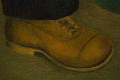
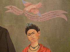
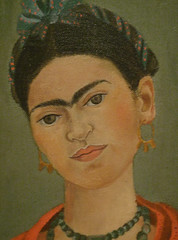
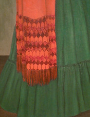
Frida Kahlo, The Two Fridas (Las dos Fridas)
by DR. DORIS MARIA-REINA BRAVO

Indelible marks

Facial hair indelibly marks the self-portraits of Mexican artist Frida Kahlo. In an era when women still wore elaborate hairstyles, hosiery, and attire, Kahlo was a rebellious loner, often dressed in indigenous clothing. Moreover, she lived as an artist during a period when many middle-class women sacrificed their ambitions to live entirely in the domestic sphere. Kahlo flouted both conventions of beauty and social expectations in her self-portraits. These powerful and unflinching self-images explore complex and difficult topics including her culturally mixed heritage, the harsh reality of her medical conditions, and the repression of women.
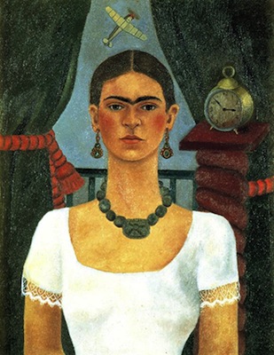
The double self-portrait The Two Fridas, 1939 (above) features two seated figures holding hands and sharing a bench in front of a stormy sky. The Fridas are identical twins except in their attire, a poignant issue for Kahlo at this moment. The year she painted this canvas she was divorced from Diego Rivera, the acclaimed Mexican muralist. Before she married Rivera in 1929, she wore the modern European dress of the era, evident in her first self-portrait (left) where she dons a red velvet dress with gold embroidery. With Rivera’s encouragement, Kahlo embraced attire rooted in Mexican customs.
Dress
In her second self-portrait (left) her accessories reference distinct periods in Mexican history (her necklace is a reference to the pre-Columbian Jadite of the Aztecs and the earrings are Colonial in style) while her simple white blouse is a nod to peasant women.
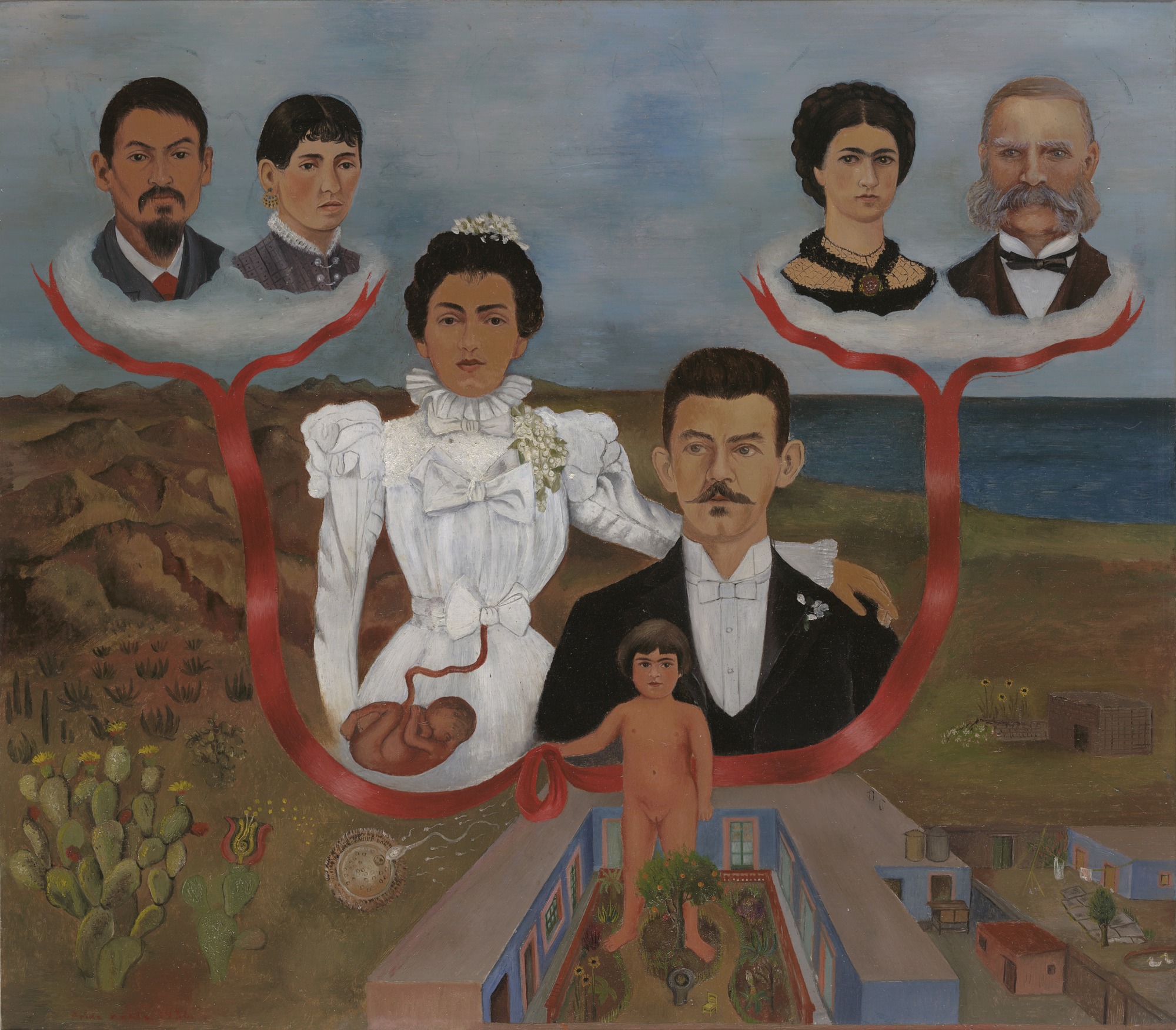
The portraits from the 1930s reflect Kahlo’s growing penchant for indigenous attire and hair-styling, as is evident in Frieda and Diego Rivera, 1931 (below) and The Two Fridas. Yet Kahlo never abandoned dressing her subjects and herself in mainstream, European dress; her female relatives wear non-indigenous clothing in My Grandparents, My Parents, and I (Family Tree), 1936 (below). In this painting, the bridal dress Kahlo’s mother wears is reminiscent of the white, stiff-collared dress the artist wears inThe Two Fridas. Indeed, the grotesque view into each woman’s insides is heightened by the virginal whiteness of both dresses.

In her brief lifetime, Kahlo painted about two hundred works of art, many of which are self-portraits. With the exception of a few family trees, the double-portrait with Rivera and The Two Fridas represents a departure in her oeuvre. If a self-portrait by definition is a painting of one’s self, why would Kahlo paint herself twice? One way to answer this question is to examine The Two Fridas as a bookend to the 1931 portrait, Frieda and Diego Rivera. Though this painting was meant to celebrate the birth of their union, their tentative grasp seems to reflect Kahlo’s misgivings about her husband’s fidelity. By contrast, the double self-portrait, though laden with suffering, exhibits resilience.

Anatomy of Two Fridas
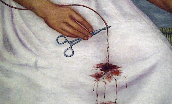
The two Fridas clasp hands tightly. This bond is echoed by the vein that unites them. Where one is weakened by an exposed heart, the other is strong; where one still pines for her lost love (as underscored by the vein feeding Rivera’s miniature portrait), the other clamps down on that figurative and literal tie with a hemostat.
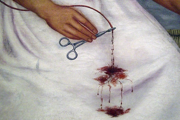
Human anatomy is often graphiclty exposed in Kahlo’s work, a topic she knew well after a childhood bout with polio deformed her right leg and a bus accident when she was eighteen years old left her disabled and unable to bear children. She would endure 32 operations as a result. Detail with Hemostat (photo: Dave Cooksey, CC: BY-NC-SA 2.0) Kahlo utilized blood as a visceral metaphor of union, as in the 1936 family portrait (below) where she honors her lineage through these bloody ties. She returns to this metaphor in The Two Fridas though with the added impact of two hearts, both vulnerable and laid bare to the viewer as a testament to her emotional suffering.

“I am the person I know best”
Photographs by artists within her milieu, like Manuel Alvarez Bravo and Imogen Cunningham, confirm that Kahlo’s self-portraits were largely accurate and that she avoided embellishng her features. The solitude produced by frequent bed rest—stemming from polio, her near-fatal bus accident, and a lifetime of operations—was one of the cruel constants in Kahlo’s life. Indeed, numerous photographs feature Kahlo in bed, often painting despite restraints. Beginning in her youth, in order to cope with these long periods of recovery, Kahlo became a painter. Nevertheless, the isolation caused by her health problems was always present. She reflected, “I paint self-portraits because I am so often alone, because I am the person I know best.”
Wifredo Lam, The Jungle
by DR. DORIS MARIA-REINA BRAVO

In The Godfather Part II Michael Corleone has the impeccable timing of visiting Cuba on the eve of the 1959 Revolution that would overthrow the corrupt government of Cuba’s leader at the time, Fulgencio Batista. Corleone’s stay in Havana—marked by business meetings with American corporations and trips to casino-resorts and cabaret shows—highlights the excesses that led to the dramatic fall of that regime during the film’s New Year’s Eve party. More than fifteen years earlier, when Wifredo Lam painted The Jungle (1943), Cuba had already spent over four decades at the mercy of United States-interests.
Wifredo Lam remains the most renowned painter from Cuba and The Jungle remains his best known work and an important painting in the history of Latin American art and the history twentieth-century modernism more broadly. In the 1920s and 30s, Lam was in Madrid and Paris, but in 1941 as Europe was engulfed by war, he returned to his native country. Though he would leave Cuba again for Europe after the war, key elements within his artistic practice intersected during this period: Lam’s consciousness of Cuba’s socio-economic realities; his artistic formation in Europe under the influence of Surrealism; and his re-acquaintance with Afro-Caribbean culture. This remarkable collision resulted in the artist’s most notable work, The Jungle.
A game of perception

The Jungle, currently on display at the Museum of Modern Art in New York, has an undeniable presence within the gallery: the cluster of enigmatic faces, limbs, and sugarcane crowd a canvas that is nearly an 8 foot square. Lam’s bold painting is a game of perception. The artist haphazardly constructs the figures from a collection of distinct forms—crescent-shaped faces; prominent, rounded backsides; willowy arms and legs; and flat, cloddish hands and feet. When assembled these figures resemble a funhouse mirror reflection. The disproportion among the shapes generates an uneasy balance between the composition’s denser top and more open bottom—there are not enough feet and legs to support the upper half of the painting, which seems on the verge of toppling over. Another significant element within Lam’s game of perception is how he places the figures within an unorthodox landscape. Lam’s panorama excludes the typical elements of a horizon line, sky or wide view; instead this is a tight, directionless snapshot, with only the faintest sense of the ground.
One part of the flora in this scene—sugarcane—is alien to the jungle setting suggested by the painting’s title. Sugarcane does not grow in jungles but rather is cultivated in fields. In 1940s Cuba, sugarcane was big business, requiring the toil of thousands of laborers similar to the cotton industry in the American South before the Civil War. The reality of laboring Cubans was in sharp contrast to how foreigners perceived the island nation, namely as a playground. Lam’s painting remains an unusual Cuban landscape compared to the tourism posters that depicted the country as a destination for Americans seeking beachside resorts. While northern visitors enjoyed a permissive resort experience, U.S. corporations ran their businesses, including sugar production. Though Cuba gained independence from Spain at the end of nineteenth century, the United States maintained the right to intervene in Cuba’s affairs, which destabilized politics on the island for decades.
European Modernism and Santería

During the interwar period in Paris, Lam befriended the Surrealists, whose influence is evident in The Jungle. Surrealists aimed to release the unconscious mind—suppressed, they believed, by the rational—in order to achieve another reality. In art, the juxtaposition of irrational images reveal a “super-reality,” or “sur-reality.” In Lam’s work, an other-worldly atmosphere emerges from the constant shifting taking place among the figures; they are at once human, animal, organic, and mystical.
This metamorphosis among the figures is also related to Lam’s interest in Afro-Caribbean culture. When the artist resettled in Cuba in 1941, he began to integrate symbols from Santería, an Afro-Cuban religion that mixes African beliefs and customs with Catholicism, into his art. During Santería ceremonies the supernatural merges with the natural world through masks, animals, or initiates who become possessed by a god. These ceremonies are moments of metamorphosis where a being is at once itself and otherworldly.
No cha-cha-cha
Lam created a new narrative within the Cuban imagination: rooted in the island’s complex history, his work was an antidote to the picturesque frivolity that mired the nation in stereotype,
[…]I refused to paint cha-cha-cha. I wanted with all my heart to paint the drama of my country, but by thoroughly expressing the negro [sic] spirit […] In this way I could act as a Trojan horse that would spew forth hallucinating figures with the power to surprise, to disturb the dreams of the exploiters. I knew I was running the risk of not being understood either by the man in the street or by the others. But a true picture has the power to set the imagination to work, even if it takes time.1
The Jungle is both enigmatic and enchanting, and has inspired generations of viewers to liberate their imaginations.
1. Fouchet, Max-Pol. Wifredo Lam. New York: Rizzoli International Publications, 1976, 188-189. Republished in Richards, Paulette. “Wifredo Lam: A Sketch.” Callaloo 34 (Winter 1988): 91-92.
Constructivism
Joaquín Torres-García, Inverted America

“Our North is the South.”
So Joaquín Torres-García proudly announced in 1935 in The School of the South Manifesto, in which he articulated his ideas about the direction of Uruguayan, and indeed all Latin American art. Torres-García upended traditional hierarchical structures by defining the art of South America on its own terms, rather than in relation to that of the North (i.e. the United States and Europe) as it had been in the past. In proclaiming itself independent from artistic centers of power like New York and Paris, Torres-García looked to the pre-Columbian past (before the arrival of Christopher Columbus to the Americas in 1492) as a source of artistic inspiration.
In 1934, Torres-García returned to Uruguay from the United States and Europe, where he had lived for roughly 40 years. Upon his return, he established the School of the South, a workshop in which he encouraged students to seek inspiration locally rather than globally, while at the same time establishing an autonomous artistic tradition. As seen in América Invertida (Inverted America), the aim of Torres-García was to challenge the traditional frame of mind, and reposition the South as the new North.
Inverted map

With the southern cone turned upside down, one sees the map of South America in an entirely new way. The map communicates important details like the cardinal direction of the South, the latitude line of Montevideo, and the equatorial line.
Rather than show the equator at the center of the hemisphere, as is usually the case, Torres-García instead places Uruguay in this privileged position.
Other symbols like the sun, boat and fish seem relatively straightforward, however for Torres-García they also communicated greater meaning. Appearing often in his work, the sun is a powerful pre-Columbian symbol. Due to its life giving force, Torres-García prominently features it, not only in this map, but also in his Cosmic Monument (1938), where it appears at the center. The boat is usually associated with travel, while the fish represents fecundity.

Torres-García argued that these symbols were indigenous to Latin America and featured in monuments as old as the ones found in Tiwanaku (one of the most prominent civilizations in South America prior to the Inca empire). As a result of their ancient origins and timeless quality, Torres-García held that these were universal symbols. In the Gate of the Sun at Tiwanaku (above), the Sun God faces out from the top of the gate with rays around his face. Pre-Columbian symbols here joined the great art of ancient civilizations, along with the hieroglyphics of the ancient Egyptians and the reliefs of the ancient Greeks. Torres-García drew on quintessentially Latin American symbols to articulate a version of modern art that was autonomous from what he had seen in Barcelona, Paris and New York, thus reaffirming his cultural identity, while simultaneously articulating a new direction.
Constructive Universalism
Constructive Universalism, as he referred to this new style, sought to imbue geometric art with a new spiritual dimension, here achieved through the appropriation of ancient symbols.

Abstraction and figuration were at odds with each other at this time, when other Latin American artists like Mexican Diego Rivera (above), Ecuadorian Camilo Egas, and Brazilian Candido Portinari championed figural depictions of local subjects rooted in social activism. Interestingly, Torres-García upheld both the principles of abstraction and a regional sense of identity, while eschewing any socio-political message.
While pre-Columbian art was at the center of Constructive Universalism, Torres-García also looked to astral, zodiacal, and other ancient signs, explaining the presence of the star and the yin and yang in his Cosmic Monument (above). The conflation of these influences demonstrates the international nature of his work, despite its emphasis on Latin American culture.
Additional Resources:
Other works by this artist at the Museum of Modern Art
Artist biography at the Guggenheim Museum
Lygia Clark, Bicho

Fold, turn, close, open
When you think of sculpture, you might think of an ancient Roman emperor or a bronze military hero, both of which exemplify the principles of traditional sculpture: idealism and permanence. Bicho (Critter), a sculpture by Lygia Clark, defies these ideas of sculpture as a static idealized form. The viewer can fold, turn, close, and open Bicho, exploring its multifaceted nature. Consisting of geometric shapes connected through hinges, Lygia Clark created a sculpture that was not only participatory, but also seemingly infinite in its variability.
Neo-Concretism

In 1951, abstract art took on new meaning and form in Brazil, largely through the impact of a retrospective of the Bauhaus-trained artist Max Bill in São Paulo and the first São Paulo biennale. Throughout the 1950s, Bill’s influence in Brazil led to the development of concrete art, a kind of abstract art, which championed universal subjects like order and rationality, founded on objectivity and science.Together with Helio Oiticica and other artists from Rio de Janeiro, however, Clark articulated her ideas about this kind of abstraction in the 1959 “Neo-Concrete Manifesto.” In it, the artists declared their break from the tenets of concrete art with its systematic approach to abstraction. Clark, on the other hand, sought a freer and more organic interpretation of geometric abstraction, effectively eliminating the demarcation between two-dimensional and three-dimensional form.
We see the organic nature of Bicho, in keeping with the ideas of neo-concretism, not only in its exoskeletal form and transformative nature, but also in its name. Whereas traditional sculpture hides its structural support, Clark instead focuses on it, by drawing attention to the hinges that bind the work together, and to the empty spaces created in between these folded spaces. As seen in Bicho, the straight-edged and round shapes recall skeletal forms while the hinges function as spinal columns. Even the name, Critter, recalls natural life, as if the work were a living creature meant to be animated – or better yet mutated—by the participant.

Participation and experience
Clark made these sculptures to be participatory, and therefore variable. Created as a series, there are around seventy Bichos in total. She challenged not only the idea that sculpture is fixed, but also that there is only one way to view or experience it. The sculptures are fundamentally unstable—both literally and metaphorically. They have no front or back, no inside or outside, no left or right. In this way, they have no author, since each participant creates a different experience of Bicho. Different from performance art however, these sculptures do not create spectacle, but rather invite participation. The work of art is not the viewing of the sculpture itself, but one’s participation with it.
A “non-object”
In exploring painting, particularly the space between the painting and frame, Clark discovered what she referred to as the “organic line.” She arrived at this conceptual idea when she looked at a door and noticed that the door and its frame are one. She observed that the gap in between is a connective line that visually integrates the two into a single whole. Discovery of the Organic Line (1954) illustrates this idea, since it is the painting within a painting that calls attention to the line itself.

Clark arrived at Bicho through her exploration of the “organic line,” and its mutability in two and three-dimensional form. However, it was Ferreira Gullar, primary author of the “Neo-Concrete Manifesto” who called Bicho neither painting, nor sculpture. Instead, Gullar described the work as a non-object (an early phrase for abstraction) that did not have a function and that resisted categorization.
Video \(\PageIndex{5}\)
Brazilian modernism
The origins of modern art in São Paulo, an introduction
Modern art in São Paulo
1922 was an important year for avant-garde activities in Brazil. During the week of February 11–18, which was also Carnival and the centennial celebration of Brazil’s declaration of independence from Portugal, a multidisciplinary event, known as Semana de Arte Moderna (Modern Art Week) took place at the Municipal Theatre of São Paulo. It featured an art exhibition, poetry readings, music, and dance festivals organized by the painter Emiliano di Cavalcanti, and poets Oswald de Andrade and Mario de Andrade (no relation to Oswald).
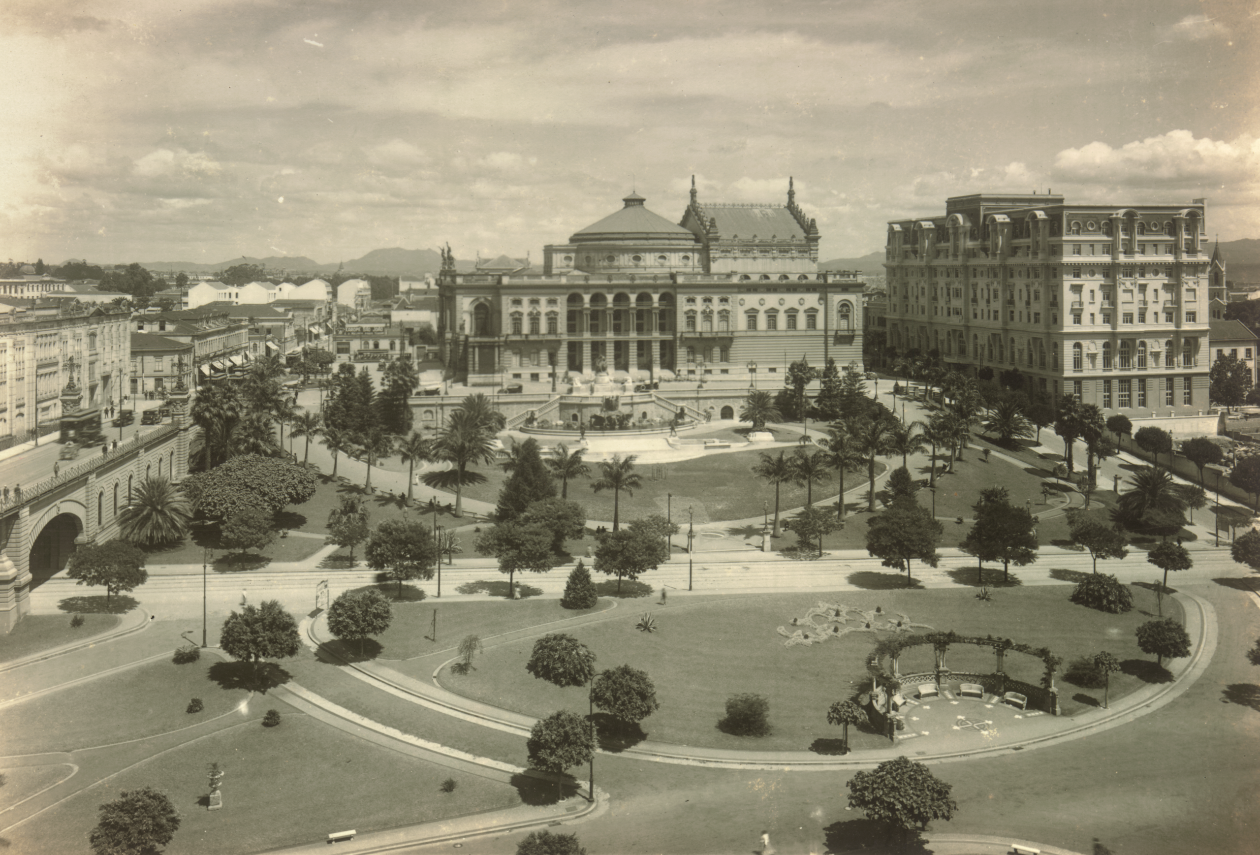
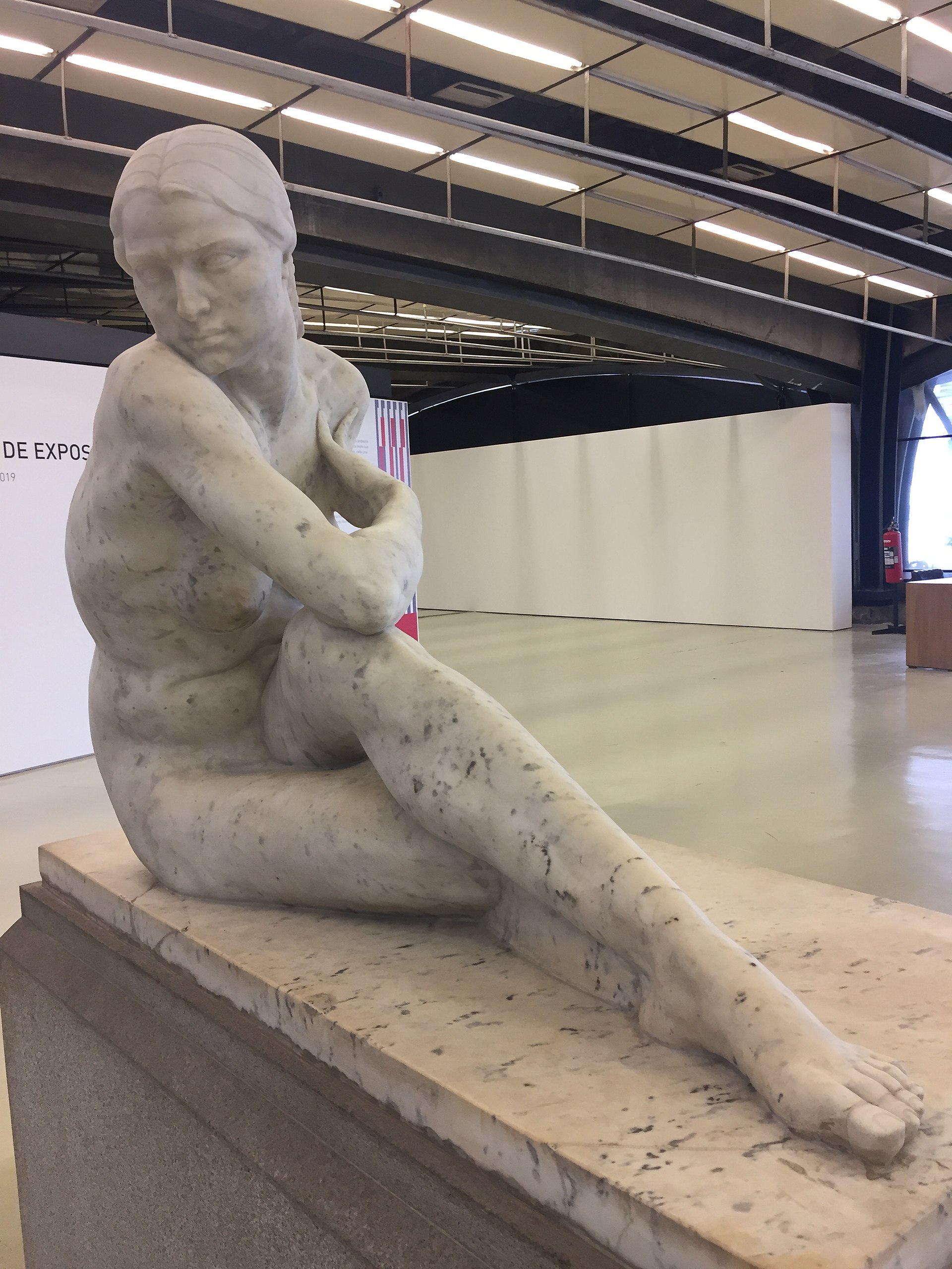
Modern Art Week was intended to announce the São Paulo avant-garde’s break with earlier art. The exhibition of art included works by the sculptor Victor Brecheret, who returned to Brazil from Rome in 1919, paintings by Anita Malfatti, completed during her time in Berlin and New York, and di Cavalcanti, along with numerous other painters, sculptors, and architects. One of the other painters who would play a significant role in the development of Brazilian modernism was Tarsila do Amaral.
The Semana was conceived as a reaction against the official academic art and literature. Academic art was associated with the conservative oligarchy (powerful families who owned huge coffee plantations) and remained intent on emulating the time-worn Romanticism of nineteenth-century Europe. In many respects the impetus for the art exhibition was the radical newness of Brecheret’s sculptures and Malfatti’s expressionist paintings. Brecheret’s sculptures were rendered in a dramatically stylized, proto-Art Deco style, and Malfatti’s paintings were met with derision from the establishment when first exhibited in 1917.
At the time of the Semana, São Paulo was one of the fastest growing cities in Brazil. Industrialization was transforming this coffee-growing center into a thriving metropolis with electrified street lamps, a café culture, movie theaters, and luxurious department stores. Young Brazilian intellectuals were hungry for art and literature that matched the city’s vibrant energy and they were also part of a political movement intent on challenging the stranglehold of the oligarchy. Like their peers in Argentina, writers and artists like Mario and Oswald de Andrade and di Cavalcanti were eager for an intellectual culture that was not only modern and up-to-date but also intrinsically Brazilian.
The controversy surrounding Malfatti’s paintings

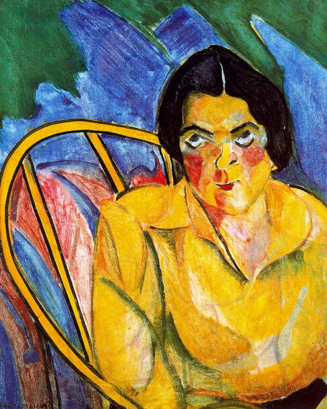
When Malfatti exhibited a selection of her paintings, including The Fool and The Man of Seven Colors, the art critic Monteiro Lobato attacked her in an influential São Paulo newspaper (“A Propósito da Exposição”). He described her painting as “beastly” and “deformed,” the latter a satirical play on the translation of her Italian last name (“mal fatti”); he declared her painting to be akin to art produced by the mentally insane, work born of “paranoia and mystification,” and finally he dismissed her as “a girl who paints.”
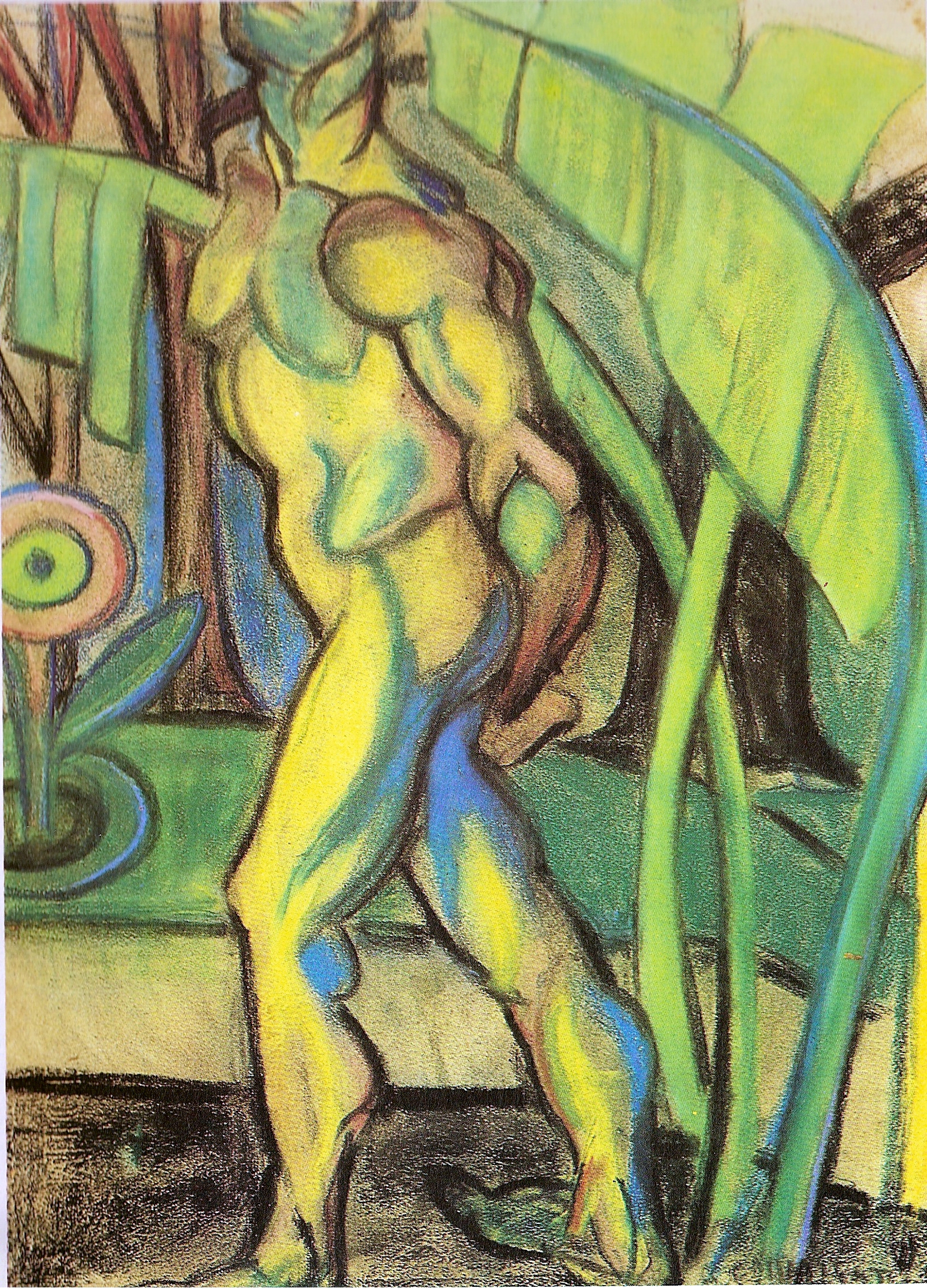
Describing her as an amateurish follower of the “excesses” of Picasso, Lobato described two kinds of artists, those who see things “normally,” in the tradition of Praxiteles, Raphael, Rubens, and Rodin, and feel called to preserve the rhythm of life aesthetically, and, those who see things as “deformed” and “sadistic.” He wrote that such artists, Malfatti among them, were merely “shooting stars” destined to oblivion. Lobato was surely offended both by her expressionistic and non-naturalistic use of color but also by her engagement with the male nude, which was still taboo for women artists.
Malfatti’s approach was, however, entirely in keeping with modern art in Berlin and New York where she had studied with Lovis Corinth and Homer Boss. It was Boss who had challenged her to use pure color, as seen in the high key yellow, green, and blue in both The Fool and The Man of Seven Colors.
In Man of Seven Colors she used expressive lines to emphasize the sculptural quality of the nude body and areas of pure color to emphasize figural torsion. The fact that the nude is headless suggests a distancing from the individual portrayed, and the potential erotic charge. The painting engages the viewer more emotionally and cerebrally than sexually, given the model’s modest posture.
Anita Malfatti and modern art in Brazil
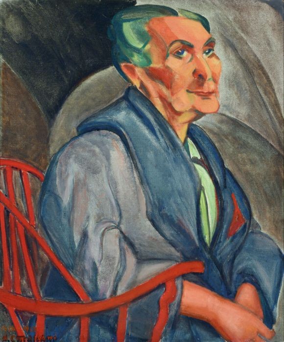
In the wake of the controversy surrounding the exhibition of Anita Malfatti’s work, young writers like Mario de Andrade rallied to her side, championing her for initiating modern art in Brazil. Twenty of her paintings were included in the exhibition during the Semana, including works like The Yellow Man and Woman with Green Hair, the titles of which call attention to the innovative use of color that had so incensed Monteiro Lobato. Emiliano di Cavalcanti recalled that Malfatti’s exhibition was “a revelation . . . [she] came from the outside, and her modernism . . . had the seal of experience in Paris, Rome, and Berlin.”\(^{[1]}\)
Emiliano Di Cavalcanti
Di Cavalcanti worked as an illustrator for newspapers and magazines. He designed the program for the Semana de Arte Moderna, and his image for the cover declares his embrace of modern art and of stylistic diversity. It features a female nude standing on a pedestal, but the figure is rendered with a combination of sharp and sensual curving lines, not unlike Malfatti’s work and even Picasso’s already infamous Les Demoiselles d’Avignon (1906–07).
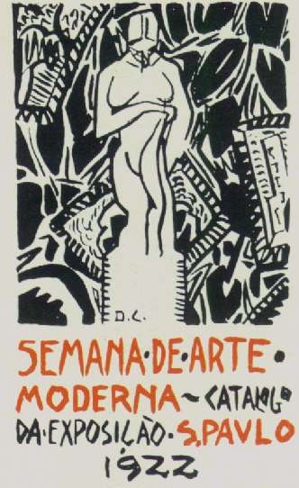
Di Cavalcanti invokes the turn in avant-garde art toward primitivism, whereby artists like Pablo Picasso and the Emil Nolde drew inspiration from objects appropriated from indigenous peoples and cultures in Africa and the South Pacific, as well as pre-conquest civilizations of the Americas to challenge establishment values by engaging in formal and conceptual experiments inspired by the exotic “other.” Throughout Latin America primitivism was made even more complex as many artists were rediscovering “other” cultures within their own local contexts and appropriating these in order to innovate and at times challenge European domination of the arts and remnants of colonial practices.
Here, di Cavalcanti sets the nude amidst a primitivistic background of foliage. In the lower right, a simplified human figure recalls a trope of ethnographic sculpture. In the middle- and background there appear to be modernist, even Cubist paintings hung askew. Their frames are articulated with jagged lines that lend additional energy to the composition.
Despite being a leading figure in the emergence of Brazilian modernism, di Cavalcanti’s own style was still overtly sensual. His portraits and figural compositions aimed at championing “another concept of femininity” as representative of the authentic Brazil, or brasilidade, and in this regard his work was somewhat atypical of the art movement launched by the Semana de Arte Moderna\(^{[2]}\).
In a context dominated by the white elite, di Cavalcanti’s pictorial interpretations of Brazil’s working classes need to be understood as a confrontation of prevailing notions of beauty. They are also in dialogue with Mexican muralists who wanted to focus on the working class and make art for the people. To the modern eye however, his work appears to internalize stereotypes of Brazil’s exotic “other” even if his aim was to subvert academic authority by affirming the beauty and value of Brazil’s mixed-race working class.
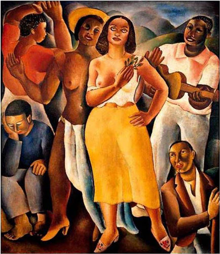
Di Cavalcanti’s approach is exemplified in Samba, a painting completed in 1925 following a two-year sojourn in Paris where he met Picasso. The painting depicts a partly nude black woman and a partially clothed mulatta swaying to the music of a guitar, strummed by a young black man. The figures’ vacant stares serve to heighten the quality of sensual abandon. Art historian Edith Wolfe has observed that the solid, naturalistic bodies suggest an affinity for Picasso’s post-Cubist classicism transferred to the favela in the service of nationalistic modernism.\(^{[3]}\)
Di Cavalcanti’s primitivized bodies seem to risk re-colonizing Brazil’s marginal communities, especially its women, in the service of the male gaze. Others have argued that the artist’s aim was to extoll Brazilian unity by celebrating and reconciling racial and class disparities. Di Cavalcanti’s Samba exemplifies the quest for an art that was both modern and Brazilian, and that followed in the wake of the Semana de Arte Moderna.
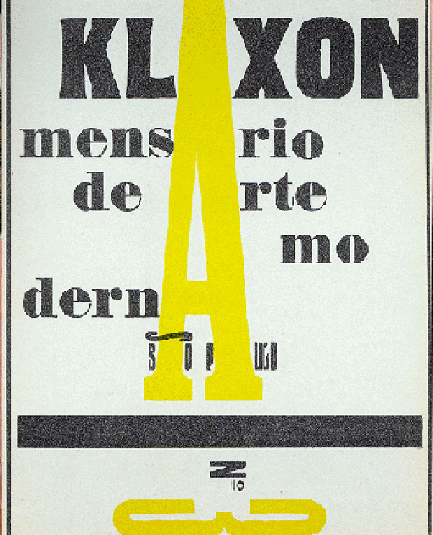
Building from the Semana de Arte Moderna, artists and writers went on to champion modernism in the pages of the journal Klaxon, considered the first publication of the Brazilian avant-garde and published between 1922 and 1923. By 1923, however, not only di Cavalcanti, but also Malfatti, Brecheret, Oswald de Andrade, and Vicente do Rêgo Monteiro were all in Paris, where each in their own way engaged with the avant-garde in the pursuit of a Brazilian modernism.
Notes
[1] Emiliano di Cavalcanti, “Remembering Modern Art Week,” in Manifestos and Polemics in Latin American Modern Art, ed. and trans. Patrick Frank (Albuquerque: University of New Mexico Press, 2017), pp. 15–19, the passage quoted appears on p. 16. This essay originally appeared in Emiliano di Cavalcanti, A viagem da minha vida (Rio de Janeiro: Ed. Civilização Brasileira, 1955), pp. 107–18.
[2] Ferreira Gullar, Di Cavalcanti 1897–1976 (Rio de Janeiro, Brazil; Pinakotheke, 2006), pp. 11–12.
[3] Edith Wolfe, “Melancholy Encounter: Lasar Segall and Brazilian Modernism, 1924-1933,” PhD Dissertation (University of Texas at Austin, 2005), pp. 259-261.
Additional Resources
Read more about Modern Art Week at Brown University’s Brazil: Five Centuries of Change
Read more about Brazilian modernism with the Guggenheim Museum’s Brazil: Body and Soul online materials
Read more about the original exhibition catalogue for the Modern Art Week in Brazil in 1922 from the Documents on 20th-century Latin American and Latino Art
Read more about Klaxon from the Documents on 20th-century Latin American and Latino Art
An Antidote for Social Amnesia: The Memory Space of the Cais do Valongo
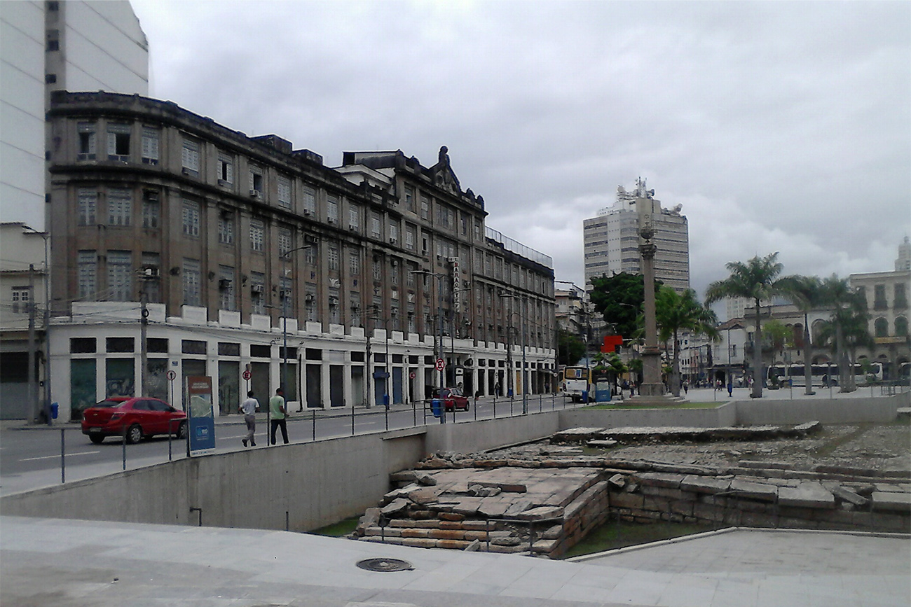
In 2011 an archeological site of global importance resurfaced in Rio de Janeiro: the Cais do Valongo (Valongo Wharf)—once the main port of entry for enslaved Africans in the Americas. Over the course of more than three centuries, the Portuguese colony of Brazil bought and exploited the largest number of African slaves in the Americas, with some estimates reaching over four million. In addition to layers of cobblestoned floor dating back two centuries, archeologists uncovered thousands of objects that belonged to the African slaves, such as amulets, rings, ceramics, smoking pipes, horns and shells, and copper coins. Six years after the excavation, in July 2017, UNESCO recognized the Cais do Valongo as a World Heritage Site, acknowledging its importance as a physical trace of a horrendous human history that should never be forgotten or repeated.
The archeologist Tania Andrade Lima, who worked on the Cais do Valongo excavation, once remarked that historical archeology is an antidote to social amnesia.[1] The anthropologist and historian Lilia Schwarcz suggested a similar idea when she stressed the importance of the Cais do Valongo as a “memory space” for contemporary Brazil, a country whose social dynamics and racial inequalities are profoundly marked by its violent colonial past.[2] Coined by French philosopher Pierre Nora, “memory space” refers to material sites and objects, as well as immaterial vestiges, that have a symbolic meaning for collective memory. According to Schwarcz, memory spaces are far from being natural, stable entities. On the contrary, a collective effort is required to create these spaces, invest them with symbolic meanings, and keep the memories they hold alive.
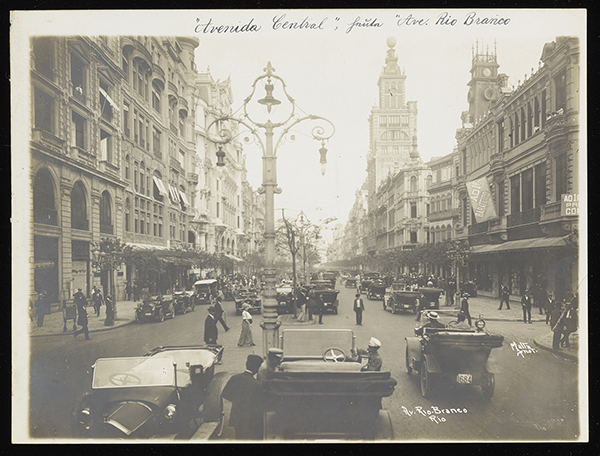
Archives and museums can be part of that effort, as they reveal forgotten histories through their collections and exhibitions. Such is the case for The Metropolis in Latin America: 1830–1930, on view at the Getty Research Institute until January 7, 2018, which looks at the transformation of six capitals in Latin America, including Rio de Janeiro, from colonial cities to modern metropolises. By highlighting important sociopolitical events—including a redevelopment campaign that erased the Cais do Valongo from public view—that shaped the urban plans of these cities, it tells the history of how memory spaces have been both hidden and revealed by cycles of construction and demolition.
While the story of the Cais do Valongo—from its use in the slave trade to its multiple renovations and relevance in the present day—is not told directly in The Metropolis in Latin America: 1830–1930, it is an essential part of Rio de Janeiro’s history. In recognition of its recent World Heritage Site designation, it is fitting to contribute to the construction of the Cais do Valongo as a memory space by telling that story here.
Covering up History
Even after gaining independence from Portugal in 1822, Brazil continued the practice of slavery and was the last country in the Americas to abolish it—in 1888, a year before becoming a republic. Beginning in 1811, the year of its construction, and through the next two decades of its operation, approximately a million Africans walked on the Cais do Valongo’s paved floors before being subjugated to the gruesome process of having their bodies exchanged for money.
The Cais do Valongo was initially paved using a technique common in colonial towns: pé de moleque, which literally translates to “boy’s foot.” Stones of irregular shape and size were arranged in a layer of sand that street children flattened by tramping on them. The pé de moleque was covered in granite blocks in 1843 for the arrival of Empress Teresa Cristina, from Sicily, who was betrothed to the Emperor of Brazil Dom Pedro II. The Cais do Valongo was renamed the Cais da Imperatriz (Empress Wharf) to conceal its past as a site of misery and mistreatment.
The wharf was completely covered again in 1911 as part of the urban renovation championed by the mayor of Rio de Janeiro, Francisco Pereira Passos, in his attempt to modernize the city as the capital of the young federal republic.
A century later, the Cais do Valongo was unearthed during the excavation phase of another urban renewal campaign that was part of an ambitious plan to renovate the historic port area of the city in anticipation of the 2016 Olympic Games.
The City at Large
The Metropolis in Latin America explores the urban renewal of Rio de Janeiro, promoted by the aforementioned Pereira Passos, the mayor of the city from 1902 to 1906, when Rio de Janeiro was still Brazil’s capital. Like his contemporaries, Pereira Passos was inspired by Baron Georges-Eugène Haussmann, the prefect of Paris between 1853 and 1870, who implemented an extensive urban renewal project in the French city half a century before. Pereira Passos’s changes not only affected the site of the Cais do Volango but also the former slaves and residents who lived nearby it.
Two Brazilian photographers documented the metamorphosis of the cityscape in Pereira Passos’s era. Marc Ferrez (1843–1923) and Augusto Malta (1864–1957) captured the recently opened carioca avenues, lined with eclectic Art Deco architecture, richly decorated iron lampposts, and sidewalks paved in mosaics of Portuguese stone. A careful eye, though, can notice that behind the elegant buildings, the photographs sometimes also captured low-rise, modest dwellings—the colonial adjacent to the modern.
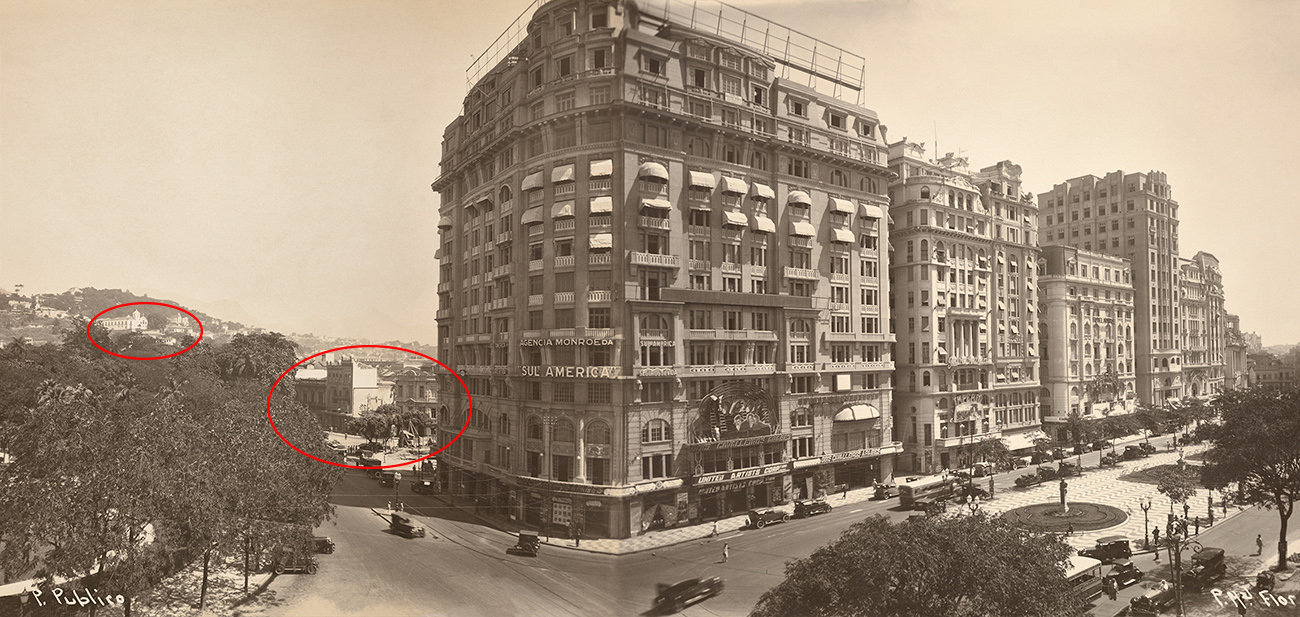
Major public works, including a sanitation system, and the beautification of the city came at the cost of large-scale demolitions of residential quarters and the displacement of their populations. While the affluent moved to salubrious neighborhoods at a distance from the city center and along the beaches, such as Botafogo and Copacabana, the lower classes were displaced to the outskirts of the city, forming the first favelas (shantytowns).
Freed slaves and their descendants were among these communities. After the abolition of slavery, freed urban slaves remained economically and socially marginalized, earning a precarious living as street vendors, blacksmiths, barbers, and domestic laborers. Many had initially settled in the harbor area near the Cais do Valongo, in the city center that was at the heart of Pereira Passos’s urban renewal project. They and other poor citizens were among those who least benefited from the modernization of the city at the turn of the twentieth century.
One hundred years later, the Cais do Valongo resurfaced from layers of dirt and forgetfulness to reveal the history of the African genocide that lasted for over three centuries in Brazil. Despite the destruction of documents and the covering up of architecture, the history of these spaces remains alive through archeological sites, artworks, photographs, maps, and written accounts and it is our moral responsibility to look, learn, and remember.[3]
Notes:
- Tania Andrade Lima, interview for the Institute of National Historical and Artistic Patrimony (IPHAN) of Rio de Janeiro.
- Lilia Schwarcz, “O Cais do Valongo. Lugares de memória: lembrar para não esquecer,” Nexo, July 31, 2017.
- The abolitionist senator Rui Barbosa (1849–1923), for example, signed a controversial decree to destroy government records on slavery that ex-slave owners could have used as aids for indemnification. After abolition, some people believed that slave owners suffered losses in granting freedom to their slaves and servants and therefore had the right to compensation. For more details, see Dain Borges, “Intellectuals and the Forgetting of Slavery in Brazil,” Annals of Scholarship 11 (1996): 41.
This essay originally appeared in the iris (CC BY 4.0)
Additional resources:
Ana Lucia Araujo, “Public Memory of Slavery in Brazil,” in Slavery, Memory and Identity: National Representations and Global Legacies, ed. Douglas Hamilton, Kate Hodgson, and Joel Quirk (London: Pickering & Chatto, 2012), 115–30.
Dain Borges, “Intellectuals and the Forgetting of Slavery in Brazil,” Annals of Scholarship 11 (1996).
Clarissa Diniz and Rafael C. Denis, Do Valongo à Favela: Imaginário e periferia (Rio de Janeiro: Odeon Instituto: Museu de Arte do Rio, 2015).
George Ermakoff, Augusto Malta e o Rio de Janeiro: 1903–1936 (Rio de Janeiro: G. Ermakoff Casa Editorial, 2009).
Annateresa Fabris and Solange F. Lima, Fotografia: Usos e funções no século XIX (São Paulo: Editora da Universidade de São Paulo, 2008).
Marc Ferrez, Robert Polidori, Shelley Rice, Angela Alonso, and Sergio Burgi, Rio (Göttingen: Steidl; São Paulo: Instituto Moreira Salles, 2015).
Boris Kossoy and Maria L. T. Carneiro, O Olhar Europeu: O negro na iconografia Brasileira do século XIX (São Paulo: Editora da Universidade de São Paulo, 2002).
Lilia Schwarcz, “O Cais do Valongo. Lugares de memória: lembrar para não esquecer,” Nexo, July 31, 2017.
Letícia Parente, Marca registrada
by PAULINA PARDO GAVIRIA
Trademark
Throughout the ten-minute duration of her video Marca registrada, Brazilian artist Letícia Parente sews the sole of her foot using a needle and thread. Stitched in capital letters, she writes the sentence “Made in Brasil,” as if sewing it as a trademark (the visual symbol or text used to represent a company or a product). Marca registrada translates from Portuguese into English as Trademark. In Parente’s video, the stitched trademark represents the Brazilian origin of a product, which in this case is not imprinted onto an industrial object but rather onto the artist’s skin.

Marca registrada exemplifies the use of new media that characterizes much contemporary art, as Parente records her actions in video and uses her body as the primary material of the work. Parente created this video in 1975 with a portable camera recording in black and white. Marca registrada specifically integrates body art (in which the physical presence of the artist is the main element of the work) and video art (an artistic medium that develops over time a recorded series of images and mimics the format of television). During its entire duration, Parente’s left foot and hands are the only visible parts of her body, and spectators are directed to look attentively at the manual skills of the artist.
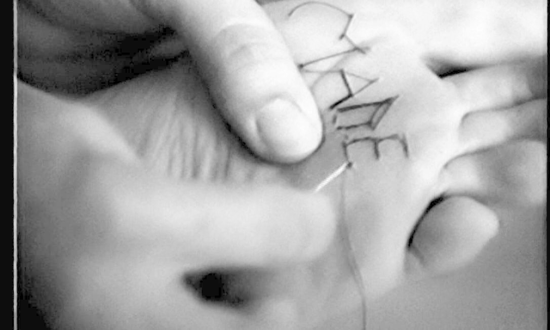
Pioneers of video in contemporary Brazilian art
Parente’s use of video for recording her actions was an innovative technique in the 1970s, since only a few of her peers used the medium of video as a tool for art-making. Fundamental to Parente’s artistic innovation was her relocation within Brazil. Parente was originally from Brazil’s northeastern region; she was born in Salvador and settled in the city of Fortaleza to develop her scientific career by working as a professor of chemistry. In 1969, she moved with two of her five children to Rio de Janeiro to attend graduate school and earn graduate degrees in inorganic chemistry.

It was while living in Rio that she met a group of artists who regularly used the workshop studios of the Museu de Arte Moderna and held weekly meetings as an independent artists’ group under the guidance of Anna Bella Geiger. Parente, Geiger, and others like Sonia Andrade and Ivens Machado were among the first artists in Brazil to produce and exhibit works of video art.
They usually deployed this medium to express their reflections about one’s own agency and their concerns for the limitations of civil rights, from the right to vote to the lawful application of justice. In Brazil, these artists were “pioneers of video art” because of their involvement with the medium at a time when portable video cameras were not commercially available in the country. Exhibited at the time to relatively small audiences, their work has recently been exhibited in different museums of modern and contemporary art around the world.
Made in “Brasil”
Although Parente’s Marca registrada can be compared with international, early examples of video art, her work has distinctive local characteristics. Comparable international examples to Parente’s videos are the practices of Korean artist Nam June Paik and U.S. artist Joan Jonas, both working in the U.S. However, Paik’s and Jonas’s works tend to emphasize the technological aspect of video, visible through the strategic adjustment of the image, as seen in Jonas’s Vertical Roll, and the manipulation of TV monitors, as seen in Paik’s Magnet TV.
Parente, on the other hand, does not manipulate the technological configuration of video but rather explores its conceptual possibilities. With her actions, Parente might be referring to the fact that as much as one’s own identity, as well as their nationality, can be a source of pain. She might also be referring to the impossibility of carrying, at that time, openly public discussions about the country’s socio-political situation. One of the most significant signs of the Brazilian origin in Parente’s video is the Portuguese spelling of Brazil (“Brasil”) during the last minutes of Marca registrada. Using her native language to inscribe the name of her country on the sole of her foot, Parente declares her personal identity while labeling her work: both her body and this video are made in Brazil.
Parente’s stitched statement reads both as a praise of her national and linguistic roots and as a critical response to the socio-political situation of her national context. By the time Parente created Marca registrada, Brazil’s military dictatorship (1964–85) had been in power for over a decade. This authoritarian government had closed congress and suspended civil rights, while at the same time carrying out a public campaign that promoted a positive perception of Brazil both inside and outside the country. Civil rights like suffrage (the right to vote) and habeas corpus (the right of a prisoner to appear before a judge) were suspended for ten years under a temporary constitutional amendment called Institutional Act No. 5.
Yet, the State simultaneously sponsored media advertisements seeking to foster a sense of national identity and stability. Through broadcast television, they highlighted, for example, Brazil’s victory in the 1970 World Cup and popularized the slogan “Brazil, love it or leave it.” While the content of Parente’s statement echoes these favorable campaigns popularly exalting the pride of national identification, her statement’s location on the sole of her foot also recalls forms of torture, particularly the practices that military officials used during Brazil’s dictatorship against civilians, like the application of electric shocks on the soles of the feet of political detainees.
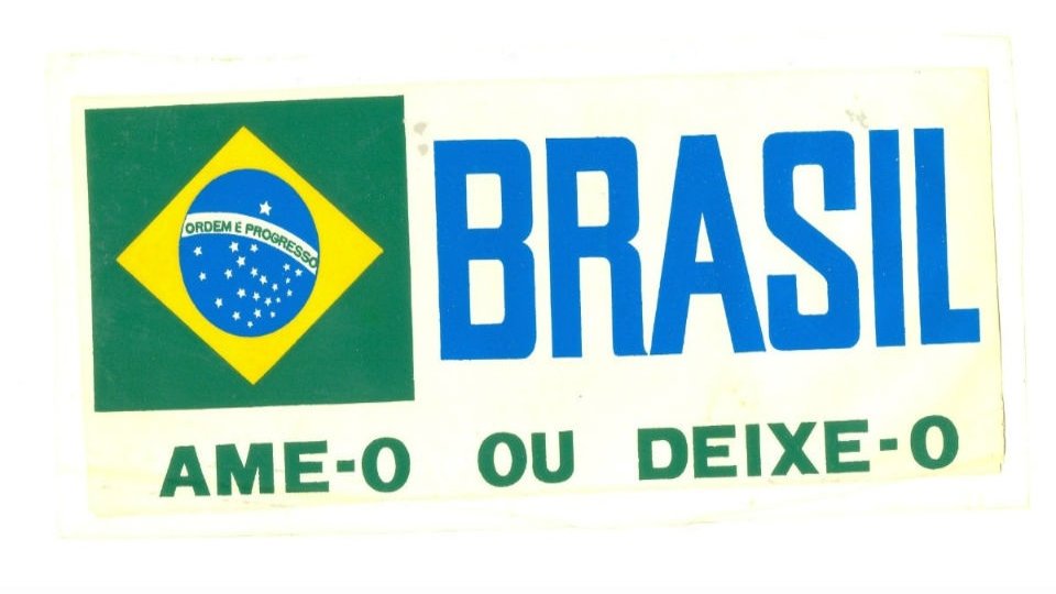
Through the spelling of Brazil in Marca registrada, Parente reclaims the name of her country—Brasil—and her own language—Portuguese—in a sentence that otherwise reads like an English trademark idiom, usually related to international commercial networks. The location of Parente’s statement on the sole of her foot and stored in a videotape also speaks to the potential of these trade networks to skirt censorship, much like in the work of another Brazilian artist, Cildo Meireles, whose Coca-Cola Project presents ideological statements only visible when the Coca-Cola bottles inscribed by Meireles were filled.
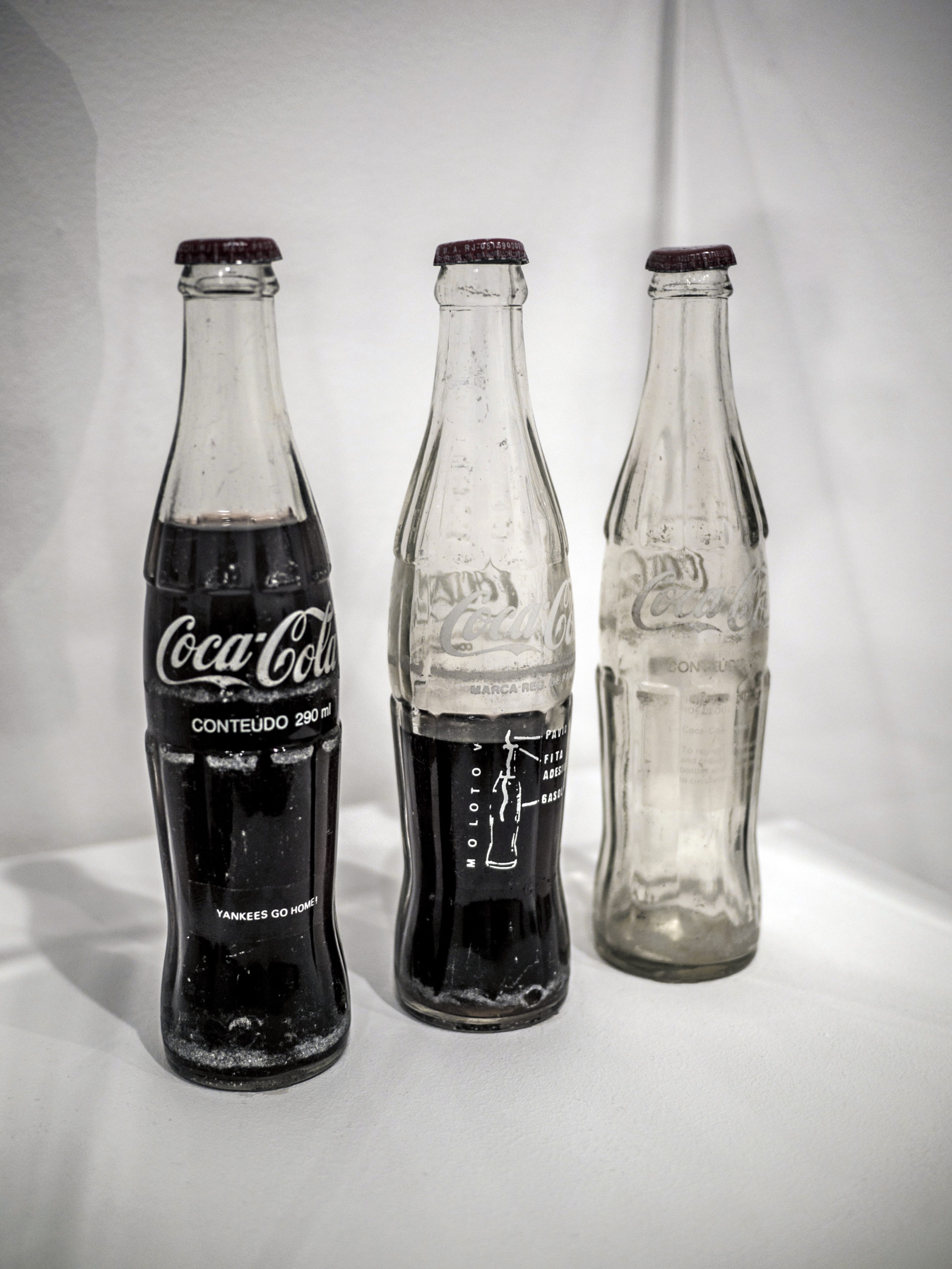
Yet, stitched on her skin, Parente’s laborious enunciation takes on a personal aspect, as well as one that is unmistakably violent. Created at a time of governmental repression and torture, Marca registrada demonstrates that identifying one’s creative work and physical body with the name of the country becomes a painful action only accessible through a black-and-white recorded videotape.
Additional resources:
Watch Marca registrada
Read more about Cildo Meireles’ Coca-Cola Project at the Tate museum
Read more about Anna Bella Geiger at the Hammer Museum
Nick Fitch and Anne-Sophie Dinant, “‘Situações-Limites’: the emergence of video art in Brazil in the 1970s.” Moving Image Review & Art Journal 1:1 (2012): 59-67
Myriam Gurba, “Images of Torture in Videos by Letícia Parente in Radical Women.” Hammer Museum Blog. Last modified November 21, 2017
Mick Hartney, “Video Art .” Grove Art Online. 2003. Accessed November 20, 2019
Arlindo Machado, ed., Made in Brasil: três décadas do vídeo brasileiro (São Paulo: Iluminuras: Itaú Cultural, 2007)
André and Katia Maciel Parente, Letícia Parente: Arqueologia do cotidiano: objetos de uso (Rio de Janeiro: Oi Futuro, 2011)
International Style architecture in Mexico and Brazil
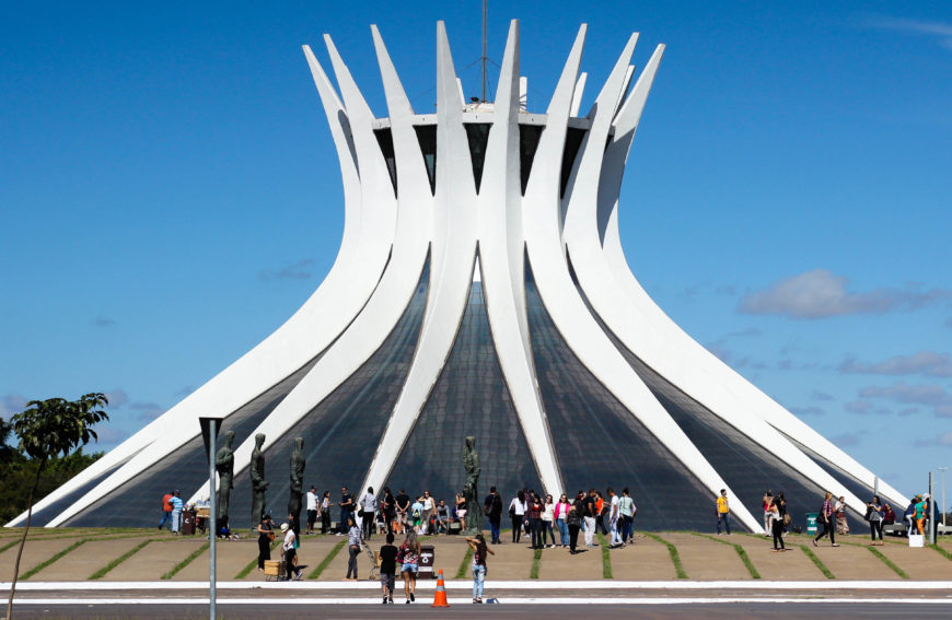
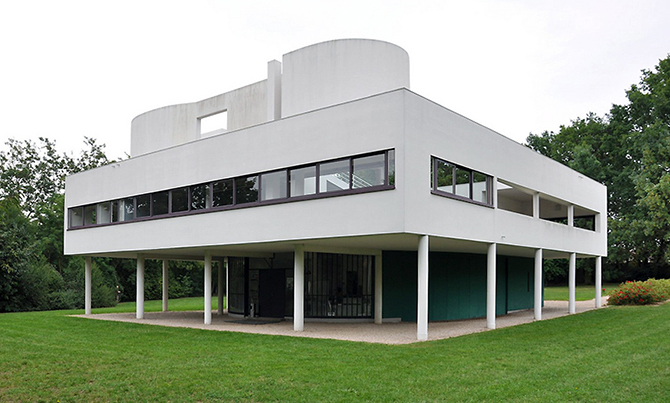
In Latin America, the International Style of architecture flourished in the mid-twentieth century, replacing the classicism of the previous decades. Countries with booming economies and nation-building efforts embraced international abstraction as an alternative to indigenism. The International Style is a general term that refers to modern architecture often stripped of ornamentation to reveal the beauty of its structural form. Designs are often use reinforced concrete and brise soleil walls. As exemplified by the Swiss architect Le Corbusier, the International Style consisted of a functional style of architecture, through which purpose dictates form. Devoid of ornament, the exterior of many of these buildings feature geometric design, modular units, and clean lines. The style transformed Latin American cities, like Mexico City and Brasília, into modern metropoles.
The International Style in Mexico City
In Mexico, Juan O’Gorman designed housing projects to accommodate the rapid urbanization of Mexico City, as well as private residences, among them the house and studio of the artists Diego Rivera and Frida Kahlo. The large windows and the modular units of square panels of glass are typical characteristics of the International Style, not to mention highly functional in the context of artists’ studios.
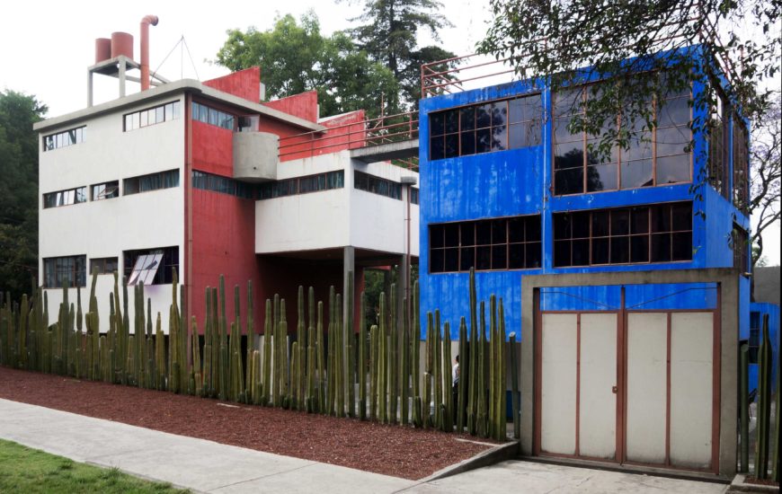
An important feature of the house was the rooftop bridge, which connected the larger red house that belonged to Rivera with the smaller blue house that belonged to Kahlo (and refers to La Casa Azul, “The Blue House,” in which she grew up in Coyoacán). The horizontality of the bridge railings, which paralleled that of the window panes, was a typical feature of the International Style, as were the supporting pilotis (or piers) on the ground floor, which elevated the house and provided parking space, as exemplified in the Villa Savoye (1931) by Le Corbusier.
The population of Mexico City grew rapidly between 1940 to 1960, increasing from 1.7 million to 5.4 million people. In order to accommodate this exploding population, housing developments, such as Satellite City, sprouted up throughout Mexico City. Designed by Mario Pani, who also designed the campus of the National Autonomous University of Mexico (UNAM), this self-sufficient urban enclave catered primarily to the middle class.
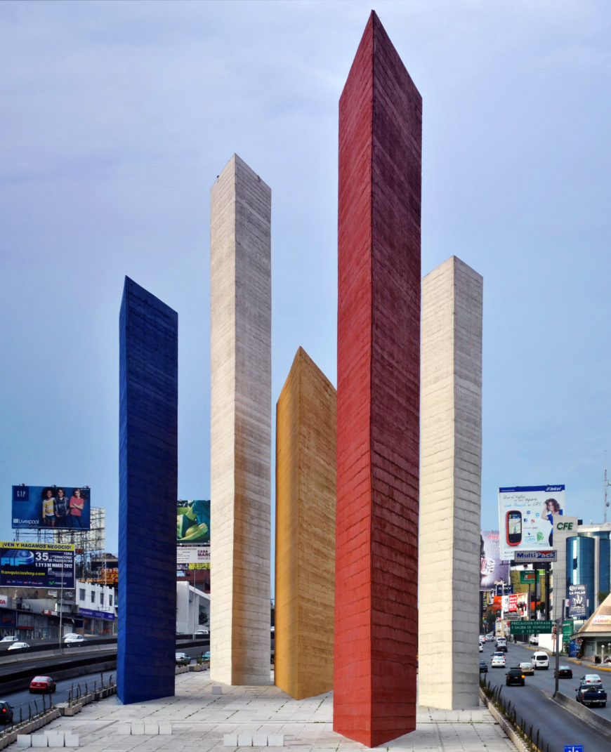
At the entrance to the city, the German émigré artist Mathias Goeritz and the Mexican architect Luis Barragán created The Towers of Satellite City, a work that “would mark the origin point of Mexico City’s mid-century middle-class expansion to the north.”[1] The monument consists of five wedge-shaped structures that rise more than 100 feet, and they demonstrate the artists’ abandonment of figuration. Varying in height, placement, and shape, they recreate an urban landscape through which their spatial relation with the viewer changes according to movement, an effect that is further dramatized by passing drivers. Goeritz further elaborated on the importance of abstraction in civic architecture in his “Emotional Nature” manifesto, in which he called for “a spiritual uplifting” in architecture.
Tropical modernism
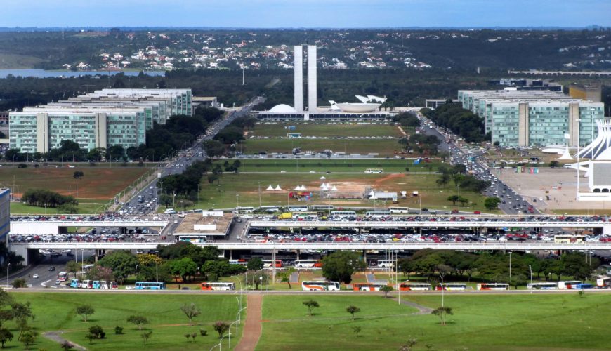
Perhaps the greatest monuments of the International Style in Latin America can be seen in Brasília. The capital city of modern-day Brazil was created between 1956 and 1960 by the famed Brazilian architect Oscar Niemeyer. Niemeyer first met Le Corbusier in 1929, when the French architect traveled to Rio de Janeiro as part of his first trip to South America, which also included visits to Argentina and Uruguay.
Transforming the horizontals and verticals of Le Corbusier into sweeping curves and spires, Niemeyer articulated a unique and modern architectural vision for Brazil. This was partly due to the influence of his mentor, Lúcio Costa, who advocated for a synthesis of Modernism and Brasilidade (“Brazilian-ness”), a “tropical modernism,” that presented a view of an industrially modern, yet exotic country. Like the Mexican Muralists, Niemeyer was empowered by the government, who showered him with commissions for architectural projects in emerging cities like Pampulha and Brasília.
Pampulha
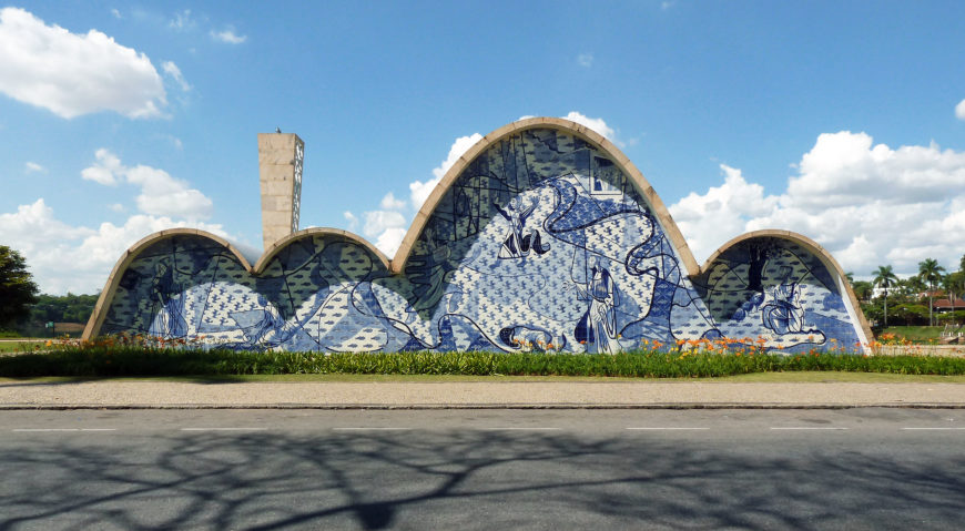
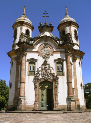
Pampulha was established as a resort community near a lake of the same name. Pampulha served as the vacation destination for residents of the surrounding city of Belo Horizonte and of Brasília. Among the many buildings designed by Niemeyer, the Church of Saint Francis of Assisi demonstrates his iconic use of curves, made possible through reinforced concrete. Niemeyer was building the curvilinear forms that characterized the Brazilian Baroque style from centuries earlier—particularly the work of Antonio Francisco Lisboa, who designed the Church of São Francisco de Assis in Ouro Prêto. The curves also echo the topography of Brazil, and Niemeyer dramatized his structure further by having the entire church plan consist of a single vaulted nave. This provides an intimate atmosphere for worship. It also prevents the interruption of form between wall and ceiling. Still, some residents of Pampulha resented the simplicity of Niemeyer’s design. Candido Portinari, on the other hand, who created murals based on the life of Saint Francis for both the interior and exterior of the church, benefitted from Niemeyer’s curved design, which provided an ideal surface for his murals.
Brasília
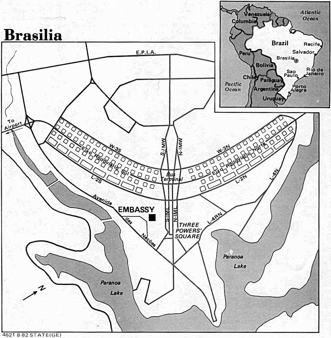
Literally built from scratch, Brasília was to showcase the modernity of a newly industrialized country, as encapsulated by its slogan “fifty years of progress in five.” The urban planning was entrusted to Lúcio Costa, while the development of government, religious, and domestic buildings was assigned to Niemeyer. Costa’s design, called the Pilot Plan, separated civic spaces from those meant for residential living. The civic spaces are arranged on an “x” axis, while blocks of housing units for 500,000 people were constructed on a “y” axis for the city.
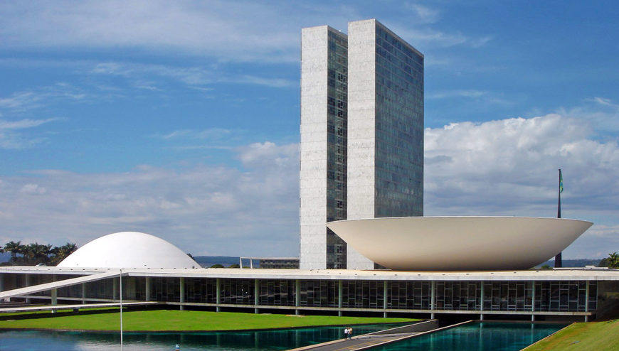
At the civic center, known as the Plaza of the Three Powers, Niemeyer situated the legislative, executive, and judicial buildings in close proximity to one another. The National Congress, which houses the legislative branch, consisted of a one-story structure topped with two opposing half-circles, a dome, which marked the Senate, and a bowl, the Chamber of Deputies. While the horizontality of the National Congress contrasts with the curvature of the bowl and the dome, it also intersects with the verticality of the two administrative buildings, prominently placed behind it. A powerful play on shape and line, Niemeyer further dramatizes the layout by adding ramps onto which visitors can approach the dome and bowl not only at street level, but also from the rooftop.
Notes
[1] Jennifer Josten, Mathias Goeritz: Modernist Art and Architecture in Cold War Mexico (New Haven: Yale University Press, 2018), 139


