
6.4: Books in Medieval Europe
- Page ID
- 67077

Books in medieval Europe
The hand-made books of the Middle Ages are known as manuscripts.
c. 330 - 1300 C.E.
A beginner’s guide to books in medieval Europe
More medieval books survive from the Middle Ages than any other artistic medium.
c. 330 - 1300 C.E.
Recording and disseminating information is quick and easy today, but in the Middle Ages this process was slow and laborious. Monastic libraries housed most books and all books were copied by hand, usually by monks. This process of copying and disseminating books was essential to the preservation of knowledge.
Medieval manuscripts, an introduction

What survives

More medieval books survive from the Middle Ages than any other artistic medium. Scholars refer to the hand-made books of the Middle Ages as manuscripts. Books that contain artistic decoration are called illuminated manuscripts. Manuscripts that survive from the European Middle Ages are generally religious books that reflect the canon, doctrine and practices of Christianity, though there are Jewish and Muslim books and other types of books that survive from this time period as well.
The codex vs. the scroll
A medieval manuscript is a codex (pl. codices), meaning a book made of pages bound between two boards. Ancient scribes wrote on scrolls that were stored in boxes. These ancient scrolls only survive in occasional fragments, as a scroll is especially vulnerable to physical degradation. The pages of codices, on the other hand, are protected by their covers and have a much greater chance for survival. Thus, medieval books survive in large numbers.
Where to see medieval manuscripts
The Bibliothèque nationale de France in Paris and the British Library in London house the world’s largest collections of medieval manuscripts. Though normally only available to scholars, many museums and libraries put some of their manuscript treasures on display. Digitizing, or creating high quality digital images of manuscripts, is increasingly common and these images are normally available on the Internet, furthering the study of these medieval books.
What’s in the books
The original manuscripts of the Bible, the works of Aristotle and Plato and other ancient writers do not survive. They are known today because medieval scribes diligently copied them.
A slow and laborious process
Recording and disseminating information is quick and easy today, but in the Middle Ages this process was slow and laborious. Monastery libraries housed most books and all books were copied by hand, usually by monks. This process of copying and disseminating books was essential to the preservation of knowledge.
Some monks traveled to distant monasteries to view and copy books to bring back to their own monastery’s library. Fires destroyed many medieval libraries and the books they housed. Because of this and other accidents of history, not all texts survived the Middle Ages. The Name of the Rose, a novel by Umberto Eco, imagines such a fate for Aristotle’s lost work on poetics.
Books & Christianity
Books were essential to the practice of Christianity. Medieval Christian missionaries, such as St. Augustine of Canterbury, brought books with them as they traveled from place to place preaching and establishing new churches. The Gospel Book of St. Augustine survives today in the Parker Library of Corpus Christi College, Cambridge. It contains the text of the gospels—Matthew, Mark, Luke and John of the New Testament—an essential work for teaching potential converts about the life of Christ. A series of images illustrating the life of Christ prefaces the text and each book of the gospels begins with an illustration detailing the events unique to that gospel, though some of these are now lost.
Illustrations
The oldest illuminated manuscripts are among the oldest manuscripts in existence. The illustration of books was functional as well as decorative. Illuminated initials and painted miniatures marked the beginnings of important sections in the text and allowed readers to navigate the book.
Prefatory image cycles prepared the mind of the reader to engage with the text. Some illustrations elaborate doctrines, record events or simply tell stories. Even readers’ doodles are intriguing to contemporary scholars.
Word and image
In illuminated manuscripts, words and images worked together to inform the medieval reader and occasionally these readers left their own mark. These books are highly interactive. Nearly all medieval manuscripts provide ample space in the margins for readers’ notes and comments. In this way, illuminated manuscripts are different from other types of media in that they provided spaces for readers to record their reactions to image and text.
Manuscripts: major works of art
Video \(\PageIndex{1}\): Video from the J. Paul Getty Museum
Making manuscripts
Video \(\PageIndex{2}\): Video from the J. Paul Getty Museum
The Bestiary
A book of beasts

Have you ever heard that elephants are afraid of mice? Or that foxes are deceptive? These characterizations of animals come from a medieval book called the Bestiary, or Book of Beasts. Though these books are not known to many today, you are likely familiar with some of their content. The magical beasts in the Harry Potter series come directly from medieval bestiaries. Descriptions of unicorns, phoenixes, basilisks, and centaurs are all included in the text, but misspell “bestiary” in a Google search and you will likely regret it.
The Bestiary is a medieval encyclopedia that identifies a selection of animals, plants, and precious stones. Some really exist in nature and others do not. Each entry includes a physical description, an overview of the animal’s supposed characteristics, and a run-down of its moral qualities. Many versions of these books include illustrations. Its worth keeping in mind that Bestiaries pre-date the printing press. They were copied by hand at different times and places, resulting in a wide range of variations.

From a Christian perspective
The lack of scientific information in each entry makes them entertaining to read. For example, the Bestiary text describes the beaver as a gentle animal whose testicles are valued for their medicinal properties. If a beaver senses that he is being hunted, he will bite off his testicles and throw them to the hunter to save his own life. If a beaver has already done this and is hunted again, he will stand on his hind legs and show the hunter that his testicles are already missing and the hunter will let him go. The text then goes on to give a Christian moralization of the beaver, stating that “every man who heeds God’s commandment and wishes to live chastely should cut off all his vices and shameless acts, and cast them from him into the face of the devil” (source).
Sources

The Bestiary text is made up of several components. The bulk of the text comes from the Physiologus, a second century Greek text by an anonymous author. Relevant comments by other ancient authors such as Aristotle, Herodotus, Pliny the Elder, and Aelian are also included. The Etymologiae of Isidore of Seville, the late fifth and sixth century Archbishop, constitute a significant portion of the text. Layers of Christian commentary and moralizations were added to those earlier texts.
Content
The Bestiary begins with a retelling of the creation story from Genesis. An important event is Adam, the first man, naming all of the animals. This scene is often included in illustrated Bestiaries. Isidore of Seville believed that the names of animals were significant. He believed that an etymological study of each animal’s name would reveal something about the nature of each animal.
The content of the Bestiary, particularly the moralizations on the animals, is echoed in many medieval texts, from sermons to stories. Chaucer’s “Nun’s Priest’s Tale,” an animal story from the Canterbury Tales, makes use of the Bestiary. The main characters are a sly, deceptive fox and Chanticleer, a foolish and egotistical rooster.
Illustrations
The Bestiary was an enormously popular book in the Middle Ages and more than 130 medieval copies survive today. These copies come from all over Western Europe. The earliest manuscripts date from the tenth century and many survive from the thirteenth and fourteenth centuries. Many illustrations were drawn by artists who had never seen the relevant animal, but used the physical descriptions as a guide. The Bestiary text was influential, but these portable illustrations of animals were equally influential and likely served as models for animals in other manuscript illustrations, stone carving, wall painting, stained glass, and other media.
A Global Middle Ages through the Pages of Decorated Books
Manuscripts and printed books—like today’s museums, archives, and libraries—provide glimpses into how people have perceived the Earth, its many cultures, and everyone’s place in it. Toward a Global Middle Ages: Encountering the World through Illuminated Manuscripts, a new book from Getty Publications, invites you to explore this theme, presenting a range of book types from premodern Africa, Europe, Asia, the Americas, and Austronesia.
The production of books is a collaborative undertaking. In the premodern period, this process could involve the makers of writing surfaces, binding supports, scribes, procurers and creators of pigment, merchants, artists, patrons, and eventually the readers, viewers, or listeners. Toward a Global Middle Ages includes essays by twenty-six authors who are specialists of the art of the book.
Whose Middle Ages?
What do we mean by a global Middle Ages (or medieval period)? Writing about the Middle Ages has traditionally centered on the Jewish, Christian, and Muslim communities in Europe, Western Asia, and the greater Mediterranean between the years 500 and 1500. The term “Middle Ages” was used in the nineteenth century to describe a medium aevum, a middle age between the Roman Empire and the Renaissance.
For decades, scholars have challenged this Eurocentric view of the past, turning attention to a global Middle Ages that includes Africa, Asia, the Americas, and Austronesia. Some of these scholars seek to uncover networks, pathways, routes, or links between people and places. In doing so, an aim has been to reveal the lives of those who have been silenced by history or tradition: women, enslaved individuals, Indigenous peoples, queer or disabled groups. Others take a comparative approach, examining similar phenomena in different places at the same time or over time. Toward a Global Middle Ages expands upon these perspectives.
There are also discussions about the meaning of “global” at a local level, and whether it is possible to speak of early globalities prior to the sustained transatlantic contacts between Europe, the Americas, and Africa in the late fifteenth century (it should be acknowledged that the latter view still largely centers on Europe—as indicated below and in the volume, peoples of northeastern China and Siberia had contacts with First Nation peoples, including those who inhabited the Aleutian Islands).
Some scholars select a hemispheric focus—referring to a hemispheric Middle Ages—that concentrates on Africa, Europe, and Asia on the one hand, and the Americas on the other. With this approach, we can still find connections through comparisons if we look to astronomy or astrology, for example, as I discuss in Toward a Global Middle Ages and have outlined briefly before; we might also consider global climate change (evidenced through ice cores and testimony from manuscripts or oral traditions) and the spread of diseases or the relationship between botany and linguistic development of words for popular trade goods, such as sweet potato or tea. Whichever methodology seems most applicable to the scope of a given study, one recommendation is to continually resist Eurocentrism and to cross boundaries—of periodization, discipline or specialization, historical or present-day geography, language (of documents and of academic training), and so forth.
It takes time to redirect the writing of history. The authors of this book therefore describe what we do as working toward a global Middle Ages.
Paper, Parchment, and Palm Leaves
Books were key modes of cultural expression and exchange throughout the Middle Ages. Manuscript means “handwritten,” from the Latin words manus (“hand”) and scriptus (“written”). Lavish examples were often embellished with metallic leaf or paint that shimmered in the light, which gives us the term “illuminated.” Print technology allowed images and texts to be replicated, and some global traditions combined manuscript and print.
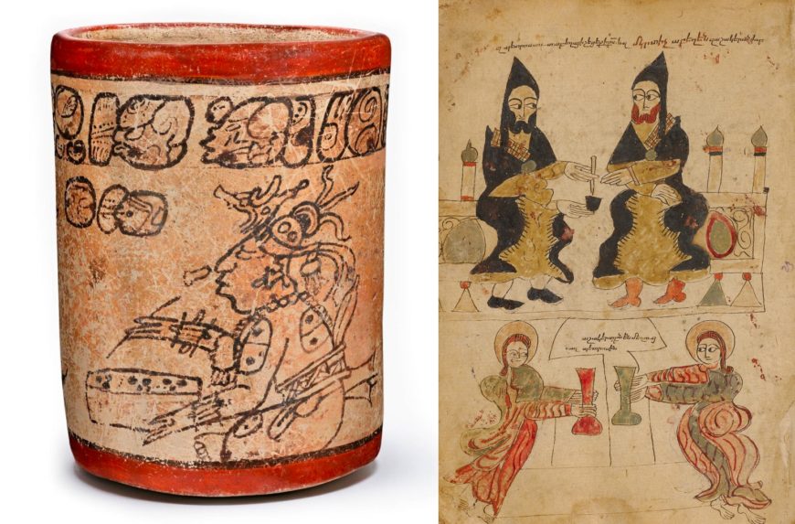
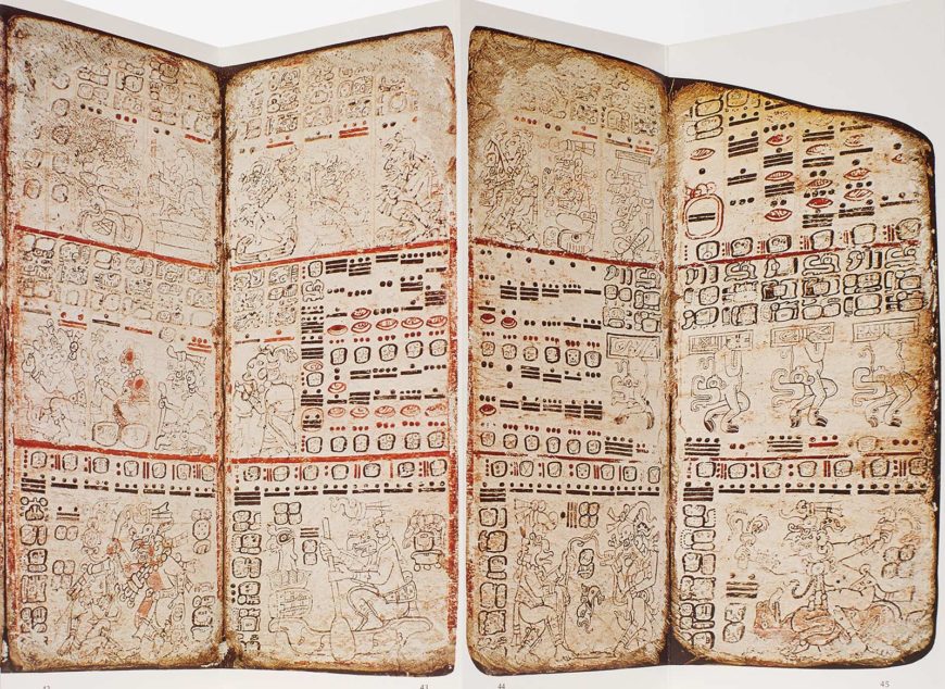
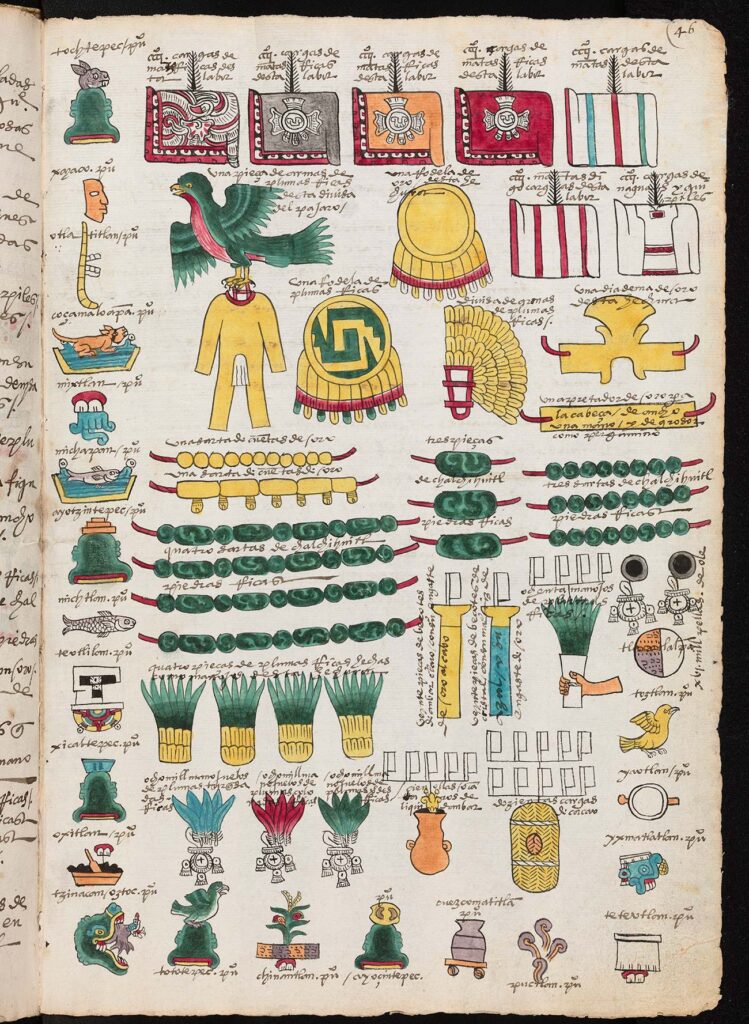
Across Afro-Eurasia, the Americas, and Austronesia during the medieval period, bookmakers used a variety of supports and structures, including paper, parchment, and palm leaves. Each of these could be gathered together in various ways: bound as a codex, rolled as a scroll, or folded as an album. In some instances, we have to look at other types of artworks for glimpses of book or writing traditions (as with the Maya, whose long history of codex creation was decimated by the Spanish conquest yet ceramic vessels provide evidence for early manuscript production in Mesoamerica). The examples shown in this post hint at the diversity of book types and formats.
Manuscripts and books operated alongside other forms of literacy and visual storytelling throughout the Middle Ages. These include glyphic and graphic examples—characters or symbols carved or painted onto a surface, such as stone, ceramic, or the body—as well as oral traditions and memory aids. Such varied objects shed light on the many ways in which the book, broadly defined, functioned in multiple contexts in the past, and on the relationship between the visual arts and language, storytelling, and the commemoration of the past.
A World Without a Center
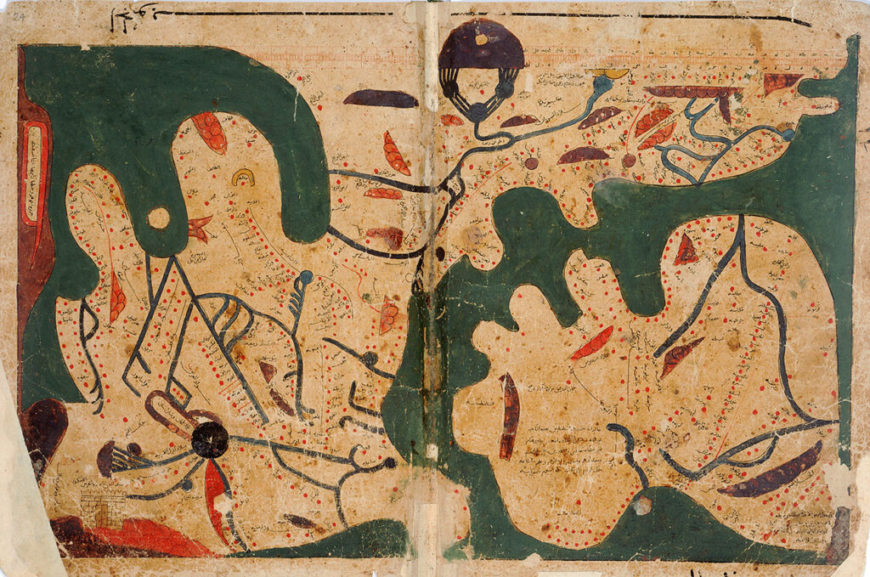
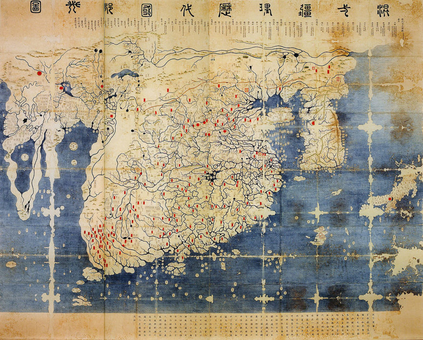
Maps are another focus of the new publication. Like manuscripts, maps present world views, including views of self and others; they also change frequently and are often political.
Fascinating parallels emerge when looking at maps across cultures. The 11th-century “Book of Curiosities” from Egypt, for example, describes legendary peoples and creatures that also appear in a 13th-century European compendium of Latin texts. The Ottoman admiral-mapmaker Piri Reis and the Korean scholar Kwon Kun created maps that include portions of the Americas (Brazil and the Aleutian Islands of present-day Alaska, respectively).
Mapping can also take many forms. On the Shoshone-Bannock Map Rock in Idaho, for example, Indigenous mapmakers charted astrological and geographic information onto the surface of rocks. The 1542 Codex Mendoza features a Nahua map of the Aztec capital of Tenochtitlan and visualizes the tribute from the provinces as luxury items of jade and feathers.

Through these and many other examples of maps, manuscripts, and related book arts, Toward a Global Middle Ages demonstrates that geographic and cultural boundaries were and are porous, fluid, and permeable.
My co-authors and I hope this new book contributes to the vibrant conversations about a global Middle Ages, and to the role of manuscripts and visual culture in these conversations. I welcome comments and questions about the book and its themes, and particularly hope it can be of use to instructors and students—see the resource list below, prepared with research and classroom use in mind.

This essay first appeared on the iris (CC BY 4.0).
Additional resources
Download a resource list for Toward a Global Middle Ages, including the table of contents, related Getty online resources, and a list of manuscripts and books discussed in the book.
Toward a Global Middle Ages: Encountering the World through Illuminated Manuscripts, ed. Bryan C. Keene (Los Angeles: The J. Paul Getty Museum, 2019)
Catherine Holmes and Naomi Standen, “Introduction: Towards a Global Middle Ages,” Past & Present, vol. 238 (November 2018), pp. 1–44
Visions of Paradise in a Global Middle Ages
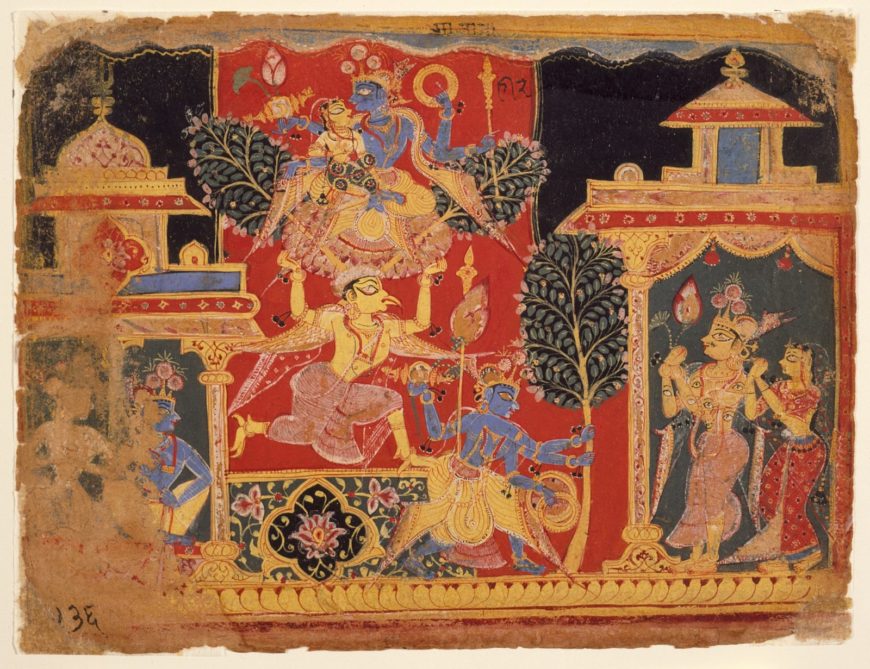
The word “paradise” often describes an idyllic place of unmatched beauty, but it can also refer to a mindset of harmony and bliss. Several world religions share these conceptions of paradise, but the paths for locating it—whether in a physical environment, a metaphysical realm like heaven, or a state of transcendence—have varied greatly. The image above shows the blue-skinned Hindu deity Krishna (an incarnation of Vishnu, “the preserver”) transplanting the sacred parijata tree from heaven. He carries the plant to earth along with his wife Satyabhama, who ride together atop an eagle-like mythical being called Garuda. At right, the many-eyed god Indra and his consort witness the event.
The exhibition Pathways to Paradise: Medieval India and Europe (2018) presented a selection of illuminated manuscripts and luxury objects from Asia, Africa, and Europe that communicate the spiritual quests of individuals who sought sacred groves, providential gems, and guides to enlightenment. This essay introduces several of the objects from the exhibition.
A Global Middle Ages
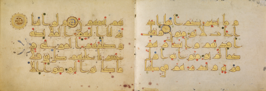
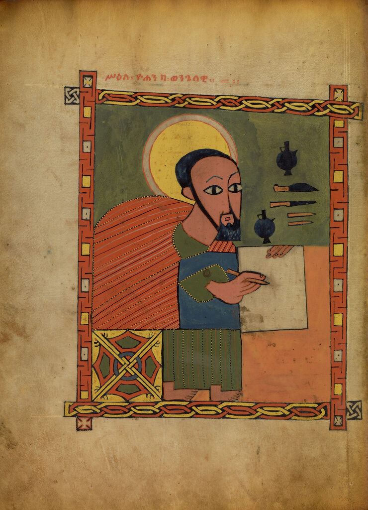
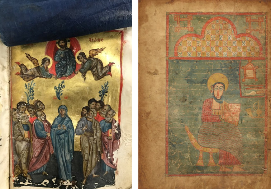
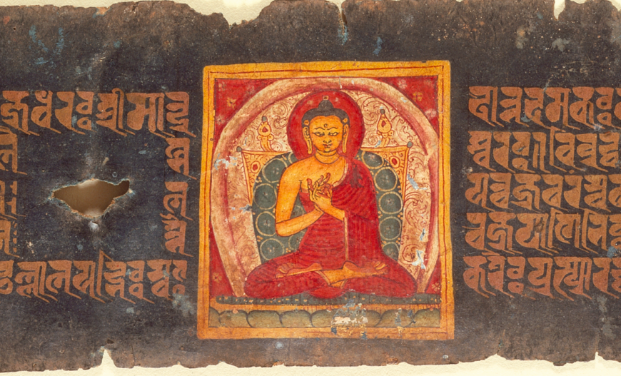
The majority of the manuscripts in the Getty’s collection were produced in Western Europe from the ninth through the sixteenth century, with additional examples from important centers of the Byzantine world (the Eastern Roman Empire), Armenia, Ethiopia, and elsewhere. Exhibitions allow us to expand the traditional narratives about a European Middle Ages to consider a global Middle Ages of trasnational connections. By doing so, our holdings of a ninth-century Qur’an from Tunisia (above), a silk veil in a thirteenth-century Byzantine Gospel book, and a page from a fifteenth-century Gospel book from Ethiopia (both below) find new relationships alongside leaves from Buddhist manuscripts on loan from the Los Angeles County Museum of Art—all of which include areas painted or dyed with the blue pigment indigo, which was largely sourced in India at the time.
Empires in the Indian subcontinent, the Hindu Kush, and the Tibetan or Himalayan Plateau shared intertwined histories with principalities to the west, from the Greeks and Romans to the Persianate, Christian, and Islamic kingdoms of Central Asia or East Africa. Similarly, peoples throughout Europe and the Mediterranean had contact with and developed imagined ideas about the land of India—its peoples, religions, and natural wonders—since ancient times. Art from Gandhara (present-day Pakistan and Afghanistan), for example, combined elements from Greece, Rome, Persia, and local traditions, demonstrating the long history of contact at this crossroads of civilizations.
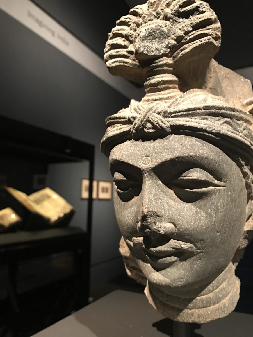
In the exhibition, a beautifully carved Gandharan head of a bodhisattva—an enlightened follower of the Buddha who helps others reach Nirvana (release from cycles of desire and suffering)—greets visitors upon entering the gallery. A mostly complete statue from the Norton Simon Museum gives a sense of the various cultural influences (the bodhisattva Maitreya wears a Greco-Roman style toga), and a relief from LACMA shows Buddha Shakyamuni seated near a Corinthian column, another instance of Roman inspiration.
The Middle Ages (about 500–1500) witnessed increased movement between Europe, Byzantium, the Islamic world, and India. One of the historical figures whose legacy links these cultures is Alexander the Great (356–323 B.C.E.), whose military campaigns took him from Macedonia to Northwest India. This range explains some of the transculturation in art from regions like Gandhara. Few contemporary accounts survive about the Macedonian world ruler, but classical and medieval writers in Europe, Central Asia, and India preserved his memory through histories, chronicles, and romances.
Rudolf von Ems (about 1200–1254) based this German World Chronicle on Roman sources, which cast Alexander as an ideal ruler from “the East.” According to the text, Alexander sought the mythical earthly paradise during his military campaigns across Asia. On one journey, an elderly man presented the ruler with a precious gem said to be from paradise, which weighed more than any other jewel. When the stone was ground into a powder, it became light and worthless. The message to Alexander was that his reign would be great in life but forgotten in death, a paradox given his enduring fame today.
The cross-cultural legacy of Alexander the Great is also present in a fifteenth century Persian text from Iran called the Khamsa of Nizami (1141–1209). Following military campaigns in Eastern Africa, India, and China, the world-ruler Iskandar (Persian for Alexander the Great) began a journey to find the Fountain of Immortality. Nizami wrote that the magical youth-granting waters flowed from the North Pole. The prophets Khizar and Ilyas guide Iskandar through a place called the Land of Gloom or Darkness but they also conceal the stream of the Fountain. The rich traditions for illuminated manuscripts about Alexander/Iskandar connected distant regions of Eurasia from ancient to Early Modern times, especially episodes about his more fantastic exploits or encounters, such as his journeys under the sea or into the sky.
Mapping the Premodern World: A View from Europe
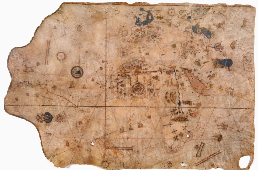
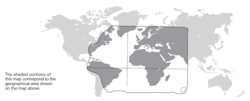
A nearly-five-foot-long map designed by cartographer Vesconte Maggiolo (1478–1530) in 1516 provides a point of connection. From India and Central Asia in the East to the Caribbean and the Americas to the West, the map presents an extensive view of the world as understood by a man living in Naples in the early sixteenth century (explore a high-resolution version of the map here).
Across Afro-Eurasia, Vesconte Maggiolo depicted tents and enthroned rulers to mark the major kingdoms known to him, including Morocco, France, and Persia. Multicolored islands indicate fabled sites of gem mining, silk production, and the spice trade, all of which derive from a long literary and visual tradition in the Mediterranean. A roundel of the Virgin and Child, situated in the Atlantic Ocean near several ships returning to Europe, suggests the missionary and mercantile agendas of the period.
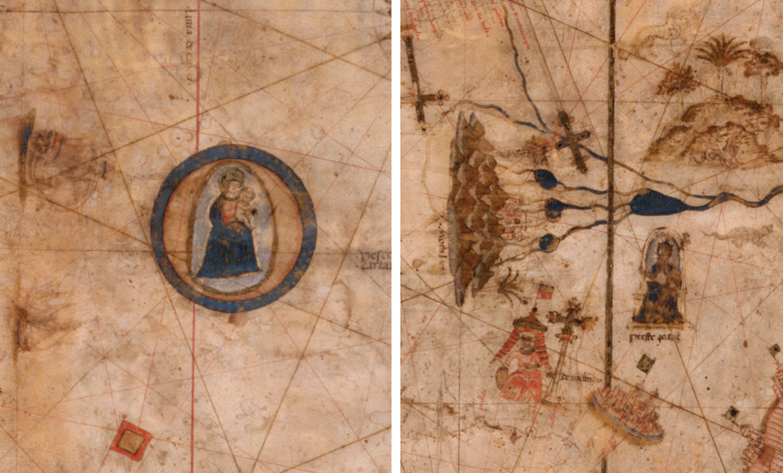
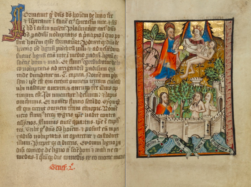
On the map, the earthly paradise known as the Garden of Eden emerges in the kingdom of Prester John, a mythical Christian king shown here in Africa (in the vicinity of Ethiopia) but who was also associated with India or lands farther east. The biblical book of Genesis describes the paradisiacal garden at the source of four rivers: the Pison (possibly in Syria), the Gihon (said to be in Ethiopia), and the Tigris and Euphrates (in ancient Mesopotamia, primarily in present-day Iraq). The artist of a devotional manuscript made in East Anglia, England labeled the rivers and showed them surging forth from a walled orchard where God placed Adam and Eve.
The Dominican writer Vincent of Beauvais (1184–1264) wrote a comprehensive world history that began with the biblical creation story and extended to the year 1254. He derived his knowledge of the East from a range of sources, including the Roman author Solonius (third century) and the Franciscan missionary John of Plano Carpini (about 1185–1252). Accordingly, Vincent of Beauvais locates the Garden of Eden not in Ethiopia but beyond the land of India and the Island of Taprobane (Sri Lanka). In other words, paradise was a place that was virtually inaccessible in the spatial imagination of sedentary writers, readers, and viewers in Europe.
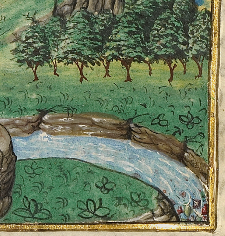
Based on the descriptions in the text, the illuminator rendered an elephant, a griffin, and blue-skinned people wearing indigo-dyed clothing. Additionally, the author mentions exports from East Asia that include spices and ivory, as well as gems believed to come from the rivers of paradise (the detail shows purple, red, and green jewels within one of the rivulets). The relationship between gems and India is a theme explored in the exhibition through a range of objects produced from the Rhine-Meuse region in Europe to Jammu and Kashmir in India.
Infinite Gems: The Auspicious Çintemani
People, manuscripts, and luxury items moved with considerable frequency throughout the premodern world. An ivory plaque (middle row, below, second from left), for example, likely came from the tusk of an African elephant, and once carved, it adorned the cover of a Gospel book from Central Europe. The colored glass pieces were likely meant to simulate rubies and emeralds, precious gemstones often sourced from Central Asia and India, and which symbolically referred to descriptions of Heavenly Jerusalem in the Book of Revelation.
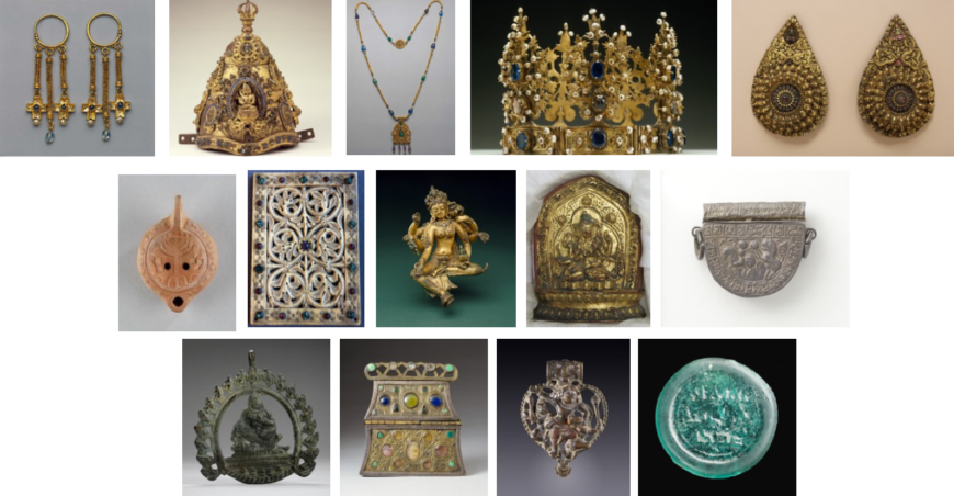
Other raw materials such as sapphires, turquoise, gold, and silver were especially prized trade goods. Many cultures and religions ascribe magical or healing properties to gems or metals, and these associations often involved ideas about the divine and the afterlife. While some precious goods—such as jewelry, amulets, and reliquaries—were highly portable and therefore had the potential to traverse great distances, other objects—including crowns, oil lamps, and votive statues—could serve local audiences at court, in temples, or in shrines.
Buddhist priests in Nepal, for example, wore crowns shaped to recall the division of the universe into earth, atmosphere, and heaven, a cosmological theme complemented by gem settings. A small gilt copper votive sculpture of the Buddhist goddess Vasudhara, bejeweled with semiprecious stones, holds grain, a waterspout, a gem, and a sacred manuscript, all symbols of paradise and prosperity.
Stories from the life of the Buddha reached European audiences through a lengthy process of translation from Sanskrit to Arabic, Georgian, Greek, and eventually Latin and German. Vignettes from the life of the Indian “enlightened one” became part of the hagiography of Christian Saints Josaphat and his spiritual mentor, Barlaam (The name Josaphat derives from the Sanskrit word bodhisattva). The author Rudolf von Ems (c. 1200–1254) wrote that an Indian prince called Josaphat meditated beneath a tree after witnessing illness, old age, and death for the first time, having lived his entire life until that point in a palace. In a sacred grove, Josaphat met the Christian missionary and merchant Barlaam, who offered Josaphat a precious gem (known as the çintemani in Sanskrit or the triratna in Pali).
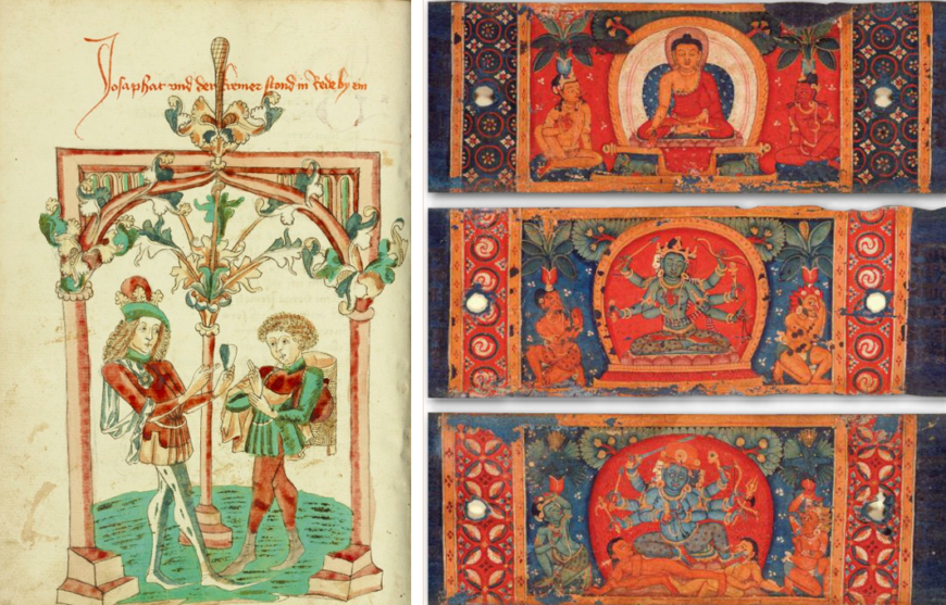
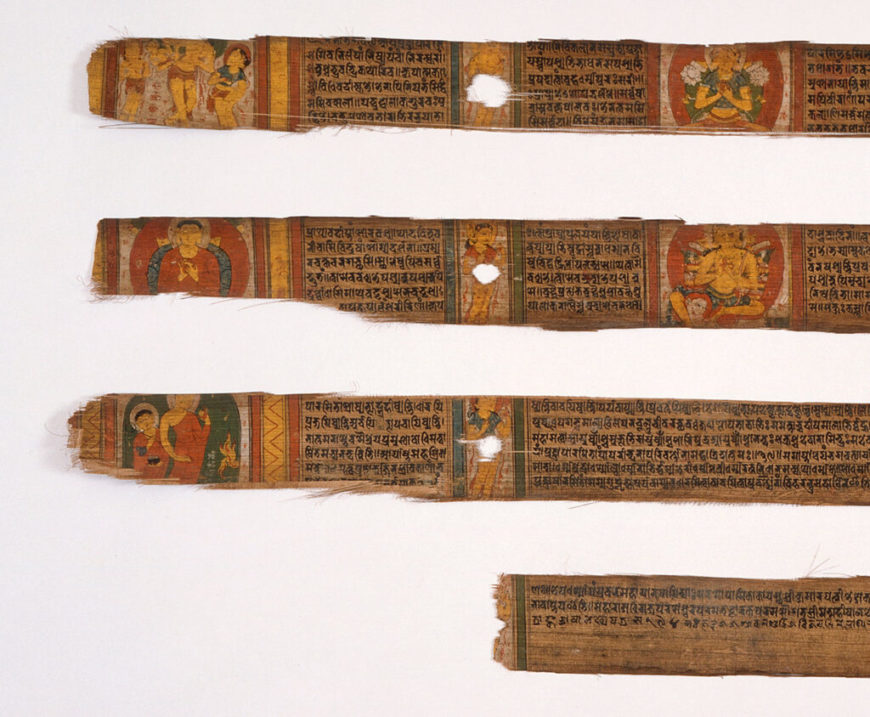
In a thirteenth-century Tibetan Ashtasarika Prajnaparamita (The Perfection of Wisdom) manuscript, the çintemani design of three dots can be seen in the background of all three pages, as well as on the cloth that extends from the Buddha’s throne (at top). The same pattern can be seen on the thirteenth-century Nepalese Paramartha Namasangiti manuscript shown above. The concept of a wish-granting or protective jewel originated in Hindu and Buddhist sacred texts, but eventually, the motif became a favorite pattern on luxury textiles throughout the Persian Empire, the Islamic world, East Asia, and Europe. As medievalist Jaroslav Fulda has demonstrated, representations in sculpture can be found on the Sasanian tombs at Naqsh-e Rustam, northwest of Persepolis, Iran, and the textile pattern was represented on garments of holy figures as early as the ninth century in the Book of Kells.
I have also found pictorial depictions of the design in Buddhist paintings from Dunhuang to Tibet, Bihar, and elsewhere. The borders around the Prajnaparamita scenes are closely related to cotton and silk textiles from India and the Islamic world, specifically in Persia, suggesting that the çintemani pattern was transmitted by way of the sericulture trade. In the exhibition, a selection of objects highlight these global connections.
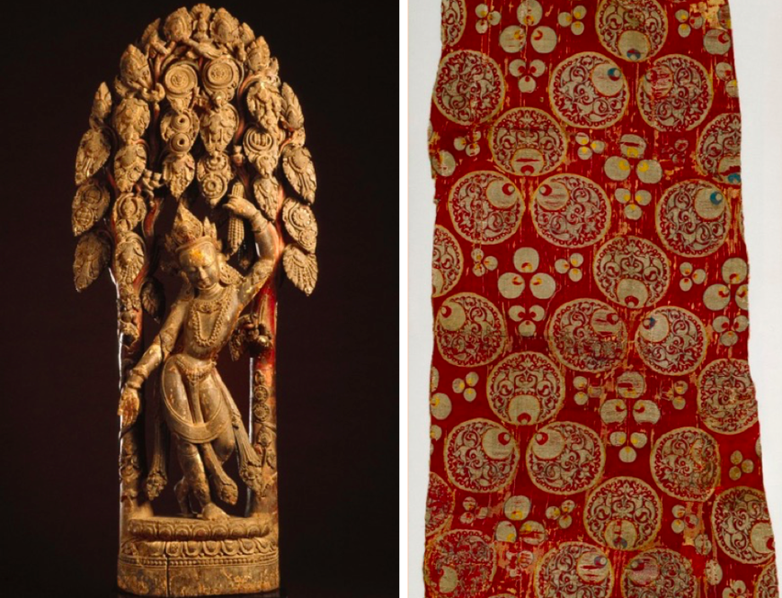
In Nepal, Çintemani Lokesvara is one of the many forms of the bodhisattva Avalokitesvara, who represents compassion. He grasps in one hand the wish-granting gem—the çintemani—and with the other welcomes all devotees, who would have visited the sculpture in a shrine. A fragment of a dress or furnishing fabric with the çintemani design from Bursa or Istanbul is a focus point in the exhibition—the silver metallic threads on gold and crimson silk satin is truly stunning.
With twenty manuscripts, over twenty coins, fifteen luxury objects, three sculptures, and a textile, the exhibition included numerous potential pathways to paradise. I encourage you to reflect on your own ideas about how to achieve a state of absolute perfection in a busy world.
This essay was first published on the iris (CC BY 4.0)
Additional resources:
Sheila Blair and Jonathan Bloom. Images of Paradise in Islamic Art (Hood Museum of Art, Dartmouth College 1991)
Bryan Keene, Gardens of the Renaissance (J. Paul Getty Museum, 2013)
Bryan Keene, ed. The World in a Book: Manuscripts and a Global Middle Ages (J. Paul Getty Museum, 2019)
Bryan Keene and Morgan Conger, “Sestieri al paradiso: l’India e l’Europa nel Medioevo,” in Alumina Pagine Miniate, no. 60 (Jan.-Mar. 2018), pp. 50-57
James McHugh, “The Incense Trees of the Land of Emeralds: The Exotic Material Culture of Kamasatra,” in the Journal of Indian Philosophy, no. 39 (2011), pp. 63-100
James McHugh, “Gemstones,” in Brill’s Encyclopedia of Hinduism, ed. Knut A. Jacobsen, Helene Basu, Angelika Malinar, Vasudha Narayana (2012)
Pratapaditya Pal, Art of Nepal: A Catalogue of the Los Angeles County Museum of Art Collection (1985)
Pratapaditya Pal, Indian Paintings: A Catalogue of the Los Angeles County Museum of Art Collection (1993)
Pratapaditya Pal, Puja and Piety: Hindu, Jain, and Buddhist Art from the Indian Subcontinent (2016)
David T Sanford, “Identification of Three Miniatures in the Nasli and Alice Heeramaneck Collection,” in Artibus Asiae, vol. 32, no. 1 (1970), pp. 42–47
Alessandro Scafi, ed. The Cosmography of Paradise: The Other World from Ancient Mesopotamia to Medieval Europe (Warburg Institute 2016)
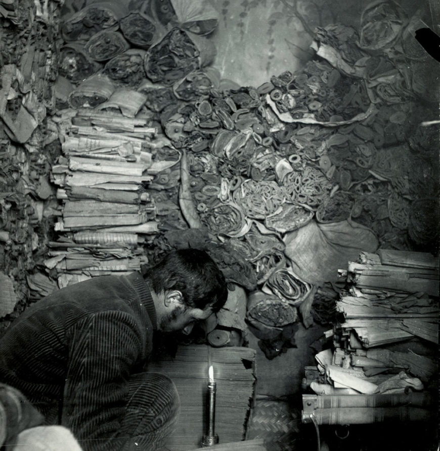
Making the medieval book
For much of the Middle Ages dead cows were the main ingredient for books. What was frolicking in the meadow one month, may have been a page in a Bible the next.
Listening to the medieval book
by DR. ERIK KWAKKEL and DR. BETH HARRIS
Video \(\PageIndex{3}\): Boethius, De institutione arithmetica, c. 1100, The Hague, Royal Library, MS 78 E 59 and Paris Bible, mid 13th century, The Hague, Royal Library, MS 132 F 21. Special thanks to Ed van der Vlist, Curator of Medieval Manuscripts, Koninklijke Bibliotheek, National Library of the Netherlands.
An introduction to medieval scripts
by DR. ERIK KWAKKEL and DR. BETH HARRIS
Video \(\PageIndex{4}\): Can you tell the difference between Carolingian Minuscule and Gothic script? Watch this video and you’ll learn how.
A medieval textbook
by DR. ERIK KWAKKEL and DR. BETH HARRIS
Video \(\PageIndex{5}\): Boethius, De institutione arithmetica, c. 1100 (The National Library of the Netherlands, The Hague, MS 78 E 59)
Special thanks to Ed van der Vlist, Curator of Medieval Manuscripts, Koninklijke Bibliotheek, National Library of the Netherlands.
Parchment (the good, the bad, and the ugly)

Parchment
For much of the Middle Ages dead cows were the main ingredient for books. What was frolicking in the meadow one month, may have been a page in a Bible the next. The skin of animals (calves, goats, sheep) was turned into parchment, which was subsequently cut into sheets. Parchment was introduced in late antiquity, when the codex (a book made of double leaves), was born and started to replace the papyrus scroll.
There is a lot you can tell from medieval skin. Like a physician today, the book historian can make a diagnosis by observing it carefully. The quality of parchment sheets varied considerably. Like people today, not all medieval creatures had perfect skin. Some cows loved to rub against trees while others were particularly prone to insect bites. We can still see these defects today, which appear as tiny holes, gaps or dark patches as we read Saint Jerome or Chaucer.
Perfect skin

The quality of the page also had a lot to do with preparation. A scribe producing a book for his own library may be less attentive than one that worked in a monastic community. The best sheets have a deep-white color, with a hint of yellow. They feel like velvet and make a slight rustling sound when you turn the page—suspenseful whispers that teased the reader (image above). Bad skin, by contrast, crackles. It is of uneven thickness, and shows staining and a variety of colors (image below). Unlike what you may have thought, looking at imperfect skin is far more interesting than studying its perfect counterpart. This is because a defect tells a powerful story, shedding light on the book’s production and providing clues about its use and storage post-production.

Damaged goods: holes and rips


Medieval craftsmen were well aware of the varying quality of animal skins, which they used as the basis for their books. However, calves, sheep or goats that had given up their livelihood and skin for the sake of medieval readers were not always to blame—and neither were the scribes. The most common imperfections are holes produced by the knife of the parchment maker.
Preparing parchment was a delicate business. In order to clear the skin of flesh and hair, it was attached to a wooden frame, tight like a drum. If the round knife of the parchment maker (the lunellum) cut too deep during this scraping process, elongated rips or holes would appear. A small puncture easily became a gaping hole. The art of preparing animal skin was to apply just the right amount of pressure.
However, readers did not seem to mind the holes too much and scribes usually just wrote around them, or they repaired them. Sometimes the reader is given an unexpected sneak peek onto the next page—where a dragon may just be introduced into the story (as in the image above).

The jabs of parchment makers—and the resulting holes—were sometimes stitched together. The image above shows a former rip (a long one) snaking across the page: the scribe has stitched it up like a patient in post-op.

Repairing holes was sometimes done more eloquently. In the manuscript above, the hole is not made to disappear, but it is highlighted by colored threads. In some monastic communities this must have been common practice, given that they repaired a lot of books with such “embroidery.” The practice turned defect into art: good-looking bad skin.
Hair follicles

Another skin problem encountered by scribes during a book’s production was the animal’s hair follicle—the skin organ that produces hair (seen above). These follicles show as pronounced black dots on the white page. Often parchment makers or scribes were able to sand them away, producing the desired smooth and cream-colored surface. However, if the follicles had been too deep in a calf or sheep, no dermatologist could have removed the imperfection, let alone the blunt instruments of the scribe. The only thing to do was to write around the patch. The follicles are helpful because they allow us to determine— from the distance between them—whether the animal was a calf, a sheep or a goat. This, in turn, may shed light on where the manuscript was produced: the use of goat, for example, often points to Italy.
The transition to paper
In the 12th century another material appeared in Europe: paper. Imported from Arabic culture, it was first exclusively used for documentary purposes, such as account books and letters. In a remarkable shift of scribal practices, in the fourteenth century scribes all over Europe started to use paper for manuscripts. Conservative scribes, such as monks, ignored the new material for some time, while others—especially those who wanted to economize—embraced it. Paper and parchment were used for all sorts of manuscripts, from chunky volumes to small portable books.
Additional resources:
Making Manuscripts: The Page
by DR. KATHLEEN DOYLE AT THE BRITISH LIBRARY
Video \(\PageIndex{6}\): How did scribes prepare their pages for writing? Patricia Lovett examines the tools for ruling and line marking in medieval books.
Skins and scraps
Leftovers (schedulae)

When the scribe cut sheets out of the animal hide, he would normally use the best part of the skin—what may be called the “prime cut.” This meant staying clear of the very edge of the skin because these areas were very thin and translucent, and deemed unsuitable for books. The scribe therefore cut a rim of parchment from the edge of the skin. It usually came off in tiny bits and pieces, which he called schedulae—strips. These odds and ends were thrown in the bin. Sometimes they were taken out to be used as scraps, for example for taking notes in the classroom or for smaller pages inserted into existing manuscripts (see image above). These tiny pages supplemented the text or added notes, like our yellow sticky notes today.
Layers (palimpsest)

What to do when you run out of parchment as a medieval scribe? You can look around for something else to write on, such as left-over parchment strips in the bin (schedulae), or use paper, if it is available. Alternatively, you can take a book that is no longer used from your monastery’s library and scrape the text off its pages. You then simply apply text of your own. Such recycling resulted in a “palimpsest,” which holds a removed “lower text” and a newer “upper text.” The ink of the reapplied text often does not stick to the page very well, as is clearly seen in the image. Moreover, the older reading often shines through. Especially important are palimpsests from the earlier Middle Ages, because underneath this old text an even older work is buried, like a stowaway. With digital photography the lower text can sometimes be made visible again, which makes studying these books like digging for treasure.
Post-production

Bad skin may also tell us something about the individuals who owned, read and stored manuscripts. The presence of holes and rips may for example indicate the cost of the materials. Studies suggest that parchment was sold in four different grades, which implies that sheets with and without visible deficiencies may have been sold at different rates. If this was indeed the case, an abundance of elongated holes in a manuscript may just point at an attempt to economize on the cost of the writing support. In other words, bad skin may have come at a good price.
Parchment provides other information about readers as well, for example that he or she stored a book in an unsuitable location. Damp places, for one, would leave a mark on the manuscript’s skin, as is clearly seen in a manuscript I sometimes call the “Moldy Psalter”—for moldy it is.

On nearly every page the top corner shows a purple rash from the mold that once attacked the skin. It is currently safe and the mold is gone, but the purple stains show just how dangerously close the book came to destruction—some corners have actually been eaten away. Similarly, if a book was stored without the proper pressure produced by a closed binding, for example because the clasp was missing, the parchment would buckle and produce “waves” on the page.
Apart from such attacks by mother nature, a manuscript could also be scarred for life by the hand of men—those evil users of books. Well known are cases where scribes and readers erased text with a knife, either because the reading was wrong or because they disagreed with it. However, in the wrong hands a knife could easily have a more severe impact on the book’s skin. All those shiny letters on the medieval page were too much for some beholders. The individual that gazed at the golden letters in the manuscript shown below used his knife to remove some of them.

While the velvety softness of perfect skin can be quite appealing to handle, getting to know imperfect parchment is ultimately more interesting and rewarding. Damage is telling, and it may shed light on such things as the attitude of scribes (who did not necessarily mind holes on the page), the manner in which a book was stored by its owner (with a missing clasp or in a wet environment), and even the state of mind of those looking at it (“Must cut out golden letters!”). As a book historian it feels good to work with bad skin.
The work of the scribe

Get set!
Before a single word flowed from his pen, the scribe needed to prepare the page. Whether he had opted for parchment or paper, the sheets were completely blank to start with. So, he first needed to think about a sensible layout, carefully considering his options. Did the text he was about to copy carry certain conventions? Was it, for example, a book that was to contain glosses (notes), or was it made for portable use? Preparing the page was a labor-intensive process, especially when the scribe had opted for a complex layout, with multiple columns and glosses. It was important to get it right since a messy layout would produce a messy book.

Rules
Unlike our notebooks today, medieval paper and parchment sheets did not come with ruled lines when you purchased them. A medieval page consisted of both horizontal and vertical ruling. To add these guiding lines to the blank page, the scribe would prick tiny holes in the outer margins, as well as in the upper and lower ones. Lines were then drawn between these holes, usually with the help of a ruler: horizontal lines to guide the space between each line of text, and vertical lines to confine the left and right side of the textblock.

Until the early twelfth century the ruling was done by pressing down on the parchment with a sharp object (a “hard point”), producing a “gutter” that would guide the scribe’s pen. In the twelfth century this type of ruling was replaced by drawing lines with a pencil (called a “plummet”), which left more visible traces on the surface of the page. From the thirteenth century a pen was used as well. Because of all these horizontal and vertical lines, if a layout was very complex, the ruling pattern may appear as a true cobweb.
Puzzles

How a page was designed depended on a variety of factors, including the number of required text columns, the space left blank for decoration, and the presence of marginal glosses and running titles. The most basic layout consisted of a single column of text. They are frequently encountered in Books of Hours (books made for use in private devotion), because these are commonly smaller books, which facilitated portability. Bigger books of two or more columns often required more work in the design stage, especially if that book also featured a marginal commentary. Particularly challenging were those cases where the commentary was of unequal length. This meant that the scribe had to design each page separately. Piecing together the segments of main text and commentary (see image) was like solving a puzzle.
Location, location, location

As with our modern books, medieval manuscripts consist of quires, small packages of folded leaves. Scribes often produced the quires themselves, but it also appears that they used prefabricated quires bought in a shop. The scribe would copy the text onto the pages of the quire, which would later be bound together to form the completed manuscript. To make sure that each finished quire ended up in the correct order, the scribe often wrote the first words of the next quire in the lower margin of the last page he copied. These are called “catchwords.”

If the catchword at the end of the quire matched the first word on the next quire, then they were in the correct sequence. To help binders put the quires in the right order, scribes would also number them. In the later Middle Ages, further organization was added to the page by also numbering the individual bifolia, so as to keep track of their specific location within the quire. In spite of all this emphasis on location, from time to time binders still jumbled up the sequence.

Bundling sheets
Quires are usually made from bifolia (singular: bifolium) or double-sheets of parchment or paper. To create a bifolium, a sheet is folded in half (each half is called a “folium,” which consists of two pages, i.e. the front and back of the folium). If the quire is the building block of the medieval book, the bifolium is what defines the quire: four, five or six of them were bundled up and subsequently filled with text.
Looking closely at the binding of the book, each bifolium appears to embrace its neighbor, bonding together to produce a strong quire. Before roughly 1200, bifolia were usually cut from processed animal skins, each of which usually supplied usually one to four double-sheets. They were either cut from the skin, or the skin was simply folded, either once (folio), twice (quarto), or three times (octavo). Paper double-sheets were exclusively produced by folding the full sheet.
Irregularities

Quires form the building blocks of the manuscript. How many bifolia the scribe bundled together often depended on his or her location. Book producers in England, for example, are known to have regularly produced quires of six bifolia, while scribes on the continent typically preferred quires of four bifolia. Some quires are irregular. An extra folium could be added (called a singleton) or a leaf could be cut out. Such instances of irregularity are of great interest to book historians, because they may suggest that the original composition was expanded by the scribe (for which an extra folium was needed) or because a blank folium was removed at a later stage, for example because it came in handy for taking notes.
Additional resources:
The making of a medieval manuscript (interactive from the Fitzwilliam Museum)
Words, words, words: medieval handwriting

The hard work of the scribe
“The fingers write, but the whole body suffers,” (medieval saying)
Parchment makers prepared skins, scribes cut their pens and filled their ink pots, and binders packed their workshops with leather and wood. All these activities would be in vain were it not for the single event that sparked them: copying words.
Writing a medieval text with a quill is hard work. The pen could only make a more or less downward movement because of how the nib was cut. It meant that letters had to be broken up into multiple pen strokes. This made writing a very slow process: a Bible could easily take a year to complete. A scribe’s handwriting—script—can tell us where and when he was trained to write. Script tells us these things because the shape of letters was constantly changing—script is thus an important historical tool that helps to place stories and information into their proper cultural-historical setting.
What you can learn from medieval script
Medieval script—the handwriting of the scribe—is the material representation of a text. An author may have composed the text, producing the original thought, poem or story, but it was often the scribe who put these words on the page. Much rides on how he did this. If he was inexperienced, it may be difficult to decipher his writing. If he was sloppy, the wrong words may appear on the page, or the right ones in the wrong order. The handwriting of scribes varied considerably. Not only did individual scribes vary their individual letter forms, as we still do today, but style of medieval script often depended on when and where it was written. This makes script extremely useful for book historians: the producer of a manuscript may tell us, between the lines, where and when he made the book. “My maker is from Germany,” a letter or abbreviation may for example say. From time to time scribes would even say so explicitly, in a colophon at the end of the book.
The main book script of the Middle Ages: Caroline Minuscule

Caroline Minuscule is the primary script of the early Middle Ages. Created in the late eighth century, it became the main book script in the empire of Charlemagne. It is an elegant script with a particularly round and spacious appearance Because Charlemagne had conquered a vast amount of territory during his reign, he found himself with an empire of many cultures, each with its own style of handwriting. A cohesive and unifying script was needed if his administration was to function properly. Caroline Minuscule looks familiar to our modern eyes because producers of typeface working for early Italian printers used it as a model. In fact, the ubiquitous default font “Times Roman” on our computers is also based on Caroline Minuscule.
The transition to Gothic script

From the middle of the eleventh century Caroline Minuscule, the dominant book script at that time, started to include new letter forms. By 1100 the number of letter transformations had grown to such an extent that the script looked different from Caroline. Slowly the script evolved into what may be regarded as the second major book script of the Middle Ages: Gothic (used from c. 1225). Where Caroline was a unifying script, the transitional script of “The Long Twelfth Century” (1075-1225) divided Europe in distinct regions. Scribes in Europe adopted the new, hybrid writing form at different speeds, while they also varied the actual appearance of certain letter forms. Scribes in Germany, for example, were far more conservative than their peers in France and England.
Cursive vs. book script

Books written between 1250 and 1600 were copied in a variety of Gothic scripts, some of which sport very different features. On the one side of the spectrum, there are formal book hands, presenting upright letters that appear to stand at attention. On the other side there are more casual cursive scripts, which were written with a thinner pen and featured connecting loops. By the early fifteenth century these two script forms were equally popular, although cursive script was introduced much later in book production. The introduction of cursive script is part of a broadening palette of scripts. This expansion may have resulted from the commercialization of book production—a consequence of the increasing demands of readers who purchased their books in small urban shops.
Cursive script began its career in the world of administration. Here it was used for account books, charters and other administrative texts. The clerks who produced these documents used a much thinner pen than what was used for formal book script. The flexible tip allowed for a faster pace and it gave the script a kind of “casual” feel.
While book script required the pen to be lifted between each stroke that formed the letter, with cursive script the pen remained on the surface of the page, with each letter connected by a ligature (or loop). Around 1300 this administrative script was exported to the world of book production. Students and scholars were early adopters, as were individuals involved in administrative duties, such as clerks, notaries and merchants. Civic clerks, for example, are known to have produced literary manuscripts after-hours, in part for an urban clientele who paid for their services. These professional users encouraged the migration of the script beyond its initial administrative setting.
Making books for profit in medieval times
While one may be inclined to emphasize how “foreign” the medieval book is—they are, after all, made of dead cows, and are handwritten—they present such recognizably modern features as a justified text, footnotes, running titles and page numbers.
Visiting a bookseller
The similarities run much further than mere physical traits, however. Take for example the manner in which the book was made and acquired from the 13th century onwards. If you wanted a book in the later Middle Ages you went to a store, as in our modern day. However, the bookseller did not normally have any books in stock—except for perhaps some second-hand copies. You would tell him what you wanted, both content-wise and with respect to the object’s material features. You could specify, for example, that he use paper (instead of parchment), cursive script (and not book script) and add miniatures (or forego decoration). Just like so many other objects you bought in late-medieval society, the commercially-made manuscript was custom-tailored to the individual who purchased it.
The professionals who made books for profit were usually found near the biggest church in town. This was a well-chosen spot as canons and clerics (i.e. people who visited the church and who could read) formed an important part of the clientele. By the 14th century true communities of the book had formed in the neighborhoods around churches and cathedrals. Evidence from such cities as Antwerp, Bruges, Brussels, London and Paris suggests that in these communities a diverse group of artisans interacted with clients and with each other. It was a world bound not only by the book, however, but also by profit.
Marketing
Whether you were scribe, illuminator or binder, as a professional you would strive for quality and diversity as this ensured bread and butter on the table. In parallel to our modern book business, medieval manuscript artisans used various marketing strategies to attract new clientele. The most striking of these is advertisements. Scribes hung large sheets outside their doors to show what kind of scripts they had mastered. The short writing samples found on these sheets were often accompanied by the names of the scripts, which shows just how professional the world of the book had become. A particularly rich specimen survives from the shop of Herman Strepel, a professional scribe in Münster (c. 1447). In the true spirit of medieval marketing he wrote the names of all the scripts in golden letters on his advertisement sheet.

Scribes also included advertisements in books they had copied for a client. An example of such “spam” is found in a French manuscript made in Paris by a scribe who calls himself Herneis. On the last page of the book he writes, “If someone else would like such a handsome book, come and look me up in Paris, across the Notre Dame cathedral.” Herneis and his fellow bookmen lived and worked in the Rue Neuve Notre Dame, which served as the center of commercially-made vernacular books. Similarly, students were served in the Rue St Jacques, on the Left Bank, where the latest Latin textbooks were on offer. For Parisians and students it was handy to have all the professionals in one street: you knew where to go when you needed a book and it was easy to check out who was available for making one for you.

Book streets
This centralization was equally convenient, however, for the artisans themselves. Booksellers (also called stationers) in Rue Neuve Notre Dame and in other such “book streets” in European cities depended on the professional scribes, illuminators and binders that lived in their vicinity. They would hire them for various projects. When a client came to order a book from a stationer, the latter would divide the work among the artisans he usually worked with. One copied the text, another drew the images, and a third bound the book. These hired hands were given contracts which specified precisely what they would have to do and how much money they received for it. From time to time the stationer would come and check on the progress they made. In some manuscripts these cost estimates were scribbled in the margin. Although making books for profit was a common scenario in the later Middle Ages, it did not make you particularly rich. On the last page of a Middle Dutch chronicle a clearly frustrated scribe wrote, “For so little money I never want to produce a book ever again!”

The printing press and the demise of the manuscript
The world of professional medieval scribes was shaken up by the coming of Gutenberg’s printing press around the middle of the 15th century. The ink pots dried up and the handwritten book slowly turned into an archaic object that was more costly than its printed counterpart. In the 16th century only large choir books (which did not fit on the press) and handsome presentation copies, custom-made for an affluent client, were still written by hand.
And so we see scribes jumping the handwritten ship, many ending up working in printing shops. Here, too, a striking parallel between the medieval and modern world of the book may be pointed out. Medieval producers and salesmen of books had to adapt to the new medium made popular by Johannes Gutenberg, just as publishers today have to change their ways in a world where pixels are gaining ground over ink.
Decorating the book
Dazzling
Some medieval readers preferred pretty pictures and shiny decoration in their books. Not only did the sparkling page appeal to them, it also proved their economic status, or that the gift they gave was special. Undecorated books were also expensive, but decorated copies cost a true fortune, especially if gold was used. In a process called gilding, the decorator would apply an ultra-thin film of flattened gold to the page, which looked not unlike our modern tin foil.

This page shows that the golden shapes were not appended directly to the surface of the parchment, but that they were stretched over little “hills” of plaster (note how the orange primer is shining through). This way the gold would catch the light from different angles, maximizing its dazzling effect.
Colorful books
When the quires were filled with text, the rubrics (title or chapter heading, often in red) were in place, and the scribe had corrected his work, it was time for the finishing touches. Many medieval books contain some kind of decoration in addition to the written words, usually executed by a different artisan. There is a considerable variation in style and quality of decoration, and, consequently, in cost. At the lower end of the scale is penwork flourishing, red and blue lines drawn with the pen in various patterns and shapes. Some of these typify local styles, allowing us to tie a manuscript to a specific country, city or religious house. At the higher end of the scale is illumination: often sophisticated little paintings that included color and often gold. While decorated books stand out among their other cousins, on the whole they were not very common.

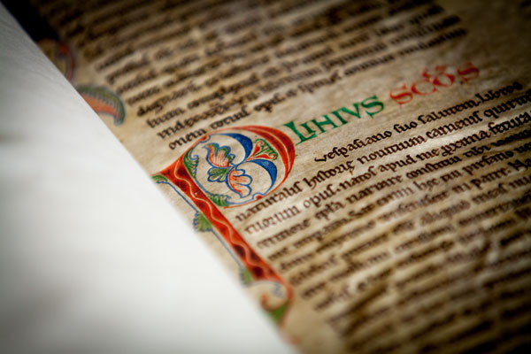
One-letter stories
Normally, letters work together to form words that present a story. From time to time, however, we encounter a letter that contains a narrative all by itself. This giant P initiates the name Paulus (Paul), who was the author of the following Bible text. To mark the beginning of the text the decorator extended the P and applied color and gold to it, turning the letter into a visual aid. Contained in the letter is St Paul himself, presented as the soldier of Christ. In his hand there is a large sword, his standard attribute in medieval decoration, and his head is clearly bald, which also aided in his identification.
While in this case the intensions of the decorator are clear, the meaning of some such historiated initials can only be understood by reading the story they initiate. Miniatures contained even more extensive narratives.

Penwork
In medieval times, penwork flourishing was the quickest and easiest way to add some color to the page. This style of decoration typically involves thin lines, usually in red and blue, drawn with a pen rather than a brush. The swirly lines form lively patterns with unexpected twists and turns, creating miniature mazes in which your eye gets lost easily. If you look carefully you may recognize familiar objects: a tree, the moon, pearls, a smiling face. The central figure attracting all of this artistic attention is the capital letter that needed decorating, in this case the letter “M” (for “Marcus”). The penwork decoration supported an important function of this letter, navigating the reader to the beginning of a new section of text. The specific flourishing patterns can often be pinpointed to a certain city or region, which turns these happy lines into a useful tool for the book historian.
Medieval supermodels

This essay is devoted to a particularly attractive and rare kind of medieval manuscript: the model book. A feast to the eye, the object is filled with drawings and paintings that were meant to show scribes and illuminators how to decorate letters, paint initials, or add large segments of decoration to the page. Within this tradition, two types of model books can roughly be distinguished. Some functioned as instruction manuals. In these books, the drawings might be accompanied by a narrative or explanation that instructs the artisan how to proceed, usually in a step-by-step process. Other model books appear to have merely functioned as a source of inspiration: they present a wide array of shapes and drawings from which the artisan could take his pick.
The level of sophistication among surviving model books varies considerably. On the lower end of the spectrum there are pattern books that merely show how to make enlarged letters with some minor flourishing. On the higher end, by contrast, there are copies with high-quality stand-alone designs and sophisticated historiated initials inhabited by figures and scenes. Evidently the requirements of the artisans varied; and by proxy, so did the taste of medieval readers. It is this variation that makes model books so fascinating, both as physical objects and as cultural artifacts.
Plainly decorated letters
To start at the lower end of the spectrum, some model books merely showed scribes how to execute a certain script or how to draw plain enlarged capitals—the most basic kind of decoration.

The book opening seen above is from Gregorius Bock’s Scribal Pattern Book, which provides instruction on both fronts (more about the manuscript here). Produced in 1510-1517, the first part of the small parchment book contains a series of alphabets in different scripts, some of which are clearly influenced by print typefaces. The second part contains decorative initials arranged in alphabetical order. In the introduction to his manual, Gregorius adds a dedication to his cousin Heinrich Lercher Wyss of Stuttgart, who was scribe to the Duke of Württemberg. The arrangement of the material shows how Heinrich likely used the book: he would thumb through its pages until he had reached either an alphabet or capital letter to his liking.

While Bock’s letters are a pleasure to look at, especially for the book historian, his designs are not exactly rocket science. More complex—but still relatively plain—are the models provided by a much older pattern book in the Fitzwilliam Museum in Cambridge. This appears to be the oldest surviving pattern book for initials: it dates from c. 1150 and was produced and used in a Tuscan workshop. The choice is much more limited than in the previous example: the Cambridge copy does not provide multiple alphabets, nor does it present a wide range of initials (in fact, only about twenty are present). Interestingly, some manuscripts survive in which we encounter decorated letters that could well be modeled from this or a similar model book (like British Library, Harley MS 7183).
Elaborately decorated letters
On the more upscale end of things is the model book known as the Macclesfield Alphabet Book. It was made and used in fifteenth-century England, apparently for the transmission of ideas to decorators or their assistants.

The artisans were offered quite a lot of choice, given that we encounter no less than fourteen different alphabets on its pages. What makes this book so special, however, is their quality and the manner in which the letters are designed: their shapes are produced by human figures in various uncomfortable positions—doing yoga exercises, it seems.


A similar subject matter is encountered in the alphabet book of the Italian artist Giovannino de Grassi (above). This book was created at the Visconti court in Milan and features both initial letters and stand-alone drawings. The Visconti’s were important patrons of the arts and so it makes sense that we see their generosity extend into the world of book production.
Giovannino was known for depicting exotic animals in their natural habitat and this book features such images as well. His pages provided models for other artists who wished to replicate his realistic depictions (the image of the cheetah to the left is from his workshop).
Marginal decoration
Even more sophisticated are model books that show how to create elaborate decoration that runs in the margin along the length of the page. These border decorations, with their curly leaves and unexpected turns, could be tricky to produce.

The so-called Göttingen Model Book, made around 1450, provides a solution to this problem. Its pages not only show, step by step, how to build a 3D leaf pattern, they also present detailed instructions like the following:
The foliage one shall first draw with a lead or a point. Then one shall outline the foliage with a pen and with very thin ink or with thin black color. Then one shall polish the foliage with a tooth, so that the color can be applied smoothly, but not too firmly. Then one shall paint it with the colors, one side right and the other side left or reversed, with a brush, namely light red and green. […] (source)
The drawings and narrative clearly complement one another. From time to time the instructions mention something like “as it is shown here” or “as the image shows.” A model book can hardly be clearer than this: while the alphabet books shown above were more or less meant to simply inspire the artist, the Göttingen book really takes the artist by the hand and guides him through each step of the production process. The instructions apparently worked well, as is shown by a surviving Gutenburg Bible that contains these very leafy borders (see above right).
The final point
Models are crucial in any learning process. Observing how something is done helps you acquire a skill you lack as much as it encourages you to develop further those you already have. Moreover, there is an additional use to these pattern books that has not yet been mentioned: patrons visiting artisans’ shops could well have been given these objects to find out what the book-maker was capable of providing. Given its many uses, it is hardly surprising that the tradition shown in this blog is also encountered in other cultures, including Byzantine and Arabic book production.

One particularly unusual Arabic specimen deserves to make the final point of this post. The fragment shown above presented Arabic decorators with models of scenes from the New Testament. It figures that the artisans, used to decorating the Qur’an, needed a little inspiration when it came to the Bible. This specimen is also interesting because some of the figures have been outlined by tiny holes, meaning that the sheet could be used as “tracing paper” (click the image to see this closer). While this ultimate instruction method took all potential flaws and creativity out of the modeling process, it allowed decorators with lesser talents to produce something beautiful.
Additional resources:
More information on Gregorius Bock’s Scribal Pattern Book
Macclesfeld Alphabet Book at the British Library
Blog post on the Macclesfeld Alphabet Book from the British Library
Binding the book

Woodwork
Medieval manuscripts, even small ones, can be surprisingly heavy. Giant Bibles, large volumes that can stand half a meter tall, weigh as much as twenty-five kilos. It requires two library staff members to carry the object to your table. A fair part of this weight is produced by the boards of the bookbinding. To protect the stack of quires that made up the actual manuscript, a wooden board was placed on the front and back. The quires were then tied to thin leather straps, which were pushed through channels drilled through the boards. The straps were pegged into the wood, as seen in the image (note the white straps). It produced a surprisingly firm binding, which lasted for centuries. All this crafty woodwork is presently hidden from our eyes because the boards were subsequently covered with leather (which was often fitted with decoration). Thousands of pieces of medieval trees are presently hidden inside book bindings, like a shelved mini forest.
Wrapper

The so-called “limp binding” is another type of binding that was in popular use in medieval times. Its most notable feature is the absence of boards, which explains its name. With a limp binding the quires are covered by a plain parchment wrapper without the support of wooden boards.The quires in these bindings—usually a limited number—are attached to the outer parchment with thin strings, which are visible on the outside. A limp binding resulted in a lighter manuscript, which meant it was easier to transport. This type of binding also decreased the cost, given that wood was not needed and that the binding process was less time-consuming. This is likely why this type of bookbinding was so popular among medieval students.
Accessories

Many medieval books were a joy to look at even when they were closed. Various shiny “accessories” were drilled in and attached to the wooden boards on the outside of the book. The most pronounced of these are the so-called “bosses,” protective metal pieces attached to each corner of the binding. Much more common are clasps, pieces of metal that kept the book closed. These were needed because, unlike paper, parchment has a tendency to expand and buckle, which could push the book open. A clasp was therefore needed to keep the book closed when not in use, protecting the text inside. Also frequently added to the binding is decoration—flower motifs, playful line patterns, and at times even a painted scene. Such decorative elements on the outside of the binding became particularly common near the end of the Middle Ages.
Clasps: hugging a medieval book

Book historians tend to compare features of the medieval book to body parts. Thus the manuscript’s “head” (top edge) is connected to its “spine” (the back) via the “shoulder” (the area where board meets spine). There are even terms that compare a medieval book’s physical features to human activities or conditions. A large letter with a lively figure inside is called a “gymnastic initial,” for example, while line ruling that is nearly invisible is “blind.” This article takes this projection phenomenon a step further. It shows how one particular feature of the medieval binding eerily resembles a body part, not just in appearance but even in function: the clasp.
Arm and hand
While a medieval book was produced to be opened and used, medieval makers of manuscripts paid just as much attention to closing it. In order to preserve the organic pages, which were often made of parchment, it was necessary to keep the volume tightly closed when it was not used. Not only did this keep moisture out, but parchment also has a natural tendency to buckle, especially when handled at room temperature. In fact, parchment pages curl up with so much force that the wooden boards would be pushed open were it not for a smart device designed to keep the lid on: the clasp.

The clasp is like an arm that extends from the one wooden board to the other. Indeed, it is hard not to think of clasps as hugging arms that embrace the leaves, safeguarding them from the harsh reality of medieval book use. Appropriately, the primary purpose of clasps was to protect the pages. They generated the pressure needed to keep the pages flat, while producing a firm object that could withstand every-day use in a medieval library—like falling off a desk or a shelf. At the end of the arm a tiny “hand” locks into an extension, as clearly visible in the image above. How great that some book binders played with the image of a hand grabbing onto the opposite clasp, as this eighteenth century example shows (above).

Generally, two clasps were able to contain the force issued by the buckling parchment of a book. However, it was important to get it right as a bookbinder. When the distance between the one end of the arm (the “arm pit”) and the handle bar was too large, there was insufficient pressure. By contrast, if the distance was too little, the book did not close. Medieval manuscripts that have lost their clasps (by far the majority) show what happens to the bookblock when the pressure was too low: unhappy pages with a wavy pattern appeared (above).
Exotic arms
Some readers preferred exotic clasps. A particularly remarkable specimen is in the National Library of Sweden. The book it helps to close is tiny, no larger than an iPhone. Made c. 1500, it was designed for the road: it concerns a portable Book of Hours (or prayer book) that was carried around by a pilgrim on his religious pilgrimage. The clasp holding it closed is in fact a skull carved out of bone. The theme is fitting for a pilgrim seeking redemption, finding his way along the dusty roads of medieval Europe. Every time he sat down to open his book he was confronted with his future, which looked rather grim: Memento mori, remember that you will die one day. Better smarten up and keep on going!
The exoticness of clasps is sometimes connected to their number instead of their shape. Clasps are a must for a peculiar binding known as dos-à-dos (or “back-to-back”). While such bindings usually hold two books bound together at their backs (hence the name), the National Library of Sweden owns a unique variant that contains no less than six books. They are all devotional texts printed in Germany during the 1550s and 1570s (including Martin Luther, Der kleine Catechismus) and each one is closed with its own tiny clasp (see the various openings here). A book with six arms and hands: it is quite the display of craftsmanship.

If clasps can be compared to arms, another feature of the bookbinding must be called “feet.” During the later Middle Ages it became customary to store manuscripts on lecterns. In lectern libraries, which were found in monastic houses and churches, readers consulted books on uncomfortable benches. The libraries often had a semi-public function, with outsiders walking in and out to consult books. To facilitate such use—and to make sure no books were unlawfully removed—the objects were usually chained to the lecterns (above).
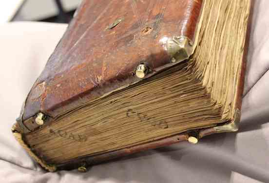
Books in lectern libraries were not read on a flat surface (such as a desk), but erect – the objects were resting, after all, on nearly vertical stands. This kind of use came with a challenge: the shuffling that inevitably happened when the book was read, wore out the lower edge of the binding. More importantly, since the medieval book block was flush with the binding, the constant contact with the lectern as the reader flipped through the book could easily damage the page. A simple tool was invented to prevent such damage: “feet”—tiny pieces of brass that hoisted the book up and made it hover, as it were (above). The feet that are attached to bindings are often shiny. It shows just how much the book was used—and how much damage was prevented by the attached feet (see below).

There is something very attractive about these body parts. They show just how much bookbinders and readers were in tune with the needs of the book as an object. They packaged them so that they could withstand rough consultation, while their designs also left room for a certain amount of fun—as the hand-clasp and perhaps even the skull-clasp shows. The hug given by these strong arms protected the book’s most precious cargo, the text, both from accidents in the medieval library and, as much as possible, from the inevitable decay of time.
Medieval books in leather (and other materials)
Every book needs a coat, a protective layer. Without it, after all, the pages would be exposed to the elements and the dirty hands of readers. And so from the very early days of the book the object was given a binding. Medieval bindings mostly consist of two components: boards, commonly made out of wood (but in the later Middle Ages also from compressed paper), and something to cover the boards with. While in medieval times the most common covering material was leather, there is great variation observed in the kind that was used, as well as how it was decorated. Readers and reading communities had their own preferences in this regard. As a result one can “read” as much from the outside of the book as from its pages: they both transmit important cultural-historical information. This is an essay with an exotic twist, which includes bindings made from seal and human skin.

Wearing leather
Most medieval bindings were made out of animal skin—usually it was a calf or pig who involuntarily ended up protecting the manuscript. Leather proved an ideal material for binding books. It is stiff, which means it does an excellent job protecting the precious cargo inside, while at the same time adding to the desired “firmness” of the book. The material also repels water quite well. This benefit may seem odd, but it’s not. While monks may not have been reading books in the bath tub, they did consult them in the cloister, which was often a damp environment—given that the hallways were in the open air.

An added bonus of leather was that it accommodated blind-tooled decoration, which was applied in mesmerizing shapes and patterns. The oldest book to survive with its original binding still in place is the seventh-century St Cuthbert Gospel (which is a Gospel of John, in fact, image above). It shows just how utterly charming early-medieval leather bindings were; and how beautifully they were decorated. The manuscript in question was placed in the coffin of St Cuthbert shortly after his death in 687. It was discovered when the grave was opened in the early twelfth century. By then a cult had grown around St Cuthbert, so the book and its original binding were both well taken care of. In fact, the binding looks like it was made yesterday.
The use of leather bindings predates books made out of parchment—like the book of St Cuthbert. Before parchment became common, books were made from plants—papyrus. Such papyrus codices were extremely fragile and they needed the protective qualities of leather, which may ultimately be the origins of the tradition of using skin for bindings. Given that papyrus not used after the fifth century (with some exceptions), very few original bindings of papyrus books survive. The oldest specimens we have are those in the so-called Nag Hammadi Archive, which date back to the third and fourth centuries. As you can see from the image to the left, these covers of papyrus books were also decorated handsomely.
Exotic leather

What to do if you need a leather binding, but there are no cows or pigs to slaughter for this purpose? The answer is seen in the image above, which shows a book that was copied and bound in Iceland. Naturally the binder turned to creatures that were available there. This is how a poor seal ended up covering this Old Icelandic book with sermons, which was made around 1200. If you look carefully you can still see a significant amount of hair on the outside. As with other cases where animal hair is found on book covers, the hairs have turned green over time (or perhaps from the liquids involved in processing animal skin into leather).
But the skin used for bookbindings is not limited to animals. Under the name anthropodermic bibliopegy goes the practice of using human skin for binding books. It turns out to be a post-medieval practice, which was particularly popular in the 17th and 18th centuries. The cover seen here dates from the early 17th century and the skin was taken from the priest Father Henry Garnet. He was executed in 1606 for his role in the Gunpowder Plot—the attempt to ignite 36 barrels of gunpowder under the British Parliament. The book in question actually outlines the story of the plot and the evidence of Garnet’s guilt. The origins of the binding must have given the reader significant satisfaction.
The last word: cloth
Not all medieval books were dressed up in leather. Less commonly used, perhaps because it is more fragile, is cloth. This material handled the frequent use of a book far less well than leather. The real-world use of a medieval book was such that the object would be pushed back and forth over a wooden desk, which did not exactly contribute to a long life. The cloth binding seen here dates from the middle of the fifteenth century and it covers a monastic rule.
The manuscript has a particularly pretty button to close the volume up, adding to the charm of this beautiful bookbinding. In the age of the printed book such cloth bindings became more common, perhaps because more books were privately owned. This meant, of course, that the objects were not consulted on the hard surface of a wooden desk, but on the soft lap of the reader. As with embroidered bindings, which also increased in popularity in post-medieval times, cloth may have been regarded as a more suitable material for private reading.
Additional resources:
St Cuthbert Gospel from the British Library blog
Nag Hammadi Archive (some of the oldest specimins of papyrus bindings)
Photo in the News: Book Bound in Human Skin
Judging a Book by its Cover: Manuscript Bindings Without Bling
Using the medieval book
Consulting a medieval book was challenging—they could be very heavy and half a meter wide (more than 1.5 feet) when open.
c. 330 - 1300 C.E.
The medieval desktop

We are used to having multiple books open at the same time when looking things up at home or writing an essay for class. Whether PDFs, e-books or good-old-fashioned paper volumes, switching between books in a smooth movement is something we don’t often think about. This was very different in medieval times. In those days, books tended to resist when you tried to move them: they were as heavy as a brick and easily twice that size. A related problem was one of space. The average medieval book has a wingspan of at least half a meter wide when open. Consequently, comfortably placing two books in front of you was a stretch, let alone multiple volumes. In an early-sixteenth-century depiction of Erasmus, the scholar cannot even place a single book on his desk as he is writing a letter (above).
Interestingly, the challenges of medieval book consultation stands in stark contrast with what we know about reading and studying in the period. We know that readers were interested in learning different points of view with respect to their topic of inquiry, and so browsed through a great number of volumes at the same time. Sparked by this contradiction, this article explores medieval desktops. How many books are being consulted at the same time in medieval depictions of reading? How are the objects laid out across the available space? In short, how are we to understand the logistics behind the devouring of knowledge in the last four centuries of the Middle Ages? As will become clear, the answers to these questions vary greatly depending on why an individual handled multiple books at the same time.
Scribes
The first group of individuals who had to manage multiple books were scribes. By definition, a scribe had to have at least two books on his desk: the one he was making (a growing pile of quires, which remained unbound until the very end) and the one he was copying from (called the “exemplar”). While keeping track of the loose quires may have been challenging, of the groups discussed here scribes had it the easiest. After all, the individual was only technically reading one book—the one he was copying from. This explains why their deskspace was of limited size, at least judging from surviving depictions.

In most cases their working space was erect rather than flat. The famous image of Jean Miélot at work (above) shows how the desktop of the scribe had a 45-degree angle, resulting in an almost erect surface. Clearly visible is also a vertical orientation in the line-up of the books: one was placed above the other. In fact, the desktop in this image is split in half, with the lower half containing the book under production, as well as the scribe’s tools (ink pots and pens), while the upper half holds the exemplar. Miélot obviously needed to go shopping for a larger desk, because we see books laying around on the ground and on a bench.

Interestingly, there are also desks with a horizontal orientation. The image at the left shows the translator Simon de Hesdin at work. Although the books are out of sight, the desk clearly provides room for two books. However, they placed next to one another. This may be specially done for the task of a translator, who needed to carefully read the source text and subsequently scribbling down the translation in loose quires or on loose sheets. This way, both books would be right before him: there was no need to look up at a high book platform.
Readers
While it is easy to find images of scribes with a desk full of books, it is less common to encounter readers in similar situations. That is to say: there are very few medieval scenes in which someone is reading but not writing—where books are present but pens are not. In part, this has to do with medieval study practices. Readers would usually have a pen nearby even when they were just reading. After all, remarks and critiques needed to be added to the margin at the spur of the moment. “Penless” images, while rare, often show a crowded desktop. The image below shows Christine de Pisan (a late medieval author) browsing multiple books at a big desk.

The absence of the pen may result from an urge to depict Christine as an avid reader. This is emphasized, I think, by the various volumes that lay open—note how some open books are facing down, the way we still do today! From the late medieval period a special tool was available for readers who did not like the clutter shown on Christine’s desk: the book carousel.

These carousels allowed readers to consult multiple manuscripts in a very convenient fashion, by spinning (slowly!) the top part, which moved. The oldest one I could find dates from the fourteenth century (here), but it is possible they were in use even earlier. It is striking that these two scenes (above and below) show readers—scholars—without pens, even though the second seems to hold an invisible one.

Book hipster
![Book wheel, Agostino Ramelli, Diverse et artificiose machine, [Leipzig] Durch Henning Grossen den Jüngern, 1620 (first published 1588), p. 440.](https://ka-perseus-images.s3.amazonaws.com/c77b19591ca40b1e026bab3e5a16551c87a20f79.jpg)
Cleverly, the medieval “spinning wheels” circumvented the constrictions of the limited space a regular desktop provided. However, what if you need even more real estate than the turning desktop could offer? The answer to this question is perhaps one of the most intriguing pieces of book furniture that survive from the past: the book wheel.
The image at left shows the book wheel invented by the Renaissance engineer Agostino Ramelli, whose concept was based on medieval designs. The upside to the carousel is obvious: there was space for a lot of books. This practice is not unlike deciding to hook up a second monitor to your computer, except that the individual is actually watching twelve monitors at the same time—like a trader on Wall Street. I have sat behind one from the 17th century myself and it is truly a majestic feeling to spin the wheel. The click-click sound of the gears hidden inside the device is simply mesmerizing.
The last word: laptop

While desktops (in their great variety) are representative of how most scribes and readers handled their books, there is also a surface space that is more exceptional—and that can only be addressed as a “laptop.” The use of such portable desks, which sat on the scribe’s lap, is well documented for the early-modern period. They were used, for example, by noblemen or secretaries drafting documents and letters while on the road.
The portable desktop was generally a box with a slightly angled surface, inside which the writing materials were stored, including sheets, ink and pens. Interestingly, this practice—and tool—goes back to at least the twelfth century (see image, left). The device contained a hole for the ink pot and inside may well have been blank sheets—in parallel to the portable kits from the Renaissance.
Apart from the fact that the actual desk space was more limited than what we are used to, the medieval desktop was not so different from ours, including how messy it was. They contained books, both open and closed, as well as writing tools. However, more so than in our present time, desktops were a necessary tool, whether they were packed (as in Christine’s case) or with only one or two books in place (as with most scribes). The medieval quill, after all, needed a stable and even surface. While desktops may seem trivial objects to us, they were crucially important to both medieval scribes and readers.
Additional resources:
More about Christine de Pizan in her study
Browse images in the Roman de la Rose in the Bodeian Library
Browse Agostino Ramelli’s Diverse et artificiose machine at the Library of Congress
Book wheel from 1625, in the Herzog August library Wolfenbüttel
A portable writing desk from the Walters Art Museum
Getting personal in the margins

At its very heart the medieval book is a vehicle of information. It was an expensive receptacle for text, which was poured onto the page by the scribe, and retrieved by the reader. As strange as this may sound, as a book historian I have limited interest in the actual text found on the medieval page. My job is to look at books, not to read them: knowing author, genre and purpose often suffices for what I do. Very different, however, is my attitude towards words found in the margins, placed there “extra-textually” by scribes and readers. Here we may find information about the production circumstances of a given manuscript and the attitude of scribes or readers towards a text. In most books, there was ample room to add such details, because on average a stunning fifty percent of the medieval page was left blank. It is in this vast emptiness—so often overlooked in editions of texts—that we may pick up key information about the long life of the book.
Pointing a finger

We are taught not to point, but in the margin of the page it is okay. Readers frequently felt the need to mark a certain passage, for example for future reference, or to debate its meaning. To do so, they added manicula (Latin for “little hand”)—those highly entertaining pointing fingers. This is good news for us, because they facilitate a look into the mind of a medieval reader. It is not uncommon that a person’s interest shines through the collection of marginal hands in a manuscript. While most individuals simply marked spots with an X, the pointing hand provided a much clearer—and more expressive—signpost.

A particularly entertaining pair is found in Berkeley’s Bancroft Library. To mark a particularly long passage we encounter a hand where all five fingers have been drafted into service, while in another case the hand is replaced by an octopus with five tentacles.

From time to time a debatable passage is highlighted by a pointing device that is part of the book’s decoration, like Augustine taking a stance while aiming his spear at a gloss in the text (image at the top of the page).
Critiquing authorities
There is nothing more inviting to a critical mind than the empty space of the margin. Medieval readers frequently felt the need to vent in that location, for different reasons. Like Augustine and his spear—they would express their dismay about something. There is the Carthusian monk from Herne, for example, who could not handle the poor Latin-Dutch Bible translation he was reading. With a pen shaking from frustration he wrote: “Whoever translated these Gospels, did a very poor job!” (14th century, Vienna, Österreichische Nationalbibliothek, S.n. 12.857, fol. 95v). The same person is encountered in the margins of a different manuscript, where he corrected yet another flawed translation (Brussels, Bibliothèque Royale, MS 2849-51). Providing improved readings in the margins he added the following personal touch: “This is how I would have translated it.” Take that, translator!

While such explicit remarks are exceptional, critiquing the text in the margin was a normal thing to do as a medieval reader. In most cases he or she would jot down a gloss next to the actual text and connect the two with so-called tie marks—the precursor of our footnote (see the left margin in the image above). This practice became particularly popular in the university classroom of the thirteenth century. The De disciplina scholarum, a student guidebook from Paris, stipulated that wax tablets or tiny slips of parchment be taken into the classroom for note-taking. These notes were later added to the margins of students’ textbooks. Aristotle manuscripts—the main textbook for the Arts Faculty—even provided a clever “zoning” system to accommodate criticism: the margins were broken up into vertical columns where the opinions of master and student would settle (see image above).
Smart bookmarks
Marking pages for future reading predates browsers and the web. In fact, the practice is much older even than printed books. This essay introduces various ways in which monks and other medieval readers kept track of the page at which they had stopped reading—and from which they planned to continue in the near future. What tools were available for this purpose? And how did these differ from one another? Apart from addressing these two queries, this post also reports on a genuine discovery: a new specimen of a rare but particularly smart type of bookmark, found at the University Library in Leiden. Cleverly, and unlike our modern equivalent, the bookmark in question showed medieval readers not only at what page they had stopped reading, but also in which text column and line they had left off.
Static bookmarks

But let’s start at the beginning. If certain bookmarks can be called “smart,” it follows that others were, well, dumb. In bookmark terms that qualifier must go to types that are fixed to one specific page rather than being able to freely move throughout the book. The image above shows such a static bookmark, perhaps as old as the twelfth century. It was produced by making a small cut in the corner of the page, after which a strip of parchment was guided through a small incision, and then folded outwards, so as to stick out of the book. The result was as unmovable as it was destructive to the page—adding to its unflattering qualifier “dumb.”

A slightly less invasive version, no doubt preferred by medieval librarians, didn’t involve cutting but glueing a tiny strip of parchment on the long side of the page. These so-called “fore-edge” bookmarks could even be filled with extra information, for example what section started at the marked location (“B” for “Baptism” in the image above).
Dynamic bookmarks

Far more interesting from a book-historical point of view are the more dynamic bookmarks, which could be used at any page of the manuscript because they were movable.
An unusual example is seen here (left)—heart-shaped bookmarks that could be clipped onto a page. Interestingly, they were cut out of a thirteenth-century manuscript with a Middle Dutch saint’s life. The culprits were nuns in the 20th century, who clearly did not appreciate old books. Only a small number of pages of this very important manuscript have survived undamaged. When you study the book in the University Library of Amsterdam, as I did a few years back, a curious collection of full leaves and heart-shaped fragments ends up on your desk.
The downside of such clip-on bookmarks is that time tended not to be very kind to them. Since they could be separated from the page, many actually were: they fell out or were never re-inserted by the reader. The solution to the vanishing bookmark came in the form of what is called a “register bookmark.” This type, which looks like a spider with its legs trapped, was securely fastened to the top of the binding (visible below), so it couldn’t get lost. Additionally, the bookmark allowed the reader to mark multiple locations in the book.

Evidently, these two groups of bookmarks—static and dynamic—provided very different approaches to marking information—and thus to a book’s use. Readers who added clip-on or “spider” bookmarks anticipated they would need to retrieve information not from one single page but from a changing number of pages. In other words, movable bookmarks served an audience with a shifting knowledge “appetite,” while the static ones encouraged a more “ritual” use of a book. In other words, both types are telling, in their own way, about medieval reading culture.
Multi-dynamic bookmarks

And then there is, finally, the multi-dynamic bookmark – and the story of how a new specimen of this type was discovered. The qualifier “multi-dynamic”, which is my own, refers to the fact that this bookmark is of the moving type, while at the same time it is able to do much more than simply marking a page. The bookmark’s use is as simple as it is clever. This becomes clear when we look at the bookmark in action, for example in this twelfth-century Bible in the Houghton Library.
As you can see, the bookmark consists of two components. As with the spider bookmark, it features a string attached to the top of the binding (in this case the string is a strip from a recycled manuscript page). This allowed the reader to mark a certain page. Nothing new here. The second component, however, is what makes this a smart bookmark: a disk with the numbers 1-4 written on it, fitted in a tiny sleeve. The reader would pull down the marker along the string until the flat top hit the line where he had stopped reading. The disk could subsequently be turned to the appropriate column—an open medieval book usually showed four columns of text—meaning the device marked page, column and line.
Discovery

Although such rotating bookmarks were used well into the age of print (see an example here), only about thirty-five have survived according to an inventory published in the Transactions of the Cambridge Bibliographical Society (2001). It figures that when in 2005 a tiny specimen of 41 × 22 mm (the size of two thumbnails) was sold off at Sotheby’s, it went for a stunning $ 11,000.
Just to illustrate that new specimen still emerge, I recently discovered one in the University Library in Leiden, where it was filed in an early-twentieth-century filing cabinet of the Bibliotheca Manuscript Neerlandica—since moved to a fragment collection with shelfmark BPL 3327).

The Leiden artifact (above) shows all the characteristics of a rotating bookmark: a small parchment disk with four numbers and a tiny hole in the middle. Interestingly, it is only the second specimen identified in Dutch collections, although the one in Leiden is clearly the oldest of the two (here is the other). While it is hard to date the red roman numbers with precision, it appears they were put on the parchment in the fourteenth century. The striking difference with the Houghton Library specimen above is that the new find comes without its sleeve, which does not survive. It is astonishing still that the tiny disk made it to our day and age. It must have been hidden in the darkness of a manuscript for several hundreds of years until it got separated and became an orphan— sleeveless and without a home.
Finding books
Books love to hide from us. While you were sure you put your current read on the kitchen table, it turns up next to your comfortable chair in the living room. As you handle more books at the same time, it becomes increasingly challenging to keep track of their location. In the Middle Ages it was even more difficult to locate a specific book. Unlike today, medieval books lacked a standard size, so you couldn’t really make neat piles—which brings a bit of order to chaos. Finding a book was also made difficult by the fact that the spine title had not yet been invented.
So how did medieval readers locate books, especially when they owned a lot of them? The answer lies in a neat trick that resembles our modern GPS : a book was tagged with a unique identifier (a shelfmark) that was entered into a searchable database (a library catalogue), which could subsequently be consulted with a handheld device (a portable version of the catalogue). Here is how to plot the route to a specific book in the medieval library.
Shelfmark

The most effective tool for retrieving a book in medieval times was to give it a number and placing it in the correct sequential order on the shelf. It is still common practice in modern libraries, for good reason: as long as the shelver puts the object back in the right spot, you will be able to find it again quickly. Such book numbers—shelfmarks—come in various forms. The more books a library owned, the more complex the shelfmarks had to become. The most simple type merely stated that the book in question was the “twelfth volume” in the cupboard (image above).

Similarly, in small collections books were marked with single letters. In Bethlehem Priory near Brussels each item in the small library of Middle Dutch (i.e. non-Latin) books was given a letter, which was placed on an empty page in front of the manuscript together with a short title. The first volume in this mini library was a late-fourteenth-century copy of works by the mystic Hadewijch (above), and on the flyleaf we can still faintly read “Visiones haywigis. A,” showing it was the first book on the shelf.

Larger libraries–exceeding 26 books–needed a more sophisticated shelfmark system. A particularly clever one is found in manuscripts that were placed on lecterns, like those used in chained libraries. The shelfmarks had two components: a letter that pointed to the appropriate lectern, and a number that indicated the book’s position on the shelf. Because manuscripts were placed on both sides of the lectern, color was added to distinguish between the sides: red numbers referred to books placed on the right side, black ones to those on the left.
The shelfmark tag on the front cover of Lucan’s Pharsalia (below) (“Q 2″) is a variation on this theme. Here the letter was made red so as to indicate on what side of the lectern the book was to be placed. It shows that the fifteenth-century owner of the book, the Benedictine Abbey of Egmond, near Amsterdam, owned a lectern library. Much like a modern GPS, the tag “(red) Q 2″ ties the manuscript to a unique location: it is the third book on the right side of the sixteenth lectern.

Catalogues
Having a location tag is only useful, of course, if there is a searchable database from which the book’s location may be retrieved. How would you otherwise get to Lucan’s Pharsalia in the library, or even know it is present there? The library catalogue is such a database. Up to 1200 the contents list of a monastic library was usually merely an inventory: it marked the presence of a book, but not its location. The later Middle Ages saw a surge of real catalogues, listing books and their location. Some of these catalogues were written out in books (as we will see in a moment), while others were pasted to the wall in the library.

A particularly big wall catalogue survives from Lopsen Abbey near Leiden: it originally measured 800×590 mm (above). The books in this list are numbered sequentially (1, 2, 3, etc.) within categories such as “books read during the meals” (libri refectoriales” ) and “books for personal, spiritual development (libri devoti et utiles). However, there is no clear indication as to where the object may be found (the same in this wall catalogue). Readers had to wander through the library to find the right section and then start counting to find the book they were looking for. Not very efficient.
By contrast, other late-medieval catalogues are very clear about the location of a book. Catalogues survive from several monastic libraries in the Forest of Soignes (just outside of Brussels) that actually refer to the sophisticated type of shelfmark seen in the Leiden University Library example above. The ones from Zevenborren Priory (now Brussels, Koninklijke Bibliotheek, MSS II 1038 and 7602, both early 16th century) refer to books on both the “black side” and the “red side” of the lectern.
Handheld device
The catalogue of the lectern library in another abbey in the forest, nearby Rooklooster Priory, is the cleverest of the lot. It comes in the form of a book with a peculiar shape (now Brussels, Koninklijke Bibliotheek, MS II 152). It is long and narrow—a format that indicates it was made for handheld use, as research has shown. Curiously, the shape of the pages resembles the long inventory slips on the side of book cupboards in chained libraries (see the wooden frames clearly visible in the image below). The hand-held Rooklooster catalogue must have been copied directly from such slips on the side of the lecterns.

What a clever tool the user ended up with. The open catalogue in his hand presented two columns, one for books on the “black” (left-hand side) side of the lectern, another for books on the “red” (right-hand) side. Moreover, each column is divided into two halves. The top half lists books placed on the upper shelf of the lectern, the lower half those on the lower shelf (these shelves were placed under the lectern, as seen in the image below).

Standing in front of a lectern with his handheld device, the reader knew precisely which of the volumes in front of him was the one he was looking for: he could identify it without even opening it. This particular medieval catalogue is not unlike a modern navigation system, with “GPS coordinates” directing readers to such works as Ambrose on the Psalms (Black A 1) and Augustine’s Civitate Dei (Red A 5). The only difference is that it never ran out of batteries.
The medieval origins of the modern footnote
As in our modern day, the urge to write down a note in medieval times often came while reading a book. And so the margins of the page grew into a prime location where the reader could vent his objections or—albeit more rarely—express his or her approval.
This essay deals with the logistics behind this “window dressing”: it shows how a reader with many important things to say kept track of his marginal comments. Particularly, it deals with a serious problem that came with adding notes to the page: how to connect a particular comment, placed among a dozen others, to the specific text passage it refers to. The clever system that was created for this purpose lives on as our modern footnote.
Disconnected

The crux of our footnote system is the presence of a symbol that connects the note to the relevant location in the text. Curiously, in medieval times it was quite common not to have such connections in place, perhaps especially in the earlier period (see above). When few remarks were added to the page, a reader could deduce with relative ease to which passage a marginal note referred.

It helped if a text was in popular use or known by heart, as many medieval works were. In such cases the note made sense instantly because the reader was familiar with the referenced literary context. Moreover, as long as notes were few and short, a reader could simply insert them—interlinearly—above the relevant word or passage (see above).

Cleverly, in this system the very position of the remark identified the word to which it referred. However, as the number and size of such comments increased, it became impossible to place them between the lines. The great blank space provided by the margins was now drafted into service. It is here that the absence of a proper reference system was felt. As the marginal body of remarks and critique began to accumulate, the page became a messy place, a labyrinth in which it became impossible for readers to find specific pieces of information (see above). In came the footnote.
Dots and lines
Connecting a marginal remark to the relevant passage in the text was usually done with a duplicated symbol, called a signe de renvoi: one was placed in front of the marginal note, the other near the word or passage that the remark commented upon. While it is hard to deduce a clear pattern of development, it appears that in the early stages of using such footnotes scribes and readers resorted to plain symbols rather than letters or numbers. These symbols varied considerably in shape and sophistication. At the high end of the spectrum we encounter complex symbols, such as the reversed letter E seen in the image below (magnified).

More popular, however, were less complex symbols, which could be added to the page much quicker. Dots and lines are particularly common ingredients of such footnote symbols. Interestingly, their first appearance is not as a connector of comment and text, but as an insertion mark that added an omitted line into the text. In the image below such an omitted line is placed in the margin accompanied by a symbol made up of a line and a dot. It is repeated in the text itself, near the location where the line belonged. This omission mark may well be the origins of the footnote system that would emerge over the course of the Middle Ages—and that we still use today, almost unchanged.


Scribes used different versions of the line-and-dot symbol. In fact, they had to if they were to produce unique ties between comment and text. When dots were used, their number would increase as more notes were added. Alternatively, the position of the dots could be varied, so that they formed different—unique!—patterns.
Customizing the line-type footnote, scribes usually distinguished one from the other by added circles, which were attached at different locations and in varying numbers. In what is a most unusual find, in a Leiden manuscript we see a scribe practicing his dot and line footnote symbols (left). It shows variations in the number and pattern of dots, as well as in the treatments of lines.
Letters
Closest to our modern system of footnotes, finally, is the use of letters to tie a marginal remark to its proper location in the text. In some manuscripts we see the entire alphabet running down the margin. The image to the left shows a page from a manuscript with works by Horace (left column) to which a high volume of notes were added (right column), all of which are connected to specific passages with the letters A to Z.

In the eleventh and twelfth centuries such classical texts were most commonly used in a classroom setting. The instructors who used the books, typically in a monastic school, had many things to explain to their students, as the notes show. It made sense to organise such added information in a clear manner, and the alphabet came in handy in this respect. Some pages in this particular book contain more footnotes than there are letters in the alphabet, which challenged the system. In such cases the user added into the mix symbols made from lines and dots.
The last word: numerals
So where are the medieval footnotes that make use of numbers, like we do today? Curiously, I have not been able to find them, which makes sense. Roman numerals would not be suitable for the task. Placed out of context, as a symbol initiating a segment of text (i.e. the marginal comment) they would easily be mistaken for a letter—which they are, graphically speaking. Moreover, a high Roman numeral would quickly take in a lot of space —not what you want in a note symbol. Arabic numerals were far less popular than Roman numerals, even in the later Middle Ages. Readers may not have felt comfortable enough with these new numbers to use them in the margin. In fact, some scribes in the later Middle Ages are still confused by the zero. The leap from alphabet to numerals—from the medieval to our modern system— appears to have been taken in the age of print.
Medieval notepads
We are surrounded by pieces of scrap paper. We chuck tons of them in the waste bin each year, leave them lying on our desks, use them as bookmarks, stuff them in our pockets, and toss them on the street. And so we usually do not have to look hard or long when we need a piece of paper for our shopping list or for writing down a thought. This was very different in medieval times. Writing material—of any kind—was very expensive back then, which meant that scribes used a paper or parchment sheet to the max: everything was used. As a result, there was nothing obvious lying around on one’s desk that was suitable for scrap material. So how did the medieval person make notes?
In the margin

The most common and sensible location for putting down thoughts, critique or notes was the margin of the medieval book. Consider this: you wouldn’t think so looking at a medieval page, but on average only half of it was filled with the actual text. A shocking fifty to sixty percent was designed to be margin. As inefficient as this may seem, the space came in handy for the reader. As the Middle Ages progressed it became more and more common to resort to the margin for note-taking. Notably, the thirteenth century gave birth to two particularly smart book designs that accommodated such use. Both types are connected to the emerging university, which makes sense as this was a note-taking environment par excellence—then and now.
The first of these is seen in the image above, which shows a page of a law manuscript that actually contains two kinds of texts. Found in the two central columns is the Digest of Justianian, written in a slightly larger letter. Draped around it, in a smaller letter, is the commentary to this work: these are the notes of smart teachers from the past, put there collectively to help the reader make sense of the law. This specific style of presenting two works on the one page, where the glosses (commentary) are presented as “square brackets”, is called textus inclusus. An Italian reader in the thirteenth century added his own two-cents to these “prefab” opinions that came with the book: in the image above we see them scribbled between the two central columns.

The second thirteenth-century book layout that was specially designed to accommodate note-taking is as clever as the text on its pages. We encounter it first and foremost in manuscripts with works by Aristotle, although the design would spread to other domains, including law and medicine.
As seen in the image above, the margins surrounding the Aristotle text (which form the two central columns) were left completely blank by the scribe. The tiny writing that is seen there now is from a student in the Arts Faculty, where the works of Aristotle formed the main textbook, called the Corpus vetustius (the old corpus).

If you look carefully at the detail above you see five vertical commentary columns marked by thin pencil lines, which allowed for five “pillars” of notes. Cleverly, in this page design the start of the note could be placed at the same height as the Aristotle line on which it commented, not just one time, but five times over! Larger comments were placed in the larger blank areas in the lower margin. Some of these Aristotle textbooks contained up to twenty “zones” for notes, which would ultimately be connected to the main text with the help of symbols resembling our current footnotes.
Yellow sticky notes
Paper and parchment sheets were commonly used to the max, meaning no redundant material was left that could be used for scraps. However, when the animal skin was turned into parchment sheets such redundant material was left over. In the process the outer rim of the dried skin was removed, because these “offcuts” were deemed unsuitable for writing on. The material was too thick for a regular page and its surface was slippery and translucent, not to mention that most offcuts were too small for normal pages. They consequently ended up in the recycling bin of the parchment maker.

Interestingly, these small, scrappy slips of parchment were sometimes sold to clients. Offcuts were used for text with a short lifespan, such as letters and drafts. In addition, it was used when a text was “utilitarian” and did not need to be produced from regular – more expensive—parchment. An example is seen in the image above, which shows a short description strapped to a bone that belonged to a saint. Such “relic labels” were important because of course nobody wanted to mistake the big toe of St Peter for that of St Paul. Such information was scribbled on the parchment strip, usually in low-quality (fast) handwriting.

Offcuts were also frequently used by students and scholars, for example for taking notes in the classroom (image above, more here). In fact, in De discipline scholarum, a guidebook made in the 1230s for students and teachers at the University of Paris, it is explained how a student should bring such slips of parchment to class for taking notes. Interestingly, some of these slips have survived because they were pasted in a student’s textbook, like the one seen in the image above. These are truly the medieval equivalent of our “yellow sticky notes.” The practice of bringing scrap material into the classroom was a much broader medieval phenomenon, as is shown by the famous birch bark notes that survive from 13th-century Russia. The image below shows funny “stick figure” doodles drawn by the student Onfim as he was sitting—bored no doubt—in class.

The last word: Notepad
There is evidence that multiple parchment offcuts were sometimes bound together, by pricking a hole in them and pulling a cord through. These bundles, which essentially form a true notepad in the modern sense of the word, could be of considerable size. A specimen in the University Library, Würzburg consists of thirty slips. A type of notepad that was even more popular in medieval times was the wax tablet (here is a collection of them). These, too, were often tied together into a bundle, forming a notepad of perhaps six or so “pages” (image below, note the holes for the cords on the left side). Smart pages, that is, because the contents could be erased from the soft wax (with the flat back of the stylus), presenting vacant space for fresh thoughts.

This particular one, which is a stunning 1500 years old, was likely used in a classroom setting in Christian Egypt, probably by one Ischyrion, whose name is carved into the wood on the other side. Curiously, the object preserves some of its original contents. When you pressed too hard with your sharp stylus, an imprint was left in the wood behind the wax. We therefore know that Ischyrion was studying the Bible, given that the indentations have been identified as Proverbs VII, 3-13.
As with the other examples of note-taking shown in this post, the tablet is a time capsule that presents us with the thoughts of individuals that lived over a thousand years ago. While the notepads from Egypt, France, Italy and Russia present highly personal scribbles not meant for posterity, time turned them into fossilized pieces of public history stuck to pages, slips and tablets.