
3.2: Principles of Composition
- Page ID
- 96105
Elements of art, as described earlier in this chapter, include line, shape and form, color, space, surface and depth, texture, and light and shadow. Design is the way the elements that comprise an artwork fit together as a whole, its composition: how individual components might be organized, and how we can interpret the results of those organizational decisions.
Artists consider how all of these elements interact and work with (or against) one another to produce an end result. These elements can complement one another, as when an artist places cool colors together (such as green, blue, and turquoise) to create a calm feeling. Artists can also pair elements to create interesting juxtapositions, such as contrasting rough and smooth textures, for example, or by pairing complementary colors (those opposite each other on the color wheel) such as yellow and purple. The way an artist organizes the objects or formal elements in an artwork is known as its composition. A formal analysis, which involves looking carefully at an artwork’s visual elements independent of its content (“story”) or historical context, generally includes both discussion of individual artistic elements and how they are arranged.
Balance, symmetry, and emphasis
by Dr. Asa Simon Mittman
Balance and symmetry
Balance is an even use of elements throughout a work of art. Symmetry is a very formal type of balance consisting of a mirroring of portions of an image. Bilateral symmetry, that is, two- sided symmetry, is the most common, in which two halves of a work of art mirror each other, as in Perugino’s painting, Christ Giving the Keys of the Kingdom to St. Peter (Figure 3.1.20). In this painting, the symmetry gives the painting not only a sense of balance, but also a sense of calm, stability, and formality. Notice in particular the way that the building and arches in the background are painted to make the work symmetrical.
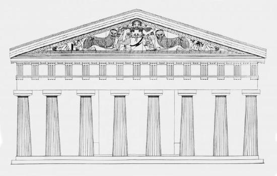
Just as the structures, themselves, are symmetrical in Perugino’s painting, symmetry is also common in major works of architecture, where it lends buildings a tone of stability and power. Classical Greek temples like the Temple of Artemis at Corfu are rigidly symmetrical.
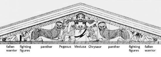
In this diagram (the temple is now a ruin), even the sculpture on the façade—the front of a building—is nearly perfectly symmetrical. At the outer corners are a mirrored pair of fallen warriors, then two pairs (one now fragmentary) of fighting figures, then two mirrored panthers, and then, in the center, Medusa, with two of her children beside her (Pegasus and Chrysaor).
Even the fearsome Gorgon in the center is presented facing directly outward at us, so that her face can be presented in hideous symmetry, with her great, bulging eyes, grimacing mouth, plaited hair, and even the snakes that emerge from the back of her head carved in perfect symmetry. This work should serve to counter the frequently made statement that symmetry makes works beautiful. While many cultures associate symmetry with beauty, and this temple as a whole might be described as such, a grotesque figure remains grotesque even when perfectly symmetrical.
Radial symmetry
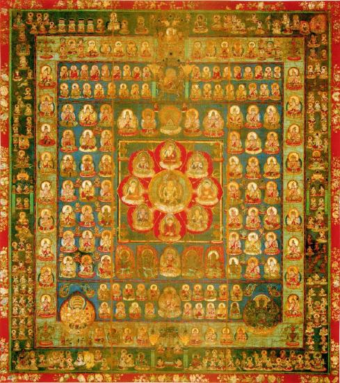
Radial symmetry is created when an image is symmetrical around a central point or axis, like a sunflower viewed head-on. Radial symmetry creates a strong sense of unity in a work of art, and is common in sacred images.
In a Shingon Tantric Buddhist World Womb Mandala, all points seem to radiate outward from the central figure of the Buddha. The numerous figures around him are bodhisattvas, individuals who have chosen out of compassion to delay their entry into Nirvana in order to help others who are suffering. It is fitting that they are shown as if emanating out of the Buddha, himself, as his enlightenment and compassion are the source and model for theirs. The image also gives a sense that the universe itself is highly ordered.
Asymmetrical balance
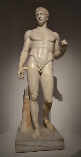
However, perfect symmetry is not necessary to create a sense of balance in an image. Asymmetrical balance is created when two sides of an image do not mirror each other, but still have approximately the same visual weight, the same amount of detail or shapes or color, and so on. The Classical Greek sculpture Doryphoros (The Spearbearer) by Polykleitos provides a clear example of asymmetrical balance. The figure does not stand in a symmetrical way, but overall, seems even, calm, balanced. In this case, the figure has his weight on his right leg, so this leg is tensed. The left leg is relaxed and bent. Balancing this out, the right arm hangs loosely, but the left arm is tensed. In this way, the body — which itself is symmetrical, or would be if he were posed with his feet side by side, looking straight ahead, with his arms hanging down — is balanced. This pose is called contrapposto, and is often used to give standing human figures a sense of life and animation.
Emphasis
Emphasis consists of drawing attention to one or more points in a work. This can be accomplished through any of the visual elements. In the World Womb Mandala, the Buddha is emphasized through location (he is centered in the image), color (the vivid red petals around him draw the eye), line (all of the rows of figures essentially guide the eye inward to the center through implied lines, and the lines dividing the red petals direct us inward, as well), symmetry (the radial symmetry focuses us inward to the center), and so on. In essence, we cannot help but return, again and again, to the Buddha, the focus of the image and also the focus of Buddhist devotion.
Movement
by Dr. Asa Simon Mittman
Movement refers to a sense of motion as the eye is guided through a work of art. This can be accomplished by showing figures in motion, or simply through the visual elements.
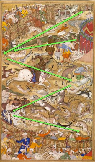
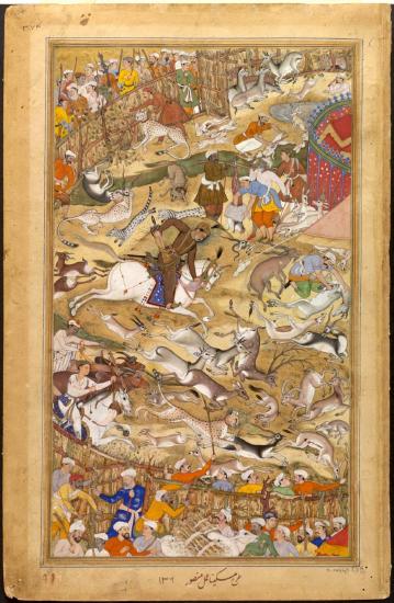
An Indian illumination—that is, a painting in a handmade book—from the Akbarnama showing Akbar hunting in an enclosure demonstrates both types. As with the Dürer woodcut, Four Horsemen of the Apocalypse, the rider on his horse charges rapidly from left to right across the image. The smaller animals scatter, darting in all directions and also hunting one another. Their movements create a strong sense of movement throughout the image. However, there are formal elements that intensify this.
Diagonals
Just as the horizontal lines behind the riders in the Dürer woodcut suggested their movement forward, so here, lines and colors help convey the motion of people and animals. There is a strong zigzag that brings us from top to bottom, or bottom to top.
Starting at the top-right corner, the fences form a strong diagonal, accompanied by the slash of green representing a stream. These meet at the left edge, where the momentum then follows Akbar on his large white horse, also emphasized by the line of darker earth that moves in a downward diagonal from the horse’s mouth. This motion then again reverses direction, in a downward diagonal, back to the left edge, which in turn bounces back to the bottom right edge.
Our eyes therefore move throughout the image not only because the figures in it are depicted in motion, but also because of the manipulation of the visual elements.
Proportion and scale
by Dr. Asa Simon Mittman
Proportion
Proportion refers to the relationship of parts of a body or form to one another and of the parts to the whole, for example, the size of the head of a figure in relation to the entire body.
Scale
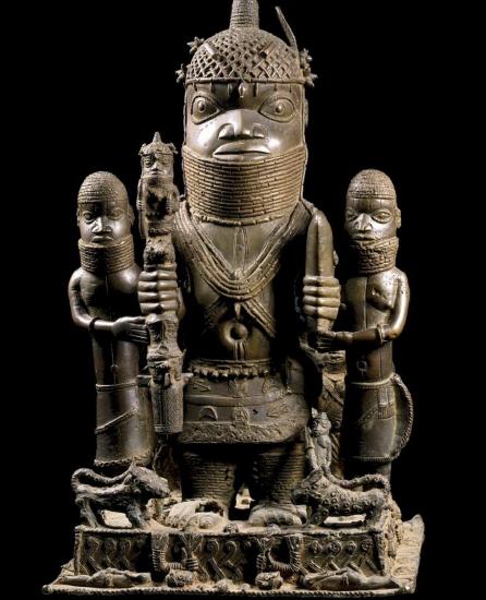
Scale is the relationship of parts of an image to the image as a whole, or to something in the world outside of the image, for example, the size of the figure of a king in an image as compared to the size of the figure of his servant in the same image, or the size of a statue of the king as compared to the size of an actual person. Beginning with proportion, we can look again at Doryphoros. We will compare his proportions to those of an Altar Group from Benin with Oba (King) Akenzua I and Two Attendants.
The proportions of Doryphoros (Figure \(\PageIndex{4}\)) were laid out according to mathematical formulas in order to create an image that the sculptor believed presented the “ideal man.” Doryphoros is about seven “heads” tall, so to speak, whereas the Akenzua is approximately two and a half “heads” tall. Doryphoros’ limbs fit within the range of average human proportion, whereas Akenzua’s legs are considerably shorter than his torso.
While their proportions are quite different, both present figures considered to be ideal by their cultures. Doryphoros embodies quite literally the focus on external beauty—according to the tastes of the day—that was prevalent in Classical Greece, whereas the image of Akenzua shows, with the intentional enlargement of the head, the greater importance of the intellect in the culture.
Hierarchical scale
Scale can refer to any relationship of parts to the whole, but one particular type is of great significance in many periods: hierarchical scale is scale based on relative importance. That is, the more important a figure, the larger he or she is in relation to the figures around him or her. This is quite different from the naturalistic scale found in works organized by linear perspective, like Perugino’s painting.
Akenzua, for example, is considerably larger than the figures that flank him. These are not children, but adult male attendants. We are not supposed to therefore assume that Akenzua is a giant, but rather, that he is far more important than the other two men. Also note that the other two have rather different proportions: their heads are much smaller in relation to their bodies, and their arms and legs longer. This reminds us that Akenzua’s proportions are absolutely deliberate, not the result of incompetence but of a conscious effort to convey a cultural meaning.
Before leaving this work, though, two more details should be mentioned. At their feet are small cats, but these are leopards—traditional symbols of the king—and so even the attendants are comparatively giant. And below the cats are fallen men, bound with their hands behind them, decapitated. The symbolism of decapitation as the ultimate, dehumanizing death highlights the importance of the scale of the head of the king who towers over them.
Pattern, repetition and rhythm, variety and unity
by Dr. Asa Simon Mittman
When an image or object is repeated throughout a work of art, or a part of a work, this is called either pattern or repetition.
Repetition and pattern
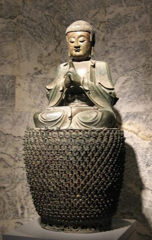
Repetition can be less structured than pattern, which is more regular. Both can work to create a sense of rhythm, as discussed below. The large base of a Ming Dynasty Chinese Bronze statue of Vairochana Buddha is composed of literally thousands of tiny bodhisattvas (enlightened beings who have chosen to stay on earth to help others achieve enlightenment), which therefore seem to serve to support Buddha figuratively, as well as visually. Their repetition is very regular, establishing a clear pattern. This is also the case in the Buddhist mandala (Figure \(\PageIndex{3}\)) from the 9th century. The pattern in both cases emphasizes the unity of purpose shared by these thousands of figures, each an embodiment of the ideal of compassion.
Rhythm
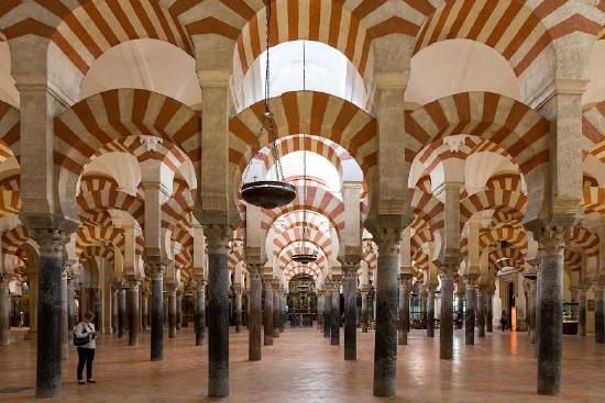
Rhythm is the visual tempo set by repeating elements in a work of art or architecture. The arches and columns of the Great Mosque of Cordoba provide a good example. They are spaced very evenly, setting up an even tone to the building. This is then enlivened by the rhythm created by the striped pattern on the arches.
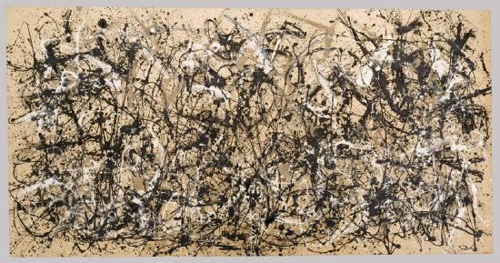
For contrast, we could look at Jackson Pollock’s Autumn Rhythm (Number 30). Pollock was a fan of jazz music, and tried to capture something of its loose, syncopated rhythms. The resulting drip-paintings (they were made with the large canvases lain on the floor of his studio) have similarly loose, improvisational compositions. Despite its lack of formal structure, there is a clear rhythm running horizontally across the painting, and Pollock uses the title of the work to draw our attention to it.
Variety and Unity
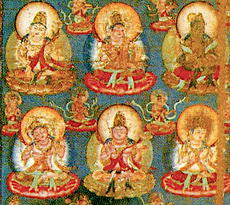
Variety is the use of different visual elements throughout a work, whereas unity is a feeling that all the parts of a work fit together well. These do not have to be opposites, as a work filled with variety might also have unity. The World Womb Mandala is an excellent example. Unlike the Ming Dynasty Bronze statue of Buddha, where all of the bodhisattvas are more or less identical, the many bodhisattvas on the World Womb Mandala are each individualized. At a distance, they all become one, expressing great unity, but taken one at a time, each as an object of devotional contemplation, they contain more variety than it would at first appear.
Articles in this chapter:
- Dr. Asa Simon Mittman, “Balance, symmetry, and emphasis,” in Smarthistory, July 10, 2019 (CC BY-NC-SA)
- Dr. Asa Simon Mittman, “Movement,” in Smarthistory, July 10, 2019 (CC BY-NC-SA)
- Dr. Asa Simon Mittman, “Proportion and scale,” in Smarthistory, July 11, 2019 (CC BY-NC-SA)
- Dr. Asa Simon Mittman, “Pattern, repetition and rhythm, variety and unity,” in Smarthistory, July 10, 2019 (CC BY-NC-SA)