
8.3: Op Art (1960s – 1970s)
- Page ID
- 209566
\( \newcommand{\vecs}[1]{\overset { \scriptstyle \rightharpoonup} {\mathbf{#1}} } \)
\( \newcommand{\vecd}[1]{\overset{-\!-\!\rightharpoonup}{\vphantom{a}\smash {#1}}} \)
\( \newcommand{\id}{\mathrm{id}}\) \( \newcommand{\Span}{\mathrm{span}}\)
( \newcommand{\kernel}{\mathrm{null}\,}\) \( \newcommand{\range}{\mathrm{range}\,}\)
\( \newcommand{\RealPart}{\mathrm{Re}}\) \( \newcommand{\ImaginaryPart}{\mathrm{Im}}\)
\( \newcommand{\Argument}{\mathrm{Arg}}\) \( \newcommand{\norm}[1]{\| #1 \|}\)
\( \newcommand{\inner}[2]{\langle #1, #2 \rangle}\)
\( \newcommand{\Span}{\mathrm{span}}\)
\( \newcommand{\id}{\mathrm{id}}\)
\( \newcommand{\Span}{\mathrm{span}}\)
\( \newcommand{\kernel}{\mathrm{null}\,}\)
\( \newcommand{\range}{\mathrm{range}\,}\)
\( \newcommand{\RealPart}{\mathrm{Re}}\)
\( \newcommand{\ImaginaryPart}{\mathrm{Im}}\)
\( \newcommand{\Argument}{\mathrm{Arg}}\)
\( \newcommand{\norm}[1]{\| #1 \|}\)
\( \newcommand{\inner}[2]{\langle #1, #2 \rangle}\)
\( \newcommand{\Span}{\mathrm{span}}\) \( \newcommand{\AA}{\unicode[.8,0]{x212B}}\)
\( \newcommand{\vectorA}[1]{\vec{#1}} % arrow\)
\( \newcommand{\vectorAt}[1]{\vec{\text{#1}}} % arrow\)
\( \newcommand{\vectorB}[1]{\overset { \scriptstyle \rightharpoonup} {\mathbf{#1}} } \)
\( \newcommand{\vectorC}[1]{\textbf{#1}} \)
\( \newcommand{\vectorD}[1]{\overrightarrow{#1}} \)
\( \newcommand{\vectorDt}[1]{\overrightarrow{\text{#1}}} \)
\( \newcommand{\vectE}[1]{\overset{-\!-\!\rightharpoonup}{\vphantom{a}\smash{\mathbf {#1}}}} \)
\( \newcommand{\vecs}[1]{\overset { \scriptstyle \rightharpoonup} {\mathbf{#1}} } \)
\( \newcommand{\vecd}[1]{\overset{-\!-\!\rightharpoonup}{\vphantom{a}\smash {#1}}} \)
Introduction
Op Art was a new form based on the exploitation of illusions and different optical effects of how an image was perceived. Op Art is a short form of Optical Art, a style of abstraction challenging the viewer's visual acuity. In 1957, neuroscientist Donald M. MacKay created an illusion based on a series of radial lines (MacKay rays), producing the perception of shimmering motion from the angled lines. The artist Victor Vasarely, one of the originators of the style, studied science and art and combined the concepts of color and optics to create images appearing to move, alter or expand. At first, Vasarely experimented with visual tricks like trompe-l'oeil before moving to geometric abstraction and recognition as the grandfather of Op Art.
The form was usually mathematically based, using repetitive color and arrangements to develop into vibrating, changing effects. The background and foreground relationships became chaotic with exaggerated 3-dimensional depths. Op Art pushed the concepts of perception, confusing the eye through multiple optical effects, angles, and materials. The artist used precise calculations and measurements based on geometric forms to produce the illusionary perception in an image. Color, grids, and patterns defined and created the illusional positive space and negative areas. Many images were based on black and white, while others used bright contrasting colors to develop the illusional motion of static patterns. Artists used straight or curved lines to establish the idea of undulation, volume, or spiraling movement. Op Art used optical illusions and incorporated the concepts of kinetics; the static work moved from a seemingly fixed position into a dimensional and moving object by interacting with the viewer's eye and perceptions in the retina.
- Bridget Riley (1931-)
- Edna Andrade (1917-2008)
- Marina Apollonio (1940-)
- Tess Jaray (1937-)
Bridget Riley
Bridget Riley (1931-) was born in London, England. Her father owned his own printing business before World War II when he served in the army. Like many families during the war, Riley, her mother, and her sister moved to the countryside in Cornwall to avoid the blitz. She liked to explore the coastline noting how reflections occurred in rock pools and the effects of the sunlight on the changing colors of the water. After the war, Riley studied art at Cheltenham Ladies' College, Goldsmiths College, and the Royal College of Art. Riley worked as an illustrator for an advertising agency when her father was seriously injured in a car accident, and she suffered a mental breakdown. Riley returned to London, taught art at a girls' school, and explored different art styles. She experimented with figurative, Impressionist, and Pointillist art styles before developing her signature style of Op Art in the 1960s. Riley focused on using black and white for her geometric patterns creating images to disorient the eye into seeing movement and color. In addition to black and white, she used gray tones and placed the geometric shapes in curves, adding movement and optical variances. Riley traveled to multiple countries, favoring Egypt and India's bright colors and patterns. By 1967, Riley incorporated color in lines to produce a shimmering effect in tessellating patterns and highly contrasting colors. She thought of her work as inspired by nature, not in realistic forms; instead, she said, "For me, nature is not landscape, but the dynamism of visual forces-an event rather than an appearance."
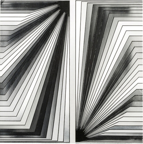
Metamorphosis (8.3.1) presents an ambiguity to the viewer of the progressive movement as the circles are applied with different gray tones against the white background. Using circles, she changes the shapes as the circles move across the image. Riley carefully designed the configuration of each circle and cut the patterns to ensure accurate proportions. Op Art became a significant part of the 1960s culture, the patterns and illusions integral to the fashion and design industries. Riley was one of England's celebrity artists. She was not inspired by realism and stated, "I started studying squares, rectangles, triangles and the sensations they give rise to…The marks on the canvas are sole and essential agents in a series of relationships which form the structure of the painting"[1] During the early 1960s, Riley only used black and white to create imaginative and sensory images. In Arrest 2 (8.3.2), Riley uses lines and multiple tones of black to white to bring the illusion of movement. The pale gray lines in the middle of the painting are bordered by heavy dark lines, forming the appearance of a channel to some viewers. In her black-and-white works, she wanted to eliminate any concept of representational art instead of using visual shapes to excite retinal emotions.


In 1967, Riley began introducing color into her work, using the relationships of color and its changing qualities as a basis for her work. Her series in color was Cataract, and she described how difficult the move to color was; geometric shapes were constant, and color brought a sense of instability based on the presentation of adjunct colors. In Cataract 3 (8.3.3), Riley used lines, a stable shape, to position the color to produce the illusion of movement. The broad or thin lines appear as ribbons waving across the canvas. She used two intense colors of turquoise and vermilion for contrast, positioning the colors to bring a luminosity to the rippling image through the center; grays at the top and bottom accent the movement through the middle of the work. Although Riley's black-and-white images were internationally respected, she wanted to continue to explore the use of color. She studied Georges Seurat's use of Pointillism and how adjunct colors affect each other. Orient IV (8.3.4) was based on her expanded sense of color and how linear structures of different colors next to each other created the concept of motion when viewed by the viewer's eye. She also began using stripes in most of her paintings, believing stripes allowed color to constantly change the viewer's perception. Riley usually made a pattern with small strips of paper to test different color combinations before painting on a large canvas, evaluating how the colors brought the feeling of motion.


Through her observations of the natural world, her experience of looking at the work of other artists, and through her own experimentation, Riley has made a deep, personal investigation of the act of painting, and of how we see. She is one of the most distinguished and world-renowned artists working today.
Edna Andrade
Edna Andrade (1917-2008), born in Virginia, was encouraged from an early age to draw and paint and graduated from the University of Pennsylvania with a degree in Fine Arts. After World War II, she went to Europe and learned the modernism of the Bauhaus movement, concepts that influenced her designs and abstractions. Andrade married in 1941 and moved to Philadelphia, where Andrade lived and painted. Early in her career, she created abstract landscapes before working on propaganda material during World War II for the organization that became the CIA; work she considered mundane and expected of women at the time. Andrade talks about herself as the unliberated housewife of the period. Andrade divorced her husband in 1960 and only then began painting the works she is known for, fully engaging in her illusionary or Op Art ideas, geometrical shapes generally based on squares and unique color juxtapositions. Some of her work is almost psychedelic, seemingly with lines moving on the painting. Andrade felt her work was a visual experience without any particular story and believed the eye was easily upset when viewing conflicting color spectrums and sophisticated geometric patterns. Andrade's use of contrasting and repeated colors placed next to each other defined the rhythm and movement of the painting, almost a hypnotic sensation. She moves the viewer's eye around the painting in constant motion, with no place to rest.
Blue Cross with Red (8.3.5) assaults the eye with the deep blue background filled with broken lines of deep red. The lines bend to move the viewer around the painting while continually returning to the strength of the red square in the middle. Andrade believed only a few basic shapes in combination with color develop symmetry and rhythm in the painting. Untitled (Metallic Square 3) (8.3.6) demonstrates her belief in the symbolic significance of fundamental shapes. The simple line, bent and moved at incremental positions combined with basic opposing colors, generates the perspective of orderly movement in a chaotic environment. While Blue Cross with Red appears as lines generating out from the middle square and Untitled has a maze-like appearance, Turbo 1-65 (8.3.7) uses what seems to appear as lightning bolts radiating from the center. The bright red lines against the opposing green give the perception the lines bend and expand as they move outwards, the bold contrasting colors conveying the rhythmic patterns.


Marina Apollonio
Marina Apollonio (1940-) was born in Trieste before she moved to Venice as a child. She attended the Accademia di Belle Arti di Venezia to study art, creating her first work in 1963. She preferred the depersonalization of Op Art instead of the more expressive Abstract Expressionism, using industrial metal materials for her artwork. Apollonio produced her work based on the concepts and relationships of parallel lines, using combinations of elementary forms and mathematical rigor. The two-dimensional work became an imaginative three-dimensional of concentric circles appearing to fluctuate and spin in motion. Her extensive work is laid on the floor, the flat surface of strong parallel lines drawing the viewer physically into the painting. Much of her work was black and white, but she also used contrasting colors. Spazio Ad Attivazione Cinetica 6B (8.3.8) demonstrates Apollonio's use of mathematics, geometry, and visual materials. Using the contrasting colors of black and white, the overly large work invites the viewer inside the painting; the flat surface appears to undulate into mini hills, slowly spinning. The Guggenheim Museum stated: "After choosing a primary shape, for instance, a circle, the artist would study its structural possibilities so that she could make it active, all the while striving to garner the maximum result via minimal means. This process was not at all tainted by subjectivity."[2] By the 1980s, Apollonio no longer made new artwork, only dedicating her time to research and writing.

Interview with Marina Apollonio about her project at the 59th International Art Exhibition "The Milk of Dreams" (Venice, 23 April - 27 November 2022).
Tess Jaray
Tess Jaray (1937-) was born in Vienna. Her parents fled to England in 1938 as the Nazis invaded Austria and started the organized massacre of the Jewish people. After Jaray completed her general education in 1957, she attended the Slade School of Fine Art. Jaray also received other scholarships to travel to Italy and France for intensive Italian Architecture and etching training in Paris. Jaray was interested in the formation and development of space, especially in how Italian ceilings were designed and constructed. The influence of the ceilings led her to create work based on geometrical repetition and patterns and how color is used. Jaray also became a teacher at Slade School of Fine Arts, the first female teacher in Slade's history. Later in her career, Jaray spent most of her time designing large installations for public commissions. The Centenary Square (8.3.9) paving design in Birmingham exemplifies how Jaray incorporated her abstract geometric patterns into large spaces. Bright, contrasting colors accentuated competing designs of filled and empty squares along with wavy patterns. People walking on the design sense their instability as they move around the patterned walkways.
.jpg?revision=1&size=bestfit&width=717&height=476)
[1] Retrieved from http://www.op-art.co.uk/bridget-riley/
[2] Retrieved from https://burnthewater.org/2016/05/29/marina-apollonio-spazio-ad-attivazione-cinetica-6b/
(16 December 2020)