
14.3: The Commercial Landscape of the Everyday
- Page ID
- 232349

\( \newcommand{\vecs}[1]{\overset { \scriptstyle \rightharpoonup} {\mathbf{#1}} } \)
\( \newcommand{\vecd}[1]{\overset{-\!-\!\rightharpoonup}{\vphantom{a}\smash {#1}}} \)
\( \newcommand{\id}{\mathrm{id}}\) \( \newcommand{\Span}{\mathrm{span}}\)
( \newcommand{\kernel}{\mathrm{null}\,}\) \( \newcommand{\range}{\mathrm{range}\,}\)
\( \newcommand{\RealPart}{\mathrm{Re}}\) \( \newcommand{\ImaginaryPart}{\mathrm{Im}}\)
\( \newcommand{\Argument}{\mathrm{Arg}}\) \( \newcommand{\norm}[1]{\| #1 \|}\)
\( \newcommand{\inner}[2]{\langle #1, #2 \rangle}\)
\( \newcommand{\Span}{\mathrm{span}}\)
\( \newcommand{\id}{\mathrm{id}}\)
\( \newcommand{\Span}{\mathrm{span}}\)
\( \newcommand{\kernel}{\mathrm{null}\,}\)
\( \newcommand{\range}{\mathrm{range}\,}\)
\( \newcommand{\RealPart}{\mathrm{Re}}\)
\( \newcommand{\ImaginaryPart}{\mathrm{Im}}\)
\( \newcommand{\Argument}{\mathrm{Arg}}\)
\( \newcommand{\norm}[1]{\| #1 \|}\)
\( \newcommand{\inner}[2]{\langle #1, #2 \rangle}\)
\( \newcommand{\Span}{\mathrm{span}}\) \( \newcommand{\AA}{\unicode[.8,0]{x212B}}\)
\( \newcommand{\vectorA}[1]{\vec{#1}} % arrow\)
\( \newcommand{\vectorAt}[1]{\vec{\text{#1}}} % arrow\)
\( \newcommand{\vectorB}[1]{\overset { \scriptstyle \rightharpoonup} {\mathbf{#1}} } \)
\( \newcommand{\vectorC}[1]{\textbf{#1}} \)
\( \newcommand{\vectorD}[1]{\overrightarrow{#1}} \)
\( \newcommand{\vectorDt}[1]{\overrightarrow{\text{#1}}} \)
\( \newcommand{\vectE}[1]{\overset{-\!-\!\rightharpoonup}{\vphantom{a}\smash{\mathbf {#1}}}} \)
\( \newcommand{\vecs}[1]{\overset { \scriptstyle \rightharpoonup} {\mathbf{#1}} } \)
\( \newcommand{\vecd}[1]{\overset{-\!-\!\rightharpoonup}{\vphantom{a}\smash {#1}}} \)
The new American city of the twentieth century inspired a raucous endorsement among a group of writers and artists dubbed the "new vulgarians," those who wanted American art to draw its content and its forms directly from the commercial, machine-based culture of modern America.12 They were critical of the "soil-spirit" artists celebrated by Alfred Stieglitz, who repudiated the messy commercial landscape of the urban present in favor of art forms that looked to the spiritual heritage of the nation, rooted in the natural landscape-the "soil"- of the country. The writer Edmund Wilson (1895-1972) summed up the credo of the new vulgarians, "[t]he hawking taxis, the screaming sirens, the joyous yell of the mechanical life, all this we hear every day; it is the music to which we dance, to which the powerdrunken city exults."13 For the "soil-spirit" camp, such efforts to capture the shock and confusion of modernity threatened to prostrate the artist before the "monster" of commercial civilization, a new machine culture that made machine men. Between these two extremes were a range of positions, as American artists struggled to create a compelling new visual language of their time and place. Advertising, packaging, and graphic design-the signage of a new commercial culture- played a key role in this new American art.
"Modern Vernacular"
The bold, attention-grabbing graphics of billboards and advertising plastered on urban walls, product packaging, and consumer objects formed a growing part of the everyday- or vernacular- visual landscape of American cities by the early twentieth century. American artists took a number of approaches to this new landscape. Though undeniably modern and American, it was also dominated by the commercial values that many artists loved to hate. While quite a few became involved in commercial design at various points in their careers, others cordoned themselves off from any such involvement with business. Yet these same artists occasionally appropriated aspects of the new visual environment in their own work, as a sign of their modernity, their desire to address a wider audience, or their ability to transform the raw materials of a mass consumer culture into the stuff of art.
STUART DAVIS. The paintings of Stuart Davis (1894- 1964), in the words of a mid-century critic, were "as American as a New England patch-quilt, though having the pattern of late cubism."14 Davis domesticated Cubism with graphic forms and bold colors inspired by America's new commercial landscape. A prolific writer, he wrote that he "enjoyed the dynamic American scene . . . all my pictures . . . have their originating impulse in the impact of the contemporary American environment."15 He identified some of his inspirations as 'American wood and iron work of the past; Civil War and skyscraper architecture; the brilliant colors on gasoline stations; chain-store fronts and taxi-cabs; the music of Bach; .. . fast travel by train, auto, and aeroplane which brought new and multiple perspectives; electric signs; the landscape and boats of Gloucester, Mass.; 5 & rn cent store kitchen utensils; movies and radio; Earl Hines hot piano and negro jazz music in general, etc." These things, he concluded, all shared a similar sense of formal, spatial, and sound dynamics that he wished to incorporate into his art, dynamics expressing "the new lights, speeds and spaces of our epoch."16

Davis's Odol (fig. 14.21) features a well-known German mouthwash marketed in the United States. His painting reproduces the distinctive angled neck of the bottle. In a fashion that anticipated the Pop art Campbell's soup cans of Andy Warhol (see fig. 18.6), Davis reproduced the precise labeling and packaging of the commercial product. Yet the painting is also Davis's "riff"-the term is appropriate, given his taste for jazz- on the European Cubist studio still-life. The advertising phrase "It purifies" refers both to the product and to the artist's relationship to European modernism. Davis had tried his hand in 1922 at a Cubist-style still-life that referred directly to the table-top compositions of Braque and Picasso. However, he realized a more successful synthesis of Cubist space and American subject matter in a series of works drawing directly on American products-Lucky Strike (1921) and Cigarette Papers (1921)- which translated the Cubist ambiguity between two and three dimensions, flatness and illusion, into boldly simplified terms. In Odol, a checkerboard bathroom tile floor is upended in a bold gesture that banishes all reference to illusionistic space. The only exception is the three-dimensional lettering on the Odol bottle itself. Davis also plays with spatial illusion in the illogical frame he superimposes upon the composition. In place of Cubist "passage" - the shaded transitional zones between areas of the composition, which suggest a lingering debt to chiaroscuro-he gives us a "purified" American expression, moving American art away from European modernism and into an unapologetic embrace of the bold flat quality of modern advertising.
Though he possessed a sophisticated knowledge of European modernism, Davis wrote that he wanted to paint "direct simple pictures of classic beauty-expressing the immediate life of the day ... They should be sold in stores like newspapers and magazines." "I do not belong to the human race but am a product made by the American Can Company and the New York Evening Journal."17 His notion of a "vernacular" language of art did not extend to creating real advertisements, however, and he refused any direct commercial involvement with advertising, unlike his contemporaries, Maxfield Parrish and Rockwell Kent. Though these latter two artists were stylistically conservative, they were professionally tied to the realms of business and advertising that were reshaping the visual landscape of the everyday. Davis's high modernist prejudices kept him from direct involvement with commercial media; claiming the subject matter of advertising for his art, he nonetheless clung fast to the privileged voice of the artist. (See fig. 16.13 for more on Davis.)
Photography and Advertising: Modernism Allied to Commerce
If modernist artists often felt they debased their art by associating it with commodities, commodities-and the whole business of buying and selling-could benefit considerably from an association with modern art. Artistic modernism exerted a wide influence, evident in the proliferation of modernist styles such as Cubism and Constructivism in such upscale publications as Vanity Fair, Vogue, Harper's Bazaar, and Fortune. "[T]he principles of Cezanne," as one advertiser put it in 1927, "have been put to use admirably in the advertising of Snowdrift and Wesson Oil."18
Not everyone agreed that modernism was suited to commercial uses. Advertisers were increasingly concerned with the ability of the image to communicate to a mass public. Some argued that abstraction, grounded in pattern and shape apart from subject, obscured the message. In this context, "transparency" -seeing through the image to the thing it represented-was an important consideration. Advertising adjusted its approaches to "niche" markets: vanguard styles for sophisticated consumers, graphic readability and an interesting narrative for "middlebrow" audiences. Techniques of persuasion thus varied along class and consumer lines.
The invention of the half-tone photographic process in the 1890s made photomechanical reproduction possible. Despite this, photography was not widely used in advertising until the 1920s, when photographers would master a range of new techniques that glamorized consumer products. After that date, photography dominated the magazines, constituting over 60 percent of all ads by the mid-1930s. In addition to its claims to truth, the camera had a second appeal for advertisers: it was distinctively American: "... leadership with the camera belongs to America .... A new art is reflecting a new scene. Skyscraper, grain elevator, dynamo, smoking factory chimneys-these become as appropriately themes for the camera as was the French landscape for the brush of Corot, or the mists of an English harbor for the art of Turner."19
Photographic advertising, as Lincoln Kirstein put it in the 1930s, "learned how to make spools of thread look like grain elevators and buttons like galaxies of moons."20 Using seductive lighting and dramatic framing, photography could make the small seem big and the everyday seem fantastical. To mass audiences, photography was less intimidating than the fine arts, but it did popularize modernism with its skewed perspectives (such as the popular "angle shot"), flattened spaces, and attention to abstract pattern. Such devices associated consumer products with an up-to-date, adventurous modern outlook and helped sell a way of life.
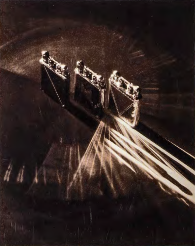
STEICHEN AS AD ARTIST. Instrumental in creating this new language was Edward Steichen, whose involvement reveals just how permeable were the boundaries between art and commerce. Steichen's career, which extended from Pictorialism to fashion, and advertising to journalism and documentary, embodies the varieties of twentieth-century photographic practice. By 1923, when he was hired by Vanity Fair, Steichen had come to think of photography as serving a wider audience. Steichen's status as a "fine art" photographer increased his appeal for advertisers. Like other media such as animation- going through a similar process of industrialization-advertising and fashion photography were produced by teams of technicians. While Steichen acknowledged his lack of control over the final product, nevertheless he still directed the entire process and put his stamp on the end result. In his advertising work he used modernist formal strategies-isolating the object from any context, repeating it to create abstract pattern, and framing it at odd angles, as well as using anti-naturalistic lighting, tonality, and perspective-to sell an image of modern life as seductive, glamorous, and excitingly new (fig. 14.22). Steichen popularized a style that combined the geometries of Art Deco with extreme camera angles. At a time when Americans relied more and more on consumption to establish a self-image, Steichen created photographs in which commodities were springboards for private fantasies, evoking materialistic desires and longings for status.
Steichen supported aesthetic collaboration with modern business. Emphasizing the message over the maker, he located the "truth value" of the photograph not in its unique artistic vision but in the power of the image itself regardless of its source in advertising, propaganda, or photojournalism- to shape public desires, memories, and future hopes. In 1929 he proclaimed that "there never has been a period when the best thing we had was not commercial art."21
The Painter, the Poet, and the City: Charles Demuth's Poster Portrait of William Carlos Williams
"The Great Figure" -William Carlos Williams
Among the rain
and lights
I saw the figure 5
in gold
on a red firetruck
moving
tense
unheeded
to gong clangs
siren howls
and wheels rumbling
through the dark city.
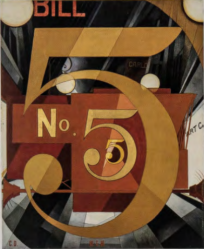
In the 1920s, Charles Demuth did a series of "poster portraits" of his friends and fellow artists. In their abstract and coded character (devoid of direct physical references), these resemble the emblematic portraits Demuth's friend Marsden Hartley had done a decade before (see Chapter 13). Visually stunning, these works nonetheless elude understanding but suggest a strategy by which artists both participated in the commercial culture of their time, and remained aloof, preserving separate identities. Demuth's 1928 painting I Saw the Figure Five in Gold (fig. 14.23) pays tribute to the modernist poet William Carlos Williams (1883-1963), whose poem "The Great Figure" inspired Demuth's painting. Williams's poem describes a vision of a fire truck speeding through the streets of New York. I Saw the Figure Five takes this vision as its central motif. In the lower third of the painting is the horizontal axle of the truck, while the globes of light in !:he upper right and left corners may be read both as headlights and as street lights. The painting offers other glimpses of an urban landscape at night-tall buildings, illuminated storefronts, electric billboards, and theater marquees take their place in an abstract composition. Demuth's painting suggests the way in which the gold five-painted on the side of the truck-activates the poet's perceptual field, a moment of revelation that unites the poem and the painting.
Demuth's dynamic composition of crisply painted letters and numerals is intersected by prismatic rays. These raylines, influenced by Futurism, bring to mind another familiar aspect of urban life in the 1920s: they resemble the light cones of cinematic projection. Like a moving picture, the city absorbs the viewer in a whirl of light and sound, superimposing a sequence of moments as layers of space. The series of fives creates a recession carrying the viewer into the depth of the canvas, only to be ping-ponged back toward the surface; the effect is of energies that expand and contract simultaneously. Background and foreground are brought together in a design of overlapping diagonals, suggesting the syncopations of jazz, or the sound of a siren as it passes, Doppler-like, through space. The visual effect of the painting echoes Williams's own call for a new poetry that would capture the "jumps, swiftnesses, colors, movements" of the modern city.22
Both Demuth and Williams directed their separate art forms toward the qualities, textures, and sensory environment of the new city-the accelerated speed of perceptions, the fractured visual field, and the impact of new media such as film in transforming life into spectacle. I Saw the Figure Five is a painter's tribute to a poet, implying a creative bond between two members of the American avant-garde engaged in a common effort to forge a new American art based in the commercial landscape.
While using imagery drawn from this familiar landscape might allow art to fulfill its democratic promise, nevertheless only those who shared Demuth's knowledge of Williams and his vanguard associates in the 1920s would understand his painting entirely. Demuth's portrait places this commercial vernacular in the service of coded meanings, difficult to grasp. Appealing to a machine-age public familiar with billboard graphics, it resisted the accessibility of commercial messages by employing a language of private allusion. In doing so, Demuth's coded images lifted his art above the "vulgar" commercial culture that supplied his raw material.
The uses Davis and Demuth made of urban graphics, packaging, and advertising were new to American art. Although trompe l'oeil paintings of the late nineteenth century depicted paper money, along with bits of popular ephemera such as theater tickets, newspaper ads, and early pin-ups (see fig. 11.6), these objects in no way suggested a new visual style, serving instead a purely iconographic function. By contrast, early modernists went beyond the mere appropriation of objects from popular culture to exploit not only the visual properties of new materials, but also the sensations associated with new urban experiences.
The City and Popular Media: Comics and Animation
American modernist painters struggled to represent urban modernity's condensation of time and space in the static medium of easel painting. They used the limited means available to them-abstraction, montage, Cubist fragmentation, and Futurist repetition of forms-to suggest the ways in which trains, planes, telephones, telegraphs, tall buildings, and photography transform the experience of reality. Early cartoons and animation-with their inherent capacity to free time and space from its everyday laws-proved far more effective than the fine arts in capturing the fluid nature of urban reality in the modern era, or so at least one commentator thought in the 1920s. Journalist Creighton Peet celebrated his favorite animated character- Felix the Cat-as "one of the few sparks of vitality in a world of insistent proprieties."23
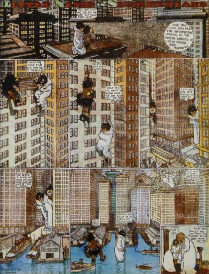
LITTLE NEMO. In the strip cartoon Little Nemo 's Adventures in Slumberland, drawn by Winsor McCay (1867- 1934) from 1905 until 1911 for the New York Herald, a young boy travels across time and space in a series of extraordinary dream/ nightmare adventures induced by having eaten rich foods before bed (fig. 14.24). Each strip begins with Nemo being spirited away by one of a cast of characters who take him on mock epic journeys, and each ends with Little Nemo tumbling out of bed and waking up. McCay's strip brought together the storybook characters of polite children's literature with an assortment of raucous ethnic stereotypes: spear-wielding Africans, ferocious redskins, vulgar cigar-smoking Irishmen. In the highly condensed space of the strip, Nemo's dreams reproduce the time travel and random illogical juxtapositions that had come to seem commonplace in everyday urban life. McCay leavened his narrative with a grasp of the unconscious, where desires have an uncanny tendency to take real form. From the polar icecaps to the tropics, from the heart of darkest Africa to the heart of the American skyscraper city, Nemo's adventures reflect the mobility of imagination liberated by new technologies of travel, and empowered by dream. McCay's Little Nemo animated the inanimate, warping an everyday sense of scale and proportion through dreamscapes that collapsed time and space and acted out the repressed anxieties and fears of modern urban Americans. It did so with wit, humor, and consummate artistry. McCay was among the first to try his hand at animation, characteristically hand-drawing each frame himself for his Gertie the Dinosaur, insisting on individual control over each aspect of a medium that, by the 1920s, had come increasingly to resemble industrial modes of production.
Little Nemo's ethnic stereotyping, along with its sudden leaps between times and places, drew upon McCay's own experience in vaudeville, a fertile source for a variety of popular forms, from film to stand-up comedy. While such stereotypes occasionally made their way into the work of the Ashcan artists of these same years (see Chapter 12), they remained generally off limits to art deemed to be serious.
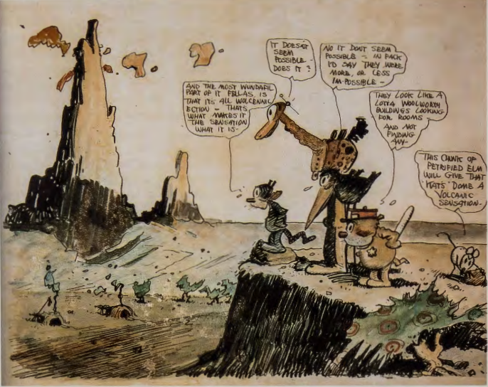
GEORGE HERRIMAN'S KRAZ¥ KAT. Despite their graphic and narrative power, comic strips have been widely decried by those interested in policing public taste and morality as the lowest of the "low art" forms. Having fought long and hard to establish fine arts institutions, public respect for the arts, and a serious audience, American elites were rigid in enforcing boundaries between fine arts and popular media. Persistent insecurity about the status of high culture in the United States also contributed to reluctance to recognize the inventiveness of low art media. Such had not been the case in Europe, where artists from Juan Gris (1887-1927) to George Grosz (1893- 1959) moved fluidly between the worlds of painting and popular media, including cartoons, both making and consuming them. Picasso, Ernest Hemingway, and T. S. Eliot were among the avid readers of George Herriman's (1880-1944) Krazy Kat (begun 1913; fig. 14.25). Such adulation contributed to growing recognition for cartoons in this country.
Like Winsor McCay's Little Nemo , the premise of the Krazy Kat strip was deceptively simple: a lovesick cat romantically attached to a sadistic mouse named Ignatz, whose violence toward his admirer is policed by Officer Pupp, a canine law enforcer who is himself in love with the cat. The strip invariably ends with Ignatz throwing a brick at Krazy Kat, who remains deluded enough to believe that such actions are motivated by love. Their antics are played out in the lunar landscape of the American Southwest, with its rocky outcroppings and otherworldly desolation. Herrirman's strip brought the surreal Southwest, with its Spanish place names (Cococino, Desierto Pintado), together with a character who muses in the vaguely Yiddish accents of an immigrant to the New World, in flights of poetry that delighted his readers. Combining slapstick comedy with snatches of Spanish, broken English, and a lovable character impervious to the hard knocks of reality, Krazy Kat celebrated the comic collision of New and Old Worlds. Herriman, who was of African American parentage although he passed as white, used the freedom of the new medium to transform a delusional obsession into compelling visual and verbal poetry and inspired comedy. Drawn with a scratchy shorthand, the strip changed landscape from frame to frame, a whimsical commentary on the pace of change in the new America.
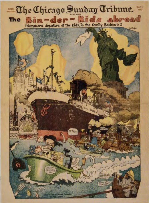
A COMIC STRIP BY A MODERNIST ARTIST. The extraordinary history of American comics and their international influence was the product of native talent, unburdened by fine art requirements and wedded to the mass-circulation daily newspaper. Under the guidance of William Randolph Hearst, Joseph Pulitzer, and others, these newspapers established an unprecedented sway over the lives of urban Americans. In one instance, a brilliant if short-lived comic strip published in the Chicago Tribune was the product of a German-American artist better known for his modernist canvases. Lyonel Feininger (1871- 1956), American-born but living in Germany since his teens, trained as an artist there and brought his interest in Art Nouveau and Japonisme to his comic art. Feininger began as· a cartoonist for European journals but eventually developed his own set of characters, traceable back to the earliest cartoon in Europe, Max and Moritz (1865) by the German cartoonist Wilhelm Busch (1843-1908). Busch's naughty boys influenced the shape of later American comics such as R. F. Outcault's Yellow Kid (1896) and the Katzenjammer Kids (1896), a popular strip published in the New York Journal. These "demon children" engaged in pranks that satirize adult behavior and poke fun at adult pretensions. Hired by the Tribune to woo German immigrants and others to the paper, Feininger created Kin-der-Kids (1906; fig. 14.26), which featured a motley crew of characters with such American-sounding names as Aunty Jim-Jam and Cousin Gussy. In figure 14.26, the Kin-der-kids sail back to Europe in a bathtub, reversing the usual direction and turning their back on a comically distorted Statue of Liberty, who waves farewell with a huge white handkerchief.
THE BEGINNINGS OF ANIMATION: "FELIX THE CAT." The animation medium was the same as film: celluloid run through a projector, in a sequence of individual frames that created the appearance of continuous motion. Yet unlike film, animation freed itself from the real world by substituting hand-drawn for photographic frames. These frames were then photographed by a motion picture camera designed to stop after each exposure. With the invention of the "eel" -short for celluloid-in 1914, animation became less labor-intensive, as multiple layers of celluloid separated the static landscape backdrops from the moving figures in the foreground. These alone were redrawn to produce the illusion of motion. As the commercial possibilities of animation became apparent, studios emerged to produce shorts shown before feature-length live action films. Resembling the division of labor within industry, animation studios were hierarchically organized by skill level, from master animators to tracers and inkers. Critics of animation charged that because animation was the result of a "production line of specialists," it lacked "a single brain and sensibility," and could not achieve aesthetic unity.
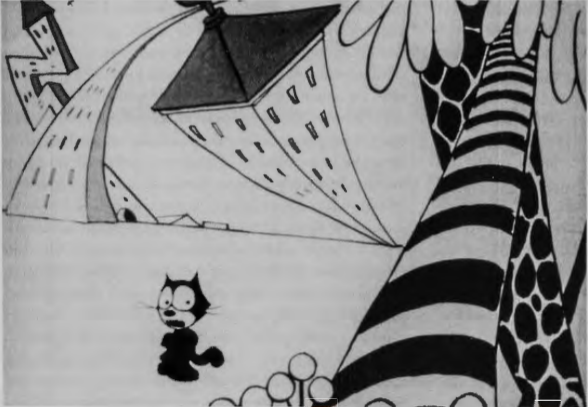
Despite the criticism that animation allowed little individual creativity, the history of the medium has been marked by strong creative personalities whose vision guided the production process. One such personality was Otto Messmer (1894-1985), creator of Felix the Cat (fig. 14.27). Widely known and loved following his first appearance in 1919, Felix was an "everyman" figure with whom audiences of all social backgrounds could identify. Felix, endowed with extraordinary powers of self-transformation, faced the constant challenges of everyday life-hunger, fear, the need for love and acknowledgment, the quest for pleasure, the battle between men and machines, the battle between the sexes, and the age-old desire to transcend the limits of bodily existence-with endless ingenuity, and occasional help from his animator. Felix Dines and Pines (1926) is played out in an urban setting characterized by syncopated jazz rhythms, swaying skyscrapers, and carousing companions. The experience of following Felix through trial, challenge, and happy (or humorous) resolution carried a cathartic force for audiences whose own experiences with modern life often presented intractable difficulties.
Watching Felix was cathartic in another sense as well; animation was a mechanized medium, yet one that balanced machine production with the individual talents and creative imagination of the animator. With minimal means-the reductive and simplified black and white of Felix and the things he is transformed into, against a stark background of abstracted props-the Felix cartoons acted out the tension between personal fantasy and mechanical form, a struggle that allowed audiences to work through their own anxieties about mechanization. Embodying the everyday travails of ordinary Americans coping with a sometimes frightening urban environment, Felix won the day through his power to improvise a quick response to new situations by shifting shapes. The ability of one thing to transform itself into something else-shape-shifting was unique to animation; no other medium had such fluid capabilities. Animation "gave man the power finally to create something new in the world," as one admiring critic put it in the 1920s,24 and Messmer used this power to the fullest. Felix's tail might become an umbrella, which in turn could become the propeller of a plane, allowing him a convenient escape from the ubiquitous predators that haunt his many lives. For viewers increasingly locked into the regimen of the production line, the time clock, the scheduled arrival and departure of trains, and the routinized nature of daily life, Felix represented freedom and possibility.
Animation shared with modernism the power to transform one thing into another. Modernism did this through metaphor: abstract forms conjure associations with the body, or with nature. Animation did this through more direct means: a lamppost becomes a sinuous monster, or a line of linked sausages becomes a corps of fighting soldiers. Modernism engaged the powers of unconscious association; animation likewise played upon such psychic mechanisms as displacement, free association, and projection, as when Felix, haunted by hunger, hallucinates edibles at every turn. In one final respect, animation paralleled modernism by calling attention to the medium and revealing its own mode of production. In Comicalamities of 1928, the hand of the animator appears, drawing Felix with pen and ink. Felix thenceforth repeatedly summons his animator to do his bidding, as when he asks him to repaint the face of an ugly female cat. After being rejected by the newly desirable cat, Felix tears a hole in the paper on which she is drawn and tosses her out, once again asserting control over the narrative. In its powers of transformation, its grasp of the unconscious, and its self-referentiality, animation also resembled Surrealism, as European commentators noted. The advent of sound technology in 1927 dramatically transformed animation by introducing narrative structures that relied far less on the visual logic of shape-shifting to drive the story.