
6: Designing Within a Visual Field
- Page ID
- 126581

\( \newcommand{\vecs}[1]{\overset { \scriptstyle \rightharpoonup} {\mathbf{#1}} } \)
\( \newcommand{\vecd}[1]{\overset{-\!-\!\rightharpoonup}{\vphantom{a}\smash {#1}}} \)
\( \newcommand{\dsum}{\displaystyle\sum\limits} \)
\( \newcommand{\dint}{\displaystyle\int\limits} \)
\( \newcommand{\dlim}{\displaystyle\lim\limits} \)
\( \newcommand{\id}{\mathrm{id}}\) \( \newcommand{\Span}{\mathrm{span}}\)
( \newcommand{\kernel}{\mathrm{null}\,}\) \( \newcommand{\range}{\mathrm{range}\,}\)
\( \newcommand{\RealPart}{\mathrm{Re}}\) \( \newcommand{\ImaginaryPart}{\mathrm{Im}}\)
\( \newcommand{\Argument}{\mathrm{Arg}}\) \( \newcommand{\norm}[1]{\| #1 \|}\)
\( \newcommand{\inner}[2]{\langle #1, #2 \rangle}\)
\( \newcommand{\Span}{\mathrm{span}}\)
\( \newcommand{\id}{\mathrm{id}}\)
\( \newcommand{\Span}{\mathrm{span}}\)
\( \newcommand{\kernel}{\mathrm{null}\,}\)
\( \newcommand{\range}{\mathrm{range}\,}\)
\( \newcommand{\RealPart}{\mathrm{Re}}\)
\( \newcommand{\ImaginaryPart}{\mathrm{Im}}\)
\( \newcommand{\Argument}{\mathrm{Arg}}\)
\( \newcommand{\norm}[1]{\| #1 \|}\)
\( \newcommand{\inner}[2]{\langle #1, #2 \rangle}\)
\( \newcommand{\Span}{\mathrm{span}}\) \( \newcommand{\AA}{\unicode[.8,0]{x212B}}\)
\( \newcommand{\vectorA}[1]{\vec{#1}} % arrow\)
\( \newcommand{\vectorAt}[1]{\vec{\text{#1}}} % arrow\)
\( \newcommand{\vectorB}[1]{\overset { \scriptstyle \rightharpoonup} {\mathbf{#1}} } \)
\( \newcommand{\vectorC}[1]{\textbf{#1}} \)
\( \newcommand{\vectorD}[1]{\overrightarrow{#1}} \)
\( \newcommand{\vectorDt}[1]{\overrightarrow{\text{#1}}} \)
\( \newcommand{\vectE}[1]{\overset{-\!-\!\rightharpoonup}{\vphantom{a}\smash{\mathbf {#1}}}} \)
\( \newcommand{\vecs}[1]{\overset { \scriptstyle \rightharpoonup} {\mathbf{#1}} } \)
\(\newcommand{\longvect}{\overrightarrow}\)
\( \newcommand{\vecd}[1]{\overset{-\!-\!\rightharpoonup}{\vphantom{a}\smash {#1}}} \)
\(\newcommand{\avec}{\mathbf a}\) \(\newcommand{\bvec}{\mathbf b}\) \(\newcommand{\cvec}{\mathbf c}\) \(\newcommand{\dvec}{\mathbf d}\) \(\newcommand{\dtil}{\widetilde{\mathbf d}}\) \(\newcommand{\evec}{\mathbf e}\) \(\newcommand{\fvec}{\mathbf f}\) \(\newcommand{\nvec}{\mathbf n}\) \(\newcommand{\pvec}{\mathbf p}\) \(\newcommand{\qvec}{\mathbf q}\) \(\newcommand{\svec}{\mathbf s}\) \(\newcommand{\tvec}{\mathbf t}\) \(\newcommand{\uvec}{\mathbf u}\) \(\newcommand{\vvec}{\mathbf v}\) \(\newcommand{\wvec}{\mathbf w}\) \(\newcommand{\xvec}{\mathbf x}\) \(\newcommand{\yvec}{\mathbf y}\) \(\newcommand{\zvec}{\mathbf z}\) \(\newcommand{\rvec}{\mathbf r}\) \(\newcommand{\mvec}{\mathbf m}\) \(\newcommand{\zerovec}{\mathbf 0}\) \(\newcommand{\onevec}{\mathbf 1}\) \(\newcommand{\real}{\mathbb R}\) \(\newcommand{\twovec}[2]{\left[\begin{array}{r}#1 \\ #2 \end{array}\right]}\) \(\newcommand{\ctwovec}[2]{\left[\begin{array}{c}#1 \\ #2 \end{array}\right]}\) \(\newcommand{\threevec}[3]{\left[\begin{array}{r}#1 \\ #2 \\ #3 \end{array}\right]}\) \(\newcommand{\cthreevec}[3]{\left[\begin{array}{c}#1 \\ #2 \\ #3 \end{array}\right]}\) \(\newcommand{\fourvec}[4]{\left[\begin{array}{r}#1 \\ #2 \\ #3 \\ #4 \end{array}\right]}\) \(\newcommand{\cfourvec}[4]{\left[\begin{array}{c}#1 \\ #2 \\ #3 \\ #4 \end{array}\right]}\) \(\newcommand{\fivevec}[5]{\left[\begin{array}{r}#1 \\ #2 \\ #3 \\ #4 \\ #5 \\ \end{array}\right]}\) \(\newcommand{\cfivevec}[5]{\left[\begin{array}{c}#1 \\ #2 \\ #3 \\ #4 \\ #5 \\ \end{array}\right]}\) \(\newcommand{\mattwo}[4]{\left[\begin{array}{rr}#1 \amp #2 \\ #3 \amp #4 \\ \end{array}\right]}\) \(\newcommand{\laspan}[1]{\text{Span}\{#1\}}\) \(\newcommand{\bcal}{\cal B}\) \(\newcommand{\ccal}{\cal C}\) \(\newcommand{\scal}{\cal S}\) \(\newcommand{\wcal}{\cal W}\) \(\newcommand{\ecal}{\cal E}\) \(\newcommand{\coords}[2]{\left\{#1\right\}_{#2}}\) \(\newcommand{\gray}[1]{\color{gray}{#1}}\) \(\newcommand{\lgray}[1]{\color{lightgray}{#1}}\) \(\newcommand{\rank}{\operatorname{rank}}\) \(\newcommand{\row}{\text{Row}}\) \(\newcommand{\col}{\text{Col}}\) \(\renewcommand{\row}{\text{Row}}\) \(\newcommand{\nul}{\text{Nul}}\) \(\newcommand{\var}{\text{Var}}\) \(\newcommand{\corr}{\text{corr}}\) \(\newcommand{\len}[1]{\left|#1\right|}\) \(\newcommand{\bbar}{\overline{\bvec}}\) \(\newcommand{\bhat}{\widehat{\bvec}}\) \(\newcommand{\bperp}{\bvec^\perp}\) \(\newcommand{\xhat}{\widehat{\xvec}}\) \(\newcommand{\vhat}{\widehat{\vvec}}\) \(\newcommand{\uhat}{\widehat{\uvec}}\) \(\newcommand{\what}{\widehat{\wvec}}\) \(\newcommand{\Sighat}{\widehat{\Sigma}}\) \(\newcommand{\lt}{<}\) \(\newcommand{\gt}{>}\) \(\newcommand{\amp}{&}\) \(\definecolor{fillinmathshade}{gray}{0.9}\)Discussion:
Let's consider our visual field as a rectangular two-dimensional space. This is the standard shape for the majority of two-dimensional designs in applied art, product design, fine art painting, drawing and printmaking. Think about all the ways we view rectangular formats during our day-to-day lives from our computer screens, cellphones, TVs, to windows and doors. If we consider the post and lintel construction of ancient architectural windows and doors we have been viewing the world through rectangular formats for thousand of years! Starting with the rectangular field we should decide on the orientation first. Do we chose a vertical formatted rectangle (portrait format) or horizontal formatted (landscape format)? The design will also be determined by the subject (if there is one), as well as the function, and purpose of the design. When multiple forms are included in the design, creating a hierarchy of these forms enables the designer to guide the viewer's eyes. Certain forms may be emphasized while others having a subordinate role in the design. Visual weight of forms are determined by many factors including the tonal value (light vs. dark), color, size and scale, as well as placement within the visual field. Darker values can imply weight and heaviness and often work well being placed toward the bottom of the visual field. Larger shapes also placed towards the bottom can provide a solid visual foundation upon which to design; much like the architectural foundation in building construction.
Leonardo Da Vinci may have used complex visual systems in his paintings, including the Golden Ratio. Photographers use the Rule of Thirds often to balance landscapes and seascapes. The Japanese Design System uses the double square (tatami mat) as a unifying element in architectural designs. Using a grid to design the visual field is also a logical and effective way to approach a creative two-dimensional assignment. These are all helpful during the creative process of visualization.
Assignment 1:
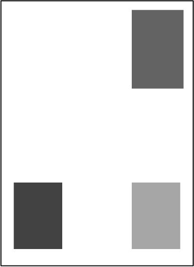
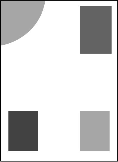
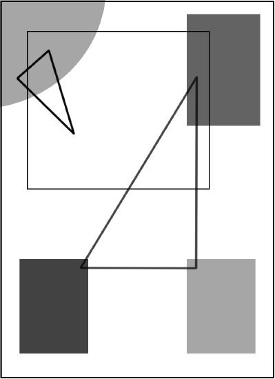
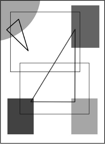
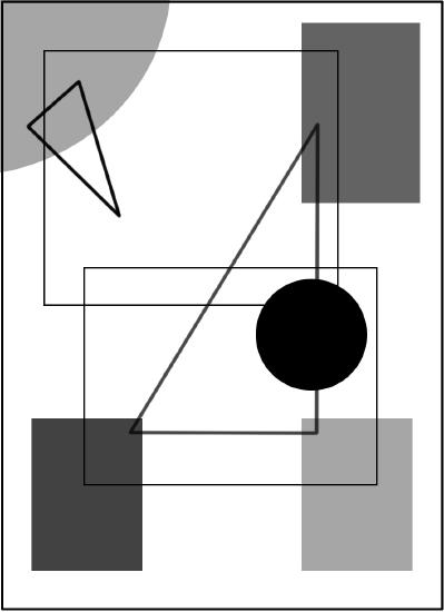
A simple assignment to help understand the challenges of creating a balanced two-dimensional design is the following (create this yourself, or as a group assignment alternating the students who place the objects):
1. Begin with either a portrait or landscape rectangular format.

2. One person places a geometric shape in the visual field

3. The next person places another geometric shape with the intention of balancing the field
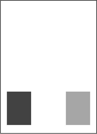
4. Continue the process until the design is complete (below is the completed design demonstrated in steps)


Discussion:
Whether drawing or painting a still-life, portrait, landscape, historical subject, or abstract composition, the types of forms, objects, shapes, and marks placed in the visual field play a part in the success of the artwork. As we’ve learned, heavier objects are often associated with the bottom of the visual field and lighter forms towards the top.
When looking at shapes within a visual field is often useful to distinguish between subject and background, or figure and ground. The subject is referred to as the positive space and the area around the subject is referred to as the negative space. When the human figure is the subject, the positive space is referred to as figure and the area around it is the ground. Shapes can be geometric or organic. When drawing representational geometric forms it is best to apply the laws of perspective if accuracy is desired. Organic forms are often easier to draw or paint since the exacting laws of perspective are not in play. Shapes can be simple or complex and often are associated with weight again based on their placement in the visual field as well as their size. When placing shapes within the visual field, visual harmony is achieved by balancing the work. Placement in relation to the edges of the visual field as well as to other objects can determine the harmony. Is the shape unnecessarily too close to the edge, or to another shape? If so, visual tension may be the result.
Groupings
of objects help to create a sense of unity within the artwork. When creating a simple grouping of objects, such as a still-life, odd numbers of three, five, and seven can be aesthetically arranged in an asymmetrical balanced composition that may be more visually appealing than a symmetrically balance grouping of an even number. When grouping objects, overlapping the objects will also create more of a sense of unity. Grouping a variety of objects of varying height, width, texture, surfaces, and values can also add interest to the artwork. This applies to both representational and abstract work. Moving object away from one another can create a sense of isolation, abandonment, disjointed, or, in another more positive way, a feeling of openness, or freedom.
Unity
within a two-dimensional work can be achieved in many ways. Repetition of certain shapes, colors, textures, and patterns can create a sense of unity.
Repetition
of designs, forms, shapes, textures, and color, can create a rhythm within the visual field. A successful design using repetition can move the viewer’s eyes along a predetermined path within the visual field. Repeating forms may create a pattern that can be decorative or leading to a more sophisticated two-dimensional design. Music and visual art share similarities when it comes to repeated forms, patterns, and contrast. In music the term color is often used to describe both voice and instrumental music. Certainly, the connections between math, music, and rhythm can also be considered when looking at two-dimensional design and visual art. Interesting that several artists considered math and art to be synonymous with perfection, harmony, and tranquility. They sought an art without the ambiguity of emotion; an art that was clear, focused, and rational. These artists followed the artistic philosophy of Suprematism. Although their philosophy was not inclusive, much of their pure two-dimensional abstract designs provide excellent examples of analytical design and are worthy of study.
Texture
is an art element and can play a role in creating contrast or visual interest in two-dimensional design. The contrast of shiny man-made metallic forms against a backdrop of natural fibers is a good example and use of contrasting textures. Texture can also be achieved using the mark-making drawing, painting, and printmaking tools of the artist.
Positive and Negative Shapes
Assignment 2:
Create a two-dimensional design emphasizing the Negative Space. Please see the PDF slides in the above link for clarification.