5.1: 5PH COLOR
- Page ID
- 91140
\( \newcommand{\vecs}[1]{\overset { \scriptstyle \rightharpoonup} {\mathbf{#1}} } \)
\( \newcommand{\vecd}[1]{\overset{-\!-\!\rightharpoonup}{\vphantom{a}\smash {#1}}} \)
\( \newcommand{\id}{\mathrm{id}}\) \( \newcommand{\Span}{\mathrm{span}}\)
( \newcommand{\kernel}{\mathrm{null}\,}\) \( \newcommand{\range}{\mathrm{range}\,}\)
\( \newcommand{\RealPart}{\mathrm{Re}}\) \( \newcommand{\ImaginaryPart}{\mathrm{Im}}\)
\( \newcommand{\Argument}{\mathrm{Arg}}\) \( \newcommand{\norm}[1]{\| #1 \|}\)
\( \newcommand{\inner}[2]{\langle #1, #2 \rangle}\)
\( \newcommand{\Span}{\mathrm{span}}\)
\( \newcommand{\id}{\mathrm{id}}\)
\( \newcommand{\Span}{\mathrm{span}}\)
\( \newcommand{\kernel}{\mathrm{null}\,}\)
\( \newcommand{\range}{\mathrm{range}\,}\)
\( \newcommand{\RealPart}{\mathrm{Re}}\)
\( \newcommand{\ImaginaryPart}{\mathrm{Im}}\)
\( \newcommand{\Argument}{\mathrm{Arg}}\)
\( \newcommand{\norm}[1]{\| #1 \|}\)
\( \newcommand{\inner}[2]{\langle #1, #2 \rangle}\)
\( \newcommand{\Span}{\mathrm{span}}\) \( \newcommand{\AA}{\unicode[.8,0]{x212B}}\)
\( \newcommand{\vectorA}[1]{\vec{#1}} % arrow\)
\( \newcommand{\vectorAt}[1]{\vec{\text{#1}}} % arrow\)
\( \newcommand{\vectorB}[1]{\overset { \scriptstyle \rightharpoonup} {\mathbf{#1}} } \)
\( \newcommand{\vectorC}[1]{\textbf{#1}} \)
\( \newcommand{\vectorD}[1]{\overrightarrow{#1}} \)
\( \newcommand{\vectorDt}[1]{\overrightarrow{\text{#1}}} \)
\( \newcommand{\vectE}[1]{\overset{-\!-\!\rightharpoonup}{\vphantom{a}\smash{\mathbf {#1}}}} \)
\( \newcommand{\vecs}[1]{\overset { \scriptstyle \rightharpoonup} {\mathbf{#1}} } \)
\( \newcommand{\vecd}[1]{\overset{-\!-\!\rightharpoonup}{\vphantom{a}\smash {#1}}} \)
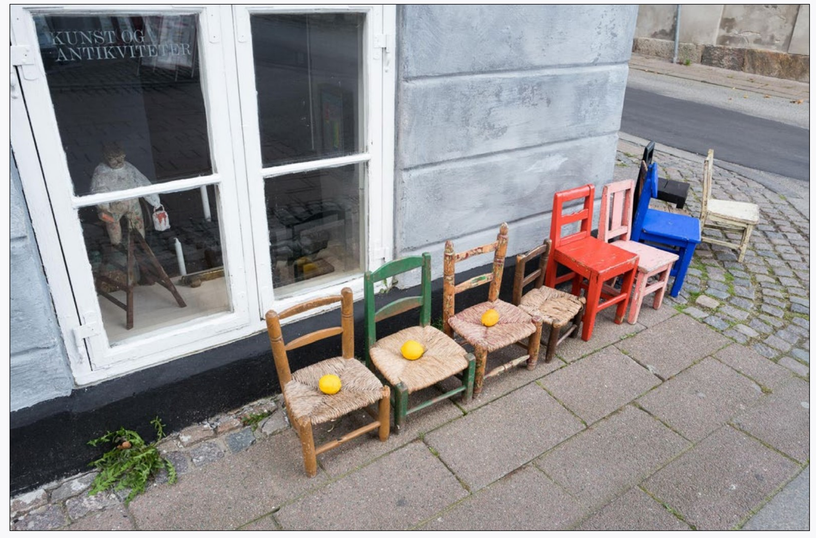
When I learned photography, it was a black and white world. Of course, there was color photography (it has been around in some form since the 19th Century), but before digital it was a stub-born beast where extreme measures were needed to get the color to do what the photographer wanted. Outside of the commercial photography I did, color held little interest. I rarely started up the color processor (be glad you don’t know what this is) for my creative work. There were creative photographers who worked with color (and some did it very well, as seen by the links in this chapter), but black and white was the norm.

This changed with digital photography as the computer allows incredible control of color. Now most of what I do is color, and I have lost much of my ability to see in black and white. But I still learned in black and white, and it still offers things I have never been able to do in color. Black and white abstracts an image—takes it out of this world and makes another one. This can be very very nice. On the other hand, color helps distinguish things, so a more complicated image can retain its definition and help keep it from sinking into chaos.
Even though color gives more options these days, there are still problems. For instance, if you pull up the contrast in an image, the colors get more saturated. Pull the saturation down and it looks unnatural. The problems are more perceptual problems than technical, but they are still problems. And with color in photographs it still feels like the control is awkward. While one can easily run an Instagram filter on an image or jack up the saturation to look like a hip advertisement from yesteryear, it is incredibly hard to get just the right blue to go with just the right orange. Sometimes it feels like working with a very small box of crayons. It is enough to make one want to paint instead of photograph.
But with limitations come opportunities. Both before and after digital photography many photographers have pushed the limits of interpreting color. Olivia Parkers’ color palettes make me weak at the knees. Sandy Skoglund uses color in obvious and humorous ways. Joel Sternfield and Stephen Shore manage to find colors in the world that jibe with the rest of the image. Loretta Lux’s painterly pastel images reinforce the soft but detached world she presents in her portraits. Elena Dorfman and Rachel Herman use color to draw you into their images. Julie Blackmon’s color work is cinematic and William Eggleston uses color to reinforce the strangeness of his vision. For these photographers (and of course others), color is not just incidental, but used in very purposeful and masterful ways.

