
12.6: Histories, real and imagined
- Page ID
- 67112

Histories, real and imagined
Contemporary artists depict the realities and possibilities of the past, often as a commentary on the present.
1980 - present
El Anatsui
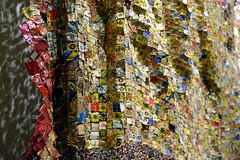
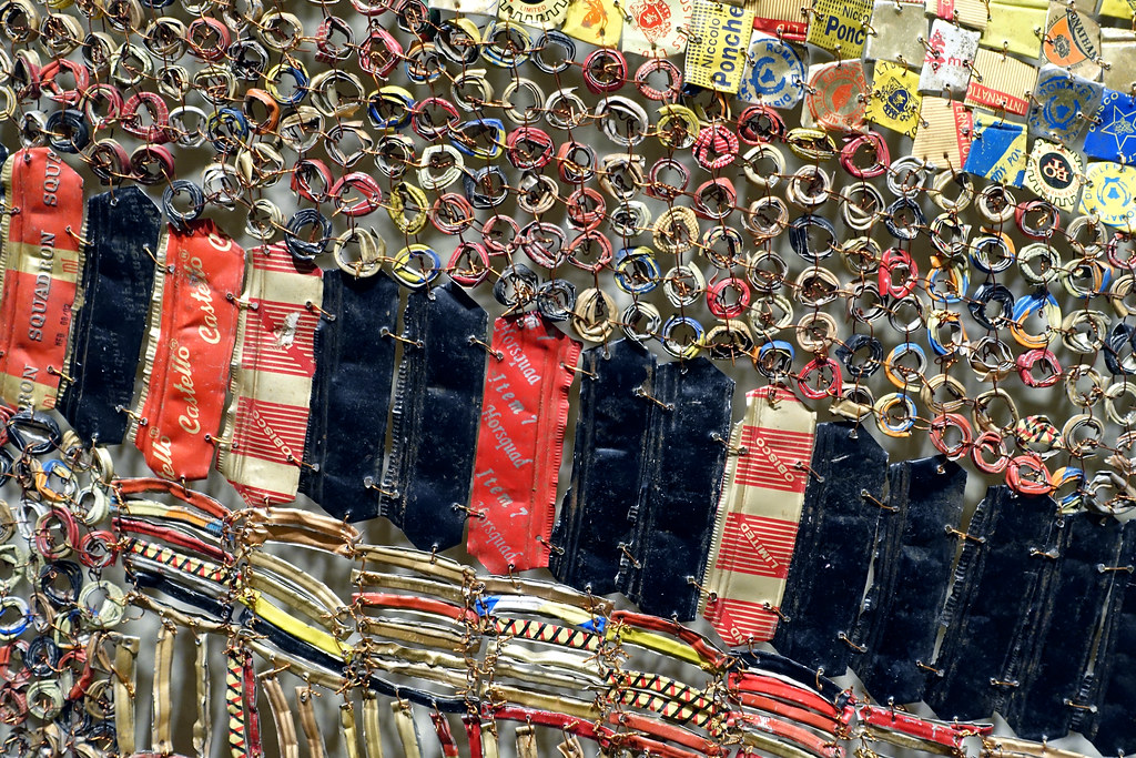
El Anatsui, Untitled
by DR. PERI KLEMM and DR. STEVEN ZUCKER
The artist transforms metal from alcohol bottles into textiles that represent libations for ancestors.
Video \(\PageIndex{1}\): El Anatsui, Untitled, 2009, repurposed printed aluminum, copper, 256.5 × 284.5 × 27.9 cm as installed (Smithsonian National Museum of African Art, Washington D.C.)
Smarthistory images for teaching and learning:
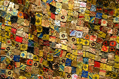
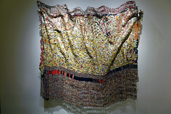
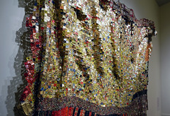

El Anatsui, Old Man’s Cloth
Old Man’s Cloth hangs like a large tapestry, but when we look closer, it’s easy to become captivated by the small metal fragments that comprise the work in hundreds. Arranged within a shifting grid of stripes and blocks of color, the components form their own internal maps across the surface, melding into vertical gold bands, interlocking black and silver rows, or a deviant red piece floating in a field of black. While Old Man’s Cloth would have been laid flat during its construction, it is contorted and manipulated during installation, so that the individual metal pieces can catch the light from every angle. This brilliant visual effect makes its humble origins all the more impressive.

The Medium or the Message?
Old Man’s Cloth has been constructed from flattened liquor bottle labels that the artist collects near his home in Southern Nigeria. While critics often write about Anatsui’s metal wall hangings using the language of textiles, the labels and bottle caps are typically fastened together with copper wire and attached corner-to-corner. As such, the issue of medium is one of the first to inspire debate amongst viewers—are the wall hangings two-dimensional or three-dimensional? Are they sculptures, even as they hang against the wall like paintings? Are they individual works or immersive installations? Lastly, are they “fine art” or simply an innovative form of “craft”?
Purposefully disregarding the limited categories imposed by Western art history, Anatsui’s practice emerges from a more expanded understanding of what art can be that stems from both the radical practices of the late-1960s, and from a vantage point outside of the Western tradition completely. As scholar Susan Vogel has explained, “such categories did not exist in classic African traditions, which made no distinction between art and craft, high art and low.”
Anatsui’s choice of discarded liquor bottle caps as a medium has as much to do with their formal properties as with their historical associations. As an African artist whose career was forged during the utopia of mid-century African independence movements, his work has always engaged his region’s history and culture. The bottle caps, for Anatsui, signify a fraught history of trade between Africa and Europe. As he explained,
Alcohol was one of the commodities brought with [Europeans] to exchange for goods in Africa. Eventually alcohol become one of the items used in the transatlantic slave trade. They made rum in the West Indies, took it to Liverpool, and then it made its way back to Africa. I thought that the bottle caps had a strong reference to the history of Africa.

The luminescent gold colors also recall the colonial past of Anatsui’s home country—modern Ghana was previously a British colony called The Gold Coast until its independence in 1957. The fluid movements of the work’s surface remind us of the waters of the Atlantic Ocean, which carried slave-ships and traders between Africa, Europe and the New World. By bestowing his works with titles such as Man’s Cloth and Woman’s Cloth, Anatsui also makes reference to the significance of textiles in African societies, and their own historical role in trade networks.
Old Man’s Cloth was included in one of Anatsui’s first exhibitions of hanging metal sculptures. Held at London’s October Gallery in 2004, the show was entitled “Gawu,” which means “metal cloak” in Ewe. Old Man’s Cloth is unique for its uneven and jagged edges as well as the “rough texture” of the recycled labels that are incorporated into the piece.
Modernism in Africa
El Anatsui was born in Ghana in 1944, and was trained in an academic European curriculum. In 1964, when he began his studies, many parts of Africa were experiencing a cultural renaissance associated with decolonization movements. Anatsui himself joined the unofficial “Sankofa” movement, which was invested in unearthing and reclaiming Africa’s rich indigenous traditions and assimilating these with the European-influenced aspects of society. His earliest works, for example, included a series of wooden market trays into which he burned designs inspired by African graphic systems and adinkra motifs (symbols widely used by the Akan people of Ghana).
In 1975, Anatsui joined the faculty at the University of Nigeria, Nsukka. Nsukka was a vibrant creative capital for African artists and writers in the 1970s, many of whom spearheaded the Zaria Rebellion in the early 1960s and revived the traditional art form of uli wall and body painting in their contemporary works.
Anatsui’s work differed slightly from that of his colleagues in his insistence on abstraction. In some of his first mature works, he used an electric chainsaw to slash geometric patterns into wood. Though abstract, these works were metaphorically rich; Anatsui chose woods of different colors to represent the diversity of African cultures, while the violence of the chainsaw enacted the ruptures imposed by European imperialist expansion.

Critical Reception: African or Contemporary?
When two of Anatsui’s metal wall hangings appeared in the 2007 Venice Biennale, they were lauded by the public and swiftly cemented his place as a leading international contemporary artist. He had, in fact, already shown in Venice almost two decades earlier in 1990, when he participated in a small exhibition surveying contemporary African art. During the time that lapsed between the two exhibitions, the art world became more receptive to artists outside of its Western centers, and by 2007, Anatsui could exhibit not only as a representative of the continent, but as an individual artist whose work was significant in its own right.
As such, his work provides an excellent opportunity for discussion about the relationships between artists at the center and at the periphery, and between the West and the Global South. The Metropolitan Museum of Art, for instance, has now acquired two of Anatsui’s metal wall hangings, but they are owned by two different curatorial departments: the Arts of Africa, Oceania and the Americas, and Modern and Contemporary Art. Both were recently on view at the same time, but in separate galleries. Visitors, students, and art historians should continue to ask themselves which designation seems more appropriate, and for what reasons. Should we understand his art as a product of its place, its time, or both? What do we see in Anatsui’s work when it is placed among African masks and ritual objects, and how do our impressions change when this work is placed beside contemporary art from around the world?
There are no correct answers to these questions, but they are indicative of the changes that have taken place both in the art world, and in today’s increasingly connected society at large.
Smarthistory images for teaching and learning:
Jean-Michel Basquiat, Horn Players

Jean-Michel Basquiat’s 1983 painting Horn Players shows us all the main stylistic features we have come to expect from this renowned American artist. In addition to half-length portraits on the left and right panels of this triptych (a painting consisting of three joined panels), the artist has included several drawings and words—many of which Basquiat drew and then crossed out. On each panel we also notice large swaths of white paint, which seem to simultaneously highlight the black background and obscure the drawings and/or words beneath. Most notable perhaps is the preponderance of repeated words like “DIZZY,” “ORNITHOLOGY,” “PREE” and “TEETH” that the artist has scattered across all three panels of this work.
Charlie Parker and Dizzy Gillespie
Despite the seeming disorder of the composition, however, it is clear that the main subjects of Horn Players are two famous jazz musicians—the saxophonist Charlie Parker and the trumpeter Dizzy Gillespie, who Basquiat has depicted in both linguistic and visual portraits. On the left of the canvas, the artist has drawn the figure of Parker, holding his saxophone which emits several hot pink musical notes and distorted waves of sound. We see Dizzy Gillespie in the right panel, who holds a silent instrument alongside his torso. The words “DOH SHOO DE OBEE” that float to the left of the figure’s head call to mind the scat (wordless improvisational) singing Gillespie often performed onstage.
Many of the words Basquiat has written on the canvas relate specifically to Charlie Parker, but they make sense only for those viewers with some knowledge of the musician’s life. For example, the literal meaning of “ORNITHOLOGY” is “the study of birds,” but this is also the title of a famous composition by Parker, who named the tune (first recorded in 1946) in reference to his own nickname “Bird.” The words “PREE” and “CHAN” that we see written above and below the saxophonist’s portrait refer to Parker’s infant daughter and common-law wife, respectively.
Basquiat and wordplay

This kind of wordplay is a characteristic that extends across most of Jean-Michel Basquiat’s work. One of the most recognizable features of the artist’s more than 2000 paintings and drawings is the overwhelming abundance of written words on the canvas. The art historian Robert Farris Thompson once declared: “It’s as if he were dripping letters.” Before his success as a painter, Basquiat was famous for writing on the walls of lower Manhattan as a teenager when he and a high school friend, Al Diaz, left cryptic messages in spray paint under the name “SAMO” (an acronym for “Same Old Shit”) from 1977 until 1979.
As SAMO, Basquiat and Diaz wrote maxims, jokes, and prophecies in marker and spray paint on subway trains throughout New York City (particularly the “D” train, which ran between downtown Manhattan and Basquiat’s home in Brooklyn), as well as on the walls and sidewalks in the SoHo and Tribeca neighborhoods. Many of the locations where SAMO writings were to be found were in close proximity to prominent art galleries. Combined with these strategic positions, phrases like “SAMO AS AN END TO PLAYING ART” or “SAMO FOR THE SO-CALLED AVANT-GARDE” presented the “SAMO” persona as outside the commercial art world and critical of it. In fact, even after relinquishing the SAMO persona and emerging to the art world as Jean-Michel Basquiat, the artist remained an outsider to the mainstream art world, despite his meteoric rise on the art auction block.
“The Black Picasso”
Basquiat went from SAMO”to commercial success at warp speed in the early 1980s. He first exhibited (still under the name SAMO) at the Times Square Show—an exhibition in June 1980 that marked the genesis of the eighties art movement. He was later invited to exhibit in New York/New Wave, a group show of sixteen hundred works by 119 artists that opened at P.S. 1 on Valentine’s Day. The show was affectionately called “The Armory Show” of the 1980s (the original Armory Show in 1913 was the first large exhibition of international modern art in America).
Almost immediately afterward, the young Basquiat (at this point just 20 years old) was invited to exhibit in his first solo show in Modena, Italy. The gallerist Annina Nosei, who showed more established artists like David Salle and Richard Prince, agreed to represent Basquiat, who had a one-man show at her gallery the next year. That same year, Basquiat had exhibitions in Los Angeles, Zurich, Rome, and Rotterdam and became the youngest artist invited to participate in Documenta 7 (an international contemporary art exhibition that takes place every five years). By 1983 the average sale price of Basquiat’s work had increased by 600 percent, and his popularity (both in the auction house and in popular culture) persists even today. You can buy his images on shirts and hats from popular retail outlets and his large paintings sell at auction for more than $20 million.
Based on his meteoric success, critics referred to Jean-Michel Basquiat as “the black Picasso.” The nickname was complicated for Basquiat, who never embraced it, but was nevertheless concerned with his own place within art history. He often relied on textbooks and other sources for his visual material; most biographies of the artist note his reliance on the medical textbook Gray’s Anatomy (a gift from the artist’s mother when Basquiat was hospitalized as a child) for the anatomical drawings and references we see on many of his surfaces. Basquiat also appropriated the work of Leonardo, Edouard Manet, and Pablo Picasso into his own compositions. These appropriations were in part an homage to the great painters Basquiat admired, but they also were a way for Basquiat to rewrite art history and insert himself into the canon.

Looking again at Horn Players, for example, reveals several connections to Picasso’s Three Musicians. Basquiat’s use of the triptych format—a popular device for the artist in this period—echoes the triple subjects of the Picasso image. The figure of Parker in Basquiat’s composition is also reproduced in the same position as the standing figure (playing the clarinet) in Picasso’s work.

The central panel of Basquiat’s canvas, which does not show a portrait of an identifiable musician like the other two panels, but instead a distorted head with roughly outlined features, suddenly comes into focus via its comparison with Three Musicians. Here Picasso references in paint, his earlier experiments with paper collage especially in rendering the face and head of his central figure, whose jawline dramatically extends beyond what is anatomically possible to create an abstract, bulbous shape. Basquiat’s central figure bears a similar protrusion—this time from the top of the head—which he fills in with hatch marks that are suggestive of the patterning of Picasso’s “collaged” paper. Once again, Basquiat seems to be speaking in code. This time, we are being asked not only to draw upon our knowledge of music history but of modern painting to fully understand his work.
Basquiat’s musicians
Musicians were a popular subject for Basquiat, who himself played briefly in a noise band called Gray—likely a reference to the Gray’s Anatomy textbook. Jazz musicians began to appear in the artist’s paintings around 1982; references to jazz musicians or recordings appear in more than thirty large-format paintings and twenty works on paper. Charlie Parker and Dizzy Gillespie are the two musicians who appear most frequently, both as figures in the paintings and through linguistic references to their work. The artist painted canvases with figures playing the trumpet, the saxophone, and the drums. He also devoted several canvases to replicating the labels of jazz records or the discographies of musicians.
Many scholars have connected Basquiat’s interest in jazz to a larger investment in African American popular culture (for example, he also painted famous African American athletes) but an alternative explanation is that the young Basquiat looked to jazz music for inspiration and for instruction, much in the same way that he looked to the modern masters of painting. Parker, Gillespie, and the other musicians of the bebop era infamously appropriated both the harmonic structures of jazz standards, using them as a structure for their own songs, and repeated similar note patterns across several improvisations. Basquiat used similar techniques of appropriation throughout his career as a painter.
Additional resources:
Sue Coe, Aids won’t wait, the enemy is here not in Kuwait
by MONICA ZIMMERMAN, PENNSYLVANIA ACADEMY OF THE FINE ARTS and DR. BETH HARRIS
Video: \(\PageIndex{2}\): Sue Coe, Aids won’t wait, the enemy is here not in Kuwait, 1990, photo-etching on paper, 23.8 x 32.5 cm (Pennsylvania Academy of the Fine Arts, © Sue Coe)
Additional resources:
Thornton Dial, Blood and Meat: Survival For The World
by TIMOTHY ANGLIN BURGARD, FINE ARTS MUSEUMS OF SAN FRANCISCO and DR. BETH HARRIS
Video \(\PageIndex{3}\): Thornton Dial, Blood and Meat: Survival For The World, 1992, rope, carpet, copper Wire, metal, canvas scraps, enamel, and splash zone compound on canvas on wood, 165.1 x 241.3 x 27.9 cm (Fine Arts Museums of San Francisco, ©Thornton Dial), a Seeing America video
Titus Kaphar, The Cost of Removal
by LAUREN HAYNES, CRYSTAL BRIDGES MUSEUM OF AMERICAN ART) and DR. BETH HARRIS
Kaphar takes a violent history and renders it visible in this modified portrait of Andrew Jackson.
Video \(\PageIndex{4}\): Titus Kaphar, The Cost of Removal, 2017, oil, canvas, and rusted nails on canvas, 274.3 x 213.4 x 3.8 cm, © Titus Kaphar (Crystal Bridges Museum of American Art)
William Kentridge, drawing from Tide Table (Soho in Deck Chair)
by JOSH R. ROSE

On the beach, but in a suit
It is a humorously discordant image: a man in a pinstriped suit sits on a deck chair at the beach, ignoring the overcast vista by reading a newspaper. The figure’s balding head and newspaper are the brightest highlights against the smooth, rippling surf. South African artist William Kentridge has said the inspiration for this scene was a photograph of his grandfather similarly dressed at a beach near Capetown. The contrast of formal dress and beach setting—while whimsical—also suggests class distinctions and the disconnect between experiencing one’s environment and codification as control: rather than watch the tide, the figure (as we come to find out) reads the newspaper’s tide table (a chart that shows water heights over time for a particular location). The gulf separating understanding and experience in this drawing resonates in much of Kentridge’s imagery and process.
“Successful Failures”
Kentridge was raised by two progressive lawyers in Johannesburg who actively helped disenfranchised South Africans navigate the legal system during the systemic inequalities of apartheid. The harsh racial and socioeconomic conditions in South Africa marked the earliest work Kentridge produced after studying visual art at the Johannesburg Art Foundation and theater at the L’École Internationale de Théâtre Jacques Lecoq in Paris.
Kentridge’s earliest passions were theater and opera (and he has continued working in these areas throughout his career), yet after realizing he was not cut out as an actor, he was “reduced to being an artist.” As he has described it, “Every clear decision I have made was wrong. And the only thing that saved me was what I hadn’t decided.” This deceptively self-deprecating remark adequately describes the intentional openness and mutability of meaning Kentridge has built into his approach.
Process as Performance
The drawing above is the result of a film, Tide Table, the ninth film in the series “Drawings For Projection” begun in 1989. These films utilize a unique stop-motion technique: using a 16mm camera, Kentridge photographs each stage of a drawing on one sheet of paper as he continually modifies it through additions and erasures, often leaving ghostly remnants of previous marks on the page. He even periodically appears within the frame, such as by placing a new sheet in front of the camera when the previous drawing/scene is finished.

The resulting work of art is generally comprised of two elements: an animated film and a series of drawings. Unlike traditional animation, which is painstakingly planned and comprised of thousands of single images each denoting a fraction of a second, Kentridge’s films develop organically without any preparatory planning like storyboards, relying more on a stream-of-consciousness approach that strives for something between random chance and conscious premeditation. Kentridge associates this with the concept of “fortuna,” in which his imagery and narrative are influenced by objects in his environment or ideas and motions that seem intrinsically related to—but independent of—the themes and narrative being tackled at the time. The relationship might be comparable to that of authors noting how their characters do something unexpected in the course of writing a novel. There is a performative quality to Kentridge’s process, predicated by the spontaneity he fosters, his own appearances in the frame, and the film itself as a time-based record of his drawing process.
The Traces Always Remain
Kentridge’s drawings for his films are often regarded as palimpsests. A palimpset is the word for a manuscript where the original text has been erased and overwritten (a practice common before paper was available and when parchment was expensive). In Kentridge’s work, the sheet of paper becomes the locus for layer upon layer of images that evolve and shift, where the earlier states of the drawing exist only through traces intentionally left on the paper. In the film, these traces help intensify the movement of his figures, but also visually remark upon the process as a physical interaction of charcoal and eraser on paper.
The palimpsest quality to Kentridge’s approach is one that many critics and historians have associated with his reaction to growing up during a turbulent and shifting period in South African history. Apartheid, legalized racial discrimination, dominated South African governance and society from 1948 until 1994. One way Kentridge has made overt reference to the atrocities of apartheid in his “Drawings for Projection” series is through the one pre-determined facet of these narratives: an established “cast” featuring the wealthy white real-estate developer and industrialist Soho Eckstein. Eckstein represents the authoritative oppressors ruling over black South Africans.

In the 1990 film Monument, for example, Eckstein unveils a heroic monument showing a black worker struggling to carry a load of pristine marble objects. An ostensibly commemorative sculpture to the efforts of South Africans is revealed later to be an actual living person, not a sculpture. Racial discrimination is starkly reduced to the contrast between the “sculpted” worker’s body and the white classically-styled load he bears.
In the 1991 film, Mine, a similar contrast is presented between Eckstein’s white bed coverings and tray as he enjoys coffee, and the grueling, dank conditions of the mines that Eckstein owns. The two are linked visually by the downward action of the French-press coffee maker that becomes the elevator within the mines. Such contrasts seem intentionally provocative, both formally and thematically. Yet Kentridge admits that the decision to have the coffee plunger become the elevator shaft was another example of fortuna, inspired simply from the fact he had that type of coffee maker in his studio that day.

A critical event linked to the legal dissolution of apartheid in the 1990s was the establishment of the Truth and Reconciliation Commission. Chaired by Archbishop Desmond Tutu, the Commission was a five year investigation into the crimes and human rights abuses committed under apartheid from 1960 until May 10, 1994. The results of the investigation, broadcast on South African television, were intended to bring to light crimes committed and the breadth of the structure of racism and disenfranchisement.
Although Kentridge’s process was established several years before the Commission, scholars like Jessica Dubow and Ruth Rosengarten have linked the palimpsest quality of Kentridge’s “Drawings for Projection” with the contradictory nature of the Commission: although the broadcasts intended to reveal atrocities, they also established that the harrowing acts revealed were firmly “in the past” and therefore not reflective of the dawn of a post-apartheid South Africa. Dubow and Rosengarten suggest that Kentridge’s palimpsest technique is reminiscent of the Commission’s attempts to show—but also remove—traces of apartheid and that Kentridge’s “finished” drawings similarly do not fully reveal everything that went into making them. The documentation of every stage of the drawing is only seen in the animated film, hence the reason the drawings and the films are intrinsically related and should not be separated.
Tide Table
The disconnect between documentation and direct experience seen in the hearings of the Truth and Reconciliation Commission is also central to the drawing of Soho Eckstein sitting at the beach in a business suit. In the films he created after 1994, Kentridge presents Soho as a man whose life has fallen apart: between inexplicable health issues, violent nightmares, and the loss of his fortune, Kentridge portrays Eckstein’s struggles in post-apartheid South Africa. Throughout Tide Table the artist provides a subtext that reflects upon youth, as a choir on the beach sings and a young boy dances and leaps in the surf. Often this occurs around Eckstein, as he sits in the deck chair, seeming to prefer the analytical table of tide flows in the newspaper and, in a later scene, pointedly placing the newspaper over his head to sleep (see above).
These images reinforce Eckstein’s character as one who is more comfortable at a remove from human connection and the natural world, a portrayal that is common to many of the films in the series.
Eckstein’s actions in Tide Table evoke a sense of loss for the comforts and advantages the character had during apartheid. Still, there is a glimmer of hope. Ultimately Eckstein observes those around him; he gets up, and playfully throws a rock into the water.
Additional Resources:
The artist discussing his 2003 film, Tide Table (SFMOMA)
The artist discusses his process (SFMOMA)
This film at SFMOMA
The National Memorial for Peace and Justice
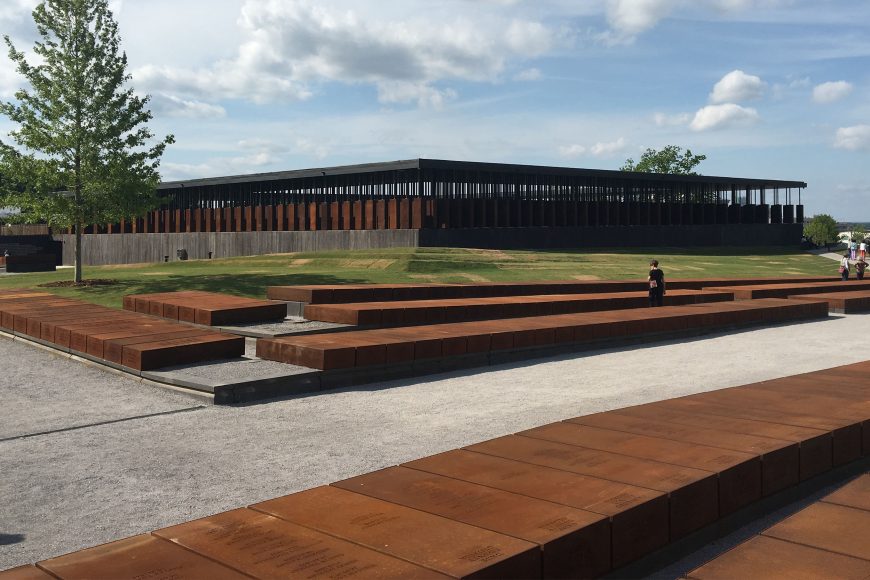
Located in Montgomery, Alabama, the National Memorial for Peace and Justice is the first monument to commemorate the over 4,000 African Americans who were lynched in the United States between 1877 and 1950. The Equal Justice Initiative (EJI) envisioned and realized the memorial as “a sacred space for truth-telling and reflection about racial terror in America and its legacy.”
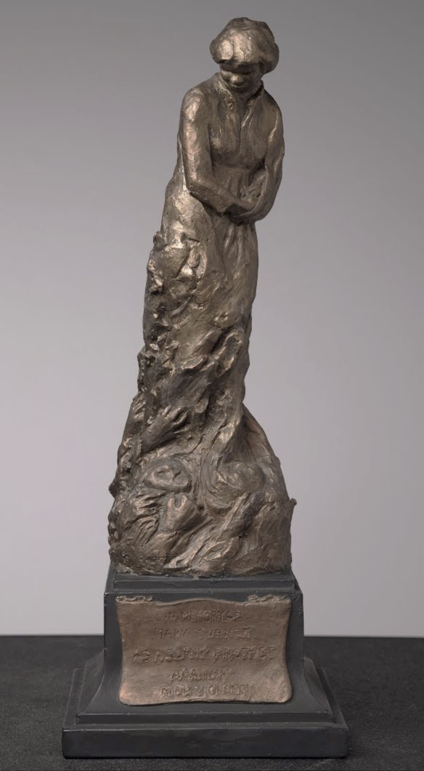
While writing my dissertation on the sculpture of Meta Warrick Fuller, I investigated the history of lynching in the United States. My research was motivated by the fact that Fuller had created a small painted plaster to honor the memory of Mary Turner, a pregnant woman who was lynched in Brooks County, Georgia, in 1918. I was interested to see if Turner was identified in the National Memorial for Peace and Justice, which I discovered she was. I also was deeply curious as to how EJI would handle the visual representation of trauma and violence. At the end of April 2018, I flew to Atlanta, rented a car, and drove through the Georgia and Alabama countryside to Montgomery to participate in the opening ceremonies and the two-day social justice conference.

Sited on six acres of land, the National Memorial for Peace and Justice is an arresting and emotionally powerful memorial to lynching victims. EJI with MASS Design Group conceived the memorial as a sober and sacred site where people can gather and reflect on America’s history of slavery, lynching, and racial inequality. EJI believes that such a monument will allow for national reconciliation and redemption.

Peace and Justice Memorial Garden
The memorial includes multiple components: a garden, four sculpture groupings, explanatory texts and quotations, and a temple-like structure with hanging rectangular boxes made of corten steel. Visitors first encounter the Peace and Justice Memorial Garden before entering the long hallway of the main entrance. Within the garden are native plantings of flowers and shrubs and the so-called “Memory Wall: Strength,” a brick arched wall from the Montgomery Theater, built in 1860, which enslaved masons constructed. The garden is intended as a contemplative space as well as a place to acknowledge past and present African American laborers in Montgomery. From the garden, a serpentine pathway leads to the entrance of the National Memorial for Peace and Justice.
Telling the story of slavery and lynching
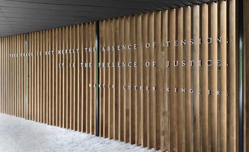
A quotation from Martin Luther King Jr. greets you as you enter the memorial. Placed along a wooden slat wall, it reads: “True peace is not merely the absence of tension, it is the presence of justice.” This quotation frames the meaning of the memorial and the overall social activist and reparative justice mission of EJI. EJI is “committed to ending mass incarceration and excessive punishment in the United States, to challenging racial and economic injustice, and to protecting basic human rights for the most vulnerable people in American society.” The memorial space flows in one direction, with visitors passing King’s remarks to begin a slow climb up the gently sloped landscape to the main building of the memorial.
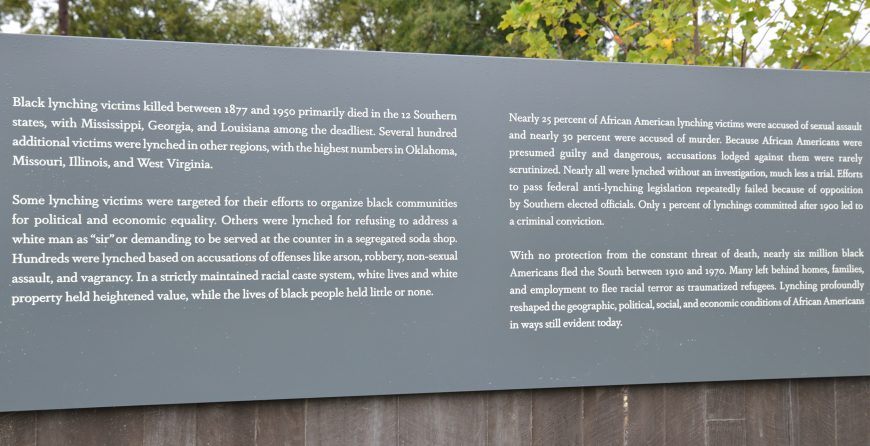
Four large grey plaques with white lettering are attached to the concrete wall along the pathway. Evenly spaced, these texts outline a history of the transatlantic slave trade and the rise of violence in the post-Civil War period; Reconstruction and the rise of convict leasing in the South; racial terror lynching in the late nineteenth and twentieth centuries; and the justifications that white Americans gave for lynching African American men and women. The texts use direct, concise language to describe the difficult historical facts of slavery and racial terror lynching.
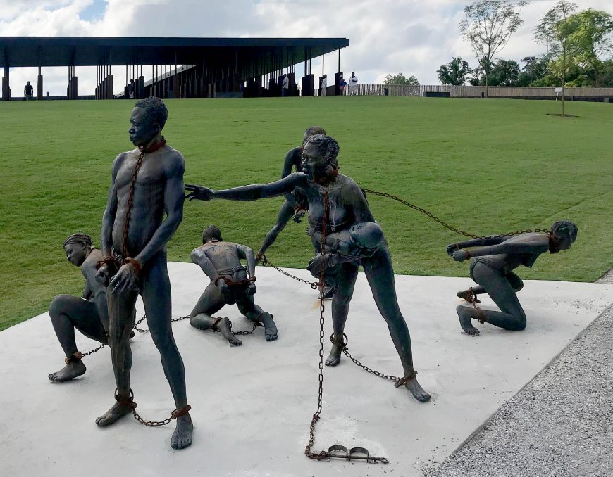
Monument to the transatlantic slave trade
In front of the first plaque, the artist Kwame Akoto-Bamfo created a cast concrete, multi-figure, stand-alone monument to the transatlantic slave trade. Entitled Nkyinkyim Installation, this work presents seven semi-nude Africans who are enchained for the harrowing journey from the interior to the coast for transportation across the Atlantic. Based on the slavery memorial in Stone Town, Zanzibar, Tanzania, Akoto-Bamfo’s memorial evokes the horror of slavery through the figures anguished expressions; chained necks and manacled hands and feet; and simulated slashed backs. The most sorrowful of these depictions is of a chained young mother holding a screaming baby as she reaches across to an older standing male figure.

Sacred space dedicated to lynching victims
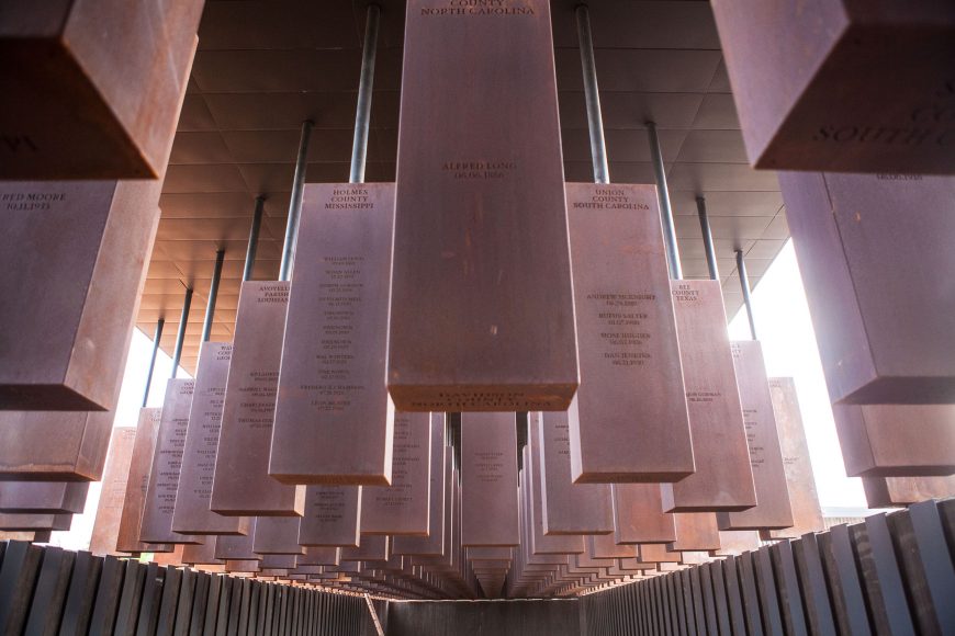
The memorial structure suggests the form of a temple with a large peristyle. At the center of the temple-like memorial is an open space, “Memorial Square,” reached by a series of aggregate concrete steps. The grassy knoll represents spaces such as town squares and courthouse lawns used for the public spectacle of lynching. Inside the memorial, over 800 rectangular corten steel boxes, six feet in height, hang by steel poles from the ceiling at even intervals. Each of these hanging forms represents a county in the United States where a lynching took place. Names of lynching victims and the dates of their murders are laser cut into the surfaces of the boxes.
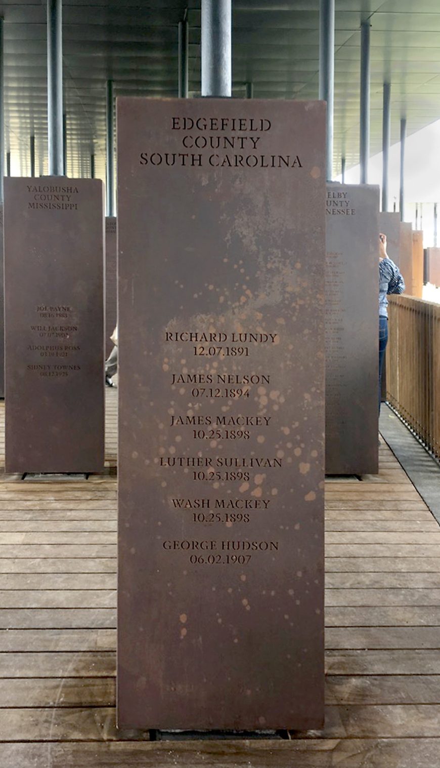
On the interior of the memorial structure, you begin on even ground, your body parallel to the coffin-like forms. If you choose, you can lean into the monument and even trace a finger across the cutout letters or feel the uneven surface quality. As you descend into the memorial, the corten steel boxes rise high above, suspended in the air and no longer within your bodily space. These rusted stele evoke the image of black bodies hanging from trees.
Along the third section of the memorial, bands of text panels in grey with white lettering identify the awful justifications for racial terror lynching including accusations of inappropriate conduct with white women, speaking out against lynching, and not showing deference to whites. After reading these difficult texts, you encounter a message of reconciliation.
For the hanged and beaten.
For the shot, drowned, and burned.
For the tortured, tormented, and terrorized.
For those abandoned by the Rule of Law.We will remember.
With hope because hopelessness is the enemy of justice.
With courage because peace requires bravery.
With persistence because justice is a constant struggle.
With faith because we shall overcome.
This text asserts unequivocally the power of this memorial to act as a remembrance device and as a space where the horror and trauma of lynching is framed in the context of peace.
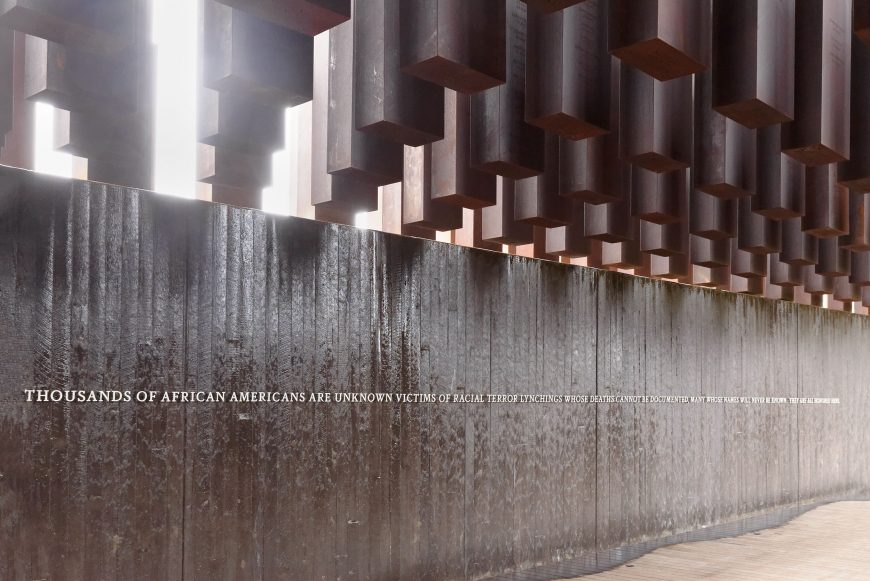
Nearby, water flows down the final long wall of the memorial. Metal lettering asserts that all victims of lynching now will be remembered. “Thousands of African Americans are unknown victims of racial terror lynchings whose deaths cannot be documented, many whose names will never be known. They are all honored here.” The slow sound of water cascading down the wall allows space for contemplation, as you are able to sit along rough-hewn seating across from the water feature.
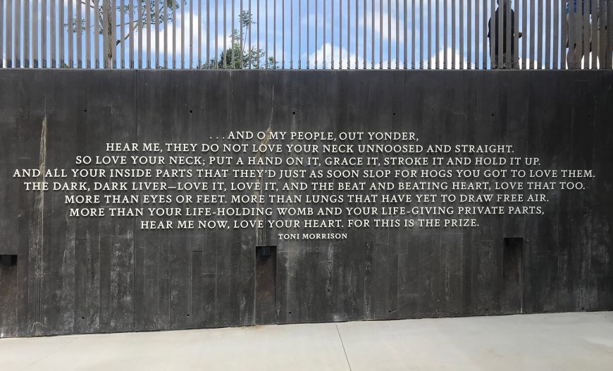
When you exit the memorial to the surrounding park, you encounter a final quotation from Toni Morrison’s novel Beloved that stresses the power of love.
And O my people, out yonder, hear me, they do not love your neck unnoosed and straight. So love your neck; put a hand on it, grace it, stroke it and hold it up. And all your inside parts that they’d just as soon slop for hogs, you got to love them. The dark, dark liver—love it, love it, and the beat and beating heart, love that too. More than eyes or feet. More than lungs that have yet to draw free air. More than your life-holding womb and your life-giving private parts, hear me now, love your heart. For this is the prize.
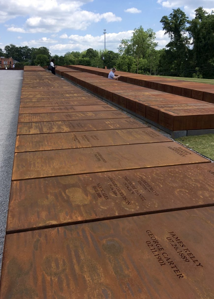
Duplicate monuments
In the park, MASS and EJI included a field of duplicate monuments. Rather than hang from a roof, the corten steel boxes now serve as cenotaphs lying flat on the ground in long rows. They are waiting to be claimed and installed in the counties they represent. For EJI, the duplicate monuments serve as “a report” as to which counties have confronted the difficult history of lynching and which have chosen to not deal with such a painful legacy. EJI believes this process of claiming the duplicate monuments will “change the built environment of the Deep South and beyond to more honestly reflect our history.”
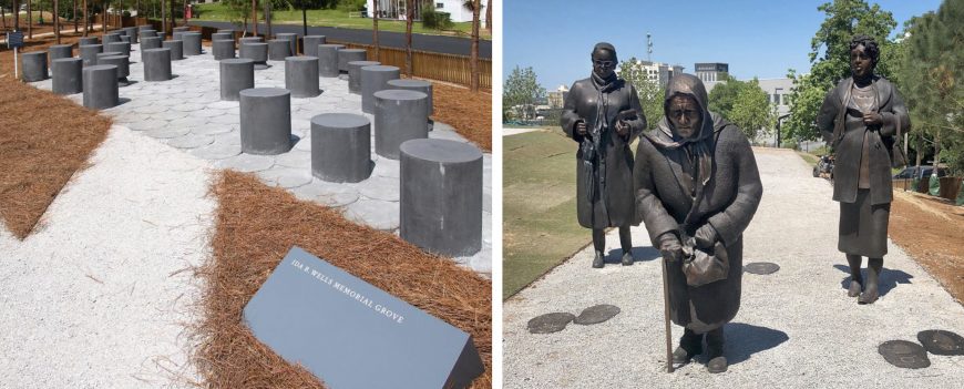
Sculpture in the park
Three additional groups of sculpture are integrated into the park. The Ida B. Wells Memorial Grove honors the early twentieth-century anti-lynching activist and writer. It contains over forty black granite cylinders of various heights that visitors can sit on and reflect. In Guided by Justice, Dana King created three life-size bronze statues of black women dressed in coats as they “walk” on the pathway. These three statues of women at various stages of life symbolize the women arrested in 1955 for challenging racial segregation on Montgomery’s public buses.
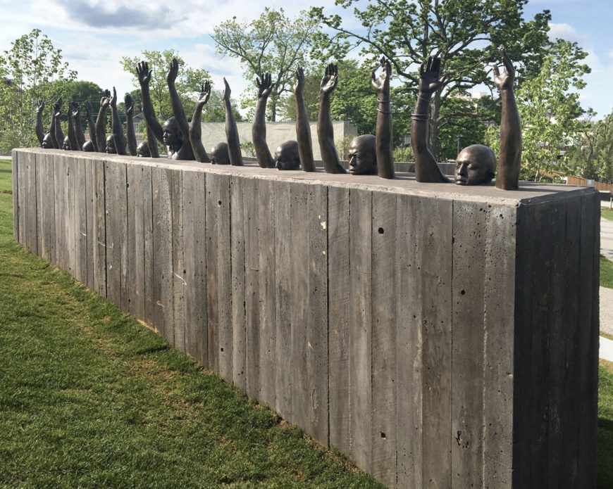
The final sculpture is by Hank Willis Thomas and represents systemized police violence directed towards African American men. Raise Up is a long horizontal, free-standing concrete wall with ten bronze portraits of black men shown from the neck up with their hands raised above their bald heads. These monuments with Akoto-Bamfo’s multi-figure statue of enslaved persons underscore the main themes of the memorial and of EJI’s work: slavery, lynching, segregation/resistance, and mass incarceration.
Elizabeth Alexander’s “Invocation”
As visitors exit the National Memorial to Peace and Justice, they encounter the haunting lines of the poet Elizabeth Alexander’s “Invocation.” In the lines of her poem, Alexander asserts that the African American victims of racial terror lynching will not be forgotten, nor lost in the telling of U.S. history. Each name—“a holy word”— is forever etched on this memorial and into the nation’s collective memory.
The wind brings your names.
We will never dissever you names
nor your shadows beneath each branch and tree.The truth comes in on the wind, is carried by water.
There is such a thing as the truth. Tell us
how you got over. Say, Soul look back in wonder.Your names were never lost,
each name a holy word.
The rocks cry out—call out each name to sanctify this place.
Sounds in human voices, silver and soil,
a moan, a sorrow song,a keen, a cackle, harmony,
a hymnal, handbook, chart,
a sacred text, a stomp, an exhortation.Ancestors, you will find us still in cages,
despised and disciplined.
You will find us still mis-named.Here you will find us despite.
You will not find us extinct.
You will find us here memoried and storied.You will find us here mighty.
You will find us here divine.
You will find us where you left us, but not as you left us.Here you endure and are luminous.
You are not lost to us.
The wind carries sorrows, sighs, and shouts.The wind brings everything. Nothing is not lost.
Additional Resources:
The National Memorial for Peace and Justice on Equal Justice Initiative website
MASS Design group page on their design for the memorial
Renee Ater’s public history blog
Julie Buckner Armstrong, Mary Turner and the Memory of Lynching (Athens, GA: University of Georgia Press, 2011).
Fritzhugh Brundage, Under Sentence of Death: Lynching in the South (Durham, NC: The University of North Carolina Press, 1997.)
Nam June Paik, Electronic Superhighway: Continental U.S., Alaska, Hawaii
Getting on the “Electronic Super Highway”
In 1974, artist Nam June Paik submitted a report to the Art Program of the Rockefeller Foundation, one of the first organizations to support artists working with new media, including television and video. Entitled “Media Planning for the Post Industrial Society—The 21st Century is now only 26 years away,” the report argued that media technologies would become increasingly prevalent in American society, and should be used to address pressing social problems, such as racial segregation, the modernization of the economy, and environmental pollution. Presciently, Paik’s report forecasted the emergence of what he called a “broadband communication network”—or “electronic super highway”—comprising not only television and video, but also “audio cassettes, telex, data pooling, continental satellites, micro-fiches, private microwaves and eventually, fiber optics on laser frequencies.” By the 1990s, Paik’s concept of an information “superhighway” had become associated with a new “world wide web” of electronic communication then emerging—just as he had predicted.
From Music to Fluxus
Paik was well-positioned to understand how media technologies were evolving: in the 1960s he was one of the very first people to use televisual technologies as an artistic medium, earning him the title of “father” of video art. Born in Seoul in 1932, Paik studied composition while attending college in Tokyo; he eventually travelled to Germany, where he hoped to encounter the leading composers of the day. He met John Cage in 1958, and soon became involved with the avant-garde Fluxus group, led by Cage’s student George Maciunas. Explain Fluxus.
Following the example of Cage’s oeuvre, many of Paik’s Fluxus works undermined accepted notions of musical composition or performance. This same irreverent spirit informed his use of television, to which he turned his attention in 1963 in his first one-man gallery show, “Exposition of Music—Electronic Television,” at the Galerie Parnass in Wuppertal, Germany. Here, Paik became the first artist to exhibit what would later become known as “video art” by scattering television sets across the floor of a room, thereby shifting our attention from the content on the screens to the sculptural forms of the sets.
The father of video art

Paik moved to New York in 1964, where he came into contact with the downtown art scene. In 1965, he began collaborating with cellist Charlotte Moorman, who would wear and perform Paik’s TV sculptures for many years; he also had a one-man show at the 57th Street Galeria Bonino, in which he exhibited modified or “prepared” television sets that upset the traditional TV-watching experience. One example is Magnet TV, in which an industrial magnet is placed on top of the TV set, distorting the broadcast image into abstract patterns of light.
According to an oft-cited story, on October 4th of that same year, Paik purchased the first commercially-available portable video system in America, the Sony Portapak, and immediately used it to record the arrival of Pope Paul VI at St. Patrick’s Cathedral. Later that night, Paik showed the tape at the Café au Go Go in Greenwich Village, ushering in a new mode of video art based not on the subversion or distortion of television broadcasts, but on the possibilities of videotape. The evolution of these tendencies into a new movement was announced by a 1969 group show, “TV as a Creative Medium.” Held at the Howard Wise Gallery in New York, the show included one of Paik’s interactive TVs, and also premiered another one of his collaborations with Moorman.
TV as a Creative Medium
For Paik and other early adopters of video, this new artistic medium was well-suited to the speed of our increasingly electronic modern lives. It allowed artists to create moving images more quickly than recording on film (which required time for negatives to be developed), and unlike film, video could be edited in “real-time,” using devices that altered the video’s electronic signals. (Ever the pioneer, Paik created his own video synthesizer with engineer Shuya Abe in 1969.) Furthermore, because the image recorded by the video camera could be transmitted to and viewed almost instantaneously on a monitor, people could see themselves “live” on a TV screen, and even interact with their own TV image, in a process known as “feedback.” In the years to come, the participatory nature of TV would be redefined by two-way cable networks, while the advent of global satellite broadcasts made TV a medium of instant global communication.

As television continued to evolve from the late 1960s onward, Paik explored ways to disrupt it from both inside and outside of the institutional frameworks of galleries, museums, and emerging experimental TV labs. His major works from this period include TV Garden (1974), a sculptural installation of TV sets scattered among live plants in a museum (image above), and Good Morning, Mr. Orwell (1984), a broadcast program that coordinated live feeds from around the world via satellite. In these and other projects, Paik’s goal was to reflect upon how we interact with technology, and to imagine new ways of doing so. The many retrospectives of his work in recent decades, including one organized by the Smithsonian American Art Museum in 2012, speak to the increasing relevance of his ideas for contemporary art.
The nation electric

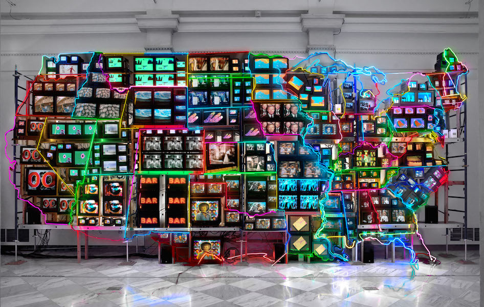
By the 1980s, Paik was building enormous, free-standing structures comprising dozens or even hundreds of TV screens, often organized into iconic shapes, as in the giant pyramid of V-yramid (1982). For the German Pavilion at the 1993 Venice Biennale, Paik produced a series of works about the relationship between Eastern and Western cultures, framed through the lens of Marco Polo; along with Hans Haacke, another artist representing Germany, Paik was awarded the prestigious Golden Lion. One of the works, Electronic Superhighway, was a towering bank of TVs that simultaneously screened multiple video clips (including one of John Cage) from a wide variety of sources. Two years later, Paik revisited this work in Electronic Superhighway: Continental U.S., Alaska, Hawaii, placing over 300 TV screens into the overall formation of a map of the United States outlined in colored neon lights (see image at the top of the page and the detail below). Roughly forty feet long and fifteen feet high, the work is a monumental record of the physical and also cultural contours of America: within each state, the screens display video clips that resonate with that state’s unique popular mythology. For example, Iowa (where each presidential election cycle begins) plays old news footage of various candidates, while Kansas presents the Wizard of Oz.

The states are firmly defined, but also linked, by the network of neon lights, which echoes the network of interstate “superhighways” that economically and culturally unified the continental U.S. in the 1950s. However, whereas the highways facilitated the transportation of people and goods from coast to coast, the neon lights suggest that what unifies us now is not so much transportation, but electronic communication. Thanks to the screens of televisions and of the home computers that became popular in the 1990s, as well as the cables of the internet (which transmit information as light), most of us can access the same information at anytime and from any place. Electronic Superhighway: Continental U.S., Alaska, Hawaii, which has been housed at the Smithsonian American Art Museum since 2002, has therefore become an icon of America in the information age.
While Paik’s work is generally described as celebrating the fact that the “electronic superhighway” allows us to communicate with and understand each other across traditional boundaries, this particular work also can be read as posing some difficult questions about how that technology is impacting culture. For example, the physical scale of the work and number of simultaneous clips makes it difficult to absorb any details, resulting in what we now call “information overload,” and the visual tension between the static brightness of the neons and the dynamic brightness of the screens points to a similar tension between national and local frames of reference.
Additional resources:
Nam June Paik, bio and collection of the Smithsonian American Art Museum
Nam June Paik, TV Garden at the Guggenheim
Nam June Paik from the National Endowment for the Arts
Nam June Paik archive at the Smithsonian American Art Museum
Nam June Paik from the Asia Society
Melissa Chiu and Michelle Yun, eds., Nam June Paik: Becoming Robot (New York: Asia Society Museum, 2014).
John G. Hanhardt and Ken Hakuta, Nam June Paik: Global Visionary (Washington, D.C.: Smithsonian American Art Museum, 2012).
John G. Hanhardt and Jon Ippolito, The Worlds of Nam June Paik (New York: Guggenheim Museum, 2000).
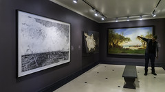
Sigmar Polke, Watchtower series
In the early 1980s, Sigmar Polke returned to painting. The ever-evolving artist had spent the previous decade experimenting with photography, inspired perhaps by his extensive travels through Asia and Australia. His interest in photography centered on the chemical processes of the darkroom and their potential for unpredictable results. Like his earlier rasterbilder (works that exposed the raster-dot technique of printing, such as Bunnies), Polke continued to delight in exposing the artistic process. As he began to use unconventional materials and chemicals across various media, viewers could see the artwork literally developing and changing in front of their eyes. These experiments have earned him the designation of alchemist—the ancient practitioner of magic, altering substances at the most fundamental levels.
Alchemy in painting

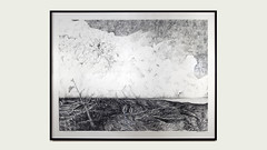
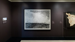
We can see Polke’s play with alchemy in the series of five works centered on the watchtower theme completed from 1984-1988. Taken as a whole, the watchtower series consistently presents a tenuous balance between imagery that evokes both the ominous and the everyday.
In Watchtower (1984), we see the watchtower clearly with its distinctive white outline against the darker background fabrics. Gestural swirls of yellow paint add to the dreamlike haziness of the image. Two styles of textile have been used: on the left, a repetitive geometric pattern similar to a basketweave; on the right, large stylized flowers of yellow, red, and purple. These fabrics are nothing special—in fact, their very banality is what appealed to the artist. Rather than use the sanctified canvas of high art, Polke has instead chosen “bargain-bin” consumer textiles. Polke’s use of these textiles alludes to a subtle type of alchemy: the transformation of a simple material widely available into the foundation for the genius of artistic expression. Through his manipulation, the fabric previously worth only dollars upon the yard has now transmuted into an artwork worth millions.
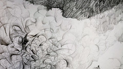
Polke’s alchemical practices are most apparent in Watchtower II (1984-85, Carnegie Museum of Art) where he used silver oxide to create a ghost-like, hazy outline, resulting in a muted image. From certain angles, the watchtower is barely visible. We see another variant on this theme in Watchtower with Geese (1987-88, Art Institute of Chicago). Polke has prominently placed a gaggle of geese atop a fabric printed with beach umbrellas and sunglasses. In this context, the function of the watchtower becomes ambiguous. The fabric alludes to the beach, thereby suggesting this symbol could be a lifeguard tower, whereas the geese allude to hunting, providing yet another possibility for the tower—a hunter’s blind. Indeed, the original German title Hochsitz translates literally to “perch” (as in a high vantage point) and typically refers to the hunter’s blind, an elevated seat used in the German countryside as a lookout for hunting fowl. Ambiguity, banality, alchemical transformations—with these recurrent themes present in this series, Polke is consistent in his inconsistency.
Art after Auschwitz
Without question, the central symbol in this series evokes the horrific realities of concentration camps, the Nazi past, and government surveillance in a divided nation. As Germany struggled with reunification in the 1980s, the military watchtowers continued to stand, near the wall separating the communist East from the democratic West. For some Germans, these towers were part of everyday reality. By layering the watchtower symbol within the banal imagery of the preprinted textiles, Polke is symbolizing a layering of consciousness, disparate realities within a divided nation. Many artists have confronted these themes of postwar reality and the healing of wide-spread cultural trauma, most notably Joseph Beuys in his shamanistic workings with felt and fat, and Anselm Kiefer’s massive canvases exploring history and myth.
Polke addressed the issues of surveillance and slaughter in this watchtower series, as well as in his ominous painting Camp (1982, Museum of Fine Arts, Boston), where the viewer is placed within a black mist set between two inwardly curving fences of barbed wire against a dark yellow sky. In these paintings, Polke does not diminish or attempt to hide the horrific realities of these symbols, yet he enshrouds them in dark uncertainties. The ghost-like haziness and mysterious mist are unpredictable and unbounded, forcing a shifting of perspective. Polke does not wish to erase the past, but perhaps something so complex can only be approached through the magic of alchemy, with its transformative powers and limitless potential.
Additional Resources:
Watchtower at the Museum of Modern Art
Watchtower II at the Carnegie Museum of Art
Watchtower with Geese at the Art Institute Chicago
Polke on the the Metropolitan Museum of Art’s Heilbrunn Timeline of Art History
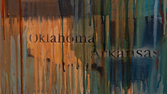
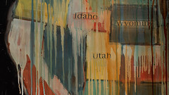
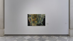
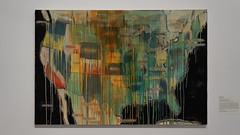
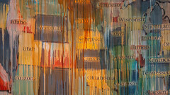
What’s in a map? Jaune Quick-To-See Smith’s State Names
by DR. ANNE SHOWALTER and DR. BETH HARRIS
Video \(\PageIndex{5}\): Dr. Anne Showalter and Dr. Beth Harris discuss Jaune Quick-To-See Smith’s State Names (2000) at the Smithsonian American Art Museum
What’s in a map? With State Names, the Native American artist Jaune Quick-To-See Smith suggests that thinking about our history in a different way, helps us rethink our present.
Additional resources
State Names at the Smithsonian American Art Museum
Jaune Quick-To-See Smith’s artist website
Artist interview with Jaune Quick-To-See Smith (The Smithsonian American Art Museum)
Smarthistory images for teaching and learning:
Wendy Red Star, 1880 Crow Peace Delegation
by WENDY RED STAR AT PORTLAND ART MUSEUM and DR. STEVEN ZUCKER
Video \(\PageIndex{6}\): Wendy Red Star, 1880 Crow Peace Delegation: Peelatchiwaaxpáash/Medicine Crow (Raven), Peelatchixaaliash/Old Crow (Raven), Déaxitchish/Pretty Eagle, Bia Eélisaash/Large Stomach Woman (Pregnant Woman) aka Two Belly, Alaxchiiaahush/Many War Achievements or Plenty Coups aka Chíilaphuchissaaleesh/Buffalo Bull Facing The Wind, 2014, 10 inket prints and red ink on paper, 16 15/16 x 11 15/16 inches (each) © Wendy Red Star (Portland Art Museum)
Gerhard Richter
Gerhard Richter, The Cage Paintings (1-6)
Video \(\PageIndex{7}\): Robert Storr talks about Gerhard Richter’s Cage paintings.
Gerhard Richter, Uncle Rudi

“I can’t see it…is it me?” I watched a young woman step closer to the canvas titled, Uncle Rudi. She was now physically closer and she was looking hard, but the image kept its distance.
Refusing Style
Meaning in Gerhard Richter’s art can also keep its distance. The elusiveness of meaning is, in some ways, a central subject of Richter’s art. Since the early 1950s, Richter has painted a huge number of subjects in wildly conflicting styles. For most artists, one style emerges and evolves slowly, almost imperceptibly, over the course of their career. This is because artists often continue to work through problems that remain relevant and perhaps, because they achieve a degree of recognition and the market then demands that style. In other words, collectors often want what is known. Artists who abandon their signature style do so at some risk to future sales. Still, some artists do push in startlingly new directions. Willem de Kooning abandoned abstraction for the figure against the advice of his dealer, and Pablo Picasso famously pursued opposing styles simultaneously—think of his volumetric, even bloated Neoclassicism compared to the collages where he pressed flat every volume in sight.
The Impossibility of Meaning
During Richter’s long career, he has produced art in an unprecedented number of conflicting styles starting with the propagandistic Social Realist art he made as a student at the Dresden Art Academy in Communist East Germany. After his move in 1961 to Düsseldorf in the West (via Berlin—the wall was begun the same year), he co-founded a German variant of Pop art which he, somewhat jokingly, termed Capitalist Realism. Since then he has painted high-pitched realism (sometimes blurred just enough to soften the image, or sometimes wiped or scraped beyond all recognition) and produced representations of abstraction (as opposed to abstraction itself). He has explored many of the most pressing visual issues of our time, the relationship of photography to painting, memory and the image, art’s role in the representation of war and politics, and perhaps most importantly, the impossibility of fixed meaning.
Image and Ideology
Richter was born in Dresden, Germany on the eve of the Second World War. His two uncles were killed in the war and his father served, but survived. His schizophrenic aunt, Marianne, was murdered by the Nazis as part of their drive to euthanize the sick. Less than a week after his thirteenth birthday, Richter heard some 3,600 British and American planes drop more than half-a-million bombs on Dresden (he then lived just outside the city). 25,000 people were killed in these raids and the Soviets would quickly occupy Eastern Germany. Unlike the idealized, classicized nudes that Adolf Hitler had promulgated, the young Richter was taught Social Realism at the Dresden academy, a celebration of the heroism of communist workers. Once in the West, Richter found that the relationship between image and ideology reversed yet again. Here, images in advertising and popular culture celebrated material wealth and the culture of capitalism. Under the Nazis, under the Soviets, and in the West, Richter saw art used to express political ideology. His art, while deeply concerned with politics and morality, rejects the very possibility of answers, even of the idea that we can know.
Uncle Rudi
Uncle Rudi, the painting the woman had stepped closer to see, is painted in the grays of a black and white photograph. It is small and has the intimacy of a family snapshot. We see a young man smiling proudly and awkwardly. He is clearly self-conscious as he poses in his new uniform. One has the sense that a moment before he was talking to the person behind the camera, likely a friend or family member. Rudi would die fighting soon after the photograph that is the basis for this painting was taken. This is the artist’s uncle, the man his grandmother favored and the adult the young Richter was to model himself after. But nothing in this painting is clear. Not the relationship between the artist and his uncle, not the tension between Rudi’s innocent awkwardness and his participation in Nazi violence, not even in the relationship between the photograph and Richter’s painting. The artist has drawn a dry brush across the wet surface of the nearly finished painting, and by doing this, he obscures the clarity of the photograph, denying us the easy certainty we expect. Richter reminds us that Uncle Rudi, like all images, promise and then fail to bring us closer to the people, things or places represented.
Gerhard Richter, Betty
by SAL KHAN and DR. STEVEN ZUCKER
Video \(\PageIndex{8}\): Gerhard Richter, Betty, 1988, oil on canvas, 102 x 72cm (Saint Louis Art Museum)
Gerhard Richter, September
Video \(\PageIndex{9}\): Robert Storr talks about Gerhard Richter’s September, 2005, oil on canvas, 52 cm x 72 cm (Museum of Modern Art, New York)
Superman, World War II, and Japanese-American experience
by DR. SARAH NEWMAN, SMITHSONIAN AMERICAN ART MUSEUM and DR. BETH HARRIS
Superman makes an appearance in what looks (at first sight) like a Japanese print.
Video \(\PageIndex{10}\): Roger Shimomura, Diary: December 12, 1941, 1980, acrylic on canvas, 127.6 x 152.4 cm (Smithsonian American Art Museum, gift of the artist, © Roger Shimomura). A conversation with Dr. Sarah Newman, James Dicke Curator of Contemporary Art, Smithsonian American Art Museum, and Dr. Beth Harris.
This Seeing America video was made possible by a generous grant from the Terra Foundation and the Alice L. Walton Foundation.
Go deeper:
This work at The Smithsonian American Art Museum
Learn more about the role of Superman and other comic book heroes during World War II
Explore primary sources on the Japanese internment camps of the 1940s
Explore more primary sources on the Japanese internment camps of the 1940s
Learn more about Japanese culture and ukiyo-e prints in this online exhibition
Shimomura’s Diary – American Experience in the Classroom (The Smithsonian American Art Museum)
An American Diary: Artist talk with Roger Shimomura (The Smithsonian American Art Museum)
Smithsonian Learning Lab collection on Japanese American Internment, Propaganda, and Superheroes
Sebastião Salgado’s Kuwait
by EVE SCHILLO, LACMA and DR. STEVEN ZUCKER
Video \(\PageIndex{11}\): Sebastião Salgado’s Kuwait, 1991, gelatin silver print, 45.24 × 30.1 cm (Los Angeles County Museum of Art, gift of Gary Sato, AC1998.162.1, ©Sebastião Salgado), a Seeing America video, speakers: Eve Schillo, Assistant Curator, Wallis Annenberg Photography Department, Los Angeles County Museum of Art and Steven Zucker
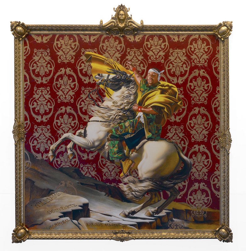
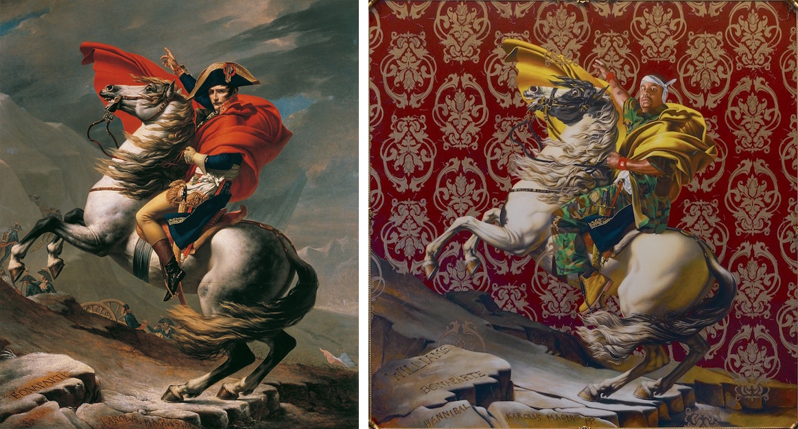
Kehinde Wiley, Napoleon Leading the Army over the Alps
Confronting Art History
In this large painting, Kehinde Wiley, an African-American artist, strategically re-creates a French masterpiece from two hundred years before but with key differences. This act of appropriation reveals issues about the tradition of portraiture and all that it implies about power and privilege. Wiley asks us to think about the biases of the art historical canon (the set of works that are regarded as “masterpieces”), representation in pop culture, and issues of race and gender. Here, Wiley replaces the original white subject—the French general-turned-emperor Napoleon Bonaparte (below)—with an anonymous black man whom Wiley approached on the street as part of his “street-casting process.” Although Wiley does occasionally create paintings on commission, he typically asks everyday people of color to sit for photographs, which he then transforms into paintings. Along the way, he talks with those sitters, gathering their thoughts about what they should wear, how they might pose, and which historical paintings to reference.
Napoleon Leading the Army is a clear spin-off of Jacques-Louis David’s painting of 1800-01 (below), which was commissioned by Charles IV, the King of Spain, to commemorate Napoleon’s victorious military campaign against the Austrians. The original portrait smacks of propaganda. Napoleon, in fact, did not pose for the original painting nor did he lead his troops over the mountains into Austria. He sent his soldiers ahead on foot and followed a few days later, riding on a mule.
Choosing Symbolic Details
Wiley calls attention to ideas about authority and historical representation, keeping many original elements and making significant alterations. The royal blue coat of the original makes an appearance (peeking out from the young man’s camouflage shirt), as does the gold-encased sword (held in place by a red strap). But Wiley’s subject wears an outfit that is completely contemporary and reflective of a culture notorious for flashy imagery and larger than life figures: hip hop culture. This young man wears camouflage fatigues, Timberland work boots, and a bandana—conjuring up militaristic associations with the original painting and with the violence of contemporary urban America, particularly as experienced by young black men. The subject of Wiley’s painting reveals his tattoos and wears red wristbands from the Starter sportswear company, details that add to the sense that this is a real individual living in the early 21st century.
Instead of the naturalistic setting of David’s painting, Wiley has inserted a decorative, unrealistic backdrop reminiscent of luxurious French fabric. This background, along with the high-keyed colors, and ornate frame (complete with faux family shields and the artist’s self-portrait at the top) call attention to the artificiality and pompousness of image-making.
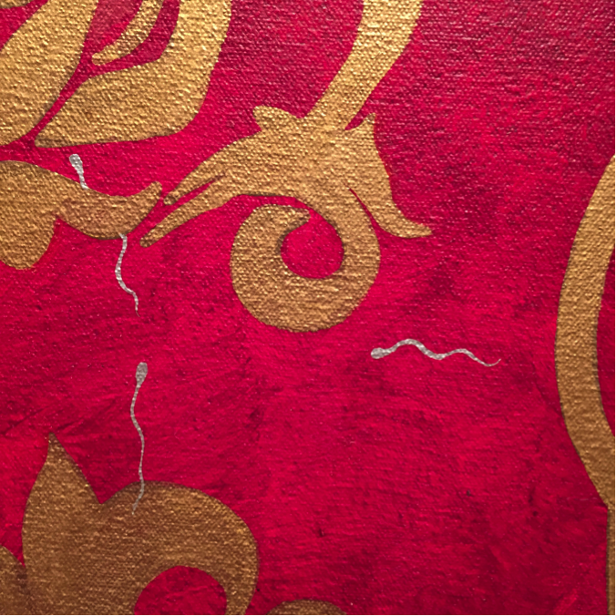
The background is also infused with tiny paintings of sperm—Wiley’s way of poking fun at the highly charged masculinity and propagation of gendered identity that are involved in the Western tradition of portraiture. This particular subgenre of portraiture—the equestrian portrait—is particularly infused with the lineage of male power. From classical Rome to post-revolutionary France, political and military leaders on horseback have evoked and perpetuated social norms of masculine might and control (for example, this equestrian portrait of the Roman Emperor Marcus Aurelius).
Through his demonstration of extraordinary painting skill and his use of famous portraits, Wiley could be seen as wryly placing himself in line with the history of great master painters. Here, for example, he has signed and dated the painting just as David did, painting his name and the date in Roman numerals onto the band around the horse’s chest. Wiley makes another reference to lineage in the foreground where he retains the original painting’s rocky surface and the carved names of illustrious leaders who led troops over the Alps: NAPOLEON, HANNIBAL, and KAROLUS MAGNUS (Charlemagne). But Wiley also includes the name WILLIAMS—another insistence on including ordinary people of color who are often left out of systems of representation and glorification. Not only is Williams a common African-American surname, it hints at the imposition of Anglo names on black people who were brought by force from Africa and stripped of their own histories.
About the Artist
Kehinde Wiley (American, born 1977) attracted media and art world attention almost immediately after earning his MFA from Yale University in 2001. He was an artist-in-residence at the Studio Museum in Harlem and has been included in many significant group and solo exhibitions. Wiley now employs studio assistants who participate in his “street-casting” process and in the various stages of painting and sculpture fabrication. In addition to large-scale paintings, Wiley has created stained glass, painted altarpieces, and cast bronze sculptures, all of which examine of art history, race, gender, and the power of representation.
Additional Resources:
Gayle Clemans, “The Stunning and Subversive Pageantry of Artist Kehinde Wiley,” The Seattle Times, February 16, 2016.
Shahrazad A. Shareef, “The Power of Decor: Kehinde Wiley’s Interventions into the Construction of Black Masculine Identity” (UMI Dissertations Publishing, 2010).
Eugenie Tsai, ed., Kehinde Wiley: A New Republic (Brooklyn, New York: Brooklyn Museum, 2015).
History and deception: Kenseth Armstead’s Surrender Yorktown 1781
by KENSETH ARMSTEAD and DR. STEVEN ZUCKER
Video \(\PageIndex{12}\): Kenseth Armstead and Steven Zucker discuss Kenseth’s Surrender Yorktown 1781 (2013) at the Newark Museum
How can we begin to correct the lies of history? Artist Kenseth Armstead suggests a poetic solution.
Additional resources
Kenseth Armstead’s artist website
The American Revolution: A World War, National Museum of American History, Smithsonian Institution
Smarthistory images for teaching and learning:
Maya Lin’s Silver Upper White River
by ALEJO BENEDETTI, CRYSTAL BRIDGES MUSEUM OF AMERICAN ART and DR. STEVEN ZUCKER
Video \(\PageIndex{13}\): Maya Lin, Silver Upper White River, 2015, recycled silver, 332.7 x 609.6 x 1 cm (Crystal Bridges Museum of American Art, © Maya Lin) Speakers: Alejo Benedetti, Assistant Curator, Crystal Bridges Museum of American Art, and Steven Zucker, a Seeing America video
Additional resources
This sculpture at Crystal Bridges
Maya Lin, Folding the Chesapeake, at the Smithsonian American Art Museum
Maya Lin, Pin River-Yangtze at the United States Embassy in Beijing
Courtney Leonard, ARTIFICE Ellipse, 2016
by COURTNEY M. LEONARD and DR. BETH HARRIS
Video \(\PageIndex{14}\): A conversation with Courtney M. Leonard and Beth Harris in front of Courtney Leonard’s ARTIFICE Ellipse | Log: 18-3, coiled micaceous clay with glaze, 5 3/8 x 15 x 7 inches (Newark Museum of Art) © Courtney M. Leonard
Hock E Aye Vi Edgar Heap of Birds, Native Hosts (Arkansas)
by DR. MINDY BESAW, CRYSTAL BRIDGES MUSEUM OF AMERICAN ART and DR. BETH HARRIS
Video \(\PageIndex{15}\): Hock E Aye Vi Edgar Heap of Birds, Native Hosts (Arkansas), 2018, aluminum sign, series of seven, 46.7 x 92.5 cm (Crystal Bridges Museum of American Art, ©Hock E Aye VI Edgar Heap of Birds), a Seeing America video Speakers: Dr. Mindy Besaw, Curator of American Art, Crystal Bridges Museum of American Art, and Dr. Beth Harris