
10.5: Cubism + early abstraction (II)
- Page ID
- 65581

Futurism
This group of young and rebellious Italian writers and artists was determined to celebrate industrialization.
1909 - 1914
Italian Futurism: An Introduction
by EMILY CASDEN
Can you imagine being so enthusiastic about technology that you name your daughter Propeller? Today we take most technological advances for granted, but at the turn of the last century, innovations like electricity, x-rays, radio waves, automobiles and airplanes were extremely exciting. Italy lagged Britain, France, Germany, and the United States in the pace of its industrial development. Culturally speaking, the country’s artistic reputation was grounded in Ancient, Renaissance and Baroque art and culture. Simply put, Italy represented the past.
In the early 1900s, a group of young and rebellious Italian writers and artists emerged determined to celebrate industrialization. They were frustrated by Italy’s declining status and believed that the “Machine Age” would result in an entirely new world order and even a renewed consciousness.
Filippo Tommaso Marinetti, the ringleader of this group, called the movement Futurism. Its members sought to capture the idea of modernity, the sensations and aesthetics of speed, movement, and industrial development.
A manifesto
Marinetti launched Futurism in 1909 with the publication his “Futurist manifesto” on the front page of the French newspaper Le Figaro. The manifesto set a fiery tone. In it Marinetti lashed out against cultural tradition (passatismo, in Italian) and called for the destruction of museums, libraries, and feminism. Futurism quickly grew into an international movement and its participants issued additional manifestos for nearly every type of art: painting, sculpture, architecture, music, photography, cinema—even clothing.
The Futurist painters—Umberto Boccioni, Carlo Carrà, Luigi Russolo, Gino Severini, and Giacomo Balla—signed their first manifesto in 1910 (the last named his daughter Elica—Propeller!). Futurist painting had first looked to the color and the optical experiments of the late 19th century, but in the fall of 1911, Marinetti and the Futurist painters visited the Salon d’Automne in Paris and saw Cubism in person for the first time. Cubism had an immediate impact that can be seen in Boccioni’s Materia of 1912 for example. Nevertheless, the Futurists declared their work to be completely original.
Dynamism of Bodies in Motion
The Futurists were particularly excited by the works of late 19th-century scientist and photographer Étienne-Jules Marey, whose chronophotographic (time-based) studies depicted the mechanics of animal and human movement.
Video \(\PageIndex{1}\)
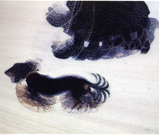
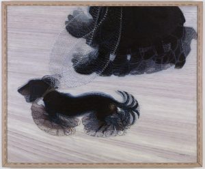
A precursor to cinema, Marey’s innovative experiments with time-lapse photography were especially influential for Balla. In his painting Dynamism of a Dog on a Leash, the artist playfully renders the dog’s (and dog walker’s) feet as continuous movements through space over time.
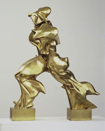
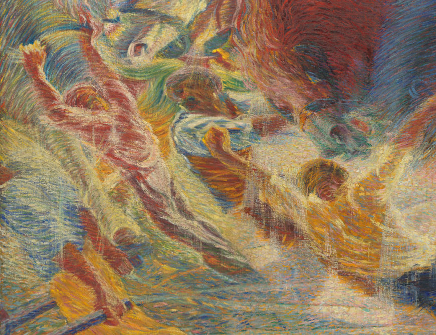
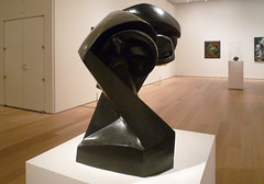
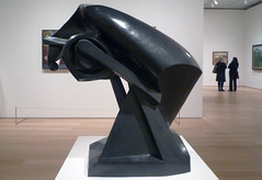
Entranced by the idea of the “dynamic,” the Futurists sought to represent an object’s sensations, rhythms and movements in their images, poems and manifestos. Such characteristics are beautifully expressed in Boccioni’s most iconic masterpiece, Unique Forms of Continuity in Space (see above).
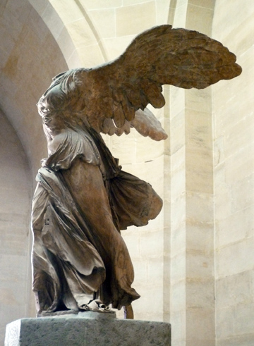
The choice of shiny bronze lends a mechanized quality to Boccioni’s sculpture, so here is the Futurists’ ideal combination of human and machine. The figure’s pose is at once graceful and forceful, and despite their adamant rejection of classical arts, it is also very similar to the Nike of Samothrace.
Politics & War
Futurism was one of the most politicized art movements of the twentieth century. It merged artistic and political agendas in order to propel change in Italy and across Europe. The Futurists would hold what they called serate futuriste, or Futurist evenings, where they would recite poems and display art, while also shouting politically charged rhetoric at the audience in the hope of inciting riot. They believed that agitation and destruction would end the status quo and allow for the regeneration of a stronger, energized Italy.
These positions led the Futurists to support the coming war, and like most of the group’s members, leading painter Boccioni enlisted in the army during World War I. He was trampled to death after falling from a horse during training. After the war, the members’ intense nationalism led to an alliance with Benito Mussolini and his National Fascist Party. Although Futurism continued to develop new areas of focus (aeropittura, for example) and attracted new members—the so-called “second generation” of Futurist artists—the movement’s strong ties to Fascism has complicated the study of this historically significant art.
Additional resources:
Unique Forms in the Continuity of Space at MoMA
The Futurist Manifestos and related materials
Charles Bernstein reading the Futurist Manifesto at MoMA (video)
Boccioni’s Materia in the Peggy Guggenheim Collection
Étienne-Jules Marey at MoMA
Smarthistory images for teaching and learning:
Futurist Free Word Painting
by DR. CHARLES CRAMER and DR. KIM GRANT
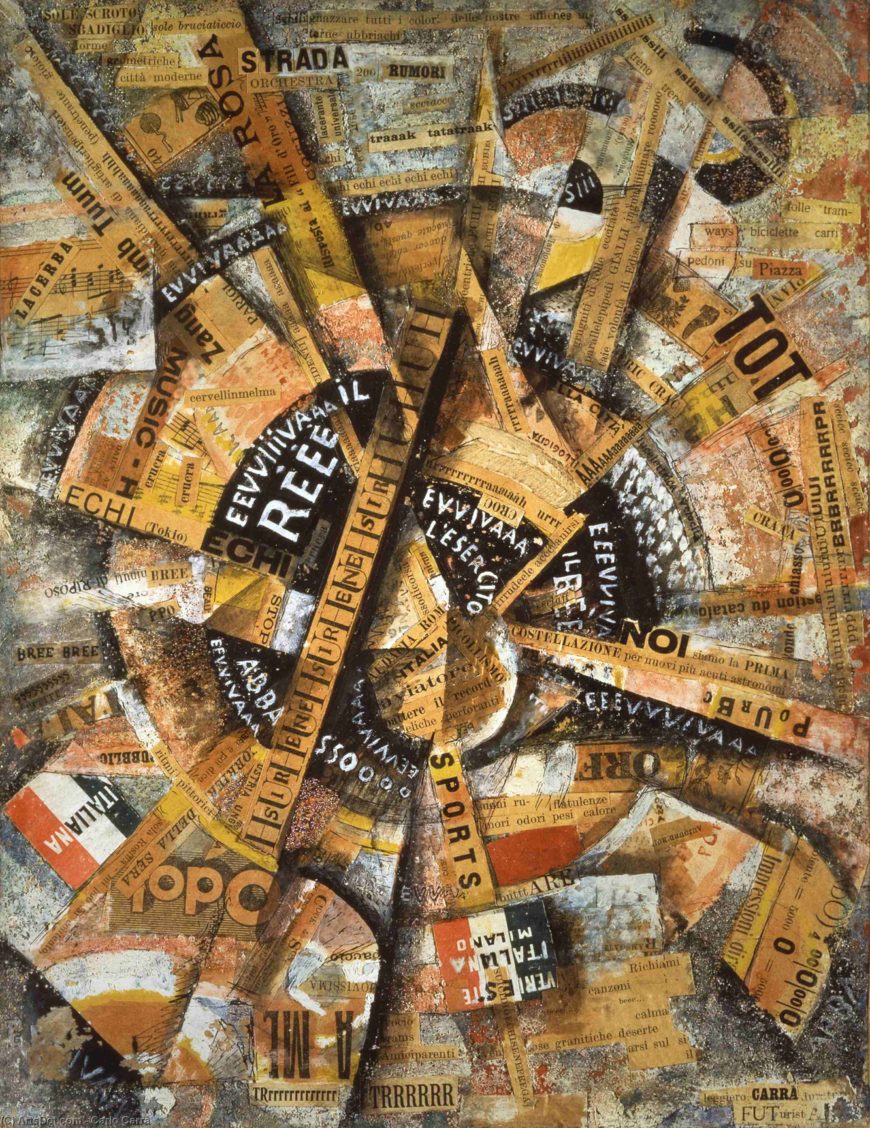
Created in the politically volatile days leading up to World War I, Carlo Carrà’s Interventionist Demonstration (Patriotic Holiday – Free Word Painting) displays both the Italian Futurists’ avant-garde techniques and their militant nationalism. It is a collage painting that uses words as its primary element.
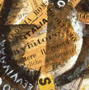
The composition rotates like an airplane propeller, and the word “aviator” is pasted at its heart. Dozens of pasted and painted words fan out from the center like voices shouting in a crowd. There are clippings from advertisements, Futurist poems, and newspaper articles, as well as two painted Italian flags and graffiti-like inscriptions of popular slogans supporting the Italian army and king, and condemning Austria.
Instructions from a propeller
Free word painting is a development of Filippo Marinetti’s parole in libertà — “words in freedom,” often translated as “free word poetry.” Inspired by the intensity of his experiences as a war correspondent in Libya, Marinetti first described parole in libertà as instructions emanating from an airplane propeller. The instructions included the abolition of syntax, punctuation, conjunctions, adverbs, and adjectives. Verbs must be used only in the infinitive form.
These restrictions defined a poetry largely based on conjunctions of nouns intended to directly express things and their physical qualities. For example, a section of Marinetti’s first free word poem Battle of Weight + Smell reads, “20 meters battalions-ants cavalry-spiders roads-fords general-island couriers-locusts sands-revolution howitzers-grandstands clouds-grates guns-martyrs . . .”\(^{[1]}\)
A multi-sensory approach
The Futurists developed multi-sensory approaches to communicate the experiences of physical reality. Instead of description, Futurist poets used onomatopoeia to convey sounds directly. The title of Marinetti’s poem ZANG TUMB TUUUM is onomatopoeic; the “words” are the successive sounds of an artillery shell firing, exploding, and reverberating.
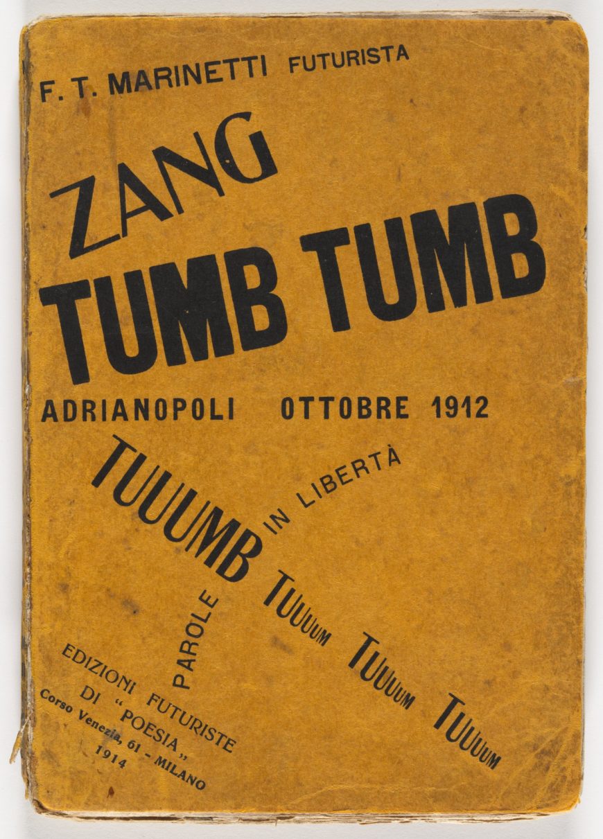
In addition to sound, parole in libertà appealed directly to vision and instigated a revolution in typography. The cover of ZANG TUMB TUUUM uses different weights of type to signify the relative volume of different sounds and layout to convey relationships and physical movement. ZANG is on top and angles steeply upward to indicate the firing of the shell. The twice-repeated TUMB is lower and heavier to convey the booming impact of the shell and the power of the explosion. The diminishing echoes of the sonic reverberation are represented below by the steep down-sloping TUUUMBs that shrink with each repetition.
While Futurist poets added concrete aural and visual dimension to their poems, Futurist artists worked to expand the sensory appeal of their works beyond the visual. Carlo Carrà published a manifesto in which he called for painters to express sounds and smells through the use of shape and color. He claimed that all sounds and smells are dynamic vibrating intensities that provoke mental shapes and colors. This is a reference to a well-known perceptual phenomenon known as synesthesia, which can affect people in varying ways. Some people, for example, see colors when they hear music, while others smell a specific odor when they see a particular color. Synesthesia played an important role in the development of abstract painting in the early 20th century, most famously in the theories of Vasily Kandinsky.
Eliminating boundaries

The dynamic arrangement of words in Interventionist Demonstration creates a vortex of expressive significance that sucks the viewer into the composition. There are no still or stable places in the painting. The expanding, radiating composition, along with the inconsistent orientation of the lines of text, suggests that the sounds are coming at the viewer from all sides, dissolving the traditional boundary between viewer and artwork. This was a key goal of the Futurist painters, who wanted to create the sensation of immediacy and aimed to place the viewer in the center of the artwork.
Eliminating boundaries between the senses and between artistic media was also crucial for the Futurists. Carrà intended his painting to communicate emotion directly and synesthetically by means of color, shape, and composition, as well as by words. In addition to political slogans, most of the collaged words are references to Futurist themes, including the city and its crowds, sports and speed, sounds and music, colors and odors. There are numerous violent-sounding onomatopoeic words as well, including the title of Marinetti’s poem ZANG TUMB TUUUM pasted in the upper left.
A twirling dancer
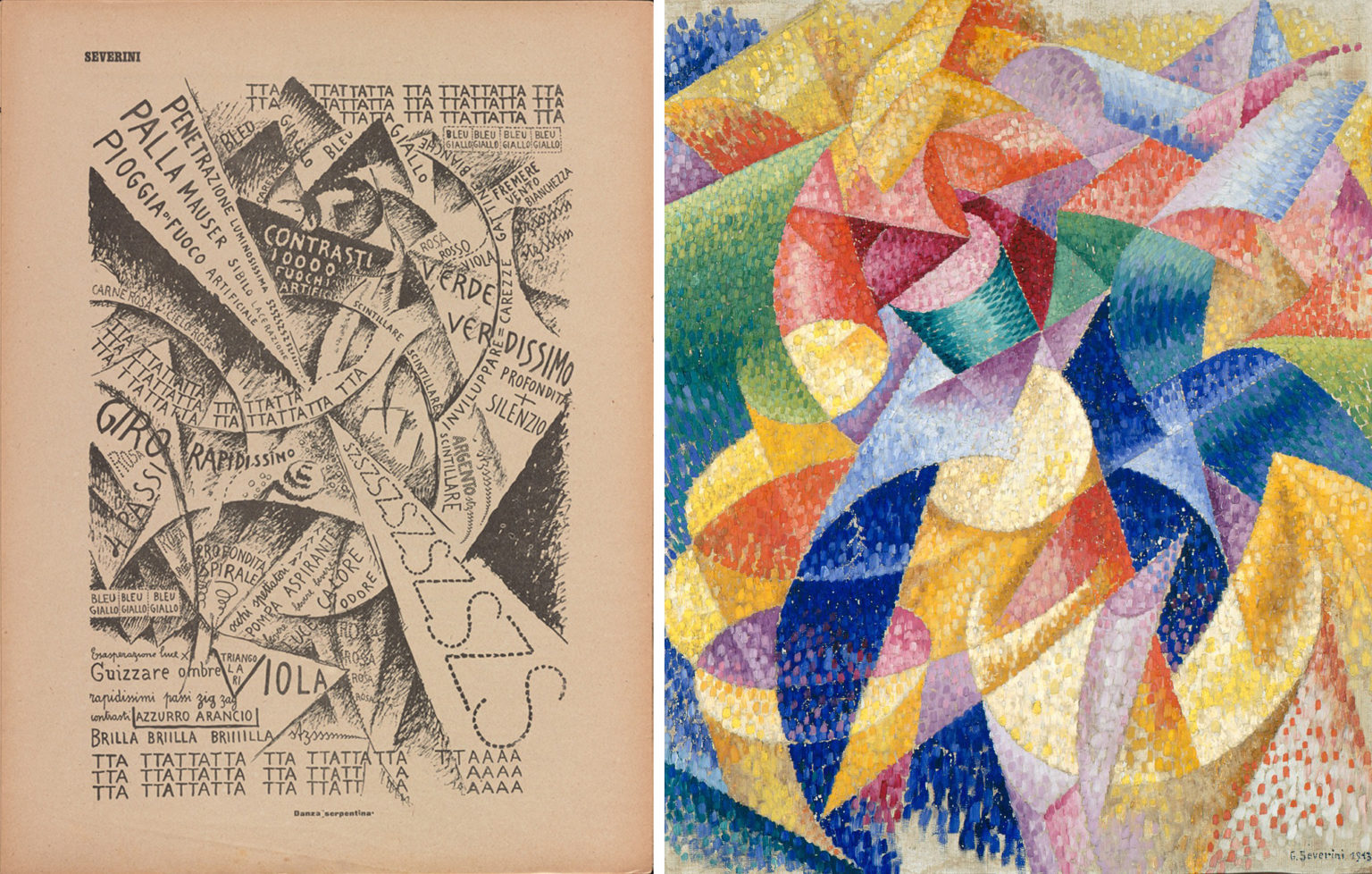
Gino Severini’s Serpentine Dancer uses an approach similar to that of Carrà’s Interventionist Demonstration. It represents the experience of watching a dancer in a nightclub. The abstract composition combines semi-circular arcs accompanied by acute triangles and stark contrasts of black and white. The forms of the drawing are comparable to Severini’s Sea = Dancer, painted only a few months earlier.
Reinforcing the equivalencies of words, sounds, and colors, the drawing includes many names of colors (verde, bleu, giallo, azzurro), as well as onomatopoeic sounds like TTATTA and SZSX. Words of different sizes are woven through the image, creating repeating patterns, echoing shapes in contrasting tones, and contributing both sound and meaning.
Severini indicated the twirling of the dancer with both repeated arcs and the words giro rapidissimo (rapid turn) and profondita spirale (deep spiral). Luce (light), calor (heat), and odore (odor) evoke the sensory experience of being in the nightclub. Piogga di fuoco artificiale (rain of fireworks), palla mauser sililo lacerazione (hissing Mauser pistol shot) and penetrazione luminosissima szszsz (luminous penetration) slash through the image in a white triangle that pierces the heart of the image. They remind us that for the Futurists any mass activity, including the pleasures of nightclubs and dancing, went hand in hand with a desire to incite violence, riot, and war.
On the battlefield
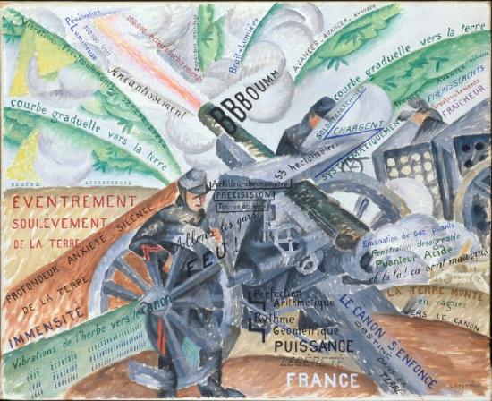
Painted a year later, Severini’s Cannon in Action uses similar techniques to communicate the experience of soldiers on the battlefield in World War I. Rather than representing the twirling of a dancer, this composition explodes out from the center in curves and arcs that convey the power and noise of a cannon firing. In keeping with the Futurists’ love of machinery, a cannon and armored vehicle dominate the scene with soldiers serving as their faceless accessories. Written words follow the painted forms, and most are informational and descriptive, just as the painting is largely representational rather than abstract. For example, the phrases written in the cloud of smoke behind the cannon are all comments on the horrible smell.
The Futurists’ parole in libertà and the development of free word painting arose from their desire to break down the divisions between different art forms to communicate feeling directly. Words, sounds, images, shapes, and colors were all used to convey the intensity of experience and bring the viewer into the heart of the action, be it participating in a crowd in a city square, dancing in a nightclub, or joining artillery men on a battlefield.
Notes:
- Translated in Christine Poggi, In Defiance of Painting: Cubism, Futurism, and the Invention of Collage (New Haven: Yale University Press, 1992), p. 207.
Additional resources:
Read about “words in freedom” at the Solomon R. Guggenheim Museum’s Checklist blog
Read Carlo Carrà’s manifesto, The Painting of Sounds, Noises, and Odors
Read Filippo Marinetti’s Technical Manifesto of Futurist Literature
Umberto Boccioni and the Futurist City
by DR. CHARLES CRAMER and DR. KIM GRANT
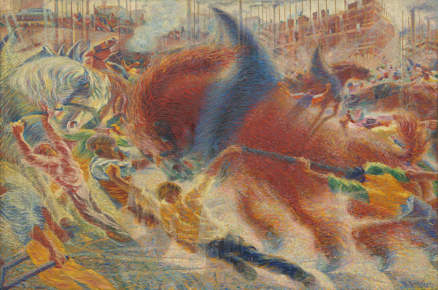
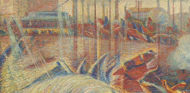
At almost ten feet wide, Umberto Boccioni’s The City Rises projects an image of overwhelming power. Huge workhorses surge across the canvas, their abstracted bodies dissolving into the space and light while their harnesses point upward like wings. Surrounding the enormous beasts, straining workmen in dynamic, elongated postures also partly dissolve into the vibrant, swirling brushstrokes that cover the painting’s surface. Boccioni has turned a construction site into a symbolic image of the powerful forces underlying the modern city.
Like the hooves of enormous steel horses
The painting contains a striking contradiction. It represents the construction site for a new electric power plant on the outskirts of Milan, Italy’s first modern industrial city. In the upper portion of the painting you can see the building under construction, tall smokestacks and, on the left, an electric tram. In the foreground, however, the scene is far from modern in its depiction of the brute power of human and animal labor rather than the power of machines. This contrast between the modern city and the physical labor required to construct it reflects Italy’s somewhat belated industrialization in the early 20th century.
The Futurists were outspoken supporters of Italy’s modernization. Led by the poet Filippo Marinetti, they demanded an end to the idolization of Italy’s dead past and called for the destruction of museums, libraries, and cultural monuments. They glorified modern technology, electricity, steel, and the speed of automobiles, trains, and airplanes. In addition, they promoted an aggressive masculinity and explicitly rejected feminism.
Boccioni’s paintings often seem to directly reflect Marinetti’s poetic imagery:
We will sing of great crowds excited by work, by pleasure, and by riot; we will sing of the multicolored, polyphonic tides of revolution in the modern capitals; we will sing of the vibrant nightly fervor of arsenals and shipyards blazing with violent electric moons; greedy railway stations that devour smoke-plumed serpents; factories hung on clouds by the crooked lines of their smoke . . . deep-chested locomotives whose wheels paw the tracks like the hooves of enormous steel horses . . .
Filippo Marinetti, “The Foundation and Manifesto of Futurism,” translated by R. W. Flint, reprinted in Art in Theory 1900-2000: An Anthology of Changing Ideas (London: Blackwell, 2003), p. 148.
Painting universal dynamism
In addition to the roiling forms of the abstracted horses, The City Rises conveys the intense energy of the modern city and its workers by using bright color. The paint is applied using a modified divisionist technique (developed by French 19th-century Post-Impressionists, most notably Georges Seurat), in which small brushstrokes of complementary colors create a bright, flickering surface. There are no shadows; instead, swirls and rays of white paint overwhelm the figures with glowing light.
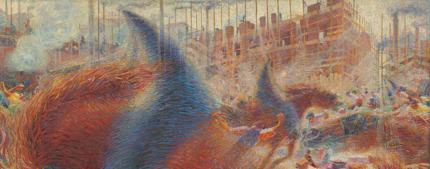
In keeping with Boccioni’s conception of a universal dynamism uniting all things, the flecks of paint suggest molecules of physical matter constantly changing to form new objects and energy. Nothing appears stable as the composition surges upward. The figures create powerful diagonals rising from right to left in the foreground. A second diagonal rises from left to right in the background, where the scene recedes into cloudy, angled vistas of industrial smokestacks.
The power of the masses
The figures in The City Rises have no faces and do not represent specific individuals. They are part of the city’s crowd, units in a potentially overwhelming force — the new masses of the modern city. The Futurists celebrated the vigor of the urban masses and even tried to incite riot and rebellion by insulting their audiences during aggressive public performances of their poetry and manifestos. We can see this side of the Futurists’ interests in another Boccioni painting, Riot in the Galleria, made while he was working on The City Rises.
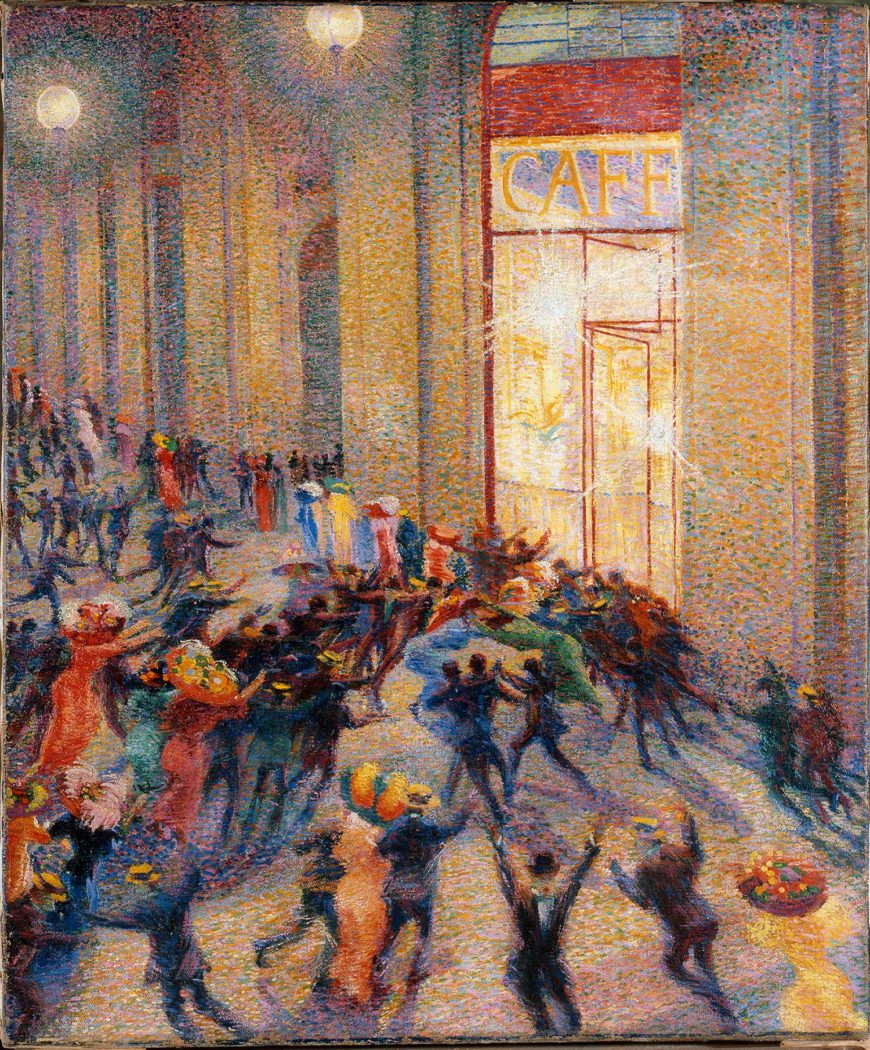
In terms of subject and location, Riot in the Galleria is almost the polar opposite of The City Rises. Instead of a daytime construction site in the new industrial suburbs, it depicts a nighttime scene in a popular shopping arcade, the Galleria Vittorio Emanuele II, in the heart of Milan’s old city. The people, although equally faceless, are well-dressed and implicitly middle-class. The men wear suits and ties, the women are fashionably attired in bright colors and large fancy hats. Bright orbs of electric light glow in the upper half of the painting and illuminate the crowd outside a glass-fronted cafe.
In his “Futurist Painting: Technical Manifesto” Boccioni declared:
We will sing of great crowds excited by work, by pleasure, and by riot; we will sing of the multicolored, polyphonic tides of revolution in the modern capitals; we will sing of the vibrant nightly fervor of arsenals and shipyards blazing with violent electric moons; greedy railway stations that devour smoke-plumed serpents; factories hung on clouds by the crooked lines of their smoke . . . deep-chested locomotives whose wheels paw the tracks like the hooves of enormous steel horses . . .
Filippo Marinetti, “The Foundation and Manifesto of Futurism,” translated by R. W. Flint, reprinted in Art in Theory 1900-2000: An Anthology of Changing Ideas (London: Blackwell, 2003), p. 148.

Painting universal dynamism
In addition to the roiling forms of the abstracted horses, The City Rises conveys the intense energy of the modern city and its workers by using bright color. The paint is applied using a modified divisionist technique (developed by French 19th-century Post-Impressionists, most notably Georges Seurat), in which small brushstrokes of complementary colors create a bright, flickering surface. There are no shadows; instead, swirls and rays of white paint overwhelm the figures with glowing light.

In keeping with Boccioni’s conception of a universal dynamism uniting all things, the flecks of paint suggest molecules of physical matter constantly changing to form new objects and energy. Nothing appears stable as the composition surges upward. The figures create powerful diagonals rising from right to left in the foreground. A second diagonal rises from left to right in the background, where the scene recedes into cloudy, angled vistas of industrial smokestacks.
The power of the masses
The figures in The City Rises have no faces and do not represent specific individuals. They are part of the city’s crowd, units in a potentially overwhelming force — the new masses of the modern city. The Futurists celebrated the vigor of the urban masses and even tried to incite riot and rebellion by insulting their audiences during aggressive public performances of their poetry and manifestos. We can see this side of the Futurists’ interests in another Boccioni painting, Riot in the Galleria, made while he was working on The City Rises.

In terms of subject and location, Riot in the Galleria is almost the polar opposite of The City Rises. Instead of a daytime construction site in the new industrial suburbs, it depicts a nighttime scene in a popular shopping arcade, the Galleria Vittorio Emanuele II, in the heart of Milan’s old city. The people, although equally faceless, are well-dressed and implicitly middle-class. The men wear suits and ties, the women are fashionably attired in bright colors and large fancy hats. Bright orbs of electric light glow in the upper half of the painting and illuminate the crowd outside a glass-fronted cafe.
In his “Futurist Painting: Technical Manifesto” Boccioni declared:
Our renovated consciousness does not permit us to look upon man as the center of universal life. The suffering of a man is of the same interest to us as the suffering of an electric lamp, which with spasmodic starts, shrieks out the most heart-rending expressions of color. The harmony of the lines and folds of modern dress works upon our sensitiveness . . .”
Umberto Boccioni, “Futurist Painting: Technical Manifesto,” Reprinted in Art in Theory 1900-2000, p. 151.
Riot in the Galleria fully demonstrates Boccioni’s claim that light and clothing are as interesting as people.
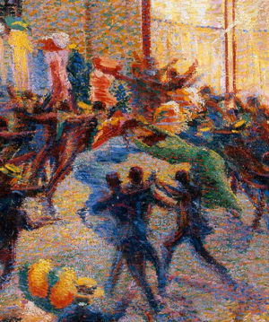
The cause of the riot is unknown. Two women dressed in blue and green fight outside the cafe, while three men struggle together in front of them. A large crowd surges in from the left with their arms raised, while a group of barely individualized figures gestures behind the fighting women. Figures on the periphery run both towards and away from the central group. The scene is depicted from a safe distance, and we look down at the melee as non-involved spectators.
Although a riot is potentially dangerous, the painting is overwhelmingly cheerful with its bright patterns of divisionist colors. The strong verticals of the arcade’s architecture loom over the frenzied crowd in the lower half of the painting, providing a sense of balance, and enhancing our sense of psychological distance.
The scene is exciting without appearing threatening. This rather callous approach to a street brawl reflects the Futurists’ conviction that riot, revolution, and war were cleansing; they would sweep away the failures of the past and renew the world.
A shift in style
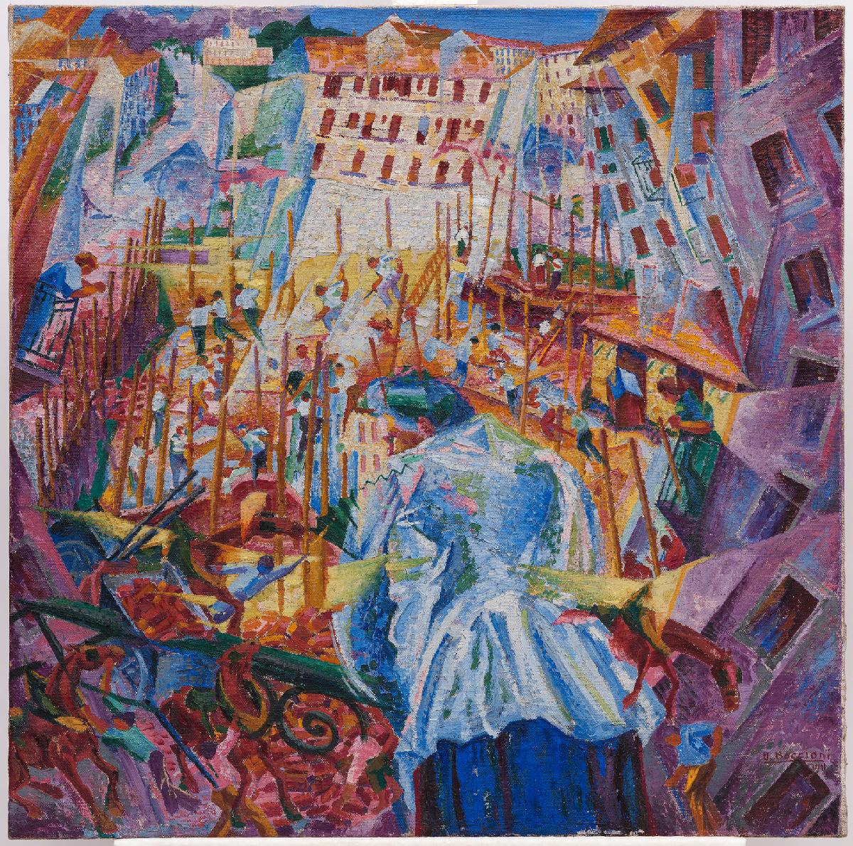
A slightly later painting of an urban scene, The Street Enters the House, represents a major shift in Boccioni’s style prompted by his exposure to Cubist techniques during a 1911 visit to Paris. The fractured representation of objects and space in Salon Cubism was not only more current than divisionism, it was an effective means to convey the Futurists’ modern concepts of space and time.
Like many of the Salon Cubists, the Futurists were influenced by the philosophy of Henri Bergson as well as by recent scientific discoveries, such as X-rays and Einstein’s new physics. They embraced the concepts of simultaneity and universal dynamism and sought new ways to depict the vital energy of the universe in painting. Boccioni declared that space no longer existed and that he would paint dynamic sensation itself rather than isolated objects. He also promised to put the spectator in the center of the picture.
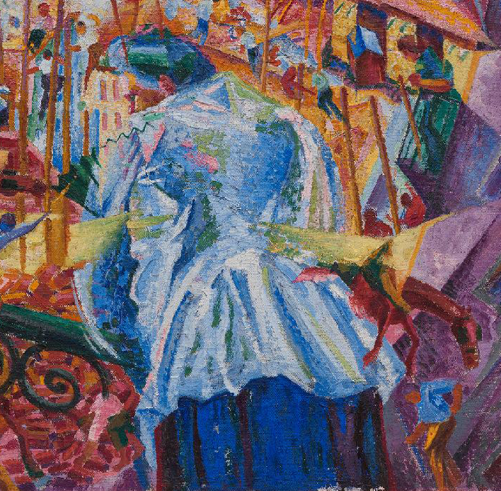
The Street Enters the House is a literal depiction of that promise. It represents a woman in the center of the picture watching men constructing a factory from her balcony. Fractured buildings frame the work site in the center, while a kaleidoscopic array of girders, bricks, and figures thrust upward, surrounding and, in places, penetrating the woman’s body. She leans somewhat precariously over the dizzying view, and we hover even more insecurely just above her. Confronted by the complexity of the scene and the vibrant colors, we are drawn in to psychologically engage with its urban confusion, a very different effect from the distant vantage point of Riot in the Galleria.
Boccioni’s desire to place the spectator in the center of the painting reflects his conception of a reality in which time and space are in constant flux, and that he as an artist intuits the vital forces that flow through all things. By depicting the excitement of rioting crowds, the construction of the new city, and the electricity that powered it, he conveyed his sensitivity to the new forms and energies of the modern world.
Additional resources:
Read about Futurism’s interest in riots at the Guggenheim Museum’s Checklist blog
Read more about Umberto Boccioni at the Metropolitan Museum of Art’s Heilbrunn Timeline of Art History
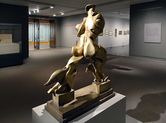
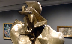
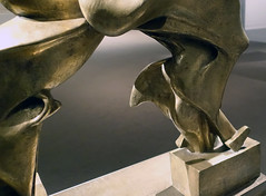
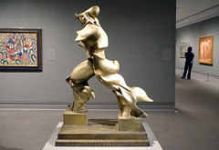
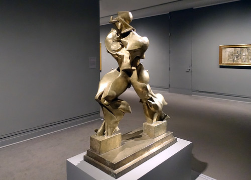
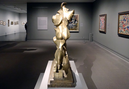
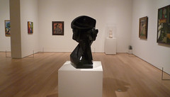
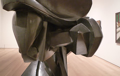
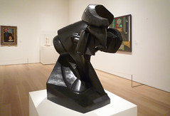
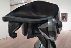
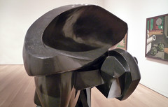
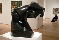
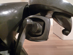
Umberto Boccioni, Unique Forms of Continuity in Space
The Futurists wanted art to break from the Classical and Renaissance styles still dominant in Italy at the start of the Twentieth Century. For some, Unique Forms of Continuity in Space shows a figure striding into the future. Its undulating surfaces seem to transform before our eyes. About fifty years after Charles Darwin introduced the theory of evolution and about thirty years after Nietzsche described his “super-man,” Boccioni sculpted a future-man: muscular, dynamic and driven.

Motion as Form

The face of the sculpture is abstracted into a cross, suggesting a helmet, an appropriate reference for the war-hungry Futurists. The figure doesn’t appear to have arms, though wing-like forms seem to emerge the rippling back. However, these protrusions are not necessarily even a part of the figure itself, since Boccioni sculpted both the figure and its immediate environment. The air displaced by the figure’s movement is rendered in forms no different than those of the actual body. See, for example, the flame-like shapes that begin at the calves and show the air swirling away from the body in motion.
This idea of sculpting the environment around a figure is expressed in Boccioni’s “Technical Manifesto of Futurist Sculpture” (1912) and shows the influence of the sculptor Medardo Rosso, an Italian contemporary of Auguste Rodin who worked in Paris (and who was becoming more popular back in Italy in this period thanks to the efforts of sometime-Futurist Ardengo Soffici. Rosso made impressionistic plaster or bronze busts, covered in wax, of people in Paris, in which the figures merge into the space around them, as seen in his Impressions of the Boulevard: Woman with a Veil, 1893. Unique Forms of Continuity in Space has also been compared to Rodin’s armless Walking Man of 1907.

Unique Forms is one of a series of sculptures of striding figures that Boccioni created in 1913. Up until 1912, Boccioni had been a painter, but after visiting Paris and the seeing sculptural innovations like Braque’s three-dimensional Cubist experiments in paper, Boccioni became obsessed with sculpture. His striding sculptures continued the theme of human movement seen in his paintings such as Dynamism of a Soccer Player, 1913.
Movement was a key element for Boccioni and the other Futurists, as the technology of transportation (cars, bicycles, and advanced trains) allowed people to experience ever greater speeds. The Futurist artists often depicted motorized vehicles and the perceptions they made possible—the blurry, fleeting, fragmentary sight created by this new velocity.
Breaking his Own Rules

Unlike fellow Futurist Giacomo Balla, who used repeated forms to represent movement, in work such as Dynamism of a Dog on a Leash (1912), Boccioni synthesized different positions into one dynamic figure. Although Unique Forms of Continuity in Space is the most famous Futurist sculpture, there are some aspects of the work that do not fit neatly with the artists’ declarations. For example, three years before he made this sculpture, Boccioni and the other Futurist artists had banned the painting of nudes for being hopelessly mired in tradition—and Unique Forms is a nude male, albeit one abstracted through exaggerated muscles and possibly shielding its head with a helmet.
Boccioni also breaks rules from his “Technical Manifesto of Futurist Sculpture” where he declared that Futurist sculpture should be made of strong, straight lines, “The straight line is the only way to achieve the primitive purity of a new architectonic structure of masses or sculptural zones.” Clearly, he had not yet recognized the potential for the dynamic curves so powerfully expressed here. His manifesto also states that sculpture should not be made from a single material or from traditional materials such as marble or bronze.
Bronze or Plaster?

Boccioni produced several mixed media sculptures and the original Unique Forms of Continuity in Space, was, like the majority of his sculptures, made of plaster. The bronze versions we are so familiar with are casts made long after the artist’s death in 1916. The original white plaster sculpture, today in São Paulo, looks more transient and delicate than the later bronze casts, and is thus far more fitting for Futurism, since many Futurists claimed to want their works of art destroyed by more innovative artist successors, rather than preserved in a museum.

Unique Forms appears on the Italian 20-cent Euro coin and is both Futurism’s most famous symbol and a reminder that the movement itself was dynamic and did not always follow its own declarations. The Futurists sought to clear away the legacy of art’s history so that the future could come more quickly, but Unique Forms has often been compared to the ancient Greek Nike of Samothrace and Gian Lorenzo Bernini’s Apollo and Daphne. The Futurists wanted to destroy the museums, but in the end, their work was added to the canon of Italian sculpture.
“Museums: absurd abattoirs for painters and sculptors who ferociously slaughter each other with colour-blows and line-blows along the disputed walls!”
–F.T. Marinetti, “The Founding and Manifesto of Futurism,” 1909
Additional Resources:
This sculpture at The Museum of Modern Art, NY
Ester Coen, Umberto Boccioni (New York: The Metropolitan Museum of Art, 1988)
This sculpture at The Metropolitan Museum of Art
Medardo Rosso, Impressions of the Boulevard: Woman with a Veil, 1893 (Estorick Collection of Modern Italian Art, London)
Smarthistory images for teaching and learning:
Gino Severini, Dynamic Hieroglyph of the Bal Tabarin
by DR. CHARLES CRAMER and DR. KIM GRANT
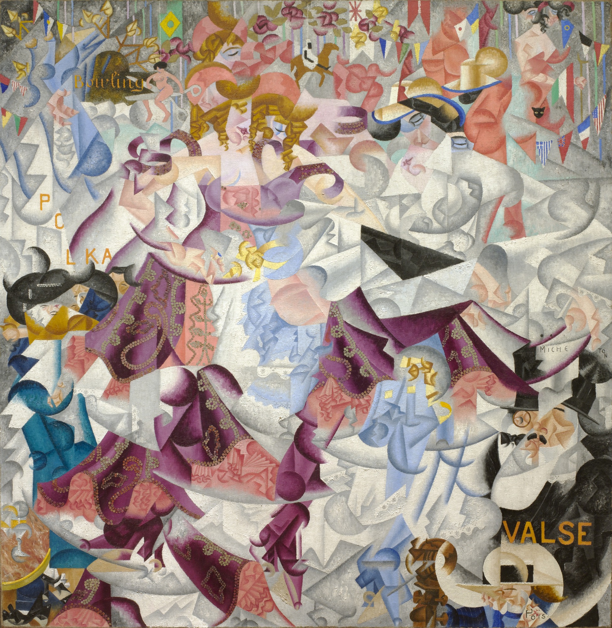
Gino Severini’s Dynamic Hieroglyph of the Bal Tabarin draws us into the frenzied excitement of a Paris nightclub. Combining a Cubist technique of fractured planes with the use of repetition, Severini creates a brilliant kaleidoscope of partially-glimpsed figures in motion. Dominating the center of the painting are two dancing women —one with blond curls on the left, the other with dark hair on the right— and a swirling pink and purple dress. Looping patterns of real sequins decorate the dress, adding to the shimmering play of light in the painting.
Adopting Cubist techniques
The painting’s emphasis on dynamism is characteristic of Italian Futurism, as is the subject of modern urban life. The Futurists embraced the energy of the modern city, its crowds and electricity. They adopted Cubist techniques to convey the sense of movement in time, while rejecting what they considered the more static and analytic approach of Cubist painters. Whereas in Cubist paintings the use of multiple, fragmentary views of things suggests the viewer is moving around the object, in Futurist paintings it is the scene that is moving around the viewer.
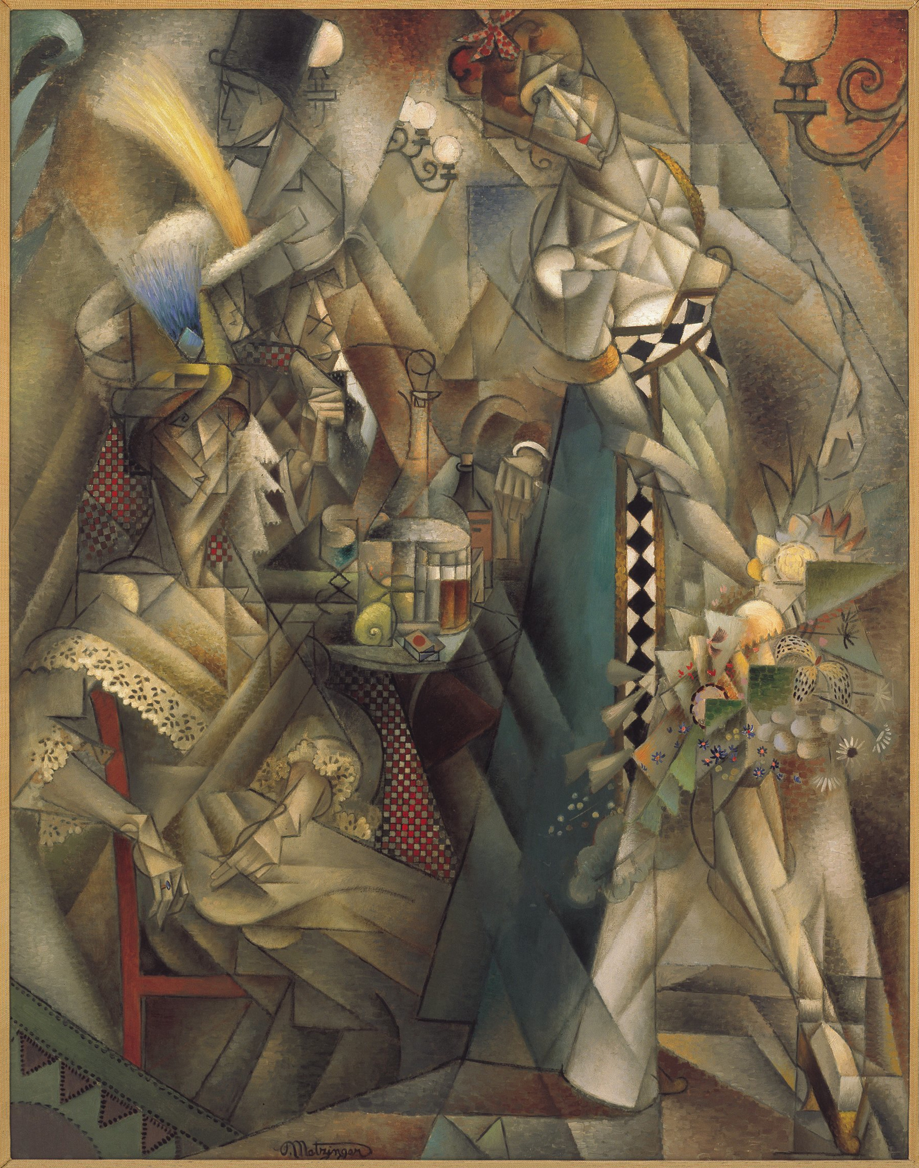
Severini lived in Paris and was friends with many avant-garde painters, including Georges Braque and Pablo Picasso. In Dynamic Hieroglyph he adopts their recent innovations by including painted words and collaging sequins onto the painting’s surface. Severini’s painting is, however, markedly different from Synthetic Cubism in its subject matter as well as its brilliant colors and decorative qualities. It is closer to the paintings of the Salon Cubists, such as Jean Metzinger’s Dancer in a Café. However, Severini’s emphasis on the whirling dynamism of the scene differentiates his Futurist approach from Metzinger’s more static and balanced Cubist composition based on an underlying grid.
Like many Salon Cubists, Severini was influenced by the popular philosopher Henri Bergson. Dynamic Hieroglyph was painted from memory, and in keeping with Bergson’s ideas, it attempts to convey the painter’s intuitive vision of reality in which time and space are suffused with memory and sensation. The dancers’ movements fragment and fill the painting with energy and traces of their momentary presence. They embody Bergson’s concept of élan vital, the vital force of the universe uniting all matter.
A frenetic scene
Severini conveys the dancer’s movements through the repetition and fragmentation of forms. For example, we see parts of the head of the dancer on the left in three or four different positions as she dances. The swirling movements of the dancer’s skirts are depicted as fragments of patterned purple, pink, light blue, and white material appearing in various locations. In addition, abstract curves and angles suggest the changing shapes of the fabric as the dancer moves through space. A bright circle of white dominates the center of the painting, suggesting a spot-lit dance floor and the swirling circular movements of the dancers.
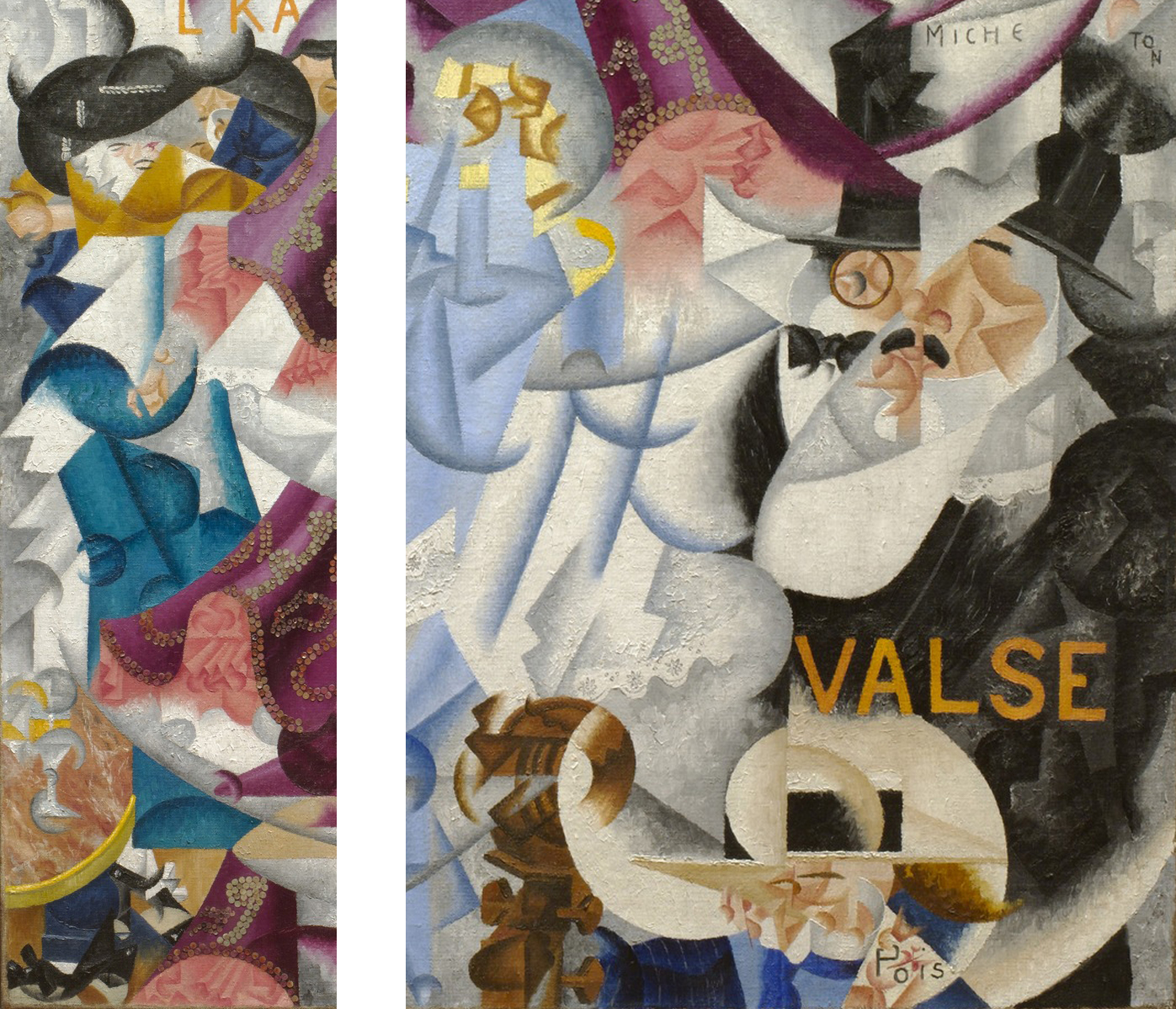
On the periphery of the dancer’s orbit many other figures and objects complete the frenetic scene of a nightclub in full swing. In the lower left corner is a Cubist tabletop still life with martini glasses, over which a woman in a blue dress and black hat stands laughing. In the lower right corner is a mustachioed man wearing a monocle, black suit, tie, and top hat. Directly in front of him is a Cubist rendering of the scroll and tuning pegs of a bass.
Placing the viewer in the center
In depicting the upper portion of a bass projecting into the painting Severini was copying a device frequently used by two earlier innovative painters of dancers and Paris nightlife, Henri de Toulouse-Lautrec and Edgar Degas.
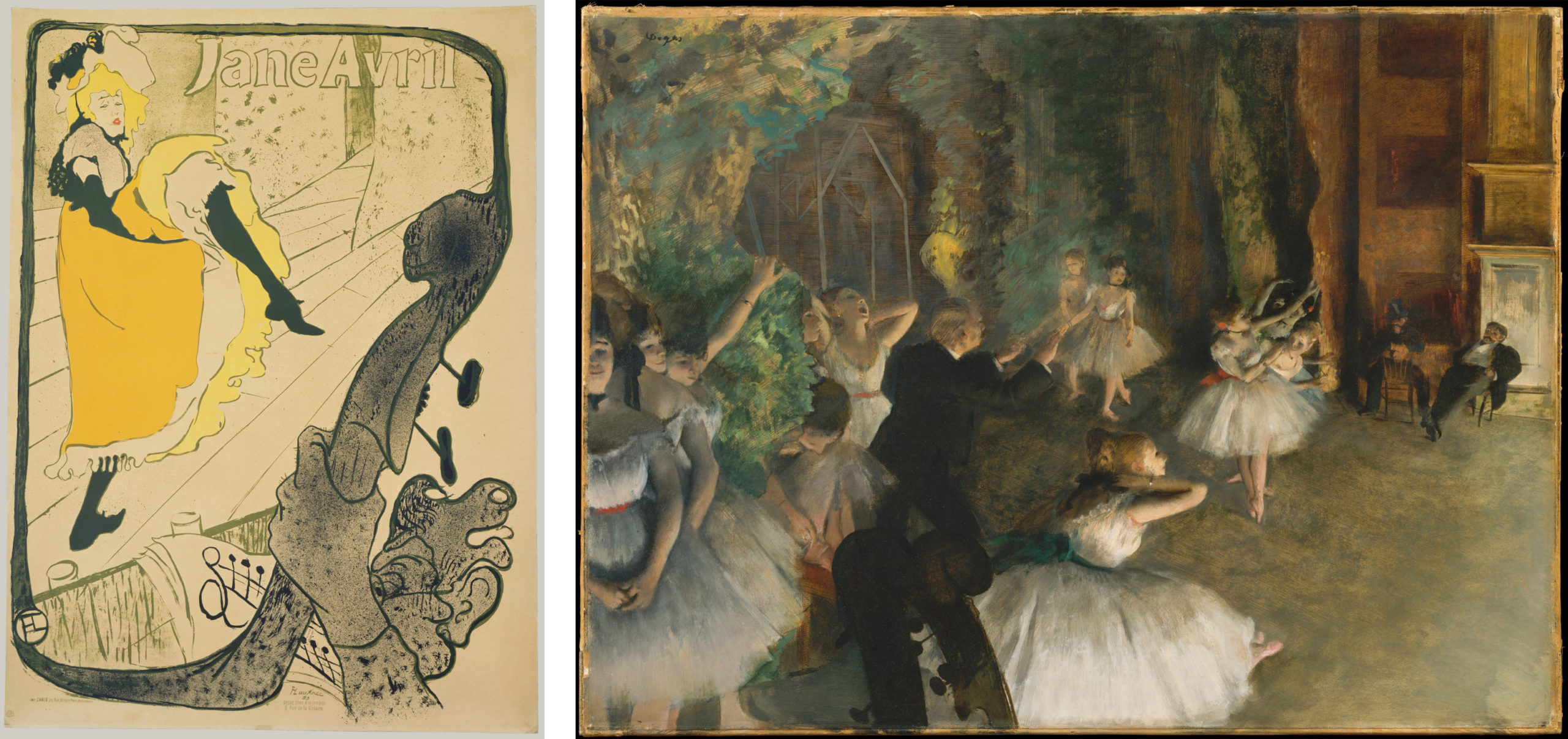
In their works the cropped tops of musical instruments were intended to give the viewer a sense of being present in the audience and looking over the musicians at the stage. Severini’s Dynamic Hieroglyph, in keeping with the Futurists’ goal of placing the viewer in the center of the painting, attempts to provide an even more intense sensation of presence and immediacy through its fractured forms, brilliant colors, and glittering sequins.
Streamers and national flags are draped across the upper portion of Dynamic Hieroglyph, intertwining with suggestions of abstracted figures and light fixtures. Among these chaotic forms several enigmatic, but easily legible, figures appear: a black cat head, a North African man riding a camel, and a nude woman riding a pair of scissors. These figures may refer to cabaret acts or themed costume parties that were often held in the fashionable nightclub.
Severini also included a number of words in the painting, a device he adopted from Picasso’s and Braque’s Cubism. The two most prominent words, “polka” and “valse” (waltz), directly refer to the painting’s subject, while others have less obvious relevance, and may refer to Severini’s personal experiences and memories.
Decadent pleasures
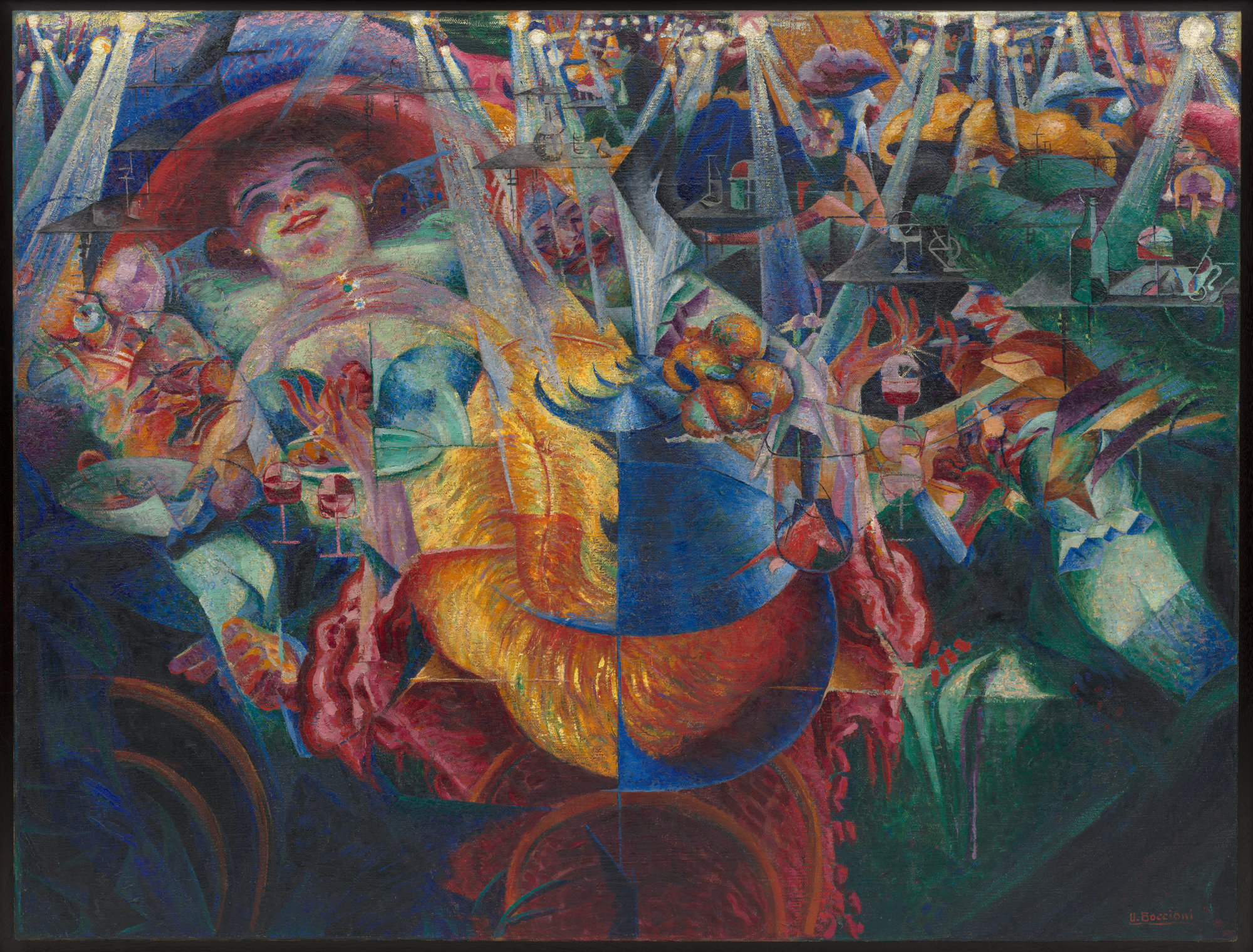
Paris nightlife was an ideal subject to display the Futurists’ fascination with the energy of modern urban crowds and the novel effects of electric lighting. Umberto Boccioni’s The Laugh depicts a crowded club splintered into shards of garish color under the projecting rays of electric lights. A smiling woman, usually identified as a cocotte or fashionable prostitute, wears a large red hat and dominates the scene in the upper left corner.
In the center of the painting we see the huge yellow feather and elaborate hat of another woman. The somewhat less visible faces of three men surround the women, and we can also see fragments of other figures, hands, stemmed glassware, and fruit in the kaleidoscope of colorful planes. Receding into the background are more tables with glasses, and suggestions of figures enjoying themselves under the glowing light bulbs.
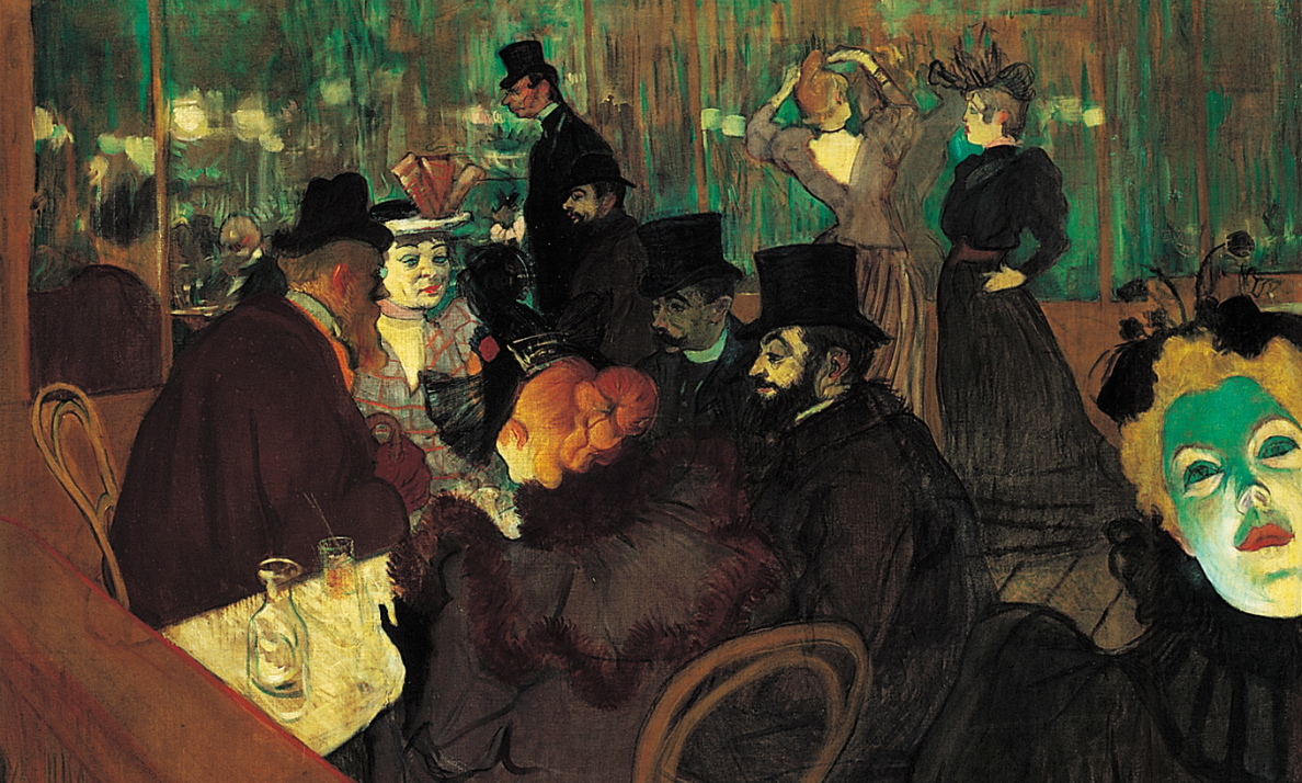
Severini’s Bal Tabarin and Boccioni’s The Laugh are Futurist updates of Toulouse-Lautrec’s At the Moulin Rouge, which also depicts the decadent pleasures of Paris nightclubs. The compositions of all three are designed to make the viewer feel as if they are present in the scene, but Toulouse-Lautrec’s is comparatively distanced and reserved. Severini and Boccioni use brilliant colors, abstraction, fragmentation and repetition of forms to create a vibrant whirling energy that seems to fully surround the viewer and encourage us to participate in the contagious hilarity of the crowded nightclub.
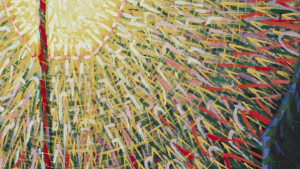
Giacomo Balla, Street Light
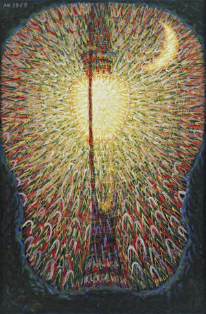
If you were an artist preparing to paint a picture, depicting a lamp post might not be your first choice of subject matter. It certainly wouldn’t have been the go-to subject for most painters in the early twentieth century: a human figure, a landscape, or a still life would have been more standard choices. But in 1910 or 1911, the Futurist painter Giacomo Balla painted a large canvas displaying a huge electric street light, on a canvas that is over five feet tall, with a diminutive moon in the corner. Why would he have made such a choice?
Loving the future, hating the past
As a member of the Italian Futurist movement, Balla was passionately invested in making art that reflected “the future”: that is, the increasingly industrialized and technological world of the early twentieth century. Futurism swept onto the European art scene in 1909, when an Italian poet named Filippo Tommaso Marinetti published “The Founding and Manifesto of Futurism” in newspapers in Italy and France. In it, he declared that reverence for history and past artistic traditions needed to be abandoned in order to move society and art decisively into the modern age. In embracing modernity and violently dismissing Italy’s honored artistic heritage (“Set fire to the library shelves! Turn aside the canals to flood the museums!” he wrote), Marinetti initiated one of the most bombastic and aggressive avant-garde movements of his time. The writer prized new technology rather than tradition, and sought to create a climate of violent revolution rather than one of comfortable stability. The artists who gathered around him aimed to make art that would showcase modern mechanical developments like airplanes and automobiles, especially because they could provide the viewer with new experiences like the speed of these new modes of transport.
Balla’s Street Light, in this sense, is a sort of demonstration piece for the Futurist movement. Balla has rejected traditional subject matter in this painting, and instead has painted an object that is forthrightly modern and technological: one of the new, electric street lamps that were just being installed at this time in Rome, where Balla lived. The introduction of electrified city lighting must have been an exciting sign of technological advancement for the Futurists, and also a powerful symbol of how the ancient city of Rome was finally abandoning its past and entering the modern age.
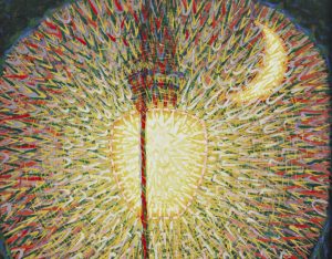
The small crescent moon Balla included in his painting is also an illustration of Futurist ideas. Just as the street light stands for the future in the picture, the small moon stands for the past. In part Balla means this in a literal sense. In the past people relied on the moon to see at night; in modern times we rely on electricity. But Balla is also alluding to a number of Marinetti’s writings in which the moon was used as a symbol for the artistic traditionalism that the Futurists wanted to destroy. Summed up in his slogan “Let’s kill the moonlight!” Marinetti attacked the gentle light of the moon and its long association with traditional romance and sentimentality. He condemned past generations of artists and poets as “lovers of the moon,” and called for a more modern and aggressive symbol—like a racing car or a train—to take its place. Balla’s Street Light, which overpowers the moon’s dim light, serves as a visual equivalent to these ideas.
Balla’s style
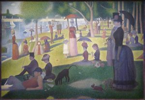
Balla was one of the older members of the Futurist movement, and he had already established a career as a painter by 1909 when Futurism was founded. Before joining the Futurists, Balla had been working in one of the styles popular in late nineteenth-century Europe, which art historians often term “post-Impressionism.” In Italy one of the most prominent post-Impressionist styles was “Divisionism,” so named because it was based on dividing colors into their constituent parts on the canvas and letting brushstrokes remain visible instead of smoothly blending them together (Georges Seurat’s Sunday Afternoon on La Grande Jatte, above, is one of the best-known examples of Divisionism). Since Street Light was painted early in the Futurist movement, Balla’s style here is still essentially Divisionist in its approach. Balla uses obvious, bold brushstrokes in a repeated V-pattern to illustrate the light and energy radiating from the lamp. The saturated colors of Street Light—from the almost blinding white and yellow at the center of the lamp, to the cooler hues further from the light’s bulb—are also typically Divisionist.
Street Light seems to have been enthusiastically received by Balla’s fellow painters when it was completed. In a group manifesto written in 1910, titled “Futurist Painting: Technical Manifesto,” the work is showcased as a superb example of Futurist subject and style: the group exalts the “electric lamp, which, with spasmodic starts, shrieks out the most heartrending expressions of color.”
Despite these claims, Balla and the other Futurist painters would soon abandon the Divisionist style, since it ultimately seemed too tied to past generations to be truly “of the future.” After the Futurists visited Paris together in 1911, several of them adopted aspects of Cubism, though they altered the technique to focus more clearly on Futurist concerns like modern technology, movement, and speed. Balla, however, began to earnestly explore how one might paint movement in other ways. At first, in a series of paintings in 1912, he showed movement by painting many small increments of time in a series, as in Dynamism of a Dog on a Leash (above). Later, in 1912 and into 1913, Balla entered an exploratory abstract phase, painting the movement of cars driving, birds in flight, and even the movement of light itself, via geometric shapes, dynamic lines, and abstract patterns of color. These paintings, such as Abstract Speed (below), put Balla at the forefront of European artists who were pioneering total abstraction in their work. Street Light, painted just a few years before these experiments, was a visual manifesto that ultimately helped drive the Futurist movement in these new directions.
Additional Resources:
This painting at The Museum of Modern Art
Balla’s Dynamism of a Dog on a Leash at the Albright-Knox Art Gallery
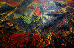
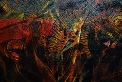
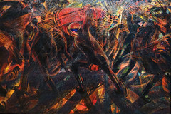
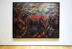
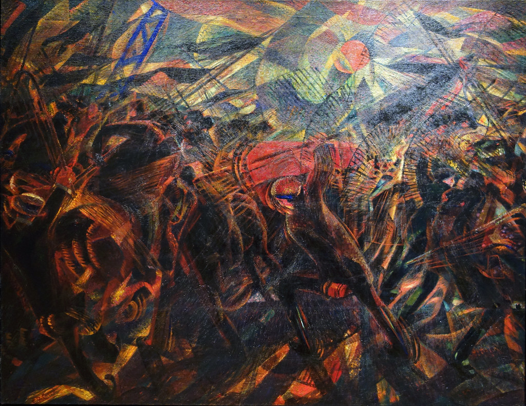
Carlo Carrà, Funeral of the Anarchist Galli

“We will sing of great crowds excited by work, by pleasure and by riot” declared F.T. Marinetti in his ‘Founding and Manifesto of Futurism’ (1909). Such crowds were increasingly common in the industrial cities of northern Italy, such as Milan, where the Futurists were based.
In this painting Carlo Carrà commemorates the death of Angelo Galli during a strike in Milan and the subsequent funerary parade to the cemetery, which erupted into violence between anarchists and the police. At the center of the canvas, Galli’s red coffin is held precariously aloft, surrounded by a chaotic explosion of figures clad in anarchist black, illuminated and dissected by light emanating both from the coffin and the sun.

Futurism’s anarchist roots
Carrà lived in Milan and was involved with anarchist groups; he was at the funeral and recalled the event in his memoirs La mia vita (1945):
I found myself unwillingly in the centre of it, before me I saw the coffin, covered in red carnations, sway dangerously on the shoulders of the pallbearers; I saw horses go mad, sticks and lances clash, it seemed to me that the corpse could have fallen to the ground at any moment and the horses would have trampled it. Deeply struck, as soon as I got home I did a drawing of what I had seen.
Carrà’s autobiography associated the funeral with the earlier 1904 strikes which had gained a mythological status in the history of Italian politics, but in fact the event took place two years later during a smaller strike, as chronicled in the Corriere della Sera on May 14, 1906. Writing his memoirs many years later—in 1945, as Fascism fell—Carrà may have been keen to associate himself with an important moment in Italian anarchism.
A Cubist redesign

The preparatory drawing for Funeral uses one-point perspective and combines detail and dynamism in its depiction of the scene. When Carrà began working on the painting in 1910, it may have originally looked similar to this drawing, but in 1911 the Futurist artists went on their first trip to Paris and saw examples of Picasso’s Cubism; upon returning Carrà changed his canvas to the fractured perspective we see in the painting today.
Nevertheless, the Futurists were keen to emphasize that their abstraction was quite different from that of the Cubists, stressing their dynamism as opposed to static analytical Cubism. In ‘The Exhibitors to the Public,’ the manifesto the Futurists published in the catalogue of their first exhibition in Paris in 1912, they wrote this statement, possibly referring to this picture:
If we paint the phases of a riot, the crowd bustling with uplifted fists and the noisy onslaughts of the cavalry are translated upon the canvas in sheaves of lines corresponding with all the conflicting forces, following the general law of violence of the picture.
Carrà’s redesign also brought the spectator closer to the action, in line with the Futurists’ desire to put the spectator “at the center of the picture,” a goal expressed in ‘Futurist Painting: Technical Manifesto’ (1910). The bright dabs of paint on the surface of Carrà’s picture, rarely apparent in reproductions, also show Futurism’s debt to the Italian Divisionist painters who preceded them.

This interest in the direct relationship between the viewer and the painting is especially apparent when Funeral of the Anarchist Galli is compared with Giuseppe Pellizza da Volpedo’s Fourth Estate (Il Quarto Stato) (1898-1901), which has a similar subject.

A historic battle
Despite its formal novelty, Funeral is unusual for Futurism because its subject and grand scale make it essentially a history painting. Alfred H. Barr, Jr., the first director of the Museum of Modern Art, wrote just a year after the museum purchased the painting, “fundamentally, in its main lines and masses Carrà’s Funeral is as classically organized as a fifteenth-century battle piece by Paolo Uccello.” (Twentieth Century Italian Art, 1949).

After moving away from Futurism in 1916, Carrà became very interested in Uccello, writing a long article mentioning The Battle of San Romano in the Uffizi, one of three canvases of this battle by Uccello. Carrà could have been familiar with the other two versions before painting Funeral as he visited both the Louvre and the National Gallery in 1899-1900. The clash between the anarchists and the police is compositionally closest to the Uffizi version; the dominance of black and red recalls the Louvre version; and the melee of flag poles, lances and cranes jutting into the sky is present in all three.
Carrà’s painting has become an emblem of Futurism, both for its violent subject and formal novelty. Its relationships with anarchist politics, Cubism and battle paintings remind us of the diverse ideas circulating in early twentieth-century Europe.
Additional resources:
F. T. Marinetti, “The Founding and Manifesto of Futurism” (1909), read by Charles Bernstein
Smarthistory images for teaching and learning:


Raymond Duchamp-Villon, Horse
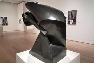
by DR. STEVEN ZUCKER and DR. BETH HARRIS
Video \(\PageIndex{2}\): Raymond Duchamp-Villon, Horse, 1914, bronze, 39-3/8 x 24 x 36 inches (99 x 61 x 91.4 cm) (Art Institute of Chicago)
Smarthistory images for teaching and learning:
Simultanism (Orphism)
Sonia Delaunay
by DR. CHARLES CRAMER and DR. KIM GRANT
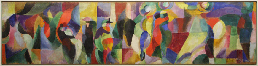
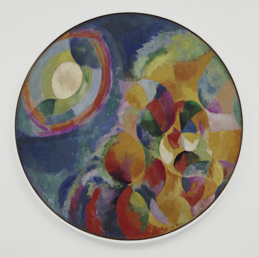
Almost eleven feet wide, Sonia Delaunay’s Bal Bullier creates an overwhelming impression of brilliant color and movement. The composition juxtaposes rectangular geometric forms and circles with more fluid curved shapes, loosely structured across the canvas in a rhythmic pattern of dark and light verticals.
A modern dance hall
The Bal Bullier was a dance hall in Paris that Delaunay frequently visited with her husband, Robert. Her painting shows a scene of modern urban life comparable to those painted by the Impressionists in the late 19th century, such as Auguste Renoir’s Moulin de la Galette.
If you look closely at the dark shapes in the center you will see the abstracted forms of couples dancing the tango. The dance, which originated in sailors’ bars in Argentina, was very popular in Paris in the early 20th century. It is renowned for its erotic intensity and requires a very tight embrace between partners, which Delaunay represents in the interlocking curves of the figures.
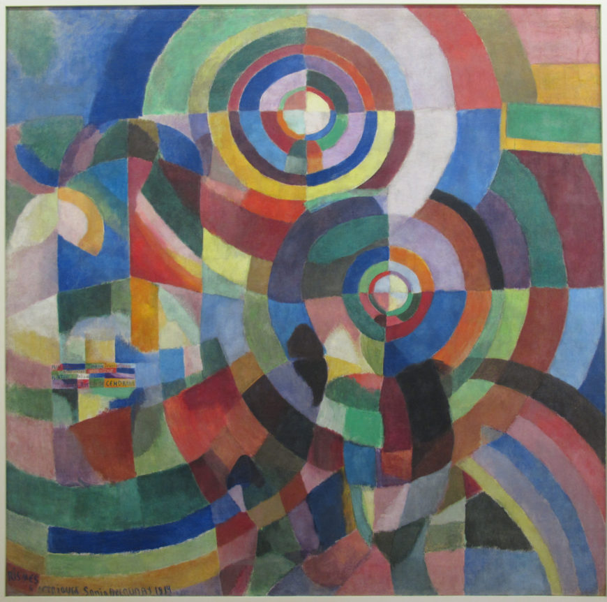
Sonia’s Electrical Prisms is both a display of color relationships and an abstracted depiction of her first experience of electric streetlights on a Paris boulevard. The streetlights become discs of radiating color that permeate the entire canvas, but there are also suggestions of solid forms. A tall kiosk with books or magazines is on the left, and parts of some shadowy figures appear in the lower half of the painting, almost completely absorbed into the brilliant colors of the electric light.
Intuition vs. intellect
While Robert studied scientific color theory, they both described Sonia’s approach to their new style as intuitive. This is a cliché of traditional Western gender roles — the male as rational and intellectually inclined, the female as naturally gifted and intuitive — but it is a cliché that they both embraced.
Interestingly, in Western art theory color is thought to appeal directly to the senses, in contrast to drawing’s supposed appeal to the intellect; thus, Sonia’s purportedly intuitive approach to color was aligned with traditional Western conceptions of color’s role in art. It should be noted, however, that Sonia formally studied art for several years in a German academy and an art school in Paris, while Robert’s formal artistic training was limited to a two-year apprenticeship with a theatrical designer in Paris.
The influence of craft
Sonia’s use of color was also sometimes explained by another cliché of the early 20th century, the influence of peasant crafts on her work. Since the late 19th century, modern artists such as Gauguin had admired, and appropriated, the purportedly naive, untutored styles of peasant art, which were often vividly colored and non-naturalistic.
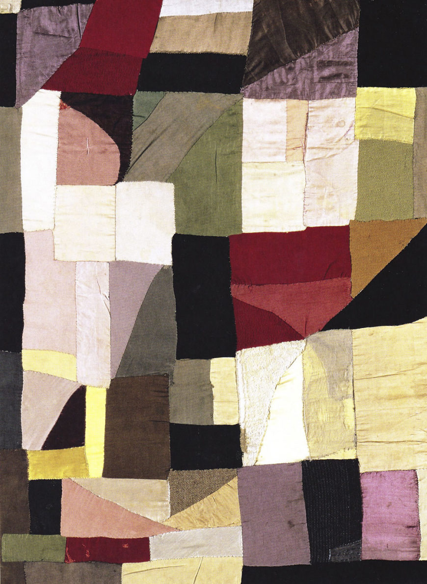
Sonia herself claimed that the patchwork blanket she made for her son in 1911 was inspired by peasant blankets she remembered seeing in Russia as a child. Its irregular grid of largely rectangular geometric forms was also similar to contemporary Cubist painting. Sonia saw her blanket as an important influence on her and Robert’s subsequent development of Simultanist paintings.
Abstraction and decoration
Sonia’s blanket and its influence raises a key issue for modern abstract art — its relationship to crafts and the decorative arts. The use of non-representational forms and patterns has a long history in Western crafts and decorative arts; it was the so-called fine arts of painting and sculpture that traditionally relied on representational subject matter. When modern painters began to use non-naturalistic colors and abstract forms in the early 20th century, one of their primary concerns was to prove that their paintings were not “mere” decoration. This is one reason why many of the first modern artists to embrace pure abstraction took so long do so and wrote extensive justifications, often claiming exalted spiritual motivations for their abstraction.
Abstraction and representation
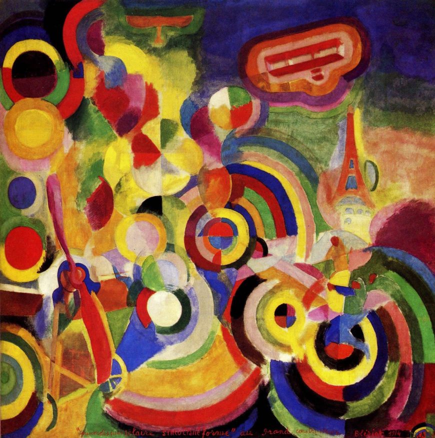
Unlike many of their contemporaries who developed abstract painting styles that progressed from representation to pure abstraction, the Delaunays painted representational and non-representational Simultanist works at the same time. Modern objects such as the Eiffel Tower and airplanes as well as scenes of dance halls and rugby games were enveloped in the prismatic color planes of Simultanism. Like the Italian Futurists, the Delaunays created a post-Cubist style appropriate to the modern city, and Sonia expanded her art beyond the limits of the easel painting to engage with everyday life.
Going beyond painting
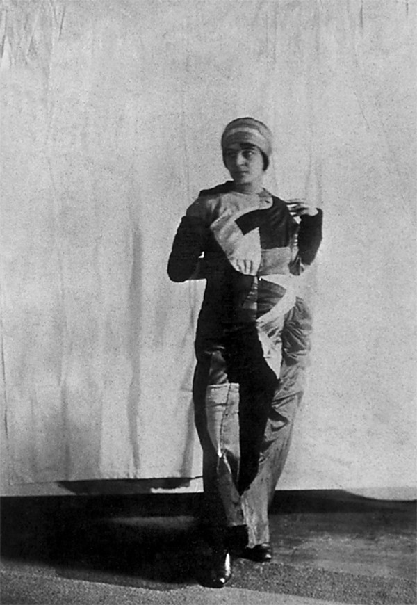
The same year that she painted Bal Bullier Sonia made herself a Simultaneous Dress. Like her earlier blanket, it was a colorful patchwork of geometric shapes, but the dress was made to be seen in public. She wore it to the dance hall with Robert, who also wore clothes in vivid contrasting colors. By attiring themselves in the colors and forms of their painting they became living, moving artworks, Simultanist human beings.
Sonia dreamed of transforming everything around her, and she created and exhibited bookbindings, home furnishings, and posters in the Simultanist style in 1913. After World War I, she became a very successful designer of clothing and interior furnishings, and colorful contrasts of geometric forms remained characteristic of her work.
A Simultanist book
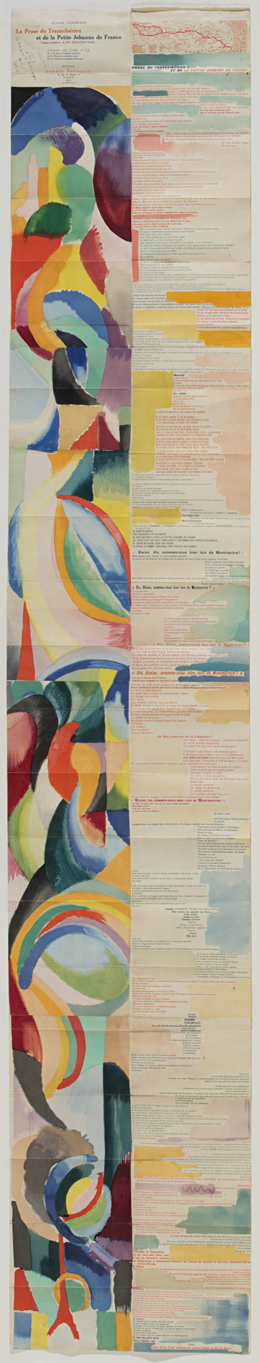
One of Sonia’s most famous early creations is the Simultanist book she designed in collaboration with the poet Blaise Cendrars titled La Prose du Transsibérien et de la Petite Jehanne de France.
Unfolded, the book is six feet long. Delaunay and Cendrars initially intended to publish 150 copies, which opened together in a line would have equaled the height of the Eiffel Tower. The text of Cendrars’ poem is printed in multiple colors and varied fonts on the right, while Delaunay’s largely abstract Simultanist designs parallel it on the left, with panels of lighter colors also interspersed throughout the text.
The poem combines disjointed thoughts, repeated refrains, and references to a trip on the Trans-Siberian railroad, of which there is a map at the top. Time and place shift throughout the text, with Paris as a constant presence. Sonia’s colorful abstract forms swirl down the long sheet, looping into circles that visually echo the poem’s evocation of the train’s rolling motion.
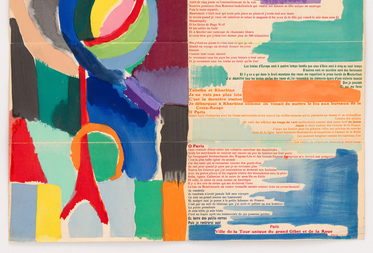
The poem ends with a Paris scene next to the only clear representational form in the design – a red Eiffel Tower accompanied by a circle reminiscent of the giant Paris ferris wheel.
When fully unfolded, the designs on the left side seem to ascend like clouds of brightly colored smoke from the Eiffel Tower to the beginning of the poem at the top, where the viewer is led to read the poem down the right side. Thus, the open book creates a continuous circuit with the tower standing like an anchor at the bottom.
Simultanism was developed in a collaboration between Sonia and Robert Delaunay, but it extended well beyond that initial relationship. It became an approach to modern art and style that worked to bridge the distances between the visual arts and literature, the fine and decorative arts, and the art and spectacles of the modern urban world.
Additional resources:
Simultanism: Robert Delaunay
by DR. CHARLES CRAMER and DR. KIM GRANT
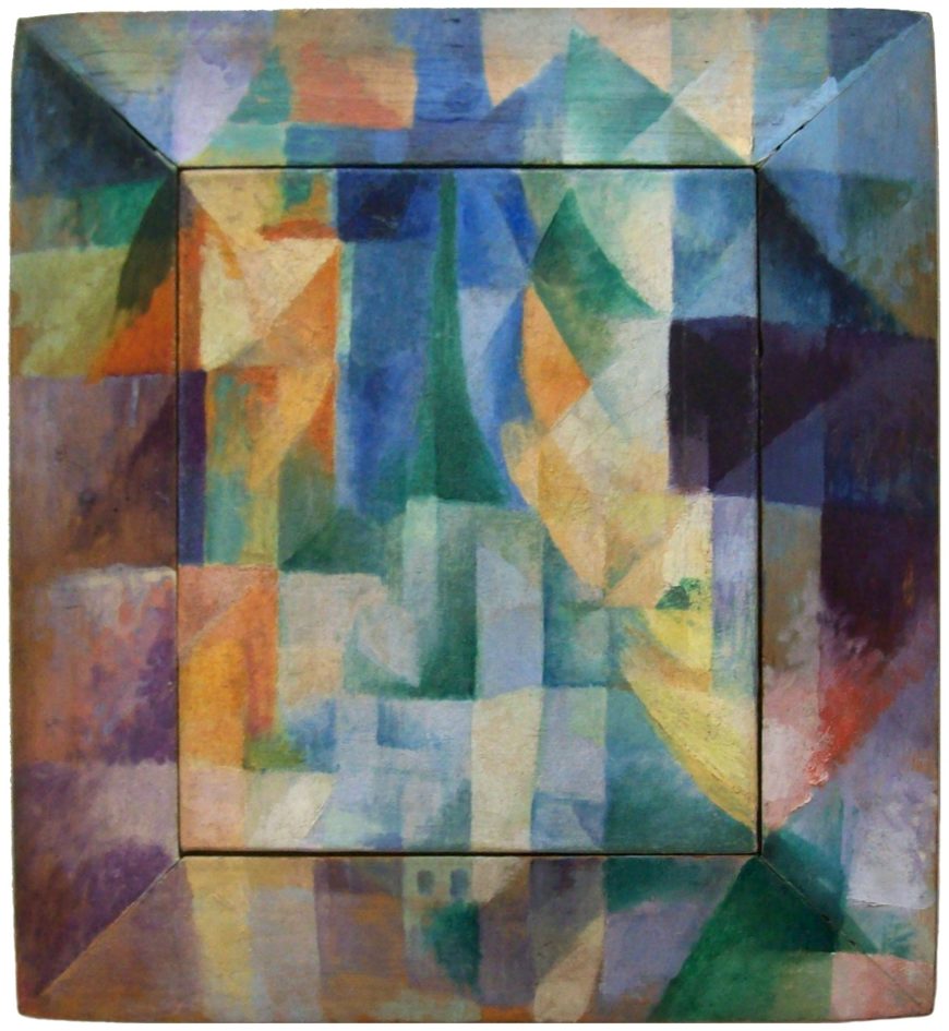
Robert Delaunay’s Simultaneous Windows on the City is enigmatic. Where is the city? Where are the windows? At first (and possibly second and third) glance what we see is a fractured pattern of mostly rectangular planes painted in the colors of the spectrum over both a canvas and its wooden frame. If we consider the post-Renaissance Western conception of a painting as being like a window, then we might interpret the painted frame as a window frame and the canvas inside as representing the city, but this does little to help us see a city depicted in the painting.
Cubist composition
Looking at the painting in Cubist terms is more successful. Delaunay exhibited with the Salon Cubists, and this painting was made as Delaunay’s artistic interests shifted from the Cubists’ analysis of form to an investigation of color and light.
Despite its intense color, Simultaneous Windows on the City remains Cubist in overall composition. Like Braque’s roughly contemporary Cubist composition Man with a Guitar, Delaunay’s painting is a complex grid of dark and light-toned planes and ambiguous forms in which the viewer can find vestigial signs of the subject.
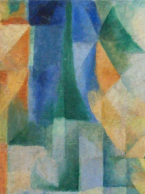
The most recognizable form in Delaunay’s painting is the green Eiffel Tower in the center, rising up from its triangular base to a point toward the top of the canvas. Below the tower are suggestions of rectangular buildings with dark blue windows. Some of these are painted directly on the wooden frame, indicating that it cannot be literally equated with a window’s frame.
The side bars of the frame are, however, darker than the canvas area, and their diagonal edges at the top and bottom create the illusion of a casement window opening into the viewer’s space. The bright yellows and oranges on the canvas convey an impression of warm outdoor light, while the intense blues in the rectangle surrounding the Eiffel Tower suggest sky. The color contrasts also create a sense of spatial depth as the cool blues appear to recede next to the vivid warmth of the yellows and oranges.
An established subject
Delaunay painted many depictions of both the Eiffel Tower and Paris as seen from a window, and this painting is a more abstract version of what was an established subject for him.
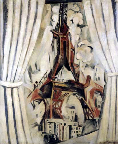
Knowledge of his earlier paintings makes it easier to see the representational forms in this one. The orange shapes, for example, are like the curtains in the windows that frame the tower in previous paintings. Here, however, their color also plays a crucial role, suggesting sunlight and creating a chromatic contrast with the blue that intensifies both colors.
Simultanism and Orphism
The use of chromatic contrast is a primary interest in Simultaneous Windows on the City, and became a central concern of Delaunay’s art. He studied the science of vision and color theory, particularly the writings of M. E. Chevreul and Ogden Rood, which had influenced the Neo-Impressionists in the 19th century.
Delaunay used the Neo-Impressionists’ divisionist technique to create a visible mosaic of colored brushstrokes in paintings like Window on the City no. 3, but he soon shifted to using larger planes of color. In 1912 he and his wife Sonia developed an approach to painting light by means of color that they called Simultanism.
The Delaunays were not alone in using the term Simultanism in relation to art. Simultaneity was a popular term with broad significance among avant-garde artists and writers of the time. Generally, it alluded to new concepts of space and time described by early-20th century physicists, such as Einstein, and philosophers, notably Henri Bergson. More specifically, it referred to techniques used by Cubists and Futurists to combine different vantage points into a single “simultaneous” image. Such images were considered a synthesis of memory and perception, and sometimes also a synthesis of many different people’s views.
The Delaunays’ friend, the writer Guillaume Apollinaire, labelled their work “Orphism” or “Orphic Cubism,” and linked it with the work of other artists who were also developing post-cubist styles. Despite Apollinaire’s confusing combination of very different artistic styles and approaches into a single category, the term Orphism has endured. It is sometimes used as a synonym for Simultanism or, more generally, to refer to abstract painting that uses color in a manner comparable to the use of sound and rhythm in music.

The complexity of vision
As we look closely at Simultaneous Windows on the City we experience the complexity of vision. The fractured planes of different colors mimic the way light reflects off glass and how when we look out a window we can often simultaneously see the view outside and reflections of objects inside. Perhaps the curved orange and yellow planes on the right are not a curtain but the reflection of a head and neck with an ear jutting out next to the Eiffel Tower.
The longer you look at the painting the more possible readings of the suggestive forms you are likely to discover. Delaunay’s painting is not only about vision, it is also about painting itself and the way its colored shapes and relationships structure vision. We are led to realize this because the lack of clear representational imagery constantly reminds that we are looking at colors painted on the flat surface of the canvas.
Between abstraction and representation
The Delaunays’ Simultanist paintings explore the potential of color contrasts to create form and depth.
They often hover ambiguously between pure abstraction and representation, particularly the paintings that take the light of celestial objects as their subjects, such as Robert’s Simultaneous Contrasts: Sun and Moon. A few are clearly non-representational, while others depict specific subjects, ranging from street lamps to dance halls and airplanes.
The modern experience
In adopting the term Simultanism to describe their paintings, the Delaunays combined reference to a famous text on color theory with recent philosophical and scientific explorations of perception and memory. The art they produced reflected this combination in its synthesis of formal concerns and modern subject matter.
Additional resources:
Read Ogden Rood’s Modern Chromatics at the Linda Hall Library Foundation
Robert Delaunay, Simultaneous Contrasts: Sun and Moon
Video \(\PageIndex{3}\): Video from The Museum of Modern Art
Russian avant-garde
Russian Neo-Primitivism: Natalia Goncharova and Mikhail Larionov
by DR. CHARLES CRAMER and DR. KIM GRANT
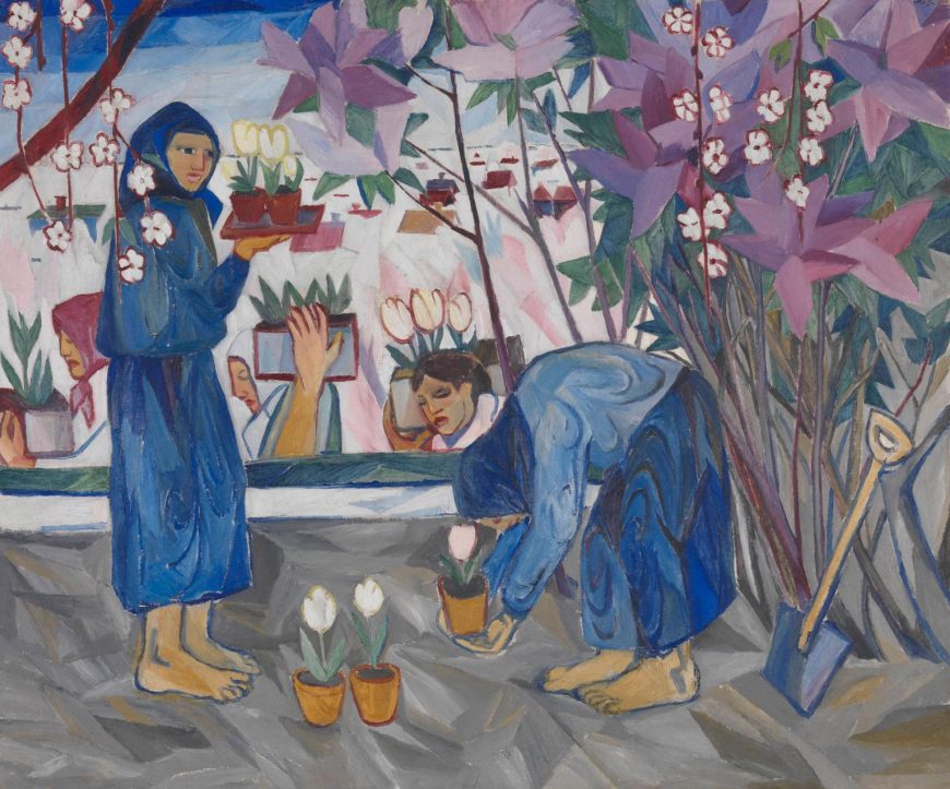
Natalia Goncharova’s Gardening is an example of the contradictions of early-twentieth century Russian modernism. It simultaneously faces outward and inward, forward and backward — outward and forward to engage with some of the most radical trends of European modern art, and inward and backward to reflect on traditional Russian subjects and themes.
Looking forward
In terms of style, Gardening is aggressively modern. With its flat colors and decorative patterning created by the flowers and distant houses, the painting reflects the deliberately simplified style initially developed by the Post-Impressionists in the late nineteenth century. At the same time, the crudely rendered forms of the figures and spatial dislocations suggest contemporaneous painting techniques associated with Fauvism and German Expressionism.
During the first decade of the twentieth century Goncharova and other Russian artists worked hard to assimilate the new styles and attitudes of modern European art. They were able to see many examples of modern art in traveling exhibitions and reproductions in books and magazines. The extensive collections of Ivan Morozov and Sergei Shchukin in Moscow also provided Russian artists with opportunities to view many works by prominent European modernists.
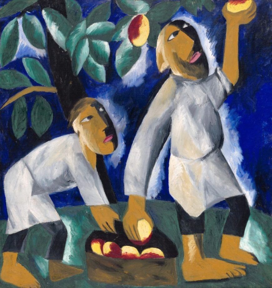
Goncharova was a remarkably prolific and eclectic painter who produced an enormous number of works that show her immersion in contemporary European styles and techniques. Peasants Picking Apples, created a few years after Gardening, depicts a similar subject, but the painting’s forms are flatter and more simplified, now reflecting Goncharova’s assimilation of the formal innovations of early Cubism. This is particularly evident in the simultaneous profile and frontal view of the peasants’ faces and in the hard, angular facets of their bodies.
Peasant life and Russian nationalism
Goncharova’s subjects were at odds with her aggressively international and forward-leaning style. Peasant labor was a popular subject for many Russian modern artists between 1910 and 1913, especially for those associated with Neo-Primitivism, which included Goncharova and her partner Mikhail Larionov, as well as Kasimir Malevich and Aleksandr Shevchenko. Although they were deeply engaged with the developments of European art, Russian modernists were also committed to explicitly Russian themes and subjects — and peasants were a particularly significant subject for them.
Belief in a specifically Russian identity had deep historical roots in Russian culture, which had defined itself since the 18th century in ambivalent relation to Western European culture. Russian modernists maintained this long-standing ambivalence. They embraced many of the ideas and formal innovations of European modernism, but they insisted on interpreting and developing them in distinctively Russian ways.
Peasants who had worked the land for centuries were widely considered to embody the Russian national identity and soul. To assert their difference from Europe, Russian intellectuals described Russian peasants and the land itself as Eastern and Asian or Oriental. Russian peasants were often portrayed as true primitives, uncorrupted by European civilization. Ironically, by embracing the primitive Russian peasant, Russian modern artists were following European precedents, most famously that of Paul Gauguin, who admired and painted the primitive lifestyle of the French peasants in Brittany before he moved to the Pacific Islands.
Embracing Russian folk traditions
Russian Neo-Primitivist artists did not just depict Russian peasants, they also often modeled their styles on traditional Russian folk art, particularly popular woodcuts called luboks, as well as shop signs, embroidery, hand-made toys, and religious icons. Paintings by Mikhail Larionov display varied styles associated with traditional folk art.
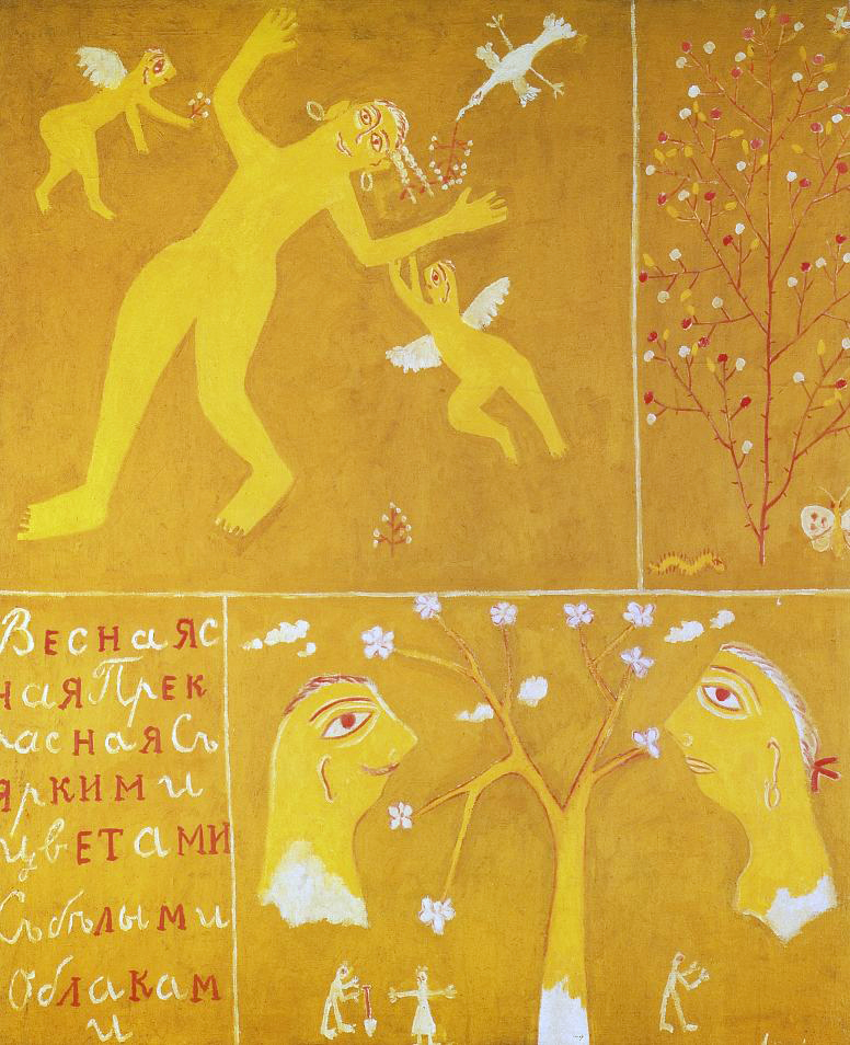
In Spring, instead of depicting peasants performing seasonal labor, Larionov adopted folk art forms to create whimsical panels in bright yellow, red, gold, and white that represent the season of fertility and new growth through symbolic imagery and text. A bird and flying cupids bring flowering branches to a smiling nude woman, a stick figure holds a shovel at the base of one flowering tree, while another flowering tree is flanked by a caterpillar and a butterfly. The style is highly decorative and abstracted in the manner of traditional folk embroidery and painted furniture designs.
Children’s art
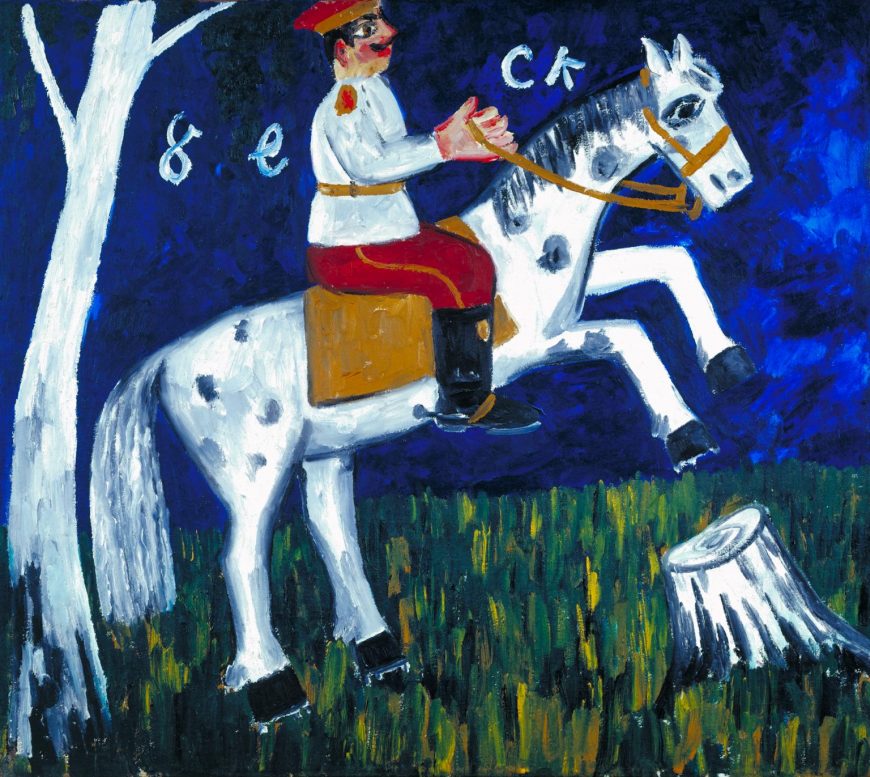
Larionov also employed styles associated with children’s art and graffiti, which were considered contemporary manifestations of primitive artistic expression. With its limited palette of vivid primary colors and flat simplified forms, his Soldier on a Horse is reminiscent of crude sign painting and children’s art.
Although it lacks the sophisticated techniques of naturalistic representation, the subject is clearly legible, and the painting effectively conveys the excitement of the rearing horse and the pride of the erect soldier, a nationalistic subject. To emphasize their connection with popular Russian art, Neo-Primitivist artists included the work of children and sign painters alongside their own paintings in the 1913 Target exhibition in Moscow.
Russia’s ancient Scythian roots
Russia’s prehistoric past was also the subject of some Neo-Primitive paintings. Goncharova’s God of Fertility depicts a type of stone funerary sculpture thought to have originated with ancient Scythians (nomadic tribes who roamed Siberia in the first millennium B.C.E.). These mysterious carved stones remained objects of folk superstition and ritual into modern times. Scythian myths and prehistoric pagan rituals were popular subjects for late-nineteenth and early-twentieth century avant-garde Russian music and dance as well. The most famous example is Igor Stravinsky’s The Rite of Spring, whose primitive rhythms, dissonances and anti-classical choreography caused a scandal at its first performance in Paris in 1913.
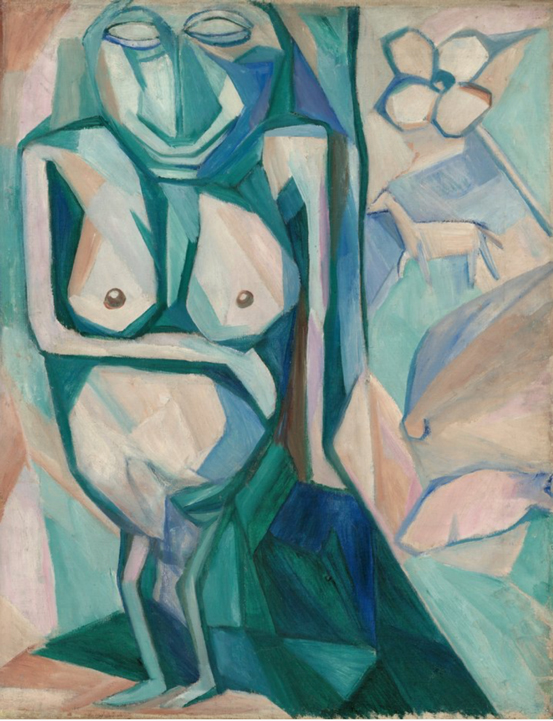
In God of Fertility Goncharova again joins a primitive subject to a modern artistic style, using a Cubist technique of faceting to create a non-naturalistic, depthless space in which various symbolic objects associated with fertility float. These include a flower and a horse, the latter referring to the importance of horses in Scythian culture. Abstract geometric forms describe the basic shapes of the ancient sculpture and also suggest that it exists in a space beyond that of the transitory material world.
Promoting Russian modernist primitivism
Neo-Primitivism was an important trend in early Russian modern art, pioneered in large part by Goncharova and Larionov. In addition to producing their own works of modern art, they were organizers of the Jack of Diamonds exhibiting group, which mounted a series of shows of modern European and Russian art in Moscow between 1910 and 1917. The first Jack of Diamonds exhibition showed the French Cubist painters Albert Gleizes and Henri Le Fauconnier alongside Russian artists working in Munich such as Vassily Kandinsky and Alexei von Jawlensky, as well as Russian artists working in Moscow.
In 1912, however, Goncharova and Larionov left the Jack of Diamonds group because they felt it had become too European in its orientation. They mounted The Donkey’s Tail exhibition devoted exclusively to Russian modern art and largely focused on Neo-Primitivism. The artworks nevertheless remained an amalgam of modern and primitive, European and Russian influences. That year, Alexander Schevchenko’s essay “Neo-Primitivism” acknowledged this fundamental contradiction by defining Russian modern art as a hybrid form that had assimilated French avant-garde painting and combined it with the traditional decorative forms of Russian folk art and icons.
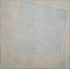
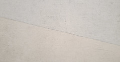
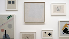
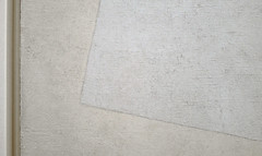
A new world after the Russian Revolution: Malevich’s Suprematist Composition: White on White
by DR. BETH HARRIS and DR. STEVEN ZUCKER
Video \(\PageIndex{4}\): Kasimir Malevich, Suprematist Composition: White on White, 1918, oil on canvas, 79.4 x 79.4 cm (The Museum of Modern Art)
Smarthistory images for teaching and learning:
Kasimir Malevich and Cubo-Futurism
by DR. CHARLES CRAMER and DR. KIM GRANT
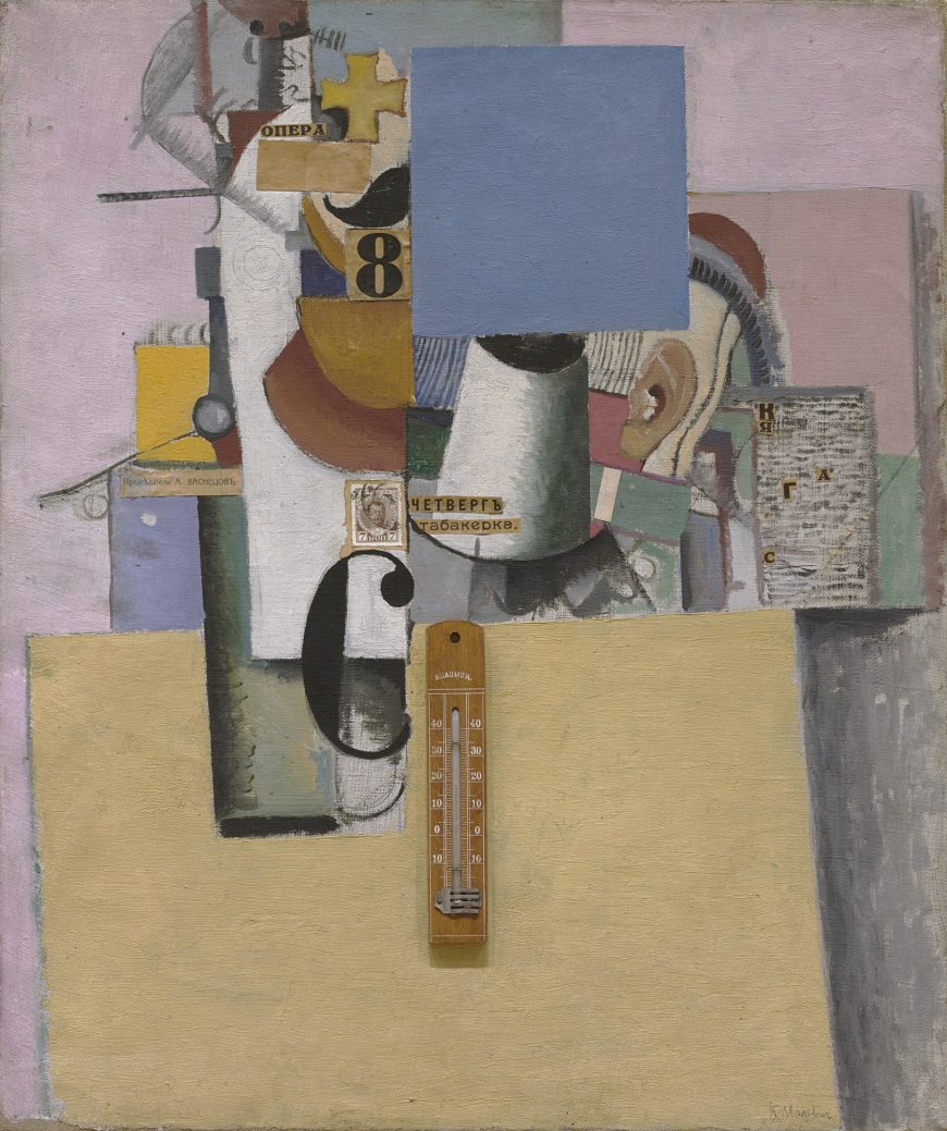
Kasimir Malevich created Reservist of the First Division (1914) in the first year of World War I. The title refers to a member of the reserve army waiting to be called up for military service, and it had personal significance as Malevich was himself a reservist (although not in the First Division). He was anxious about going to war, but the painting does not convey any obvious emotion or even a clear message. It is a combination of oil paint and collage in a style related to the Synthetic Cubism of Picasso and Braque. At the time Malevich was part of a group of Russian modern artists known as Cubo-Futurists, who used pictorial techniques initially developed by modern artists in Western Europe.
Combining representations
Like Synthetic Cubist paintings, Malevich’s Reservist of the First Division combines different systems of representation. Several objects are depicted using naturalistic techniques — a white cylinder projecting towards the viewer in the middle of the painting and a green cylinder on the left cast shadows and have traditional chiaroscuro shading to indicate their curved shapes. On the right a human ear is clearly depicted. There are also two immediately recognizable schematic objects — a gold cross just to the left of center at the top, and below it half of a black handlebar mustache on a peachy flesh-colored ground; both are symbolic references to a Russian military man.
These identifiable objects and symbols are detached elements in an abstract geometric design of colored shapes, varied textures, and painted lines that includes paper collages with printed words, letters, the number 8, a postage stamp depicting the Czar, and a real thermometer. The collaged words are: opera (at the top), Thursday and tobacconist (in the middle), and (to the left) the name of a traditional academic painter, A. Vasnetzov, who had rejected Malevich’s paintings from exhibition. The words, like the represented forms, refer to things without clearly relating them to the other elements of the painting.
Zaum Realism
Reservist of the First Division uses fragments of objects, shapes, and words to communicate by non-rational means. This was a central technique of Russian Futurist writers that they called zaum, a neologism usually translated as “transrational.” Zaum entailed using non-referential linguistic forms — simple phonemes, letters, and nonsense words — to bypass rational understanding and communicate emotion directly. The Futurists believed that through zaum they were able to access a higher reality that transcended the limitations of rationality and the material world.
Malevich collaborated with the Futurist writers on several projects, the most important of which was the radically innovative opera Victory over the Sun (1913). Like the Futurists, he tried to use the formal elements of painting (line color, shape, composition, etc.) as direct means to communicate feeling independent of representation or obvious reference. He described many of his paintings, including Morning in the Village after Snowstorm (1912-13) and The Knife Grinder (1912-13), as “zaum realism.”
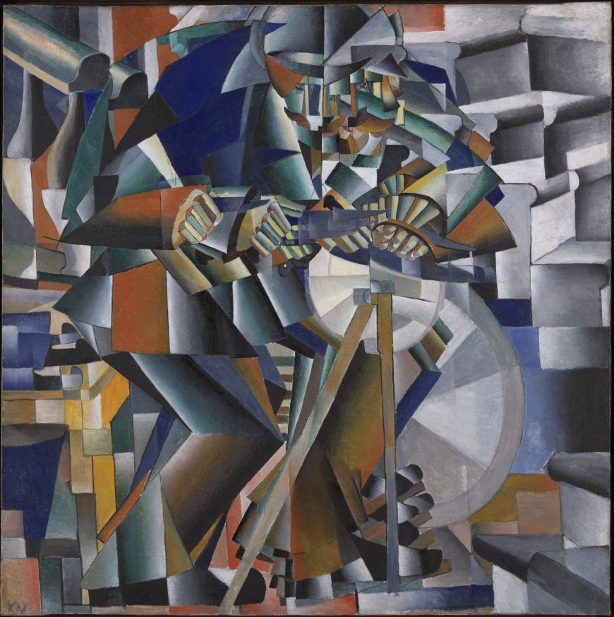
Russian Subjects
Although Malevich explicitly linked these two paintings to zaum’s direct emotional non-rational communication through basic formal units, they are less abstract and easier to decipher than the slightly later work Reservist of the First Division. Figures and space are simplified into geometric shapes and arranged to create repeating abstract patterns. The Knife Grinder depicts a man pumping a sharpening wheel as he works. His foot, hand, and knife appear in multiple positions to convey motion in time. Malevich derived the faceting of space and figure from techniques popular among many well-known Western European Cubists and Futurists whose works were reproduced in art magazines and exhibited in Russia.
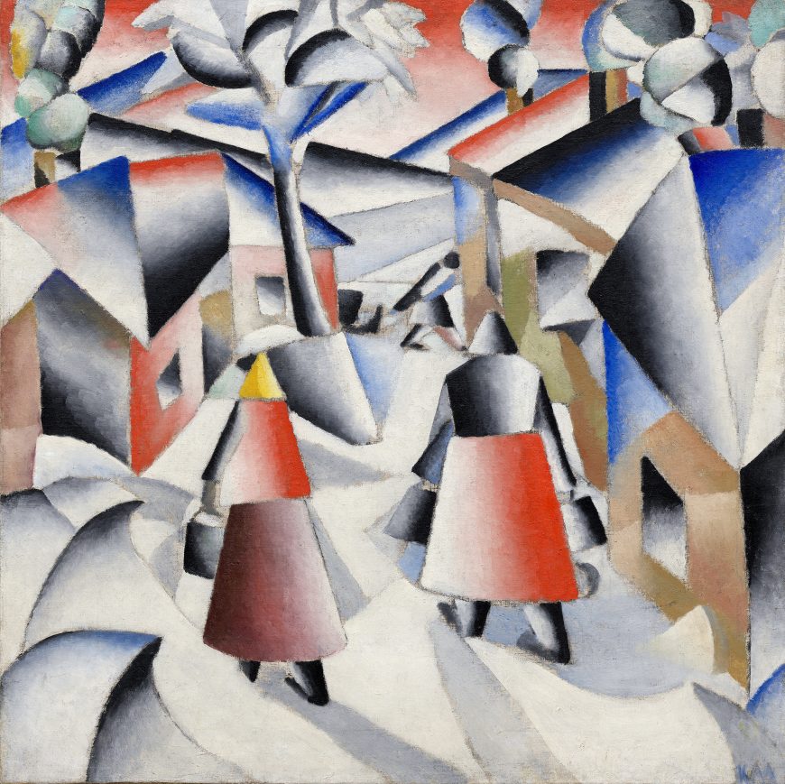
The Italian Futurists often used modern representational techniques to depict conspicuously modern subjects. Malevich, by contrast, used an avant-garde formal vocabulary to represent traditional (even self-consciously “primitive”) subjects. Such subjects were popular among Russian avant-garde painters such as Natalia Goncharova and Mikhail Larionov, who promoted a specifically Russian approach to modernism by embracing Russian subjects and traditional art forms. Morning in the Village after Snowstorm shows Russian peasants carrying buckets and pulling a sled through a snowy village scene. The Knife Grinder uses his foot to pump a simple wheel and pulley mechanism, a marked contrast to the Italian Futurists’ passion for depicting electricity and powerful, sometimes violent, modern machines such as automobiles, trains, and machine guns.
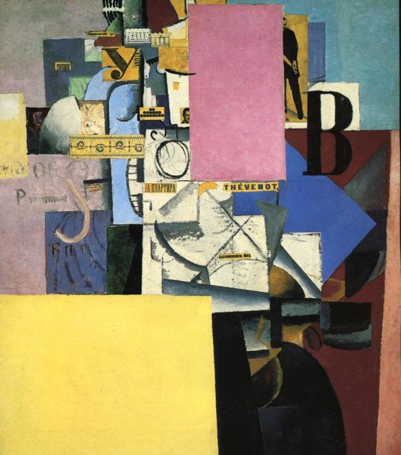
Combining Media and Styles
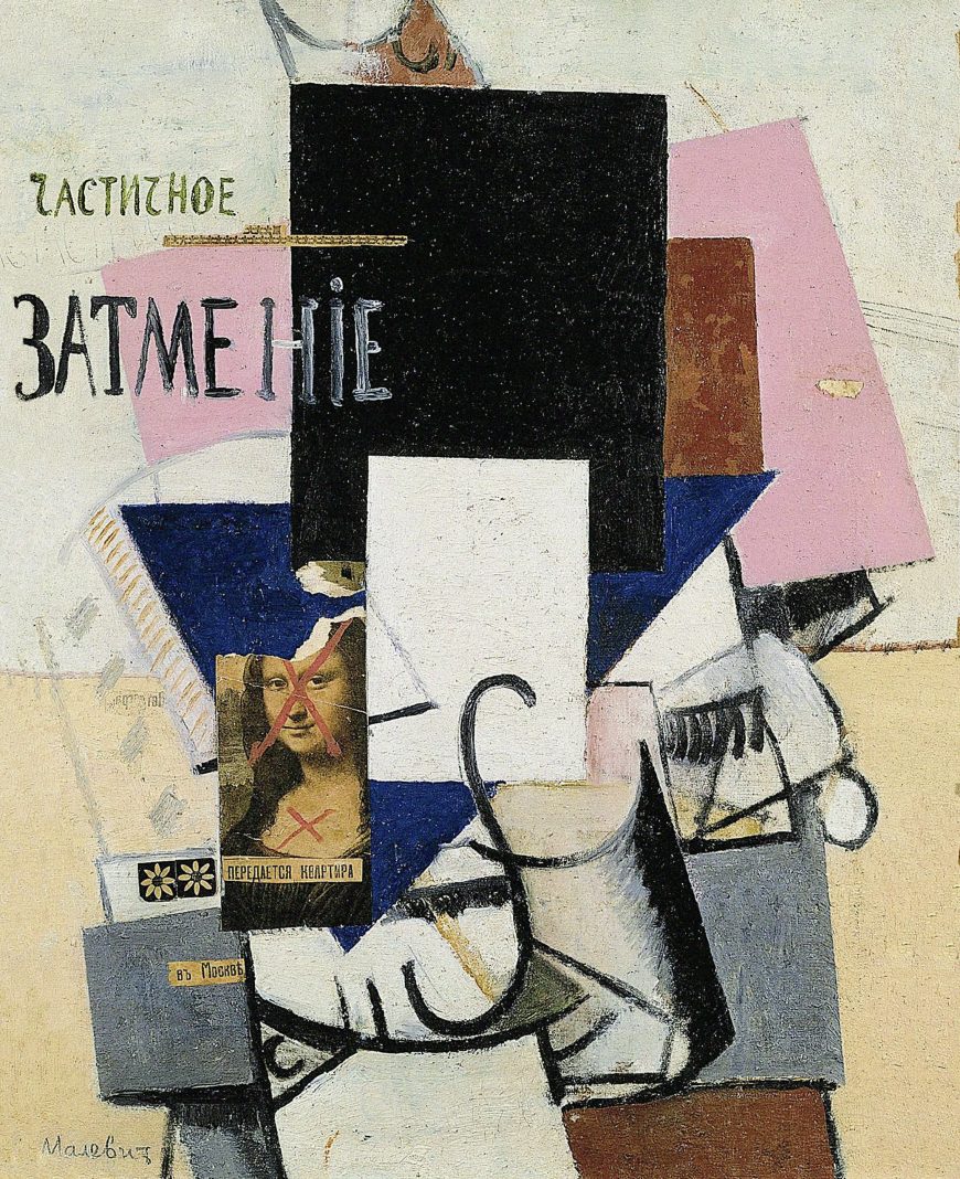
Malevich combined geometric abstraction, Cubist systems of representation, and collage in an unprecedented manner in Reservist of the First Division and related works such as Woman at a Poster Column (1914) and Composition with Mona Lisa (1914). With these works the zaum techniques of non-rational communication using basic formal units are more fully realized and developed to include recognizable images and objects detached from their usual context.
All three use large flat planes of color as a structuring device. These planes seem to hover in front of the picture plane, creating complex layers of space markedly different from the shallow, fractured pictorial space of most Cubist paintings. The inclusion of photographs and objects, such as the thermometer in Reservist of the First Division and the strips of lace in Woman at a Poster Column, was also an innovative zaum pictorial strategy that foreshadowed the Dada artists’ embrace of the illogical in their strategically disruptive use of collage.
Replacing Conventions
Composition with Mona Lisa combines a collaged reproduction of Leonardo da Vinci’s Mona Lisa with colored planes and suggestions of cylinders and other objects rendered in a Cubist style. The painted Russian text translates as “partial eclipse,” and the collaged newspaper text directly under the Mona Lisa reproduction declares “apartment for rent,” while the text collaged on the painted cube below reads, “in Moscow.” Two red ‘X’s have been painted on the Mona Lisa’s face and chest, and the top of her head is torn off. The work seems to thematize as well as embody the fact that the conventions of naturalistic representation, which had dominated Western art since the Renaissance, have been cancelled out. New replacements are available in Moscow, and Malevich puts himself at the forefront of the avant-garde.
Malevich’s intense engagement with Cubist and Futurist styles exemplified the Russian avant-garde’s adaptation of European modernist techniques to serve their own distinctive artistic aims — most notably the depiction of specifically Russian subjects. With his later collage works, Malevich ventured into new territory, combining abstract planes with representational elements. In the following year he would break away completely from representation and create a new art movement, Suprematism.
Additional resources:
Read more about Reservist of the First Division
Read more about Morning in the Village After a Snowstorm
Charlotte Douglas, Kazimir Malevich (New York: Harry Abrams, 1994).
Suprematism, Part I: Kasimir Malevich
by DR. CHARLES CRAMER and DR. KIM GRANT
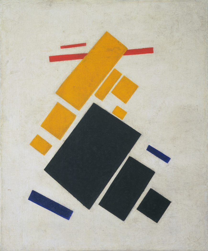
Kasimir Malevich’s Airplane Flying: Suprematist Composition does not depict an airplane. Instead, it was intended to convey the sensation of mechanical flight using thirteen rectangles in black, yellow, red, and blue placed in dynamic relationships on a white ground. Movement is created by the diagonal orientation of the rectangles in relation to the edges of the canvas. Groups of individual colors suggest distinct objects shown at varying distances as they increase or diminish in scale. Ascension is implied by the point of the yellow rectangle centered at the top of the composition, while the bright yellow and red rectangles float above the heavier dark blue and black rectangles.
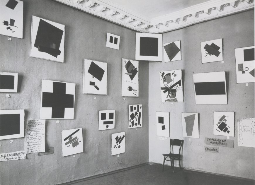
The Last Futurist Exhibition
Airplane Flying: Suprematist Composition was first shown in 1915 at “The Last Futurist Exhibition of Paintings 0.10” in St. Petersburg, Russia. It was not the most important painting in this first display of Malevich’s Suprematist paintings. That was Black Square, which was hung in a position of honor up by the ceiling in the corner of the room, the traditional location of a Christian icon in a Russian peasant’s house. In keeping with this exalted placement Malevich described Black Square as ”the first step of pure creation in art”\(^{[1]}\) and “the embryo of all potentials.”\(^{[2]}\) The 38 other paintings of geometric forms, including Airplane Flying, were implicitly generated from this basic form.
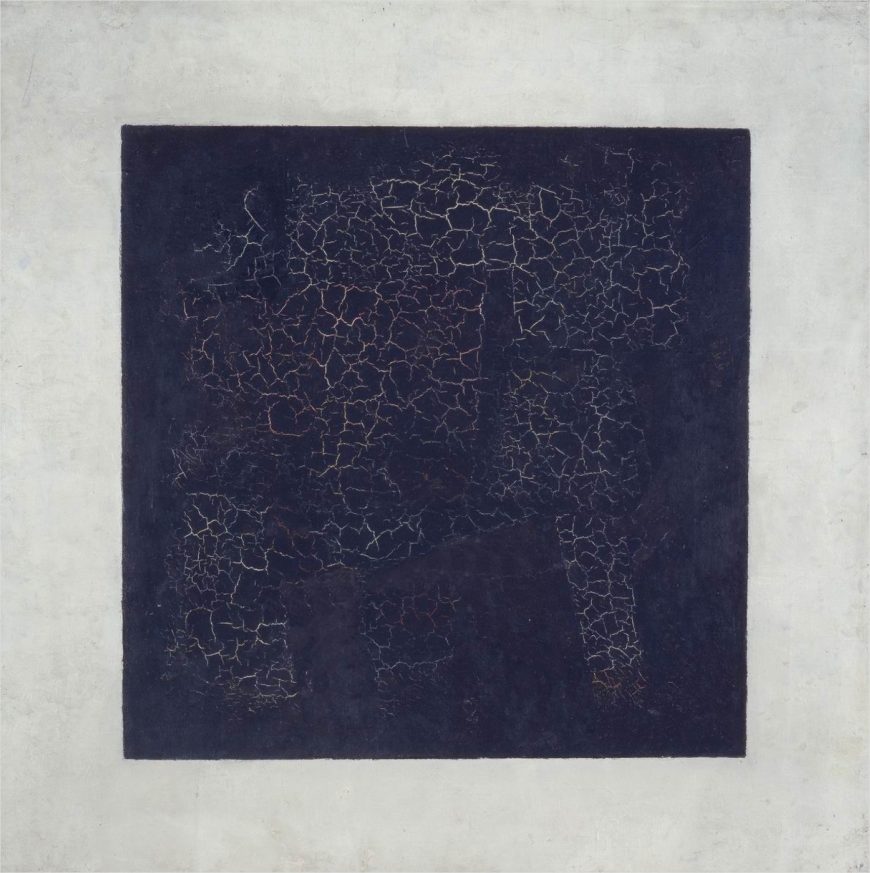
Suprematism as a new realism
Malevich declared Suprematism was a new “realism” in painting, a statement that may seem puzzling given that the paintings are all basic geometric forms on a white background. By making this claim Malevich rejected the conventional understanding of realism in painting as the representation of the world we see.
There are two different ways to understand Malevich’s alternative conception of realism. The first is formal: the painter’s basic formal elements of surface, color, shape, and texture are real things in themselves. They are not signs referring to anything else or images representing real things outside the painting. Black Square is a black square of paint on canvas, nothing more, nothing less. It makes no reference to any other object; it is a real thing in itself.
This formalist approach is a defining aspect of modernist art and literature, and it was a major concern of the Russian Futurist poets with whom Malevich often collaborated. They invented zaum, a “transrational” language that used linguistic forms — phonetic sounds, letters, syllables and words divorced from referential meaning — to communicate directly by means of feeling. Reduction to basic forms of verbal or visual language was intended to liberate the writer or artist from the conventions of the past and the limitations of the world as it exists. Zaum would pave the way to a new world and a new mode of being.
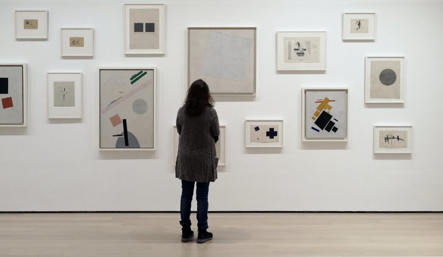
The second way to understand Suprematism as a “new realism” is in relation to a reality beyond the one we normally experience. Mystical traditions and theories of multi-dimensional, non-Euclidean space were popular within artistic and literary circles in the early 20th century. Malevich was particularly interested in the mystical geometry of Peter Ouspensky, who believed artists were able to see beyond material reality and communicate their visions to others. In a pamphlet written for The Last Futurist Exhibition, Malevich echoes this conception of the artist:
I transformed myself in the zero of form . . . I destroyed the ring of the horizon and escaped from the circle of things, from the horizon-ring that confines the artist and the forms of nature.T. Anderson, ed. K. S. Malevich: Essays on Art 1915-1933, vol. 1 (Copenhagen, 1969), p. 19.
This is a description of the artist as a superior being who leads the way to a new consciousness. Suprematism was the result, a non-objective art of “pure feeling,” unconcerned with representation of the visible world.
Kasimir Malevich as a pioneer of abstraction
Malevich has long been considered, with Kandinsky and Mondrian, one of the pioneers of non-representational painting in the early twentieth century. A number of other artists also developed non-representational painting in this period, but for varying reasons their work was not widely known. Malevich, Kandinsky and Mondrian were prominent and active participants in the world of modern avant-garde art and published multiple texts explaining their theories. This greatly increased their visibility and influence.
All three were committed to the notion of the artist as a spiritual leader who perceives a greater metaphysical reality and whose art guides society towards its realization. They also all believed that they could communicate this spiritual reality using the basic formal means of painting.
Malevich’s approach was, however, different from the multi-year, carefully reasoned progression from naturalistic representation to non-objective painting undertaken (separately) by Kandinsky and Mondrian. Malevich leaped from a style closely related to Synthetic Cubism to Suprematism within a few months, and his explanatory texts were written afterwards to support what was largely an intuitive discovery.
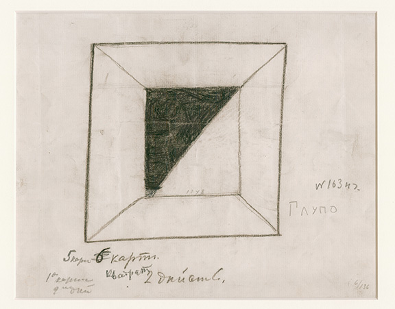
Suprematism’s beginnings
Malevich retrospectively located the origin of Black Square in the basic geometric shapes of the stage designs he made in 1913 for the Cubo-Futurist opera, Victory over the Sun. This opera, created in collaboration with the Futurist poets Velimir Khlebnikov and Aleksei Kruchenykh, told a story of time travelers overcoming old concepts of time and gravity. The theme of space travel and the character of the Aviator are directly relevant to Suprematist painting, which also reflects forms in aerial photographs widely reproduced in Russian newspapers during the early years of World War I.
The title of Airplane Flying: Suprematist Composition makes direct reference to this subject, but all Suprematist paintings depict geometric forms on a white ground in a manner that suggests abstracted objects floating in space. Malevich related this white ground to the cosmic infinite and the void that represents transformed consciousness. Combining mystic spiritualism with modern technology was common practice among Cubists and Futurists in Europe as well as Russia.
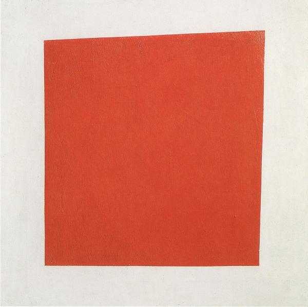
What’s in a name?
The titles of Malevich’s paintings in The Last Futurist Exhibition indicated that Suprematism was not a carefully refined and consistent theory of non-objective painting. Some works had non-referential titles such as Quadrilateral, while others referred to specific objects or people as in Painterly Realism of a Peasant Woman in Two Dimensions. Whether a painting received a referential title or not often seems random: Quadrilateral is the original title of Black Square, while Painterly Realism of a Peasant Woman is a similar painting of a red square.
The referential titles in Malevich’s early Suprematist paintings contradict his initial claim to have escaped the world of material things and reached a world of pure non-objective form. Although the works are non-representational, Suprematist paintings often refer to feelings provoked by specific material things. We have seen how non-representational forms may convey the sensation of flight in Airplane Flying: Suprematist Composition at the beginning of this essay. What sensations do the forms of Malevich’s Painterly Realism of a Boy with a Knapsack. Color Masses in the Fourth Dimension provoke in you?
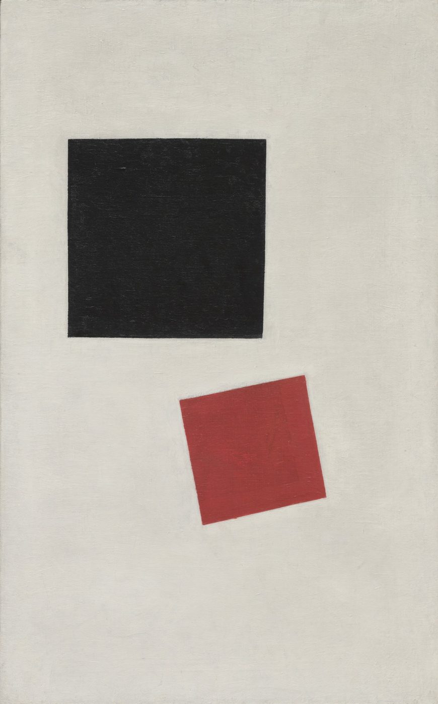
Notes:
- Kasimir Malevich, From Cubism and Futurism to Suprematism: The New Realism in Painting. (Moscow, 1916).
- Letter to Mikhail Matyushin (1915) quoted in John Milner, Kazimir Malevich and the Art of Geometry (New Haven, 1996), p. 127.
Additional resources:
John Bowlt, Russian Art of the Avant-Garde: Theory and Criticism, 1920-1934. Revised Edition. New York: Thames and Hudson, 2017.
Charlotte Douglas, Kazimir Malevich (New York: Harry Abrams, 1994).
The Great Utopia: The Russian and Soviet Avant-Garde, 1915-1932 (New York: Guggenheim Museum, 1992).
John Milner, Kazimir Malevich and the Art of Geometry (New Haven: Yale University Press, 1996).
Suprematism, Part II: El Lissitzky
by DR. CHARLES CRAMER and DR. KIM GRANT
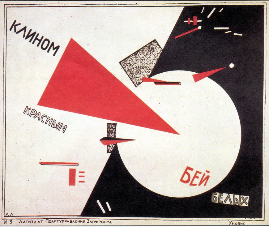
Beat the Whites with the Red Wedge is a propaganda poster designed by El Lissitzky using the abstract visual language of Suprematism, an art movement founded by Kasimir Malevich in 1915. Made in support of the efforts of the Bolshevik Red Army to overcome the anti-communist White Russians, the poster creates a powerful dynamic composition using basic geometric shapes in red, white, and black.
The few words are aligned with the diagonal trajectory of the red triangle so the act of reading follows the overall movement of the design. The red triangle pierces the white circle like a pin in a balloon, implicitly freeing it from the surrounding darkness. A smaller triangle and circle repeat the same theme in the upper right, and throughout the design small red rectangles dominate small dispersing white rectangles, symbolizing the Red Army’s triumph over the White Russians.
Towards a practical Suprematism
In this poster we see not only a masterpiece of modern graphic design, but also a new application of the Suprematist visual language, which signified spiritual transcendence, into a practical language intended to convey specific ideas and information about the material world. This seems like a betrayal of the aims of Suprematism, but Malevich supported this practical application of Suprematism’s forms.
In the chaotic years following the Russian Revolution of 1917 Malevich backed the creation of the new Soviet culture and believed that deploying Suprematist works throughout society would help to usher in a new spiritual era of immateriality.
This sounds naive in hindsight, given the dedicated materialism of communist ideology and Soviet society, but in the years following the revolution avant-garde artists were given substantial opportunities to help shape the new culture. Many artists, including Lissitzky, followed Malevich in seeing the Russian Revolution as a preliminary stage on the path to a new spiritual form of existence.
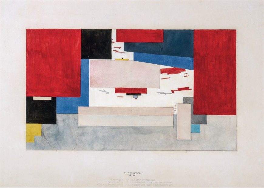
UNOVIS
After the Russian Revolution the art education system was re-organized, and many modern artists took teaching positions in the new art schools and workshops. In 1919 Malevich was invited to teach at the art school in Vitebsk, where he promoted his Suprematist ideals and acquired many followers among the teachers and students. They formed a group, UNOVIS (Affirmers of the New Art), dedicated to disseminating Suprematism as the visual language of world revolution.
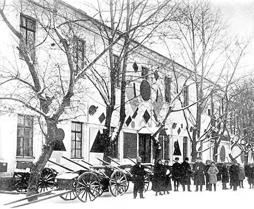
In keeping with communist ideals they saw themselves as a collective and signed works as UNOVIS. Most of their works have not survived as they were temporary installations or ephemeral works like posters, brochures, and signs. They used Suprematist forms to decorate public buildings and meeting rooms, such as the facade decoration and curtain design for the Committee to Abolish Unemployment in Vitebsk, which was celebrating its anniversary with a festival in 1920. This is a new stage of Suprematism, one that sees it moving out of the cloistered confines of avant-garde art exhibitions and into the real world, to test its viability in front of a general public.
Prouns
In addition to the movement from the art gallery into the real world, another key transformation of later Suprematism was the extension of its flat planes into designs suggesting volumetric forms. Lissitsky makes this move explicitly in compositions he called “prouns,” an acronym for Project for the Affirmation of the New in Russian, which he described as “the transfer point from painting to architecture.”\(^{[1]}\)
Lissitzky’s Proun 19D and Malevich’s Painterly Masses in Motion both display abstract rectilinear forms floating in an indeterminate space. Malevich suggests some depth by relative size and by overlapping his brightly colored rectangles, but the overall design of the painting remains very flat. Lissitzky’s Proun 19D uses more muted colors and multiple textures, including collaged papers of varied sorts, foil, oil paint, and crayon. These textures already make the proun a more substantial material object than Malevich’s oil painting.
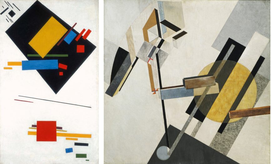
In addition, Lissitzky depicted some of his floating forms in axonometric perspective to indicate that they were three dimensional. The thin brown rectangle that juts in from the right edge of the painting has a bright side receding on the top and an even brighter end receding on the left. In the center of the work two more rectangles, one brown and one blue and beige, are also depicted in axonometric perspective, floating at the same angle. These three forms hover over and through the various flat painted planes surrounding them in the composition to create an ambiguous, but still fairly consistent sense of objects in space.
The upper left side of Proun 19D is, however, far more complex and cannot be read as a depiction of objects in the same space as the forms on the right, or even at all in many instances. For example, several of the black rectangles suggest the sides of three-dimensional geometric forms, but they are not consistently drawn, so they metamorphose into flat shapes or altogether different objects as you examine them. Which planes are receding? Which are flat? It is impossible to tell. This lack of rationally-defined space is another instance of the Suprematists’ preference for ambiguous, otherworldly spatial constructions over practical, real-world applications.
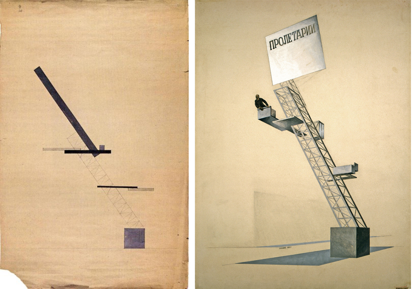
Making Suprematism Practical?
Despite their apparently greater materiality, Lissitzky’s prouns remain abstract and spiritual, and even when Suprematism was enlisted to make utilitarian and propagandistic objects for real-world use, it was similarly impractical. One of Lissitzky’s most famous designs, Lenin Tribune, was for a speaker’s rostrum, which was based on earlier UNOVIS designs attributed to Ilia Chashnik.
Chashnik’s earlier design employs characteristic Suprematist geometric forms, but rather than floating in an indeterminate space, the forms rise up diagonally from a square anchored to a ground line. Lissitzky’s reworking of the design employs the three-dimensional forms of his prouns: the square is now a cube, and the linear pattern of the diagonal rectangle has become a structural girder supporting the speaker’s platform.
The photo collage of Lenin speaking from the rostrum further emphasizes the material reality and function of the structure, but even so the Lenin Tribune is curiously abstract and impractical. The jutting platforms, although drawn as solid forms, serve no obvious purpose, and how did Lenin get up to the top platform? What exactly is that gray plane on the ground? A shadow? And if so, of what? The Lenin Tribune is less a utilitarian design for a speaker’s podium, and more a conceptual project intended to associate modern engineering, abstract design, and the leadership of Soviet Russia. In the end, Suprematism had great difficulty reconciling its utopian, spiritual aims with the practical applications demanded by the Soviet state.
Notes:
- El Lissitzky and Hans Arp, Die Kunstismen (1925) translated and quoted in Victor Margolin, The Struggle for Utopia, p. 33.
Additional resources:
Learn about the Russian Revolution
The Great Utopia: The Russian and Soviet Avant-Garde, 1915-1932 (New York: Guggenheim Museum, 1992).
Inventing Abstraction 1910-1925: How a Radical Idea Changed Modern Art (New York: Museum of Modern Art, 2012).
Victor Margolin, The Struggle for Utopia: Rodchenko, Lissitzky, Moholy-Nagy, 1917-1946 (Chicago: University of Chicago Press, 1997).
Constructivism, Part I
by DR. CHARLES CRAMER and DR. KIM GRANT
Aleksandr Rodchenko’s Spatial Construction no. 12 is one of a set of three-dimensional geometric forms generated by a simple iterative process. It began as a sheet of plywood cut into an ellipse. Rodchenko then made a second cut following the edge of the first to create a narrow oval ring. He continued cutting ever smaller rings until reaching the center.
Once cut, the rings were fanned out into three dimensional forms held in place by wire. They were covered with aluminum paint and suspended from the ceiling for exhibition, along with similar constructions cut from a square, a circle, a triangle, and a hexagon. These visually complex sculptures created by a simple process were the result of the Russian Constructivists’ goal to create rationally-produced objects based on fundamental laws of form and structure.
Constructing a new art for a new Russia
The Constructivists were a group of avant-garde artists who worked to establish a new social role for art and the artist in the communist society of 1920s Soviet Russia. They were committed to applying new methods of creation aligned with modern technology and engineering to art, and eventually to utilitarian objects. Their overall approach was theoretical and scientific, and they rejected the stereotype of the artist as intuitive and inspired.
They made a distinction between composition, which resulted from the artist’s intuition, and construction, based on scientific laws. Rodchenko’s Spatial Constructions were examples of the latter, forms structured by logical deduction, not intuition. They were considered “lab work” rather than art objects and were made to demonstrate theoretical concepts.
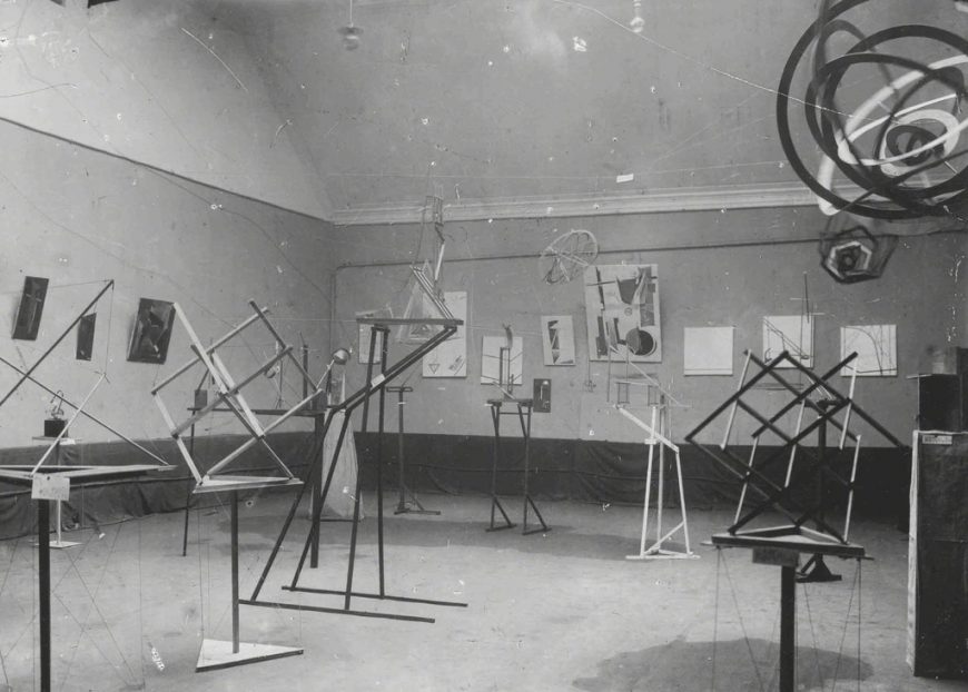
Structure as form
Very few early Russian Constructivist works have survived, but the photograph of the Obmokhu (Society of Young Artists) exhibition where Rodchenko displayed his Spatial Constructions in 1921 shows a variety of Constructivist works. Most use simple geometric forms and straight lines, a visual language that suggests the basic structural units of modern engineering and architecture.
In two-dimensional works, paint strokes and free-hand drawings were replaced by lines and shapes created by ruler and compass. Most of the three-dimensional works were made of wood, but they have uniform smooth surfaces suggesting machine-made forms rather than textures created by the artist’s hand. As noted above, Rodchenko’s Spatial Constructions were covered with aluminum paint, and it is likely that they would have been made of metal if that had been feasible.
The visual language of many Constructivist works signifies the modern machine age in terms of structure as well as surface. Rodchenko’s hanging Spatial Constructions were dynamic forms with visible structures, rather than static sculptural masses on pedestals. The interest of the work lies, in part, in the way it demonstrates a system. Rodchenko’s Spatial Constructions create complex shifting patterns of solid planes, spaces, and shadows, but their basis is a simple, easily-grasped rational system. Recognizing the way this rudimentary system generates complex visual experiences is part of the works’ aesthetic pleasure.
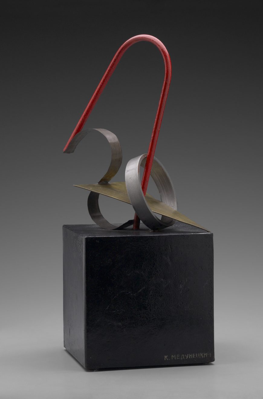
Materials and faktura
Konstantin Medunetsky’s Spatial Construction was also in the Obmokhu exhibition, but it displays different concerns from Rodchenko’s works. Instead of demonstrating a rational construction system, Medunetsky’s work displays contrasts between shaped metals. A tin S-curve, a steel circle, a brass triangle, and a red-painted iron parabola are interwoven and welded to a painted metal cube. The work is strikingly modern in its abstract formal language and its machine-age materials.
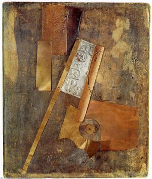
The different shapes of the metals demonstrate their material properties: the thin S-curve shows the great flexibility of tin; the thin triangle plate of brass highlights its qualities as a surface material; the heavy steel ring showcases its strength and flexibility; while the red-painted iron parabola is the stabilizing, unifying, and dynamic force of the composition. It also has symbolic references; it is like both a handle and an arrow pointing upward to the communist future, signified by the brilliant red paint.
The juxtaposition of different materials in Medunetsky’s work reflects the Constructivist concept of faktura. Faktura was a much-debated term among Russian modernists in the first decades of the twentieth century that signaled a focus on the texture and working qualities of materials.
Vladimir Tatlin’s Counter-Relief is an example of a modern sculpture that was seen as primarily concerned with faktura. It is a non-representational sculptural assemblage of various found materials displayed in ways that demonstrate their properties. The wood, pitted and discolored with age, acts as a tack board for the other elements, including coarse-grained leather stained with different dyes and various types of metal with contrasting colors and sheens.
Each material is manipulated in ways that display its working qualities: the soft elasticity of the leather tacked to the upper half, and the stiff flexibility of the metal as it is bent into curved planes and twisted into a wire corkscrew.
Traditional Western sculptors such as Michelangelo or Bernini had generally attempted to transcend their materials: to make marble appear to be flesh or cloth. The philosophy of faktura was, on the contrary, to understand and display the fundamental properties of materials.
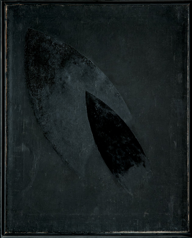
In 1918 Rodchenko made a number of paintings that demonstrate pure faktura; their surfaces were simply black paint applied to canvas in varied textures to create shapes. The paintings were made as a challenge to the white Suprematist paintings of Kasimir Malevich, which used white geometric forms as a means of spiritual communication. In contrast, Rodchenko’s black paintings made no reference to anything other than their material qualities.
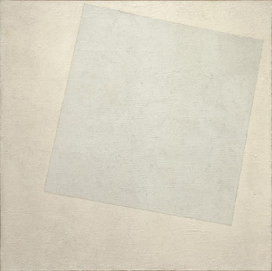
The end of artistic intuition
Rodchenko’s challenge to Malevich’s Suprematism illustrates one of the essential tenets of Constructivism: the rejection of old conceptions of art and the artist. Despite his radical invention of pure geometric abstraction, Malevich was what the Constructivists considered an outdated and bourgeois artist. He was an individualist who believed that he created his art intuitively. In addition, Malevich was an idealist dedicated to a spiritual world and an art that communicated transcendental meanings and emotions. The Constructivists, in line with Communist tenets, rejected spiritual concerns in favor of the material world and laws determined by scientific means. The Constructivists’ “lab works” in the 1921 Obmokhu exhibition displayed their approach to making impersonal and scientifically-grounded forms that had no significance beyond their material existence as physical examples of rational systems.
Synthesizing art and engineering
The work of Vladimir Tatlin was a major touchstone for the Constructivists. His Monument to the Third International, a model for a structure intended to house Communist Party functions, was a paradigm of the Constructivists’ efforts to synthesize art and engineering to create modern utilitarian forms for the new era. Tatlin himself, however, rejected the Constructivists’ dedication to the scientific production of works. Although his art was not engaged with spiritual concerns, as Malevich’s was, he believed the artist’s intuition could not be replaced by scientific laws.
After the 1921 Obmokhu exhibition the Constructivists left their theoretically-oriented lab works behind and became dedicated to utilitarian production. Their abstract formal ideas helped to shape designs for furniture and clothing, posters and theatrical productions, architecture and even manufacturing techniques. This turn to utilitarian projects was motivated in large part by the requirements and expectations of Soviet society and the massive drive to modernize and industrialize the country.
The Constructivists’ theories and ideas also became part of international conversations about the fundamental elements of art, designing for the modern world, and the education of artists. Another major focus for these debates was the German Bauhaus, and they resonated across the 20th century and continue to this day.
Additional resources:
Christina Lodder, Russian Constructivism (New Haven: Yale University Press, 1983).
The Great Utopia: The Russian and Soviet Avant-Garde, 1915-1932 (New York: Guggenheim Museum, 1992).
Constructivism, Part II
by DR. CHARLES CRAMER and DR. KIM GRANT
Gustav Klutsis’ kiosk is a utilitarian Constructivist design from the early 1920s. The structure is economical and based on a systematic rational design stripped down to its essential supporting elements. It is a simple multi-purpose structure containing a bookshelf, a screen for projecting newsreels, a platform for a speaker, and a board for posters. In this single object we see the fundamental aim of the Constructivists: the creation of utilitarian works whose structural organization and materials were aligned with the ideology of communism and contributed to the creation of a new society.
The kiosk was intended to be a public locus for spreading “agitation and propaganda,” often shortened to agitprop. The Agitation and Propaganda Section was a crucial arm of the Central Committee of the Communist Party. Its work included conveying information about communism and the Soviet government’s policies and goals, as well as more directly practical information intended to support the development of the people.
Agitprop played an important role in the creation of the new Soviet society, helping to turn a poor agricultural country of largely-uneducated peasants into a modern nation of literate industrial workers. Propaganda directed people to become dedicated Communist Party members and contributors to the new socialist society. As artists and designers, the Constructivists were closely involved with Soviet agitprop during the 1920s.
A New Environment
After 1921 the Constructivists renounced the creation of mere art objects and entered a “productivist” phase during which they attempted to design utilitarian objects for factory production. Given the nascent state of Soviet industry at the time, this effort was largely unsuccessful, however, and very few Constructivist designs made it past the drawing board.
Alexandr Rodchenko’s Workers’ Club is a rare documented example of Constructivist furniture designs that were actually made. It was exhibited in the Soviet pavilion (itself a famous example of early Russian modernist architecture by Konstantin Melnikov) at the 1925 International Exposition of Decorative Arts in Paris.
Like Klutsis’ kiosk, the furniture of the Workers’ Club is made of basic, undecorated geometric forms that display their structural purpose and integrity. The material — wood — is economical, and some of the furniture (the bookshelf, podium, display board, projection screen, and bench) was collapsible so it could be stored when not in use. The color scheme was red, gray, white, and black, which created a distinctive graphic quality as well as highlighting red, the signature color of the Communist Revolution.
Also like Klutsis’ kiosk, the purpose of the Workers’ Club was to foster the new communist society. It was both a center for education and a place for the new workers to meet socially. As such, it is the best example ever made of the Constructivist ideal of designing an environment to foster the new communist life. It was, however, not mass-produced, nor did it serve as a prototype for factory production. It was in the end closer to an artisan-produced conceptual art project than it was to a modern industrial product.
Designing for life
The everyday utilitarian objects designed by the Constructivists included clothing. Vavara Stepanova published her ideas about clothing designed for pure functionality, accompanied by illustrations of her sports clothing designs. They used a minimum of cloth cut into boxy shapes that would be easy to manufacture and comfortable to wear. The graphic textile designs were intended to distinguish the individual athletes or teams for spectators viewing from a distance.
Stepanova’s designs rejected the pitfalls of bourgeois “fashion,” in which designs change rapidly to promote consumerism and signal gender and class differences. By subsuming all stylistic decisions to the unifying Constructivist visual language of basic geometric forms, strong diagonals, and a restricted palette of red, black, and white, clothing design itself could reflect the communist ideals of rigorous functionalism and class leveling.
Working in Industry
Stepanova and Liubov Popova were the only prominent Constructivists working as designers in industrial production during the 1920s. They were employed by the First State Textile Printing Works to design textile patterns. Their designs were aggressively abstract and economical, using repeating patterns of basic geometric forms in black and white and sometimes one or two colors. They described their designs as a form of Constructivist propaganda, but their success in Constructivist terms was limited.
Although their textile patterns were mass-produced and used to make clothing, their employment in the textile industry was exclusively that of conventional artisan/designers. It did not reflect their Constructivist goal to be a new type of artist-producer fully engaged in all areas of the production and marketing processes, from developing chemicals for dyes to designing store window displays and advertisements.

Advertising and Posters
Ultimately, the most widely disseminated Constructivist products were their advertising posters and graphic designs for product packaging, books, and magazines. Rodchenko saw his work in advertising as a direct engagement with building the Soviet economy during the NEP (New Economic Policy) period of the 1920s.
His poster for rubber overshoes combines representation and abstract geometric forms to convey its message. White diagonal lines representing heavy rain are prevented from hitting the globe by an enormous rubber overshoe. The color scheme is simple: red, yellow, blue, black, and white. The simple sans serif font uses different colors to create emphasis and support the visual message. The blue background suggests water, while the USSR in red dominates the globe. Not only will buying rubber overshoes keep your feet dry, it will help to maintain Soviet dominance of the world.
The Stenberg Brothers’ poster for Dziga Vertov’s The Man with the Movie Camera uses a low vantage point to depict a dizzying array of skyscrapers rising diagonally into space and suggesting the kind of modern, productive, and prosperous communist city shown in the film. The text is formed into a spiral that also appears to rise toward the center, while a woman’s arms, legs and head are arranged to suggest a dancer spinning through space. The abstract forms of modern design have become the forms of the urban environment and the human body. The emphasis on dynamic compositions and hard-edged geometric design made the Constructivist style a perfect vehicle for fostering excitement about the new Communist/industrial society.
Turning to Photomontage
By the late 1920s photography and photomontage had come to dominate Constructivist poster design. This was part of a widespread turn away from modernist abstraction in Soviet culture and an embrace of realistic styles that would be more easily understood by the masses. Klutsis’ We Will Repay the Coal Debt is one of many posters he designed as propaganda for the first Five Year Plan – Stalin’s drive to industrialize the nation.
Although the main content of the poster is a photograph of workers, the overall design and color scheme remains Constructivist. The figures are closely cropped to make them appear large, and they loom up over the viewer at a diagonal. The dynamism of the diagonal is further emphasized by the drill and mallet held by two workers, as well as the belts strapped across the third worker’s chest. The flat red background and sans serif text placed at an opposing diagonal and partly overlapping the central worker turn the photograph of three individuals into a timeless image of the Soviet workers’ determination to support the economic goals of their society.
Additional resources:
Permanent Reconstruction of Rodchenko’s Workers’ Club in Kunstmuseum, Liechtenstein
Read more about Liubov Popova at the Tate Museum
Christina Kiaer, Imagine No Possessions:The Socialist Objects of Russian Constructivism (Cambridge: M.I.T. Press, 2005).
Christina Lodder, “Liubov Popova: From Painting to Textile Design,” Tate Papers no. 14.
Christina Lodder, Russian Constructivism (New Haven: Yale University Press, 1983).
The Great Utopia: The Russian and Soviet Avant-Garde, 1915-1932 (New York: Guggenheim Museum, 1992).
Tatlin’s Tower
by DR. CHARLES CRAMER and DR. KIM GRANT
Vladimir Tatlin’s Monument to the Third International, commonly referred to as Tatlin’s Tower, is an iconic work of Russian modern art from the early Soviet era. It is a symbol of the utopian aspirations of the communist leaders of Russia’s 1917 October Revolution, and of the brief period when those aspirations were allied with the futuristic visions of modern artists. The original Monument has not survived and is known only from photographs, but it was never intended to be a durable object.
An ambitious plan for a sculptural structure
It was a 20-foot-tall wooden model for an enormous structure that was never constructed, in part because the material and technological resources required to build it successfully were unavailable in post-revolutionary Russia. Tatlin’s Monument thus has historical significance that goes beyond its original purpose and meaning. It is both a symbol of exalted utopian goals and an ironic monument to the economic and technological limitations of the early Soviet state.
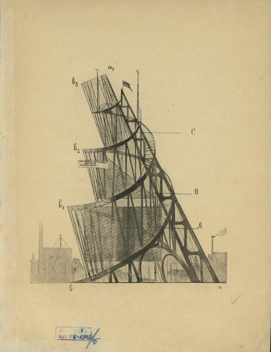
As part of a large-scale program to replace old czarist monuments with monuments to the revolution, the huge structure was both a symbolic sculpture and functional architecture. Designed to straddle the Neva river in St Petersburg, the 1300 foot (400 meter) iron and glass Monument would surpass Paris’s Eiffel Tower in both scale and complexity. Its design consists of a contracting double helix that spirals upward, supported by a huge diagonal girder. Inside this external metal structure are four geometric volumes that were intended to revolve at different speeds.
As planned, the geometric volumes would be made of glass and serve both practical and symbolic functions. The largest and lowest was a cube, making one revolution per year, that would house meetings of the legislature of the Third International or Comintern, the international communist organization working for world revolution. The next volume up was a pyramid, making one revolution per month, that would host the Comintern executive. Above that was a cylinder, making a full revolution every day, to house the Comintern propaganda services, including the press, poster and pamphlet designers, etc.; and on top was a half sphere that revolved hourly and housed the Comintern radio station.
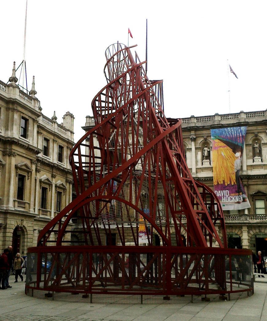
A Symbol of the Future
Tatlin’s design for the Monument conveyed meaning in multiple ways. The rising spirals, diagonal girder, and rotating internal volumes give symbolic form to the aspirations and dynamic forces of the world communist revolution. The planned materials of metal and glass were associated with modern engineering and construction technology, and signified the advanced, even futuristic, goals of communist society. This was further emphasized in the plan to have the interior volumes revolve mechanically, which symbolized the alignment of communist world revolution with the astronomical movement of the sun, earth, and moon, and also likened the new government to an efficient modern machine.
The Monument stressed the Comintern’s transparency to the people in its fully visible support structure and the glass interior volumes housing its various functions. The importance given to disseminating information and propaganda to the masses is also integral to the design and acknowledges the crucial role played by mass communication technologies in modern society and their power to promote world revolution.
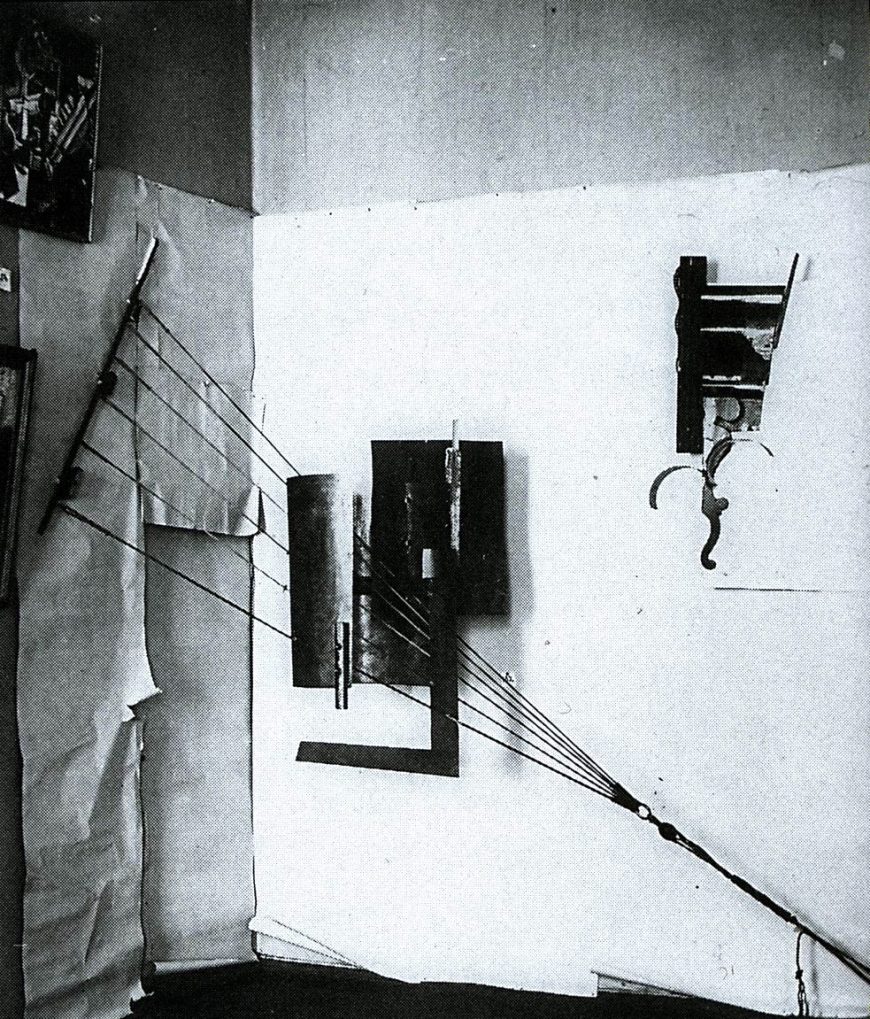
Tatlin and Constructivism
Although Tatlin’s Monument was never built, models of it were made and displayed at political meetings, demonstrations, and parades through the 1920s. Its most important historic role, however, was its influence on Russian Soviet modern artists, particularly the Constructivists, who were conceptualizing new aesthetic practices aligned with the goals and values of the new communist society. For these artists Tatlin’s combination of modern materials, rational structure, and utilitarian forms was an important example of how artists could synthesize the historically disparate roles and forms of art, craft, and engineering to contribute to the formation of a new world.
Tatlin had established his reputation as a cutting-edge modern artist in Moscow before the 1917 revolution. He participated in The Last Futurist Exhibition of Paintings 0.10 in 1915, where his rival Kasimir Malevich first presented Suprematist works. There, Tatlin exhibited a group of sculptures he called “counter-reliefs” and “corner counter-reliefs.” These were complex assemblages of various found non-art materials (scraps of wood, metal, glass, cardboard, wire, and rope) suspended from walls.
These counter-reliefs are often associated with Picasso’s early Cubist sculptures, which Tatlin saw in Paris in 1913. Both artists rejected the Western tradition of sculpture as a unified mass made from a single material (traditionally marble or bronze), and instead created assemblages — sculptures that combine heterogeneous materials in novel ways.
Picasso’s Cubist sculptures represented objects such as guitars, glasses, and bottles, and explored the formal and spatial ambiguities previously developed in Cubist painting. Tatlin’s approach was markedly different and often completely non-representational. He was more interested in the forms, textures and physical potential of the materials themselves than in exploring the ambiguities of representation, and his works were also more radical in their relationship to space than Picasso’s.
A New Type of Sculpture
Tatlin’s earliest counter-reliefs were in a rectangular format and hung on the wall. They were composed of separate but interdependent components, and emphasized the contrasts between different textures and materials.
The relief reproduced here was part of a group of works titled Selection of Materials. It is an abstract composition made of scraps of wood, metal, and glass attached to a chipped and cracked stucco surface. Each material displays its texture rather than being cleaned and polished to suggest pure abstract forms. The materiality of the object and its constituent parts is fundamental to the effect of the work.
This work and others like it engage with a prominent concern of early 20th-century modern artists and writers: how non-representational form could communicate feeling directly. Faktura was a key concept in Russian debates on modern art that was connected to the artist’s use of the physical qualities of materials. Tatlin’s reliefs were understood as displays of faktura, meaning their interest was fundamentally formal and concerned with the visual and tactile properties of their material components. They had no representational content and (unlike the work of many of Tatlin’s contemporaries) no spiritual significance.
Corner counter-reliefs
The corner counter-reliefs added another dimension to Tatlin’s work. They broke out of the limiting rectangle and created a new kind of spatially-ambiguous sculpture with indefinite boundaries. These were not self-supporting objects that could be easily moved; their form depended on the walls from which they were hung. This made their sculptural identity as independent objects even more ambiguous. The walls were part of the sculpture, and were sometimes covered with paper to emphasize their integral role in the work.
One of the most noticeable and innovative aspects of Tatlin’s corner counter-reliefs is the way they incorporate literal dynamic tension in the form of supporting ropes and wires. These allow the planes of various textures and materials to be suspended in space, and they also make physical tension a manifest part of the work’s composition.
We don’t just see the flat planes, curved forms, and bars hovering juxtaposition to each other, we see how the entire sculpture is put together. The structural relationships are laid bare. It was this literal incorporation of structure that came to be seen as an early stage in the development of Constructivism — the dominant modern art movement in Soviet Russia after 1920.
Additional resources:
Learn about the Russian Revolution
John Bowlt, Russian Art of the Avant-Garde: Theory and Criticism, 1920-1934. Revised Edition. New York: Thames and Hudson, 2017.
Christina Lodder, Russian Constructivism. New Haven: Yale University Press, 1983.
The Great Utopia: The Russian and Soviet Avant-Garde, 1915-1932. New York: Guggenheim Museum, 1992.
Inventing Abstraction 1910-1925: How a Radical Idea Changed Modern Art. New York: Museum of Modern Art, 2012.
Cite this page as: Dr. Charles Cramer and Dr
Varvara Stepanova, The Results of the First Five-Year Plan
by JESSICA WATSON

Photomontage in the Soviet Union
Have you ever wondered what came before Photoshop? After the First World War, artists in Germany and the Soviet Union began to experiment with photomontage, the process of making a composite image by juxtaposing or mounting two or more photographs in order to give the illusion of a single image. A photomontage can include photographs, text, words and even newspaper clippings.
![Alexander Rodchenko and Varvara Stepanova in their studio 1922 (photo: Mikhail Kaufman[?])](https://ka-perseus-images.s3.amazonaws.com/52a2806e6cd0ee5885c263f379ccc972ea829e0b.jpg)
Russia had for centuries been an absolute monarchy ruled by a tsar, but between 1905 and 1922 the country underwent tremendous change, the result of two wars (World War I, 1914-18 and Civil War, 1917-22) and a series of uprisings that culminated in the October Revolution of 1917. The Union of Socialist Soviet Republics (USSR) was established in 1922 under Vladimir Ilyich Lenin. The young communist state was celebrated by many artists and intellectuals who saw an opportunity to end the corruption and extreme poverty that defined Russia for so long.
The Russian avant-garde had experimented with new forms of art for decades and in the years after the Revolution, photomontage became a favorite technique of artists such as El Lissitzky, Alexander Rodchenko and Varvara Stepanova. Stepanova was a talented painter, designer and photographer. She defined herself as a constructivist and focused her art on serving the ideals of the Soviet Union. She was a leading member of the Russian avant-garde and later in her career, she became well known for her contributions to the magazine USSR in Construction, a propagandist publication that focused on the industrialization of the Soviet Union under Joseph Stalin, a ruthless dictator who took power after Lenin’s death and who’s totalitarian policies are thought to have caused suffering and death for millions of his people.
Propaganda

The public targeted by USSR in Construction was mostly foreign. The purpose of the magazine was to show countries such as France and Great Britain that the USSR was also a leading force in the global market and economy. By choosing to include images rather than just articles, the public would be able to see with their own eyes the accomplishments achieved under Stalin. At first the subjects depicted were strictly industrial, but as the magazine gained recognition and readers, topics diversified, and included subjects from education to sports and leisure. Soviet strategists were well aware that many European countries were witnessing the rise of a small base of devoted Communists, despite general mistrust and even contempt by the continental social and political elite.
As its title suggests, this photomontage is an ode to the success of the First Five-Year Plan, an initiative started by Stalin in 1928. The Plan was a list of strategic goals designed to grow the Soviet economy and accelerate its industrialization. These goals included collective farming, creating a military and artillery industry and increasing steel production. By the end of the First Five-Year Plan in 1933, the USSR had become a leading industrial power, though its worth noting that contemporary historians have found that economists from the USSR inflated results to enhance the image of the Soviet Union. In this work of art, Stepanova has also used the tools of the propagandist. This photomontage is an ideological image intended to help establish, through its visual evidence, the great success of the Plan.

Constructing the image
In Stepanova’s photomontage, everything is carefully constructed. The artist uses only three types of color and tone. She alternates black and white with sepia photographs and integrates geometric planes of red to structure the composition. On the left, Stepanova has inserted public address speakers on a platform with the number 5, symbolizing the Five Year Plan along with placards displaying the letters CCCP, the Russian initials for USSR. The letters are placed above the horizon as is a portrait of Lenin, the founder of the Soviet Union. The cropped and oversized photograph of Lenin shows him speaking; his eyes turned to the left as if looking to the future. Lenin is linked to the speakers and letter placards at the left by the wires of an electrical transmission tower. Below, a large crowd of people indicate the mass popularity of Stalin’s political program and their desire to celebrate it.
Red, the color of the Soviet flag, was often used by Stepanova in her photomontages. She also commonly mis-matched the scale of photographic elements to create a sense of dynamism in her images. Despite the flat, paper format, different elements are visually activated and can even seem to ‘pop out.’ Several clear artistic oppositions are visible in The Results of the First Five-Year Plan. For example, there is a sharp contrast between the black and white photographs and the red elements, such as the electric tower, the number 5, and the triangle in the foreground. Our eyes are attracted to these oppositions and by the contrast between the indistinct masses and the individual portrait of Lenin, as an implicit reference to the Soviet political system.

Manipulating reality
As the term photomontage suggests, images are combined and manipulated to express the message the artist wants to convey. This image celebrating of the results of the First Five-Year Plan is the artist’s interpretation of events, under the strict supervision of Party ideologues.
The Plan resulted in radical measures that forced farmers to give up their land and their livestock. Many people were reduced to extreme poverty and famine became widespread. Terror, violence, and fear replaced the initial optimism about the Plan. What started as positive propaganda became, little by little, a means to hide a disastrous economic policy from the rest of the world. It became an absolute necessity for the State to project a pristine image of its society no matter how dire the situation became. Stepanova admits no fault or imperfection in The Results of the First Five-Year Plan.
Although Stepanova worked hand in hand with the Soviet government, her work shows great personal creativity. By using vibrant color, and striking images in a dynamic composition, she pioneered photomontage and revolutionized the way we now understand photography. Historical hindsight can make it difficult for contemporary viewers to engage the overtly propagandistic aspects of these images, in fact their exaggerated euphoria can even be mistaken for irony. Nevertheless, despite our increasingly sophisticated understanding of the distinction between image and reality, Stepanova’s photomontages are an important reminder of how an artist can blur the line between aesthetic passion and ideology.
Purism
by DR. CHARLES CRAMER and DR. KIM GRANT
A rational and scientific art
The Purists, Amédée Ozenfant and Charles-Edouard Jeanneret (now better known as the architect Le Corbusier), rejected the image of the modern artist as an intuitive, expressive genius. In their view modern artists and their art should be rational and scientific, and Jeanneret’s Still Life shows exactly what they meant by that. It depicts a collection of man-made objects simplified into basic geometric forms: circles, cylinders, rectangles, and regular curves. These forms are precisely placed in a rhythmic composition that was organized using a pre-determined geometric system to achieve a harmonious balance. Colors are dark and muted to enhance the shapes of the objects without creating decorative distractions.
The painting is absolutely precise, with sharp, clear edges and unobtrusive brushwork. It has been purified of anything extraneous and accidental, and its parts create a perfectly ordered whole along horizontal and vertical axes. It is as if we are seeing each object in its ideal Platonic state in a conceptual geometric space, rather than from a human point of view that could change. The repeated perfect circles are clear indicators of this idealist perspective. They represent the forms of a white plate, the mouths of two glass bottles, the rim of a drinking glass, and two pipe bowls.
In a naturalistic still life, like the one above, these would be depicted as ellipses to indicate perspectival depth, but here they are drawn to show their true circular shape, without regard for how they might be perceived in real life. The lighting also indicates the painter’s disregard of naturalism. Lighting is used only to indicate the shape of the volumes; some objects are lit from the left, others from the right. There are no cast shadows, with the possible exception of the top of the guitar neck on the right, which has an echoing black geometric shape underneath it.
Mechanical evolution
The Purists presented their paintings as the next stage of modern art’s evolution after Cubism. Purism replaced what they described as Cubism’s decorative, vague, and contingent forms with mathematically-designed compositions of perfected ideal forms. Purist paintings were, however, clearly indebted to Cubism, particularly the geometrically-organized paintings of Juan Gris. The guitar in Jeanneret’s Still Life was one of the Cubists’ favorite subjects, and Jeanneret used compositional rhymes throughout as Cubist painters often did.
As you can see, Juan Gris’s Cubist Guitar and Glasses creates a pattern of circles from glasses and the guitar’s sound hole, quite similar to the compositional use of circles in Jeanneret’s painting. The comparison of these two paintings also shows how the Purist painting rejects Cubist ambiguity in favor of solidly placed, fully depicted objects — note how many of Gris’ objects fragment and disappear into the background.
Purist still-life objects were not intended to represent the spatial ambiguities of three-dimensional objects presented on a two-dimensional plane; they were presented as “type objects.” These are objects — like plates, glasses, bottles and musical instruments — that humans have been making for generations and that have evolved through a process of mechanical selection and refinement to become pure economical forms.
Classical modernism
Unlike Cubism, which was invented, gradually refined, and reinvented by Picasso and Braque in the process of working, Purist theory preceded the creation of Purist artworks. In addition, individual Purist paintings were fully conceived before being made; they are rational constructions, not idiosyncratic personal expressions.
The Purists saw their art as both modern and classical. It was modern in its dedication to evolutionary science, industrial technology, and a machine-age aesthetic of economical forms. It was classical in its devotion to rationality and order. According to the Purists, the modern machine age was able to realize the goals and ideals of the Ancient Greeks — a perfectly harmonious society and environment.
Their paintings alluded to Ancient Greek models in their depiction of ideal platonic forms, their employment of the harmonious mathematical proportions used to build Greek temples like the Parthenon, and in their generalized references to Greek architectural forms. Ozenfant’s Still Life with Bottles is one of many Purist paintings that use faceted glassware to suggest the fluted columns of Classical architecture.
The Purists communicated their ideas through their magazine, L’Esprit Nouveau (The New Spirit), which was published from 1920 to 1925. In addition to essays on contemporary art and architecture, they published articles about modern music, literature, theater, politics, city planning, industrial practices, and recent scientific discoveries.
This broad scope demonstrated the Purists’ engagement with the developments of modern industrial society and the process of mechanical evolution. For them, all human-made objects, from paintings to architecture and machines, participated in the same fundamental evolution toward more efficient and rational forms. In one of his most famous essays from the Purist period, Jeanneret compared the evolution of Ancient Greek temple designs to that of modern automobiles, both of which became lighter and more efficient in terms of structure and use of materials.
Celebrating mass-produced objects
The Purists celebrated the efficiency of assembly-line production in modern factories and claimed that modern factory workers were proud of the well-designed, efficient objects they helped to produce. Purist paintings reflect this attitude in both subject matter and style. The same objects appear repeatedly in their paintings, as though mass-produced. In addition, the forms of the paintings rely on mechanical tools such as rulers, compasses, and french curves; tools that are associated with engineering and mass-production rather than with the fine art of painting.
Ozenfant and Jeanneret were the only true Purist artists, but Fernand Léger was closely associated with them during the early 1920s. He also embraced a machine aesthetic in his paintings and celebrated the achievements of modern technology and industry.
The Siphon depicts modern glassware in simplified legible forms. The glass, siphon, and hand were derived from a contemporary newspaper advertisement for Campari, but Léger made them into anonymous refined objects and placed them against a background of ambiguous geometric forms and abstract rectangles. Although the style is notably different from that of the Purists in its greater abstraction and attention to bold graphic design through the extensive use of black, the subject matter and simplified forms of modern mass-produced objects is in explicit accord with Purist theories.
The Esprit Nouveau Pavilion
The most famous work associated with Purism was the Esprit Nouveau pavilion at the 1925 International Exposition of Decorative Arts in Paris. The Purists were one of several movements in the 1910s and 20s that sought to deploy their style not just in isolated individual works of art, but in total designed environments. Indeed, Jeanneret, under his pseudonym Le Corbusier, later became a renowned architect.
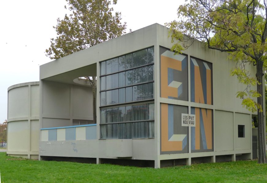
Ozenfant and Jeanneret conceived the Esprit Nouveau pavilion and its furnishings as a model of standardized industrial design for the masses. The building was to be made of inexpensive modern materials while the lighting fixtures and glassware were mass-produced items, the latter made for chemistry laboratories. Paintings by the Purists and Léger decorated the walls, their idealized compositions of abstracted objects the perfect complement to the basic geometric forms of the structure and its furnishings.
Purism reflected the optimistic attitudes of the post-World War I period of reconstruction in which France worked to rebuild its industries and war-torn land. The movement’s theories embraced machine-age industrial production and looked forward to an era of health and prosperity for the masses. In this modern age, Purist art was made to complement a rationally designed environment that efficiently met the needs of everyone.
Additional resources:
Carol Eliel, L’Esprit Nouveau: Purism in Paris, 1918-1925. Los Angeles County Museum of Art and Harry N. Abrams, 2001.
The School of Paris
In the center of the European pre-war art world, artists experimented with a variety of styles and media.
c. 1904 - 1939
Amedeo Modigliani, Young Woman in a Shirt
by DR. STEVEN ZUCKER and DR. BETH HARRIS
Video \(\PageIndex{5}\): Amedeo Modigliani, Young Woman in a Shirt, 1918, oil on canvas (Albertina, Vienna)
Constantin Brancusi, The Kiss
by DR. BETH HARRIS and DR. STEVEN ZUCKER
Video \(\PageIndex{6}\): Constantin Brancusi, The Kiss, 1916, limestone, 58.4 x 33.7 x 25.4 cm (Philadelphia Museum of Art)
Smarthistory images for teaching and learning:


Photography
Henri Cartier-Bresson, Behind the Gare Saint-Lazare
by DR. SHANA GALLAGHER-LINDSAY and DR. BETH HARRIS
Video \(\PageIndex{7}\): Henri Cartier-Bresson, Behind the Gare Saint-Lazare, Paris, 1932
De Stijl
Members of the De Stijl movement used abstract, geometric principles and primary colors in painting, sculpture, design, and architecture.
1917 - 1931
De Stijl, Part I: Total Purity
by DR. CHARLES CRAMER and DR. KIM GRANT
De Stijl is one of the most recognizable styles in all of modern art. Consisting only of horizontal and vertical lines and the colors red, yellow, blue, black, and white, De Stijl was applied not only to easel painting but also to architecture and a broad range of designed objects from furniture to clothing. This is not inappropriate. Despite its close association with Piet Mondrian, the artist thought of it not as his personal style, but as De Stijl – The Style; it was objective and universal, applicable to all people and all things.
We will discuss De Stijl in three parts. This first part will introduce the elements of De Stijl, the second will examine the processes of abstraction that led to De Stijl, and the third part will examine the application of De Stijl to architecture and design.
De Stijl and Theosophy
Mondrian partially attributed his arrival at the elements of De Stijl to Theosophy, an occult philosophy promoted by thinkers such as Madame Blavatsky and Rudolf Steiner. Theosophists sought knowledge of higher, spiritual truths than those available to science, and often claimed to have access to those truths through direct spiritual insight. Mondrian became a member of the Dutch Theosophical Society in 1909, and painted a number of works around that time that explore mystical awareness.
His Evolution triptych (1910-11) shows the “three spirits” that Madame Blavatsky described as living within humankind: terrestrial (on the left), sidereal or astral (on the right), and divine (in the center). Such works show Mondrian’s interest in finding a visual language for expressing spiritual things, but they are far from the radical abstraction that he later arrived at. In fact, allegorical paintings of spiritual and occult subjects have a long tradition, with roots in the nineteenth-century Symbolist movement, and even farther back in the Renaissance and Baroque periods.
While Theosophy certainly informed the spiritual goals of De Stijl, its influence on the actual style of De Stijl is less clear. The Dutch mathematician and Theosophist M. H. J. Schoenmaekers, whom Mondrian met in 1916, wrote an essay the year before in which he asserted that, “The three essential colors are yellow, blue, and red.” He also declared that, “The two fundamental and absolute oppositions that shape our planet are: the horizontal line of the earth’s trajectory around the Sun, and the vertical trajectory of the rays that emanate from the center of the sun.”\(^{[1]}\)
These quotes are, however, just two examples from a torrent of wildly different suggestions that Theosophists made for visualizing the spiritual. Other artists influenced by Theosophy developed very different styles (Vassily Kandinsky and Hilma af Klint, for example). So why did the practitioners of De Stijl believe that their style was the most authentic expression of universal spirituality?
Blue, yellow, red, black, white
It helps to think of the elements of De Stijl as building-blocks: structural components that, in different combinations, can be used to make everything in the universe. Take for example De Stijl’s limited palette of red, yellow, and blue. These are what are called the “primary”colors, because if you had perfectly pure versions of each of these colors, you could create every other color. Red + yellow in different proportions create every shade of orange; blue + yellow create the shades of green; blue + orange create brown, and so on. Similarly, by combining black and white, you can make every shade of gray in between.
Red, yellow, and blue are “primary” colors in another sense as well. Although you can mix red and yellow to make orange, or red and blue to make violet, you cannot mix violet and orange, or even red-violet and red-orange, to make pure, primary red. It is for this reason that the artists of De Stijl could not have chosen orange, lavender, and teal. Not only are those colors impure (teal is a mixture of blue and green), they are also not fully representative of the color spectrum; if you had only those three colors you could never create red, yellow, or blue.
Color printers rely on this principle, although the primaries that work best in this case are cyan (a light greenish blue), magenta (a blueish red), and yellow. Together with black ink and the white of the page itself, a four-cartridge CMYK printer can reproduce every color in a photograph of you and your friend at the beach, from the subtle teals of the water, to the dull reddish-brown of the rocks, to the brilliant yellow of the sand.
Horizontal and vertical lines
The justification for De Stijl’s use of only horizontal and vertical lines is somewhat trickier, and it helps to think of them not as ‘lines’ but as directional forces or vectors: dynamic structuring factors, rather than stable structural components. If you recall from working with coordinate planes in mathematics, any kind of regular line can be expressed in a formula that describes the movement of a point along a regular grid defined by ‘x,’ the horizontal axis, and ‘y’, the vertical axis.
A diagonal line at a forty-five degree angle would be expressed as x = y, for example: for every unit moved in a horizontal (x) direction, move the same unit in a vertical (y) direction. The parabola of a soccer ball punted upfield might be x2 = -8y +100. Thus any rational line could be expressed mathematically as a motion defined by two interacting forces, a horizontal force and a vertical force.
To put this into what may be more familiar terms, think of an Etch-a-Sketch machine. There are just two control knobs, one for the horizontal motion of a black line on the gray screen, and the other for vertical motion. But by simultaneously manipulating both knobs, you can draw diagonal or curved lines to create triangles and circles — or a baseball cap, a human face, and even a chaotic scribble that would seem impossible to reduce to an “x, y” formula.
De Stijl’s horizontal and vertical lines are like the shape-making vectors controlled by the Etch-a-Sketch knobs. In the same way that a printer combines just a few primaries to make any color, by manipulating the horizontal and vertical forces of an Etch-a-Sketch, you can draw anything in the universe, from a box, to a tree, to the Taj Mahal.
Building-blocks of the universe
To give one more analogy by way of conclusion, the elements of De Stijl are the artist’s equivalent of the physicist’s fundamental building blocks: protons, neutrons, and electrons. With a bucket of each of these atomic building blocks, you could make anything in the universe, from hydrogen (one proton + one electron), to oxygen (eight protons + eight electrons + eight neutrons), to water (two hydrogen atoms + one oxygen atom), to a protein, a paramecium, and eventually even a person.
Similarly, if you have buckets of pure red, yellow, blue, black and white paint, and a lot of skill on an Etch-a-Sketch machine, you could represent absolutely anything. It is in this sense that De Stijl is universal, “the” style, and not just the personal style of Piet Mondrian or the style of some specific region or period in time. Although our own historical moment tends to celebrate cultural and individual differences and reject “absolutes” or “universals,” De Stijl has a decent claim to being, as its name asserts, The Style for all things, all time, and all people everywhere.
Notes:
- M. H. J. Schoenmaekers, Het Nieuwe Wereldbeeld (Van Dishoeck: Bussum, 1915), pp. 224,
102 (authors’ translation).
Additional Resources:
Yve-Alain Bois, et.al., Piet Mondrian, 1872-1944 (Exhibition catalog: National Gallery of Art and MoMA, 1994).
Piet Mondrian, Harry Holtzman, and Martin S. James, The New Art–the New Life: The Collected Writings of Piet Mondrian (Boston: G.K. Hall, 1986).
Michel Seuphor. Piet Mondrian: Life and Work (New York: Harry N. Abrams, 1969).
De Stijl, Part II: Near-Abstraction and Pure Abstraction
by DR. CHARLES CRAMER and DR. KIM GRANT
Theo van Doesburg’s Composition VIII consists of just fourteen rectangles. One nearly perfect yellow square in the center is surrounded by thirteen rectangles of different proportions: four green, three blue, four black, and two red. They are scattered evenly across the surface, not overlapping (although two pairs abut), and are carefully aligned with the edges of the rectangular white canvas. This seems to be a good, and fairly early, example of what is called “abstract art,” art without any subject matter or visual resemblance to actual objects in nature.
In what appears to be a ludicrous parenthetical statement, however, the title also declares the work to be a cow. And indeed, there are a number of preliminary studies by van Doesburg that may justify that subtitle.
One graphite drawing is immediately recognizable as a cow or bull grazing head down in a field, despite its sketchy execution and the simplification of its muscular contours. Another graphite drawing squares off those contours; the cow’s hip and thigh muscles are simplified into a block, and the rear leg is straightened into an elongated peg. A painted study continues this squaring off process. The head is now composed of a few rectangles: a broad forehead in purple, a black snout terminating in a nested red band, and a yellow antenna-like vertical suggesting an ear.
Now it is possible to see Composition VIII as a cow as well. The central yellow square is a massive, weighty ribcage, and the black rectangle on the left is a hip, with the blue and red below representing two legs. In the lower right is a tripartite head: blue forehead, black snout, and red mouth/nostrils. The title is appropriate after all; at first sight what we see is just an abstract “composition” of colored rectangles, but hidden within is a cow.
Near-abtraction and pure abstraction
This set of works introduces what is an important distinction for modern art: the difference between near-abstract art and pure-abstract (non-representational) art; or better yet, the difference between abstraction as a verb and abstraction as a noun. Pure-abstract art is abstraction as a noun: the work is begun without reference to natural objects, and intends no reference to natural objects.
The artists of De Stijl did eventually end up practicing pure-abstract art, but first van Doesburg and Mondrian spent nearly a decade in the gray area of near abstraction: starting with recognizable scenes, then drawing them away from their natural appearances. This is to practice abstraction as a verb: the etymology of the word derives from “ab” = “away” + “trahere” = ‘”to pull” (the same root as the word “tractor”).
A gradual process
In his 1919 “Dialogue on the New Plastic,” Mondrian explains how he “very gradually” arrived at the straight lines of De Stijl, starting with the complex lines found in nature: “First I abstracted the capricious, then the freely curved, and finally the mathematically curved.” [1] This use of the term abstraction as a verb suggests a process; by gradually “pulling away” the contingencies and imperfections of natural objects, the artist can gradually purify nature of its “accidents” to discover its essence. This process would eventually lead to a spiritual abstract art, abstraction as a noun, as Mondrian had already realized in a note written in a sketchbook around 1912-14:
If one conceived of these forms as increasingly simple and pure, commencing with the physical visible forms of appearance, then one passes through a world of forms ascending from reality to abstraction. In this manner one approaches Spirit, or purity itself.Piet Mondrian, Two Mondrian Sketchbooks, ed. and trans. R. P. Welsh and J. M. Joosten (Amsterdam: Meulenhoff International, 1969), p. 36.
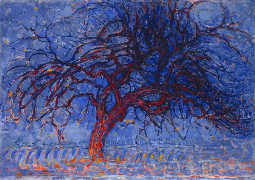
Abstraction as purification
Mondrian’s work between around 1908 and 1920 exemplifies this gradual abstracting process starting from a number of natural objects and scenes: a landscape of a pier and ocean, a church in the Dutch town of Domburg, and, most famously, trees.
In the tree series, Mondrian starts with an immediately recognizable apple tree. The color is intensified, but the cool blues suggest the deepening twilight of its title “Evening,” and the red tree glows as if reflecting the sunset. The branches are carefully rendered; every twist and knot is shown, and the texture of the rough bark is conveyed by thick, parallel strokes. The painting concentrates on the surface appearance of the tree, viewed in the light of a specific time of day.
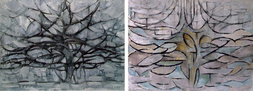
In a later painting of the same subject Mondrian reduced the color to all grays, eliminating any reference to lighting conditions. The branches have also been simplified into sweeping strokes, as though Mondrian was rendering a general blueprint of an apple tree’s spreading growth rather than the details of a particular tree. In a third painting those sweeping curves are generalized further into almost mathematical regularity, with near-perfect parabolas representing the tree’s uppermost branches stretching toward the sky.
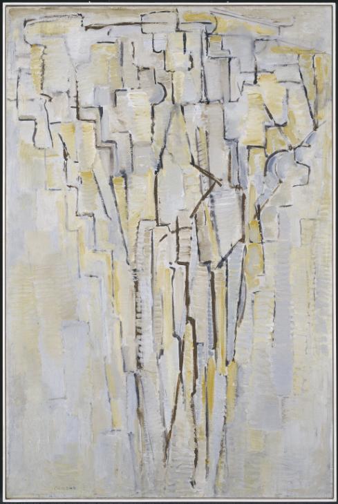
By 1913 Mondrian had reduced most of the curved and diagonal lines of his trees to a step-pattern of horizontal and vertical lines, almost literally embodying his later assertion that he proceeded by abstracting first the “capricious” curves, then the “freely curved,” and finally the “mathematically curved” in order to arrive at the horizontal and vertical lines of De Stijl.
Composition and harmony
After nearly a decade of abstracting from carefully-observed natural objects, the project of De Stijl changed. Although it is not obvious when looking at their works, at a certain point Mondrian and van Doesburg stopped working from nature – from trees or cows – and began working directly with the elements of De Stijl: horizontal and vertical lines bounding flat areas of yellow, blue, red, black, and white. At this point the focus of the work changed from abstraction as a verb to abstraction as a noun, from distillation to composition.
Having discovered the pure building blocks of the universe, they began using those building blocks to create compositions independent of any reference to natural objects. The goal was now to create an aesthetic harmony or compositional balance that is not available in nature.
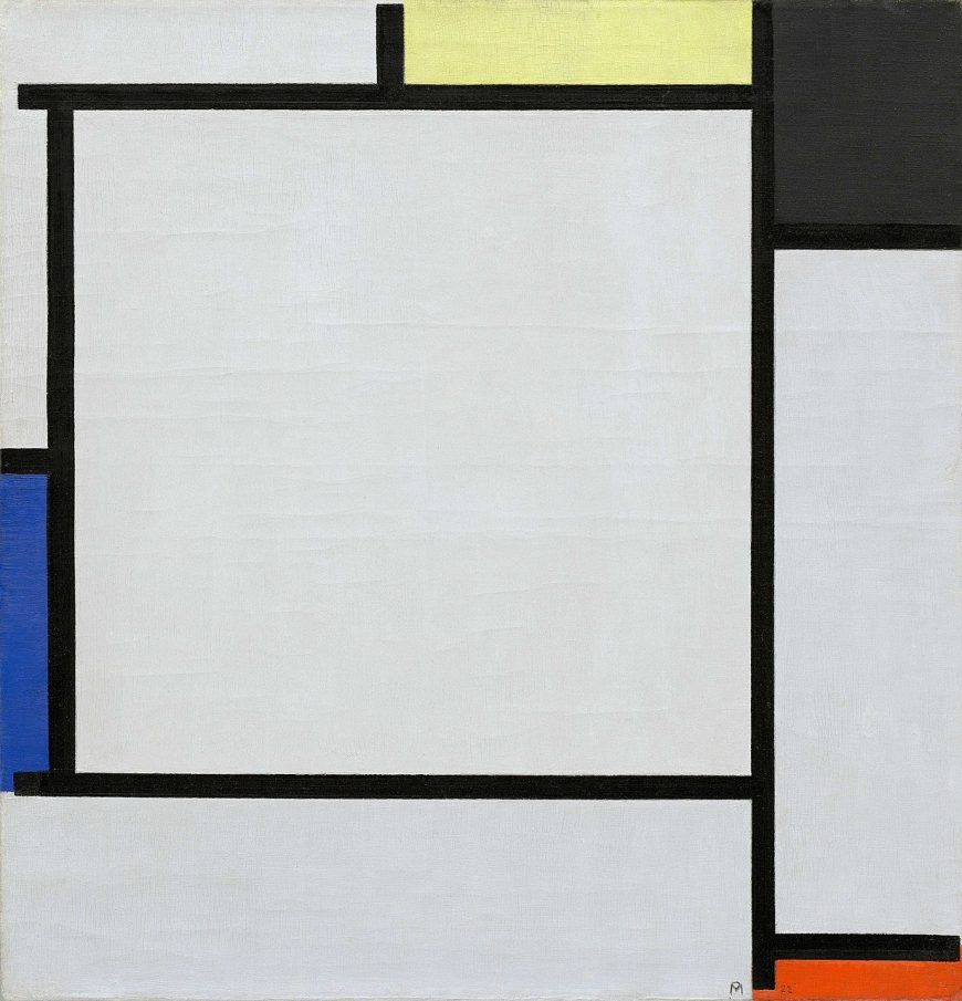
For example, in Tableau 2 (1922), an equilateral triangle is created within the square of the canvas by balancing the three areas of color around its edges: the red to the lower right, the blue just below middle left, and the yellow and black corner in the upper right. The square format of the canvas gives a sense of overall stability, while the implied triangle tilts toward the right, creating a dynamic internal equilibrium.
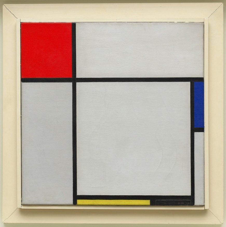
Composition with Red, Blue, Yellow, and Black (1929) has an asymmetrical but satisfying balance around a square in the lower right. Three colored rectangles surround this square: a red square in the upper left joins with the yellow rectangle below and the blue rectangle to the right to create another implied triangle. In both compositions, as a response to the different visual “weights” of the three primary colors, the pale yellow rectangles are paired with a black rectangle to balance the more visually powerful red and dark blue.
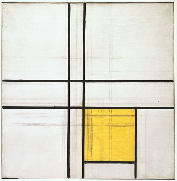
This project of creating dynamically balanced compositions using the elements of De Stijl occupied Mondrian for two decades. Unfinished works from this period show his intuitive and sometimes very tentative and slow process. He would push black lines and color areas around until they came together in a composition that satisfied his quest for absolute purity and total harmony.
Irritated by nature
Mondrian’s early biographer Michel Seuphor described how the artist was so “irritated” by nature and the color green that when seated facing the window, he asked if he could change places so he would not have to look at the trees outside. [2] This may seem odd since many people think a view of trees is pleasant, and Mondrian himself had made a careful study of trees in order to arrive at De Stijl. But for Mondrian, nature was impure, contingent, materialistic, and aesthetically dissonant; it was the opposite of the pure, spiritual harmony that he sought and found in De Stijl.
Notes:
- Piet Mondrian, “Dialog on the New Plastic,” De Stijl February-March 1919, in Harry Holtzman and Martin S. James, eds. and trans., The New Art – The New Life: The Collected Writings of Piet Mondrian (New York: Da Capo Press, 1993), p. 77.
- Michel Seuphor, Mondrian: Life and Work, (New York: Harry Abrams, 1956), p. 73.
De Stijl, Part III: The Total De Stijl Environment
by DR. CHARLES CRAMER and DR. KIM GRANT
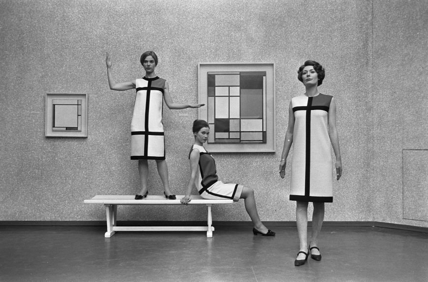
In 1965, French fashion designer Yves Saint Laurent created a set of six cocktail dresses in the style of Piet Mondrian, using only red, yellow, blue, and white rectangles bounded by black horizontal and vertical lines. The cut of the dresses was A-line, with no darts or belt, and the weight of the fabric was calculated to ensure that it hung straight, with minimal wrinkling or movement. Today, an internet search for “Mondrian car,” “Mondrian chair,” “Mondrian tea towel,” and the like will find any number of De Stijl-inspired home products for purchase.
A universal style
While it may seem like crass commercial exploitation to see the pure, spiritual art of De Stijl applied to product design, in a way it actually serves to fulfill the ultimate long-term goal of the movement, which was to make the style truly universal. Mondrian wrote many essays discussing how De Stijl could be seen in modern architecture, product design, city planning, and even music.
Similarly, Theo van Doesburg, editor of the journal De Stijl, was an architect who preferred to design total environments, including the furniture and wall decoration. Bart van der Leck, one of the co-founders of De Stijl (although he refused to sign their “manifesto”), designed De Stijl-inspired stained glass, a typeface, and posters, as well as hangings and carpets sold by the Dutch department store Metz & Co.
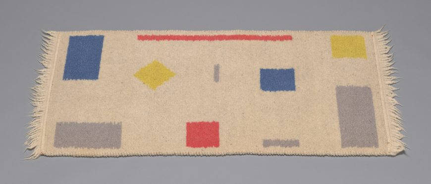
Provided that all of these products not only use the elements of De Stijl, but are also composed in a way that is sensitive to the sort of harmonious balance sought by Mondrian and his fellow artists, this expansion beyond the museum painting and into the terrain of everyday life is entirely appropriate.
Entering paradise
If a single De Stijl painting represents an oasis of absolute purity and harmony in a world that is woefully short of both of those qualities, and if an encounter with a De Stijl painting can help to purify and harmonize the human spirit, think how it would be to live in an entire De Stijl environment.
Mondrian himself sought to move beyond the isolated easel painting. Although there are inevitable aesthetic compromises that come with designing architecture, enough purity and harmony can be retained that the individual living in an entire De Stijl environment will be, in Mondrian’s words, “uplifted through beauty toward universal life.”\(^{[1]}\)
When Mondrian moved back to Paris following the end of World War One, he painted all of his furniture white and decorated the walls with planes of colored card stock. His friend Maud van Loon described the effect of coming into this space as a spiritual oasis:
The stairwell was horrific, terribly shabby, unsightly … Then you walked through his door and into a brilliantly white studio with a color plane here and there. As you stepped inside, you were in Paradise.Cited in Cees de Jong, ed., Piet Mondrian: The Studios (London: Thames & Hudson, 2015), p. 96.
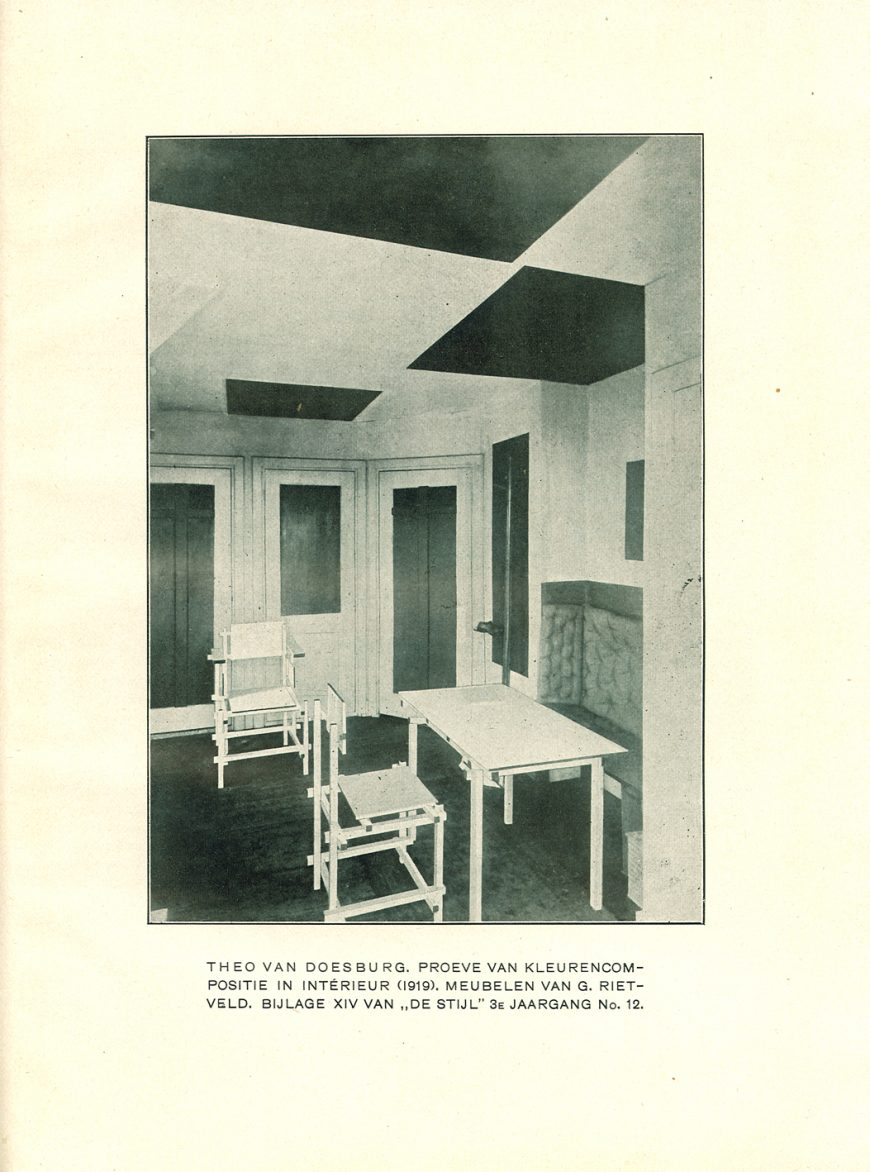
De Stijl architecture
Architecture and interior design were important to De Stijl from the beginning, and in fact architectural renderings dominate the illustrations in the short-lived journal dedicated to the movement, De Stijl magazine. However, in order for architecture to become, in effect, a three-dimensional De Stijl environment, rigorous rules need to be followed.
Ornament must be excluded in order to purify the space as much as possible, so any merely decorative objects or elements must be banished. Functional objects such as chairs and lamps need to be included, of course, but they should conform with the pure elements of De Stijl as much as possible.
Mondrian acknowledged that whereas a painter has total freedom about what shapes to use and where to place them, “Utility or purpose indeed affects architectural beauty … Function can even limit beauty: some utilitarian things … may require a round form, although the straight expresses the profoundest beauty.” In such cases, the designer should use “a pure circle, which is far from capricious nature” and closer to the rigorous geometric purity of De Stijl.\(^{[2]}\)
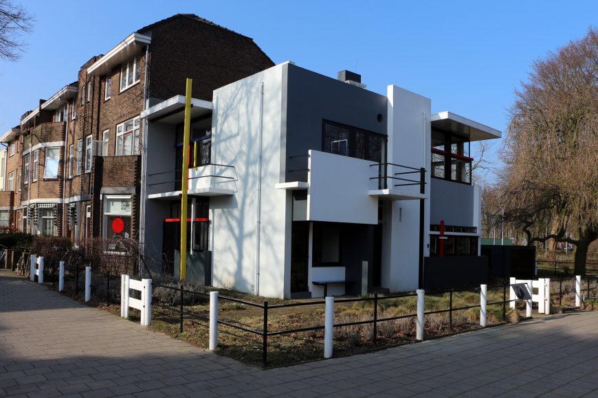
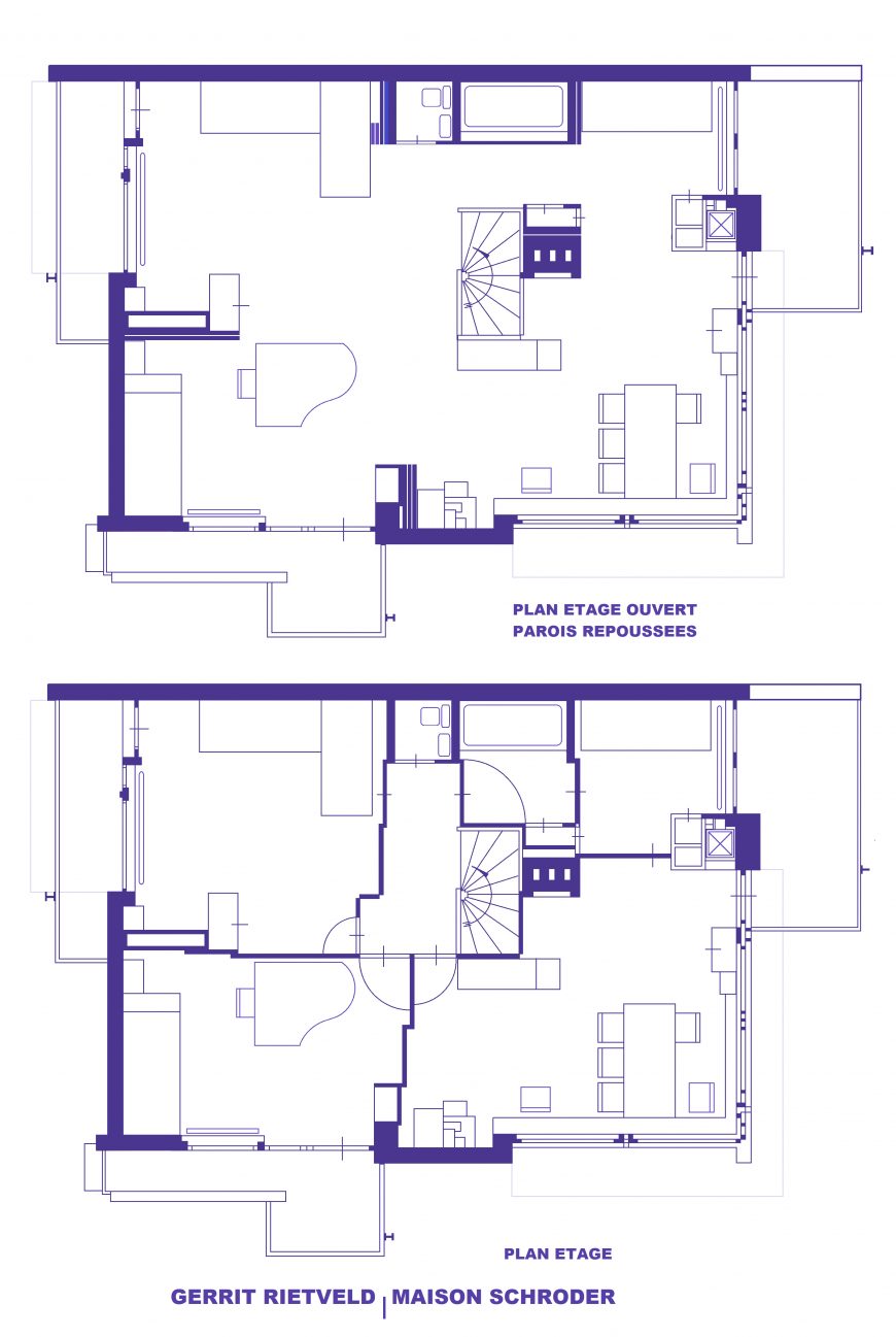
Rietveld’s Schröder House
The best-known example of a total De Stijl environment is Gerrit Rietvelt’s Schröder House (1924). Commissioned by Truus Schröder, a recently widowed mother of three, the house clings oddly to the end of a street of row houses in Utrecht, The Netherlands. Its exterior is composed entirely of white and neutral gray rectangular planes, punctuated by horizontal and vertical linear elements in black, red, yellow, and blue.
One of the architect’s intentions was to integrate the house with its environment, so entire walls and even corners are opened up by windows and French doors. The interior was also designed to be open, especially on the top floor, which had sliding panels that could create separate rooms or one flowing space.
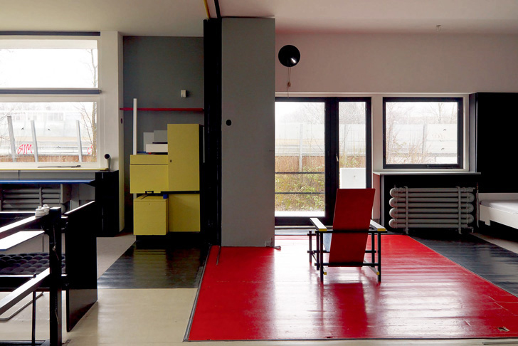
Rietveld also designed as much of the interior and furnishings as possible using the basic tenets of De Stijl. A hanging lamp seems to demonstrate the three dimensions of space: length, width, and height, and is so stripped of unnecessary ornament that it hangs from its own electric cords. His famous Red Blue Chair shows an element of the compromise that Mondrian noted for designing functional objects. A perfectly horizontal seat and perfectly vertical back would be extremely uncomfortable, so Rietveld tilted both slightly to accommodate the organic imperfection of the human body. But the armature of the chair is made of modular beechwood slats oriented in the three dimensions, and of course all is painted in pure De Stijl red, blue, yellow, and black.
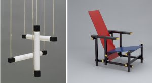
The individual and the universal
De Stijl was one of a number of modern movements that believed its utopian aspirations would be best achieved by creating total environments, over which the designer (not the inhabitant) had complete control. As we imagine living in Rietveld’s Schröder House, we may be put off, not only by the barren minimalism of the hard, geometric surfaces, but also by the total lack of individual personality or whimsy. These are environments to which the occupant is expected to conform, rather than adapting the decor to fit the individual tastes of the occupant.
What may appear repugnant in our era, which prizes individual differences and self-expression, was actively embraced by many modern architects and designers. For Mondrian, “If our material environment is to be pure in its beauty and therefore healthy and practical, it can no longer be the reflection of the egotistic sentiments of our petty personality.” If a total De Stijl environment were to expand from the painting, to the home or office interior, to the street and city itself, then all individual components of the environment must be subsumed to an overarching, homogeneous design. Mondrian continues, “And man? Nothing in himself, he will be part of the whole; and losing his petty and pathetic individual pride, he will be happy in the Eden he will have created!”\(^{[3]}\)
Notes:
- Piet Mondrian, “Neo-Plasticism: The Home – The Street – The City,’ in De internationale revue i10 (Amsterdam, 1927), as translated in Harry Holtzman and Martin S. James, eds. and trans., The New Art – The New Life: The Collected Writings of Piet Mondrian (New York: Da Capo Press, 1993), p. 208.
- Piet Mondrian, “The Realization of Neo-Plasticism in the Distant Future and in Architecture Today,” originally published in De Stijl (March and May, 1922), as translated in The New Art – The New Life, p. 171.
- Piet Mondrian, “Neo-Plasticism: The Home, The Street – The City” (1926), as translated in The New Art – The New Life, pp. 208, 212.
Additional Resources:
Nancy J. Troy, The De Stijl Environment (Cambridge, MA and London: The MIT Press, 1983).
Cees W. De Jong, ed. Piet Mondrian: The Studios (London: Thames & Hudson, 2015).
Piet Mondrian
Mondrian, Composition with Red, Blue, and Yellow
Pure abstract art becomes completely emancipated, free of naturalistic appearances.
—Piet Mondrian, 1929\(^{[1]}\)
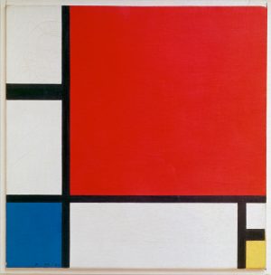
Walking up to Piet Mondrian’s painting, Composition with Red, Blue, and Yellow can be a baffling experience (see image at left). The canvas is small and uses only the simplest of colors: red, blue, yellow, white and black. The composition is similarly reduced to the simplest of rectilinear forms, squares and rectangles defined by vertical and horizontal lines. One would hardly suspect that we are seeing the artist’s determination to depict the underlying structure of reality.
Neo-Plasticism
Mondrian called his style Neo-Plasticism or “The New Plastic Painting,” the title of his famous 1917 essay promoting abstraction for the expression of modern life. Don’t be confused by Mondrian’s use of the term “plastic.” He uses it to refer to the plastic arts—media such as sculpture, that molds three-dimensional form, or, in Mondrian’s case, painting on canvas. For centuries, European painters had attempted to render three-dimensional forms in believable spaces—creating convincing illusions of reality (click here for an example—Vermeer’s Young Woman with a Water Pitcher). In contrast, Mondrian and other modernists wanted to move painting beyond naturalistic depiction to focus instead on the material properties of paint and its unique ability to express ideas abstractly using formal elements such as line and color.
Mondrian believed his abstraction could serve as a universal pictorial language representing the dynamic, evolutionary forces that govern nature and human experience. In fact, he believed that abstraction provides a truer picture of reality than illusionistic depictions of objects in the visible world. Perhaps this is why Mondrian characterized his style as “abstract real” painting.
Abstraction and human progress
Mondrian’s earliest paintings were quite traditional in both subject and style. He studied at the art academies in the Hague and in Amsterdam in his home country of the Netherlands. Then, as with many artists during the early twentieth century, he began to emulate a variety of contemporary styles, including Impressionism, Neo-Impressionism, and Symbolism in an effort to find his own artistic voice. The impact of these modern movements can be seen in the development of Mondrian’s painting which, over time, shows the dissolution of recognizable objects into increasingly pared-down structures (see the three depictions of trees below). His emphasis on line, color, and geometric shape sought to highlight formal characteristics.
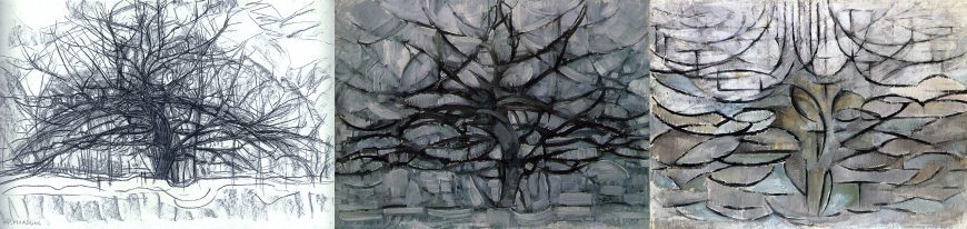
Mondrian was inspired by Cubism, a movement led by Pablo Picasso and Georges Braque that explored the use of multiple perspectives. Mondrian began experimenting with abstracted forms around the time he moved to Paris in 1912.
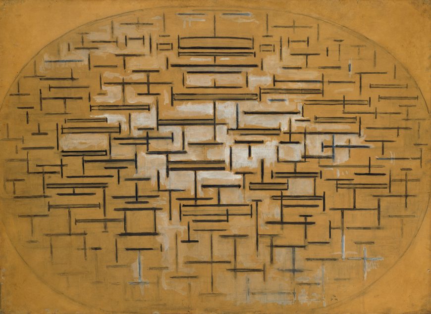
His famous “Pier and Ocean” series (see above), which reduces the landscape to arrangements of vertical and horizontal lines, exemplifies this period in Mondrian’s career. He wanted to push beyond Cubism’s strategy of fragmenting forms (café tables were a favorite subject), and move toward pure abstraction. However, this change in Mondrian’s process did not take place overnight and he continued to work in a studied, methodical way. In fact, his production of paintings within a series of canvases was part of Mondrian’s method, and how he worked through thematic and compositional issues. Because Mondrian continued to rely on the series throughout his career, we can see the progression of his pictorial language even in his later, purely abstract work.
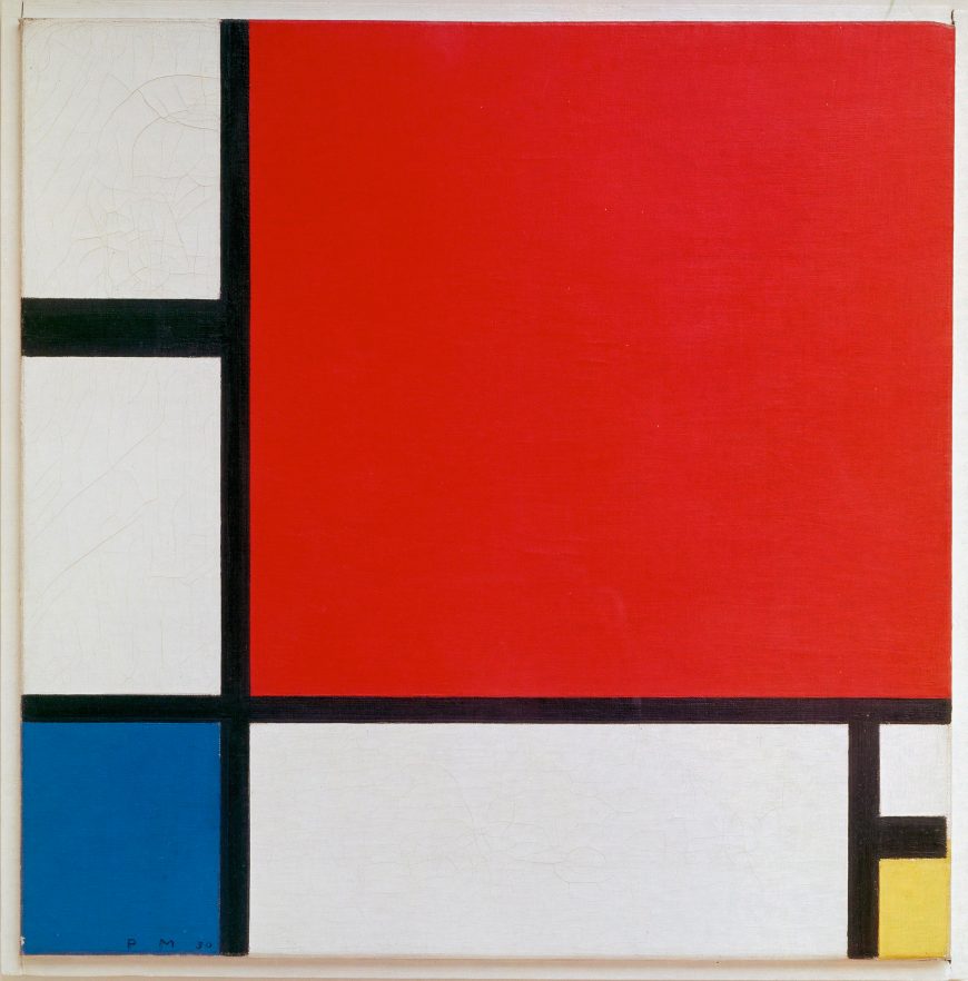
His use of the term “composition” (the organization of forms on the canvas) signals his experimentation with abstract arrangements. Mondrian had returned home to the Netherlands just prior to the outbreak of the First World War and would remain there until the war ended. While in the Netherlands he further developed his style, ruling out compositions that were either too static or too dynamic, concluding that asymmetrical arrangements of geometric (rather than organic) shapes in primary (rather than secondary) colors best represent universal forces. Moreover, he combined his development of an abstract style with his interest in philosophy, spirituality, and his belief that the evolution of abstraction was a sign of humanity’s progress.
Philosophy & Theosophy
Some art historians have viewed Mondrian’s painting as an expression of his interest in dialectical relationships, ideas advanced by the early nineteenth-century German philosopher Hegel that art and civilization progress by successive moments of tension and reconciliation between oppositional forces. For Mondrian then, composing with opposites such as black and white pigments or vertical and horizontal lines suggest an evolutionary development.
Mondrian’s painting may also reflect his association with the Theosophical Society, an esoteric group that had a strong presence in Europe. Theosophists were interested in opposites as an expression of hidden unity. During WWI, Mondrian stayed in Laren, a village with a thriving art community near Amsterdam. He lived near M.H.J. Schoenmaeker, a prominent Theosophist who used terms such as “New Plastic” to promote his ideas on spiritual evolution and the unification of the real and the ideal, the physical and immaterial. In Theosophy, lines, shapes, and colors symbolized the unity of spiritual and natural forces.
De Stijl
While in Holland, Mondrian founded the movement called De Stijl (The Style) with the artist Theo van Doesburg. The two shared many ideas about art as an expression of relationships, particularly the relationships between art and life. Because these artists believed that the evolution of art coincided with the modern progression of humankind, they thought that New Plasticism could, and should, encompass all of human experience. Van Doesburg founded the journal De Stijl to promote these ideas and demonstrate that their geometric abstraction, based on their theory of spiritual and pictorial progress, could form a total environment, and impact modern life. Although Mondrian and van Doesburg eventually parted ways, their movement to combine modern art and living was so influential that the abstract, geometric principles and use of primary colors they applied in painting, sculpture, design, and architecture still resonate today.
Dynamic contrasts
Mondrian’s Composition with Red, Blue, and Yellow demonstrates his commitment to relational opposites, asymmetry, and pure planes of color. Mondrian composed this painting as a harmony of contrasts that signify both balance and the tension of dynamic forces. Mondrian viewed his black lines not as outlines but as planes of pigment in their own right; an idea seen in the horizontal black plane on the lower right of the painting that stops just short of the canvas edge (see image above). Mondrian eradicates the entire notion of illusionistic depth predicated on a figure in front of a background. He achieves a harmonious tension by his asymmetrical placement of primary colors that balance the blocks of white paint. Notice how the large red square at the upper right, which might otherwise dominate the composition, is balanced by the small blue square at the bottom left. What’s more, when you see this painting in a person you can discern just how much variation is possible using this color scheme—and that Mondrian used varying shades of blacks and whites, some of which are subtly lighter or darker. Seen up close, this variety of values and textures create a surprising harmony of contrasts. Even the visible traces of the artist’s brushwork counter what might otherwise be a rigid geometric composition and balance the artist’s desire for a universal truth with the intimately personal experience of the artist.
\(^{[1]}\)Piet Mondrian, “Pure Abstract Art, 1929” in The New Art—The New Life: The Collected Writings of Piet Mondrian, edited and translated by Harry Holtzman and Martin S. James (Boston: G.K. Hall& Co.), p. 224.
Additional resources
Marty Bax, Complete Mondrian (Aldershot, Hampshire, U.K.: Lund Humphries, 2001).
Yve-Alain Bois, et.al., Piet Mondrian, 1872-1944 (Boston: Little, Brown & Co., 1994).
Piet Mondrian, Harry Holtzman, and Martin S. James, The New Art–the New Life: The Collected Writings of Piet Mondrian (Boston: G.K. Hall, 1986).
Nancy Troy, The De Stijl Environment (Cambridge: MIT Press, 1983).
Piet Mondrian, Composition No. II, with Red and Blue
by DR. BETH HARRIS and DR. STEVEN ZUCKER
Video \(\PageIndex{8}\): Piet Mondrian, Composition No. II, with Red and Blue, oil on canvas, 1929 (original date partly obliterated; mistakenly repainted 1925 by Mondrian), oil on canvas, 15 7/8 x 12 5/8″ / 40.3 x 32.1 cm (Museum of Modern Art, New York)
TateShots: Piet Mondrian
by TATE
Video \(\PageIndex{9}\): Co-curator Michael White explores how Mondrian’s studio became a way of creating abstract space outside his paintings.
British art and literature
British Art and Literature During WWI
The Old Guitarist, and the question of beauty
by DR. BETH HARRIS and DR. STEVEN ZUCKER
Video \(\PageIndex{10}\): Pablo Picasso, The Old Guitarist, late 1903 – early 1904, oil on panel, 122.9 × 82.6 cm (Art Institute of Chicago, © 2018 Estate of Pablo Picasso)