1.16: The Grid
- Page ID
- 67737
\( \newcommand{\vecs}[1]{\overset { \scriptstyle \rightharpoonup} {\mathbf{#1}} } \)
\( \newcommand{\vecd}[1]{\overset{-\!-\!\rightharpoonup}{\vphantom{a}\smash {#1}}} \)
\( \newcommand{\dsum}{\displaystyle\sum\limits} \)
\( \newcommand{\dint}{\displaystyle\int\limits} \)
\( \newcommand{\dlim}{\displaystyle\lim\limits} \)
\( \newcommand{\id}{\mathrm{id}}\) \( \newcommand{\Span}{\mathrm{span}}\)
( \newcommand{\kernel}{\mathrm{null}\,}\) \( \newcommand{\range}{\mathrm{range}\,}\)
\( \newcommand{\RealPart}{\mathrm{Re}}\) \( \newcommand{\ImaginaryPart}{\mathrm{Im}}\)
\( \newcommand{\Argument}{\mathrm{Arg}}\) \( \newcommand{\norm}[1]{\| #1 \|}\)
\( \newcommand{\inner}[2]{\langle #1, #2 \rangle}\)
\( \newcommand{\Span}{\mathrm{span}}\)
\( \newcommand{\id}{\mathrm{id}}\)
\( \newcommand{\Span}{\mathrm{span}}\)
\( \newcommand{\kernel}{\mathrm{null}\,}\)
\( \newcommand{\range}{\mathrm{range}\,}\)
\( \newcommand{\RealPart}{\mathrm{Re}}\)
\( \newcommand{\ImaginaryPart}{\mathrm{Im}}\)
\( \newcommand{\Argument}{\mathrm{Arg}}\)
\( \newcommand{\norm}[1]{\| #1 \|}\)
\( \newcommand{\inner}[2]{\langle #1, #2 \rangle}\)
\( \newcommand{\Span}{\mathrm{span}}\) \( \newcommand{\AA}{\unicode[.8,0]{x212B}}\)
\( \newcommand{\vectorA}[1]{\vec{#1}} % arrow\)
\( \newcommand{\vectorAt}[1]{\vec{\text{#1}}} % arrow\)
\( \newcommand{\vectorB}[1]{\overset { \scriptstyle \rightharpoonup} {\mathbf{#1}} } \)
\( \newcommand{\vectorC}[1]{\textbf{#1}} \)
\( \newcommand{\vectorD}[1]{\overrightarrow{#1}} \)
\( \newcommand{\vectorDt}[1]{\overrightarrow{\text{#1}}} \)
\( \newcommand{\vectE}[1]{\overset{-\!-\!\rightharpoonup}{\vphantom{a}\smash{\mathbf {#1}}}} \)
\( \newcommand{\vecs}[1]{\overset { \scriptstyle \rightharpoonup} {\mathbf{#1}} } \)
\(\newcommand{\longvect}{\overrightarrow}\)
\( \newcommand{\vecd}[1]{\overset{-\!-\!\rightharpoonup}{\vphantom{a}\smash {#1}}} \)
\(\newcommand{\avec}{\mathbf a}\) \(\newcommand{\bvec}{\mathbf b}\) \(\newcommand{\cvec}{\mathbf c}\) \(\newcommand{\dvec}{\mathbf d}\) \(\newcommand{\dtil}{\widetilde{\mathbf d}}\) \(\newcommand{\evec}{\mathbf e}\) \(\newcommand{\fvec}{\mathbf f}\) \(\newcommand{\nvec}{\mathbf n}\) \(\newcommand{\pvec}{\mathbf p}\) \(\newcommand{\qvec}{\mathbf q}\) \(\newcommand{\svec}{\mathbf s}\) \(\newcommand{\tvec}{\mathbf t}\) \(\newcommand{\uvec}{\mathbf u}\) \(\newcommand{\vvec}{\mathbf v}\) \(\newcommand{\wvec}{\mathbf w}\) \(\newcommand{\xvec}{\mathbf x}\) \(\newcommand{\yvec}{\mathbf y}\) \(\newcommand{\zvec}{\mathbf z}\) \(\newcommand{\rvec}{\mathbf r}\) \(\newcommand{\mvec}{\mathbf m}\) \(\newcommand{\zerovec}{\mathbf 0}\) \(\newcommand{\onevec}{\mathbf 1}\) \(\newcommand{\real}{\mathbb R}\) \(\newcommand{\twovec}[2]{\left[\begin{array}{r}#1 \\ #2 \end{array}\right]}\) \(\newcommand{\ctwovec}[2]{\left[\begin{array}{c}#1 \\ #2 \end{array}\right]}\) \(\newcommand{\threevec}[3]{\left[\begin{array}{r}#1 \\ #2 \\ #3 \end{array}\right]}\) \(\newcommand{\cthreevec}[3]{\left[\begin{array}{c}#1 \\ #2 \\ #3 \end{array}\right]}\) \(\newcommand{\fourvec}[4]{\left[\begin{array}{r}#1 \\ #2 \\ #3 \\ #4 \end{array}\right]}\) \(\newcommand{\cfourvec}[4]{\left[\begin{array}{c}#1 \\ #2 \\ #3 \\ #4 \end{array}\right]}\) \(\newcommand{\fivevec}[5]{\left[\begin{array}{r}#1 \\ #2 \\ #3 \\ #4 \\ #5 \\ \end{array}\right]}\) \(\newcommand{\cfivevec}[5]{\left[\begin{array}{c}#1 \\ #2 \\ #3 \\ #4 \\ #5 \\ \end{array}\right]}\) \(\newcommand{\mattwo}[4]{\left[\begin{array}{rr}#1 \amp #2 \\ #3 \amp #4 \\ \end{array}\right]}\) \(\newcommand{\laspan}[1]{\text{Span}\{#1\}}\) \(\newcommand{\bcal}{\cal B}\) \(\newcommand{\ccal}{\cal C}\) \(\newcommand{\scal}{\cal S}\) \(\newcommand{\wcal}{\cal W}\) \(\newcommand{\ecal}{\cal E}\) \(\newcommand{\coords}[2]{\left\{#1\right\}_{#2}}\) \(\newcommand{\gray}[1]{\color{gray}{#1}}\) \(\newcommand{\lgray}[1]{\color{lightgray}{#1}}\) \(\newcommand{\rank}{\operatorname{rank}}\) \(\newcommand{\row}{\text{Row}}\) \(\newcommand{\col}{\text{Col}}\) \(\renewcommand{\row}{\text{Row}}\) \(\newcommand{\nul}{\text{Nul}}\) \(\newcommand{\var}{\text{Var}}\) \(\newcommand{\corr}{\text{corr}}\) \(\newcommand{\len}[1]{\left|#1\right|}\) \(\newcommand{\bbar}{\overline{\bvec}}\) \(\newcommand{\bhat}{\widehat{\bvec}}\) \(\newcommand{\bperp}{\bvec^\perp}\) \(\newcommand{\xhat}{\widehat{\xvec}}\) \(\newcommand{\vhat}{\widehat{\vvec}}\) \(\newcommand{\uhat}{\widehat{\uvec}}\) \(\newcommand{\what}{\widehat{\wvec}}\) \(\newcommand{\Sighat}{\widehat{\Sigma}}\) \(\newcommand{\lt}{<}\) \(\newcommand{\gt}{>}\) \(\newcommand{\amp}{&}\) \(\definecolor{fillinmathshade}{gray}{0.9}\)The Grid
Why a Grid?
Helps artists and graphic designers:
• organize space
• create unity, rhythm, repetition
• proportionally enlarge an image or photo
• with page design and composition
https://www.tate.org.uk/research/publications/tate-papers/12/the-grid-as-a-checkpoint-of-modernity
Professional Applications
❖ The grid, along with the Rule of Thirds and the Golden Section, is a design (composition) solution with practical applications
❖ As an artist I often use the grid to design layouts for print and web applications
❖ I also use the grid to create illustrations for a variety of clients, including wineries (see below)
https://www.meleonarddesign.com/wine-labels?lightbox=dataItem-iiw09hx41


General History of Grid and Grid-related Art
http://www.artnowpakistan.com/the-grids-before-modernism/
Ancient Egyptians
https://www.ucl.ac.uk/museums-static/digitalegypt/art/artgrids.html
❖ The ancient Egyptians were the first to create and utilize the grid system as a step in the formation of their art
❖ Some of the unfinished temples from the Middle Kingdom have surviving grid line systems still showing on the stone walls
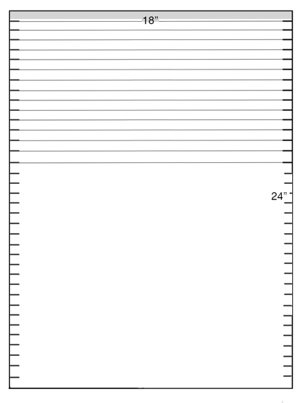
❖ The parts of the body relate to a grid consisting of eighteen squares from the soles of the feet to the hairline (see below)

Grid applied to unfinished tomb painting
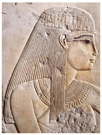
Typical Ancient Egyptian figure using the standard Egyptian proportional grid system
The Grid in Modern Figurative Art
❖ Post-Impressionism (1886-1905)
❖ Georges Seurat (1859-1891)
❖ Cubism (1910s-1020s)
❖ Pablo Picasso (1881-1973)
❖ Georges Braque (1882-1963)
Georges Seurat (1859-1891)
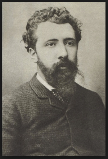
https://mymodernmet.com/pointillism-art-georges-seurat/
❖ Known for Pointillism:
❖ Pointillism is a technique of Post-Impressionist painting using tiny dots of various pure colors, which become blended in the viewer's eye. It was developed by Seurat with the aim of producing a greater degree of luminosity and brilliance of color.
❖ Although technically not a grid, there is a systematic application of the tiny dots of color creating a similar organized rhythm within the painting.
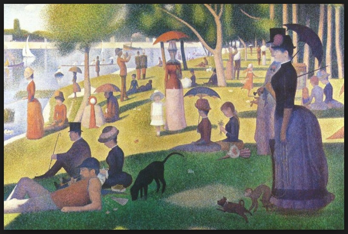
A Sunday Afternoon on the Island of La Grande Jatte, 1884 - 1886
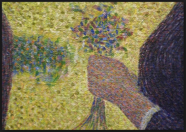
A Sunday Afternoon on the Island of La Grande Jatte, 1884 - 1886 (detail)
Pablo Picasso
https://www.metmuseum.org/toah/hd/pica/hd_pica.htm
https://www.nationalgallery.org.uk/artists/pablo-picasso
With Picasso and Georges Braque we see exploration into new ways of seeing and representing the world through visual art. Les Demoiselle d'Avignon cleared the way for new and radical ways of representing subject matter as well as creating art. It shocked viewers and some of Picasso's patrons. Nevertheless, it helped pave the way for the art movements that follow. One of those movements is Cubism.
https://www.moma.org/collection/works/79766
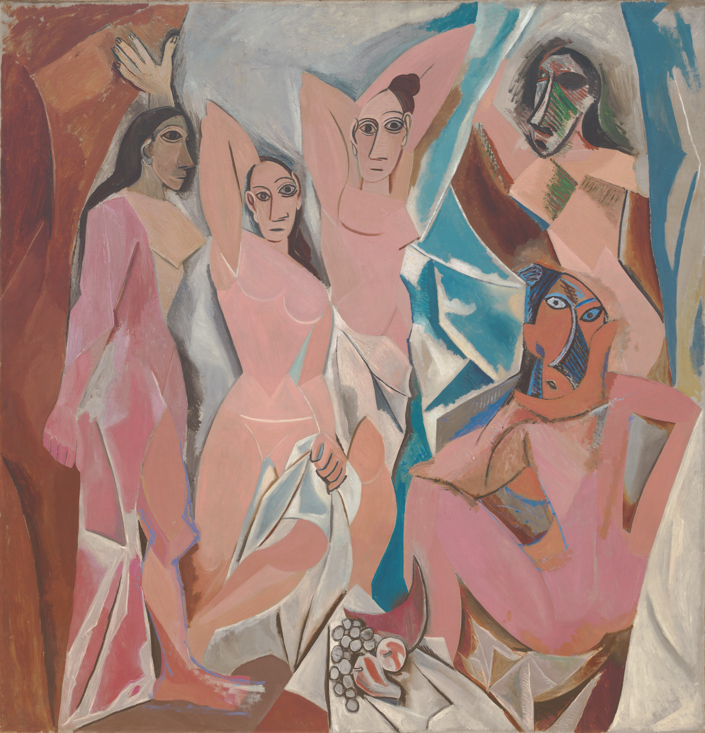
Les Demoiselles d' Avignon, 1907
Les Demoiselles includes symbolism and abstraction, however it is not considered Cubism at this point. Cubism, to follow shortly after this landmark painting, is a systematic approach to art involving an underlying framework upon which shapes are attached. There is, in a sense, a loose grid underlying the forms drawn or painted on the two-dimensional surface. Additionally, color becomes less and less important and the focus is on the placement and nature of the forms in the visual field. No longer is the intent to create a sense of depth, but rather the forms tumble out towards the viewer. A similar effect was achieved in the realistic Baroque paintings of Caravaggio where the depth of field was limited and the figures projected outward with hand and arm gestures.
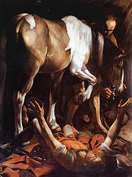
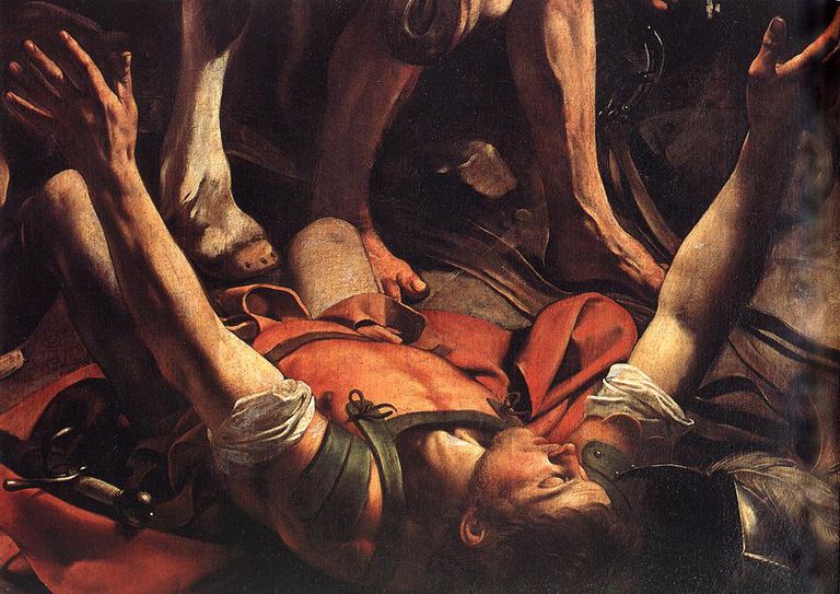
The Conversion of St. Paul, 1600
https://www.nationalgallery.org.uk/artists/michelangelo-merisi-da-caravaggio
https://www.metmuseum.org/toah/hd/crvg/hd_crvg.htm
Cubism also plays with our point of view. The same subject may be represented in a drawing or painting simultaneously from different angles. For example, a nose may be shown in profile, while an eye may be represented from the front. Where have we seen this before? The Ancient Egyptian grid proportional system for depicting the human form is similar to what Picasso and Braque were creating with their Cubist works. However, the Egyptians created logical images in their minds. They show the head in profile, but the eye from the front; the shoulders and hips from the front, but the hands and feet from the side. Each body part is drawn or painted to its most advantageous point of view. Logical. The below paintings are by Picasso.
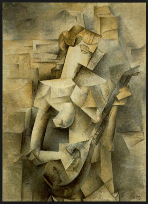
Girl with a Mandolin (1910)
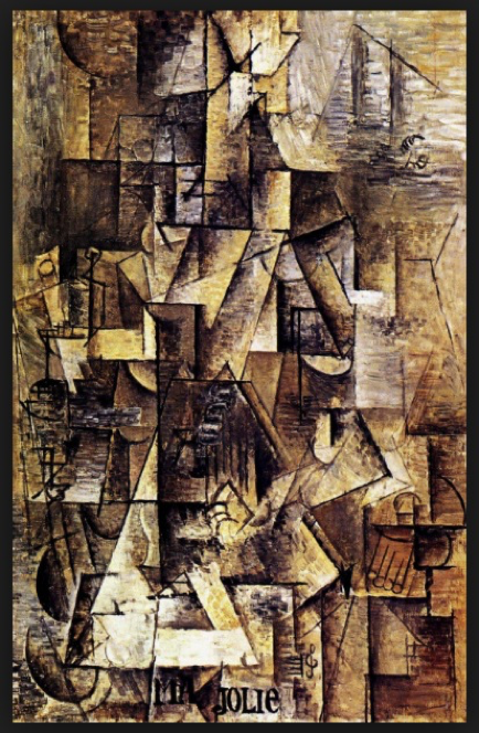
Ma Jolie (1911-1912)
Georges Braque
https://www.tate.org.uk/art/artists/georges-braque-803
https://www.sfmoma.org/artist/georges_braque/
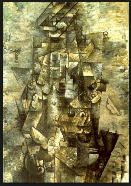
Man with a Guitar (1912)
Chuck Close (born 1940) - read more about Chuck Close at the end of the chapter
https://www.pacegallery.com/artists/chuck-close/
https://www.sfmoma.org/artist/chuck_close/
❖ He uses a grid to divide the image into small sections which he scales up onto a large canvas.
❖ His later work uses the grid as a structural element in the composition.
❖ Due to their large scale, Chuck Close's paintings can be read in different ways: up close each section of the grid becomes a small abstract color study; from a distance all the sections of the grid combine to create a realistic portrait.
Chuck Close’s Early Artistic Work
❖ Influenced by late Abstract Expressionism:
❖ Jackson Pollock
❖ Willem de Kooning (Chuck thought of himself as an inferior copy of de Kooning)
Jackson Pollock (1912-1956)
https://www.moma.org/artists/4675
https://www.guggenheim.org/artwork/artist/jackson-pollock
❖ Abstract Expressionist known for his drip paintings.
❖ Chuck Close saw his work and thought “that’s not art.” However, within a day or two, he was dripping paint on his work.
❖ Pollock, obviously was an influence on Chuck Close.
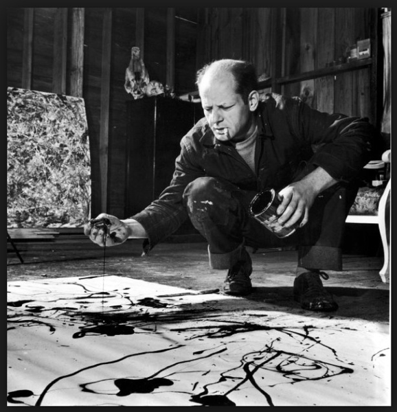
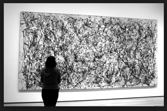
Willem de Kooning (1904-1997)
https://www.moma.org/artists/3213
https://www.guggenheim.org/artwork/artist/willem-de-kooning
https://www.tate.org.uk/art/artists/willem-de-kooning-1433
❖ Both de Kooning and Pollock are Abstract Expressionists.
❖ They are part of a group of artists who are known as the New York School.
❖ His images of women show aggression and complexity, much like the paintings of women by Pablo Picasso.
❖ He was the most influential artist in the early development of Chuck Close.
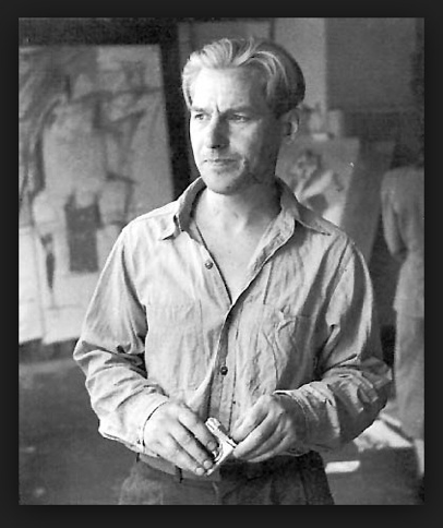
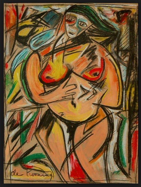
The Early Works (1960s-1970s) of Chuck Close
❖ Monument is scale
❖ Personal subject matter (himself, friends and family)
❖ Exhibited in 1967-68
❖ Black and white Photorealism
❖ Uses a grid to enlarge
❖ Influenced by ancient Roman mosaics
https://blogs.getty.edu/iris/a-brief-introduction-to-roman-mosaics/
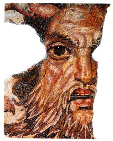
Ancient Roman Mosaic
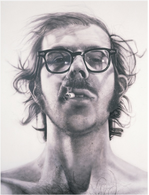
Chuck Close Self Portrait (1967-68)
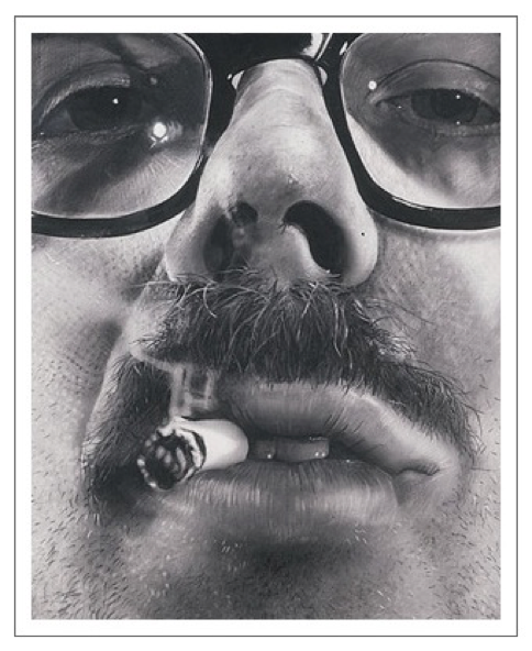
Chuck Close Self Portrait (1967-68) (closeup)
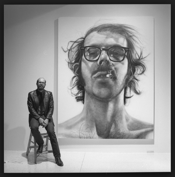
Size and scale of the painting.
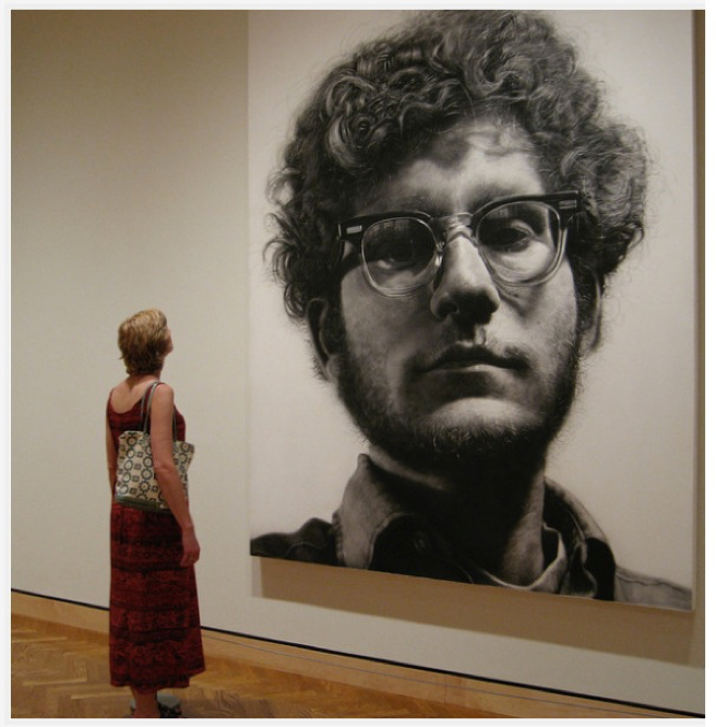
Another painting from the first show.
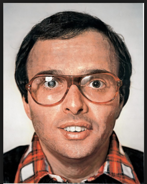
Mark (1978-79)
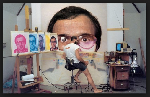
This shows the process Chuck Close was using for the paintings of the late 1970s.
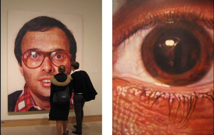
Details of the painting Mark
Chuck Close and “The Event”
❖ In 1988 he suffered a spinal stroke which left him paralyzed from the neck down and dependent on a wheelchair for mobility. He refers to this as “The Event.”
❖ After “The Event,” he was determined to continue with his painting despite the limitations of his disability.
❖ He now uses a splint to enable him to hold a paintbrush and a mechanized easel to raise, lower, and rotate his canvas to a suitable position for painting.
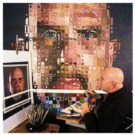
Current painting technique.
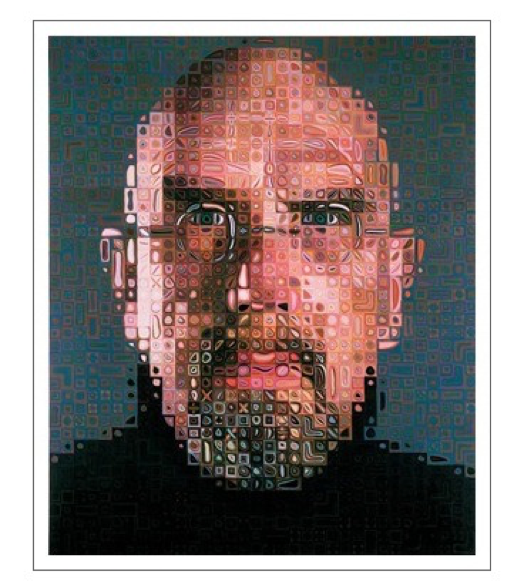
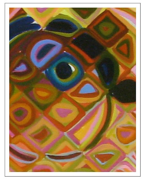
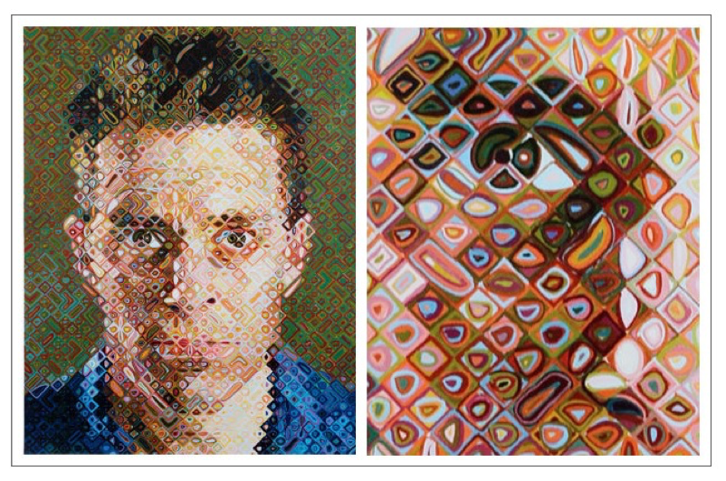
There is now a heavy influence by the color theory work of Vasily Kandinsky (1866 - 1944) as seen here and the following examples.
https://www.moma.org/artists/2981
The Grid Drawing Assignment
OBJECTIVES:
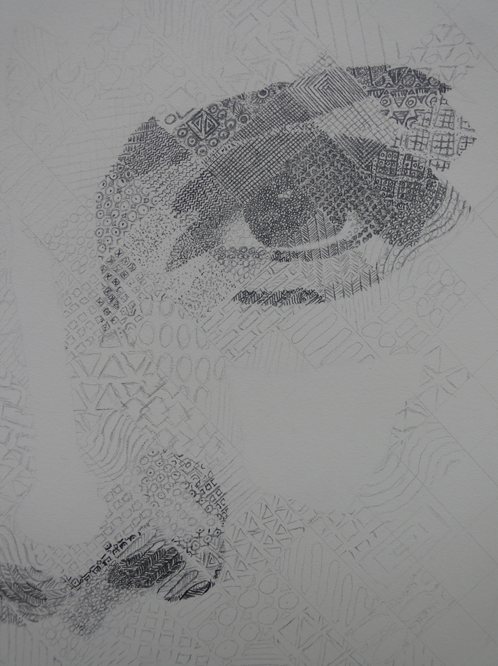
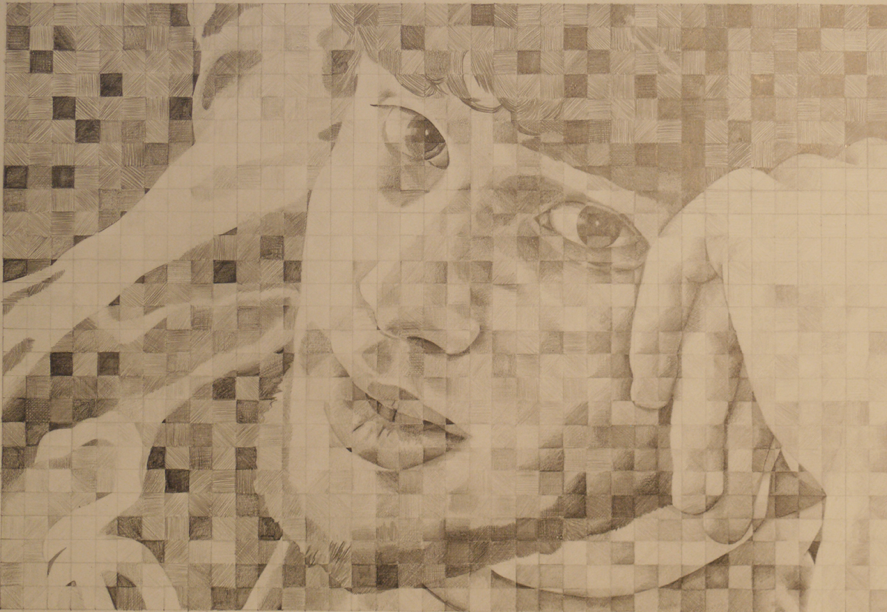
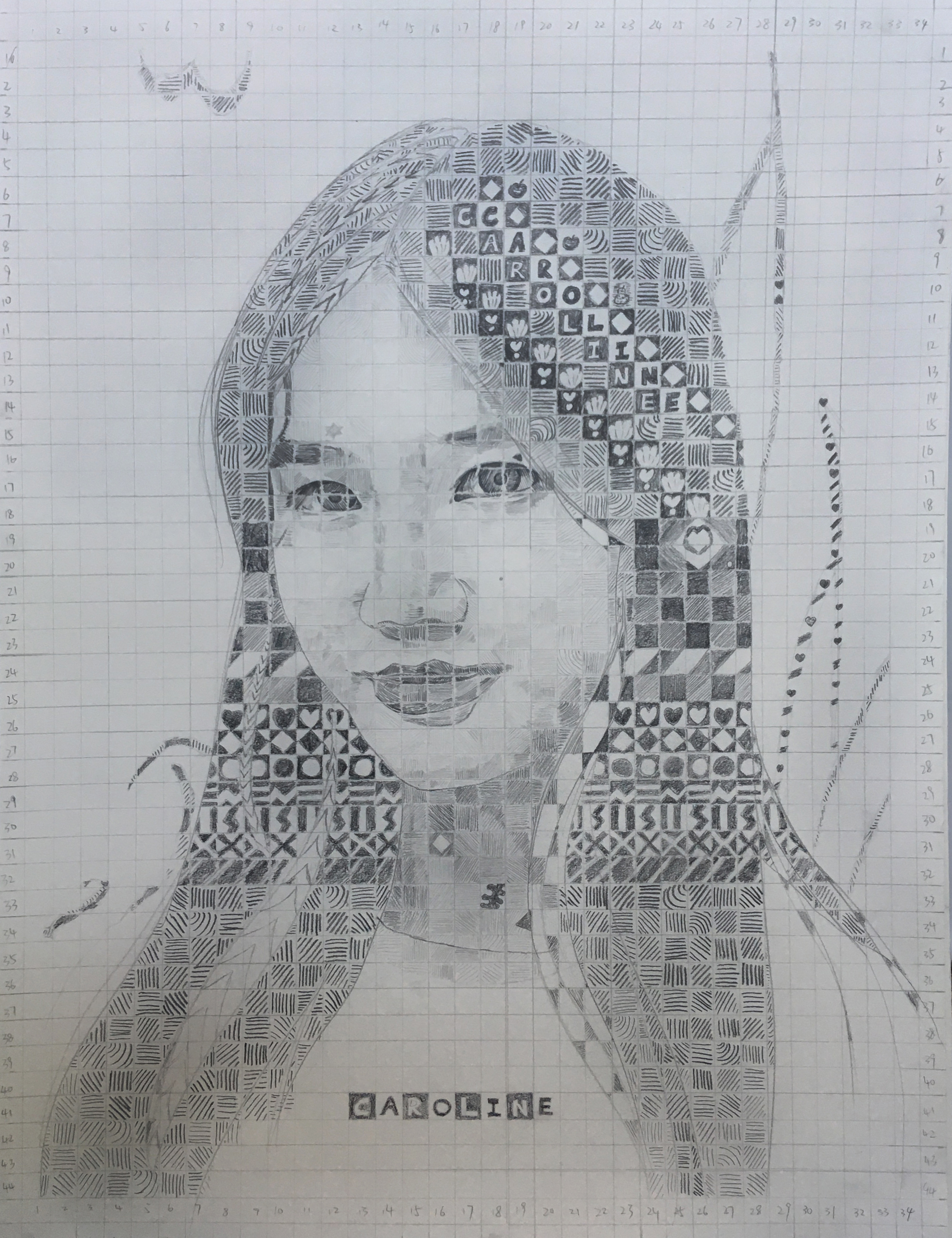
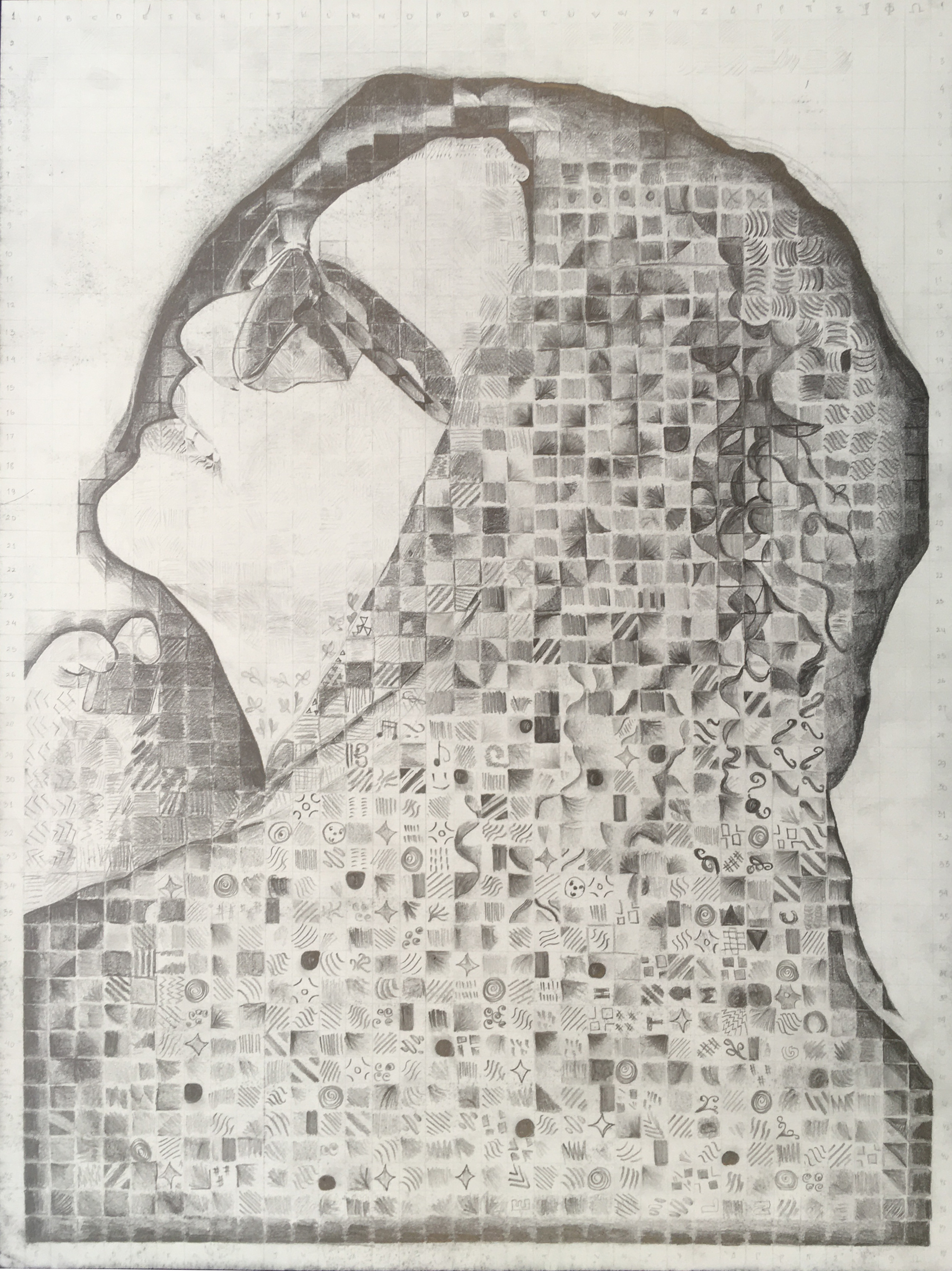
The student will learn how to draw using a grid and enlarge a photographic print based on the artwork of the artist, Chuck Close. The drawing will transcend the photo in one or more ways to become art. This project allows students struggling with drawing from life to successfully create a drawing of depth, correct proportions, strong values, interesting mark-making and enough contrast to be visually appealing, from both a distance, and from up close.
STUDENT LEARNING OUTCOMES:
Upon completion of this assignment, the student will be able to:
• Create value contrast in a drawing
• Match a variety of values in a graphite drawing
• Create art from a photographic image
• Successfully incorporate a grid to enlarge a photograph
• Effectively draw using shapes, symbols and patterns
MATERIALS:
• High resolution 8 1/2” x 11” photographic print
• 18” x 24” Strathmore Series 400 drawing paper
• Variety of graphite drawing pencils (HB, 2B, 4B, 6B)
• White plastic eraser
• Metal ruler!
DIRECTIONS:
Step 1:
Choose a portrait photograph that has good contrast and is relatively high resolution. The subject of this portrait can be yourself, a family member or friend, a celebrity or an animal.


Step 2:
Print this photograph in black and white on 8 1/2” x 11” paper. Most printers do not print to the edge of the paper, so about a 1/4” white border will remain. That is OK. Note: if you enlarge the photo digitally, make sure you hold down the “shift” key as you drag the object box corner to enlarge, so that you do not distort the photo.
Step 3:
Using your metal ruler, carefully mark all four sides of the photograph with small tick marks at predetermined intervals. The intervals are typically 1/4” or 1/2”.

Step 4:
Again, using the ruler, draw lines connecting the tick marks carefully to create a grid over the entire photograph using a marker visible over the values in the photograph. The grid can be straight up and down or on a diagonal. You may need a pen to do this.

Step 5:
Label the squares on all four sides (top, bottom, left and right) with numbers and/or letters. You are now ready to move to the drawing pad.
Step 6: You will enlarge your photo proportionately as follows. If you created a 1/4” grid on your photo, then create a 1/2” grid on your 18” x 24” drawing pad. Note: the ratio of the 8 1/2” x 11” printed photo is not the same ratio as the 18” x 24” drawing pad. You will have four more squares from top to bottom and also from left to right. Given a little thought, these extra rows of squares can be successfully added into the final drawing.
If you chose the 1/2” grid for your photograph, enlarge your drawing paper grid to 1” squares.
Step 7:
Follow Steps 3-5 above on the drawing paper. Your lines will be light and drawn with a pencil.


Step 8:
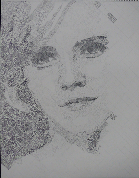
Study the photograph. Examine various drawing solutions to represent the values in the photograph. On a separate sheet of paper, experiment with mark-making, shapes and symbols, cross-hatching, stipple and any other creative ways to represent the values seen in the photo. The drawing may have two different experiences for the viewer; one from a distance where it looks like representational art, and one from up close where the abstract patterns, symbols and shapes dominate.
When confident you have a strategy to complete the drawing, move on to Step 9.
Step 9:
Lightly draw in the major shapes of the photo using an outline. Be careful to create this outline using the correct squares. Take your time. Once the major shapes are in place, in outline, move to Step 10.
Step 10:
Following your strategy for tones and shapes, begin drawing square by square. Pay attention to values Match the values of the photo closely in the drawing. Note: if you are having difficulty “seeing” the values in the photo, cut a 1/4” (or 1/2”) square out of paper and place it over the square on the photo you wish to replicate in the drawing. This will isolate the value. Likewise, you can place a cutout square over the square in the drawing to assist you.
Step 11:
Complete the drawing square by square.
Recent Student Grid Drawing Examples:



Chuck Close
Chuck Close’s paintings are studies in both patience and the limits of seeing. When his monumental close-ups of human faces appeared in the late 1960s, there was already a burgeoning return to realism in painting, even if the dominant modes of art making at the time were color field painting, pop art, and minimalism. In this return to realism, the photograph was often used as a guide to enhance the detail of painting or, as in the case of Gerhard Richter, to question the reliability of both painting and photography. Close took a fresh and different approach, using an airbrush and a grid to painstakingly expand a photographic image to monumental size. In the process, Close showed the limitations of the photograph through his intuitive adaptation and changing of the image to accommodate the demands of painterly detail and scale.
- Chuck Close is a modern American artist who is famous for his massive portraits of his family and friends.!
- He works from large printed photographs of his subjects.
- He helped to revived the art of portraiture at a time when abstract art was all the rage.
- His early works are painted in black and white in a Photorealist style.
- He is influenced by many different styles and techniques from Pop Art to Pointillism to ancient Roman mosaics.
- He uses a grid to divide the image into small sections which he scales up onto a large canvas.
- His later work uses the grid as a structural element in the composition.
Due to their large scale, Chuck Close's paintings can be read in different ways: up close each section of the grid becomes a small abstract color study; from a distance all the sections of the grid combine to create a realistic portrait.
- His artworks are a careful balance between the representational, the abstract and the conceptual qualities of the image.
- Chuck Close has learning difficulties such as dyslexia and prosopagnosia (the inability to remember faces) which have had a major influence on his style.
- In 1988 he suffered a spinal stroke which left him paralyzed from the neck down and dependent on a wheelchair for mobility. He refers to this as 'The Event'.
- After the 'Event' he was determined to continue with his painting despite the limitations of his disability.
- He now uses a splint to enable him to hold a paintbrush and a mechanized easel to raise, lower and rotate his canvas to a suitable position for painting.
- Chuck Close works in a wide range of techniques and materials including acrylic, oils, watercolor, drawing, pastels, printmaking, collage, tapestry, photography, CYMK color separations, digital imaging, rubber stamps, fingerprints, paper pulp and string.

