1.5: Composition
- Page ID
- 67695
\( \newcommand{\vecs}[1]{\overset { \scriptstyle \rightharpoonup} {\mathbf{#1}} } \)
\( \newcommand{\vecd}[1]{\overset{-\!-\!\rightharpoonup}{\vphantom{a}\smash {#1}}} \)
\( \newcommand{\dsum}{\displaystyle\sum\limits} \)
\( \newcommand{\dint}{\displaystyle\int\limits} \)
\( \newcommand{\dlim}{\displaystyle\lim\limits} \)
\( \newcommand{\id}{\mathrm{id}}\) \( \newcommand{\Span}{\mathrm{span}}\)
( \newcommand{\kernel}{\mathrm{null}\,}\) \( \newcommand{\range}{\mathrm{range}\,}\)
\( \newcommand{\RealPart}{\mathrm{Re}}\) \( \newcommand{\ImaginaryPart}{\mathrm{Im}}\)
\( \newcommand{\Argument}{\mathrm{Arg}}\) \( \newcommand{\norm}[1]{\| #1 \|}\)
\( \newcommand{\inner}[2]{\langle #1, #2 \rangle}\)
\( \newcommand{\Span}{\mathrm{span}}\)
\( \newcommand{\id}{\mathrm{id}}\)
\( \newcommand{\Span}{\mathrm{span}}\)
\( \newcommand{\kernel}{\mathrm{null}\,}\)
\( \newcommand{\range}{\mathrm{range}\,}\)
\( \newcommand{\RealPart}{\mathrm{Re}}\)
\( \newcommand{\ImaginaryPart}{\mathrm{Im}}\)
\( \newcommand{\Argument}{\mathrm{Arg}}\)
\( \newcommand{\norm}[1]{\| #1 \|}\)
\( \newcommand{\inner}[2]{\langle #1, #2 \rangle}\)
\( \newcommand{\Span}{\mathrm{span}}\) \( \newcommand{\AA}{\unicode[.8,0]{x212B}}\)
\( \newcommand{\vectorA}[1]{\vec{#1}} % arrow\)
\( \newcommand{\vectorAt}[1]{\vec{\text{#1}}} % arrow\)
\( \newcommand{\vectorB}[1]{\overset { \scriptstyle \rightharpoonup} {\mathbf{#1}} } \)
\( \newcommand{\vectorC}[1]{\textbf{#1}} \)
\( \newcommand{\vectorD}[1]{\overrightarrow{#1}} \)
\( \newcommand{\vectorDt}[1]{\overrightarrow{\text{#1}}} \)
\( \newcommand{\vectE}[1]{\overset{-\!-\!\rightharpoonup}{\vphantom{a}\smash{\mathbf {#1}}}} \)
\( \newcommand{\vecs}[1]{\overset { \scriptstyle \rightharpoonup} {\mathbf{#1}} } \)
\(\newcommand{\longvect}{\overrightarrow}\)
\( \newcommand{\vecd}[1]{\overset{-\!-\!\rightharpoonup}{\vphantom{a}\smash {#1}}} \)
\(\newcommand{\avec}{\mathbf a}\) \(\newcommand{\bvec}{\mathbf b}\) \(\newcommand{\cvec}{\mathbf c}\) \(\newcommand{\dvec}{\mathbf d}\) \(\newcommand{\dtil}{\widetilde{\mathbf d}}\) \(\newcommand{\evec}{\mathbf e}\) \(\newcommand{\fvec}{\mathbf f}\) \(\newcommand{\nvec}{\mathbf n}\) \(\newcommand{\pvec}{\mathbf p}\) \(\newcommand{\qvec}{\mathbf q}\) \(\newcommand{\svec}{\mathbf s}\) \(\newcommand{\tvec}{\mathbf t}\) \(\newcommand{\uvec}{\mathbf u}\) \(\newcommand{\vvec}{\mathbf v}\) \(\newcommand{\wvec}{\mathbf w}\) \(\newcommand{\xvec}{\mathbf x}\) \(\newcommand{\yvec}{\mathbf y}\) \(\newcommand{\zvec}{\mathbf z}\) \(\newcommand{\rvec}{\mathbf r}\) \(\newcommand{\mvec}{\mathbf m}\) \(\newcommand{\zerovec}{\mathbf 0}\) \(\newcommand{\onevec}{\mathbf 1}\) \(\newcommand{\real}{\mathbb R}\) \(\newcommand{\twovec}[2]{\left[\begin{array}{r}#1 \\ #2 \end{array}\right]}\) \(\newcommand{\ctwovec}[2]{\left[\begin{array}{c}#1 \\ #2 \end{array}\right]}\) \(\newcommand{\threevec}[3]{\left[\begin{array}{r}#1 \\ #2 \\ #3 \end{array}\right]}\) \(\newcommand{\cthreevec}[3]{\left[\begin{array}{c}#1 \\ #2 \\ #3 \end{array}\right]}\) \(\newcommand{\fourvec}[4]{\left[\begin{array}{r}#1 \\ #2 \\ #3 \\ #4 \end{array}\right]}\) \(\newcommand{\cfourvec}[4]{\left[\begin{array}{c}#1 \\ #2 \\ #3 \\ #4 \end{array}\right]}\) \(\newcommand{\fivevec}[5]{\left[\begin{array}{r}#1 \\ #2 \\ #3 \\ #4 \\ #5 \\ \end{array}\right]}\) \(\newcommand{\cfivevec}[5]{\left[\begin{array}{c}#1 \\ #2 \\ #3 \\ #4 \\ #5 \\ \end{array}\right]}\) \(\newcommand{\mattwo}[4]{\left[\begin{array}{rr}#1 \amp #2 \\ #3 \amp #4 \\ \end{array}\right]}\) \(\newcommand{\laspan}[1]{\text{Span}\{#1\}}\) \(\newcommand{\bcal}{\cal B}\) \(\newcommand{\ccal}{\cal C}\) \(\newcommand{\scal}{\cal S}\) \(\newcommand{\wcal}{\cal W}\) \(\newcommand{\ecal}{\cal E}\) \(\newcommand{\coords}[2]{\left\{#1\right\}_{#2}}\) \(\newcommand{\gray}[1]{\color{gray}{#1}}\) \(\newcommand{\lgray}[1]{\color{lightgray}{#1}}\) \(\newcommand{\rank}{\operatorname{rank}}\) \(\newcommand{\row}{\text{Row}}\) \(\newcommand{\col}{\text{Col}}\) \(\renewcommand{\row}{\text{Row}}\) \(\newcommand{\nul}{\text{Nul}}\) \(\newcommand{\var}{\text{Var}}\) \(\newcommand{\corr}{\text{corr}}\) \(\newcommand{\len}[1]{\left|#1\right|}\) \(\newcommand{\bbar}{\overline{\bvec}}\) \(\newcommand{\bhat}{\widehat{\bvec}}\) \(\newcommand{\bperp}{\bvec^\perp}\) \(\newcommand{\xhat}{\widehat{\xvec}}\) \(\newcommand{\vhat}{\widehat{\vvec}}\) \(\newcommand{\uhat}{\widehat{\uvec}}\) \(\newcommand{\what}{\widehat{\wvec}}\) \(\newcommand{\Sighat}{\widehat{\Sigma}}\) \(\newcommand{\lt}{<}\) \(\newcommand{\gt}{>}\) \(\newcommand{\amp}{&}\) \(\definecolor{fillinmathshade}{gray}{0.9}\)Composition
When we think of someone composing a creative work we may think of a composer creating a work of music, like a symphonic poem, or orchestral suite, maybe a piano concerto? We may not immediately think of an artist creating a drawing. However, composition is the term used for an artist designing within the two-dimensional visual field using art elements and the principles of design.
An assignment I give my Two-Dimensional Design and Color class is one that really makes them think about the visual forces at play in creating a work of two-dimensional art. I begin by defining a boundary on a white board, usually a portrait format rectangular outline. I then ask a student to go up to the whiteboard and place a mark or shape anywhere within the borders of the rectangle. I ask the class if the art being created is balanced? I then ask a second student and so on to go up and add a mark or shape considering balance and the aesthetics of the art. Each time a shape is added, the entire composition is affected. Some shapes take on a more dominant role and some smaller shapes may be subordinate, yet each piece plays a part in process of building an aesthetic work of art.
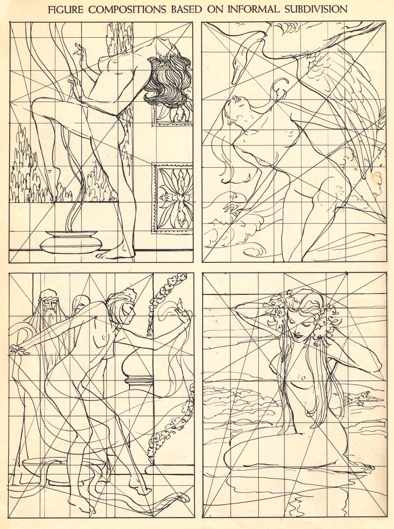
Much consideration must be given to the many aspects of composition since the study of the visual forces at play is complex and multifaceted: symmetrical and asymmetrical balance, directing the eye, implied lines, weight of tones and values, line weight, vertical placement of shapes, the play of positive and negative shapes, how packed the space is, or conversely, how open the space is, and the list goes on. An intuitive eye for design is helpful and there are techniques and art principles to be learned. Once mastered, artists begin to bend or break the rules of art in creative ways while still having success with the final work. This is one of the joys of visual art, learning the rules of the game, and then sometimes successfully breaking those same rules.
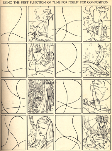
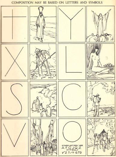
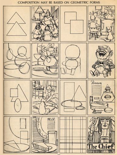
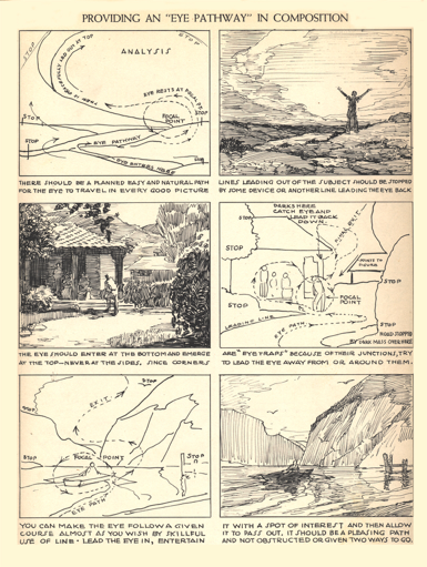
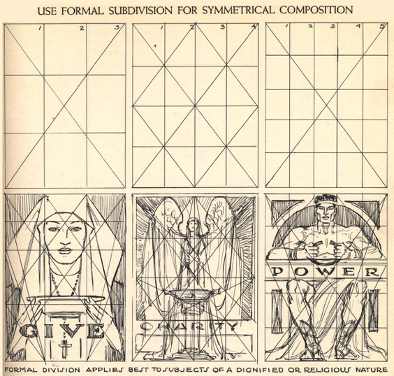
https://www.joshuanava.biz/creative-illustration/the-form-principle-as-a-basis-of-approach.html
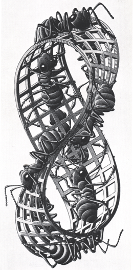
M.C. Escher. Möbius Strip. 1962
https://mathstat.slu.edu/escher/index.php/M.C._Escher
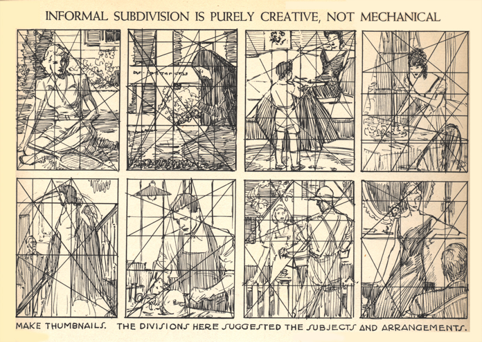
https://www.joshuanava.biz/creative-illustration/the-form-principle-as-a-basis-of-approach.html
Positive & Negative Space
Overview
Positive and negative space play an important role in determining the overall composition in a work of art. By understanding positive and negative space and applying your knowledge, you can become more successful in designing your compositions.
What is Positive & Negative Space?
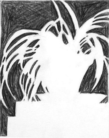
Positive space is best described as the areas in a work of art that are the subjects, or areas of interest. Negative space is the area around the subjects, or areas of interest.
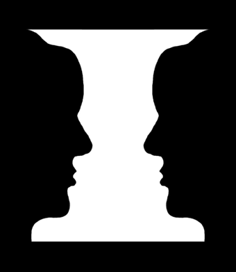
Take a look at the image to the left. If you are seeing a vase, then you are seeing the white area as the positive space. The black areas become the negative space. If you are seeing faces, then you are seeing the black areas as the positive space, and the white area as the negative space.
Balance of Positive and Negative space

Mostly negative space (below image)

Mostly positive space

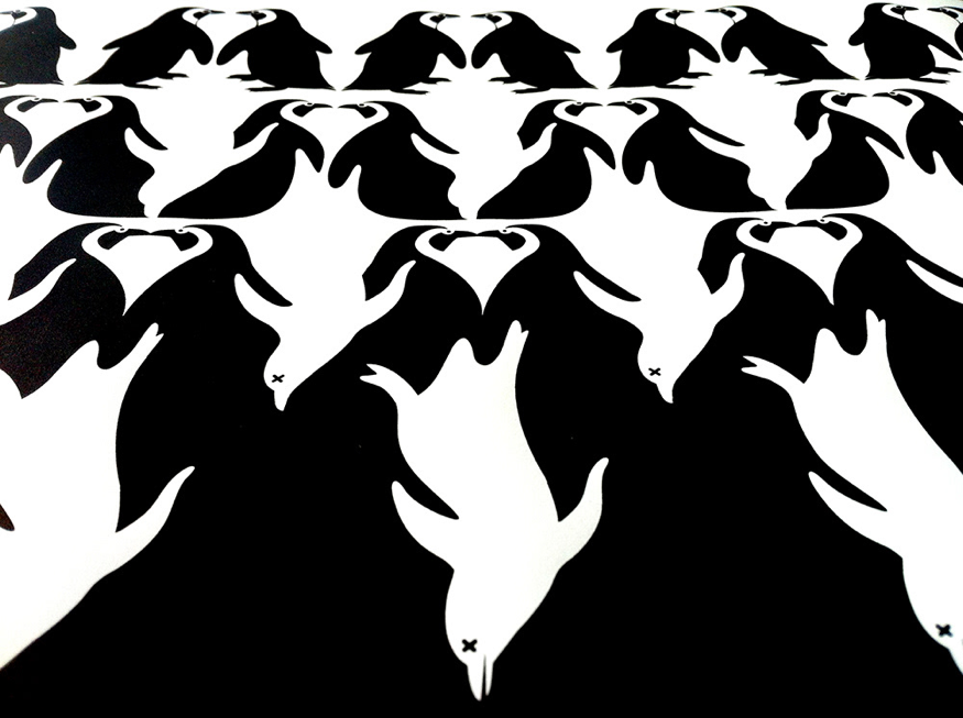
Example of an M.C. Escher lithograph focusing on the play of Positive and Negative spaces and shapes (below image)

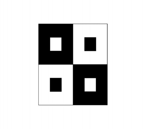
Positive and Negative space and forms created by contemporary artists (see below images)






https://www.fromthegrapevine.com/arts/artist-turns-negative-space-into-positive
Drawing Assignment
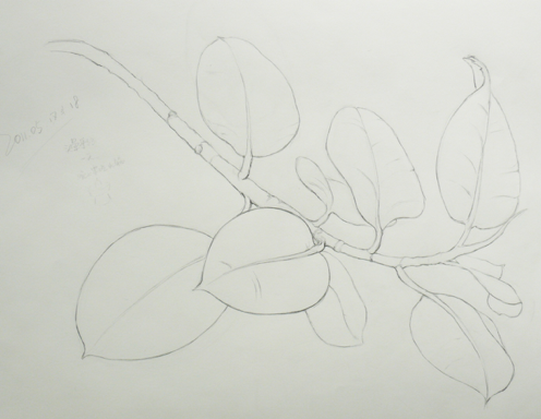
We have learned about the following concepts in studying contour line drawing:
- Sensual (organic line)
- Thick & thin
- Light & dark
- Loose and find
The above drawing combines those concepts with am aesthetic composition in the visual field.
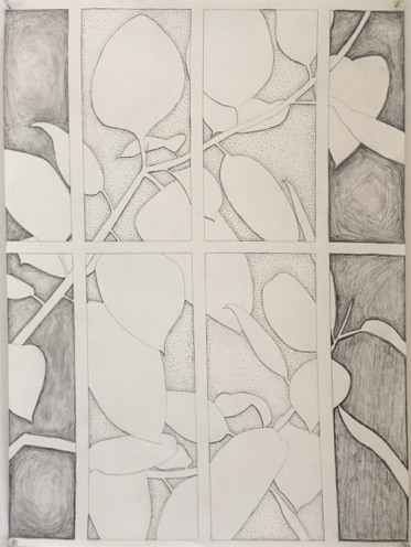
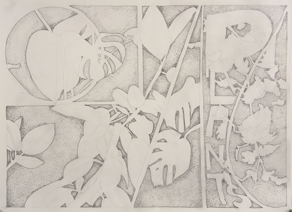
Now we want to combine a contour drawing of a plant and a formal geometric design (composition) emphasizing the negative space. The types and sizes of the geometric shapes you choose are up to your imagination. One objective is to create a sense of balance. Another is to incorporate one of the design systems into your drawing (see design systems featured later in the chapter). Here are some student drawings created for this assignment:
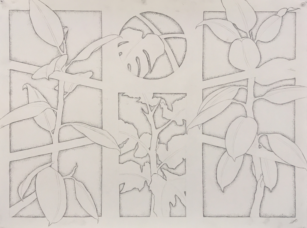
Focus on Composition
• Composition is a very broad but important term in art. Art is not just about being able to accurately render a scene. It is the visual form of music and you are the composer.
• Composition in art is essentially the arrangement of Visual Elements using various Principles of Art and techniques. It is often used to describe the overall design of a drawing.
• A well composed drawing will intrigue and invite the viewer and help communicate the artist's statement.
Rule of Thirds
• Rule of Thirds is dividing the visual field into thirds
• Divisions into thirds can be horizontal, vertical, or both
• It does not have to be exact, since it is an aesthetic design principle
• Rule of Thirds applies nicely to landscape photography, painting, and drawing
• The concept of the Rule of Thirds is a Principle of Design

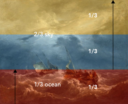
Examples of 2-D Art using rule of thirds landscape format

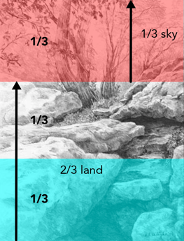
Example of rule of thirds portrait format


Vertical rule of thirds may relate to foreground, middle ground and background
• The foreground is made up of the large rocks
• The middle ground features the closest trees
• The background includes the lightest in value trees - fading them into the background
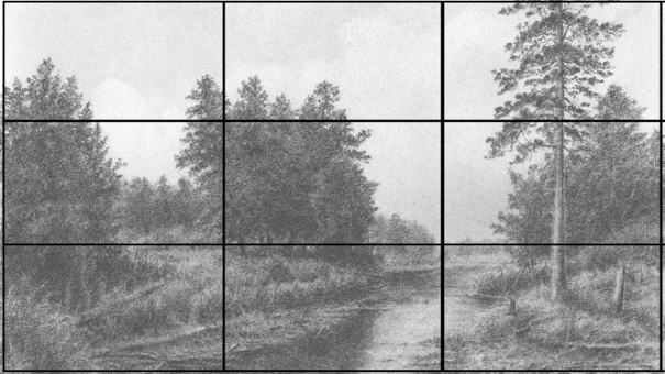
Contemporary drawing with use of Rule of Thirds
Japanese Design
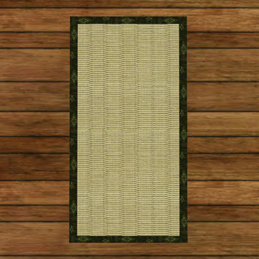
• Japanese design is based on two squares side by side.
• This is represented in the Japanese tatami mat seen here:
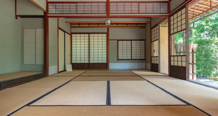
Tatami mats are two squares side by side and form the basis for the Japanese design system.
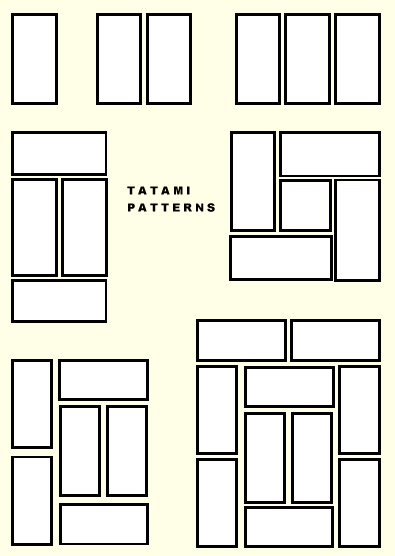
The two square system of Japanese design = repeated rectangles incorporated into living quarters
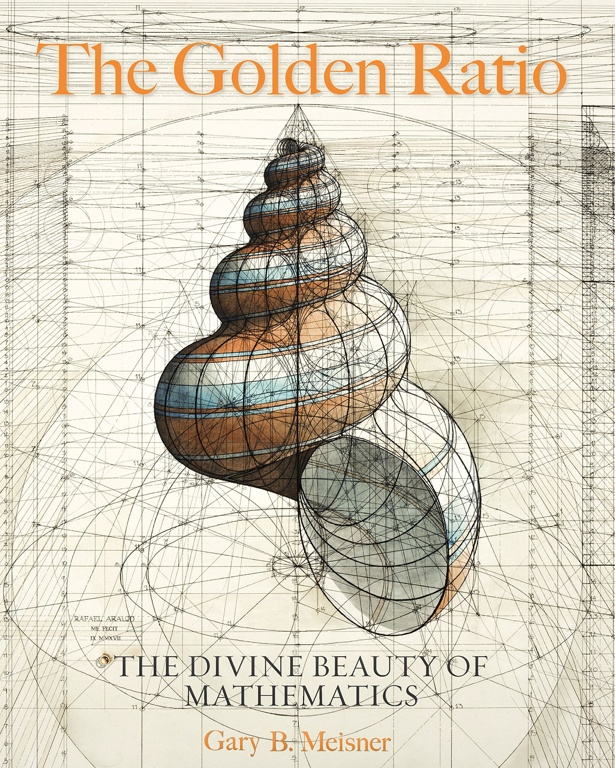
The Golden Ratio
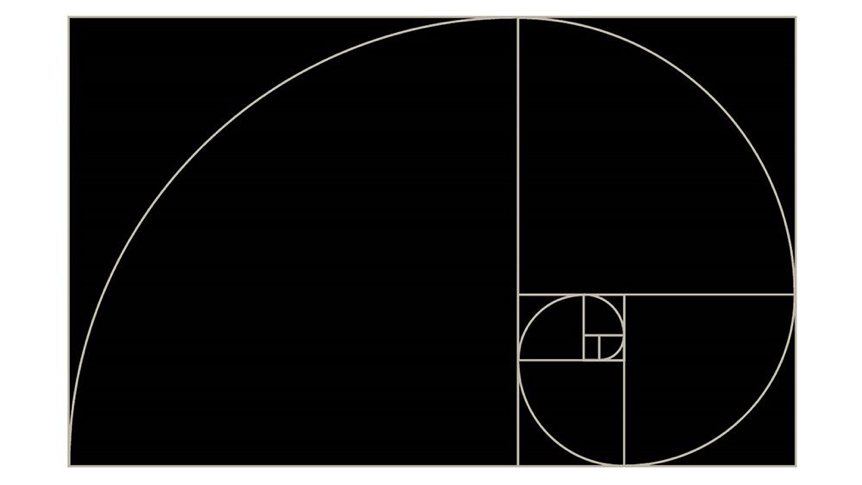
The Golden Spiral
The golden ratio is also called the golden mean or golden section.
Mathematicians since Euclid have studied the properties of the golden ratio, including its appearance in the dimensions of a regular pentagon and in a golden rectangle, which may be cut into a square and a smaller rectangle with the same aspect ratio.
The golden ratio has also been used to analyze the proportions of natural objects. The golden ratio appears in some patterns in nature, including the spiral arrangement of leaves and other plant parts. The golden spiral appears in seashells!
