
3.6: Visual Elements
- Page ID
- 117365
Line
A line is defined as a mark that connects the space between two points, taking any form along the way.
Learning Objectives
Compare and contrast different uses of line in art
Key Takeaways
Key Points
- Actual lines are lines that are physically present, existing as solid connections between one or more points.
- Implied line refers to the path that the viewer ‘s eye takes as it follows shapes, colors, and forms along any given path.
- Straight or classic lines provide stability and structure to a composition and can be vertical, horizontal, or diagonal on a work’s surface.
- Expressive lines refer to curved marks that increase the sense of dynamism of a work of art.
- The outline or contour lines create a border or path around the edge of a shape, thereby outlining and defining it. “Cross contour lines” delineate differences in the features of a surface.
- Hatch lines are a series of short lines repeated in intervals, typically in a single direction, and are used to add shading and texture to surfaces, while cross-hatch lines provide additional texture and tone to the image surface and can be oriented in any direction.
Key Terms
- texture:The feel or shape of a surface or substance; the smoothness, roughness, softness, etc. of something.
- cross-hatching:A method of showing shading by means of multiple small lines that intersect.
- line:A path through two or more points.
The line is an essential element of art, defined as a mark that connects the space between two points, taking any form along the way. Lines are used most often to define shape in two-dimensional works and could be called the most ancient, as well as the most universal, forms of mark making.
There are many different types of lines, all characterized by their lengths being greater than their width, as well as by the paths that they take. Depending on how they are used, lines help to determine the motion, direction, and energy of a work of art. The quality of a line refers to the character that is presented by a line in order to animate a surface to varying degrees.
Actual lines are lines that are physically present, existing as solid connections between one or more points, while implied lines refer to the path that the viewer’s eye takes as it follows shape, color, and form within an art work. Implied lines give works of art a sense of motion and keep the viewer engaged in a composition. We can see numerous implied lines in Jacques-Louis David’s Oath of the Horatii, connecting the figures and actions of the piece by leading the eye of the viewer through the unfolding drama.
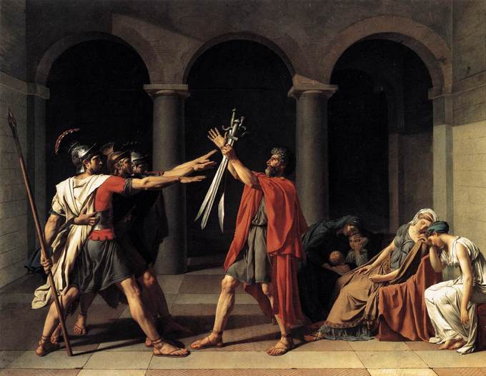
Jacques-Louis David, Oath of the Horatii, 1784: Many implied lines connect the figures and action of the piece by leading the eye of the viewer through the unfolding drama.
Straight or classic lines add stability and structure to a composition and can be vertical, horizontal, or diagonal on the surface of the work. Expressive lines refer to curved marks that increase the sense of dynamism of a work of art. These types of lines often follow an undetermined path of sinuous curves. The outline or contour lines create a border or path around the edge of a shape, thereby outlining and defining it. Cross contour lines delineate differences in the features of a surface and can give the illusion of three dimensions or a sense of form or shading.
Hatch lines are a series of short lines repeated in intervals, typically in a single direction, and are used to add shading and texture to surfaces. Cross-hatch lines provide additional texture and tone to the image surface and can be oriented in any direction. Layers of cross-hatching can add rich texture and volume to image surfaces.
Light and Value
Value refers to the use of light and dark in art.
Learning Objectives
Explain the artistic use of light and dark (also known as “value”)
Key Takeaways
Key Points
- In painting, value changes are achieved by adding black or white to a color.
- Value in art is also sometimes referred to as ” tint ” for light hues and “shade” for dark hues.
- Values near the lighter end of the spectrum are termed “high-keyed” while those on the darker end are called “low-keyed.”
- In two-dimensional art works, the use of value can help to give a shape the illusion of mass or volume .
- Chiaroscuro was a common technique in Baroque painting and refers to clear tonal contrasts exemplified by very high-keyed whites, placed directly against very low-keyed darks.
Key Terms
- chiaroscuro:An artistic technique popularized during the Renaissance, referring to the use of exaggerated light contrasts in order to create the illusion of volume.
The use of light and dark in art is called value. Value can be subdivided into tint (light hues) and shade (dark hues). In painting, which uses subtractive color, value changes are achieved by adding black or white to a color. Artists may also employ shading, which refers to a more subtle manipulation of value. The value scale is used to show the standard variations in tones . Values near the lighter end of the spectrum are termed high-keyed, while those on the darker end are low-keyed.

Value scale: The value scale represents different degrees of light used in artwork.
In two-dimensional artworks, the use of value can help to give a shape the illusion of mass or volume. It will also give the entire composition a sense of lighting. High contrast refers to the placing of lighter areas directly against much darker ones, so their difference is showcased, creating a dramatic effect. High contrast also refers to the presence of more blacks than white or grey. Low-contrast images result from placing mid-range values together so there is not much visible difference between them, creating a more subtle mood.
In Baroque painting, the technique of chiaroscuro was used to produce highly dramatic effects in art. Chiaroscuro, which means literally “light-dark” in Italian, refers to clear tonal contrasts exemplified by very high-keyed whites, placed directly against very low-keyed darks. Candlelit scenes were common in Baroque painting as they effectively produced this dramatic type of effect. Caravaggio used a high contrast palette in such works as The Denial of St. Peter to create his expressive chiaroscuro scene.
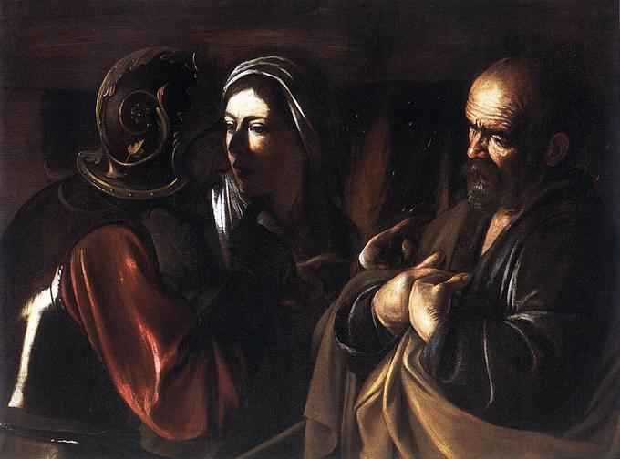
Caravaggio, The Denial of St. Peter, 1610: Caravaggio’s The Denial of St. Peter is an excellent example of how light can be manipulated in artwork.
Color
In the visual arts, color theory is a body of practical guidance to color mixing and the visual impacts of specific color combinations.
Learning Objectives
Express the most important elements of color theory and artists’ use of color
Key Takeaways
Key Points
- Color theory first appeared in the 17th century, when Isaac Newton discovered that white light could be passed through a prism and divided into the full spectrum of colors.
- The spectrum of colors contained in white light are red, orange, yellow, green, blue, indigo , and violet.
- Color theory divides color into the ” primary colors ” of red, yellow, and blue, which cannot be mixed from other pigments, and the “secondary colors” of green, orange, and violet, which result from different combinations of the primary colors.
- Primary and secondary colors are combined in various mixtures to create tertiary colors.
- Complementary colors are found opposite each other on the color wheel and represent the strongest contrast for those particular two colors.
Key Terms
- complementary color:A color which is regarded as the opposite of another on the color wheel (i.e., red and green, yellow and purple, and orange and blue).
- value:The relative darkness or lightness of a color in a specific area of a painting or other visual art.
- primary color:Any of three colors which, when added to or subtracted from others in different amounts, can generate all other colors.
- tint:A color considered with reference to other very similar colors. Red and blue are different colors, but two shades of scarlet are different tints.
- gradation:A passing by small degrees from one tone or shade, as of color, to another.
- hue:A color, or shade of color.
Color is a fundamental artistic element which refers to the use of hue in art and design. It is the most complex of the elements because of the wide array of combinations inherent to it. Color theory first appeared in the 17th century when Isaac Newton discovered that white light could be passed through a prism and divided into the full spectrum of colors. The spectrum of colors contained in white light are, in order: red, orange, yellow, green, blue, indigo and violet.
Color theory subdivides color into the “primary colors” of red, yellow, and blue, which cannot be mixed from other pigments; and the “secondary colors” of green, orange and violet, which result from different combinations of the primary colors. Primary and secondary colors are combined in various mixtures to create “tertiary colors.” Color theory is centered around the color wheel, a diagram that shows the relationship of the various colors to each other .

Color wheel: The color wheel is a diagram that shows the relationship of the various colors to each other.
Color ” value ” refers to the relative lightness or darkness of a color. In addition, “tint” and “shade” are important aspects of color theory and result from lighter and darker variations in value, respectively. “Tone” refers to the gradation or subtle changes of a color on a lighter or darker scale. “Saturation” refers to the intensity of a color.
Additive and Subtractive Color
Additive color is color created by mixing red, green, and blue lights. Television screens, for example, use additive color as they are made up of the primary colors of red, blue and green (RGB). Subtractive color, or “process color,” works as the reverse of additive color and the primary colors become cyan, magenta, yellow, and black (CMYK). Common applications of subtractive color can be found in printing and photography.
Complementary Color
Complementary colors can be found directly opposite each other on the color wheel (purple and yellow, green and red, orange and blue). When placed next to each other, these pairs create the strongest contrast for those particular two colors.
Warm and Cool Color
The distinction between warm and cool colors has been important since at least the late 18th century. The contrast, as traced by etymologies in the Oxford English Dictionary, seems related to the observed contrast in landscape light, between the “warm” colors associated with daylight or sunset and the “cool” colors associated with a gray or overcast day. Warm colors are the hues from red through yellow, browns and tans included. Cool colors, on the other hand, are the hues from blue green through blue violet, with most grays included. Color theory has described perceptual and psychological effects to this contrast. Warm colors are said to advance or appear more active in a painting, while cool colors tend to recede. Used in interior design or fashion, warm colors are said to arouse or stimulate the viewer , while cool colors calm and relax.
Texture
Texture refers to the tactile quality of the surface of an art object.
Learning Objectives
Recognize the use of texture in art
Key Takeaways
Key Points
- Visual texture refers to an implied sense of texture that the artist creates through the use of various artistic elements such as line , shading, and color.
- Actual texture refers to the physical rendering or the real surface qualities we can notice by touching an object.
- Visible brushstrokes and different amounts of paint will create a physical texture that can add to the expressiveness of a painting and draw attention to specific areas within it.
- It is possible for an artwork to contain numerous visual textures but still remain smooth to the touch.
Key Terms
- tactile:Tangible; perceptible to the sense of touch.
Texture
Texture in art stimulates the senses of sight and touch and refers to the tactile quality of the surface of the art. It is based on the perceived texture of the canvas or surface, which includes the application of the paint. In the context of artwork, there are two types of texture: visual and actual. Visual texture refers to an implied sense of texture that the artist creates through the use of various artistic elements such as line, shading and color. Actual texture refers to the physical rendering or the real surface qualities we can notice by touching an object, such as paint application or three-dimensional art.
It is possible for an artwork to contain numerous visual textures, yet still remain smooth to the touch. Take for example Realist or Illusionist works, which rely on the heavy use of paint and varnish, yet maintain an utterly smooth surface. In Jan Van Eyck’s painting “The Virgin of Chancellor Rolin” we can notice a great deal of texture in the clothing and robes especially, while the surface of the work remains very smooth .
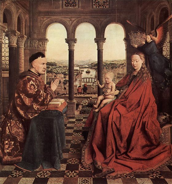
Jan van Eyck, The Virgin of Chancellor Rolin, 1435: The Virgin of Chancellor Rolin has a great deal of texture in the clothing and robes, but the actual surface of the work is very smooth.
Paintings often use actual texture as well, which we can observe in the physical application of paint. Visible brushstrokes and different amounts of paint will create a texture that adds to the expressiveness of a painting and draw attention to specific areas within it. The artist Vincent van Gogh is known to have used a great deal of actual texture in his paintings, noticeable in the thick application of paint in such paintings as Starry Night.
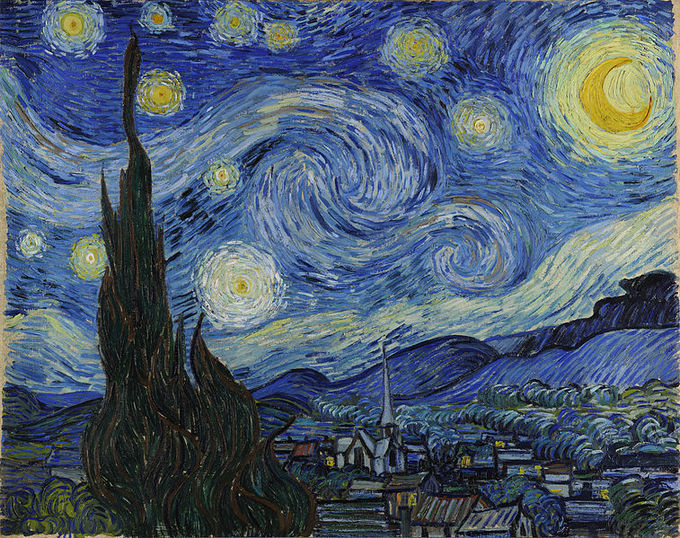
Vincent van Gogh, The Starry Night, 1889: The Starry Night contains a great deal of actual texture through the thick application of paint.
Shape and Volume
Shape refers to an area in a two-dimensional space that is defined by edges; volume is three-dimensional, exhibiting height, width, and depth.
Learning Objectives
Define shape and volume and identify ways they are represented in art
Key Takeaways
Key Points
- “Positive space ” refers to the space of the defined shape or figure.
- “Negative space” refers to the space that exists around and between one or more shapes.
- A ” plane ” in art refers to any surface area within space.
- ” Form ” is a concept that is related to shape and can be created by combining two or more shapes, resulting in a three-dimensional shape.
- Art makes use of both actual and implied volume .
- Shape, volume, and space, whether actual or implied, are the basis of the perception of reality.
Key Terms
- form:The shape or visible structure of an artistic expression.
- volume:A unit of three-dimensional measure of space that comprises a length, a width, and a height.
- plane:A flat surface extending infinitely in all directions (e.g., horizontal or vertical plane).
Shape refers to an area in two-dimensional space that is defined by edges. Shapes are, by definition, always flat in nature and can be geometric (e.g., a circle, square, or pyramid) or organic (e.g., a leaf or a chair). Shapes can be created by placing two different textures , or shape-groups, next to each other, thereby creating an enclosed area, such as a painting of an object floating in water.
“Positive space” refers to the space of the defined shape, or figure. Typically, the positive space is the subject of an artwork. “Negative space” refers to the space that exists around and between one or more shapes. Positive and negative space can become difficult to distinguish from each other in more abstract works.
A “plane” refers to any surface area within space. In two-dimensional art, the ” picture plane ” is the flat surface that the image is created upon, such as paper, canvas, or wood. Three-dimensional figures may be depicted on the flat picture plane through the use of the artistic elements to imply depth and volume, as seen in the painting Small Bouquet of Flowers in a Ceramic Vase by Jan Brueghel the Elder.
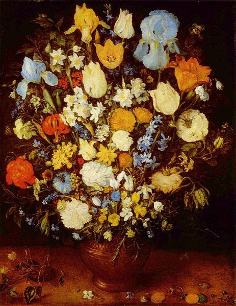
Jan Brueghel the Elder, Small Bouquet of Flowers in a Ceramic Vase, 1599: Three-dimensional figures may be depicted on the flat picture plane through the use of the artistic elements to imply depth and volume.
“Form” is a concept that is related to shape. Combining two or more shapes can create a three-dimensional shape. Form is always considered three-dimensional as it exhibits volume—or height, width, and depth. Art makes use of both actual and implied volume.
While three-dimensional forms, such as sculpture, have volume inherently, volume can also be simulated, or implied, in a two-dimensional work such as a painting. Shape, volume, and space—whether actual or implied—are the basis of the perception of reality.
Time and Motion
Motion, a principle of art, is a tool artists use to organize the artistic elements in a work; it is employed in both static and time-based mediums.
Learning Objectives
Name some techniques and mediums used by artists to convey motion in both static and time-based art forms
Key Takeaways
Key Points
- Techniques such as scale and proportion are used to create the feeling of motion or the passing of time in static a visual piece.
- The placement of a repeated element in different area within an artwork is another way to imply motion and the passing of time.
- Visual experiments in time and motion were first produced in the mid-19th century, and the photographer Eadweard Muybridge is well-known for his sequential shots.
- The time-based mediums of film, video, kinetic sculpture , and performance art employ time and motion by their very definitions.
Key Terms
- frames per second:The number of times an imaging device produces unique consecutive images (frames) in one second. Abbreviation: FPS.
- static:Fixed in place; having no motion.
Motion, or movement, is considered to be one of the “principles of art”; that is, one of the tools artists use to organize the artistic elements in a work of art. Motion is employed in both static and in time-based mediums and can show a direct action or the intended path for the viewer ‘s eye to follow through a piece.
Techniques such as scale and proportion are used to create the feeling of motion or the passing of time in static visual artwork. For example, on a flat picture plane , an image that is smaller and lighter colored than its surroundings will appear to be in the background. Another technique for implying motion and/or time is the placement of a repeated element in different areas within an artwork.
Visual experiments in time and motion were first produced in the mid-19th century. The photographer Eadweard Muybridge is well known for his sequential shots of humans and animals walking, running, and jumping, which he displayed together to illustrate the motion of his subjects. Marcel Duchamp’s Nude Descending a Staircase, No. 2 exemplifies an absolute feeling of motion from the upper left to lower right corner of the piece.
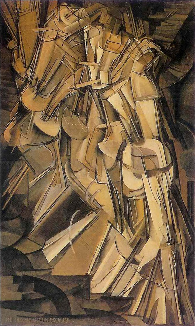
Marcel Duchamp, Nude Descending a Staircase, No. 2, 1912: This work represents Duchamp’s conception of motion and time.
While static art forms have the ability to imply or suggest time and motion, the time-based mediums of film, video, kinetic sculpture, and performance art demonstrate time and motion by their very definitions. Film is many static images that are quickly passed through a lens. Video is essentially the same process, but digitally-based and with fewer frames per second . Performance art takes place in real time and makes use of real people and objects, much like theater. Kinetic art is art that moves, or depends on movement, for its effect. All of these mediums use time and motion as a key aspect of their forms of expression.
Chance, Improvisation, and Spontaneity
Dadaism, Surrealism, and the Fluxus movement all relied on the elements of chance, improvisation, and spontaneity as tools for making art works.
Learning Objectives
Describe how Dadaism, Surrealism, and the Fluxus movement relied on chance, improvisation, and spontaneity
Key Takeaways
Key Points
- Dadaists are known for their “automatic writing” or stream of consciousness writing, which highlights the creativity of the unconscious mind.
- Surrealist works, much like Dadaist works, often feature an element of surprise, unexpected juxtaposition , and tapping into the unconscious mind.
- Surrealists are known for having invented ” exquisite corpse” drawing.
- The Fluxus movement was known for its ” happenings ,” which were performance events or situations that could take place anywhere, in any form , and relied heavily on chance, improvisation, and audience participation.
Key Terms
- happening:A spontaneous or improvised event, especially one that involves audience participation.
- assemblage:A collection of things which have been gathered together..
Chance, improvisation, and spontaneity are elements that can be used to create art, or they can be the very purpose of the artwork itself. Any medium can employ these elements at any point within the artistic process.
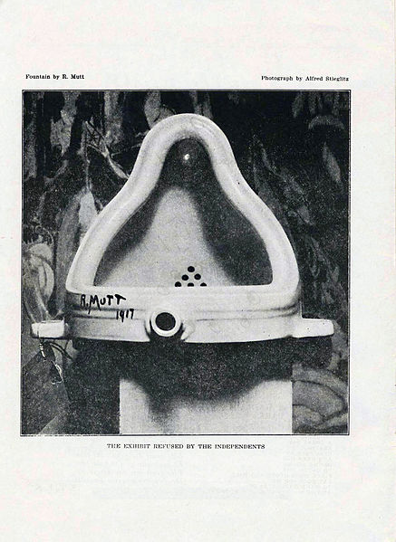
Marcel Duchamp, Urinal, 1917: Marcel Duchamp’s Urinal is an example of a “ready-made,” which were objects that were purchased or found and then declared art.
Dadaism
Dadaism was an art movement popular in Europe in the early 20th century. It was started by artists and poets in Zurich, Switzerland with strong anti-war and left-leaning sentiments. The movement rejected logic and reason and instead prized irrationality, nonsense, and intuition. Marcel Duchamp was a dominant member of the Dadaist movement, known for exhibiting “ready-mades,” which were objects that were purchased or found and then declared art.
Dadaists used what was readily available to create what was termed an “assemblage,” using items such as photographs, trash, stickers, bus passes, and notes. The work of the Dadaists involved chance, improvisation, and spontaneity to create art. They are known for using “automatic writing” or stream of consciousness writing, which often took nonsensical forms, but allowed for the opportunity of potentially surprising juxtapositions and unconscious creativity.
Surrealism
The Surrealist movement, which developed out of Dadaism primarily as a political movement, featured an element of surprise, unexpected juxtaposition and the tapping of the unconscious mind. Andre Breton, an important member of the movement, wrote the Surrealist manifesto, defining it as follows:
Like Dadaism before it, the Surrealist movement stressed the unimportance of reason and planning and instead relied heavily upon chance and surprise as a tool to harness the creativity of the unconscious mind. Surrealists are known for having invented “exquisite corpse” drawing, an exercise where words and images are collaboratively assembled, one after another. Many Surrealist techniques, including exquisite corpse drawing, allowed for the playful creation of art through assigning value to spontaneous production.
The Fluxus movement
The Fluxus movement of the 1960s was highly influenced by Dadaism. Fluxus was an international network of artists that skillfully blended together many different disciplines, and whose work was characterized by the use of an extreme do-it-yourself (DIY) aesthetic and heavily intermedia artworks. In addition, Fluxus was known for its “happenings,” which were multi-disciplinary performance events or situations that could take place anywhere. Audience participation was essential in a happening, and therefore relied on a great deal of surprise and improvisation. Key elements of happenings were often planned, but artists left room for improvisation, which eliminated the boundary between the artwork and the viewer , thus making the audience an important part of the art.
Inclusion of All Five Senses
The inclusion of the five human senses in a single work takes place most often in installation and performance art.
Learning Objectives
Explain how installation and performance art include the five senses of the viewer
Key Takeaways
Key Points
- In contemporary art, it is quite common for work to cater to the senses of sight, touch, and hearing, while it is somewhat less common to address smell and taste.
- “Gesamtkunstwerk,” or “total work of art,” is a German word that refers to an artwork that attempts to address all five human senses.
- Installation art is a genre of three-dimensional artwork that is designed to transform the viewer ‘s perception of a space .
- Virtual reality is a term that refers to computer-simulated environments.
Key Terms
- happening:A spontaneous or improvised event, especially one that involves audience participation.
- virtual reality:A reality based in the computer.
The inclusion of the five human senses in a single work takes place most often in installation and performance-based art. In addition, works that strive to include all senses at once generally make use of some form of interactivity, as the sense of taste clearly must involve the participation of the viewer. Historically, this attention to all senses was reserved to ritual and ceremony . In contemporary art, it is quite common for work to cater to the senses of sight, touch, and hearing, while somewhat less common for art to address the senses of smell and taste.
The German word “Gesamtkunstwerk,” meaning “total work of art,” refers to a genre of artwork that attempts to address all five human senses. The concept was brought to prominence by the German opera composer Richard Wagner in 1849. Wagner staged an opera that sought to unite the art forms, which he felt had become overly disparate. Wagner’s operas paid great attention to every detail in order to achieve a state of total artistic immersion. “Gesamkunstwerk” is now an accepted English term relating to aesthetics , but has evolved from Wagner’s definition to mean the inclusion of the five senses in art.
Installation art is a genre of three-dimensional artwork that is designed to transform the viewer’s perception of a space. Embankment by Rachel Whiteread exemplifies this type of transformation. The term generally pertains to an interior space, while Land Art typically refers to an outdoor space, though there is some overlap between these terms. The Fluxus movement of the 1960s is key to the development of installation and performance art as mediums.
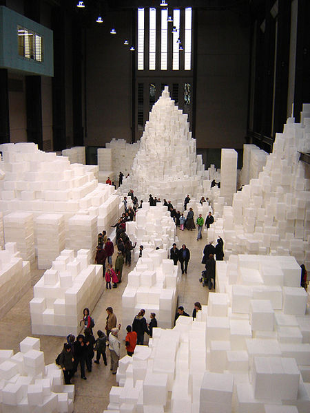
Rachel Whiteread, Embankment, 2005: Whiteread’s installation Embankment is a type of art designed to transform the viewer’s perception of space.
“Virtual reality” is a term that refers to computer-simulated environments. Currently, most virtual reality environments are visual experiences, but some simulations include additional sensory information. Immersive virtual reality has developed in recent years with the improvement of technology and is increasingly addressing the five senses within a virtual realm. Artists have been exploring the possibilities of these simulated and virtual realities with the expansion of the discipline of cyberarts, though what constitutes cyberart continues to be up for debate. Environments such as the virtual world of Second Life are generally accepted, but whether or not video games should be considered art remains undecided.
Compositional Balance
Compositional balance refers to the placement of the artistic elements in relation to each other within a work of art.
Learning Objectives
Categorize the elements of compositional balance in a work of art
Key Takeaways
Key Points
- A harmonious compositional balance involves arranging elements so that no one part of a work overpowers or seems heavier than any other part.
- The three most common types of compositional balance are symmetrical, asymmetrical, and radial .
- When balanced, a composition appears stable and visually right. Just as symmetry relates to aesthetic preference and reflects an intuitive sense for how things “should” appear, the overall balance of a given composition contributes to outside judgments of the work.
Key Terms
- radial:Arranged like rays that radiate from, or converge to, a common center.
- symmetry:Exact correspondence on either side of a dividing line, plane, center, or axis. The satisfying arrangement of a balanced distribution of the elements of a whole.
- asymmetry:Want of symmetry, or proportion between the parts of a thing, especially want of bilateral symmetry. Lacking a common measure between two objects or quantities; Incommensurability. That which causes something to not be symmetrical.
Compositional balance refers to the placement of the elements of art (color, form , line , shape, space , texture , and value) in relation to each other. When balanced, a composition appears more stable and visually pleasing. Just as symmetry relates to aesthetic preference and reflects an intuitive sense for how things “should” appear, the overall balance of a given composition contributes to outside judgments of the work.
Creating a harmonious compositional balance involves arranging elements so that no single part of a work overpowers or seems heavier than any other part. The three most common types of compositional balance are symmetrical, asymmetrical, and radial.
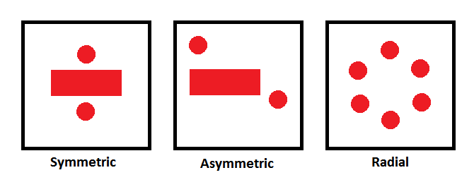
Compositional balance: The three common types of balance are symmetric, asymmetric, and radial.
Symmetrical balance is the most stable, in a visual sense, and generally conveys a sense of harmonious or aesthetically pleasing proportionality. When both sides of an artwork on either side of the horizontal or vertical axis of the picture plane are the same in terms of the sense that is created by the arrangement of the elements of art, the work is said to exhibit this type of balance. The opposite of symmetry is asymmetry .
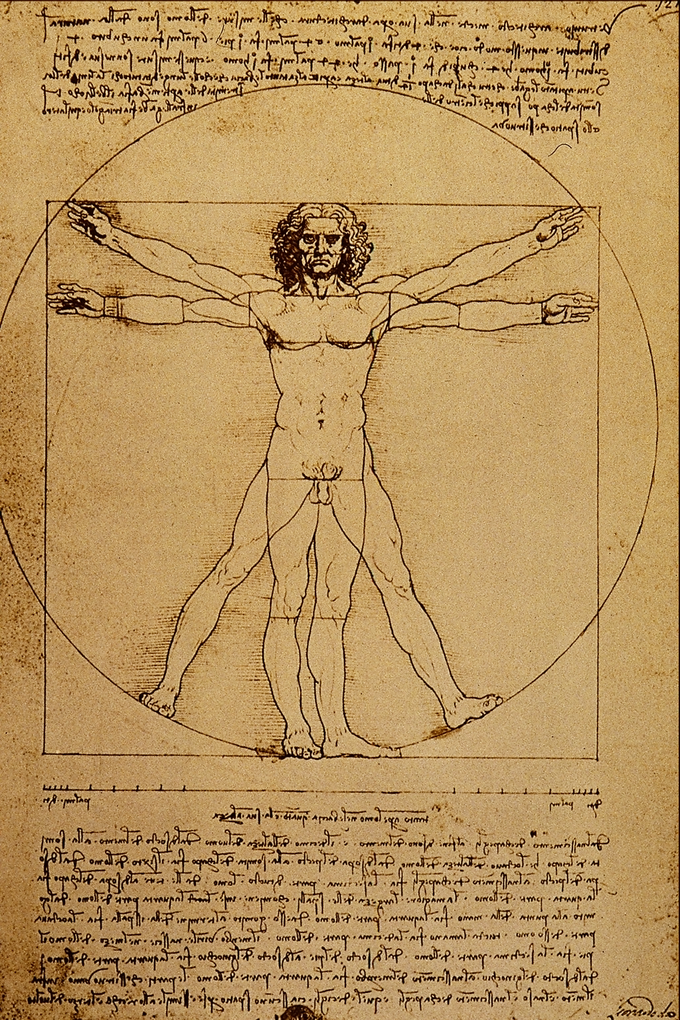
Leonardo da Vinci, Vitruvian Man, 1487: Leonardo da Vinci’s Vitruvian Man is often used as a representation of symmetry in the human body and, by extension, the natural universe.
Asymmetry is defined as the absence of, or a violation of, the principles of symmetry. Examples of asymmetry appear commonly in architecture. Although pre-modern architectural styles tended to place an emphasis on symmetry (except where extreme site conditions or historical developments lead away from this classical ideal), modern and postmodern architects frequently used asymmetry as a design element. For instance, while most bridges employ a symmetrical form due to intrinsic simplicities of design, analysis, fabrication, and economical use of materials, a number of modern bridges have deliberately departed from this, either in response to site-specific considerations or to create a dramatic design statement. .
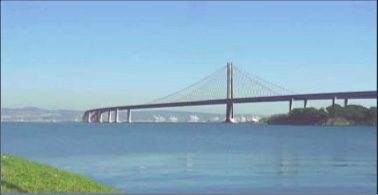
Oakland Bay Bridge: Eastern span replacement of the San Francisco–Oakland Bay Bridge reflects asymmetrical architectural design.
Radial balance refers to circular elements in compositions. In classical geometry, a radius of a circle or sphere is any line segment from its center to its perimeter. By extension, the radius of a circle or sphere is the length of any such segment, which is half the diameter. The radius may be more than half the diameter, which is usually defined as the maximum distance between any two points of the figure. The inradius of a geometric figure is usually the radius of the largest circle or sphere contained in it. The inner radius of a ring, tube or other hollow object is the radius of its cavity. The name “radial” or “radius” comes from Latin radius, meaning “ray” but also the spoke of a circular chariot wheel.
Rhythm
Artists use rhythm as a tool to guide the eye of the viewer through works of art.
Learning Objectives
Recognize and interpret the use of rhythm in a work of art
Key Takeaways
Key Points
- Rhythm may be generally defined as a “movement marked by the regulated succession of strong and weak elements, or of opposite or different conditions” (Anon. 1971).
- Rhythm may also refer to visual presentation as “timed movement through space ” (Jirousek 1995), and a common language of pattern unites rhythm with geometry.
- For instance, placing a red spiral at the bottom left and top right, for example, will cause the eye to move from one spiral, to the other, and everything in between. It is indicating movement in the piece by the repetition of elements and, therefore, can make artwork seem active.
Key Terms
- symmetry:Exact correspondence on either side of a dividing line, plane, center or axis. The satisfying arrangement of a balanced distribution of the elements of a whole.
The principles of visual art are the rules, tools, and guidelines that artists use to organize the elements of in a piece of artwork. When the principles and elements are successfully combined, they aid in creating an aesthetically pleasing or interesting work of art. While there is some variation among them, movement, unity, harmony, variety, balance, rhythm, emphasis, contrast , proportion, and pattern are commonly sited as principles of art.
Rhythm (from Greek rhythmos, “any regular recurring motion, symmetry ” (Liddell and Scott 1996)) may be generally defined as a “movement marked by the regulated succession of strong and weak elements, or of opposite or different conditions” (Anon. 1971). This general meaning of regular recurrence or pattern in time may be applied to a wide variety of cyclical natural phenomena having a periodicity or frequency of anything from microseconds to millions of years. In the performing arts, rhythm is the timing of events on a human scale, of musical sounds and silences, of the steps of a dance, or the meter of spoken language and poetry. Rhythm may also refer to visual presentation, as “timed movement through space” (Jirousek 1995), and a common language of pattern unites rhythm with geometry.
In a visual composition , pattern and rhythm are generally expressed by showing consistency with colors or lines . For instance, placing a red spiral at the bottom left and top right, for example, will cause the eye to move from one spiral, to the other, and then to the space in between. The repetition of elements creates movement of the viewer ‘s eye and can, therefore, make the artwork feel active. Hilma af Klint’s Svanen (The Swan) exemplifies the visual representation of rhythm using color and symmetry.

Hilma af Klint, Svanen (The Swan), 1914: Color and symmetry work together in this painting to guide the eye of the viewer in a particular visual rhythm.
Proportion and Scale
Proportion is a measurement of the size and quantity of elements within a composition.
Learning Objectives
Apply the concept of proportion to different works of art
Key Takeaways
Key Points
- Hierarchical proportion is a technique used in art, mostly in sculpture and painting, in which the artist uses unnatural proportion or scale to depict the relative importance of the figures in the artwork.
- Mathematically, proportion is the relation between elements and a whole. In architecture, the whole is not just a building but the set and setting of the site.
- Among the various ancient artistic traditions, the harmonic proportions, human proportions, cosmic orientations, various aspects of sacred geometry , and small whole-number ratios were all applied as part of the practice of architectural design.
Key Terms
- golden ratio:The irrational number (approximately 1·618), usually denoted by the Greek letter φ (phi), which is equal to the sum of its own reciprocal and 1, or, equivalently, is such that the ratio of 1 to the number is equal to the ratio of its reciprocal to 1. Some twentieth-century artists and architects have proportioned their works to approximate this—especially in the form of the golden rectangle, in which the ratio of the longer side to the shorter equals this number—believing this proportion to be aesthetically pleasing.
Proportion is a measurement of the size and quantity of elements within a composition . Hierarchical proportion is a technique used in art, mostly in sculpture and painting, in which the artist uses unnatural proportion or scale to depict the relative importance of the figures in the artwork. In ancient Egyptian art, for example, gods and important political figures appear much larger than common people. Beginning with the Renaissance , artists recognized the connection between proportion and perspective , and the illusion of three-dimensional space . Images of the human body in exaggerated proportion were used to depict the reality an artist interpreted.
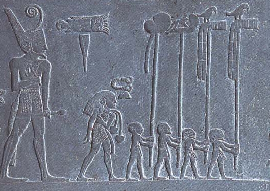
Depiction of Narmer from the Narmer Palette: Narmer, a Predynastic ruler, accompanied by men carrying the standards of various local gods. This piece demonstrates the ancient Egyptians’ use of proportion, with Narmer appearing larger than the other figures depicted.
Mathematically, proportion is the relation between elements and a whole. In architecture, the whole is not just a building but the set and setting of the site. The things that make a building and its site “well shaped” include everything from the orientation of the site and the buildings on it, to the features of the grounds on which it is situated. Light, shade, wind, elevation , and choice of materials all relate to a standard of architectural proportion.
Architecture has often used proportional systems to generate or constrain the forms considered suitable for inclusion in a building. In almost every building tradition, there is a system of mathematical relations which governs the relationships between aspects of the design. These systems of proportion are often quite simple: whole number ratios or incommensurable ratios (such as the golden ratio) were determined using geometrical methods. Generally, the goal of a proportional system is to produce a sense of coherence and harmony among the elements of a building.
Among the various ancient artistic traditions, the harmonic proportions, human proportions, cosmic orientations, various aspects of sacred geometry, and small whole-number ratios were all applied as part of the practice of architectural design. For instance, the Greek classical architectural orders are all proportioned rather than dimensioned or measured modules, because the earliest modules were not based on body parts and their spans (fingers, palms, hands, and feet), but rather on column diameters and the widths of arcades and fenestrations .

Temple of Portanus: The Greek Temple of Portanus is an example of classical Greek architecture with its tetrastyle portico of four Ionic columns.
Typically, one set of column diameter modules used for casework and architectural moldings by the Egyptians and Romans is based on the proportions of the palm and the finger, while another less delicate module—used for door and window trim, tile work, and roofing in Mesopotamia and Greece—was based on the proportions of the hand and the thumb.
Dating back to the Pythagoreans, there was an idea that proportions should be related to standards, and that the more general and formulaic the standards, the better. This concept—that there should be beauty and elegance evidenced by a skillful composition of well understood elements—underlies mathematics, art, and architecture. The classical standards are a series of paired opposites designed to expand the dimensional constraints of harmony and proportion.
Space
Space in art can be defined as the area that exists between two identifiable points.
Learning Objectives
Define space in art and list ways it is employed by artists
Key Takeaways
Key Points
- The organization of space is referred to as composition and is an essential component to any work of art.
- The space of an artwork includes the background, foreground, and middle ground , as well as the distance between, around, and within things.
- There are two types of space: positive space and negative space.
- After spending hundreds of years developing linear perspective , Western artistic notions about the accurate depiction of space went through a radical shift at the beginning of the 20th century.
- Cubism and subsequent modernist movements represented an important shift in the use of space within Western art, which is still being felt today.
Key Terms
- space:The distance or empty area between things.
- Cubism:An artistic movement in the early 20th century characterized by the depiction of natural forms as geometric structures of planes.
The organization of space in art is referred to as composition, and is an essential component of any work of art. Space can be generally defined as the area that exists between any two identifiable points.
Space is conceived of differently in each medium . The space in a painting, for example, includes the background, foreground and middle ground, while three-dimensional space, like sculpture or installation , will involve the distance between, around, and within points of the work. Space is further categorized as positive or negative. “Positive space” can be defined as the subject of an artwork, while “negative space” can be defined as the space around the subject.
Over the ages, space has been conceived of in various ways. Artists have devoted a great deal of time to experimenting with perspectives and degrees of flatness of the pictorial plane .
The perspective system has been a highly employed convention in Western art. Visually, it is an illusionist phenomenon, well suited to realism and the depiction of reality as it appears. After spending hundreds of years developing linear perspective, Western artistic conventions about the accurate depiction of space went through a radical shift at the beginning of the 20th century. The innovations of Cubism and subsequent modernist movements represented an important shift in the use of space within Western art, the impact of which is still being felt.
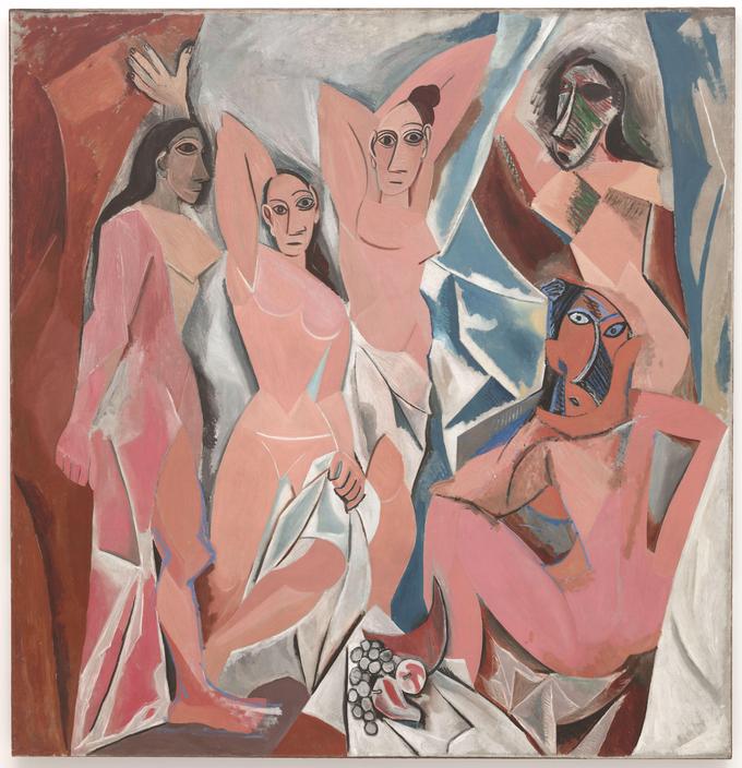
Pablo Picasso, Les Demoiselles d’Avignon, 1907: Les Demoiselles d’Avignon is an example of cubist art, which has a tendency to flatten the picture plane, and its use of abstract shapes and irregular forms suggest multiple points of view within a single image.
Two-Dimensional Space
Two-dimensional, or bi-dimensional, space is a geometric model of the planar projection of the physical universe in which we live.
Learning Objectives
Discuss two-dimensional space in art and the physical properties on which it is based
Key Takeaways
Key Points
- In physical terms, dimension refers to the constituent structure of all space and its position in time.
- Drawing is a form of visual art that makes use of any number of instruments to mark a two-dimensional medium .
- Almost any dimensional form can be represented by some combination of the cube, sphere, cylinder, and cone. Once these basic shapes have been assembled into a likeness, then the drawing can be refined into a more accurate and polished form.
Key Terms
- dimension:A single aspect of a given thing. A measure of spatial extent in a particular direction, such as height, width or breadth, or depth.
- Two-Dimensional:Existing in two dimensions. Not creating the illusion of depth.
- Planar:Of or pertaining to a plane. Flat, two-dimensional.
Two dimensional, or bi-dimensional, space is a geometric model of the planar projection of the physical universe in which we live. The two dimensions are commonly called length and width. Both directions lie on the same plane . In physics, our bi-dimensional space is viewed as a planar representation of the space in which we move.

Mathematical depiction of bi-dimensional space: Bi-dimensional Cartesian coordinate system.
In art composition , drawing is a form of visual art that makes use of any number of drawing instruments to mark a two-dimensional medium (meaning that the object does not have depth). One of the simplest and most efficient means of communicating visual ideas, the medium has been a popular and fundamental means of public expression throughout human history. Additionally, the relative availability of basic drawing instruments makes drawing more universal than most other media.
Measuring the dimensions of a subject while blocking in the drawing is an important step in producing a realistic rendition of a subject. Tools such as a compass can be used to measure the angles of different sides. These angles can be reproduced on the drawing surface and then rechecked to make sure they are accurate. Another form of measurement is to compare the relative sizes of different parts of the subject with each other. A finger placed at a point along the drawing implement can be used to compare that dimension with other parts of the image. A ruler can be used both as a straightedge and a device to compute proportions. When attempting to draw a complicated shape such as a human figure, it is helpful at first to represent the form with a set of primitive shapes.
Almost any dimensional form can be represented by some combination of the cube, sphere, cylinder, and cone. Once these basic shapes have been assembled into a likeness, then the drawing can be refined into a more accurate and polished form. The lines of the primitive shapes are removed and replaced by the final likeness. A more refined art of figure drawing relies upon the artist possessing a deep understanding of anatomy and the human proportions. A trained artist is familiar with the skeleton structure, joint location, muscle placement, tendon movement, and how the different parts work together during movement. This allows the artist to render more natural poses that do not appear artificially stiff. The artist is also familiar with how the proportions vary depending on the age of the subject, particularly when drawing a portrait.
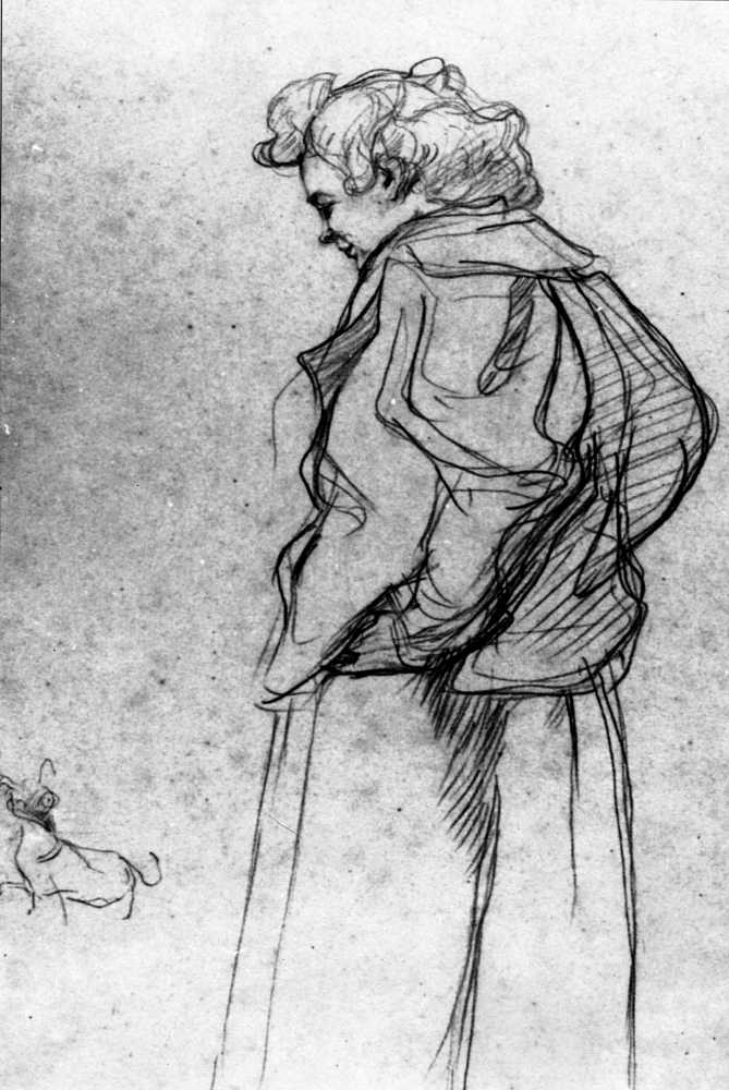
Drawing human figures: Henri de Toulouse-Lautrec’s Madame Palmyre with Her Dog, 1897.
Linear Perspective and Three-Dimensional Space
Perspective is an approximate representation on a flat surface of an image as it is seen by the eye.
Learning Objectives
Explain perspective and its impact on art composition
Key Takeaways
Key Points
- Systematic attempts to evolve a system of perspective are usually considered to have begun around the 5th century B.C. in the art of Ancient Greece.
- The earliest art paintings and drawings typically sized objects and characters hierarchically according to their spiritual or thematic importance, not their distance from the viewer .
- In Medieval Europe, the use and sophistication of attempts to convey distance increased steadily but without a basis in a systematic theory.
- By the Renaissance , nearly every artist in Italy used geometrical perspective in their paintings, both to portray depth and also as a new and “of the moment” compositional method.
Key Terms
- curvilinear:Having bends; curved; formed by curved lines.
- horizon line:A horizontal line in perspective drawing, directly opposite the viewer’s eye and often implied, that represents objects infinitely far away and determines the angle or perspective from which the viewer sees the work.
- vanishing point:The point in a perspective drawing at which parallel lines receding from an observer seem to converge.
- Perspective:The technique of representing three-dimensional objects on a two-dimensional surface.
In art, perspective is an approximate representation on a flat surface of an image as it is seen by the eye, calculated by assuming a particular vanishing point . Systematic attempts to evolve a system of perspective are usually considered to have begun around the 5th century BCE in the art of Ancient Greece. By the later periods of antiquity , artists—especially those in less popular traditions—were well aware that distant objects could be shown smaller than those close at hand for increased illusionism. But whether this convention was actually used in a work depended on many factors. Some of the paintings found in the ruins of Pompeii show a remarkable realism and perspective for their time.
The earliest art paintings and drawings typically sized objects and characters hierarchically according to their spiritual or thematic importance, not their distance from the viewer. The most important figures are often shown as the highest in a composition , also from hieratic motives, leading to the “vertical perspective” common in the art of Ancient Egypt , where a group of “nearer” figures are shown below the larger figure(s).
The art of the Migration Period had no tradition of attempting compositions of large numbers of figures, and Early Medieval art was slow and inconsistent in relearning the convention from classical models, though the process can be seen underway in Carolingian art. European Medieval artists were aware of the general principle of varying the relative size of elements according to distance, and use and sophistication of attempts to convey distance increased steadily during the period, but without a basis in a systematic theory.
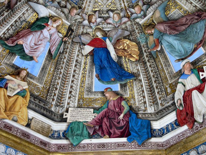
By the Renaissance, however, nearly every artist in Italy used geometrical perspective in their paintings. Not only was this use of perspective a way to portray depth, but it was also a new method of composing a painting. Paintings began to show a single, unified scene, rather than a combination of several. For a while, perspective remained the domain of Florence. Gradually, and partly through the movement of academies of the arts, the Italian techniques became part of the training of artists across Europe and, later, other parts of the world.
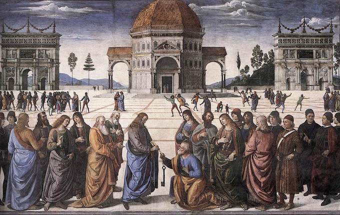
Perspective in Renaissance Painting: Pietro Perugino’s usage of perspective in this fresco at the Sistine Chapel (1481–82) helped bring the Renaissance to Rome.
A drawing has one-point perspective when it contains only one vanishing point on the horizon line . This type of perspective is typically used for images of roads, railway tracks, hallways, or buildings viewed so that the front is directly facing the viewer. Any objects that are made up of lines either directly parallel with the viewer’s line of sight or directly perpendicular (the railroad slats) can be represented with one-point perspective. These parallel lines converge at the vanishing point.
Two-point perspective can be used to draw the same objects as one-point perspective, but rotated—such as looking at the corner of a house, or looking at two forked roads shrink into the distance. In looking at a house from the corner, for example, one wall would recede towards one vanishing point and the other wall would recede towards the opposite vanishing point.
Three-point perspective is used for buildings depicted from above or below. In addition to the two vanishing points from before, one for each wall, there is now a third one for how those walls recede into the ground . This third vanishing point would be below the ground.
Four-point perspective is the curvilinear variant of two-point perspective. The resulting elongated frame can be used both horizontally and vertically. Like all other foreshortened variants of perspective, four-point perspective starts off with a horizon line, followed by four equally spaced vanishing points to delineate four vertical lines. Because vanishing points exist only when parallel lines are present in the scene, a perspective with no vanishing points (“zero-point”) occurs if the viewer is observing a non-rectilinear scene. The most common example of a nonlinear scene is a natural scene (e.g., a mountain range), which frequently does not contain any parallel lines. A perspective without vanishing points can still create a sense of depth.
Distortions of Space and Foreshortening
Distortion is used to create various representations of space in two-dimensional works of art.
Learning Objectives
Identify how distortion is both employed and avoided in works of art
Key Takeaways
Key Points
- Perspective projection distortion is the inevitable misrepresentation of three-dimensional space when drawn or “projected” onto a two-dimensional surface. It is impossible to accurately depict three-dimensional reality on a two-dimensional plane .
- However, there are several constructs available which allow for seemingly accurate representation. Perspective projection can be used to mirror how the eye sees by the use of one or more vanishing points .
- Although distortion can be irregular or follow many patterns, the most commonly encountered distortions in composition , especially in photography, are radially symmetric, or approximately so, arising from the symmetry of a photographic lens.
Key Terms
- radial:Arranged like rays that radiate from, or converge into, a common center
- projection:The image that a translucent object casts onto another object.
- foreshortening:A technique for creating the appearance that the object of a drawing is extending into space by shortening the lines with which that object is drawn.
A distortion is the alteration of the original shape (or other characteristic) of an object, image, sound, or other form of information or representation. Distortion can be wanted or unwanted by the artist. Distortion is usually unwanted when it concerns physical degradation of a work. However, it is more commonly referred to in terms of perspective, where it is employed to create realistic representations of space in two-dimensional works of art.
Perspective Projection Distortion
Perspective projection distortion is the inevitable misrepresentation of three-dimensional space when drawn or “projected” onto a two-dimensional surface. It is impossible to accurately depict three-dimensional reality on a two-dimensional plane. However, there are several constructs available that allow for seemingly accurate representation. The most common of these is perspective projection. Perspective projection can be used to mirror how the eye sees by making use of one or more vanishing points.
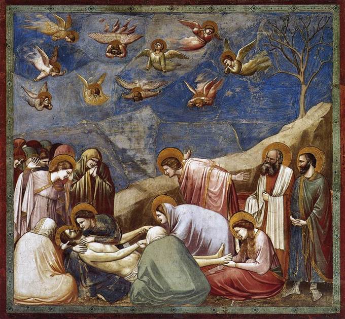
Giotto, Lamentation (The Mourning of Christ), 1305–1306: Giotto is one of the most notable pre-Renaissance artists to recognize distortion on two-dimensional planes.
Foreshortening
Foreshortening is the visual effect or optical illusion that causes an object or distance to appear shorter than it actually is because it is angled toward the viewer . Although foreshortening is an important element in art where visual perspective is being depicted, foreshortening occurs in other types of two-dimensional representations of three-dimensional scenes, such as oblique parallel projection drawings.
The physiological basis of visual foreshortening was undefined until the year 1000 when the Arabian mathematician and philosopher, Alhazen, in his Perspectiva, first explained that light projects conically into the eye. A method for presenting foreshortened geometry systematically onto a plane surface was unknown for another 300 years. The artist Giotto may have been the first to recognize that the image beheld by the eye is distorted: to the eye, parallel lines appear to intersect (like the distant edges of a path or road), whereas in “undistorted” nature, they do not. In many of Giotto’s paintings, perspective is employed to achieve various distortion effects.
Foreshortening: This painting illustrates Melozzo da Forlì’s usage of upward foreshortening in his frescoes at The Basilica della Santa Casa.
Distortion in Photography
In photography, the projection mechanism is light reflected from an object. To execute a drawing using perspective projection, projectors emanate from all points of an object and intersect at a station point. These projectors intersect with an imaginary plane of projection and an image is created on the plane by the points of intersection. The resulting image on the projection plane reproduces the image of the object as it is beheld from the station point.
Radial distortion can usually be classified as one of two main types: barrel distortion and pincushion distortion. Barrel distortion occurs when image magnification decreases with distance from the optical axis. The apparent effect is that of an image which has been mapped around a sphere (or barrel). Fisheye lenses, which take hemispherical views, utilize this type of distortion as a way to map an infinitely wide object plane into a finite image area.
On the other hand, in pincushion distortion, the image magnification increases with the distance from the optical axis. The visible effect is that lines that do not go through the center of the image are bowed inwards, towards the center of the image, like a pincushion. A certain amount of pincushion distortion is often found with visual optical instruments (i.e., binoculars), where it serves to eliminate the globe effect.
Cylindrical perspective is a form of distortion caused by fisheye and panoramic lenses, which reproduce straight horizontal lines above and below the lens axis level as curved, while reproducing straight horizontal lines on lens axis level as straight. This is also a common feature of wide-angle anamorphic lenses of less than 40mm focal length in cinematography. Essentially it is just barrel distortion, but only in the horizontal plane. It is an artifact of the squeezing process that anamorphic lenses do to fit widescreen images onto standard-width film.
- Curation and Revision. Provided by: Boundless.com. License: CC BY-SA: Attribution-ShareAlike
- David-Oath of the Horatii-1784. Provided by: Wikipedia. Located at: en.Wikipedia.org/wiki/File:David-Oath_of_the_Horatii-1784.jpg. License: Public Domain: No Known Copyright
- Elements of art. Provided by: Wikipedia. Located at: en.Wikipedia.org/wiki/Elements_of_art. License: CC BY-SA: Attribution-ShareAlike
- Oath of the Horatii. Provided by: Wikipedia . Located at: en.Wikipedia.org/wiki/Oath_of_the_Horatii. License: CC BY-SA: Attribution-ShareAlike
- Module 3: The Visual Language: The Elements of Art. Provided by: Saylor. Located at: http://www.saylor.org/site/wp-content/uploads/2011/12/Module-3.pdf. License: CC BY: Attribution
- Line art. Provided by: Wikipedia. Located at: en.Wikipedia.org/wiki/Line_art. License: CC BY-SA: Attribution-ShareAlike
- Outline drawing. Provided by: Wikipedia. Located at: en.Wikipedia.org/wiki/Outline_drawing. License: CC BY-SA: Attribution-ShareAlike
- texture. Provided by: Wiktionary. Located at: en.wiktionary.org/wiki/texture. License: CC BY-SA: Attribution-ShareAlike
- line. Provided by: Wiktionary. Located at: en.wiktionary.org/wiki/line. License: CC BY-SA: Attribution-ShareAlike
- cross-hatching. Provided by: Wiktionary. Located at: en.wiktionary.org/wiki/cross-hatching. License: CC BY-SA: Attribution-ShareAlike
- Caravaggio denial. Provided by: Wikimedia. Located at: commons.wikimedia.org/wiki/File:Caravaggio_denial.jpg. License: Public Domain: No Known Copyright
- ART VALUE SCALE. Provided by: Wikimedia. Located at: commons.wikimedia.org/wiki/File:ART_VALUE_SCALE.png. License: CC BY-SA: Attribution-ShareAlike
- Elements of art. Provided by: Wikipedia. Located at: en.Wikipedia.org/wiki/Elements_of_art. License: CC BY-SA: Attribution-ShareAlike
- Module 3: The Visual Language: The Elements of Art. Provided by: Saylor. Located at: http://www.saylor.org/site/wp-content/uploads/2011/12/Module-3.pdf. License: CC BY: Attribution
- The Denial of Saint Peter (Caravaggio). Provided by: Wikipedia. Located at: en.Wikipedia.org/wiki/The_Denial_of_Saint_Peter_(Caravaggio). License: CC BY-SA: Attribution-ShareAlike
- Lightness. Provided by: Wikipedia. Located at: en.Wikipedia.org/wiki/Lightness. License: CC BY-SA: Attribution-ShareAlike
- Chiaroscuro. Provided by: Wikipedia. Located at: en.Wikipedia.org/wiki/Chiaroscuro. License: CC BY-SA: Attribution-ShareAlike
- chiaroscuro. Provided by: Wiktionary. Located at: en.wiktionary.org/wiki/chiaroscuro. License: CC BY-SA: Attribution-ShareAlike
- BYR color wheel. Provided by: Wikimedia. Located at: commons.wikimedia.org/wiki/File:BYR_color_wheel.svg. License: CC BY-SA: Attribution-ShareAlike
- Color wheel. Provided by: Wikipedia. Located at: en.Wikipedia.org/wiki/RYB_color_model. License: CC BY-SA: Attribution-ShareAlike
- Module 3: The Visual Language: The Elements of Art. Provided by: Saylor. Located at: http://www.saylor.org/site/wp-content/uploads/2011/12/Module-3.pdf. License: CC BY: Attribution
- Elements of art. Provided by: Wikipedia. Located at: en.Wikipedia.org/wiki/Elements_of_art. License: CC BY-SA: Attribution-ShareAlike
- Theory of Colours. Provided by: Wikipedia. Located at: en.Wikipedia.org/wiki/Theory_of_Colours. License: CC BY-SA: Attribution-ShareAlike
- Boundless. Provided by: Boundless Learning. Located at: www.boundless.com//art-history/definition/complementary-color. License: CC BY-SA: Attribution-ShareAlike
- hue. Provided by: Wiktionary. Located at: en.wiktionary.org/wiki/hue. License: CC BY-SA: Attribution-ShareAlike
- gradation. Provided by: Wiktionary. Located at: en.wiktionary.org/wiki/gradation. License: CC BY-SA: Attribution-ShareAlike
- primary colour. Provided by: Wiktionary. Located at: en.wiktionary.org/wiki/primary_colour. License: CC BY-SA: Attribution-ShareAlike
- value. Provided by: Wiktionary. Located at: en.wiktionary.org/wiki/value. License: CC BY-SA: Attribution-ShareAlike
- tint. Provided by: Wiktionary. Located at: en.wiktionary.org/wiki/tint. License: CC BY-SA: Attribution-ShareAlike
- Van Gogh - Starry Night - Google Art Project. Provided by: Wikipedia. Located at: en.Wikipedia.org/wiki/File:Van_Gogh_-_Starry_Night_-_Google_Art_Project.jpg. License: Public Domain: No Known Copyright
- Jan van Eyck 070. Provided by: Wikipedia. Located at: en.Wikipedia.org/wiki/File:Jan_van_Eyck_070.jpg. License: Public Domain: No Known Copyright
- Madonna of Chancellor. Provided by: Wikipedia. Located at: en.Wikipedia.org/wiki/Madonna_of_Chancellor_Rolin. License: CC BY-SA: Attribution-ShareAlike
- The Starry Night . Provided by: Wikipedia. Located at: en.Wikipedia.org/wiki/The_Starry_Night. License: CC BY-SA: Attribution-ShareAlike
- Pattern. Provided by: Wikipedia. Located at: en.Wikipedia.org/wiki/Pattern%23Patterns_in_art_and_architecture. License: CC BY-SA: Attribution-ShareAlike
- Module 3: The Visual Language: The Elements of Art. Provided by: Saylor. Located at: http://www.saylor.org/site/wp-content/uploads/2011/12/Module-3.pdf. License: CC BY: Attribution
- Texture (visual arts). Provided by: Wikipedia. Located at: en.Wikipedia.org/wiki/Texture_(visual_arts). License: CC BY-SA: Attribution-ShareAlike
- Elements of art. Provided by: Wikipedia. Located at: en.Wikipedia.org/wiki/Elements_of_art. License: CC BY-SA: Attribution-ShareAlike
- Texture (painting). Provided by: Wikipedia. Located at: en.Wikipedia.org/wiki/Texture_(painting). License: CC BY-SA: Attribution-ShareAlike
- tactile. Provided by: Wiktionary. Located at: en.wiktionary.org/wiki/tactile. License: CC BY-SA: Attribution-ShareAlike
- Jan Bruegel d.nu00c4.n007. Provided by: Wikipedia. Located at: en.Wikipedia.org/wiki/File:Jan_Bruegel_d._%C3%84._007.jpg. License: Public Domain: No Known Copyright
- Elements of art. Provided by: Wikipedia. Located at: en.Wikipedia.org/wiki/Elements_of_art. License: CC BY-SA: Attribution-ShareAlike
- Module 3: The Visual Language: The Elements of Art. Provided by: Saylor. Located at: http://www.saylor.org/site/wp-content/uploads/2011/12/Module-3.pdf. License: CC BY: Attribution
- form. Provided by: Wiktionary. Located at: en.wiktionary.org/wiki/form. License: CC BY-SA: Attribution-ShareAlike
- volume. Provided by: Wiktionary. Located at: en.wiktionary.org/wiki/volume. License: CC BY-SA: Attribution-ShareAlike
- plane. Provided by: Wiktionary. Located at: en.wiktionary.org/wiki/plane. License: CC BY-SA: Attribution-ShareAlike
- Duchamp - Nude Descending a Staircase. Provided by: Wikipedia. Located at: en.Wikipedia.org/wiki/File:Duchamp_-_Nude_Descending_a_Staircase.jpg. License: Public Domain: No Known Copyright
- Nude Descending a Staircase, No. 2. Provided by: Wikipedia. Located at: en.Wikipedia.org/wiki/Nude_Descending_a_Staircase,_No._2. License: CC BY-SA: Attribution-ShareAlike
- Sequential art. Provided by: Wikipedia. Located at: en.Wikipedia.org/wiki/Sequential_art. License: CC BY-SA: Attribution-ShareAlike
- Kinetic art. Provided by: Wikipedia. Located at: en.Wikipedia.org/wiki/Kinetic_art. License: CC BY-SA: Attribution-ShareAlike
- Video art. Provided by: Wikipedia. Located at: en.Wikipedia.org/wiki/Video_art. License: CC BY-SA: Attribution-ShareAlike
- Module 4: The Artistic Principles. Provided by: Saylor. Located at: http://www.saylor.org/site/wp-content/uploads/2011/12/Module-4.pdf. License: CC BY: Attribution
- Sound art. Provided by: Wikipedia. Located at: en.Wikipedia.org/wiki/Sound_art. License: CC BY-SA: Attribution-ShareAlike
- Performance art. Provided by: Wikipedia. Located at: en.Wikipedia.org/wiki/Performance_art. License: CC BY-SA: Attribution-ShareAlike
- static. Provided by: Wiktionary. Located at: en.wiktionary.org/wiki/static. License: CC BY-SA: Attribution-ShareAlike
- frames per second. Provided by: Wiktionary. Located at: en.wiktionary.org/wiki/frames_per_second. License: CC BY-SA: Attribution-ShareAlike
- Duchamp Fountaine. Provided by: Wikipedia. Located at: en.Wikipedia.org/wiki/File:Duchamp_Fountaine.jpg. License: Public Domain: No Known Copyright
- Public art. Provided by: Wikipedia. Located at: en.Wikipedia.org/wiki/Public_art. License: CC BY-SA: Attribution-ShareAlike
- New media art. Provided by: Wikipedia. Located at: en.Wikipedia.org/wiki/New_media_art. License: CC BY-SA: Attribution-ShareAlike
- Collaboration. Provided by: Wikipedia. Located at: en.Wikipedia.org/wiki/Collaboration%23Arts. License: CC BY-SA: Attribution-ShareAlike
- Dada. Provided by: Wikipedia. Located at: en.Wikipedia.org/wiki/Dada. License: CC BY-SA: Attribution-ShareAlike
- Interactive art. Provided by: Wikipedia. Located at: en.Wikipedia.org/wiki/Interactive_art. License: CC BY-SA: Attribution-ShareAlike
- happening. Provided by: Wiktionary. Located at: en.wiktionary.org/wiki/happening. License: CC BY-SA: Attribution-ShareAlike
- assemblage. Provided by: Wiktionary. Located at: en.wiktionary.org/wiki/assemblage. License: CC BY-SA: Attribution-ShareAlike
- Whiteread tate 1. Provided by: Wikipedia. Located at: en.Wikipedia.org/wiki/File:Whiteread_tate_1.jpg. License: CC BY-SA: Attribution-ShareAlike
- Installation art. Provided by: Saylor. Located at: http://www.saylor.org/site/wp-content/uploads/2011/05/Installation-art.pdf. License: CC BY-SA: Attribution-ShareAlike
- Immersion (virtual reality). Provided by: Wikipedia. Located at: en.Wikipedia.org/wiki/Immersion_(virtual_reality). License: CC BY-SA: Attribution-ShareAlike
- Simulated reality. Provided by: Wikipedia. Located at: en.Wikipedia.org/wiki/Simulated_reality. License: CC BY-SA: Attribution-ShareAlike
- Installation art. Provided by: Wikipedia. Located at: en.Wikipedia.org/wiki/Installation_art. License: CC BY-SA: Attribution-ShareAlike
- happening. Provided by: Wiktionary. Located at: en.wiktionary.org/wiki/happening. License: CC BY-SA: Attribution-ShareAlike
- virtual reality. Provided by: Wiktionary. Located at: en.wiktionary.org/wiki/virtual_reality. License: CC BY-SA: Attribution-ShareAlike
- ProposedSFOBBEasternSpan. Provided by: Wikipedia. Located at: en.Wikipedia.org/wiki/File:ProposedSFOBBEasternSpan.jpg. License: Public Domain: No Known Copyright
- Artistic balance. Provided by: Wikipedia. Located at: en.Wikipedia.org/wiki/File:Artistic_balance.png. License: Public Domain: No Known Copyright
- Studio del Corpo Umano - Leonardo da Vinci. Provided by: Wikipedia. Located at: en.Wikipedia.org/wiki/File:Studio_del_Corpo_Umano_-_Leonardo_da_Vinci.png. License: Public Domain: No Known Copyright
- Vitruvian Man . Provided by: Wikipedia. Located at: en.Wikipedia.org/wiki/Vitruvian_Man. License: CC BY-SA: Attribution-ShareAlike
- Radius. Provided by: Wikipedia. Located at: en.Wikipedia.org/wiki/Radius. License: CC BY-SA: Attribution-ShareAlike
- Principles of art. Provided by: Wikipedia. Located at: en.Wikipedia.org/wiki/Principles_of_art. License: CC BY-SA: Attribution-ShareAlike
- Psychology of art. Provided by: Wikipedia. Located at: en.Wikipedia.org/wiki/Psychology_of_art%23Compositional_balance. License: CC BY-SA: Attribution-ShareAlike
- Asymmetry. Provided by: Wikipedia. Located at: en.Wikipedia.org/wiki/Asymmetry. License: CC BY-SA: Attribution-ShareAlike
- Symmetrical. Provided by: Wikipedia. Located at: en.Wikipedia.org/wiki/Symmetrical. License: CC BY-SA: Attribution-ShareAlike
- symmetry. Provided by: Wiktionary. Located at: en.wiktionary.org/wiki/symmetry. License: CC BY-SA: Attribution-ShareAlike
- asymmetry. Provided by: Wiktionary. Located at: en.wiktionary.org/wiki/asymmetry. License: CC BY-SA: Attribution-ShareAlike
- radial. Provided by: Wiktionary. Located at: en.wiktionary.org/wiki/radial. License: CC BY-SA: Attribution-ShareAlike
- Hilma_af_Klint_Svanen.jpg. Provided by: Wikipedia. Located at: upload.wikimedia.org/Wikipedia/commons/0/07/Hilma_af_Klint_Svanen.jpg. License: CC BY-SA: Attribution-ShareAlike
- Principles of art. Provided by: Wikipedia. Located at: en.Wikipedia.org/wiki/Principles_of_art%23Pattern.2FRhythm. License: CC BY-SA: Attribution-ShareAlike
- Rhythm. Provided by: Wikipedia. Located at: en.Wikipedia.org/wiki/Rhythm. License: CC BY-SA: Attribution-ShareAlike
- Rhythm. Provided by: Wikipedia. Located at: en.Wikipedia.org/wiki/Rhythm. License: CC BY-SA: Attribution-ShareAlike
- Principles of art. Provided by: Wikipedia. Located at: en.Wikipedia.org/wiki/Principles_of_art. License: CC BY-SA: Attribution-ShareAlike
- Composition (visual arts). Provided by: Wikipedia. Located at: en.Wikipedia.org/wiki/Composition_(visual_arts). License: CC BY-SA: Attribution-ShareAlike
- symmetry. Provided by: Wiktionary. Located at: en.wiktionary.org/wiki/symmetry. License: CC BY-SA: Attribution-ShareAlike
- TempleOfPortunus-ForumBoarium.jpg. Provided by: Wikipedia. Located at: upload.wikimedia.org/Wikipedia/commons/b/b1/TempleOfPortunus-ForumBoarium.jpg. License: CC BY-SA: Attribution-ShareAlike
- Narmer-Tjet2. Provided by: Wikipedia. Located at: en.Wikipedia.org/wiki/File:Narmer-Tjet2.JPG. License: CC BY-SA: Attribution-ShareAlike
- Principles of art. Provided by: Wikipedia. Located at: en.Wikipedia.org/wiki/Principles_of_art%23Proportion. License: CC BY-SA: Attribution-ShareAlike
- Hierarchical proportion. Provided by: Wikipedia. Located at: en.Wikipedia.org/wiki/Hierarchical_proportion. License: CC BY-SA: Attribution-ShareAlike
- Proportion (architecture). Provided by: Wikipedia. Located at: en.Wikipedia.org/wiki/Proportion_(architecture). License: CC BY-SA: Attribution-ShareAlike
- Fenestrations. Provided by: Wiktionary. Located at: en.wiktionary.org/wiki/Fenestrations. License: CC BY-SA: Attribution-ShareAlike
- golden ratio. Provided by: Wiktionary. Located at: en.wiktionary.org/wiki/golden_ratio. License: CC BY-SA: Attribution-ShareAlike
- Les Demoiselles d'Avignon. Provided by: Wikipedia. Located at: en.Wikipedia.org/wiki/File:Les_Demoiselles_d'Avignon.jpg. License: Public Domain: No Known Copyright
- White space (visual arts). Provided by: Wikipedia. Located at: en.Wikipedia.org/wiki/White_space_(visual_arts). License: CC BY-SA: Attribution-ShareAlike
- Composition (visual arts). Provided by: Wikipedia. Located at: en.Wikipedia.org/wiki/Composition_(visual_arts). License: CC BY-SA: Attribution-ShareAlike
- Elements of art. Provided by: Wikipedia. Located at: en.Wikipedia.org/wiki/Elements_of_art. License: CC BY-SA: Attribution-ShareAlike
- Module 3: The Visual Language: The Elements of Art. Provided by: Saylor. Located at: http://www.saylor.org/site/wp-content/uploads/2011/12/Module-3.pdf. License: CC BY: Attribution
- representational. Provided by: Wiktionary. Located at: en.wiktionary.org/wiki/representational. License: CC BY-SA: Attribution-ShareAlike
- Cubism. Provided by: Wikipedia. Located at: en.Wikipedia.org/wiki/Cubism. License: CC BY-SA: Attribution-ShareAlike
- Boundless. Provided by: Boundless Learning. Located at: www.boundless.com//art-history/definition/space. License: CC BY-SA: Attribution-ShareAlike
- Henri de Toulouse-Lautrec - Madame Palmyre with Her Dog, 1897. Provided by: Wikipedia. Located at: en.Wikipedia.org/wiki/File:Henri_de_Toulouse-Lautrec_-_Madame_Palmyre_with_Her_Dog,_1897.jpg. License: Public Domain: No Known Copyright
- Cartesian-coordinate-system. Provided by: Wikipedia. Located at: en.Wikipedia.org/wiki/File:Cartesian-coordinate-system.svg. License: Public Domain: No Known Copyright
- Dimension. Provided by: Wikipedia. Located at: en.Wikipedia.org/wiki/Dimension. License: CC BY-SA: Attribution-ShareAlike
- Drawing. Provided by: Wikipedia. Located at: en.Wikipedia.org/wiki/Drawing. License: CC BY-SA: Attribution-ShareAlike
- Two dimension. Provided by: Wikipedia. Located at: en.Wikipedia.org/wiki/Two_dimension. License: CC BY-SA: Attribution-ShareAlike
- dimension. Provided by: Wiktionary. Located at: en.wiktionary.org/wiki/dimension. License: CC BY-SA: Attribution-ShareAlike
- Two-Dimensional. Provided by: Wikipedia. Located at: en.Wikipedia.org/wiki/Two-Dimensional. License: CC BY-SA: Attribution-ShareAlike
- Planar. Provided by: Wiktionary. Located at: en.wiktionary.org/wiki/Planar. License: CC BY-SA: Attribution-ShareAlike
- Perugino Keys. Provided by: Wikipedia. Located at: en.Wikipedia.org/wiki/File:Perugino_Keys.jpg. License: Public Domain: No Known Copyright
- vanishing point. Provided by: Wiktionary. Located at: en.wiktionary.org/wiki/vanishing_point. License: CC BY-SA: Attribution-ShareAlike
- Linear perspective. Provided by: Wikipedia. Located at: en.Wikipedia.org/wiki/Linear_perspective. License: CC BY-SA: Attribution-ShareAlike
- curvilinear. Provided by: Wiktionary. Located at: en.wiktionary.org/wiki/curvilinear. License: CC BY-SA: Attribution-ShareAlike
- Perspective. Provided by: Wiktionary. Located at: en.wiktionary.org/wiki/Perspective. License: CC BY-SA: Attribution-ShareAlike
- Perspective drawing. Provided by: Wikipedia. Located at: en.Wikipedia.org/wiki/Perspective_drawing. License: CC BY-SA: Attribution-ShareAlike
- Foreshortening. Provided by: Wiktionary. Located at: en.wiktionary.org/wiki/Foreshortening. License: CC BY-SA: Attribution-ShareAlike
- Loreto Fresko. Provided by: Wikipedia. Located at: en.Wikipedia.org/wiki/File:Loreto_Fresko.jpg. License: Public Domain: No Known Copyright
- Giotto - Scrovegni - -36- - Lamentation (The Mourning of Christ). Provided by: Wikipedia. Located at: en.Wikipedia.org/wiki/File:Giotto_-_Scrovegni_-_-36-_-_Lamentation_(The_Mourning_of_Christ).jpg. License: Public Domain: No Known Copyright
- radial. Provided by: Wiktionary. Located at: en.wiktionary.org/wiki/radial. License: CC BY-SA: Attribution-ShareAlike
- Cylindrical perspective. Provided by: Wikipedia. Located at: en.Wikipedia.org/wiki/Cylindrical_perspective. License: CC BY-SA: Attribution-ShareAlike
- foreshortening. Provided by: Wiktionary. Located at: en.wiktionary.org/wiki/foreshortening. License: CC BY-SA: Attribution-ShareAlike
- Perspective projection distortion. Provided by: Wikipedia. Located at: en.Wikipedia.org/wiki/Perspective_projection_distortion. License: CC BY-SA: Attribution-ShareAlike
- Distortion. Provided by: Wikipedia. Located at: en.Wikipedia.org/wiki/Distortion. License: CC BY-SA: Attribution-ShareAlike
- Distortion (optics). Provided by: Wikipedia. Located at: en.Wikipedia.org/wiki/Distortion_(optics). License: CC BY-SA: Attribution-ShareAlike
- Foreshortening. Provided by: Wiktionary. Located at: en.wiktionary.org/wiki/Foreshortening. License: CC BY-SA: Attribution-ShareAlike
- Projection. Provided by: Wiktionary. Located at: en.wiktionary.org/wiki/Projection. License: CC BY-SA: Attribution-ShareAlike