
3.7: Contrast
- Page ID
- 156863
Overview
When an artist uses two noticeably different aspects of a visual element, that person is applying the principle of contrast. Examples include using different types of color, value, texture, size, etc.
Simultaneous Contrast
Simultaneous contrast occurs when the eye attempts to create a balance when colors seem to have a greater hue, intensity, or value when set next to another color. The effects are that:
- Colors will look darker or near lighter colors or colors will look lighter or near darker colors.
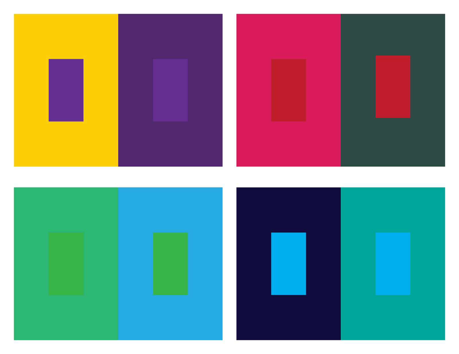
Simultaneous contrast showing different hues and intensities.
-
Complementary colors will look more intense on or near each other than they will on or near grays.
Hues that look more intense near each other than on and near gray.
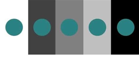
- The colors of the same intensity can look darker as the background becomes lighter.
|
The square in the middle of each neutral background has the same value. |
The square in the middle of each secondary purple background has the same value. |


Contrast: Principle of Design Explained! (2021, July 13), uploaded by Winged Canvas, https://youtu.be/7iwZEuT29vc
- Contrast can be thought of as using opposite aspects of a specific visual element of art.
- Contrast can be created by different colors, textures, or values of an element of art.
- Although the visual elements are completely different, they are related because they fall into the same category or grouping.
- Contrast can create visual interest in a work of art by using similar groupings of visual elements in dramatic ways to create a sense of drama in the work.