
3.5: Principles of Design- Balance
- Page ID
- 156860
Overview
The design principle of balance is the issue of visual “weight.” Compositional balance is achieved when these competing visual weights are roughly equivalent. The “job” of balance in a work of art is to lead a person’s eye around a two-dimensional or three-dimensional work of art. There are three basic types of balance.
How to Identify Balance
Before deciding upon what type of balance is seen in an artwork, the following must be done:
1. Bisect the work on either axis (vertical, horizontal or either diagonal) in whatever way makes sense for the artwork.
2. Mentally flip one side on top of the other (as if the artwork was printed onto a piece of paper and you folded it in half along whatever axis works best to bisect the artwork.
3. Look at the numbers, sizes, and types of forms and visual elements seen on each side of the bisected axis.
4. Then, determine what type of balance is seen.
A really good example of balance is seen in the work of Piet Mondrian, whose revolutionary paintings of the early twentieth century used non-objective balance instead of realistic subject matter to generate the visual power in his work. In the examples below you can see that where the white rectangle is placed makes a big difference in how the entire picture plane is activated.
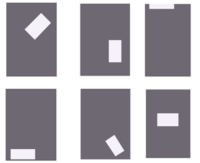
- The example on the top left is weighted toward the top, and the diagonal orientation of the white shape gives the whole area a sense of movement.
- The top middle example is weighted more toward the bottom, but still maintains a sense that the white shape is floating. On the top right, the white shape is nearly off the picture plane altogether, leaving most of the remaining area visually empty.
- This arrangement works if you want to convey a feeling of loftiness or simply direct the viewer’s eyes to the top of the composition. The lower left example is perhaps the least dynamic: the white shape is resting at the bottom, mimicking the horizontal bottom edge of the ground. The overall sense here is restful, heavy and without any dynamic character.
- The bottom middle composition is weighted decidedly toward the bottom right corner, but again, the diagonal orientation of the white shape leaves some sense of movement. Lastly, the lower right example places the white shape directly in the middle on a horizontal axis.
- This is visually the most stable, but lacks any sense of movement. Refer to these six diagrams when you are determining the visual weight of specific artworks.
There are three basic forms of visual balance:
- Symmetrical Balance
- Asymmetrical Balance
- Radial Symmetry
Notice that the different types of balance have (in a sense) a first and last name (e.g., symmetrical + balance, asymmetrical + balance, radial + balance).
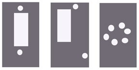
Image by Christopher Gildow. Used with permission.
Symmetrical Balance (a.k.a. Absolute Symmetry or Mirror Symmetry)
In this type of balance, when a two- or three-dimensional work is bisected, the artwork shows the exact same numbers, sizes and types of visual elements on one side as it does the other. Symmetrical balance conveys a sense of stability in the artwork. Since symmetrical balance is the most visually stable, it is characterized by an exact—or nearly exact—compositional design on either (or both) sides of the horizontal or vertical axis of the picture plane.
- Symmetrical compositions are usually dominated by a central anchoring element. There are many examples of symmetry in the natural world that reflect an aesthetic dimension.
- The Taj Mahal complex was commissioned by a grieving Shah Jahan as a memorial to his wife.
- Pure visual symmetry united all elements, echoing the couple's united love and creating a perfect balance.
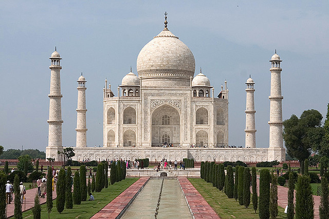
Ustad Ahmad Lahauri, Abd al-Karim Ma’mur Khan and Makramat Khan. Taj Mahal. Agra, Inda. Mughal period. c. 1632-1653. Marble.
"Taj Mahal" by ndj5 is licensed under CC BY-NC 2.0.
If the image was printed and the photo was folded in half along the vertical line, the exact same numbers, sizes & types of forms and visual elements on each side is seen on both sides of the Tah Mahal. Symmetrical balance conveys a sense of stability in the artwork.
Another example is Richard Serra’s Tilted Spheres (below). The four massive slabs of steel show a concentric symmetry and take on an organic dimension as they curve around each other, appearing to almost hover above the ground.
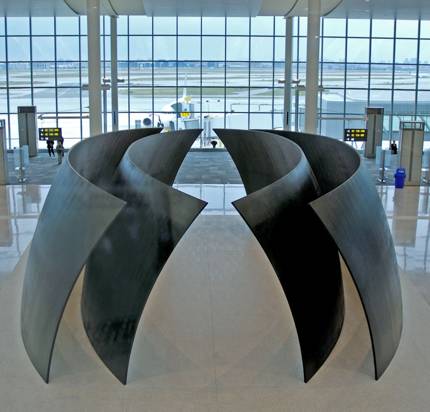
Richard Serra, Tilted Spheres, 2002 – 04, Cor-ten steel, 14’ x 39’ x 22’. Pearson International Airport, Toronto, Canada.
"Tilted Spheres" by Ken Mist is licensed under CC BY 2.0.
Asymmetrical Balance
In this type of balance, when bisected, the artwork shows numbers, sizes and types of visual elements are different on one side than on the other, but the overall harmony of the artwork is not destroyed. In this the painting below, one side shows a cityscape filled with people, buildings, and streetcars; the other side shows a barren landscape with benches and lights. Despite that, we still get the sense that each half of the composition are set in the same location despite the fact that both sides of the work have different numbers, sizes, and types of visual elements.
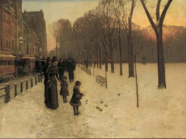
Childe Hassam. Boston Common at Twilight. 1885-86. Oil on canvas. 42 in. x 60 in. Museum of Fine Arts, Boston, MA.
"Boston Common" by Bosc d'Anjou is licensed under CC BY-NC-SA 2.0.
Asymmetrical balance uses compositional elements that are offset from each other. Artists often use different visual “weights” on each side of a composition. Elements on the left and right sides are not the same, but the combination counters each other.
- Asymmetrical visual balance is the most dynamic because it creates a more complex design construction.
- A graphic poster from the 1930s shows how offset positioning and strong contrasts can increase the visual effect of the entire composition.

Poster from the Library of Congress archives.
Image is in the public domain.
Claude Monet’s Still Life with Apples and Grapes from 1880 (below) uses asymmetry in its design to enliven an otherwise basic arrangement. For example, Monet:
- sets the whole composition on the diagonal, cutting off the lower left corner with a dark triangle.
- purposely sets most of the fruit, which looks like it's arranged haphazardly, on the top half of the canvas to achieve a lighter visual weight.
- balances the darker basket of fruit with the white of the tablecloth, even placing a few smaller apples at the lower right to complete the composition.
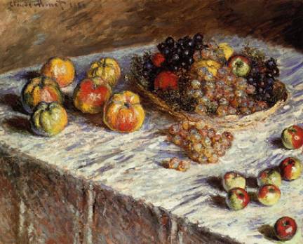
Claude Monet. Still Life with Apples and Grapes. 1880. Oil on canvas. 26-3/16 in. x 32-1/2 in. The Art Institute of Chicago, Chiicago, IL.
"Monet fruits still life painting" by Free Public Domain Illustrations by rawpixel is licensed under CC BY 2.0.
Monet and other Impressionist painters were influenced by Japanese woodcut prints, whose flat spatial areas and graphic color appealed to the artist’s sense of design.
One of the best-known Japanese print artists is Ando Hiroshige (1797-1858). Strong asymmetry is seen in this woodcut, Shinagawa on the Tokaido, one of a series of works in which Hiroshige explored the landscape around the Tōkaidō road. Hiroshige received an invitation to join an official procession to Kyoto, Japan in 1832, which gave him the opportunity to travel along the Tōkaidō route that linked Edo and Kyoto, the two capitals. He sketched the scenery along the way, and when he returned to Edo, he produced the series The Fifty-three Stations of the Tōkaidō, which contains some of his best-known prints.
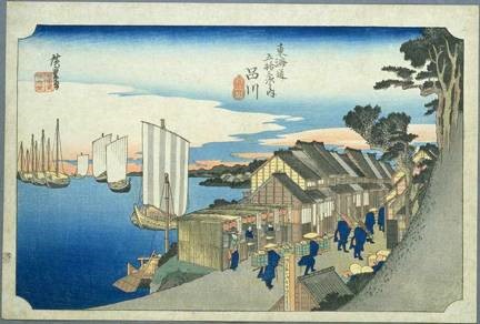
Hiroshige. Shinagawa on the Tokaido. Ukiyo-e print. After 1832. Woodblock print on Echizen handcrafted paper.
Image is in the public domain.
In Henry Moore’s Reclining Figure the organic form of the abstracted figure, strong lighting and precarious balance obtained through asymmetry make the sculpture a powerful example in three-dimensions.
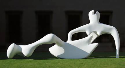
Henry Moore, Reclining Figure, 1951. Painted bronze. The Fitzwilliam Museum, Cambridge. United Kingdom.
"Reclining figure" by Andrew Dunn is licensed under Creative Commons CC BY-NC 2.0.
Radial Balance
In this type of balance, the visual elements of art start from a central point within the artwork and branch outward. This arrangement suggests movement in the artwork. Radial balance is another form of symmetry that offers stability and a point of focus at the center of the artwork.
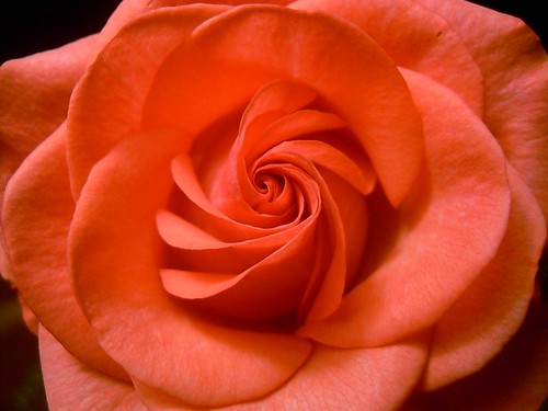
"Rose" by tissime is licensed under CC BY-NC-SA 2.0.
The same concept can occur when the artwork is bisected along any axis.
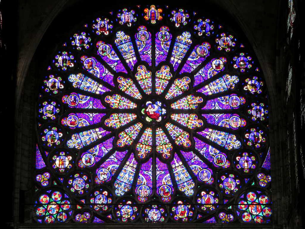
"Rose Window" by D-Stanley is licensed under CC BY 2.0.
Radial balance suggests movement from the center of a composition towards the outer edge—or vise versa.
- Buddhist mandala paintings offer this kind of balance almost exclusively. Similar to the scroll painting we viewed previously, the image radiates outward from a central spirit figure. In the example below there are six of these figures forming a star shape in the middle. Here we have absolute symmetry in the composition, yet a feeling of movement is generated by the concentric circles within a rectangular format.
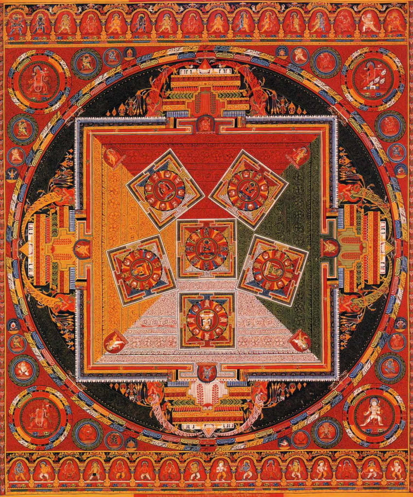
Mandala of the Six Chakravartins. c. 1429-46. Central Tibet. Ngor Monastery. Distemper on cloth.
Image is in the public domain.
- Balance is a way to lead the eye around a two-dimensional or three-dimensional artwork.
- Whether two-dimensional or three-dimensional, works can be completely balanced, where each side of the artwork looks the same or offset, where there are minor to major differences in the numbers, sizes, and types of visual elements seen on the bisected halves of the artwork.
- Symmetrical balance creates a sense of stability.
- Radial balance suggests movement because the forms seen in the work will start from a central point and spiral outwards as it reaches the edges of the artwork.
Sources
Christopher Gildow, Washington State Board for Community and Technical Colleges, http://opencourselibrary.org/art-100-art-appreciation/
 This work is licensed under a Creative Commons Attribution 3.0 License.
Delmar Larsen. Developed by Wendy Riley from Columbia Basin College with contributing work from Lumen Learning. https://human.libretexts.org/Bookshe...iation_(Lumen)
 This work is licensed under a Creative Commons Attribution 3.0 License.
Sayre, Henry. A World of Art, Sixth edition. Boston: Prentice Hall, 2010. Print.