
13.2: Appropriation and ideological critique
- Page ID
- 147853
Appropriation and ideological critique
Contemporary artists use copying and other visual methods to deconstruct the myths that inform our daily lives.
1980 - present
Masami Teraoka, American Kabuki
by EMMA ACKER AT THE FINE ARTS MUSEUMS OF SAN FRANCISCO and DR. STEVEN ZUCKER
Video \(\PageIndex{1}\): Masami Teraoka, American Kabuki (Oishiiwa), 1986, watercolor and sumi ink on paper mounted on a four-panel screen, 196.9 x 393.7 x 3 cm (de Young Museum, Fine Arts Museums of San Francisco), © Masami Teraoka Seeing America video Speakers: Emma Acker, Associate Curator of American Art, Fine Arts Museums of San Francisco and Steven Zucker
Additional resources:
This painted screen at the de Young Museum, Fine Arts Museums of San Francisco
Ai Weiwei
The Case for Ai Weiwei
Video \(\PageIndex{2}\): Speaker: Sarah Urist Green
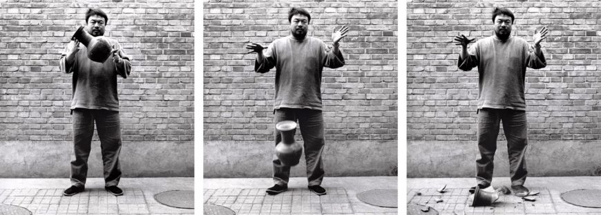
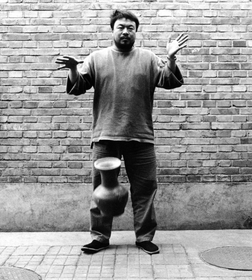
Ai Weiwei, Dropping a Han Dynasty Urn
How can the destruction of an artifact also be an act of preservation? Dropping a Han Dynasty Urn (1995) by Ai Weiwei is a highly provocative work of art. This series of three black and white photographs portray the artist holding a 2,000-year-old Han dynasty urn that, frame by frame, he drops, it falls, and shatters. As much a work of photography as a work of performance art, in each still an unaffected Ai looks directly at the camera aware of his destructiveness. In fact, to capture the action on film (rather than digital photography, which lets you review the image immediately), the artist actually broke two ceramic vessels, just in case. This kind of blatant destruction of artifacts may seem highly irreverent, yet it also forces viewers to consider issues of transformation and destruction of the past.
Ai Weiwei
Born in Beijing, China, in 1957, Ai Weiwei is an activist, filmmaker, curator and one of the world’s most famous artists. Ai began his artistic career in New York City, where he lived from 1981 to 1993. When he returned to China in the mid-90s, a time of rapid modernization for his home country, he was shocked to discover that certain objects of cultural patrimony were not highly valued. Ai explains that when he came across these Han dynasty ceramic objects, they were just a dime a dozen: “I still have a photo of when I was in Xi’an. There was a farmer sleeping on top of these two urns waiting for someone to pay him a few hundred yuan. For him that was a few months’ salary, but even then nobody wanted them.” [1] Ai realized that during that period, most of his fellow countrymen were not nearly as interested in their country’s historic art objects as he was. For this reason, Ai began collecting antiquities, particularly ancient vessels and furniture, and eventually began converting these objects into contemporary artworks. Whether he reworks a discarded four-hundred-year-old wooden stool into a standing sculpture or creates an installation from hundreds of salvaged blue and white ceramic shards, Ai is interested in giving these historical found objects a second life as contemporary art.
Historical legacy
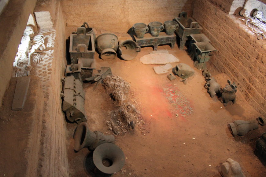
This kind of repurposing of the past also relates to Chinese aesthetics and culture. In China, there is a long and rarified tradition of collecting ancient material remains and transforming them into new art. For millennia before the advent of modern scientific archeology, rulers and elites collected ancient materials and acted to preserve them or emulate them in new works, whether it was preserving important documents by recording them on durable surfaces like stone steles or incorporating ancient designs into bronze or ceramics. For example, Fu Hao’s tomb in Anyang, a Shang dynasty (1600-1046 B.C.E.) royal burial tomb excavated in the 1980s, enabled scholars to push the history of antique collecting in China back to the thirteenth century B.C.E. The 775 jade carvings found in this tomb of a powerful Shang queen included both a collection of prehistoric jades as well a collection made in her era but modeled on earlier Neolithic prototypes. [2] This is an important revelation because it suggests that more than three thousand years ago, antique collections were already providing references and inspirations for making new works of art. This tradition of collecting and revitalizing antiquity has encouraged generations of Chinese artists and craftsmen to look to the past in making contemporary art.
Act of revitalization?
Ai Weiwei has chosen an unusual way of continuing this legacy of transforming the material past while at the same time expressing dissent against a country that sometimes obliterates its own cultural heritage: through direct confrontation. On the one hand we can view his work as a destruction of another artist’s work; on the other, Ai’s act can also be thought of as a kind of collaboration with an ancient artist over thousands of years—a revitalization. Once an ancient receptacle, the urn in Dropping a Han Dynasty Urn takes on new meaning as contemporary art. In Ai’s work, the object is less a vessel than an emblem of Chinese history. For this performance, it seems that the object selection is almost immaterial—it might as well have been any ancient object. However, in recognition of Ai’s own celebrity, the artist has transformed this urn into something of great significance just by selecting it to become the subject of his art, by including its name in the title, and, of course, by destroying it. The sensationalism of breaking something so old and rare is what modern audiences find so compelling. Here the nostalgia for what once was serves as a mirror, reminding us that China’s past remains important and relevant today.
Destruction as preservation
The event that Ai Weiwei created and captured in these photographs is one of violence. Many feel that it is unethical to destroy an artifact under any circumstances—that such an act indicates a lack of value and respect. Indeed, law professor Joseph Sax calls such destruction a kind of “unqualified ownership” because it enables “the indulgence of private vice to obliterate public benefits.” [3] Certainly, the destruction of art for ideological or egoistic reasons reflects badly on a collector of ancient objects. Yet was Dropping a Han Dynasty Urn a true obliteration? The Han dynasty urn still exists for the public but it has been transformed into the form of captured film stills. The loss of one object gives the new artwork its potency.
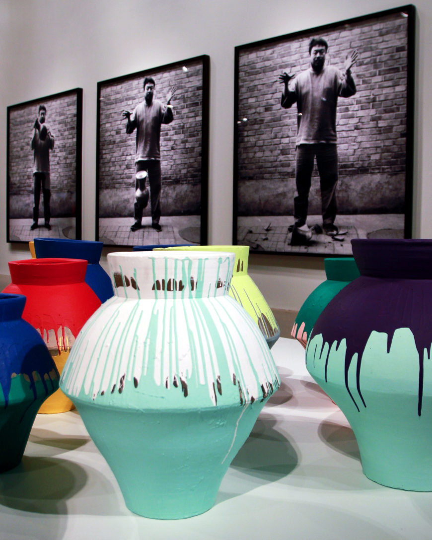
Ai himself says that he considers the act of dropping the urn one of creation rather than destruction: “People always ask me: how could you drop it? I say it’s a kind of love. At least there is a kind of attention to that piece [because of the photograph].” [4] From the artist’s point of view, his act was one of preservation through transformation. Indeed, this triptych (set of three photographs) and the shadow of the vessel captured within it now receive unprecedented attention. These photographs are displayed in museums and public institutions around the world. The work is widely available online, and even the focus of academic essays like this one. Given Ai’s own celebrity status and the significance of this artwork, Dropping a Han Dynasty Urn is also now far more valuable than the original ceramic object. In 2016, this limited edition work sold for nearly 1 million dollars at Sotheby’s Auctions in London. [5]
Dropping a Han Dynasty Urn is one of many works by Ai Weiwei that focuses on heritage loss and the importance of the past. According to the artist, “the power [of my artwork] comes not from the act but from the audience’s attention, the challenge to their values. The act is easy—every day we can drop something, but it is when we are forced to come face to face with this action and make a judgment … that is the interesting part.” [6] Ultimately the work demands a judgment: was the provocation and the global attention Ai garnered for the urn worth the destruction of the urn itself? This set of photographs encourages its viewers to question value of antiquity in our modern world and whether it is worth preserving.
Notes:
- Tiffany Wai-Ying Beres, “A Battlefield of Judgments: Ai Weiwei as Collector,” Orientations 46, no. 7 (2015), pp. 87–92.
- Wu Hung, ed., Reinventing the Past: Archaism and Antiquarianism in Chinese Art and Visual Culture (Chicago: Art Media Resources, 2010), pp. 16–39.
- Joseph L Sax, “Collectors: Private Vices, Public Benefits,” in Playing Darts with a Rembrandt: Public and Private Rights in Cultural Treasures (Ann Arbor: University of Michigan Press, 2011), p. 63.
- Beres, p. 92.
- Sotheby’s Auction: www.sothebys.com/en/auctions/ecatalogue/lot.42.html/2016/contemporary-art-evening-auction-l16020
- Beres, p. 92.
Ai Weiwei, Kui Hua Zi (Sunflower Seeds)
Video \(\PageIndex{3}\): Video from Tate
Subversive seeds
Ai Weiwei often uses his art to critique political and economic injustice. This can be seen in work such as his 2010 installation, Kui Hua Zi (Sunflower Seeds) at Tate Modern, London.

Kui Hua Zi (Sunflower Seeds) consists of more than 100 million tiny, handmade porcelain sunflower seeds, originally weighing in at 150 tons. They filled the enormous Turbine Hall at Tate Modern, an industrial building-turned-contemporary art space. Sunflower seeds evokes a warm personal memory for the artist, who recalls that while he was growing up, even the poorest in China would share sunflower seeds as a treat among friends. The use of sunflower seeds as the basis of his installation was also designed to subvert popular imagery rooted in the artist’s childhood. Communist propaganda optimistically depicted leader Mao Zedong as the sun and the citizens of the People’s Republic of China as sunflowers, turning toward their chairman. Ai Weiwei reasserts the sunflower seed as a symbol of camaraderie during difficult times.

Though each of the 100 million carefully crafted individual seeds can draw the viewer’s attention, once arranged together in a neat rectangle, or covering the floor of an entire room, the hyper-realistic seeds create a sense of vastness. In the Tate installation, there was a sense of precision in the arrangement of the seeds, creating visual order and uniformity. The individual seed is lost among the millions, a critique of the conformity and censorship inherent in modern China.

Made In China
More than 1,600 artisans worked to make the individual porcelain seeds by hand in Jingdzhen, the city known as the “Porcelain Capital,” where artists have been producing pottery for nearly 2000 years. Porcelain, first produced during the Han dynasty in about 200 B.C.E. and later mastered during the Tang dynasty, is made by heating white clay (kaolin) to a temperature over 1200 degrees Celsius. The fusion of the particles within the clay during firing allowed artists to create vessels with thin but strong walls. Porcelain— a symbol of imperial culture in China—was also made for export via the Silk Road and became important to the creation of the idea of China in the West.

Ai Weiwei’s use of porcelain comments on the long history of this prized material while also rejecting the common negative connotations of the modern term “Made in China.” Utilizing skilled artisans known for their exquisite craftsmanship to make objects that can only be differentiated one from another upon close inspection, alludes to the important porcelain tradition in Jingdzhen, as well as to the uniformity and diffusion of modern (cheap and fast) labor that is responsible for China’s hard-won place in the world economy. Sunflower Seeds asks us to examine how our consumption of foreign-made goods affects the lives of others across the globe.

How we experience an artwork impacts our perception of the work. In the tradition of participatory contemporary art, Sunflower Seeds asks the public to physically interact with the art. Initially, Tate visitors were invited to walk over and lie on the seeds, though the museum, in consultation with the artist, suspended this opportunity about a week into the exhibition because of safety concerns.
Art and activism
Ai Weiwei was arrested at the Beijing Capital International Airport on April 3, 2011 during his Tate exhibition.[1] He was detained for 81 days. The artist, along with many in the international community, asserted that his true offense was his political activism for democracy and human rights. Ai Weiwei had blogged for four years—investigating cover-ups and corruption in the government’s handling of a devastating 2008 earthquake in Sichuan and the country’s hosting of the Olympics. Ai Weiwei’s blog was shut down in 2009. Since then, he has turned to Twitter and Instagram. During his detention, the international community, including major US art institutions, rallied for his release. Officials eventually released him, charging Ai Weiwei with tax evasion, but his passport was withheld, preventing him from leaving the country for four years. It was returned in 2015.

[1] Andrew Jacobs, “China Takes Dissident Artist Into Custody,” The New York Times, 4/3/11, A4
Additional resources:
You can follow Ai Weiwei on Instagram and Twitter @aiww
More information on Ai Weiwei’s Sunflower Seeds
Ai Weiwei, Remembering and the Politics of Dissent
by JP MCMAHON

Dangerous Art
All art is political in the sense that all art takes place in the public arena and engages with an already existing ideology. Yet there are times when art becomes dangerously political for both the artist and the viewers who engage with that art. Think of Jacques-Louis David’s involvement in the French Revolution—his individual investment in art following the bloodshed —and his imprisonment during the reign of terror. If it were not for certain sympathisers, David may well have ended up another victim of the guillotine. Goya is another example of an artist who fell foul of government power. There are instances in the 20th century when artists have faced down political power directly. Consider the photomontages of John Heartfield. Heartfield risked his life at times to produce covers for the magazine A/Z, which defied both Hitler and the Nazi Party.
Ai Weiwei
The Chinese artist, Ai Weiwei, offers is an important contemporary example. In 2011, Weiwei was arrested in China following a crack down by the government on so-called “political dissidents” (a specific category that the Chinese government uses to classify those who seek to subvert state power) for “alleged economic crimes” against the Chinese state. Weiwei has used his art to address both the corruption of the Chinese communist government and its outright neglect of human rights, particularly in the realm of the freedom of speech and thought. Weiwei has been successful in using the internet (which is severely restricted in China) as a medium for his art. His work is informed by two interconnected strands, his involvement with the Chinese avant-garde group “Stars” (which he helped found in 1978 during his time in the Beijing Film Academy) and the fact that he spent some of his formative years in New York, engaging there with the ideas of conceptual art, in particular the idea of the readymade. Many of the concepts and much of the material that Weiwei uses in his art practice are informed by post-conceptual thinking.
An International Audience

Weiwei has exhibited successfully in the West in many major shows, for example, the 48th Venice Biennale in Italy (1999) and Documenta 12 (2007). He also exhibited Sunflower Seeds (October, 2010) in the Turbine Hall in the Tate Modern. In this work, Weiwei filled the floor of the huge hall with one hundred million porcelain seeds, each individually hand-painted in the town of Jingdezhen by 1,600 Chinese artisans. Participants were encouraged to walk over the exhibited space (or even roll in the work) in order to experience the ideas of the effect of mass consumption on Chinese industry and 20th-century China’s history of famine and collective work. However, on October 16, 2010, Tate Modern stopped people from walking on the exhibit due to health liability concerns over porcelain dust.
“…a natural disaster is a public matter.”
Perhaps the work that contributed most to Weiwei’s current imprisonment and the destruction of his studio was his investigation of corruption in the construction of the schools that collapsed during the 2008 earthquake in Sichuan, China. Like many others, Weiwei investigated how improper material and the contravention of civil engineering laws led to the wholesale destruction of schools (which led in turn to the deaths of thousands of children trapped within them), Weiwei has produced a list of all the victims of the earthquake on his blog. This act is typical Weiwei’s use of the internet to communicate information. This information is his “art”, in much the way that American artists of the late 1960s used words and ideas as art.

So Sorry
In his retrospective show So Sorry (October 2009 to January 2010, Munich, Germany), Weiwei created the installation Remembering on the façade of the Haus der Kunst. It was constructed from nine thousand children’s backpacks. They spelled out the sentence “She lived happily for seven years in this world” in Chinese characters (this was a quote from a mother whose child died in the earthquake). Regarding this work, Weiwei said,
The idea to use backpacks came from my visit to Sichuan after the earthquake in May 2008. During the earthquake many schools collapsed. Thousands of young students lost their lives, and you could see bags and study material everywhere. Then you realize individual life, media, and the lives of the students are serving very different purposes. The lives of the students disappeared within the state propaganda, and very soon everybody will forget everything.
The title of the show referred to the apologies frequently expressed by governments and corporations when their negligence leads to tragedies, such as the collapse of schools during the earthquake. Two months before the opening of this exhibition Weiwei suffered a severe beating from Chinese police in Chengdu in August 2009, where he was trying to testify for Tan Zuoren, a fellow investigator of the shoddy construction and the student casualties. Weiwei underwent emergency brain surgery for internal bleeding as a result of the assault.
The Arrest

On April 3rd 2011, Weiwei was arrested at Beijing’s airport while while waiting for a flight to Hong Kong. While his detention is broadly believed to be linked to his criticism of the Chinese government, the Chinese Ministry of Foreign Affairs declared that he is “under investigation for alleged economic crimes.” Weiwei’s participation in the Jasmine Rallies, a series of peaceful protests which took place all over China in February, no doubt contributed to his arrest.
Additional Resources:
*Historical Note on the Haus der Kunst: The Haus der Kunst (designed by Paul Ludwig Troost, “first master builder to the führer”) was sited by Adolf Hitler and sought to express Nazi ideology by using stone from German quarries and with its references to the work of Klenze and Schinkel. From its opening in 1937, the Haus der Kunst held exhibitions glorifying the “Blood and Soil” propaganda of the Nazi regime.
Tate Modern: Sunflower Seeds Video
Simon Elegant, “Ai Weiwei: Interview Transcript”, Time, May 12, 2009
Roberta Smith, “12 Heads Do the Talking for a Silenced Artist,” The New York Times, May 2011
Hans Haacke, Seurat’s “Les Poseuses” (small version), 1884-1975
by SAL KHAN, DR. BETH HARRIS and DR. STEVEN ZUCKER
Video \(\PageIndex{4}\): Hans Haacke, Seurat’s “Les Poseuses” (small version), 1884-1975, 1975
Keith Haring, Subway Drawings
An international art star, Keith Haring and his work have often been characterized as quintessentially of the eighties—an embodiment of the decade’s street art, hip hop, and urban energy in New York. While his career involved a diverse range of art making—painting, drawing, performance, video, murals, and art merchandising—his subway drawings stand among his most well-known and celebrated work.
Haring drew over 5,000 chalk drawings over a five-year period, from 1980 to 1985, in New York City subway stations (visit the Keith Haring Foundation website to see his work year by year). Since the beginning of his career, Haring was determined to create art that could be for everyone, both through an accessible style and by locating his work in easily reachable, public locations. Creating art on the street meant that a bigger audience could see his work, outside of the more insular space of an art gallery.
Previous Street Art
Haring’s subway drawings were not his first intervention into public, urban space. In New York City, early in 1980, he began to subtly alter street advertisements, such as one for Chardón Jeans, in which he blocked out letters, so the ad read “hard on Jeans.” He also posted small collages on street lamps made up of images appropriated from print media and bits of painted paper. In the summer of 1980, Haring made more overtly political collages by cutting and rearranging headlines from the New York Post, to say things like “REAGAN SLAIN BY HERO COP” and “POPE KILLED FOR FREED HOSTAGE.” He xeroxed these works by the hundreds and posted them all over the city in an effort to undermine the political conservatism of the period. These early experiments helped set the stage for Haring’s subway drawings.
Subway Drawings
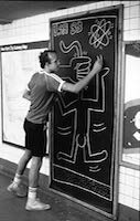
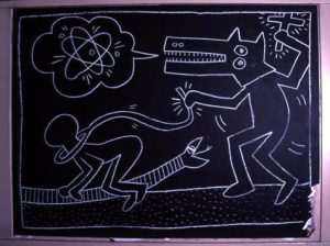
In late 1980, Haring noticed that New York City subway’s blank advertising spaces were covered with black matte paper when advertising subscriptions expired. He immediately purchased some chalk, and started drawing. Over the next five years, this became a daily, repetitive obsession: he would ride the subway, look for these empty spaces of black paper, and draw quickly—without any preparation—and then leave on the next train. Through incessant repetition,Haring’s subway drawings allowed him to perfect his highly recognizable reduced linear vocabulary, and to create an inventory of images. Simplification was practical: he needed to complete his drawings as fast as possible to avoid being arrested. He created characters, such as the barking dog and the radiating baby, which he drew on flat planes with no spatial depth, often with only a horizon line or a staircase to suggest space. Drawn close to the surface like cartoons, his images had immediacy and impact, and could carry multiple meanings through various combinations.
The radiant baby, for example, could represent birth or purity, but could also be read as a symbol of nuclear energy or bodily corruption depending on what he drew around it. Haring intentionally sanitized the subject matter of his subway drawings, leaving out any explicit sexual and political imagery. He wanted his audience, which included children, to enjoy his works. This made his drawings more ambiguous to an extent, but also more outwardly positive and universal in theme. This work, though, while seemingly straightforward, did incorporate some darker references, including generalized themes of oppression and the abuse of power (image below left), but these were often simplified to such an extent that they remained open to multiple interpretations.
Graffiti scene
Haring’s arrival in New York coincided with graffiti’s peak in 1978-79, when artists covered subway cars, walls, and storefront gates throughout the city. Haring’s well-defined style benefited from graffiti, which offered lessons in how to make graphic images visible in a cluttered urban environment and stressed the importance of motion, speed, and improvisation. Haring never considered himself to be a graffiti artist however. His subway drawings significantly differed from graffiti in location, timing, and medium. Haring often used white chalk and worked during the day so that he could interact with his audience. In contrast, graffiti artists usually used spray paint or markers, working at night. Graffiti encompassed a subculture at the social margins of New York City that excluded artists like Haring both racially and socio-economically.
Downtown Arts Scene
Other artists of Haring’s generation worked within the public spaces of New York City to create and display art including Jean-Michel Basquiat, Kenny Scharf, Barbara Kruger, Jenny Holzer, and Richard Hambleton. In addition the artist collectives Colab, Fashion Moda, Gran Fury, and Group Material used the street as canvas. Like Haring, these artists experimented with alternate distribution systems to expand their reach outside of the commercial art world. Through posters, billboards, or small sculptures, or by engaging the community through artist-run events, pop-up exhibition spaces, or activist demonstrations, these downtown artists (like Haring) regularly put their art and ideas on the street to be enjoyed, and to inform and involve the public. Their intention was inclusion, rather than to alienate or confuse.
Burgeoning Celebrity
Haring drew several works of art every day, over many years in the New York City subway, a system used by millions of people. While he made his subway drawings for free, they proved to be a promotional tool that catapulted him into the public spotlight and helped launch his gallery career. In effect, he co-opted spots meant for advertising and campaigned for himself. His drawing was also performative—often attracting an audience captivated by his quick actions and improvisation. He promoted his subway work in other media, including one instance in which a friend taped one of his arrests by the MTA police, which was then featured on CBS News on a nationwide special. He also designed buttons illustrating his characters and gave away thousands to subway riders. Attached to shirts and bags, these buttons enhanced the visibility of his work.
In 1982, Haring joined the Tony Shafrazi gallery, but continued to work in the subway. This was a strategy he used throughout his career: operating in both the contemporary art world and in public spaces. His gallery career helped to fund his time making street art for free, and they both reinforced his public presence. Eventually, Haring’s popularity meant that his work in the subways became so valuable that people began to steal panels as soon as he drew them, ending this phase of his work. He continued to create art for all through posters and prints, merchandising, and large scale public murals in cities around the world. Before Haring became a worldwide celebrity, however, he was a local celebrity—generating his first fame through his subway drawings.
Additional resources:
Henry Geldzhaler, Introduction to Art in Transit
Michael Auping, Urban Theater: New York Art in the 1980s (New York: Rizzoli, 2014).
Peter Belsito, Notes from the Pop Underground (Berkeley, CA: Last Gasp of San Francisco, 1985).
Jeffrey Deitch and Carlo McCormick. Keith Haring: 31 Subway Drawings (New York: Art Issue Editions, 2012).
John Gruen, Keith Haring: The Authorized Biography (New York: Prentice Hall Press, 1991).
Keith Haring and Robert Harris Thompson, Keith Haring Journals (New York: Viking, 1996).
Tseng Kwong Chi and Henry Geldzahler, Keith Haring, Art in Transit: Subway Drawings (New York: Harmony Books, 1984).
Keith Haring: Journey of the Radiant Baby (Piermont, N.H.: Bunker Hill Pub., 2006).
Cedar Lewisohn, Street Art: The Graffiti Revolution (New York: Abrams, 2008).
Anselm Kiefer
Anselm Kiefer, Shulamite

Black milk of morning we drink you at night
we drink you at noontime Death is a gang-boss aus Deutschland
we drink you at dusktime and dawntime
we drink and drink Death is a gang-boss aus Deutschland his eye is blue
he shoots you with leaden bullets his aim is true
there’s a man in this house your golden hair Margareta
he sets his dogs on our trail he gives us a grave in the sky
he cultivates snakes and he dreams Death is a gang-boss aus Deutschland
your golden hair Margareta
your ashen hair Shulamite
—the final lines of Paul Celan’s poem, “Death Fugue,” published 1947 (trans. Jerome Rothenberg)
Breaking postwar silence
Born in Germany just months shy of the end of World War II, Anselm Kiefer came of age in the late 1960s when the silence surrounding the crimes of the Nazi regime was ruptured by a vocal younger generation horrified by their collective German “past,” struggling to reconcile such shame and redefine what it meant to be German in a post-Nazi world.
For Kiefer, who had studied with the artists Peter Dreher in Karlsruhe and Joseph Beuys in Dusseldorf, painting became the arena to vocalize and elucidate his contempt for the Nazis and their reprehensible legacy, instilling every brush stroke with palpable rage, grief, and shame. In the 1970s, Kiefer developed a signature style that was influenced in part by the Neo-expressionist style of Georg Baselitz, but also by his teacher Beuys, particularly Beuys’s tendency to use commonplace materials, such as fat and felt within his artistic practice. Kiefer augmented his thick layers of impasto with lead, glass, straw, wood, dried flowers, and more, yielding highly textured, viscous surfaces. As his list of materials grew, so too did the scale of his canvases, which though large and formidable, felt ephemeral and fragile as a result of the materials he utilized.
A thick impasto
All of the canonical elements of Kiefer’s work are present in Shulamite—a thick impasto resulting from a hardened mixture of oil, acrylic, emulsion, and shellac; a brittle, textured surface infused with commonplace materials (in this case, straw and ash); mythological or biblical references (Shulamite refers to the heroine in the Song of Solomon); a literary reference (Celan’s “Death Fugue”); and a historical subject or location (a Nazi Memorial Hall in Berlin).

Kiefer’s hall is not a memorial to great men with patriotic flags waving boldly, but a gateway to damnation, a dark and foreboding road to hell, enclosed by low arches and paved with massive stones —the whole mise-en-scène (a stage set that tells a story) suggestive of an oven (immediately bringing to mind the hyperactivity of the crematoria at the Nazi death camps). Sulamith, is inscribed in the upper left hand corner, a graffiti-like testament in white paint upon the stone, to Celan’s brave young Jewish girl consumed by this living hell, who came to her death in a chamber such as this because she had not the golden hair of Aryan Margarete but the dark “ashen hair” of Shulamite. Kiefer transformed architecture meant to honor Nazi heros into a memorial for their victims.
Emotional honesty
Comparisons to Jackson Pollock in terms of both scale and expressive, gestural style are understandable, but for me Kiefer’s paint handling is even more reminiscent of Vincent van Gogh, in terms of raw beauty and emotional honesty. Just as van Gogh’s paint can transport me into the Dutch or French countryside and fill my nose with the smell of fresh sunflowers or irises, so too can Kiefer transport me to another place in time and space—but rather than a hayfield in Holland it is the dark abyss of a concentration camp with the stomach-churning smell of burning flesh sullying the air.
Special thanks to Sandy Heller, The Heller Group, LLC
Anselm Kiefer, Bohemia Lies by the Sea
by COREY D'AUGUSTINE and DR. STEVEN ZUCKER
Video \(\PageIndex{5}\): The conservator’s eye: Anselm Kiefer, Bohemia Lies by the Sea, 1996, oil, emulsion, shellac, charcoal, and powdered paint on burlap, 75 1/4 in. × 18 ft. 5 inches / 191.1 × 561.3 cm (The Metropolitan Museum of Art). Speakers: Corey D’Augustine and Steven Zucker.
Julie Mehretu, Stadia II

Opening / Ceremonies
When looking at Stadia II, first try to isolate the black lines from the rest of the composition. Does this centrifugal structure remind you of a sports arena, an amphitheater or opera house? Perhaps a political chamber? It could denote all of these, broadly invoking our experiences as individuals and collective bodies in such spaces. The built environment, for Mehretu, provides a setting in which people can gather, protest, pray, and riot in mass numbers.
Now, try to imagine yourself in a large stadium, at an important athletic championship such as the FIFA World Cup or the Olympics. How do the crowds behave? What types of phrases or slogans are they shouting, and at what volume? Think about the matching clothing and the painted faces of spectators wearing team colors, or the flags and banners that they wave over their heads.
In her monumental paintings, murals, and works on paper, Julie Mehretu overlays architectural plans, diagrams, and maps of the urban environment with abstract forms and personal notations. The resulting compositions convey the energy and chaos of today’s globalized world. Stadia II is part of a triptych of works created in 2004, and explores themes such as nationalism and revolution as they occur in the worlds of art, sports, and contemporary politics.
Gaze back into the painting and observe the various shards of color floating over the work’s architectural skeleton. The scene, however abstract, could easily represent our visualization of the sports arena. Small circles, dots, and hash marks float through the open space at the center of the composition, resembling the eruption of confetti that announces a winning team’s victory (or, alternately, that of a lucky political candidate on Election Day).

Notice the larger circles, triangles, blocks and parallelograms that float across the upper register. Far from arbitrary, these basic pictorial elements could comprise the designs of nearly any country’s national flag. The cluster of red and blue stripes, for instance, located along the top-right edge of the canvas, resemble the American flag, without necessarily resolving into a perfect match. We may also find corporate logos and religious symbols interspersed throughout; Mehretu is intentional in drawing analogies between these forms and the propagandistic ways in which they are often used.
Lastly, observe the painterly grey marks that seem to rise from the lower and central registers like plumes of smoke. Stadiums and capital buildings can represent triumph, pride and celebration, but they are also common targets for bombings and acts of terror, which are often motivated by a comparable degree of zealousness and ideological fervor.
Process
Mehretu’s working process begins with the projection of maps and diagrams onto the work’s blank surface. From these, the artist makes traces and hash marks that eventually grow into characters and communities. The first layer is coated with an acrylic-and-silica mixture that seals the drawing under a transparent ground. After drying, this ground is itself overlaid with more figures and photographs that are again assimilated into the composition.
The artist describes her final product as containing a “stratified, tectonic geology (…) with the characters themselves buried—as if they were fossils.”1 This distinct sense of temporality serves as a metaphor for history, memory, and the legacies of past cultural epochs that still influence contemporary life.
Utopian Abstraction
While nationalism, sports and global politics are key points of entry into the work, Mehretu also considers art historical precedents for these themes.

Take a look at the orange diamonds at the side edges, the black quadrilaterals interspersed above, or the dynamic red “X” found at the top edge. These lines and shapes are unmistakable references to the Russian constructivist and Bauhaus movements of the early twentieth century, and to artists such as Alexandr Rodchenko, Kasmir Malevich, El Lissitzky, and Wassily Kandinsky. These artists conceived of pure abstraction as a way to wipe clean the slate of history and to promote universalism and collectivity in art, politics and culture.
Mehretu has long explored the use of abstraction in service of revolution and utopian politics throughout the history of Modernist art, “I am (…) interested in what Kandinsky referred to in ‘The Great Utopia’ when he talked about the inevitable implosion and/or explosion of our constructed spaces out of the sheer necessity of agency. So, for me, the coliseum, the amphitheater, and the stadium are perfect metaphoric constructed spaces.”2 These can represent both the organized sterility of institutions and the “chaos, violence, and disorder” of revolution and mass gathering.

Global Networks
Because Mehretu builds her piece from multiple layers of figure and ground alike, the colors, shapes, and planar forms in Stadia II seem to be suspended between surfaces, and are often caught in a swirling motion around the axis of her compositions. The dynamism of the work makes reference to traffic patterns, wind and water currents, migrations, border crossings and travel.
Depicting patterns of movement, Mehretu emphasizes, on one hand, the militarization of bodies moving within and between national (or digital) spaces, and acknowledges the increasing speeds at which the world seems to be moving. Yet, while her compositions might be vertiginous and disorienting at times, we are given a chance to reflect on the potential and importance of such interconnectedness.
Born in Addis Ababa, Ethiopia, Mehretu has lived in Michigan, Rhode Island, and Dakar Senegal, and now resides in New York City.
1. Julie Mehretu, quoted in Thelma Golden, “Julie Mehretu’s Eruptive Lines of Flight as Ethos of Revolution,” in Julie Mehretu: The Drawings, ed. Catherine de Zegher and Thelma Golden, New York, NY: Rizzoli, 2007.
2. Julie Mehretu, “Looking Back: Email Interview between Julie Mehretu and Olukemi Ilesanmi, April 2003” in Drawing into Painting, Minneapolis, MN: Walker Art Center, 2003: 13-14.
Doris Salcedo, Shibboleth
by DR. DORIS MARIA-REINA BRAVO
The Turbine Hall
Since 2000, the Tate Modern has commissioned installations (the Unilever series) for the museum’s enormous Turbine Hall, including Olafur Eliasson’s The Weather Project (2003) and Ai Weiwei’s Sunflower Seeds (2010). In the eighth iteration, the Colombian artist Doris Salcedo produced Shibboleth, a deep meandering crack in the floor. Despite the unassuming nature of this work, it defies neat description and exists in a limbo between sculpture and installation; and the provocative title complicates the work instead of decoding it.

Salcedo has offered few explanations beyond stating how the fissure represents the immigrant experience in Europe. Though this theme is apparent in the work, it is by no means the only issue raised. As photographs of the installation demonstrate, visitors contorted their bodies in infinite ways as they tried to see below the crack. In Shibboleth, Salcedo elaborates a complex socio-political topic in a work with a tremendous formal presence.
Coded identification
Salcedo’s installation requires attentive viewing. The rupture measures 548 feet in length but its width and depth vary (changing from a slight opening to one several inches wide and up to two feet in depth). The viewer’s perception into the crevice alters, as he or she walks and shifts to better glimpse inside the cracks and appreciate the interior space, notably the wire mesh embedded along the sides.

Change in perspective is one of Salcedo’s goals. She quotes the Frankfurt School theorist Theodor Adorno: “We should all see the world from the perspective of the victim, like Jewish people that were killed with their head down in the Middle Ages. So he wonders, what is the perspective of a person that is agonizing in this position?”
To go from viewing this installation as a fissure in concrete to an artwork about the disenfranchised may seem like a big step. It is helpful to think of Shibboleth as a work of conceptual art since the ideas that frame the physical crack in the floor are of equal, if not greater importance than the material work itself. Salcedo’s installation at the Tate Modern would be completely different if it were simply untitled; indeed, the analysis of the work would then settle exclusively on its formal qualities. But Salcedo has bestowed a curious and specific name: “Shibboleth,” a codeword that distinguishes people who belong from those who do not.

Every community, culture, and nation has its shibboleth. Among the U.S. military, “lollapalooza” was used during World War II since its tricky pronunciation could identify native, English-speaking Americans. But the sinister history of the word “shibboleth” illustrates how friends and enemies are separated by fine, linguistic lines. Any stranger in a foreign land appreciates the vulnerability this entails, especially the fear of being outed as a foreigner and exposed in a hostile environment.
Irrevocably “other”
Salcedo’s experience as a Colombian artist working abroad has made her especially sympathetic to the plight of marginalized people. Between 2002 and 2003, Salcedo completed two installations that make this clear. In the first work, the artist staged a performance where she lowered empty wooden chairs over the side of the Palace of Justice in Bogotá. The performance lasted 53 hours and commemorated the 1985 siege in that building where three hundred people were held hostage; the siege ended in a bloody confrontation between rebels and the military.

The second installation also honored the victims of senseless violence. Salcedo piled more than 1,500 chairs into a space between two buildings in Istanbul. The breathtaking sight of this nearly three-story sculpture highlighted how warfare disrupts everyday life and creates refugees out of ordinary citizens as it recalls the countless shoes discovered at concentration camps at the end of World War II.
For Salcedo, the ravine in the Tate Modern’s floor represents the immigrant experience in Europe, notably the racial segregation that marks people from the third-world as irrevocably “other,” a permanent state apart. Yet, the artist offers some hope. After seven months, the show ended and the Tate Modern filled the crack, leaving a scarred floor. This is a remarkable symbol of the possibility of healing through figurative and literal closure; however, the mark is also an obstacle to any attempts to erase the past.

Sources
From an institutional perspective, this scar is remarkable for other reasons: it is usually unimaginable for museum officials to permit an artist to permanently alter the exhibition space.

Salcedo’s act remains transgressive: the act of deliberately breaking one’s media (in this case a concrete floor) is an act of rebellion. In this way, Shibboleth joins a tradition of artists experimenting with surface. In the late 1940s Lucio Fontana developed “Spazialismo,” an approach to art-making that converted the two-dimensional canvas into a three-dimensional space. Fontana slashed his monochrome canvases, and revealed a new space underneath the gashes. The artist’s bold move to disrupt the canvas’s nearly sacred surface was revolutionary and influenced later artists.

Throughout the 1970s Gordon Matta-Clark sawed into the walls, floors, and ceilings of buildings, often leaving cracks like the line of light in Splitting (1974). For centuries, a canvas was a flat plane, the support for an image rather than an object in its own right. A building by definition sought to be structurally sound; any structural damage makes it unstable and dangerous. To highlight their subversion, these artists flaunt the negative space made by their incisions: Matta-Clark’s cuts in Splitting are illuminated by blinding light, while Fontana’s slashes and Shibboleth each reveal a startlingly dark void previously unseen.

Meanings
Matta-Clark, Fontana, and Salcedo create art that is difficult to classify. Is this painting? sculpture? architecture? installation? intervention? Salcedo’s strength as an artist is her ability to balance the formal impact of Shibboleth with its message, while preventing one from overshadowing the other. Salcedo’s reticence to discuss her process and meaning at length is our opportunity to develop infinite interpretations.
Cindy Sherman
Cindy Sherman, Untitled Film Still #21
by DR. SHANA GALLAGHER-LINDSAY and DR. BETH HARRIS
Video \(\PageIndex{6}\): Cindy Sherman, Untitled Film Still #21, 1978, gelatin silver print, 7.5 x 9.5 inches or 19.1 x 24.1 cm (MoMA)
Cindy Sherman, Untitled #228

This photograph is from Sherman’s History Portraits series—where she draws inspiration from the history of art.
Description
The artist depicts herself in costume, standing in front of printed textiles parted slightly to reveal darkness beyond. She wears a red satin, full length dress, which is cinched by a dark blue sash across the shoulders, just under the bust line, and also well below a seemingly swollen abdomen. A gold sash wraps around her head and neck and drapes over each shoulder. In one hand she holds the head or mask of an old person, with a wrinkled, receding hairline, a large nose and bloodshot eyes. In the other hand, which is bloody, she holds a knife.
The figure tilts her head slightly to one side as she gazes at the viewer with a blank expression. The face is artificially made up with thin, arching brows and lips stained red in the center to suggest that they are puckered, as if about to kiss. Bare feet point outward, and appear enlarged in proportion to the rest of the figure.
Judith
In Untitled #228, Sherman cites the story of Judith and Holofernes—a popular subject during the Renaissance and Baroque periods (especially the 16th-17th century).
The Book of Judith (included In some versions of the Bible), recounts the story of Judith, who, to save her people (the Israelites in the town of Bethulia) from the Assyrian King Nebuchadnezzar, entered the tent of the invading general (named Holofernes), who found her attractive. She seduced him into drinking too much, and then beheaded him. In triumph, she brought the severed head back to the Jewish people.

For Renaissance and Baroque audiences, the story of Judith and Holofernes symbolized triumph over tyranny (much like the story of David and Goliath). Painters such as Caravaggio, Artemisia Gentileschi and Elisabetta Sirani provided patrons with select stages in the story—at times depicting Judith in the act of severing Holofernes’ head, sneaking away from the darkened enemy encampment while carrying the severed head, or marching forward in triumph, holding aloft the head by the hair, as the citizens of Bethulia look on.
Sherman’s photographic interpretation of this subject conflates two of those picture types. While Judith (enacted by Sherman herself) stands, holding the general’s head in a fully lit space, the array of printed textiles draped behind her evokes a middle Eastern motif—referencing Holofernes’ tent. The darkened parting between two cloths implies that Judith has just left.
The subject is pushed forward in the picture plane, backgrounded by the row of hanging textiles (this treatment of space is typical of Baroque art of the 17th century). She occupies a shallow stage. Her feet splay outwards, perhaps as a reminder of proto-Renaissance artists’ struggles with foreshortening of forms intended to project towards the viewer (see frescos by Giotto, for example).

In a nod to Raphael’s many High Renaissance Madonna images (right), the rich primary colors of red, blue and yellow figure prominently, and the two heads, arms and hand form a small, triangular composition within an otherwise vertically oriented format. The suggestion of a swollen abdomen may refer to Renaissance era fashion, in which women’s empire-waisted garments deemphasized natural waists and hips. It may also be a way of conflating the figure of the Virgin Mary of the New Testament—typically portrayed in reds and blues in the Renaissance period—with the Old Testament heroine Judith.
Props
Sherman’s work in this series is characterized by the blatant use of props and prosthetic devices. The full mask or head appears to be a store-bought “fright mask” typically used for Halloween. It is a jarringly out-of-place element in an image that historically featured a somewhat younger adult man. Both the rounded belly and the overly large feet are also obvious prosthetic enhancements. Sherman’s facial makeup exaggerates the overall effect of artificiality.
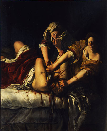
Sherman asks the viewer to consider layers of un-realities, beginning with the props and prosthetics she has employed in the image. Sherman herself is a prop: a real stand-in for the idealized Judiths of art history. As the props undermine the seriousness with which we might consider the scene, the image also questions the complex implications of a violent murder. As in many of the historical paintings, Judith’s hands are bloody, but her garments and face remain clean. Her face—like the bland faces of so many other images of Judith is matter-of-fact, revealing no trace of the grim act that was purportedly committed (the exception to this is Artemisia Gentileschi’s Judith). The direct studio lighting of Sherman’s image dampens the drama and further heightens the artificiality of the scene.
The artist invites the viewer to consider how all of these matters converge in a photograph. In the early 19th century, painters struggled to supplant or utilize the technical advantages of photography. Both painting and photography can and do afford the opportunity for invention. By adopting contrivances from prior centuries and adding multiple contemporary contrivances to her interpretation, Sherman’s Untitled #228 both blatantly exposes and provides an art historical context for her contemplations on the nature of narrative and pictorial invention.
Additional resources:
Smarthistory essay on Gentileschi’s Judith Slaying Holofernes
Interview with Sherman from the Walker Art Center
Cindy Sherman at MoMA
Kara Walker, Darkytown Rebellion
by DR. DORIS MARIA-REINA BRAVO
Brilliant patterns
The Art of Kara Walker, a “PBS Culture Shock” web activity, tests the participant’s tolerance for imagery that occupies the nebulous space between racism and race affirmation. Though the activity gives the participant only two options at the end (whether or not to feature one of Walker’s silhouettes on the “Culture Shock” homepage), the activity explores the multiple and complex reactions Walker’s work elicits. Yet to focus solely on the controversy Walker’s art generates is a disservice to her artistic training and the strength of her art, especially in a stunning and absorbing installation like Darkytown Rebellion. Here, a brilliant pattern of colors washes over a wall full of silhouettes enacting a dramatic rebellion, giving the viewer the unforgettable experience of stepping into a work of art. Walker’s talent is not about creating controversy for its own sake, but building a world that unleashes horrors even as it seduces viewers.

In contrast to larger-scale works like the 85 foot, Slavery! Slavery! (1997), Darkytown Rebellion occupies a 37 foot wide corner of a gallery. This ensemble, made up of over a dozen characters, plays out a nightmarish scene on a single plane: one figure stands upright over his severed limb, despite his bleeding leg stump, with bones protruding from his hips; another figure, also exhibiting a severed limb, rolls on his back; a woman with a bonnet and voluminous hoop skirt may be attacking a smaller figure on its back, perhaps a crying baby, with a long, plunger-like instrument.
Silhouettes and concealment
What is most remarkable about these scenes is how much each silhouette conceals. Without interior detail, the viewer can lose the information needed to determine gender, gauge whether a left or right leg was severed, or discern what exactly is in the black puddle beneath the woman’s murderous tool. The color projections, whose abstract shapes recall the 1960s liquid light shows projected with psychedelic music, heighten the surreality of the scene.
Walker is a well-rounded multimedia artist, having begun her career in painting and expanded into film as well as works on paper. The layering she achieves with the color projections and silhouettes in Darkytown Rebellion anticipates her later work with shadow puppet films.
In addition to creating a striking viewer experience, Darkytown Rebellion reflects on the historical representation of African Americans in American visual culture. From the infamous Brookes slave ship print (1789), to Birth of a Nation (1915) to the Aunt Jemima logo (c.1890-today), powerful visuals shape African-American stereotypes and inform how popular culture perceives this community. Walker is one of several African-American women who use art to engage with and challenge visualizations of race within popular culture; others include Renee Cox, Adrian Piper, and Faith Ringgold.
Perverse ingenuity
Walker anchors much of her work in documents reflecting life before and after the Civil War. The Daily Constitution 1878 (2011) emerged after Walker read an 1878 article from the eponymous Atlanta newspaper about a mob lynching a black woman and the brutal way the tree flung the woman’s body into the air. Walker converted the article into a drawing because, as she stated, “it’s this completely absurd, extreme, violent situation that required so much perverse ingenuity.”1
Darkytown Rebellion is also born from a desire to translate the past into visual form. Walker discovered a landscape painting in American Primitive Painting, a book featuring artwork by unschooled artists. One anonymous landscape, mysteriously titled Darkytown, intrigued Walker and inspired her to remove the over-sized African-American caricatures. She placed them, along with more figures (a jockey, a rebel, and others), within a scene of rebellion, hence the re-worked title of her 2001 installation. Through Darkytown Rebellion, Walker is not attempting to correct a late-nineteenth century depiction of African-Americans but rather to broach a discussion: are these merely images from the past or do these caricatures still resonate in the twenty-first century?
Incomplete histories
Walker’s dedication to recovering lost histories through art is a way of battling the historical erasure that plagues African Americans, like the woman lynched by the mob in Atlanta. Though this lynching was published, how many more have been forgotten? Who was this woman, what did she look like, why was she murdered? The impossibility of answering these questions finds a visual equivalent in the silhouetted voids in Walker’s artistic practice.
Silhouettes began as a courtly art form in sixteenth-century Europe and became a suitable hobby for ladies and an economical alternative to painted miniatures, before devolving into a craft in the twentieth century. Traditionally silhouettes were made of the sitter’s bust profile, cut into paper, affixed to a non-black background, and framed. Except for the outline of a forehead, nose, lips, and chin all the subject’s facial details are lost in a silhouette, thus reducing the sitter to a few personal characteristics. In Walker’s hands the minimalist silhouette becomes a tool for exploring racial identification. All things being equal, what distinguishes the white master from his slave in Darkytown Rebellion? Walker forces the viewer to confront the visual cues that make up stereotypes: these cues distill human forms into basic and arbitrary shapes that compose the basis of racial discrimination.
Though Darkytown Rebellion is full of shapes lacking detail, Walker reserves sharp outlines for faces and limbs. Walker’s silhouettes are (mostly) full-bodied figures, captured in various poses from the traditional profile, to a three-quarter turn, to full frontal. This plurality of poses, often in a single body, is another example of obscured detail within the silhouette tradition: here not only is the face absent, but the body’s action is also ambiguous. As mentioned earlier, it is impossible to make out which leg is severed on the standing figure near the corner, yet Walker manages to give the gory details of that man’s tragedy. If traditional silhouettes illustrated a contained shape, Walker’s figures overflow these boundaries, whether through graphic violence or metaphorically, in terms of subject matter.
Getting at the truth
In contrast to The Daily Constitution 1878, which was born from a news article, Walker herself developed the narrative for the orphaned figures that compose Darkytown Rebellion. Though the title suggests a historical event, both the original nineteenth-century painting and Walker’s response are visual inventions rather than documents in a traditional sense. Walker enjoys this ambiguity between history and fiction: “I’m not making work about reality; I’m making work about images. I’m making work about fictions that have been handed down to me, and I’m interested in those fictions because I’m an artist, and any sort of attempt at getting at the truth of a thing, you kind of have to wade through these levels of fictions, and that’s where the work is coming from.”2
Darkytown Rebellion does not attempt to stitch together facts, but rather to create something more potent, to imagine the unimaginable brutalities of an era in a single glance.
1. Laura Barnett, “Kara Walker’s Art: Shadows of Slavery,” The Guardian (October 10, 2013)
2. “Kara Walker Rattles Art World Again,” NPR (March 07, 2008)
Art, Race, and the Internet: Mendi + Keith Obadike’s Black.Net.Art Actions

Looking at the landscape of the internet today, it’s hard to imagine conversations about race not being a central part of net culture. Consider “Black Twitter,” a concept that goes beyond user demographics to describe the significant role the internet plays in promoting dialogues about race in all parts of our lives.[1] Or spend some time exploring the many social media accounts dedicated to the cultural heritage of specific racial and ethnic groups, from influential Asian Pacific Islander women to artists of Africa and the African diaspora. You’ll also find these conversations happening in art-specific venues like Rhizome, which in 2017 hosted First Look: New Black Portraitures, a primarily online exhibition that links the history of portraiture to questions surrounding blackness, representation, and image making in our networked present.[2]
However, net culture looked very different back in the 1990s when internet use first started to become popular. It’s not that no one was talking about race online—there were actually quite a few email lists and other proto-social networks focused on race and ethnicity—but these discussions tended to be ignored in the mainstream, or simply treated as peripheral.[3] Cyber enthusiasts had long promoted the misguided perception that virtual communication could allow users to interact without the prejudices associated with physical difference such as race, gender, or disability.[4] When advertisers seized on this premise as a strategy for making the strange new world of the internet seem more approachable, they popularized the idea that, to quote a 1997 internet ad for telecom MCI, on the internet “there is no race.” In fact, the notion that race was simply irrelevant to life online became so prevalent that sociologist Alondra Nelson once declared it the “founding fiction of the digital age.”[5]
During this same period internet art, or net art, was becoming a more widely recognized category of artistic practice. Like in the rest of net culture, race was not a common topic in early net art—but that doesn’t mean there weren’t artists addressing it.[6] Here, we’ll focus on Mendi + Keith Obadike’s Black.Net.Art Actions (2001–2003), a suite of retroactively grouped artworks that argue that racial discourses aren’t just relevant online, they are essential to how we interact with computer networks.
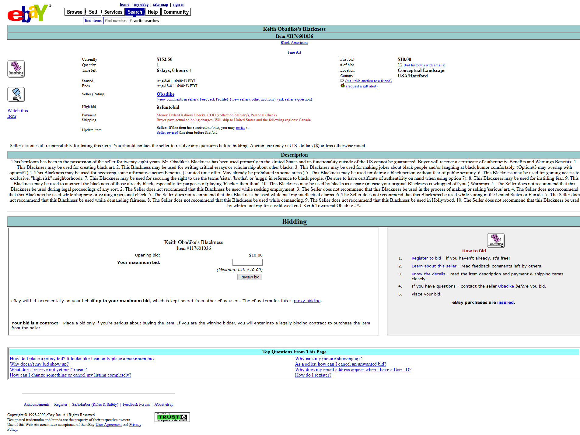
Blackness for Sale
In 2001 the Obadikes released Blackness for Sale, an online performance in which they attempted to auction Keith’s Blackness on eBay. It received twelve bids over four days before eBay shut the project down, calling it “inappropriate.” The item description includes benefits like “This Blackness may be used for making jokes about black people and/or laughing at black humor comfortably” as well as warnings like “The Seller does not recommend that this Blackness be used while voting in the United States or Florida.”[7] The work thus reminds us that “Blackness” never just refers to a value-neutral color or the hue of a person’s skin. Rather, it is bound to a complex history, simultaneously recalling the experiences of one individual and the condition of race relations across the United States.
By highlighting the field of meaning that surrounds language, Blackness for Sale also directs attention to how we talk about the platform that hosted it: eBay. As Keith Obadike has pointed out, many of the words we use to describe our activities online also describe the activities of colonization and slavery.[8] We cross the new electronic frontier, taking browsers like Navigator, Explorer, and Safari to plunder the Amazon and trade in the eBay. There we find representations of the Black body returned to the auction block, not just in this artwork but in the mammy figurines and other racist memorabilia sold alongside it as “Fine Arts and Black Americana.”[9] Blackness for Sale argues that this digital frontierism is ideologically linked to the “real world” histories of colonialism and the slave trade, histories that cannot be divorced from how we interact online. In other words, even though our internet exchanges may appear to be virtual and therefore disembodied, what MCI called “communicating mind to mind,” we still come to those exchanges with the experiences of our bodies and all of the histories that shape them.
Website for the Whitney Museum
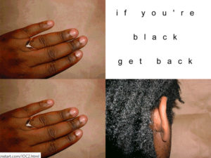
The Obadikes continued their investigation into how color and race signify online with The Interaction of Coloreds (2002), a website they originally produced for the Whitney Museum’s now-defunct Artport gate page program. Both the work’s title and the grid format of its opening page reference Josef Albers’s Interaction of Color (1963), a modernist text that theorizes the relationship between color and personal preference. Moving your mouse over that grid reveals famous lyrics from a Big Bill Broonzy song that remind us how such color preferences emerge in our ideas about race: “if you’re white you’re right / if you’re black get back / if you’re brown stick around / if you’re yellow you’re mellow.”

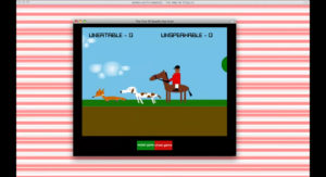
When you enter the main site you find the IOC Color Check System®, which the artists describe as a “brown paper bag test for the internet.”[10] Using photographs of applicants’ skin alongside answers to a “Hyper-Race Analysis” questionnaire, the System promises to return a precise hexadecimal color for your skin. This is a six digit HTML (hypertext markup language) code that tells your web browser what color to show you—or, in this case, assigns a color value to a human being. Now, the System exults, “Websafe colors aren’t just for webmasters,” a reference to the fact that when IOC was produced there were only a limited number of “websafe” codes that would display consistently on all browsers. By proposing that the color of a person can also be used to designate her as “websafe,” IOC demonstrates how social meanings are reasserted when human beings interpret the apparently neutral mathematical system of HTML. In the Color Check System® the “true white” of #FFFFFF is like the “right white” of the Big Bill Broonzy song, representing not just a full amount of additive light but also a full human being. And the #000000 of “absolute black” (“get back”) doesn’t just signify a lack of light; it signifies the lack of humanity too often associated with blackness. (Or, as Blackness for Sale put it, “The Seller does not recommend that this Blackness be used while making intellectual claims.”)

The IOC Color Check System® also invites us to consider for whom we are being designated “websafe.” In addition to wry mentions of dating websites and airlines hoping to “offer lower rates on the web to customers with non-threatening bodies,” the System suggests that it may be useful to a “new African-American web portal or an old Negro social club looking for a way to maintain your club’s discriminating tastes in the information age.” This is a reference to the racially oriented proto-social networks that flourished during the 1990s, such as the immensely popular BlackPlanet. Although these networks offered an important platform for many people who didn’t see themselves reflected in other areas of internet culture, IOC points out that they also threatened to exaggerate racial segmentation and reduce Black internet users to a consumer category. In this way, the Obadikes not only challenge the idea that race is irrelevant on the internet, they also critique the assumption that simply having more Black people online will make the internet a more equitable place.[11]
The Pink of Stealth or Keeping Up Appearances
The final work the Obadikes choose to include in the Black.Net.Art Actions varies depending on the url where it is accessed. In some publications it’s The Pink of Stealth (2003); in others, it’s Keeping Up Appearances (2001).[12] What these two works share in common is an emphasis on the gender and sexual politics that are only hinted at in Blackness for Sale and The Interaction of Coloreds. Keeping Up Appearances is a hypertextimonial poem by Mendi Obadike that explores the relationship between Blackness and femininity, in part through the visual signifier of the color pink. This signifier is picked up by The Pink of Stealth, which integrates a website, hypertext poem, sound collage, and Flash game to play with the different class, gender, sexual, and even health-related meanings that have been associated with pinkness over time. The inclusion of either work in the Black.Net.Art Actions rounds out the suite’s focus on the multiple meanings of color language by insisting that racial discourses cannot be separated from their intersections with all of the other factors that influence our experiences—online as well as off.

As discussed at the beginning, the fact that race no longer feels peripheral on the internet is a dramatic change from the years when the Black.Net.Art Actions were being produced. In the 1990s and early 2000s, the myth that race disappears online still shaped how many people understood the emancipatory potential of computer networks. The Actions helped to counter that myth by revealing how the histories that influence our ideas and experiences of race persist throughout our encounters on the network. In the process, these artworks also demonstrated that the relationship between race and computer networks is an essential subject for internet-based art.
Notes:
- Donovan X. Ramsey and Meredith D. Clark, “The Truth About Black Twitter,” The Atlantic (April 10, 2015), https://www.theatlantic.com/technolo...witter/390120/
- Aria Dean, “An Introduction to New Black Portraitures,” Rhizome (blog), October 26, 2017, http://rhizome.org/editorial/2017/oc...-portraitures/.
- Email lists like the Afro-Am Listserv started popping up in the early 1990s, and by the end of the decade commercial enterprises like Community Connect were launching racially oriented social networks such as AsianAvenue and BlackPlanet. The latter quickly became a sprawling platform that would only be eclipsed in size and popularity by the rise of MySpace.
- Two of the most well-known promoters of the model of the internet as disembodied home of the mind are John Perry Barlow, co-founder of the internet advocacy group the Electronic Frontier Foundation (EFF), and Howard Rheingold, author of The Virtual Community: Homesteading on the Electronic Frontier (1993), an oft-cited book on The WELL, the internet’s first social network. This well-meaning argument is based on the assumption that a world of the mind would be inherently more just. However, it ignores the reality that embodied experience does shape life online, for better and worse, as well as the fact that not everyone is able to shed the histories associated with their bodily characteristics even in an apparently all virtual environment—nor does everyone want to.
- Alondra Nelson, “Introduction: FUTURE TEXTS,” Social Text 20, no. 2 (71) (Summer 2002): 1, https://doi.org/10.1215/01642472-20-2_71-1. In 1998, Nelson founded the influential Afrofuturism online discussion group. While scholarship on race in early net culture was also relatively rare, she’s not the only person working in this area. Other prominent voices include Lisa Nakamura, Wendy Hui Kyong Chun, Jennifer González, and Tara McPherson.
- It’s important to note that while race wasn’t central to early net art, it wasn’t entirely marginalized either. Guillermo Gómez-Peña, the Mongrel group, Prema Murthy, Tana Hargest, and Mendi + Keith Obadike are just a few examples of artists who made relatively well-known work addressing the relationship between race and computer networks during the 1990s and early 2000s.
- This is a reference to large-scale voter disenfranchisement in Florida during the 2000 US presidential election, which disproportionately affected Black voters. See Ari Berman, “How the 2000 Election in Florida Led to a New Wave of Voter Disenfranchisement,” The Nation, July 28, 2015, https://www.thenation.com/article/ar...franchisement/.
- Coco Fusco, “All Too Real: The Tale of an On-Line Black Sale; Coco Fusco Interviews Keith Townsend Obadike,” September 24, 2001, http://blacknetart.com/coco.html.
- This is the category to which the Obadikes submitted Blackness for Sale in 2001. eBay has since changed their categories, but a search for “Black Americana” still turns up plenty of racist memorabilia, much of it filed under “Ethnic & Cultural Collectibles.”
- The brown paper bag test is an historical form of colorism (racial prejudice within communities of color) that is said to have been used to admit—or deny—access to certain African American social institutions. Stories about this test claim that only those whose skin was lighter than a brown paper bag were allowed in.
- The one area in which scholars did focus on the relationship between race and computer networks during this period was the question of access, often referred to as the “digital divide.” While being able to use the internet had already become undeniably important, scholars such as Alondra Nelson argue that the digital divide narrative tends to frame Black people as inherently anti-technological while paying little attention to how race influences experience once people are online.
- The Obadikes feature The Pink of Stealth as the third work in the Black.Net.Art Actions in Keith + Mendi Obadike, “The Black.Net.Art Actions: Blackness for Sale (2001), The Interaction of Coloreds (2002), and The Pink of Stealth (2003),” in Re:Skin, ed. Mary Flanagan and Austin. Booth (Cambridge, Mass.: MIT Press, 2006), 245–50. It was later replaced by Keeping Up Appearances in the Black.Net.Art Actions’ entry into the Rhizome Net Art Anthology. Neither source is more authoritative; rather, this reflects the fluidity of internet art, which, like performance art, is often characterized by change over time.
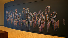
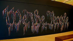
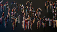
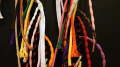
Nari Ward, We the People (black version)
by DR. MINDY BESAW, CRYSTAL BRIDGES MUSEUM OF AMERICAN ART and DR. STEVEN ZUCKER
Video \(\PageIndex{7}\): Nari Ward, We the People (black version), 2015, shoelaces, 8 × 27 feet (Crystal Bridges Museum of American Art), a Seeing America video
Smarthistory images for teaching and learning:


Alfredo Jaar, A Logo for America
by DR. DORIS MARIA-REINA BRAVO
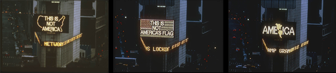
In the spring of 1987, visitors to Times Square were confronted by a puzzling 45-second animation among the glittering billboards characteristic of this part of Manhattan. The animation consisted of three digital renderings that each combined images (maps and a flag) with simple lines of text. What mystified some viewers were not the images themselves, but the text that accompanied them: in the first frame, “This is Not America” was superimposed on a map of the United States; in the second frame, “This is Not America’s Flag” was superimposed on the image of the United States flag; and in the last frame, the single word “AMERICA” was superimposed on the image of the North and South American continents together.
In less than a minute, artist Alfredo Jaar succeeded in provoking patriotic inhabitants of the United States by asserting that they are not the only “Americans.” Jaar’s message gave credence to a long-standing belief among Latin Americans in other countries that they, too, have the right to call themselves by that term. Nearly thirty years later, Jaar’s A Logo for America remains a powerful example of art that uses the language of commercial advertising to convey a pointed political message.
Messages in Spectacolor
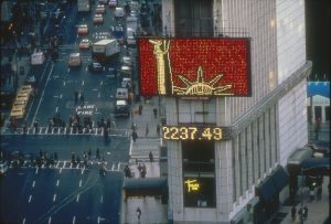
In 1982, New York City’s Public Art Fund launched the Messages to the Public program with the goal of exposing viewers to media-based artworks through Times Square’s Spectacolor board. For nearly a decade, dozens of artists created short animations that would appear within loops of commercial advertising. A new “Message” would appear every month, providing the viewing public with a fresh animation. According to the project’s originator, the painter Jane Dickson (who was working as a designer for Spectacolor at the time), the purpose was to inject a political message into daily life. “I picked that title,” she said of Messages to the Public, “because I thought the propaganda potential from this project was terrific.” [1] Other Latin American artists involved in the Messages project also used this opportunity to highlight their critical perspectives on U.S. culture. For example, Catalina Parra’s USA, Where Liberty is a Statue (see image) critiques the promise of the modern immigrant experience using the country’s most iconic symbol of liberty.
Jaar’s message
Jaar illustrates two iconic symbols of the United States of America—the map of the country and the flag—and embeds them with messages that subvert their traditional meanings. The contrast is meant to pose the question, What exactly is America? As a potential answer, Jaar ends his animation with a rendering suggesting that the entire hemisphere is, in fact, “America.” For those living in Mexico, Central, and South America, this is an argument that has often fallen on deaf ears. For example, it is common for someone from Chile—Jaar’s country of birth—to simultaneously consider themselves a Chilean and an American. The distinction is simply the difference between national and continental affiliations. When Jaar was commissioned to create this work of art, he had only been living in the United States for a few years, and it would likely have struck him as odd to hear the term “America” being used to define only citizens of the United States.
Defining “America”
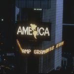
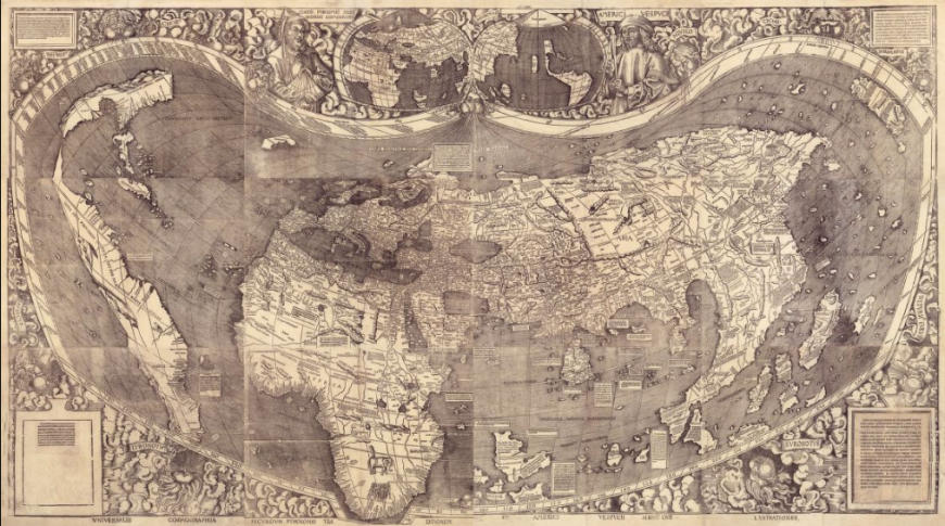
However, for many people living within the United States, this question is likely rarely, if ever considered: for them, “America” implies one country, one flag, and one nationality. According to Jaar, “Some of [the viewers] said live on national radio, ‘This is illegal. How could they let him do this?’ It is so embedded in their education that the U.S. is America, whereas the rest of the continent is erased.” [2] Jaar elicited this reaction by appropriating a national symbol to critique mainstream ideas about Americanness—not only about the definition of the term itself, but the ways that the term’s use in the United States implies superiority over other American countries and cultures. The final frame of his animation, which shows the outline of North, Central, and South America along with the word “AMERICA,” is the new “logo” referenced in Jaar’s title. It is a literal re-rendering—a “rebranding,” to use the language of advertising—of the American continents that Europeans encountered in the late fifteenth century. Afterall, the lands of the Western hemisphere which came to be called America after the explorer and mapmaker Amerigo Vespucci, were perceived as one geographic entity, despite political subdivisions.
Pop and propaganda
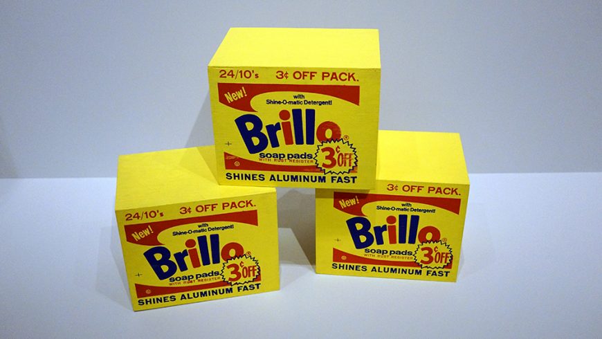
What does it mean to make this logo for America, a type of symbol normally used to represent products or corporations? A useful example can be seen in the earlier movement, Pop Art, and its use of consumer culture as a source of inspiration. Artists like Richard Hamilton, Roy Lichtenstein, and Andy Warhol appropriated the slick, graphic sensibility of mid-century advertising as well as the means and materials of industrial production. Warhol’s Brillo Boxes, for instance, perfectly mimicked factory-made boxes, simultaneously drawing attention to the aesthetic appeal of what might otherwise be passed over as an unremarkable, mass-produced package, while critiquing high-minded notions of art that fetishized unique, handmade objects.
However, unlike Warhol’s Brillo Boxes which are exhibited within galleries and museums, Messages to the Public existed within a stream of actual advertising, emphasizing its critical opposition. Like the Pop artists before him, Jaar not only made use of the formal language of advertising, but in taking it out of the object-centric realm of the gallery and into the virtual space of the advertising screen, he also questioned the very definition of art-making, which he described as primarily a process of thinking:
I think that artists are thinkers, they’re intellectuals. And art is about thinking. For me, art is about 99% thinking and 1% making. So I spend most of my time, and I ask my students to spend 99% of their time, thinking. […] Only at the end of a very long thinking process [do] we make something […] And in my case I do not work with a specific medium. The medium I use is the one that I feel speaks the better for the ideas I’m working with. [3]
Just as Jaar asserted the importance of thinking in creating his art, the viewer is also rewarded for investing time considering it—something one might not normally do in the face of advertising.
A Logo for America is still considered a seminal work of Latin American Art. It was acquired by the Guggenheim Museum as part of the Guggenheim UBS MAP Global Art Initiative and was featured in the museum’s 2014 exhibition, Under the Same Sun: Art from Latin America Today. Concurrent with this show, Jaar’s video returned to Times Square for a month-long reenactment, playing every night on dozens of screens. Despite its simplicity, Jaar’s message continues to stir emotions and serve as a daring intellectual exercise.
[1] Alfredo Jaar—Messages to the Public: A Logo for America,” Public Art Fund.
[2] “In Conversation: Alfredo Jaar,” The Brooklyn Rail, April 6, 2009.
[3] “Focus on: Alfredo Jaar,” Vogue Italia.