
10.12: Postwar American art (II)
- Page ID
- 147838
Pop art
Can you celebrate consumer culture at the same time that you critique it? Pop artists thought so.
c. 1956 - 1980
A beginner's guide
Contemporary Art, an introduction
“Getting” Contemporary Art
It’s ironic that many people say they don’t “get” contemporary art because, unlike Egyptian tomb painting or Greek sculpture, art made since 1960 reflects our own recent past. It speaks to the dramatic social, political and technological changes of the last 50 years, and it questions many of society’s values and assumptions—a tendency of postmodernism, a concept sometimes used to describe contemporary art. What makes today’s art especially challenging is that, like the world around us, it has become more diverse and cannot be easily defined through a list of visual characteristics, artistic themes or cultural concerns.
Minimalism and Pop Art, two major art movements of the early 1960s, offer clues to the different directions of art in the late 20th and 21st century. Both rejected established expectations about art’s aesthetic qualities and need for originality. Minimalist objects are spare geometric forms, often made from industrial processes and materials, which lack surface details, expressive markings, and any discernible meaning. Pop Art took its subject matter from low-brow sources like comic books and advertising. Like Minimalism, its use of commercial techniques eliminated emotional content implied by the artist’s individual approach, something that had been important to the previous generation of modern painters. The result was that both movements effectively blurred the line distinguishing fine art from more ordinary aspects of life, and forced us to reconsider art’s place and purpose in the world.
Shifting Strategies
Minimalism and Pop Art paved the way for later artists to explore questions about the conceptual nature of art, its form, its production, and its ability to communicate in different ways. In the late 1960s and 1970s, these ideas led to a “dematerialization of art,” when artists turned away from painting and sculpture to experiment with new formats including photography, film and video, performance art, large-scale installations and earth works. Although some critics of the time foretold “the death of painting,” art today encompasses a broad range of traditional and experimental media, including works that rely on Internet technology and other scientific innovations.

Contemporary artists continue to use a varied vocabulary of abstract and representational forms to convey their ideas. It is important to remember that the art of our time did not develop in a vacuum; rather, it reflects the social and political concerns of its cultural context. For example, artists like Judy Chicago, who were inspired by the feminist movement of the early 1970s, embraced imagery and art forms that had historical connections to women.
In the 1980s, artists appropriated the style and methods of mass media advertising to investigate issues of cultural authority and identity politics. More recently, artists like Maya Lin, who designed the Vietnam Veterans’ Memorial Wall in Washington D.C., and Richard Serra, who was loosely associated with Minimalism in the 1960s, have adapted characteristics of Minimalist art to create new abstract sculptures that encourage more personal interaction and emotional response among viewers.
These shifting strategies to engage the viewer show how contemporary art’s significance exists beyond the object itself. Its meaning develops from cultural discourse, interpretation and a range of individual understandings, in addition to the formal and conceptual problems that first motivated the artist. In this way, the art of our times may serve as a catalyst for an on-going process of open discussion and intellectual inquiry about the world today.
Smarthistory images for teaching and learning:


Pop Art

Popular culture, “popular” art
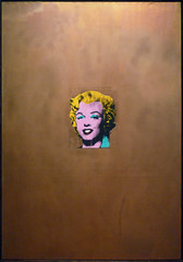
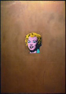
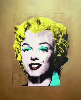
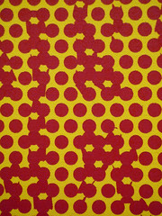
At first glance, Pop Art might seem to glorify popular culture by elevating soup cans, comic strips and hamburgers to the status of fine art on the walls of museums. But, then again, a second look may suggest a critique of the mass marketing practices and consumer culture that emerged in the United States after World War II. Andy Warhol’s Gold Marilyn Monroe (1962) clearly reflects this inherent irony of Pop. The central image on a gold background evokes a religious tradition of painted icons, transforming the Hollywood starlet into a Byzantine Madonna that reflects our obsession with celebrity. Notably, Warhol’s spiritual reference was especially poignant given Monroe’s suicide a few months earlier. Like religious fanatics, the actress’s fans worshipped their idol; yet, Warhol’s sloppy silk-screening calls attention to the artifice of Marilyn’s glamorous façade and places her alongside other mass-marketed commodities like a can of soup or a box of Brillo pads.
Genesis of Pop

In this light, it’s not surprising that the term “Pop Art” first emerged in Great Britain, which suffered great economic hardship after the war. In the late 1940s, artists of the “Independent Group,” first began to appropriate idealized images of the American lifestyle they found in popular magazines as part of their critique of British society. Critic Lawrence Alloway and artist Richard Hamilton are usually credited with coining the term, possibly in the context of Hamilton’s famous collage from 1956, Just what is it that makes today’s home so different, so appealing? Made to announce the Independent Group’s 1956 exhibition “This Is Tomorrow,” in London, the image prominently features a muscular semi-nude man, holding a phallically positioned Tootsie Pop.

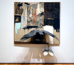
Pop Art’s origins, however, can be traced back even further. In 1917, Marcel Duchamp asserted that any object—including his notorious example of a urinal—could be art, as long as the artist intended it as such. Artists of the 1950s built on this notion to challenge boundaries distinguishing art from real life, in disciplines of music and dance, as well as visual art. Robert Rauschenberg’s desire to “work in the gap between art and life,” for example, led him to incorporate such objects as bed pillows, tires and even a stuffed goat in his “combine paintings” that merged features of painting and sculpture. Likewise, Claes Oldenberg created The Store, an installation in a vacant storefront where he sold crudely fashioned sculptures of brand-name consumer goods. These “Proto-pop” artists were, in part, reacting against the rigid critical structure and lofty philosophies surrounding Abstract Expressionism, the dominant art movement of the time; but their work also reflected the numerous social changes taking place around them.
Post-War Consumer Culture Grabs Hold (and Never Lets Go)

The years following World War II saw enormous growth in the American economy, which, combined with innovations in technology and the media, spawned a consumer culture with more leisure time and expendable income than ever before. The manufacturing industry that had expanded during the war now began to mass-produce everything from hairspray and washing machines to shiny new convertibles, which advertisers claimed all would bring ultimate joy to their owners. Significantly, the development of television, as well as changes in print advertising, placed new emphasis on graphic images and recognizable brand logos—something that we now take for granted in our visually saturated world.
It was in this artistic and cultural context that Pop artists developed their distinctive style of the early 1960s. Characterized by clearly rendered images of popular subject matter, it seemed to assault the standards of modern painting, which had embraced abstraction as a reflection of universal truths and individual expression.
Irony and Iron-Ons

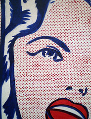
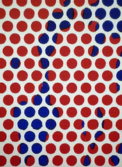
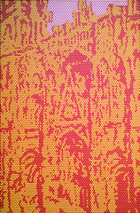
In contrast to the dripping paint and slashing brushstrokes of Abstract Expressionism—and even of Proto-Pop art—Pop artists applied their paint to imitate the look of industrial printing techniques. This ironic approach is exemplified by Lichtenstein’s methodically painted Benday dots, a mechanical process used to print pulp comics.
As the decade progressed, artists shifted away from painting towards the use of industrial techniques. Warhol began making silkscreens, before removing himself further from the process by having others do the actual printing in his studio, aptly named “The Factory.” Similarly, Oldenburg abandoned his early installations and performances, to produce the large-scale sculptures of cake slices, lipsticks, and clothespins that he is best known for today.
Additional resources:
Pop Art on the Metropolitan Museum of Art’s Heilbrunn Timeline of Art History
Smarthistory images for teaching and learning:
Andy Warhol
Warhol, Coca-Cola [3]
by ALEJO BENEDETTI, CRYSTAL BRIDGES MUSEUM OF AMERICAN ART and DR. STEVEN ZUCKER
Video \(\PageIndex{1}\): Andy Warhol, Coca-Cola [3], 1962, casein on canvas, 176.2 x 137.2 cm (Crystal Bridges Museum of American Art, © The Andy Warhol Foundation for the Visual Arts), a Seeing America video
Smarthistory images for teaching and learning:
![Warhol, Coca-Cola [3]](https://farm2.static.flickr.com/1805/29479781528_b33087de54_m.jpg)
![Warhol, Coca-Cola [3]](https://farm2.static.flickr.com/1769/28480765527_46e4ea56a0_m.jpg)
![Warhol, Coca-Cola [3]](https://farm2.static.flickr.com/1787/28480766057_cfd949506d_m.jpg)
![Warhol, Coca-Cola [3]](https://farm2.static.flickr.com/1809/42633025644_ff1d05d891_m.jpg)
![Warhol, Coca-Cola [3]](https://farm2.static.flickr.com/1809/28480770637_a1b320669b_m.jpg)
![Warhol, Coca-Cola [3]](https://farm2.static.flickr.com/1808/29479784858_646795fcca_m.jpg)
![Warhol, Coca-Cola [3]](https://farm1.static.flickr.com/922/29479790408_9df4d7c042_m.jpg)
![Warhol, Coca-Cola [3]](https://farm2.static.flickr.com/1828/42633026544_7da4e85a8f_m.jpg)
![Warhol, Coca-Cola [3]](https://farm2.static.flickr.com/1765/28480770267_434559bea9_m.jpg)
![Warhol, Coca-Cola [3]](https://farm2.static.flickr.com/1828/29479786208_74aa35e08a_m.jpg)
![Warhol, Coca-Cola [3]](https://farm1.static.flickr.com/833/28480767597_a04cd713db.jpg)
![Warhol, Coca-Cola [3]](https://farm2.static.flickr.com/1828/42633027994_a1df3a9edc.jpg)
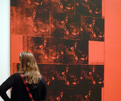
Andy Warhol, Marilyn Diptych

Andy Warhol’s Marilyn Diptych is made of two silver canvases on which the artist silkscreened a photograph of Marilyn Monroe fifty times. At first glance, the work—which explicitly references a form of Christian painting (see below) in its title—invites us to worship the legendary icon, whose image Warhol plucked from popular culture and immortalized as art.

But as in all of Warhol’s early paintings, this image is also a carefully crafted critique of both modern art and contemporary life.
Not only pop culture
With sustained looking, Warhol’s works reveal that he was influenced not only by pop culture, but also by art history—and especially by the art that was then popular in New York. For example, in this painting, we can identify the hallmarks of Abstract Expressionist painters like Jackson Pollock and Willem de Kooning.

As in the work of these older artists, the monumental scale of Marilyn Diptych (more than six feet by nine feet) demands our attention and announces the importance of the subject matter. Furthermore, the seemingly careless handling of the paint and its “allover composition”—the even distribution of form and color across the entire canvas, such that the viewer’s eyes wander without focusing on one spot—are each hallmarks of Abstract Expressionism, as exemplified by Jackson Pollock’s drip paintings. Yet Warhol references these painters only to undermine the supposed expressiveness of their gestures: like Jasper Johns and Robert Rauschenberg, whose work he admired, he uses photographic imagery, the silkscreen process and repetition to make art that is not about his interior life, but rather about the culture in which he lived.
Emotional flatness
Warhol takes as the subject of his painting an impersonal image. Though he was an award-winning illustrator, instead of making his own drawing of Monroe, he appropriates an image that already exists. Furthermore, the image is not some other artist’s drawing, but a photograph made for mass reproduction. Even if we don’t recognize the source (a publicity photo for Monroe’s 1953 film Niagara), we know the image is a photo, not only because of its verisimilitude, but also because of the heightened contrast between the lit and shadowed areas of her face, which we associate with a photographer’s flash.
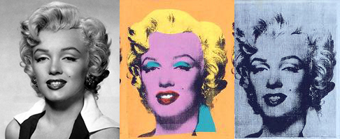
True to form, the actress looks at us seductively from under heavy-lidded eyes and with parted lips; but her expression is also a bit inscrutable, and the repetition remakes her face into an eerie, inanimate mask. Warhol’s use of the silkscreen technique further “flattens” the star’s face. By screening broad planes of unmodulated color, the artist removes the gradual shading that creates a sense of three-dimensional volume, and suspends the actress in an abstract void. Through these choices, Warhol transforms the literal flatness of the paper-thin publicity photo into an emotional “flatness,” and the actress into a kind of automaton. In this way, the painting suggests that “Marilyn Monroe,” a manufactured star with a made-up name, is merely a one-dimensional (sex) symbol—perhaps not the most appropriate object of our almost religious devotion.
Repetitions
While Warhol’s silkscreened repetitions flatten Monroe’s identity, they also complicate his own identity as the artist of this work. The silkscreen process allowed Warhol (or his assistants) to reproduce the same image over and over again, using multiple colors. Once the screens are manufactured and the colors are chosen, the artist simply spreads inks evenly over the screens using a wide squeegee. Though there are differences from one face to the next, these appear to be the accidental byproducts of a quasi-mechanical process, rather than the product of the artist’s judgment. Warhol’s rote painting technique is echoed by the rigid composition of the work, a five-by-five grid of faces, repeated across the two halves of its surface.
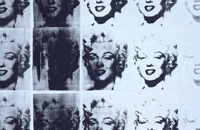
Here, as in many Neo-Dada, minimalist and conceptual works, the grid is like a program that the artist uses to “automate” the process of composing the work, instead of relying on subjective thoughts or feelings to make decisions. In other words, Warhol’s “cool,” detached composition is the opposite of the intimate, soulful encounter with the canvas associated with Abstract Expressionism. But whereas most works that use grids are abstract, here, the the grid repeats a photo of a movie star, causing the painting to resemble a photographer’s contact sheet, or a series of film strips placed side-by-side. These references to mechanical forms of reproduction further prove that for Warhol, painting is no longer an elevated medium distinct from popular culture.
Ghostly symmetry
Aside from radically changing our notion of painting, Warhol’s choices create a symmetry between the artist and his subject, who each seem to be less than fully human: the artist becomes a machine, just as the actress becomes a mask or a shell. Another word we could use to describe the presence of both the artist and the actress might be ghostly, and in fact, Warhol started making his series of “Marilyn” paintings only after the star had died of an apparent suicide, and eventually collected them with other disturbing paintings under the title “Death in America.” Her death haunts this painting: on the left, her purple, garishly made-up face resembles an embalmed corpse, while the lighter tones of some of the faces on the right make it seem like she is disappearing before our eyes.
Warhol once noted that through repeated exposure to an image, we become de-sensitized to it. In that case, by repeating Monroe’s mask-like face, he not only drains away her life, but also ours as well, by deadening our emotional response to her death. Then again, by making her face so strange and unfamiliar, he might also be trying to re-sensitize us to her image, so that we remember she isn’t just a symbol, but a person whom we might pity. From the perspective of psychoanalytic theory, he may even be forcing us to relive, and therefore work through, the traumatic shock of her death. The painting is more than a mere celebration of Monroe’s iconic status. It is an invitation to consider the consequences of the increasing role of mass media images in our everyday lives.
Additional resources:
This painting at Tate
Hal Foster et al., Art Since 1900: modernism antimodernism postmodernism, 2nd ed. (London: Thames and Hudson, 2011).
Steven Henry Madoff, ed., Pop Art: A Critical History (Berkeley: University of California Press, 1997).
Kynaston McShine, ed., Andy Warhol: A Retrospective, exh. cat. (New York: Museum of Modern Art, 1989).
Annette Michelson, ed., Andy Warhol (October Files) (Cambridge, MA: MIT Press, 2002).
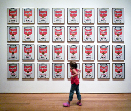
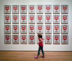
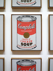
Why is this art? Andy Warhol, Campbell’s Soup Cans
by SAL KHAN and DR. STEVEN ZUCKER
Video \(\PageIndex{2}\): Andy Warhol, Campbell’s Soup Cans, 1962 (MoMA)
Smarthistory images for teaching and learning:


The Case for Andy Warhol
Video \(\PageIndex{3}\): Speaker: Sarah Urist Green
Additional resources:
Smarthistory images for teaching and learning:
![Warhol, Coca-Cola [3]](https://farm2.static.flickr.com/1828/42633027994_a1df3a9edc_m.jpg)
![Warhol, Coca-Cola [3]](https://farm1.static.flickr.com/833/28480767597_a04cd713db_m.jpg)
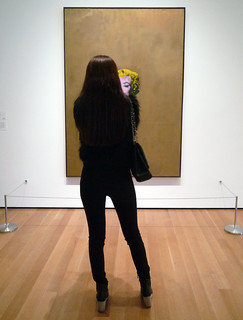
Andy Warhol, Gold Marilyn Monroe
by DR. BETH HARRIS and DR. STEVEN ZUCKER
Video \(\PageIndex{4}\): Andy Warhol, Gold Marilyn Monroe, silkscreen ink on synthetic polymer paint on canvas, 71.25 x 57″ (211.4 x 144.7 cm), 1962 (Museum of Modern Art, New York)
Smarthistory images for teaching and learning:
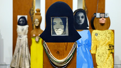
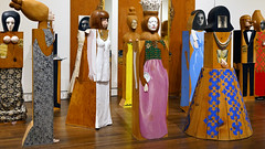
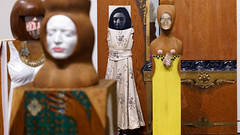
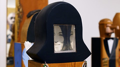
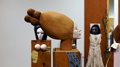
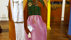
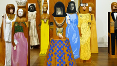
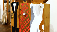
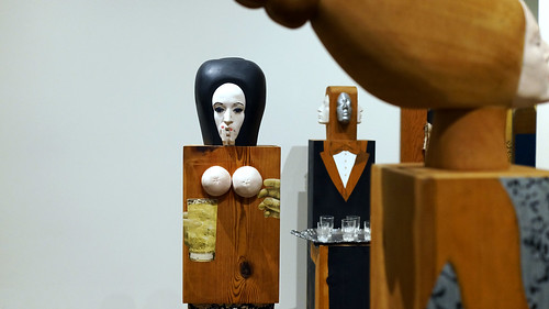
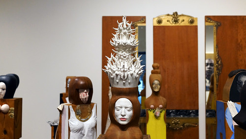
Marisol, The Party
by DR. HALONA NORTON-WESTBROOK, TOLEDO MUSEUM OF ART and DR. STEVEN ZUCKER
Video \(\PageIndex{5}\): Marisol Escobar, The Party, 1965-66, fifteen freestanding, life-size figures and three wall panels, with painted and carved wood, mirrors, plastic, television set, clothes, shoes, glasses, and other accessories, variable dimensions (Toledo Museum of Art, © artist’s estate)
Additional resources
Smarthistory images for teaching and learning:

Claes Oldenburg
Claes Oldenburg, Lipstick (Ascending) on Caterpillar Tracks
by MYA DOSCH

A monumental tube of lipstick sprouting from a military vehicle appeared, uninvited, on the campus of Yale University amidst the 1969 student protests against the Vietnam War. While the sculpture may have seemed like a playful, if elaborate artistic joke, Claes Oldenburg’s Lipstick (Ascending) on Caterpillar Tracks was also deeply critical. Oldenburg made the 24-foot-high sculpture in collaboration with architecture students at his alma mater and then surreptitiously delivered it to Yale’s Beinecke Plaza. In Beinecke Plaza, the sculpture overlooked both the office of Yale’s president and a prominent World War I memorial. Lipstick (Ascending) on Caterpillar Tracks claimed a visible space for the anti-war movement while also poking fun at the solemnity of the plaza. The sculpture served as a stage and backdrop for several subsequent student protests.

Oldenburg and the architecture students never intended for the original Lipstick (Ascending) on Caterpillar Tracks sculpture to be permanent. They made the base of plywood, and the red vinyl tip of the lipstick could be comically inflated and deflated—although the balloon mechanism didn’t always work. The original remained in Beinecke Plaza for ten months before Oldenburg removed it in order to remake the form in metal. The resulting sculpture was placed in a less-prominent spot on Yale’s campus, where it remains to this day.
Gender, consumerism, and war
Oldenburg had experimented with lipstick forms earlier in the 1960s, pasting catalog images of lipstick onto postcards of London’s Picadilly Circus. The resulting collages showed lipstick tubes looming like massive pillars over Picadilly’s plaza. In the Yale sculpture, the artist combined the highly “feminine” product with the “masculine” machinery of war. In doing so, he playfully critiqued both the hawkish, hyper-masculine rhetoric of the military and the blatant consumerism of the United States.
In addition to its feminine associations, the large lipstick tube is phallic and bullet-like, making the benign beauty product seem masculine or even violent. The juxtaposition implied that the U.S. obsession with beauty and consumption both fueled and distracted from the ongoing violence in Vietnam.

Going public
Oldenburg had been designing large-scale, vinyl versions of household objects since his Green Gallery exhibition in 1962. He had created collages and drawings that played with the notion of massive domestic objects in public places, but Lipstick was his first large-scale public artwork. Oldenburg went on to make several other public sculptures that enlarged everyday domestic items to monumental dimensions. For example, he rendered a clothespin on the scale of an ancient Egyptian obelisk in a 1976 sculpture for Philadelphia, Pennsylvania (below).
By bringing both domestic and military objects into a public space, Lipstick (Ascending) on Caterpillar Tracks blurred the lines between public and private, and between the war in Vietnam and culture of the United States. In doing so, it upheld Oldenburg’s 1961 declaration that “I am for an art that is political-erotical-mystical, that does something other than sit on its ass in a museum […] I am for an art that imitates the human, that is comic, if necessary, or violent, or whatever is necessary […].”1
1. Claes Oldenburg, “I Am For an Art…” in Environments, Situations, Spaces (New York: Martha Jackson Gallery, 1961); reprinted in an expanded version in Oldenburg and Emmett Williams, eds., Store Days: Documents from The Store (1961) and Ray Gun Theater (1962) (New York: Something Else Press, 1967), 39-42.
Additional resources:
Claes Oldenburg, Floor Cake
by DR. BETH HARRIS and DR. STEVEN ZUCKER
Video \(\PageIndex{6}\): Claes Oldenburg, Floor Cake, 1962, synthetic polymer paint and latex on canvas filled with foam rubber and cardboard boxes, 58.375 x 114.25 x 58.375″ / 148.2 x 290.2 x 148.2 cm (Museum of Modern Art, New York)
Smarthistory images for teaching and learning:

James Rosenquist, F-111
Video \(\PageIndex{7}\): Video from The Museum of Modern Art
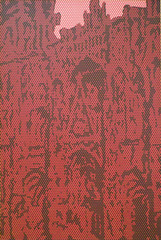
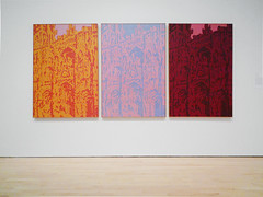
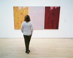
Roy Lichtenstein, Rouen Cathedral Set V
by DR. BETH HARRIS and DR. STEVEN ZUCKER
Video \(\PageIndex{8}\): Roy Lichtenstein, Rouen Cathedral Set V, 1969, oil and magna on canvas, 3 canvases: 63-5/8 x 141-7/8 x 1-3/4″ / 161.61 x 360.36 x 4.45 cm (San Francisco Museum of Modern Art)
Smarthistory images for teaching and learning:
Minimalism + Earthworks
Emerging in reaction to Abstract Expressionism, the Minimalists looked to remove the artist's hand from artmaking, and earthworks did away with traditional media altogether.
c. 1960 - present
A beginner's guide
An introduction to Minimalism

A reductive abstract art
Although many works of art can be described as “minimal,” the name Minimalism refers specifically to a kind of reductive abstract art that emerged during the early 1960s. At the time, some critics preferred names like “ABC,” “Boring,” or “Literal” Art, and even “No-Art Nihilism,” which they believed best summed up the literal presentation and lack of expressive content characterizing this new aesthetic. While scholars have recently argued for a broader definition of Minimalism that would include artists in number of disciplines, the term remains closely linked to sculpture of the period.
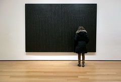
Donald Judd’s Untitled (1969) is characteristic in its use of spare geometric forms, repeated to create a unified whole that calls attention to its physical size in relationship to the viewer. Like most Minimalists, Judd used industrial materials and processes to manufacture his work, but his preference for color and shiny surfaces distinguished him among the artists who pioneered the style.
Lack of apparent meaning
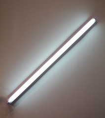
What most people find disturbing about Minimalism is its lack of any apparent meaning. Like Pop Art, which emerged simultaneously, Minimalism presented ordinary subject matter in a literal way that lacked expressive features or metaphorical content; likewise, the use of commercial processes smacked of mass production and seemed to reject traditional expectations of skill and originality in art. In these ways, both movements were, in part, a response to the dominance of Abstract Expressionism, which had held that painting conveys profound subjective meaning. However, whereas Pop artists depicted recognizable images from kitsch sources, the Minimalists exhibited their plywood boxes, florescent lights and concrete blocks directly on gallery floors, which seemed even more difficult to distinguish as “Art.” (One well-known story tells of an art dealer, who visited Carl Andre’s studio during the winter and unknowingly burned a sculpture for firewood while the artist was away.) Moreover, when asked to explain his black-striped paintings of 1959, Frank Stella responded, “What you see is what you see.” Stella’s comment implied that, not only was there no meaning, but that none was necessary to demonstrate the object’s artistic value.
Writings
Given these facts, it may seem odd to learn that hundreds of essays and books have been written about Minimalism, many by the artists themselves. It is significant that, although Minimalist art shares similar features, the artists associated with the movement developed their aesthetic ideas from variety of philosophical and artistic influences. Through their writings, Minimalist artists put forth distinctive positions about the work they produced. In addition to his role as a sculptor, Judd was a prominent art critic, and his reviews provide eloquent explanations of his intent—shared by Stella and Dan Flavin—to eliminate the illusionism and “subjective” decision-making of traditional painting. Robert Morris, whose sculpture was influenced by avant-garde dance and performance, published a series of texts, arguing for sculpture to be understood in physical and psychological terms; and, Sol LeWitt introduced the term Conceptual Art to explain the use of seriality and systemic structure in his cubic grid-like forms.
Legacy
In this way, the artists, along with critics and art historians over the past 50 years, have developed a critical discourse that surrounds the art objects, but which is essential to understanding Minimalism itself. Likewise, such artists as Richard Serra, Bernd and Hilla Becher, Maya Lin and Rachel Whiteread, who use Minimalist practice of the early 1960s as a point of departure for their own creative exploration, continue to contribute to the movement’s legacy and our understanding of its significance today.
Additional resources:
Minimalism (movement and related works) MoMA, New York
Smarthistory images for teaching and learning:
The Case for Minimalism
Video \(\PageIndex{9}\): Speaker: Sarah Urist Green
Additional resources:
Smarthistory images for teaching and learning:
Donald Judd, Untitled
by DR. SHANA GALLAGHER-LINDSAY and DR. BETH HARRIS
Video \(\PageIndex{11}\): Donald Judd, Untitled, 1969, ten copper units, each 9 x 40 x 31 inches with 9 inch intervals (Guggenheim Museum, New York)
Smarthistory images for teaching and learning:
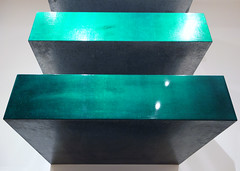
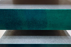
Robert Morris
Robert Morris, (Untitled) L-Beams
by JP MCMAHON
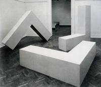
Unfortunately, any photograph of Robert Morris’s Untitled (L-Beams) is going to miss the point if we want to understand the object both in an artistic and material sense. Morris wanted to expose the conditions of perception and display and the fact that these conditions always affect the way we comprehend the art object—sculpture always exists somewhere in relationship to someone at sometime. This specificity, Morris felt, had not been investigated enough, even by the many avant-garde experiments that define Modernism.
By placing two eight-foot fiberglass “L-Beams” in a gallery space (often, he showed three), Morris demonstrated that a division existed between our perception of the object and the actual object. While viewers perceived the beams as being different shapes and sizes, in actuality, they were the same shape and of equal size. In direct opposition to Modernism’s focus on the internal syntax of the object, that is, how the object can be understood as something “self-contained,” Morris chose instead to examine the external syntax; the theatricality of the object—the way an object extends out from itself into its environment. In a series of essays written in the late 1960s, Morris observed how he wanted to make sculpture:
A function of space, light, and the viewer’s field of vision […] for it is the viewer who changes the shape constantly by his change in position relative to the work. […] There are two distinct terms: the known constant and the experienced variable.
This last line is revealing as it demonstrates the crux of L-Beams. No matter how hard we try, we can’t reconcile what we see and what we know. Morris’ objects appear one way, “the expierenced variable,” but in our minds we identify them to be another, “the known constant.”
Informed by theories of the body and perception, including his reading of Maurice Merleau-Ponty’s Phenomenology of Perception (1945), Morris explored the circumstances of the art object as we actually encounter it. He asked, why do we ignore the space and conditions of display in the presentation of art? Why do we only focus on the object? What about everything that circumscribes it; from its frame, to the wall that it is hung on, to the shape of the space that we put it in.
Like other artists of his generation, Morris pursued an advanced education in art history and earned a Master of Arts degree from Columbia University. Furthermore, Morris was associated with the Judson Dance School, an experimental group of performers who sought to push the conceptual boundaries of dance. These experiences informed Morris’s understanding of what art could be, both in relation to the gallery and to history.
In relation to his artistic exploration of perception and space, Morris was explicitly influenced by Hans Namuth’s photographs of Jackson Pollock and also by Allan Kaprow’s reading of Pollock. Kaprow’s essay, “The Legacy of Jackson Pollock” (1958), urged a new generation of artists to adopt the use of “sight, sound, movement [and] people” in order to make their art. Kaprow supported this call with his own brand of theatrical “Happenings,” in which he staged bizarre and unplanned events in art galleries, further informing many young artists.
Morris has explained the theories behind his art practice in his teaching and in writing where he has sought to justify his art to a larger audience and enter into the debate surrounding his own practice. In particular, the summer edition of Artforum (1967) included not only Morris’s “Notes on Sculpture 3,” but also Robert Smithson’s “Towards the Development of an Air Terminal Site,” Michael Fried’s “Art and Objecthood,” and Sol LeWitt’s “Paragraphs on Conceptual Art.” This issue is of utmost importance in understanding Morris’s relationship to Modernism, Minimalism, and to Conceptual Art.
Morris’s Untitled (L-Beams) were shown in the exhibition, “Primary Structures: Younger American and British Sculpture” (April 27 – June 12, 1966). This exhibition, which took place at the Jewish Museum in New York, effectively launched Minimalism into the discourse of contemporary art on the international stage. The critical and art historical discussions that followed this exhibition resulted in important debates over the inherent significance of the Minimalist object, the role of the artist in its production, and the role of the viewer in relation to the creation of its meaning.
Additional resources:
This sculpture at the Whitney Museum of American Art
Bodyspacemotionthings
by TATE
Video \(\PageIndex{12}\): Video from Tate
Interactive art was a new concept when the exhibition Bodyspacemotionthings first went on show at the Tate in 1971. Created by the American artist Robert Morris, it consists of a series of beams, weights, platforms, rollers, tunnels and ramps that people can clamber all over. It closed just four days after opening, due to safety concerns over the wildly enthusiastic reaction of the audience. For The Long Weekend 2009 the exhibition was recreated at Tate Modern using stronger, modern materials. In this film we watch the reaction of today’s visitors, and speak to curators Catherine Wood and Kathy Noble about Morris’s vision and influence.
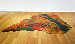
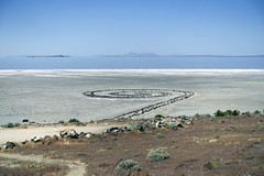
Robert Smithson, Spiral Jetty
Video \(\PageIndex{13}\): Robert Smithson, Spiral Jetty, 1970, Rozel Point, Great Salt Lake, Utah, 1500 (if unwound) x 15 foot spiral of basalt, sand, and soil, ©Holt-Smithson Foundation
Speakers: Dr. Steven Zucker and Dr. Beth Harris
A monument to paradox and transience
A loud abrasive buzzing bellows from the nightstand and I raise my head, only to be blinded by the red light emanating from the small—in size, not volume—machine against a backdrop of pure blackness. 4:00 A.M. Oy. I’m immediately beset by the eternal morning conflict: ten more minutes of sleep vs. the rush of adrenaline that wants to start the adventures that await. The latter quickly usurps the former as I realize today is September 25th, a day I’ve waited for my entire life (metaphorically speaking) and actually been counting down to since the spring. It’s Spiral Jetty day.

I bound out of bed, Gianfranco Gorgoni’s seminal photograph of Robert Smithson’s iconic earth work on repeat in my head as I shower and “pack” for the daylong adventure that will take me to a remote area of Utah. I meet the rest of my party at the gate at LAX and it’s immediately clear from the conversation that we’ve all arrived at this moment with decades of expectation accumulated. How would the experience compare to the visions (particular to each person) we had all conjured up over the years? Would the jetty “deliver” the transformative experience we all sought? Or would it fall victim to a case of excessively high and unattainable expectations? Time would tell.
But, it would indeed take time. An hour at the airport, followed by an hour plus on the plane, then a two plus hour bus ride over the bumpiest “trail” – it certainly wasn’t a road! — imaginable, and ultimately a fifteen minute hike. Nearly eight hours after my day had begun, it came into view. At last, Spiral Jetty.
But…it was so…so…so small. That couldn’t possibly be it! Naturally the distance made the work appear smaller and it “grew” as we approached, but even as we stood perched on the rocks right above it, it seemed utterly dominated by the landscape. Yet another surprise, the water from the Great Salt Lake no longer permeated the rocks, but was a significant distance beyond. Between the Jetty and the lake, there was a blanket of white – a picture-perfect postcard image of a quiet winter’s morn, and yet, the “snow” wasn’t melted by the sun blazing down from above. Upon closer inspection, the “snow” was actually crystallized salt that brilliantly reflected the sun’s rays and the nearby water.
We walked about the Jetty with the sun hot upon our skin, the smell of the salt air filling our nose and lungs, and the feel of salt crystals on our fingers (having knelt to examine the minerals that carpeted the environ). An all-consuming, olfactory experience. We then decided to make our way across the white blanket to the water’s edge, fighting off fears that the salt, which had the distinct characteristics of ice—would “break” and we would plunge into the Great Salt Lake below (which was a physical impossibility since the water wasn’t below). From a distance the water had appeared a brilliant blue, but as we neared, gradations of color began to appear – shades of blue, purple, pink, and red – a traveler’s mirage, of sorts, and undeniably picturesque.
We found our way up to a piece of land overlooking the jetty and sat down on the rocks to enjoy our sandwiches and “debate” Smithson’s intentions and ethical issues in conserving the work with several scholars. One of them compared Smithson’s Spiral Jetty to Monet’s Rouen Cathedral series which conveyed the same location at various times of day so that he could capture the specific lighting and other nuances of a particular moment. He said, “Smithson’s doing that here but he’s not doing it on canvas, he’s doing it out there in the elements themselves…it has that same type of specificity too it, and yet specificity that is subject to all kinds of permutations.” The question was raised about Smithson’s vision for the work, his view on its ephemerality, and whether he ever envisioned groups such as ours making the journey out to this incredibly remote location to experience his work.
We were reminded that the physical jetty is only part of the work, which is actually a triad of the “sculpture” in the landscape, an essay by Smithson, and a film documenting the project. But, as time has marched on, the work has become embodied in the minds of the general public in a single photograph, the aforementioned image taken by Gorgoni who hovered about the work in a helicopter and captured the piece from the perfect angle so that it looked colossal, while the hills looked minuscule.
This is due, in large part, to the fact that the jetty became submerged only a few years after it was made, and remained that way for decades. Only in the past ten years has it resurfaced and been “available” for visitation. Though Smithson may not have ever intended or even considered that people would take the time (and trouble) to visit, which begs the question that Loe posed to us, “Who is this work for?” Coolidge said the work was for Gorgoni, that Smithson had literally made it for the photograph. They all agreed that the sculpture itself is the “gesture,” but the documentation is every bit as much a part of it.
Up until that moment, the essay, the film, and the Gorgoni photograph were the entirety of my experience with Smithson’s Spiral Jetty, which is probably true for all but a small population who’ve sought out the physical experience of the “gesture.” An object whose identity is so deeply intertwined with its documentation is fraught with complexities and paradox, but given interest in ephemerality and entropy, I’d imagine he’d be quite satisfied with the transient nature of his jetty—how it disappears and reappears at nature’s will. Such is the foundation for arguing against any conservation of the earth work, and allowing it to emerge and submerge with the tides. And yet, the thought of the work vanishing for another thirty years beneath the lake devastates me. With this debate reeling in my head, I made my way back down to the jetty. If I couldn’t be certain the work would be here waiting for my return in the distant future, I’d better take another promenade on the rocks.
This time I separated from my friends, put down my camera, and walked the spiral in absolute silence. Though physically alone, I felt the overwhelming presence of several invisible companions: Mother Nature herself, the spirit of Robert Smithson that is somehow pervades the rocks, and God. I thought about each of them in a way that the loud noise of my crowded, urban existence prohibits. I found the transcendental calm within that often only comes to me upon reading an Emerson poem, hearing a choir sing “Amazing Grace,” or staring into the floating color-field abyss of a Mark Rothko painting.
I began the walk back to the bus with my colleagues. We found ourselves humbled by the beauty of nature and the power of art, and hailed Smithson for giving us a reason to find our way to this breathtaking place.
On the bumpy ride back towards town, I realized that I had made a pilgrimage in search of a monument, an icon of culture and history, but found pleasure in the aesthetic of transience instead. Spiral Jetty looked nothing like I’d imagined – a.k.a. the Gorgoni photograph – and I’m grateful. Grateful because I saw the work on September 25, 2010 and no one will ever replicate the experience of seeing it on that day, for it reinvents itself with every change of light, tide, and weather.
Additional resources:
Excerpt of Robert Smithson’s Film on Spiral Jetty (Robert Smithson Estate)
Smarthistory images for teaching and learning:


Walter De Maria, The Lightning Field

Figure \(\PageIndex{32}\): Walter De Maria, The Lightning Field, 1977 (New Mexico)
Earthwork in the city
The first earthwork I ever encountered was, ironically, in the heart of New York City. I made my way by subway and on foot to 141 Wooster Street in Soho. I climbed a narrow staircase and turned to see a work of art unlike anything I’d ever encountered: a gallery filled with dirt. The attendant told me the space was 3,600 square feet, the soil was 22 inches deep, and the weight of this natural material was 280,000 pounds. I couldn’t walk on it, but I could smell the earthy air and feel the humidity that kept the dirt a dark, rich brown. I took my time, inhaling deeply and looking intently, before turning and heading back to the city street.
The New York Earth Room (1977) is a terrific introduction to Walter De Maria’s artistic practice. As a maker of earthworks or land art, he crafts experiences with and in nature that appear to be simple, but are often transcendent. Like the works of fellow land artists—Robert Smithson’s Spiral Jetty, Nancy Holt’s Sun Tunnels, and Michael Heizer’s Double Negative, to name a few—they are also conceptual and challenge the notion that art is a commodity that can be easily bought and sold.
As part of the Postminimalist generation of the 1960s and 1970s, these artists focused on process and nontraditional materials, while they critiqued the commercialism of the New York art world. Seeing Earth Room in person made me want to leave the city and travel to see how De Maria work functioned in the American landscape, rather than the man-made environment of lower Manhattan. My next stop would be De Maria’s largest and most famous earthwork, The Lightning Field in New Mexico.
Destination: art
My pilgrimage to The Lightning Field was considerably more arduous and time consuming. The closest town is Quemado, about two and a half hours southwest of Albuquerque. The drive takes you through the high desert of New Mexico. This area is flat but beautiful. The summer morning was chilly and sunny and my friends and I met our guide at the Dia Foundation office, a nearly empty building in a very sleepy town. We signed the guestbook, and eagerly piled into the big, dusty SUV that would take us to our destination. The route was hard to chart, as so many roads are unpaved and unmarked. I had trouble keeping track of the time as I watched for rattlesnakes, counted cattle, and searched for signs of De Maria’s installation.
After what felt like only a moment, but must have been more than an hour, we pulled up to the edge of a large field of metal poles that look like sleek lightning rods. We unloaded our belongings and toured our overnight accommodations, a humble wooden cabin with a pellet stove for warmth and a pan of green chile enchiladas in the fridge for dinner. We found a binder in the cabin that contained basic information about the surveys and engineering studies that the project required and that lists many of its essential physical properties. The field measures one mile by one kilometer and the 400 poles range in height from 15 feet to 26 feet 9 inches, but because the seemingly flat terrain is actually quite uneven, their tips are so level that you could lay a sheet of glass atop them. It took roughly 38,000 pounds of stainless steel to make the poles and if you laid them down in a line, they would stretch a distance of more than one and a half miles. From the porch we could see many of the poles gleaming in the late-afternoon sun, but some in the distance were hard to spot. So we spent the remaining daylight hours roaming the field, getting lost, and finding our way back.
The Invisible, isolation, and the sublime
When he announced The Lightning Field in the April 1980 issue of Artforum De Maria explained, “The invisible is real” and “Isolation is the essence of land art.” These are the statements that preoccupied us as we explored this work of art. The maximum number of visitors at any one time is six, and it is easy to venture so far out that you cannot see any of your companions. At twilight, I found myself on the far edge of the field, turned to look back at the steely gray poles and the cabin, and instead of seeing my friends, saw a pronghorn in my path. At sunrise, we all sipped coffee as we watched the poles reflect the pink and blue sky of the early morning. At midday, many of the poles seemed to disappear as the sun hit them from above and in the early afternoon the tips shone so brightly that they almost looked like burning candles. Around the clock, these man-made poles reminded us of nature’s ephemeral qualities and the poetry of consciously experiencing our surroundings.
Of course, the title of this work teases you with the possibility of seeing lightning strike and dance atop the poles. This is possible. In fact, De Maria selected this part of New Mexico precisely because of the relatively high incidence of electrical storms. The likelihood increases in the summer, especially during the rainy months of July and August. But if you don’t see lightning, don’t fret. In my two trips to The Lightning Field I have managed to find that sublime landscape of the modern American West even without witnessing lightning. My experiences of The Lightning Field were not unlike the feeling I get when looking at a painting by Albert Bierstadt (below), Frederic Edwin Church, or Thomas Moran. All of these artists make me want to get outside and find a spot where the air is crisp and clean, where I feel alone and independent, and where I can think about big ideas.

Additional resources:
Walter De Maria’s Lightning Field at Dia
Cornelia Dean, “Drawn to the Lightning, The New York Times (September 21, 2003)
John Beardsley, “Art and Authoritarianism: Walter De Maria’s “Lightning Field”” October 16 (1981), pp. 35-38.
Kenneth Baker, The Lightning Field (New Haven: Yale University Press, 2008.
Suzaan Boettger, Earthworks: Art and the Landscape of the Sixties (Berkeley: University of California Press, 2002).
Walter De Maria, “The Lightning Field: Some Facts, Notes, Data, Information, Statistics, and Statements,” Artforum 18, no. 8 (April 1980), p. 58.
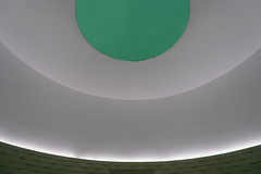
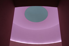
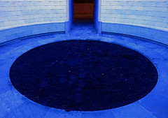
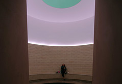
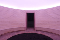
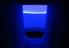
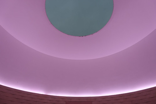
James Turrell, Skyspace, The Way of Color
by DR. BETH HARRIS and DR. STEVEN ZUCKER
Video \(\PageIndex{14}\): James Turrell, Skyspace, The Way of Color, 2009, stone, concrete, stainless steel, and LED lighting 228 x 652 inches © James Turrell (Crystal Bridges Museum of American Art, Bentonville, Arkansas). Speakers: Dr. Beth Harris and Dr. Steven Zucker
Smarthistory images for teaching and learning:


Richard Serra
Richard Serra, Tilted Arc
by MYA DOSCH

A different public art
Imagine walking past a sculpture in a city plaza—you might see a 19th-century bronze statue of a Civil War General on horseback or a marble statue of the Greek goddess of victory atop a high pedestal. Perhaps you glance up at the artwork in passing. Or, maybe you don’t even take notice, as it is just one of the many urban sculptures honoring bygone heroes.

Richard Serra wanted passers-by to have a very different relationship to public sculpture. His 1981 sculpture Tilted Arc was a 12-foot-tall, 120-foot-long, 15-ton steel slab that cut across Federal Plaza in Lower Manhattan. Instead of focusing on the optical experience of sculpture—looking at it from a distance—Serra wanted passers-by to experience the sculpture in a physical way. He said that the long, curving metal sheet would “encompass the people who walk on the plaza in its volume,” altering their experience of the space as they moved to and from the surrounding government buildings.
Serra shared this interest with many of his minimalist colleagues such as Dan Flavin and Robert Morris, who sought to engage the spaces surrounding their sculptures. Minimalist artists considered their audience as moving beings with changing perspectives, not static viewers. For example, Tilted Arc could seem like a lyrical curve from some vantage points and an imposing barrier from others.
The sculpture was commissioned by the U.S. General Services Administration (GSA), as part of its “Art-in-Architecture” program, which commissioned large-scale, permanent artworks for new government buildings. However, Serra’s work would not be permanent.
The controversy
Serra saw public art as a way to expose and critique the surrounding public space, not to beautify it. This approach made Titled Arc a target of criticism from the moment of its installation in 1981. New York Times art critic Grace Glueck called it “an awkward, bullying piece that may conceivably be the ugliest work of outdoor art in the city.”1 Employees of two government divisions that were housed on Federal Plaza collected 1,300 signatures requesting the removal of the sculpture. However, this criticism did not gain real traction until William Diamond became the GSA administrator in 1984 and took up the cause. Diamond held a public forum about Tilted Arc, in which 180 federal plaza workers, art critics, artists, curators, and other concerned parties expressed their opinions about the piece.
All those in favor
Another New York Times critic, Michael Berenson, wrote that ”Tilted Arc is confrontational. But it is also gentle, silent and private.”2 Proponents of the sculpture stated that removing the sculpture at the request of a few would infringe upon Serra’s First Amendment right to free speech, and therefore was un-American. Some emphasized that difficult artworks often become masterpieces only after an initial controversy (for example, Manet’s Olympia).

Serra and his supporters also stated that the artwork was site specific—that it was designed specifically for the Federal Plaza space. Because Tilted Arc engaged with its surroundings, it could not simply be moved to another location like other sculptures. The removal of the sculpture from Federal Plaza would destroy it.
All those opposed
Opponents of Tilted Arc felt that the public had not been adequately consulted. Indeed, the GSA amended its policies in 1988 to include more public awareness programming around each of its new sculptures. Furthermore, they found the resulting sculpture to be yet another rusting eyesore in New York City. Some argued that the sculpture “attracted” graffiti and rats. Others contended that the sculpture compromised the security and surveillance of the plaza, making the surrounding buildings more vulnerable to terrorist attacks.
The verdict
Many of those who defended Tilted Arc felt that Diamond and the rest of the jury had already made up their minds to remove the sculpture before the public forum began. Indeed, in spite of the fact that 122 people spoke in favor of the Tilted Arc and 58 against, the jury voted to remove the sculpture. The forum, however, brought up larger issues about the audience for public art. Who was the audience for this public sculpture? Was it the 180 concerned art critics and bureaucrats that attended the forum? The 10,000 people who worked in federal plaza? All New Yorkers? All Americans?
Serra sued the GSA, claiming violations of his contract, his copyright, and his right to Free Speech. A court found that the government owned the sculpture and thus could do as it saw fit. In 1989, the sculpture was removed in pieces and put in storage indefinitely.

Not long after the removal of Tilted Arc, the GSA contacted landscape architect Martha Schwartz to re-imagine the plaza. Her design included mound-shaped hedges and long, curving benches. Proponents said that this restored the “use value” of the space by allowing office workers to enjoy their lunches on the plaza, while opponents said that it made the plaza into an ordinary park space that lacked the drama and artistry of Serra’s work.
Should public art be practical? Provocative? Beautiful? Brash? Who is the audience for public art? Who gets to have a say in the process of commissioning new art? The history of Tilted Arc looms over these debates.
1. Grace Glueck, “An Outdoor Sculpture Safari Around New York,” The New York Times,
August 7, 1981.
2. Michael Brenson, “Art View: The Case in Favor of a Controversial Sculpture,” The New York Times, May 19, 1985.
Additional Resources:
The Trial of Tilted Arc (video from SFMOMA)
The Messy Saga of Tilted Arc Is Far From Over (NY Times, 1989 article)
Richard Serra, Intersection II
Video \(\PageIndex{15}\): Video from The Museum of Modern Art
Richard Serra, Torqued Ellipse IV
Video \(\PageIndex{16}\): Video from The Museum of Modern Art
Richard Serra, Band
Video \(\PageIndex{17}\): Video from The Museum of Modern Art
Christo and Jeanne-Claude, The Gates
by DR. DORIS MARIA-REINA BRAVO

Nearly thirty years after the artists Christo and Jeanne-Claude first conceived of The Gates, this logistically complex project was finally realized over a period of two weeks in New York’s Central Park. Each gate, a rectilinear three-sided rigid vinyl frame resting on two steel footings, supported saffron-colored fabric panels that hung loosely from the top. The gates themselves matched the brilliant color of the fabric. The statistics are impressive: 7,503 gates ran over 23 miles of walkways; each gate was 16 feet high, with widths varying according to the paths’ width. Despite a brief exhibition period—February 12th through 27th 2005—The Gates remains a complex testament to two controversial topics in contemporary art: how to create meaningful public art and how art responds to and impacts our relationship with the built environment.

Wrapped, surrounded, suspended
Since the 1960s, Christo and Jeanne-Claude have introduced eye-catching color into the landscape, for example pink in Surrounded Islands, 1980-83 in Biscayne Bay, Florida.

The saffron color in The Gates was used to create “a golden ceiling creating warm shadows”1 for the visitor walking along the Central Park path. The same color also appeared in an earlier work by Christo and Jeanne-Claude, Valley Curtain (1970-72), in Rifle, Colorado.

In contrast to many of their works that directly intervene in urban structures like the Pont Neuf in Paris or the German Parliament building in Berlin, where architectural masses are literally wrapped, Surrounded Islands and Valley Curtain engage, rather than seek to contain nature: a pink border of fabric floating around islands or a curtain suspended across a remote valley.
A public art
The Gates respond to spaces designed by Frederick Law Olmsted and Calvert Vaux within the dense urban grid of Manhattan. The artists complicate an environment that was, in fact, entirely invented in the mid-19th century to express the Victorian ideal of the pastoral and picturesque landscape.
This intrusion into Manhattan’s “natural environment” left many visitors uneasy, as in the case of Joanne Landy:
Whoever…wrote about the way the exhibit draws aesthetic attention to the park itself is off the mark, in my experience anyway. The flags just draw attention to themselves, period, and there appears to be no particular relationship to the shapes and colors of the park. That’s part of the problem. 2

A point of contrast can be seen at the Storm King Art Center, a renowned sculpture park 52 miles north of New York City that has successfully cultivated a dialogue between sculptures and their landscape for over fifty years. Whereas sculptures are installed within the meadows and rolling hills of Storm King’s grounds, The Gates were tied to the paths that meander through the park. This was done for two reasons: to avoid drilling thousands of holes into the soil and potentially harming the root systems of adjacent trees, and because Christo and Jeanne-Claude were inspired by the way the city’s pedestrians navigate its paths. Thus, in contrast to the works in Biscayne Bay and Rifle that divide and isolate forms in the landscape, The Gates aligned itself along pre-existing pathways of movement.
Pathways
A path cut into a pristine natural environment is very much an intervention, as evidenced in Richard Long’s A Line Made by Walking, 1967 and Walter De Maria’s One Mile Long Drawing, 1969.

However Central Park, a much-loved urban oasis, is one of the most famous examples of urban planning. The Gates reinforce and highlight pre-existing routes within this manmade environment. Critiques of The Gates that are rooted in the issue of the artwork’s relationship with nature are therefore curious since the Park itself is not an untouched natural space.
This installation alters the experience of seeing and walking along the paths that run throughout the park. The title alludes to a threshold, a point of exit and entrance. In fact, in some places, the structures form an oval. There is no starting point and no end point and moreover, no favored point from which to view the work. It is an installation made for the pedestrian in motion and not a static object that asks us to stand still before it.
Bureaucratic collaborators
The Gates cost 21 million dollars and both the artists and the supporting institutions (the City of New York and the Central Park Conservancy) were quick to emphasize that Christo and Jeanne-Claude financed the project themselves and that the installation was free to the public. The artists sold preparatory drawings related to The Gates, and other works, before the exhibition opened; they rely on this method to independently fund their projects since they do not accept sponsors. Though the City and the Central Park Conservancy did not use public money to support this project, their approval and support were seen as an invaluable currency by many critics. Months before The Gates debuted, both institutions had worked in concert to prevent United for Peace from holding an antiwar demonstration in Central Park to coincide with the Republican National Convention which was held in New York that year.

It is important to remember that Christo and Jeanne-Claude’s favorable turn with the powers that be was 26 years in the making. The artists submitted proposals, attended meetings, and made presentations throughout this period, persisting even after they received a 251-page official rejection only three years into their campaign. Many consider the 2001 mayoral election of Michael Bloomberg—a Christo and Jeanne-Claude collector—as the turning point in this saga. The artists are accustomed to bureaucratic battles, an inevitability given subjects that reshape iconic structures such as their The Pont Neuf, Wrapped, 1975-1985, Wrapped Reichstag, 1971-1995, and The Gates.

Art designed to end
It might seem odd that Christo and Jeanne-Claude invest so much time, effort, reputation, and money in creating ephemeral non-collectible artwork. Yet they are completely devoted to this kind of artistic practice: “The temporary quality of the projects is an aesthetic decision. Our works are temporary in order to endow the works of art with a feeling of urgency to be seen, and the love and tenderness brought by the fact that they will not last. Those feelings are usually reserved for other temporary things such as childhood and our own life. These are valued because we know that they will not last. We want to offer this feeling of love and tenderness to our works, as an added value (dimension) and as an additional aesthetic quality.” 3

In the end the show took about six weeks to install and The Gates came down the day after the exhibition ended, with most of the materials headed for recycling. The artists maintain a thorough archive of their work on their website; along with projects that never materialized (including several for New York City) and current projects (not surprisingly these are decades in the making). With Jeanne-Claude’s passing in 2009, this archive of the past, present, and future is poignant in its meticulous documentation and optimism—evidence of the duo’s perseverance and monumental dreams.
1. Christo and Jeanne-Claude, The Gates
2. Jesse Lemish, “Art for the People, Christo and Jean-Claude’s The Gates,” New Politics 10, no. 3 (Summer 2005)
3. Christo and Jeanne-Claude in Their Own Words, NYC.gov, 2005
Photography
Gordon Parks, Off on My Own (Harlem, New York)
by MICHAL RAZ-RUSSO, ART INSTITUTE OF CHICAGO and DR. STEVEN ZUCKER
Video \(\PageIndex{18}\): Gordon Parks (American, 1912-2006), Off on My Own (Harlem, New York), 1948. Gelatin silver print. The Art Institute of Chicago, Amanda Taub Veazie Acquisition Fund, 2016.125. © The Gordon Parks Foundation. From “Harlem is Nowhere,” a collaborative project between Gordon Parks and Ralph Ellison. A Seeing America video. Speakers: Michal Raz-Russo, David and Sarajean Ruttenberg Associate Curator of Photography, Art Institute of Chicago and Dr. Steven Zucker Special thanks to Michal Raz-Russo, Sarah E. Alvarez, The Gordon Parks Foundation, the Ralph and Fanny Ellison Charitable Trust, and the Art Institute of Chicago.
Gary Winogrand, Democratic National Convention, Los Angeles, 1960
by DR. ROBERT COZZOLINO, MINNEAPOLIS INSTITUTE OF ART and DR. STEVEN ZUCKER
Video \(\PageIndex{19}\): Gary Winogrand, Democratic National Convention, Los Angeles, 1960 (printed c. 1980), gelatin silver print, 45.88 x 30.8 cm (Minneapolis Institute of Art, © The Estate of Gary Winogrand). A Seeing America video.
A conversation with Dr. Robert Cozzolino, Patrick and Aimee Butler Curator of Paintings, Minneapolis Institute of Art, and Dr. Steven Zucker