
10.11: Postwar American art (I)
- Page ID
- 147837
Postwar American art
From Abstract Expressionism to Pop, the United States was the epicenter of the postwar art world
1945 - 1980
Abstract Expressionism
Dripping, flinging, rolling, soaking—the Abstract Expressionists did everything academic tradition said not to do with paint.
1945 - 1980
Abstract Expressionism, an introduction

The group of artists known as Abstract Expressionists emerged in the United States in the years following World War II. As the term suggests, their work was characterized by non-objective imagery that appeared emotionally charged with personal meaning. The artists, however, rejected these implications of the name.
What’s in a name?
They insisted their subjects were not “abstract,” but rather primal images, deeply rooted in society’s collective unconscious. Their paintings did not express mere emotion. They communicated universal truths about the human condition. For these reasons, another term—the New York School—offers a more accurate descriptor of the group, for although some eventually relocated, their distinctive aesthetic first found form in New York City.
The rise of the New York School reflects the broader cultural context of the mid-Twentieth Century, especially the shift away from Europe as the center of intellectual and artistic innovation in the West. Much of Abstraction Expressionism’s significance stems from its status as the first American visual art movement to gain international acclaim.
Art for a world in shambles
Barnet Newman, an artist associated with the movement, wrote:
“We felt the moral crisis of a world in shambles, a world destroyed by a great depression and a fierce World War, and it was impossible at that time to paint the kind of paintings that we were doing—flowers, reclining nudes, and people playing the cello."\(^{1}\)
Although distinguished by individual styles, the Abstract Expressionists shared common artistic and intellectual interests. While not expressly political, most of the artists held strong convictions based on Marxist ideas of social and economic equality. Many had benefited directly from employment in the Works Progress Administration’s Federal Art Project. There, they found influences in Regionalist styles of American artists such as Thomas Hart Benton, as well as the Socialist Realism of Mexican muralists including Diego Rivera and José Orozco.
The growth of Fascism in Europe had brought a wave of immigrant artists to the United States in the 1930s, which gave Americans greater access to ideas and practices of European Modernism. They sought training at the school founded by German painter Hans Hoffmann, and from Josef Albers, who left the Bauhaus in 1933 to teach at the experimental Black Mountain College in North Carolina, and later at Yale University. This European presence made clear the formal innovations of Cubism, as well as the psychological undertones and automatic painting techniques of Surrealism.
Whereas Surrealism had found inspiration in the theories of Sigmund Freud, the Abstract Expressionists looked more to the Swiss psychologist Carl Jung and his explanations of primitive archetypes that were a part of our collective human experience. They also gravitated toward Existentialist philosophy, made popular by European intellectuals such as Martin Heidegger and Jean-Paul Sartre.
Given the atrocities of World War II, Existentialism appealed to the Abstract Expressionists. Sartre’s position that an individual’s actions might give life meaning suggested the importance of the artist’s creative process. Through the artist’s physical struggle with his materials, a painting itself might ultimately come to serve as a lasting mark of one’s existence. Each of the artists involved with Abstract Expressionism eventually developed an individual style that can be easily recognized as evidence of his artistic practice and contribution.
What does it look like?
Although Abstract Expressionism informed the sculpture of David Smith and Aaron Siskind’s photography, the movement is most closely linked to painting. Most Abstract Expressionist paintings are large scale, include non-objective imagery, lack a clear focal point, and show visible signs of the artist’s working process, but these characteristics are not consistent in every example.
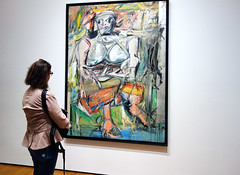
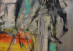
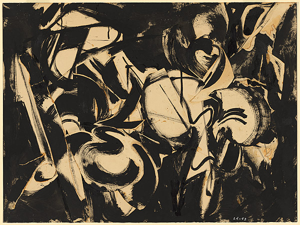
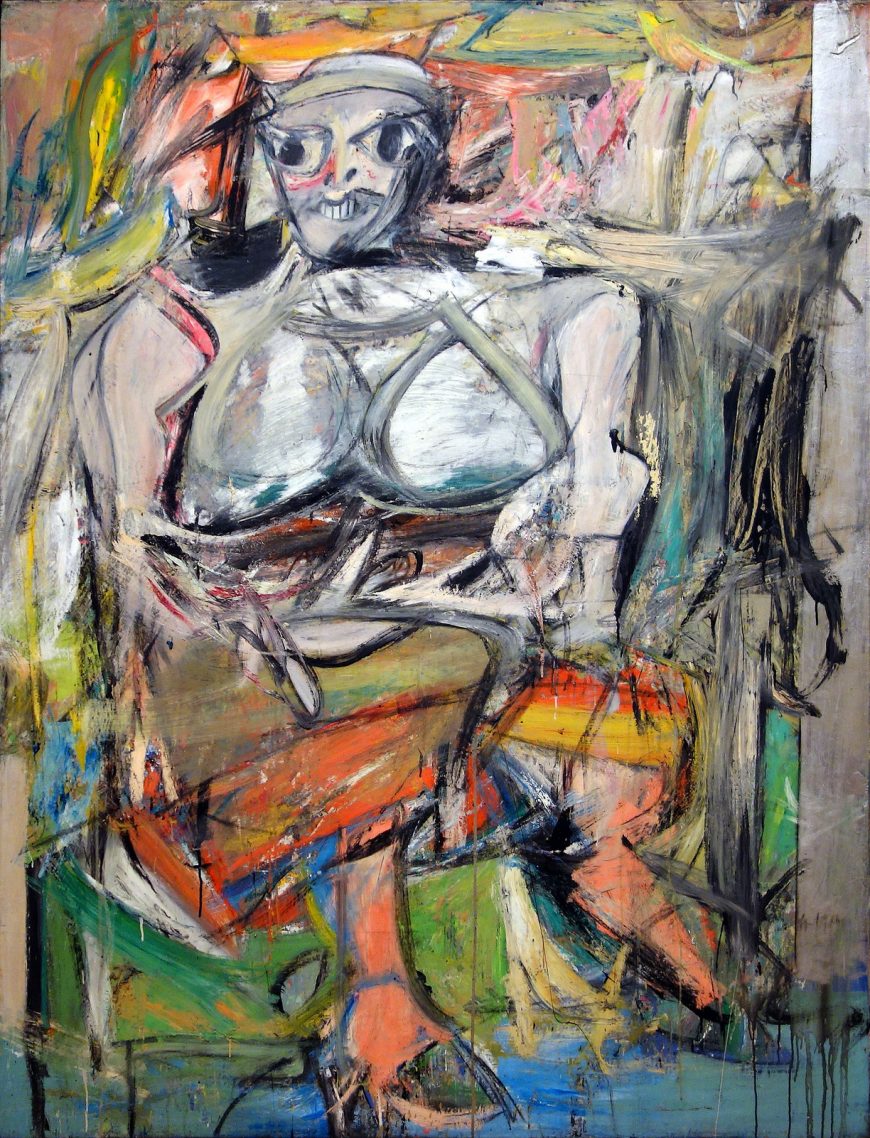
In the case of Willem de Kooning’s Woman I, the visible brush strokes and thickly applied pigment are typical of the “Action Painting” style of Abstract Expressionism also associated with Jackson Pollock and Franz Kline. Looking at Woman I, we can easily imagine de Kooning at work, using strong slashing gestures, adding gobs of paint to create heavily built-up surfaces that could be physically worked and reworked with his brush and palette knife. De Kooning’s central image is clearly recognizable, reflecting the tradition of the female nude throughout art history. Born in the Netherlands, de Kooning was trained in the European academic tradition unlike his American colleagues. Although he produced many non-objective works throughout his career, his early background might be one factor in his frequent return to the figure.
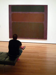
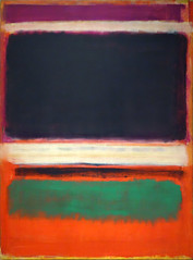
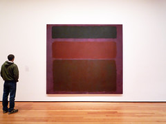
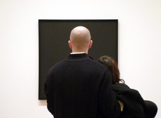
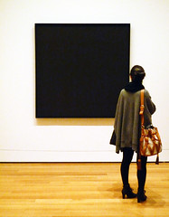
In contrast to the dynamic appearance of de Kooning’s art, Mark Rothko and Barnett Newman exemplify what is sometimes called the “Color Imagist” or “Color Field” style of Abstract Expressionism. These artists produced large scale, non-objective imagery as well, but their work lacks the energetic intensity and gestural quality of Action Painting. Rothko’s mature paintings exemplify this tendency. His subtly rendered rectangles appear to float against their background. For artists like Rothko, these images were meant to encourage meditation and personal reflection.
Adolph Gottlieb, writing with Rothko and Newman in 1943, explained, “We favor the simple expression of the complex thought."\(^{2}\)
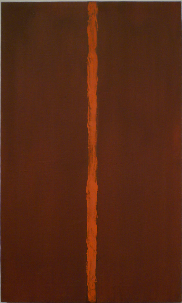
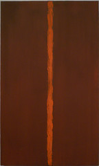
Barnett Newman’s Vir, Heroicus, Sublimis illustrates this lofty goal. In this painting, Newman relied on “zips,” vertical lines that punctuate the painted field of the background to serve a dual function. While they visually highlight the expanse of contrasting color around them, they metaphorically reflect our own presence as individuals within our potentially overwhelming surroundings. Newman’s painting evokes the 18th century notion of the Sublime, a philosophical concept related to spiritual understanding of humanity’s place among the greater forces of the universe.
Abstract Expressionism’s legacy
Throughout the 1950s, Abstract Expressionism became the dominant influence on artists both in the United States and abroad. The U.S. government embraced its distinctive style as a reflection of American democracy, individualism, and cultural achievement, and actively promoted international exhibitions of Abstract Expressionism as a form of political propaganda during the years of the Cold War. However, many artists found it difficult to replicate the emotional authenticity implicit in the stylistic innovations of de Kooning and Pollock. Their work appeared studied and lacked the same vitality of the first generation pioneers. Others saw the metaphysical undertones of Abstract Expressionism at odds with a society increasingly concerned with a consumer mentality, fueled by economic success and proliferation of the mass media. Such reactions would inevitably lead to the emergence of Pop, Minimalism, and the rise of a range of new artistic developments in the mid 20th century.
1. Barnett Newman, “Response to the Reverend Thomas F. Mathews,” in Revelation, Place and Symbol (Journal of the First Congress on Religion, Architecture and the Visual Arts), 1969.
2. Letter from Mark Rothko and Adolph Gottlieb to Edward Alden Jewell Art Editor, New York Times, June 7, 1943.
Additional resources:
Abstract Expressionism on The Metropolitan Museum of Art’s Heilbrunn Timeline of Art History
Smarthistory images for teaching and learning:
Finding meaning in abstraction
by SARAH ALVAREZ, THE ART INSTITUTE OF CHICAGO, DR. BETH HARRIS and DR. STEVEN ZUCKER
Video \(\PageIndex{1}\): Joan Mitchell, City Landscape, 1955, oil on linen, 203.2 × 203.2 cm (Art Institute of Chicago 1958.193, ©The Estate of Joan Mitchell), a Seeing America video
Willem de Kooning, Woman, I
by DR. BETH HARRIS and DR. STEVEN ZUCKER
Video \(\PageIndex{2}\): Willem de Kooning, Woman, I, 1950-52, oil on canvas, 192.7 x 147.3 cm (The Museum of Modern Art) © The Willem de Kooning Foundation
A conversation between Dr. Beth Harris and Dr. Steven Zucker
Barnett Newman
Barnett Newman, Onement, I
by DR. STEVEN ZUCKER and DR. BETH HARRIS
Video \(\PageIndex{3}\): Barnett Newman, Onement, I, 1948, oil on canvas, 27 1/4 x 16 1/4″ / 69.2 x 41.2 cm (Museum of Modern Art, New York)
Smarthistory images for teaching and learning:
Barnett Newman
Video \(\PageIndex{4}\): Video from The Museum of Modern Art
The Painting Techniques of Barnett Newman
Video \(\PageIndex{5}\): Video from The Museum of Modern Art
Representation and abstraction: looking at Millais and Newman
by SAL KHAN, DR. BETH HARRIS and DR. STEVEN ZUCKER
Vir Heroicus Sublimus, 1950-51 (MoMA)
What’s “heroic” about a painting that looks like a craft project on HGTV? This comparison suggests an answer.
Smarthistory images for teaching and learning:
Mark Rothko
Mark Rothko, No. 210/No. 211 (Orange), 1960
by DR. MARGARET C. CONRADS and DR. STEVEN ZUCKER
Video \(\PageIndex{8}\): Mark Rothko, No. 210/No. 211 (Orange), 1960, oil on canvas, 175.3 x 160 cm (Crystal Bridges Museum of American Art). Speakers: Dr. Margi Conrads and Dr. Steven Zucker
Mark Rothko, No. 3/No. 13
by DR. BETH HARRIS and DR. STEVEN ZUCKER
Video \(\PageIndex{9}\): Mark Rothko, No. 3/No. 13, 1949, oil on canvas (Museum of Modern Art, New York)
Smarthistory images for teaching and learning:
Mark Rothko (at MoMA)
Video \(\PageIndex{10}\): Video from The Museum of Modern Art
Jackson Pollock
Why is that important? Looking at Jackson Pollock
by SAL KHAN, DR. BETH HARRIS and DR. STEVEN ZUCKER
Video \(\PageIndex{12}\): Jackson Pollock, Number 1A, 1948, 1948, oil and enamel paint on canvas, 68″ x 8′ 8″ / 172.7 x 264.2 cm (MoMA)
Smarthistory images for teaching and learning:

The Case for Jackson Pollock
Video \(\PageIndex{7}\): Speaker: Sarah Urist Green
Jackson Pollock, Mural
by KATRINA KLAASMEYER

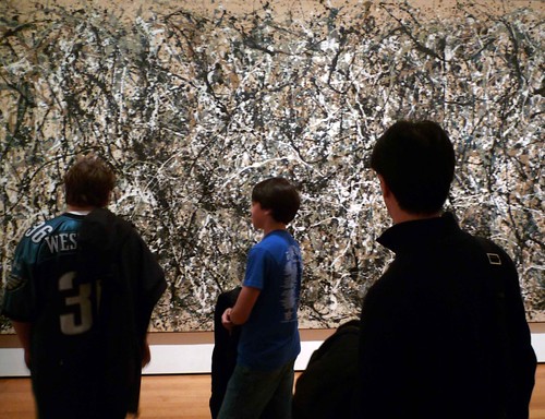
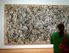
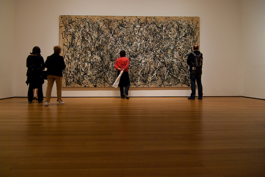
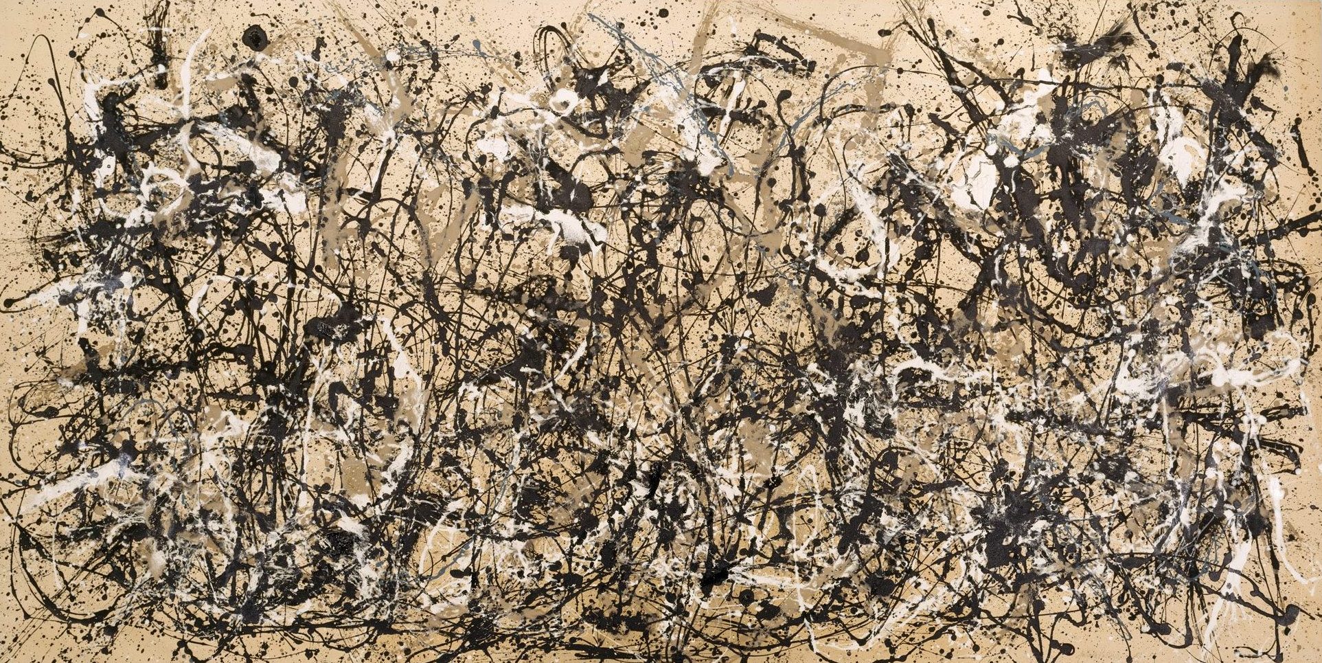
Imagine living in New York in the early 1940s. Your friend, the art dealer Peggy Guggenheim, is excited to show you her latest acquisition by an up-and-coming artist. You can’t miss it on the right-hand wall in the long, narrow corridor of her townhouse. Nearly twenty feet in length and eight feet high, it consumes the space and takes your breath away. In the words of art critic Clement Greenberg, “I took one look at [Mural]…and I knew Jackson was the greatest painter this country had produced.”
Creative decisions
The artist, Jackson Pollock, had studied with the American muralist Thomas Hart Benton as well as with the Mexican muralist David Alfaro Siqueiros at his experimental workshop. Later Pollock was employed through the Federal Art Project, part of Franklin D. Roosevelt’s Works Progress Administration. That ended in January 1943 and, desperate to make a living, Pollock took a job as a janitor and handyman at The Museum of Non-Objective Art (which is now named the Solomon R. Guggenheim Museum for its principal benefactor, Peggy’s uncle). Peggy Guggenheim’s assistant Howard Putzel became aware of Pollock’s work, and introduced him to the art patron who would champion his career. For this first commission she envisioned a mural painted directly on the wall, but her friend, the artist Marcel Duchamp, wisely suggested a painting on canvas that could be removed and transported in the future. She purchased the oversized Belgian linen canvas, thereby dictating the size of the work, but all other creative decisions were at the artist’s discretion. Pollock received this commission mid-July 1943, and by the end of that same year the painting was hanging in her townhouse. In 1951 Peggy Guggenheim gifted the painting to the University of Iowa.

Conservation
Mural began to deteriorate in the 1970s. Paint was starting to flake, and the weak original stretcher caused the canvas to sag. In 1973, conservators at the University of Iowa adhered a lining canvas with wax-resin to the reverse side for stability, replaced the original stretcher, and applied varnish to the surface of the painting. However, in recent years Mural’s need for additional care was apparent, and in July 2012 the painting was transported to the Getty Conservation Institute in Los Angeles for an in-depth study and conservation treatment. GCI conservators first removed the aged varnish on the surface, which restored the original brilliance and depth of color. They also built a new stretcher to accommodate the slightly curved canvas. Additionally, the Getty Conservation Institute’s scientific analysis revealed several important discoveries regarding Pollock’s process and methods.
Technique
A number of myths surrounding the creation of this painting were debunked by GCI conservators. First among them is the idea that Mural was completed in a single night, in a sudden burst of inspired creativity. Instead, careful analysis of the canvas unmistakably revealed multiple layers of dried paint. All but one of the colors used in Mural were traditional oil paint, which takes days or even weeks to dry. If an artist were to apply paint over a layer of still wet paint, there would be a distinct blending or swirl of colors. Several areas of this canvas reveal this blending, but many other areas do not, indicating a much longer timeframe than a single night.

The only paint to be identified as water-based is off-white, which Pollock may have applied in the final stages of the painting. Its quick-drying nature may have been the reason for its use, although, significantly, this anticipates his later well-known experimentation with house paint. The areas of white provide visual space in between the vibrant curvilinear brushstrokes, as well as unifying the composition as a whole.

Another myth is that Pollock used his signature drip technique, wherein the canvas is placed flat on the studio floor while the artist flicks paint in a seeming haphazard manner. However, the drips are always flowing in the downward direction, indicating that the canvas was standing upright. Additionally, GCI conservators were able to replicate the shape and size of these drips on an upright canvas with a vigorous flick of the wrist. Although Pollock may not have used his “action painting” technique on this canvas, it does point in that direction.
Significance
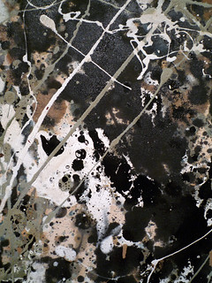
Why is this painting important and what was Pollock trying to paint? Mural is the largest canvas Pollock ever painted and is often seen by art historians as a moment of liberation as the artist pushes beyond the restrictive traditions of easel painting. Stylistically this marks a moment of transition from his earlier surrealist-inspired biomorphic abstraction to more gestural, more active painting. The pronounced brushwork and occasional drip point to an energetic, rhythmic creative expression that Pollock will explore more fully in the future.

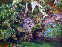
What do you see in Mural? Faces, figures, birds, numbers, letters—all are partly visable, partly hidden within this massive painting. However, given Pollock’s interest in the Surrealist concept of automatism (automatic actions, used to express the creative force of the unconscious), as well as Jungian concepts such as the collective unconscious, he may well have been interested in opening the viewer’s mind to universal archetypes. What can be seen inside Mural? The answer may provide more insight into viewer as an individual, than a simple decoding of the artist’s brushstrokes.
The Painting Techniques of Jackson Pollock
Video \(\PageIndex{8}\): Video from The Museum of Modern Art
Conservation: Jackson Pollock, One: Number 31, 1950
Video \(\PageIndex{9}\): Video from The Museum of Modern Art
Paint Application Studies of Jackson Pollock’s Mural
by THE J. PAUL GETTY MUSEUM
Video \(\PageIndex{10}\): Video from The J. Paul Getty Museum
Lee Krasner, Untitled
by DR. TOM FOLLAND
Little images
By the standards of the New York School (an umbrella term for post-World-War II American abstract artists), Untitled is a relatively small work—vertically oriented and consisting of tightly painted, gridded crescents of black and white paint with flecks of vibrant color, it measures 48 x 37 inches. This painting belongs to a series from the late 1940s that Krasner called “Little Images.” An ironic title, no doubt, when one considers how large and heroic were the paintings of that period’s leading figures like Jackson Pollock (whom Krasner married in 1945), Willem de Kooning, and Barnett Newman.
Painting large meant that one worked with large—almost comically so—brushes and the resulting meshes of abstract form and color encapsulated this muscular new approach to art. Pollock’s method of laying out large sheets of canvas upon the floor or Barnett Newman’s use of broomstick-length brushes stands in marked contrast to Krasner’s approach—hers were done on a tabletop. Thus, the tightly woven and interlocking shapes of Untitled had little of the drip and sweep of Pollock or de Kooning. Were the “Little Images” a breakthrough as she would later state—the beginnings of a feminist commentary on the part of Krasner? She would, after all, incorporate strips of Pollock’s discarded canvases into a mid-50s’ collage series, an act that art historian David Hopkins described as a “muting of [Pollock’s] painterly heroics.” Her name has in fact became virtually synonymous with the topic of ‘women and art,” despite the fact that on its face at least, abstract painting has nothing to do with gender.
Women generally not invited
The reason for this has a lot to do with how we now understand this period in art history. Women artists faced inordinate obstacles. There was a machismo that characterized the painters and sculptors who frequented the famous Cedar Tavern and took part in “The Club,” the organization that Phillip Pavia founded in 1948 and that served as an informal meeting space for members. Women were generally not invited. Despite her centrality to the New York School and her friendship with many leading figures in the New York art world of the 1940s and 50s, it would take a number of years for Krasner to receive the kind of attention Pollock seemed to warrant almost immediately. Is this why the artist adopted the name “Lee Krasner” instead of her birth name Lena Kreisner? Lee was suitably ambiguous in terms of gender. Krasner would sometimes just sign her paintings with the initials “L.K.” or otherwise diminish her signature. In Ann Eden Gibson’s study of this period, Abstract Expressionism: Other Politics, the author suggests that the “anonymity made possible by the gallery system—the dealer was visible but the artist was not—provided female artists with the chance to pass as men.”

The influence of Cubism and Surrealism
The notion that work of women artists could achieve a universal significance was often dismissed. “Little Images” nevertheless issued from the same set of pictorial concerns faced by her male counterparts. Grappling with the legacies of Cubism and Surrealism in the post-war years, American artists pushed through to dramatically new configurations of abstraction.
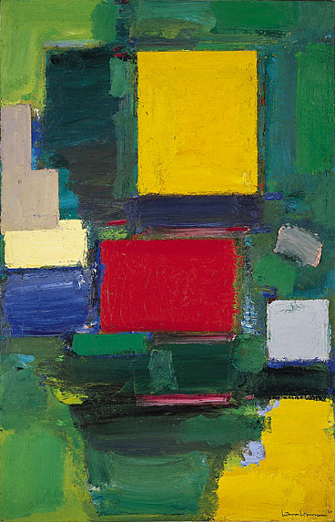
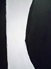
Untitled shows the influence of Cubism’s radical reordering of Renaissance perspective. The space of the painting is shallow; the overall palette is black and white. Krasner had studied with the German expatriate Hans Hoffman in the 1930s whose influence on the post-world II generation of artists cannot be over-stated (see image, left). Hoffman advocated a “push-pull” approach to painting (which emphasized both the flatness of the painting’s surface and the creation of abstract forms that could move forward and back into space) and took its cues from Cubist geometry.
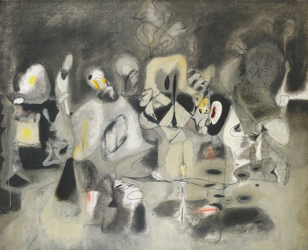
The work in the series “Little Images” represents a break from the over-arching influence of Cubist art whose geometric forms were still rooted in the study of nature. In the postwar years this “hard-edged” approach was softened by the influence of the organic abstraction of surrealist artists, many of them living in New York (see Gorky’s Diary of a Seducer, below for an example).
Surrealism represented an art of the unconscious mind; it seemed perfectly suitable to the unreality of the war years and after when artists started to grapple with the possibility or impossibility of representing the war’s aftermath. Krasner described her interest in Surrealism emerging around 1945 as a result of the large emigrant population of European Surrealists in New York City. But surrealism, like Cubism was still rooted in the observation of nature—however distorted. When Krasner first met Pollock she saw that, instead of abstracting his forms from nature, he began with a blank canvas upon which he would begin to arrange skeins of color in the all-over technique for which he became famous. Abandoning nature as a source for art allowed for greater freedom of choice.
Nature is not the source
But if nature is no longer a source for artists, then what is? In the postwar years the focus shifted to myth or inward to a deeply personal realm. Krasner’s painting appears hieroglyphic—as if the artist were repeatedly tracing numbers or letters over and over again across the surface. Her painting may be based on Hebrew letters from her childhood studies but dissembled in such a way that Untitled seems akin to the Cold War scrambling of codes. The personal was often connected to larger historical realities. Krasner’s abstract rendition of Hebrew could thus be read as a reference to the Holocaust, which represented for many the almost unimaginable horror, along with the Atom bomb, of contemporary life in the 1950s.
But if art historians now read these works of art within larger critical and historical frameworks, it is important to remember that artists of the postwar period resisted such interpretations. They stressed instead private symbolism. Artists sought to sever the link between the work of art and the everyday world. The post-war art critic Clement Greenberg, whose name is synonymous with the term “formalism,” advocated a non-representational approach to art. For Krasner, well versed in advanced theories of art, “Little Images” represented a breakthrough into this new realm, a post-Cubist and post-Surrealist abstraction. The one reality she could never escape was the fate bestowed upon women artists in an era dominated by the heroic male.
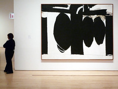
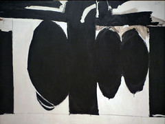
Robert Motherwell, Elegy to the Spanish Republic No. 57
by DR. BETH HARRIS and DR. STEVEN ZUCKER
Video \(\PageIndex{11}\): Robert Motherwell, Elegy to the Spanish Republic No. 57, 1957-60, oil on canvas, 84 x 109-1/8″ (San Francisco Museum of Modern Art)
Smarthistory images for teaching and learning:
Franz Kline
Franz Kline
Video \(\PageIndex{12}\): Video from The Museum of Modern Art
The Painting Techniques of Franz Kline
Video \(\PageIndex{13}\): Video from The Museum of Modern Art
The New York School
Collage, copying, and color: the New York School was about more than just gestural abstraction.
1945 - 1980
The Impact of Abstract Expressionism

Painters in Postwar New York City
The end of World War II was a pivotal moment in world history and by extension the history of art. Many European artists had come to America during the 1930s to escape fascist regimes, and years of warfare had left much of Europe in ruins. In this context New York City emerged as the most important cultural center in the West. In part, this was due to the presence of a diverse group of European artists like Arshile Gorky, Marcel Duchamp, Salvador Dalì, Piet Mondrian, and Max Ernst, and the influential German teachers Josef Albers and Hans Hofmann (see also Black Mountain College). American artists’ exposure to European modernist movements also resulted from the founding of the Museum of Modern Art (1929), the Museum of Non-Objective Painting (later the Guggenheim Museum, 1939), and galleries that dealt in modern art, such as Peggy Guggenheim’s Art of this Century (1941). Both Americans and European expatriates joined American Abstract Artists, a group that advanced abstract art in America through exhibitions, lectures, and publications.
These institutions and the art patrons affiliated with them actively promoted the work of New York City artists. During the 1940s and ’50s, the scene was dominated by the figures of Abstract Expressionism, a group of loosely affiliated painters participating in the first truly American modernist movement (sometimes called the New York School), championed by the influential critic Clement Greenberg. Abstract Expressionism’s influences were diverse: the murals of the Federal Art Project, in which many of the painters had participated, various European abstract movements, like De Stijl, and especially Surrealism, with its emphasis on the unconscious mind that paralleled Abstract Expressionists’ focus on the artist’s psyche and spontaneous technique. Abstract Expressionist painters rejected representational forms, seeking an art that communicated on a monumental scale the artist’s inner state in a universal visual language.
Action Painting
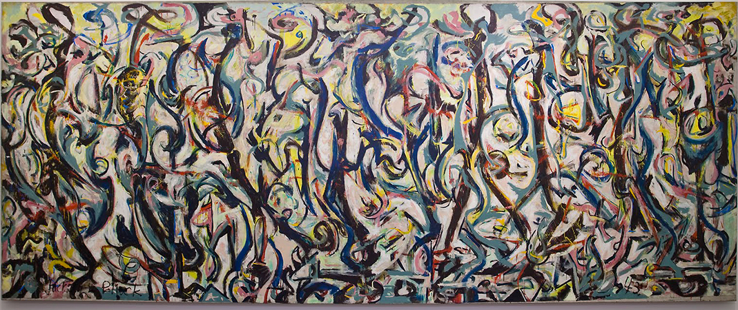
These painters fall into two broad groups: those who focused on a gestural application of paint, and those who used large areas of colour as the basis of their compositions. The leading figures of the first group were Franz Kline, Robert Motherwell, Willem de Kooning, Lee Krasner, and above all Jackson Pollock. Pollock’s innovative technique of dripping paint on canvas spread on the floor of his studio prompted critic Harold Rosenberg to coin the term action painting to describe this type of practice. Action painting arose from the understanding of the painted object as the result of artistic process, which, as the immediate expression of the artist’s identity, was the true work of art. Helen Frankenthaler also employed experimental techniques by pouring thinned pigments onto untreated canvas.

\(\PageIndex{21}\): Barnett Newman, Vir Heroicus Sublimis, 1950-51, oil on canvas, 242.2 x 541.7 cm (The Museum of Modern Art, New York)
Color Field Painting
The second branch of Abstract Expressionist painting is usually referred to as Color Field painting. Two central figures in this group were Mark Rothko, known for canvases composed of two or three soft, rectangular forms stacked vertically, and Barnett Newman, who, in contrast to Rothko, painted fields of colour with sharp edges interrupted by precise vertical stripes he called “zips” (see Vir Heroicus Sublimis, 1950–51). Through the overwhelming scale and intense colour of their canvases, Colour Field painters like Rothko and Newman revived the Romantic aesthetic of the sublime.
Influence
Because of the huge influence of Abstract Expressionism in postwar New York City, other artists and movements are generally understood in relation to it. Ad Reinhardt in the early 1950s and then Frank Stella later in the decade painted abstract canvases, but rejected the Abstract Expressionist emphasis on gesture and the painting as a means of communing with the artist (see Stella’s Die Fahne Hoch!, 1959). They instead reinforced the essence of the painting as a physical object through precise geometric forms and smooth application of paint, presaging Minimalism.
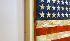
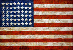
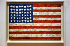
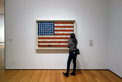
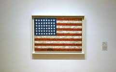
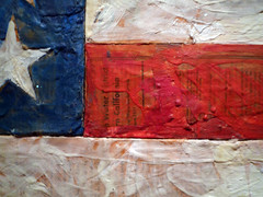
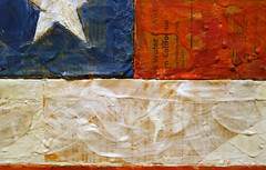
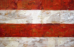
The other principal movement of postwar New York was Pop art. Although Pop had begun in England (see, for example, Richard Hamilton), postwar America provided a meaningful context for the movement’s emphasis on mass media and consumer culture. American adherents also saw Pop art as a welcome alternative to pure abstraction. The artists Jasper Johns and his close friend Robert Rauschenberg rejected Abstract Expressionism’s attachment to the universal meaning expressed in a work of art, instead creating multiple or fluid meanings through combinations of everyday objects and images. Johns depicted “things the mind already knows,” such as American flags, targets, numerals, and beer cans, and incorporated newsprint and plaster casts into his works (see Target with Four Faces, 1955). Rauschenberg also blurred the boundaries between painting and sculpture with his combines, such as Bed of 1955. These works are related to both assemblage and collage in their use of found three-dimensional objects (bedding, furniture, taxidermied animals) and layering of printed material (product packaging, newspaper, photographs) on painted surfaces.
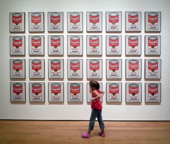
Both Johns and Rauschenberg provided a critical departure from the pure abstraction of the dominant painters of the 1950s, setting the stage for the flourishing of Pop art in the ’60s. Andy Warhol was unquestionably the central figure of the American Pop art movement. He first worked as a highly successful advertising artist in New York before exhibiting paintings and silkscreen prints beginning in the early 1960s. Best known for his images of Campbell’s soup cans, Coke bottles, and American public figures, Warhol’s work seems to celebrate icons of consumer culture – both actual products and celebrities who were marketed and sold as such, like Marilyn Monroe – but is also often interpreted as a critique of passive, unthinking consumption. James Rosenquist, a contemporary of Warhol, also took inspiration from his work in advertising as a billboard painter. His huge canvases depicting images from print media and advertisements, such as Marilyn Monroe I (1962), are rooted in the vulgarity of contemporary life, but reminiscent of Surrealism in their juxtaposition of disparate, fragmentary imagery.
The success of abstract and Pop painters in postwar New York established the city’s international importance as an artistic center, in the ensuing decades drawing to it some of the world’s most talented and innovative artists.
Text by Kandice Rawlings, PhD (Associate Editor, Oxford Art Online)
This content was first developed for Oxford Art Online and appears courtesy of Oxford University Press.
Additional Resources:
Abstract Expressionist New York, The Museum of Modern Art, NY (2010)
“Jackson Pollock on his Process”, Making Sense of Modern Art, video, SFMOMA (2000)
Justin Wolf, “Abstract Expressionism”, theartstory.org
de Kooning: A Retrospective, The Museum of Modern Art, NY (2011)
David Anfam, “Surrealism”, Grove Art Online, © 2009 Oxford University Press
David Anfram, “Action Painting”, Grove Art Online, © 2009 Oxford University Press
Smarthistory images for teaching and learning:

Jasper Johns
Smarthistory images for teaching and learning:
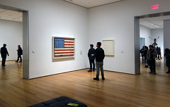
Jasper Johns, White Flag
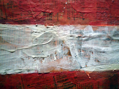
by THE METROPOLITAN MUSEUM OF ART
Video \(\PageIndex{15}\): Video from The Metropolitan Museum of Art
Robert Rauschenberg
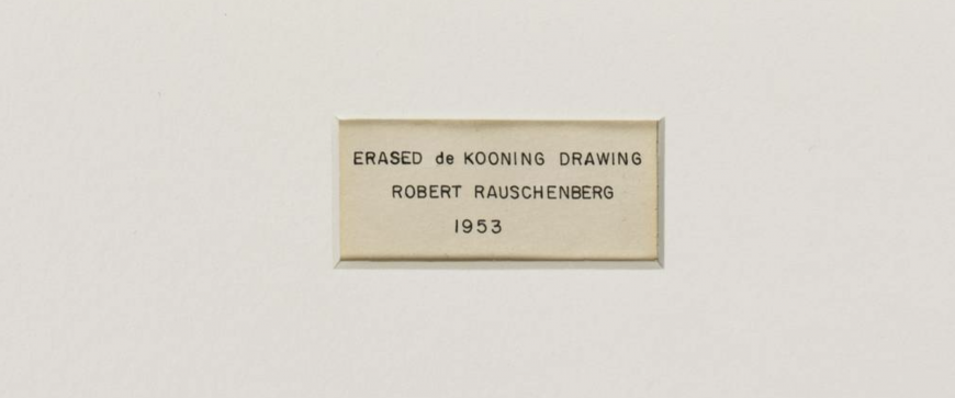
In 1953, Robert Rauschenberg erased a drawing by de Kooning
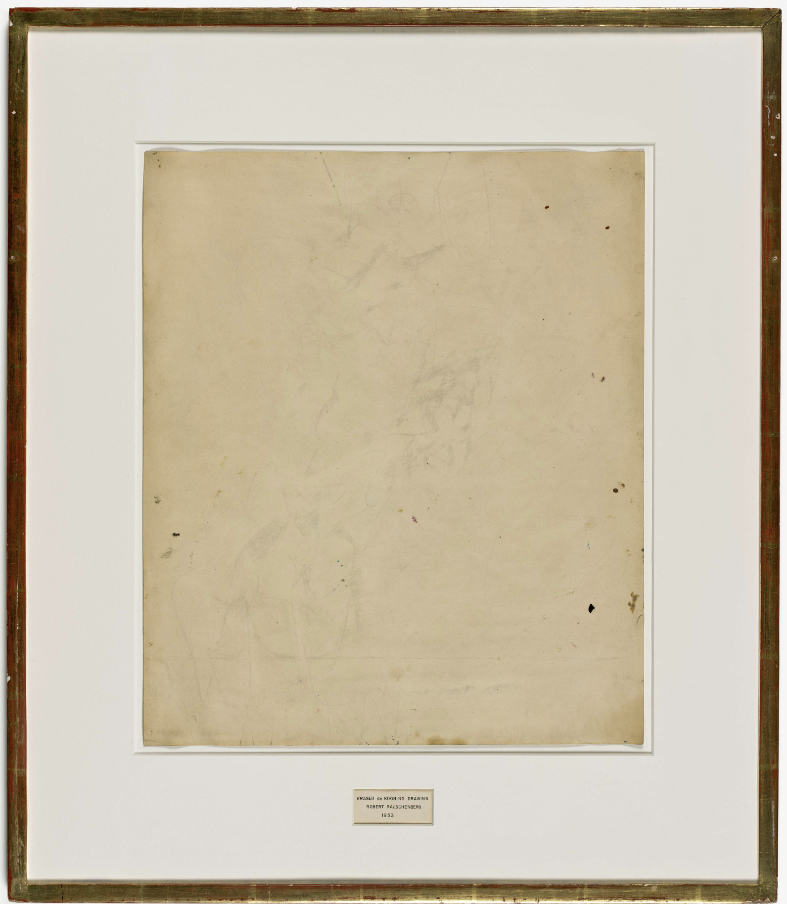
That’s right, the Erased de Kooning Drawing is… an erased drawing by Willem de Kooning. It is also a statement that the “erasing” artist, Robert Rauschenberg, made about the artistic culture of his time and about his own artistic practice.
How It Happened
In the Fall of 1952, the young artist Robert Rauschenberg visited the New York studio of Willem de Kooning. Rauschenberg met de Kooning and befriended him as a student at Black Mountain College in North Carolina. By 1952, de Kooning was a leading figure, along with Jackson Pollock, in Abstract Expressionism, one of the first modernist art movements in post-World-War II New York. Both de Kooning and Pollock had forged a radically new style of abstract painting, and de Kooning would become particularly well known for a painting series that dramatically distorted the female form. The so-named “de Kooning style,” in fact, became a template for modernist painting for years to come.
But Rauschenberg was not interested in painting like de Kooning; his plan, as he told the elder artist, was to erase one of his drawings. And de Kooning agreed, after having chosen one that might prove difficult to undo, as it had been done in charcoal, oil paint, pencil, and crayon. Rauschenberg dutifully erased it over the ensuing weeks.
Fellow artist and Rauschenberg’s longtime friend, Jasper Johns would later provide a gilded frame and mat, onto which was placed an inscription for the re-titled drawing: “Erased de Kooning Drawing, Robert Rauschenberg, 1953.”
Cultural Context of Abstract Expressionism
Rauschenberg’s erasure was at odds with the prevailing sensibility in art during the 1950s in America. Abstraction had emerged as the defining characteristic of Modernism. In fact, it became a kind of post-war call-to-arms, vigorously promoted by the influential art critic Clement Greenberg. Accordingly, all art, whether it be painting, sculpture, or photography, was to pursue a path that eliminated subject matter and narrative, whilst focusing instead upon the expressive qualities of the medium. This often took the form of highly gestural and non-representational mark-making. Since it was painting that best embodied this new approach, it was painting that reigned as the dominant artistic medium of the Post-World-War II years.
Whether it was the overall effect of Jackson Pollock’s so-called “drip” paintings (in which paint had been flung or dripped across large canvases), or the stained pools of color in the work of Helen Frankenthaler, or even the distorted images in de Kooning’s Women series, the unifying force was a will to abstraction. Pollock once famously remarked that if what he was painting veered too closely to resemblance, he would paint it out.
Even photography tried to mimic painting’s abstract qualities. The documentary photographer Aaron Siskind had created portraits of rural America in the 1930s, but by the 1950s his photographs were reduced to black and white arrangements of form. Abstraction was seen by many artists as a liberating force, especially in the context of American realist painting of the preceding decades. Folkish American subjects and themes now seemed provincial compared to what had been achieved in Europe and particularly France since the early twentieth century.
Most significantly, abstraction embodied a specifically postwar American sense of individualism. Through the gestural and often theatrical or performative act of making marks upon the large, flat expanse of canvas, the artist was freed from the constraints of subject matter. In Abstract Expressionist painting, the subject matter, if there can be said to be one, was the artist himself. I use the gendered pronoun “himself” purposively here since it was male artists who were the celebrated authors of these muscular paintings, requiring large brushes and massive canvases. This is not to say that women did not produce powerful bodies of work in this period—indeed Lee Krasner, Janet Sobel, Buffie Johnson, Anne Ryan, Hedda Sterne, and others did just that.
Erasing conformism: Rauschenberg’s Neo-Dada
One of the Black Mountain Poets, Robert Duncan described the “bravura brushstroke” as evidence of “the power and movement of the arm itself” and of the “involvement of the painter in the act.”\(^{[1]}\) It is hard not to see in this statement evidence of the gender bias that reflected a prevalent idea according to which painting powerfully on large surfaces meant painting like a man.
In this regard, it is important to point out that Rauschenberg was gay, and like women and even artists of color, invariably deemed too far outside the extremely conformist culture of 1950s America to produce the requisite kind of art that was needed to prove America’s place on the international stage. Metaphorically therefore, it could be argued that Rauschenberg was erasing not just a drawing, but this very idea of artistic, masculine authorship.
Erased de Kooning Drawing thus had symbolic force. Though, as one can imagine, that force was mostly viewed by critics as negative. Rauschenberg’s erasure was a destructive act, to be sure, one that seemed to harken back to a World-War-I movement called Dada, in which traditional ideas of art were challenged in often absurd ways. Rauschenberg’s seeming nihilism would, in the later 1950s, be called “Neo-Dada,” and he would be linked to Marcel Duchamp whose anti-art objects had resurfaced in New York during the 1950s. But Rauschenberg saw the erased drawing in very different terms and possibly as a follow up to a series of white paintings in which canvases were entirely painted white.
“It was nothing destructive…. I was trying to purge myself of my teaching…so I was doing monochrome no-image.”Robert Rauschenberg in conversation with Tanya Grosman, Interview, vol. VI, no. 5, 1976
Of course we must always weigh the proclamations of artists against the cultural climate in which they work. Rauschenberg’s coy statement would not mark the first time an artist feigned indifference or ignorance of the larger meanings of their work. American artists had finally achieved what they believed to be a truly modern art that could rival Paris. It was also no coincidence that America had emerged as a superpower in the world at large. There was, as a result, a heroic sense about the whole affair; artists inadvertently became cultural cold warriors. Rauschenberg seemed cavalier about it all. In the words of one critic: “We have finally won, are we going to throw it all away?”\(^{[2]}\)
Notes
[1] Robert Duncan, Black Mountain Review, 1956. The Black Mountain Review was a literary magazine associated with the community of poets and artists active at Black Mountain College, and seen by its founders as a way of continuing the legacy of the College after its closure.
[2] Leo Steinberg paraphrasing the art critic Robert Rosenberg. Interview by Tom Folland with Leo Steinberg, January 16, 2008, New York, New York.
Additional resources
This drawing at SFMOMA
Rauschenberg discussing Erased de Kooning Drawing (short video)
This drawing on the Robert Rauschenberg Foundation website
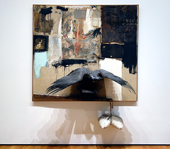
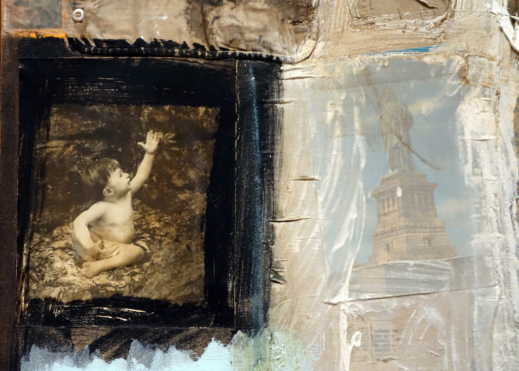
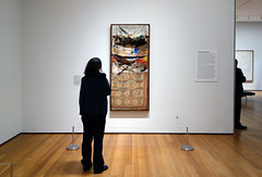
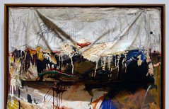
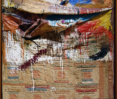
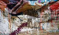
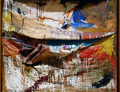
Robert Rauschenberg, Canyon
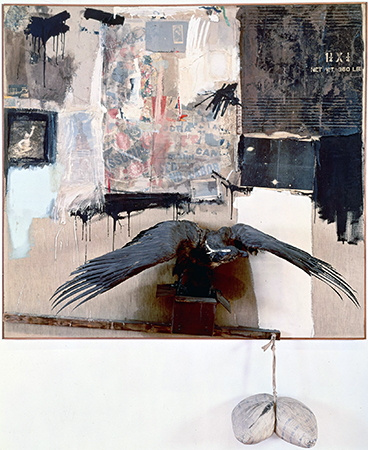
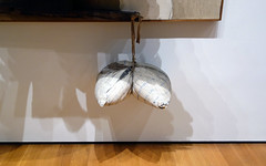
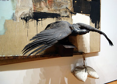
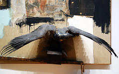
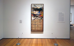
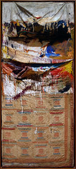
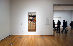
Is Canyon a painting or sculpture? Its upper half is a mass of materials that include bits of a shirt, printed paper, a squashed tube of paint, and photographs all seemingly held in place by broad slashes of house paint, while its lower half consists of a stuffed bald eagle with outstretched wings about to lift off from an opened box. The box seems to balance precariously upon a beam that tilts downward to the right; its end point meets the frame. As if that were not enough, that beams suspends a pillow dangling below the frame and squeezed in half by the cloth string that holds it.
Combines
Canyon belongs to a group of artworks called “Combines,” a term unique to this artist who attached extraneous materials and objects to canvases in the years between 1954 and 1965. What makes Rauschenberg so significant for this period—the postwar years—is how he challenged conventional ways of thinking about advanced modern art; especially the art of “The New York School,” a group of émigré Europeans and like-minded American artists (including Jackson Pollock, Willem de Kooning and their followers), who were praised for their heroic abstraction. Rauschenberg’ s art violated the rules.
While the the word “Combine” has no known origin in an art context, it describes Rauschenberg’s hybrid approach to art making which dismantled the rigid medium-specific categories so dear to modernist culture. In the American art critic Clement Greenberg’s influential theory, so-called true painting was to explore only the properties inherent to painting: gesture, flatness and color. Sculpture was to adhere strictly to the delineation of volume and mass. Both would necessarily be abstract since the truth-to-materials maxim of post-war modernism meant that any kind of illusionism (bronze pretending to be flesh or paint attempting to resemble the thing it represented) was anathema. “Subject matter,” in Greenberg’s infamous declaration, “becomes something to be avoided like a plague.”1 With Canyon, like any number of Combines the artist created during this period, all of this was put into question. Not only did the artist subvert the distinction between painting and sculpture, he reintroduced subject matter and narrative back into art. The art historian Leo Steinberg declared that Rauschenberg’s Combines “let the world back in again.”2

Reading Canyon
Canyon is not an entirely abstract work of art. But what exactly is the subject matter? On the face of it, it seems to be a wryly comic re-telling of the Greek myth in which the god Zeus, disguised as an eagle, abducts a youth named Ganymede. The subject had of course appeared in art before. There are, for example, Greek vases, Roman reliefs and European oil paintings dedicated to this story. Rembrandt’s Abduction of Ganymede, 1636—to which Rauschenberg’s version might readily be compared—paints the story in the lurid richness of oil with a dramatically diagonal arrangement of the figures. Or could it even be a reference to the “scales of Justice” so often found in the art and architecture of Europe and America? It would be a mistake to read Canyon narrowly using only conventional iconography. Although some art historians have sought to “read” Canyon as one would a traditional representional artwork, Rauschenberg’s work seems to resist fixed decoding in favor of a more open-ended play of meaning.

Rauschenberg combined disparate elements in a random fashion perhaps responding to his urban environment (New York City) and a world of ephemera: the flotsam and jetsam of mass culture in the years after the Second World War. Look, for example, at the top right: here is a slab of cardboard with commercial lettering, probably the discarded packaging for a shipment of goods found on the street in his lower Manhattan neighborhood. In this sense he anticipated the later work of Pop artists such as Andy Warhol, Roy Lichtenstein and James Rosenquist who would, a few years later, make such commercial imagery the focus of their art.
Cultural debris
Rauschenberg did know other artists who took a similar approach and challenged the narrow parameters of the formalists wing of the New York School and its rejection of popular culture and illusionism. His immediate circle included the painter Jasper Johns, the choreographer Merce Cunningham and the avant-garde composer John Cage. On the West Coast Edward Keinholz and Wallace Berman were creating artworks that would come to be called “Assemblage”—think collage on a large scale. In Paris, Arman, Jean Tinguley and Jacques de la Villeglé incorporated the debris of the city; junk and cast off commodities incorporated into artworks that became know as Nouveau réalism (New realism).

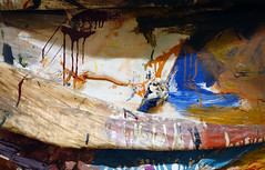
Canyon is more than an accumulation of debris, however. Note the skeins of paint, brushed, scribbled, clotted, dripping in the style of the abstract expressionists. Rauschenberg was also closely aligned with the New York School—particularly the older abstract expressionists—whose work he admired. But he nevertheless expressed a profound ambivalence towards this group: “There was something about the self-assertion of abstract expressionism that personally always put me off, because at that time my focus was as much in the opposite direction as it could be.”3

Rauschenberg’s self-conscious handling of paint intertwined with often-outrageous objects can be construed as parody. In this way, Canyon can be seen as a counter to the overblown rhetoric of abstract expressionism with its stress on heroic individualism and the formal purity of abstract art. The eagle (with its testicular appendage hanging below the frame)—like Jasper Johns’ American flag (see above) from the same period—may be an ironic commentary on heroic masculine identity and even cold-war era American power. As a gay artist during a deeply repressive era that sought to expel both the threat of communism and of homosexuality, Rauschenberg distanced himself from cultural orthodoxy.
1. Clement Greenberg, “Avant Garde and Kitsch,” (1939), Art And Culture: Critical Essays (Beacon Press: Boston): 5.
2. Dorothy Seckler, “Oral history interview with Robert Rauschenberg,” 1965 December 21. Smithsonian Archives of American Art.
3. Leo Steinberg, “Other Criteria,” Other Criteria: Confrontations with Twentieth-Century Art (New York: Oxford University Press, 1972): 90.
Additional resources:
This painting at The Museum of Modern Art
Smarthistory images for teaching and learning:
Robert Rauschenberg, Bed
by DR. BETH HARRIS and DR. STEVEN ZUCKER
Video \(\PageIndex{16}\): Robert Rauschenberg, Bed, 1955, oil and pencil on pillow, quilt, and sheet on wood supports, 191.1 x 80 x 20.3 cm (MoMA) © 2013 Robert Rauschenberg Foundation
Smarthistory images for teaching and learning:
Homage to JFK: Rauschenberg’s Retroactive I
by PATRICIA HICKSON, WADSWORTH ATHENEUM MUSEUM OF ART and DR. STEVEN ZUCKER
Video \(\PageIndex{16}\): Robert Rauschenberg, Retroactive I, 1963, oil and silkscreen-ink print on canvas, 213.4 x 152.4 cm (Wadsworth Atheneum Museum of Art) All works © Robert Rauschenberg
Additional resources
This painting at the Wadsworth Atheneum Museum of Art, Hartford, Connecticut
This painting on the Rauschenberg Foundation website
Robert Rauschenberg, Note on painting, October-November 1963
Ed Kienholz and Nancy Reddin Kienholz, Useful Art #5: The Western Motel
Video \(\PageIndex{17}\): Ed Kienholz and Nancy Reddin Kienholz, Useful Art #5: The Western Motel, 1992 (Portland Art Museum). Video from Portland Art Museum (speakers: Dr. Christina Olsen and Bruce Guenther).
Ad Reinhardt
Ad Reinhardt, Abstract Painting
by SAL KHAN and DR. STEVEN ZUCKER
Video \(\PageIndex{18}\): Ad Reinhardt, Abstract Painting, 1963, oil on canvas, 60 x 60″ (MoMA)
Smarthistory images for teaching and learning:
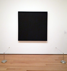
Ad Reinhardt
Video \(\PageIndex{19}\): Video from The Museum of Modern Art
The Painting Techniques of Ad Reinhardt
Video \(\PageIndex{20}\): Video from The Museum of Modern Art
Helen Frankenthaler
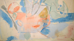
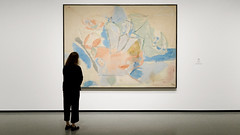
Helen Frankenthaler, Mountains and Sea
by DR. BETH HARRIS and DR. STEVEN ZUCKER
Video \(\PageIndex{21}\): Helen Frankenthaler, Mountains and Sea, 1952, oil and charcoal on unsized, unprimed canvas, 219.4 x 297.8 cm (National Gallery of Art, Washington)
Smarthistory images for teaching and learning:


Helen Frankenthaler, The Bay
Violet to Indigo
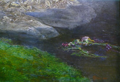
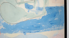
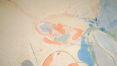
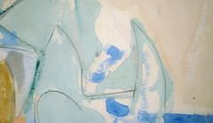
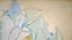
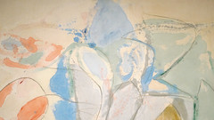
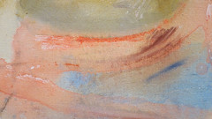
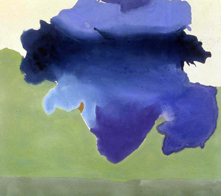
At first glance, it’s hard to know what to make of Helen Frankenthaler’s heaving, atmospheric painting, The Bay.
We see an imposing fluid blue promontory suspended in front of us. Its colors ranging from violet to indigo run into one another with a clear zone of navy near the top of the canvas that draw our eyes up to it. The blurring of the colors gives an immediate sense of the artist’s process: paint poured onto the canvas when it was wet. We can almost watch as the blues meld into one another during this early stage giving the image its blurred and smooth finish.
Is its subject what the title suggests—a landform of some kind with certain emblematic associations? Is the swelling amorphous blue mass floating amid that moss green and cream border meant to stand for something beyond itself? With many Abstract Expressionist paintings of the 1950s and 60s, it’s important not to get too caught up with possible social and historical contexts and biography, but to focus on what’s before us—the physical elements of the work itself because those elements can tell us so much about the painting.
When Helen Frankenthaler painted The Bay, she was already a well-regarded artist. She’d been the subject of a LIFE Magazine profile in 1956 and was one of the handful of women among the traditional all-boys’ club of the New York Abstract Expressionists. The Bay was chosen as one of the paintings for the American pavilion of the 1966 Venice Biennale. Looking closely you can see that the shades of blues that run into one another are part of a specific process of pouring paint on to the canvas rather than painting the colors onto the surface with a brush, as the leading Abstract Expressionist painters, like Jackson Pollock, Willem de Kooning, and Franz Kline, were so famous for doing.
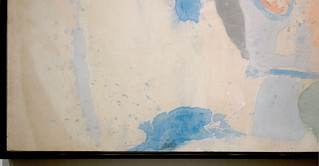
Soak-stain
Frankenthaler’s approach here was to use a soak-stain method with diluted acrylic paint. Acrylics gave her more flexibility with viscosity and movement than oils, and allowed her more control as she poured that thinned paint onto the taut unprimed canvas so that it would get absorbed into the weave of the fabric. As a substitute for the action of the brush, Frankenthaler would lift the canvas and tilt it at various angles so that the paint would flow across the surface. She had to account for gravity and the ebb and flow of a liquid across a flat surface, so a fascinating aspect of Frankenthaler’s method is the blend of the artist’s control paired with the unpredictability of the forces of nature.
This kind of painting is often classified as Color Field painting, painting characterized by simplicity of line and a focus on color as the subject rather than as an add-on. The first generation of Abstract Expressionists, Mark Rothko and Barnett Newman were the first important Color Field painters, while Helen Frankenthaler is often classified as a second-generation member of the group.
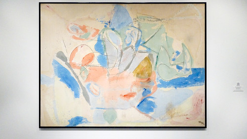
Frankenthaler was inspired by the drip method of Jackson Pollock who began painting on the floor in the late 1940s, but she knew she wanted to work differently. Pollock and other artists such as de Kooning and Franz Kline had made the painted gesture too famous and recognizable by the early 1950s. In 1952, at the age of 23, Frankenthaler’s experiments lead her to produce her first major painting, Mountains and Sea, an expansive luminous depiction of the landscape of Nova Scotia, where she’d recently taken a holiday.

Devotion to color
Mountains and Sea in turn inspired other painters to use this soak-stain method to great success, painters like Kenneth Noland, Morris Louis and Paul Feeley, whose canvases of floating thinned color heralded in a new era of abstract painting. The sense of natural spontaneity and devotion to color is part of what makes The Bay and the work of the Color Field painters so compelling. The basic formal elements of a painting speak for themselves as the viewer experiences the work in a fundamental, direct manner.
The influential mid-20th century art critic, Clement Greenberg, a close friend of Frankenthaler (and Pollock), believed that if art made after the trauma of the second world war was going to have any real impact on the social consciousness of Americans it would have to radically change and move towards the abstract. For Greenberg, abstraction could reach a more universal and expansive mode of visual communication.
In a 1965 interview for Artforum Magazine with the art critic Henry Geldzahler, Helen Frankenthaler described her process of conceptualizing her work:
When you first saw a Cubist or Impressionist picture there was a whole way of instructing the eye or the subconscious. Dabs of color had to stand for real things. It was an abstraction of a guitar or a hillside. The opposite is going on now. If you have bands of blue, green and pink, the mind doesn’t think sky, grass and flesh. These are colors and the question is what are they doing with themselves and with each other. Sentiment and nuance are being squeezed out.
That last sentence, “sentiment and nuance are being squeezed out,” is crucial. The colors on the canvas don’t have to represent something in particular, but can have a more ambiguous, emblematic quality for the viewer. The basic act of responding to color, the way one would respond to a sunset, or to light from a stained-glass window, simplicity and pure emotion through clarity of color and form.
The same year she painted The Bay, Frankenthaler painted a series of similar soak-stain paintings with titles referring to water and geography: Canal, Low Tide, Blue Tide, inspired by the landscape of her country home in Provincetown, Massachusetts. As Frankenthaler said, it’s important for us not to be too encumbered by context and speculation when we look at her work. We’re to take from it what we will on our own terms.
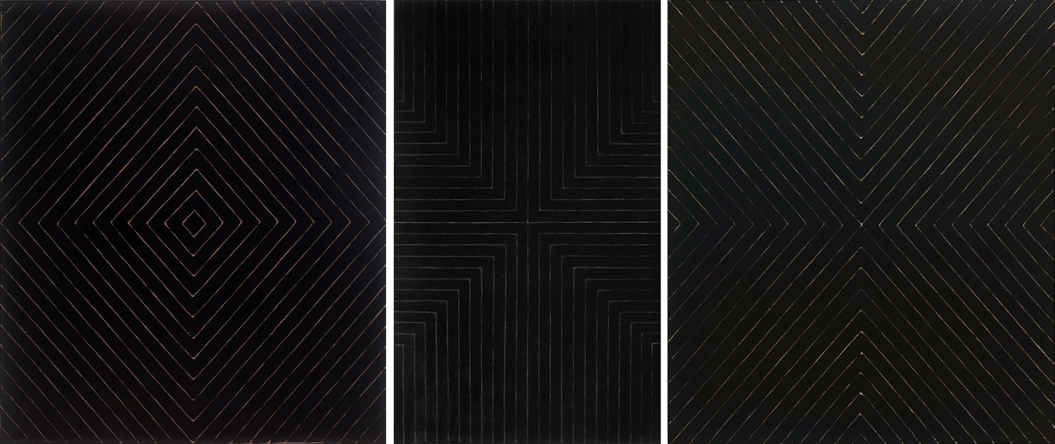
Frank Stella, The Marriage of Reason and Squalor
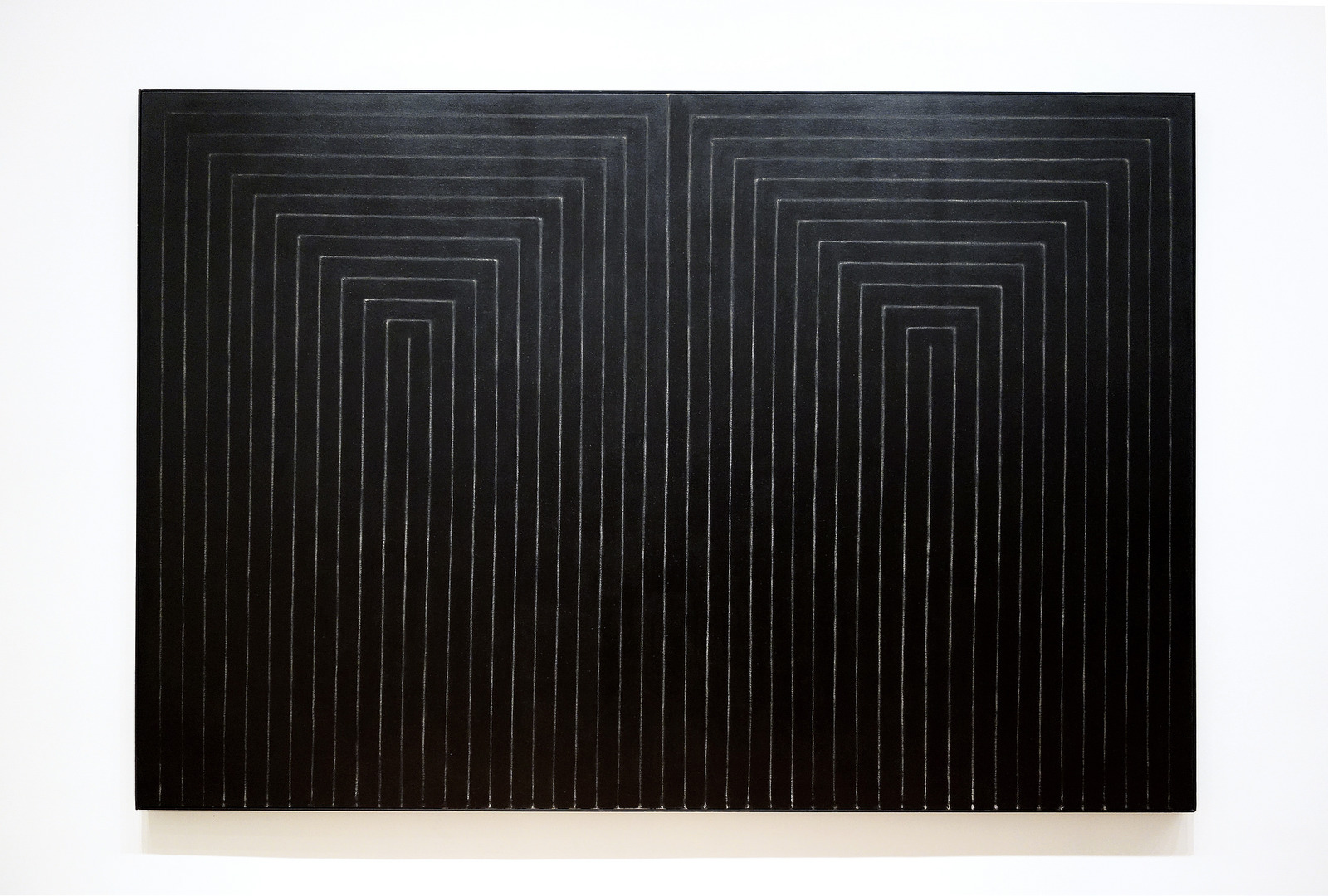
The best known American abstract painting of the 1950s was gestural and emotionally expressive (see below). This art, known as Abstract Expressionism was just that. It was abstract, but more to the point, it was subjective—it was about the experience and the very being of the artist. Frank Stella’s early series, the “Black Paintings” of 1958-1959 (below), was none of these things. The Marriage of Reason and Squalor II, one of that series, is characterized by thick black lines painted to alternate repeatedly with thin “stripes” of exposed canvas—with no room for gesture. The series features an array of designs made by differently arranging these same elements in symmetrical rectilinear patterns.
Stella’s early paintings are often associated with Minimalism which also begins at about this time. Like the Minimalists, Stella heralds the literal presentation of spare abstract forms. His technical approach—constructing each stroke with a wide housepainter’s brush and enamel house paint—highlights the shift among many artists of the time to reject the gestural style of action painting typical of Abstract Expressionism, the preeminent American art movement of the 1950s. By contrast, works like The Marriage of Reason and Squalor II exhibit a controlled sensibility that speaks to the systematic planning and conceptual framework that belie their simplistic appearance.
Rejecting emotion
Stella wanted to eliminate the personal reference and symbolic meaning associated with modernist abstract painting. In this way, his paintings differ from those of European modernists like Piet Mondrian who used reductive geometrical forms to communicate spiritual ideals. Stella criticized the work of these earlier painters as too “relational,” a term he used to describe their subjective process of arranging distinct parts in relation to one another in order to create what they saw as a harmonious and balanced composition.1
Jasper Johns was an important influence on Stella in these formative years. Working in the 1950s, Johns had also rejected the metaphysical overtones of Abstract Expressionism in his ironic use of encaustic, an ancient media that requires careful application to build up layers of wax and pigment, and reference to everyday objects. Johns’ deliberate mark-making denied action painting’s insistence on the spontaneity of individual expression, and his rendering of easily recognizable targets and flags mocked one of Abstract Expressionism’s claims—to communicate universal meaning through archetypal images.

For Stella, Johns’s art hinted at a way to eliminate the subjectivity inherent to the artist’s task. Representing an existing object meant that the appearance and structure of the thing itself determined the painted imagery. Johns’s use of repetition further appealed for its visible adherence to the artist’s subject matter, and suggested to Stella a systematic, detached approach to artmaking based on a predetermined motif.
“What you see is what you see”
Stella adapted these ideas for his own non-objective imagery (images that don’t depict recognizable forms) by looking to the rectangular shape of the canvas as the basis for his compositions. He explained this rationale in 1960 to students at Pratt Institute in Brooklyn:
I had to do something about relational painting . . . . The obvious answer was symmetry—make it the same all over. The question still remained though, of how to do this in depth. A symmetrical image or configuration symmetrically placed on an open ground is not balanced out in the illusionistic space. The solution I arrived at . . . forces illusionistic space out of the painting at constant intervals by using a regulated pattern. The remaining problem was simply to find a method of paint application which followed and complemented the design solution. This was done by using the house painter’s technique and tools.2
Although painted by hand, the image’s methodical regularity erased any sign of the artist’s individuality or emotional investment in his work. In adopting “the house painter’s technique and tools,” Stella replaced the romanticized notion of an artist’s creative act with the actual labor used to make a painting. In this way, the Black Paintings challenged the assumption that a painting must represent an ideal or communicate profound meaning to the viewer—a position summed up best in Stella’s famous quip, “What you see is what you see.”
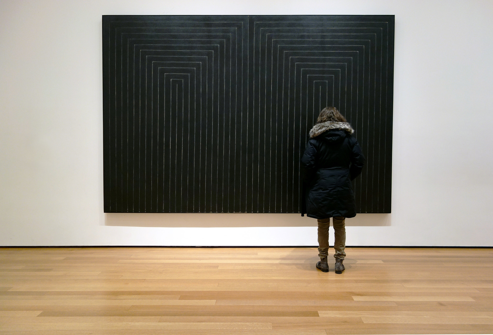
Stella’s solution not only eliminated the subjectivity of abstract painting, it also forced the viewer’s attention to the materials of the painting itself. Repeating the striped pattern to fill the canvas emphasized the flatness of the painted surface, an effect heightened by building up thick layers of dense black enamel to obscure brushstrokes and texture. The result was to deny the viewer the illusion of depth usually perceived in paintings, and to highlight the symmetrical design that echoed the rectangular shape of the canvas itself.
For artists like Donald Judd, who also wanted to rid art of its metaphysical meaning and illusionistic tradition, Stella’s Black Paintings appealed for their object-like appearance. Stella used deep stretcher bars which caused his paintings to stand out further from the wall. Judd, who is best known for his Minimalist sculpture, argued that Stella’s paintings emphasized the three-dimensionality of the painting as a real object that extended into the space of the gallery itself. Likewise, the human scale of the canvas seemed to heighten the art’s physical relationship to the viewer, a characteristic of Minimalism in sculpture. Stella rejected these interpretations, however, insisting that his primary interest was the viewer’s optical experience.
The title
For all of Stella’s emphasis on painting’s formal properties (that is how the painting looks as opposed to what it represents), the provocative titles of his Black Paintings compel speculation about deeper meaning. These includes Nazi references such as Arbeit Macht Frei and Die Fahne Hoch, and places such as Arundel Castle (a favorite subject of English Romantic painters). The general tendency of the titles to reflect what Stella called “‘downbeat’ and ‘depressed political’ situations” suggests they say more about the artist and the world around him than the paintings themselves.3 In the case of The Marriage of Reason and Squalor II, Stella’s orderly pairing of identical halves plays on the contrasting terms in the title. It was Carl Andre, Stella’s long-time friend and fellow artist, who first invented the title in 1957 for a series of his own pastel drawings that he destroyed. Because both men agreed the phrase was an apt characterization of their lives as artists in New York City, Andre suggested Stella use the title for his painting.4
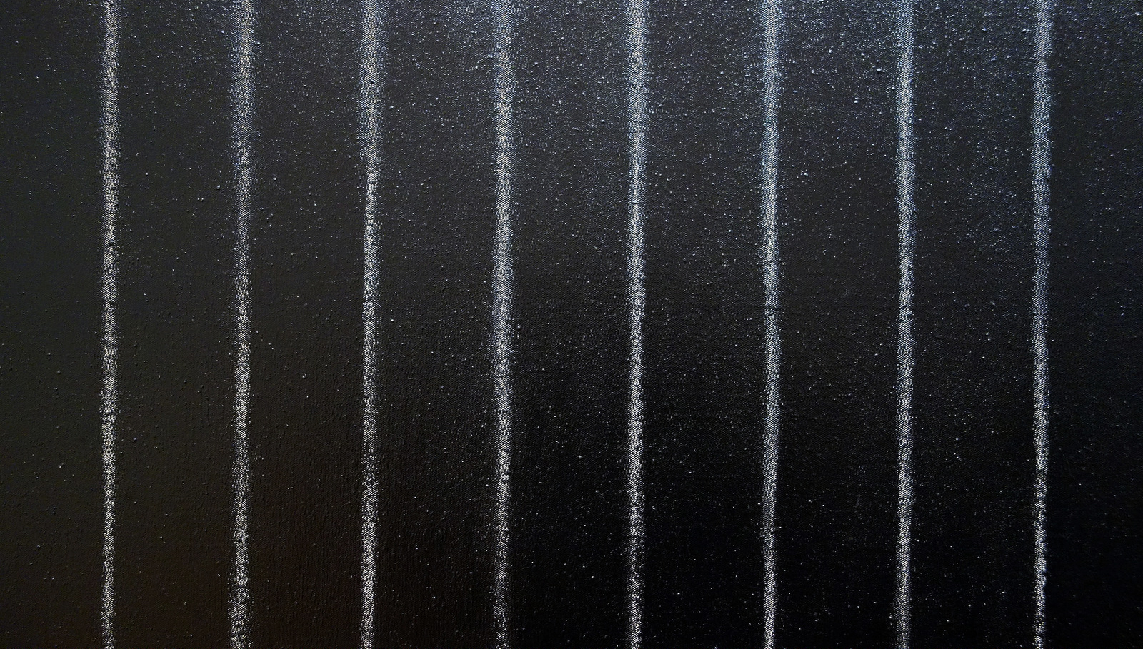
Art historian Caroline Jones believes The Marriage of Reason and Squalor II sums up contradictions that are pervasive throughout all the Black Paintings. She writes, “It is precisely the marriage of reason and squalor—the union of control and flow, the matings between differences, the pleasures of conjugation—that allows the procreation of meaning in the Black Paintings (to pursue Andre’s analogy.)”5 Noting that the painting was the second of two versions of the same composition, Jones shows that, despite Stella’s mechanical stance, close looking (see detail above) reveals tell-tale signs of the artist’s hand: small drips of paint, blurred edges in the black lines, varying widths of the white space in between, and tonal shifts in the layers of color. She even points out how the overall configuration pulls ever so slightly to the right as evidence of Stella’s dominant hand at work.6
Like Pop Art, which developed around the same time, Stella’s Black Paintings challenge viewers by representing imagery that is self-evident and lacks expressive impact. For art historians like Jones, this detached approach to art making reflects the economic shift toward mass production and the growing commodity culture of the United States in the 1960s. However, by asking us to consider Stella’s creative process and his motivations for so strongly denying it, The Marriage of Reason and Squalor II also forces us to treat the painting like a traditional work of art, demanding focused attention to its visual effect and intellectual engagement with the conceptual issues it raises.
Notes:
1 Bruce Glaser, “Questions to Stella and Judd.” Art News 65.5 (1966), pp. 55-61.
2 Frank Stella, “The Pratt Lecture,” reprinted in Brenda Richardson, Frank Stella: The Black Paintings (The Baltimore Museum of Art, 1976), p. 78.
3 William Rubin, Frank Stella (NY: The Museum of Modern Art, 1970), quoted in Brenda Richardson, Frank Stella: The Black Paintings (The Baltimore Museum of Art, 1976), p. 3.
4 Richardson, 46.
5 Caroline Jones, The Machine in the Studio (University of Chicago Press, 1996), p. 149.
6 Ibid., p. 148.
Additional resources:
Frank Stella, Black Series I (Prints), National Gallery of Art
Postwar figurative art
Tooker, Highway
by DR. PETER JOHN BROWNLEE, CURATOR, TERRA FOUNDATION FOR AMERICAN ART and DR. STEVEN ZUCKER
Video \(\PageIndex{22}\): George Tooker, Highway, 1953, egg tempera on gesso hardboard, 58.1 x 45.4 cm (Terra Foundation for American Art, Daniel J. Terra Collection, 1992.134 © Estate of George Tooker), a Seeing America video. Dr. Peter John Brownlee, Curator, Terra Foundation for American Art, and Dr. Steven Zucker
Additional resources
Jess, If All the World Were Paper and All the Water Sink
by EMMA ACKER AT THE FINE ARTS MUSEUMS OF SAN FRANCISCO and DR. BETH HARRIS
Video \(\PageIndex{23}\): Jess (Burgess Franklin Collins), If All the World Were Paper and All the Water Sink, 1962, oil on canvas, 96.5 x 142.2 cm (Fine Arts Museums of San Francisco) © estate of the artist
Benny Andrews, Flag Day
by ROBYN FARRELL, THE ART INSTITUTE OF CHICAGO and DR. BETH HARRIS
Video \(\PageIndex{24}\): Benny Andrews, Flag Day, 1966, oil on canvas, 53.3 x 40.6 cm ©The Benny Andrews Estate (The Art Institute of Chicago), a Seeing America video
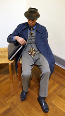
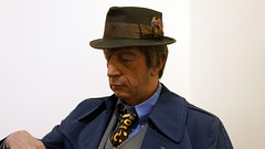
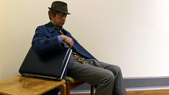
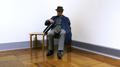
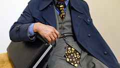
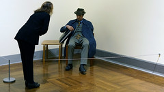
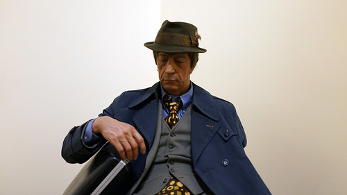
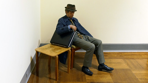
Duane Hanson, Executive, originally titled, Another Day
by DR. HALONA NORTON-WESTBROOK, TOLEDO MUSEUM OF ART and DR. STEVEN ZUCKER
Video \(\PageIndex{25}\): Duane Hanson, Executive, originally titled, Another Day, 1971, polyester resin and fiberglass, oil paint, mixed media with accessories, life size (Toledo Museum of Art, ©estate of the artist)
Additional resources
Smarthistory images for teaching and learning:
Faith Ringgold, Dancing at the Louvre
Marcia and her three little girls took me dancing at the Louvre. I thought I was taking them to see the Mona Lisa. You’ve never seen anything like this. Well, the French hadn’t either. Never mind Leonardo da Vinci and Mona Lisa, Marcia and her three girls were the show.
— Willa Marie Simone, Dancing at the Louvre
Breaking rules
Faith Ringgold’s Dancing at the Louvre is all about breaking the rules, and having lots of fun while doing it. Combining representational painting and African-American quilting techniques with the written word, Dancing at the Louvre is the first in Ringgold’s series of twelve “story quilts” called The French Collection.

The series tells the fictional story of Willa Marie Simone, a young black woman who moves to Paris in the early 20th century. Told through text written around the margin of each quilt, Willa Marie’s adventures lead her to meet celebrities such as Pablo Picasso and Henri Matisse, Josephine Baker, Zora Neale Hurston, Sojourner Truth, and Rosa Parks on the road to becoming an artist and businesswoman.
Drawing on her own struggle for recognition in an art world dominated by European traditions and male artists, Ringgold uses this narrative format to literally rewrite the past by weaving together histories of modern art, African-American culture, and personal biography. This practice reflects the shift toward postmodernism in art of the 1980s and 1990s. In deliberate contrast to Modernism’s emphasis on autonomy and universal meaning, artists like Ringgold highlighted the implicit biases in accepted forms of art, especially in their treatment of race and gender. Characteristic is her use of appropriation, narrative, biographical references, and non-Western traditions. Through these devices, Ringgold offers an alternative to the European and masculine perspectives that are prevalent in art history.
Story-quilts
Ringgold’s story-quilting technique is important to meaning in her work. She creates the central image using acrylic paint on canvas, reflecting her knowledge of western art history in both style and subject matter, and surrounds it with a patchwork cloth border that includes her hand-written text. She then uses traditional quilting methods to sandwich a layer of batting by stitching the decorative front to the plain cotton backing.

She first developed this format in Who’s Afraid of Aunt Jemima (1983), a large quilt that transformed the marketing stereotype into Jemima Blakey, a successful black businesswoman. Comprised of squares of fabric, painted portraits, and text, Ringgold’s quilt draws on Afro-Caribbean storytelling practices to create the Blakey’s family folklore. Made soon after the death of Ringgold’s mother Willi Posey (a seamstress and fashion designer in Harlem), the quilt also serves as personal tribute to the inspiration and creative skills she passed on to her artist-daughter.
Ringgold’s technique positions her work more in the world of folk art and craft than European traditions of fine art. Associated with women’s domestic work, quilt making has historically been important to maintaining female relationships. Quilting is often done collectively, allowing women time to gather and have conversations away from men or others outside their community. Young girls watch and participate in the activity in order to learn family stories, cultural background, shared knowledge, and technical skills associated with their maternal and domestic roles. Although quilts are common in a number of cultures, Ringgold’s African-American heritage recalls their historical role, especially within the Underground Railroad, to communicate codes and hidden messages that remain unrecognized by outsiders to the community. (The Underground Railroad was a network of secret routes and safe houses in the 19th century that allowed slaves of African descent to move northward to freedom.)
Rewriting the past
Typical of much postmodern art, Ringgold’s work appropriates recognizable imagery and alternative artistic practices to offer critical cultural commentary. She challenges us to consider expectations of gender and race, as well as traditional expectations and values of what art might be. Through image and text, Ringgold rewrites history to make a place for women like herself in its historical development.
The transformative power of Ringgold’s message led her to translate her work into picture books for children. Her first Tar Beach (1991), based on a 1988 story quilt in the Solomon R. Guggenheim Museum in New York, received the 1992 Caldecott Honor Award. She has since published several others including Aunt Harriet’s Underground Railroad in the Sky (1992) and If A Bus Could Talk: The Story of Rosa Parks (1999) inspired by African-American history and her own life story.
Additional Resources:
Faith Ringgold, Ben
by DR. HALONA NORTON-WESTBROOK, TOLEDO MUSEUM OF ART and DR. BETH HARRIS
Video \(\PageIndex{26}\): Faith Ringgold, Ben, c. 1978, soft sculpture/mixed media, 99.1 x 30.5 x 30.5 cm (Toledo Museum of Art, ©Faith Ringgold)
Additional resources
Smarthistory images for teaching and learning:


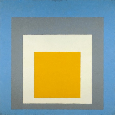
Josef Albers, Homage to the Square
by SHAWN ROGGENKAMP

Looking deeply
Take a moment to really look deeply at this example of Josef Albers’ extensive series, Homage to the Square. The composition of this painting is simple enough – four progressively smaller squares within each other, each in a different color, and all aligned closer to the bottom of the composition than to the top.
So stand back from this Homage to the Square and look at the whole thing. What is the relationship between the squares? Are they stacked on top of each other, like cut out pieces of construction paper? Are they sinking underneath each other, as if you are looking at a painting of a tunnel? Do some appear to push toward you and others to fall away? And how does it change between each version of the painting? Looking at the pieces, you may find that you are able to force your eyes to see a stack of blocks or a tunnel, or you may find that you are instinctively drawn to one interpretation of how the squares are arranged. This is exactly the principle that Albers experimented with as he produced hundreds of variations on this theme over a period of about 25 years. These included paintings, drawings, prints, and tapestries—but each explored the same basic question: can an artist create the appearance of three dimensions, using only color relations?
The Bauhaus
Though Albers began work on the Homage paintings in 1950, he was introduced to color theory very early in his career, when he enrolled as a student at the Bauhaus in 1920. The Bauhaus was a revolutionary school of art and design in Germany, founded by Walter Gropius in 1919. Its philosophy was to integrate the principles of fine art and functional design, and many of the most important artists in Europe were teachers there. When Albers was a student, the foundation for all Bauhaus education was the Vorkurs, or preliminary course, taught by Johannes Itten. The course covered the fundamentals of material, composition, and color theory, and was one of the most influential and widely disseminated aspects of Bauhaus curriculum.

Many studies done by students as part of the Vorkurs can be seen in museums and exhibitions, and they often bear a resemblance to Albers’ Homage paintings: a repeated series of shapes, each in different color combinations. The goal of these exercises was for the students to understand how colors related to each other. Many years later, Albers used the Homage paintings to go into even more depth with those lessons, and bring them to audiences, as well as art students.
From Dessau to Black Mountain

In 1925, the year that the Bauhaus moved from Weimar to their iconic building in Dessau, Gropius invited Albers to be the first student of the Bauhaus to join the faculty. Albers worked with Paul Klee in the stained glass workshop and was the longest-serving member of the faculty when the school was shut down by the Nazis in 1933. But the Bauhaus was to be only the first of Albers’ celebrated and influential teaching positions. When that school was shut down, Albers’ and his wife, Anni—herself an influential artist and Bauhaus alumna—emigrated to the United States, where he was invited to teach at the revolutionary Black Mountain College in North Carolina, and later Yale University, where he began the first Homage paintings in 1950. An encouraging but strict teacher, Albers brought Bauhaus ideas to a new country, introducing his disciplined approach to color theory to the next generation of the artistic vanguard in America.

For all their variety of color, the Homage paintings are relatively cold and clinical. It is interesting to compare them to paintings by Mark Rothko, who produces canvasses that have strong similarities to the Homage series. Albers and Rothko both use roughly square or rectangular forms in solid colors, and both take the relationship between colors as their subject matter. But while Rothko’s paintings use variation of color to suggest or inspire certain emotional reactions, Albers’ paintings are exploring the creation of space through the use of color. He experiments with subverting the limits of two-dimensional space.
Tradition and variation

The idea of creating space through color goes back to a technique known as atmospheric perspective. The best examples can be seen in landscapes of the Dutch Golden Age and Italian Renaissance artists such as Leonardo da Vinci. The principle of atmospheric perspective is that objects that are far away are less saturated in color, and have less contrast. Looking at the mountains behind Leonardo’s Virgin of the Rocks, each set of mountains that is farther away is closer in color to the sky than the set of mountains in front of it.
This technique had been used to create space in representative paintings going back to antiquity, but Albers was revolutionary in applying it to abstract art. His experiments in the Homage series paved the way for artists such as Bridget Riley and a whole generation of Op artists, who also pushed the limits of two-dimensional media by creating large-scale optical illusions. Though Homage to the Square may seem boring and repetitive to some, their simple beauty is often compared to classical music, like the work of Bach: a study on theme and variation.

“If one says “Red” (the name of a color) and there are 50 people listening, it can be expected that there will be 50 reds in their minds. And one can be sure that all these reds will be very different.” —Josef Albers, Interaction of Color (1963)
Additional Resources:
Josef and Anni Albers Foundation
Ruth Asawa, Untitled
by ALLISON GLENN, CRYSTAL BRIDGES MUSEUM OF AMERICAN ART, and DR. BETH HARRIS
Video \(\PageIndex{27}\): Ruth Asawa, Untitled, c. 1958, iron wire, 219.7 × 81.3 × 81.3 cm (Crystal Bridges Museum of American Art, © Estate of Ruth Asawa)