
10.4: Cubism + early abstraction (I)
- Page ID
- 147830
Cubism and early abstraction
A new, modern world demanded new ways of seeing and representing the things in it.
c. 1907 - 1939
Additional resources:
Abstract art definition from the Tate
Abstract art resources from The Metropolitan Museum of Art’s Heilbrunn Timeline of Art History
Smarthistory images for teaching and learning:
Who created the first abstract artwork?
by DR. CHARLES CRAMER and DR. KIM GRANT
Abstract art — also called “non-representational” or “non-objective” — has long been considered a central achievement of modernism. Several early-twentieth century artists claimed to be the first to make a completely abstract artwork, and although it turns out to be surprisingly difficult to fully settle the question, we will consider some of the main contenders below.
Defining the terms
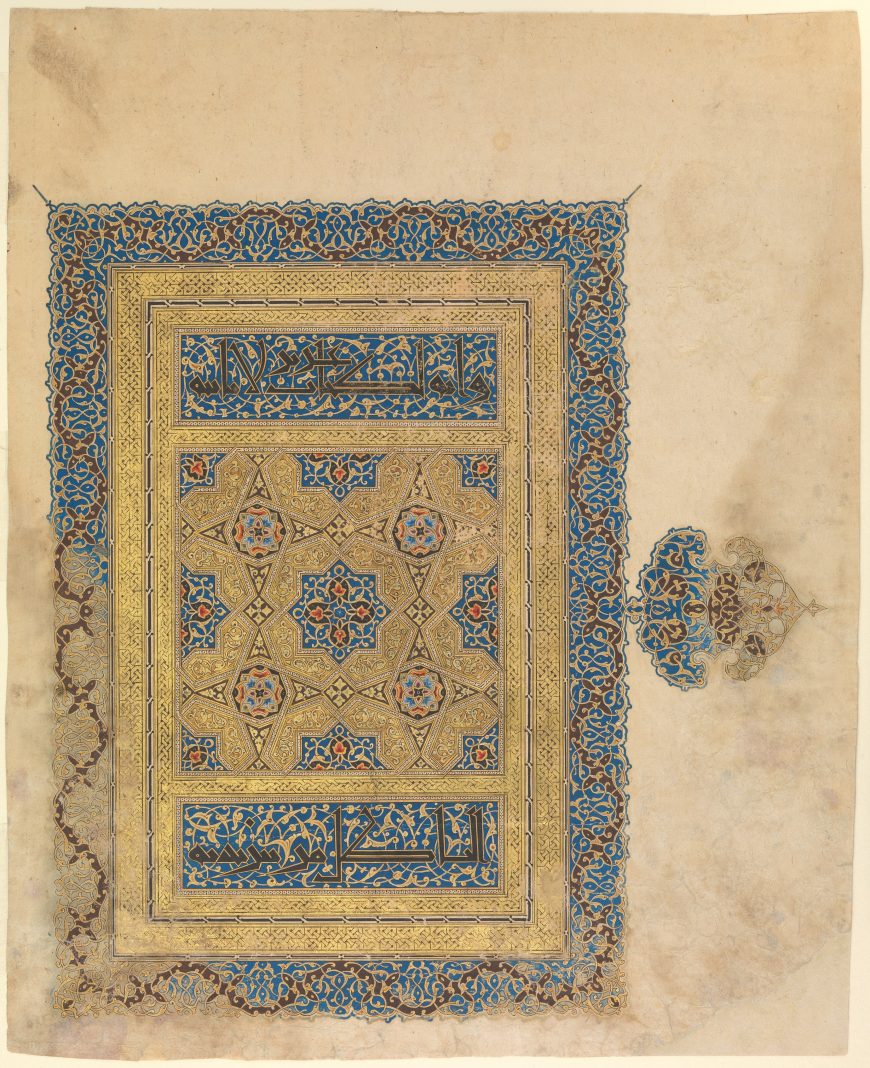
This 14th-century manuscript painting pre-dates the modern contenders for the first abstract work by over six hundred years. It is one example from a long Islamic tradition of non-representational art. Works like this are generally ignored in discussions about who made the first abstract painting, which reveals that the debate is, in fact, quite limited in its focus. We really mean, “Who in Western culture created the first abstract work?” Like Columbus “discovering” America, it turns out that there were actually a lot of people already there.
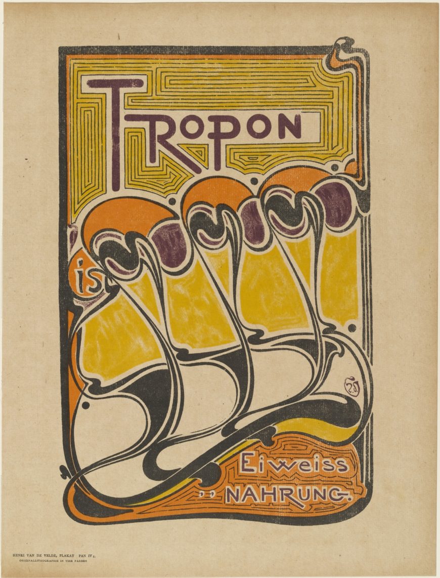
Van de Velde’s poster advertising the protein extract Tropon displays an abstract design of stylized, vaguely organic shapes. Why is this also not generally considered a viable contender for the first abstract work? We find that we need to limit the question again: the first abstract work must have been made as “fine art.” Decorative art and commercial design don’t count. This distinction can seem very arbitrary, since many modern artists worked as commercial designers at times, and modern design is also often collected by art museums.
What we are really looking for, then, is not truly “the first” abstract artwork. Instead, we are seeking the first abstract artwork that was intentionally created in the context of the post-Renaissance Western art world, when fine art was expected to be representational.
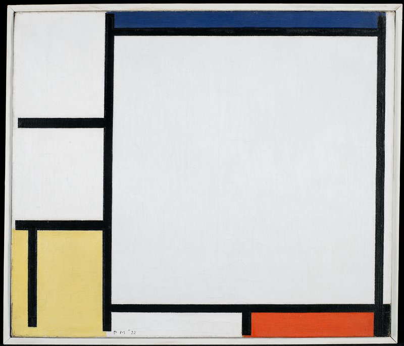
A De Stijl contender
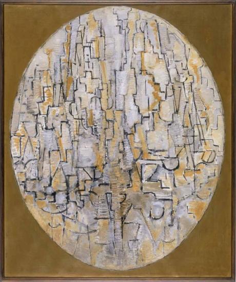
Piet Mondrian wrote extensive justifications of abstract art, demonstrating a clear awareness of how radical he felt the move to abstraction was for fine art. Over the course of the 1910s he produced several series of works through a process that he explicitly called “abstraction,” etymologically defined as “pulling away” elements of natural appearances from observed objects until eventually they bore no resemblance to those objects.
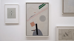
The work above is part of his series of abstracted trees: perhaps the two parallel vertical lines in the lower center are a trunk, and the oval frame defines the crown of the tree. However, if we approached the work in a museum without that information, it would be easy to see it as abstract in the sense of entirely non-representational. The gradual nature of Mondrian’s evolution makes it very difficult to state when he first created a fully abstract work.
The titling of works can further complicate the issue: this work was titled “Tableau” or “Composition” by Mondrian, asking us to see it as just a composition of lines, shapes, and colors. An equally abstract-seeming work from the same year is called “The Tree A,” which asks us to see a tree where otherwise we might not. Should determining whether a work is abstract depend on its title or other extrinsic information?
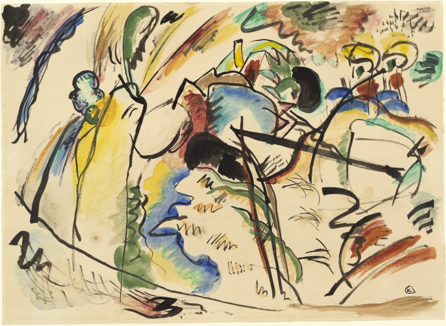
Kandinsky’s spiritual vision
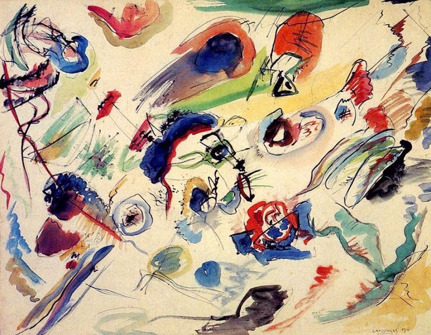
Vasily Kandinsky backdated this work to 1910 (in the signature at the lower right), probably in order to claim that he was the first abstract artist — most art historians believe it dates to 1913. His 1909 text On the Spiritual in Art justifies abstraction in art as more spiritual than representation. However he, like Mondrian, approached abstraction very gradually. Even this painting is ambiguously abstract. It is part of a group of works based on imagery of the apocalypse, and, like Mondrian, Kandinsky “abstracted” that imagery to reduce material references.
In many paintings the imagery is very difficult to recognize, but it is still there. Kandinsky famously described seeing one of his own paintings as “only form and colors . . . . whose content was incomprehensible,” but this was only because the work was on its side. Viewing it from the proper angle he saw the painting’s apocalyptic imagery.\(^{[1]}\)
Both Mondrian and Kandinsky eventually went on to create unequivocally non-representational artwork, but where is the line between representation and abstraction when the abstracted forms are derived from representational images that only a few people, if any, can recognize? Is abstraction in the eye of the beholder?
Appreciating color and music
In the early twentieth century many people (including Kandinsky) justified abstract painting by comparing it to music. When we listen to instrumental music we do not generally compare it to real world sounds; we just enjoy being moved by the melody, harmony, rhythm, etc., in themselves. Why should visual art be different? Why not just appreciate how we are moved by colors, shapes, and textures?
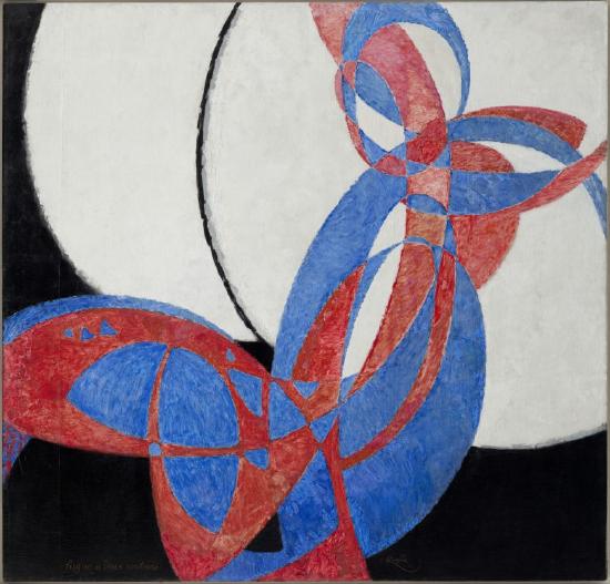
A group of artists called the Orphists, including Robert and Sonia Delaunay and František Kupka, took this route. The title of Kupka’s Fugue in Two Colors declares the painting to be the visual equivalent of a type of musical composition in which a short melody is repeated and developed in multi-part counterpoint. The looping, swelling, intertwining curves of red and blue in Kupka’s painting are understandable as visualizations of the flowing aural interweaving of the musical voices in a fugue. Again, however, there was a naturalistic source for the painting: a drawing of a girl dancing with a ball in her hand that Kupka progressively abstracted.
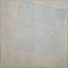
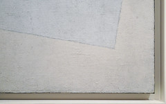
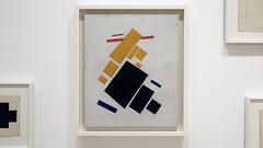
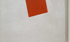
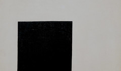
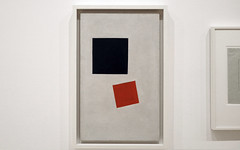
Malevich’s Suprematism
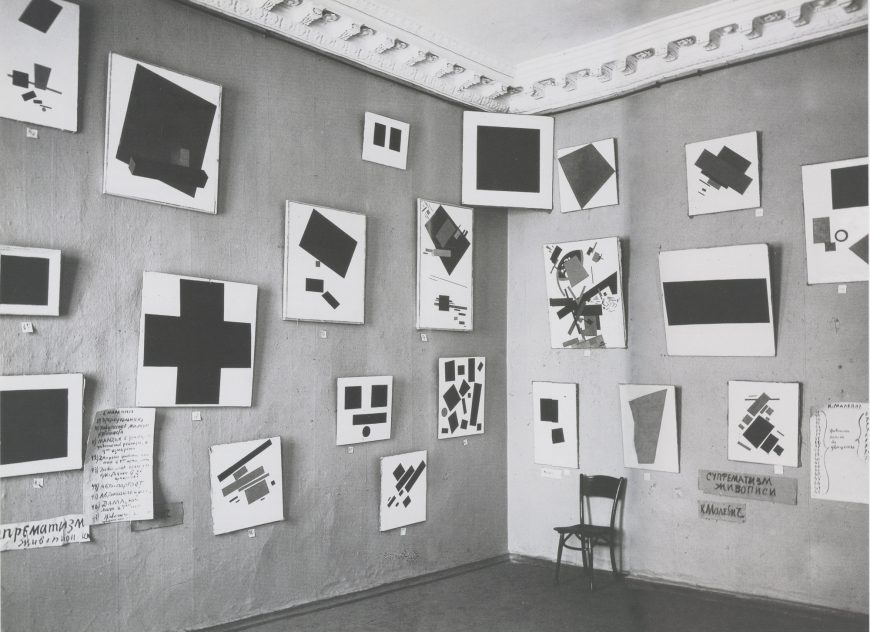
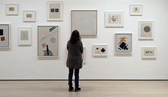
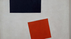
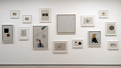
Kasimir Malevich is unusual in making the leap to pure abstraction very rapidly, rather than through a long process of abstracting natural objects. Malevich’s works in The Last Futurist Exhibition are geometric abstractions, although some of them have titles that suggest real-world references, such as Airplane Flying. Malevich claimed that he first painted a pure abstract work, Black Square, in 1913. However, there is no evidence to support this other than some loosely-related theater designs, and as we have noted, abstraction in design occurred earlier than that. This photograph of the exhibition dates to 1915, and Malevich wrote a theoretical justification of non-representational Suprematist painting the same year, making 1915 a solid terminus ante quem for the first abstract painting.
A new contender
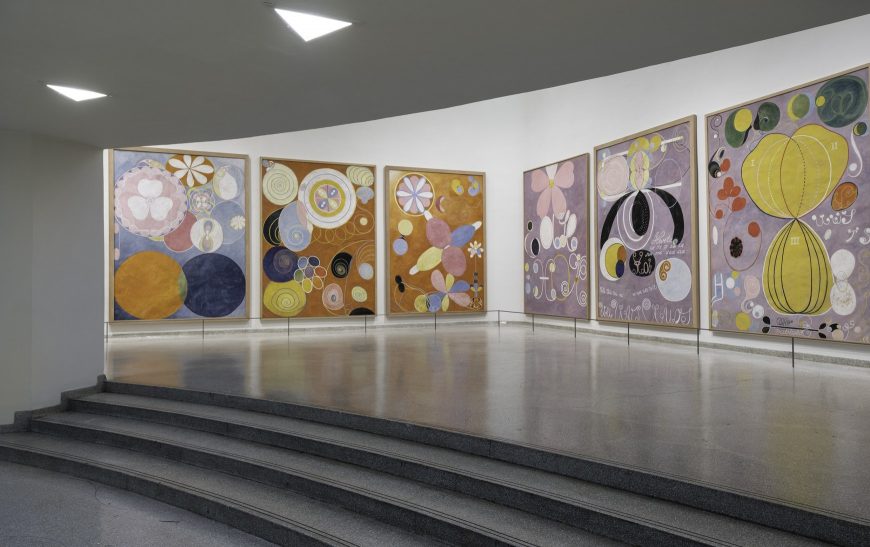
Another artist who has recently been brought forward as a candidate for painting the first abstract artwork is Hilma af Klint. Between 1906 and 1915 Klint made a series of works called Paintings for the Temple that were generated from visions she had as a spiritual medium (in fact, all of the artists considered here apart from van de Velde were motivated to create abstract art for spiritual reasons). Some of Klint’s works have recognizable natural imagery, but many others are pure geometric or biomorphic abstractions.
In terms of chronology Klint is a serious contender to be the first abstract painter, and it may be gratifying to think that it is a woman who has that distinction, despite the jockeying of her male contemporaries. Unfortunately, however, Klint’s abstract works were created completely outside the context of the modern art world. In fact, she stipulated that they not be exhibited until twenty years after her death, and as a consequence they were unknown outside of her circle of friends, and had no influence on the debates concerning the viability of abstraction in art until the question was already settled.
An unanswerable question?
In the end, it may not be possible to answer the question of who created the first abstract artwork, but even this brief survey of the main contenders raises an arguably more interesting question. Although there were common themes and some direct contacts between the artists considered here, they were largely independent, working in different countries (Sweden, Russia, Germany, France, and The Netherlands), ending up with very different-looking works, and developing substantially different rationales for practicing abstraction. For whatever reason, in the years around 1910-15 all across Europe, the time was right for abstract art to (re-)enter the Western art world.
Notes:
- Vasily Kandinsky, “Reminiscences” (1913), as translated in Robert L. Herbert, ed., Modern Artists on Art (Mineola, New York: Dover Publications, 2000), p. 29.
Additional resources:
Abstract art and Theosophy
by DR. CHARLES CRAMER and DR. KIM GRANT
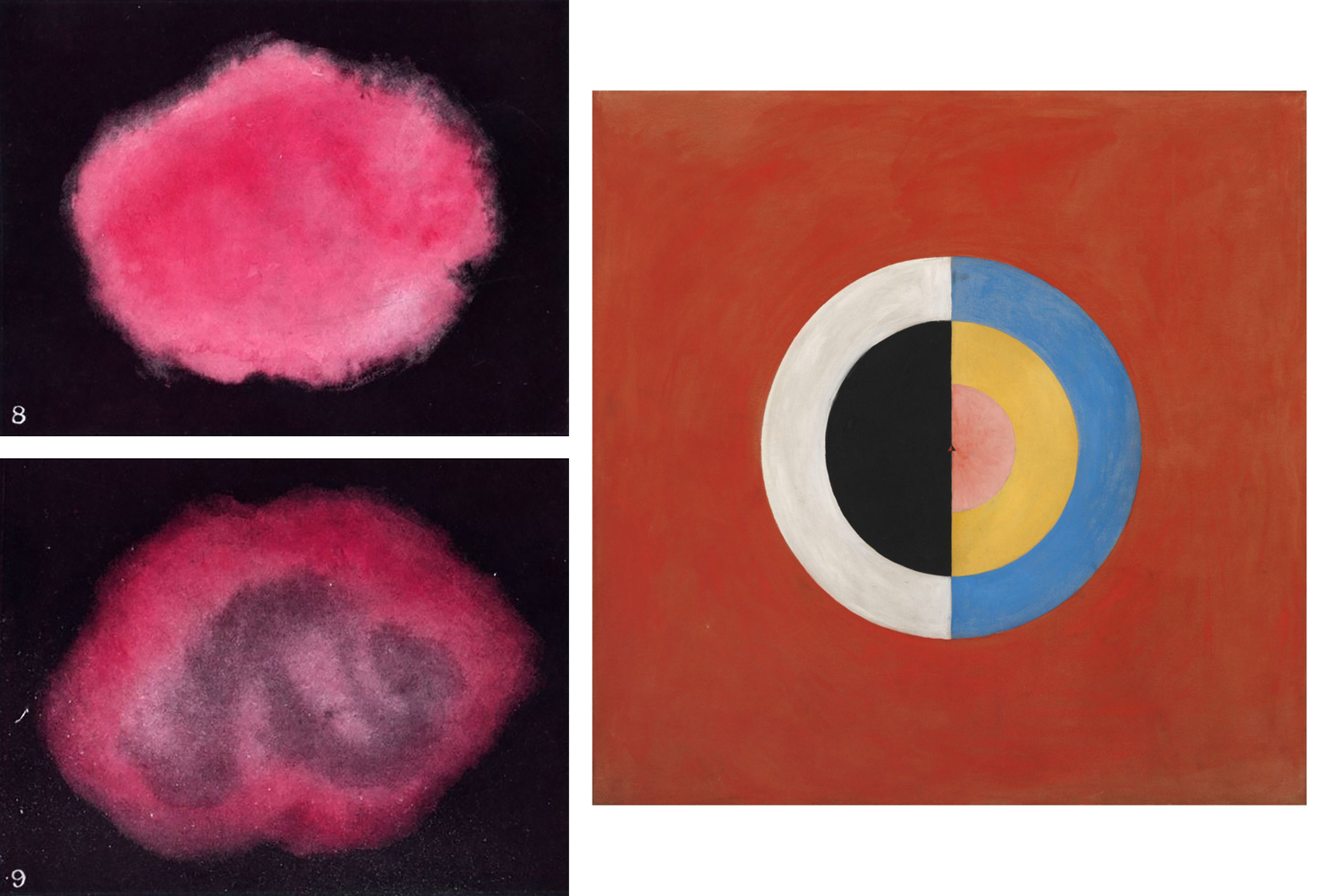
On the left, two amorphous pinkish clouds float against a black field; and on the right, a nested set of hard-edged, bisected disks converge toward a tiny equilateral triangle. These images look like they belong in the milieu of mid-twentieth century Abstract Expressionism, but they were actually produced almost half a century earlier by two remarkable women, Annie Besant and Hilma af Klint. They provide the first hints of the way in which abstract art was underwritten by a very surprising source: an occult spiritualist movement called Theosophy. Many early abstractionists, including Vassily Kandinsky, Piet Mondrian, Kasimir Malevich, and František Kupka, as well as Hilma af Klint, cited Theosophy as a direct source for their ideas and works.
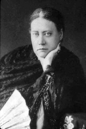
The Theosophical Society, founded in 1875, was probably the most influential spiritualist organization of the late-nineteenth and early-twentieth century. Theosophy was a highly eclectic mixture of religious, philosophical, and occultist ideas. One of the founders, Madame Blavatsky, wrote books that mix elements of Hinduism and Buddhism with Ancient Greek philosophy and modern science.
The Society had no formal dogma or established rituals, and had multiple, sometimes competing, centers and leaders around the world. Its members generally believed that there were truths beyond the reach of science, and that throughout history certain enlightened individuals or Mahatmas (including Abraham, Jesus, Buddha, and Confucius) used spiritual discipline to grasp these truths and obtain supernatural powers.
Symbolism
The connection between Theosophy and formally-innovative modern art begins in the late-nineteenth century, when some artists and writers reacted strongly against the materialism of an age dominated by science and industrialization. In an 1892 essay, the art critic Albert Aurier decried the futility of scientific reasoning in the face of the deeper mysteries of life:
The nineteenth century, after having proclaimed for eighty years, in its infantile enthusiasm, the omnipotence of observation and of scientific deduction, after having affirmed that no mystery could survive its lenses and its scalpels, seems finally to realize the vanity of its efforts, the puerility of its boasts.
Aurier saw hope for the future in a new art movement called Symbolism, led by Paul Gauguin. Gauguin’s work demonstrates his rejection of science and modernity most obviously in its turn away from the modern, urban subjects preferred by the Impressionists in favor of rural and religious subject-matter. His Vision after the Sermon, which Aurier described as the first masterpiece of the new movement, shows a group of Breton peasant women leaving church and having a collective vision of the Biblical patriarch Jacob wrestling an angel (Genesis 32:22-32).
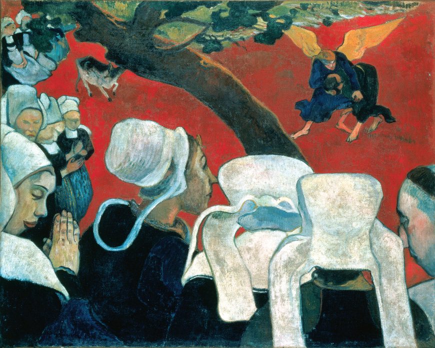
Equally important is the work’s style, which rejects what had been a constant in Western art since the Renaissance: a basis in naturalism. Anatomy in Gauguin’s work is rendered with the crude simplicity of a medieval woodcut. There is very little chiaroscuro to indicate volume, and the ground is painted a virtually unmodulated red, defying expectations of both spatial recession and naturalistic color choice.
Following Gauguin, a number of Symbolist artists affirmed this linkage of a simplified or abstracted style with higher spiritual content. Prominent among these was a group who called themselves The Nabis, after the Hebrew word for “prophet.” They were influenced by the Theosophist Edouard Schuré, whose book Les Grands Initiés (1889) recounts the esoteric wisdom of an eclectic group of spiritual “initiates,” including Krishna, Hermes, Moses, Pythagoras, Plato, and Jesus.
Paul Sérusier’s Portrait of Paul Ranson shows the Nabi artist in an elaborate blue-and gold robe, holding a gold staff decorated with symbols, and reading from a medieval-style illuminated manuscript. Behind him a red circle creates a mystic halo, and also shows the flat bright colors and abstract designs favored by the Nabis.
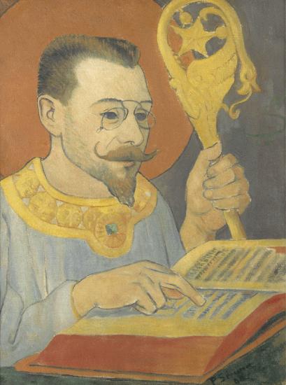
Although the juxtaposition of Ranson’s 19th century pince-nez, waxed mustache, and well-trimmed goatee with this Medieval and esoteric regalia is somewhat incongruous (and may well have been intended to be tongue-in-cheek), it does demonstrate the spiritual aspirations of the group.
Spiritual visions
Theosophists often claimed that the “initiated” had an ability to directly perceive spiritual manifestations in the world around us. The Besant and Klint works with which we began were the result of such visions. Besant was a medium who was able to perceive color auras or “thought-forms” emanating from individuals that revealed their emotional and spiritual state. The upper pink cloud of “vague pure affection” was seen issuing from someone who was “happy and at peace with the world, thinking dreamily of some friend,” while the one below shows affection intermixed with “the dull hard brown-gray of selfishness,” and thus indicates affection based upon the pleasure of favors received or anticipated \(^{[1]}\).
Klint was a member of a group of five women in Sweden who used séances to communicate with the spirits of deceased Mahatmas in order to recover lost wisdom. She claimed that her series of Paintings for the Temple were
…painted directly through me [by these spirits], without any preliminary drawings, and with great force. I had no idea what the paintings were supposed to depict; nevertheless I worked swiftly and surely, without changing a single brush stroke.
Theosophy and Modernism
Theosophy aligned so well with modern art because it validated the idea that European art’s traditional naturalistic style, which (they believed) merely imitates the surface appearances of nature, is inadequate to explain the deep underlying mysteries of the universe. For the theosophists and the artists who were influenced by them, there are truths inaccessible to the scientific method, and a meta-reality beyond the reach of human perception. Theosophy was a source for many artists who sought higher spiritual truths and a non-perceptual basis for their art, and it validated the idea that a fully spiritual art would leave behind all basis in natural objects and would be fully abstract.
It is important to recognize, however, that the styles inspired by Theosophy were remarkably diverse, ranging from Mondrian’s rigidly rectilinear geometry to Kandinsky’s improvisational painterly exuberance. The spiritual meta-reality appeared to different artists in remarkably diverse guises.
Theosophy was also undoubtedly compelling to some artists because of its suggestion that the artists themselves could be counted among the initiates, and that they had a mission to enlighten humankind. In his treatise Concerning the Spiritual in Art (1909), Kandinsky imagines the spiritual evolution of humankind as an upward-moving triangle articulated with different levels of enlightenment, from the ignorant masses at the base to the few initiates at the apex. Those toward the top of the triangle cannot be understood by those below them – thus helping to explain the poor critical reception of innovative modernist art such as Kandinsky’s – but nonetheless are leading humanity upward in their spiritual evolution.
Notes:
- Annie Besant and C. W. Leadbetter, Thought Forms, New York: John Lane, 1905, pp. 40-42.
Additional resources:
Sixten Ringbom. “Art in ‘The Epoch of the Great Spiritual’: Occult Elements in the Early Theory of Abstract Painting.” Journal of the Warburg and Courtauld Institutes. vol. 29 (1966), pp. 386–418.
Maurice Tuchman, et al. The Spiritual in Art: Abstract Painting 1890-1985 (New York, London, and Paris: Abbeville Press, 1986).
Cubism
Picasso and Braque revolutionized painting with their new approach to representation.
c. 1907 - 1939
Beginner's guide to Cubism
Pablo Picasso and the new language of Cubism
by DR. BETH HARRIS and DR. STEVEN ZUCKER
Video \(\PageIndex{2}\): Pablo Picasso, The Guitarist, 1910, oil on canvas, 100 x 73 cm (Centre Pompidou, Paris)
Smarthistory images for teaching and learning:
Inventing Cubism
by DR. BETH HARRIS and DR. STEVEN ZUCKER
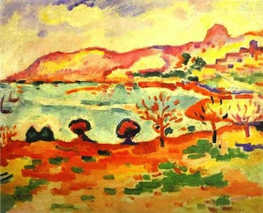
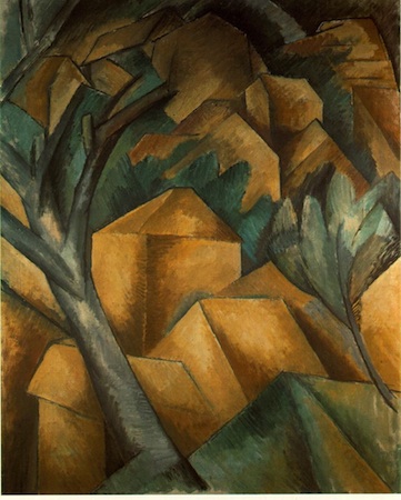
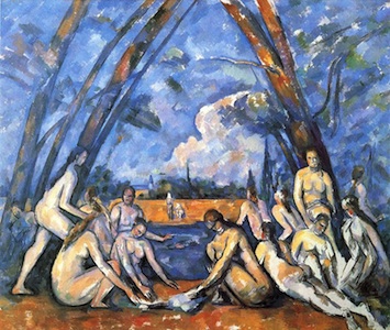
During the summer of 1908, Braque returned to Cézanne’s old haunt for a second summer in a row. Previously he had painted this small port just south of Aix-en-Provence with the brilliant irrevent colors of a Fauve (Braque along with Matisse, Derain, and others defined this style from about 1904 to 1907). But now, after Cézanne’s death and after having met Picasso, Braque set out on a very different tack, the invention of Cubism.
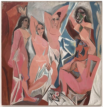
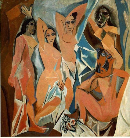
Cubism is a terrible name. Except for a very brief moment, the style has nothing to do with cubes. Instead, it is an extension of the formal ideas developed by Cézanne and broader perceptual ideas that became increasingly important in the late 19th and early 20th centuries. These were the ideas that inspired Matisse as early as 1904 and Picasso perhaps a year or two later. We certainly saw such issues asserted in Les Demoiselles d’Avignon. But Picasso’s great 1907 canvas is not yet Cubism. It is more accurate to say that it is the foundation upon which Cubism is constructed. If we want to really see the origin of the style, we need to look beyond Picasso to his new friend Georges Braque.
A New Perspective
The young French Fauvist, Georges Braque that had been struck by both the posthumous Cézanne retrospective exhibition held in Paris in 1907 and his first sight of Picasso’s radical new canvas, Les Demoiselles d’Avignon. Like so many people that saw it, Braque is reported to have hated it—Matisse, for example, predicted that Picasso would be found hanged behind the work, so great was his mistake. Nevertheless, Braque stated that it haunted him through the winter of 1908. Like every good Parisian, Braque fled Paris in the summer and decided to return to the part of Provence in which Cézanne had lived and worked. Braque spent the summer of 1908 shedding the colors of Fauvism and exploring the structural issues that had consummed Cézanne and now Picasso. He wrote:
It [Cézanne’s impact] was more than an influence, it was an invitation. Cézanne was the first to have broken away from erudite, mechanized perspective…\(^{1}\)
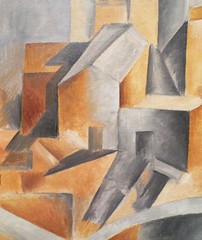
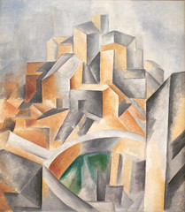
Like Cézanne, Braque sought to undermine the illusion of depth by forcing the viewer to recognize the canvas not as a window but as it truly is, a vertical curtain that hangs before us. In canvases such as Houses at L’Estaque ( 1908), Braque simplifies the form of the houses (here are the so called cubes), but he nullifies the obvious recessionary overlapping with the trees that force forward even the most distant building.
Brothers of Invention
When Braque returned to Paris in late August, he found Picasso an eager audience. Almost immediately, Picasso began to exploit Braque’s investigations. But far from being the end of their working relationship, this exchange becomes the first in a series of collaborations that lasts six years and creates an intimate creative bound between these two artists that is unique in the history of art.
Between the years 1908 and the beginning of the First World War in 1914, Braque and Picasso work together so closely that even experts can have difficulty telling the work of one artist from the other. For months on end they would visit each others studio on an almost daily basis sharing ideas and challenging each other as they went. Still, a pattern did emerge and it tended to be to Picasso’s benefit. When a radical new idea was introduced, more than likely, it was Braque that recognized its value. But it was inevitably Picasso who realized its potential and was able to fully exploit it.
Tough Art
By 1910, Cubism had matured into a complex system that is seemingly so esoteric that it appears to have rejected all esthetic concerns. The average museum visitor, when confronted by a 1910 or 1911 canvas by Braque or Picasso, the period known as Analytic Cubism, often looks somewhat put upon even while they may acknowledge the importance of such work. I suspect that the difficulty, is, well…, the difficulty of the work. Cubism is an analysis of vision and of its representation and it is challenging. As a society we seem to believe that all art ought to be easily understandable or at least beautiful. That’s the part I find confusing.
1. As quoted in William Rubin, Picasso and Braque: Pioneering Cubism, New York: The Museum of Modern Art, 1989, p.353.
Additional resources:
Cubism on the Metropolitan Museum of Art’s Heilbrunn Timeline of Art History
Smarthistory images for teaching and learning:
Cubism and multiple perspectives
by DR. CHARLES CRAMER and DR. KIM GRANT
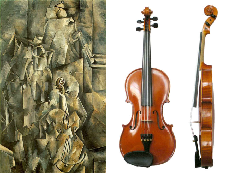
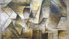
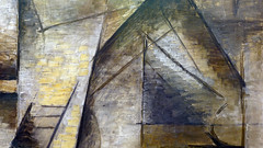
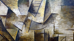
At first sight the objects in Georges Braque’s Pitcher and Violin appear arbitrarily distorted, but they are not. One tactic that Braque uses here is depicting objects from multiple perspectives. While most of Braque’s violin is depicted frontally, like an illustration in an encyclopedia, the scroll at the top of the neck is represented from the side, and the bridge that holds the strings over the neck and sound board has been flipped up.
The pitcher is also depicted mostly from the side, but we see the top rim from above on the left-hand side, while the spout is depicted from a slightly less elevated angle. Similarly, while Braque appears to have depicted the violin standing improbably on its bottom edge, it is more likely that we are expected to understand it as lying flat on a table. Thus, we are looking down on the violin at the same time as we look straight ahead at the body of the pitcher and the wall behind the table.
Cubism as higher truth
This use of multiple perspectives became a hallmark of the Cubist style, but Braque and Picasso never explained why they employed this technique. One common contemporary interpretation argued that the use of multiple perspectives allows greater truth and accuracy than the traditional naturalistic style that had dominated art since the Renaissance. In 1912, the writer and art critic Jacques Rivière argued that linear perspective creates unrealistic distortions. For example, if we stand in the middle of railroad tracks, they appear to converge and meet at a point, when in fact they remain parallel.
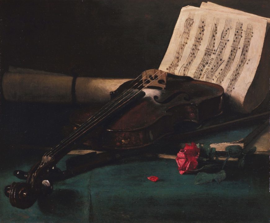
François Bonvin’s painting of a violin shows how much the instrument is skewed and distorted when viewed in perspective. Parts nearer the viewer are larger than parts further away, and some parts are compressed by foreshortening while others are occluded entirely. Rivière wrote that such distortions are corrected in real life simply by moving around objects to see their true shapes.
A step to the right and a step to the left [can] complete our vision. The knowledge we have of an object is … a complex sum of perceptions … the object must always be presented from the most revealing angle.
Jacques Rivière, “Present Tendencies in Painting” (1912), as translated in Edward Fry, ed., Cubism (New York and Toronto: Oxford University Press, 1966), p. 77.
Braque represents the key parts of the violin from the most revealing angle. For example, the scroll is flipped to the side because if viewed from the front like the rest of the violin, it would not be visible at all. At the same time, though, if the scroll were viewed from the side, we would only see two of the tuning pegs, so Braque flips the view again to straight on so that all four pegs are visible.
Perspective is a deliberate lie
In 1912, the writer Olivier-Hourcade provided another example of how Cubist paintings correct the distortions of perspective:
The painter, when he has to draw a round cup, knows very well that the opening of the cup is a circle. When he draws an ellipse, therefore, he is not sincere, he is making a concession to the lies of optics and perspective, he is telling a deliberate lie.
Olivier-Hourcade, “The Tendency of Contemporary Painting” (1912), as translated in Fry, Cubism, p. 74.
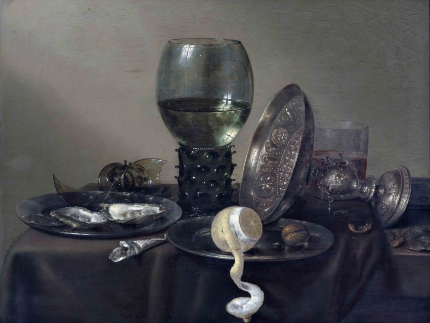
Look at all of the ellipses (flattened circles) in the Heda still-life above: the lip of the glass, the goblet, and the silver pedestal bowl, as well as the two pewter plates and the sliced lemon. All of these shapes are circles in real life; they only appear to be ellipses because of the angle from which they are viewed. The painter can correct this illusion simply by depicting these shapes from straight on, so the circle reveals its true shape.
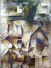
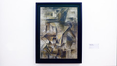
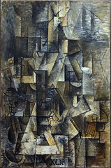
Recognizing objects in Cubism
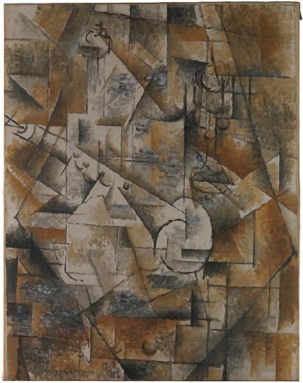
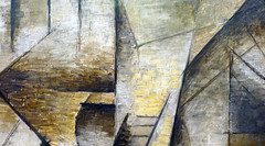
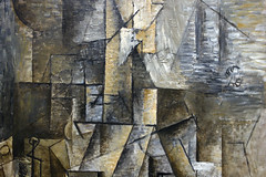
The subject of this still life may be difficult to discern, but with the help of the title we can begin to pick out the represented objects. The clarinet is the white rectangular shape in the left of the painting. Four finger holes extend up its length, which is shaded with chiaroscuro to suggest its tubular volume.
Note that while the bulk of the instrument is seen from the side, the opening at the base in the center of the painting is round, and a semicircle and schematic triangle at the other end by the edge of the canvas suggest the wedge-shaped cut out of the mouthpiece where the reed sits.
Above the clarinet’s finger holes, we can see a wine bottle with schematic, squared-off shoulders. Its transparency is indicated by the fact that we can see the clarinet through it. Notice that here, too, while we see the bulk of the bottle from the side, Braque has rendered the bottle’s mouth as a circle, as though seen from above, while a quarter-circle indicates the round base below.
With familiarity, we can begin to recognize objects in Cubist still-lifes even when they are not explicitly mentioned in the title. In the upper right quadrant of this painting there is a stemmed glass, again seen mostly from the side, but circles at the base, lip, and stem indicate the perfect roundness of those parts.
An art of conception, not perception
Jacques Rivière also argued that monochromatic color and inconsistent lighting are more truthful means to depict reality than traditional naturalism. As the Impressionists had demonstrated, the appearance of objects changes radically in different kinds of light.
Monochromatic color eliminates the variables of lighting to represent objects in their true form, as we know them to be, rather than showing them distorted by our vision. For this reason, Cubism was often seen as an art of conception rather than perception. Cubist paintings represented the composite idea of objects that we have in our heads, rather than rendering objects from one point of view, at one moment in time, and in one kind of light.
Cubism vs. illusionism
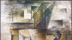
Braque and Picasso were well aware of how revolutionary their new way of representing objects was. As if marking the very different approaches to “realism” employed by Cubism and traditional naturalism, Braque painted a nail in the top center of Pitcher and Violin. Although it is rendered in a relatively cursory manner, its darkness and cast shadow make it appear at first sight as though it were a real nail pinning the painting to the wall.

This refers to a tradition of nineteenth-century trompe l’oeil painting that was the culmination of Renaissance naturalism. Trompe l’oeil paintings are so detailed and convincing that the viewer is fooled into thinking they are real.
Everything in this Harnett still life is painted: the violin, the door, the rusty hinges and nails, the lock, and even the wooden frame. Although this is the style that is usually taken as being the most “realistic,” it is in fact an illusion: it’s only paint on canvas. The use of multiple perspectives to show objects’ true shapes is arguably more true to reality.
Incomprehensible fins
The idea of Cubism as a more truthful representation of objects based on the use of multiple perspectives to build up a composite, conceptual representation was one of the dominant interpretations of the movement. It does not, however, fully account for what we see in the works, and it should be remembered that Braque and Picasso did not articulate or endorse this interpretation.
One thing that this interpretation does not account for is what can be called the “background noise” of Cubist paintings. While some shapes in Braque’s Pitcher and Violin and Clarinet and Bottle can be seen as articulating the shapes of those objects from multiple perspectives, others appear to be just arbitrary fragments. Also, as the style of Cubism evolved, Braque and Picasso broke objects up into smaller and smaller facets, until they are virtually unrecognizable in a shallow plane of monochromatic shards.
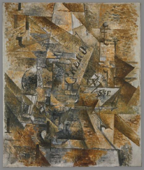
More oddly still, not only are the objects themselves faceted, it appears as though the empty space between them has also been shattered into facets. In some works, paint is applied in an almost brick-like fashion, further contributing to the background noise, until only a few clues (and the titles) hint at what is being represented.
Rivière found such paintings perplexing:
To each object they add the distance which separates it from neighboring objects … and in this way they show it prolonged in all directions and armed with incomprehensible fins. The intervals between forms—all the empty parts of the picture, all the places in it occupied by nothing but air, find themselves filled up by a system of walls and fortifications.
Jacques Rivière, “Present Tendencies in Painting” (1912), as translated in Edward Fry, ed., Cubism, p. 79.
Although this is a fairly accurate description of late Cubist painting, Rivière was unable to explain its motivations and claimed that these were “mistakes.” His highly rational view of Cubism led him to dismiss the elements of the style that did not conform to his ideas. Rivière’s “multiple perspectives as higher truth” interpretation is compelling, and as we have seen backed by some visual evidence, but there are clearly other facets to Picasso’s and Braque’s Cubism.
Additional resources:
Edward Fry, ed., Cubism (New York and Toronto: Oxford University Press, 1966)
Read and listen to more about Still life with Banderillas at the Metropolitan Museum of Art
Synthetic Cubism, Part I
by DR. CHARLES CRAMER and DR. KIM GRANT
Starting in 1912, surprising new elements begin to turn up in works by Pablo Picasso and Georges Braque: cut-up pieces of newspaper, wallpaper, construction paper, cloth, and even rope. Although the resulting collages are visually very different from the largely monochromatic oil paintings most commonly associated with the movement, they are still considered to be part of Cubism.
Partly this is because these works often included drawings that use techniques associated with Cubism, such as deconstructing objects into fragmented, angular forms seen from multiple perspectives. Beyond this similarity, though, there is also another, more conceptual one. This new phase of Cubism is also dedicated to exploring the ambiguities of representation, now on an even wider scale.

Fruit Dish and Glass is Braque’s first work using papier collé (pasted paper), a subset of collage made using only paper. Picasso’s first collage, Still Life with Chair Caning preceded Braque’s Fruit Dish and Glass by a few months and was made from a variety of materials including oilcloth and rope. Papier collé was a central medium in the second phase of Braque’s and Picasso’s joint Cubist investigations commonly known as Synthetic Cubism.
Retreat from abstraction
During this phase both artists retreated from the verge of total abstraction they had reached in their late Analytic Cubist paintings. Synthetic Cubist works use multiple forms of representation, combining the abstracted forms of Analytic Cubism with color, collage, and even sometimes naturalistic representations, to create a complex whole.
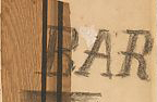
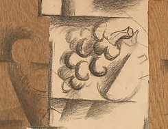
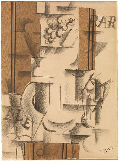
In Fruit Dish and Glass, Braque combines Cubist drawing with illusionistic representation, words, and decorative paper printed with a wood grain pattern (faux bois). At the top we see a bunch of grapes drawn relatively naturalistically, with light and shade defining its three-dimensional forms. The remaining still-life objects are depicted in an Analytic Cubist style that deconstructs them into arcs, cylinders, and flat planes representing a fruit dish, plates, and glasses on a table. The words “BAR” and “ALE” are frequently seen on signs and labels in cafés and indicate the general location of the still life.
References to traditional illusionism
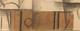
Charcoal drawing extends over the strips of wood grain paper that frame and anchor the central forms. The two vertical strips in the upper portion represent wood paneling on a café wall behind the still life, while the horizontal strip below represents a wooden table supporting the dishes and fruit. A circle drawn on the lower strip of wood grain paper suggests the round knob of a drawer pull. This is a reference to illusionistic paintings, which often depict handles and knobs facing the viewer to enhance the sense of the objects being real and within easy reach.
The naturalistic grapes framed by lines and pasted paper at the top of the work are also a specific reference to the Western tradition of illusionistic representation. A famous story from Ancient Greece describes how the painter Zeuxis was so skilled an artist that birds tried to eat the grapes he painted. Braque centers his drawn grapes as a well-known example of traditional naturalism and then surrounds them with alternative strategies of representation.
Signifying real objects by other means
The Cubist drawings of suggestive geometric forms are, like the words BAR and ALE, a means of referring to or signifying real objects. If we know the language we know what a word signifies; this is true of French and English, and it is (at least theoretically) true of Cubist forms as well. Once we are aware of Cubist conventions for drawing we can recognize that certain relationships of lines and shapes signify fruit, a glass, or a face. The wood grain paper is also a means of signification. The represented texture refers to the physical materials in the scene, providing further information.
In addition, wood grain paper is, like the drawn grapes, an illusion. The naturalistically depicted grapes represent the central achievement of the European fine art tradition. The wood grain paper is, by contrast, a cheap mass-produced item used for decorative purposes. Its presence undermines the exalted value of artistic skill in creating illusionistic representations, and demonstrates another feature of synthetic Cubism: the collapse of distinctions between “high” art and the cheap, ephemeral materials and techniques of mass-produced design.
A kind of certainty
Braque later wrote:
The papiers collés in my drawings have also given me a kind of certainty.
Georges Braque, “Thoughts on Painting” (1917)
This is generally understood to mean that they allowed him a way to retreat from the increasingly unmoored abstraction of late Analytic Cubism and anchor his works more solidly in relation to reality. The vaporous spaces and ambiguous forms of Analytic Cubist paintings like The Portuguese are, however, replaced by a different type of ambiguity resulting from the complex and shifting relationships of disparate materials and modes of signification.
Braque’s association of papiers collés with certainty should also be understood in terms of literalism and materiality. Picasso and Braque often employed collage elements as a shortcut means to represent objects. A newspaper in a still life of a café table will be represented by simply gluing newspaper to the picture plane, rather than painstakingly imitating its appearance using paint. Similarly, literal wallpaper is used to represent the presence of wallpaper in the scene, and the actual label is used to show a label on a bottle of wine. This is a form of playful one-upmanship of the Western tradition of naturalistic depiction: the artist now offers reality itself, rather than illusion.
Collage elements also enhance the physical and tactile qualities of the artwork, which increasingly interested both Braque and Picasso. During this period they both also made sculptures and created pronounced surface textures in their paintings by adding sand, sawdust and other grainy materials to paint.
The strips of wood-grain paper in Fruit Dish and Glass confront the viewer with powerful dark shapes, which create a visually strong frame for the more immaterial charcoal drawing on white paper. In addition, the way the drawing continues onto the pasted paper enhances the typically Cubist interest in the tension between literal flatness and represented spatial depth.
Multiple readings
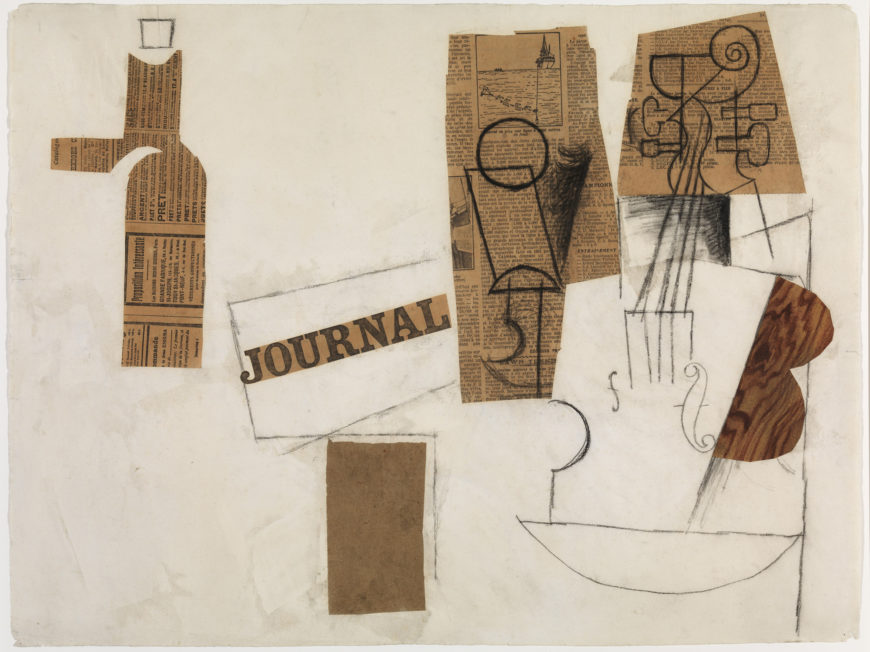
In Siphon, Glass, Newspaper and Violin, Picasso displays the multiple ways charcoal drawing and papier collé can be used to represent objects. For example, on the left newspaper is cut into the shape of a siphon, while on the right it is used as a surface for drawings of a glass and part of a violin. Its edges also define the left side of the violin’s upper body and neck.
Analytic cubist techniques are used to depict the glass, violin, and top of the siphon from multiple perspectives, while on the far right, paper painted with illusionistic wood grain indicates the violin’s material. In the center the word ‘JOURNAL’ (the French word for newspaper) cut from a newspaper’s masthead represents that object in a particularly direct and literal way. Although we are not offered a coherent visual illusion of the objects in the title, these multiple media and representational strategies combine to give us all of the relevant information.

Papier collé and collage not only anchored Cubist forms more firmly as distinct material objects, they also gave the artists a particularly rich means for generating multiple possibilities of meaning through a combination of media, representational strategies, and suggestive shapes and their formal relationships. Collage shapes, materials, colors, and words all contribute to the complex significations that proliferate in Synthetic Cubism.
Additional resources:
Read about Fruit Dish and Glass at the Metropolitan Museum of Art
Synthetic Cubism, Part II
by DR. CHARLES CRAMER and DR. KIM GRANT
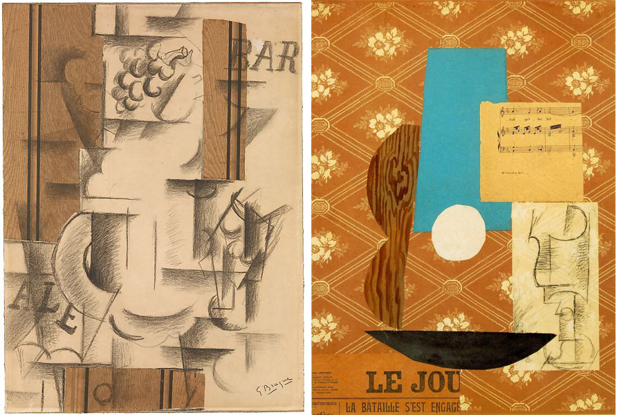
Pablo Picasso’s Guitar, Sheet Music and Glass is generally thought to have been made as a response to Georges Braque’s Fruit Dish and Glass. Both works bring a new tool into the already-complex collection of Cubist techniques of representation — the use of collage.
A wealth of associations
The subject of Picasso’s Guitar, Sheet Music and Glass is familiar from earlier Analytic Cubist paintings, which frequently depict café tables with drinks, newspapers, and musical instruments. Here, however, the abstracted geometric forms of Analytic Cubism are limited to the charcoal drawing of the glass on paper pasted on the right. It is one element in the collage, which includes seven different types of paper arranged on a wallpaper ground.
The pattern of the wallpaper is a diagonal lattice that frames flowers and recalls the overall patterns of lattices and grids that structure earlier Analytic Cubist paintings such as Braque’s Piano and Mandola.
While Braque’s Fruit Dish and Glass used only one type of pasted paper (the printed wood grain), Picasso uses many, and demonstrates that a wealth of associations can be generated from their juxtaposition.
Patterns of formal relations
An intricate pattern of formal relations is created between the varied shapes and colors of the pasted paper, which also generate a complex set of possible readings. The guitar is signified by multiple cut-paper elements.
On the left, the hand-painted wood grain paper cut into a double curve suggests the material and shape of the guitar’s body. A vertical trapezoid of blue paper is the neck in perspective, while the shallow black curve below stands for both the bottom of the guitar and the leading edge of the circular table on which the still-life sits.
In the center of the image, the white paper circle representing the sound hole in the guitar body looks like a hole cut out of the picture, while the fragment of sheet music simultaneously refers to itself, and to the sounds emanating from the instrument.
The glass drawn in charcoal is somewhat overwhelmed by the strong shapes of the pasted papers, but its ghostly appearance, as well as the semi-transparency of the paper on which it is drawn, suggests the transparency of glass. It is brought into the composition by the use of a visual rhyme — the circular lip of the glass directly echoes the white circle of pasted paper to the left.
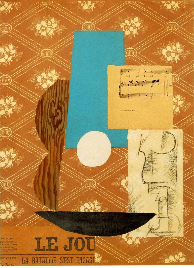
The importance of text
One topic of debate among art historians has been the importance of the legible texts in Cubist collages. In this instance, it is generally agreed that the newspaper text in the lower left is relevant. The headline “La Bataille s’est engagé” (the battle has begun) is from an article about the Balkan War, but it is often interpreted as a competitive challenge to Braque, referring to the use of papier collé. In that reading, this work is a direct response to, and attempt to one-up, Braque’s Fruit Dish and Glass.
The truncated masthead of the newspaper “LE JOU” (short for le journal, French for “the newspaper”) is also meaningful. It appears in many Cubist works and not only signifies the newspaper’s presence in the still life, but also a pun on the French words for “to play” (jouer) and “toy” (le jouet). This is a verbal echo of the many formal rhymes and visual puns that appear in Synthetic Cubist works. These allow for multiple readings of individual elements and the relationships between them.
In Guitar, Sheet Music and Glass, for example, “LE JOU” also recalls the French word for day (le jour), and suggests another reading for the forms in the work. The circle of white paper overlapping the trapezoid of blue paper above it can be interpreted as representing not only a guitar’s sound hole and neck, but as the sun rising into the sky at the beginning of a new day. Battles often begin at dawn, and the paired juxtaposition of the papier collé guitar and the Analytic Cubist drawing of a glass suggests a competition between older and newer Cubist techniques.
Political references
Most early discussions of Cubist collages stressed their formal innovations and the novel representational strategies they employed. More recently, however, some art historians have looked more closely at the texts of the newspaper clippings in Picasso’s works and discovered references to his political interests.
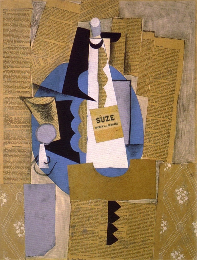
Still Life with Bottle of Suze is another work that uses legible clippings of articles about the contemporary Balkan war. This one also includes a clipping about a socialist demonstration against that war held in a Paris suburb. When asked about it years later Picasso said he used that particular clipping because it was a huge event and to show that he was against the war.
While it is unlikely that Picasso expected viewers to carefully read the fine print text in the newspaper clippings he used, headlines and sub-headers often stand out and appear to make relevant comments. In Still Life with Bottle of Suze a bold face sub-header on the left, “La Dislocation”, is easily legible and placed next to the still-life objects that have been separated and dislocated by Cubist representational techniques.
An art of ordinary activities and cheap materials
Most early Cubist collages depict still-life subjects, usually the types of objects found on café tables. They represent the ordinary places where the artists would have a drink, listen to a musical act, read a newspaper, and meet their friends. Newspaper clippings represent the sort of topical events discussed in cafés. Preserved in the artworks, the newspapers and other ordinary non-art materials such as wallpaper, labels, tickets, etc. now seem like mementos of a specific time and place.
In their collages Picasso and Braque avoided conventional, often expensive, art materials and overt displays of technical skill that would indicate artistic training. Prior to its use by Braque and Picasso, collage was primarily a craft technique used by women and hobbyists in the 19th century to make scrapbooks. Collages are “poor” art works that do not employ the professional artist’s traditional manual skills.
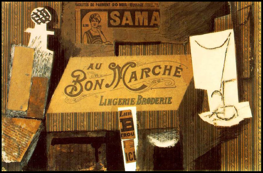
Picasso’s Au Bon Marché proclaims its cheapness not only in its materials, but by its title as well. Bon marché is a French term meaning “good deal” or “cheap” as well as being the name of a prominent Paris department store. At the top of the collage, an advertisement for a rival Paris department store, Samaritaine, suggests another persistent theme of the collages: references to brand name products, mass media, advertisements, and commerce. Many artists, starting with the Dadaists during World War I and continuing to the present day, adopted the Cubists’ use of cheap found materials, employing them as a critical strategy to question the commercial values of the art world and modern society.
An enormous influence
For many people the appeal of early Cubist collage and papier collé is more intellectual than conventionally aesthetic. These works prompt the viewer to enjoy the multiple references and significations to be found in the combinations of forms and punning texts, rather than displaying the sensuous qualities of the painted surface or the artist’s skilled touch.
Despite its somewhat arcane intellectual appeal, however, Cubist collage had an enormous influence on modern art in the 20th century. Its employment of simplified planar forms was instrumental in the establishment of non-representational art, especially the geometric abstraction of movements such as Suprematism, Constructivism, De Stijl, Color Field painting, and Minimalism. And, the way the collages combine disparate found materials, refer to mass consumer culture, and collapse distinctions between ‘low’ and ‘high’ culture contributed to the development of Dada, Surrealism, assemblage, Pop art, and the various trends associated with post-modernism.
Additional resources:
Salon Cubism
by DR. CHARLES CRAMER and DR. KIM GRANT
The face of Cubism
Today, most people associate Cubism with Picasso and Braque, but in the early 1910s when the style was new, the works of many other Cubist artists, including Jean Metzinger, Albert Gleizes, Henri Le Fauconnier, and Fernand Léger, were better known. These artists are often called the Salon Cubists because they participated in the large annual public exhibitions in Paris known as Salons. Picasso and Braque, by contrast, had an exclusive contract with their dealer Daniel-Henry Kahnweiler and only showed their Cubist works in Paris at his private gallery.
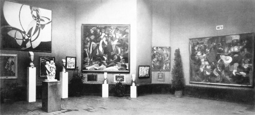
The Salon Cubists lived and worked in Paris neighborhoods, mostly Montparnasse and suburban Puteaux, some distance from Picasso and Braque’s studios in Montmartre. They met frequently with writers and intellectuals to discuss a range of ideas including mathematics, physics, politics, and philosophy. The group was large; thirty artists exhibited over 200 works at their 1912 exhibition, La Section d’Or (The Golden Section). In the early 1910s their works appeared in modern art exhibitions throughout Europe.
A public profile
The Salon Cubists cultivated publicity; they showed their works as a group in order to attract attention in the overcrowded Salons. The Cubist Room at the 1911 Salon des Indépendants gained them public notice from purportedly scandalized viewers along with extensive critical recognition in newspapers and magazines.
By the time Cubism appeared, public outrage over modern art was a cliché. A long succession of modern art movements had led the public to expect incomprehensible new art works, and in the 1910s the number of “-isms” began to proliferate exponentially in both visual arts and literature. Cubism was one of the most prominent and successful movements claiming to represent the modern world in new, specifically modern ways. How it did so was, however, a matter of constant debate.
Big, ambitious paintings
Like Picasso and Braque, the Salon Cubists extended Cézanne’s exploration of the tensions and ambiguities of depicting three-dimensional objects in space on the flat surface of the picture plane. Salon Cubist paintings were, however, notably different from Picasso’s and Braque’s.

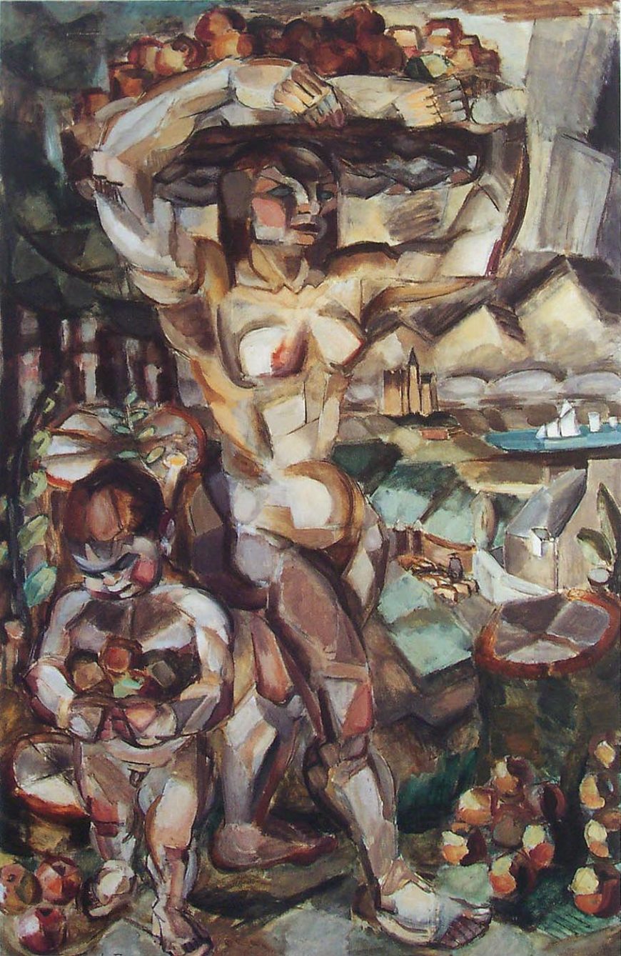
The first difference is scale. Many Salon Cubist paintings were large. Henri Le Fauconnier’s Abundance, which was considered an important example of Cubist painting and exhibited widely throughout Europe in the 1910s, measures slightly over six by four feet. Picasso’s and Braque’s contemporary Cubist works were rarely more than a quarter that size, and often much smaller.
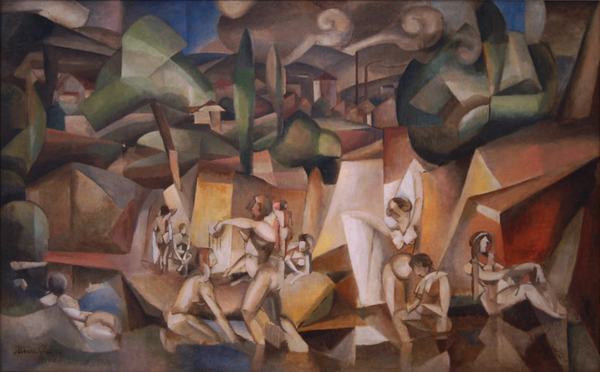
Another difference is subject matter. Picasso and Braque painted mostly still lifes and single figures in portrait format, while the Salon Cubists addressed grand themes and painted multi-figure compositions, landscapes, and cityscapes. Albert Gleizes’ The Bathers combines a pastoral scene of nude figures bathing in the foreground with the factory chimneys of a modern suburb smoking in the background. In Le Fauconnier’s Abundance an allegorical female nude and a child are surrounded by fruit symbolizing the fertility of the land, and by extension, nationalistic pride in France itself.
Conflicting interpretations
While Picasso and Braque never provided any explanation of their Cubist work, some Salon Cubists were more forthcoming. Albert Gleizes and Jean Metzinger published Du Cubisme (1912), which, despite its often vague and theoretically inconsistent text, was the most popular book on Cubist art for years. It was one of many texts on Cubism by critics, writers, and theorists eager to explain the new style.
Interpretations were often in conflict as critics attempted to explain how and why Cubist painters developed their non-naturalistic techniques of representation in relation to almost every scientific discovery and philosophical theory popular in the early 20th century. Some prominent critics and theorists analyzed Cubism as an art of conception (depicting what is known) rather than perception (depicting what is seen) in terms of the philosophy of Immanuel Kant. Cubist approaches to depicting figures and space were also frequently linked to non-Euclidean geometry and conceptions of space and time derived from both occultism and non-Newtonian physics. Another source for Cubist innovations was seen in the enormously popular anti-rationalist philosophy of Henri Bergson.
Bergsonian Cubism
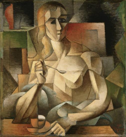
Jean Metzinger’s Le Goûter can be used to illustrate a Bergsonian approach to interpreting Cubism. The painting, whose title translates both to “taste” and “tea-time,” shows a seated woman holding a spoon and touching a tea saucer. Bergson’s philosophy stressed the importance of the physical senses, particularly touch, taste, and smell, as sources of intuitive knowledge. Le Goûter is all about sensory experience. Its female subject is partially nude, traditionally intended to appeal to the (implied) heterosexual male viewer’s sense of touch as well as sight, and it depicts her using her own senses, touching the tea saucer while smelling and tasting her tea.
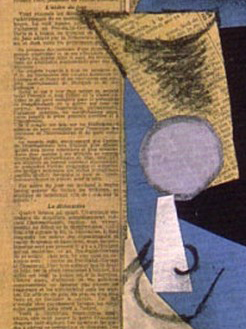
Typical Cubist techniques can also be interpreted in Bergsonian terms. In Le Goûter the woman’s head and the cup are depicted from different angles. We see the cup and saucer from the side on the left and from above on the right. The woman faces us directly on the right, and is in profile on the left. According to Bergson the world is not composed of static objects isolated in empty space. Instead everything exists in duration — a continuous flow of time and space. The Cubist technique of depicting things simultaneously from different vantage points can be understood as presenting a Bergsonian conception of reality by rejecting a static single view point and showing the object as constantly changing in the temporal and spatial flux. This is also indicated by the technique of passage, breaking the boundaries between solid objects and surrounding space, as Gleizes does on the woman’s left shoulder in Le Goûter.
Bergson’s concepts of intuition and élan vital can also be used to interpret Cubism. Élan vital is Bergson’s concept of a universal life force. In Le Fauconnier’s Abundance the vibrant and chaotic interlocking planes unify the figures, fruit, village and distant Alpine landscape into a visually active, faceted surface that suggests a vital force pulsating through everything. Élan vital cannot be directly perceived or even rationally understood, but it can be intuited. Bergson believed artists were particularly sensitive and intuitive beings in tune with the élan vital, and in their art they communicated their insights to the masses.
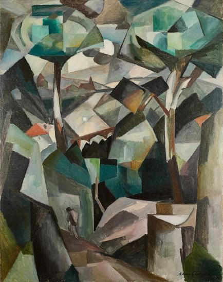
Products of the artist’s intuitive understanding, Cubist paintings with their non-rational spaces and ambiguous forms also prompted viewers to use their own intuition to complete the images in their minds. Gleizes’ The Path (Meudon) is a patchwork of geometric shapes that on examination reveals a scene of trees towering over a suburban village with a man walking in the foreground and a church on the horizon. The dynamic interlocking planes convey both a sense of movement and of unity, a world in which each part is connected to the whole in a vibrant, oscillating pattern suggestive of the vital force that animates the Bergsonian universe.
A kaleidoscope of modern experience
Some painters used Cubist forms to suggest a more abstract and extended interpenetration of space and time than Metzinger depicted in Le Goûter.
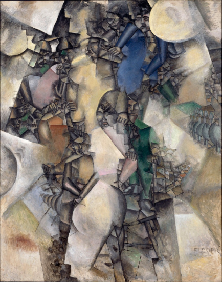
Fernand Léger’s The Wedding combines fragmented images of a crowded wedding celebration with aerial views of rooftops and a tree-lined street, interspersed with cloudy white abstract planes. His multiple views are more complex and disjointed than the comparatively legible scenes by Gleizes, Metzinger, and Le Fauconnier.
Léger’s painting suggests floating fragments of memory brought together in a kaleidoscope of shifting images. This conflation of different scenes in a single painting can be connected to Bergson’s notion of duration and to the related concept of simultaneity, which was understood by many artists of the time as a synthesis of memory and vision.
Ultimately, the work of the Cubist artists exhibiting in the Paris Salons was no more the product of a single unified theory than were the less public Cubist works of Picasso and Braque. The Salon Cubists used the new style to address a broad range of subjects and ideas, from traditional allegories and the celebration of nature to contemporary concepts of time and space.
Additional resources:
Pablo Picasso
Picasso’s Early Work
by DR. BETH HARRIS and DR. STEVEN ZUCKER
Age twenty and looking rather goth
When I’m in the galleries at The Museum of Modern Art in New York, I obviously spend a good deal of time looking at the art. But I also watch people look at the art and listen to what they have to say. The comments that people make can be quite thoughtful and visitor comments and questions have added enormously to my appreciation of the art over the years. Still, there are many comments that are born of pure befuddlement. And many of these target Picasso.
Many people seem to believe that Picasso’s abstraction of the human figure, his penchant for reconfiguring the body by mis-aligning a nose or an eye, for instance, is the result of his inability to draw. Nothing could be farther from the truth. There is an old anecdote that tells of Picasso, who, upon emerging from an exhibition of drawings by young children, says, “When I was their age I could draw like Raphael, but it took me a lifetime to learn to draw like them.”
Perhaps this quote is apocryphal, but it points to something undeniably true: Picasso was an extraordinary craftsman, even when measured against the old masters. That he chose to struggle to overcome his visual heritage in order to find a language more responsive to the modern world is an important triumph that has had a vast effect upon our world. Picasso’s art has transformed and inspired not only artists, but also architects, designers, writers, mathematicians, and even philosophers. We may look at Picasso’s art in museums, but his art—via these translators—has therefore had a profound influence on what we see in our everyday life. Just think of the advertisements for products we buy, buildings in which we live and work, books we read, and even the way we conceive of reality.
“My kid could make that”
There is no question that Picasso’s art has had a most profound impact on the twentieth century. While Picasso suggests the value of unlearning the academic tradition, it is important to remember that he had mastered its techniques by a very early age. His father, Don José Ruiz Blasco, was a drawing teacher and curator at a small museum. The young Picasso began drawing and painting by age seven or eight. By age ten, Picasso assisted his father, sometimes painting the minor elements of the elder’s canvases. Soon after his father became a professor at the art academy in Barcelona, the young Picasso completed the entrance examinations (in record time) and was advanced to the school’s upper-level program. He repeated this feat when he applied to the Royal Academy in Madrid.
Picasso in Paris
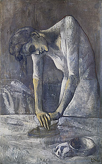
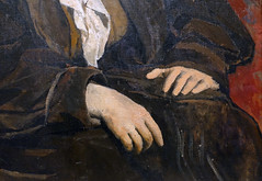
Like Van Gogh had done before him, Picasso arrived in Paris determined to work through the avant-garde’s techniques and subjects to better understand such art. An example of his explorations of the achievements of contemporary art in Paris can be seen by comparing a painting by Degas to one by Picasso.
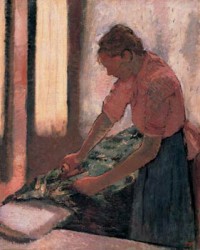
It is not surprising that Picasso, the great draftsman, would be interested in the work of the “odd man out” Degas, who nearly alone among the Impressionists retained the primacy of line. In the example Woman Ironing, Picasso has infused a somewhat maudlin weariness to his attenuated and curiously sensual laborer. Still, Picasso understands Degas’s experimentation with abstraction. Note how in Degas’s image, the luminous negative space defined between the arms refuses to recede beyond the figure, remaining trapped instead. Likewise, Picasso defines and centers an almost identical form. Notice, too, the bowl that Picasso places in the lower right corner. Like everything in this canvas, it is roughly formed with a dry brush. Still, the simple strokes of white and dark gray that define the volume speak to the magical pleasure of rendering space, a love that Picasso carries with him through out his career.
Family of Saltimbanques
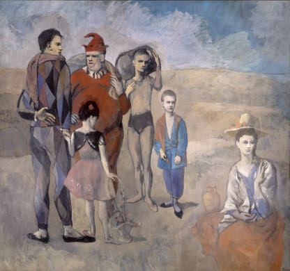
This great, early painting by Picasso portrays a family of saltimbanques. These are wandering circus performers that move from town to town—never truly welcome, and only briefly tolerated for their ability to entertain.
Like so many of Picasso’s early subjects during his so-called Blue and Rose periods in the first years of the twentieth century, here is a group of disenfranchised, alienated people that live on the fringes of society. This particular group includes characters from the sixteenth-century Italian performing tradition of commedia dell’arte. One such figure is the rogue wit known as the Harlequin, who wears a suit of multicolored triangles. Picasso seems to have identified with such characters at this time. As he often reminded people, he was very poor at this point in his career. A Spaniard in France who did not yet speak the language, and still an unknown artist only in his mid-twenties, Picasso might well have felt an affinity with itinerant outsiders such as the saltimbanques.
The Laundry Barge
In Paris in 1904, Picasso rented a studio in an old, dilapidated building filled with artists and poets. Located at 13 Rue Ravignan, the building was dubbed the Bateau-Lavoir (or laundry barge) by poet-in-residence, Max Jacob. It is at this time that Picasso first came into contact with French painter Henri Matisse, as well as American ex-pat Gertrude Stein, who—along with her brother Leo—was one of the foremost patrons of modern art in Paris.
Additional resources:
Pablo Picasso on The Metropolitan Museum of Art’s Heilbrunn Timeline of Art History
Cubism on The Metropolitan Museum of Art’s Heilbrunn Timeline of Art History
Portrait of Gertrude Stein at The Metropolitan Museum of Art
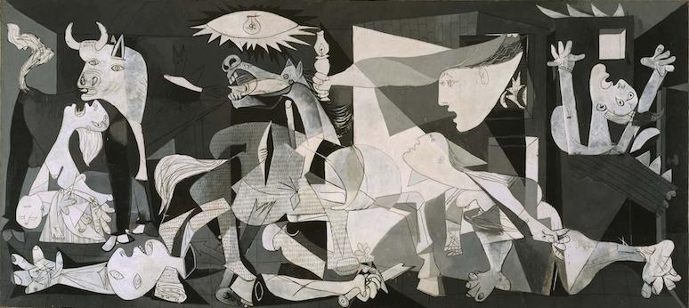
Pablo Picasso, Guernica
What would be the best way today to protest against a war? How could you influence the largest number of people? In 1937, Picasso expressed his outrage against war with Guernica, his enormous mural-sized painting displayed to millions of visitors at the Paris World’s Fair. It has since become the twentieth century’s most powerful indictment against war, a painting that still feels intensely relevant today.

Antiwar icon
Much of the painting’s emotional power comes from its overwhelming size, approximately eleven feet tall and twenty five feet wide. Guernica is not a painting you observe with spatial detachment; it feels like it wraps around you, immerses you in its larger-than-life figures and action. And although the size and multiple figures reference the long tradition of European history paintings, this painting is different because it challenges rather than accepts the notion of war as heroic. So why did Picasso paint it?
Commission
In 1936, Picasso (who was Spanish) was asked by the newly elected Spanish Republican government to paint an artwork for the Spanish Pavilion at the 1937 Paris World’s Fair. The official theme of the Exposition was a celebration of modern technology. Yet Picasso painted an overtly political painting, a subject in which he had shown little interest up to that time. What had happened to inspire it?
Crimes against humanity: an act of war
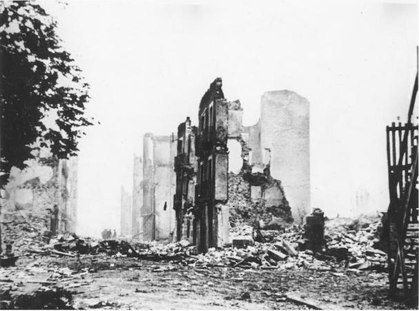
In 1936, a civil war began in Spain between the democratic Republican government and fascist forces, led by General Francisco Franco, attempting to overthrow them. Picasso’s painting is based on the events of April 27, 1937, when Hitler’s powerful German air force, acting in support of Franco, bombed the village of Guernica in northern Spain, a city of no strategic military value. It was history’s first aerial saturation bombing of a civilian population. It was a cold-blooded training mission designed to test a new bombing tactic to intimidate and terrorize the resistance. For over three hours, twenty five bombers dropped 100,000 pounds of explosive and incendiary bombs on the village, reducing it to rubble. Twenty more fighter planes strafed and killed defenseless civilians trying to flee. The devastation was appalling: fires burned for three days, and seventy percent of the city was destroyed. A third of the population, 1600 civilians, were wounded or killed.
Picasso hears the news
On May 1, 1937, news of the atrocity reached Paris. Eyewitness reports filled the front pages of local and international newspapers. Picasso, sympathetic to the Republican government of his homeland, was horrified by the reports of devastation and death. Guernica is his visual response, his memorial to the brutal massacre. After hundreds of sketches, the painting was done in less than a month and then delivered to the Fair’s Spanish Pavilion, where it became the central attraction. Accompanying it were documentary films, newsreels and graphic photographs of fascist brutalities in the civil war. Rather than the typical celebration of technology people expected to see at a world’s fair, the entire Spanish Pavilion shocked the world into confronting the suffering of the Spanish people.
Later, in the 1940s, when Paris was occupied by the Germans, a Nazi officer visited Picasso’s studio. “Did you do that?” he is said to have asked Picasso while standing in front of a photograph of the painting. “No,” Picasso replied, “you did.”
World traveler
When the fair ended, the Spanish Republican forces sent Guernica on an international tour to create awareness of the war and raise funds for Spanish refugees. It traveled the world for 19 years and then was loaned for safekeeping to The Museum of Modern Art in New York. Picasso refused to allow it to return to Spain until the country “enjoyed public liberties and democratic institutions,” which finally occurred in 1981. Today the painting permanently resides in the Reina Sofia, Spain’s national museum of modern art in Madrid.
What can we see?
This painting is not easy to decipher. Everywhere there seems to be death and dying. As our eyes adjust to the frenetic action, figures begin to emerge. On the far left is a woman, head back, screaming in pain and grief, holding the lifeless body of her dead child. This is one of the most devastating and unforgettable images in the painting. To her right is the head and partial body of a large white bull, the only unharmed and calm figure amidst the chaos. Beneath her, a dead or wounded man with a severed arm and mutilated hand clutches a broken sword. Only his head and arms are visible; the rest of his body is obscured by the overlapping and scattered parts of other figures. In the center stands a terrified horse, mouth open screaming in pain, its side pierced by a spear. On the right are three more women. One rushes in, looking up at the stark light bulb at the top of the scene. Another leans out of the window of a burning house, her long extended arm holding a lamp, while the third woman appears trapped in the burning building, screaming in fear and horror. All their faces are distorted in agony. Eyes are dislocated, mouths are open, tongues are shaped like daggers.
Color
Picasso chose to paint Guernica in a stark monochromatic palette of gray, black and white. This may reflect his initial encounter with the original newspaper reports and photographs in black and white; or perhaps it suggested to Picasso the objective factuality of an eye witness report. A documentary quality is further emphasized by the textured pattern in the center of the painting that creates the illusion of newsprint. The sharp alternation of black and white contrasts across the painting surface also creates dramatic intensity, a visual kinetic energy of jagged movement.
Visual complexity
On first glance, Guernica’s composition appears confusing and chaotic; the viewer is thrown into the midst of intensely violent action. Everything seems to be in flux. The space is compressed and ambiguous with the shifting perspectives and multiple viewpoints characteristic of Picasso’s earlier Cubist style. Images overlap and intersect, obscuring forms and making it hard to distinguish their boundaries. Bodies are distorted and semi-abstracted, the forms discontinuous and fragmentary. Everything seems jumbled together, while sharp angular lines seem to pierce and splinter the dismembered bodies. However, there is in fact an overriding visual order. Picasso balances the composition by organizing the figures into three vertical groupings moving left to right, while the center figures are stabilized within a large triangle of light.
Symbolism
There has been almost endless debate about the meaning of the images in Guernica. Questioned about its possible symbolism, Picasso said it was simply an appeal to people about massacred people and animals. ”In the panel on which I am working, which I call Guernica, I clearly express my abhorrence of the military caste which has sunk Spain into an ocean of pain and death.” The horse and bull are images Picasso used his entire career, part of the life and death ritual of the Spanish bullfights he first saw as a child. Some scholars interpret the horse and bull as representing the deadly battle between the Republican fighters (horse) and Franco’s fascist army (bull). Picasso said only that the bull represented brutality and darkness, adding “It isn’t up to the painter to define the symbols. Otherwise it would be better if he wrote them out in so many words. The public who look at the picture must interpret the symbols as they understand them.”
In the end, the painting does not appear to have one exclusive meaning. Perhaps it is that very ambiguity, the lack of historical specificity, or the fact that brutal wars continue to be fought, that keeps Guernica as timeless and universally relatable today as it was in 1937.
Additional resources:
This painting at the Museo Nacional Centro de Arte Reina Sofía
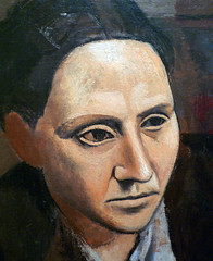
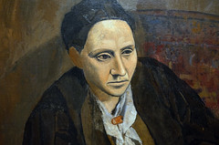
Pablo Picasso, Portrait of Gertrude Stein
by DR. BETH HARRIS and DR. STEVEN ZUCKER
Video \(\PageIndex{3}\): Pablo Picasso, Portrait of Gertrude Stein, 1905-06, oil on canvas, 100 x 81.3 cm (The Metropolitan Museum of Art)
The Laundry Barge
In 1904, Picasso rented a studio in an old, dilapidated building in Paris filled with artists and poets. Located at 13 Rue Ravignan, the building was dubbed the Bateau-Lavoir (or laundry barge) by poet-in-residence, Max Jacob.
It was at this time that Picasso first came into contact with French painter Henri Matisse, as well as the American expatriate Gertrude Stein. Gertrude commissioned a portrait by Picasso in 1905, around the same time that her brother Leo bought Matisse’s Bonheur de Vivre. As the strong solid woman of Picasso’s painting suggests, Gertrude Stein was a formidable presence in Paris of the early 20th century. An influential writer, she, along with her brother, was an important patron of the arts, known for hosting salons that brought together some of the period’s most famous artists, writers, and intellectuals.
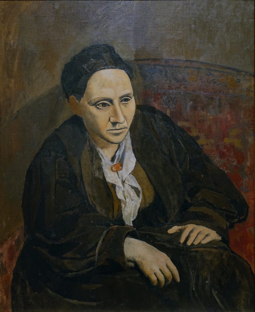
Gertrude and Picasso
At the time of his commission, Picasso hoped to cultivate a relationship with the wealthy Stein, who had already been impressed by the innovative style of Matisse.
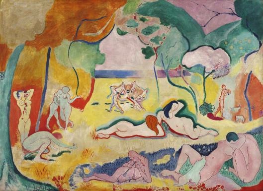
In contrast to Matisse’s bright colors and sensuous undertones in paintings like Bonheur de Vivre, Picasso’s portrait demonstrates the angular distortions and formal experimentation that would characterize his artwork through the invention of Cubism.
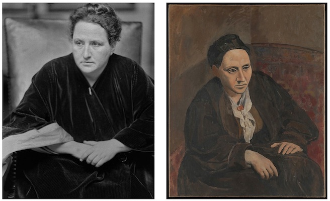
The story goes that Stein sat for Picasso so many times (as many as 90 sittings) that eventually he said he could no longer see her when he looked at her. He then wiped out her face in the painting and left on a trip to Spain. When he returned to Paris in the fall, Picasso quickly completed the portrait—supposedly from memory—in a way that challenged traditional expectations of portraiture. Whereas most portraits tell us about the sitter through their physical likeness and expressive detail, Picasso instead showed his subject as a massive hulking figure who stares blankly past the viewer.
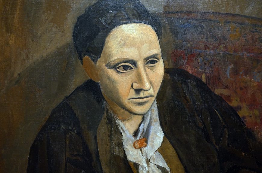
Painted in dull, muted colors, Stein’s broad body fills Picasso’s canvas. Her bulky form sits on a large armchair or sofa and stiffly leans forward, imposing in the way she rests her arms and large hands heavily on the folds of her skirt. In contrast to the rounded mass of the figure, Stein’s face has a planar quality that seems hard and mask-like—an effect heightened by the geometric treatment of the eyes, nose, and mouth, and the dark modeling that distinguishes its angular contours from the rest of her head and body.
Picasso’s odd rendering of Stein’s features reflects the influence of African and Iberian art on the artist, but it might also allude to art’s inability to reveal the truth about an individual. Like many European artists at the time, Picasso looked to ancient and non-western art as a source of primitive inspiration—a colonialist notion that viewed “uncivilized” cultures to be more spiritually authentic than the sophisticated cities of Europe. Thus, while Picasso admired the formal qualities of these sculptural influences, he also believed them better able to communicate deeper meaning and ideas that could not be conveyed through the established traditions of Western art.
The Power of the Artist
By reworking Gertrude Stein’s portrait in a primitive style, Picasso claimed for himself the power to represent the woman as she really is, not merely as a likeness of her physical appearance. Stein’s response to the image supports this point of view. In her book on Picasso, she wrote:
I was and I still am satisfied with my portrait, for me, it is I, and it is the only reproduction of me which is always I, for me. \(^{1}\)

Like Picasso’s reliance on the expressive potential of primitive forms, Stein’s repetitive word play demonstrates her own interest in how language could convey meaning through formal effect instead of descriptive content. For the artist and the author, both challenged the conventions of their media in order to explore the power of art to communicate in new ways that would be appropriate to the modern era.
\(^{1}\)Gertrude Stein, Picasso (London: B.T. Batsford, LTD, 1938); reprinted by Dover Publications, 1984, p. 8.
Additional resources:
This painting at the Metropolitan Museum of Art
Matisse’s Bonheur de Vivre at The Barnes Foundation
Biography of Gertrude Stein from The Oxford Companion to Women’s Writing in the United States
Smarthistory images for teaching and learning:

Pablo Picasso, Les Demoiselles d’Avignon
by DR. BETH HARRIS and DR. STEVEN ZUCKER
Video \(\PageIndex{4}\): Pablo Picasso, Les Demoiselles d’Avignon, 1907, oil on canvas, 243.9 x 233.7 cm (The Museum of Modern Art, New York)
Cézanne’s ghost, Matisse’s Bonheur de Vivre, and Picasso’s ego
One of the most important canvases of the twentieth century, Picasso’s great breakthrough painting Les Demoiselles d’Avignon was constructed in response to several significant sources.
First amongst these was his confrontation with Cézanne’s great achievement at the posthumous retrospective mounted in Paris a year after the artist’s death in 1907.
The retrospective exhibition forced the young Picasso, Matisse, and many other artists to contend with the implications of Cézanne’s art. Matisse’s Bonheur de Vivre of 1906 was one of the first of many attempts to do so, and the newly completed work was quickly purchased by Leo & Gertrude Stein and hung in their living room so that all of their circle of avant-garde writers and artists could see and praise it. And praise it they did. Here was the promise of Cézanne fulfilled—and one which incorporated lessons learned from Seurat and van Gogh, no less! This was just too much for the young Spaniard.
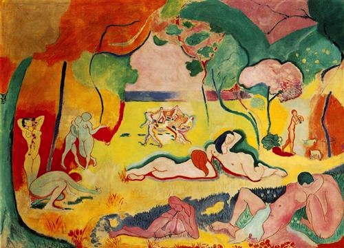
Pablo becomes Picasso
By all accounts, Picasso’s intensely competitive nature literally forced him to out do his great rival. Les Demoiselles D’Avignon is the result of this effort. Let’s compare canvases. Matisse’s landscape is a broad open field with a deep recessionary vista. The figures are uncrowded. They describe flowing arabesques that in turn relate to the forms of nature that surround them. Here is languid sensuality set in the mythic past of Greece’s golden age.
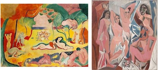
In very sharp contrast, Picasso, intent of making a name for himself (rather like the young Manet and David), has radically compressed the space of his canvas and replaced sensual eroticism with a kind of aggressively crude pornography. (Note, for example, the squatting figure at the lower right.) His space is interior, closed, and almost claustrophobic. Like Matisse’s later Blue Nude (itself a response to Les Demoiselles d’Avignon), the women fill the entire space and seem trapped within it. No longer set in a classical past, Picasso’s image is clearly of our time. Here are five prostitutes from an actual brothel, located on a street named Avignon in the red-light district in Barcelona, the capital of Catalonia in northern Spain—a street, by the way, which Picasso had frequented.
Picasso has also dispensed with Matisse’s clear, bright pigments. Instead, the artist chooses deeper tones befitting urban interior light. Gone too, is the sensuality that Matisse created. Picasso has replaced the graceful curves of Bonheur de Vivre with sharp, jagged, almost shattered forms. The bodies of Picasso’s women look dangerous as if they were formed of shards of broken glass. Matisse’s pleasure becomes Picasso’s apprehension. But while Picasso clearly aims to “out do” Matisse, to take over as the most radical artist in Paris, he also acknowledges his debts. Compare the woman standing in the center of Picasso’s composition to the woman who stands with elbows raised at the extreme left of Matisse’s canvas: like a scholar citing a borrowed quotation, Picasso footnotes.
The creative vacuum-cleaner
Picasso draws on many other sources to construct Les Demoiselles D’Avignon. In fact, a number of artists stopped inviting him to their studio because he would so freely and successfully incorporate their ideas into his own work, often more successfully than the original artist. Indeed, Picasso has been likened to a “creative vacuum cleaner,” sucking up every new idea that he came across. While that analogy might be a little coarse, it is fair to say that he had an enormous creative appetite. One of several historical sources that Picasso pillaged is archaic art, demonstrated very clearly by the left-most figure of the painting, who stands stiffly on legs that look awkwardly locked at the knee. Her right arm juts down while her left arm seems dislocated (this arm is actually a vestige of a male figure that Picasso eventually removed). Her head is shown in perfect profile with large almond shaped eyes and a flat abstracted face. She almost looks Egyptian. In fact, Picasso has recently seen an exhibition of archaic (an ancient pre-classical style) Iberian (from Iberia–the land mass that makes up Spain and Portugal) sculpture at the Louvre. Instead of going back to the sensual myths of ancient Greece, Picasso is drawing on the real thing and doing so directly. By the way, Picasso purchased, from Apollinaire’s secretary, two archaic Iberian heads that she had stolen from the Louvre! Some have suggested that they were taken at Picasso’s request. Years later Picasso would anonymously return them.
Spontaneity, carefully choreographed
Because the canvas is roughly handled, it is often thought to be a spontaneous creation, conceived directly. This is not the case. It was preceded by nearly one hundred sketches. These studies depict different configurations. In some there are two men in addition to the women. One is a sailor. He sits in uniform in the center of the composition before a small table laden with fruit, a traditional symbol of sexuality. Another man originally entered from the left. He wore a brown suit and carried a textbook, he was meant to be a medical student.
The (male) artist’s gaze
Each of these male figures was meant to symbolize an aspect of Picasso. Or, more exactly, how Picasso viewed these women. The sailor is easy to figure out. The fictive sailor has been at sea for months, he is an obvious reference to pure sexual desire. The medical student is trickier. He is not there to look after the women’s health but he does see them with different eyes. While the sailor represents pure lust, the student sees the women from a more analytic perspective. He understands how their bodies are constructed, etc. Could it be that Picasso was expressing the ways that he saw these women? As objects of desire, yes, but also, with a knowledge of anatomy probably superior to many doctors. What is important is that Picasso decides to remove the men. Why? Well, to begin, we might imagine where the women focused their attention in the original composition. If men are present, the prostitutes attend to them. By removing these men, the image is no longer self-contained. The women now peer outward, beyond the confines of the picture plane that ordinarily protect the viewer’s anonymity. If the women peer at us, like in Manet’s Olympia of 1863, we, as viewers, have become the customers. But this is the twentieth century, not the nineteenth and Picasso is attempting a vulgar directness that would make even Manet cringe.
Picasso’s perception of space
So far, we have examined the middle figure which relates to Matisse’s canvas; the two masked figures on the right side who refer, by their aggression, to Picasso’s fear of disease; and, we have linked the left-most figure to archaic Iberian sculpture and Picasso’s attempt to elicit a sort of crude primitive directness. That leaves only one woman unaccounted for. This is the woman with her right elbow raised and her left hand on a sheet pulled across her left thigh. The table with fruit that had originally been placed at the groin of the sailor is no longer round, it has lengthened, sharpened, and has been lowered to the edge of the canvas. This table/phallus points to this last woman. Picasso’s meaning is clear, the still life of fruit on a table, this ancient symbol of sexuality, is the viewer’s erect penis and it points to the woman of our choice. Picasso was no feminist. In his vision, the viewer is male.
Although explicit, this imagery only points to the key issue. The woman that has been chosen is handled distinctly in terms of her relation to the surrounding space. Yes, more about space. Throughout the canvas, the women and the drapery (made of both curtains and sheets) are fractured and splintered. Here is Picasso’s response to Cezanne and Matisse. The women are neither before nor behind. As in Matisse’s Red Studio, which will be painted four years later, Picasso has begun to try to dissolve the figure/ground relationship. Now look at the woman that Picasso tells us we have chosen. Her legs are crossed and her hand rests behind her head, but although she seems to stand among the others, her position is really that of a figure that lies on her back. The problem is, we see her body perpendicular to our line of sight. Like Matisse and Cezanne before him, Picasso here renders two moments in time: as you may have figured out, we first look across at the row of women, and then we look down on to the prostitute of our/Picasso’s choice.
African masks, women colonized
The two figures at the right are the most aggressively abstracted with faces rendered as if they wear African masks. By 1907, when this painting was produced, Picasso had begun to collect such work. Even the striations that represent scarification is evident. Matisse and Derain had a longer standing interest in such art, but Picasso said that it was only after wandering into the Palais du Trocadero, Paris’s ethnographic museum, that he understood the value of such art. Remember, France was a major colonial power in Africa in the nineteenth and twentieth centuries. Much African art was ripped from its original geographic and artistic context and sold in Paris. Although Picasso would eventually become more sophisticated regarding the original uses and meaning of the non-Western art that he collected, in 1907 his interest was largely based on what he perceived as its alien and aggressive qualities.
William Rubin, once the senior curator of the department of painting and sculpture at The Museum of Modern Art, and a leading Picasso scholar, has written extensively about this painting. He has suggested that while the painting is clearly about desire (Picasso’s own), it is also an expression of his fear. We have already established that Picasso frequented brothels at this time so his desire isn’t in question, but Rubin makes the case that this is only half the story. Les Demoiselles D’Avignon is also about Picasso’s intense fear…his dread of these women or more to the point, the disease that he feared they would transmit to him. In the era before antibiotics, contracting syphilis was a well founded fear. Of course, the plight of the women seems not to enter Picasso’s story.
Smarthistory images for teaching and learning:
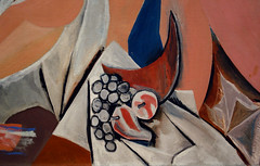
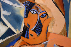
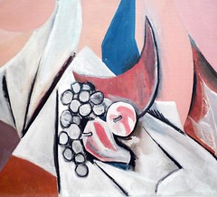
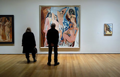
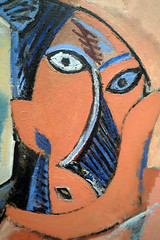
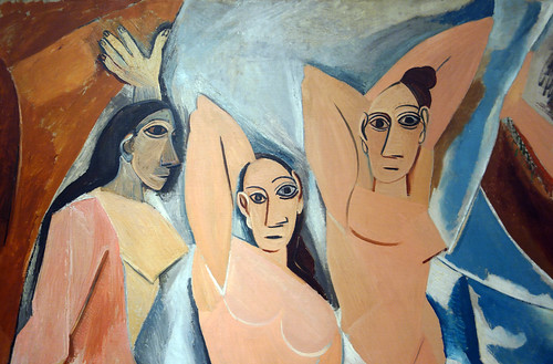
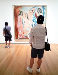
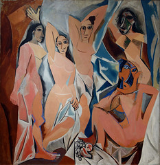
Pablo Picasso, Three Women
by DR. CHARLES CRAMER and DR. KIM GRANT
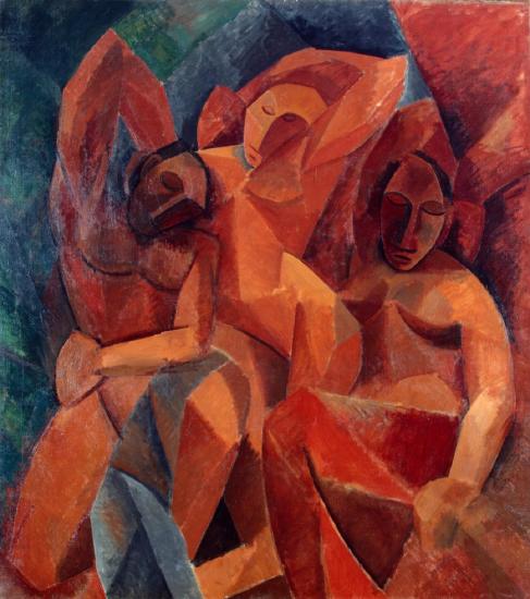
Pablo Picasso’s Three Women shows both a simplification of the human body to basic geometric forms and a novel approach to representing the figure in space. Rather than depicting the figures as independent forms in an open spatial environment, Picasso’s women form an interlocking whole, fitting together like pieces in a jigsaw puzzle.
The jutting hip of the central figure forms a common edge with the right-hand figure’s torso and breast, and the left-hand figure’s shoulder, arm, and head help to define the central figure’s right side. The figure on the right merges with the surrounding form, which is probably a curtain. On the left and at the top of the painting there is a greater distinction between the orange and red tones of the figures and the blues and greens of the background, but here too the relation of the figures’ physical forms to the surrounding space is ambiguous.
The geometrically schematized blue drapery covering part of the left-hand figure echoes the the color of the background, and both are divided into a pattern of diamonds and triangles. The effect of these repeated patterns and ambiguities is a painting that shifts oddly from conveying a strong sense of solid volumes and space, and a reminder that the painting is literally a flat surface covered in a pattern of painted geometric shapes.
A new approach
Three Women is closely related in subject and style to Les Demoiselles d’Avignon, painted the previous year, but in the later painting the women no longer confront the viewer. Their eyes are shut, and their faces are depicted using very similar simplified forms rather than the varied approaches used in Les Demoiselles. The women’s faces are, however, still mask-like and echo the forms of African masks that Picasso admired in the ethnographic museum in Paris.
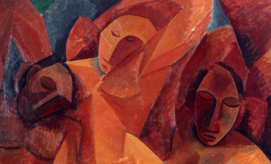
The mood of Three Women is also very different from Les Demoiselles; it is restrained and calm rather than expressive and aggressive. Three Women is focused on formal qualities — the creation of geometric patterns using the simplified shapes of the women’s bodies. This simplification of the bodies’ forms into basic shapes was also deeply indebted to the African sculptures Picasso had seen.
Les Demoiselles uses similar formal devices, but they are just one among many concerns. In the differences between the two paintings we can see Picasso turning away from using painting as a means of emotional expression and instead adopting a much more restrained approach directed to exploring ways of representing figures in space. This ultimately led to the revolution in representation known as Cubism.
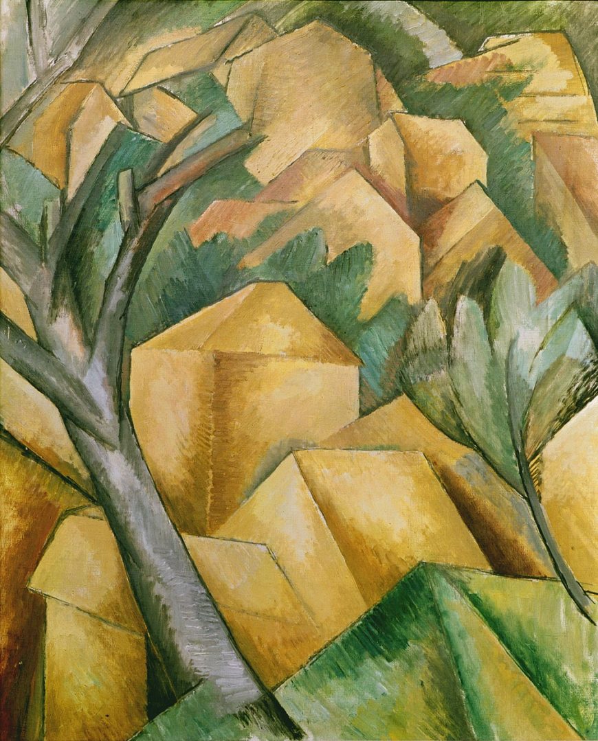
Three Women also reflects Picasso’s encounter with Georges Braque’s recent L’Estaque landscapes in its random deployment of light and shadow. Although both painters used chiaroscuro to depict three-dimensional form, neither Braque’s Houses at l’Estaque nor Picasso’s Three Women reveals a consistent light source. This further confuses our perception of objects in space and is a key way the painting ignores the conventions of naturalistic representation established in the Renaissance.
The origin of “Cubism”
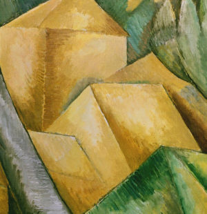
Braque’s landscapes were the source of the term Cubism, which originated in an art critic’s passing comment. In a brief newspaper review, Louis Vauxcelles (who also “named” Fauvism by making a similarly casual comment) described Braque’s paintings of l’Estaque as reducing all forms to geometrical schemas and cubes. Vauxcelles’ description caught on, and the label “Cubism” became a catch-all term referring to a broad range of experimental modern painting and sculpture created in the early decades of the 20th century.
What broadly connects the disparate artworks labeled Cubist is not cubes, however, but the use of abstracted forms to represent objects in space. In many instances, Cubist forms can be described as geometric schemas (to use Vauxcelles’ other descriptive term for Braque’s 1908 landscapes). But more important than any particular stylistic feature is the way Cubism attempts to revolutionize the representation of the third dimension in art, arguably for the first time since the invention of linear perspective in the 1400s.
This project evolved and shifted over time, both formally and conceptually, and its main catalysts, Picasso and Braque, did not explain what they were doing or trying to achieve. Contemporary critics and subsequent art historians were left to figure out the significance of the new style, and while they all agreed it was interesting and important, they came to no ultimate consensus. Despite the many and varied interpretations, one thing that underlies Picasso and Braque’s Cubism is an inquiry into the problems of perceiving and representing volume and space in art.
Building on Cézanne
By 1908, abandoning naturalistic conventions was far from new. What made Braque’s and Picasso’s early Cubist paintings distinctive was their emphasis on depicting three-dimensional forms and spatial relationships. Their early Cubist works build on Paul Cézanne’s exploration of the tensions between representing three-dimensional forms in space and the flatness of the painting’s surface.
In Bathers Cézanne used a mosaic of brushstrokes to unify the painting and emphasize the flatness of its surface. Although the figures are situated in a landscape, there is minimal indication of spatial recession, and the background is a flat pattern of color that vaguely suggests trees and a cloudy sky.
As in Picasso’s Three Women, a piece of drapery on the left is painted the same color as the background sky and contributes to the painting’s lack of recession. Also like Picasso’s painting, the figures are simplified and arranged into tight-knit groups, a pyramid on the left and an oval on the right. In comparison to Cézanne’s painting, however, the figures in Three Women are more sculptural and massive, the space more compressed.
Although primarily interested in the human figure, during this period Picasso followed Cézanne and Braque in painting landscapes as he extended his exploration of new strategies for representing three dimensional forms in space.
Houses on the Hill, Horta de Ebro is markedly more abstract than Cézanne’s Houses in Provence, but both paintings unify the forms of the landscape into a consistent surface pattern that renders spatial depth ambiguous. Cézanne’s surface pattern is created by a mosaic of identical parallel brushstrokes, while Picasso uses repeating patterns of geometric shapes; the diamond pattern of the sky is a prominent example.
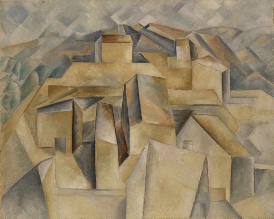
The abstraction of Houses on the Hill, Horta de Ebro is more pronounced than that of Three Women, although many of the formal strategies are the same. The viewer is confronted with an array of advancing and receding geometric forms defined by sharply delineated edges and chiaroscuro shading. The light source is inconsistent, as is the vantage point; some of the barely identifiable houses are depicted from the side, while those next to them are shown from above. The overall effect suggests that the viewer, instead of being fixed solidly in place relative to the scene, is floating above and around it, combining views from multiple perspectives. This concept would become increasingly important to the understanding of Cubism, but it is only embryonic here.
Rather than being situated in clear relation to the land, the buildings are spread out as if on a sloped table top and appear to be sliding out of the canvas and into the viewer’s space. While the figures in Three Women are tightly interlocked and neatly contained with the limits of the canvas, the buildings in Houses on the Hill seem to teeter on the brink of losing their balance. Maintaining a precarious balance between representation and abstraction would preoccupy Picasso and Braque for the next six years.
A daring and dangerous pursuit
Braque’s and Picasso’s early Cubist paintings privileged three dimensional form over color and explored new but very ambiguous ways of representing forms in space. This approach was only the beginning of their Cubist adventure. Picasso described his relationship with Braque during the Cubist years 1908-1914 as being like two mountain climbers roped together.
The artists also referred to themselves as the American aviation pioneers, Wilbur and Orville Wright, indicating that they saw themselves as pursuing a daring and dangerous course. It would lead them away from the representation of solid three dimensional forms to the shadowy ambiguities of late Analytic Cubism and then to the collage techniques associated with Synthetic Cubism.
Additional resources:
Read about African influences in Modern art at the Metropolitan Museum of Art
Watch a video about Georges Braque”s Houses at L’Estaque at the Kunstmuseum, Bern
Pablo Picasso, The Reservoir, Horta de Ebro
by DR. BETH HARRIS and DR. STEVEN ZUCKER
Video \(\PageIndex{5}\): Pablo Picasso, The Reservoir, Horta de Ebro, summer 1909, oil on canvas, 24-1/8 x 20-1/8″ (The Museum of Modern Art, New York, fractional and promised gift)
Smarthistory images for teaching and learning:
Pablo Picasso, Portrait of Daniel-Henry Kahnweiler
by DR. CHARLES CRAMER and DR. KIM GRANT
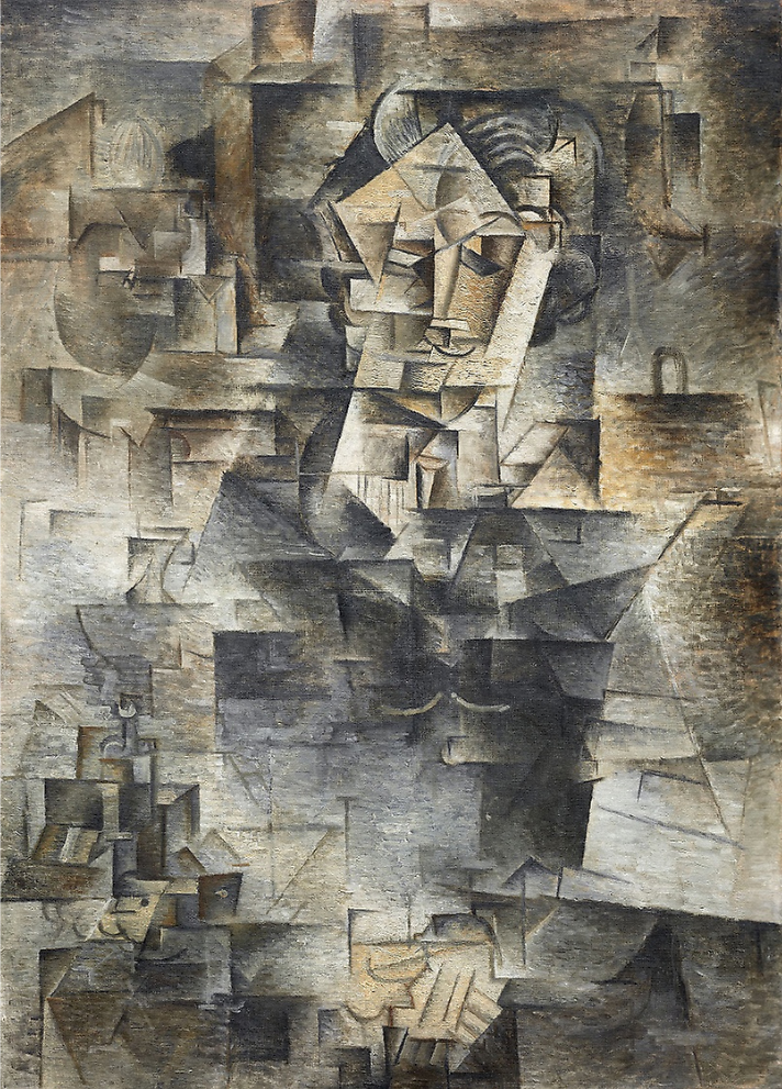
Over a hundred years after it was made, Pablo Picasso’s portrait of his art dealer Daniel-Henry Kahnweiler remains a mysterious painting. Viewers often wonder if they are looking at it correctly. Is there an angle of view from which the rudimentary shadowy forms will suddenly fall into place and clearly reveal the image of a man? The answer is no, or at least not in the way that optical puzzles often reveal their subjects.
Pablo Picasso’s and Georges Braque’s Cubist paintings can, however, be deciphered. To help us understand the portrait of Kahnweiler we will look at how Picasso’s representation of the human figure changed from emphasizing solid forms to a more linear schematic approach in which the boundaries between figure and space dissolve.
Abstracting solid mass
Although the objects and figures depicted in the earliest Cubist paintings are often distorted and abstracted they are not difficult to recognize. In these paintings Picasso experimented with the representation of objects in space by emphasizing three-dimensional mass and form. The woman’s head in Woman with Pears is depicted using blocky geometric shapes.
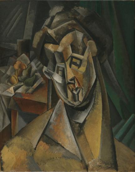
Picasso does not just simplify the surface planes of her head into basic geometric forms; he exaggerates shapes to invent a new abstracted structure. The forehead becomes a series of separate projecting and recessed cubic forms, while the tendons of the neck look like massive concrete supports buttressing the head. Picasso similarly abstracted the head into a complex of geometric shapes in the sculptures he made at this time as well.

One thing that makes Woman with Pears easier to read than Kahnweiler’s portrait is Picasso’s use of contrasting colors to clearly separate figure from background. However, we can also see that the angular abstracted shapes in the background echo the forms of the woman’s head. This has the effect of creating a strong pattern on the surface of the canvas. Instead of receding into the background, the folds of the green curtain parallel the structure of the neck, and the scattering of fruit on the table imitates the shapes of the woman’s face. It is the complex ambiguity of representing three-dimensional objects in space on a painting’s two-dimensional surface that would become a central focus of Picasso’s (and his colleague Braque’s) Cubism.
Shattering form and space
In Portrait of Ambrose Vollard, painted a few months before the portrait of Kahnweiler, Picasso has shattered the figure into a collection of angular planes that extend into the surrounding space like pieces of a broken window. The head is easy to identify, largely because it is painted in naturalistic flesh tones and stands out next to the surrounding grays. Shadowed facets on the forehead and eyes are reminiscent of the woman’s boxy forehead in Woman with Pears, but unlike the figure in that painting, the rest of the body has no solidity and merges entirely with the background.
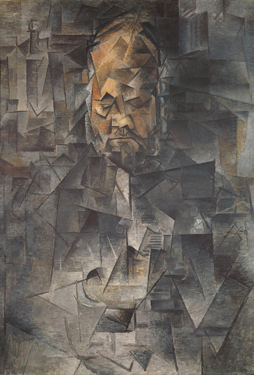
Rather than sculptural form, Picasso’s Portrait of Ambrose Vollard is largely composed of lines and floating abstract planes defined by apparently random chiaroscuro shading. Other than the face, nothing seems solid or certain. The vague outlines of a bottle in the upper left and the suggestion of architectural forms in the upper right are more legible than Vollard’s body in the foreground. We can just distinguish the suggestion of shoulders and arms in the shaded planes below the head. Perhaps the white planes in the center indicate the man’s shirt front.
Between Woman with Pears of 1909 and Portrait of Ambrose Vollard painted the following year, Picasso’s investigations into the abstract representation of three dimensional forms in space changed significantly. The same change is evident in Braque’s contemporary works. The two artists’ early analysis and abstraction of solid masses emphasized solidity at the expense of surrounding space. The later paintings emphasize the representation of space at the expense of solid three-dimensional forms.
A traditional portrait?
The portrait of Kahnweiler extends this breakdown of solid form even further. The simplification of complex three-dimensional forms to arrangements of angular facets that advance and recede into a flickering gridded arrangement of shadows and highlights creates a ghostly appearance. It is as if Kahnweiler and his surroundings are simultaneously materializing and dematerializing as we look at the painting.
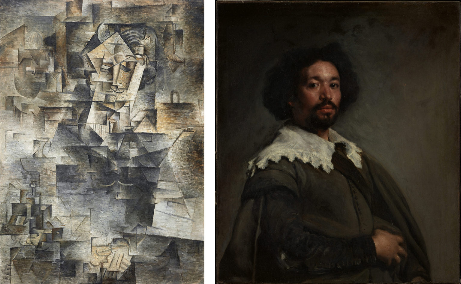
Unlike Vollard’s portrait, Kahnweiler’s face has no color to distinguish clearly it from the surrounding space. Suggestive areas of dark forms indicate the general shape of the figure. Although difficult to see, the figure dominates the center of the canvas as it does in Vollard’s portrait. This is the traditional format used in European half-length portraits like Diego Velazquez’s Juan de Pareja. Within this centralized dark area, lighter quadrilaterals and triangles on the upper portion suggest Kahnweiler’s face, neck, white shirt, and tie. At the bottom of the canvas another central area of lighter forms reveals his folded hands, and a few lines indicate the basic shapes of his fingers.
A few legible references
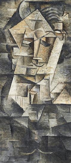
When we examine the upper portion of the figure we can see more details in the face. Simplified cubic forms describe the eyes and surrounding facial structure, while a shaded cylinder suggests the nose. A parallel set of linear curves arching above the face indicate the art dealer’s slicked back hair, and another curve under the nose suggests a mustache or simplified mouth.
Below the projecting angle of the chin there is a suggestion of a white collar, tie and pleated shirt front, and further down two light horizontal curves indicate Kahnweiler’s watch chain gleaming against his dark jacket. Picasso said he added these legible references to natural forms to the overwhelmingly abstract composition late in the painting process in order to help viewers recognize the subject.
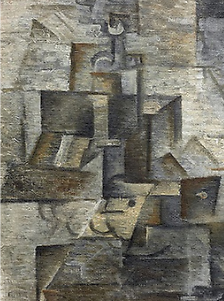
Kahnweiler is not portrayed in an abstract empty space. There is a tabletop still life in the bottom left corner of the painting, with the upper portion of a long-necked bottle easily discernible. Suggestions of architectural elements and other objects appear as well.
Art historians have identified the shadowy forms of an African mask in the upper right and an Oceanic sculpture from New Caledonia in the upper left, both artifacts owned by Picasso. Non-western works from Africa and Oceania were key inspirations for Picasso’s initial abandonment of Western techniques of representation and his later development of the abstract approaches associated with Cubist sculpture and collage.
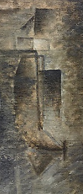
Picasso’s portrait of Kahnweiler presents the essential innovations of Analytic Cubism. Three-dimensional forms are simplified into geometric shapes and combined with nonrepresentational geometric planes to create ambiguous relationships between mass and space. The use of light and shade further emphasizes the spatial ambiguities and abstract pattern on the surface of the canvas. A visible mosaic of brushstrokes adds to the surface pattern and enhances the modernist tension between the painting’s representation of objects in space and the painting as a flat plane.
Additional resources:
Read more about the Kahnweiler portrait at the Art Institute of Chicago
Read about the African influences on Modern Art at the Metropolitan Museum of Art
Pablo Picasso, Still Life with Chair Caning
by DR. BETH HARRIS and DR. STEVEN ZUCKER
Video \(\PageIndex{6}\): Pablo Picasso, Still Life with Chair Caning, 1912, oil and oilcloth on canvas framed with rope, 29 x 37 cm (Musée Picasso, Paris)
The Evolution of Cubism
Beginning in 1908, and continuing through the first few months of 1912, Braque and Picasso co-invent the first phase of Cubism. Since it is dominated by the analysis of form, this first stage is usually referred to as Analytic Cubism. But then during the summer of 1912, Braque leaves Paris to take a holiday in Provence. During his time there, he wanders into a hardware store, and there he finds a roll of oil cloth. Oil cloth is an early version of contact paper, the vinyl adhesive used to line the shelves or drawers in a cupboard. Then, as now, these materials come in a variety of pre-printed patterns.
Braque purchased some oil cloth printed with a fake wood grain. That particular pattern drew his attention because he was at work on a Cubist drawing of a guitar, and he was about to render the grain of the wood in pencil. Instead, he cut the oil cloth and pasted a piece of the factory-printed grain pattern right into his drawing. With this collage, Braque changed the direction of art for the next ninety years.
Collage
As you might expect, Picasso was not far behind Braque. Picasso immediately begins to create collage with oil cloth as well—and adds other elements to the mix (but remember, it was really Braque who introduced collage—he never gets enough credit). So what is the big deal? Oil cloth, collage, wood grain patterns—what does this have to do with art and Cubism? One of the keys to understanding the importance of Cubism, of Picasso and Braque, is to consider their actions and how unusual they were for the time. When Braque, and then Picasso placed industrially-produced objects (“low” commercial culture) into the realm of fine art (“high” culture) they acted as artistic iconoclasts (“icon”=image/”clast”=destroyer).
Moreover, they questioned the elitism of the art world, which had always dictated the separation of common, everyday experience from the rarefied, contemplative realm of artistic creation. Of equal importance, their work highlighted—and separated—the role of technical skill from art-making. Braque and Picasso introduced a “fake” element on purpose, not to mislead or fool their audience, but rather to force a discussion of art and craft, of high and low, of unique and mass-produced objects. They ask: “Can this object still be art if I don’t actually render its forms myself, if the quality of the art is no longer directly tied to my technical skills or level of craftsmanship?”
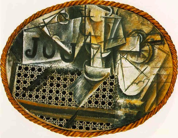
Still-Life with Chair Caning
Virtually all avant-garde art of the second half of the twentieth century is indebted to this brave renunciation. But that doesn’t make this kind of Cubism, often called Synthetic Cubism (piecing together, or synthesis of form), any easier to interpret. At first glance, Picasso’s Still-Life with Chair Caning of 1912 might seem a mish-mash of forms instead of clear picture. But we can understand the image—and other like it—by breaking down Cubist pictorial language into parts. Let’s start at the upper right: almost at the edge of the canvas (at two o’clock) there is the handle of a knife. Follow it to the left to find the blade. The knife cuts a piece of citrus fruit. You can make out the rind and the segments of the slice at the bottom right corner of the blade.
Below the fruit, which is probably a lemon, is the white, scalloped edge of a napkin. To the left of these things and standing vertically in the top center of the canvas (twelve o’clock) is a wine glass. It’s hard to see at first, so look carefully. Just at the top edge of the chair caning is the glass’s base, above it is the stem (thicker than you might expect), and then the bowl of the glass. It is difficult to find the forms you would expect because Picasso depicts the glass from more than one angle. At eleven o’clock is the famous “JOU,” which means “game” in French, but also the first three letters of the French word for newspaper (or more literally, “daily”; journal=daily). In fact, you can make out the bulk of the folded paper quite clearly. Don’t be confused by the pipe that lays across the newspaper. Do you see its stem and bowl?
Looking Down and Looking Through
But there are still big questions: why the chair caning, what is the gray diagonal at the bottom of the glass, and why the rope frame? (Think of a ship’s port hole. The port hole reference is an important clue.) Also, why don’t the letters sit better on the newspaper? Finally, why is the canvas oval? It has already been determined that this still life is composed of a sliced lemon, a glass, newspaper, and a pipe. Perhaps this is a breakfast setting, with a citron pressé (French lemonade). In any case, these items are arranged upon a glass tabletop. You can see the reflection of the glass. In fact, the glass allows us to see below the table’s surface, which is how we see the chair caning—which represents the seat tucked in below the table.
Okay, so far so good. But why is the table elliptical in shape? This appears to be a café table, which are round or square but never oval. Yet, when we look at a circular table, we never see it from directly above. Instead, we see it at an angle, and it appears elliptical in shape as we approach the table to sit down. But what about the rope, which was not mass-produced, nor made by Picasso, but rather something made especially for this painting? We can view it as the bumper of a table, as it was used in some cafés, or as the frame of a ship’s port hole, which we can look “through,” to see the objects represented. The rope’s simultaneous horizontal and vertical orientation creates a way for the viewer (us) to read the image in two ways—looking down and looking through/across. Put simply, Picasso wants us to remember that the painting is something different from that which it represents. Or as Gertrude Stein said, “A rose is a rose is a rose.”
Additional resources:
Picasso on The Metropolitan Museum of Art’s Heilbrunn Timeline of Art History
Cubism on The Metropolitan Museum of Art’s Heilbrunn Timeline of Art History
Pablo Picasso, The Three Musicians
by DR. CHARLES CRAMER and DR. KIM GRANT
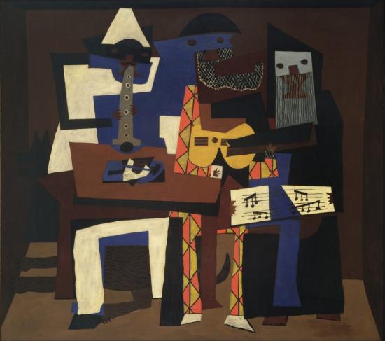
Picasso’s Three Musicians presents three figures painted in a decorative, brightly colored, Synthetic Cubist style. It is one of two very large paintings of the same subject that Picasso painted in 1921, both interpreted to be symbolic group portraits of the artist and two old friends. In this version, Picasso is the Harlequin figure wearing the bright diamond patterned suit in the center. The white Pierrot figure on the left is thought to be the poet Guillaume Apollinaire, while the dark figure of a monk on the right represents the poet Max Jacob.
An old subject made new
Both Harlequin and Pierrot are characters from the traditional Italian theater known as commedia dell’arte. Picasso depicted these characters throughout his career, personally identifying with the trickster Harlequin.
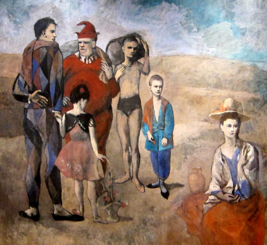
In his early Family of Saltimbanques, Picasso portrayed himself as Harlequin standing in a group of figures, two of whom have also been identified as representing Apollinaire (the red jester) and Jacob (the small acrobat in blue). When Picasso painted Three Musicians sixteen years later he had lost both friends; Apollinaire had died in 1918, and Jacob had recently entered a monastery.
Although it is an oil painting, Three Musicians looks like a collage made from cut out pieces of colored paper. The forms are simplified into angular shapes that interlock like a jigsaw puzzle, and the flat colors create a surface pattern with multiple spatial ambiguities. Dark brown is used for the background wall and also for a foreground table, parts of the figures’ faces, and the silhouette of a dog lying under the table. Harlequin’s mask is part of a large, complex blue shape that covers much of the Pierrot. The same blue appears in the lower portion of the painting, possibly as furniture, and on the table top as part of a still life. While some objects are easily identifiable — the guitar in the center, the sheet music, and the clarinet on the left — others, like the pile of objects on the table, are less clear.
A retrospective presentation of Cubism
Three Musicians reads like a retrospective presentation of Cubism and its elements. Picasso painted Harlequin’s hand in brown on a small white square close to the center of the painting, making it the pivot of the composition. It represents both collage and the artist’s creative hand. Not only is the painting’s style derived from Cubist collage, it contains multiple references to earlier Cubist works.
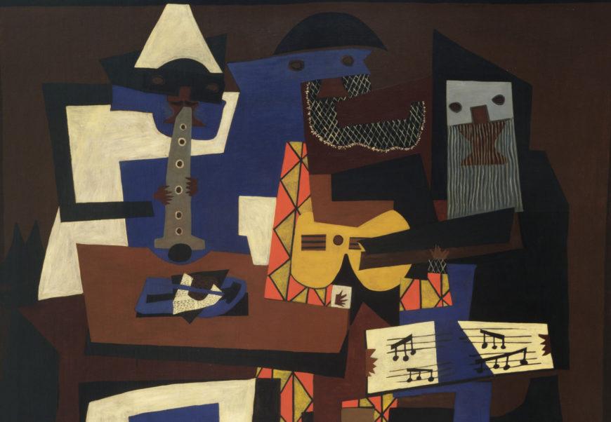
The clarinet, guitar, and sheet music were standard objects in Cubist still life paintings. Prominent among the objects depicted on the table to the left is the painted representation of a cut out piece of newspaper, a primary material of early Cubist collage. The light blue face and beard of the monk is in the form of a wood comb, a decorator’s tool used by Braque and Picasso to create fake wood grain in many Cubist works. The diamond pattern of Harlequin’s suit, as well as his ruff and left cuff, echo the lattice pattern both Picasso and Braque used to structure many Analytic Cubist paintings. Also, according to tradition Harlequin’s suit is made from patches, a particularly appropriate costume for one of the inventors of Cubist collage.
A new decorative approach
Three Musicians is part of a significant shift that occurred in Picasso’s art after 1914. This was the year World War I began, and it marked the end of his close working relationship with Georges Braque, who joined the French army. After 1914 Picasso made few collages. Instead, he deployed his Cubist strategies in the traditional medium of oil on canvas, which allowed him to create paintings that were much larger and more decorative. This new approach had one very practical advantage; oil paintings could be sold at higher prices. Man with a Pipe is an early example of this shift.
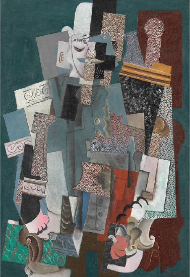
Measuring a little over four by three feet, it is a painted illusion of collaged layers of different colored and textured papers. The bright colors and stippled planes form a richly decorative pattern, very different from Picasso’s actual collages of rather grubby odds and ends. Despite the new emphasis on color and pattern, Picasso’s trademark Cubist play with illusionism is still present, appearing not only in the representation of collaged paper fragments, but also in the painted decorative textures of marble and wood in the lower left.
A new theatricality
Another significant change that occurred during the war years was Picasso’s involvement with the Ballets Russes. Beginning in 1916, Picasso designed costumes and stage sets for the ground-breaking ballet company, often using the stylistic innovations of Synthetic Cubism in his designs.
Picasso’s involvement with the ballet paralleled conservative trends in his work during and after World War I. In its highly theatrical presentation of Cubist elements, Three Musicians showcases the radical innovations of modern art, but the painting also has many conservative elements.
It is a large-scale, multi-figure oil painting in the tradition of the masterpiece. Despite its spatial ambiguities and inconsistencies, the figures are placed in a shallow stage-like space defined by receding orthogonal lines in conformity with linear perspective techniques for representing depth.
Three Musicians, like Picasso’s designs for the very aristocratic art form of ballet, indicated that Cubism was no longer truly subversive. It had become a fine art.
Turn to tradition
One of the most startling transformations in Picasso’s art during World War I was his return to traditional naturalistic representation. He was not alone; the years of reconstruction following the war were dominated by a widespread cultural desire for a “return to order.”
Many formerly radical modern artists adopted traditional styles and subjects during this period of intense nationalism in France, when the extreme innovations of modern art were often regarded as foreign (German) and suspicious. The commedia dell’arte subject of Three Musicians is itself traditional and was particularly popular in the conservative political and cultural climate of World War I and its aftermath.
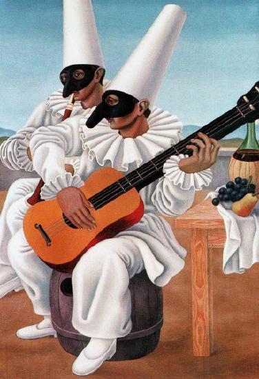
During this period Picasso painted many commedia dell’arte figures using traditional naturalistic techniques, as did other prominent modern artists, including the former Italian Futurist Gino Severini.
The same summer that he painted the two versions of Three Musicians, Picasso also painted the much more traditional Three Women at the Spring, which uses chiaroscuro modeling to represent classical figures based on Ancient Greek sculpture.
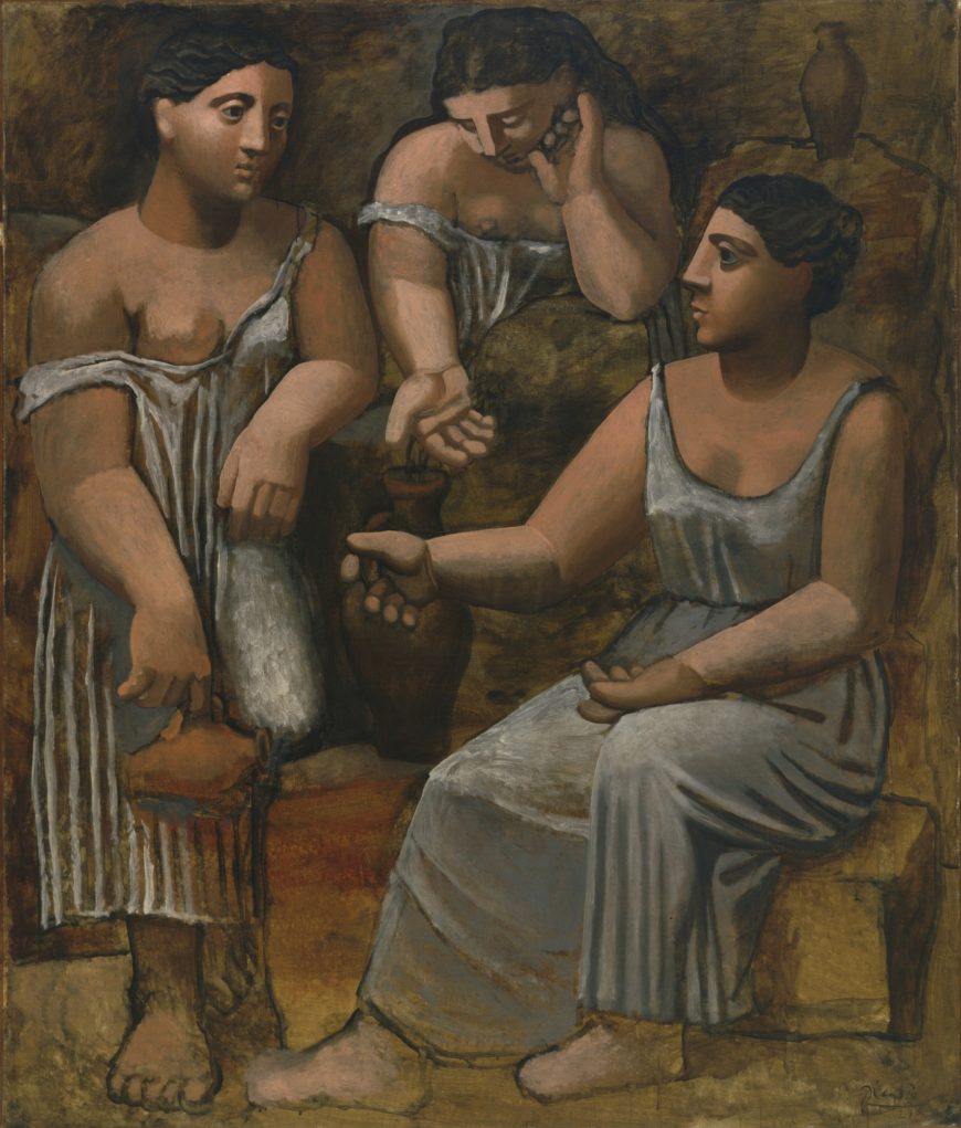
Despite obvious differences of style and subject, the paintings are all large, centralized, and balanced compositions, with three monumental figures compressed into a shallow, frieze-like space. The paintings display Picasso’s simultaneous commitment to two different styles of representation: classical naturalism and Cubism. Three Musicians can thus be seen as reconciling the two, making Cubism into a style that is appropriate for masterpieces in the traditional sense of large scale ambitious multi-figure paintings.
Additional resources:
Pablo Picasso, Guitar
by SAL KHAN and DR. STEVEN ZUCKER
Video \(\PageIndex{7}\): Pablo Picasso, Guitar, 1914, ferrous sheet metal and wire 30 1/2″ x 13 3/4″ x 7 5/8″ / 77.5 x 35 x 19.3 cm (MoMA)
I have seen what no man has seen before. When Pablo Picasso, leaving aside painting for a moment, was constructing this immense guitar out of sheet metal whose plans could be dispatched to any ignoramus in the universe who could put it together as well as him, I saw Picasso’s studio, and this studio, more incredible than Faust’s laboratory, this studio which, according to some, contained no works of art, in the old sense, was furnished with the newest of objects… Some witnesses, already shocked by the things that they saw covering the walls, and that they refused to call paintings because they were made of oilcloth, wrapping paper, and newspaper, said, pointing a haughty finger at the object of Picasso’s clever pains: “What is it? Does it rest on a pedestal? Does it hang on a wall? What is it, painting or sculpture?’ Picasso, dressed in the blue of Parisian artisans, responded in his finest Andalusian voice: ‘It’s nothing, it’s el guitare!’; And there you are! The watertight compartments are demolished. We are delivered from painting and sculpture, which already have been liberated from the idiotic tyranny of genres. It is neither this nor that. It is nothing. It’s el guitare!
(André Salmon, New French Painting, August 9, 1919)
Georges Braque
Georges Braque, Le Viaduc à L’Estaque, (The Viaduct at L’Estaque)
by DR. BETH HARRIS and DR. STEVEN ZUCKER
Video \(\PageIndex{8}\): Georges Braque, Le Viaduc à L’Estaque, (The Viaduct at L’Estaque), 1908, oil on canvas, 28-5/8 x 23-1/4″ / 72.5 x 59 cm (Musée national d’art moderne, Centre Pompidou, Paris)
Smarthistory images for teaching and learning:
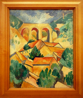
Georges Braque, Violin and Palette
by DR. CHARLES CRAMER and DR. KIM GRANT
Although much of the painting is not naturalistic, we can identify the still-life objects in Georges Braque’s Violin and Palette fairly easily. The form of the violin at the bottom of the painting is fractured; the body of the instrument has been broken up into geometric shapes, and on the right side they grow like crystals into the surrounding space.
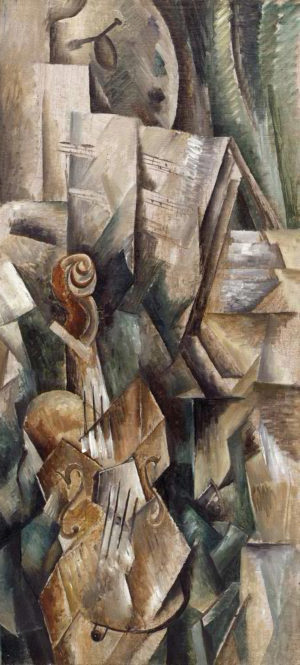
While the lower portion of the instrument is painted naturalistically and visibly recedes, the upper left side does not, and part of it is missing altogether. The bridge that supports the strings has been tilted and flattened into a light gray pentagon between the S-shaped sound holes. The strings are broken into two differently angled sections, the neck is shortened, and the scroll at the top is displaced and twisted in relation to the body.
Tradition and innovation
This painting is an early example of Analytic Cubism, the name given to the first phase of Picasso’s and Braque’s joint endeavor to create a new approach to the pictorial representation of objects in space. Despite its often baffling innovations, one of the defining features of Cubism is its engagement with the European painting tradition.
This engagement with tradition is particularly evident in Picasso’s and Braque’s use of traditional subjects: landscapes, figure studies, portraits, and still life paintings of dishes, fruit, glassware, and musical instruments. Landscapes largely disappeared after the earliest stages. Picasso made more figure studies and portraits during the Analytic Cubist phase, while Braque favored still life subjects.
The relative familiarity of these subjects helps to set Cubism’s radical formal innovations in high relief. Why are objects and even apparently space itself fractured and faceted? Many different explanations have been put forward by art critics and historians, but they all revolve around Braque and Picasso’s engagement in a radical new analysis of three-dimensional form and its relation to both literal and pictorial space.
New strategies of representation
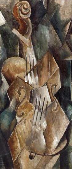
Some of the distortions in Violin and Palette, most notably the relationship of the violin’s scroll to its body, may be explained as the result of combining several different angles of view into a single depiction. This explanation was frequently advanced by contemporaneous critics, and it does explain many of the Salon Cubists’ paintings. However, it fails to account for all of the distortions in Braque’s Violin and Palette, such as the way parts of the violin are abstracted into geometric forms, and the elimination of entire parts of the instrument.
It also does not address the way in which the surrounding space is represented as if it too were fractured geometric abstractions of solid forms. These are all important characteristics of Braque’s Cubist exploration of new strategies of pictorial representation.
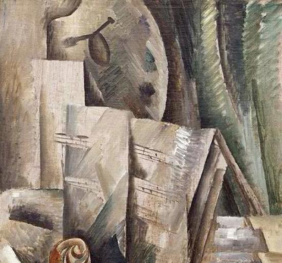
The upper half of Violin and Palette displays additional approaches to representation. We see several pages of sheet music, perhaps propped up on a music stand behind the violin depicted below. Paper is flat, but Braque has used shading to indicate creases and the bowing of the page.This gives the paper tangible form while also connecting it to the abstract geometric pattern that dominates the painting. Notice that Braque paints the musical staff lines projecting to the left beyond the page on which they are printed. This is an echo of the way he painted cubic sections of the violin growing into space below.
A trompe l’oeil illusion
Above and behind the sheet music, Braque painted a green curtain and a palette hanging from a nail. Both of these objects refer to traditional naturalistic representation. The curtain is a conventional framing device used in European painting to suggest spatial depth. In Braque’s painting the curtain frames the palette. Although the curtain, nail, and palette are painted in a sketchy manner that is not very realistic, cast shadows make a direct visual reference to the kind of trompe l’oeil illusionism employed in William Harnett’s Violin and Music.
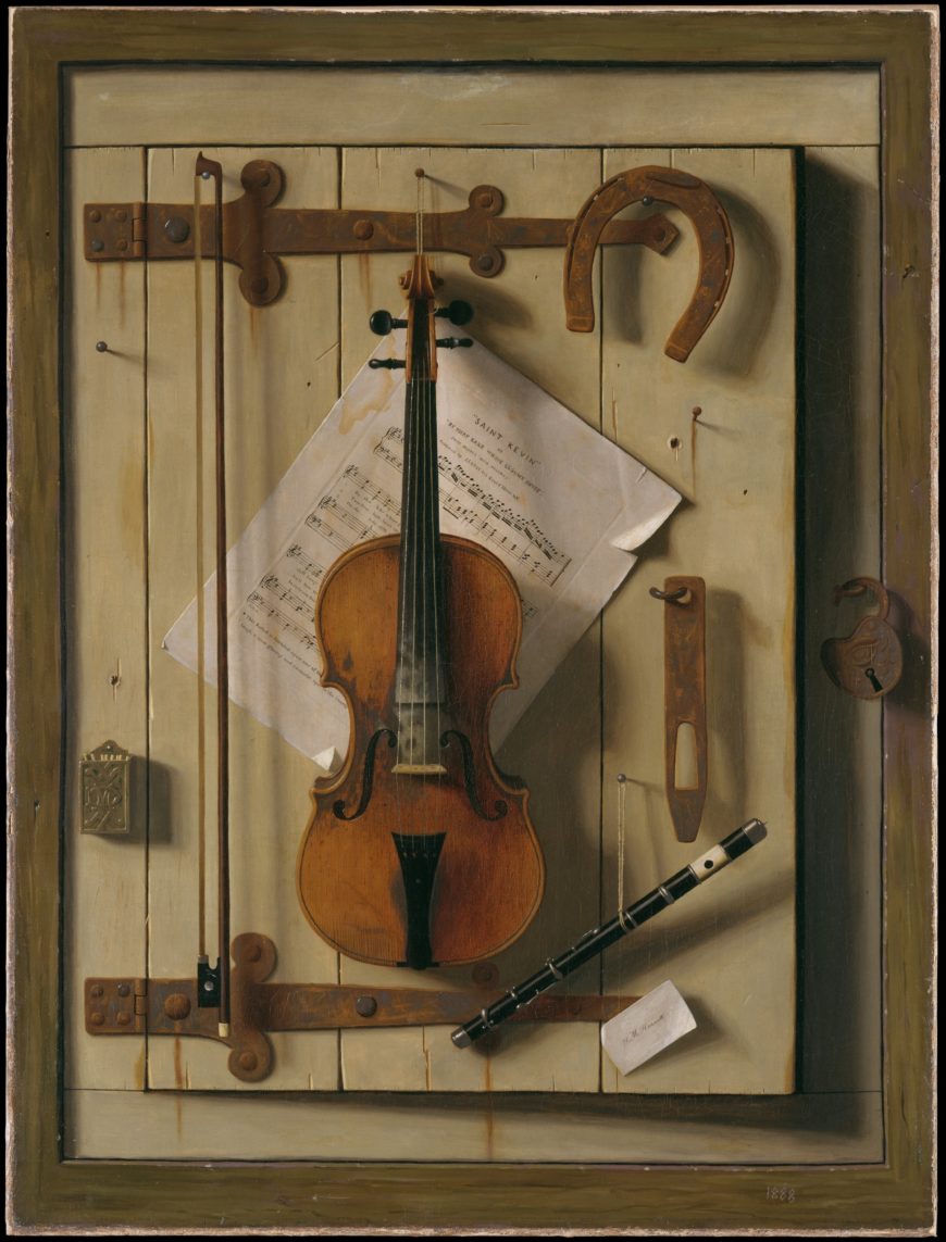
Because the palette is itself flat, and Braque painted shadows behind its curved edges, his illusion is somewhat successful and contrasts with the distorted representation of the violin below. The placement of the nail in the top center of the painting adds another layer to the paintings’ illusion. It looks like it could be literally nailing the canvas to the wall. As a whole, Violin and Palette presents naturalistic representation in juxtaposition to Cubist representational techniques to indicate that these new techniques are alternative, and equally viable, modes of depiction.
A developmental process
Picasso’s and Braque’s Cubism is generally understood to have been a developmental process rather than a style that followed a predetermined theoretical approach. The two artists worked in a close and competitive relationship between 1908 and 1914, meeting regularly to see each other’s latest works, and pushing each other to increasingly daring pictorial innovations. Braque’s Violin and Palette was painted during the early stages of their Cubist explorations. Over the course of the next few years, both artists’ approach to representation became increasingly abstract.
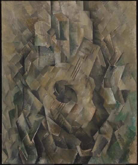
In Braque’s Mandora, the surface of the painting is divided into a shifting lattice of diamond shapes in which we can dimly perceive the suggestion of several objects. The mandora (a type of lute) is the only object we can see with certainty, but it is a much less substantial presence than the violin in Violin and Palette. Dark geometric shapes create a shadow framing the lighter central facets, suggesting the outline of the mandora and other objects arranged on a table. Vertical rectangles in the upper portion of the canvas may indicate more objects resting on the table top, but there is not enough information to be certain. The still life objects have become a shifting chiaroscuro pattern of abstract shapes that sparkle across the canvas with little regard for legibility or representational accuracy.
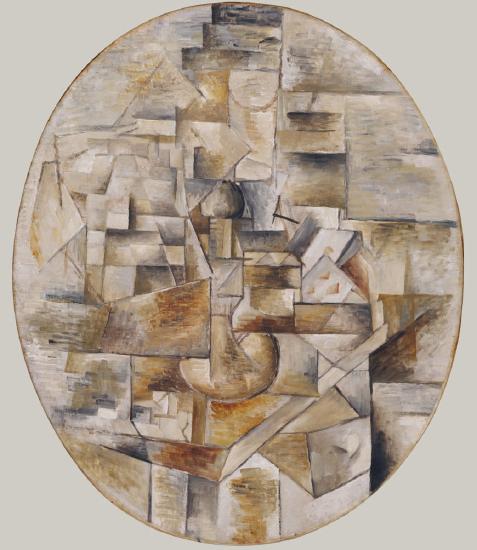
A new kind of pictorial space
Candlestick and Playing Cards on a Table is even more difficult to decipher. The title tells us what to look for, and hints of the objects’ forms emerge from the shifting grid of rectangles presented in an oval format. In the center of the composition we can find the circular base of a candlestick. It is placed above the corner of a table, which juts out towards the viewer. The most legible objects are the two playing cards on the right. Below them Braque painted a schematic open drawer, another reference to traditional trompe l’oeil painting effects like the curtain and nail in Violin and Palette.
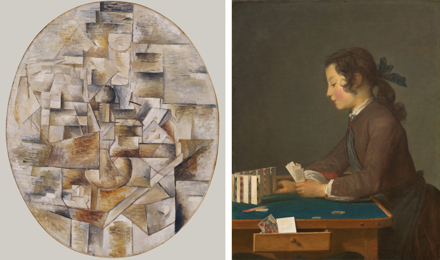
The jutting corner of the table and the open drawer in Braque’s painting are counterpoints to the depiction of an indeterminate space. Black lines that demarcate the edges of objects also create abstract floating planes that hover throughout the painting. This adds another level of complexity to the composition and its suggestion of multiple interlocking layers of planes that fill and define a new kind of shallow pictorial space.
A limited palette
One of the characteristics of Braque’s and Picasso’s Analytic Cubist paintings is their increasingly limited color range. In his earliest Cubist landscapes, Braque used the ochres, greens, and blues favored by Cézanne. Violin and Palette is restricted to browns, grays, and a little green, while the later still life paintings are limited to browns and grays.
From 1909 to 1912 both Picasso and Braque painted almost exclusively in a range of neutral tones before re-introducing color, largely through the use of collage elements. Other Cubist painters often used bright colors, making the use of a limited palette one of the distinctive characteristics of Braque’s and Picasso’s Analytic Cubist paintings. This elimination of color is generally linked to their intense focus on the structural analysis of representing objects in space.
Georges Braque and Pablo Picasso: Two Cubist Musicians
by DR. CHARLES CRAMER and DR. KIM GRANT
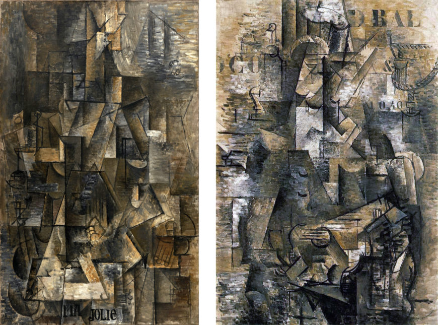
The Portuguese and Ma Jolie are well-known examples of late Analytic Cubism, sometimes called High Analytic Cubism or Hermetic Cubism. The latter name refers directly to the mysterious and difficult qualities of these paintings’ abstraction. The two paintings are very similar in overall appearance. At the time, Braque and Picasso were using the same pictorial language and had stopped signing the front of their paintings, sometimes making it difficult to distinguish authorship of individual works.
Where are the musicians?
The artists’ joint exploration of new pictorial strategies for representing solid forms in space became something quite different from their earlier investigations. There are no clear representations of recognizable solid forms in either painting, and the figures that are the subjects of the paintings seem to be absent as well. Both are intended to represent musicians: in Braque’s, a man plays a guitar, while in Picasso’s a woman plays a guitar or zither. Finding the representations of the bodies of these figures is, however, virtually impossible. Knowledge of earlier Analytic Cubist works can help direct our efforts.
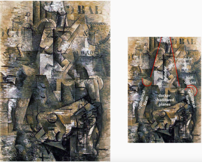
Cubist portraits and figure paintings typically follow the traditional format of placing the figure in the center of the canvas. In The Portuguese, darker shadowed planes suggest the upper body in the center. There are also suggestions of cylindrical forms representing the upper arms on the sides of this area, and half circles above them indicate shoulders. On top of the dark torso area rises a long lighter triangle outlining a collection of smaller forms surrounding another dark cylinder. This is the area of the man’s neck and head.
Looking for identifiable signs
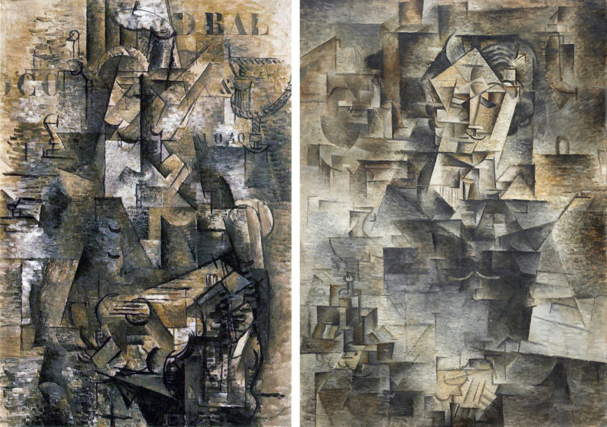
Picasso’s Daniel-Henry Kahnweiler uses a similar yet more legible strategy of contrasting light and dark areas to suggest the head above the body. The face of Braque’s guitar player is more abstracted than Kahnweiler’s face, in which we can find the eyes, nose, and mouth/mustache fairly easily.
In Braque’s painting, curved lines may represent closed eyelids, the bottom of the nose, a mustache, or a chin, but no clear relationships between these marks and those next to them solidly anchor our translation of the schematic lines and angles into a legible face. We cannot identify even the basic features — eyes, nose and mouth — with certainty.
While the guitarist’s face and head in Braque’s painting are a welter of black lines and shifting light and shadowed planes, there are some legible signs within the painting. The one that is most helpful in terms of orienting the viewer is the black outline of the guitar’s sound hole crossed by black horizontal lines indicating the instrument’s strings in the center of the lower portion of the painting. A bright rectangle projects diagonally to the right from the sound hole to indicate the guitar’s fret board.
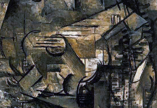
Once we recognize the location of the guitar we can begin to look for the signs of the figure holding it. This approach to reading Cubist works by looking for identifiable signs and establishing others based on their relationship to them is key to understanding Cubist paintings, particularly the later ones.
They are structured like a language in which basic units (comparable to words) are placed in relation to each other (as words are in a sentence), making it possible to represent and communicate an infinite number of ideas. You could also think of Cubism as an attempt to create a new alphabet or sign language for representation.
A deeper understanding
Some early theorists of Cubism, including Kahnweiler, thought the Cubist system of representation would prompt a deeper understanding of its subjects than traditional naturalistic representation. We know much more about things than the limited views that traditional representational paintings can supply. When we consider what a Cubist painting represents we engage in an intellectual or conceptual activity rather than a merely perceptual or visual one. The limited gray and brown palette enhances this intellectual approach by denying us the sensual pleasures of color.
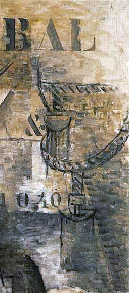
Braque included some identifiable forms to indicate the environment surrounding the figure in The Portuguese. The most noticeable is the loop of rope in the upper right. This is a recurring motif in contemporary works by both Braque and Picasso that represents a rope and tassel curtain tie back; here it suggests the guitar player is in an interior space, possibly a cafe. This is not certain, however; the surrounding environment is often interpreted as the deck of a ship in harbor, largely because Braque informed Kahnweiler that he saw the Portuguese guitar player in that context.
Including letters, numbers and symbols
One of the most striking aspects of The Portuguese is the inclusion of letters, numbers, and an ampersand in the painting’s shadowy, abstract planes. They are in standardized stencil format and suggest partially visible posters or painted signs, perhaps on the walls or windows of an interior space. They are also flat forms floating in ambiguous relation to the complex spatial planes depicted in the painting; neither clearly foreground nor background, they remind the viewer that the painting is literally a flat surface and even its confusing shallow planar space is an illusion.
The letters, numbers, and ampersand also repeat our experience of trying to understand the painting by the limited number of identifiable visual signs. We recognize them as individual signifying units, but they don’t make up complete words; the information they provide is only partial, and we have to fill in the blanks.
The Portuguese offers an array of clues in the form of letters, symbols, abbreviated representations, suggestive forms, and signs. It is a mystery with many possible readings and no single correct solution. By the time The Portuguese was painted neither Braque nor Picasso worked directly from life. Despite Braque’s letter informing Kahnweiler that the painting’s subject was a Portuguese guitar player he saw on board a ship in Marseilles, it is unlikely that a specific real world scene is the basis for every detail in the painting.
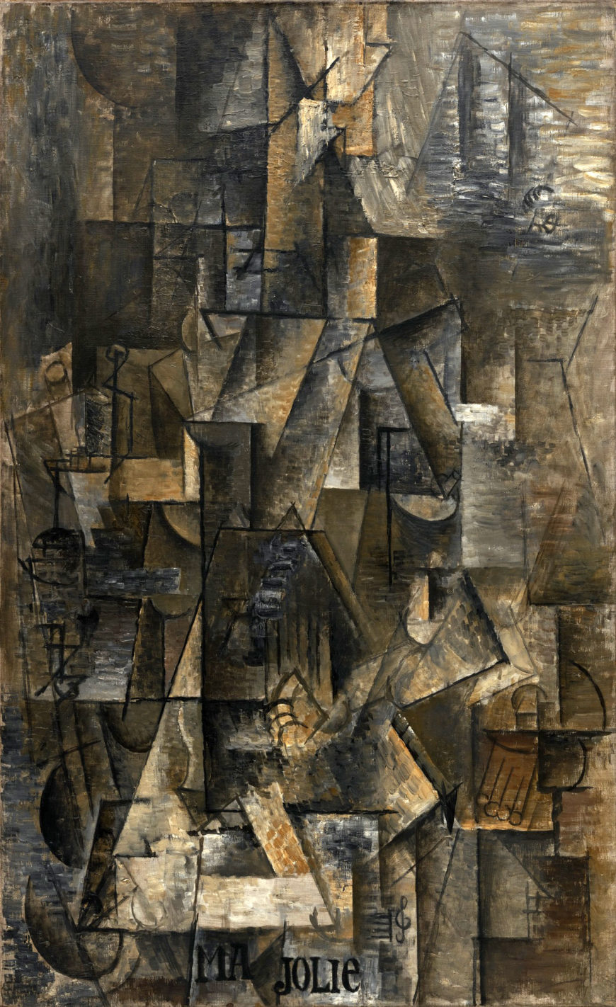
Music as a subject
Picasso’s Ma Jolie is even more abstract than Braque’s The Portuguese. Other than a greater concentration of shaded planes in the center of the painting there is little suggestion of a distinction between figure and background, or head and body. Picasso does provide a few visual hints of the subject, signs that he used, often more legibly, in contemporary works.
Curved black lines in the lower corners are often interpreted as indicating the arms of a chair, and the group of short parallel lines ending in circles on the lower right may be tassels or fringe on the chair. Six vertical lines in the center of the painting suggest the strings of a guitar or zither. The words “Ma Jolie” (“my pretty one” in French) accompanied by a musical staff and treble clef painted at the bottom of the canvas refer to a popular song of the day, as well as to Picasso’s nickname for his current girlfriend.
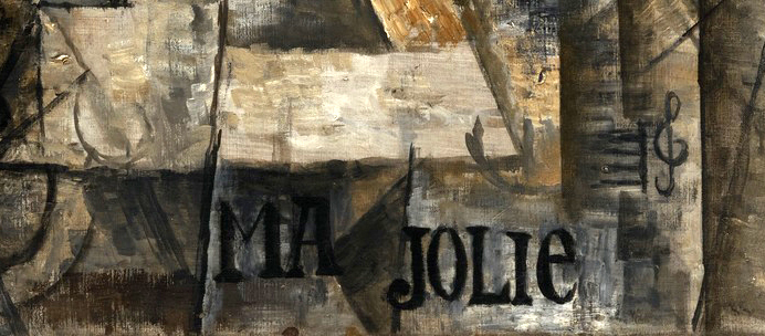
The reference to a popular song adds to the multiple ways music is the subject of Analytic Cubist paintings. In part, musical references are practical; musical instruments are more complex and interesting forms than the glassware and bottles that were also common Cubist subjects. Musical instruments are easy to identify by parts and lend themselves to the formal transformations foundational to Cubist innovations. Braque was an amateur musician, and both artists had various instruments in their studios. Music was also an important touchstone for Cubism more generally. As a non-representational art form with its own internal structures and systems of tones and rhythm, music is an abstract language that is suggestive rather than concretely referential. The paintings of late Analytic Cubism with their mysterious objects and figures in indeterminate space are like music; they are visual orchestrations of painted forms in which shifting patterns suggest far more than they clearly depict. For both Picasso and Braque these paintings were as close as they were willing to approach complete abstraction.
Additional resources:
Read more about Cubism at MoMA
Read about African influences in Modern art at the Metropolitan Museum of Art
Georges Braque, The Portuguese
by DR. BETH HARRIS and DR. STEVEN ZUCKER
Cold Coffee and Analytic Cubism
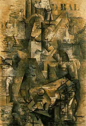
To understand Cubism it helps to go back to Cézanne’s still life paintings or even further, to the Renaissance. Let me use an example that worked nicely in the classroom. I was lecturing, trying to untangle Cubism while drinking increasingly cold coffee from a paper cup. I set the cup on the desk in the front of the room and said, “If I were a Renaissance artist in mid-15th century Italy painting that cup on that table, I would position myself at particular point in space and construct the surrounding objects and space frozen in that spot and from that single perspective. On the other hand, if this was the late 19th century and I was Cézanne, I might allow myself to open this view up quite a bit. Perhaps I would focus on, and record, the perceptual changes of shape and line that result when I shift my weight from one leg to the other or when I lean in toward the cup to get a closer look. I might even allow myself to render slightly around the far side of the paper cup since, as Cézanne, I am interested in vision and memory working together. Finally, if I were Braque or Picasso in the early 20th century, I would want to express even more on the canvas. I would not be satisfied with the limiting conventions of Renaissance perspective nor even with the initial explorations of the master Cézanne.
As a Cubist, I want to express my total visual understanding of the paper coffee cup. I want more than the Renaissance painter or even Cézanne, I want to express the entire cup simultaneously on the static surface of the canvas since I can hold all that visual information in my memory. I want to render the cup’s front, its sides, its back, and its inner walls, its bottom from both inside and out, and I want to do this on a flat canvas. How can this be done?
The answer is provided by The Portuguese. In this canvas, everything was fractured. The guitar player and the dock was just so many pieces of broken form, almost broken glass. By breaking these objects into smaller elements, Braque and Picasso are able to overcome the unified singularity of an object and instead transform it into an object of vision. At this point the class began to look a little confused, so I turned back to the paper cup and began to tear it into pieces (I had finished the coffee). If I want to be able to show you both the back and front and inside and outside simultaneously, I can fragment the object. Basically, this is the strategy of the Cubists.
Additional resources:
This painting at the Kunstmuseum, Basel
Biographical essay and collected work, MoMA
Essay on Cubism from the Heilbrunn Timeline of Art History, The Metropolitan Museum of Art
Cubist sculpture
Cubist Sculpture I
by DR. CHARLES CRAMER and DR. KIM GRANT
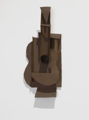
Picasso’s Guitar hangs from the wall like a painting or a real guitar, but we wouldn’t mistake it for either one. Unlike a painting, it’s a complex three-dimensional object, and it’s clearly not a functional guitar to be played. It’s an abstract representation of a guitar, an artwork, but one that doesn’t fit neatly into the tradition of Western representational sculpture. It is not a solid mass carved from marble or cast in bronze; it is not on a pedestal, nor is it attached to a background like a relief.
An unprecedented subject
Furthermore, the guitar as a subject is unprecedented in a sculptural tradition almost exclusively devoted to representations of human and animal figures. Picasso’s own earliest Cubist-based sculptures were of a woman’s head.
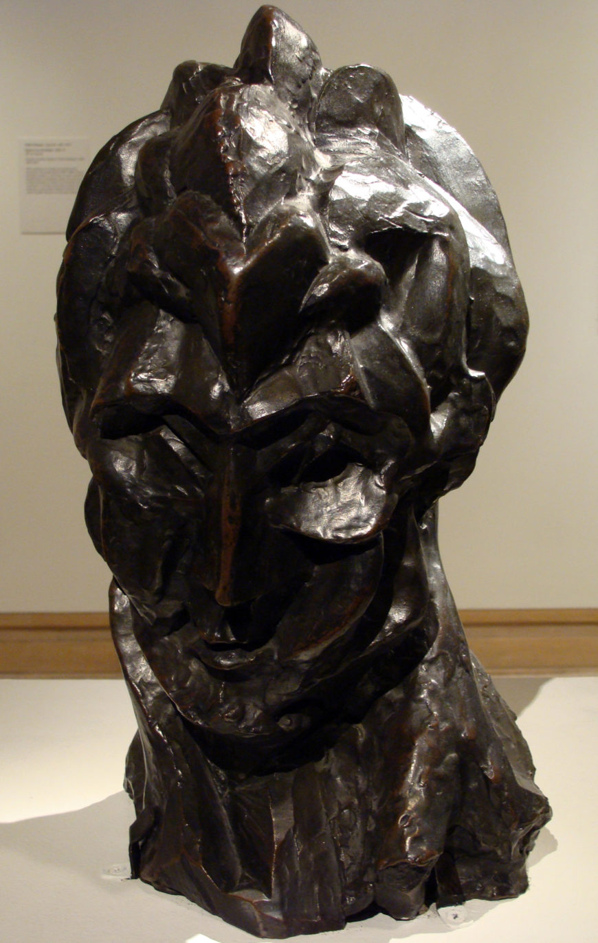
Guitar represents Picasso’s attempt to expand his Cubist investigations of the ambiguities of represented form and space into three dimensions. Both Picasso and Braque began making paper and cardboard Cubist sculptures of still-life objects around the same time that they began making collages.
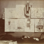
None of these early sculptures survive, and only a few photographs document their existence. They were, however, seen by other artists who visited Picasso’s and Braque’s studios. Vladimir Tatlin’s counter-reliefs were made in direct response to these early Cubist sculptures.
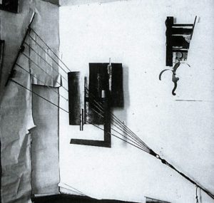
Innovations derived from an African mask
The surviving sheet-metal Guitar in MoMA’s collection is a later version of a now lost cardboard model (also known as a maquette). It is an important work, not only because it is one of the earliest surviving Cubist sculptures by Picasso, but also because of what Picasso’s friend and art dealer D. H. Kahnweiler wrote about it. He claimed that the innovative treatment of forms in Guitar was directly derived from an African Grebo mask Picasso owned. In that mask the eyes are represented by projecting cylinders. Human eyes, of course, are recessed in the head and do not project out from the face. In Guitar Picasso used a similar strategy for representing the guitar’s sound hole as a tube projecting from the empty space at the base of the fretboard. Space becomes shaped forms, while solid forms — the body of the guitar in this case — become, in places, empty space.

Guitar follows the example of the Grebo mask in radically simplifying forms to basic geometric shapes and arranging them to convey information. We see the double curve of the guitar’s body in the flat frontal plane of the sculpture as well as a larger flat plane in the back. We also are shown the guitar’s hollowness by the rectangle cut into the guitar shape between the front and back curved planes. The cylinder projects from the center of this empty space; it is itself hollow, so it is both a projecting form and one signifying emptiness.
Kahnweiler explained that Picasso derived a crucial concept from the Grebo mask — that it was possible to use signs to represent things rather than imitating their appearance. This, far more than mere formal similarities, is central to understanding the way Picasso’s art as a whole was affected by insights prompted by African and Oceanic masks and sculptures. We recognize the facial features in the Grebo mask by the placement and relationship of the parts rather than their specific details. The mouth, for example, is simply a rectangle with stripes. Alone it would not be recognized as a mouth, but in the context of the mask it is a very effective representation of one.
A new type of sculpture
With Guitar, Picasso extended his collage explorations into three dimensions. By doing so he made a new type of sculpture, which is now called assemblage because it is assembled from multiple parts rather than formed as a single mass. The move into three dimensions added an important element to the work — cast shadows. These contribute to the visual complexity of Guitar by creating planes and patterns, and suggesting much greater depth and solidity than is actually created by the rather delicate metal planes. In this photograph the shadow projected on the wall to the left seems to represent the side of the guitar.
Of course, because it is a three dimensional object, the shadows projected by Guitar will change with changes in lighting. Shadows add an additional layer of complexity to Picasso’s Cubist investigation of the ambiguities that can arise from the juxtaposition of real things and their representations.
A workman’s lunch
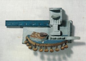
Picasso’s Still Life is another Cubist sculpture attached to a wall that plays with reality and representation. The still life subject is unconventional for a sculpture. It represents a working man’s simple lunch of sausage and bread accompanied by a glass of wine and a knife. All of the elements are painted wood except for a real piece of tasseled upholstery fringe attached to the semicircular plane representing the table top. The bread and sausage are crudely painted imitations of the subject, the knife is a simplified basic form, while the wineglass is Cubist in style. A strip of wood painted with a repeating pattern represents a decorative railing on the wall.
The sculpture uses a real decorative object, the strip of upholstery tassels, in combination with representations of objects depicted with varying degrees of naturalism. Adding to the complex display of reality and illusion is the painted decorative railing, which is attached to the wall as part of the sculpture, but could be a “real” decorative railing on the gallery wall.
Despite the inclusion of real objects and the realistically painted bread and sausage, Picasso clearly wanted the viewer to see Still Life as art, a hand-made object. The semi-circular plane representing the table top does not project from the wall at 90 degrees; it is tipped down like the table tops in Cubist paintings and collages, and could not support a real glass or knife. The quality of the workmanship is intentionally crude and roughly finished, in keeping with the simple workman’s lunch depicted.
Fine art versus craft
Still Life leads us to consider different possible approaches to representation and decoration, fine art and craft, and what they signify. The work juxtaposes the crafts of woodworking and upholstering, both associated with working class labor, with the illusionistic representation of still life objects associated with fine art. In uniting these two very differently-valued types of craft labor Picasso calls into question the traditional high valuation of the fine arts in relation to the so-called crafts, as well as challenging established distinctions between fine art and decoration. Known for his working class sympathies, Picasso here seems to claim an affinity with the artisans who work in the decorating trades.
Although they were little known at the time they were made, the innovations of Picasso’s Cubist assemblages foreshadowed many developments of twentieth-century sculpture. His use of found materials, rejection of the traditional materials and techniques of European sculpture, and elimination of a clear distinction between artwork and object make his early Cubist assemblages important early contributions to the breakdown between art and life that would become a key theme of twentieth-century sculpture.
Additional resources:
Picasso: Guitars 1912-1914 at the Museum of Modern Art, New York
A Technical Study of Picasso’s Construction Still Life, 1914 in the Tate Papers
Cubist Sculpture II
by DR. CHARLES CRAMER and DR. KIM GRANT
Cubism instigated significant developments in twentieth-century sculpture, challenging the European sculptural tradition in terms of form, media, and often subject matter. Alexander Archipenko’s Médrano II is an early example of the new approaches used by Cubist sculptors.
A circus performer
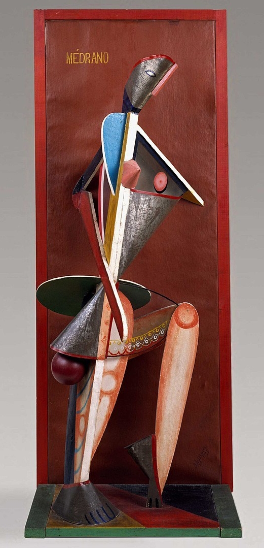
Médrano II is a representation of a woman made from simple shapes in a variety of materials. She looks like a jaunty doll dancing on a shelf. Her head is a piece of folded tin with a painted eye and red hairline and a thin piece of pink wood for a nose. A central wooden vertical supports glass, tin, and wood planes, which are cut into basic geometric shapes and painted in bright colors to represent her shoulders, arms, legs, and skirt. Two simplified wooden feet anchor the figure on a multicolored horizontal plane that projects like a shelf from a vertical red backdrop that frames the figure.
The title refers to the Médrano circus, which was frequented by many artists in the early 20th century, and indicates that the brightly painted figure is a circus performer. Her mobile stance with one leg bent on tiptoes and the inclusion of a ball below her skirt suggests the lighthearted attitude of an acrobat or juggler. The forms of Archipenko’s sculpture are similarly playful with repeated circles that seem to bounce through the figure, as well as the delicate pattern painted on the glass skirt, through which we can see the woman’s thigh.
Sculptures that hang from the wall
Médrano II is a rare surviving early Cubist sculpture that reflects the innovations of Pablo Picasso and Georges Braque’s Synthetic Cubist collages and sculptures. Like them, Archipenko combines a variety of cheap materials, emphasizes repeated geometric shapes, and adopts a playful approach to representation and design. The presentation of the sculpture against a framing backdrop is also similar to Picasso’s early Cubist sculptures, which were frequently conceived as hanging from the wall like paintings. The subject of a female figure and the bright colors are, however, more comparable to the approaches used by the Salon Cubists, and Médrano II was, in fact, exhibited in the 1914 Salon des Indépendants.
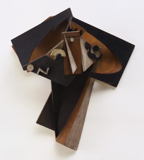
Henri Laurens’ Head of a Woman also uses a Cubist assemblage technique, but it is a more abstract and formally ambitious work than Archipenko’s. Like the later Cubist paintings and collages of Braque and Picasso, the head is fractured into multiple abstract shapes that represent specific features by relationship and form. For example, we can recognize the central vertical white triangle as a nose and the white circle next to it as an eyeball, while zigzag edges in the plane above suggest hair. The sculpture successfully translates the ambiguities of Cubist representation into three dimensions; however, it was made to hang on a wall, and thus intended to be viewed from a restricted angle. Like Archipenko’s Médrano II, it does not exploit the full potential of sculpture’s three-dimensionality.
A more traditional approach
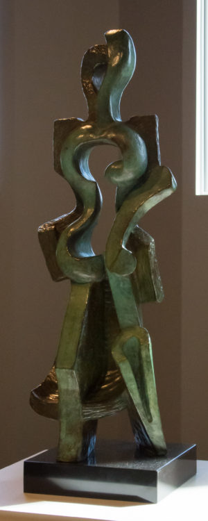
Archipenko also created several small freestanding bronze Cubist sculptures of women. In terms of medium, these were much more traditional than his Médrano II. They did, nevertheless, fully translate the Cubist approach into the three dimensions of sculpture. Walking Woman breaks down the mass of the body and incorporates space into the center of the form. The solid elements of the sculpture shape space, turning a void into an implied solid. The woman’s torso is defined by the conventional double curves that outline breasts, waist, and hips, but here they shape emptiness. Picasso used a similar strategy to define the body of the guitar in his collage Guitar, Sheet Music and Glass.

Archipenko’s Walking Woman is also reminiscent of the Analytic Cubist strategies used in paintings like Picasso’s Girl with a Mandolin in which simplified, geometric body parts are fragmented and dissolved into the surrounding space. The figure is suggested in Archipenko’s sculpture, and some parts of it, like the head, legs and part of a skirt, can be identified with confidence, but others, like the arms, are missing or only indirectly suggested.
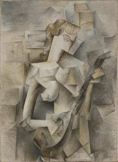
Classical references
Woman Combing Her Hair is much more traditional than Walking Woman despite the shaped void representing the woman’s head and neck. Archipenko used Cubist techniques here to create a decorative form with obvious classical references in both the contrapposto pose and the form. The truncated arm and breaks at the knees suggest the broken remains of Classical figures like the Venus de Milo.
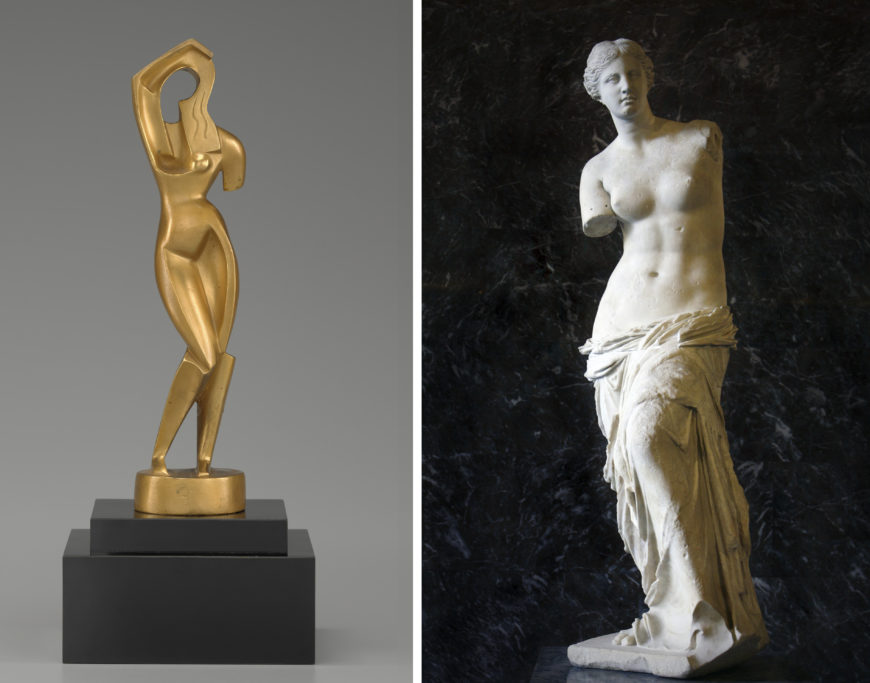
A non-naturalistic concavity defines the inner thighs and pubic area, but the effect is still fundamentally naturalistic and sensual. The raised arm merging with the figure’s hair is a quotation of many images of Venus. In this work the innovations of Cubism are used to create a modernist update of a decorative table-top sculpture.
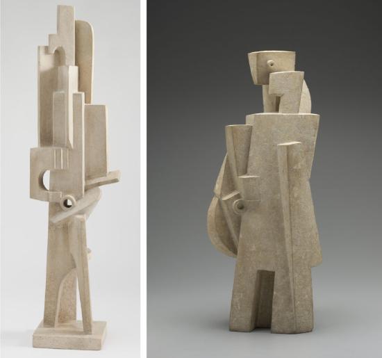
Jacques Lipchitz also made Cubist figure sculptures in the mid-1910s that participate in the contemporary trend to establish Cubism as a classical style. His Man with a Guitar and Man with a Mandolin abstract the figures into clusters of simple geometric planes. This approach is notably similar to Picasso’s contemporary Cubist figure paintings, such as Seated Man.
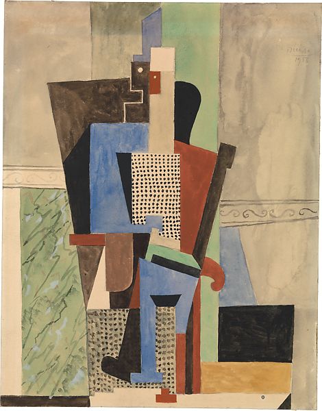
The technique of stone carving is traditional, and the soft white tones of Lipchitz’s figures reflect the classical tradition of Western sculpture. The figures themselves are radically abstracted, but the overall treatment of the sculptural form remains conventional. Lipchitz emphasizes sculptural mass, rather than integrating mass and space. Man with a Guitar stands on an integrated pedestal, a long-established mode of presentation. Like Archipenko’s more sensual figures of women, Lipchitz’s male musicians turn Cubism into a decorative style with classical overtones.
Cubism instigated two significant developments in twentieth century sculpture. The first, and more radical of the two, was the combination and assemblage of non-traditional materials to create objects that challenged the European sculptural tradition in terms of form, media, and often subject matter. This development led through Dada and Surrealism and on to the many art works of the later 20th century that challenged traditional conceptions of art.
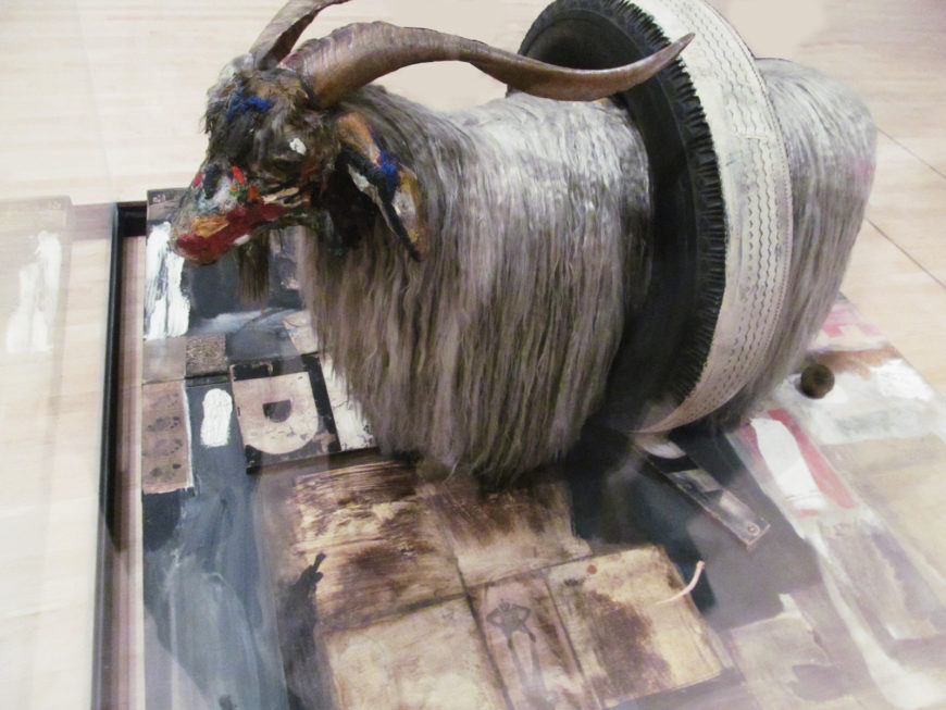
The second development of Cubist sculpture was also extremely fertile. It was the establishment of a new abstract formal language for sculpture that retained the traditional Western conception of the art object as designed for aesthetic contemplation, while expanding its range into non-representational forms.
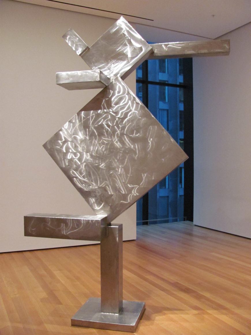
Additional resources:
Read more about Robert Rauschenberg’s Monogram at the Moderna Museet, Stockholm
Read more about David Smith’s Cubi X at the Museum of Modern Art, New York
Juan Gris, The Table
by DR. CHARLES CRAMER and DR. KIM GRANT
Juan Gris’ The Table depicts a Cubist still life using an elaborate combination of traditional naturalism, abstraction, and papier collé (pasted paper collage). Objects or parts of objects, including a pipe, a glass, bottles, and a key, have been meticulously drawn and shaded in charcoal. Their arrangement is, however, abstract, and many of them have been broken into sections and partly obscured.
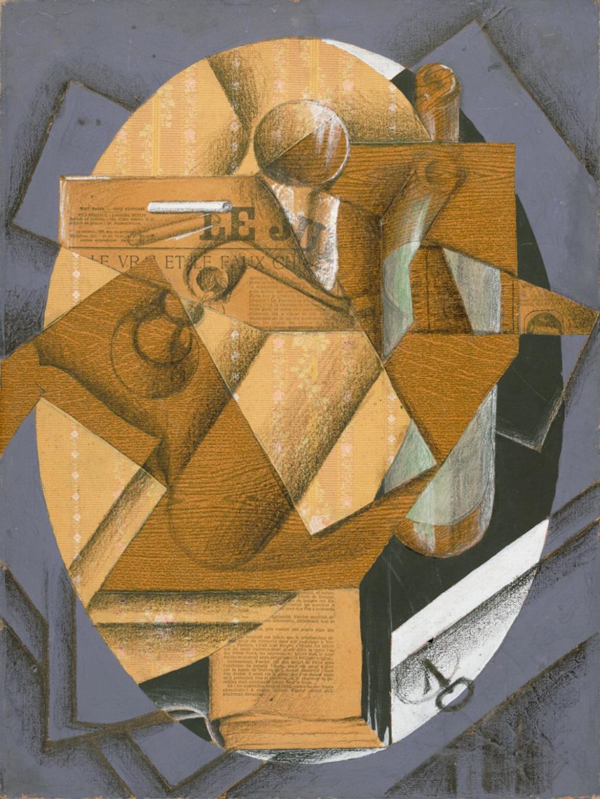
A tangle of forms
Most of the objects are depicted from above and are placed along one of two distinct axes: one vertical and one diagonal. Aligned with the vertical axis we see a wine bottle on the right, the upper portion of a glass with its circular lip in the center, an open book at the bottom, and the stripes of the flowered wallpaper. A second wine bottle is canted at a diagonal in the center of the composition; to the left another open book and the pedestal bottom and stem of a wineglass are placed at the same angle, as is the cut right edge of a piece of wood grain paper.
Gris used a variety of papers in this work. In addition to the wallpaper and the printed wood grain paper, there is a page from a detective novel, part of the front page of a newspaper, and different types of unprinted paper. The charcoal drawings and paint appear on all the papers, creating a woven tangle of forms in which it is impossible to clearly determine the represented location and spatial relationships of the objects.
The True and the False
Like Georges Braque and Pablo Picasso, Gris used printed paper in his collage as a direct means to refer to objects. The wallpaper represents the wallpaper in the cafe where the still life is located. The printed wood grain paper represents the wooden table. The piece of newspaper and page of the novel signify the presence of these two objects in the still life.
The newspaper headline is directly relevant to Gris’ playful Cubist approach to representation. It is slightly obscured but still legible and reads “Le Vrai et le Faux Chic” — “The True and the False Fashion.” The paper’s masthead, also partially visible as “LE JU” is an elision of “Le Journal” (newspaper), and a pun on the French words for “to play” (jouer) and “toy” (le jouet) that was frequently used by Picasso and Braque in their Cubist still lifes.

The newspaper headline states the theme of the work, a play between the real and the fake. Although we reflexively associate the Western naturalistic style with ‘reality’ and ‘truth’, compared to the charcoal drawings it is the collaged papers that are real things — a real newspaper, a real page from a book — not representations of things. The wood grain on the printed paper, called faux bois (fake wood) in French, is, however, obviously fake despite its material presence.
Conceptual puzzles and illusionism
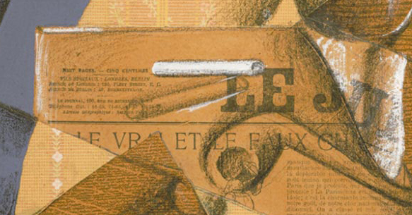
Gris displays various tricks and conceptual puzzles related to pictorial illusionism throughout the work. Above the headline “Le Vrai et le Faux” he depicted two cigarettes. One is painted white and stands out against the darker background to create a trompe l’oeil image with shadowed edges covering part of the the masthead. Below this cigarette is a second one only sketched in outline. This one makes no attempt to fool the viewer into thinking it is a real cigarette; it is simply a drawing. Which one is “true,” the one that tricks the viewer into thinking it is really there, or the one that announces itself as what it is, lines drawn on paper?

Such plays between representation and reality were common in the Synthetic Cubist still-life paintings of Picasso and Braque as well. In the first papier collé, Fruit Dish and Glass, Braque contrasted faux bois paper with realistically rendered grapes, a reference to the ancient Greek painter Zeuxis, who was said to have painted grapes so realistic that birds pecked at them.
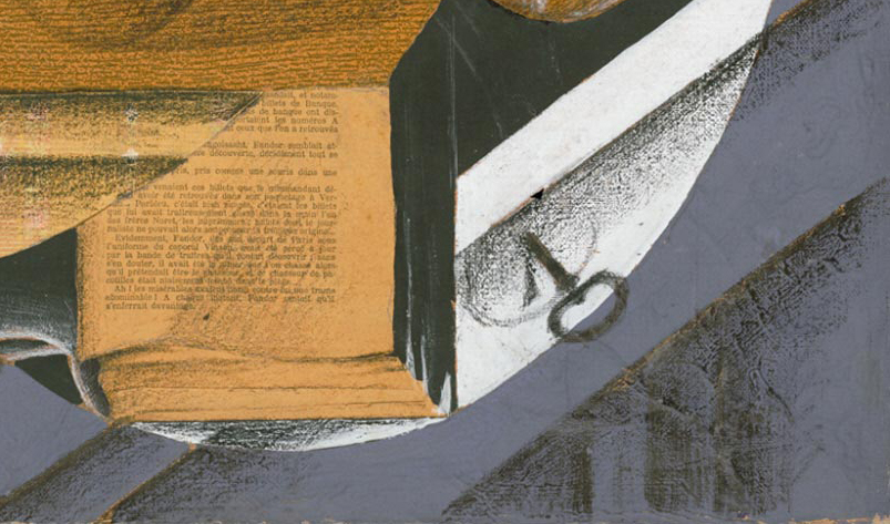
In Fruit Dish and Glass, Braque also drew a circle on the lower strip of woodgrain paper to represent the knob of a drawer pull facing the viewer. Gris uses a much more naturalistic drawing of a key in a drawer in a similar manner, as well as depicting a book with its collaged page as a three dimensional object projecting over the table’s edge. Both suggest that the objects are real and within the viewer’s reach — a common strategy used in naturalistic still life paintings to convince viewers that their illusionistic objects are real.
Logical Cubism
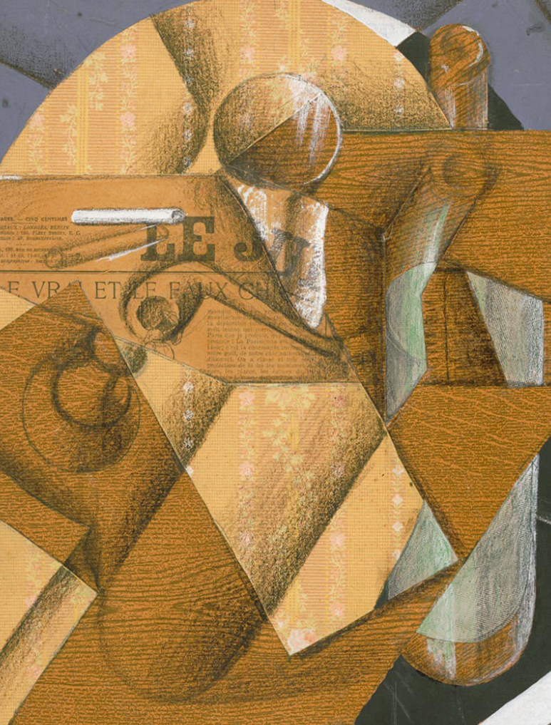
In The Table, Gris developed the Cubist techniques and representational strategies used by Picasso and Braque into something distinctly his own. His drawings do not radically deconstruct objects as Picasso did in his drawing of a glass in Guitar, Sheet Music and Glass. Gris’ wine bottles are naturalistically drawn, as are the parts of his wineglass in the upper center and left of the canvas. He does, however, use the deconstructive formal vocabulary of Analytic Cubism when he detaches the rim of the glass and the lips of the bottles from their bodies to draw them as perfect circles.
For many contemporary art critics Gris’ painting was considered both extremely logical and the best example of Cubism as an art of conception rather than perception. He presents objects as they are known/conceived rather than as they are seen/perceived. His depiction of the rims of glasses as perfect circles combined with drawing the rest of the glasses in profile is a conceptual approach because it shows key aspects of the object simultaneously, even though they cannot both be seen at once in reality.
Rhyming patterns
In addition to describing the essential form of objects, note how the circles in The Table align with the main diagonal and vertical axes of the composition, creating a pattern of formal rhymes throughout the work. This is one of the most distinctive aspects of Gris’ style, the development of complex surface patterns based on a systematic geometric order. The background checkerboard pattern of Guitar and Glasses organizes the distribution of objects laid upon the café table, aligning everything into an interwoven vertical, horizontal, and diagonal grid.
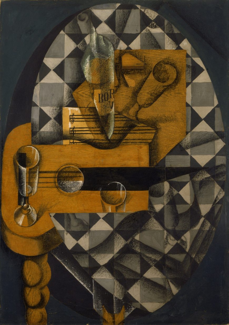
In some of his earliest Cubist works, such as Man in a Café, Gris used the golden section system of harmonious proportions to organize his compositions, but even when he worked more intuitively, his paintings and collages were structured to emphasize clear geometric forms and formal balance.
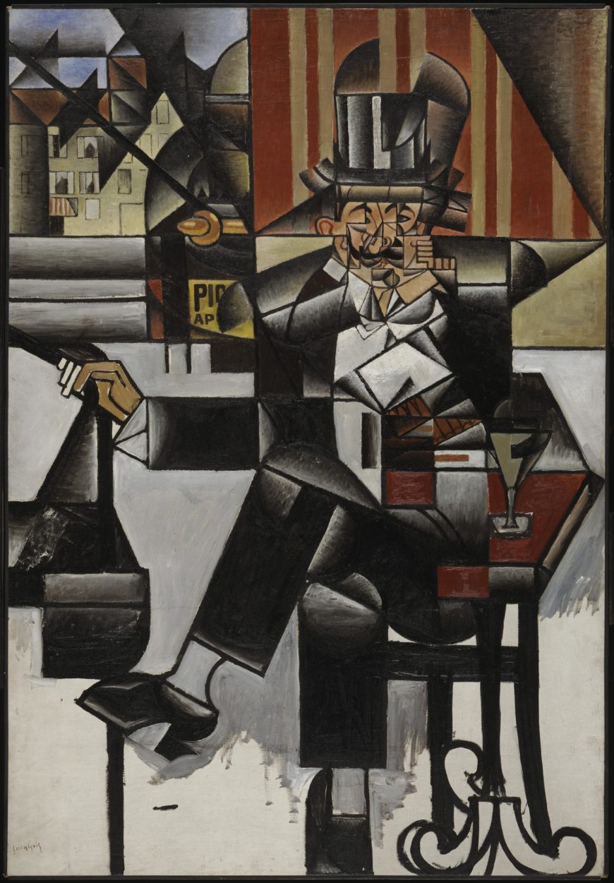
For some influential early critics and theorists of Cubism, the conceptual clarity and formal harmony of Gris’ paintings exemplified the art movement’s achievements. He had close connections to the Salon Cubists as well as to Picasso and Braque. Man in a Café was shown in the Section d’Or exhibition in 1912, after which Picasso and Braque’s dealer, Daniel Henry Kahnweiler, offered Gris a contract and he began to focus more specifically on still life subjects.
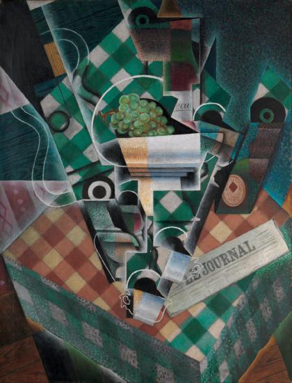
The decorative qualities of Gris’ work with its rich colors and strong geometric structure would become key characteristics of late Cubism and Purism as they developed during and after World War I.
Additional resources:
The Cubist City – Robert Delaunay and Fernand Léger
by DR. CHARLES CRAMER and DR. KIM GRANT
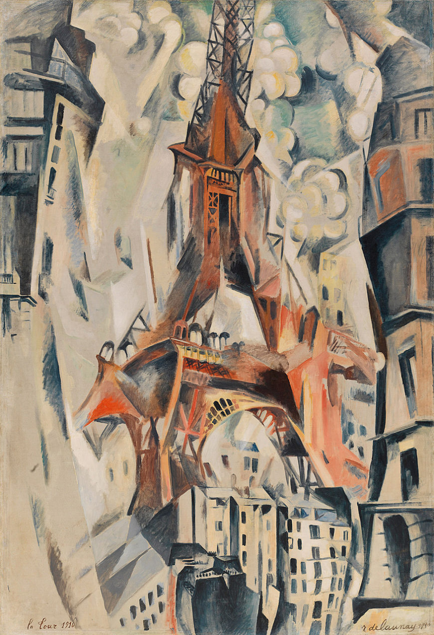
Robert Delaunay’s Eiffel Tower seems to slash up through the canvas, bending and distorting the surrounding city as it climbs into a fractured sky. This is one of many paintings in which Delaunay attempted to convey the dominating and disorienting presence of the famous nineteenth-century Paris monument — a product of modern engineering and a symbol of modernity.
In this painting we see the tower from different angles, looking simultaneously up at the supporting legs and arch, and down at the central portions of the tower. Some sections seem to dissolve, while others morph into extra supports and towers as if a different side view has been attached to the main form.
Although the details of the structure are often confused, the overall triangle formed by the central tower projecting from its splay-legged base is clear and shapes everything that surrounds it. The tall buildings on the sides of the painting curve and sway as if responding to the tower’s contours. The sky shatters into crystalline angles, and clusters of round shapes — suggesting trees or clouds or smoke — solidify the space around the tower into a cacophony of shifting planes.
Modern style for a modern subject
This is a vision of the modern city in the most modern painting style of the day, Cubism. Delaunay exhibited with many other Cubist painters in the Paris Salons, where his work was notable for its focus on Paris as a subject.
Although the group of Cubists with whom Delaunay was associated, the Salon Cubists, were dedicated to modern artistic techniques, their subjects were often not especially modern. Delaunay was unusual in his devotion to representing the experience of the modern city, and he was particularly drawn to the Eiffel Tower as a symbol of modern Paris.
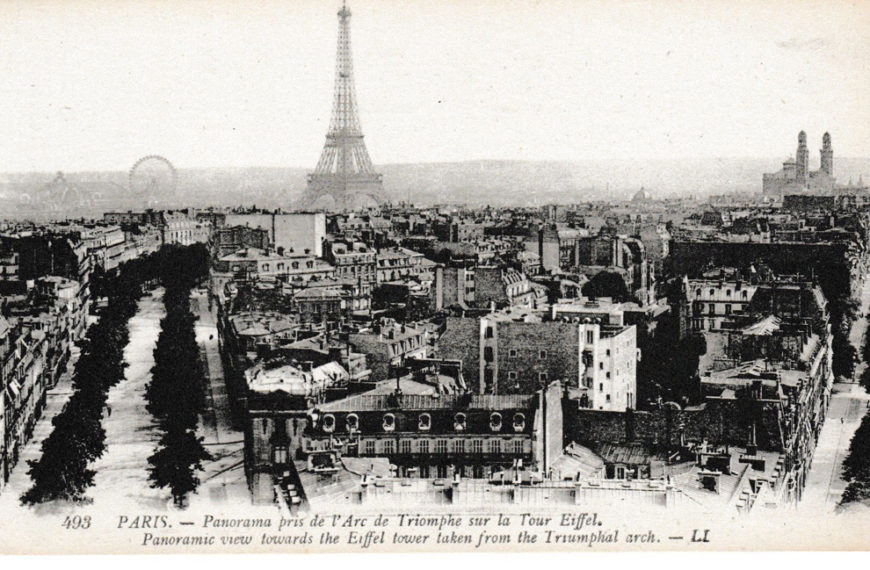
Constructed as a temporary monument for the 1889 Universal Exposition, the Eiffel Tower was intended to display advanced structural engineering. It was, and remains, completely out of scale with the surrounding buildings. It is also remarkably different in kind from the city’s buildings; it has no external walls and no solid form. Although massive in scale, it seems light and airy because of its open structure, through which the sky is visible. In the early twentieth century, it was a center for modern communications and scientific technology, serving as a telegraph relay station as well as a post for studying weather and aerodynamics.
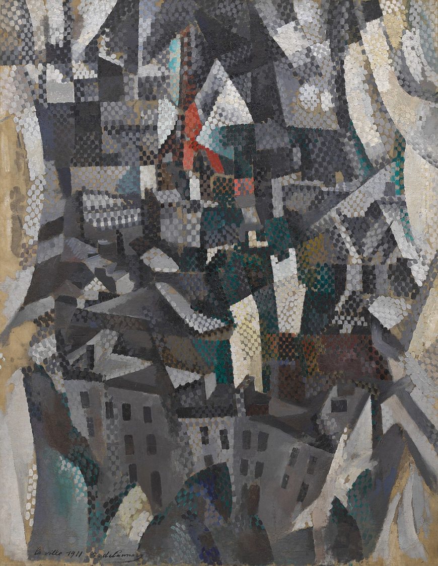
Delaunay often depicted Paris and the Eiffel Tower as viewed through a window. In The City, curtains are visible on the sides as light, curved forms framing the central scene. The dark shadowed buildings and rooftops of the city rise up from below and stretch into the distance, where the red and black silhouette of the Eiffel Tower can just be seen surging up into the faceted sky. In addition to the Cubist fracturing of forms and space, Delaunay here used a Neo-Impressionist-like technique of small brushstrokes to create the effect of shimmering highlights on the surface of the canvas. The following year he would devote himself to an analysis of color and light partly derived from Neo-Impressionism that would lead him to non-representational painting.
Unanimist spectacles
Delaunay’s depictions of the Eiffel Tower as a conjunction of fragmented and discontinuous views have been linked to the French philosopher Henri Bergson’s early twentieth-century theories about the way memory informs perception to combine past and present experiences. The unification of different views of the tower in a single image has also been connected to the contemporary French literary movement Unanimism, which celebrated the collective soul of individuals united by group experiences.
In Delaunay’s paintings, the Eiffel Tower becomes a focus for all of the city’s inhabitants. The simultaneous depiction of different viewing angles can be understood as a way of representing the union of all the different people’s viewpoints, and perhaps even the people’s spiritual unification, as they look at the tower.
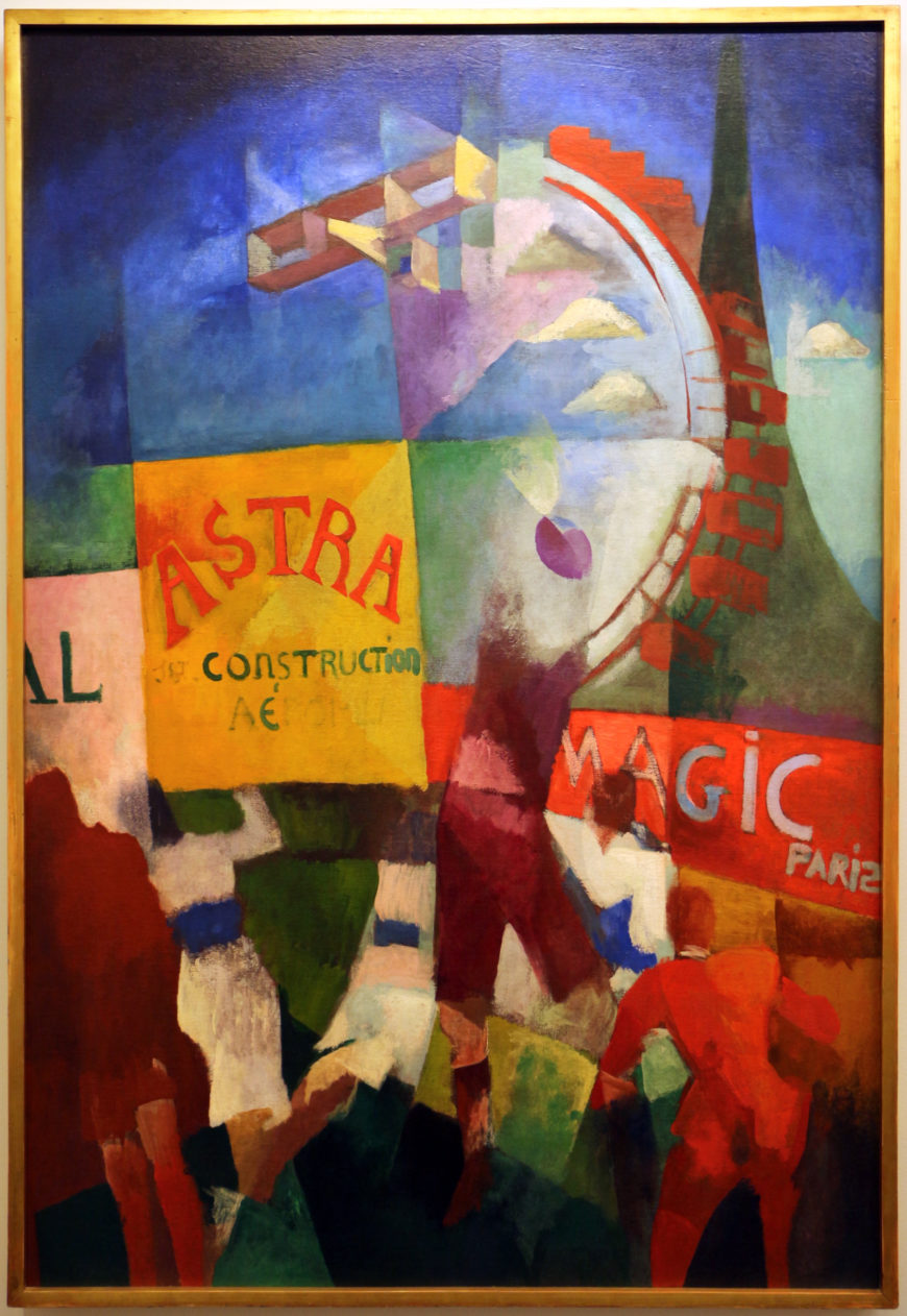
In The Cardiff Team the Eiffel Tower form is joined by two other aggressively modern subjects, a biplane and the enormous Paris Ferris wheel, which hover over the ball players and billboards in the lower half of the canvas. The title refers to a recent Paris-Cardiff rugby match, and the active figures in the foreground are based on a contemporary newspaper photo. The spectacle of modern team sports is an example of a popular group activity that created a Unanimist experience of collectivity.
The painting’s billboards advertise Astra, an airplane construction company, and “Magic Paris.” (In another version of the painting “Magic Paris” is replaced by “Delaunay,” indicating how closely the painter identified with the Eiffel Tower rising above the sign.) The contrasting planes of brilliant colors that structure the painting reflect Delaunay’s contemporary exploration of abstract color relationships, but this work is clearly a representation of Paris as a modern urban spectacle.
The Urban Experience
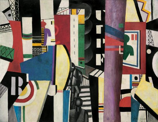
Delaunay’s friend and fellow Salon Cubist, Fernand Léger, also painted the modern city in a modern style. His huge painting The City, painted after World War I, is an amalgam of the chaotic visual experience of the twentieth-century urban environment. A cacophony of brightly colored geometric shapes and letters compete for attention. Vertical rectangles create a rhythm across the surface of the canvas, while depth is suggested by layering and diagonal planes jutting into the painting from the lower corners.
In the upper half of the painting there are two simplified shapes of a human head and torso, one green and one purple and red. These immediately recognizable human silhouettes are figures in advertising posters, similar to those in Delaunay’s The Cardiff Team, a nod to another aspect of modern life — the increasing presence and stridency of commercialism.
While most Cubist painters tended to depict traditional subjects, both Delaunay and Léger found the flat, hard-edged geometric style of Cubism an appropriate vehicle for representing the modern world of machines and mass production. Léger’s highly abstract style contrasts with the more legible, painterly, and nuanced representation of the city in Delaunay’s The Cardiff Team, but there are nevertheless important similarities.
Both artists represent the modern city by combining disparate elements, including letters and billboards, in complex abstract compositions based on ambiguous spatial relationships and color patterns. Léger’s painting builds on Delaunay’s earlier work and even has a coded homage to his fellow artist in the form of the initial R on the left paired with the bisected target shape, which forms a D. These are surrounded by open ironwork scaffolding that suggests fragments of the Eiffel Tower. The target shape also echoes Delaunay’s investigations of color in disc-shaped abstract paintings.
Transforming people
A striking aspect of these paintings of the city is the treatment of the human figure, which is starkly impersonal. The rugby players in The Cardiff Team are part of the modern spectacle. They have no faces, and in the case of the main central figure, no head at all.
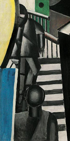
Similarly, in the lower center of The City are two charcoal-gray figures. The featureless face of one confronts us at the bottom of the canvas, while the other is on a dark-gray and white staircase in the background.
The anonymous, geometric rendering of these figures shows that Léger, like Delaunay, had no interest in depicting human beings as individuals. It may even suggest that modernity is transforming not only the environment, but also humankind, to match its own mechanical rationality.
Delaunay and Léger used Cubism’s abstract language of fractured forms and spatial dislocations to express the unique qualities of the modern urban experience. Their paintings focused on the distinctively modern aspects of Paris and depicted the way in which people are absorbed into and perhaps even transformed by modernity. Neither artist saw this as a bad thing; their paintings celebrate the union of modern humans and their new environment.
Additional resources:
Fernand Léger, Contrast of Forms
Video \(\PageIndex{9}\): Video from The Museum of Modern Art