3.8: German art between the wars
- Page ID
- 107369
German art between the wars
New movements in the Weimar Republic sought to bring art and design in line with modern life.
1918 - 1939
Prints and photography
These artists used easily-reproducible media to capture the sometimes harsh realities of life in the Weimar Republic.
1918 - 1939
Käthe Kollwitz, In Memoriam Karl Liebknecht

Printmaking
In the political turmoil after the First World War, many artists turned to making prints instead of paintings. The ability to produce multiple copies of the same image made printmaking an ideal medium for spreading political statements. German artist Käthe Kollwitz worked almost exclusively in this medium and became known for her prints that celebrated the plight of the working-class.
The artist rarely depicted real people, though she frequently used her talents in support of causes she believed in. This work, In Memoriam Karl Liebknecht was created in 1920 in response to the assassination of Communist leader Karl Liebknecht during an uprising of 1919. This work is unique among her prints, and though it memorializes the man, it does so without advocating for his ideology.
History and politics
From the end of the First World War in late 1918 to the founding of the Weimar Republic (the representative democracy that was the German government between the two World Wars) in August 1919, Germany went through a period of social and political upheaval. During this time, Germany was led by a coalition of left-wing forces with Marxist sympathies, the largest of which was the Social Democratic Party of Germany (SPD). Other, more radical groups were grappling for control of Germany at the same time, including the newly founded German Communist Party (KPD).
The Socialists and Communists both wanted to eliminate Capitalism and establish communal control over the means of production, but while the Socialists believed that the best way to achieve that goal was to work step by step from within the Capitalist structure, the Communists called for an immediate and total social revolution that would put governmental power in the hands of the workers. In this spirit, the KPD staged an uprising in Berlin in January 1919. Military units called in by the SPD suppressed the uprising and captured two of the leaders, Karl Liebknecht and Rosa Luxemburg. Liebknecht and Luxemburg were murdered while in custody on January 15, 1919. Their deaths struck a chord across the left-wing landscape and they were widely celebrated as martyrs to the Communist cause.
Kollwitz was not a Communist, and even acknowledged that the SPD (generally more cautious and pacifist than the KPD), would have been better leaders. But she had heard Liebknecht speak and admired his charisma, so when the family asked her to create a work to memorialize him she agreed.
A Lamentation
Memorial Sheet of Karl Liebknecht is in the style of a lamentation, a traditional motif in Christian art depicting the followers of Christ mourning over his dead body, casting Liebknecht as the Christ figure. The iconography would have been easily recognizable by the masses who were the artist’s intended audience.

Other memorial works
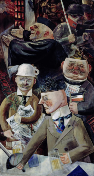
Several artists at the time created memorial works for Liebknecht and Luxemburg. The most well known (along with Kollwitz’s work) are Max Beckmann’s “The Martyrdom” from his portfolio Hell of 1919 (above), and Conrad Felixmüller’s People Above the World from that same year. In contrast to those works, Kollwitz’s In Memoriam Karl Liebknecht focuses not on the man himself, but on the workers who had put their faith in him,. The focus on those broadly affected, rather than those in the spotlight is a constant theme in the artist’s work, reflected in her most famous works from the War cycle, which depict not the soldiers or the fighting, but the suffering of the women and children left behind and starving.
The composition
The composition divides the sheet into three horizontal sections. The top section is densely packed with figures. Their faces are well modeled and have interesting depth in themselves, but the sense of space is very compressed – the heads push to the foreground and are packed into every available corner of space. It gives the impression of multitudes coming to pay their respects, without compromising the individuality of the subjects.
The middle strata contains comparatively fewer details, further emphasizing the crowding at the top of the printing plate. This section draws attention to the specific action of the bending mourner. His hand on Liebknecht’s chest connects this section to the the bottommost level of the composition, the body of the martyred revolutionary.

Above the bending mourner, a woman holds her baby up to see over the heads of those in front of them. Women and children were a central concern of Kollwitz’s work, making her a unique voice in a creative environment dominated by young men (in fact, Kollwitz was the first woman to be admitted into the Prussian Academy).
Woodblock prints
Woodblock printing is a technique in which a design is carved into a slab of wood which is then covered with ink and printed onto paper. Ink coats the original surface of the wood block, which prints as black, while the cut away areas stay the color of the paper. This is different from printmaking methods such as engraving in which the ink is caught in the recesses carved into the metal plate by the stylus and therefore the lines print black and the untouched areas of the plate come out white in the print.
The German Expressionist artists, in particular Ernst Ludwig Kirchner and the Brücke group, used woodcuts as early as 1904 to capture the rough, vital energy that they perceived in the work of so-called “primitive” societies without a fine art tradition.
Kollwitz’s career overlapped with the German Expressionists but she was not an Expressionist herself and was about a generation older than most of them. Her use of such a trendy technique was uncharacteristic, and in fact, she only worked in woodblocks for a few years after the First World War. Kollwitz created some of her most powerful and affecting work in this style, including the War print cycle of 1924. She embraced the raw effect of woodblock printing to create pieces works that have cast off the subtlety and finesse of her earlier work in etching and lithography. Kollwitz’ felt that her protest against the horrors of war was best communicated in the rough edges and stark black and white that woodblock prints afforded.
Additional Resources:
Biography of the artist from Oxford University Press
August Sander, Portraits
by DR. JULIANA KREINIK, DR. BETH HARRIS and DR. STEVEN ZUCKER
Video \(\PageIndex{1}\): Three portraits by August Sander are discussed here: Pastry Cook, gelatin silver print, 1928; Secretary at a Radio Station, Cologne, gelatin silver print, c. 1931; and Disabled Man, gelatin silver print, 1926.
Umbo, The Roving Reporter
by DR. JULIANA KREINIK, DR. STEVEN ZUCKER and DR. BETH HARRIS
Video \(\PageIndex{2}\): Umbo (Otto Umbehr), The Roving Reporter, photomontage (rephotographed), 1926
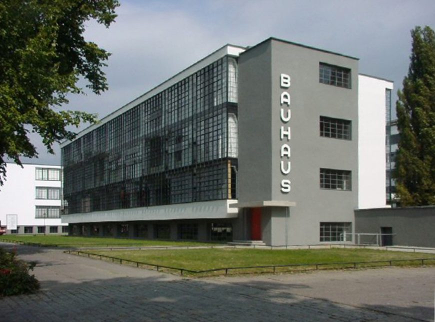
The Bauhaus
At the Bauhaus, the various fine and applied arts were integrated and equally valued.
1919 - 1933
The Bauhaus, an Introduction
by DR. CHARLES CRAMER and DR. KIM GRANT
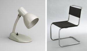
The Bauhaus was an art and design school in Germany whose importance is astonishing given its very brief and tenuous existence. The desk lamp and chair illustrated here are so familiar and so simple that they don’t seem to have required a designer, but they were as radical in their time as they are commonplace now, and their apparent simplicity was the result of a thoughtful and meticulous design education and design process that remains a model today.
During its fourteen years of existence the Bauhaus was forced to change location three times and was ultimately closed as a result of political pressure from the Nazi party. Founded by Walter Gropius in 1919, the school originally had three aims: to abolish the “arrogant” distinction between artist and craftsperson by recognizing the knowledge and skills common to both; to mobilize all arts and crafts towards the creation of total design environments; and, to foster links between the school and local manufacturers.

Art education and the “Vorkurs” (preliminary course)
The Bauhaus program of study is diagrammed above as a circle. Students began in the outer ring with the half-year Vorkurs or preliminary course (later expanded to a full year) before moving into one of several workshops to concentrate on a specific medium such as ceramics, woodworking, weaving, metalworking, and so on. Once they had achieved a degree of proficiency in their chosen medium all students converged again in Bau (building), to construct total environments, designing everything from the architecture to the furniture, carpets, dishes, and flatware.
The Vorkurs, which taught skills common to all areas of art and design, was one enduring innovation of the Bauhaus. Today’s art students will recognize in the Vorkurs the progenitor of their first-year 2-D Design and 3-D Design “foundations” courses. The original head of the Vorkurs was a charismatic Swiss art teacher named Johannes Itten, a follower of Mazdaznan (related to the ancient Persian religion Zoroastrianism) who wore monk-like clothing and encouraged students to meditate, do breathing exercises, and eat a vegetarian diet as aids to creativity.
Projects assigned in the Vorkurs were free-form and generally without practical application. They were intended to develop students’ perception, creativity, and understanding of materials. For one typical project Itten collected disparate materials such as wool, rope, and wood shavings.
The students had to feel these sequences of textures with their fingertips, their eyes closed. After a short while their sense of touch improved dramatically. I then asked them to make texture montages of contrasting materials. Fantastic structures were produced and their effects were completely novel at the time.
Johannes Itten, Design and Form: The Basic Course at the Bauhaus and Later (London: Thames & Hudson, 1975), p. 34
Experimental constructions
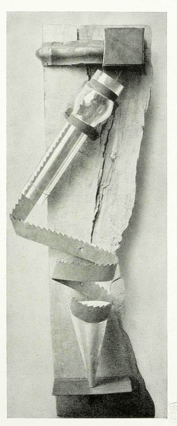
Very few of these Vorkurs projects have survived as they were only intended to be exercises. The work above is described in the 1923 Bauhaus exhibition catalog as a “combined contrast effect: material contrast (glass, wood, iron), contrast of expressive forms (jagged-smooth); rhythmic contrast.” In addition to demonstrating these formal contrasts, its purpose was to understand the nature and potential of different materials.
For example, the wood is left rough and unfinished in order to demonstrate its grain, texture, and color variations. Similarly, the saw blade shows the dull sheen of its surface and has been curled into a spiral to demonstrate the flexibility of metal. The rust on the saw blade’s surface and the knots and splits in the wood are not sanded or polished; instead, they are featured as qualities of those materials that need to be understood by the design students who will be working with them.
From craft to industry
The early Bauhaus concentrated primarily on hand-made crafts, but it soon became evident that, in order to survive, the school needed to reorient its goals toward industrial production. Bauhaus headmaster Walter Gropius asserted in the keynote address for the school exhibition of 1923, “The Bauhaus believes the machine to be our modern medium of design and seeks to come to terms with it.”\(^{[1]}\)
Itten, whose spiritual and expressionist orientation did not fit with these aims, was replaced by Laszlo Moholy-Nagy, and later Josef Albers, as head of the Vorkurs. The traditional medieval titles from craft workshops initially used in the Bauhaus, where instructors were called “Masters” and students were called “Apprentices” or “Journeymen,” were replaced by the more modern titles of professor and student.
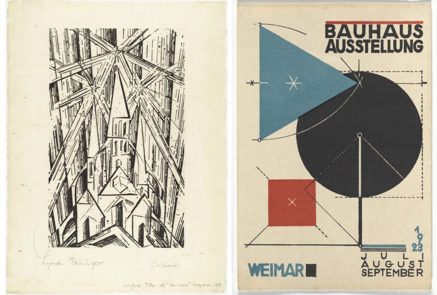
The reorientation toward the modern machine age is most obvious in products designed by the Bauhaus for mass production, but it is also visible in the graphic branding of the Bauhaus itself. In 1919, the founding manifesto of the Bauhaus was published with a cover by Lyonel Feininger that featured a cathedral crowned by three radiant stars. Both the medieval subject and the woodcut technique are deliberately old-fashioned, reflecting the guild structure of the school itself and its emphasis on hand making and personal expression.
By contrast, the poster designed for the 1923 exhibition is a lithograph, a more modern printmaking technology. It uses only rational geometric shapes and the primary colors red and blue, along with black and the white of the paper. Dotted lines and arcs made by a compass reinforce the overall sense of precise, mechanical execution, very different from the uneven, expressive marks of Feininger’s print. Even the letter forms reinforce the impression of clean, rationalized modernity: sans-serif, upright, and with a consistent (monoline) weight. Such “modern” typefaces are very familiar today, but were quite different from the medieval blackletter or gothic typeface that was common in Germany until the 1940s.
The Bauhaus is dead … long live the Bauhaus
In 1925, the Bauhaus was forced to flee from its original location in Weimar, Germany. The right-wing nationalists who came to power in the region saw the school as a hotbed of foreigners sympathetic to Communism. The school lasted only seven years in its next location, Dessau, before being forced to move to Berlin. When the Nazi party came to national power under Chancellor Adolf Hitler in 1933 the Bauhaus closed for good.
Despite its relatively brief existence, the Bauhaus had an enormous influence on our contemporary visual environment. Fleeing Nazi Germany, its professors disseminated the school’s curriculum and ideals across the United States. Bauhaus founder Walter Gropius went on to teach at the Harvard School of Design, along with furniture designer Marcel Breuer. Vorkurs instructors Moholy-Nagy and Josef Albers also continued their influential teaching careers: Moholy-Nagy at the New Bauhaus in Chicago and Josef Albers at Black Mountain College in North Carolina and Yale University in New Haven, CT.
Generations of art and design students have absorbed their instruction not only directly, in foundation courses that adopt the aims and sometimes sometimes even exact projects of the Bauhaus Vorkurs, but also by osmosis, living in dorms, sitting in chairs, and using desk lamps that are the direct descendants of Bauhaus designs.
Notes:
- Cited in William J. R. Curtis, Modern Architecture since 1900 (Upper Saddle River, NJ: Prentice Hall, 1996), p. 193.
Additional resources:
Bauhaus: Building the New Artist at the Getty Research Institute
Magdalena Droste. Bauhaus: 1919-1933 (Köln: Taschen, 2006).
Elaine S. Hochman. Bauhaus: Crucible of Modernism (New York: Fromm International, 1997).
Frank Whitford. Bauhaus (New York and London: Thames and Hudson, 1984).
The Bauhaus and Bau
by DR. CHARLES CRAMER and DR. KIM GRANT

Although it did not have an architecture department until 1927, the 1919 Bauhaus charter called the “complete building” the “ultimate aim of the visual arts.” Architecture requires a unification of all media, both arts and crafts:
Let us conceive, consider, and create together the new building of the future that will bring all into one simple integrated creation: architecture, painting, and sculpture rising to heaven out of the hands of a million craftsmen, the crystal symbol of the new faith of the future.
Translated in William J. R. Curtis, Modern Architecture since 1900 (Prentice Hall, 1996), p. 184.
In the Bauhaus program of study, diagrammed above as a movement towards the center of a series of concentric circles, all students would start in a half-year or yearlong foundations course in the elements and principles of design, and then each would choose a medium to specialize in: textiles, glass, metal, and so on. The goal was for all of these different specializations to come together in Bau or “building,” the creation of total designed environments, from the structure, to the furniture and tableware, to the rugs on the floor and the paintings on the walls.
The Haus am Horn
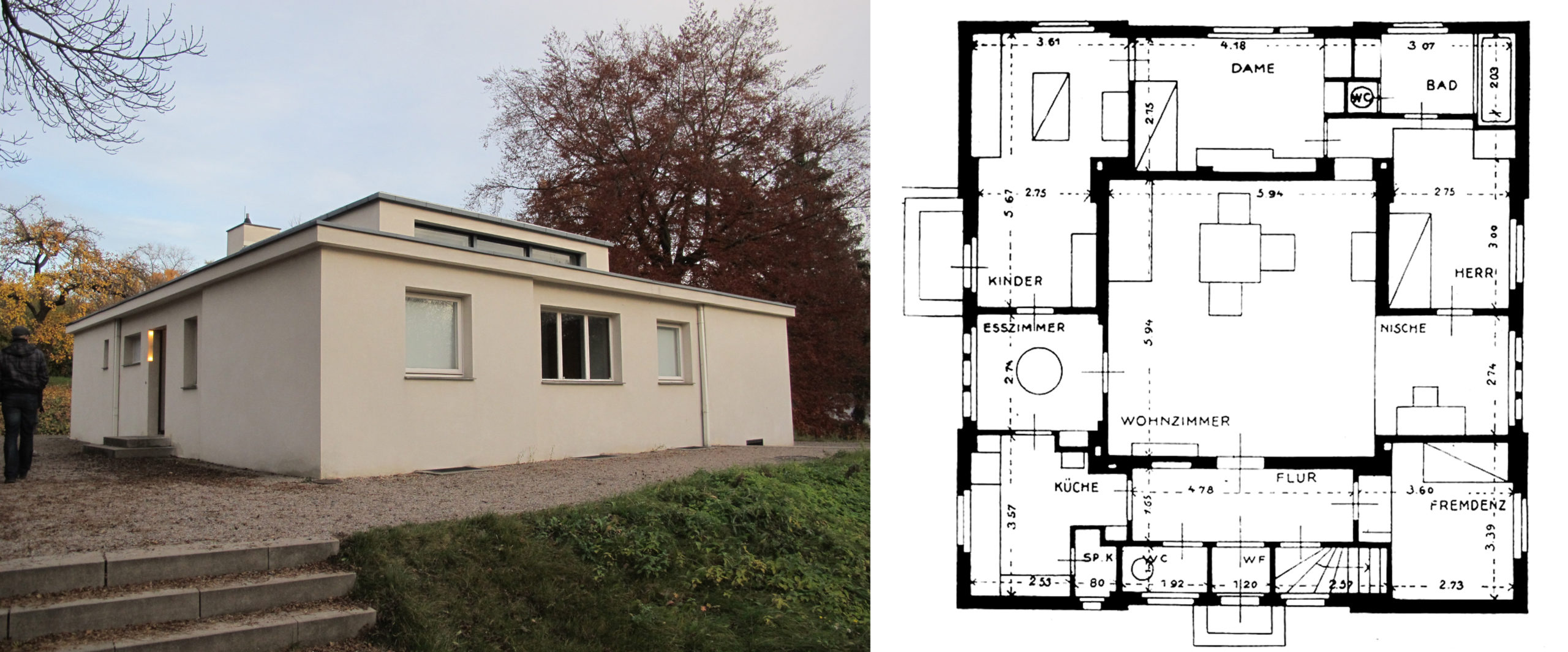
This goal was tested in 1923, when the struggling school was given a state loan on the condition that it prove its worth by showing concrete results in a public exhibition. Part of that exhibition was a conventional display of sculptures, paintings, ceramics, textiles, and other objects produced by Bauhaus students and staff. In addition to this, it was decided to build a model house near the school to display Bauhaus designs in a practical, everyday context.
Designed by Georg Muche (oddly, the Bauhaus weaving master), the Haus am Horn is a flat-roofed white cube centered around a living room as the main gathering place for the family. Because it is almost completely surrounded by other rooms, the living room projects above the rest of the house to let in light through clerestory windows. Surrounding it are four bedrooms, along with the entryway, kitchen, pantry, dining room, bathroom, and a small work niche.
A group effort
All the Bauhaus workshops were involved in the project. The furniture was designed by Marcel Breuer, a student in the woodworking workshop; the rugs by textile students Marta Erps and Gunta Stölzl (who later became head of the weaving workshop); and the lighting fixtures by Lázló Moholy-Nagy in the metal workshop.
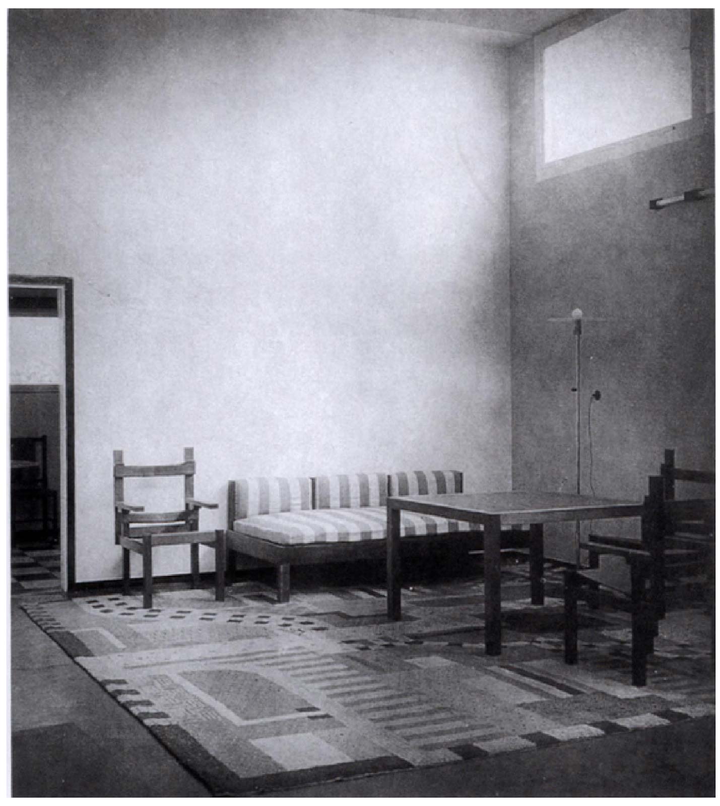
Despite the diversity of designers involved, a surprising degree of unity was achieved because every aspect of the project was based on the basic Bauhaus principles of functionalism and geometric rationalism. Purely “decorative” elements were eliminated for the sake of cost-effectiveness in manufacture, efficiency in usage, and harmony in aesthetics. The straight-edge and right-angle geometry of almost all of the objects, from the walls, to the window trim, to the furniture, makes them all harmonize with one another, as does the largely white and cream color scheme, enlivened with a few quiet colors.
The Bauhaus rejection of decoration did not imply a neglect of aesthetics. For Bauhaus designers, beauty was not something to be added to a functional item in the form of extra frills; instead, it was achieved through careful choices of materials, proportions, textures, and colors for the functional features of the objects.
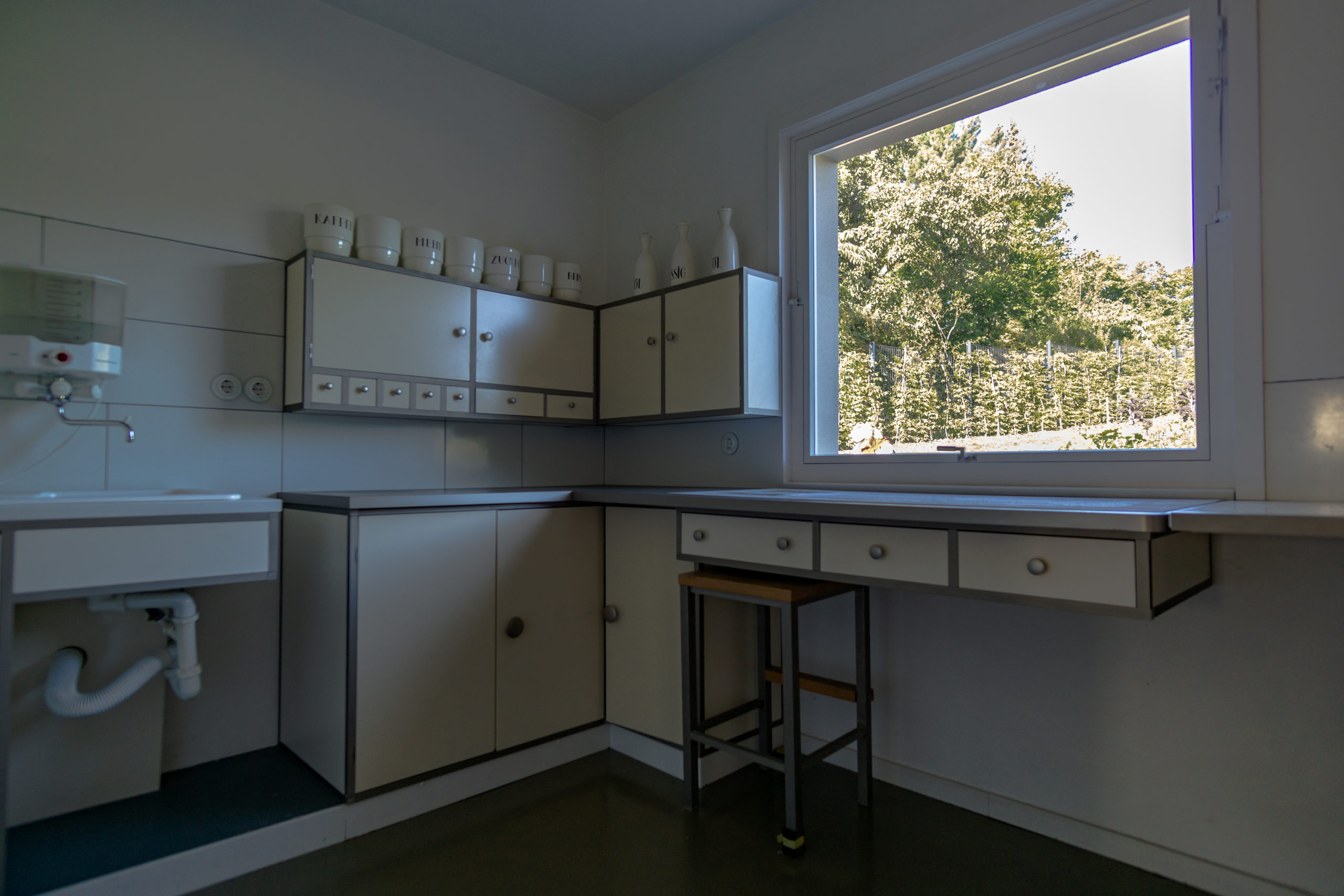
The kitchen is a particularly good example of modern functionalist design. Wall-mounted cabinets are built in over a continuous countertop resting on more built-in cabinets between the sink and the cooker. A large horizontal window brings plenty of light into the room during the day, and all necessary items are available at arm’s reach while standing at the counter.
The faces of the cabinets are flush and smooth, apart from simple projecting knobs; there are no moldings, panels, or decorative elements that would collect dirt. The floors throughout are rubber or Triolin, a linoleum substitute, so that all surfaces are easy to clean with a quick wipe. These features are commonplace today, but in the 1920s dedicated kitchens were rare outside upper class households. Most poor and middle-class people had none of the modern appliances seen here. They cooked on a stove in the living room, and used separate furniture for food storage and preparation, rather than an integrated design of built-in cupboards and countertops.
The Bauhaus building, Dessau
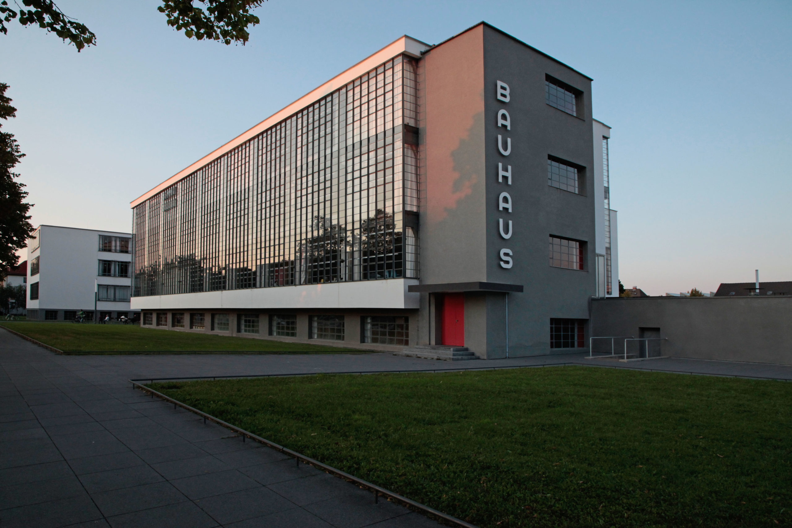
Due to the hostile political environment in Weimar, after 1924 the Bauhaus was forced to move to Dessau, Germany. The more sympathetic local government there provided the Bauhaus with land and a budget to build its own campus, giving the school another opportunity to fulfill its vision of a holistically-designed modern environment.
The Dessau building was constructed using aggressively modern materials appropriate to the machine age: steel, reinforced concrete, and glass, none of which are disguised with a false facade or ornamented with non-structural embellishments. The three main buildings — shop block, vocational school, and living quarters — are simple rectangular cubes of different dimensions, joined into an asymmetrical pinwheel plan by two connectors: a two-story bridge used for administrative offices, and a one-story building with an auditorium and cafeteria.
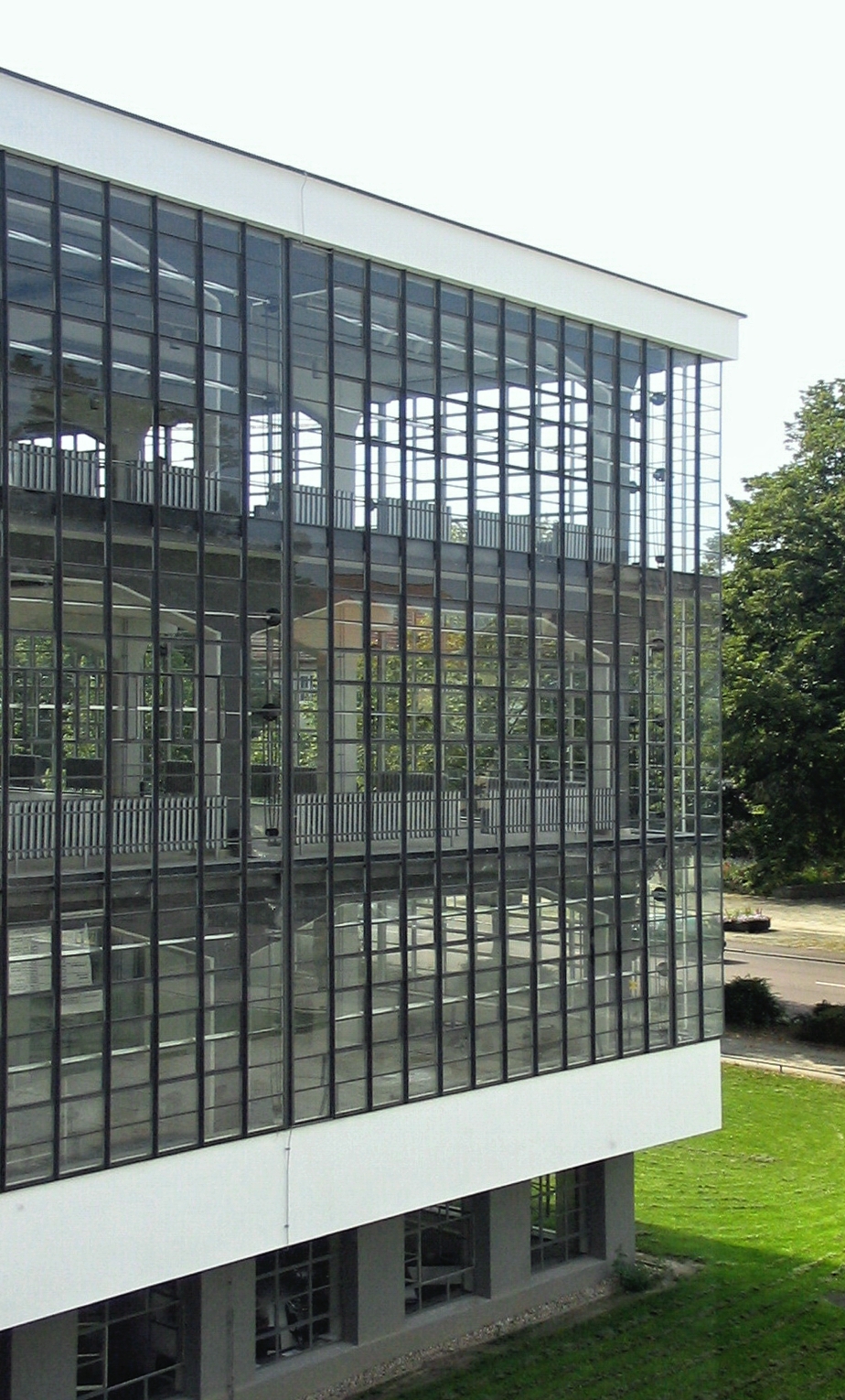
The most precociously modern of the three main buildings was the shop block, which is sheathed entirely in glass to let in plenty of natural light. The steel frame structure, proudly visible through the transparent walls, has been recessed, allowing the two glass curtain walls to meet at a corner without a masonry joint.
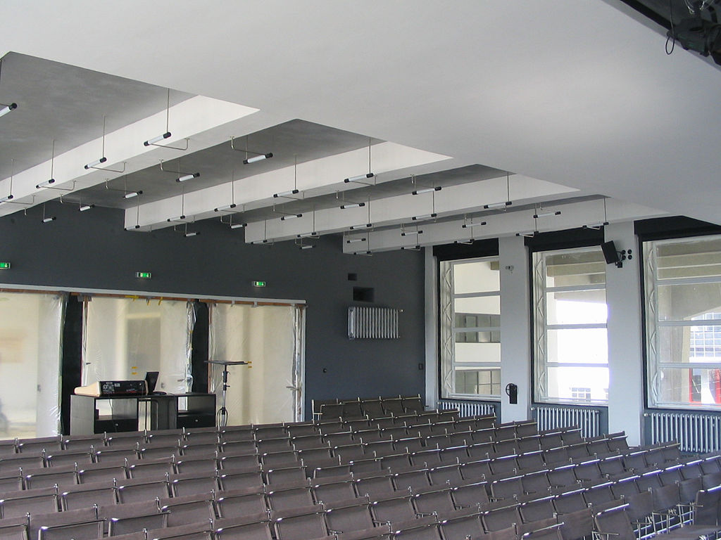
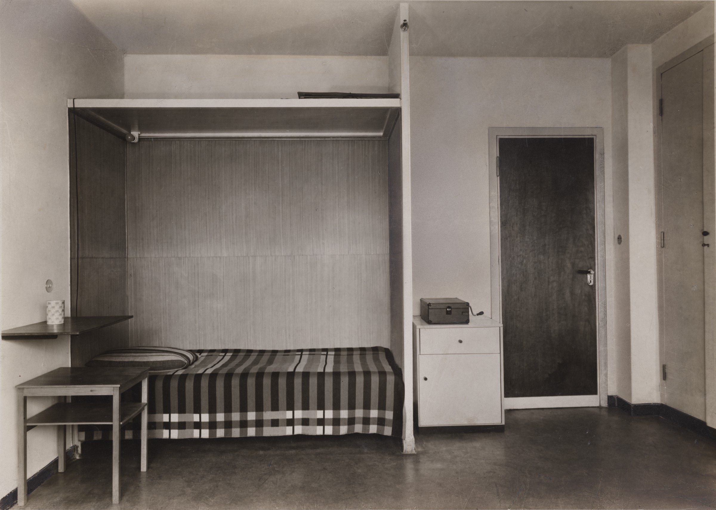
The interior spaces are as starkly geometric and functionalist as the exterior, with the furniture and hardware all designed in the school’s workshops. In the auditorium, Marcel Breuer designed the tube-steel seating and Max Krajewski designed the lighting. The 28 apartments for students and junior instructors, each measuring 20 square meters (approximately 215 square feet), are models of spartan efficiency and have shared bathrooms. But there are also surprising amenities, including a small balcony for every room, a roof terrace, and a food lift to connect the ground-floor canteen to the shared kitchens on every floor.
Legacy of the Bauhaus
Just seven years after it moved to Dessau, the Bauhaus was forced to move again, this time to Berlin, where it stayed for only one year before being disbanded by the rising Nazi government. Fleeing the unfavorable political environment as well as a disastrous economic situation, Bauhaus students and instructors spread across Europe and the United States, bringing their modern design principles with them. Two of the former directors of the Bauhaus, Walter Gropius and Mies van der Rohe, went to teach in the United States (in Boston and Chicago respectively), where their designs and teaching helped to form the International Style of corporate architecture that now dominates the urban environment.

The promise of the Bauhaus shop block, a building apparently made entirely of glass and steel without the comforting presence of a masonry bulwark, is fulfilled in Mies van der Rohe’s Seagram Building in New York City. Its clear glass ground-floor lobby shows the steel frame and reinforced concrete core that hold the building up, so that its 38-story height appears to stand on stilts. Like the Dessau shop block, there are no decorative flourishes. Mies’s famous motto, “less is more,” embodies the Bauhaus creed that design should be about careful attention to function, materials, engineering, and proportion, not useless decoration. Whether this creed results in livable environments is perhaps a matter of taste, but Bauhaus ideals and designs continue to have an enormous influence today.
The Bauhaus: Marcel Breuer
by DR. CHARLES CRAMER and DR. KIM GRANT
The Bauhaus was an art and design school founded in Germany in 1919. In its early years, the Bauhaus concentrated primarily on hand-made crafts, but it soon became evident that, in order to survive, the school needed to reorient its goals toward industrial production. It therefore underwent a major overhaul in the early 1920s to shift its orientation toward mechanical production. Four chairs by Bauhaus student—and later professor—Marcel Breuer encapsulate the famous design school’s history and changing philosophy in a nutshell.
An Expressionist chair
Made when he was still a student, Breuer’s painted African Chair exemplifies the early, expressionist phase of Bauhaus design. In keeping with the Arts and Crafts creed that hand making is superior to machine making, the carved wood in African Chair is left unplaned to retain a hand-hewn look. Gunta Stölzl, a fellow student in the Bauhaus textile workshop, used the chair frame itself as a loom, weaving the brightly colored geometric patterns of the seat back in place to complete the highly expressive and individualistic piece of furniture.
As its name suggests, African Chair participates in a primitivist aesthetic that was widespread among those seeking an antidote to the ills of urban and industrial life. African art, in particular, inspired many early twentieth-century European modernists, although often, as here in Breuer’s chair, that inspiration is vaguely evocative rather than referring to any specific African cultural tradition.
Coming to terms with industry
Breuer produced African Chair under the tutelage of Johannes Itten, the master of the Bauhaus carpentry workshop. The year after it was produced, the Bauhaus turned away from the expressionist aesthetic promoted by Itten and embraced a machine aesthetic. A major influence on this shift was De Stijl co-founder Theo van Doesburg, who came to Germany in 1921 to offer courses on De Stijl principles of design that were attended by many Bauhaus students.
Van Doesburg’s teaching drove the final wedge between two competing schools of thought at the Bauhaus: one, led by Itten, that embraced individualistic, hand-making, spiritual, and expressionist aims; and the other that thought the school should be oriented toward impersonal, rational, industrial manufacture. Bauhaus founder Walter Gropius originally hoped the school could find a middle path, but in a 1922 memorandum he declared that
the world of forms which emerged from and in company with the machine asserts itself … Some Bauhaus students worship a misunderstood “return to nature” à la Rousseau; they want to shoot with bow and arrow rather than with a rifle. But then why not throw stones and go about naked?
Cited in Frank Whitford, Bauhaus (London: Thames and Hudson, 1984), p. 120.
Gropius persuaded Itten to resign in 1923, and in his keynote address for the Bauhaus exhibition of that year, declared, “The Bauhaus believes the machine to be our modern medium of design and seeks to come to terms with it.”\(^{[1]}\)
Learning from De Stijl
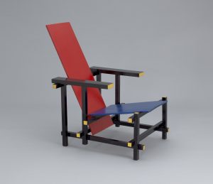
In practice, this meant adopting a cleaner, more rational geometric aesthetic similar to De Stijl’s reduction of design to its basic elements: horizontal and vertical lines; the primary colors red, yellow, and blue; and the values black and white. Gerrit Rietveld’s Red Blue Chair is a prime example of De Stijl design; all the structural members are oriented on a perfect grid, meeting at 90 degree angles in what are still called “Rietveld Joints.” Only the seat and back are inclined at an angle, because it would be very uncomfortable to sit in a perfectly vertical chair. The chair was originally stained beechwood, but in 1923 Rietveld painted it the iconic primary colors of De Stijl.
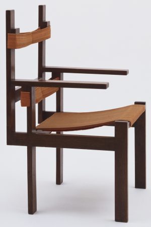
Breuer’s armchair, designed a year after his African Chair, shows the clear influence of De Stijl. The structural framework is composed entirely of straight horizontal and vertical members meeting at perfect right angles. Like Rietveld, Breuer recognizes the need for some compromise with perfect geometric rationalism where the chair interfaces with the organic human body. The design is softened with a fabric seat that slopes down toward the back, and two slightly offset bands that cradle the lower back and just below the shoulder blades. Although the joinery (mortise-and-tenon, with some lap joints) would be somewhat time-consuming, the wood stock is of an even thickness and width throughout and joins meet exclusively at right angles, making the chair relatively easy to mass produce.
Turning to tubular steel
After he graduated, Breuer left the Bauhaus briefly in 1924 to work in Paris, but when the school moved to Dessau he returned to become head of the carpentry workshop. Ironically, at that time he changed materials and began producing furniture using an unabashedly industrial material: tubular steel rather than wood. Breuer’s switch to tube steel was prompted by his admiration for the frame of a bicycle he bought to ride around Dessau. Extruded from a mold, the seamless tubes could be produced in any length needed, then bent around forms into any desired shape. A plumber taught Breuer how to weld the tubes together, and with the Bauhaus weaving workshop to make the fabric, all of the parts came together for what would become Breuer’s signature style.
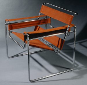
Although it looks complex, Breuer’s first version of the tube steel chair has a simple geometric basis worthy of De Stijl. The arms and legs form the armature of a cube, while the seat and back suggest a second cube nested within, tilted backwards at an ergonomic angle that almost appears to float. As with Breuer’s earlier wood slat chair, within the rigid, rationalized geometric armature, the parts that interface with the human body are made of soft fabric. This is not only ergonomic, it gives an interesting contrast between hard and soft, flexible and rigid, shiny and matte that seems to have come right out of the Bauhaus Vorkurs exercises.
A design classic
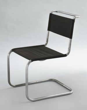
Breuer continued to refine the design, and the B33 version of the tube steel chair surprisingly has no back legs. Taking advantage of the strength of the steel, the seat is cantilevered off its front legs (a cantilever occurs when a beam or plane projects beyond its vertical support). There was some dispute about who was responsible for the first cantilevered tubular steel chair. Dutch architect Mart Stam was demonstrably the first to make one, but Breuer claimed he did so after a visit to his studio, during which Breuer showed Stam his ideas for a chair based on a tubular steel table turned on its side.
Breuer had used cantilevers in his furniture design as early as 1922: notice that the arms of his wooden armchair are cantilevered and not supported in front. The cantilevered seat marks the logical conclusion of the tube-steel chair, and is widely acknowledged as a masterpiece of design. The use of a cantilever achieves several things at once. First, it allows the chair to be made of seemingly one single, continuous length of tubing, with just twelve right-angle bends, although cross braces were frequently welded beneath the seat for added rigidity. This considerably simplifies the manufacturing process in comparison to the much more complicated, multi-part, multi-weld Wassily armchair above.
Second, the cantilever takes advantage of the flexibility of the metal; when someone sits in it, the chair has a slight spring. This not only acts as a shock absorber while sitting (and provides a slight boost when standing up), it also allows the chair to maintain a rigidly rational horizontal-and-vertical form when empty, but provides a slight recline when it is occupied — simultaneously fulfilling the Bauhaus principles of geometric rationalism and ergonomic functionalism.
Notes:
- Cited in William J. R. Curtis, Modern Architecture since 1900 (Upper Saddle River, NJ: Prentice Hall, 1996), p. 193.
Additional resources:
Bauhaus: Building the New Artist at the Getty Research Institute
Read more about primitivism in modern art
Sigrid Wortmann Wellige, Women’s Work: Textile art from the Bauhaus (San Francisco: Chronicle Books, 1993).
Frank Whitford, Bauhaus (New York and London: Thames and Hudson, 1984).
Christopher Wilk, Marcel Breuer: Furniture and Interiors (New York: MoMA, 1981).
The Bauhaus: Marianne Brandt
by DR. CHARLES CRAMER and DR. KIM GRANT
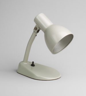
Chances are you have owned a lamp just like this one. It has no decoration or added “flair” that would distinguish it as being in the style of any particular designer, or even any particular decade. It appears absolutely generic — and yet it is the result of a very thoughtful design process in which each feature has been carefully considered.
The hood is long to protect the viewer from the glare of the raw bulb. A pin attaches the hood to the arm, allowing it to pivot slightly to direct the light. The wedge shape of the base helps in this regard as well, and provides ergonomic access to an obvious on-off switch. (How many times have you had to search to find the switch on a lamp?)
Its few, geometrically-regular parts are easy to manufacture and very efficient — notice the way the steel is rolled under at the opening of the hood to smooth the rough edge, as well as to provide additional rigidity. The lack of decoration keeps down manufacturing costs, but the proportions of the parts and the sheen on the curves of the lacquered steel are attractive in themselves.
Although it looks like it could have been made yesterday, this desk lamp was in fact designed in 1928 by a remarkable woman named Marianne Brandt at the Bauhaus, a famous design school in Germany. Brandt was exceptional not only as a designer, but also as a woman in the male-dominated field of metalwork.
Women at the Bauhaus
The charter of the Bauhaus stated that “any person of good repute, without regard to age or sex … will be admitted,” but when female applicants unexpectedly threatened to equal or even outnumber male applicants, the masters at the school agreed to limit their numbers and channel women exclusively into the pottery, bookbinding, and weaving workshops.\(^{[1]}\)
The pottery master resisted, and the bookbinding workshop was dissolved in 1922, so as a consequence almost all the women at the Bauhaus studied textiles such as weaving, embroidery, decorative edging, crocheting, sewing, and macrame. Anni Albers, for example, came to the Bauhaus in 1922 to study painting, but went into textiles instead, and by 1931 was appointed the head of the weaving workshop. When the Bauhaus closed in 1933, Albers emigrated to the United States, where she continued to teach. In 1949 Albers was the first female textile artist to have a solo show at the Museum of Modern Art in New York.
An exception to the rule
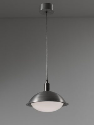
Brandt was an exception to this tendency to direct women into what were seen as gender-appropriate media. When she came to the Bauhaus in 1923, her work in the preliminary course caught the eye of the head of the metal workshop, László Moholy-Nagy, who made her his assistant. She designed the lighting fixtures for the new building when the Bauhaus moved to Dessau, and secured a number of important contracts with local manufacturers, helping to fund the school. When Moholy-Nagy left the Bauhaus in 1928, Brandt became acting director of the metal workshop before leaving the Bauhaus herself to work in industry.
Key Bauhaus design principles
Brandt’s works exemplify the key principles of Bauhaus design: rationalism, functionalism, formalism, and design for manufacture:
Rationalism signifies the design of objects using a limited repertory of elementary shapes and colors. Geometric shapes such as circles, squares, cylinders, and cones, and primary colors and values such as red, yellow, blue, black, and white, are to be preferred wherever possible over more complex shapes and mixed colors.
Functionalism signifies a primary emphasis on making the object as easy and efficient as possible to use. “Pure” functionalism takes this creed to an extreme in which the design has no features that do not serve some necessary function: no merely decorative frills whatsoever, however attractive they may be.
Formalism signifies the use of materials in ways that suit their inherent properties: the transparency and brittleness of glass, the sheen and flexibility of metal, and so on. Ideally, those materials are to be left in their raw state and not disguised. Paint as a protective coat is permissible, but not giving plastic a fake wood veneer, for example.
Design for Manufacture takes into account how the object will be mass-produced by machines, and attempts to make that process as efficient as possible. Objects are designed with few (ideally modular) parts with simple shapes that can be produced and assembled easily and inexpensively.
Sometimes compromises were necessary. For example, rational shapes are not always the most functional or ergonomic, and in such cases functionalism tended to override other principles. The Bauhaus is thus associated primarily with functionalism in design.
A tea set for the machine age
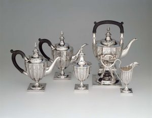
To see how these design principles work in practice, we can compare a Marianne Brandt tea pot with a roughly contemporaneous one by George Christian Gebelein. The biggest difference is the amount of added decoration in the Gebelein, most obviously the fluting (vertical grooves) and engraved designs that serve no functional purpose but would considerably increase the difficulty, time, and hence expense of manufacture. By contrast, Brandt’s teapot — a handmade model for a design intended for manufacture — is made of as few parts as possible, and all of those parts are reduced to simple, rational forms.
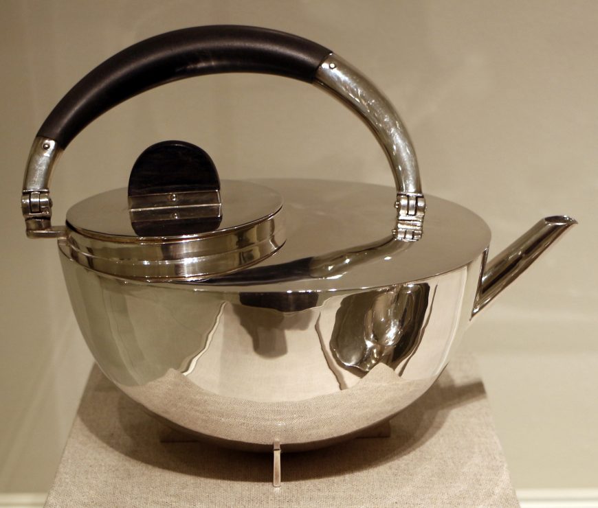
It is largely a study in circles: the overall hemispheric shape of the body is complemented by a circular opening and a half-circular handle. The strainer insert (not shown here) is similarly a cylinder with a hemispherical base, topped with a circular rim, and its handle is a perfect half-circle with an inset half-circle thumb grip. These simple shapes are not only easy to manufacture, their repetition gives an overall harmony to the work.
If we look closely, though, within this highly rationalized, geometric design there are a number of subtle choices. The spout is not a perfect circle, since that would cause the pot to dribble, so a slight lip helps to project the tea when it is poured. This is an example of functionalism superseding rationalism.
Similarly, notice that the fill opening is offset towards the back of the pot, and the handle is similarly not centered. This unexpected asymmetry seems capricious, but in fact it prevents the tea from sloshing out of the lid when it pours, and helps to keep the center of gravity consistent in the pot as it is tilted. Notice that the ebony wood handle — a material chosen for the handle and lid knob because it does not conduct heat — is similarly set backwards to prompt the user to grip it appropriately.
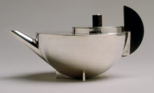
Design experimentation
Another mock-up of the tea infuser design shows some slightly different balances among the principles of rationalism, functionalism, and design for manufacture. Here, the hinged handle has been replaced by a half-disk of ebony wood attached to the side with flanges. This design is simpler, and has the benefit of keeping the handle from getting in the way when filling the pot and accessing the infuser. Brandt probably tested this option because it would be easier and cheaper to manufacture.
This version of the tea pot would not, however, be as easy to hold and pour. Considerable grip strength would be required to pinch the wooden handle securely, especially when the kettle was full of water, and the weight would not be evenly balanced throughout the pour. This comparison does show that, while the Bauhaus principles were not conducive to stylistic flair or personal expression on the part of the designer, a good deal of thoughtful attention did go into their apparently obvious, generic designs.
Notes:
- Sigrid Wortmann Wellige. Women’s Work: Textile art from the Bauhaus (San Francisco: Chronicle Books, 1993), pp. 41-42.
Additional resources:
Bauhaus: Building the New Artist at the Getty Research Institute
Magdalena Droste, Bauhaus: 1919-1933 (Köln: Taschen, 2006).
Sigrid Wortmann Wellige, Women’s Work: Textile art from the Bauhaus (San Francisco: Chronicle Books, 1993).
Lyonel Feininger, Cathedral for Program of the State Bauhaus in Weimar
by DR. STEVEN ZUCKER and DR. JULIANA KREINIK
Video \(\PageIndex{3}\): Lyonel Feininger, Cathedral for Program of the State Bauhaus in Weimar, 1919, woodcut (Museum of Modern Art, New York)
Additional resources:
Bauhaus: Building the New Artist at the Getty Research Institute
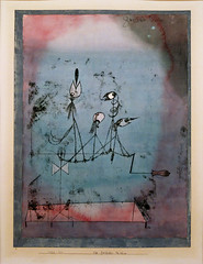
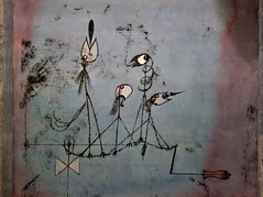
Paul Klee, Twittering Machine (Die Zwitscher-Maschine)
by DR. JULIANA KREINIK and DR. STEVEN ZUCKER
Video \(\PageIndex{4}\): Paul Klee, Twittering Machine (Die Zwitscher-Maschine), 1922, watercolor, ink, and gouache on paper, 25 1/4 x 19″ (Museum of Modern Art, New York)
Additional resources:
Bauhaus: Building the New Artist at the Getty Research Institute
Smarthistory images for teaching and learning:
László Moholy-Nagy
László Moholy-Nagy, Telephone Pictures
by DR. ELIZABETH OTTO and DR. STEVEN ZUCKER
Video \(\PageIndex{5}\): László Moholy-Nagy, EM1, EM2, and EM3 (Telephone Pictures), 1923, porcelain enamel on steel, 95.2 x 60.3 cm, 47.5 x 30.1 cm, and 24 x 15 cm (The Museum of Modern Art, New York)
Additional resources:
Bauhaus: Building the New Artist at the Getty Research Institute
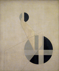
László Moholy-Nagy, Composition A.XX
by DR. BETH HARRIS and DR. STEVEN ZUCKER
Video \(\PageIndex{6}\): László Moholy-Nagy, Composition A.XX, 1924, oil on canvas, 135.5 x 115cm (Musée national d’art moderne, Centre Georges Pompidou, Paris)
Additional resources:
Bauhaus: Building the New Artist at the Getty Research Institute
Smarthistory images for teaching and learning:

László Moholy-Nagy, Climbing the Mast
by DR. JULIANA KREINIK and DR. VANESSA ROCCO
Video \(\PageIndex{7}\): László Moholy-Nagy, Climbing the Mast, 1928, gelatin silver print, 13 15/16″ x 11″ (5.4 x 28 cm) (Metropolitan Museum of Art, New York)
Additional resources:
Bauhaus: Building the New Artist at the Getty Research Institute
New Objectivity
Neue Sachlichkeit (New Objectivity) – An Introduction
by DR. CHARLES CRAMER and DR. KIM GRANT
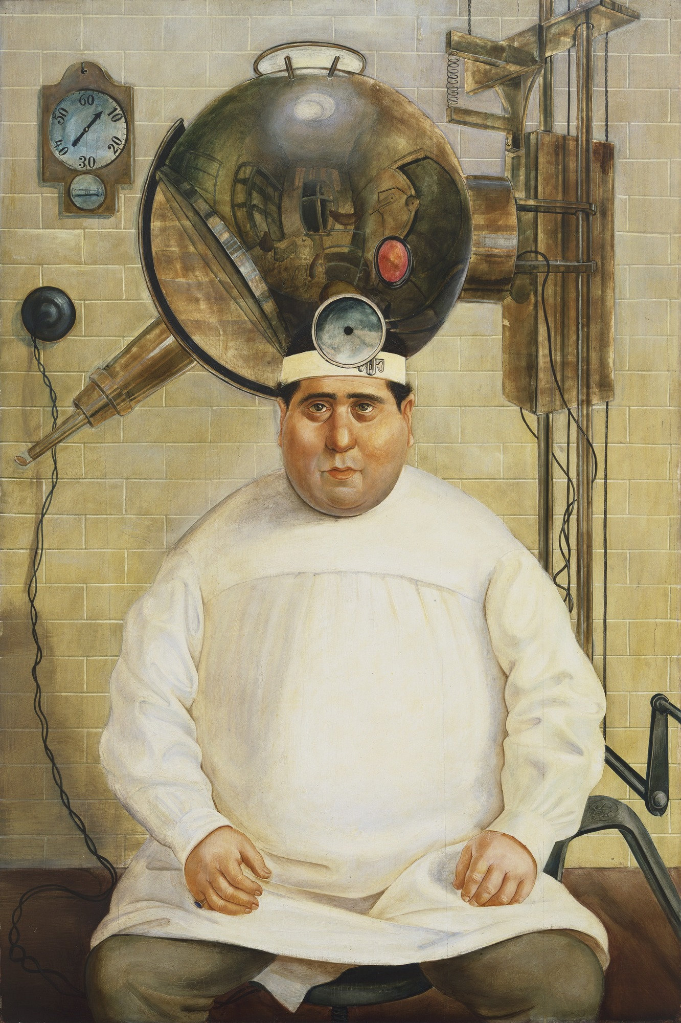
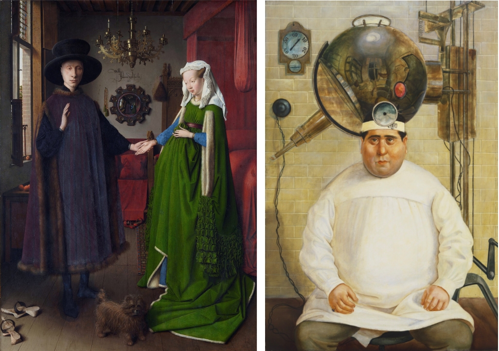
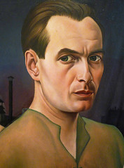
Otto Dix painted the successful Berlin throat specialist Dr. Wilhelm Mayer-Hermann surrounded by medical equipment in his own examination room. Wearing the white smock and head mirror of his profession he stares straight out of the painting at us. The reflective globe of a machine used for light treatments seems to be part of his head and intensifies our sense of being under close observation.
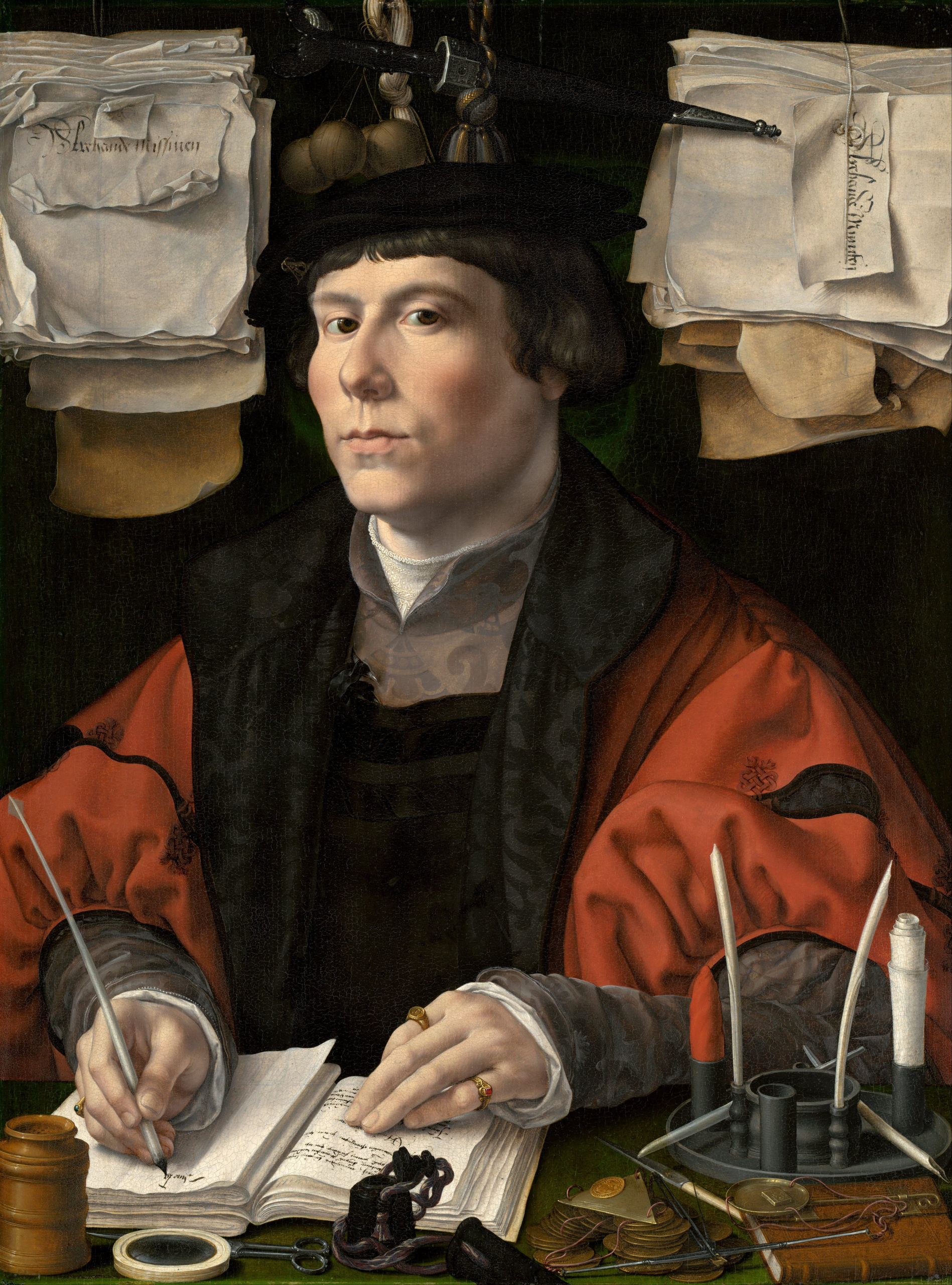
Just as we are being observed by the doctor, we are observing him. Dix painted Dr. Mayer-Hermann using a painstaking, realistic technique, showing us that Dix himself carefully studied the doctor and his surroundings. Both the realistic style and the medium (oil and tempera paint on a wood panel) are old-fashioned and consciously imitate the highly-refined portraits of Northern Renaissance painters. In Portrait of a Merchant, Jan Gossaert depicted the 16th-century merchant surrounded by the tools of his trade, just as Dix does in his portrait of the 20th-century throat specialist.
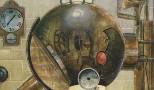
The convex reflective surface of the light machine above the doctor’s head shows us a distorted image of the rest of the examination room. Dix is here quoting another very famous Renaissance painting, Jan van Eyck’s Arnolfini Portrait, in which a convex mirror similarly reflects the room in front of the depicted figures.
Realism and abstract forms
The meticulous realism used in Renaissance portraits by van Eyck and Gossaert reveals a world of deep colors and rich, soft textures that is very different from the metal machinery, hard tile surfaces, and dirty white, grays, and browns of the modern doctor’s examination room. In addition, the flat composition shows Dix’s modernist concern with abstract geometric form. The doctor is centered in the painting, framed by the metal structure of the machine on the right and the hanging electrical cord on the left. Seated in a symmetrical pose that emphasizes his rotundity, he is positioned squarely in front of a flat wall covered in a grid of tiles. Above his curved shoulders various mechanical objects create a repeating pattern of circles that echoes his round torso and face. The effect is both humorous and ominous.
A critical attitude
Dix was a leading representative of the realist tendency in post-World War I German art known as Neue Sachlichkeit, usually translated as New Objectivity. The name of the tendency originated in a 1925 exhibition of figurative painters that included Dix, George Grosz, and Max Beckmann. Some of the painters associated with Neue Sachlichkeit had previously been associated with German Expressionism or the Dada movement and maintained a critical attitude toward modern Germany. Dix abandoned his early Expressionist style to paint what he saw as a corrupt contemporary German society with a pitiless “objective” eye.
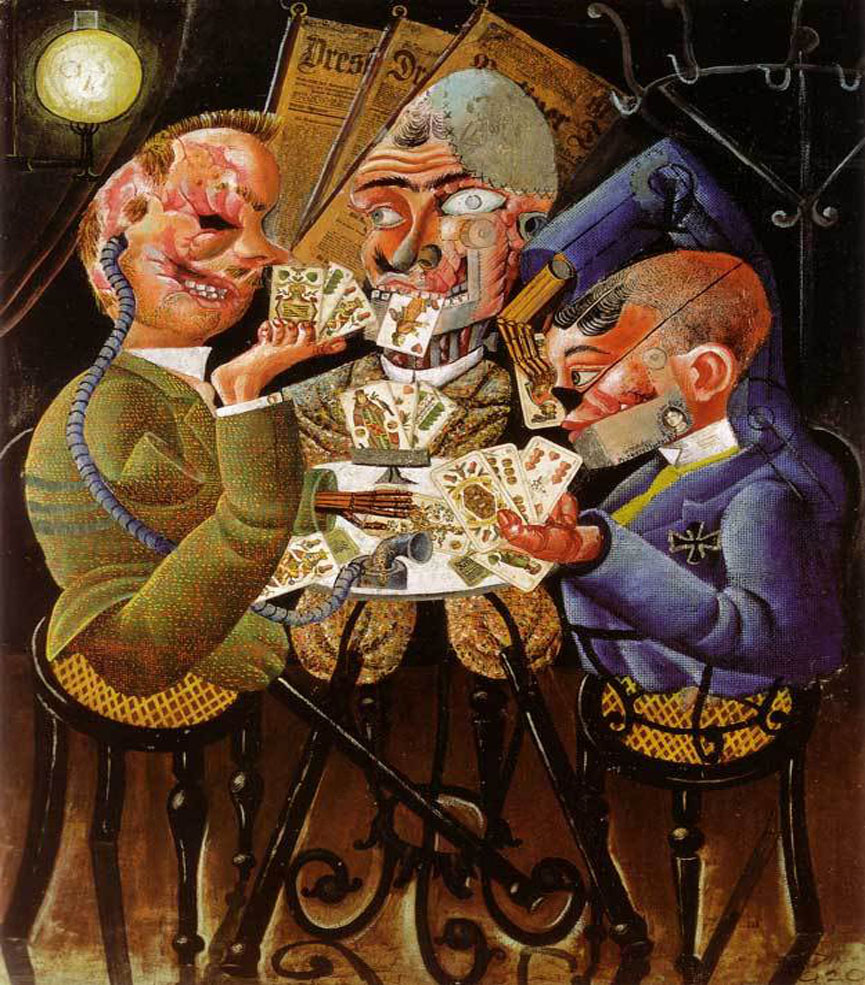
In The Skat Players Dix depicted disabled war veterans in excruciating detail. The combination of collage and oil paint he used in this work reflects early plastic surgery (first practiced on a mass scale in World War I), which was often unsuccessful and extremely disfiguring. Dix shows the veterans enjoying a card game together despite their severe physical mutilations.
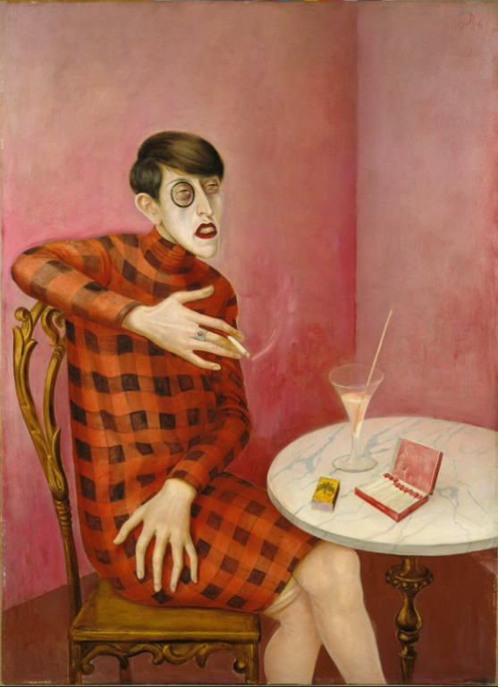
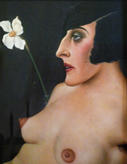
Dix also painted successful members of German society in unflattering, even caricatural ways. He depicted the writer Sylvia von Harden as an androgynous “new woman” — a then-popular term for the modern, sexually-liberated woman. She seems vaguely menacing with her gesturing, over-large hands, lit cigarette, and black-rimmed monocle. Posed to emphasize the sharp angles of her head and body, and dressed in a boldly-patterned red and black check dress, she clashes with the traditionally feminine curves of the table, chair and glass, as well as the pink walls behind her.
Christian Schad, previously associated with the Dada movement, was another artist associated with Neue Sachlichkeit who adopted a meticulous realistic painting technique. His portrait Count St. Genois d’Anneaucourt depicts the subject as part of a decadent bohemian world. Standing on a balcony with a Paris skyline in the background, the Count is dressed in an evening jacket and black tie. He looks out at us while two large, rather masculine-looking women in transparent dresses lock gazes behind him. In fact, the heavily made-up figure on the right was a cross-dresser from the Eldorado cabaret in Berlin, adding to the sexual tension created by the figures’ transparent dresses and challenging stares.
George Grosz’s Pillars of Society uses caricature to condemn the ruling classes of Germany’s Weimar Republic. In the foreground, a member of the old aristocracy, holding beer mug and sword, sports a Nazi swastika pin on his tie. The top of his head is cut off to reveal his outdated dreams of military triumph on horseback.
Rising behind him are a journalist (wearing a chamber pot on his head), a politician (with a pile of excrement in his head), a church minister (with his arms out to embrace the burning city), and helmeted soldiers, one carrying a bloody sword and gun. Here, Neue Sachlichkeit can be seen as more an attempt to reveal the truth about the ruling classes in a direct manner than a realistic style of painting.
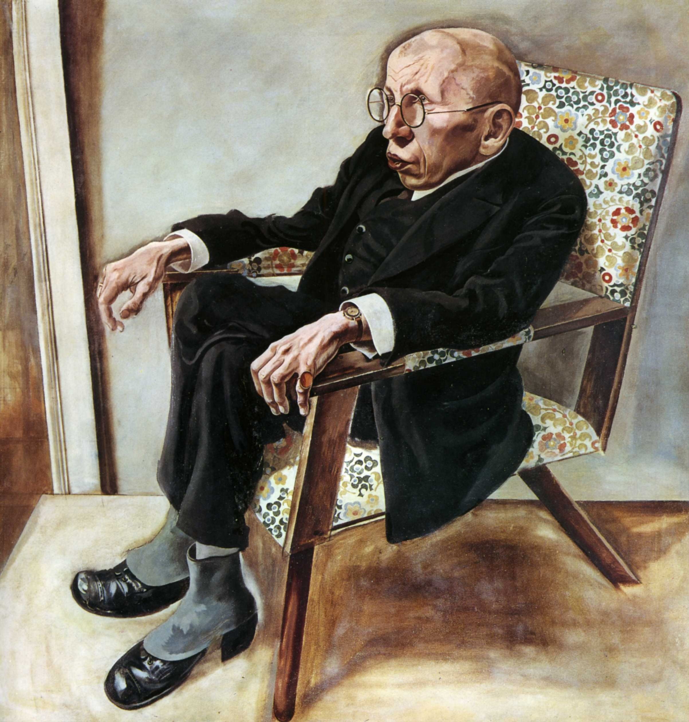
Grosz did occasionally use the realist style most often associated with Neue Sachlichkeit. In a portrait of the writer Max Hermann Neiss, Grosz emphasizes his friend’s large head and hands and coldly records their wrinkles, veins, bone structure, and tonal variations. The brightly flowered cushions create a marked contrast to the frail figure dressed in his black suit and slumped down in the chair. This is a portrait in which it would seem objective truth takes precedence over affection for his friend.

Exposing the corruption of society
Max Beckmann participated in the original Neue Sachlichkeit exhibition in 1925 and is considered an important representative of the tendency, although his painting remained generally expressionist in style through the 1920s. Beckmann’s subject matter was also often highly personal, idiosyncratic, and allegorical rather than an objective depiction of reality. He is, however, similar to other Neue Sachlichkeit painters in his dedication to exposing the corruption of modern society, which he saw in terms of the spiritually fallen condition of humanity.
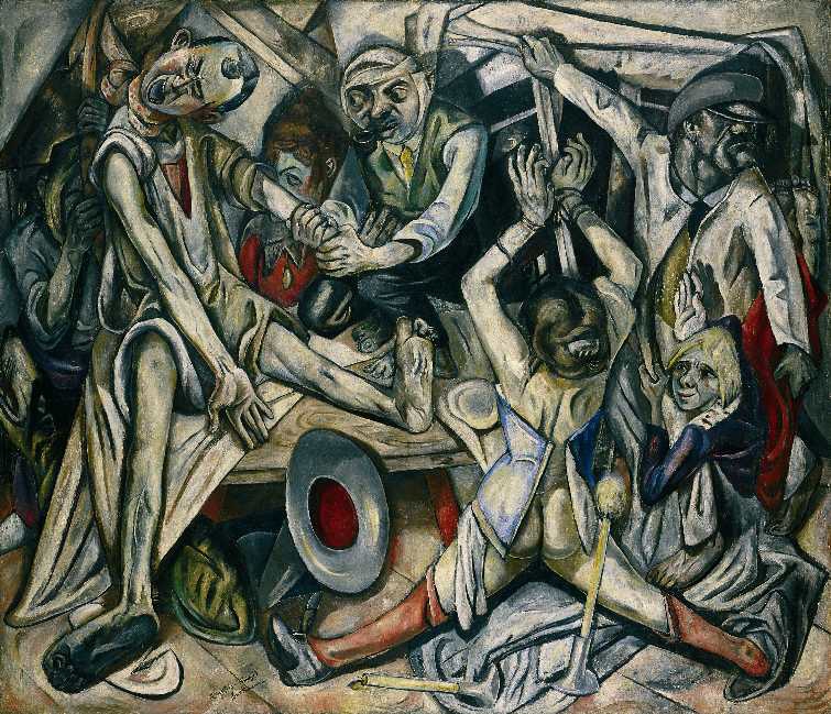
The Night is a claustrophobic scene of seven people crammed into a small space. Violence and torture are illuminated by a large burning candle in the foreground, while the window in the background opens onto black night. On the left a man in a nightshirt is being hanged with a scarf. Another man with a bandaged head squats barefoot on a table and smokes a pipe while he twists the arm of the hanged man. On the right we see a woman with her hands bound and her legs split apart. She appears to have been violated; her corset hangs open to reveal her bare torso and buttocks, her red stockings slide down, and she is only wearing one shoe. A girl is being carried upside down by a man wearing a cap pulled down over his eyes. He reaches behind himself to lower a blind over the window. Although the painting has been interpreted in relation to contemporary events, it is an image of human brutality and degradation that takes no explicit political stand.
The German Neue Sachlichkeit painters lived through the violence of World War I and its aftermath. Their art reveals the disillusionment and cynicism that resulted from their often psychologically-shattering experiences. The political upheavals of the post-war period and the brief economic boom of the 1920s were reflected in their paintings, which depict German society and its people as decadent and corrupt.
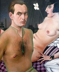
Christian Schad, Self-Portrait
by DR. BETH HARRIS and DR. STEVEN ZUCKER
Video \(\PageIndex{8}\): Christian Schad, Self-Portrait, 1927, oil on wood, 29 x 24-3/8″ / 76 x 62 cm (Tate Modern, London)
Unusually, two figures make up this self-portrait, which is all sexuality but no passion.
Smarthistory images for teaching and learning:
George Grosz, Remembering
by DR. ROBERT COZZOLINO, MINNEAPOLIS INSTITUTE OF ART and DR. STEVEN ZUCKER
Video \(\PageIndex{9}\): George Grosz, Remembering, 1937, oil on canvas, 71.2 x 91.76 cm (Minneapolis Institute of Art, © Estate of George Grosz)
Nazi violence forced many artists and intellectuals to leave Germany in the 1930s, and like Grosz, many came to the United States.
Additional resources:
Nazi visual culture
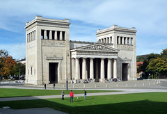
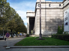
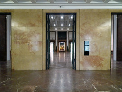
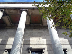
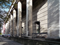
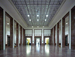
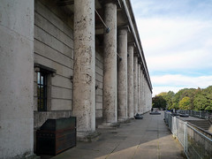
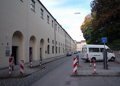
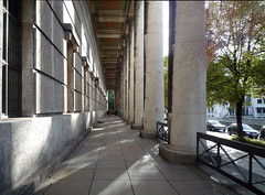
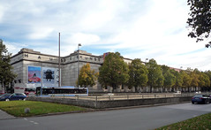
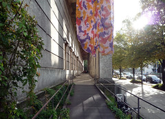
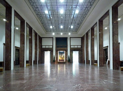
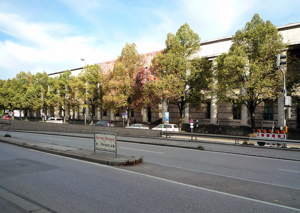
Paul Troost, House of (German) Art
by DR. STEVEN ZUCKER and DR. BETH HARRIS
Video \(\PageIndex{10}\): Paul Troost, House of (German) Art, 1933-37
This video discusses Troost’s building in relation to the “Great Exhibition of German Art” and the “Entartete Kunst” exhibitions of 1937 in Munich. The House of German Art now exhibits international contemporary art in direct opposition to the original National Socialist intent.
Smarthistory images for teaching and learning:
Art in Nazi Germany
Nazi art policy
How do you destroy an artwork? You can hide it, scratch it, tear it, put a slogan over it, burn it, or, as the Nazis did in 1937, simply show it to millions of people.
If you visited Munich in the summer of that year, you could see two spectacular exhibitions that were held only a few hundred meters apart. One was the Great Exhibition of German Art, showcasing recent leading examples of ‘Aryan’ art. The other was the Entartete Kunst (Degenerate Art) Exhibition, which offered a tour through the art that the National Socialist Party had rejected on ideological grounds. It was made up of art that was not considered ‘Aryan’ and offered a last glimpse before these works of art disappeared.

The Entartete Kunst (Degenerate Art) Exhibition cleverly manipulated visitors to loathe and ridicule the art on exhibit, in part by erasing their original meaning. Until shortly before the exhibition, these paintings and sculptures had been displayed at the nation’s greatest museums, but now they were the principal performers in a freak show. The shock-value was enhanced by only allowing over-18s into the exhibition. The lines for the Degenerate Art Exhibition went around the block. Inside, many pictures had been taken out of their frames, and were attached to walls that were emblazoned with outraged slogans. Rather than whispering respectfully, people pointed and snickered. The paintings and sculptures had lost their status as artworks, and were now reduced to dangerous and outrageous rubbish.

Visual symbolism was important to the Nazis, and Hitler himself had been a painter, so it is not surprising that they dedicated significant resources promoting their ideals through art. So how was the decision made? How were ‘degenerate’ and ‘Aryan’ artworks selected? If you look at the works of art that were glorified and compare them to those that were attacked by the Nazis, the differences usually seem clear enough; experimental, personal, non-representational art was rejected, whilst conventionally ‘beautiful,’ stereotypically heroic art was revered. This seems like an obvious line to be taken by a totalitarian regime: everyone will find these artworks beautiful, and everyone will feel and think the same thing about them, without the risk of unwanted, random, personal, or unclear interpretations.

A simple decision
And the Nazis presented it as a simple decision, any true German would immediately be able to tell the difference. But in reality, a four-year battle was fought all the way to the top echelons of the Nazi hierarchy over what ‘Aryan’ art was supposed to be, exactly. The opinions on this could not have been more contradictory, and top Nazi officials such as Heinrich Himmler, Joseph Goebbels and Alfred Rosenberg championed the art they each preferred.
Surprisingly, before 1937, Goebbels–and many other Nazis–collected modern art. Goebbels had works of modern art in his study, his living room and was a fan of many artists that eventually ended up in the Degenerate Art Exhibition. Heinrich Himmler was interested in mystical, Germanic art that harked back to a tribal past. Another influential Nazi, Alfred Rosenberg, liked the pastoral, romantic style that depicted humble farmers, rural landscapes and blond maidens.
Hitler would have none of it. He loathed Expressionism and modern art whilst pastoral idylls were not serious enough. Goebbels reversed himself and became one of the driving forces behind the Degenerate Art Exhibition, prosecuting the same artworks he had once enjoyed. Rosenberg also let go, albeit reluctantly, whilst Himmler changed tack and stole artworks by the wagonload behind Hitler’s back throughout the war.
How was “Aryan” art defined?
In a sense, the concept of “Aryan” art was defined by what it was not: anything that was ideologically problematic (that did not fit with the extremist beliefs of the regime) was removed until there little left but an academic style that celebrated youth, optimism, power and eternal triumph. Nevertheless, it remained difficult for even the most influential Nazis to understand the selection criteria for art sanctioned by the state.

Take for example Adolf Ziegler, who had been in charge of selecting the artwork to be exhibited in the Great Exhibition of German Art. Just before the show opened, Hitler visited in order to inspect the artwork chosen to represent the eternal future of Nazi Germany. He was not pleased with the selection his most loyal followers had made. On the 5th of June, 1937, Goebbels wrote in his diary that the Führer was “wild with rage” and subsequently issued a statement declaring “I will not tolerate unfinished paintings,” meaning that the exhibition had to be reconceived at the last minute.
Even opportunistic “hard-liners” like Adolf Ziegler, an artist favored by Hitler, were not quite able to fulfill their patron’s vision. However, it would not be right to conclude that the criteria for art that represented the ‘Aryan’ state appears to have been based principally on the eye of Adolf Hitler rather than a set of delineated characteristics. Even Hitler’s taste was not the ultimate indicator of ‘Aryan’ art: whilst planning what great artworks he would take from the conquered museums of Europe for his never-realized Führer-Museum, he was convinced by his newly appointed museum director that his taste was not up to standard for the world-class museum he envisaged. Rather than firing the man, Hitler deferred to this Dr. Hans Posse, despite the fact that he had recently been fired from his post as museum director in Dresden for endorsing “degenerate art.”
What was actually on display in the two exhibitions?

The Degenerate Art Exhibition mostly exhibited Expressionism, New Objectivism and some abstract art. Strangely, very few works came from Jewish artists, and a lot of artworks had until recently been favorites of many Nazis. Renowned works by artists such as Ernst Ludwig Kirchner, Karl Schmidt-Rotluff and Ernst Barlach now hung on walls marked with graffiti. The works ranged from quiet and traditional looking, such as Ernst Barlach’s The Reunion (Das Wiedersehen), 1926 which showed two poised, realistically carved wooden figures holding each other, to more grotesquely painted works, such as Otto Dix’ War Cripples (Kriegskrüppel), 1920. This work shows a procession of cartoonesque yet morbid war veterans, painfully moving forward with the aid of pushchairs, prosthetic legs and crutches, smoking cheerfully, though one soldier’s face is half eaten away, revealing a rictus grin of clenched teeth.


In contrast, the Great Exhibition of German Art showed art with the hallmarks of classical tradition, large sculptures of tall and muscular bodies and paintings of heroic soldiers by artists such as Josef Thorak and Arno Breker. Prominent position was given to Breker’s Decathlete (‘Zehnkämpfer’) and Victory (‘Siegerin’), both made in 1936, showing two bronze figures over three metres high, their impersonal facial expressions and perfectly proportioned bodies almost archetypical examples of the classical style.
However, in later editions of the Great Exhibition of German Art, works that did not fit the ideals of beauty, youth and optimism crept back in. Realistically painted works depicting soldiers despairing in the trenches by Albert Heinrich and sad, emaciated figures like the bust Der Walzmeister by Fritz Koelle began to share the space with oversized muscular bronze men and paintings of serene nude women.
The random nature of Nazi art policy continued after these exhibitions closed. Breker and Thorak, superstars of the Nazi regime, actually had some works branded as degenerate (though this was quickly covered up), whereas the artist Emil Nolde, who joined the Nazi party and was an early and enthusiastic supporter, had been issued a so-called Malverbot forbidding him to paint even in the privacy of his own home. He received regular visits from the Gestapo, the secret police, who came to touch his brushes to ensure that they had not been used. Nolde became a water-color painter. The brushes dried a lot faster than with oil paint.

Additional Resources:
Website for this building today: The House of Art
Culture in the Third Reich: Disseminating the Nazi Worldview
A Teacher’s Guide to the Holocaust
Excerpt of Hitler’s Speech at the inauguration of the House of German Art