
4.8: New Modern Art Movements
- Page ID
- 226937

\( \newcommand{\vecs}[1]{\overset { \scriptstyle \rightharpoonup} {\mathbf{#1}} } \)
\( \newcommand{\vecd}[1]{\overset{-\!-\!\rightharpoonup}{\vphantom{a}\smash {#1}}} \)
\( \newcommand{\dsum}{\displaystyle\sum\limits} \)
\( \newcommand{\dint}{\displaystyle\int\limits} \)
\( \newcommand{\dlim}{\displaystyle\lim\limits} \)
\( \newcommand{\id}{\mathrm{id}}\) \( \newcommand{\Span}{\mathrm{span}}\)
( \newcommand{\kernel}{\mathrm{null}\,}\) \( \newcommand{\range}{\mathrm{range}\,}\)
\( \newcommand{\RealPart}{\mathrm{Re}}\) \( \newcommand{\ImaginaryPart}{\mathrm{Im}}\)
\( \newcommand{\Argument}{\mathrm{Arg}}\) \( \newcommand{\norm}[1]{\| #1 \|}\)
\( \newcommand{\inner}[2]{\langle #1, #2 \rangle}\)
\( \newcommand{\Span}{\mathrm{span}}\)
\( \newcommand{\id}{\mathrm{id}}\)
\( \newcommand{\Span}{\mathrm{span}}\)
\( \newcommand{\kernel}{\mathrm{null}\,}\)
\( \newcommand{\range}{\mathrm{range}\,}\)
\( \newcommand{\RealPart}{\mathrm{Re}}\)
\( \newcommand{\ImaginaryPart}{\mathrm{Im}}\)
\( \newcommand{\Argument}{\mathrm{Arg}}\)
\( \newcommand{\norm}[1]{\| #1 \|}\)
\( \newcommand{\inner}[2]{\langle #1, #2 \rangle}\)
\( \newcommand{\Span}{\mathrm{span}}\) \( \newcommand{\AA}{\unicode[.8,0]{x212B}}\)
\( \newcommand{\vectorA}[1]{\vec{#1}} % arrow\)
\( \newcommand{\vectorAt}[1]{\vec{\text{#1}}} % arrow\)
\( \newcommand{\vectorB}[1]{\overset { \scriptstyle \rightharpoonup} {\mathbf{#1}} } \)
\( \newcommand{\vectorC}[1]{\textbf{#1}} \)
\( \newcommand{\vectorD}[1]{\overrightarrow{#1}} \)
\( \newcommand{\vectorDt}[1]{\overrightarrow{\text{#1}}} \)
\( \newcommand{\vectE}[1]{\overset{-\!-\!\rightharpoonup}{\vphantom{a}\smash{\mathbf {#1}}}} \)
\( \newcommand{\vecs}[1]{\overset { \scriptstyle \rightharpoonup} {\mathbf{#1}} } \)
\(\newcommand{\longvect}{\overrightarrow}\)
\( \newcommand{\vecd}[1]{\overset{-\!-\!\rightharpoonup}{\vphantom{a}\smash {#1}}} \)
\(\newcommand{\avec}{\mathbf a}\) \(\newcommand{\bvec}{\mathbf b}\) \(\newcommand{\cvec}{\mathbf c}\) \(\newcommand{\dvec}{\mathbf d}\) \(\newcommand{\dtil}{\widetilde{\mathbf d}}\) \(\newcommand{\evec}{\mathbf e}\) \(\newcommand{\fvec}{\mathbf f}\) \(\newcommand{\nvec}{\mathbf n}\) \(\newcommand{\pvec}{\mathbf p}\) \(\newcommand{\qvec}{\mathbf q}\) \(\newcommand{\svec}{\mathbf s}\) \(\newcommand{\tvec}{\mathbf t}\) \(\newcommand{\uvec}{\mathbf u}\) \(\newcommand{\vvec}{\mathbf v}\) \(\newcommand{\wvec}{\mathbf w}\) \(\newcommand{\xvec}{\mathbf x}\) \(\newcommand{\yvec}{\mathbf y}\) \(\newcommand{\zvec}{\mathbf z}\) \(\newcommand{\rvec}{\mathbf r}\) \(\newcommand{\mvec}{\mathbf m}\) \(\newcommand{\zerovec}{\mathbf 0}\) \(\newcommand{\onevec}{\mathbf 1}\) \(\newcommand{\real}{\mathbb R}\) \(\newcommand{\twovec}[2]{\left[\begin{array}{r}#1 \\ #2 \end{array}\right]}\) \(\newcommand{\ctwovec}[2]{\left[\begin{array}{c}#1 \\ #2 \end{array}\right]}\) \(\newcommand{\threevec}[3]{\left[\begin{array}{r}#1 \\ #2 \\ #3 \end{array}\right]}\) \(\newcommand{\cthreevec}[3]{\left[\begin{array}{c}#1 \\ #2 \\ #3 \end{array}\right]}\) \(\newcommand{\fourvec}[4]{\left[\begin{array}{r}#1 \\ #2 \\ #3 \\ #4 \end{array}\right]}\) \(\newcommand{\cfourvec}[4]{\left[\begin{array}{c}#1 \\ #2 \\ #3 \\ #4 \end{array}\right]}\) \(\newcommand{\fivevec}[5]{\left[\begin{array}{r}#1 \\ #2 \\ #3 \\ #4 \\ #5 \\ \end{array}\right]}\) \(\newcommand{\cfivevec}[5]{\left[\begin{array}{c}#1 \\ #2 \\ #3 \\ #4 \\ #5 \\ \end{array}\right]}\) \(\newcommand{\mattwo}[4]{\left[\begin{array}{rr}#1 \amp #2 \\ #3 \amp #4 \\ \end{array}\right]}\) \(\newcommand{\laspan}[1]{\text{Span}\{#1\}}\) \(\newcommand{\bcal}{\cal B}\) \(\newcommand{\ccal}{\cal C}\) \(\newcommand{\scal}{\cal S}\) \(\newcommand{\wcal}{\cal W}\) \(\newcommand{\ecal}{\cal E}\) \(\newcommand{\coords}[2]{\left\{#1\right\}_{#2}}\) \(\newcommand{\gray}[1]{\color{gray}{#1}}\) \(\newcommand{\lgray}[1]{\color{lightgray}{#1}}\) \(\newcommand{\rank}{\operatorname{rank}}\) \(\newcommand{\row}{\text{Row}}\) \(\newcommand{\col}{\text{Col}}\) \(\renewcommand{\row}{\text{Row}}\) \(\newcommand{\nul}{\text{Nul}}\) \(\newcommand{\var}{\text{Var}}\) \(\newcommand{\corr}{\text{corr}}\) \(\newcommand{\len}[1]{\left|#1\right|}\) \(\newcommand{\bbar}{\overline{\bvec}}\) \(\newcommand{\bhat}{\widehat{\bvec}}\) \(\newcommand{\bperp}{\bvec^\perp}\) \(\newcommand{\xhat}{\widehat{\xvec}}\) \(\newcommand{\vhat}{\widehat{\vvec}}\) \(\newcommand{\uhat}{\widehat{\uvec}}\) \(\newcommand{\what}{\widehat{\wvec}}\) \(\newcommand{\Sighat}{\widehat{\Sigma}}\) \(\newcommand{\lt}{<}\) \(\newcommand{\gt}{>}\) \(\newcommand{\amp}{&}\) \(\definecolor{fillinmathshade}{gray}{0.9}\)Pop art and Minimalism follow Abstract Expressionism in the 1950s and ‘60s. Both styles develop as a reaction against the subjective intensity and physical aspects associated with Abstract Expressionism. Pop art responds by celebrating recognizable subject matter drawn from the everyday, the commercial, and the commonplace and rejecting the emphasis on abstraction. Minimalism responds by focusing on the formal aspects of the artwork, rejecting the idea of the individual gesture of the artist and the subjective expressionistic focus of Abstract Expressionism in favor of establishing a different relationship between art, its viewer and the space both occupy.
 IMAGE 4.26 James Rosenquist, House of Fire, 1981, oil on canvas, 78 inches x 17 feet, 6 inches. Met Museum of Art CC0.
Both styles push the language of modernism to its conclusion meaning that with them, the language of modern art has now been completely and successfully explored. With Pop art, we see the merging of the realms of art and popular culture, art and technology, and art and commercialism that began with the Impressionists and Post-Impressionists and that continued to define modern art in different ways over the 20th Century. With Minimalism, we see the final explorations of the possibilities of strict geometric and non-representational abstraction that here harnesses the space beyond the gallery’s wall or sculptural pedestal to re-define the boundaries of art beyond the two and three-dimensional.
What follows these two styles in the 1970s is called Post-Modern because it comes after modernism and uses the visual languages of modernism as seen in the various art styles we have studied but in different ways or for different reasons.

IMAGE 4.27 Who's Afraid of Red, Yellow, and Blue I Minimalist artwork by Barnett Newman - 1966. CC0.

IMAGE 4.28 Andy Warhol’s “Campbell’s Soup Cans”
At first glance, Pop Art might seem to glorify popular culture by elevating soup cans, comic strips and hamburgers to the status of fine art on the walls of museums. But, then again, a second look may suggest a critique of the mass marketing practices and consumer culture that emerged in the United States after World War II. Andy Warhol’s Gold Marilyn Monroe (1962) clearly reflects this inherent irony of Pop. The central image on a gold background evokes a religious tradition of painted icons, transforming the Hollywood starlet into a Byzantine Madonna that reflects our obsession with celebrity. Notably, Warhol’s spiritual reference was especially poignant given Monroe’s suicide a few months earlier. Like religious fanatics, the actress’s fans worshipped their idol; yet, Warhol’s sloppy silk-screening calls attention to the artifice of Marilyn’s glamorous façade and places her alongside other mass-marketed commodities like a can of soup or a box of Brillo pads.
“Pop Art” first emerged in Great Britain, which suffered great economic hardship after the war. In the late 1940s, artists of the “Independent Group,” first began to appropriate idealized images of the American lifestyle they found in popular magazines as part of their critique of British society.
Pop Art’s origins, however, can be traced back even further. In 1917, Marcel Duchamp asserted that any object could be art, as long as the artist intended it as such. Artists of the 1950s built on this notion to challenge boundaries distinguishing art from real life, in disciplines of music and dance, as well as visual art. Robert Rauschenberg’s desire to “work in the gap between art and life,” for example, led him to incorporate such objects as bed pillows, tires and even a stuffed goat in his “combine paintings” that merged features of painting and sculpture. Likewise, Claes Oldenberg created The Store, an installation in a vacant storefront where he sold crudely fashioned sculptures of brand-name consumer goods. These “Proto-pop” artists were, in part, reacting against the rigid critical structure and lofty philosophies surrounding Abstract Expressionism, the dominant art movement of the time; but their work also reflected the numerous social changes taking place around them.
The years following World War II saw enormous growth in the American economy, which, combined with innovations in technology and the media, spawned a consumer culture with more leisure time and expendable income than ever before. The manufacturing industry that had expanded during the war now began to mass-produce everything from hairspray and washing machines to shiny new convertibles, which advertisers claimed all would bring ultimate joy to their owners. Significantly, the development of television, as well as changes in print advertising, placed new emphasis on graphic images and recognizable brand logos.
As the decade progressed, artists shifted away from painting towards the use of industrial techniques. Warhol began making silkscreens, before removing himself further from the process by having others do the actual printing in his studio, aptly named “The Factory.” Similarly, Oldenburg abandoned his early installations and performances, to produce the large-scale sculptures of cake slices, lipsticks, and clothespins that he is best known for today.
The influence that TV exerted on increasing numbers of people was a major subject for the pop artists of the early sixties. For a brief time John F. Kennedy raised the spirits of America and Europe. He was the first TV President, and the public identified with him because of TV. His “New Frontier” culture also became a popular priority. And his establishment of the National Endowment for the Arts and Jackie Kennedy united fashion and culture with her media image.
Pop artists typically worked in a passive detachment from the spiritual. They commented on everyday life in a very morbid sense, not connecting emotionally with their art.
Andy Warhol is probably the most famous figure in Pop Art. Warhol attempted to take Pop beyond an artistic style to a lifestyle, and his work often displays a lack of human affectation that dispenses with the irony and parody of many of his peers. Warhol's artwork ranges in many forms of media including hand drawing, painting, printmaking, photography, silk screening, sculpture, film, and music. New York's Museum of Modern Art hosted a Symposium on Pop Art in December 1962 during which artists like Warhol were attacked for giving in to consumerism. Throughout the decade it became increasingly clear that there had been a profound change in the culture of the art world, and that Warhol was at the center of that shift. Eventually, he moved from hand painting to silk-screen printing, removing the handmade element altogether. The element of detachment reached such an extent at the height of Warhol's fame that he had several assistants producing his silk-screen multiples.

IMAGE 4.29 Andy Warhol – “Marilyn Pop Art" by Kelly DeLay is licensed under CC BY 2.0
Of equal importance to American pop art is Roy Lichtenstein. His work defines the basic premise of pop art better than any other through parody. Selecting the old-fashioned comic strip as subject matter, Lichtenstein produced hard-edged, precise compositions that documented mass culture while simultaneously creating soft parodies. Lichtenstein used oil and Magna paint in his best known works, such as Drowning Girl (1963), which was appropriated from the lead story in DC Comics’ Secret Hearts #83. His characteristic style featured thick outlines, bold colors and Ben-Day dots to represent certain colors, as if created by photographic reproduction. Lichtenstein’s contribution to Pop Art merged popular and mass culture with the techniques of fine art while injecting humor, irony, and recognizable imagery and content into the final product. The paintings of Lichtenstein, like the works of many other pop artists, shared a direct attachment to the commonplace image of American popular culture while treating the subject matter in a cool, impersonal manner. This detached style illustrated the idealization of mass production and its inherent anonymity.
Minimalism in art and music was an effort to create a form with a minimum of material and process. That means that one of Donald Judd’s cube-shaped sculptures was reduced to the simple form of a cube, and nothing more. Minimal Music was similar in that an entire musical work could be composed from a very simple tune with only three notes, as opposed to lush and rich orchestrated songs.
Artists in the 1960s and 1970s who explored reductive notions found a new way to embody their ideas in visual form. These artists explored the reductive tradition with highly experimental three dimensional work. This new approach to art was eventually called Minimal Art. A diverse group of artists were at one point or another during their careers classified as minimalists.
The name Minimal was applied to this style because the art seemed to have a minimal amount of art content. It certainly did not represent objects and people as Pop Art did nor did it seem to have any of the emotional or expressive characteristics of Abstract Expressionism. In fact, it was usually so simple that it seemed to lack complexities even under the surface. The minimal artists were more interested in pure shape, color, and texture of the object and how it related to the viewer in space. The work was often placed on the floor, instead of a pedestal, to occupy the visitor’s space and ensure that their attention was captured.
The Minimalists created work which drew in the viewer to participate and contemplate what its meaning or purpose was to themselves. They were interested in how a space could be transformed or altered by their art. The artists also went so far as to dismiss themselves from the art making process itself and sometimes the physical piece was made by technicians in factories, who followed a set of instructions or diagrams with precision.
Overall, the Minimalists were interested in continuity and order. They were interested in what comes next and what the final piece was as a whole. Their work did not refer to any other subject matter, because that would designate it as inferior to what it represented. This belief is the basis of why their work was often titled as “Untitled.” For these artists, the meaning of the art could no longer be found within the piece they made, and was defined instead by its surroundings. This was a cool, cerebral approach to art that often implied that the idea was more important than the object, a line of thinking that eventually led to Conceptual Art.
Minimal Music is composed with a bare minimum of structure. These composers have produced a collective body of work that relies heavily on simplified progressions and melodies. Filled with repetitiveness in rhythms, these musicians worked to reduce the excesses of expression and historical reference they found to be overly abundant in much contemporary classical music. A key element of the minimalist music being showcased in this unit is the development of hypnotic rhythms. While this also occurred in the music of the 19th century composers, Laurie Anderson, Steve Reich and Phillip Glass had modern technology to conjure up mesmerizing rhythms in new ways.
CONTEMPORARY PORTRAITS
Kehinde Wiley (b. 1977, USA) is a contemporary portrait painter. In his work, he refers back to poses and other compositional elements used by earlier masters in much the same way that Trumbull did in his portrait of George Washington. Wiley means for his viewers to recognize the earlier work he has borrowed from in creating his painting, to make comparisons between the two, and to layer meaning from the earlier work into his own. Due to the strong contrasts between the sitters in Wiley’s paintings and those who posed for the earlier portraitists, however, this comparison often makes for a complex interweaving of meanings. It is based upon an 1847 marble work of the same name by French sculptor Auguste Clésinger (1814-1883, France). When Clésinger’s flagrantly sensual nude was exhibited, the public and critics alike were scandalized, and fascinated. It was not uncommon in European and American art of the nineteenth century to use the subject of the work as justification for depicting the female nude.
For example, if the subject was a moral tale or a scene from classical mythology, that was an acceptable reason for showing a nude figure. In Clésinger’s sculpture, the pretext for the woman’s indecent writhing was the snake bite, which, coupled with the roses surrounding the woman, was meant to suggest an allegory of love or beauty lost in its prime rather than simply a salacious depiction of a nude. Unfortunately, the model was easily recognized as a real person, Apollonie Sabatier, a courtesan who was the writer Charles Baudelaire’s mistress and well known among artists and writers of the day. Clésinger defended his sculpture as an artful study of the human form but, having used the features and body of a contemporary woman, his sculpture’s viewers objected to the image as too real. Wiley’s painting is the opposite: it is clearly intended to be a portrait of one individual, but he is clothed and inexplicably lying with his back to the viewer while turning to look over his shoulder. In his painting, Wiley retains the extended arms, and twisted legs and torso of Clésinger’s figure, but the sculpted woman’s thrown back head and closed eyes are replaced by the man’s turned head and mildly quizzical gaze.
Wiley takes that pose and its meanings—indecency, exposure, vulnerability, powerlessness— and uses them in a context that seemingly makes no sense when the subject is a fully clothed black male. Or does it? By using the conventions for depicting the female nude, Wiley asks us to examine the following: what happens when the figure is clothed—with a suggestion of eroticism in the glimpse of brown skin and white briefs above his low-riding jeans; what happens when a young man gazes at the viewer with an unguarded expression of open inquisitiveness; and what happens when a black male presents his body in a posture of weakness, potentially open to attack? The artist uses these juxtapositions of meaning to challenge our notions of identity and masculinity. By expanding his visual vocabulary to include traditions in portraiture going back hundreds of years, Wiley paints a young black man at odds with contemporary conventions of (male) physicality and sexuality.
Remixed from:
Fineberg, Jonathan. Art Since 1940, Strategies of Being. Second Edition. New Jersey: Prentice Hall. Print. CC BY-NC 4.0.
Funk, Clayton. A Quick an Dirty Guide to Art, Music, and Culture. The Ohio State University, 2016. 23-27. https://ohiostate.pressbooks.pub/artandmusicbiographies/ CC BY.
Pop Art. Authored by: Virginia Spivey. Provided by: Khan Academy. Located at: https://web.archive.org/web/20140215034544/http://smarthistory.khanacademy.org/pop-art.html. CC BY-NC-SA.
Sachant, Pamela; Blood, Peggy; LeMieux, Jeffery; and Tekippe, Rita, "Introduction to Art: Design, Context, and Meaning" (2016). Fine Arts Open Textbooks. 3.
https://oer.galileo.usg.edu/arts-textbooks/3 CC BY SA.
Warhol, Gold Marilyn Monroe, 1962. Authored by: Beth Harris and Steven Zucker. Provided by: Khan Academy. Located at: https://www.khanacademy.org/embed_video?v=lXfzq27fGvU. CC BY-NC-SA.
“Week 13 / May 1st: POP Art and Minimalism.” Introduction to the History of Modern Art, CUNY Academic Commons, 3 Jan. 2019, arh141.commons.gc.cuny.edu/week-13. CC BY-NC SA 4.0.
ASSEMBLAGE ART
Assemblage Art is a process whereby compositions are created in two and three dimensional representations by combining found objects. These found objects were often considered to be trivial, with no prescribed meaning, though once assembled together, the artist creates new meaning while evoking wholly new sensations and feelings. While similar to the process of collage, it is distinct in its deliberate inclusion of non-art materials.
The origin of the term assemblage can be traced back to the early 1950s, when French artist Jean Dubuffet created a series of collages of butterfly wings titled “assemblages d’empreintes.” However, the origin of the artistic practice dates to the early 20th century, as both Marcel Duchamp and Pablo Picasso, as well as others, worked with found objects for many years prior to it becoming an accepted artistic medium in the mid 20th century.
In 1961, the exhibition “The Art of Assemblage” was featured at the Museum of Modern Art in New York City. The exhibition showcased the work of early 20th century European artists such as Braque, Dubuffet, Marcel Duchamp, Picasso, and Kurt Schwitters alongside Americans Man Ray, Joseph Cornell, Robert Mallary, and Robert Rauschenberg. It also included lesser-known American West Coast assemblage artists such as George Herms, Bruce Conner, and Edward Kienholz. William C. Seitz, the curator of the exhibition, described assemblages as preformed natural or manufactured materials, objects, or fragments not originally intended as art.
Robert Rauschenberg is a significant proponent of assemblage art. Rauschenberg picked up trash and found objects that interested him on the streets of New York City and brought these back to his studio where they could become integrated into his work. These works, which he called “combines,” served as instances in which the delineated boundaries between art, sculpture, and the everyday were broken down so that all were present in a single work of art. Technically “combines” refers to Rauschenberg’s work from 1954 to 1962, but the impetus to combine both painting materials and everyday objects such as clothing, urban debris, and taxidermied animals continued throughout his artistic life.
Remixed from:
“The Art World Grows: Curation and Revision”. Boundless.com. OER Commons. https://www.oercommons.org/courses/simple-book-publishing/view CC BY-SA.
PHOTOREALISM

IMAGE 4.30 Chuck Close 2" by iainr is licensed under CC BY-NC 2.0
Photorealism or super-realism is a genre of art that began in the late 1960s, encompassing painting, drawing, and other graphic media in which an artist studies a photograph and then attempts to reproduce the image as realistically as possible.
Photorealism, also known as super-realism or hyper-realism, is a genre of art that makes use of photography to create a highly realistic art work in another medium. The term was first applied in America during the late 1960s. Like pop art, photorealism was a reactionary movement that stemmed from the overwhelming abundance of photographic media, which by the mid 20th century had grown into such a massive phenomenon that it threatened to lessen the value of imagery in art. While pop artists were primarily pointing out the absurdity of the imagery that dominated mass culture—such as advertising, comic books, and mass-produced cultural objects—photorealists aimed to reclaim and exalt the value of the image.
Photorealist painters gather imagery and visual information through photographs, which are transferred onto canvas either by slide projection or the traditional grid. The resulting images are often direct copies of the photograph, usually on an increased scale. Stylistically, this results in painted compositions that are tight and precise, often with an emphasis on imagery that requires a high level of technical prowess and virtuosity to simulate; for example, reflections in surfaces and embellished, man-made environments.
The first generation of American photorealists included such painters as Richard Estes, Ralph Goings, Chuck Close, Charles Bell, Audrey Flack, Don Eddy, Robert Bechte, and Tom Blackwell.
Remixed from:
“The Art World Grows: Curation and Revision”. Boundless.com. OER Commons. https://www.oercommons.org/courses/simple-book-publishing/view CC BY-SA.
HIP-HOP
The development of Rock and Roll music in the 1950s and aspects of Rock music in the 1960s can be compared to the emergence and development of Rap and Hip Hop music in the 1980s, certainly in relation to the African American communities.
In the 1950s, white radio stations and record companies wanted to capitalize on and manipulate the a so-called “Black sound” without actually having African Americans perform the music. In the 1960s, record companies including Motown, which was owned and managed by African Americans, tried to capitalize on the appeal that Black music had to the White audience and tailored their music to a largely White group of fans. But by the time that Rap and Hip Hop developed, things in the music world had changed dramatically.
In the 1980s, the Hip Hop music industry wanted to have a sound that was entirely their own with no appropriations or limitations. Hip Hop music was produced by African Americans. Unlike Motown, record labels like Def Jam, Bad Boy, and Death Row did not cater to a White audience at all, although the music eventually found a large audience among White people, and has become one of the most popular types of music in recent years.
The influence of Hip Hop on Rock has been intense and some of the most interesting music of the early twenty-first century is either rap, based on rap, or influenced by rap. Although we use the terms “Rap” and “Hip Hop” interchangeably, Rap is strictly a form of rhythmic speaking in rhyme, which in the world of music goes all the way back to the rhyming “jive talk” of the Bebop Jazz musicians. But in Hip Hop, the backing music for “Rapping” is often collaged from samples of other recorded songs. Hip-Hop deconstructs familiar sounds and songs from earlier music, and builds those sounds into entirely new, often unpredictable songs. James Brown, Sly Stone, and George Clinton of Parliament/ Funkadelic are early influences on Hip-Hop.
Rap began in 1971, in the Bronx, with Kool Herc, who was from Jamaica. At block parties, Kool Herc appropriated two turntables as an electronic instrument, actually moving two turntables by hand and mixing samples from two records to create an entirely new sound, while he rapped the lyrics. The “break”, or instrumental part of the record was played repeatedly and this became his background music. Since he did not think that Americans would receive Reggae widely, he used the break from American Funk musicians, like James Brown. He also employed dancers, who became known as Break Dancers or b-boys.
When another early Rap artist, Grandmaster Flash, heard Kool Herc perform, he set out to prove he was better and he started stretching the break, created new sounds by scratching the records and sometimes playing them backwards. Like John Cage and Jimi Hendrix, he pushed the sounds that a turntable, a needle and a record could make. He could not Rap, so he got together a group called the Furious Five to Rap to his scratching. Eventually, the first Rap group to have a hit record was the Sugarhill Gang.
Afrika Bambaadaa (IMAGE 4.31) from the South Bronx was an important influence in Hip Hop, as well. In his youth, Bambaadaa was a founding member of the Bronx River Projects area street gang, known later as the Black Spades. Bambaadaa’s life would soon change after a trip to Africa and after seeing the Michael Caine film Zulu. He changed his name to Afrika Bambaadaa Aasim and set out to redirect the energy of street gangs towards positive community roles, which became known as The Zulu Nation.

IMAGE 4.31 Afrika Bambaadaa. Photo taken by artist Laura Levine. Smithsonian National Portrait Gallery
These early Rap groups are now called “Old School.” As Rap developed, elements from Rock music such as electric guitars and intense drumbeats were introduced by Run-D.M.C., which was the first hardcore Rap group, and the earlier scratching was replaced by sampling, an electronic pulling of sounds from earlier music. Public Enemy developed a very sophisticated sampling technique, which often was based on a blend of white noise, strong beats, and unrecognizable samples. Just as importantly, or more so, they introduced social and political elements from the Black community into their music.
Remixed from:
Funk, Clayton. A Quick an Dirty Guide to Art, Music, and Culture. The Ohio State University, 2016. 36-38. https://ohiostate.pressbooks.pub/artandmusicbiographies/ CC BY.
STREET ART
An international art star, Keith Haring and his work have often been characterized as quintessentially of the eighties—an embodiment of the decade’s street art, hip hop, and urban energy in New York. While his career involved a diverse range of art making—painting, drawing, performance, video, murals, and art merchandising—his subway drawings stand among his most well-known and celebrated work.
Haring drew over 5,000 chalk drawings over a five-year period, from 1980 to 1985, in New York City subway stations (visit the Keith Haring Foundation website to see his work year by year). Since the beginning of his career, Haring was determined to create art that could be for everyone, both through an accessible style and by locating his work in easily reachable, public locations. Creating art on the street meant that a bigger audience could see his work, outside of the more insular space of an art gallery.
PREVIOUS STREET ART
Haring’s subway drawings were not his first intervention into public, urban space. In New York City, early in 1980, he began to subtly alter street advertisements, such as one for Chardón Jeans, in which he blocked out letters, so the ad read “hard on Jeans.” He also posted small collages on street lamps made up of images appropriated from print media and bits of painted paper. In the summer of 1980, Haring made more overtly political collages by cutting and rearranging headlines from the New York Post, to say things like “REAGAN SLAIN BY HERO COP” and “POPE KILLED FOR FREED HOSTAGE.” He xeroxed these works by the hundreds and posted them all over the city in an effort to undermine the political conservatism of the period. These early experiments helped set the stage for Haring’s subway drawings.
In late 1980, Haring noticed that New York City subway’s blank advertising spaces were covered with black matte paper when advertising subscriptions expired. He immediately purchased some chalk, and started drawing. Over the next five years, this became a daily, repetitive obsession: he would ride the subway, look for these empty spaces of black paper, and draw quickly—without any preparation—and then leave on the next train. Through incessant repetition,Haring’s subway drawings allowed him to perfect his highly recognizable reduced linear vocabulary, and to create an inventory of images. Simplification was practical: he needed to complete his drawings as fast as possible to avoid being arrested. He created characters, such as the barking dog and the radiating baby, which he drew on flat planes with no spatial depth, often with only a horizon line or a staircase to suggest space. Drawn close to the surface like cartoons, his images had immediacy and impact, and could carry multiple meanings through various combinations.
The radiant baby, for example, could represent birth or purity, but could also be read as a symbol of nuclear energy or bodily corruption depending on what he drew around it. Haring intentionally sanitized the subject matter of his subway drawings, leaving out any explicit sexual and political imagery. He wanted his audience, which included children, to enjoy his works. This made his drawings more ambiguous to an extent, but also more outwardly positive and universal in theme. This work, though, while seemingly straightforward, did incorporate some darker references, including generalized themes of oppression and the abuse of power (image below left), but these were often simplified to such an extent that they remained open to multiple interpretations.
Image 4.32 Keith Haring, Untitled (Subway Drawing), 1982, chalk on paper @ Keith Haring Foundation
GRAFFITI SCENE
Haring’s arrival in New York coincided with graffiti’s peak in 1978-79, when artists covered subway cars, walls, and storefront gates throughout the city. Haring’s well-defined style benefited from graffiti, which offered lessons in how to make graphic images visible in a cluttered urban environment and stressed the importance of motion, speed, and improvisation. Haring never considered himself to be a graffiti artist however. His subway drawings significantly differed from graffiti in location, timing, and medium. Haring often used white chalk and worked during the day so that he could interact with his audience. In contrast, graffiti artists usually used spray paint or markers, working at night. Graffiti encompassed a subculture at the social margins of New York City that excluded artists like Haring both racially and socio-economically.
DOWNTOWN ARTS SCENE
Other artists of Haring’s generation worked within the public spaces of New York City to create and display art including Jean-Michel Basquiat, Kenny Scharf, Barbara Kruger, Jenny Holzer, and Richard Hambleton. In addition the artist collectives Colab, Fashion Moda, Gran Fury, and Group Material used the street as canvas. Like Haring, these artists experimented with alternate distribution systems to expand their reach outside of the commercial art world. Through posters, billboards, or small sculptures, or by engaging the community through artist-run events, pop-up exhibition spaces, or activist demonstrations, these downtown artists (like Haring) regularly put their art and ideas on the street to be enjoyed, and to inform and involve the public. Their intention was inclusion, rather than to alienate or confuse.
BURGOENING CELEBRITY
Haring drew several works of art every day, over many years in the New York City subway, a system used by millions of people. While he made his subway drawings for free, they proved to be a promotional tool that catapulted him into the public spotlight and helped launch his gallery career. In effect, he co-opted spots meant for advertising and campaigned for himself. His drawing was also performative—often attracting an audience captivated by his quick actions and improvisation. He promoted his subway work in other media, including one instance in which a friend taped one of his arrests by the MTA police, which was then featured on CBS News on a nationwide special. He also designed buttons illustrating his characters and gave away thousands to subway riders. Attached to shirts and bags, these buttons enhanced the visibility of his work.
In 1982, Haring joined the Tony Shafrazi gallery, but continued to work in the subway. This was a strategy he used throughout his career: operating in both the contemporary art world and in public spaces. His gallery career helped to fund his time making street art for free, and they both reinforced his public presence. Eventually, Haring’s popularity meant that his work in the subways became so valuable that people began to steal panels as soon as he drew them, ending this phase of his work. He continued to create art for all through posters and prints, merchandising, and large scale public murals in cities around the world.
Before Haring became a worldwide celebrity, however, he was a local celebrity—generating his first fame through his subway drawings.
ACT UP used “Silence=Death” as a slogan for the movement starting in 1987. A pink triangle was the symbol used to mark gays in Nazi concentration camps. Keith Haring, an artist and advocate for AIDS awareness, died of AIDS-related complications on February 16, 1990 at the age of thirty-one.
Remixed from:
Dr. Amy Raffel, "Keith Haring, Subway Drawings," in Smarthistory, February 24, 2017, accessed June 30, 2022, https://smarthistory.org/keith-haring-subway-drawings/. CC BY NC SA.
JEAN MICHAEL BASQUAIT

Image 4.33 Jean-Michel Basquiat, Horn Players, 1983, acrylic and oilstick on three canvas panels mounted on wood supports, 243.8 x 190.5 cm (The Broad Art Foundation) © The Estate of Jean-Michel Basquiat
Jean-Michel Basquiat’s 1983 painting Horn Players shows us all the main stylistic features we have come to expect from this renowned American artist. In addition to half-length portraits on the left and right panels of this triptych (a painting consisting of three joined panels), the artist has included several drawings and words—many of which Basquiat drew and then crossed out. On each panel we also notice large swaths of white paint, which seem to simultaneously highlight the black background and obscure the drawings and/or words beneath. Most notable perhaps is the preponderance of repeated words like “DIZZY,” “ORNITHOLOGY,” “PREE” and “TEETH” that the artist has scattered across all three panels of this work.
CHARLIE PARKER AND DIZZY GILLESPIE
Despite the seeming disorder of the composition, however, it is clear that the main subjects of Horn Players are two famous jazz musicians—the saxophonist Charlie Parker and the trumpeter Dizzy Gillespie, who Basquiat has depicted in both linguistic and visual portraits. On the left of the canvas, the artist has drawn the figure of Parker, holding his saxophone which emits several hot pink musical notes and distorted waves of sound. We see Dizzy Gillespie in the right panel, who holds a silent instrument alongside his torso. The words “DOH SHOO DE OBEE” that float to the left of the figure’s head call to mind the scat (wordless improvisational) singing Gillespie often performed onstage.
Many of the words Basquiat has written on the canvas relate specifically to Charlie Parker, but they make sense only for those viewers with some knowledge of the musician’s life. For example, the literal meaning of “ORNITHOLOGY” is “the study of birds,” but this is also the title of a famous composition by Parker, who named the tune (first recorded in 1946) in reference to his own nickname “Bird.” The words “PREE” and “CHAN” that we see written above and below the saxophonist’s portrait refer to Parker’s infant daughter and common-law wife, respectively.
BASQUIAT AND WORD PLAY

Image 4.34 Jean-Michel Basquiat posing next to SAMO graffiti
This kind of wordplay is a characteristic that extends across most of Jean-Michel Basquiat’s work. One of the most recognizable features of the artist’s more than 2000 paintings and drawings is the overwhelming abundance of written words on the canvas. The art historian Robert Farris Thompson once declared: “It’s as if he were dripping letters.” Before his success as a painter, Basquiat was famous for writing on the walls of lower Manhattan as a teenager when he and a high school friend, Al Diaz, left cryptic messages in spray paint under the name “SAMO” (an acronym for “Same Old Shit”) from 1977 until 1979.
As SAMO, Basquiat and Diaz wrote maxims, jokes, and prophecies in marker and spray paint on subway trains throughout New York City (particularly the “D” train, which ran between downtown Manhattan and Basquiat’s home in Brooklyn), as well as on the walls and sidewalks in the SoHo and Tribeca neighborhoods. Many of the locations where SAMO writings were to be found were in close proximity to prominent art galleries. Combined with these strategic positions, phrases like “SAMO AS AN END TO PLAYING ART” or “SAMO FOR THE SO-CALLED AVANT-GARDE” presented the “SAMO” persona as outside the commercial art world and critical of it. In fact, even after relinquishing the SAMO persona and emerging to the art world as Jean-Michel Basquiat, the artist remained an outsider to the mainstream art world, despite his meteoric rise on the art auction block.
THE BLACK PICASSO
Basquiat went from SAMO”to commercial success at warp speed in the early 1980s. He first exhibited (still under the name SAMO) at the Times Square Show—an exhibition in June 1980 that marked the genesis of the eighties art movement. He was later invited to exhibit in New York/New Wave, a group show of sixteen hundred works by 119 artists that opened at P.S. 1 on Valentine’s Day. The show was affectionately called “The Armory Show” of the 1980s (the original Armory Show in 1913 was the first large exhibition of international modern art in America).
Almost immediately afterward, the young Basquiat (at this point just 20 years old) was invited to exhibit in his first solo show in Modena, Italy. The gallerist Annina Nosei, who showed more established artists like David Salle and Richard Prince, agreed to represent Basquiat, who had a one-man show at her gallery the next year. That same year, Basquiat had exhibitions in Los Angeles, Zurich, Rome, and Rotterdam and became the youngest artist invited to participate in Documenta 7 (an international contemporary art exhibition that takes place every five years). By 1983 the average sale price of Basquiat’s work had increased by 600 percent, and his popularity (both in the auction house and in popular culture) persists even today. You can buy his images on shirts and hats from popular retail outlets and his large paintings sell at auction for more than $20 million.
Based on his meteoric success, critics referred to Jean-Michel Basquiat as “the black Picasso.” The nickname was complicated for Basquiat, who never embraced it, but was nevertheless concerned with his own place within art history. He often relied on textbooks and other sources for his visual material; most biographies of the artist note his reliance on the medical textbook Gray’s Anatomy (a gift from the artist’s mother when Basquiat was hospitalized as a child) for the anatomical drawings and references we see on many of his surfaces. Basquiat also appropriated the work of Leonardo, Edouard Manet, and Pablo Picasso into his own compositions. These appropriations were in part an homage to the great painters Basquiat admired, but they also were a way for Basquiat to rewrite art history and insert himself into the canon.
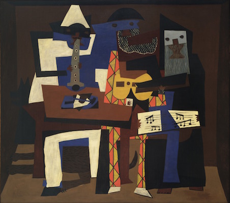
Image 4.35 Pablo Picasso, Three Musicians, 1921, oil on canvas, 200.7 x 222.9 cm (The Museum of Modern Art)
Looking again at Horn Players, for example, reveals several connections to Picasso’s Three Musicians. Basquiat’s use of the triptych format—a popular device for the artist in this period—echoes the triple subjects of the Picasso image. The figure of Parker in Basquiat’s composition is also reproduced in the same position as the standing figure (playing the clarinet) in Picasso’s work.

Image 4.36 Right: Jean-Michel Basquiat, Horn Players (detail), 1983, acrylic and oilstick on three canvas panels mounted on wood supports, 243.8 x 190.5 cm (The Broad Art Foundation) © The Estate of Jean-Michel Basquiat; left: Pablo Picasso, Three Musicians (detail), 1921, oil on canvas, 200.7 x 222.9 cm (The Museum of Modern Art)
The central panel of Basquiat’s canvas, which does not show a portrait of an identifiable musician like the other two panels, but instead a distorted head with roughly outlined features, suddenly comes into focus via its comparison with Three Musicians. Here Picasso references in paint, his earlier experiments with paper collage especially in rendering the face and head of his central figure, whose jawline dramatically extends beyond what is anatomically possible to create an abstract, bulbous shape. Basquiat’s central figure bears a similar protrusion—this time from the top of the head—which he fills in with hatch marks that are suggestive of the patterning of Picasso’s “collaged” paper. Once again, Basquiat seems to be speaking in code. This time, we are being asked not only to draw upon our knowledge of music history but of modern painting to fully understand his work.
BASQUIAT’S MUSICIANS
Musicians were a popular subject for Basquiat, who himself played briefly in a noise band called Gray—likely a reference to the Gray’s Anatomy textbook. Jazz musicians began to appear in the artist’s paintings around 1982; references to jazz musicians or recordings appear in more than thirty large-format paintings and twenty works on paper. Charlie Parker and Dizzy Gillespie are the two musicians who appear most frequently, both as figures in the paintings and through linguistic references to their work. The artist painted canvases with figures playing the trumpet, the saxophone, and the drums. He also devoted several canvases to replicating the labels of jazz records or the discographies of musicians.
Many scholars have connected Basquiat’s interest in jazz to a larger investment in African American popular culture (for example, he also painted famous African American athletes) but an alternative explanation is that the young Basquiat looked to jazz music for inspiration and for instruction, much in the same way that he looked to the modern masters of painting. Parker, Gillespie, and the other musicians of the bebop era infamously appropriated both the harmonic structures of jazz standards, using them as a structure for their own songs, and repeated similar note patterns across several improvisations. Basquiat used similar techniques of appropriation throughout his career as a painter.
Remixed from:
Dr. Jordana Moore Saggese, "Jean-Michel Basquiat, Horn Players," in Smarthistory, November 28, 2015, accessed June 30, 2022, https://smarthistory.org/jean-michel-basquiat-horn-players/.CC BY NC SA.