
4.2: Layout and Document Design
- Page ID
- 50700

\( \newcommand{\vecs}[1]{\overset { \scriptstyle \rightharpoonup} {\mathbf{#1}} } \)
\( \newcommand{\vecd}[1]{\overset{-\!-\!\rightharpoonup}{\vphantom{a}\smash {#1}}} \)
\( \newcommand{\dsum}{\displaystyle\sum\limits} \)
\( \newcommand{\dint}{\displaystyle\int\limits} \)
\( \newcommand{\dlim}{\displaystyle\lim\limits} \)
\( \newcommand{\id}{\mathrm{id}}\) \( \newcommand{\Span}{\mathrm{span}}\)
( \newcommand{\kernel}{\mathrm{null}\,}\) \( \newcommand{\range}{\mathrm{range}\,}\)
\( \newcommand{\RealPart}{\mathrm{Re}}\) \( \newcommand{\ImaginaryPart}{\mathrm{Im}}\)
\( \newcommand{\Argument}{\mathrm{Arg}}\) \( \newcommand{\norm}[1]{\| #1 \|}\)
\( \newcommand{\inner}[2]{\langle #1, #2 \rangle}\)
\( \newcommand{\Span}{\mathrm{span}}\)
\( \newcommand{\id}{\mathrm{id}}\)
\( \newcommand{\Span}{\mathrm{span}}\)
\( \newcommand{\kernel}{\mathrm{null}\,}\)
\( \newcommand{\range}{\mathrm{range}\,}\)
\( \newcommand{\RealPart}{\mathrm{Re}}\)
\( \newcommand{\ImaginaryPart}{\mathrm{Im}}\)
\( \newcommand{\Argument}{\mathrm{Arg}}\)
\( \newcommand{\norm}[1]{\| #1 \|}\)
\( \newcommand{\inner}[2]{\langle #1, #2 \rangle}\)
\( \newcommand{\Span}{\mathrm{span}}\) \( \newcommand{\AA}{\unicode[.8,0]{x212B}}\)
\( \newcommand{\vectorA}[1]{\vec{#1}} % arrow\)
\( \newcommand{\vectorAt}[1]{\vec{\text{#1}}} % arrow\)
\( \newcommand{\vectorB}[1]{\overset { \scriptstyle \rightharpoonup} {\mathbf{#1}} } \)
\( \newcommand{\vectorC}[1]{\textbf{#1}} \)
\( \newcommand{\vectorD}[1]{\overrightarrow{#1}} \)
\( \newcommand{\vectorDt}[1]{\overrightarrow{\text{#1}}} \)
\( \newcommand{\vectE}[1]{\overset{-\!-\!\rightharpoonup}{\vphantom{a}\smash{\mathbf {#1}}}} \)
\( \newcommand{\vecs}[1]{\overset { \scriptstyle \rightharpoonup} {\mathbf{#1}} } \)
\(\newcommand{\longvect}{\overrightarrow}\)
\( \newcommand{\vecd}[1]{\overset{-\!-\!\rightharpoonup}{\vphantom{a}\smash {#1}}} \)
\(\newcommand{\avec}{\mathbf a}\) \(\newcommand{\bvec}{\mathbf b}\) \(\newcommand{\cvec}{\mathbf c}\) \(\newcommand{\dvec}{\mathbf d}\) \(\newcommand{\dtil}{\widetilde{\mathbf d}}\) \(\newcommand{\evec}{\mathbf e}\) \(\newcommand{\fvec}{\mathbf f}\) \(\newcommand{\nvec}{\mathbf n}\) \(\newcommand{\pvec}{\mathbf p}\) \(\newcommand{\qvec}{\mathbf q}\) \(\newcommand{\svec}{\mathbf s}\) \(\newcommand{\tvec}{\mathbf t}\) \(\newcommand{\uvec}{\mathbf u}\) \(\newcommand{\vvec}{\mathbf v}\) \(\newcommand{\wvec}{\mathbf w}\) \(\newcommand{\xvec}{\mathbf x}\) \(\newcommand{\yvec}{\mathbf y}\) \(\newcommand{\zvec}{\mathbf z}\) \(\newcommand{\rvec}{\mathbf r}\) \(\newcommand{\mvec}{\mathbf m}\) \(\newcommand{\zerovec}{\mathbf 0}\) \(\newcommand{\onevec}{\mathbf 1}\) \(\newcommand{\real}{\mathbb R}\) \(\newcommand{\twovec}[2]{\left[\begin{array}{r}#1 \\ #2 \end{array}\right]}\) \(\newcommand{\ctwovec}[2]{\left[\begin{array}{c}#1 \\ #2 \end{array}\right]}\) \(\newcommand{\threevec}[3]{\left[\begin{array}{r}#1 \\ #2 \\ #3 \end{array}\right]}\) \(\newcommand{\cthreevec}[3]{\left[\begin{array}{c}#1 \\ #2 \\ #3 \end{array}\right]}\) \(\newcommand{\fourvec}[4]{\left[\begin{array}{r}#1 \\ #2 \\ #3 \\ #4 \end{array}\right]}\) \(\newcommand{\cfourvec}[4]{\left[\begin{array}{c}#1 \\ #2 \\ #3 \\ #4 \end{array}\right]}\) \(\newcommand{\fivevec}[5]{\left[\begin{array}{r}#1 \\ #2 \\ #3 \\ #4 \\ #5 \\ \end{array}\right]}\) \(\newcommand{\cfivevec}[5]{\left[\begin{array}{c}#1 \\ #2 \\ #3 \\ #4 \\ #5 \\ \end{array}\right]}\) \(\newcommand{\mattwo}[4]{\left[\begin{array}{rr}#1 \amp #2 \\ #3 \amp #4 \\ \end{array}\right]}\) \(\newcommand{\laspan}[1]{\text{Span}\{#1\}}\) \(\newcommand{\bcal}{\cal B}\) \(\newcommand{\ccal}{\cal C}\) \(\newcommand{\scal}{\cal S}\) \(\newcommand{\wcal}{\cal W}\) \(\newcommand{\ecal}{\cal E}\) \(\newcommand{\coords}[2]{\left\{#1\right\}_{#2}}\) \(\newcommand{\gray}[1]{\color{gray}{#1}}\) \(\newcommand{\lgray}[1]{\color{lightgray}{#1}}\) \(\newcommand{\rank}{\operatorname{rank}}\) \(\newcommand{\row}{\text{Row}}\) \(\newcommand{\col}{\text{Col}}\) \(\renewcommand{\row}{\text{Row}}\) \(\newcommand{\nul}{\text{Nul}}\) \(\newcommand{\var}{\text{Var}}\) \(\newcommand{\corr}{\text{corr}}\) \(\newcommand{\len}[1]{\left|#1\right|}\) \(\newcommand{\bbar}{\overline{\bvec}}\) \(\newcommand{\bhat}{\widehat{\bvec}}\) \(\newcommand{\bperp}{\bvec^\perp}\) \(\newcommand{\xhat}{\widehat{\xvec}}\) \(\newcommand{\vhat}{\widehat{\vvec}}\) \(\newcommand{\uhat}{\widehat{\uvec}}\) \(\newcommand{\what}{\widehat{\wvec}}\) \(\newcommand{\Sighat}{\widehat{\Sigma}}\) \(\newcommand{\lt}{<}\) \(\newcommand{\gt}{>}\) \(\newcommand{\amp}{&}\) \(\definecolor{fillinmathshade}{gray}{0.9}\)Layout and Document Design
On the most global level, document design is all about layout. The design of a document is first and fundamentally controlled by the layout of the text and images on the page. Yes, the size and color of the text matters in how someone reads, as we’ll get to in a moment, but layout controls what they encounter and when as they navigate in the traditional top-left corner and over and down manner. (And, if you’re writing for languages that are right-to-left, from the top-right corner and over and down). Learning how to use layout to guide/assist readers is a fundamental skill for technical writers.
With that said, most word processing software doesn’t really dive into in-depth document design as part of its core functionality. Instead, we tend to operate in a set of conventional document design presets that govern how we read and write everyday documents. When you open a word processor, you likely have a white page with black text, probably Calibri or Times New Roman or Cambria as your font, and your margins are usually set to 1 inch or so on all sides. When you type, the text fills the whole page until it hits the margin, unless you may use of tools like tabs or lists or indents. This is the world we’re used to operating in, and while document design is possible in these types of environments, the freedom to determine layout isn’t really baked into the fundamental operation of these traditional word processors. You aren’t supposed to have to think about fundamental layout—you’re writing.
When we take control of layout, much more is opened up to us. Many times a program truly dedicated to document design will simply open up to a blank page—there will be no places to write, there will no places to insert images. All of the choices are open to you, the designer. This can be a bit overwhelming at first, but you’ll come to enjoy the freedom. You can place text boxes to house text, you insert frames for images, or just insert the image into the document and move it around. You can create custom paragraph and text styles as well as object-level styles that govern how and when text and images interact. The amount of choices you have are virtually endless.
Document design programs are designed as sandboxes for the creation of any sort of document you can think of rather than any particular type of document. The amount of choices they provide and the lack of handholding go hand-in-hand with professional work where you want to create your design rather than spend your time undoing someone else’s preconceptions of what a design should start with.
This can be a bit overwhelming if you’re new to things, and you may try to start reinventing the wheel, creating your own take on a fundamental document type from scratch. Try to resist that urge. If you’re creating a document that you’ve never made before, find some examples of the document in the wild from competitors or internally. Look at what they’ve done that you like and that you don’t like. Figure out which elements work for you, and bring them together in a unique design that borrows from a few different traditions. This is how design works—incrementally and building off older ideas. Sometimes you’ll see older content brought back to the forefront as the next new thing. Sometimes you’ll see existing content tweaked a bit for a new take on design. Designers tend to work to develop off of what is already here—it is much more rare to create something that is fundamentally unconnected to any previous design. Design is a conversation more than anything, and when you contribute to the conversation you’re building on what has already come before.
If you can think of the flavoring you wish to give your design, you often start off in a much better place then simply saying, I’m going to create this type of document. I’ll give you an example from my own development as a designer to illustrate this point. When I was a Ph.D. student, I met my future wife and we decided to get married. At the same time we were planning the wedding, I was taking a design studio course over the summer. Neither of us were happy with the traditional wedding program, so I decided—naively—to suggest that I could design it and get it printed at the local printer. At first, this did not work out well at all. I would go to my future wife with a design, and she wouldn’t like it. I would go to her with another, and she wouldn’t like it. A good part of this was related to my actions—I was trying to create something I had no experience with and with no conventions to reference. It was awful. This happened for a while before I realized that I didn’t need to reinvent the wheel—I simply needed a new paradigm to view what I was doing.
I thought about who we were as a couple and what we had in common in our pasts. Both of us had many friends in theater when we were in college, and we both helped a lot with theater productions. I realized that what we could do was create a wedding program that was designed with the same visual aesthetic as a low-budget college theater’s program for a play. Once I had this idea, which my future wife loved, I had a much easier time developing things. I was able to use classic clip art to give it a retro and low budget feel, and I set up the “play” of the wedding as a love story. The exit song and theme of the program was “Ever Ever After,” so that tied in nicely. The different parts of the wedding were set up as acts and scenes in the play. Our history as a couple was the summary of the story thus far. And the back page, which I was particularly proud of, was the cast and crew—the wedding party basically—with headshots and short bios about each member and how they connected to the bride or groom. Having the theme, an approach that I could take to reimagine and meld two different types of documents, made all the difference.
So, with your layout work, don’t try to start with nothing and create something. Do some research on what is out there. Think about your goals, your audience, the use of your text. Find a thematic that works well and features that you like from elsewhere and blend them together into your own design that speaks in a particular design language that makes sense. As I’ve mentioned, you see this all the time. Ever noticed how phone design seems to work based off one hit design that gets copied and adapted just because? It works the same with material design and even architecture! Folks doing design operate in existing traditions and expectations. You can get rewarded for something novel, but that is extremely hard to pull off, and often outside the scope of what you need to do in any given project.
To flesh out the rest of our discussion on layout, we’re going to cover some fundamental ways of viewing layout and doing layout. We’ll look at the basic concept of stacking to create layouts and designs, we’ll discuss placement and purpose, we’ll discuss legibility and color, and we’ll discuss print concerns with layout choices (bleeds and such).
Stacking—The Fundamental Design Tool
When it comes to doing document design, or any sort of visual design really, the concept of stacking is absolutely central to pulling off virtually any sort of complicated multi-element design. (And, if we’re honest, it applies to drawing and painting too, but let’s not go too far astray). Stacking is a way of viewing design, one that makes the process of breaking down and then creating or recreating a design much easier than trying to tackle a full image by itself. I’ll explain.
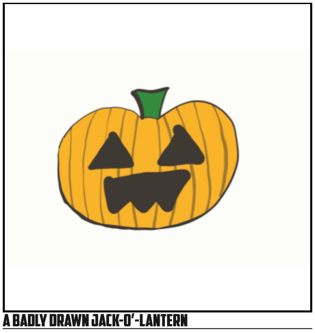
Let’s start with a terribly-drawn example of a carved pumpkin. I believe I’ve mentioned that Halloween is my favorite holiday, and thanks to the iPad Pro that I’m working on, I can draw you the world’s worst drawing of a pumpkin. (I promise I can do better design work on a pc with a mouse). This example will provide for us both comic relief as well as a brief insight into how stacking can be used to create document design effects when doing layout.
In this image, you see a pumpkin or something that looks like a pumpkin that has been carved for Halloween—but we need to move beyond seeing the image as a single entity to understand how stacking works. Normally, we would view this image as a single visual. The stem, the eyes and mouth, the banding on the body, the outline of the body, and the color of the main body are all seen as one. We need to instead see each of these items as a single entity that has been created through stacking several different elements.
Stacking works in layout and document design fairly simply, much like an old fashioned projector, you layer one visual element on top of another, creating a stacked effect that creates your final product. Crucially, you also operate in a stacking mindset, creating each individual level of elements on their own layer of the image. By breaking down the image into differing layers and stacking those on top of each other, you create a final image.
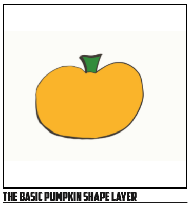
In the example above, we actually have four different layers that are being used. First, we have a background image that is being used. In this case, we have a transparent background, so we can ignore that for now. Next, we have the actual shape of the pumpkin and its outline and stem as you can see on the next page.
This is all that we have on this layer, and if we wanted to be really process-driven, we could have put the stem on a different layer entirely. What this allows is for us to create the basic look and overall shape of our design element without having to worry about other elements.
Next, you have a layer that consists just of the banding that you see on the pumpkin. In this case, I started with a solid black line stroke and painted that onto the pumpkin body from left to right. Once that was done, I lowered the opacity of the layer so it would be less harsh and look more organic—which I suppose is overkill when you’re drawing the world’s worst pumpkin carving. Once I was done, I was able to clean up by erasing any strokes that went past the edge of the pumpkin body. Because I was on a totally different layer, I didn’t have to worry about erasing any of the pumpkin’s body. This is another key advantage to stacking and layer-based design. Here is what this layer looks like alone:
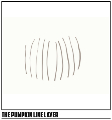
Notice that just the lines are visible here. That is all that is operating on this layer. However, due to the way that layers work, I was able to see what was below when I was doing my line insertion. The final product, combining the two layers, can be seen here.
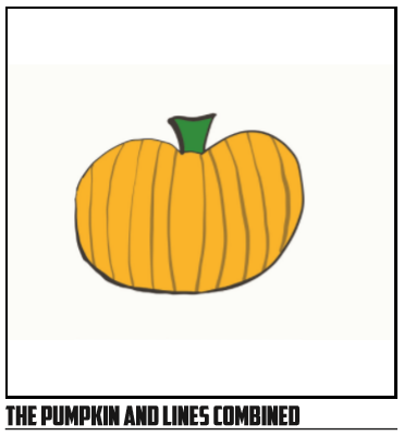
Through the use of layering, you can see how the image slowly evolves into something that looks more and more like a terrible pumpkin. The complex design elements (ha!) are layered on top of each other, allowing you to tweak each layer independently without impacting the others.
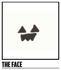
The final step was to take the eyes and mouth and add them onto the pumpkin. This was, as you might guess, yet another layer that was drawn on top.
As you can see, there is simply a mouth and two eyes here. This was drawn with the advantage of seeing what was going on below, allowing me to line everything up. However, since the elements were all on their own layer, I was able to tweak them, erase the edges as needed, and redo them even without having to worry about the rest of the document getting altered. The end result, which you can see, was far from striking, but it does take advantage of this concept of stacking when doing document design layout.
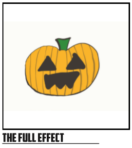
Each stacked element, from bottom to top, blends together in the final image to create a carved pumpkin. Each element is standalone, which means I can tweak the colors and the shapes quickly without having to do much work at all. If I want to have a bright purple pumpkin with a silly face, I can do that by simply repainting the coloration on the pumpkin, making the lines darker, and redrawing the face layer. In less than two minutes, I was able to get just such a result that you can see on the next page.
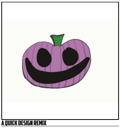
Again, because of the leeway that stacking gives us when doing a design, we can quickly change the elements, move different elements and recolor them quickly, etc. Stacking really is the secret to a good layout! It also helps when you need to replicate something with slightly different looks over and over again. Think about my pumpkins above—I was able to create a basic pumpkin then riff off that design with the same dimensions over and over again, giving me a basic template for future pumpkins that could all fit into the same slot/spot.
Now most of our examples thus far have been with our outrageously bad pumpkin illustration. I started with that type of example because stacking is often the secret to creating complex logo elements and other pieces of technical writing that you may need to create from time to time. But, it also works for standard designs like signs and newsletters. You just need to apply the same paradigm and thought process to your work. Think in layers and stacks and you’ll be able to break down virtually any design that you see and replicate it fairly easily. This also gives you any number of ways to find inspiration for a design because you start to see the various elements in the stack rather than the entirety of the image or document. You can borrow a few elements of the stack as inspiration and leave the rest.
Take for another example the newsletter template you’ll find below. In this example, you have several different items stacked in simple layers. The background layer has all of the major color blocks for the header and the footer, then you have text on top of those layers one layer of text for the main text in the body of the newsletter. To create colored segments that are edge-to-edge, you simply need to draw a box or equivalent shape and then color it. That becomes a stand-alone layer and colors that particular part of the layout:
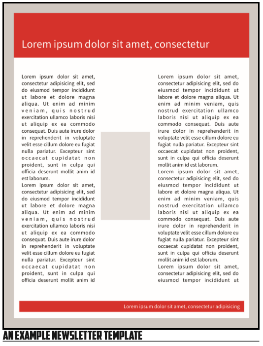
Here you get the effects of a simply-designed newsletter with a space for a photo in the center and a colored header and footer. A few of the elements could be aligned better, but the overall layout works as a newsletter. By making use of layers and stacking, you can create virtually any design layout you’d like by breaking down your intended final product into a series of independent layers. And, again, this makes recoloring and movement of elements easy because you’re not constantly running into all of the elements at any single time.
- Take a document with a fair level of design applied—visuals and colors and the like. Break it down into a stack that you could reproduce. What elements will be on what level? What order will they be in?
- Build your own stack—you just need a program that does design in layers. Create a simple graphic using a stack, such as an icon representing a PC. Plan your stack out and then build it.
Placement and Purpose in Layout Design
Having looked at stacking, we now need to look at the central move we make when doing document design work—placing elements and using that placement to convey purpose. Whereas stacking is an approach to creating document designs, placement represents a type of choice we make with each individual element in our design. Where we place elements and the relationship of that placement to the whole document and other elements in the document controls the way our text is perceived and navigated.
When we view a traditional document, placement often determines the level of importance that we give to a line of text. Looking at the x-axis of the document, the further left or right an item is placed usually determines the level of importance in the textual hierarchy. If this sounds familiar, it is because we touched on this same issue when we were discussing taxonomies in chapter 1. Generally the closer to the left side of the document, the more importance something is given. The same also holds true to the y-axis: the closer to the top, the more important something is.
As we noted earlier in the taxonomy discussion, placement has a crossover effect—items that are placed in the same way and along the same line on an axis are considered to be of equal importance. If you have three images that are placed side-by-side in the middle of a page, you consider them of equal importance.
Going along with the idea of placement equaling the same value for different items, placement together also creates groups of items, groups that are usually read as being considered one unit to be read together. You see this in many texts where you will have a grouping of images or paragraphs. Each of the paragraphs or images that are placed together are considered to be equal and connected in some way because they share the same placement on a line in the x or y axis. See the example below for what this looks like:
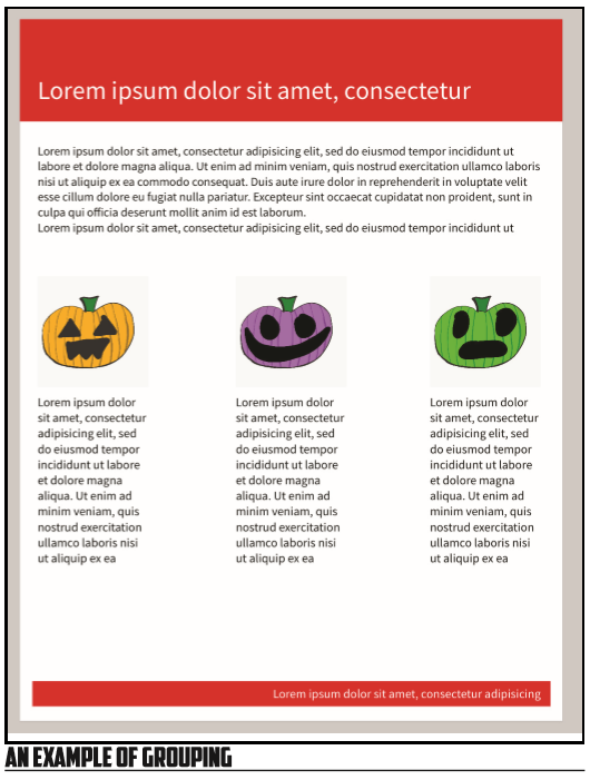
In the above example, you have three different images of pumpkins on the same level of the y-axis. Because they are of equal size and on the same line, they are viewed as being of equal value to most readers. If you look at the x-axis alignment of the pumpkin images with the text that is below them, both the text and the image are on the same line of the x-axis. This creates an association that these two items are of equal importance and draws a connection.
In addition to simple alignment along an axis, the relative closeness of two items in a document matters as well. In the pumpkin example, the relative closeness of the text and the images suggests to the reader that they are part of the same item—they belong together because they are quite close. Each of the pairs is considered to be of equal value because they are on the same line of the y-axis, but they are not considered the same item because they are not quite as close together.
The end result is that we can use placement along an axis to indicate that items are of equal importance, and the relative closeness between two items along an axis to group them together visually, creating a unit within the text on account of the proximity each item has to its companion.
When it comes to placement, do note that subtlety is usually not something to be sought after. What I mean by that is simply that when you want to space items out or want to group them together, don’t be amibiguous or subtle. If items are together, place them close to each other. If they are of equal importance, place them along the same line. If they are not together, make sure the distance is great enough that it doesn’t appear to be a mistake—very slight variations in distance can be read as mistakes by an author rather than a differentiation between two different images. The same holds true for any types of placement that indicate value or groupings—if you make the differences between groupings or alignments slight, it can and will be read as a mistake. See the image below for an example of this:
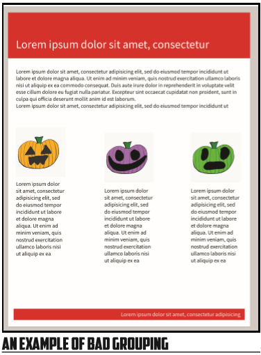
In this example, you can see that the placement of the left and right pairings of pumpkins is almost exactly along the same line on the y-axis. There really isn’t much difference between the two, and there is an awkward gap between them on the x-axis that just sits empty and open. To most readers, this is read as a design mistake because there is a very subtle shift in the placement of the images and a general lack of balance to the placement as well—the large white space doesn’t sit well with us.
Supplementing Placement with Size and Design Elements
To fix this, we would likely want to use a different alignment, but we can also supplement our placement using size and other tools. Generally speaking, the size of an item that is placed in a document correlates to importance, just like the size of a font usually connects to the importance of text in a document. In addition, much like with text, we can use lines and other visuals to underscore our choices in the layout placement.
Putting a line between grouped items is the equivalent of a line break or other spacing equivalent in text. The size and placement already indicates a relationship in the layout, but the extra elements underscore this as in the example below:
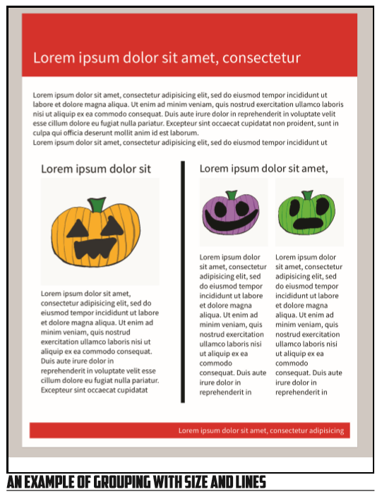
Here we have a massive size difference between the two pumpkin/text groups. On the left we have traditional colors for the pumpkin in a fairly large size. On the right, separated by a black vertical line but still occupying the same line on the y-axis, we have two additional pumpkins. This line exaggerates the importance or at least draws attention to the importance of the size difference and layout differences between these two groups. It also makes the two groups separate cleanly. The symmetry between the smaller elements size and placement also indicates they are of equal importance, but of less importance than the larger and left-most image and text combination.
- Take an example designed document and breakdown the layout choices. How are size and placement used to control the navigation of the document? How are groups created and what impact do they have on the text?
- Create your own layout using simple wire frames to meet a specific purpose, perhaps creating a poster or flyer for an event. Think about how you can use size, placement, grouping, and stacking to indicate intent.
- Take a layout that works well and break it. Move things in ways that ruin the intended effect. Why do your choices mess things up? What rules are being broken that make things uncomfortable to read or misleading?
Legibility and Color in Layout
In addition to the placement of the elements of a design and the relative size of elements in a design, we need to consider the relationship the overall legibility of elements and the relationship in particular of legibility to color choices. While you can put a lot of great information into a document, that doesn’t matter much if no one can actually read the information that you’ve placed in the text. Texts can become illegible for a couple of reasons including physical placement, size, and color contrast. We’ll spend a little extra time discussing color because uses of color can cause text to be less obvious without necessarily making it fully illegible.
We cover legibility for practical and ethical reasons. If you’ve ever run into a document that had important information in a place that was hard to find or in a place that didn’t allow you to read very easily, you understand the ethical issues with legibility. Sadly, there are some writers out there who have purposefully used the layout and design of their texts to make some information less legible or to hide it altogether. One fundamental question we have to ask ourselves regarding legibility is simply: am I making this text fit at the cost of readability?
One way we need to deal with legibility is just the physical aspects of legibility—where text is on a document and how conducive that placement is to use and reference. In some cases, you may have a text where certain parts of the document simply aren’t that useful for prime information. For example, if part of your document could be exposed to excessive wear, you wouldn’t want anything important to go in that space. (This might be an issue with a text that has a long life and gets referenced and used continually). You can also have parts of a text hidden by the physical structure of a document—content too close to the spine of a book can be unreadable.
We also want to think about the size of the text that we’re placing and how that size impacts readability. When it comes to working with size, we want to be able to balance the overall amount of space that a bit of text is using with the importance of that text, the amount of information that needs to be there, and the legibility of the choices that we’re making.
Not all fonts are created equally, as we’ll discuss in our next major section on typography. One way we can measure/assess fonts is their relative x-height: the height of a given font’s lowercase “x.” X-height allows us to assess the general contrast between the height of lower-case and upper-case letters in a particular font. The closer the lower and upper case letters are in height, the more legibility a particular font tends to be at smaller sizes. This isn’t universally true—some fonts are just hard to read at small sizes—but, it can be a great rule of thumb. So, if you need a font that will perform at small sizes, find one with a relatively small level of contrast between lower and upper case letters. For an example, see below:
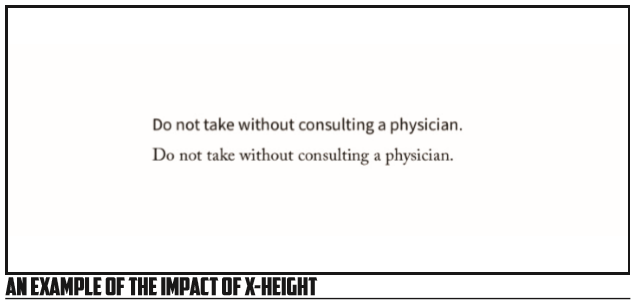
Here you have two different fonts, each set at 10pt. Notice that the top example is much easier to read at any level of distance. A major reason for this readability? The x-height.
When we’re dealing with text in general, legibility concerns should lead us to try to never go below 10 point sizing. 12 point is a relatively common size for general paragraph text, and while smaller font sizes can be readable in certain contexts, going below 10 can cause issues for some readers. If you simply need more space to convey the information on a given document, you may need to either edit your information for clarity and brevity, or you may need to create a larger document or a supplemental text that can be referenced. (Though, the issue with supplemental texts is that very few of us are going to go out of our way to find and read them).
As a secondary issue related to legibility and size, we want to make sure our use of size is is proportional to the importance of a bit of information to our users. We shouldn’t go out of our way to make less important information super visible while hiding less important information—to do so is unethical and often causes no amount of frustration with readers. Have you ever gone to the store and seen a special and decided to go ahead and take advantage of it, only to get to the checkout and realize you didn’t see the fine print that makes you ineligible to actually get the special price? If so, you’ve encountered this very issue! Depending on your mood, you may have rewarded the misuse of font sizing by just going ahead and getting the purchase, regardless of the sale price, but if you’re annoyed enough you might just abandon your whole purchase. Without naming names, I can tell you that a certain local retailer with a national footprint has basically turned me off of all of their “buy X and get a gift card for X amount” deals for this exact reason. If I see those signs, I tend to ignore them—I’ve been mislead too often and I’m too annoyed to mess with them.
To get around issues related to size and importance, simply make sure that any critical information is obvious enough on a quick read. If you’ve gone out of your way to make a special visible to a reader, make sure any common disqualifications are equally visible, or at least make sure the fact that qualifications exist is very visible. When possible, try to give all information regarding a subject equal billing, that way you don’t risk annoying or misleading your readers by gating certain information via sizing. For example, a BOGO (buy one, get one) sale sign that doesn’t let you see that the BOGO nets you a 10% discount is deeply frustrating to someone who assumed a second item was free or heavily discounted. In this case, we would want the tail end of the BOGO to show up at the same size as the rest of the text, or at least at a size that allows instant comprehension of the deal. In situations like this, the extra text placement simply makes sense—you can’t assess the value of a BOGO offer without the final bit of information.
Having looked at physical placement, font size, and the size/importance connection, we finally need to cover the importance of color in layout legibility and readability. Color can impact the way that we process texts in any number of ways, each worth taking a moment to focus on. First, color can impact overall legibility of text and other elements. It can also impact the way that readers assess a text and associate a text with other information. Finally, color pose an accessibility concern that we need to be aware of.
When thinking about the legibility of a text’s layout in regards to color, we want to think about how much contrast is available between a given text and that text’s background. The traditional writing arrangement that we see when we fire up a word processor makes optimum usage of contrast by presenting us with a total contrast between a solid white background and solid black text. In a few cases we see this reversed for nighttime reading on a screen with a solid black background and solid white text. Regardless of which is used, the goal for both layouts is an optimum level of contrast. When moving beyond these two choices, we need to make sure our color choices maintain an acceptable color contrast in our layout.
When dealing with contrasting colors, the simple rule of thumb is to choose colors that different in their general darkness or shade—you want a lighter option to contrast with a darker option. Generally speaking, light text and light background shades don’t go well together as in the example below:
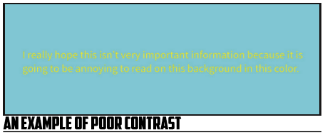
With this example, you can see the horror that has been wrought by using a light yellow with a light blue background. These two shades are both too close in coloration to be of use to us.
One trick to finding useful colors is to simply use complementary colors—colors that are opposite each other on the color wheel. Any number of tools exist to select color off of a wheel-type selector, and all you need to do is choose from colors on opposite sides to create a level of contrast that is legible and often aesthetically pleasing as well. See the example below where we’ve kept the same general shade of blue but alternated the text with something complementary:
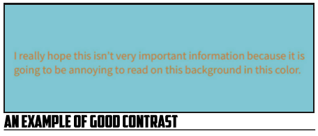
Notice that the orange shade is much more legible on the blue background, creating a much more attractive layout choice in general for text that should be easy-to-read.
Now, when it comes to color, this isn’t to say that you should always avoid using similar colors! When you’re creating a design, you may well want to use colors that are shades of each other or that blend well together. This can create aesthetically pleasing designs with the various elements of your text. You should only avoid having colors that blend together easily when you’re trying to say something important to your readers, when you’re passing along textual information.
In addition to general legibility, color often impacts the way that we read a text—it colors our interpretation. For example, if you’re trying to associate a document with a particular brand, you will want to use that brand’s colors. Think about the way we can identify someone’s affiliation at a given sports event based almost entirely on the colors they are wearing—the same holds true for texts. Certain brands have iconic colors and iconic imagery—by using those, we’re drawing on the associations and immediately impacting how someone assesses the text.
There can be issues when we misuse color to draw associations—you want to make sure your usage is genuine and not misleading, else you risk the ire of your users. No one likes to be deceived by a document and using color to imply something that isn’t accurate does just that.
In addition to brands, colors also have seasonal and cultural associations. We’ve already highlighted how black and orange can signal Halloween, and the same can be true for green and red for Christmas in the US. You likely can think of any number of color associations you have with seasonal and local events, and the number of associations that go with these colors reaches even further when we open up to an international audience. For example, Chinese weddings tend to make use of abundant amounts of red—white wouldn’t be appropriate at all because of associations with funerals. At the same time, a red wedding in current US culture might draw entirely different associations with a popular television and book series. Color and culture have a close connection that must be researched and respected!
Next, as with size, you want to use the contrast and impact of a color choice to correlate with the information’s importance that you’re sharing. If you’re simply creating a background element that makes the text nicer looking, there is no duty to make things stand out—blending in is a good thing. But, if you’re relaying important information, you need to make sure that it stands out! Don’t use your contrasting colors for unimportant information while hiding the important stuff with colors that blend into the background. Make sure your text stands out!
Finally, keep in mind that colors can pose accessibility issues to those with different visible color spectrums. Keep in mind that combinations such as red and green can be difficult to many readers who cannot differentiate between these two colors! While going into a full discussion of colorblindness accessibility is outside the scope of this current text, you should make sure to test your documents and identify issues with color choices that may impact your readers. For example, green and black can be a difficult distinction for some with colorblindness to make: my father’s favorite pair of pants is a set of olive slacks that are his favorite pair of black pants that he owns. A growing number of design tools have a built-in testing tool for color accessibility—if those are available for you, use them.
Just like other audience issues, color needs to be researched! You need to be aware of any brand connections with your color choices, any cultural significance related to your colors when you’re creating a text, and any barriers that your colors may present to those with color blindness and different views of the colors around them. This type of work is simply due diligence for us as technical writers. Colors send a message, and we want to make sure we’re using them to send a message we fully understand and intend to send.
Layout and Printing Considerations
One final layout consideration we need to tackle is the issue of printing, primarily an issue of bleeds and margins. If you’ve not done any professional printing, or at least any edge-to-edge color printing, you likely have no idea what I’m talking about. That’s okay. We’ll dive into the physicality of printing in this section and give you a brief boot camp on getting this stuff done.
Whenever you see a printed document that has color elements that go all the way to the edge of the page, you’re seeing a choice that was designed around the physical nature of printing using bleeds. Edge-to-edge printing is not something that naturally happens in a production environment. You may have noticed with your own printers that you can’t print all the way to the edge of a piece of paper—there is always a margin the printer simply can’t touch. The same is mostly true for professional printing. To get around this, documents are printed on larger pieces of paper than the final product and then cut down to the actual size needed. Usually you pay per cut for this service, so if you had four sides of a text cut, you’d pay for the four different cuts in your run. (Note, this is for the full run, not per document).
The issue with cutting a text down to size is that cutting is not as precise as we’d prefer. There is almost always going to be some variability in the cut made by the printer. To get around this variability, we make use of a document element known as a bleed. A bleed is a small extra margin around a text where all elements that go to the edge of the final text will bleed off the normal page to a secondary edge of the text, usually one that is perhaps a quarter of an inch or less more than the standard edge. This extra area is the bleed, and is used to make sure if the blade cuts too far outside the document there will still be designed elements to keep the text looking as intended. The same is true for the opposite side—you generally don’t want important information within the same margin of the bleed on the inside of a text’s border either—the cut can be too far in either direction.
When you set up your document for these types of printing, you’ll want to go into your document settings and create a bleed. The size of the bleed will depend on where you’re getting the document printed—different places with have different tolerances they prefer. Once you’ve set the bleed, you’ll want to make the printer aware of the bleed that will need to be cut off the text to reach the ideal size.
In addition to the bleed, you’ll want to be aware of the binding’s impact on your text. Any text that is bound by some sort of spine will have less room on the inside of each page for legible content. Too close to the spine of the text and your words will be lost in the page—especially on documents with a hefty spine.
- Think about colors and connections. What colors are associated with your campus, with events on your campus, and with groups there? What about with your workplaces or your hometowns?
- Bleeds are a concept that can be foreign at first. Do some searching for designs that use edge-toedge color or images or text and assess how they use the bleed. What do you think the document would look like after the margin, in the space for the bleed? What freedom does allowing elements to hang off the text provide for you as an author or designer?