
3.2: Using visual conventions
- Page ID
- 50693

Using Visual Conventions
As technical writers, we want to ask ourselves—what do we need to convey visually in this situation? The question of how to convey something visually can get complex quickly due to the multitude of factors that impact how a visual is interpreted. To navigate the process effectively, you need to ask the right questions and identify the issues that may pop up with your visual choices. There are risks and rewards to using visuals heavily in a text, and the risks can multiply as you lean harder into your visuals to carry the weight of your meaning. Too many references, too many meanings, and your visuals can become more complicated than a word-based text!
When you go to design visuals, try starting with the workflow/questions below to guide your visual design and thought process:
Drafting Visual Rhetoric
- What is the goal/purpose of the visual?
- What needs to be conveyed?
- Who will be the audience and what visuals will they recognize?
- Are there any visuals that could be altered or integrated to fit the purpose?
- What will the visual look like?—Draft it.
- What associations, good and bad, come with the visuals?
- What legal guidelines, if any, impact the visuals?
- Will this visual be understood, or will it need to be explained?
- Finish it or return to a previous phase.
1) What is the goal/purpose?
First off, you need to decide your purpose and goal for the visual. If the visual is a stand-alone document, then this process is much more involved. If the visual is a part of a larger document, or a single document that is part of a larger campaign, then you often have less work before you when it comes to deciding what your goal and purpose are.
The goal and purpose are going to be guiding principles for you, just like with the drafting process. You need to make sure that you keep your goal and principle in mind always—they are the rubric that you will use to grade your work and that you will use to judge the choices that are available. Never allow your design to take control of your drafting process! Your purpose is what matters—not the awesomeness of the design. There are a lot of awesome looking designs out there that are absolutely awful documents or experiences because the folks creating them became so enamored of their visual design that they forgot that people had to actually use the text. To quote Dr. Ian Malcolm, “[they] were so preoccupied with whether or not they could that they didn’t stop to think if they should.”
2) What needs to be conveyed?
Going along with the question of purpose, we need to figure out what exactly the visual is going to be doing—what is it going to convey? To answer this question, you need to ask whether the visual will be carrying all of the weight or simply part of the weight of your project. If it is the sole document, then it will convey all of your information. If it is part of a document…well…you get the picture. Make a list of everything the visual needs to convey, and then run that list by your purpose and weed out things that don’t fit the criteria of your purpose.
Once you have an idea of what you’ll be conveying, try to get specific. What particular values are going to be conveyed? What specific data? Go beyond simple typology and get into how much data will be there and what format it will have. These considerations matter a great deal. During this process don’t be afraid to doubt the creation of your text—sometimes a visual needs help and that is okay.
3) Who will be the audience and what will they recognize?
Once you have an idea of what information you should be conveying and your purpose, you need to run this all past your audience and what they’re going to need and understand. This might seem a bit backwards, but you want to at least have a firm idea of your own goals before you hit the audience angle. You don’t want to have this project/visual spiral out of control.
At this point, you may need to add some information if your audience needs some help—that is alright. But, always keep your purpose in mind. Your text doesn’t need to do everything your audience could ever desire and want. It needs to complete the goals you’ve set for it. Sometimes you need to expand what you thought the text would be to do that, but you make that expansion with your goals and purpose in mind!
If you realize that your audience may need more than your purpose allows, you have some hard conversations ahead potentially. When you want to make a project bigger, there are often institutional concerns about mission creep—letting a project grow until it basically can do anything and everything. More often than not, good projects do one thing well rather attempting to do all the things. As such, organizations can be—rightfully so many times—opposed to expanding what a document is supposed to do. If you feel strongly that a text needs to be expanded, make sure to couch your conversation in language that serves your organization—show them how this is going to help them too.
When it comes to what your audience will recognize, you’re going to be thinking about what you can rely on without explanation and what you can rely on with explanation. Most folks understand what a stop sign is, but not everyone can quickly read the chemical hazard sign that you find on the doors of laboratories with dangerous chemicals inside. That’s okay. Part of your visual design at times should be an explanation of the design itself—that is what a key on a map is for after all.
4) Are there any visuals that could be altered or integrated for the purpose?
Once you know who your audience will be and what they will recognize, you can move along to the next phase and decide what visual conventions could be altered or used for your purpose.
In some cases, you can quickly alter a visual to make something visible. You might, for example, take a generic soccer jersey shape and then use that shape as a frame in Illustrator with a nation’s flag underneath. The end result is a quickly-made graphical representation of a national soccer team. In this case, you’ve identified two visuals that make sense to your audience/user—the national flag and the soccer jersey. Combining the two is fairly seamless and with the right context (such as a poster title referencing the beautiful game) the visuals should fit right in and explain things visually at a glance.
The goal here is to identify what visuals would be useful, or to create some visuals to be useful. You can mashup various conventions to make one whole convention, or you can rely on a single convention or two to make things work. Don’t think about this as a close-ended process; this stage is all about coming up with ideas.
Create a list as you work of what conventions might work or might be modified to fit your needs. If you want, jot down some notes as to why you’ve chosen this convention and how it might work/ integrate with your purpose, audience, or content.
5) What will the visual look like?—Draft it!
For the next phase, you’ll want to take all of your information and come up with at least one or two drafts of what your visual could look like. One thing that may be helpful as you go through this process is to get all of your data into one place where you can reference it clearly. A table can often help for these purposes:
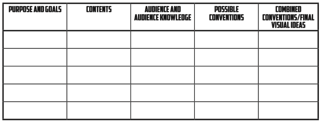
With a table like the one above, you can see your information and make connections across the matrix you’ve created. This can be extremely helpful in group writing situations and can help you see/ make connections that you might not make or see when you’re simply referencing a list or talking out loud.
After you’ve gotten some ideas together, sketch them out. Don’t spend a ton of time on polishing your concept though—you want to make sure this is something you can/should stick with!
6) What associations, good and bad, come with the visuals?
Next, you want to take stock of your visuals and what they connote. This may be something you’ve been doing all along, but sometimes you can include some imagery without critically engaging with what that will mean and say to others.
In this phase, take a hard look at your visual drafts. What are they saying? What type of message is being conveyed? Does this align with your purpose and your content and your public image? If not, you may need to make some changes. Your audience is crucial in this phase—you might even want to reach out to some testers and get some feedback from the audience you are targeting. There could be positive, negative, or political associations with some of the visual conventions you’ve chosen without you having realized the connections that exist! Just because you don’t see them doesn’t mean you’ll not get implicated in any mishaps.
For example, you may have chosen a shade of red that is associated with a major rival of the flagship state university’s football team. You likely wouldn’t want to have that color associated with your project, especially during a tense football season. But, if you’re not huge football fans, you might not realize that a connection exists. Getting some outside feedback can be really helpful when you’re figuring out what exactly your visual conventions may be saying. Don’t be Picard on Risa with a horga’hn.
7) Will this visual be understood, or will it need to be explained?
Next, you’ll want to make sure your visual can be understood, or if it can’t be understood that you provide interpretation. If your entire visual is difficult to understand, you’ll likely need to revert to a previous phase of development. There isn’t much use in creating an entirely novel set of conventions that require painstaking explanations. (Sure, you can make some what-about cases, but for the most part entirely novel designs that make sense to no one are a bad idea).
As you consider your visuals, run past what you’re conveying and what your purpose is and combine that with your audience. Where are the gaps that might appear? Once you’ve identified those gaps, create some explanations to help guide the user. If the gaps can’t be bridged, redesign!
For example, you might be using the soccer jersey with national flag example from earlier in an infographic. In addition to the jersey, you might also be including soccer balls that represent 500 people in order to create an infographic about the average attendance of home games for the national team. In the case of the ball and the 500 people, there is not a direct visual convention that exists. No one that I’m aware of naturally associates 500 people with an icon of a soccer ball. Since that is the case, you’ll want to label this aspect of your visual accordingly, teaching your reader that the value of a single soccer ball in your visual is 500 people in attendance.
8) What legal guidelines, if any, impact the visuals?
This step comes late in the process, though depending on the field you’re working in, it might need to come earlier. In this phase, we’re going to basically be assessing the legal guidelines that impact our text in one way or another.
You may primarily want to think about copyright here—visual design is an area that has lots of tangles that you can get into. You can’t simply use the Nike swoosh and think everything is going to be okay. Make sure that you have the rights to the visuals that you will be using!
Go through your visuals—are there any copyrighted or trademarked aspects that you’re using? Do you own those or have permission for their use? If you don’t, see if you want to take the trouble to get the visuals or if you simply need to design around the issue. Be warned—if you are using parody or satire, you can still end up in a legal battle.
9) Finish it up or return to a previous phase
Once you’ve finished the previous steps, you should have a final candidate and be confident in the candidate’s effectiveness and legality. In that case, put some final polish onto the design and get it ready to go. If, however, you’re not happy with what you’ve found yourself with, take some time to go back in the design process.
Section Break - Visuals and Production
- What are the iconic visuals associated with your institution? How are they protected? How are they parodied or used by 3rd parties?
- What conventions are protected by regulation in your major area of study due to their importance?