14: 20th Century Modern Art Movements- Cubism
- Page ID
- 67732
\( \newcommand{\vecs}[1]{\overset { \scriptstyle \rightharpoonup} {\mathbf{#1}} } \)
\( \newcommand{\vecd}[1]{\overset{-\!-\!\rightharpoonup}{\vphantom{a}\smash {#1}}} \)
\( \newcommand{\dsum}{\displaystyle\sum\limits} \)
\( \newcommand{\dint}{\displaystyle\int\limits} \)
\( \newcommand{\dlim}{\displaystyle\lim\limits} \)
\( \newcommand{\id}{\mathrm{id}}\) \( \newcommand{\Span}{\mathrm{span}}\)
( \newcommand{\kernel}{\mathrm{null}\,}\) \( \newcommand{\range}{\mathrm{range}\,}\)
\( \newcommand{\RealPart}{\mathrm{Re}}\) \( \newcommand{\ImaginaryPart}{\mathrm{Im}}\)
\( \newcommand{\Argument}{\mathrm{Arg}}\) \( \newcommand{\norm}[1]{\| #1 \|}\)
\( \newcommand{\inner}[2]{\langle #1, #2 \rangle}\)
\( \newcommand{\Span}{\mathrm{span}}\)
\( \newcommand{\id}{\mathrm{id}}\)
\( \newcommand{\Span}{\mathrm{span}}\)
\( \newcommand{\kernel}{\mathrm{null}\,}\)
\( \newcommand{\range}{\mathrm{range}\,}\)
\( \newcommand{\RealPart}{\mathrm{Re}}\)
\( \newcommand{\ImaginaryPart}{\mathrm{Im}}\)
\( \newcommand{\Argument}{\mathrm{Arg}}\)
\( \newcommand{\norm}[1]{\| #1 \|}\)
\( \newcommand{\inner}[2]{\langle #1, #2 \rangle}\)
\( \newcommand{\Span}{\mathrm{span}}\) \( \newcommand{\AA}{\unicode[.8,0]{x212B}}\)
\( \newcommand{\vectorA}[1]{\vec{#1}} % arrow\)
\( \newcommand{\vectorAt}[1]{\vec{\text{#1}}} % arrow\)
\( \newcommand{\vectorB}[1]{\overset { \scriptstyle \rightharpoonup} {\mathbf{#1}} } \)
\( \newcommand{\vectorC}[1]{\textbf{#1}} \)
\( \newcommand{\vectorD}[1]{\overrightarrow{#1}} \)
\( \newcommand{\vectorDt}[1]{\overrightarrow{\text{#1}}} \)
\( \newcommand{\vectE}[1]{\overset{-\!-\!\rightharpoonup}{\vphantom{a}\smash{\mathbf {#1}}}} \)
\( \newcommand{\vecs}[1]{\overset { \scriptstyle \rightharpoonup} {\mathbf{#1}} } \)
\(\newcommand{\longvect}{\overrightarrow}\)
\( \newcommand{\vecd}[1]{\overset{-\!-\!\rightharpoonup}{\vphantom{a}\smash {#1}}} \)
\(\newcommand{\avec}{\mathbf a}\) \(\newcommand{\bvec}{\mathbf b}\) \(\newcommand{\cvec}{\mathbf c}\) \(\newcommand{\dvec}{\mathbf d}\) \(\newcommand{\dtil}{\widetilde{\mathbf d}}\) \(\newcommand{\evec}{\mathbf e}\) \(\newcommand{\fvec}{\mathbf f}\) \(\newcommand{\nvec}{\mathbf n}\) \(\newcommand{\pvec}{\mathbf p}\) \(\newcommand{\qvec}{\mathbf q}\) \(\newcommand{\svec}{\mathbf s}\) \(\newcommand{\tvec}{\mathbf t}\) \(\newcommand{\uvec}{\mathbf u}\) \(\newcommand{\vvec}{\mathbf v}\) \(\newcommand{\wvec}{\mathbf w}\) \(\newcommand{\xvec}{\mathbf x}\) \(\newcommand{\yvec}{\mathbf y}\) \(\newcommand{\zvec}{\mathbf z}\) \(\newcommand{\rvec}{\mathbf r}\) \(\newcommand{\mvec}{\mathbf m}\) \(\newcommand{\zerovec}{\mathbf 0}\) \(\newcommand{\onevec}{\mathbf 1}\) \(\newcommand{\real}{\mathbb R}\) \(\newcommand{\twovec}[2]{\left[\begin{array}{r}#1 \\ #2 \end{array}\right]}\) \(\newcommand{\ctwovec}[2]{\left[\begin{array}{c}#1 \\ #2 \end{array}\right]}\) \(\newcommand{\threevec}[3]{\left[\begin{array}{r}#1 \\ #2 \\ #3 \end{array}\right]}\) \(\newcommand{\cthreevec}[3]{\left[\begin{array}{c}#1 \\ #2 \\ #3 \end{array}\right]}\) \(\newcommand{\fourvec}[4]{\left[\begin{array}{r}#1 \\ #2 \\ #3 \\ #4 \end{array}\right]}\) \(\newcommand{\cfourvec}[4]{\left[\begin{array}{c}#1 \\ #2 \\ #3 \\ #4 \end{array}\right]}\) \(\newcommand{\fivevec}[5]{\left[\begin{array}{r}#1 \\ #2 \\ #3 \\ #4 \\ #5 \\ \end{array}\right]}\) \(\newcommand{\cfivevec}[5]{\left[\begin{array}{c}#1 \\ #2 \\ #3 \\ #4 \\ #5 \\ \end{array}\right]}\) \(\newcommand{\mattwo}[4]{\left[\begin{array}{rr}#1 \amp #2 \\ #3 \amp #4 \\ \end{array}\right]}\) \(\newcommand{\laspan}[1]{\text{Span}\{#1\}}\) \(\newcommand{\bcal}{\cal B}\) \(\newcommand{\ccal}{\cal C}\) \(\newcommand{\scal}{\cal S}\) \(\newcommand{\wcal}{\cal W}\) \(\newcommand{\ecal}{\cal E}\) \(\newcommand{\coords}[2]{\left\{#1\right\}_{#2}}\) \(\newcommand{\gray}[1]{\color{gray}{#1}}\) \(\newcommand{\lgray}[1]{\color{lightgray}{#1}}\) \(\newcommand{\rank}{\operatorname{rank}}\) \(\newcommand{\row}{\text{Row}}\) \(\newcommand{\col}{\text{Col}}\) \(\renewcommand{\row}{\text{Row}}\) \(\newcommand{\nul}{\text{Nul}}\) \(\newcommand{\var}{\text{Var}}\) \(\newcommand{\corr}{\text{corr}}\) \(\newcommand{\len}[1]{\left|#1\right|}\) \(\newcommand{\bbar}{\overline{\bvec}}\) \(\newcommand{\bhat}{\widehat{\bvec}}\) \(\newcommand{\bperp}{\bvec^\perp}\) \(\newcommand{\xhat}{\widehat{\xvec}}\) \(\newcommand{\vhat}{\widehat{\vvec}}\) \(\newcommand{\uhat}{\widehat{\uvec}}\) \(\newcommand{\what}{\widehat{\wvec}}\) \(\newcommand{\Sighat}{\widehat{\Sigma}}\) \(\newcommand{\lt}{<}\) \(\newcommand{\gt}{>}\) \(\newcommand{\amp}{&}\) \(\definecolor{fillinmathshade}{gray}{0.9}\)Cubism
https://www.metmuseum.org/toah/hd/cube/hd_cube.htm
https://www.tate.org.uk/art/art-terms/c/cubism
Cubism was one of the most influential visual art styles of the early twentieth century. It was created by Pablo Picasso (Spanish, 1881–1973) and Georges Braque (French, 1882–1963) in Paris between 1907 and 1914. The French art critic Louis Vauxcelles coined the term Cubism after seeing the landscapes Braque had painted in 1908 at L’Estaque in emulation of Cézanne. Vauxcelles called the geometric forms in the highly abstracted works “cubes.” Other influences on early Cubism have been linked to Primitivism and non-Western sources. The stylization and distortion of Picasso’s groundbreaking Les Demoiselles d’Avignon (Museum of Modern Art, New York), painted in 1907, came from African art. Picasso had first seen African art when, in May or June 1907, he visited the ethnographic museum in the Palais du Trocadéro in Paris.
The Cubist painters rejected the inherited concept that art should copy nature, or that artists should adopt the traditional techniques of perspective, modeling, and foreshortening. They wanted instead to emphasize the two-dimensionality of the canvas. So they reduced and fractured objects into geometric forms, and then realigned these within a shallow, relief-like space. They also used multiple or contrasting vantage points.
Abstraction
Cubism is a form of abstraction. Many students when asked the question "do you understand abstract art?" answer that they do not. A second question is then posed, "do you like abstract art?" and the same students often answer no as well. I explain that like many things in life, if you study the subject and have a general understanding of the "Ws," (who, what, where, when, and why) you may come to appreciate it. That certainly pertains to modern art of the 20th Century. Why was Dada art created? Without the context of the First World War as a backdrop, we may not understand at all this approach to art. However, with the context of the time considered, it makes begins to make sense.
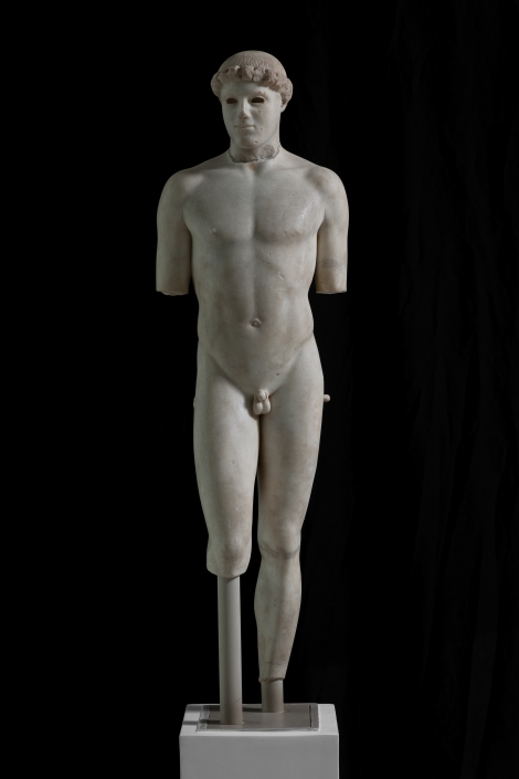
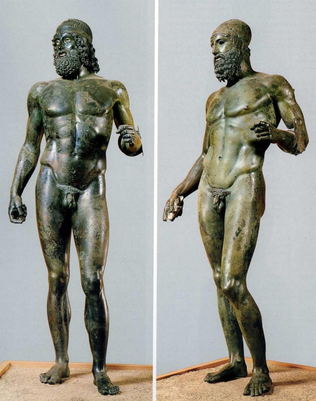
Abstraction in art can be a simplification. Consider the large published scientific article. With what does it begin? An Abstract that condenses the article into the most salient points. It can also be so with abstract art where the artist sees the world and abstracts from reality presenting an imaginative vision of that reality. We have the need to be creative, and when creating art that records only what we see we become bored. Why create what we see? We can use our eyes for that. The Ancient Greeks worked hard to create realistic, life-size images of Koure and Kouros (idealized men and women). They reached that goal with the landmark sculpture Kritios Boy, yet, in about a generation, they began lawfully distorting the human body by evidence of the Riace bronzes and other works of that period. The Riace bronzes go beyond human through idealization and subtle exaggeration. The stylistic formula for the Riace bronzes and much of the Greek Classical and Hellenistic sculpture is attributed to Polykleitos and Pheidias.
https://www.theacropolismuseum.gr/en/content/kritios-boy-and-severe-style
https://www.moma.org/interactives/exhibitions/2012/inventingabstraction/?work=207
https://www.tate.org.uk/art/artists/theo-van-doesburg-1017
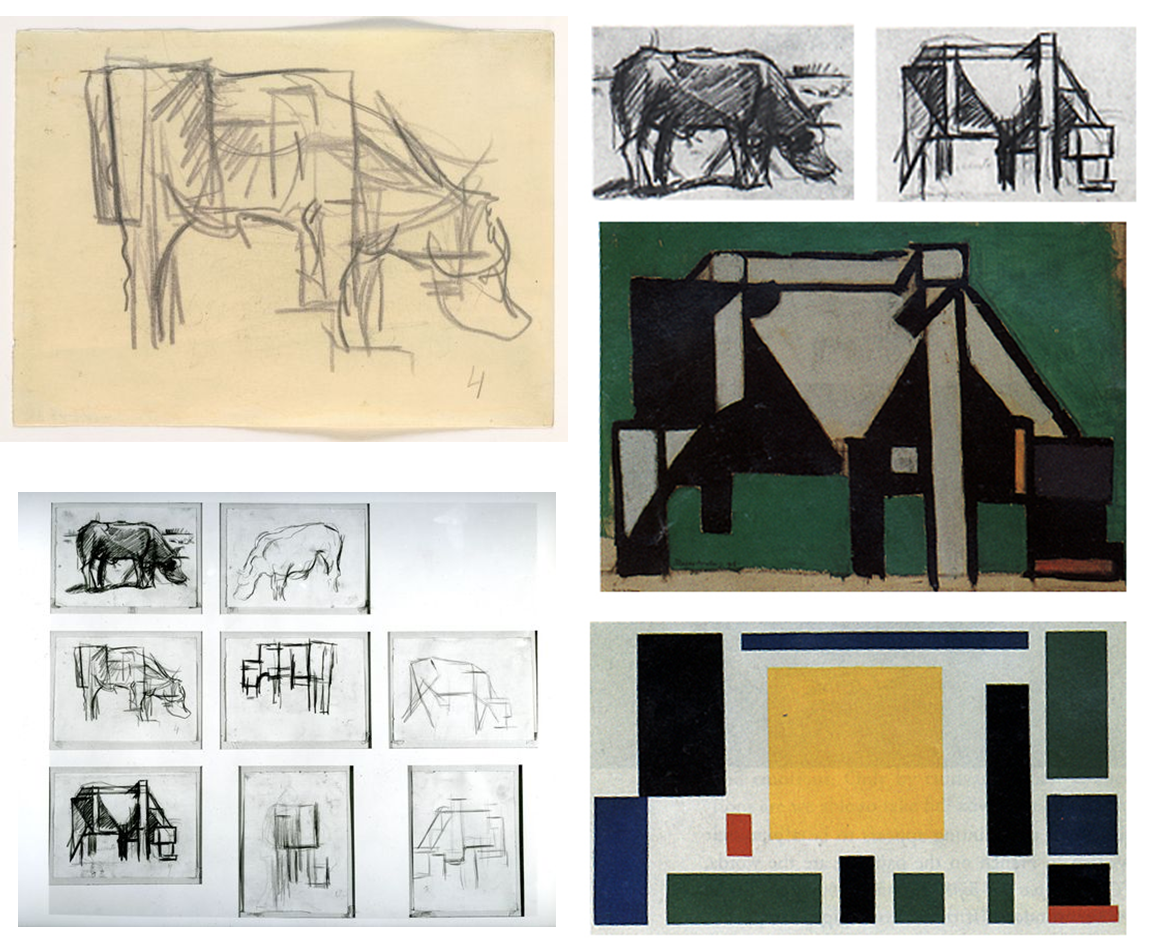
Theo van Doesburg, Composition VIII (The Cow), 1918, oil on canvas, 37.5 x 63.5 cm, (MoMA)
Theo van Doesburg’s Composition VIII consists of just fourteen rectangles. One nearly perfect yellow square in the center is surrounded by thirteen rectangles of different proportions: four green, three blue, four black, and two red. They are scattered evenly across the surface, not overlapping (although two pairs abut), and are carefully aligned with the edges of the rectangular white canvas. This seems to be a good, and fairly early, example of what is called “abstract art,” art without any subject matter or visual resemblance to actual objects in nature.
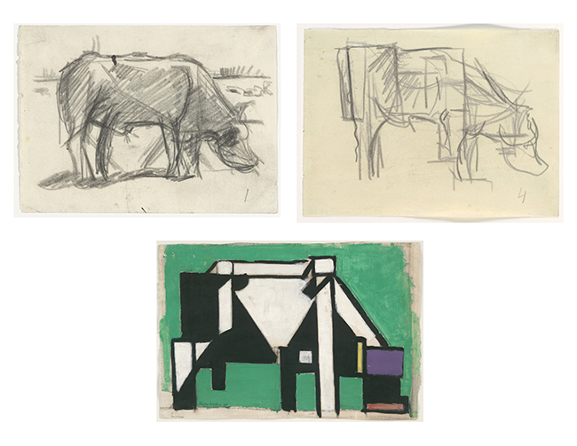
In what appears to be a ludicrous parenthetical statement, however, the title also declares the work to be a cow. And indeed, there are a number of preliminary studies by van Doesburg that may justify that subtitle.
Top left: Theo van Doesburg, Study for Composition (The Cow), 1917, pencil on paper, 11.7 x 15.9 cm (MoMA); top right: Theo van Doesburg, Study for Composition (The Cow), 1917, pencil on paper, 11.7 x 15.9 cm (MoMA); bottom: Theo van Doesburg, Composition (The Cow), 1917, gouache, oil, and charcoal on paper, 39.4 x 58.4 cm (MoMA).
One graphite drawing is immediately recognizable as a cow or bull grazing head down in a field, despite its sketchy execution and the simplification of its muscular contours. Another graphite drawing squares off those contours; the cow’s hip and thigh muscles are simplified into a block, and the rear leg is straightened into an elongated peg. A painted study continues this squaring off process. The head is now composed of a few rectangles: a broad forehead in purple, a black snout terminating in a nested red band, and a yellow antenna-like vertical suggesting an ear.
Now it is possible to see Composition VIII as a cow as well. The central yellow square is a massive, weighty ribcage, and the black rectangle on the left is a hip, with the blue and red below representing two legs. In the lower right is a tripartite head: blue forehead, black snout, and red mouth/nostrils. The title is appropriate after all; at first sight what we see is just an abstract “composition” of colored rectangles, but hidden within is a cow.
The above highlighted areas by authored By Dr. Charles Cramer and Dr. Kim Grant (full article accessed by using link below)
Visualizing Cubism
There are several helpful ways to look at creating an imaginative abstract drawing inspired by Cubism. Imagine that the form you wish to draw is simplified into facets, planes and surfaces each catching light differently. Each may have its own value. Gradations in tones may be added and contrast, by allow the lighter side of the facet, or plane, to be placed next to a darker side of a plane. This creates a shimmering effect like a mosaic, or a cut gemstone. Below are examples of cut gemstones and you will see the light effects on the many facets. Each facet is on a plane catching light in a unique fashion.


Another way of looking at Cubism is to consider what happens when a mirror is cracked and you look at your subject in that mirror. The image is distorted in a way that separates the whole image into shapes shifted in various directions creating a unique image quite similar to the drawings and paintings we sometimes see in Cubism.


Often students have difficulty applying the concepts and new ways of seeing the world that Cubism affords. The first drawing below is the beginning of a Cubist student drawing. It represents an abstract bunny that is broken up into geometric shapes using line and some tone. The student is unsure what to do next and how to complete the drawing. Since this is from an online drawing class I am not able to easily demonstrate drawing solutions using tracing paper and a pencil over the student drawing. Instead I am relying on Photoshop to teach the student how to take this drawing to the next level. Each time I add an element the composition is changed. When adding shapes, values, and textures, the balance is effected and so I work over the entire piece adding elements with the goal of creating a balanced drawing with contrast, movement, and rhythm. Note that I place several values on identified planes, create facets with gradations, patterns with lines, texture with a rough stipple, and areas shadows. Most importantly, I add black shapes which immediately change the look of the work from a rather flat art with middle grays, to a work of art with a full range of values. It becomes more dynamic and complete. I could also play up the use of white in the drawing, but decided to stop where I was considering the art completed to an adequate point. Sometimes it is good to know when to stop when creating art. You can overwork a piece.
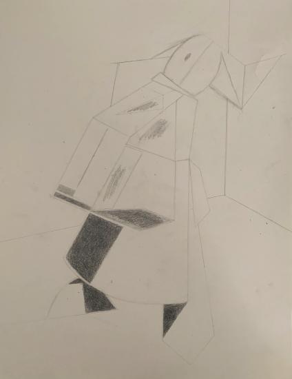


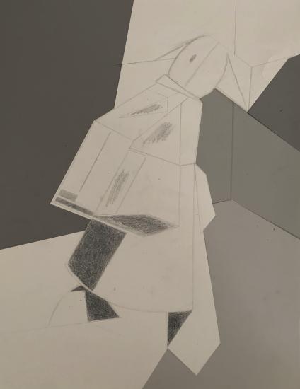
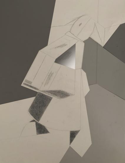


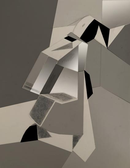
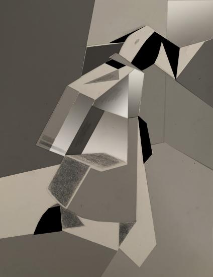

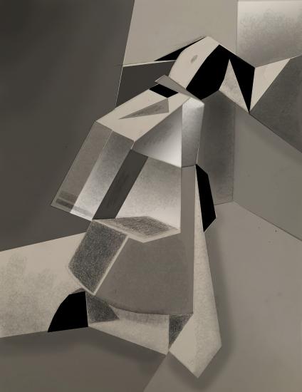
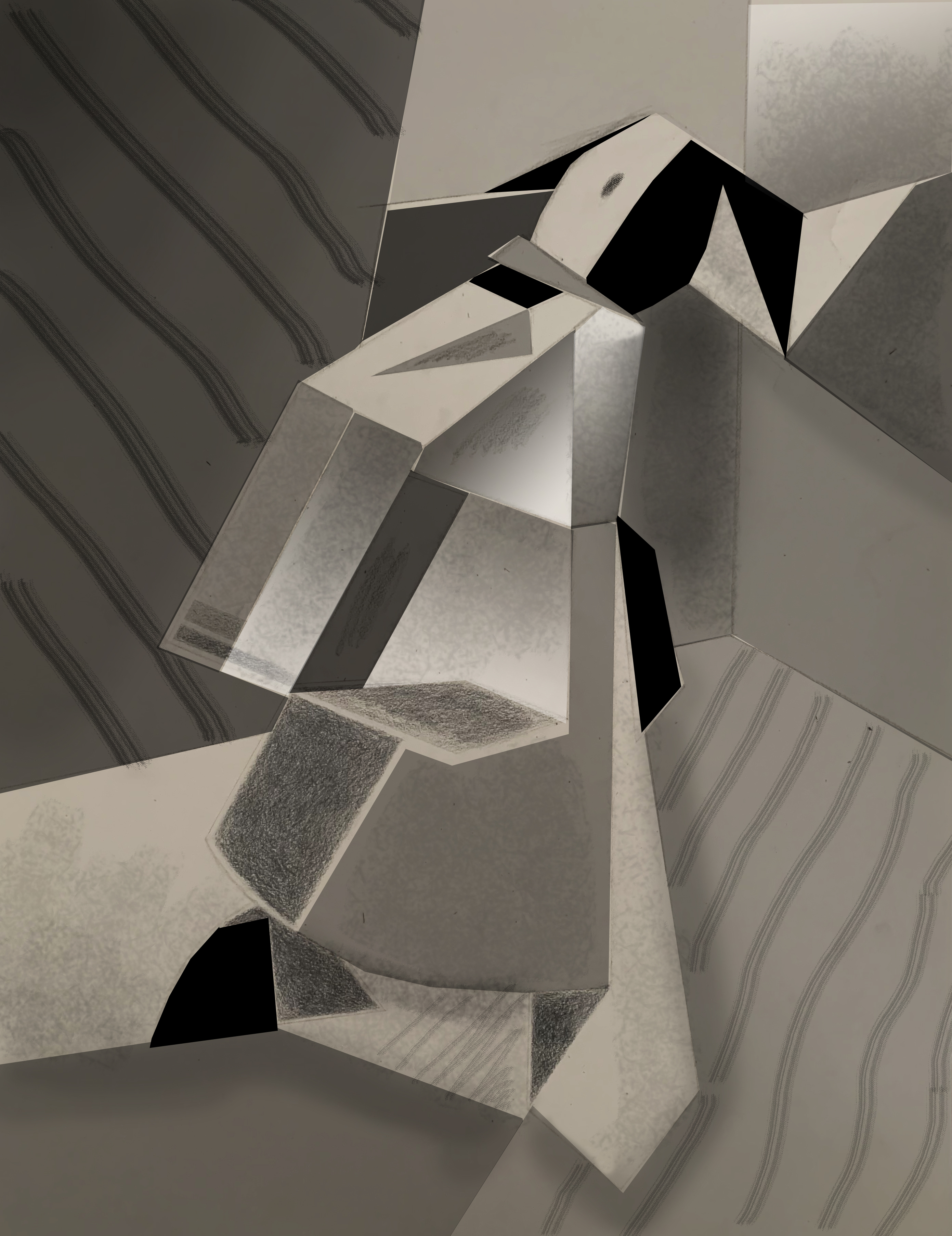
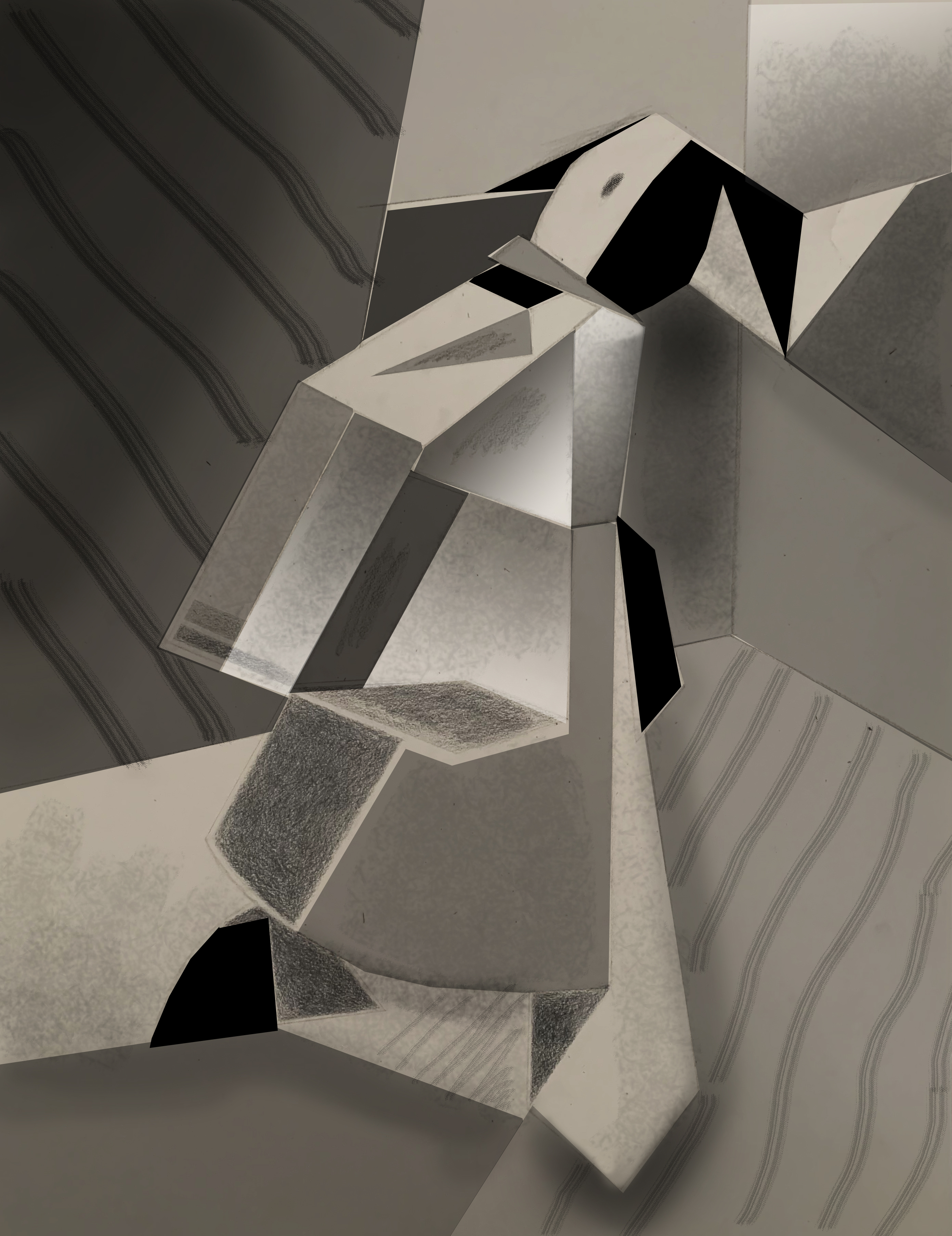


Before After
Assignment
• Study the Cubist work of Picasso and Braque
• Be inspired by their “new ways of seeing”
Thumbnail your concept
AFTER YOU DETERMINE YOUR CONCEPT
• Share your concept with the instructor
• Gather your materials
• Carefully execute the design (collage or drawing)
Student Work


