1.8: Tone
- Page ID
- 67698
\( \newcommand{\vecs}[1]{\overset { \scriptstyle \rightharpoonup} {\mathbf{#1}} } \)
\( \newcommand{\vecd}[1]{\overset{-\!-\!\rightharpoonup}{\vphantom{a}\smash {#1}}} \)
\( \newcommand{\dsum}{\displaystyle\sum\limits} \)
\( \newcommand{\dint}{\displaystyle\int\limits} \)
\( \newcommand{\dlim}{\displaystyle\lim\limits} \)
\( \newcommand{\id}{\mathrm{id}}\) \( \newcommand{\Span}{\mathrm{span}}\)
( \newcommand{\kernel}{\mathrm{null}\,}\) \( \newcommand{\range}{\mathrm{range}\,}\)
\( \newcommand{\RealPart}{\mathrm{Re}}\) \( \newcommand{\ImaginaryPart}{\mathrm{Im}}\)
\( \newcommand{\Argument}{\mathrm{Arg}}\) \( \newcommand{\norm}[1]{\| #1 \|}\)
\( \newcommand{\inner}[2]{\langle #1, #2 \rangle}\)
\( \newcommand{\Span}{\mathrm{span}}\)
\( \newcommand{\id}{\mathrm{id}}\)
\( \newcommand{\Span}{\mathrm{span}}\)
\( \newcommand{\kernel}{\mathrm{null}\,}\)
\( \newcommand{\range}{\mathrm{range}\,}\)
\( \newcommand{\RealPart}{\mathrm{Re}}\)
\( \newcommand{\ImaginaryPart}{\mathrm{Im}}\)
\( \newcommand{\Argument}{\mathrm{Arg}}\)
\( \newcommand{\norm}[1]{\| #1 \|}\)
\( \newcommand{\inner}[2]{\langle #1, #2 \rangle}\)
\( \newcommand{\Span}{\mathrm{span}}\) \( \newcommand{\AA}{\unicode[.8,0]{x212B}}\)
\( \newcommand{\vectorA}[1]{\vec{#1}} % arrow\)
\( \newcommand{\vectorAt}[1]{\vec{\text{#1}}} % arrow\)
\( \newcommand{\vectorB}[1]{\overset { \scriptstyle \rightharpoonup} {\mathbf{#1}} } \)
\( \newcommand{\vectorC}[1]{\textbf{#1}} \)
\( \newcommand{\vectorD}[1]{\overrightarrow{#1}} \)
\( \newcommand{\vectorDt}[1]{\overrightarrow{\text{#1}}} \)
\( \newcommand{\vectE}[1]{\overset{-\!-\!\rightharpoonup}{\vphantom{a}\smash{\mathbf {#1}}}} \)
\( \newcommand{\vecs}[1]{\overset { \scriptstyle \rightharpoonup} {\mathbf{#1}} } \)
\(\newcommand{\longvect}{\overrightarrow}\)
\( \newcommand{\vecd}[1]{\overset{-\!-\!\rightharpoonup}{\vphantom{a}\smash {#1}}} \)
\(\newcommand{\avec}{\mathbf a}\) \(\newcommand{\bvec}{\mathbf b}\) \(\newcommand{\cvec}{\mathbf c}\) \(\newcommand{\dvec}{\mathbf d}\) \(\newcommand{\dtil}{\widetilde{\mathbf d}}\) \(\newcommand{\evec}{\mathbf e}\) \(\newcommand{\fvec}{\mathbf f}\) \(\newcommand{\nvec}{\mathbf n}\) \(\newcommand{\pvec}{\mathbf p}\) \(\newcommand{\qvec}{\mathbf q}\) \(\newcommand{\svec}{\mathbf s}\) \(\newcommand{\tvec}{\mathbf t}\) \(\newcommand{\uvec}{\mathbf u}\) \(\newcommand{\vvec}{\mathbf v}\) \(\newcommand{\wvec}{\mathbf w}\) \(\newcommand{\xvec}{\mathbf x}\) \(\newcommand{\yvec}{\mathbf y}\) \(\newcommand{\zvec}{\mathbf z}\) \(\newcommand{\rvec}{\mathbf r}\) \(\newcommand{\mvec}{\mathbf m}\) \(\newcommand{\zerovec}{\mathbf 0}\) \(\newcommand{\onevec}{\mathbf 1}\) \(\newcommand{\real}{\mathbb R}\) \(\newcommand{\twovec}[2]{\left[\begin{array}{r}#1 \\ #2 \end{array}\right]}\) \(\newcommand{\ctwovec}[2]{\left[\begin{array}{c}#1 \\ #2 \end{array}\right]}\) \(\newcommand{\threevec}[3]{\left[\begin{array}{r}#1 \\ #2 \\ #3 \end{array}\right]}\) \(\newcommand{\cthreevec}[3]{\left[\begin{array}{c}#1 \\ #2 \\ #3 \end{array}\right]}\) \(\newcommand{\fourvec}[4]{\left[\begin{array}{r}#1 \\ #2 \\ #3 \\ #4 \end{array}\right]}\) \(\newcommand{\cfourvec}[4]{\left[\begin{array}{c}#1 \\ #2 \\ #3 \\ #4 \end{array}\right]}\) \(\newcommand{\fivevec}[5]{\left[\begin{array}{r}#1 \\ #2 \\ #3 \\ #4 \\ #5 \\ \end{array}\right]}\) \(\newcommand{\cfivevec}[5]{\left[\begin{array}{c}#1 \\ #2 \\ #3 \\ #4 \\ #5 \\ \end{array}\right]}\) \(\newcommand{\mattwo}[4]{\left[\begin{array}{rr}#1 \amp #2 \\ #3 \amp #4 \\ \end{array}\right]}\) \(\newcommand{\laspan}[1]{\text{Span}\{#1\}}\) \(\newcommand{\bcal}{\cal B}\) \(\newcommand{\ccal}{\cal C}\) \(\newcommand{\scal}{\cal S}\) \(\newcommand{\wcal}{\cal W}\) \(\newcommand{\ecal}{\cal E}\) \(\newcommand{\coords}[2]{\left\{#1\right\}_{#2}}\) \(\newcommand{\gray}[1]{\color{gray}{#1}}\) \(\newcommand{\lgray}[1]{\color{lightgray}{#1}}\) \(\newcommand{\rank}{\operatorname{rank}}\) \(\newcommand{\row}{\text{Row}}\) \(\newcommand{\col}{\text{Col}}\) \(\renewcommand{\row}{\text{Row}}\) \(\newcommand{\nul}{\text{Nul}}\) \(\newcommand{\var}{\text{Var}}\) \(\newcommand{\corr}{\text{corr}}\) \(\newcommand{\len}[1]{\left|#1\right|}\) \(\newcommand{\bbar}{\overline{\bvec}}\) \(\newcommand{\bhat}{\widehat{\bvec}}\) \(\newcommand{\bperp}{\bvec^\perp}\) \(\newcommand{\xhat}{\widehat{\xvec}}\) \(\newcommand{\vhat}{\widehat{\vvec}}\) \(\newcommand{\uhat}{\widehat{\uvec}}\) \(\newcommand{\what}{\widehat{\wvec}}\) \(\newcommand{\Sighat}{\widehat{\Sigma}}\) \(\newcommand{\lt}{<}\) \(\newcommand{\gt}{>}\) \(\newcommand{\amp}{&}\) \(\definecolor{fillinmathshade}{gray}{0.9}\)Creating drawings using tone has been an interest of mine since childhood. My mother was the colorist, so naturally I moved in a different direction focusing more on drawing in pencil and charcoal. Even in my professional career as a medical illustrator, I am known more for my carbon dust work than my color illustrations. Carbon dust is a specialized technique using mainly brushes and a mix of ground charcoal and soft, black Conté pencils. I will share some examples during this chapter to make certain educational points.
Historically, tonal studies have mainly been for the creation of larger works such as paintings, and frescoes. Since much of the artwork created prior to the 20thcentury was commissioned by a patron, it tended to be for the patron’s enjoyment, to express power, to document history, to educate, for a gift, or for commemoration. Few drawings in black and white for created as an end unto itself. That changed during the age when artists began to separate from the patron and create art for the sake of creating art. This trend begins in the mid 1800s and continues today.
Creating drawings with a continuous tone allows for modeling of the form in a more natural way. No longer are we abstracting from the visible forms as in line drawing, but are observing the light as it falls on the subject creating highlights and shadows – form in three-dimensions. Most of these forms can be reduced down to geometric shapes like spheres, cylinders, cubes, pyramids, cones and so on. Mastering the fundamental qualities of light on these forms helps tremendously in drawing them in tone. Applying this knowledge to even the most difficult subjects, like the human figure, will help the student create the illusion of three-dimensionality on the two-dimensional plane of the paper.
The Importance of Light
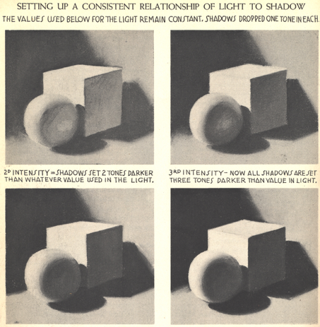
- The quality of light on form is very important
- A one-point (like a lamp) light source will give predictable highlights and shadows
- A strong on point light (like a spotlight on a stage) will be dramatic!
- Try to arrange the object(s) to maximize the effect of light and shadow on the form
- Strong one-point lighting also creates the most contrast
- Strong one-point lighting may also show less number of tones
- Soft lighting often will reveal a higher number of tonal variations
- Sunlight is high quality, fluorescent lighting is low quality
- Creating a value scale is good practice!
Adjacent Values
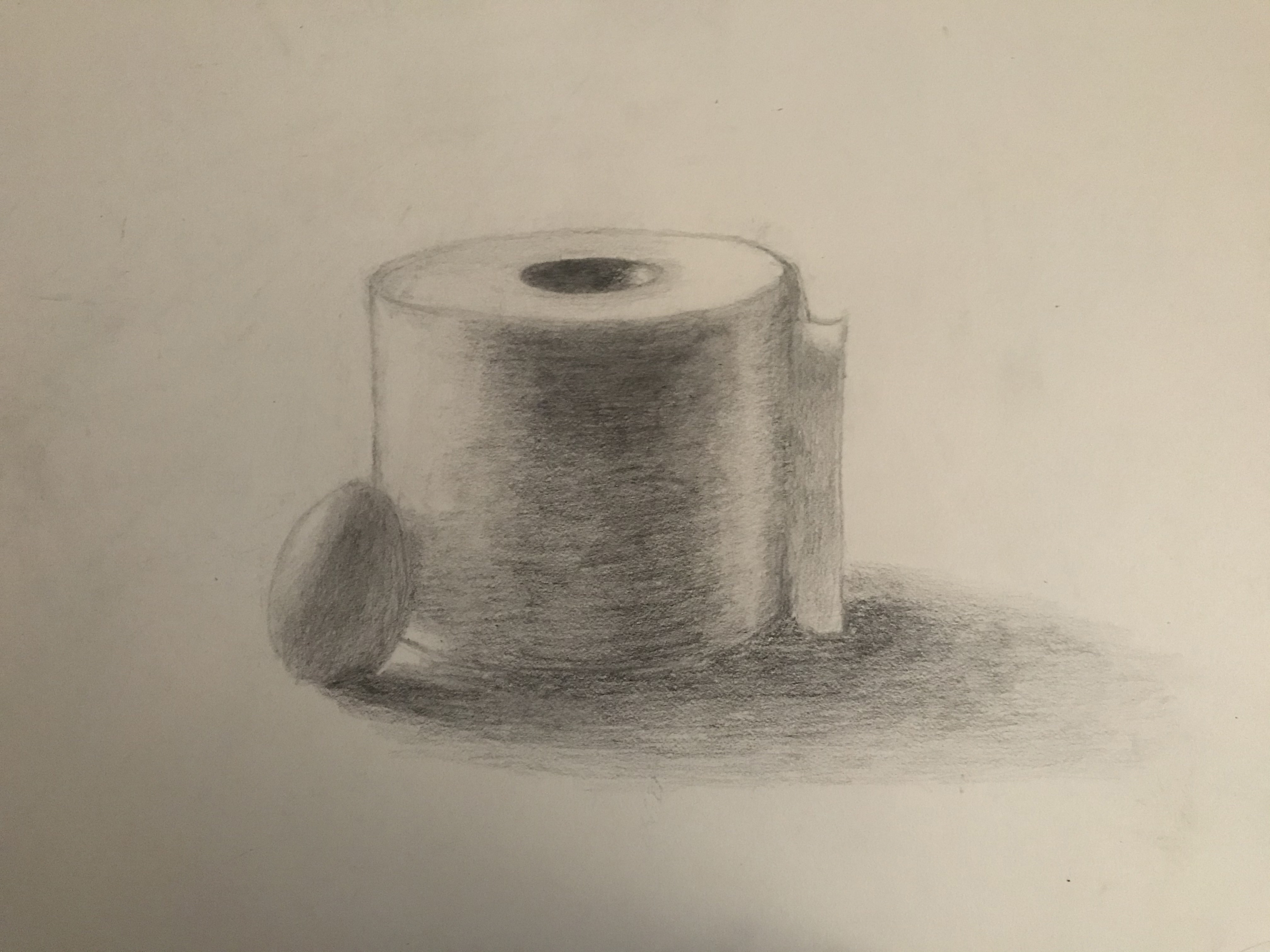
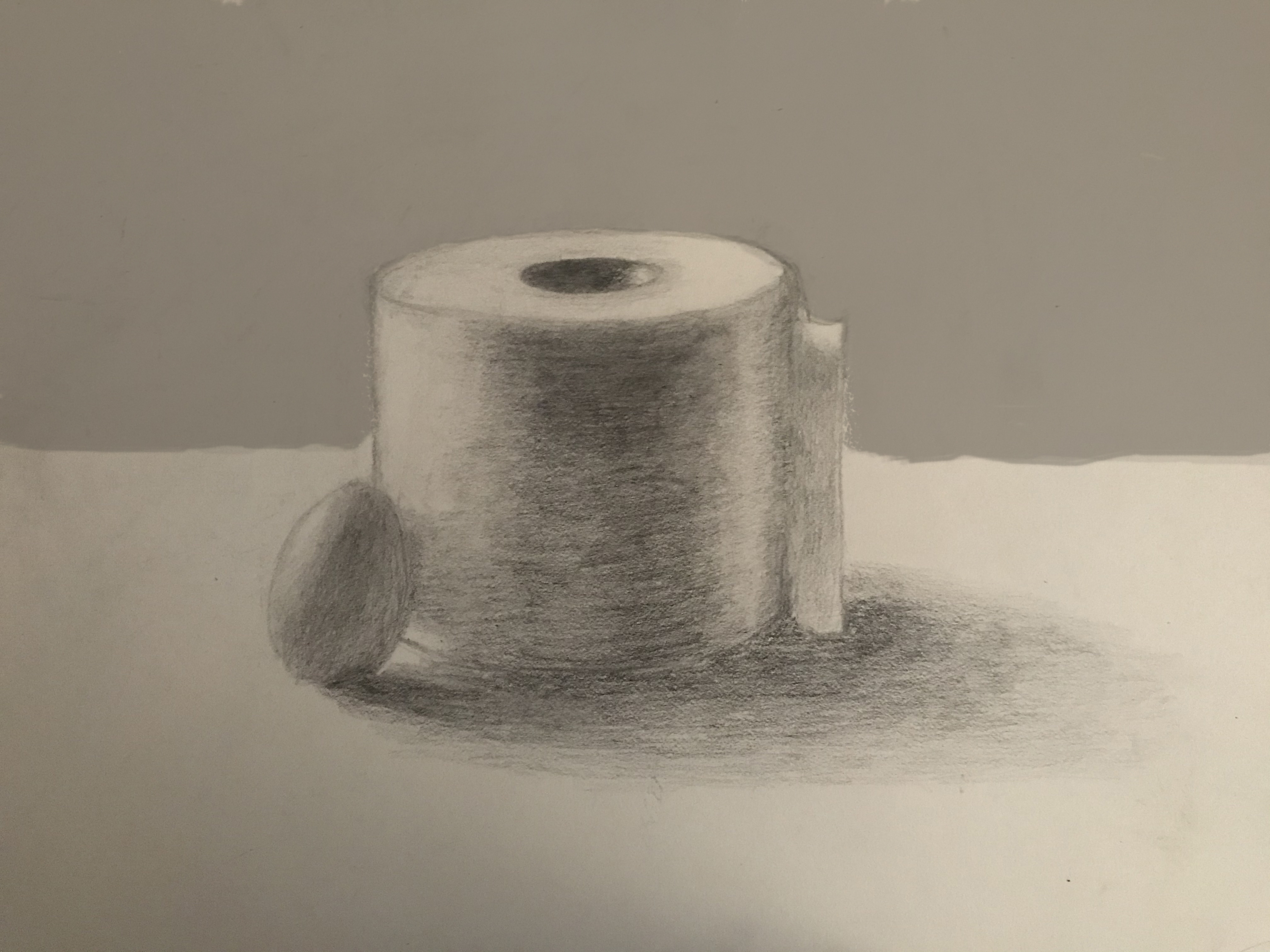
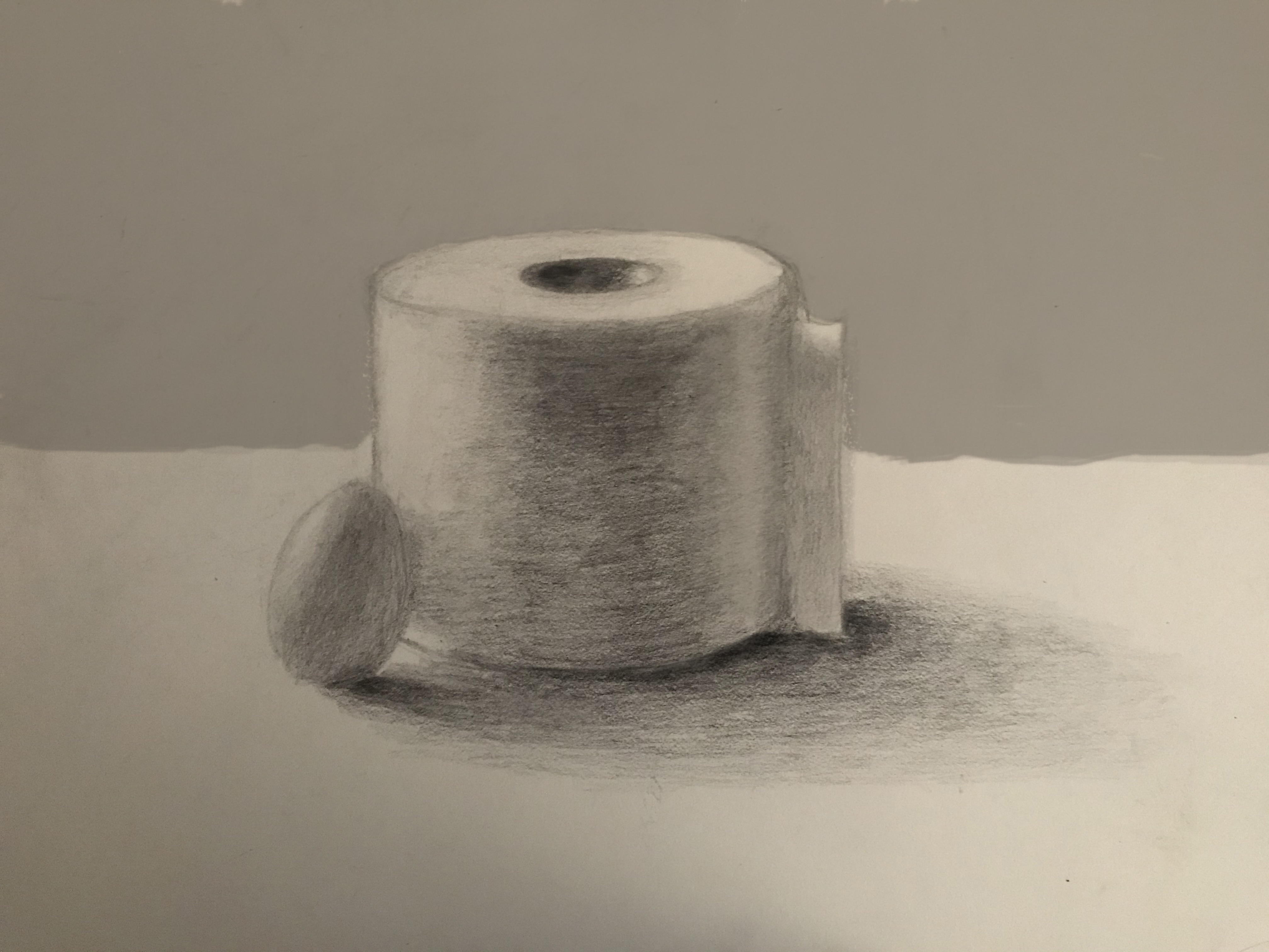
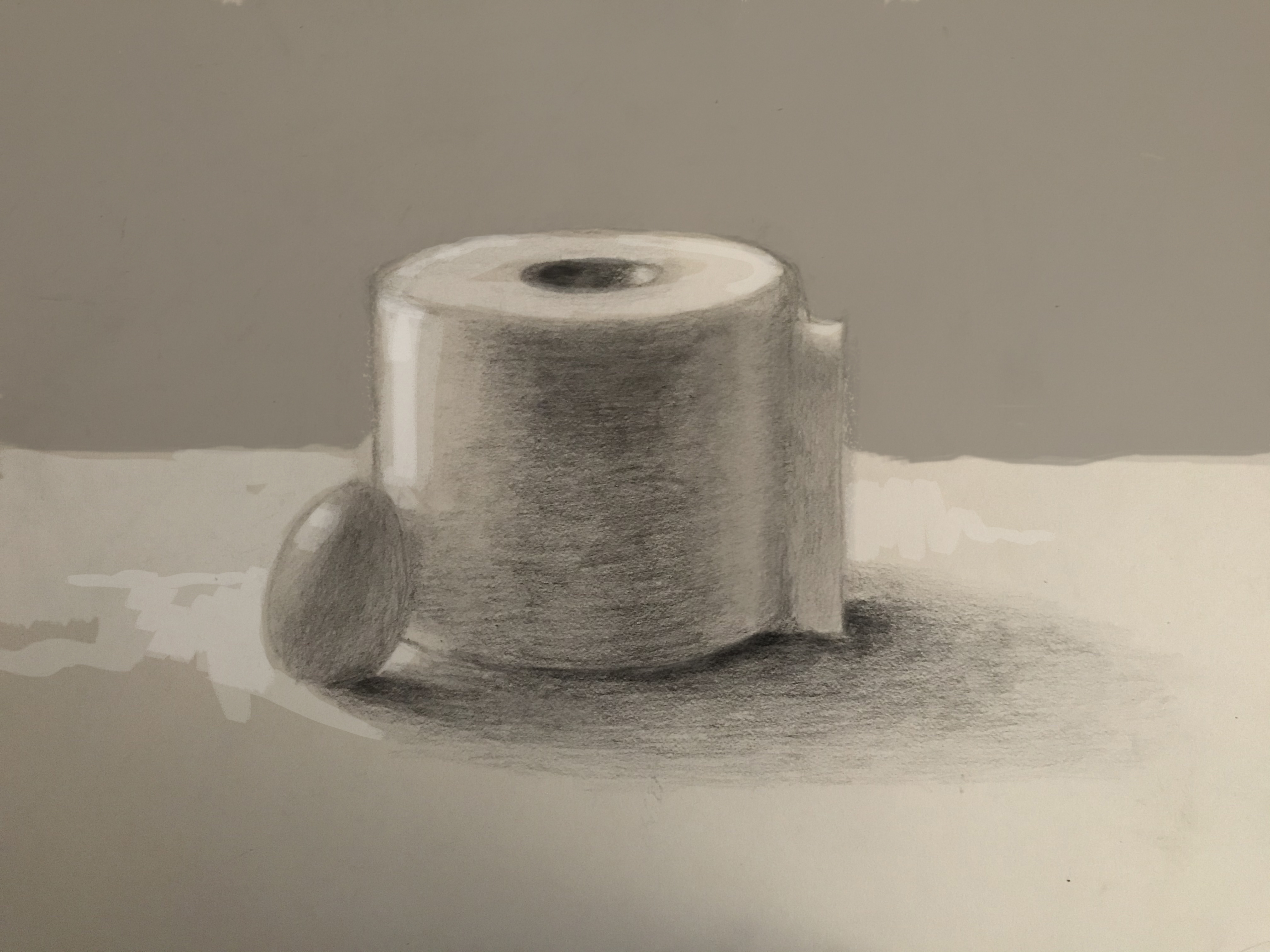
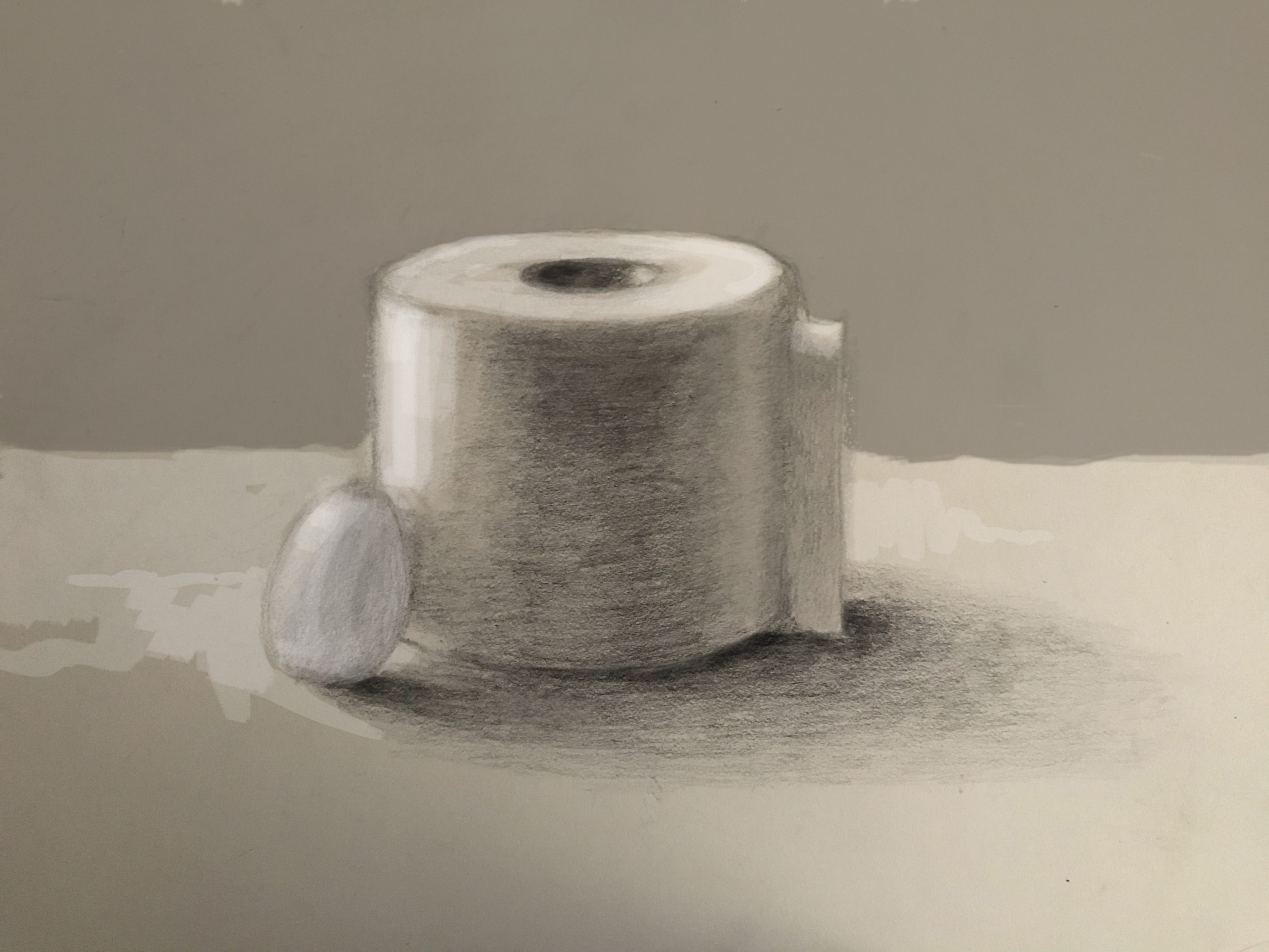
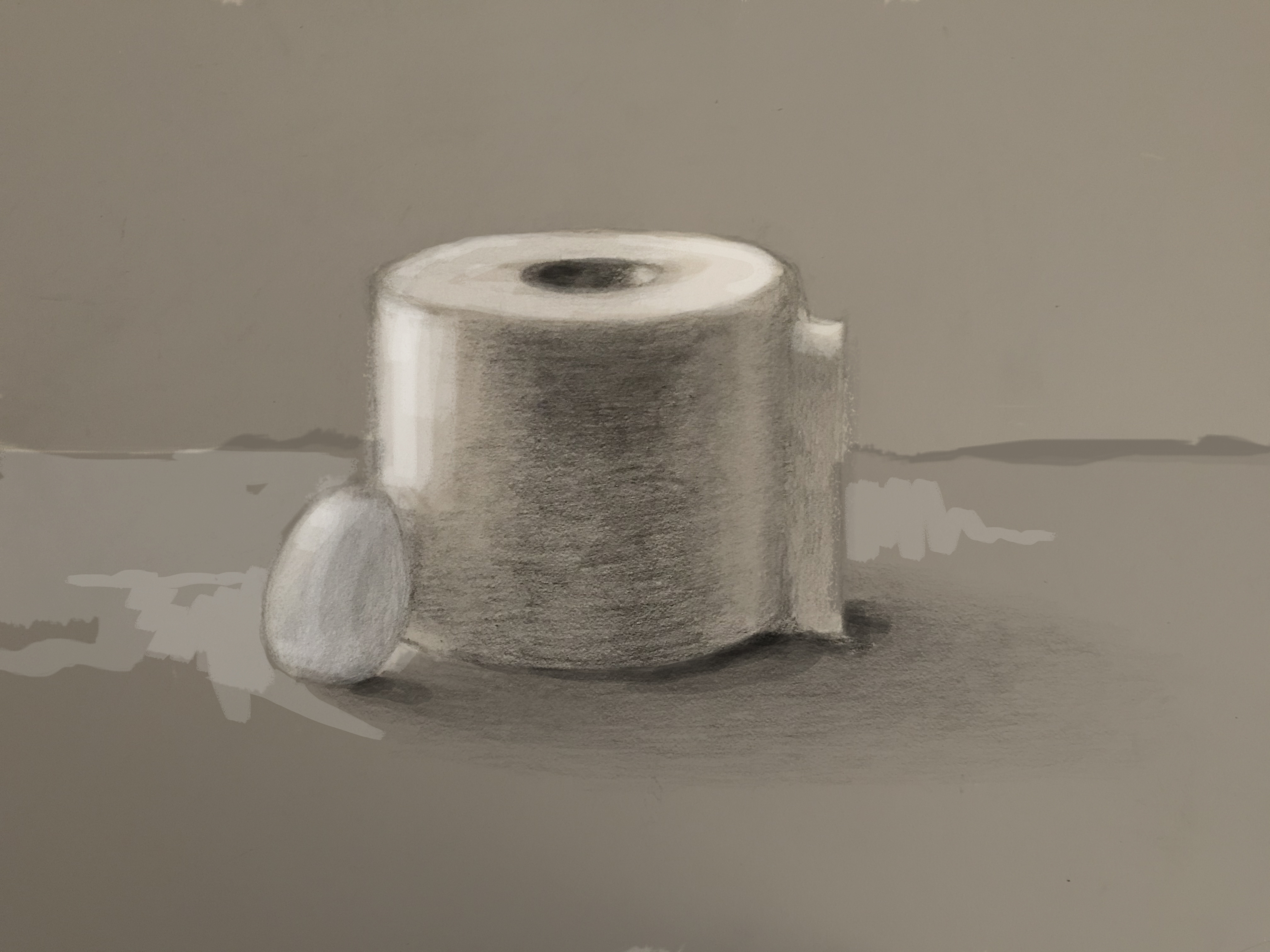
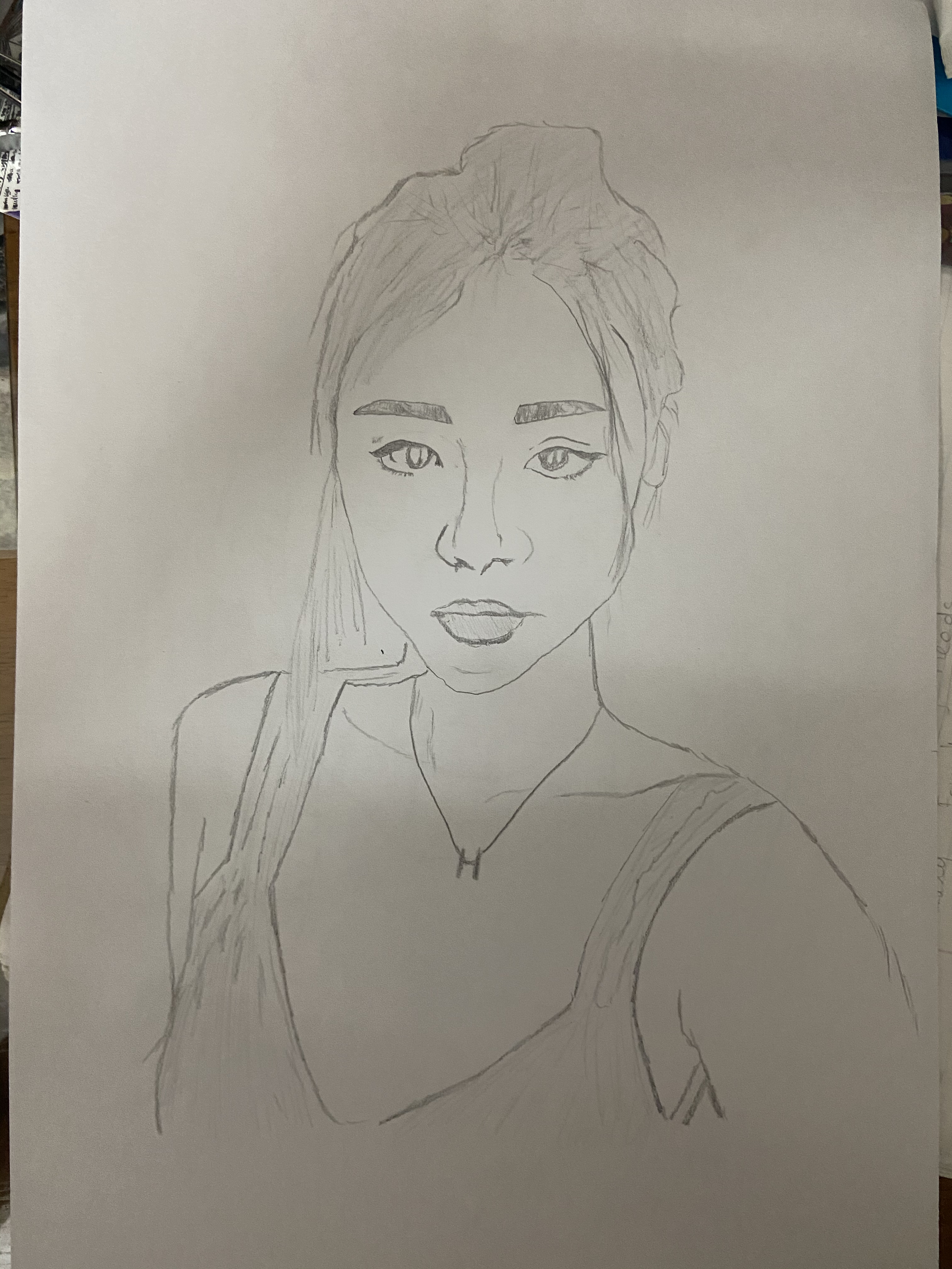
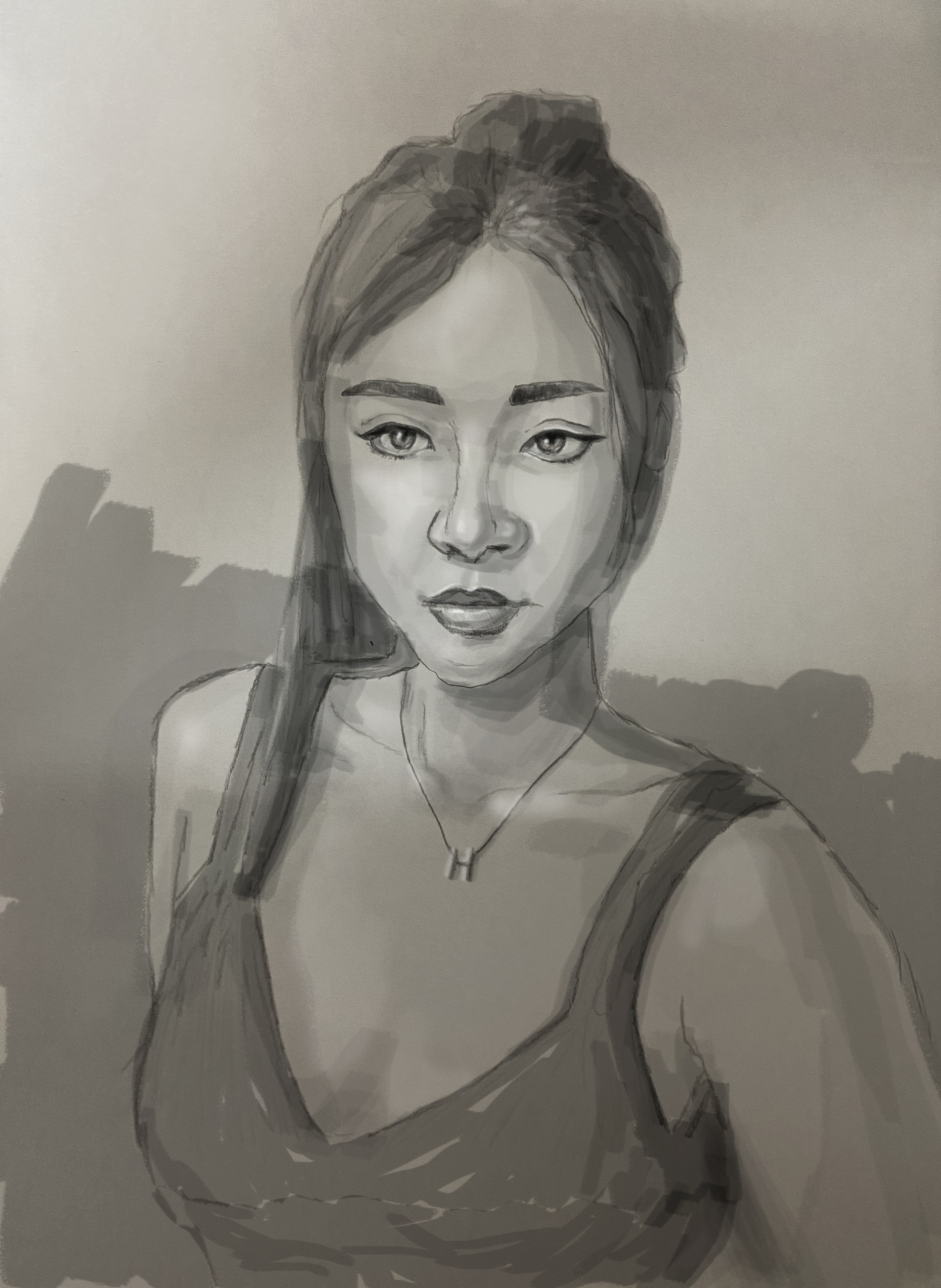
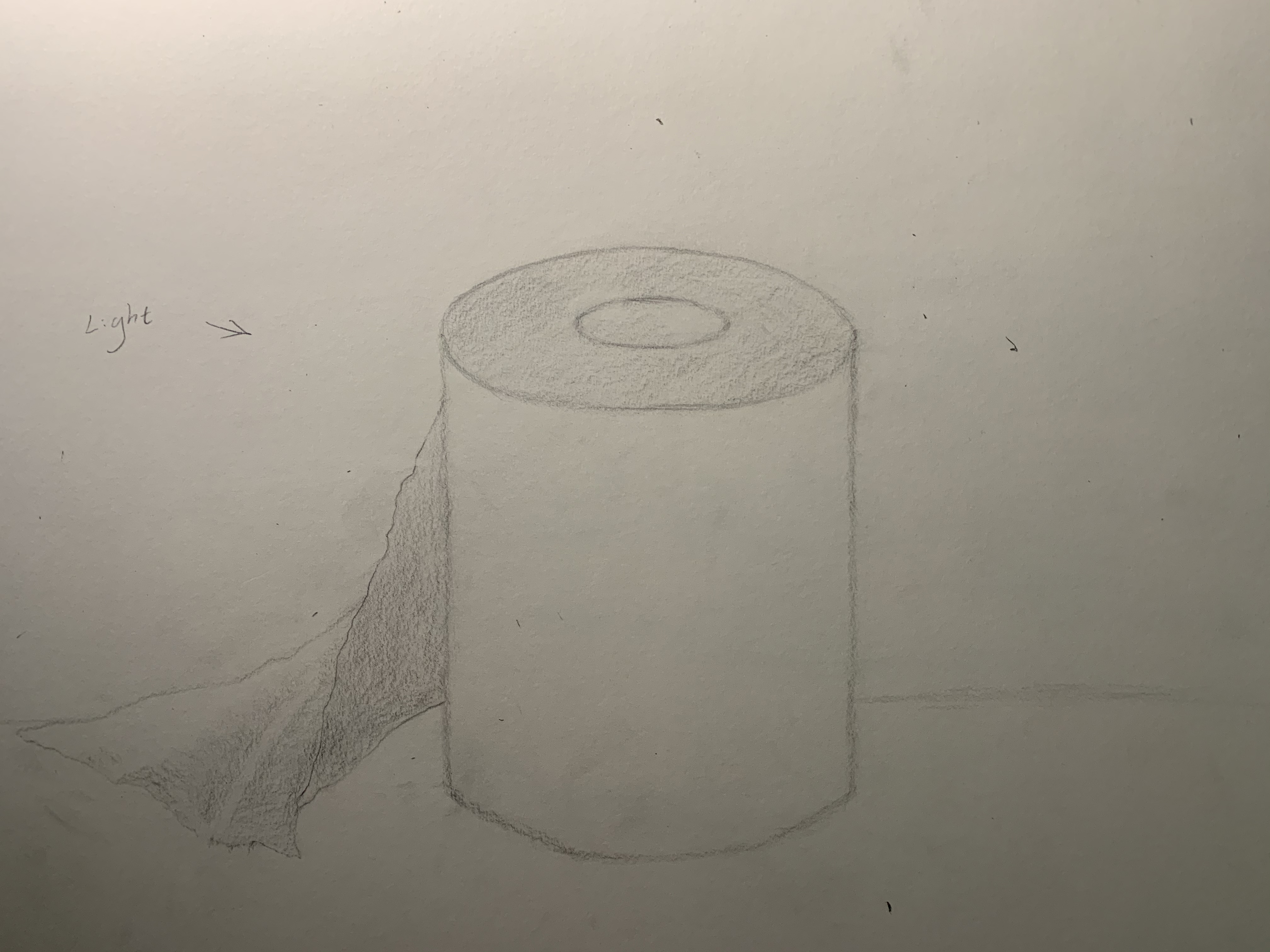
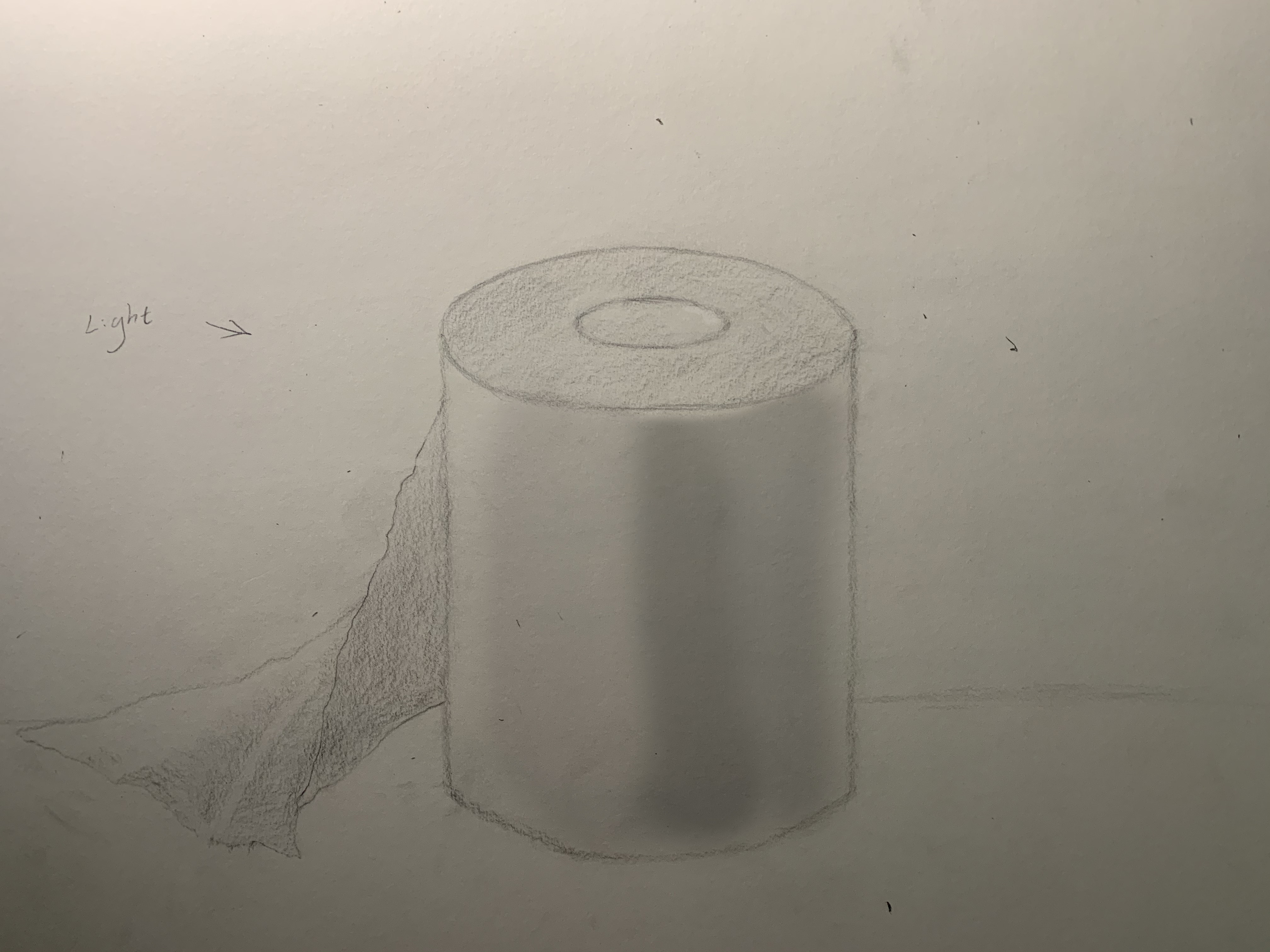
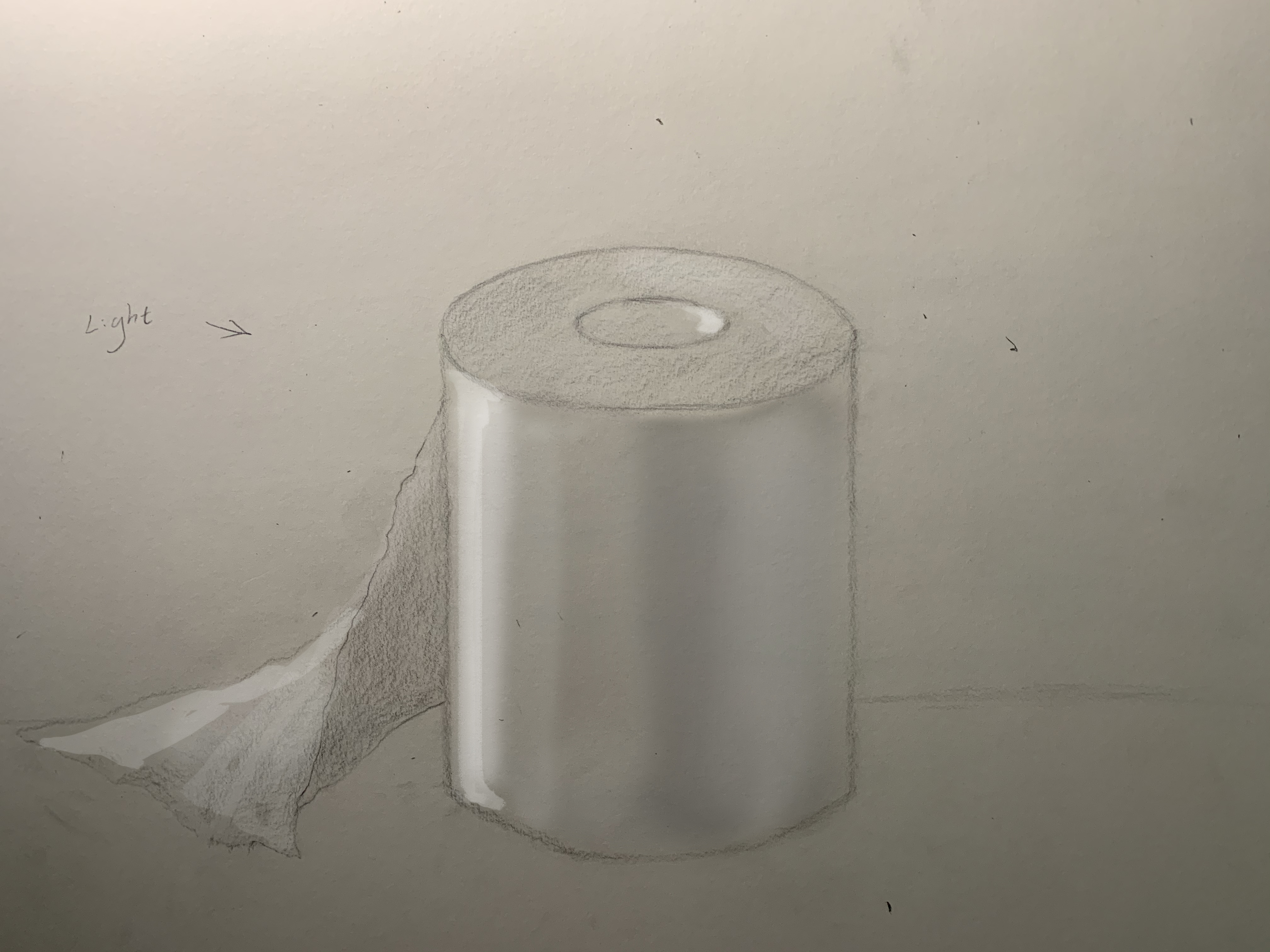
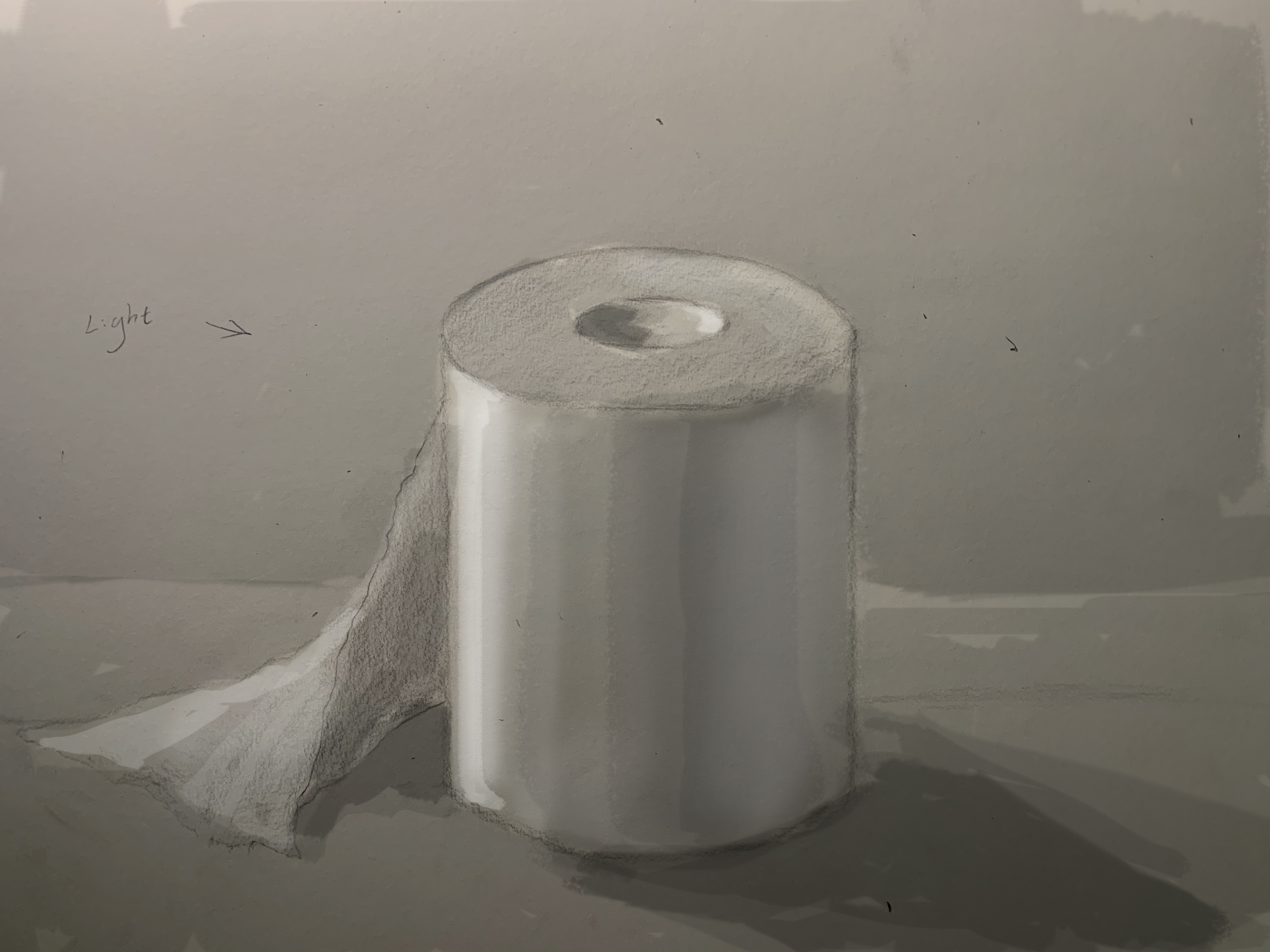
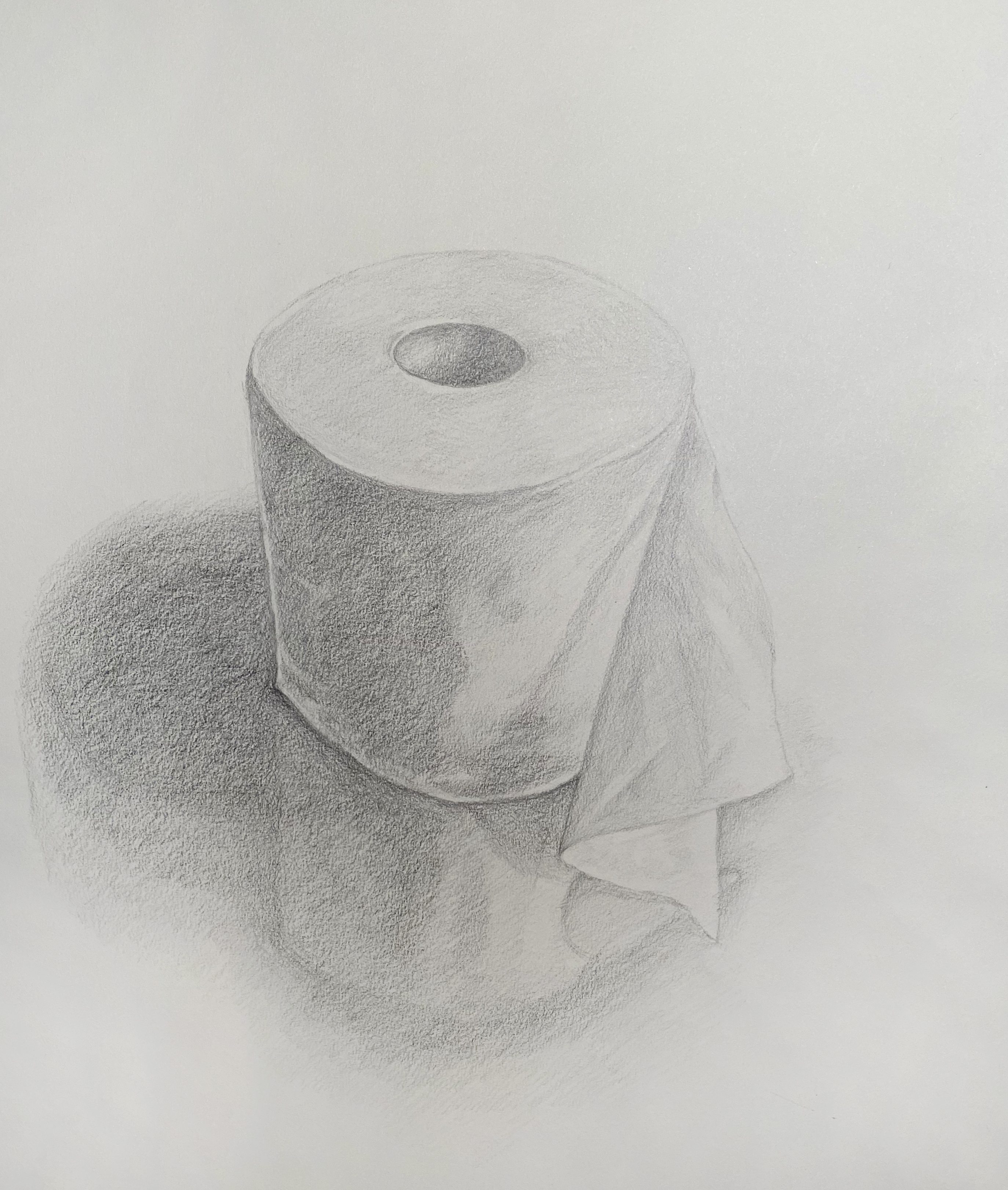
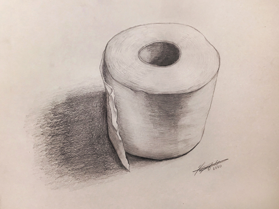
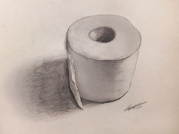
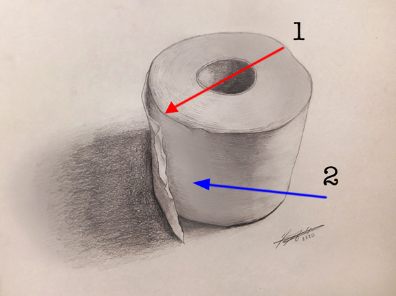
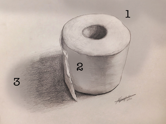
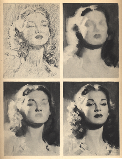
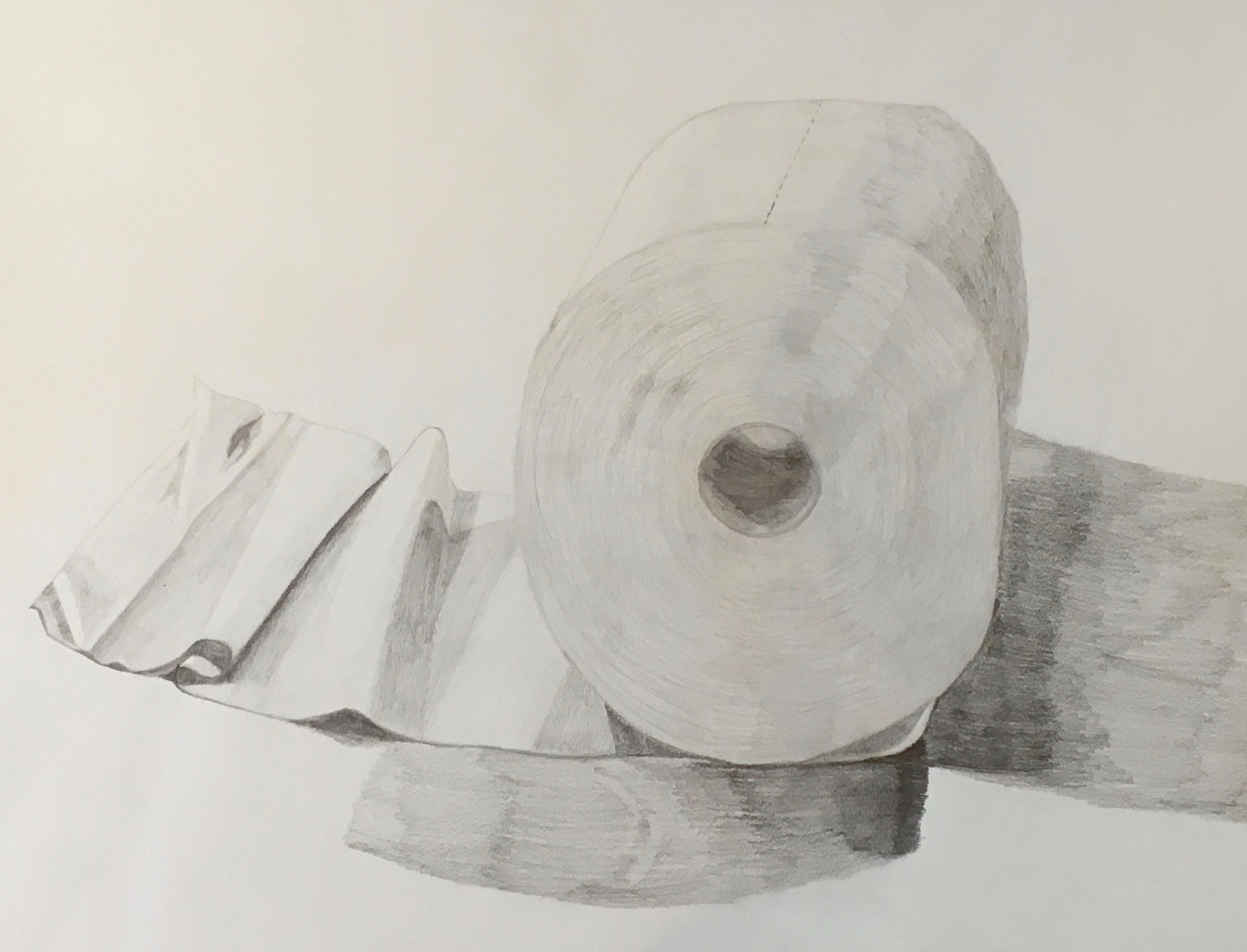
One very important property of tone mentioned in the above figure is the relationship of value to all adjacent values. The student drawing below is excellent (Figure 1). So how can we take it further? We can do this by focusing on and changing around the Adjacent Values. Look at how the intensity of the light and three-dimensional qualities of the form change. In Figure 2, the focus now becomes the form and separating the value on the top plane from plane of the table surface, also the reflected light is darkened. Why? It is darkened because it should be darker than the highlight area catching the light directly (not reflected off another surface). Notice also that the tone added to the top surface is added as a gradation to further push contrast (Figure 3, #1). The darkened reflected light area is labeled #2 in Figure 3. The approach in Figure 2 does improve the overall drawing, however, an even better approach is Figure 4. Figure 4, #1 shows the background plane darkened creating the illusion of light on the flat top plane of the toilet paper roll. The reflected light is still darkened at Figure 4, #2, and the cast shadow from the toilet paper is darkened and developed further.
Adjacent Values have an effect on each other - they can create more contrast; make form appear more three-dimensional; create the illusion of light on an object and so on. Look at her drawing again, and then look at the effect created by changing values in specific areas.
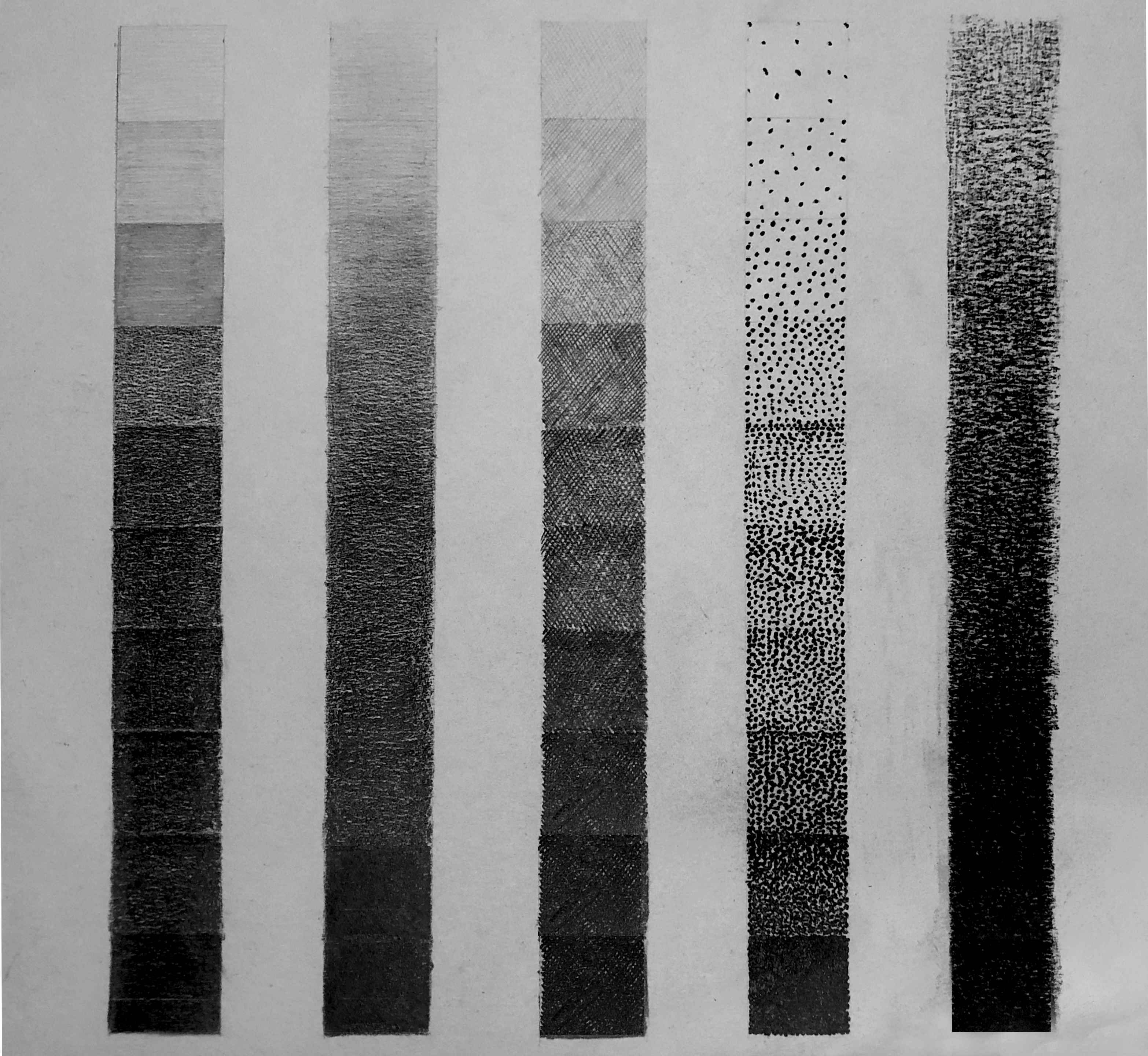
Value Scale
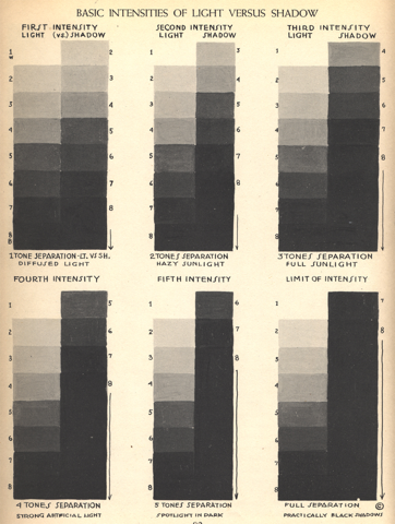
- Create a scale that has even transitions from one value to the next
- Use a variety of media and mark-making
- Notice the First Intensity scale has the broadest range of values
- The Limit of Intensity has the most contrast
Tonal Study
- Draw basic shapes with one-point lighting
- Notice the first drawing has the broadest range of values
- The last drawing has the most contrast
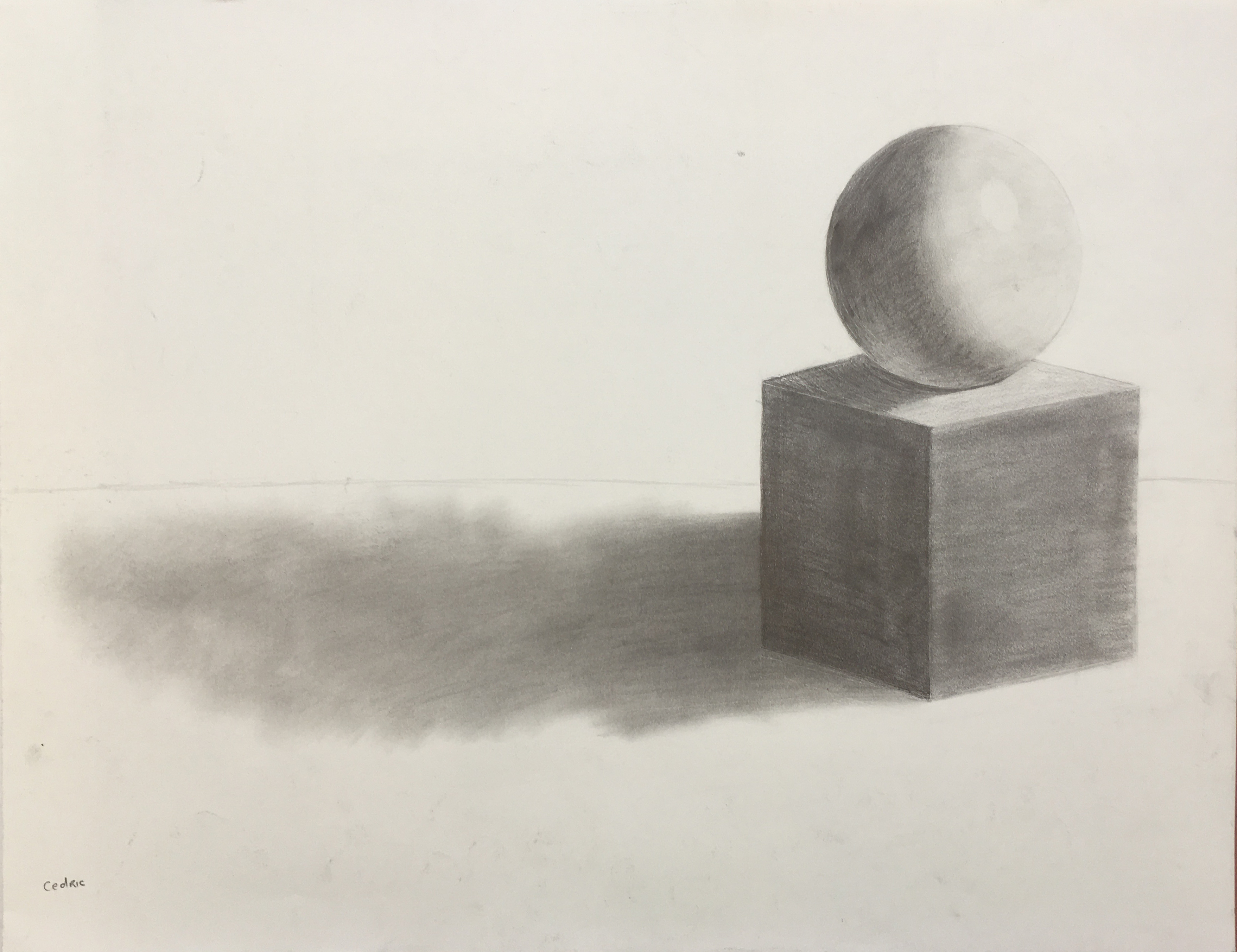
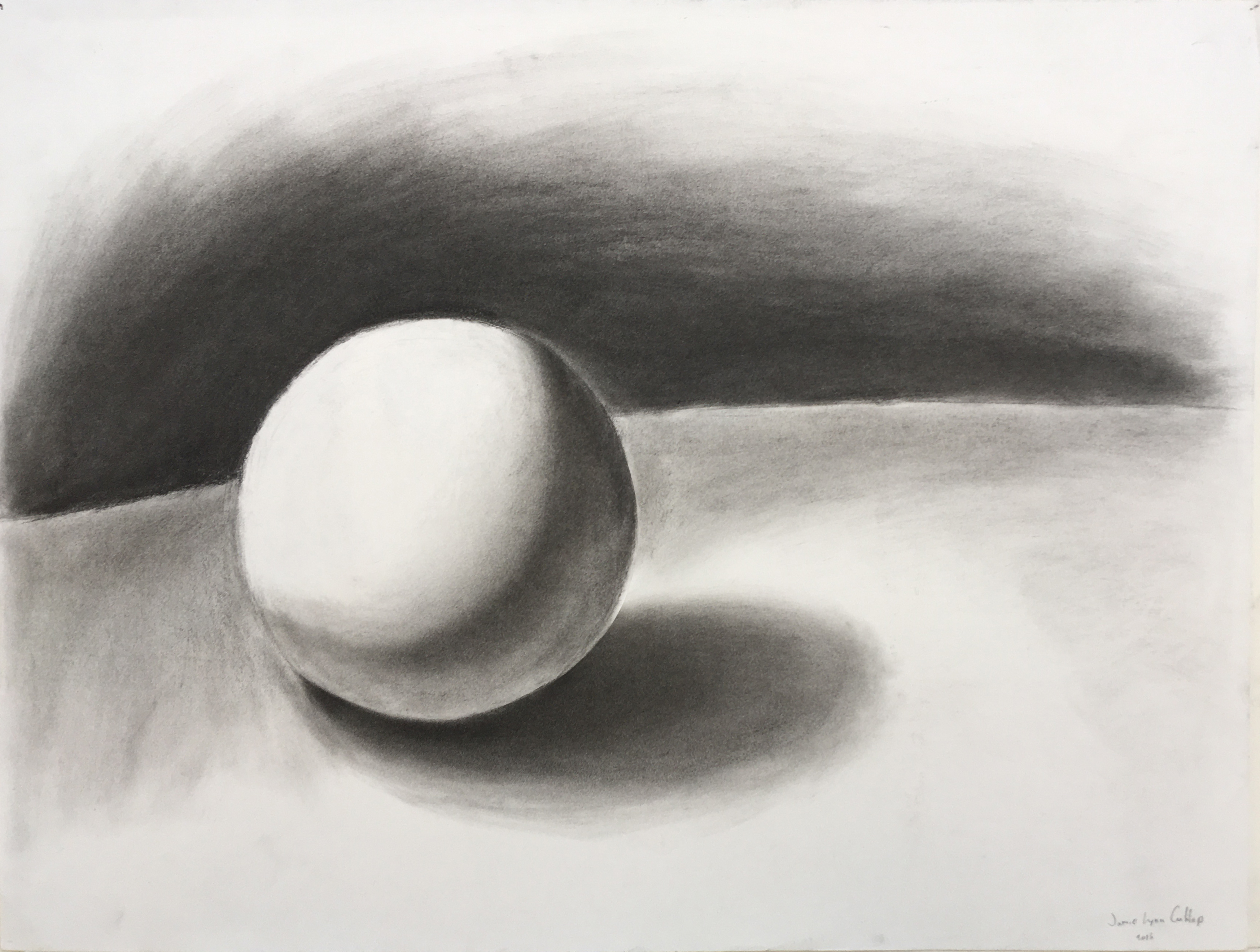
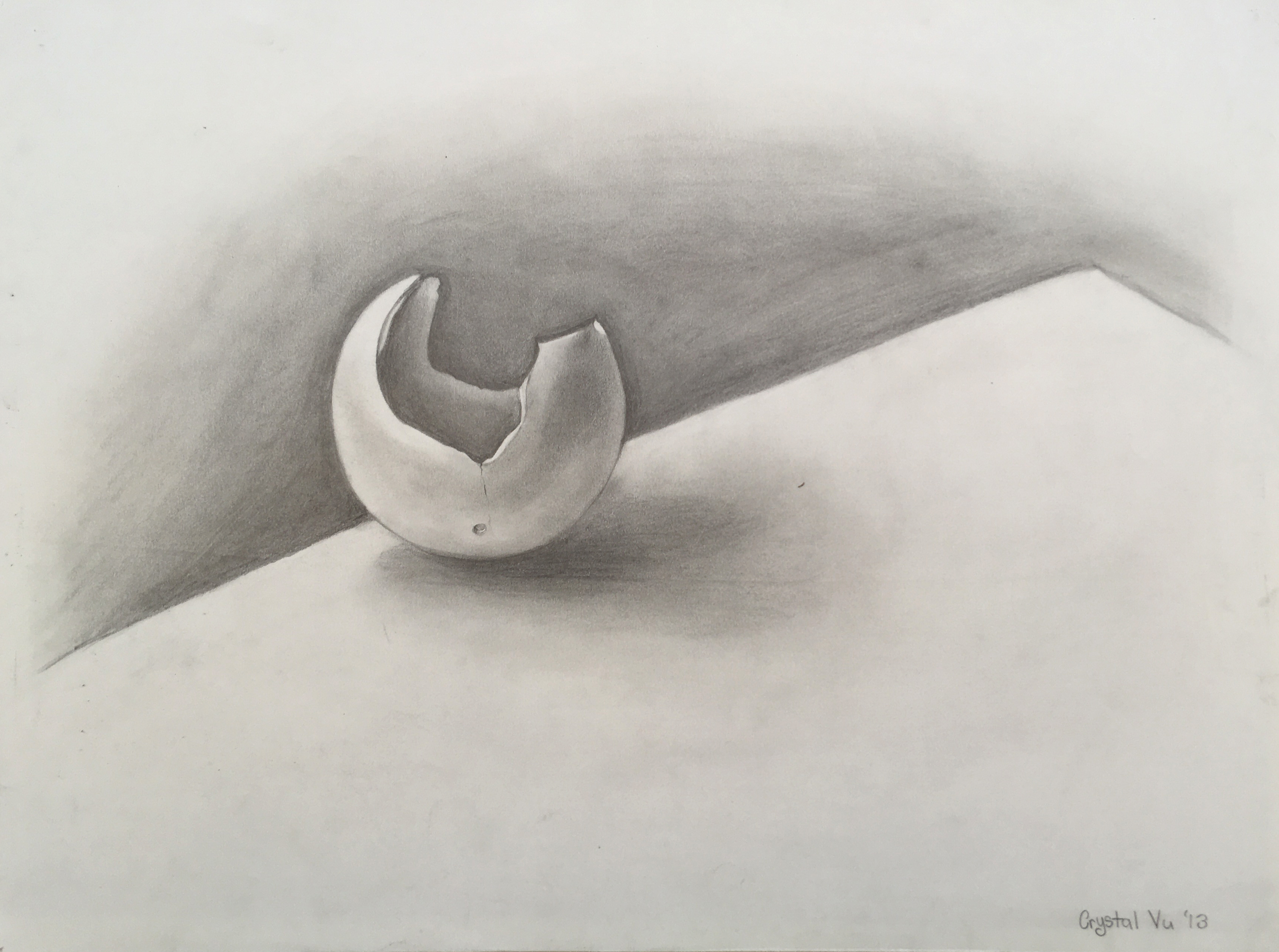
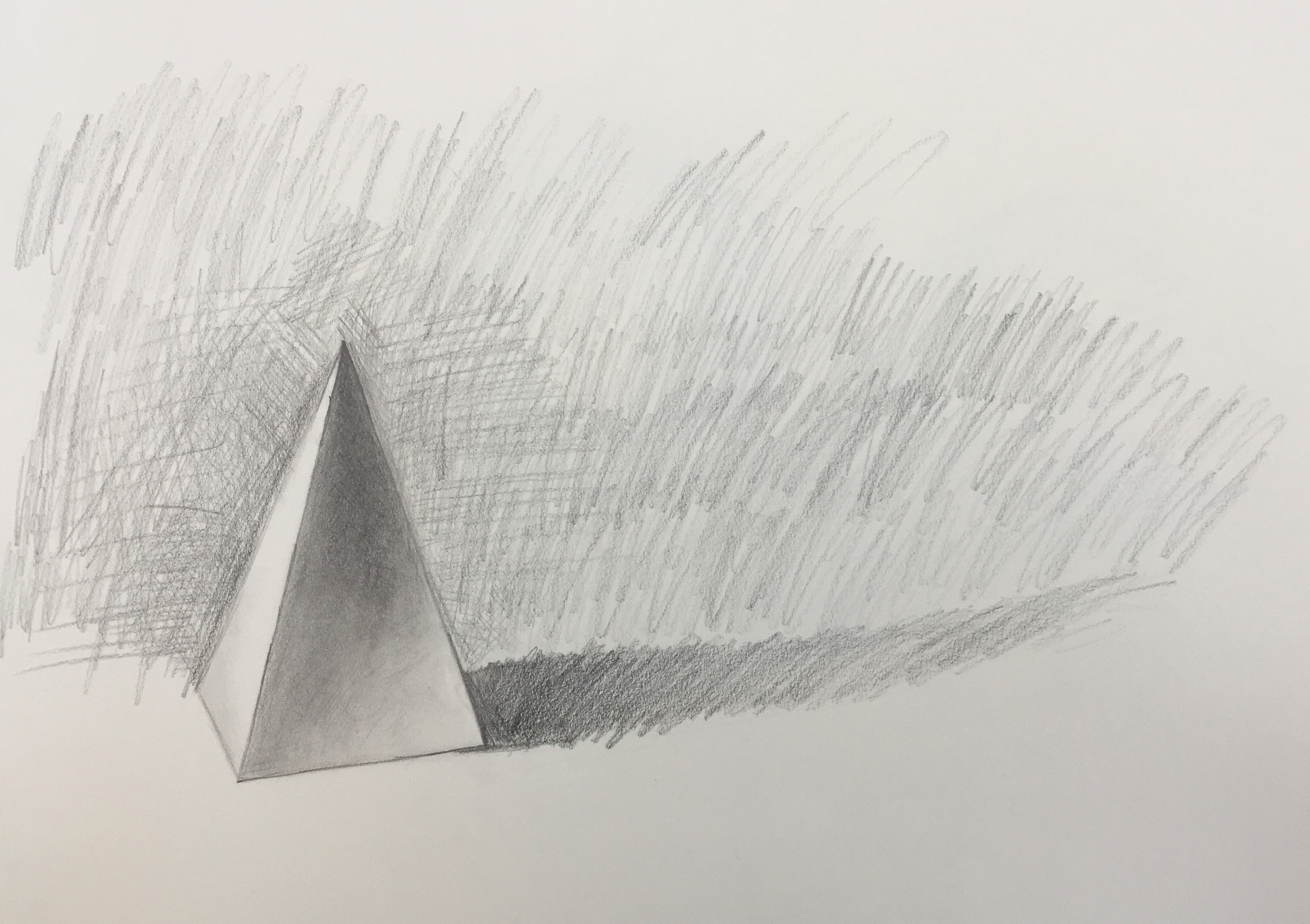
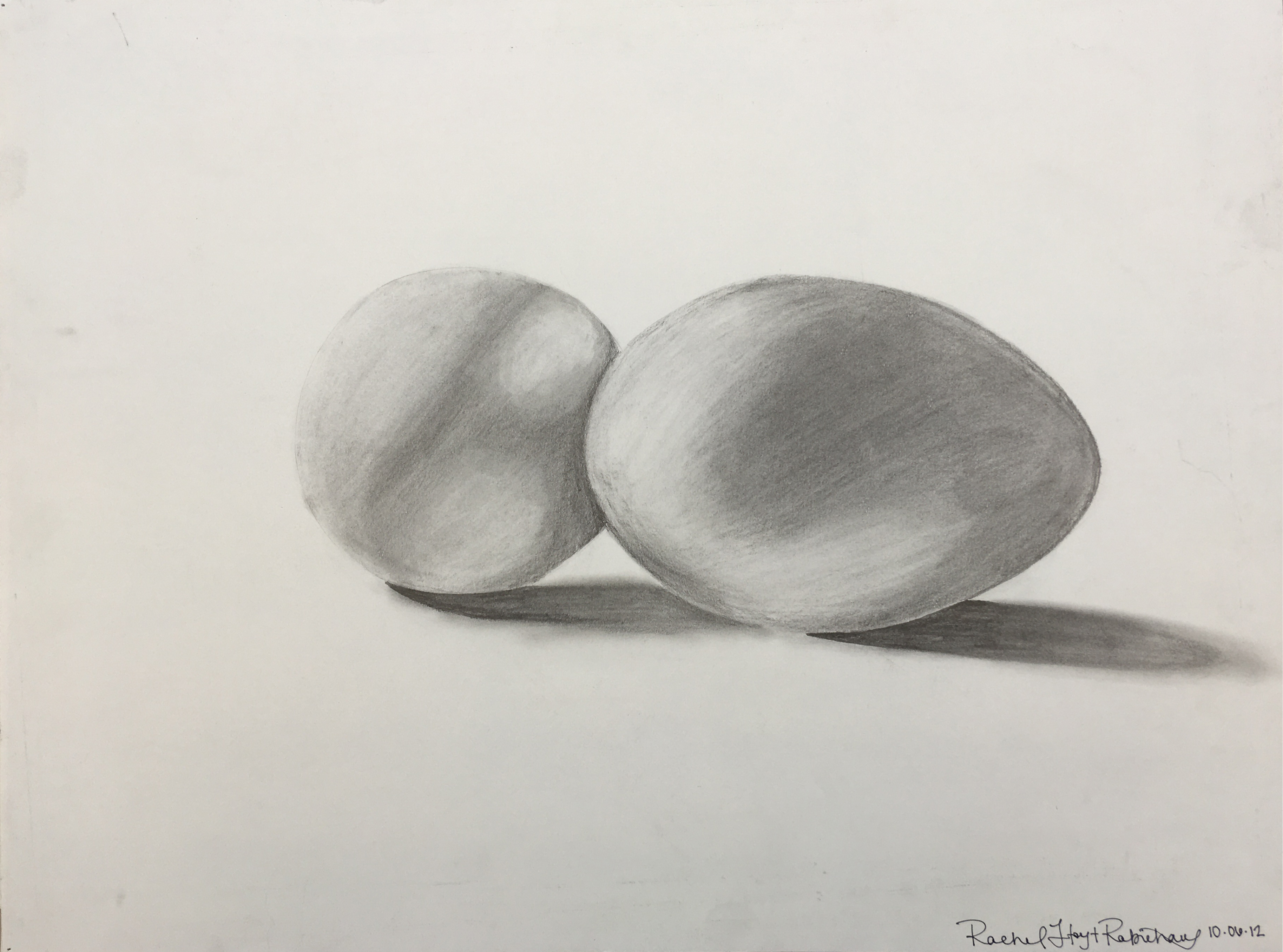
Tonal Study with Sphere
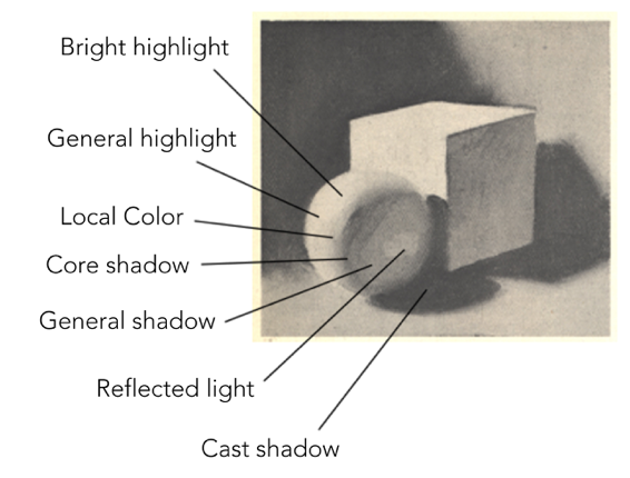
- The forms have bright highlights
- The forms also have general highlights
- The forms have shadows
- The forms have cast shadows
- The forms have reflected light
Example of Contrast and Value Range
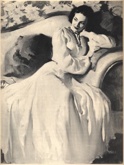
The figure above shows a very successful composition by an artist using black-and-white tones. Where do your eyes go when you look at this black-and-white painting? How does the artist use contrast and tone to direct your eyes to the most important part of the composition?
Answer:
The artist places the most value contrast at the woman's face and hair. Additionally, the top of the sofa with its dark wooden frame directs the eyes also to the face. The dark pillow to her right creates a line on the edge of her dress again leading us up to her face. If we travel down her right arm we reach her elbow and again and move upward to her left arm which then directs us back to, you guessed it, her face! This is a great example of an artist carefully designing a composition that successfully directs the viewers eyes to the exact place where he/she intended for the eyes to land.
Also note the overall compositional form –it’s a pyramid shape which is very stable–a favorite design construct of Da Vinci.
Here the artist began by “mapping out” the drawing (see above figure)
The artist next filled in darker values, including the background –this creates the illusion of light on the form
Next, the artist continued working all over (not just in one area) to build up the drawing –by doing this, changes can easily be made during the process
The final art has strong lighting from the back (backlighting) and a soft “fill” light from the front
Tonal (Value) Studies
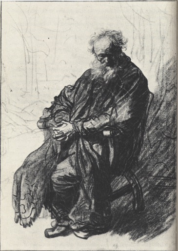
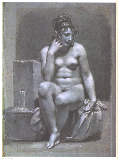
The next three figures show artists using tone to draw the human figure. The first dark drawing is by Rembrandt. It is very solid, almost like a sculpture. The next two charcoal drawings are by Pierre-Paul Prud’hon. Notice that Pru’dhon tones in the background of the paper in order to show light hitting the skin of the figure. He also uses white chalk in his second drawing of the female nude sitting by a fountain. The use of white chalk is possible in this case because he is using gray paper.
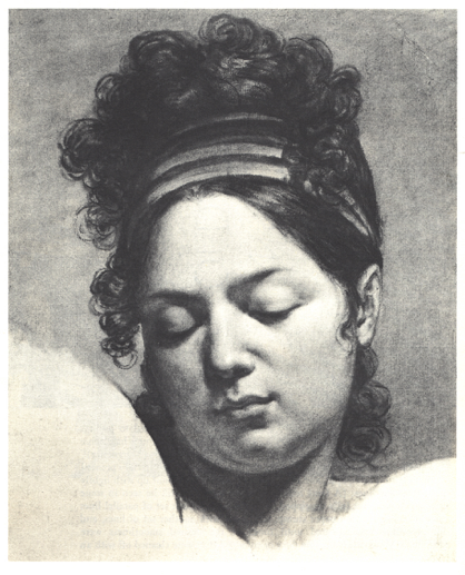
The lighting is very soft in the drawings (in charcoal) by Prud’hon. He is a French master artist from the 1800s. Notice also the use of reflected light in his drawings helping to reveal the roundness of the forms.
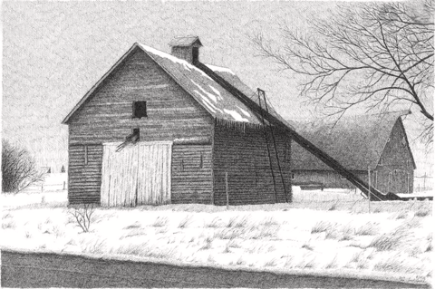
Use of Tone in a Landscape
- Notice the planes of the buildings have different values
- Also see the use of positive and negative shapes are revealed by tone, not line
- The branches of the trees are revealed by dark tones and the snow, by leaving the paper white
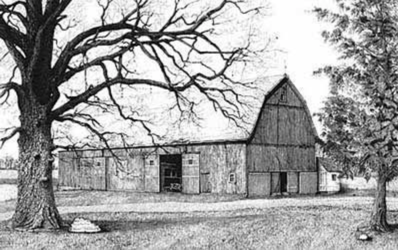
Use of Contrast in a Landscape
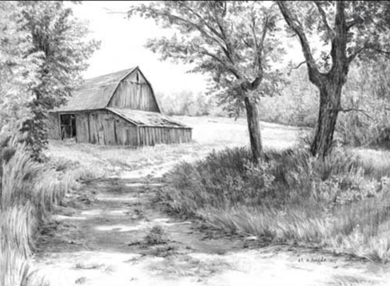
Use of Light to Show Depth and Shadows from Sunlight
Tone Assignment
Where to Begin?
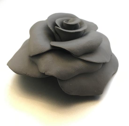
If we look at the form above we see an image made up of values. This image of a rose is made out of a kneaded eraser by a student. Very creative. But the point is that we see soft light hitting the slightly curved planes of the sculpted petals. Each petal in turn has a gradient from the lightest area through the curve to the edge. Under each petal is a cast shadow. When you begin to break down a complex three-dimensional form like this logically, then you are not as overwhelmed by drawing it. Again, we see highlights, gradations, and cast shadows. There are the three major tonal characteristics of this form.
For this assignment, follow these directives:
- Choose a place inside to draw where you control the lighting
- A one-point light source (like a lamp) is ideal
- Determine your eye level
- Choose simple geometric forms like a ball, sphere or box
- Simple round organic forms may also be used like an apple, orange, or egg
- Try to arrange the object(s) to maximize the effect of light and shadow on the form
- Create a balanced composition by cropping and the placement of the cast shadow
- Possibly use “Rule of Thirds” to create balance
- Use softer pencils from HB up to 6B
- Hold the pencil loosely and relax
- Focus on values
- Repeat using charcoal
Here are student drawings in pencil and charcoal:
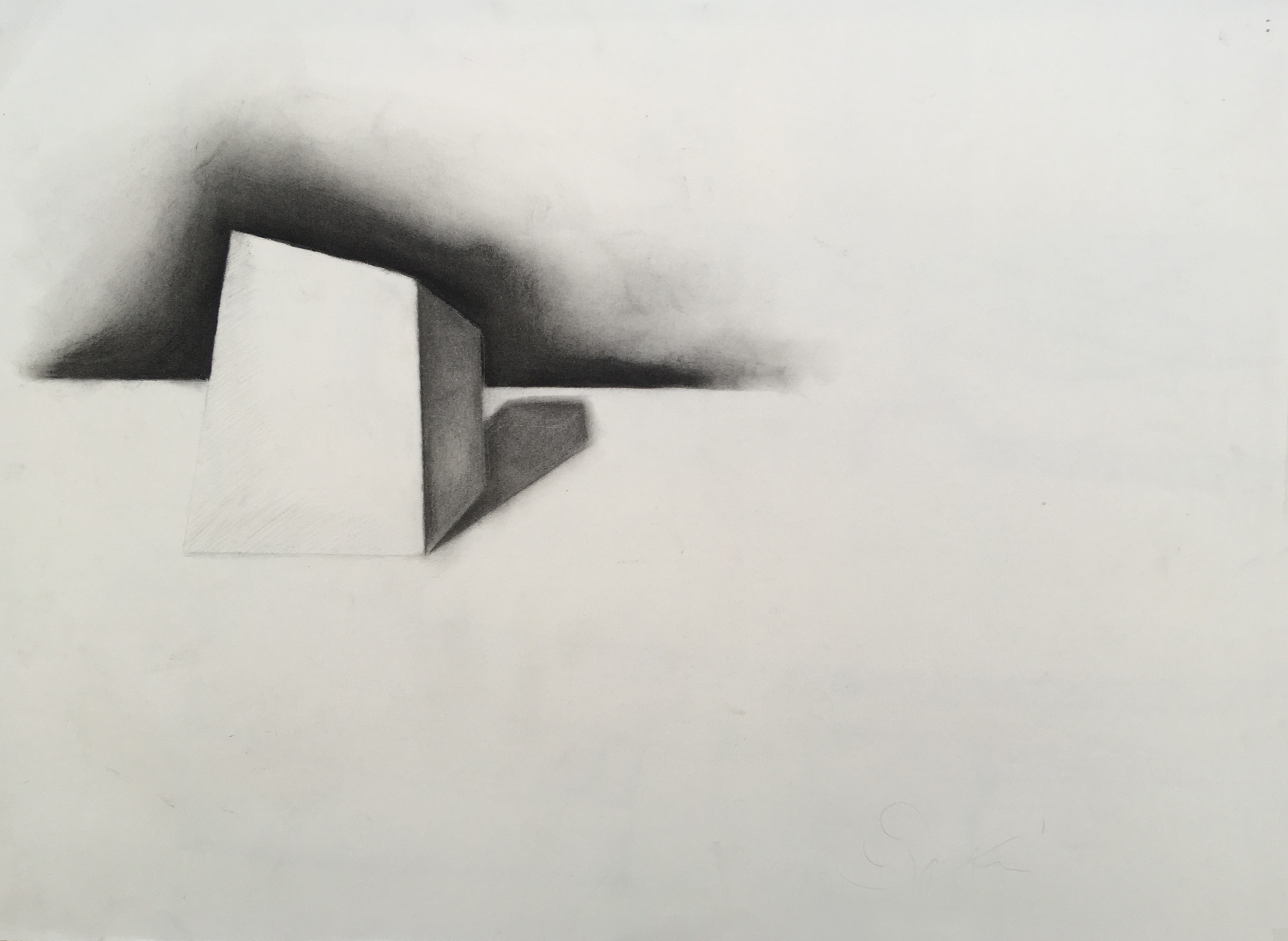
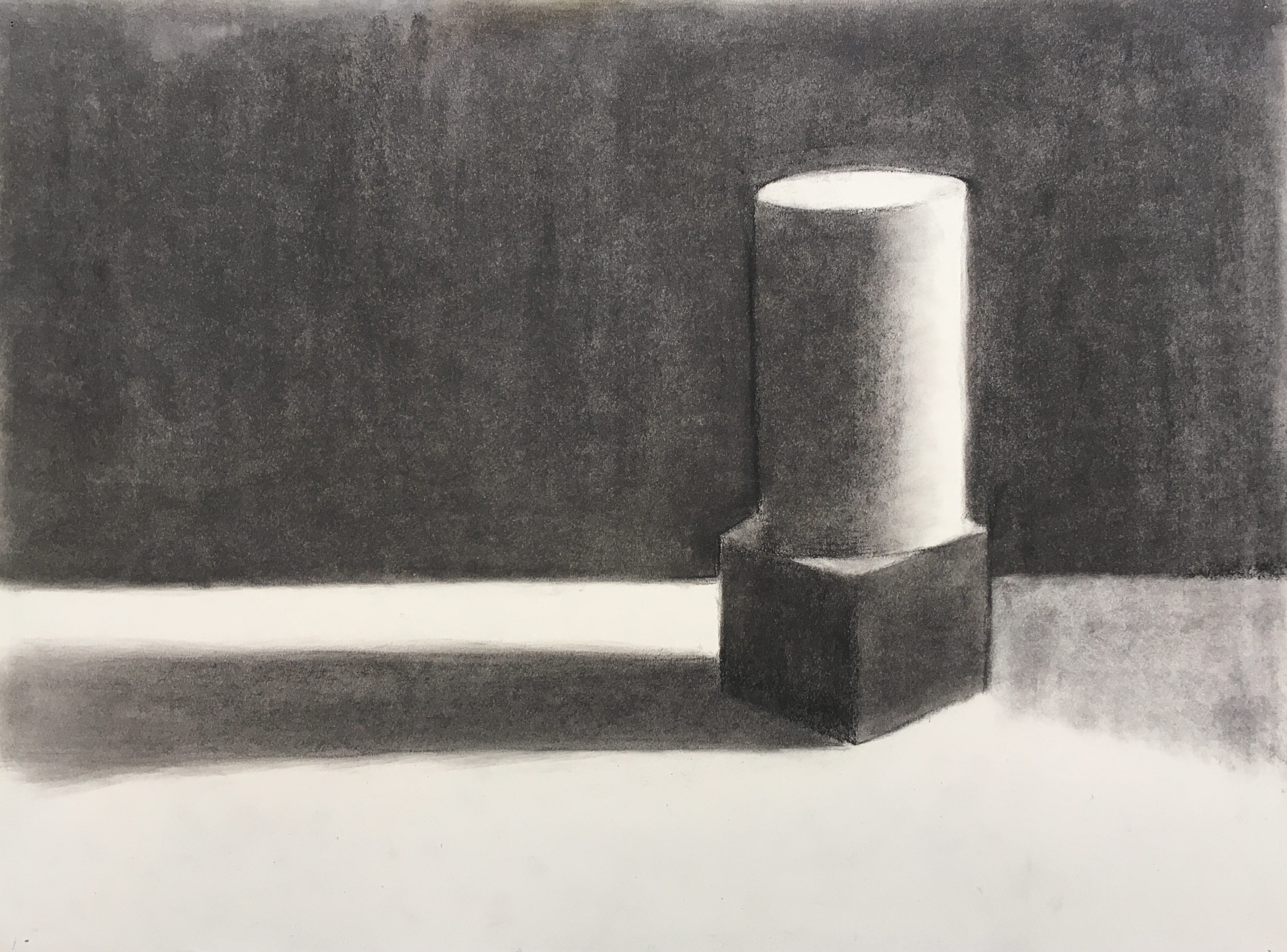

Below are student tonal studies using squares and organic forms:
Elevating your Drawings: