
Appendix
- Page ID
- 92500
\( \newcommand{\vecs}[1]{\overset { \scriptstyle \rightharpoonup} {\mathbf{#1}} } \)
\( \newcommand{\vecd}[1]{\overset{-\!-\!\rightharpoonup}{\vphantom{a}\smash {#1}}} \)
\( \newcommand{\dsum}{\displaystyle\sum\limits} \)
\( \newcommand{\dint}{\displaystyle\int\limits} \)
\( \newcommand{\dlim}{\displaystyle\lim\limits} \)
\( \newcommand{\id}{\mathrm{id}}\) \( \newcommand{\Span}{\mathrm{span}}\)
( \newcommand{\kernel}{\mathrm{null}\,}\) \( \newcommand{\range}{\mathrm{range}\,}\)
\( \newcommand{\RealPart}{\mathrm{Re}}\) \( \newcommand{\ImaginaryPart}{\mathrm{Im}}\)
\( \newcommand{\Argument}{\mathrm{Arg}}\) \( \newcommand{\norm}[1]{\| #1 \|}\)
\( \newcommand{\inner}[2]{\langle #1, #2 \rangle}\)
\( \newcommand{\Span}{\mathrm{span}}\)
\( \newcommand{\id}{\mathrm{id}}\)
\( \newcommand{\Span}{\mathrm{span}}\)
\( \newcommand{\kernel}{\mathrm{null}\,}\)
\( \newcommand{\range}{\mathrm{range}\,}\)
\( \newcommand{\RealPart}{\mathrm{Re}}\)
\( \newcommand{\ImaginaryPart}{\mathrm{Im}}\)
\( \newcommand{\Argument}{\mathrm{Arg}}\)
\( \newcommand{\norm}[1]{\| #1 \|}\)
\( \newcommand{\inner}[2]{\langle #1, #2 \rangle}\)
\( \newcommand{\Span}{\mathrm{span}}\) \( \newcommand{\AA}{\unicode[.8,0]{x212B}}\)
\( \newcommand{\vectorA}[1]{\vec{#1}} % arrow\)
\( \newcommand{\vectorAt}[1]{\vec{\text{#1}}} % arrow\)
\( \newcommand{\vectorB}[1]{\overset { \scriptstyle \rightharpoonup} {\mathbf{#1}} } \)
\( \newcommand{\vectorC}[1]{\textbf{#1}} \)
\( \newcommand{\vectorD}[1]{\overrightarrow{#1}} \)
\( \newcommand{\vectorDt}[1]{\overrightarrow{\text{#1}}} \)
\( \newcommand{\vectE}[1]{\overset{-\!-\!\rightharpoonup}{\vphantom{a}\smash{\mathbf {#1}}}} \)
\( \newcommand{\vecs}[1]{\overset { \scriptstyle \rightharpoonup} {\mathbf{#1}} } \)
\(\newcommand{\longvect}{\overrightarrow}\)
\( \newcommand{\vecd}[1]{\overset{-\!-\!\rightharpoonup}{\vphantom{a}\smash {#1}}} \)
\(\newcommand{\avec}{\mathbf a}\) \(\newcommand{\bvec}{\mathbf b}\) \(\newcommand{\cvec}{\mathbf c}\) \(\newcommand{\dvec}{\mathbf d}\) \(\newcommand{\dtil}{\widetilde{\mathbf d}}\) \(\newcommand{\evec}{\mathbf e}\) \(\newcommand{\fvec}{\mathbf f}\) \(\newcommand{\nvec}{\mathbf n}\) \(\newcommand{\pvec}{\mathbf p}\) \(\newcommand{\qvec}{\mathbf q}\) \(\newcommand{\svec}{\mathbf s}\) \(\newcommand{\tvec}{\mathbf t}\) \(\newcommand{\uvec}{\mathbf u}\) \(\newcommand{\vvec}{\mathbf v}\) \(\newcommand{\wvec}{\mathbf w}\) \(\newcommand{\xvec}{\mathbf x}\) \(\newcommand{\yvec}{\mathbf y}\) \(\newcommand{\zvec}{\mathbf z}\) \(\newcommand{\rvec}{\mathbf r}\) \(\newcommand{\mvec}{\mathbf m}\) \(\newcommand{\zerovec}{\mathbf 0}\) \(\newcommand{\onevec}{\mathbf 1}\) \(\newcommand{\real}{\mathbb R}\) \(\newcommand{\twovec}[2]{\left[\begin{array}{r}#1 \\ #2 \end{array}\right]}\) \(\newcommand{\ctwovec}[2]{\left[\begin{array}{c}#1 \\ #2 \end{array}\right]}\) \(\newcommand{\threevec}[3]{\left[\begin{array}{r}#1 \\ #2 \\ #3 \end{array}\right]}\) \(\newcommand{\cthreevec}[3]{\left[\begin{array}{c}#1 \\ #2 \\ #3 \end{array}\right]}\) \(\newcommand{\fourvec}[4]{\left[\begin{array}{r}#1 \\ #2 \\ #3 \\ #4 \end{array}\right]}\) \(\newcommand{\cfourvec}[4]{\left[\begin{array}{c}#1 \\ #2 \\ #3 \\ #4 \end{array}\right]}\) \(\newcommand{\fivevec}[5]{\left[\begin{array}{r}#1 \\ #2 \\ #3 \\ #4 \\ #5 \\ \end{array}\right]}\) \(\newcommand{\cfivevec}[5]{\left[\begin{array}{c}#1 \\ #2 \\ #3 \\ #4 \\ #5 \\ \end{array}\right]}\) \(\newcommand{\mattwo}[4]{\left[\begin{array}{rr}#1 \amp #2 \\ #3 \amp #4 \\ \end{array}\right]}\) \(\newcommand{\laspan}[1]{\text{Span}\{#1\}}\) \(\newcommand{\bcal}{\cal B}\) \(\newcommand{\ccal}{\cal C}\) \(\newcommand{\scal}{\cal S}\) \(\newcommand{\wcal}{\cal W}\) \(\newcommand{\ecal}{\cal E}\) \(\newcommand{\coords}[2]{\left\{#1\right\}_{#2}}\) \(\newcommand{\gray}[1]{\color{gray}{#1}}\) \(\newcommand{\lgray}[1]{\color{lightgray}{#1}}\) \(\newcommand{\rank}{\operatorname{rank}}\) \(\newcommand{\row}{\text{Row}}\) \(\newcommand{\col}{\text{Col}}\) \(\renewcommand{\row}{\text{Row}}\) \(\newcommand{\nul}{\text{Nul}}\) \(\newcommand{\var}{\text{Var}}\) \(\newcommand{\corr}{\text{corr}}\) \(\newcommand{\len}[1]{\left|#1\right|}\) \(\newcommand{\bbar}{\overline{\bvec}}\) \(\newcommand{\bhat}{\widehat{\bvec}}\) \(\newcommand{\bperp}{\bvec^\perp}\) \(\newcommand{\xhat}{\widehat{\xvec}}\) \(\newcommand{\vhat}{\widehat{\vvec}}\) \(\newcommand{\uhat}{\widehat{\uvec}}\) \(\newcommand{\what}{\widehat{\wvec}}\) \(\newcommand{\Sighat}{\widehat{\Sigma}}\) \(\newcommand{\lt}{<}\) \(\newcommand{\gt}{>}\) \(\newcommand{\amp}{&}\) \(\definecolor{fillinmathshade}{gray}{0.9}\)Contents
TERM REFERENCES 256
SUGGESTED PROJECTS 258
PANORAMA & HDR 270
ANIMATED GIFS 271
OTHER TECHNIQUES 272
PHOTOSHOP TECHNIQUES 274
COPYING FLAT MATERIAL 279
CELLPHONE CAMERAS 282
LIGHTROOM INSTRUCTIONS 285
CREDITS AND OTHER THINGS 314
*Page numbers noted are where the term is defined. Multiple pages signify increasingly complete definitions.
8 bit image 80
24 bit image 81
A
additive color 243
Adobe Photoshop format 132
Adobe RGB 244
albumin prints 228
ambient light 213
ambrotype 228
animated GIF 192
A or Av (Aperture or Aperture Value) 148
aperture 44, 142
auto-bracketing 124
auto-focus 62
automatic ISO 89
auto setting 23
B
background light 211
battery 43
bit depth 80
bracketing 124
built in flash 213
Bulb (B) 162
C
cabinet photograph 235
camera 38
camera color 248
camera flash 213
camera movement 165
camera obscura 223
camera shake 165
card photographs 235
cartes de visite 234
center-weighted metering 125
channel 81
CMYK 244
collodion 227
color gamut 245
color of light 207
color profile 247
Color Rating Index (CRI) 249
color space 243
color temperature 84
complex lens 60
compression 131
copy stand 213
D
Daguerreotype 225
depth of field 57, 146
Digital Negative (.DNG) 86
Digital Single Lens Reflex 38
Digital SLR (DSLR) 38
digital zoom 109
diopter adjustment 23
direction of light source 203
E
Edward Muybridge 233
effective size of light source 201
evaluative metering 125
EV corrections 123
exposure compensation 123
exposure meter 125
Exposure Value (EV), 123
F
fast lens 66, 152
field of view 101
fill light 211
film 236
fish-eye lens 66
flair 67
flash 191
fluorescent 84
focal length 101
focus 44
focus areas 63
format 25
f-stop 142
full-frame equivalent 108
full-frame sensor 40, 82
function menu 22
G
gaffer tape 216
gelatin 235
George Eastman 236
gray card 247
H
hair light 211
hard light 201
highlight clipping 121
Highlights 120
histogram 119
hot light 214
HUH 42
I
image stabilization (IS) 60
incandescent 84
infinity 65, 150
initializing 25
ISO 24, 185
ISO setting 44
ISO speed 87
J
Jacob Riis 234
JPEG 131
Julia Margret Cameron 231
K
Kelvin 84
Kodak 236
L
LED lights 215
lens hood 67
level 78, 119
Lewis Carroll 232
light color 249
light falloff 210
lock focus 62
long lens 101
lost highlights 120
M
Macro lenses 66
main light 211
manual focus 63
Matthew Brady 229
maximum aperture 150
megapixel 79
memory card 25
midtones 120
mirrorless camera 39
mixed light 207
M (Manual) mode 187
monolights 214
motion blur 164
N
natural light 213
neutral gray 122
noise 82, 87
normal focal length 101
number of light sources 206
O
O. G. Rejlander 232
one inch sensor 82
open up 144
overexposure 120
P
panning 168
panorama 192
partial metering 125
PASM dial 23
photography 223
pinhole camera 56
pinhole lens 54
pixel 78
plane of focus 143
portraits 210
P (Program) mode 23, 170
prime lens 109, 151
ProPhoto RGB 244
Q
quick menu 22
R
RAW format 23, 85, 129
RAW+JPEG 24, 130
reflections 203, 208
relative movement 166
resolution 131
RGB 79, 243
S
SD card 25
sensor 26, 38, 78
sensor size 82
sensor size and focal length 106
shadow clipping 121
shadows 120
short lens 102
shutter 162
shutter speed 44, 162
simple lens 59
soft box 215
soft light 202
S or TV (Shutter speed or Time Value) 169
spot metering 125
sRGB 243
stop 88, 123, 162
stop down 144
subject movement 166
subtractive color 244
T
telephoto 26, 101
telephoto zoom 104
texture 202
Timothy O’Sullivan 230
tint 85
tintype 228
tripod 42
U
umbrella 215
underexposure 120
unusual light 190
UV filter 41
V
variable focal length lens 102
variables of light 201
Vibration Reduction (VR) 60
W
wet-plate 227
white balance 83, 247
wide angle 25, 102
wide angle zoom 104
Z
zoom lens 102
zoom position 25
zoom range 103
SUGGESTED PROJECTS
The following projects are some that have been useful to students in my photography classes. These projects are very flexible, enabling the student to bring their own interpretations into the mix. They also highlight key aesthetic controls that are used by photographers. As mentioned in the introduction, it is important that you make prints of a carefully edited selection of your photographs.
Preliminaries
This is a simple one. Just go out and take photographs! Familiarize yourself with the work-flow: Try different things with your camera, then file your images on the computer. Edit for your best images and then make some changes to those images.
The Edge and the Light
The main tools that photographers use to interpret the world are edge and light. They are two basics differences of how camera vision departs from our vision.
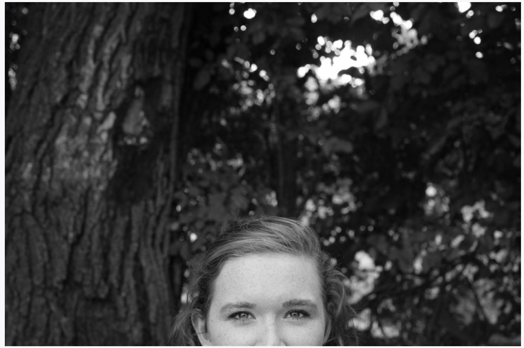
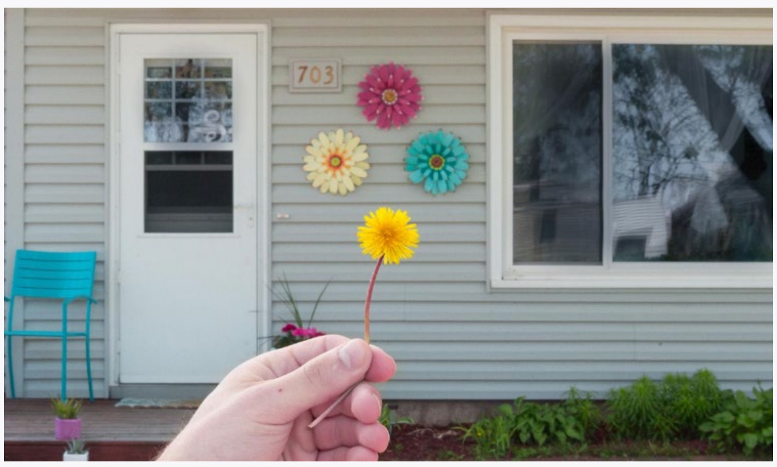
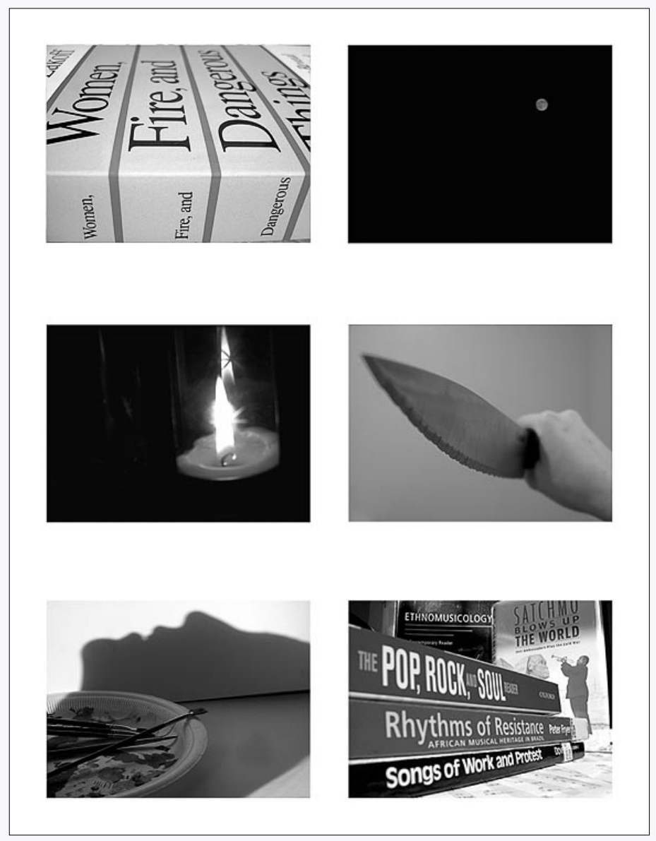
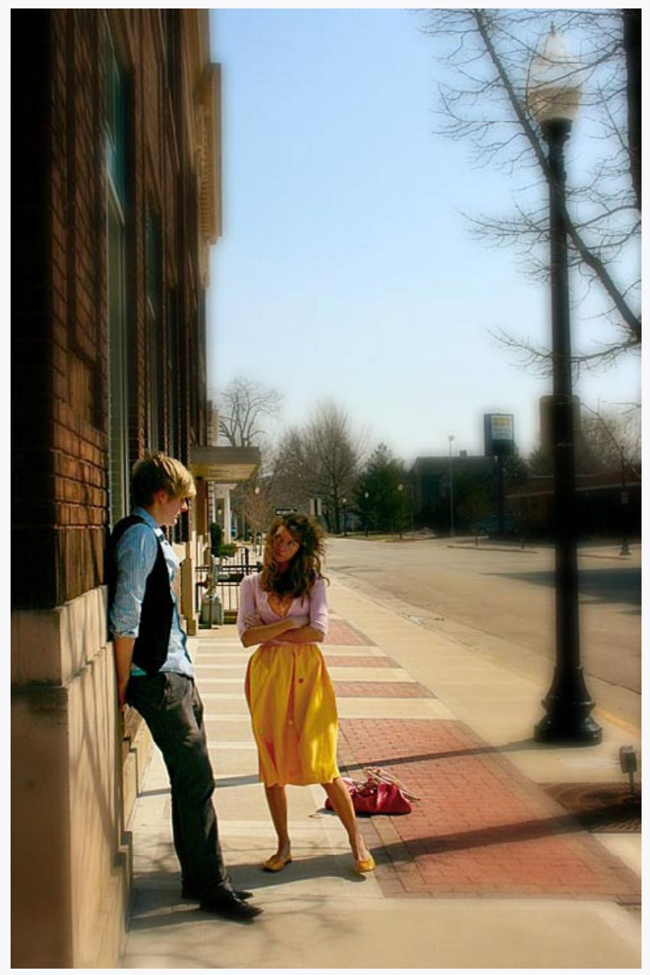
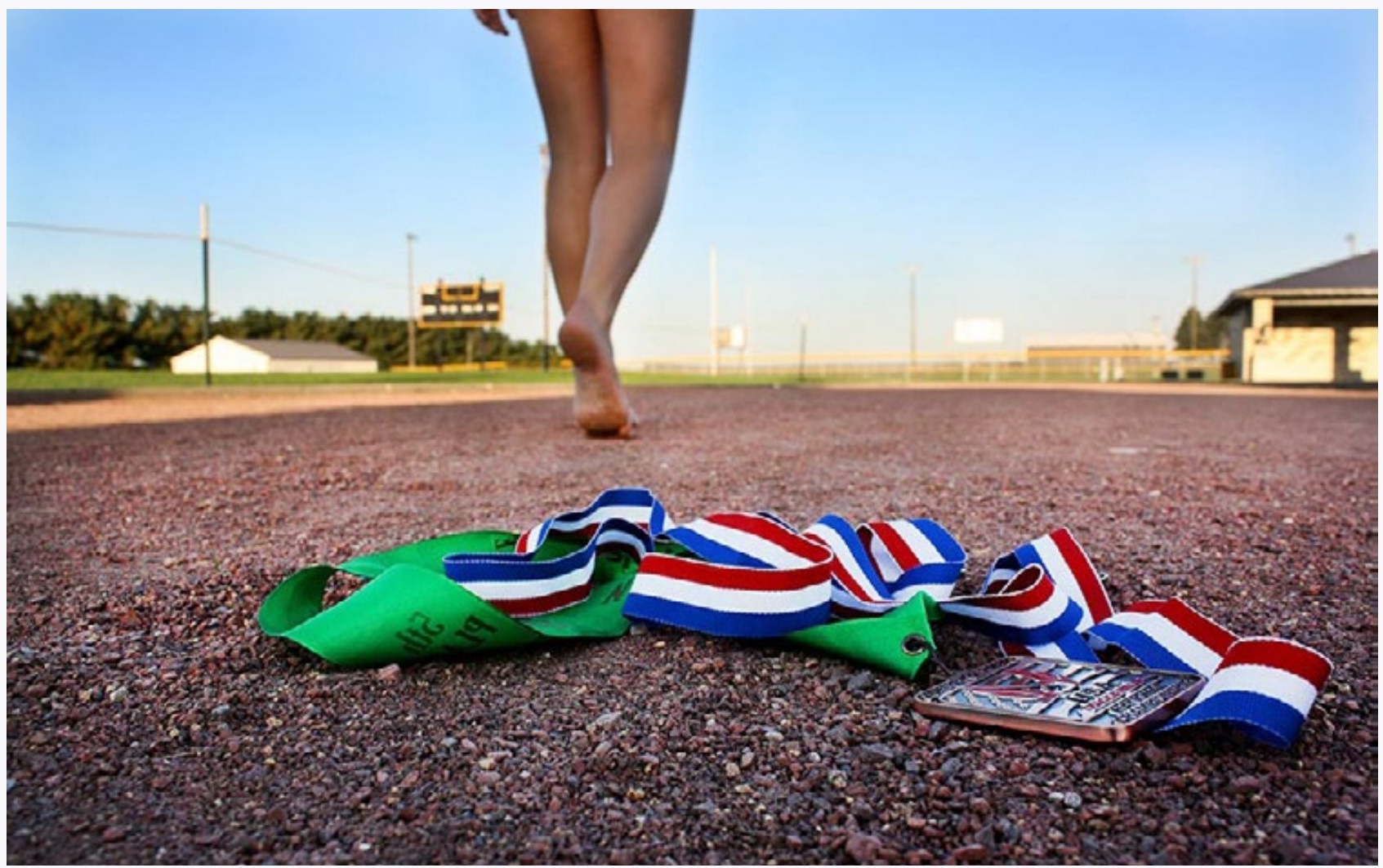
EDGE & LIGHTMolly Savage. The use of light is not obvious in this image, but the use of edge is very obvious. The image is not framed the way the viewer expects.
|
THE EDGE: Unless we are in a car or looking out some other window, we do not normally see the world with a frame around it. Photographs have definite edges (frames). This is one way they differ from reality or how they abstract reality. For this assignment do not just put your subject in the middle of the frame—use the edges very obviously. Cut things off, put them to the side. Hide them outside the frame. Make it edgy! At least unexpected. And if you don’t understand how to use edge, then just cut things off using one of the four edges of your camera frame. Put the thing people expect in the photograph half outside of it.
THE LIGHT: You are not photographing the things in the world, but light reflected off those things. Think about this while you are walking around with your camera. Do not photograph objects, photograph light. Look at light that is revealing things closely. If you don’t understand this, then take photographs of shadows. They obviously show light.
Each of your photographs should either show obvious light or obvious edge, and if possible, both!
Convert all of your images to black and white for this project. Color is great, but tends to obscure light interactions. If you can learn to see tonalities in black and white, it will make even your color images better.
And turn off your flash at this point and keep it off. Your built-in flash might be useful at times, but not when you are learning photography. All you really can learn is that you have to be close to your subject for the flash to illuminate it.
While doing this project you might find that nice light isn’t always very bright. In dimmer situations you need to brace your camera carefully and perhaps even use a tripod.
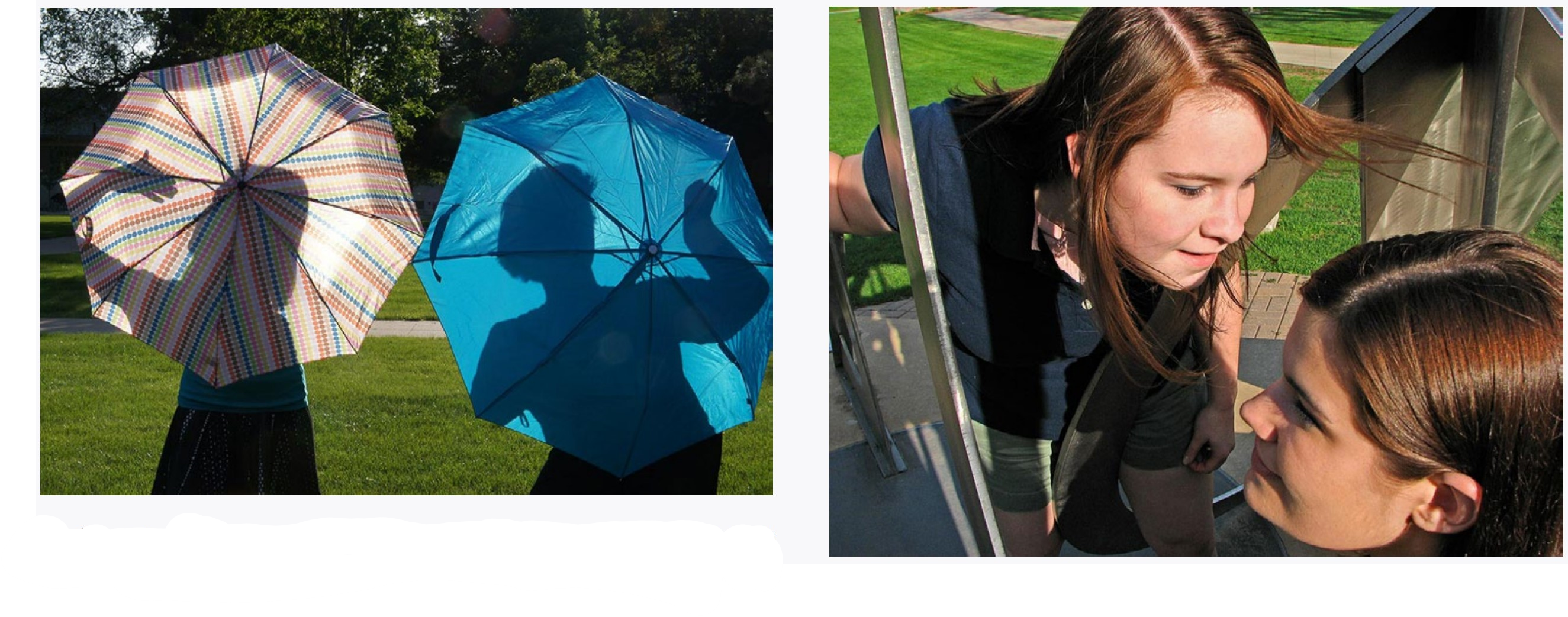
EDGE & LIGHT
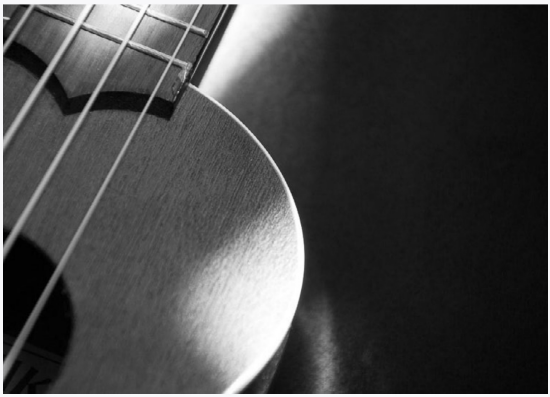
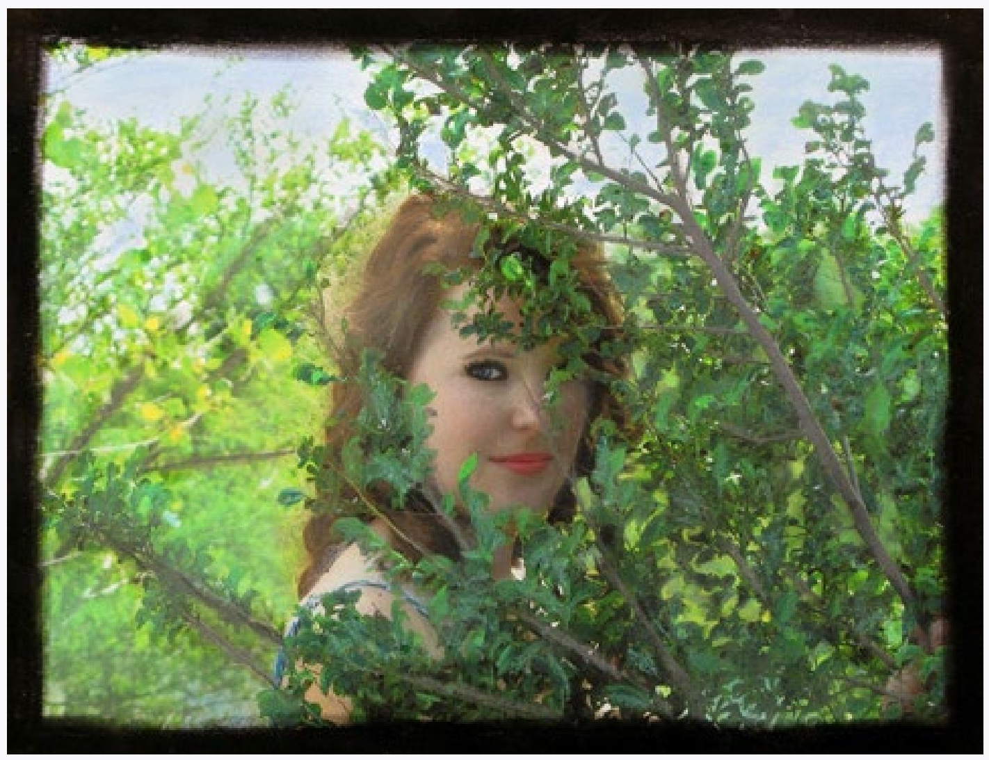
TOP Suusen Ng. The edge is not obvious, although one could argue differently. The light is very obvious. BOTTOM Alex Gheysens. In this image both the light and the edge are used in obvious ways. Notice that these two images on this page ‘talk to each other’, with the guitar neck visually continuing to the top image.
|
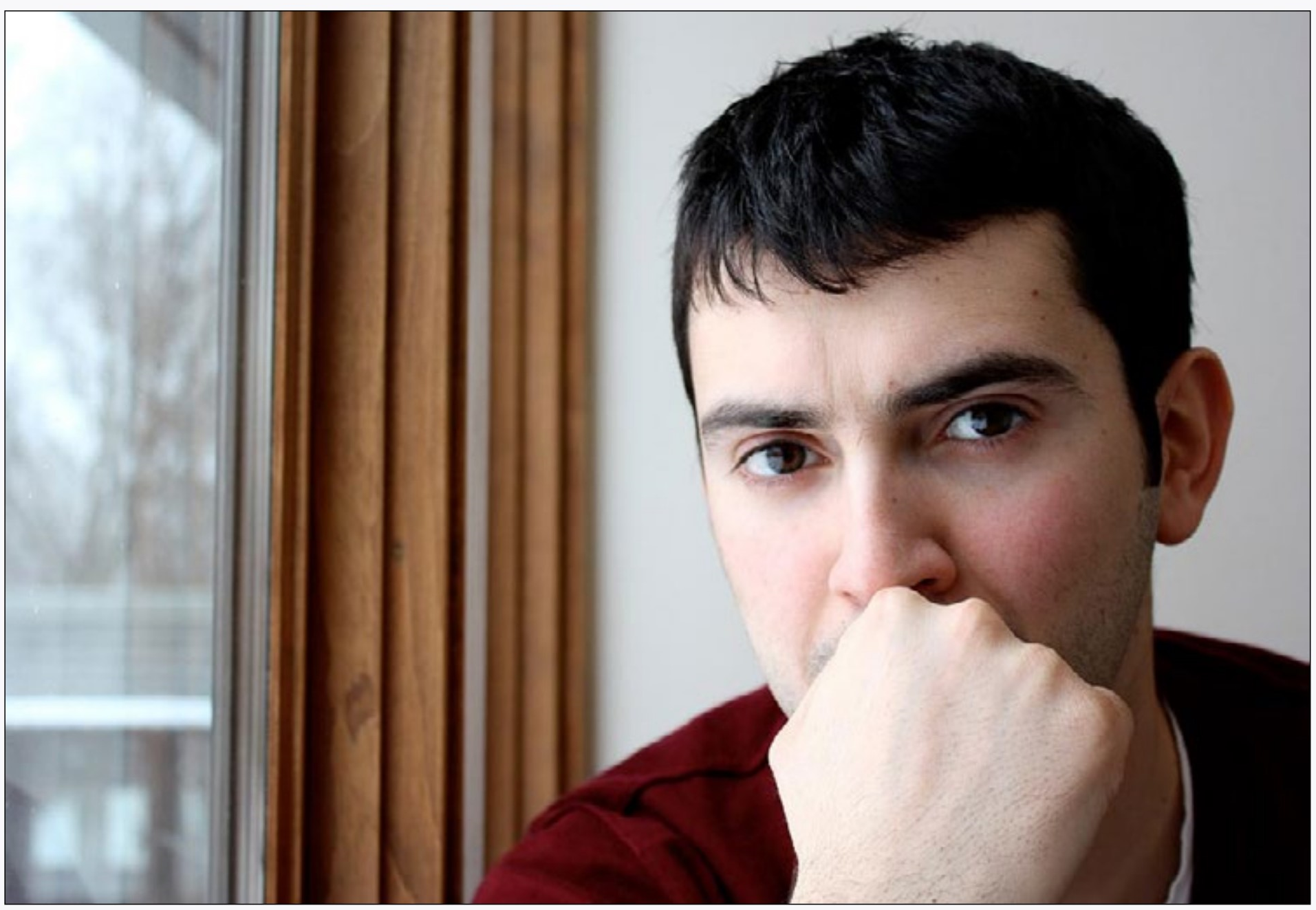
Portrait
If you can imagine all of the photographs that have ever been taken in a big pile, how many of those would be pictures of people? I would venture a guess that it is a lot. People have a never-ending fascination with... people. Portraits get to the heart of this. Here a portrait is not a snapshot. It is a thoughtful rendition of someone else’s image. It says something about the subject, and most probably also some things about the photographer and perhaps even their relationship to the subject.
Obviously the formula portraits that you get from Walmart are not included in this definition. Nor are quick or candid snapshots. It is relationships that matter here. Who is the subject to you? What are they doing? How comfortable are they? Are they doing something? Try to make the images meaningful.
PORTRAIT
LEFT Leslie Davis. A portrait doesn’t have to be a head and shoulders shot. RIGHT Somto Mogbogu. This image is very formally composed. BELOW Katinka Kober. This interpretation is much more relaxed. Notice the lighting used for these images.
|
While taking these, experiment. Look at the light and how it falls onto a face. Notice the background and control it with the position of the subject and the camera. Perhaps point up or down at the subject (this makes a big difference). You might even try to direct them like a movie director directs the actors. Take control of the situation—remember that photographs are not reality, but an interpretation of it. Your interpretation.
Different subjects will present different challenges. You are shooting your subject, so understand their apprehension and nervousness. One fact that photographers are aware of is that people tend to lose their apprehension the longer you take to photograph them. So perhaps after the first half-hour of shooting they will drop that photo smile and present something more genuine.
Try to find a subject that is tolerant of you taking time with them, and make sure they are not hungry (feed them!) or otherwise preoccupied. If you know someone who loves to have their photograph taken, it is easier. Your subject may even help you make photograph decisions. This project is a collaboration after all.
PORTRAIT
LEFT Luke Gibbs. One could argue that this is not a portrait, but it could be argued back that the viewer is actually getting a lot of information about the person on the bench enjoying a spring day. RIGHT Haley Flores. This is a much more what we expect a portrait to look like, and could even be a senior picture. It doesn’t matter how you make a portrait, but it does matter if it is intentional. |

Color
The importance of color in photography is self-evident. Most photographs taken today include color, and here you will try to be intentional about it. Intentional color is a tool that all photographers use.
Deal with color directly while doing this project—take images that depend on color. High or low saturation, dark or light colors, different colors. Look for color and arrange those colors in the viewfinder. What are the variations within a color or two colors? What colors are there in your frame and how do they compliment or contrast with each other? If there are neutral areas in the frame how do the colors react with those areas?
Think about colors you like. Are the colors subtle or do you like colors that pop?
Don’t just lay out a bunch of colored paper and shoot photographs of it (or the equivalent). Yawn. Instead go out and look for color and color combinations, look at your entire frame, arrange, &c.
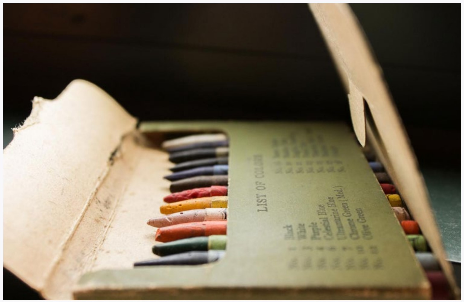
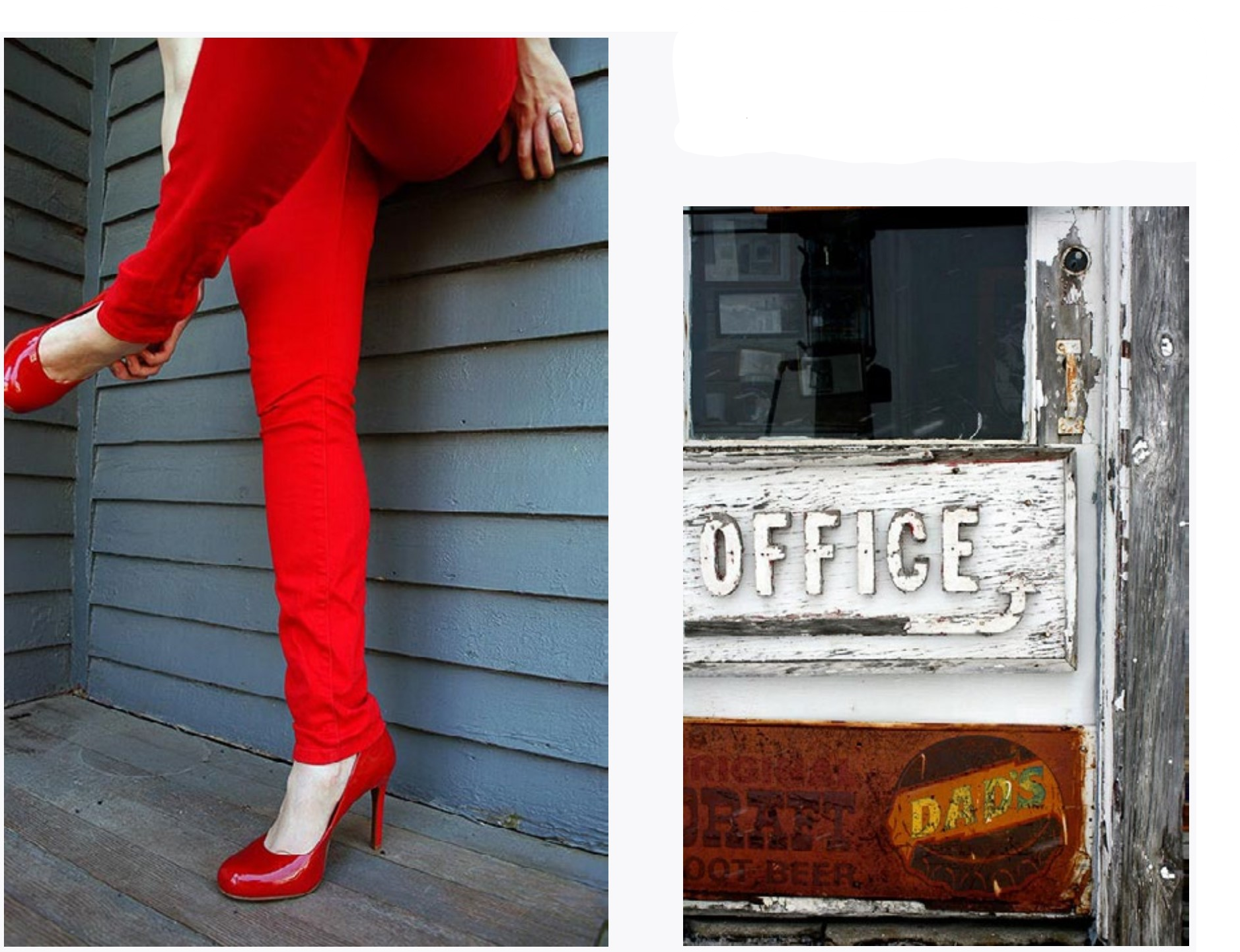
COLOR
LEFT Kyle Barton. Red is a pretty loud color, especially in saturated amounts. ABOVE Miranda Fober. An old box of crayons. Notice how the photographer didn’t just lay some crayons out to photograph them. RIGHT Alicia Ford. Color doesn’t have to be bright to be effective. Neutral areas can help give colors harmony.
|
To help you be concerned about color, you want to set the camera to the white balance dictated by the light you are using—at the very least it helps you to think about the color of the light. And beware of two different colors of light hitting your scene. Light from a window will almost always have a different color than indoor light.
You will probably want to set your white balance back to automatic after you are done. If you are shooting in RAW format you can always override the camera’s white balance guesses, but if you are shooting in JPEG format a wrongly-set white balance will render the images with worthless color.
Interaction
When you see a person with a tree directly behind their head you probably don’t even notice. But if you take a photograph of this, you will, and the tree will seem to be coming out of their head. Visual interactions such as this are something that photographers notice and use with almost every photograph they take.
In simple terms, it is how photographs are composed. How are the near things interacting with the background? How do two things next to each other relate? By asking these questions you can avoid unintentional interactions and embrace intentional ones.
COLORStefan Hansen. If you walk around sensitive to color, you may be surprised at the combinations waiting to be photographed.
|
INTERACTIONMegan Karels. The interaction between the foreground and background is obvious.
|
Position two (or more) things in your frames to visually interact with each other in obvious ways. You can use something in the foreground and something in the background, but you could also have the things on the same plane.
INTERACTIONLEFT Jessica Glendenning RIGHT Matthew Ollendick In both of these photographs the interaction moves the viewer’s eyes back and forth between the two main subjects, which have similarities, but are not the same. In other words, the main subjects in each photograph are visually interacting!
|
Make sure you are making VISUAL interactions. Two people holding hands or someone drinking a soda are NOT necessarily visual interactions! The things in the camera frame need to relate visually. This can either be juxtaposition, where two things are placed near each other in the frame and contrast, or it can be two things that relate to each other and make your eye move back and forth between them (think of a picture of twins to understand this).
What you are really trying to do is get the different things in the camera frame to ‘talk to each’ other visually. If you are really at a loss on how to understand this, perhaps just fall back on a common photo-joke where someone in the foreground is ‘holding’ something in the background (like holding up a water tower or eating a car). Or you could have two people pretending to react to something very different expressions. Or you could select an object and put it in front of different backgrounds.
Self Portrait (not selfie)
This project departs from things photographers do every time they take a photograph, and instead presents you with a variety of technical and aesthetic problems somewhat like the ones photographers encounter daily.
In taking a self portrait there are three considerations: The first is how do you want to portray yourself for others to see? It can be fictional, real, one or more aspects. Remember, photographs are not reality, but an interpretation of it!
 |
The second consideration is how you actually view yourself. At least some of these should include your face, which is kind of at the root of our self-perception (for better or worse). But there are also bits of you in people you love or objects you covet (or objects you love and people you covet!). Don’t use clichés here. Your teddy bear collection may be important to you, but does it really communicate that to others? ...Perhaps, but only if you do it right.
The third consideration is technical. How are you going to make the photographs? You could find reflective surfaces or use your camera’s self timer. Perhaps just your long arm, but stay away from making this a selfie, and be more thoughtful about it. Try not to have someone else take the photographs, since this introduces a variable that isn’t helpful.
Note: If you are doing this with the camera’s self-timer, focusing might be a problem. Just focus on something that is the same distance from the camera as you will be, then switch the focus to manual to lock in that distance.
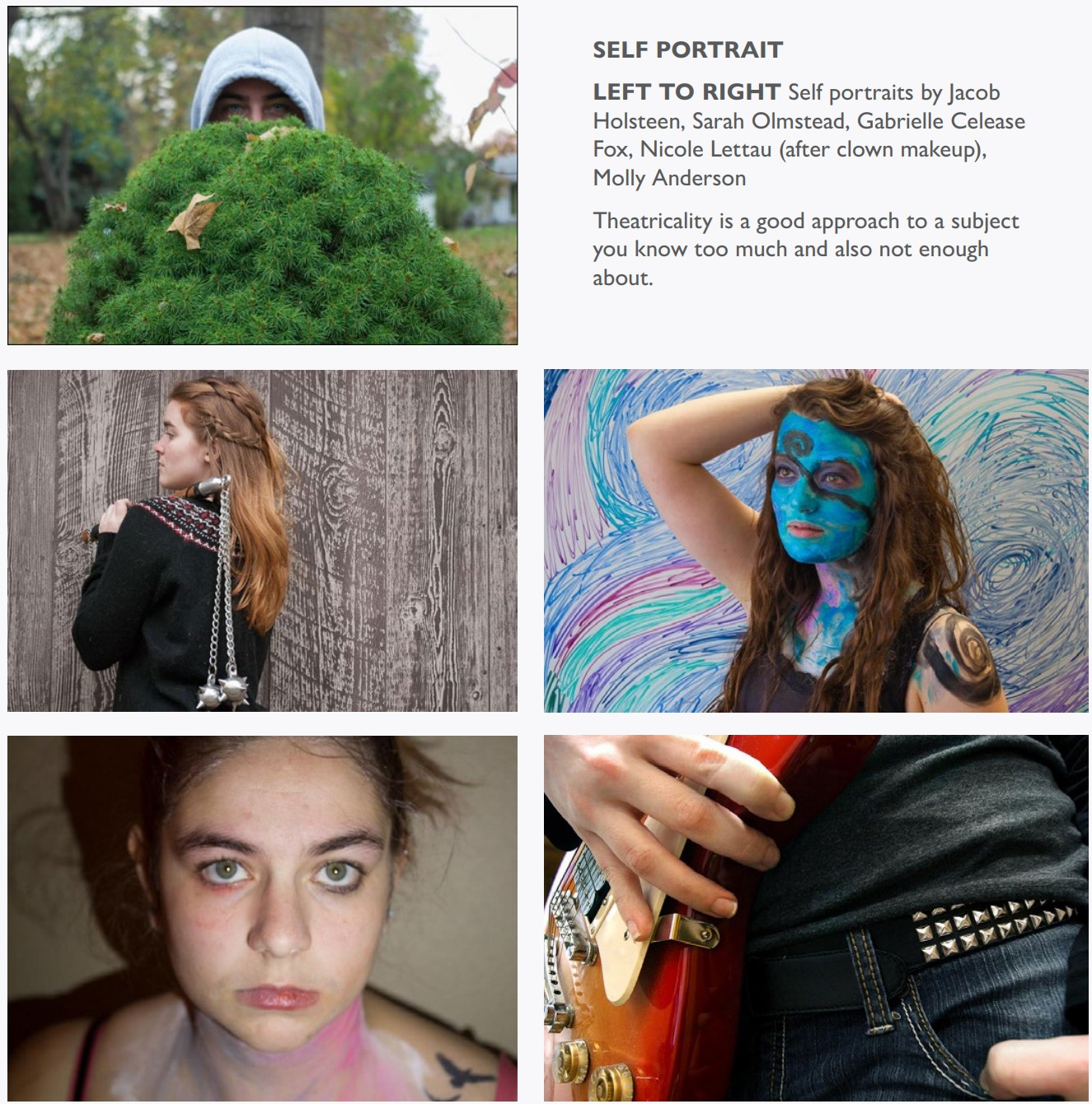
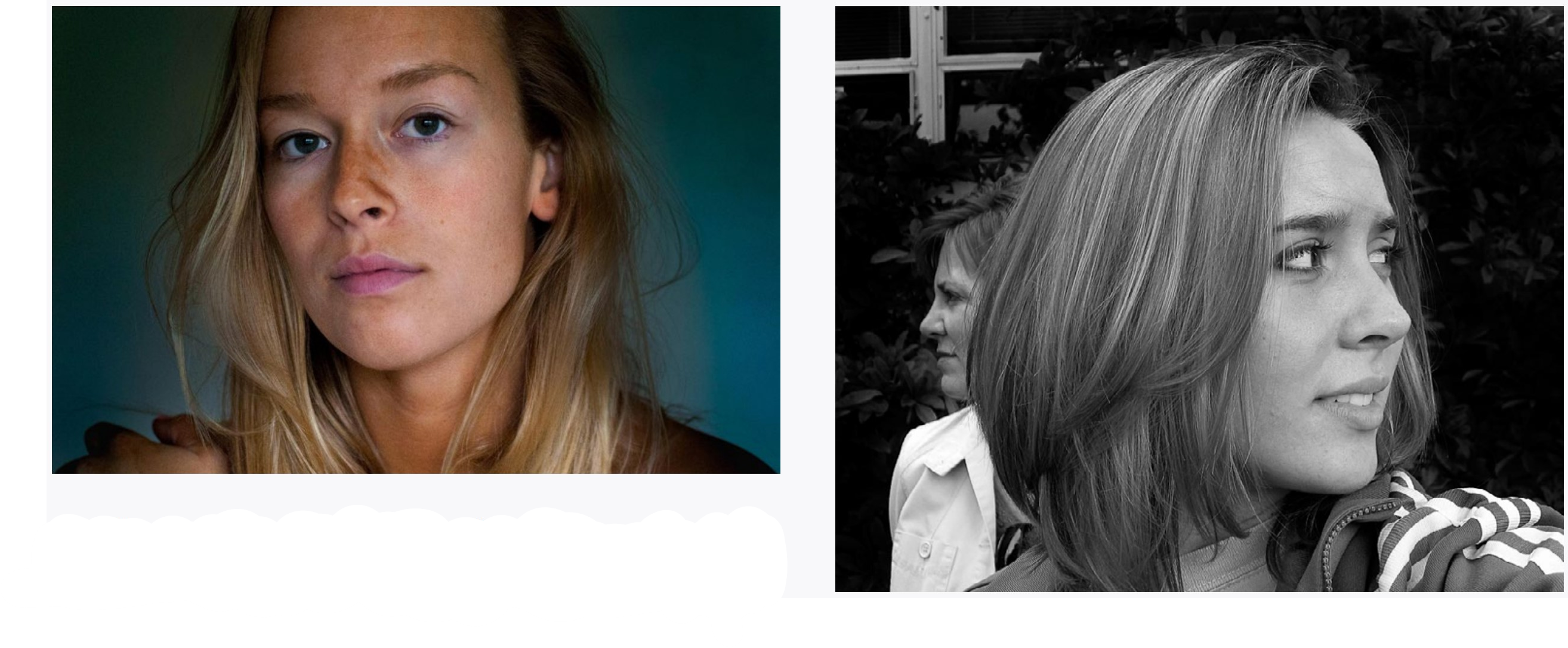
SELF PORTRAIT
LEFT Kate Shindelar. This is very much like a standard portrait, but feels incredibly direct and honest. RIGHT Brei Aspenson. We find a lot of the identity of ourselves in our family, especially in our parents. This photograph could also fit very well with the interaction project. |
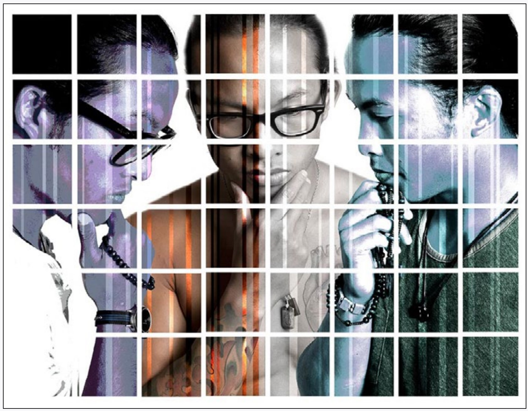
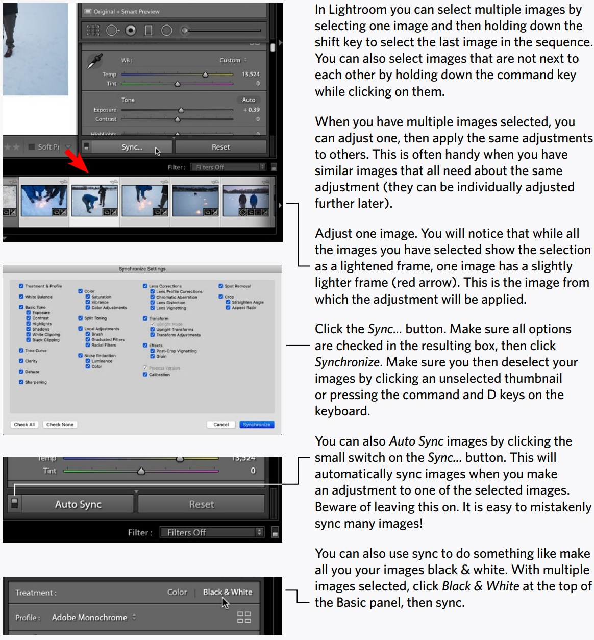
Multiple Images
You’ve probably noticed by now that photographs together can work very much like words and sentences together to express thoughts and observations. Photographic essays have had a long history from magazines to blogs.
Make a story using six or more images together. Display these together adjusting color and tonality so they work together. Through these photographs, and without words, you should explain something. How you do this is up to you. If a picture is worth a thousand words you have the equivalent of at least 6,000 words with this project.
MULTIPLE IMAGES
LEFT Jess Macauley. Six different views of flowers add up to a seventh interpretation. This approach is a photographic essay. ABOVE Shin Yasu. A narrative with a beginning and end to the story. RIGHT Megan Pratt. These images have strong visual relationships to each other. They also tell a (somewhat loose) story.
|
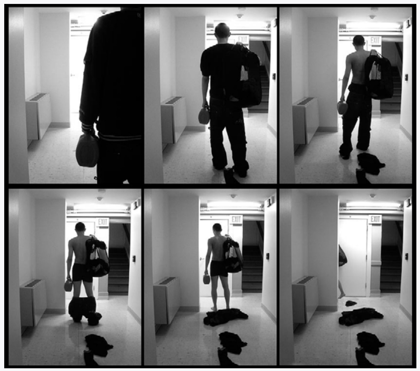
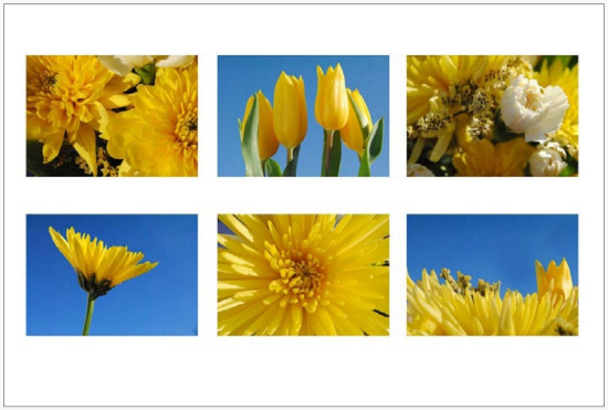
Your interpretation may be external—a very literal story like a photo-essay reading from the upper left photograph to the bottom right. Or it may be very internal, and explain your feelings or thoughts like a poem or philosophical abstraction. Or it may be anywhere in between. You may want these photographs to work together visually, but they don’t necessarily have to.
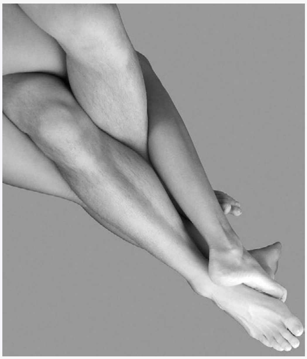
Body
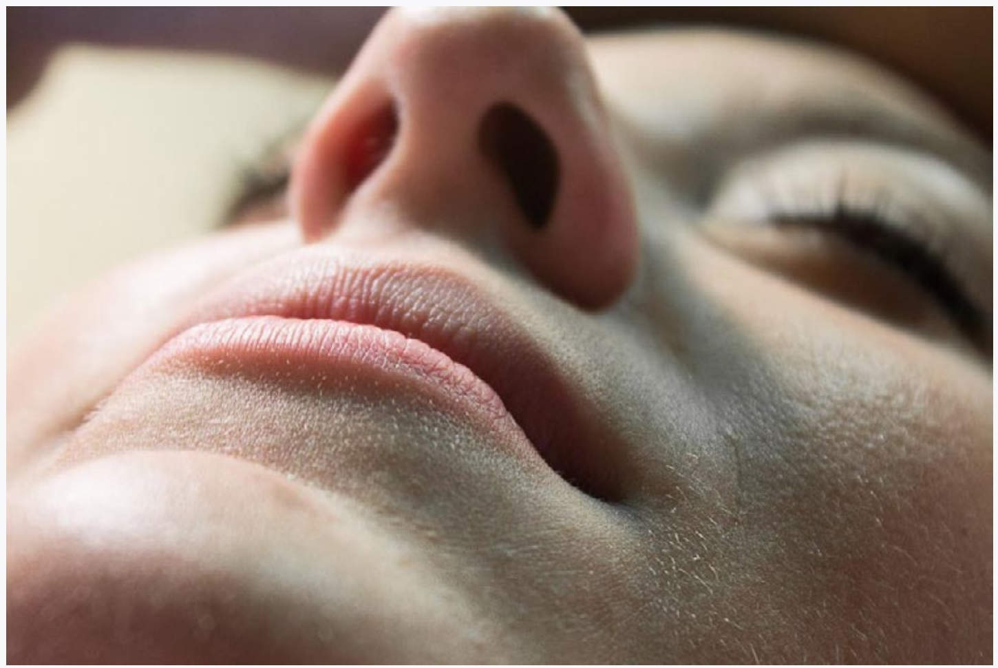
Just about every person responds to the human body. In that pile of all photographs that have ever been taken, you won’t find too many photographs of the human body, but the ones that you do find will be appreciated. Photographs of the body can of course be sexual, but pornography is the ransom note of photographs: not thoughtful, but does get your attention. Do something thoughtful.
MULTIPLE IMAGESLEFT Roland Ferrie. Combining images can be done in Photoshop, a layout program, or just putting physical photographs together. RIGHT Chelsea Spangler. You don’t have to be very understandable when combining images. Poetry can be symbolic or more about a feeling than literal meaning.
|
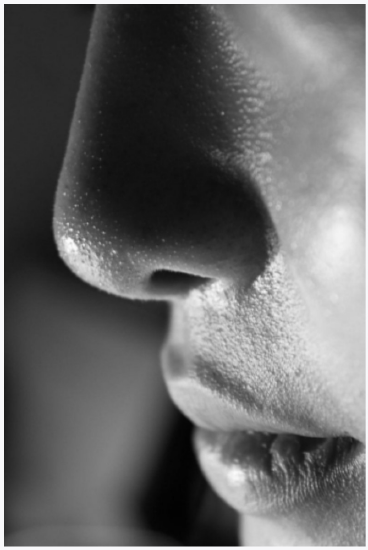
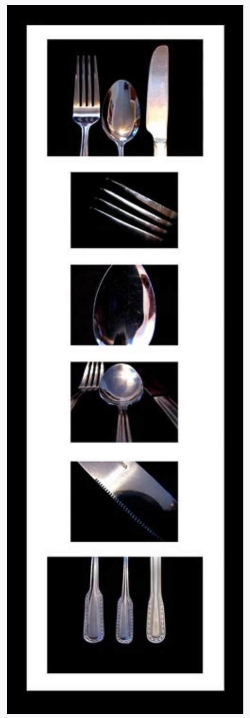
Photograph different parts of the body. You can think of this as very much like the portrait assignment in the way that something like hands are expressed. Or you may think of it like the light and edge assignment and the way that the shape and texture are revealed by light. Or you may approach the assignment differently. Experiment.
In general, light is going to be extremely important to this assignment, and you may very well want to photograph using a window for light. What this means is that if you do not have a tripod or other support, your shutter speed will probably be very slow. Hold ‘er steady. And your aperture is going to be very wide. Focus carefully and don’t plan on having much depth of field. Try to anticipate how the final print is going to look before you shoot the photograph.
Color is also going to be very important in this project. You have several ways to make sure it is good. Shoot in RAW format (as always). Carefully adjust color balance (temperature), and saturation/lightness/hue. If you haven’t spread your photos out on your screen to directly compare color and exposure, then do it for this one. We can tell when skin color is ‘off’.
BODY
TOP Molly Schmidt. This is obviously not a portrait since the intent is to show the shapes of the body. LEFT Katie Zimmer. The contrast of the body with things that have different qualities can have interesting visual and literal interactions.
|

PANORAMA & HDR
PANORAMAS
To make panoramas in Camera RAW, simply select multiple images, then in the same menu go to Merge to Panorama.
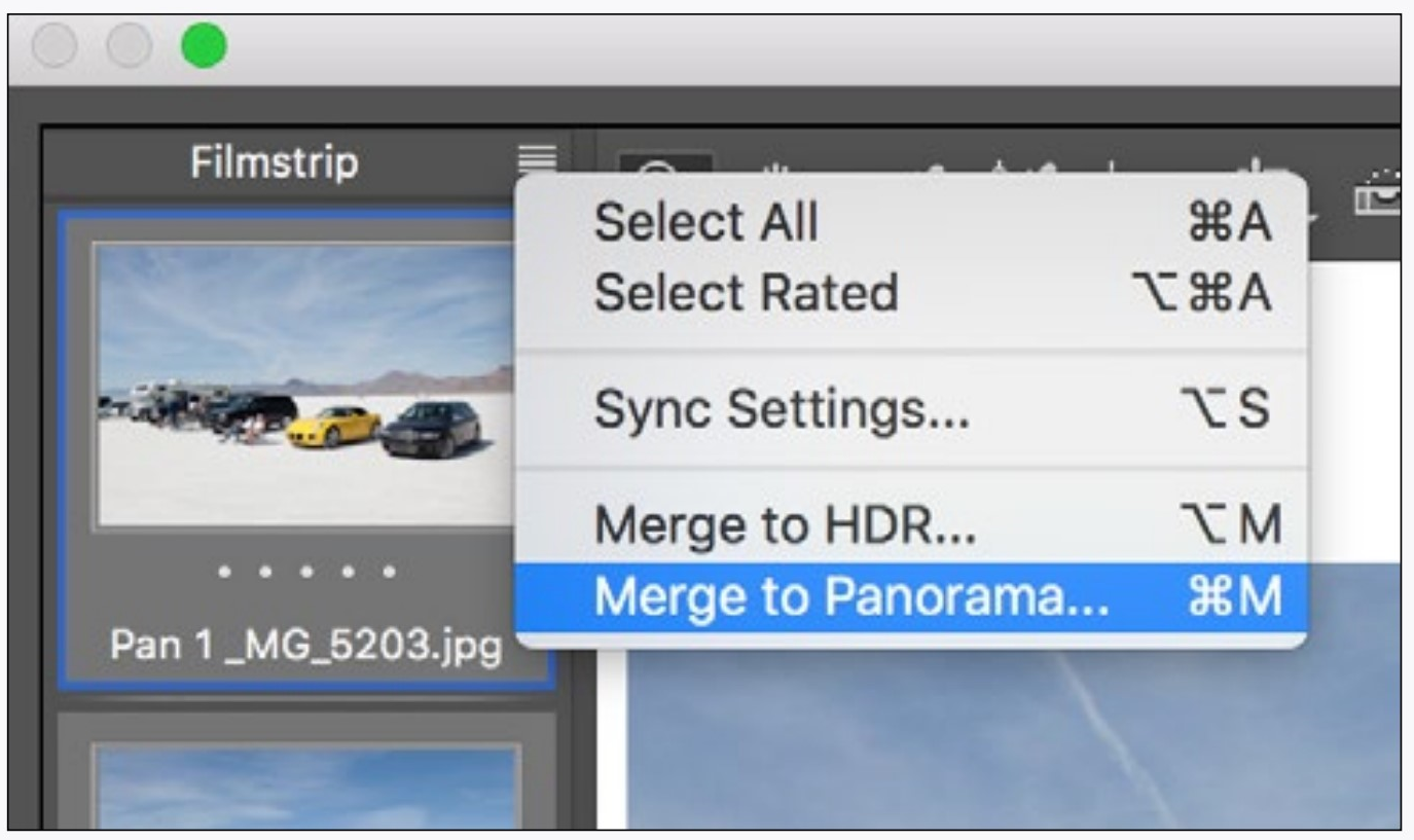
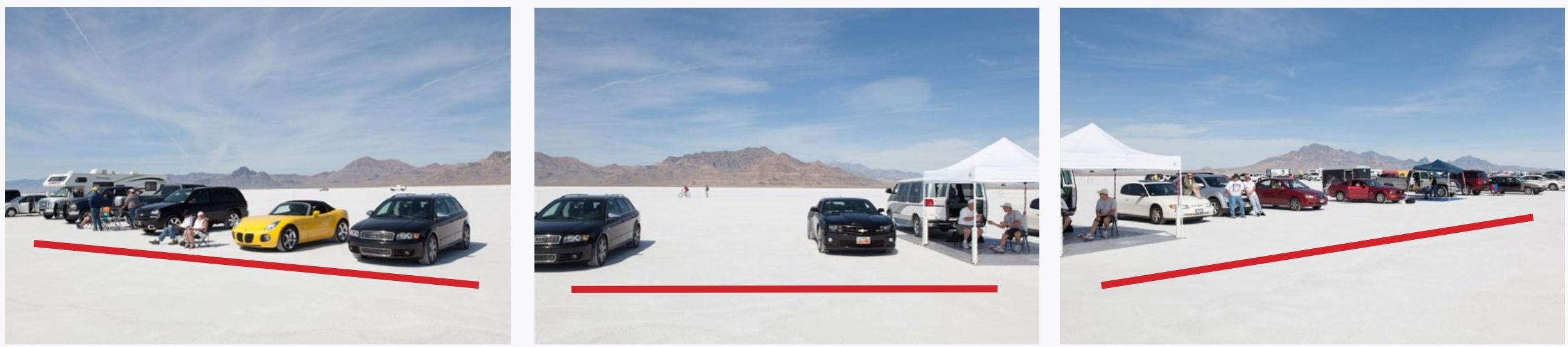
The different projection options can be tried to see what works best. Basically, the choices come down to how the program deals with straight lines that no longer remain straight when the camera is turned (see illustration below).
Camera Raw needs plenty of overlap with the images (if in doubt take a lot of images), and it works best when all of the images are the same exposure.
You can also use this technique to either take a wider-angle view of something or stitch together images to make a high resolution file. In these situations shoot each image vertically for horizontal images (and vice-versa).
HIGH DYNAMIC RANGE
RAW images are capable of recording a wide range of brightnesses, but they can’t record very contrasty scenes like sunsets, night shots, or even looking out a window.
In very high contrast situations you can take several pictures at different exposures and combine them with the menu item Merge to HDR (in upper left illustration). The resulting HDR image has an incredible amount of tonal information which can be made visible with highlight/shadow adjustment and local controls.
There are limits to what you can do with HDR, and the resulting images can easily look very unnatural. Like bad postcards from the last century.
When taking photographs for HDR make sure you take enough photographs for Camera RAW to figure out how to align them. You only need the Deghost options if there is movement of something in the frame while you are taking the pictures.
ANIMATED GIFS
1 Take several photographs that you want to see move in sequence. It may be just two if you want simple movement, or many more if you want complex movements. Most GIFs use under 10 photographs.
2 Open these photographs in Photoshop. If they open in tabs, make your window very small and drag the tabs out of the window to make a separate window for each image.
3 With the move tool (top tool), drag the second image you took onto the window of the first image you took. Hold down the shift key while you are doing this to automatically align the images. Now take the third image (if there is one) and shift-drag it to the first image. Continue with all your images.
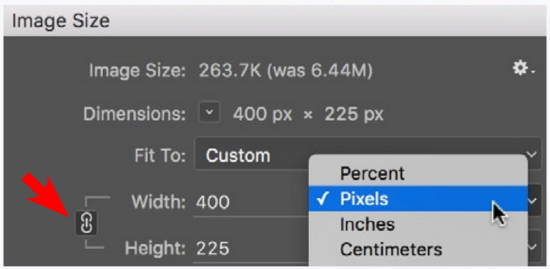
4 Go to the menu Image> Image Size. With constrain proportions (red arrow below) locked and resample image box checked (lines appear from it), enter a pixel dimension in either the width or the height boxes. GIFs are generally pretty small—anywhere from about 100 pixels wide to 800 pixels wide. Click Okay, then set the image to 100% (the actual size it will be in any other application) by double-clicking right on the magnifier tool. If it is too big or too small, undo your image size and do it again using a different pixel dimension value.
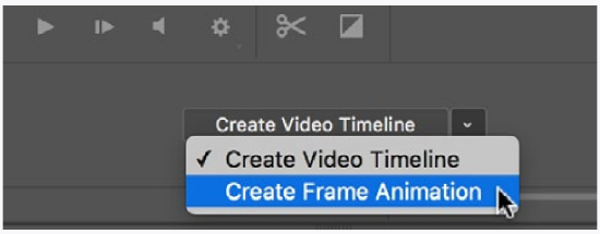
5 Open the Layers Panel by going to the menu Window> Layers. Now open the Timeline Panel (Window> Timeline). Choose Create Frame Animation as shown below (little triangle), then click on Create Frame Animation to activate it.
In the Layers Panel, uncheck the visibility (eye icon) of all your layers except the one on the bottom (titled Background). A thumbnail of this layer will show up in the Timeline Panel. Change the number under the thumbnail to the amount of time you want the image to show in your animation. Usually it is less than one second.
6 At the bottom of the Timeline Panel, click on the icon for a new frame (the ‘+’ icon next to the trash can icon). You will notice that this will make a second thumbnail image next to the first, but they are the same. Go to your Layers Panel, and click on the visibility of the layer called Layer 1. You will notice that now the second thumbnail in the Timeline Panel corresponds to your second image.
7 Repeat the above step for all the subsequent layers in your image. Test the animation by clicking the play button in the Timeline Panel, and adjust the times under the thumbnails to speed up all the frames or only some of them. Click and hold on the Once button in the timeline panel and change to Forever (if it is not already).
8 If you would like to add more frames (perhaps to make the animation run backwards after it runs forwards) just add more frames in the Timeline Panel, and with the specific frame selected, click only the visibility of the layer you want in the Layers Panel.
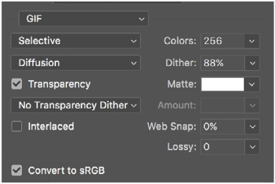
9 To save your GIF, go to File> Export> Save for Web (Legacy).
Fill in the boxes on the top right of the box as shown in the illustration below. Click Save, specifying where you want to save it. You may want to also save your Photoshop file in case you want to do further work on it.
That’s it! Test it by dragging the icon for your GIF to a web browser icon. Drag it into an email document and send it to someone. Or drag it into a presentation to show it there. Any application that supports animated GIFs will show it as you made it.
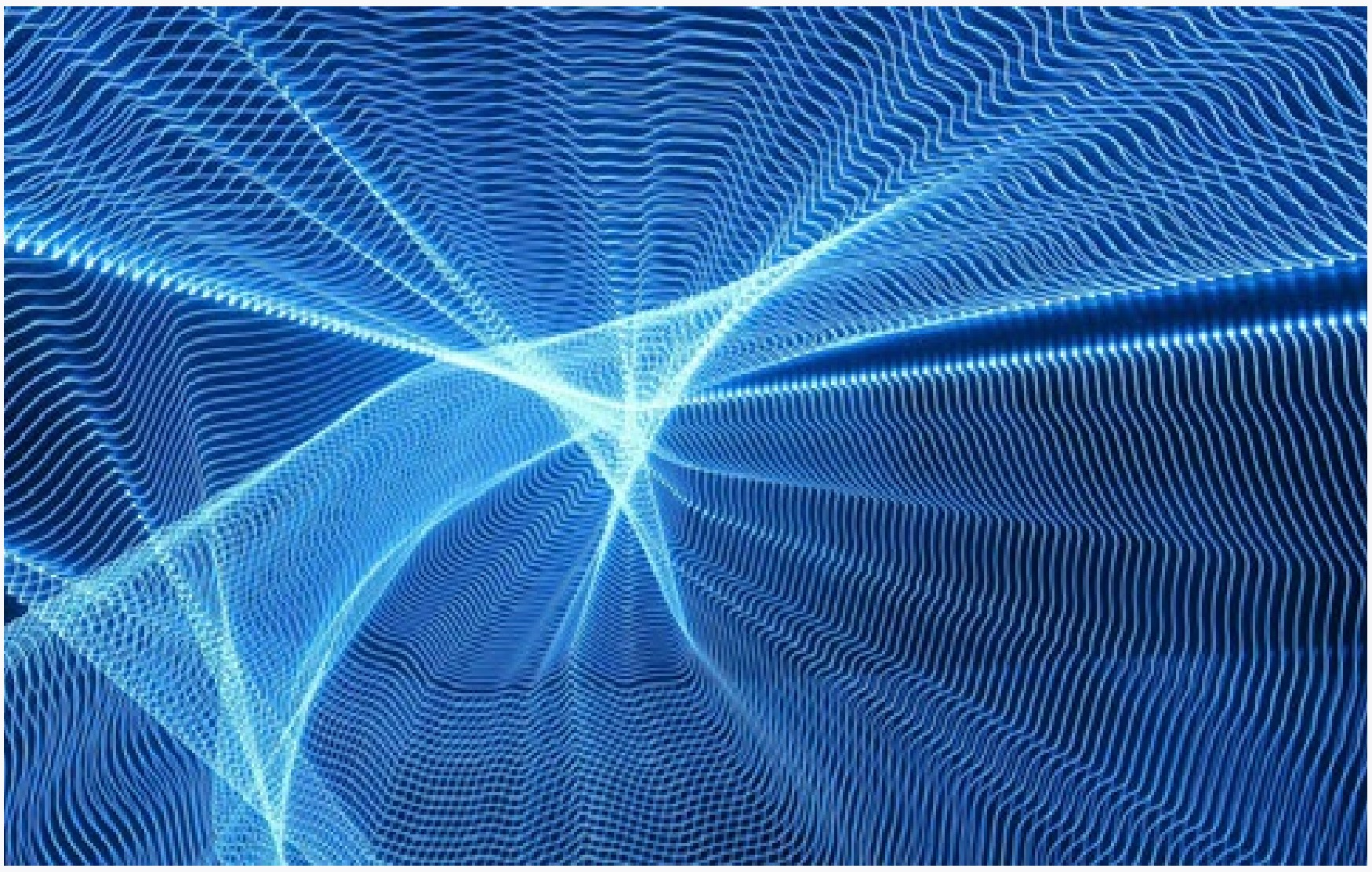
OTHER TECHNIQUES
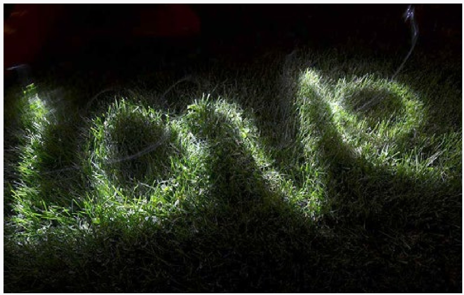
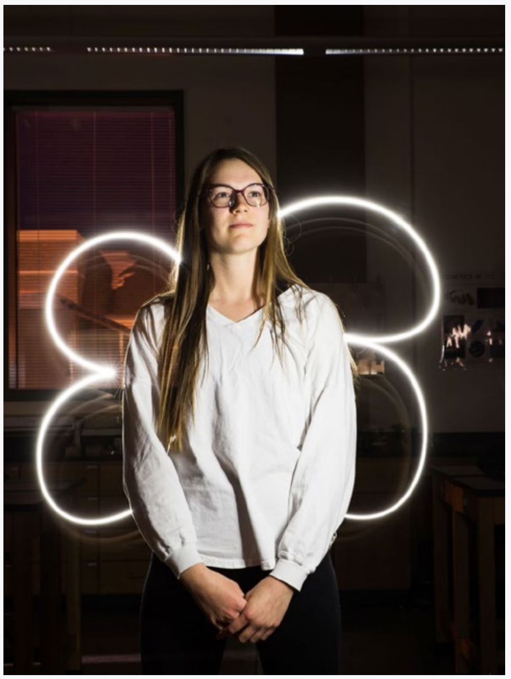
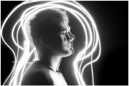
LIGHT PAINTING
There is no rule in photography that says that everything needs to be exposed at the same time. In a dark scene with your camera set to a long exposure you can do many things.
During a long exposure you can take a flashlight (or other light) and literally ‘paint in’ the lighting in a dark scene, moving the light across the area to expose certain parts of it.
Hold it on one part longer, it will be brighter.
You can also turn that light towards the camera, and make a drawing in the air, or do both things during one exposure.
Different lights have different qualities. LED lights sometimes flash on and off so quickly you don’t notice the flashing, but it they are moving, the camera will notice.
You can also do a lot with the color of lights, such as put colored pieces of plastic over them. With the light of a cellphone screen you can easily choose the color.
You are not limited to moving the lights. You can also move the camera to paint with light.
|
Ali Kilburg |
Austin MacTaggart |
Light painting steps:
1 Find a darkened room or go out at night.
2 Set your camera to manual mode.
3 Set your shutter speed to B or to a very long exposure like 30 seconds (if set to B you will have to have something to hold down the shutter button or a remote release).
4 Set your f-stop to whatever it needs to be (do some tests).
5 Set your focus to the approximate distance and turn off auto-focus.
6 Set your camera on a sturdy support, but for some you could move your camera during the exposure.
7 Take and retake as needed.
8 Experiment and have fun.
|
Tyler Jonsrud |
Gabrielle Celease Fox |
STEREO (3D)
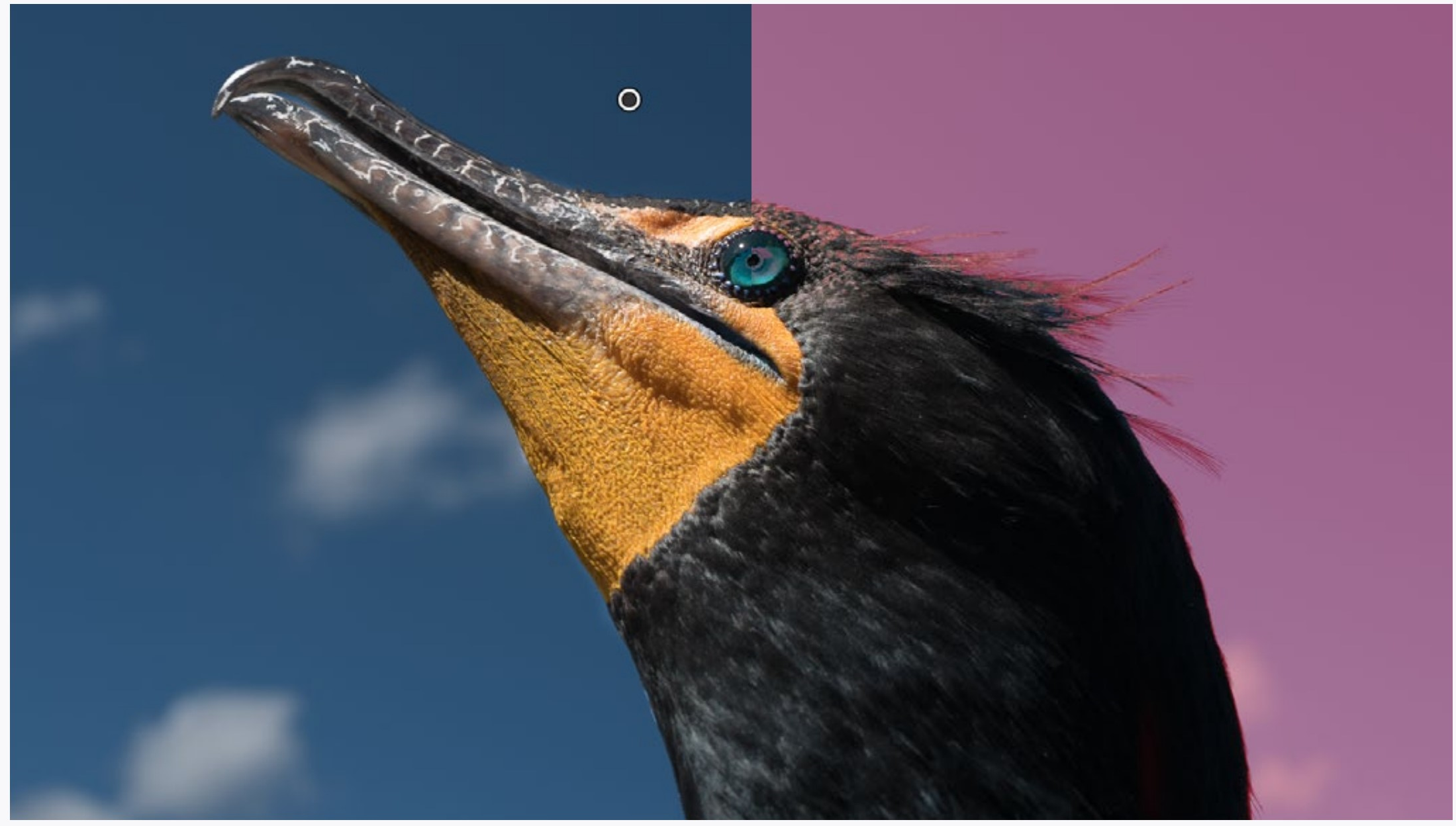
Cross-Eyed Stereo
At normal viewing distance, look at the pair
of dots in the middle illustration and slightly cross your eyes until you see three dots, then concentrate on the middle dot and bring it into focus.
If you can do this, try it the same way with the top pair of images (the woman sculpture). You should see depth.
To make your own cross-eyed stereograph, simply take two photographs pointed at the same subject, but for the second image rock
a bit to the right so the images are taken from a point about two and a half inches apart. You can move more for an exaggerated depth. Don’t worry about being too precise.
On the screen (or in a print), put the image taken on the right to the left of the other and use this viewing technique. Keep them small since the bigger they are the more the viewer’s eyes need to be crossed.
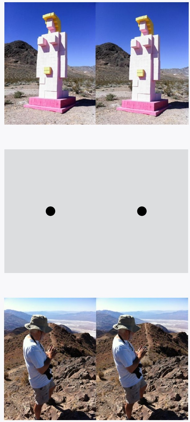
Pie-Eyed Stereo
More difficult to view is the pie-eyed technique. Now again look at the dots, but this time stare past the dots. While continuing to stare, move your eyes closer to the dots until they overlap into three dots.
Here is the tricky part—concentrate on the middle dot, then slowly move away from the dots until you can see the middle one in focus, while still seeing the other two dots on the sides in your peripheral vision.
If you can do this, you will be able to do the same with the bottom pair of images, and you can see depth in the image.
Of course, you can also make or buy viewers that can make this viewing easier.
To make a pie-eyed stereograph, take photographs as you did for the cross-eyed, but this time put the right image on the right and the left on the left. As big as the pair can be is about 4 inches across since a bigger pair would require the viewer’s eyes to splay out in different direction—an ability very few people have!
PHOTOSHOP TECHNIQUES
This section refers to Photoshop as the image editing application, but there are others that work just as well with the following techniques.
Photoshop is an incredibly deep application. The reason for this is that multiple techniques can be combined. For example, image blur is one technique. But you can also limit blur to just colors or tones. Or, you can combine a heavy blur with no blur so that you have a unique quality of blur. Or you can just blur parts of the image or vary the blur across the image. What you can do with just a blur runs into hundreds or thousands of variations. And each will look different with different images.
There are three ways of approaching this issue of the ‘bottomless’ nature of Photoshop.
|
LEFT Heidi Hanson RIGHT Hanna Cox |
The first is to know everything you can about Photoshop. This would be another book in itself, and it still would be incomplete.
The second approach is to find things on the web that step you through a technique. This works best if you can find something that approximates what you are after.
The third way is a combination of the first two. Find instructions for techniques on the web, but try to understand what is happening and why the steps of the instruction are there. Look up the techniques for certain techniques you don’t understand. Buy a book on Photoshop.
That last method will help you learn the things YOU need to know about the application, and that is about all you can do. If someone tells you they know everything about Photoshop, they are a liar (a cheat, a dirty scoundrel—but I digress).
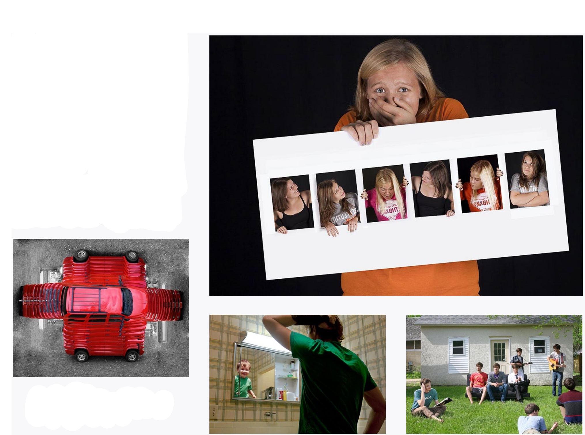
COMBINING IMAGES SIDE BY SIDE
There are many ways of combining multiple images in Photoshop. Often students’ biggest problem is actually figuring out exactly what they want to do before they start doing it.
A few pointers: Black or white is your friend. Transitions can be hidden with any color, but they are much easier with black or white.
Image sizing is actually very important, and you should figure it out. Otherwise it is easy to bloat file sizes into gigabytes by only combining a few images.
Consider using an application other than Photoshop for combining images. There can be much less of a learning curve because image sizing does not come into play as much. Illustration programs also allow you to combine type with your images without having to worry as much about typography’s additional resolution requirements.
If you are printing, consider wide format printing. Printers that take 24 inch to 44 inch paper are common, and you should be able to have a copy shop or photography studio make your image big. Prices vary widely.
|
TOP TO BOTTOM Ayako Shimizo Randi Westervelt Deidra Whipple |
COMBINING IMAGES INTO ONE
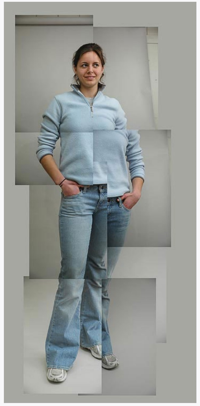
Like combining images side by side, there are many ways of combining images together into one image.
Again, the first thing to do is get a firm concept of what you want to do, then figure out how to get there. But be prepared to change your concept somewhat to fit your skill level.
Often you need to tailor how you shoot the images as the first step in combining them. Do several tests of your idea before shooting the entire project.
Some ways of combining images are very easy. In the bottom right image the same person is photographed multiple times in a scene, then the images were simply combined as layers in Photoshop and parts were erased.
|
CLOCKWISE FROM ABOVE Abby Shannon, Megan Howe, Luke Salzwedel, Trevor Finchcamp |
MULTIPLE IMAGE EFFECTS
Many special effects in Photoshop start with combinations of images. For instance, you can take a photograph of a textured surface, and then apply that texture to another image, either imparting it’s color, tonality, or both.
It is impossible to outline the infinite ways this can be done, but you can browse through Photoshop instructions on the web to get an idea of what is possible and how to do specific effects. For example, you can combine multiple images to get greater depth of field (focus stacking). Or ‘wrap’ images onto other images (image wrap or displacement map)
If you are going to be doing images with a lot of handwork, a pen tablet (often called a Wacom tablet because this brand is ubiquitous), is a critical piece of equipment. Some things work better with a mouse or track-pad, but drawing is not one of them.
|
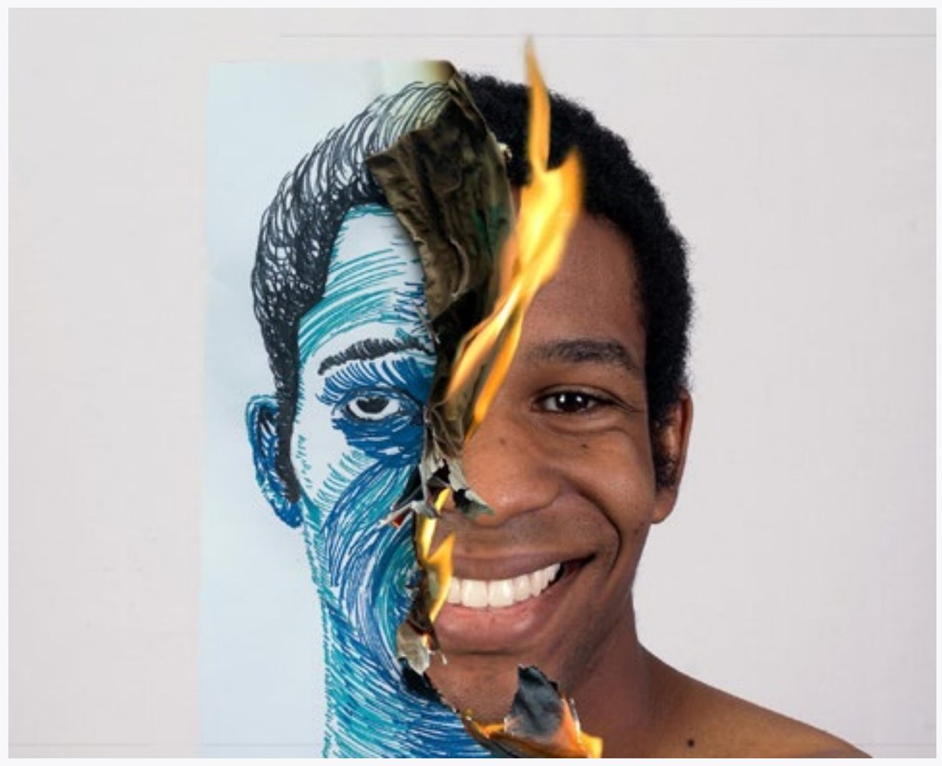
LEFT TO RIGHT Matt Ollendick Michael Benson (fire self portrait) Courtney Mehus Lauren Kahler |
PHOTOSHOP MISCELLANY
There is a plethora of information on the web covering a myriad of Photoshop techniques to do this, that, or just about anything. As noted before, Photoshop is very deep since most effects used in combination produce still more effects.
Some common effects are polar coordinates, which makes an image a small planet; and selective blur, which is used for everything from making something look miniature to making a false lack of depth of field.
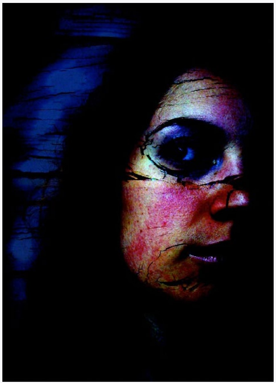
You can also colorize a black and white image or combine the original color of an image with a black and white version.
Just a tour through the Photoshop filter menu will present you with a multitude of ways to improve an image... or mess it up.
|
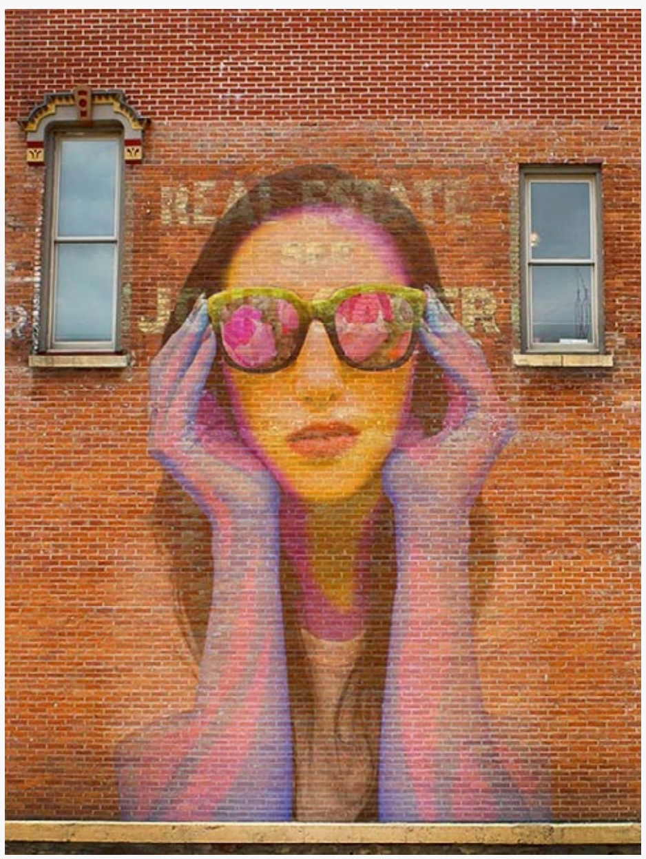
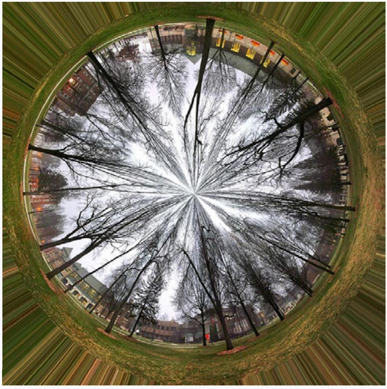
LEFT TO RIGHT Jessica Grant, polar coordinates Spencer Albers, selective blur Kendall Platt, filters etcetera Chrissy Schweiger, color and b&w |
COPYING FLAT MATERIAL
WITH A COPY STAND
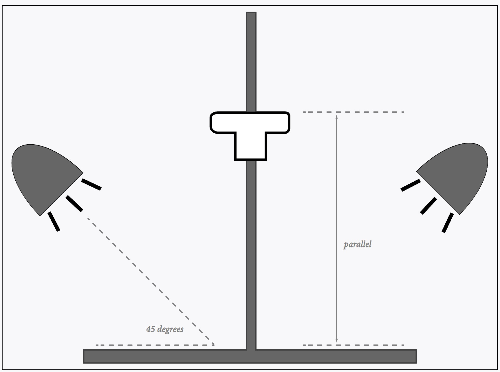
Using a copy stand is the easiest way to take photographs of artwork (or anything that is flat and less than about 16 by 20 inches).
Preparation
Attach the camera to the copy stand, making sure back of camera is parallel to artwork. If it is not, rectangular material will be rendered trapezoidal. You can use a level to be precise.
If lights are not placed at 45 degrees to material, adjust them, making sure lights are pointed to the center of artwork or a little beyond center. Set your camera to a zoom setting about midway between wide angle and telephoto. All zoom lenses bend straight lines, but the effect is almost always less at this setting. For more accuracy you could do tests to see where the exact setting for your zoom lens renders lines straight.
Setting exposure
Turn off any lights other than your copy stand lights. If you have exposure controls on your camera, set it to manual mode and the lowest ISO. Adjust aperture to f-8 (on many lenses f-8 is the sharpest aperture). With artwork in place, set the shutter speed as necessary to obtain good exposure: If your material is a neutral gray, then it should be neutral gray in the resulting image, if it is light, then it should be light, and dark should be dark. For more accuracy, take a test photograph of a white sheet of paper. Adjust your shutter speed so that the histogram for the resulting photograph shows the hills near (but not at) the right side of the scale.
However you arrive at your shutter speed, use the same speed for all of your photographs. In this way, dark material will show up appropriately dark and light material appropriately light.
Setting the white balance
If you have your camera set to save JPEGs, you need to adjust the white balance. One way to do this is to set it for 3200k, or indoor lighting (represented with a light bulb symbol). For more accuracy, set it manually using a white sheet of paper (see your camera instructions). For even more accuracy, take a photograph of a white sheet of paper at first using RAW format. Take the rest of your photographs using RAW format and set all to the same color balance (color temperature) as your white sheet in your image editor like Photoshop. Always use RAW image format for the best quality.
Focusing
Ideally, every time you move the camera height you would want to focus manually. In practice, this doesn’t work very well. Instead, use the automatic focus on your camera. If your camera has a hard time focusing on material, temporarily place something with detail on it (like a sheet of typing). Press the shutter button down half-way to lock the focus, then remove the sheet and take the photograph.
Taking the pictures
Even if your shutter speed is fairly short, there is always the possibility of moving the camera slightly when pushing the button to take your photographs. To avoid this use the self-timer so that the camera fires after you push the button. Many cameras have a 2 second delay for the self-timer which is made for this purpose.
It is also a good idea to turn off any image stabilization (or vibration reduction) if your camera has these settings. If your camera is on a sturdy support having this setting on might actually increase blur.
For even sharper images you could use a remote release. Some cameras even have a way to lock the mirror up before you take the photograph so that the movement of the mirror won’t jar the camera, although this is generally not needed unless you have a very flimsy copy stand.
Take and look
Take several shots, then view them on the computer. Enlarge them to see if there are any problems. If there are straight lines (like the edges of the artwork) are they straight? Is the artwork framed okay? Is your exposure good? Are your colors fairly accurate or is there a color cast? Is everything sharp? When you are sure everything is okay, take the rest of the photographs.
|
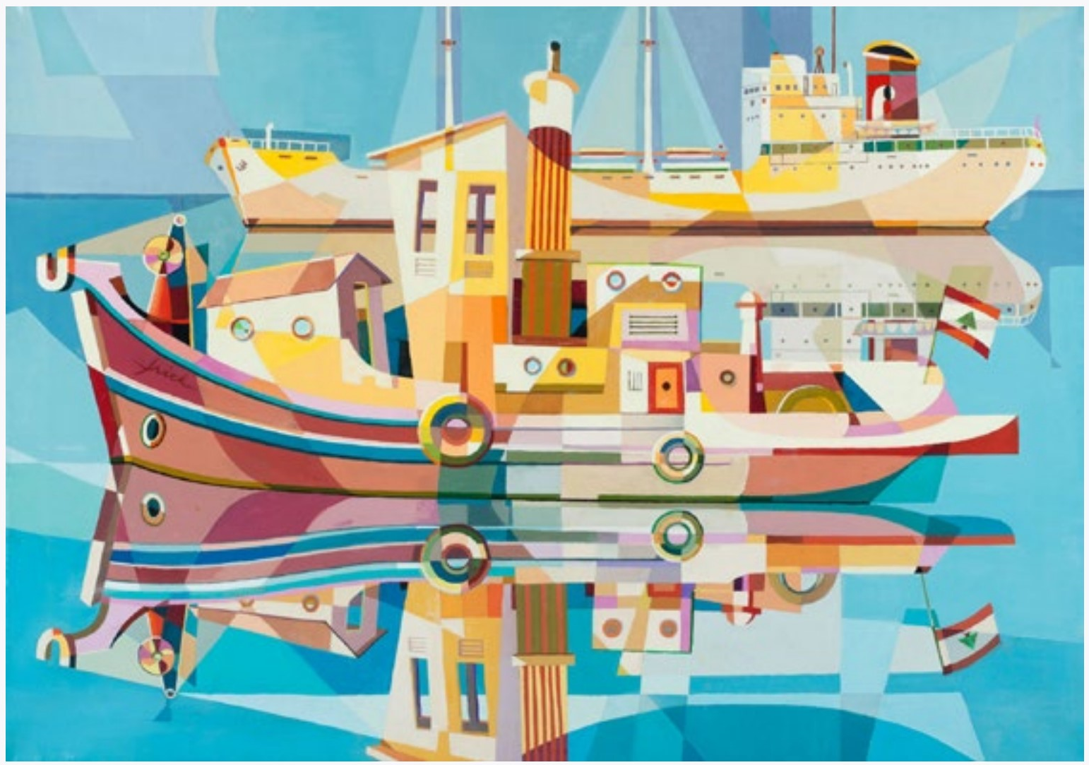
Painting of Beirut Harbor by Arthur Frick |
WITHOUT A COPY STAND
Sometimes you can’t use a copy stand because there isn’t one available or your artwork is too large to be evenly lit with the copy stand lights. In this case, you can use a tripod, two lights, and a pin-up wall to make your own very big horizontal copy stand.
The illustration of the copy stand is seen from the front. Instead, imagine it as a lighting set-up looking from above with the artwork pinned to a wall.
Place the camera so that the back is parallel to the artwork. This is a little more difficult than with a copy stand. One easy way to do it accurately is to have someone hold a mirror flat on the center of your artwork. When you can see your camera centered in the mirror you can be sure everything is parallel.
How far away the lights (at 45 degrees to the artwork) should be is also something you will need to figure out. If they are too close, the work will not be evenly lit. If they are too far away, you will have to use overly long exposures and you run more risk of reflections, especially if the artwork has glass covering it. Turn on and off each light to better see how each is illuminating the artwork. Watch for any areas which are brighter with each light (hot spots).
How you arrive at your exposure, color balance, and other settings is just like with using a copy stand.
WITHOUT ANYTHING
Sometimes you might not have the luxury of having any equipment other than a camera (you definitely need the camera).
You want as much light as you can get while staying away from direct sunlight (which would accentuate any texture or defects in the thing you are copying). Also try to find a place that is amply lit from the side. The image above is photographing on a porch. You can also use a wall to put the artwork on or just put it on the ground and point the camera down.
Setting exposure
Just use the Program (P) setting on your camera. The light may change, so you don’t want it on manual mode. Also, the program setting does a pretty good job of determining the optimum shutter speed and aperture combination. For artwork that is lighter in tone, set your EV adjustment to +1 or +2. If the artwork is darker, set it to EV -1 or -2. Experiment.
Setting the white balance
Set the white balance on the camera to daylight. You could also use the same white balance methods as for the copy stand, but if the sun goes behind a cloud your white balance will change.
Focusing
If your camera has a hard time finding a focus, then point it at another part of the artwork, hold the shutter half way down to lock the focus, then recenter and take the photograph.
Taking the pictures
If you are shooting with a tripod, a level can make sure the camera is level with the art. If you are hand-holding your camera you definitely want image stabilization (vibration reduction) turned on. Also try to hold your camera against something. Your forehead works well if you are using a DSLR. If you are using a smaller camera with a viewing screen, put the neck strap around your neck and pull against it to steady the camera. If there is something else like a chair handy to steady the camera, use it!
If your pictures turn out blurry, then you may want to also set your ISO to a higher setting. Set it only as high as you need to get sharp images.
Other considerations
The success of this method really depends a lot on the reflective qualities of the artwork you copying. Thick acrylic or oil paintings have gloss surfaces that depart in small areas from being parallel to the main surface. Glass presents daunting reflection problems. Pencil lines may disappear if graphite is reflecting light badly. And so on.
But, if you are careful and thoughtful, you can do very high quality copies of many types of things with nothing but a camera and your keen eye focused on what you are doing.
PROCESSING THE IMAGES
No matter what method of shooting you use, processing the images in the computer should be fairly straightforward. Count on the lighter tones compressing—in other words, it is difficult to come up with something which has the exact same tonality as the original.
Most image processing programs have provisions for correcting non-parallel lines that result when your camera is not perfectly parallel to the copied material. These corrections can be automatically applied to all of your images at once.
Also, if you are using manual exposure, you should be able to correct exposure and contrast to one image and then paste the same correction to all the images.
CELLPHONE CAMERAS
Cellphone cameras are handy, traveling along with you almost everywhere you go, and are incredibly easy to use in most situations. They also have features that your camera might not have, such as automatic HDR, very good low-light capabilities, panorama capabilities, location data applied to every image... the list goes on, and yearly it expands to include more features.
The disadvantages of a cellphone camera mainly stem from a very small sensor — about the width of a pea. Physics dictates the limitations of image quality here, but various software ‘tricks’ (such as combining multiple images) help to mitigate those disadvantages. So much so, in fact, that for small images on a screen the images can look just as good as those taken with a camera. Actually, in the hands of someone without photographing experience, they can even look quite a bit better.
|
An unadjusted cellphone image. If you would have stood in the same place with the same cellphone you would have gotten the same image. Assuming your lens was wiped clean. |
|
A night shot without a tripod. With a camera this scene would have necessitated a tripod, but with a cellphone camera, it was just a pull from the pocket, an aim, and a push the button. |
Cellphone Camera Software
Even before you take a photograph with a cellphone, little AI gremlins get to work on that image. How much light is there? What does the contrast of lighting look like? What does the histogram look like? Is that sky or a face? The gremlins make a lot of decisions based on these and other things, all in the hopes that you will look at the image they made and congratulate yourself on a photograph well-taken. They can even give you different versions of the photograph starting before the time you pushed the button.
Those gremlins are smart in a way, and many times the fruits of their labor will give you the image you want. At other times they can present you with flesh-tones that look like a quarter-inch of makeup, skies that are so blue they only exist at forty thousand feet. And detail that looks like someone smudged it all up with a paintbrush. And the worst thing is you have little or no control to improve that image to suit it to your taste.
This sounds like a criticism, but it is really not. I use the standard camera app on my camera-phone at least half the time I use my cellphone camera, if not more. It is, after all, EASY. You don’t have worry too much about the amount of light available or holding the camera steady. You get a pretty good shot no matter how distracted you are, and really, if I wanted an image I could control a lot I would be using a dedicated camera.
But there are times when it would be nice to have some control over a cellphone image, and for that you need another application. Adobe Lightroom includes a camera function, and there are others that are quite inexpensive. At the time of this writing one of the best of these is Halide. With Halide installed on your phone, you can have better control while shooting since it is easier to selectively focus and change your exposure. But best of all, you have more control with your processing, since you can set it to shoot RAW images (in DNG format) in which the tones can be stretched and pulled when you edit the image. You can’t control tonality to the extent that you can with a dedicated camera image, but you are not stuck with the tonality the gremlins dictated when you took the image.
|
The photograph on the left is a small detail of an image taken using the Apple camera application. The image on the right was taken with an application which produced a RAW image (the exposure and contrast were adjusted). Regardless of which one you ‘like better’ the left image illustrates a bit about how the gremlins work on an image to mask imperfections by smoothing fine detail and enhancing edges. |
|
The painterly look of the camera’s software is clearly evident in this detail. |
Lens & Aperture
Because cellphone cameras must be thin, they cannot use an optical zoom lens. The digital zoom that is available just takes part of the image on the sensor, so the marginal quality of the image just gets worse. I am sure you have experienced this.
The best solution to this problem is to have multiple lenses on an cellphone camera. Actually this is multiple cameras, since each lens needs its own sensor. By combining these cameras, the software can mimic a zoom lens or do other tricks, such as forming a ‘depth map’ that can be used to different parts of the image blurry, (badly) simulating a large aperture.
This is useful since the aperture of cellphone cameras is not adjustable, and even if it was, would not be able to render depth of field: The actual focal length of the lens is simply too small to significantly put the background out of focus with photographs taken at normal distances.
Image Format
The applications that come with cellphone cameras give you photographs in either of two different formats. JPEG should be familiar to you, and it allows for small file sizes and compatibility with other software and devices.
HEIC format is also used. This format is much more flexible than JPEG, and allows multiple images to be stored in the same file package. So, multiple images or depth maps can be stored in the same place, allowing for later adjustments. Since this file is not compatible with many other applications, when you send an image or transfer it to another application it is often converted to another format and any additional images (or depth maps) are stripped from the HEIC file. For example, if you send someone a still image, that image will be sent as a JPEG. Or, if you send a small HEIC file animation made with an Apple cellphone, the file will be converted to a GIF file, an animation format that any device can decode.
RAW format does not need much explanation here. It is the same as other camera RAW formats, except you should not expect the wealth of information that RAW format can provide in cameras. You can still easily change the white balance, but exposure changes and color information will be more limited since the small sensor is not able to capture it in the first place.
The Future of Cellphones
The fact that cellphone cameras do as well as they do in ease of use and quality is a surprise to me. In other words, I don’t know what the future of cellphone cameras hold.
Physics limit the image quality at this point, but there are many experiments attempting to work around these limitations. For instance, one newer cellphone fits the length of a telephoto zoom lens into a thin phone by using a mirror to change the direction of the lens to align with the side of the phone. Another solution is adding a larger sensor to the wide angle lens, since that lens requires less distance from the lens to the sensor.
Perhaps more computing power will add to cellphone quality, or perhaps just more lenses. An array of lenses (with sensors) could theoretically enhance image quality, and other experiments, such as attaching a larger sensor/lens combination external to the phone might prove fruitful. Or might not.
Or, it might be that the technology that is already out there just gets more fine-tuned. Is there really a market for better quality cellphone images when at this point they are good enough for more people to post on Facebook and Instagram? Stay tuned.
1LR ADOBE LIGHTROOM
SET UP LIGHTROOM
Before you even open Lightroom, connect the camera’s SD card to the computer. Also connect the hard drive or flash drive where you will keep your images and catalogue—you may want to make a folder on this drive called Images.
Now open Lightroom and go to File/New Catalog... in the menu at the top of the screen. Name your catalogue and save it your external drive (hard drive or flash drive).
As the application directs you, click the Import... button to show the Import window. On the upper left select your camera’s SD card as the source (where your images will be coming from).
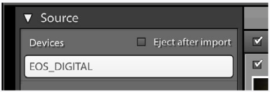
At the lower right of the Import window select your drive as the destination (where your images will be copied to).
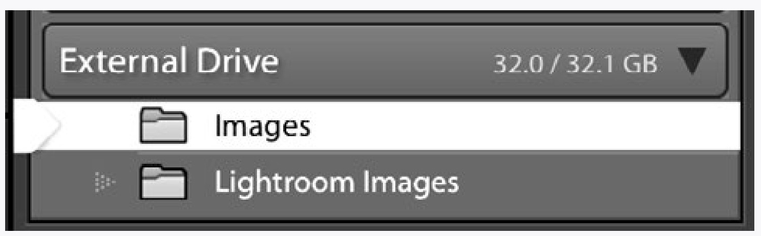
In the illustration above I had previously made a folder called Images to put the photographs in. Do not put them in the folder that is titled with your catalogue name—this is a folder Lightroom made when you saved your catalogue (here named Lightroom Images).
Study the options you have when importing images. Most of these are on the right hand side of the Import window. Many of the options you might need now are self-explanatory.
In the File Handling category (panel) there is an important option to not import duplicates.
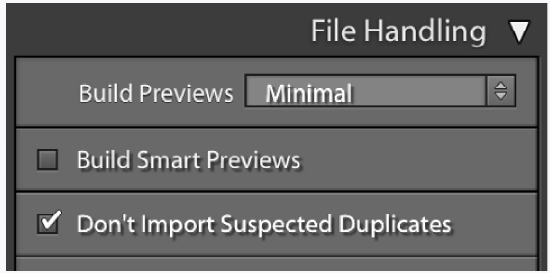
You should choose this if it is not checked. Lightroom does not delete images from your camera’s SD card after you import them. Instead it assumes you will leave them on the card as a back-up, which is a very good idea. The next time you import images, it will overlook the images you have already imported with this option activated, only retrieving the newer images you have taken.
If you run out of room on your SD card, you can buy a new card or delete the images manually outside of the application (see below).
Speaking of backups, Lightroom will at some point ask you if you would like to back up your catalogue. Importantly, doing this will not back up your images, but only the information (such as organizing) you have added in Lightroom.
Since you are just starting out, you probably don’t need to back up the catalogue since you could easily rebuild it by making a new catalogue and re-importing the images.
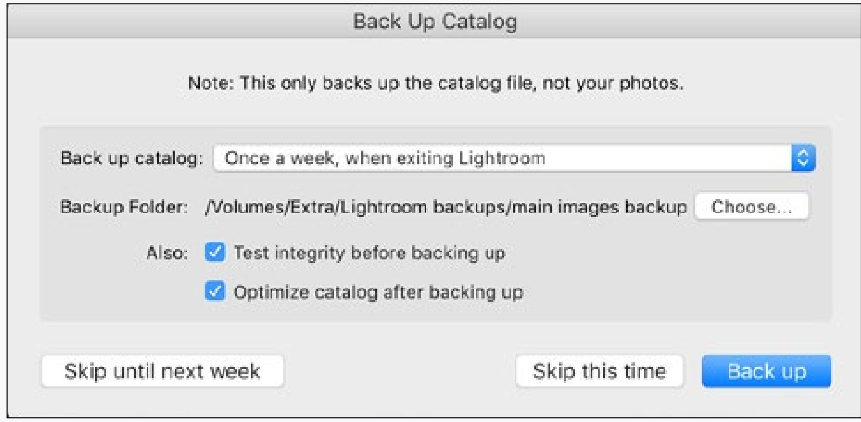
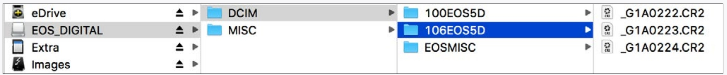
One last thing to do is make sure your camera’s SD card has been ejected from the computer before you remove it. This can be done automatically from Lightroom (next to source option) or from outside the application. Not ejecting your card will hide forever any files you may have deleted (and subtract that file space from your card).
|
Your camera stores images in folders on the SD card. Folders and files can be deleted the same way as other files on the computer. |
1LR LIGHTROOM DEVELOP MODULE
Adobe Lightroom doesn’t actually change your images, but instead adds instructions to your original images as to how they should be changed whenever they are viewed or exported. It does this by adding instructions to either the application, the image itself or more commonly in a separate file called a sidecar file.
What this means is that Lightroom doesn’t actually change an image until you export it—if you make wrong edits or completely mess up an image, you can always go back to the original, just as it came out of the camera.
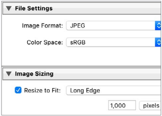
Since your adjusted RAW images cannot be opened in most applications, you might want to make a copy of the image to send to someone (or place into another program or whatever). In the Library module (see previous page) go to Export... (bottom left of the window) set the destination, give the file a name, and probably set the file format to JPEG with the color space set to sRGB. If you are emailing the image you can set the size as 1,000 pixels for the long edge.
BASICS OF DEVELOP MODULE
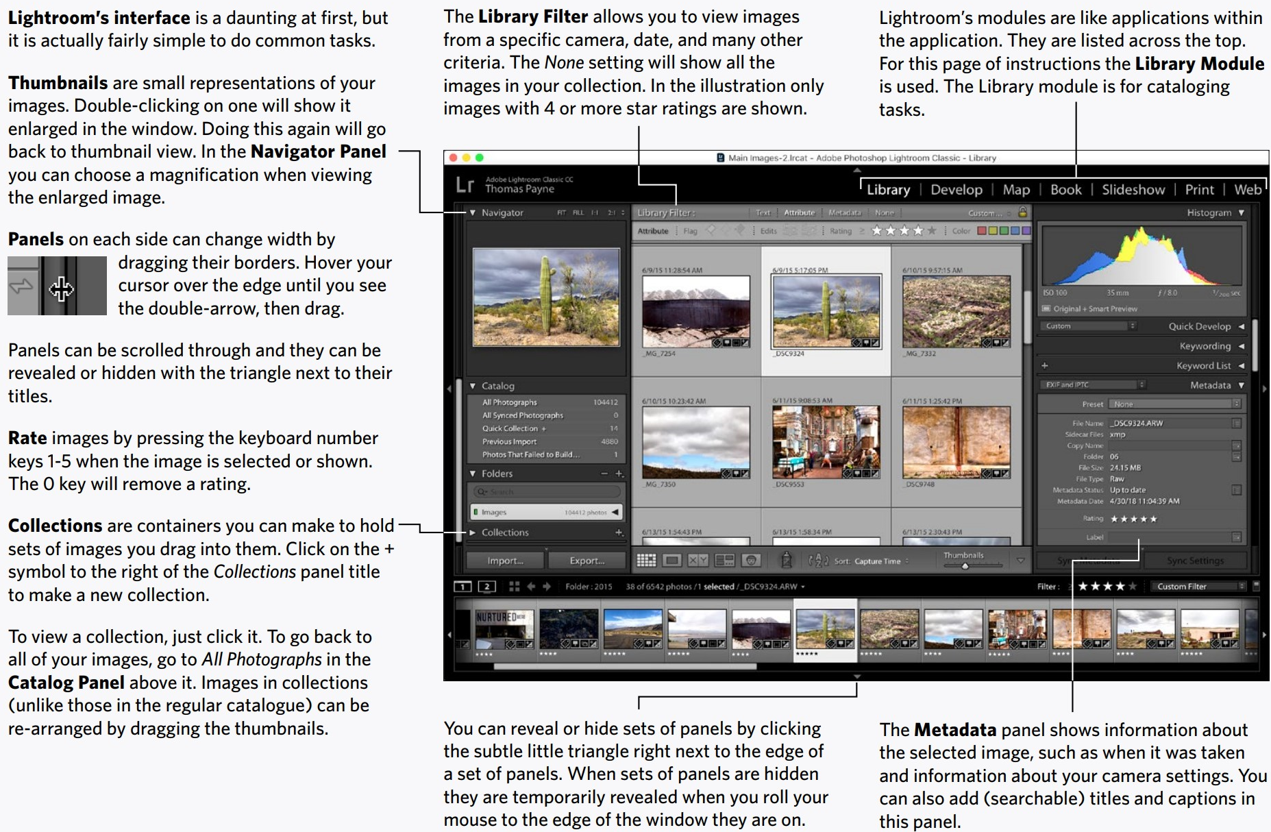
Change Lightroom from the Library to the Develop module on the upper right. If you cannot see the Basic Panel as shown you can scroll the panels up and down.
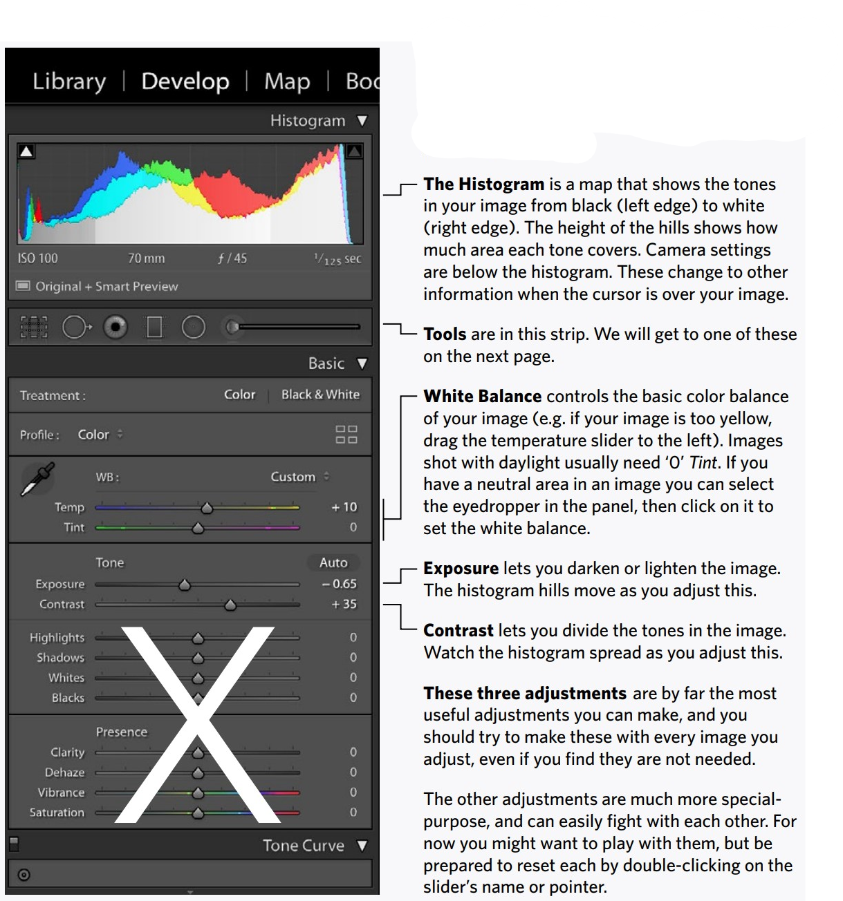
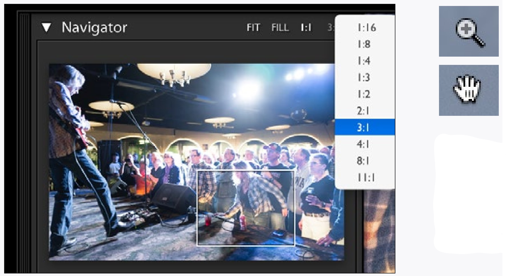
These two views can be set to specific magnifications in the Navigator Panel. With an enlarged view you can also move the image around by dragging the box overlaying the Navigator panel’s image.
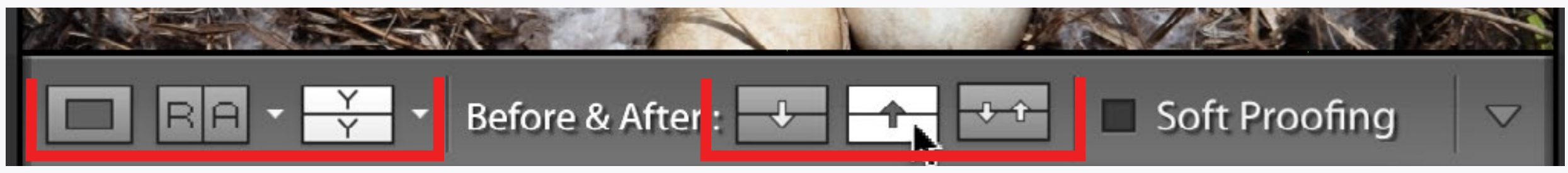
Below the image in the Develop module are the view controls. The first icon on the left will present the selected image (Loupe View). The second icon takes you to Reference View where you can select two different thumbnails to compare different images. The third icon allows you to compare the same image Before & After adjustments.
The small triangles next to the last two icons activate pull-down menus to choose the type of arranged views you want.
The three icons on the right allow you to switch adjusted and non-adjusted views. Essentially these allow you to undo adjustments or confirm adjustments in preparation for more adjustments.
Experiment with these buttons and get used to using them. Adjusting photographs is more than just sliding a bunch of sliders. Also, for explanations of the buttons, just rest your cursor over them for pop-up explanations.
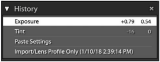
You may have to scroll down in the left set of panels to see the History Panel. This panel allows you to select any previous adjusted state of the image, even long after you have made the adjustments.
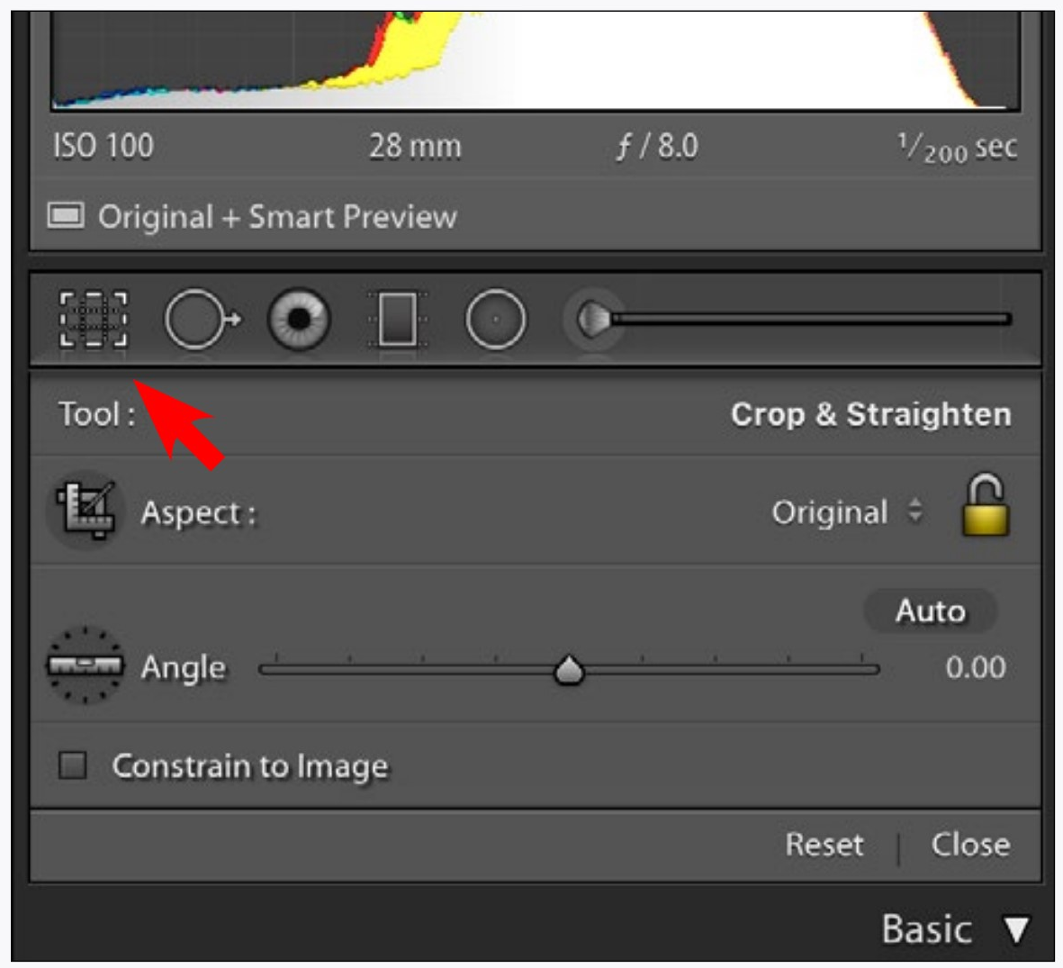
The Crop Tool (red arrow) is in the set of tools in the right set of panels. As with all of the tools, clicking on it will reveal options for the tool which appears below it. Clicking the tool again will confirm or cancel the tool and close the options panel.
Crop an image by dragging on the image itself. You can always reset the crop or constrain it to different proportions by using the options in the tool’s panel.
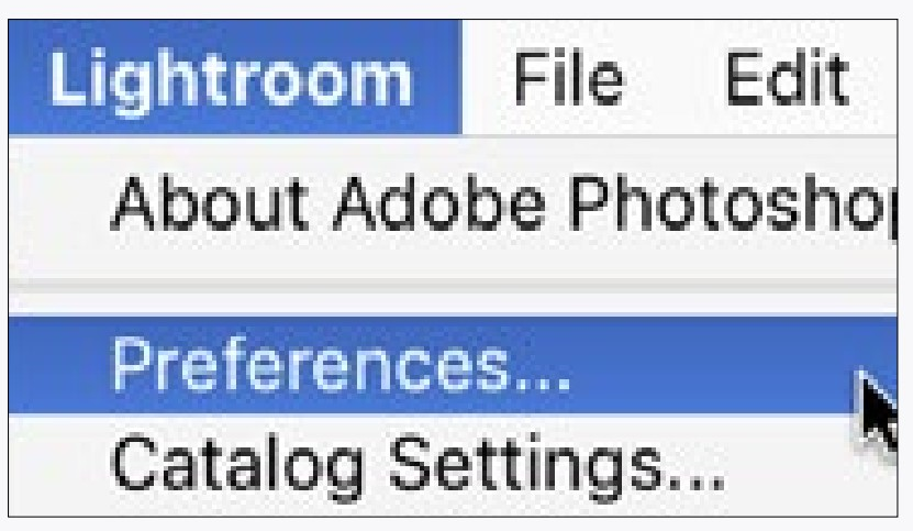
The preferences for Lightroom are in the Lightroom menu. Take a quick gander at these, but don’t change anything you don’t understand.
Each catalogue also has its own settings in the Catalog Settings directly below the preferences menu item.
1LR USING THE CONTROLS
You may notice that there are some controls that are not covered here, such as that little Auto button next to the exposure and contrast sliders. I bet you can figure many of these out yourself, and they may even be useful sometimes.
Keep the instructions on the previous pages at your side while you import, organize, and adjust your images in Lightroom.
Drag the sets of panels to resize them in Lightroom. Sometimes you might want the adjustments panels on the right to be small for a big image, other times you might want them big for easier adjustments. You also may want to hide the filmstrip at the bottom of the window by clicking that little triangle right near the edge of the screen. Try it.
Rate your best images, then view only those in the Library module using the controls at the top of the thumbnail views. Make a collection and put some of your images into it.
Adjust the white balance, exposure, and contrast with different images. Although not all images will need adjusting, you should get very familiar with what the changes look like.
Go ahead and try other image adjustments as well, but be aware that the other adjustments can easily work against each other and most images just need the first three adjustments.
COMPARE, DANG IT
It always amazes me how students will make changes to an image and then compare these changes to an image they only hold in their memories from before the changes were made. This only works for extreme adjustments, and is not good for eking out the best in an image.
Instead of comparing changes you have made to an image in your memory, use the before/after buttons. Sure, these are a little difficult to get the hang of, but they are important.
The following are questions you should ask yourself about this section of Lightroom instructions.
CAN YOU...
Import images using Lightroom and know where those images are being stored?
View and organize a set of images in Lightroom?Scroll through panels and resize sets of panels?Make a collection and put images into it?
Sort your best images by dragging them in a collection?
Find information about your images, including the time and date they were taken?
Export a sized JPEG image from Lightroom?Adjust the white balance of images?
Adjust the exposure and contrast of an image?Easily reset an adjustment slider to 0.
Zoom in or out of an image to see details or entire image?
Look at different areas of an enlarged image?
Set the white balance using the eyedropper when a neutral area is available?
Crop images?
Use comparison views to see changes clearly?
Use comparison views to move adjusted images back and forth or reset them?
2LR MULTIPLE EDITS
Here are two things that don’t necessarily have much to do with the operation of Lightroom, but are necessary to control your images.
Set Lightroom Background to White
If you hold the control key and click and hold on the border of your image (you may need to reduce the magnification of your view to see the border), you will have the option to make the background white.
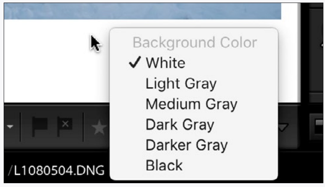
This is a good idea if you are going to print your image or otherwise show it on a white background in an email or on the web.
Adjust Your Display Brightness
Different computer displays have different brightnesses, and even the same display appears at different brightnesses relative to the level
of room light. This is a problem, since you can correct an image to be just perfect, but change the room light or the display and the result is not perfect.
The easiest method to adjust display brightness is to hold a piece of white paper to the side of the display and adjust the brightness of a white area on the display to match (or make a bit brighter) than the paper.
2LR PRINTING
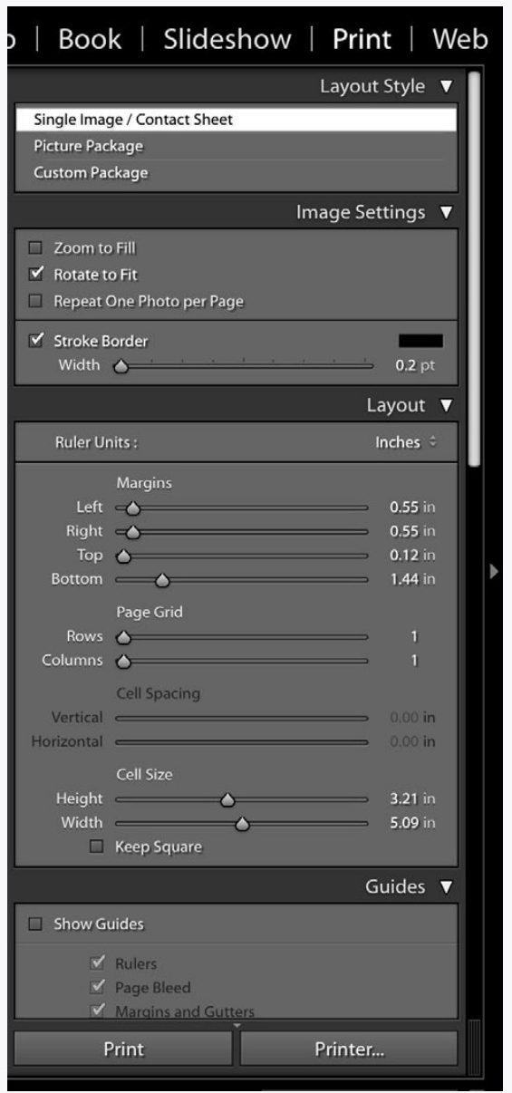
To print from Lightroom, go to the Print Module at the top of the window. Most of the controls here are pretty self-explanatory (don’t forget to scroll to see all of them), and you get a preview of how your image will appear on the paper in the main window.
One thing that might seem odd is that there is no provision here for changing your paper size. This must be done by going File > Page SetUp... in the menus at the top of the screen.
As you change the Margin Options (borders of the print) in Lightroom you might notice that the numbers don’t quite correspond to your actual margins. One reason for this is that your image always remains in proportion. The other reason is that your printer may not be able to print as close to the margin as you have your numbers set to.
There are also options for printing multiple images on one sheet of paper. To do this, select multiple images and adjust the options in
the Layout panel until the preview shows the arrangement you would like.
The first time you print, choose the Printer... button at the bottom of the panels. Here is where you set up your printer. After you print using this button, for subsequent prints you can just click the Print button. The settings will remain as they were for the first print and the image will be sent to the printer.
Other Modules
Choosing modules in Lightroom is like changing applications, but as you have probably noticed, some things carry over from one module to the next, such as images that are selected and collections you are viewing.
You might not need these other modules, but if you are curious, here is what they do:
The Web Module is like printing, but instead of prints it generates web pages. The designs (templates) here are fairly long in the tooth, but who knows, you might find them useful.
The Book Module generates PDF books of images. Some book printers, such as Blurb, also make plug-ins that allow you to generate a book and send it to them for printing.
The Slideshow Module allows you to make slideshows for viewing with Lightroom.
The Map Module shows you where you took your images if they have GPS information embedded. Your camera phone probably embeds this information, but your dedicated camera probably does not.
You can also record location information on images by dragging their thumbnails onto the map. Selecting multiple images locates that set in one place.
Remember that all of these instructions are just to get you started, which in most ways is the hardest part. More information about specific parts of Lightroom are easily found elsewhere.
2LR USING THE CONTROLS
FIRST THINGS FIRST
Think about this for a second: Say you have a photograph that you are viewing on a dark Lightroom background. How are you going to know how light the lighter areas are? They may look very bright, but is that because your monitor is set to a high brightness? You can’t tell. I know that because I can’t either.
Set your background to white. Yes, I know it doesn’t look as cool, but for any photographs that are going to be printed or shown on a lighter background, it is the easiest way to judge the tones in an image.
But what about the darker tones? Yes, you can tell how dark the darker tones are better with the background set to black. But for a variety of reasons this is less of a problem unless the final viewing situation is on a black background.
Adjust your display brightness or you may have an embarrassingly bad image when you show someone the photograph you adjusted on a display that was set too bright.
MULTIPLE IMAGE ADJUSTMENTS
Try selecting a few images in Lightroom, then go through the steps of adjusting one then applying that adjustment to others.
REVIEW
Now is a good time to go back to the previous chapter (1lr) and review the things there while you are sitting at the computer. These are important basic techniques that we will be building on later.
|
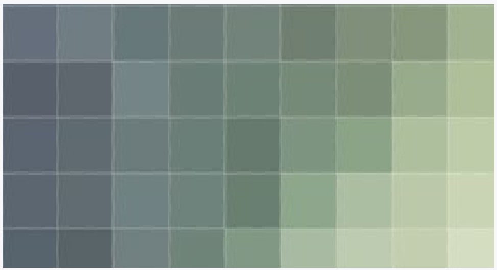
Even with all the white on this page, it is difficult to tell how dark that little square is when it is on a dark background. It is much easier to see when the same square is on a white background. By the way, did you notice that all of the pages of this book are not actually white? Probably not, since in most PDF viewers there is nothing which to compare (key) the white. |

DID YOU...
Set your Lightroom background to white and adjust the brightness of your display?
Notice how I repeat some things a lot?
CAN YOU...
Make an adjustment to one image, then apply that adjustment to other images?
Print an image?
Still do everything covered in the previous Lightroom instructions (1lr)?
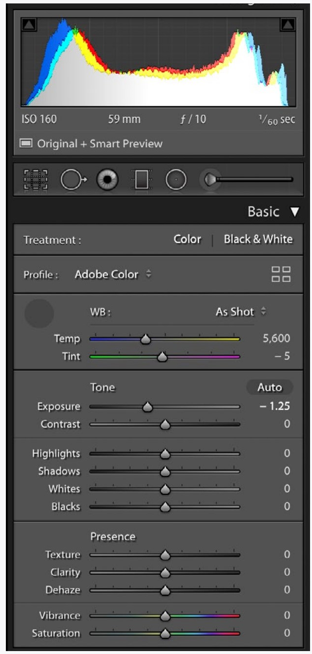
3LR HISTOGRAM
Every digital photograph is made up small squares called pixels (a shortening of picture elements). You don’t normally see these because they are too small in most viewing situations. Each of these pixels is only one color. When there are enough of them (they are small enough) your eyes see these not as squares, but as continuous tone and color.
When editing photographs individual pixels don’t matter too much, but how the pixels work together does matter.
The histogram is a map that shows the pixels working together. The number of pixels of a certain tone give the hills height, and the tone of the pixels give it width, with the darker pixels on the left and lighter on the right. It is an essential tool that shows us another perspective and can illuminate problems with images.
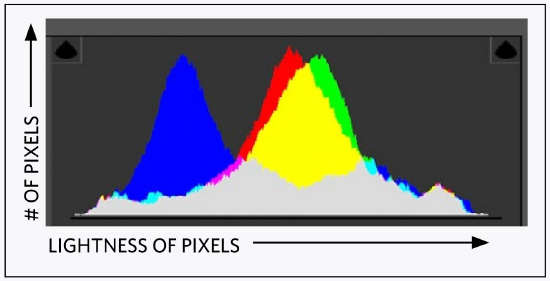
The Lightroom histogram shows the levels of each of the three primary colors of the pixels.
Proof of how important histograms are is the fact that you see them in any image editing application, and even as a display option on your camera.
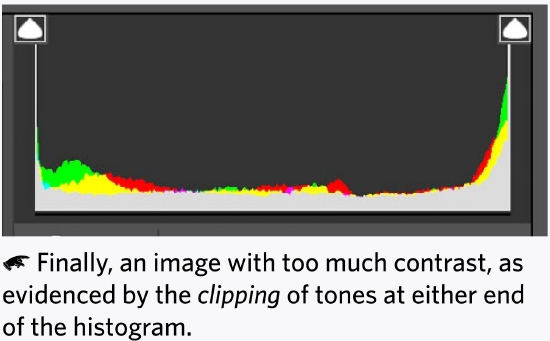
Good photographs can be very dark, very light, or have a lot of clipping. But the histogram helps you to be intentional about what you are doing.
3LR TONAL ADJUSTMENTS
Before adjusting the following options in Lightroom, first adjust White Balance, Exposure, and Contrast.
Here is when you adjust the others:
Highlights
These are the lighter tones (or colors) in an image. After you adjust the brightness and contrast, sometimes you will find that the lighter areas in the image are too light and so without detail. Bringing down the highlights will correct for this.
Shadows
These are the darker tones (or colors) in an image. If they are too dark without detail, you can lighten them to correct for this.
Less often with both highlights and shadows, you may need to adjust the other way. Such as if the highlights are too dark or the shadows too light.
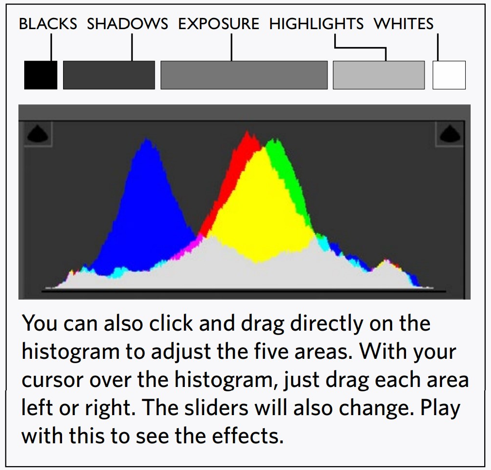
Whites
These are the very light areas of the image. Be careful adjusting these since all of the spark of an image can be dulled with too low a setting and all detail lost with too high of a setting.
Blacks
The very darkest tones. Making them too light will render the darkest areas gray and muddy, so be careful with this adjustment also.
Texture
The edges of small repeating details are sharpened to enhance the impression of texture.
Clarity
Clarity is like contrast, but works at a more detailed level. As with all the adjustments, try the extremes to see what they do.
Vibrance
Vibrance is like saturation, but protects skin tones and already saturated colors from getting too saturated.
Saturation
Saturation is how intense the colors appear. With no saturation you have a black and white image, and with a lot of saturation the colors ‘pop’ unnaturally. This is a common control, and since contrast also effects saturation, it is often needed when you make a contrast change.
Saturation, along with exposure, contrast, and white balance work linearly on the image, while the other adjustments use a bit more ‘intelligence’, which can lead to a very artificial look when used without discretion.
|
(Dehaze is not a commonly used adjustment) |
3LR USING THE CONTROLS
HISTOGRAM
You may notice that histograms on cameras are dealt with in Chapter 6 of this text. The histograms in Lightroom are basically the same, but they are more immediately useful when editing images. That is why they are introduced here first.
Get used to looking at histograms as you adjust images. They help you see what is happening to the tones of an image, and so are very important. As you get better at the controls they will become even more helpful... but only if you know how to use them.
TONAL ADJUSTMENTS
Most students tend to drag the more advanced controls discussed here wily-nilly in strange ways. Be intentional!
|
Lightroom comparison view showing difference of only shadows adjustment |
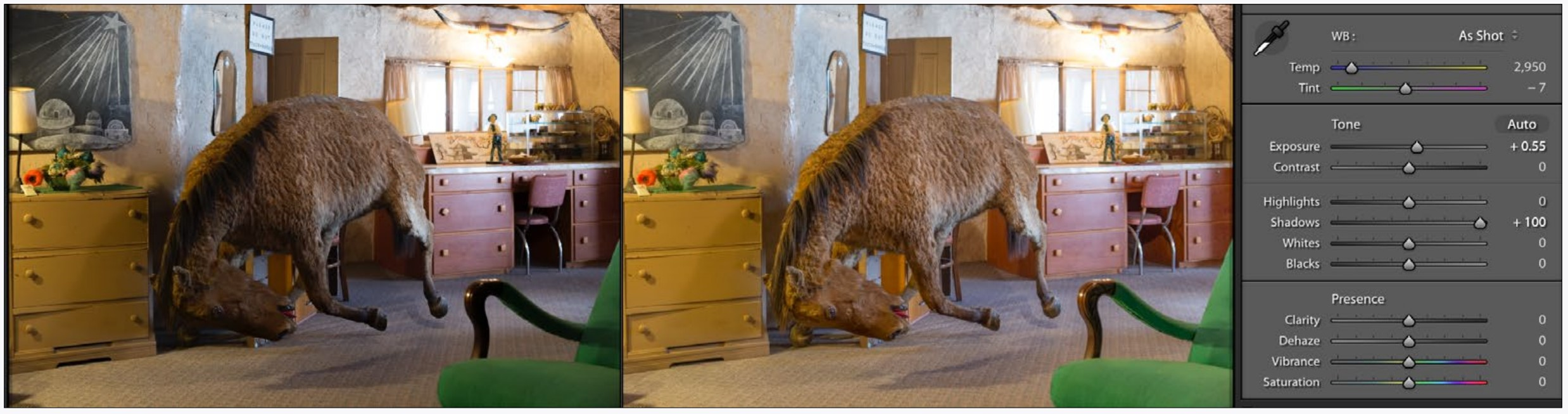
In other words, do the basic exposure and contrast adjustments first, then invoke the others only as you need to. So, if you adjust the exposure and contrast, then find you need the shadows to be lighter, only then use the shadows slider (see example of this below). Adjust the same way for the other controls.
This is a good time for you to review how to compare images side by side (1lr) so you can see exactly what is happening when you make an adjustment. Just make one adjustment at a time (then reset it) to see what each slider does.
All of this takes practice. I wish I could tell you how to use any control in Lightroom and suddenly you would know how and when to use it, but it doesn’t work that way. Practice is the only way to learn these controls. This book only gets you started.
CAN YOU...
Understand the basics of what a histogram is showing about your image?
Predict the contrast and exposure needs of an image just from the histogram?
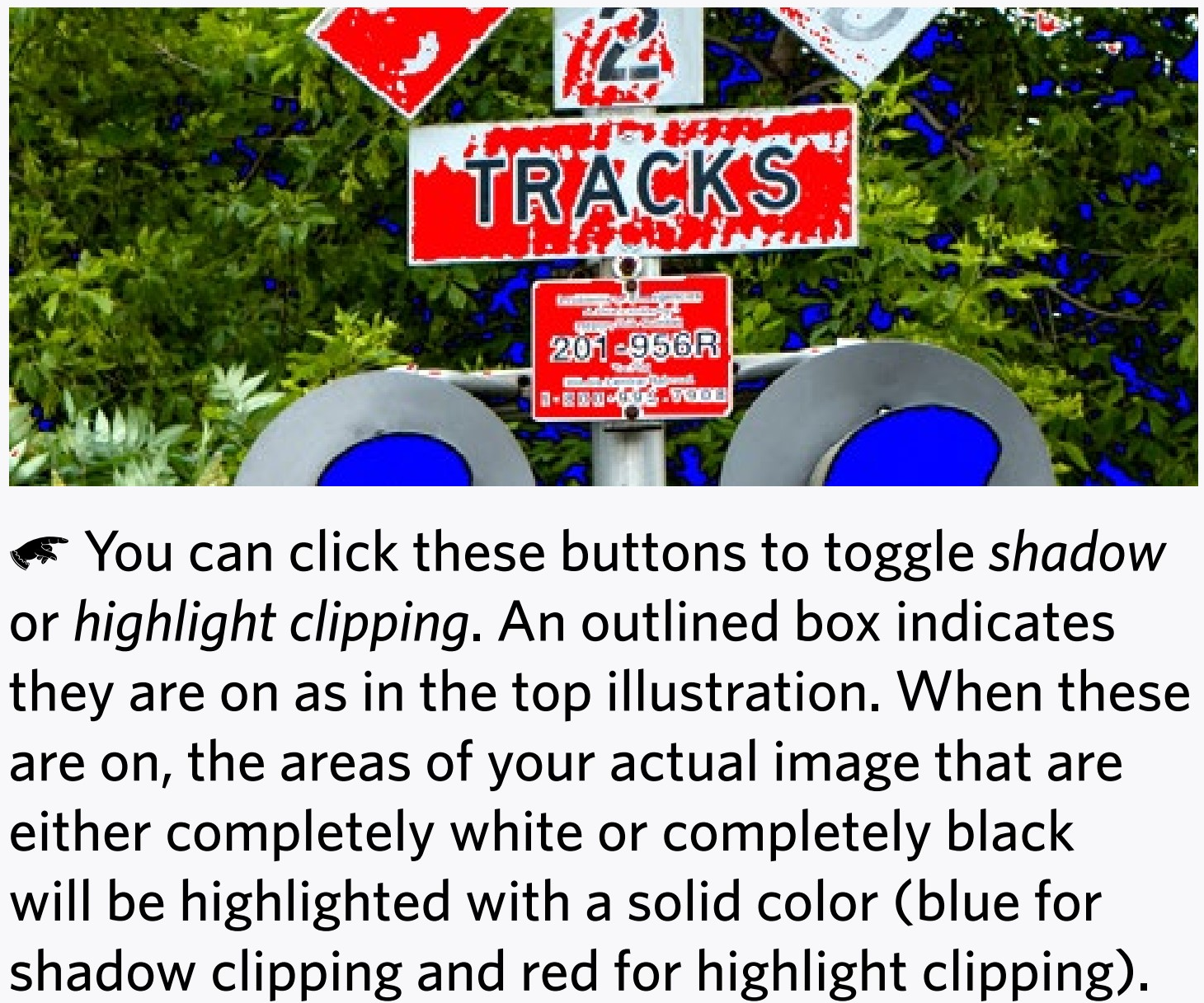
Turn on and off the clipping buttons to see the tones outside areas of an image?
Understand the function of all the sliders in the basic tab of Lightroom?
Identify and change the sliders by dragging directly on the histogram?
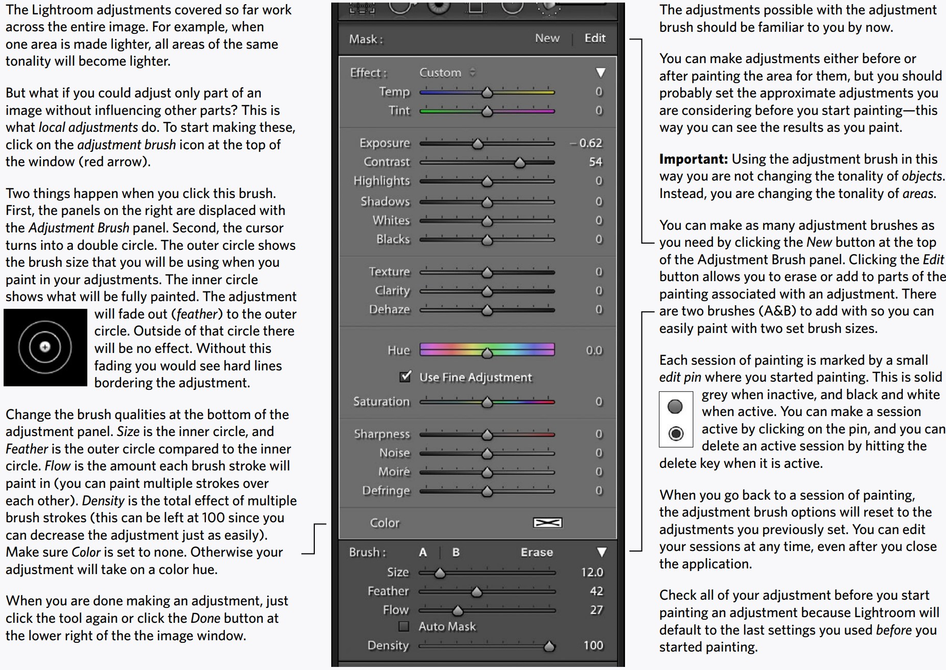
4LR LOCAL ADJUSTMENTS
|
Trevor Finchcamp, before local adjustments |
Trevor Finchcamp, after local adjustments to darken the top area of the image and lighten and increase contrast on bottom |
|
Original image |
Background area was lightened and foreground area darkened. The sculpture on the left was lightened more by using auto mask (next page). |
4LR MASKS
A Mask in Lightroom is simply a selected area. When you are painting in adjustments, you can turn on the mask right below the image.

This will allow you to see the areas you are painting with a color overlay. Showing the mask is simply a viewing aid —it will not change the image.
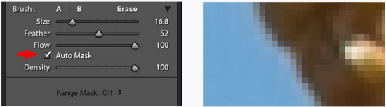
Auto Mask
Much different than this mask is the Auto Mask. When turned on (red arrow below), the adjustments brush will attempt to find boundaries in the image and constrain the painting to within those boundaries. This is the way you use the adjustments brush to adjust things instead of areas in the image.
Often when using auto mask you should first paint along the edges of the thing you want adjusted, then turn off Auto Mask to paint in the rest of the thing to be selected for adjustment.
Painting and erasing (also using auto mask) at enlarged views is a way to refine the edge, and you may have to repeat this several times to get the right masking edge.
Auto mask does have its limits. Edges in images are not clear cut, and often include transition pixels that are neither the color of the object nor of the background.
In general, do not expect to make radical adjustments using auto mask to define things.
The image above shows the red mask defining areas painted while using Auto Mask on the right and a darkened sky on the left. While auto mask does a good job in large areas with definite borders (the beak), it has a very difficult job selecting smaller areas and areas with less defined edges (like the small feathers on the top of the bird’s head).
Hard edges are actually composed of transition pixels (below right) which can cause problems with extreme adjustments when using the auto mask.
4LR USING THE CONTROLS
LOCAL ADJUSTMENTS
Being able to adjust only parts of an image is a powerful technique, but one that takes a lot of practice. You might as well get started now.
Pick some images that might need an adjustment in areas that is different from the overall adjustments, and see what you can do. Make things lighter, darker, and maybe increase the contrast. Try changing the color of an area using the white balance tools at the top of the adjustment brush panel. Try to instead change the color using the Hue slider.
Perhaps find some images that don’t need obvious adjustments. Can you improve the image using them? In general, lighter areas draw the viewer’s eye and darker areas recede. Can you use this fact to control the way the viewer sees elements in the image?
Experiment. As always, view your changes side by side with the unchanged version to compare them.
AUTO MASK
Use auto mask to limit your local adjustments to just one thing in the image, such as the sky, or perhaps a person’s face which is too dark in relation to the rest of the image.
Get the hang of how accurate auto mask can be by enlarging the adjusted image to 1:1 (100%) to view it. In general the heavier the adjustment the more accurate auto mask needs to be.
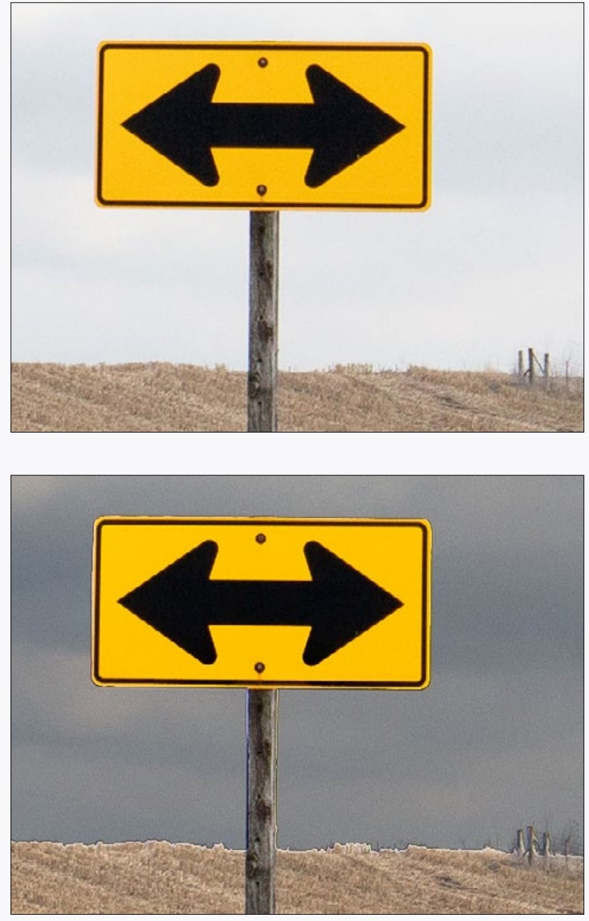
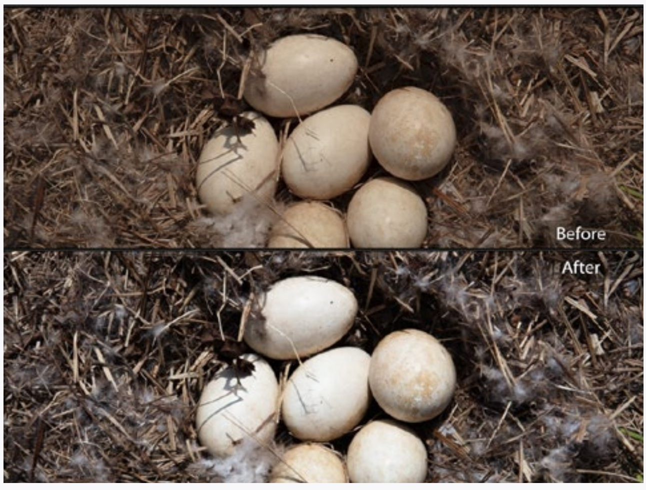
Small section of a photograph before and after the sky was darkened with the adjustment brush using auto mask. The transition line along the horizon is very obvious on the adjusted image. Auto mask does have limitations, especially with the heavy adjustment seen here.
Two options to hide this limitation would be to make the adjustment not as extreme or make the photograph (and therefore the imperfections) smaller—as shown at right.
CAN YOU...
Effectively change only parts of an image?
Make your local adjustments seem natural?Erase and add to portions of your adjustments?Use appropriate brush sizes and feathers?
Use flow to control the strength of the adjustments within an adjustment area?
Make multiple adjustments and then go back and edit each one individually?
View your adjustment areas using a mask?
Use auto mask to limit adjustments to objects (tonal edges)?
Use auto mask to paint edges, then fill in areas to be selected with auto mask off?

5LR CURVES
The Tone Curve
Curves are another way of adjusting tonality in an image. There are two modes in the Tone Curve panel. For the tone curve mode, make sure the Regions are showing below the curve. If they are not, click the small button in the lower right.

Adjusting on the Image
Click the small circle in the upper right of the panel to activate direct image adjustment.

Now pick an area of your image and drag the cursor up or down. All areas with that same tonality will get lighter or darker. This is a great way to tweak an image to the correct tonality.
You can look at the tone curve in the panel to see how the changes being made to the tone curve (which you can instead adjust directly by dragging the curve itself or the sliders below). When you are finished dragging in the image to adjust the curve, click the small button in the upper right again.
Curve adjustments have a different effect than the adjustments in the basic tab (highlight, shadow, whites, blacks). In short, adjusting the curve will generally give a more naturalistic look, but also can make the image look flat (low contrast) in areas.
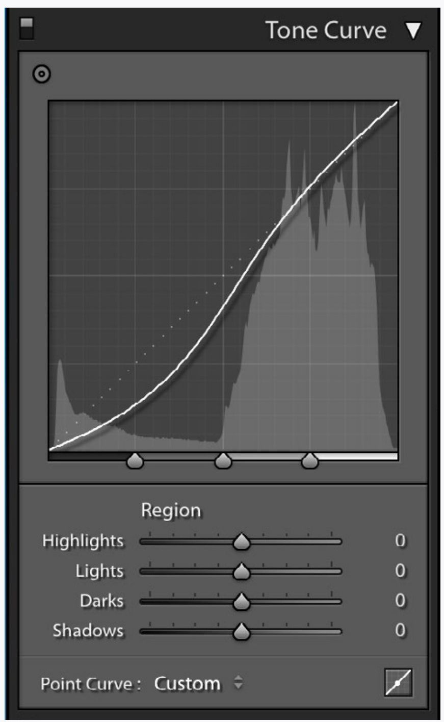

You can also change the extent of your tonal adjustments (highlight, shadow, whites, blacks). Click and drag the three small triangles touching the bottom of the histogram.
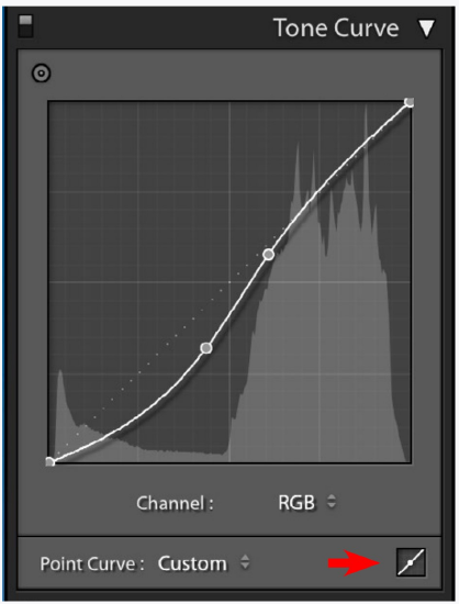
By clicking the Point Curve button (red arrow) you can free-edit the curve. This is somewhat tricky and because of this has limited utility at this point. Still, try it.
You can add points by clicking on the line and remove them by double clicking on them.
Although the point curve is more difficult to edit, it is very powerful. Playing with it can show you the extent (not the refinements) of the adjustments possible.
You can also adjust the three color channels individually, but it is my fond hope you will not need to any time soon.
5LR COLORS
|
The small switches in the far upper left of adjustment panels (red square) allow you to toggle on and off the adjustments within that panel. |
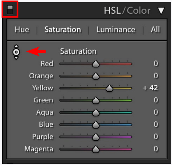
Adjusting Discreet Colors
The HSL/Color panel lets you adjust discreet colors. Activate direct image dragging using the small button (red arrow) as you did with curves.
Click and drag on an area in the image with the panel set to Hue, Saturation, or Luminance.
Hue: Allows the shifting of the color to another similar color.
Saturation: Controls the intensity of the color.
Luminance: Controls the brightness of the color.
The images at right show some of the controls for adjusting colors in Lightroom. Typically, the controls are used more subtly to correct skin tones, sky color, and over or under-saturated colors.
Instead of dragging directly on the image you can of course adjust these colors directly with the sliders in the HSL/Color panel.
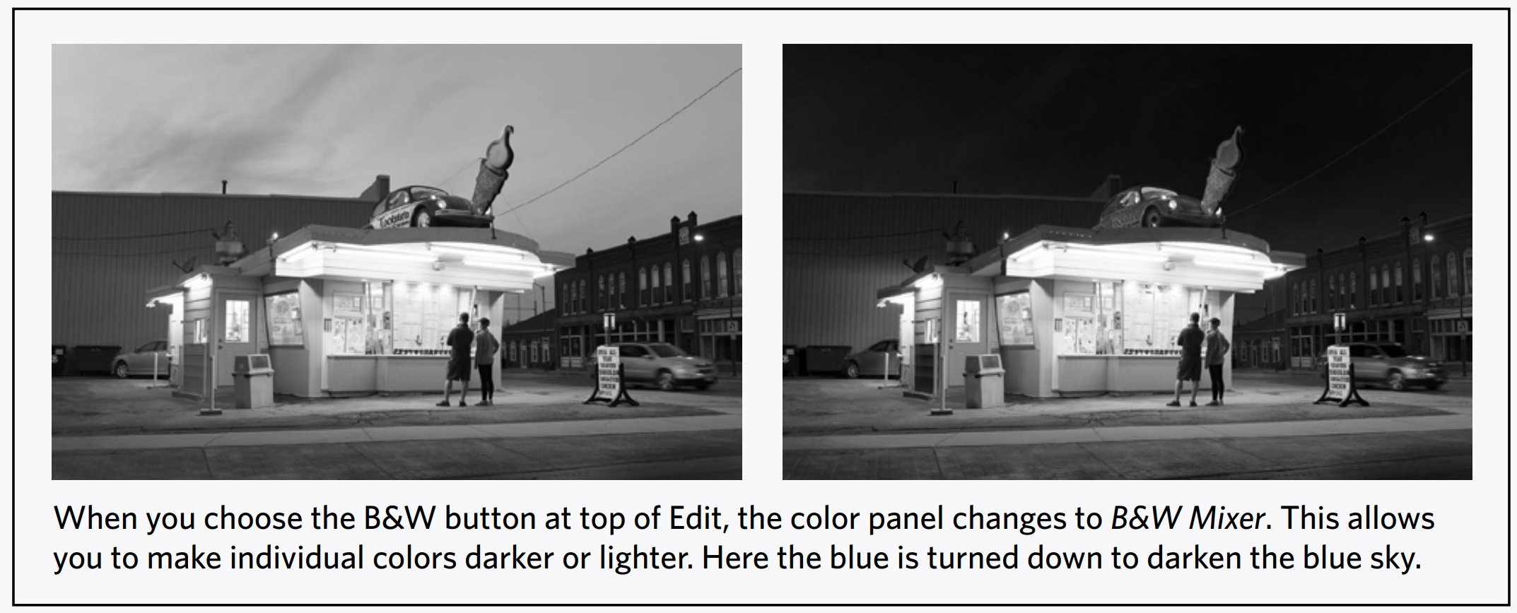
|
Gabrielle Calease Fox (original image) |
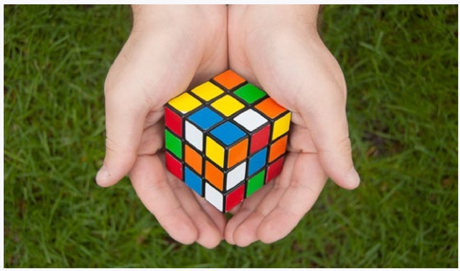
|
Green hue, saturation, and luminance increased, blue saturation and luminance increased. |

|
All colors except green and blue desaturated. |
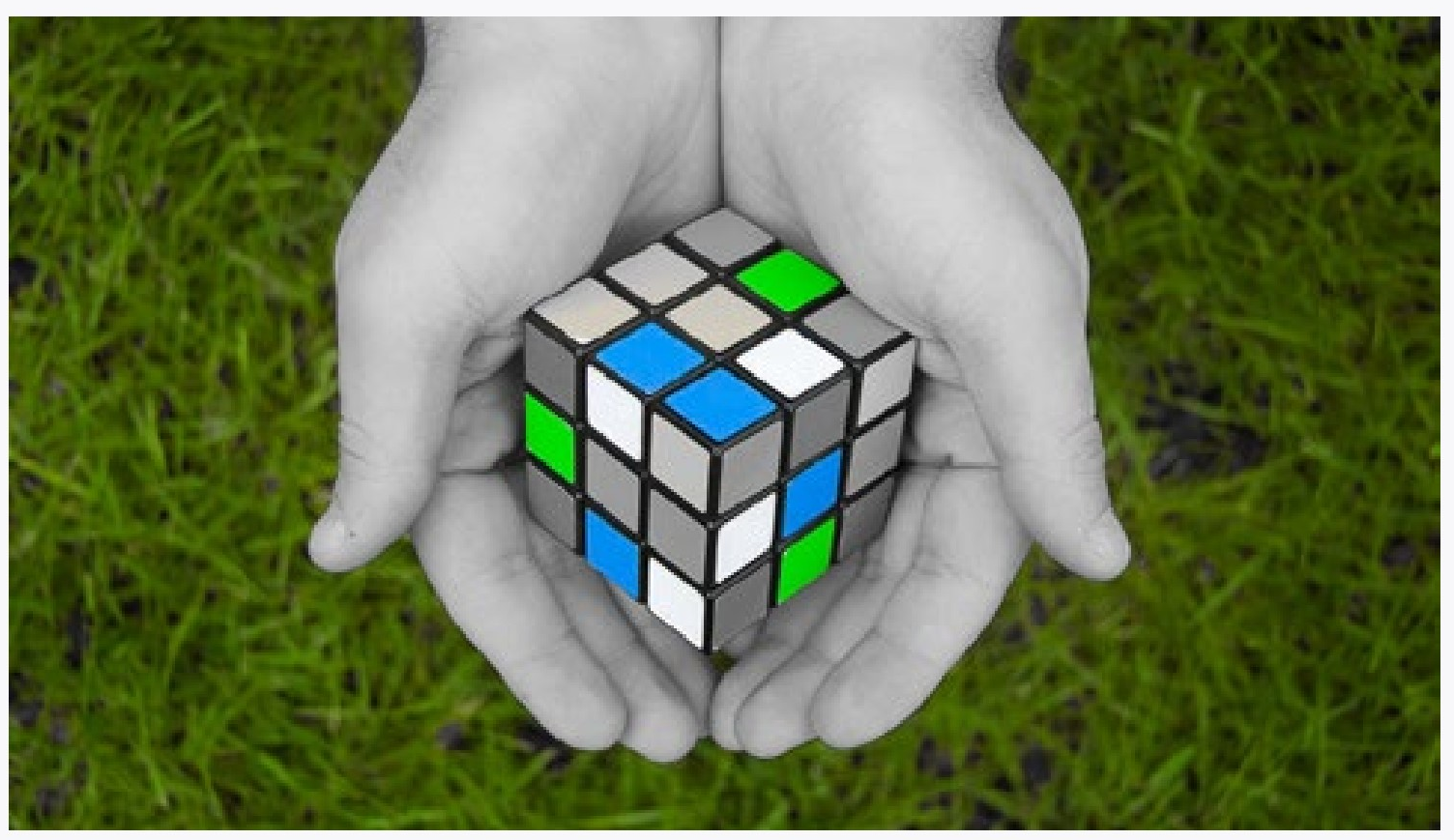
5LR USING THE CONTROLS
TONE CURVES
Using the tone curve to adjust tones is an alternative to using the controls discussed in the last chapter. It is really handy because you are actually editing the histogram directly (see it behind the curve?).
Unfortunately curves don’t always help you if you are also using the highlights/shadows/whites/blacks controls since they somewhat duplicate their functionality, but in an entirely different way.
Play around with the parametric curve to see if you like the way it works. Try it on several different images. It may work great for you for small adjustment, but the other controls may work better for large adjustments. At the very least remember them so that you can try them again on an image you can’t get just right.
COLORS
Color adjustments are essential. Practice them, play with them, and remember them.
Although at first these adjustments may just seem like fun because you can change your blue car into a green car, in reality they are very useful for tweaking the color of everything. Getting that skin tone just right. Adjusting the color of the sky that your camera got wrong.
So play now, but remember these controls. You will need them if you care about good images. Modern cameras are pretty good with color
in many situations, but they often need help with interpreting that color. And color in a photograph is not reality, but an interpretation.
POINT CURVE
Mess around with the point curve. The worse thing that could happen is that you understand image tonality a bit more.
The illustrations to the right show three different curves. The first is the unadjusted image. For the second image the tones (and colors) were reversed by dragging the lower left of the curve to the top left and the lower right to the top right. The curve for the last image is shown below it.
Point curves are usually used for fine adjustments to tones (and colors). I doubt that you will need or want to do this right away, but playing can help you understand how the point curve could be an important advanced control.
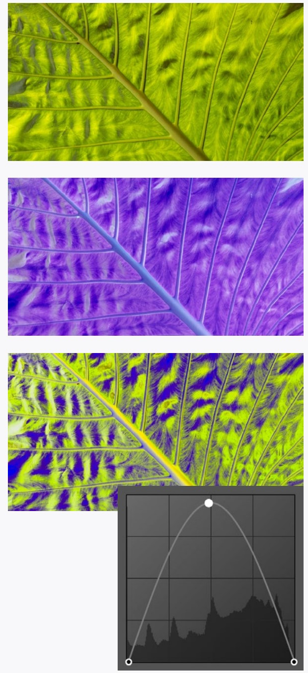
CAN YOU...
Use the targeted adjustment tool on your image to adjust the parametric curve sliders to improve and image?
Change the extent of the four tonal areas on the parametric curve?
Add, move, and delete points on the point curve?
Understand what hue, saturation, and luminance is when referring to a color?
Adjust the hue, saturation, and luminance of individual colors in an image?
Make an image black and white and change the tonality of the original colors?
6LR MORE LOCAL ADJUSTMENTS
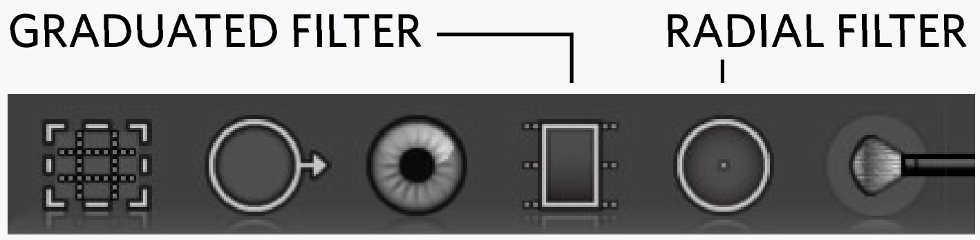
In addition to the adjustment brush, there are two other local adjustment tools in Lightroom. These behave the same way as the brush, and like it you can define multiple areas with their own separate adjustments.
The Graduated Filter allows you to define an adjustment area by clicking and dragging in an image. This is helpful to do something like darken a sky. Where you first click is the extent of the fullest part of the adjustment, and where you drag to defines the area where the adjustment fades out (the feather). You can move this adjustment or edit it with a brush.
The Radial Filter allows you to adjust a circular or oval area. This might be used for making the center of an image lighter to emphasize it or to correct for dark edges produced by a lens.
Like the adjustment brush, there is a feather adjustment for the effect, but unlike the brush, the effect does not coincide with the oval drawn. Fifteen minutes of playing around with this tool is worth more than all explaining that can be done here. Neither the radial nor the graduated filters do anything that the adjustment brush won’t. But they do make some things easier.
|
The graduated filter used to darken the background and draw attention to the mired mare |
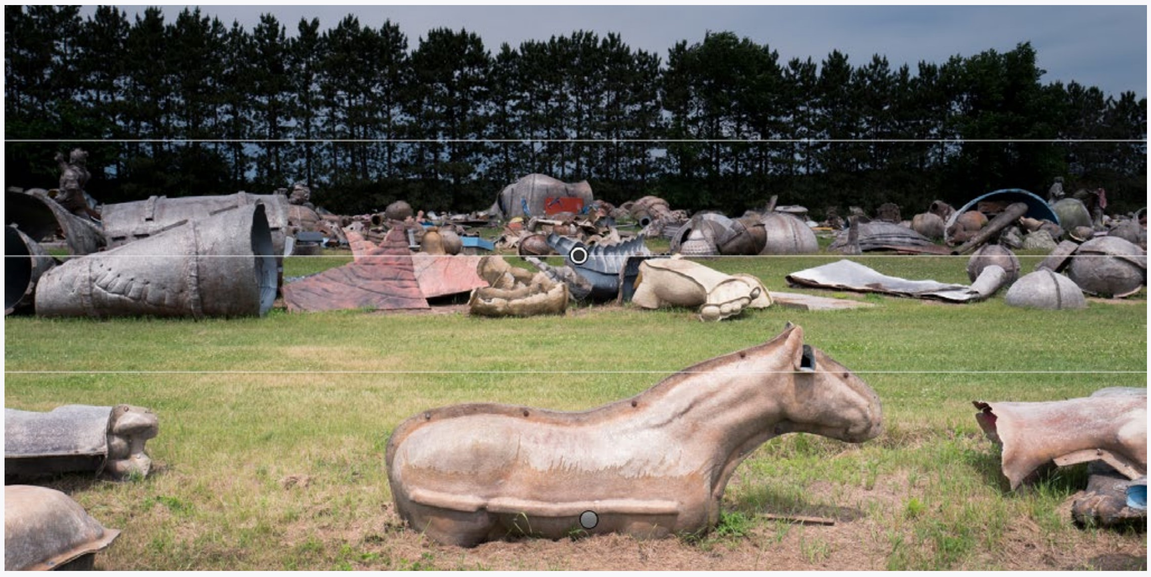
|
A circular radial filter used to make the horse very obvious in the image |
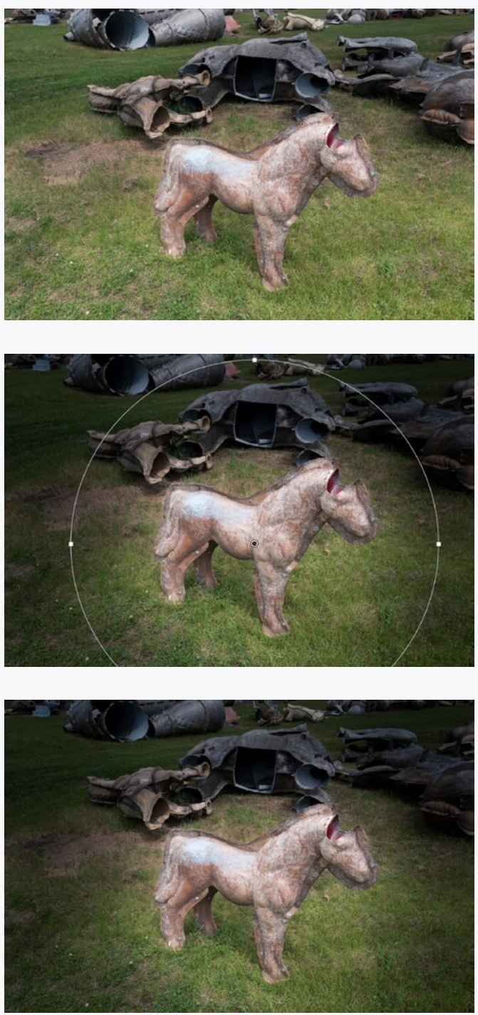
6LR RANGE MASKS
You may have noticed that you don’t have all the adjustments over a local area that you do for a whole image. One important thing missing is the ability to change the hue, saturation, or luminance of colors only in one area.
The solution to this is the Range Mask. After painting in an adjustment area (it can be really rough), you can limit that area to only work on a certain color. Set the range mask to Color, then with the eyedropper tool (red arrow) in the image click the color you want to adjust.
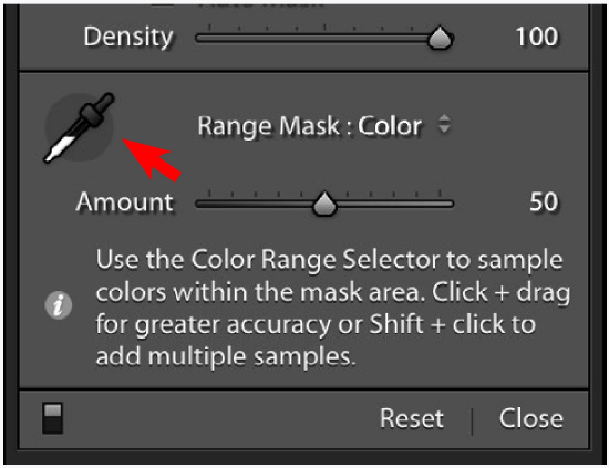
You can expand your color area by picking on similar colors with the shift key held down, and/or you can drag across an area with the eyedropper. After you select the color(s), use the Color range slider to expand (or narrow) the range of colors selected.
The statue in the bottom image at right was very roughly selected and the white balance was shifted. That selection was then limited to the statue by shift-clicking with the eyedropper on several parts of the bronze.
Instead of limiting an adjustment brush to a color range, you can limit it to a Luminance Range (a range of brightnesses).
After you make your rough selection, drag the left Luminance range slider to limit the adjustment area to the lighter areas, or the right slider to limit it to the darker areas. Experiment with this after you have made the adjustments you plan to make.
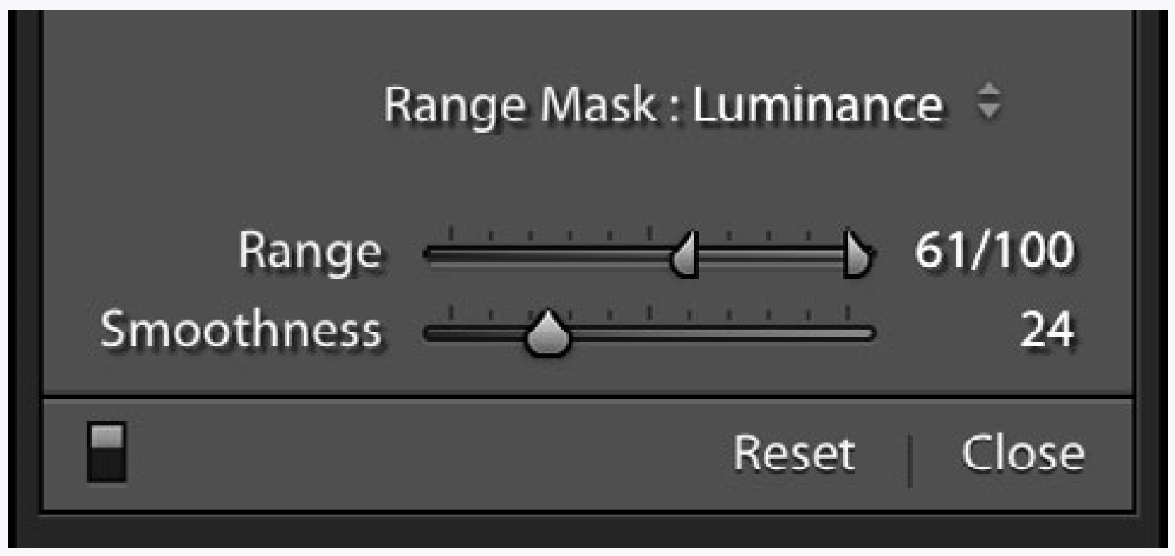
After your luminance range is picked, use the Smoothness slider to fine-tune the adjustment area.
In the bottom illustration the graduated filter was pulled over the top two thirds of the image and the sky was darkened. Then the left luminance range slider was pulled to the right until the adjustment did not include the foliage.
You can edit your adjustment masks even after you define a color or luminance range. Making the mask visible and/or holding down the option key while moving the sliders may help you see the affected areas when making adjustments.
The range mask will also allow you to do some of the same things as the auto mask. Which should you use? Practice and experiment.
|
Original image |
Statue and sky with exaggerated adjustments |
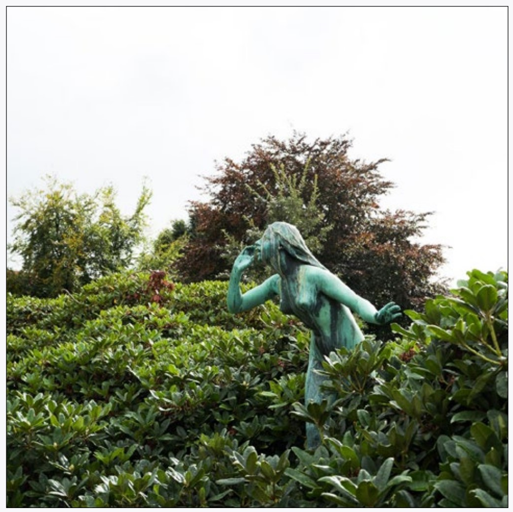
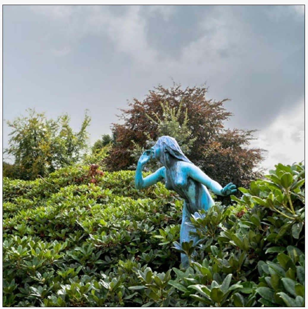
6LR USING THE CONTROLS
MORE LOCAL ADJUSTMENTS
The graduated filter tool is the most used in my toolbox. It is simple, direct, and very quick to use. Try using it to darken skies or the edges of images.
Try editing your graduated filter area using a brush. Erase parts of the filter, periodically switching the mask (not auto mask) on to see where you are painting.
Use both adjustment brushes and the graduated filters on the same image. See how strong you can make the adjustments. I will be willing to bet that what you think looks a bit like a ‘fakey’ adjustment will be accepted by the viewer as unadjusted.
The radial filter is much less useful as an adjustment, but when it is needed it is great. Try lightening the area where a main subject is in an image. Try using it to darken an image’s corners.
RANGE MASKS
Okay, I admit it, range masks are a little difficult considering how useful they are at this point. But they can be great in certain situations, so try them out. Then when you get to an image that really calls for them you are prepared to learn the finer details about how to use them.
Try to select different colors using the color range mask. Also try to use the luminance range mask to limit adjustments to one tonal area. Play with these controls. We are learning tools here, and the more tools you have the better you will be able to make improvements in the future when you need them.
CAN YOU...
Use the graduated filter to adjust parts of an image?
Erase parts of a graduated filter?
Erase using auto mask?
Use the flow tool to control how much to erase parts of the graduated filter?
Use multiple graduated filters and edit them?
Use the radial filter and invert the effect? (don’t tell me you didn’t see that option)
Use the color and luminance range masks in conjunction with the adjustment brush and the graduated filter?
Use the color range mask tool to limit an adjustment to similar colors?
Select a range of colors with multiple samples or dragging through an area of colors?
Use the luminance range mask to adjust only the darker or lighter parts of the masked portion of the image?
7LR LENS CORRECTIONS
Lens Profile
All lenses have faults which Camera Raw can correct by simply telling the application which lens you are using.
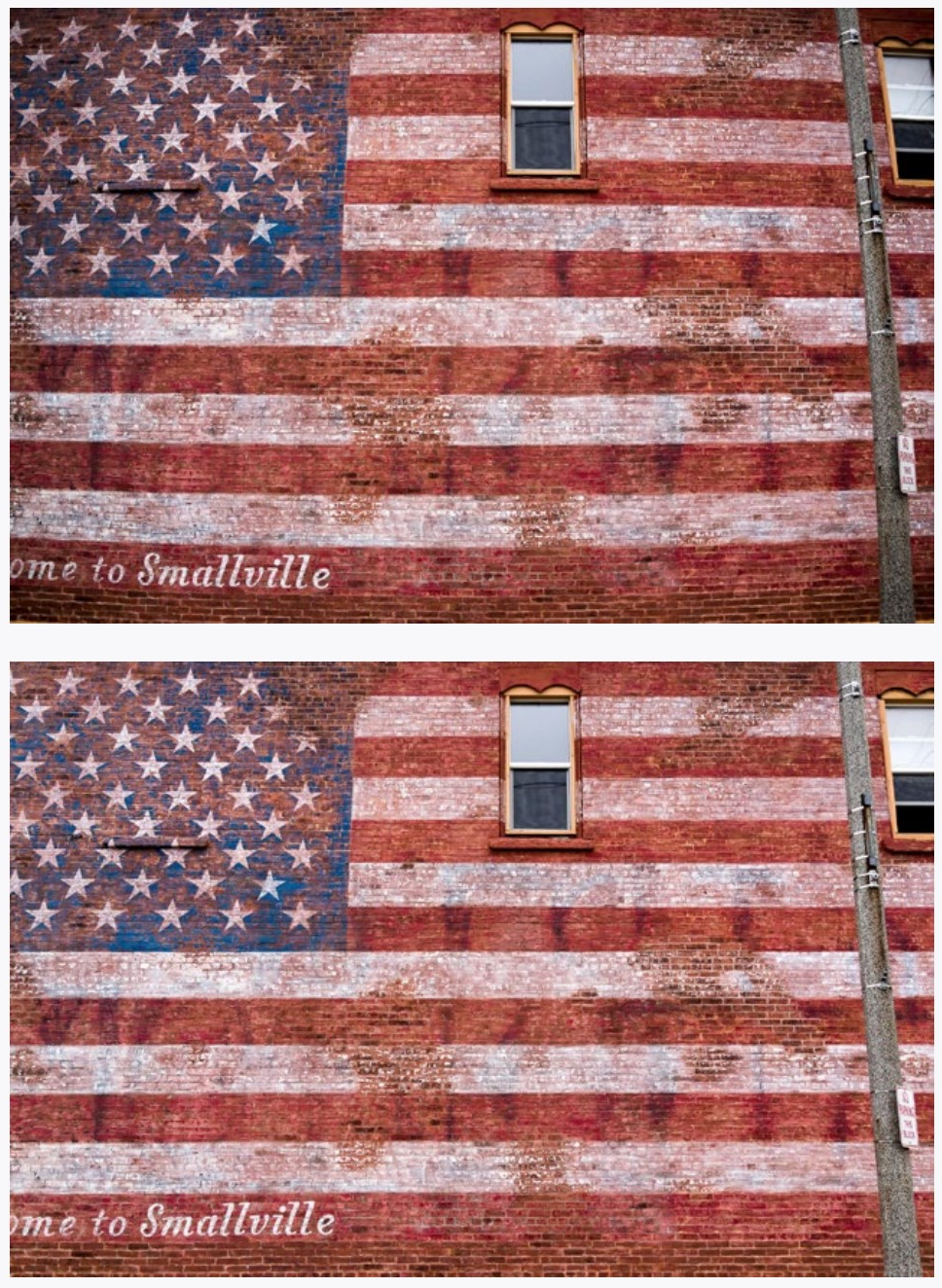
The first image below has parallel lines that bow out. This type of distortion, called barrel distortion, is common with wide angle lenses. The second image has this distortion corrected automatically by Camera Raw.
Go to the Optics panel to bring up the Lens Corrections panel, then choose Use Profile Corrections. With newer common cameras, Camera Raw will recognize
the camera/lens combination automatically.
Careful inspection of the images at left will reveal another difference. The first image has darker corners. This vignetting is mostly caused by the fact that the center of the sensor is closer to the lens, and therefore gets more light. Profile Corrections also corrects for this automatically.
If the corrections for distortion and vignetting are not quite right for your image, you can always further adjust them using the sliders at the bottom of the Lens Correction panel.
If your lens is not recognized by Camera Raw, there are two things you can do. First, look for a camera/lens combination in the drop-down menus that appear when you click the disclosure triangle (arrow). Select the lens that you have or one that may be close to what you have.
If there is no camera/lens combination close to what you have, you can manually adjust vignetting and distortion using the sliders under the Manual Tab near the top of the Optics panel. This tab also has color corrections which will be covered on the next page.
These lens corrections may not be necessary, and unless you take photographs of things like buildings, you may never need them. Applying them unnecessarily will not visibly degrade your image, so you can use them whenever you have doubts, although some vignetting can sometime be beneficial to an image.
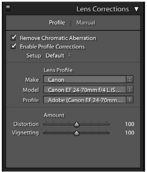
Near the corners of an image with high contrast there can be bands of color called Chromatic Aberration. It is often seen as a purple fringe around objects as you can see in the first image on the right. It may also show up as other colors, and many times one side of an object will show one color, and the other side a contrasting color.
This is easily corrected in the Profile tab of Lens Corrections panel by activating Remove Chromatic Aberration. This has been done in the middle photograph on the right.
The Manual tab for the Lens Corrections panel lets you further remove the chromatic aberration colors. This is how the purple fringing was completely removed from the bottom image on the right.
Generally, when manually correcting aberration, you can just slide the Purple or Green Amount. If you do need to tweak the Hue Adjustments it will be obvious which range of colors to specify.
Be careful that you don’t also remove any important details that may be colored similarly to the fringe color.
Notice that the Distortion and Vignetting controls on the manual tab have a much greater range of adjustment than the ones on the profile tab.
|
Original Image (detail) |
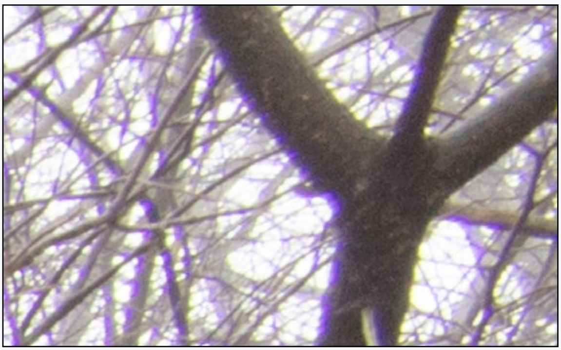
|
Lens profile with Remove Chromatic Aberration |
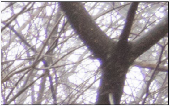
|
Lens profile with Defringe adjustment |
|
Manual corrections can be used instead of or in addition to the profile corrections. |
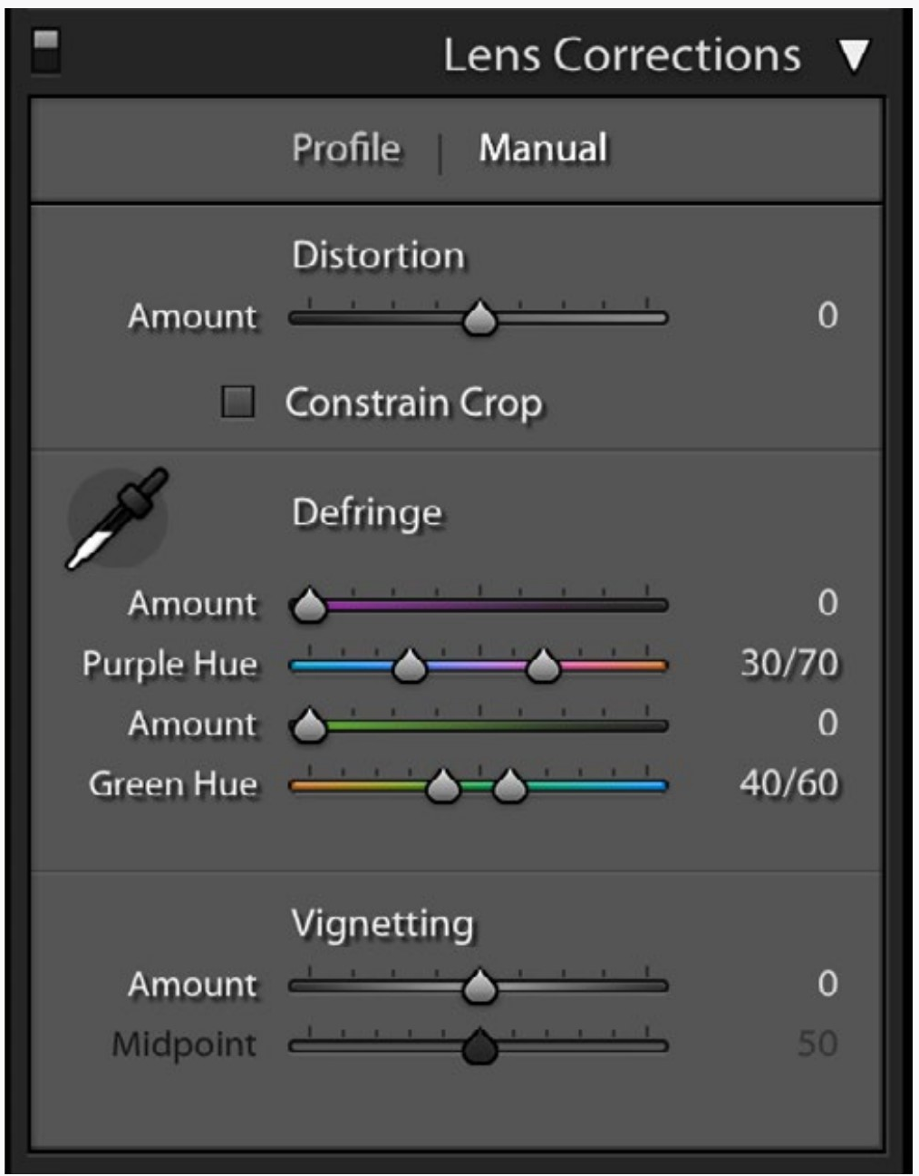
7LR USING THE CONTROLS
Imagine you buy a hex wrench at the hardware store. You may never need it. But then you have to take out a screw that has a funny-looking slot on it that a regular screwdriver won’t fit into. Suddenly you are very glad you bought it.
These techniques are a lot like hex wrenches. Some people need them often, some people will never need them. And some will only need them occasionally.
So, here I am taking you down the hex key aisle just in case you need it. These techniques don’t take practice, just an awareness of how they work and what they are good for.
LENS PROFILE
The first thing I do when importing images is apply profile corrections. Lightroom can be set to to this automatically, and at least with my cameras it not only straightens curved lines, but also lightens the edges to make the field of tonality even.
I suggest you at least try the profile corrections on a few images to see if it improves them (the strength of the effect depends on the lens used).
Try the manual corrections instead of or in addition to the profile corrections. The profile correction is not always perfect, and tweaking it with the manual corrections may be necessary.
If you only take photographs of people, you may never need these corrections. If you take architectural photographs you may always need them.
CHROMATIC ABERRATION
How much you need to correct for chromatic aberration really depends on how you take photographs. Like the lens profile corrections, you may never need this. At least try to find an area (near edges at 100% magnification) that needs correction in an image and apply the correction. That way you will remember it is there if you find you need it later.
CAN YOU...
Notice any curvature or vignetting inherent in your lens and correct for it by applying a lens profile?
Manually correct for curvature and vignetting both in the profile and manual panels?
Notice any chromatic aberration inherent in your lens and correct for it?
8LR TRANSFORM TOOLS
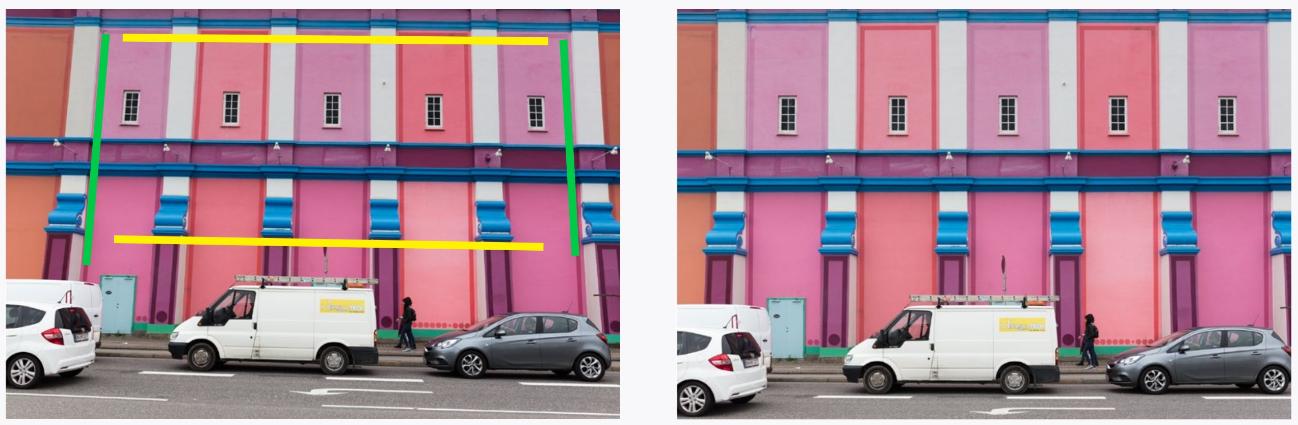
Sometimes converging parallel lines in photographs are distracting. This convergence is called parallax. The Transform panel allows this to be corrected.
Some buttons at the top the Transform panel (at right) let Lightroom automatically figure out how to do corrections. However, the Guided option is the most powerful. When you click on it, you can draw either two lines in your image over lines which should be parallel (like the green lines in illustration), and also a second set of parallel lines which should be parallel (yellow lines in illustration). Lightroom will correct the distortion based on the lines that you drew.
You can instead correct parallax (and a few other things) manually using the sliders below the tools.
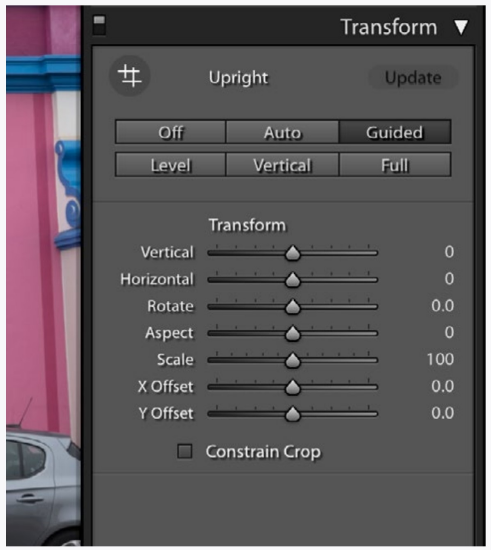
After parallax correction using the sliders, you may have white edges which need to be cropped out of the image. You can eliminate these with Constrain Crop box at the bottom of the panel.
The Straighten option associated with the Crop tool works very much the same way, allowing you to click the icon and then draw a straight line across an object that needs straightening.

A common cause of parallax comes from pointing the camera up at a building. In the second illustration the parallax is not fully corrected, as in this instance it would make the building look top-heavy.
8LR THE REST
There are a few more features that you may (or may not) find useful in Lightroom:
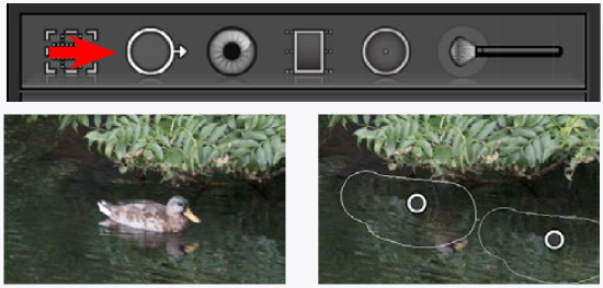
Paint over a duck or leaf with the Spot Removal Tool. It will replace that area with another
(movable) area. It also works on ex-girlfriends if they are small and/or far away. The Heal and the Clone options for this tool each work a little differently, and you can try each even after you have painted in the area to remove.

The Red Eye Correction Tool does what it says. That red area in eyes is actually an image of the back of they eye which only light coming from near the lens reveals. It is more apparent in low light since the aperture of the eye (iris) is larger.

Profiles (near the top of the Basic panel) are definitions of how you want the colors in an image to be rendered. You could make one for your camera (and lighting situation), but that is too advanced for this book. Just leave it at the setting it is at or at one you like better.
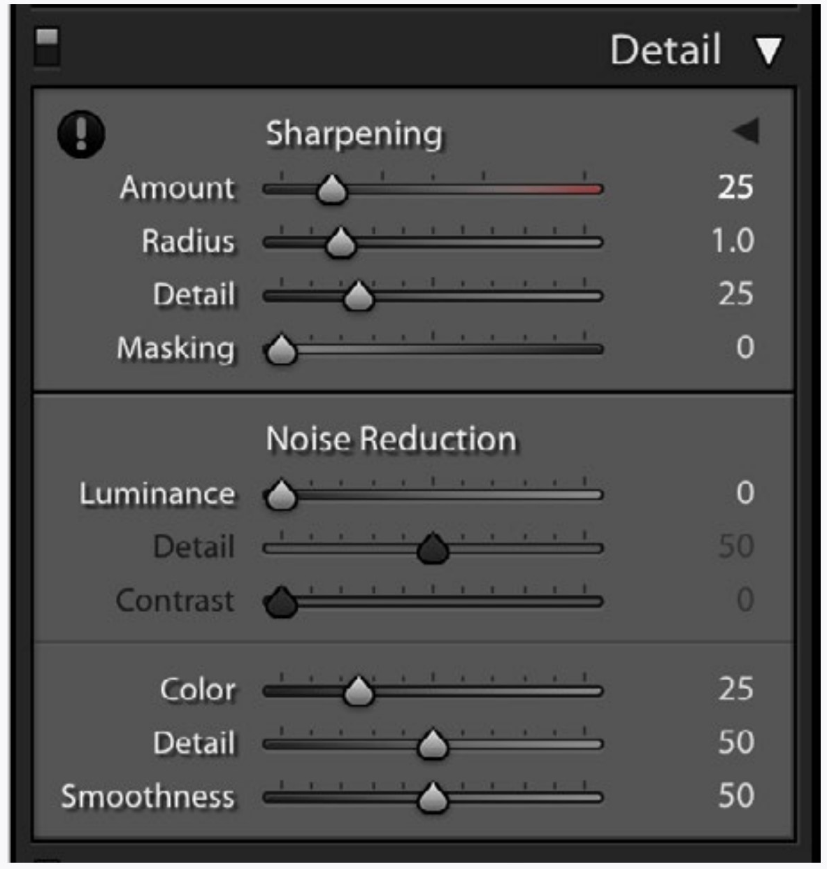
All digital images get sharpened automatically somewhere. The Detail Panel lets you specify sharpening. For photographs taken at high ISOs, Noise Reduction helps you eke out as much quality as you can from an image.
Split Toning is intended for correcting image defects in older cameras, JPEG files with the wrong white balance, and possibly for an effect you might want. Images converted to black & white can also be split-toned to give them a duotone look. Just pick a color and saturation for the shadows and highlights. You can also define the dividing point of the colors between shadows and highlights.
The Snapshots Panel in the left set of panels in the Develop module allows you to save your images in stages. Just click the + at the top of the panel. These snapshots (which you can name or not) will be saved with your image, making them available in future editing sessions.

The Presets Panel (also in the left set of panels) lets you save sets of adjustments for later use (using the + symbol). Lightroom comes with presets you can also use.
The Effects Panel is a grab-bag of things that you probably won’t need unless you want old-time looking images.
It is best to leave Calibration alone unless you want to get really picky about how Lightroom interprets color from your camera.
8LR USING THE CONTROLS
The good news is that (like the last set of instructions) these are options that you may or may not need, but are easy to learn.
This does not mean we have covered all of the things you can do in Lightroom. For example, things like strategies for key-wording. But most of these things you probably don’t need now, and (again) this book is really intended to just get you started.
If you want to practice something, go back to image adjustments and local adjustments. Those are the things I am sure you still need to work on. For the tools here, just work through them so that you know what they do in case you do need them.
And keep this book for reference. I doubt that you can sell it for much anyway.
TRANSFORM TOOLS
If you don’t have a picture of a building, go out and take one. At least take a photograph of something that has straight lines, like the room you are sitting in right now (spooky how I know where you are).
Try the various automatic transform tools. Play with the sliders. Zero out your controls and try the guided tool and draw lines on your image to straighten them to each other.
THE REST
Try each of the rest of the tools. Some may be helpful. For instance, if you often take the lens off your camera I am sure you will use the spot removal tool a lot. That dust just stays there casting its shadow on every image you take.
Your way of working may also benefit from using the snapshots panel. Or it may not.
CAN YOU...
Straighten a crooked image?
Use different techniques to correct for converging lines (parallax)?
Remove blemishes (from a pimple to an old boy/girlfriend) from an image?
Remove the image of the (red) back of the eye from a flash photograph of a person?
Save your changes to an image using snapshots?Apply split toning to an image?
Save sets of adjustments to use on other images?
Apply at least a few effects that an image might need?
Leave the camera calibration alone?
9LR OTHER CATALOGING APPLICATIONS
|
Phase One Capture One Pro |
Lightroom for mobile on iPad |
CATALOGUE APPLICATIONS
Although Lightroom is a very good cataloging (DAM or Digital Assets Management) application, there may be reasons to use another instead or in addition to it.
Adobe Bridge
A very light cataloging program. Very good at quickly assessing and editing batches of images.
Apple Photos
Very easy and nicely designed, without much versatility (no local adjustments, limited lens correction). Integrates extremely well with other Apple devices.
Capture One Pro
Best at image editing, with strong local controls. I have found it not great at cataloging many images unless they are broken into smaller sets, but my cataloging experience with it has been minimal.
Corel Aftershot
Very much like Lightroom, but cheaper and not quite as versatile, but may do everything a person needs it to do.
Camera Manufacture Applications
These range from not-so-great to worse, but sometimes include special features, such as good tethered shooting (viewing and shooting from a connected computer).
Others
There are other catalogue applications you can easily find on the web, such as Alien Skin’s Exposure. Most programs have free trial versions you can use for a month. RawTherapee and Darktable are open-source and free. There are also web-centric image cataloging methods such as Flickr and Google Photos.
Lightroom
Lightroom comes in two different versions (Lightroom CC and Lightroom CC Classic). These pages have covered the Classic version.
The non-classic Lightroom is striped down and has a ‘groovier’ interface. It is also made for mobile devices such as an iPad. Lightroom uses an ingenious system to synchronize one catalogue with all image adjustments across devices. A limited version is free to try out.
9LR EDITING APPLICATIONS
|
Affinity Photo |
Affinity Photo for iPad |
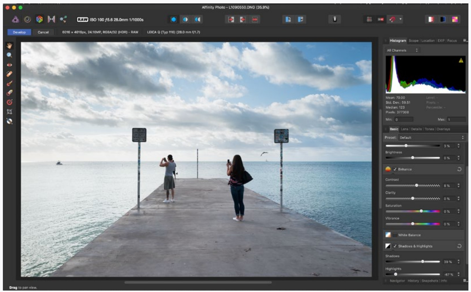
EDITING APPLICATIONS
Without cataloging capabilities, these applications are narrower in focus and generally can do many things catalogue programs can’t. So, while this book is about improving images, it is not about manipulating images (to any extent). To combine images (&c) you need an image editing application such as one of the following ones. There are too many others (such as Luminar) to cover here.
Photoshop
The best, meaning that it is the most versatile.
Affinity Photo
A solid and inexpensive application. It does all of what many photographers would need it to do.
Pixelmator
A well-respected and inexpensive application.
Gimpshop (or Gimp or Seashore)
Free versions of open-source software. Many compare these with older versions of Photoshop. Fairly versatile and you can’t beat the price. While all of these are basically the same application, they have different user interfaces applied to them.
Others
There are many photo editing applications out there. You can usually download an application and try it for free. Everyone’s needs are different for editing images, so it might take some time with Google to find one that is right for you.
Tablet and Phone
There are also many applications for tablets and phones made to edit images. Although not as featured as computer applications, some deal well with RAW files, and all are easy to use. Affinity Photo (shown above) is one that has impressed me. For $20 (at the time of this writing) you can’t go wrong. Unless you don’t have a newer iPad.
Photoshop is also available for mobile devices. At the present time it is only suitable for compositing, but Adobe promises more to come.
If you want to add drawing or painting to your photographs, there are tablet applications such as ProCreate which have many controls for this.
CREDITS AND OTHER THINGS
Image Credits
Images in this text identified with names were made by students in Introduction to Photography. I am always amazed at what students of mine create, and it is with great thanks to them for keeping me interested in teaching for many years. These images are all very good.
Images without a credit in the caption were taken by me. Some images are good, some not-so.
The History of Photography chapter contains images that are in the public domain. Most of these are from the Library of Con-gress, and a few of them are from my small collection.
Colophon
Pagination for this text is done for reading devices where the page index of the PDF reader will correspond with the page num-bers at the top of the pages.
The body of the main text is set in Chaparral Pro. It is clear to read on and has a somewhat modern feel without much attitude. The font also has a wide variety of weights and has contrast attributes suitable for a wide variety of viewing devices. Cap-tions and page heads are in Gill Sans Nova, which pairs well with Chaparral in this context.
Instructions are set in Witney, which has a precise look that makes difficult instructions at least easy to read, and chapter headings are Tungsten for a slight bit of attitude.
The Text
I have been teaching photography in colleges and universities for the past forty years. The primary intention of this book is to provide students with a kind of text that fits the way they learn while also providing a firm foundation in photography.
The second intent of the book is to clean house. Photography has change radically during the time I have been teaching it, and momentum sometimes dictates what I teach. Writing this text has provided a way to question what I am teaching, add things that have gained relevance, and discard things that are no longer needed. The text in the gray boxes are things that I didn’t think were really needed, but nor did I quite want to toss them, either because they are interesting or because they might answer some questions students might have.
I am fully aware that not everything will be understood by all students. Experience has taught me that students’ needs vary widely. So, while one student might easily understand depth of field, they might have a really difficult time with motion blur. And vice versa.
That being said, let me know if there are better ways of explain-ing anything in this text, and please let me know where there are errors. The editing of the text was in proportion to its price.
Various sets of my photographs can be found at quxl.net.
Thomas Payne