12: Color
- Page ID
- 92498
Color on the computer is a complicated subject, but there are some fairly simple things that you can do to ensure that your color is predictable and consistent from your camera to your printer and across computers that are used to view your images. You might not use all of the information in this chapter, but it will give you a good framework for understanding color issues.
Color is a much more slippery thing than you might think. Consider the perception of color. Just like smell or taste, sensitivity to a color diminishes the longer one is exposed to it. Adjacent colors also change the perception of a color. In short, a human’s physical structure (and also memory) is fairly poor with color, and that is not even considering various color blindnesses that affect around one in ten males.
Making this problem worse is the fact that color on a computer is greatly influenced by the color and brightness of the light in the environment of the computer. Proof of this can be had by looking at a camera or phone display in bright sunlight.
Although computer displays have improved, each one also has different color, and the color capabilities of different devices (cameras, computers, and printers) can vary widely. Blue is always blue, but there can be astounding differences in what kind of blue is displayed. A television’s colors even change greatly between the different standard viewing settings.
To understand how to control what by now should appear to be a mess, first some background on how color is made, something that was briefly covered in the Sensor chapter.
|
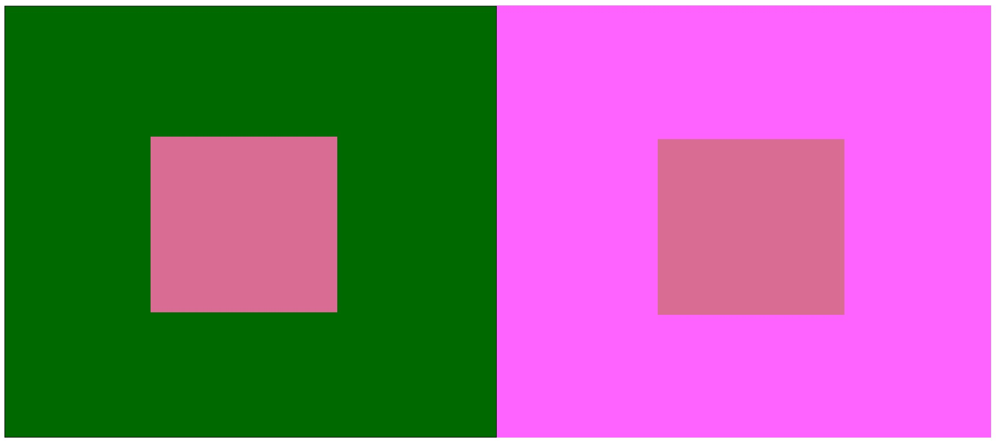
It is difficult to tell if the squares in the middle are the same color and tonality because of the surrounding color (they are the same). |
|
Bryan McCarty |
Additive Color
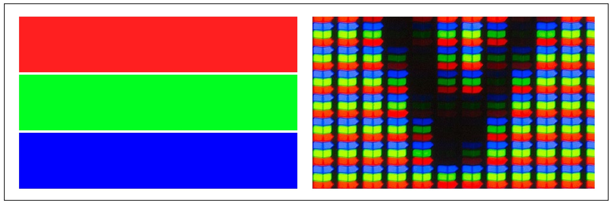
As we have seen, cameras and computers record and display only three colors: Red, Green, and Blue (RGB). These individual colors are too small to see individually, so effectively they are mixed to show the rest of the colors (see illustrations at right). These three colors are the additive colors, since the screen or camera image starts out black and the three colors are added to show or produce an image. These colors are different than the primary colors you might have learned in an art class.
Each of these three colors is divided into 256 levels of brightness, and varying these brightnesses can make any color the camera or screen is capable of.
Color Space
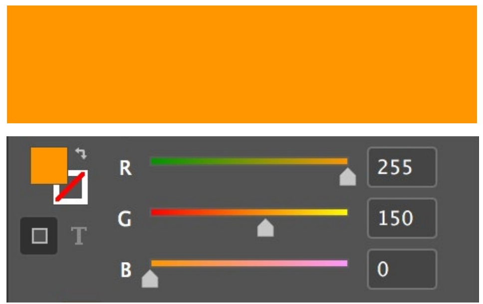
But here is a rub: What exact color should be displayed when the definition is something like [Red: 255, Green: 150, Blue: 0]? These are not numbers that occur in nature, so there has to be a language to define them.
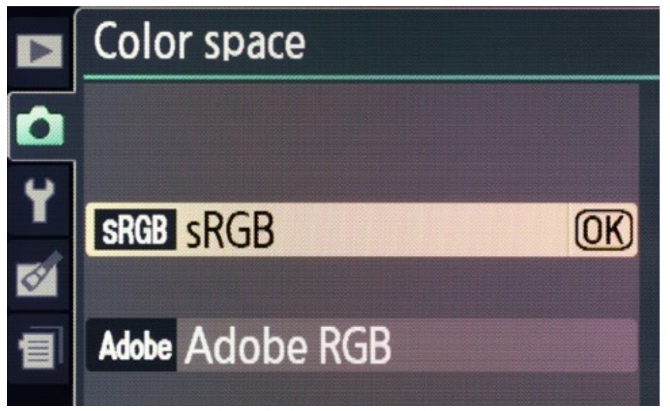
The most common language for these numbers in photography is called sRGB, a language codified by Microsoft. It is the default both on your camera and on your computer. It is called the color space in which you are working. Most likely you have seen sRGB in passing. Sometimes it is shown with a string of numbers after it.
When you take a picture, a little notation is added to it which says the image colors are defined by sRGB. The computer reads this notation, and displays the image using the sRGB language (color space). So that kind of violet purplish medium dark color is displayed correctly.
When you make a print, the printer sees that the image is defined by sRGB, and adjusts accordingly.
|
LEFT The red, green, and blue used by cameras and display screens. RIGHT Close up of a screen with the bottom of letter on a white background. Notice that the white cannot be perceived this close. At normal viewing distance the individual colors are mixed to our eyes. |
|
An orange and its definition below. Some ranges show these as percentages rather than the 0–255 scale. Three sliders are all that is needed to make any color the computer is capable of displaying. |
Adobe RGB
There is another color space that your camera is probably capable of using, and since it was developed by Adobe, it iscalled Adobe RGB. Many photographers use this color space since it is capable of more print colors than sRGB. So, to get this wider range of colors, you set your camera to Adobe RGB (1998 may be included in the name).
Adobe RGB is actually good for screen display also, but be careful. Many web browsers and email programs (especially those with Microsoft operating systems) default to sRGB and do not do the translation necessary to produce good color. In this case your images will suddenly look too dark. But you can always easily convert an Adobe RGB image to sRGB when it is destined for the screen (usually for web or email use).
There is one more color space that you might come across called ProPhoto RGB. This is a newer color space that is capable of even more colors (called wider gamut) than Adobe RGB. In many workflows Adobe applications will default to converting images to this color space as you work on the image.
Whatever color spaces you use (usually sRGB if you do nothing), make sure that you use them appropriately and that the camera, application, and printer all agree on the color space.
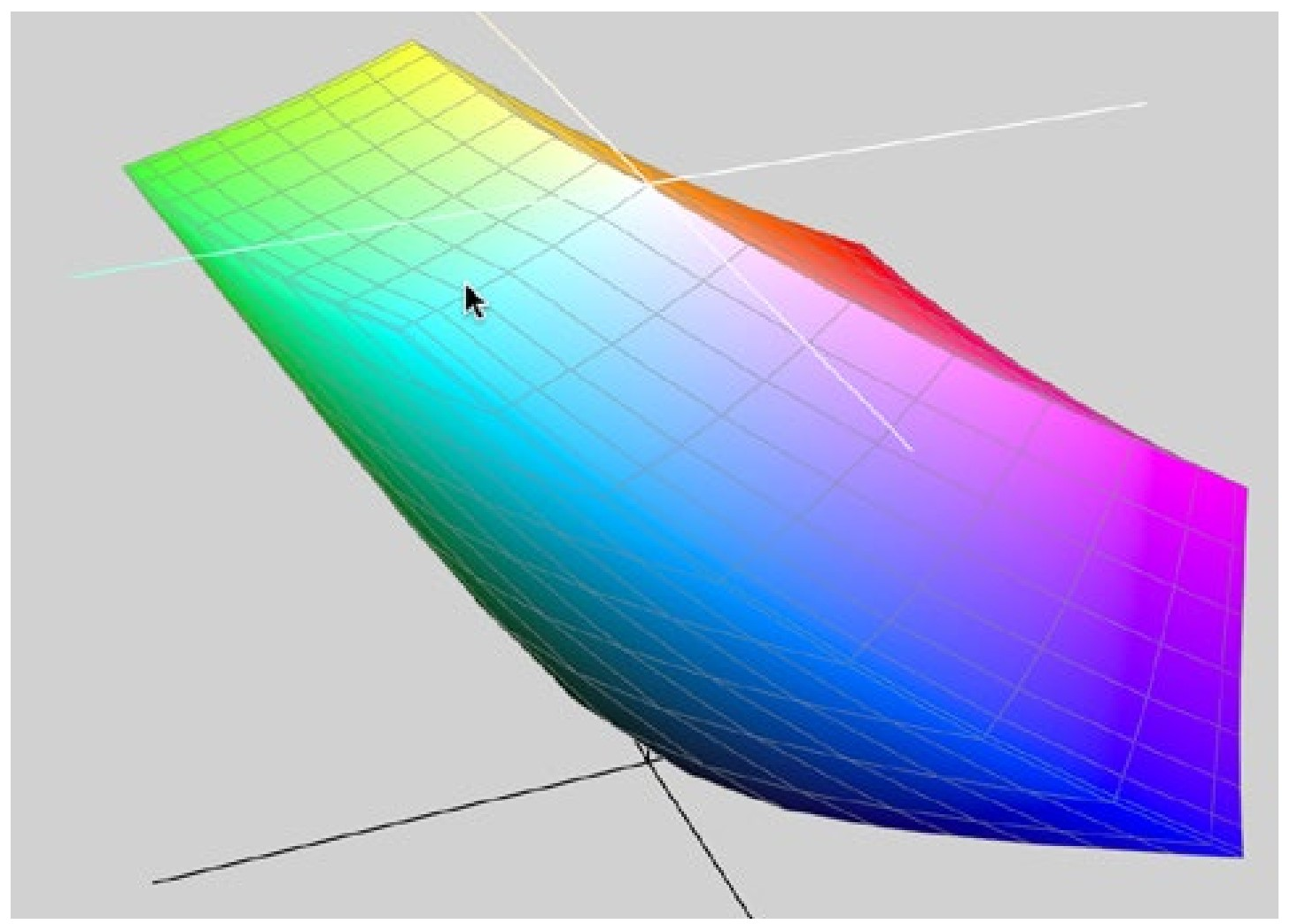
Three Part ColorThere are many ways of describing colors, but to describe colors from a full spectrum there are always three parts. So, you can describe a color with a numbers for Red, Green, and Blue. CMYK is also a three-parter, since K (blacK) is not used to describe the color but as a technical fix for printer inks. There is also HSB color, in which numbers are assigned to Hue, Saturation, and Brightness (this is sometimes very useful); and Lab color where the first number is assigned to Lightness and the others to color ‘a’ and color ‘b’. And there are many more—always with three things to describe the color. If you ever see a color space visualized, it will also be in three dimensions. On Macs you can go to Applications> Utilities> ColorSync Utility and choose one of the spaces on your computer. It takes the form of a multicolor block which you rotate to see all three dimensions. |
Subtractive Color
All printers (from a home inkjet to a commercial printing press) use a different set of colors to make color. These are Cyan, Magenta, and Yellow. (CMY). Black is added to this mix to compensate for ink characteristics, so the colors are CMYK (poor black has to be K since Blue took its initial) These are the subtractive colors, called such because the paper (or other medium) starts out white and light is subtracted to show or produce an image. In other words, all the subtractive colors will produce black, where all the color in the additive system will produce white.
This doesn’t mean you should specify CMYK color when you print—ink jet printers expect to do their own conversion from RGB, and printing an image that is in CMYK may lead to incorrect color.
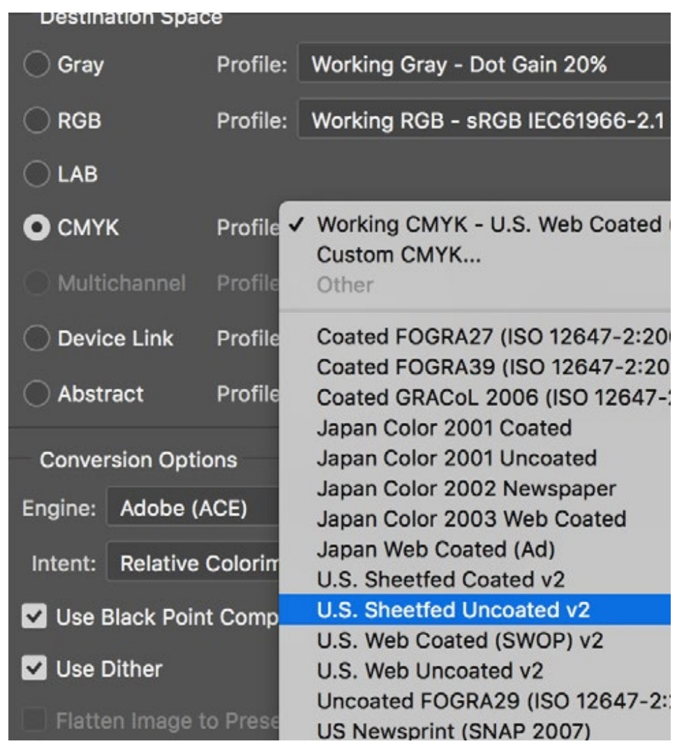
If you are including photographs in a publication, many commercial printing firms will ask you to convert all of your images to CMYK in an image editing program. Don’t do this without specific instructions on how to convert them. There are a lot of options, and without knowing the specific CMYK color setup the printer needs, you will probably get unpredictable color. Ask your printer for instructions!
|
A portion of Photoshop’s CMYK conversion options. |
|
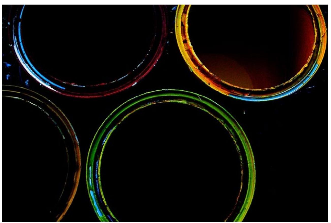
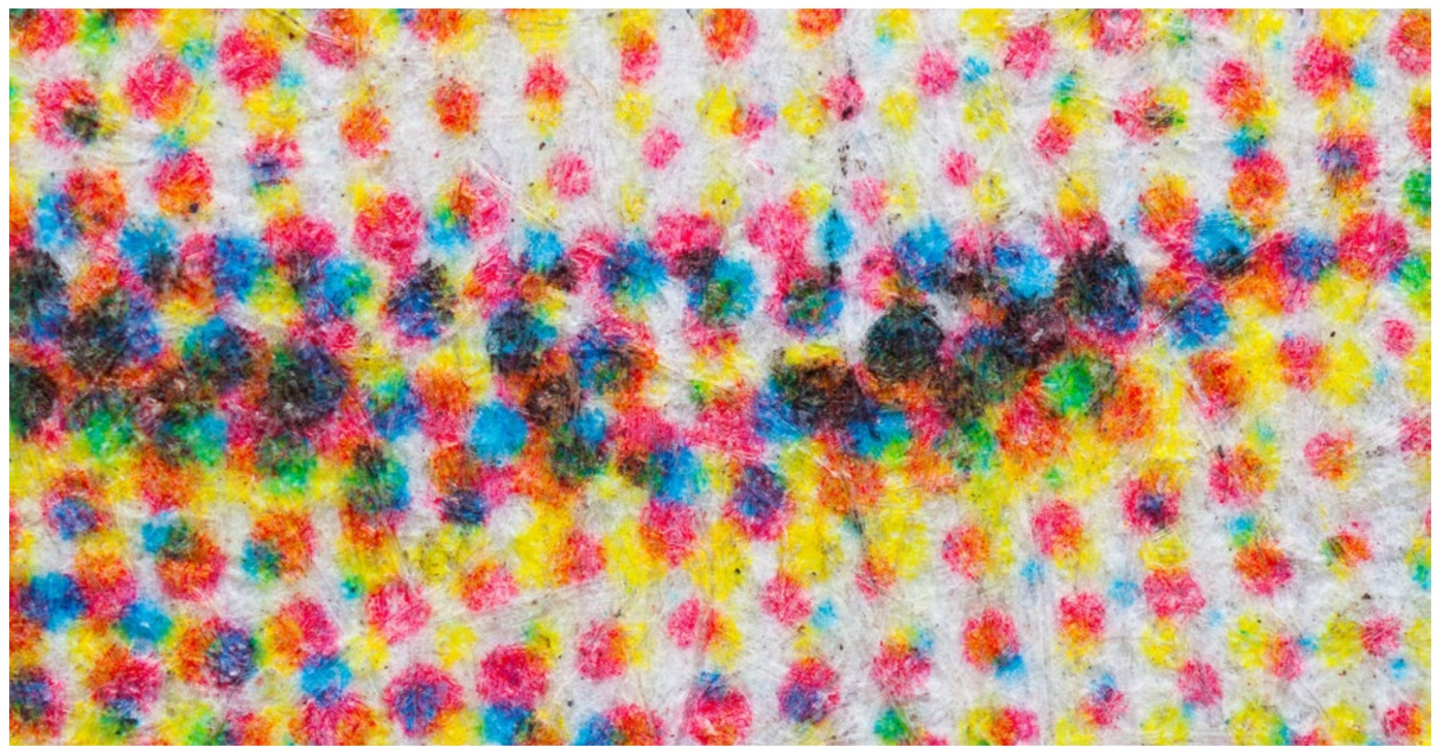
Subtractive (CMYK) color. Close-up of printed smile from a newspaper. Although the only colors used are CMYK, the green results from the transparency of the yellow ink laying over cyan ink. All printed digital photographs look something like this when highly magnified. |
|
CMYK: Cyan, Magenta, Yellow, and Black |

Color Gamut
The range of colors that can be produced with any device (such as a camera, monitor, or printer) is called the color gamut. Every device has a different gamut, with prints having a much different gamut than screen images. For example, no printer will be able to print a saturated green that the monitor displays—instead it will just print a less saturated version. That color is just not possible mixing CMYK inks.
Most photo applications will alert you when you try to pick an out-of-gamut color. The best thing to keep in mind is that this might be why your print doesn’t match your screen image. The gamut of most displays are pretty close to each other, but you might also see differences between a computer and a phone.
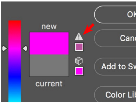
|
The exclamation mark next to the new color indicates an out-of-gamut color for printing. |
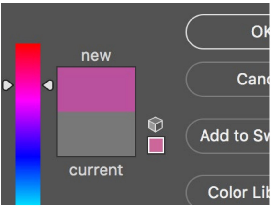
|
Clicking on the exclamation mark will select the closest in-gamut color. This illustration is from Photoshop. |
|
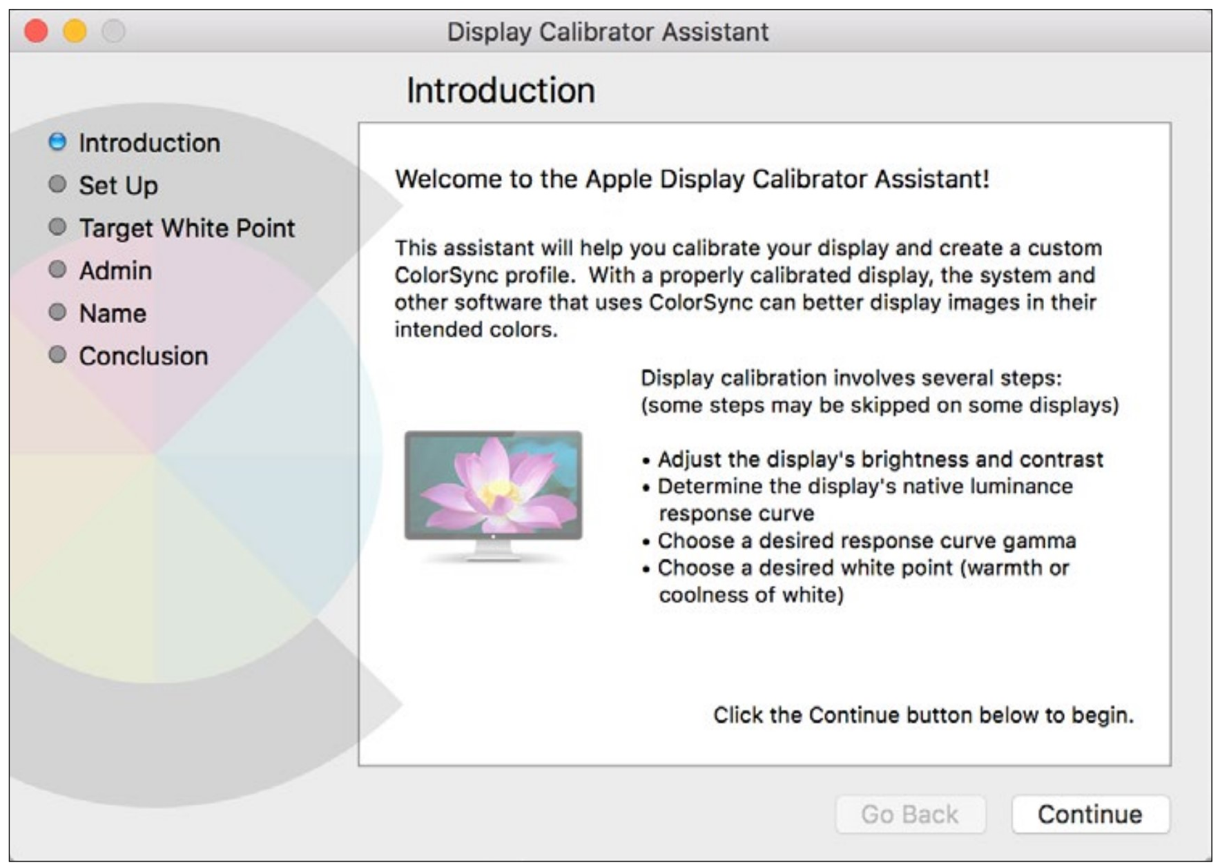
The Apple Display Calibrator takes you through easy steps to make a profile specific to your display. |
More Control
As mentioned, color from the camera to the computer to the print or to other computers is controlled fairly automatically. If you want more control, there are several things you can do.
Computer displays are each a bit different in how they display color, and even changes in the light existing in a room can make a display appear differently. One of the things you can do to correct for this is found in the Apple System Preferences under Displays. Clicking the Color button will allow you to calibrate your display to make it more standard to other computer displays. This is a somewhat subjective process, but if you don’t get it right, you can easily go back to the standard setting.
Another thing you can do is make sure you always use the same lighting environment when you edit photographs. A room only lit with daylight-balanced lighting is ideal, but it is really like eating veggies you don’t like. Who wants to sit in a consistently lit room all day unless they are paid to?
At the very least you can be cognizant of the brightness of your computer display, the room you are in, and the light you use to view photographic prints. So, don’t sit in a dark room with your display at maximum brightness. Even with the help of assessing the levels, the image will be too dark to just about anyone else looking at it in a different viewing environment.
Better Computer Display ColorWhile the Apple calibration is somewhat subjective (you adjust it by viewing targets), several manufacturers make color calibration devices which cost a few hundred dollars. These automatically calibrate not only your display, but many can also calibrate your printer to make it more of an ideal ‘standard’. I have found these to be essential in setting up more than one printer so they give consistent color. They are very easy to use. Even with display calibration I can never get the two displays I use to completely agree. But the calibrator does help.
|
White Balance
When taking photographs, you can make color easier to deal with when you are in a stable lighting situation and have a little extra time. Take a sheet of paper and put it somewhere in the scene for one shot. When you are editing your image you can use the white balance tool (in all image editing applications) to target that paper to neutral and your other colors will fall into place. Applying the same white balance to all the photographs you take under that lighting will also balance their colors.
For more precision you can buy a neutral gray card that has more neutral color than a sheet of paper.
Color Profile
Remember a color space is the definition of the way the colors are assigned to numbers. But since each device (such as a camera or printer) handles color differently, wouldn’t it be nice to have another definition for how each device handles color? It would, and it is called the color profile.
If you adjusted your display as discussed earlier, you were actually making a color profile that defined how your specific display responds to color. And it enabled you to use that profile or the generic one that came with the computer.
|
A color profile 3D representation in two dimensions. Not practically helpful, but shows what one visualized looks like. |
Ink jet printers work the same way. When you choose a printing paper, the printer invisibly uses a color profile for that printer/paper combination.
Since color profiles are largely invisible, it is only important to know that they exist and are there if you need to modify them.
Camera Color
Different cameras produce different colors. In part this is because manufacturers have different ideas about what constitutes good color. So you might find a photographer who likes the color output of Sony cameras, while another is partial to the color of Nikon cameras. Remember, photographs are not reality, but an interpretation of it.
These color differences can be dramatic—cheaper cameras can wildly oversaturate some colors, in particular red. You may have even noticed that in your camera’s menu there are provisions for selecting the kind of color you want. Generally these should be left at the most neutral setting. Choosing the color rendition later gives more control (these settings only apply to JPEG images anyway).
Critical Camera ColorFor one step more control than with a gray card, you can buy a color checker which not only has a neutral gray area but a full range of colors that can be used to assess and correct image color. This is rarely necessary unless you are taking photographs of things which are very color-critical. These can even be used to set up a camera color profile for a specific light source and camera which can then be applied in your image editing program. This allows for precise color control over not just gray, but many colors.
|
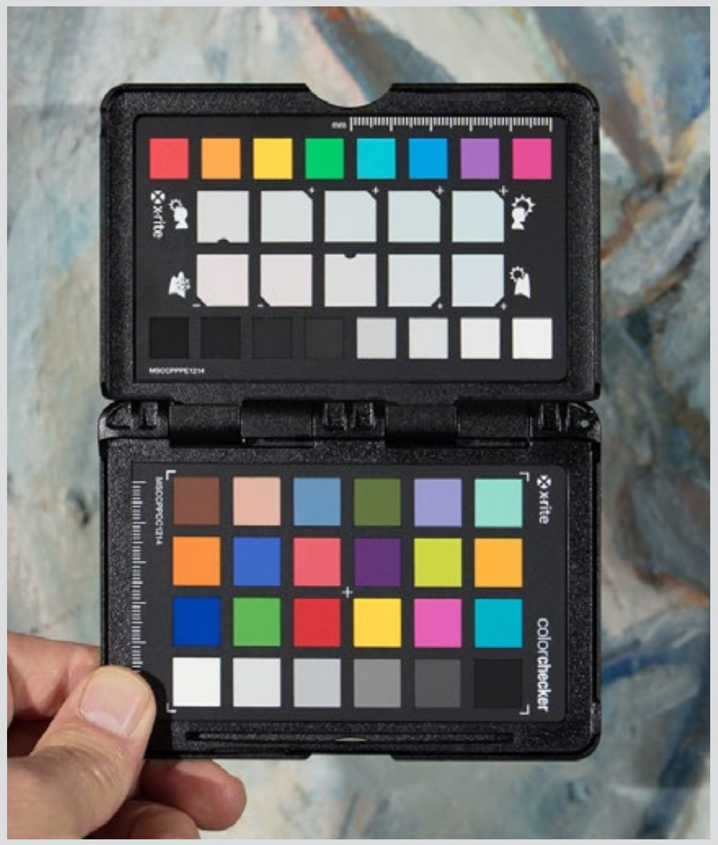
Image editing applications also have controls for correcting the colors of different cameras. These controls are useful when color is critical or when you need to correct the color of a camera that has very screwy color. I use these controls for images from my first DSLR. The color rendition of that camera can only be described as ugh. The color rendition of digital cameras has gotten much better over the years.
Light Color
Light is composed of a spectrum of different colors. For instance, the sun’s light is white, but that white light is made up of all the visible colors (and then some). So, when you have a green plant, that plant reflects only the green part of the color spectrum. The sky is blue because the water vapor in the atmosphere predominantly reflects blue light.
Many indoor lights emit different colors, but not quite the same way as the sun does. As already noted, incandescent lights emit more yellowish light, but this is not really a problem since the camera can balance the color to compensate for that heaviness.
LED lights and (especially) florescent lights may have a very uneven distribution of colors, and this can easily distort the colors in a scene. Because of this, these lights have a Color Rating Index (CRI) number which describes how close they come to emitting all colors as the sun does (the full spectrum). A CRI of 100 would be perfect, but in practice a CRI of 85 is pretty good for lights that are used to take photographs or even lights used to choose the color of your outfit.
|
Very simplified representation of the colors in light. Sunlight has all the colors of the spectrum in even amounts. Flash is very similar. |
|
Incandescent lights are heavy in the yellowish areas, but still contain all the colors of the spectrum in healthy amounts. |

|
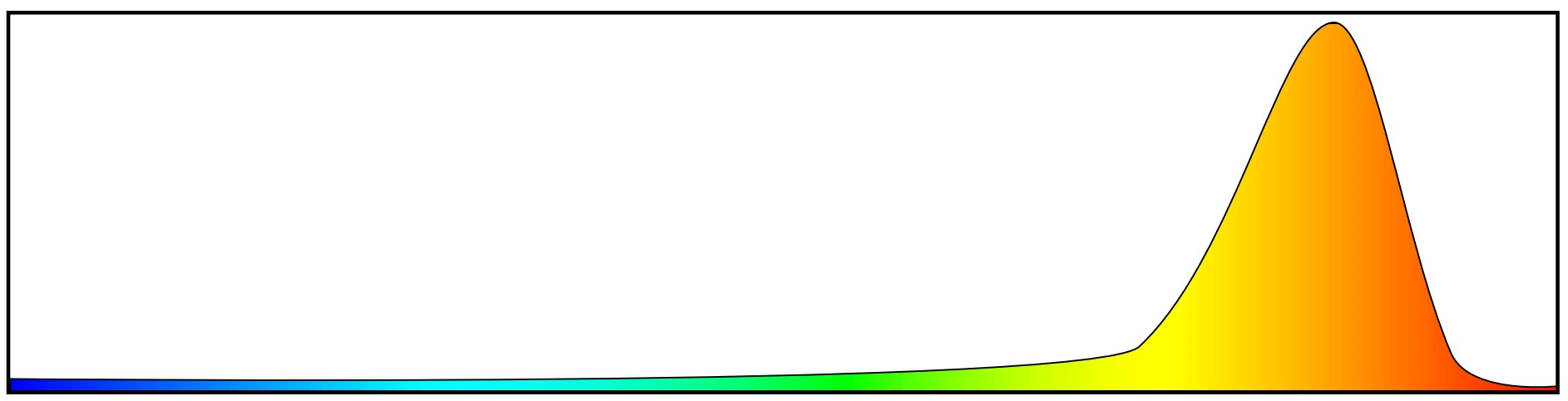
These are the colors contained in light from an orangish streetlight. This light cannot show colors because it is made up of only one color. Blue cannot be reflected if there is no blue in the light (see illustrations on next page). |
Color Rating IndexMany quality household LED and florescent bulbs state the CRI on the package (or on their web site). This is because most people find that the most pleasant light to live with contains the most colors. Incandescent bulbs are not rated because by their nature they are all a CRI of 100 (the best). If you have ever replaced an incandescent bulb with a florescent bulb and then decided the florescent light made the room look like a flop-house, then you should pay attention to the CRI for your household lights. Look for a CRI of 80 or above. Kelvin temperature is also on the package, and is even more important. You don’t want to be one of those people who put a 5200K (daylight) bulb in their living room fixture giving the room a warehouse look. On a related note, look for the light output in lumen relative to energy. With LEDs, 1 watt per 100 lumen is a worthy target. |
If you are in a situation where you don’t know the CRI of a bulb, just take photographs anyway. Color errors are masked by many different factors, and even with low CRI numbers your color will probably look pretty good.
Lights especially made for photography will always have a high CRI and it will be stated in descriptions of them. Often the CRI of these is at least 90.
There are many other kinds of light sources, and some emit very uneven spectrums. Probably the worst common kind are the orangish lamps now being replaced by LEDs in streetlights. As you can see from the illustrations at right, they are not good for color photography!
|
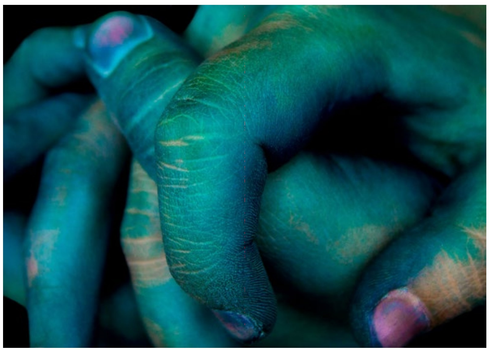
Eva Murguet. Here color is used expressively. Correct color is sometimes just not important. |
|
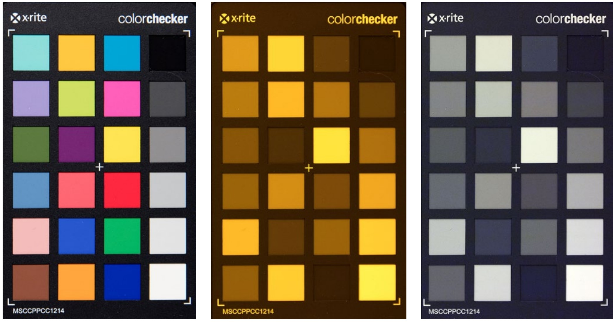
LEFT The color checker (patches of different colors) is photographed using incandescent light. MIDDLE The color checker is photographed using a sodium light. This is the kind of light used in the orangish streetlights. RIGHT The middle color checker is white balanced to the gray squares. The sodium bulb only emits a narrow range of color, so the color patches appear without color. If there is no red (or blue or whatever) in the light to begin with, there is no red (or blue or whatever) to reflect from the color checker. |
Color Questions
What are the only three colors a computer (or television) can display?
What is the term for the set of colors that make white when added together? The colors that make black?
How many levels of brightness does each color on a computer display usually have?
What defines the numeric description of colors?
What color space is most commonly used?
What color space is best for printing?
For printing the best quality images on an ink-jet printer, should you use RGB or CMYK mode?
What is the term for the range of colors a device can produce?
Why should you not edit images in a dark room with your computer display at maximum brightness?
What is card you photograph for precise white balancing called?
What is the definition of the color of a specific device, such as a computer display?
How many colors are there in sunlight? (trick question)
What describes how close a light comes to emitting the full spectrum of colors with fluorescent or LED lights?