

1.3: Cultural Interpretations
- Page ID
- 386865
\( \newcommand{\vecs}[1]{\overset { \scriptstyle \rightharpoonup} {\mathbf{#1}} } \)
\( \newcommand{\vecd}[1]{\overset{-\!-\!\rightharpoonup}{\vphantom{a}\smash {#1}}} \)
\( \newcommand{\dsum}{\displaystyle\sum\limits} \)
\( \newcommand{\dint}{\displaystyle\int\limits} \)
\( \newcommand{\dlim}{\displaystyle\lim\limits} \)
\( \newcommand{\id}{\mathrm{id}}\) \( \newcommand{\Span}{\mathrm{span}}\)
( \newcommand{\kernel}{\mathrm{null}\,}\) \( \newcommand{\range}{\mathrm{range}\,}\)
\( \newcommand{\RealPart}{\mathrm{Re}}\) \( \newcommand{\ImaginaryPart}{\mathrm{Im}}\)
\( \newcommand{\Argument}{\mathrm{Arg}}\) \( \newcommand{\norm}[1]{\| #1 \|}\)
\( \newcommand{\inner}[2]{\langle #1, #2 \rangle}\)
\( \newcommand{\Span}{\mathrm{span}}\)
\( \newcommand{\id}{\mathrm{id}}\)
\( \newcommand{\Span}{\mathrm{span}}\)
\( \newcommand{\kernel}{\mathrm{null}\,}\)
\( \newcommand{\range}{\mathrm{range}\,}\)
\( \newcommand{\RealPart}{\mathrm{Re}}\)
\( \newcommand{\ImaginaryPart}{\mathrm{Im}}\)
\( \newcommand{\Argument}{\mathrm{Arg}}\)
\( \newcommand{\norm}[1]{\| #1 \|}\)
\( \newcommand{\inner}[2]{\langle #1, #2 \rangle}\)
\( \newcommand{\Span}{\mathrm{span}}\) \( \newcommand{\AA}{\unicode[.8,0]{x212B}}\)
\( \newcommand{\vectorA}[1]{\vec{#1}} % arrow\)
\( \newcommand{\vectorAt}[1]{\vec{\text{#1}}} % arrow\)
\( \newcommand{\vectorB}[1]{\overset { \scriptstyle \rightharpoonup} {\mathbf{#1}} } \)
\( \newcommand{\vectorC}[1]{\textbf{#1}} \)
\( \newcommand{\vectorD}[1]{\overrightarrow{#1}} \)
\( \newcommand{\vectorDt}[1]{\overrightarrow{\text{#1}}} \)
\( \newcommand{\vectE}[1]{\overset{-\!-\!\rightharpoonup}{\vphantom{a}\smash{\mathbf {#1}}}} \)
\( \newcommand{\vecs}[1]{\overset { \scriptstyle \rightharpoonup} {\mathbf{#1}} } \)
\(\newcommand{\longvect}{\overrightarrow}\)
\( \newcommand{\vecd}[1]{\overset{-\!-\!\rightharpoonup}{\vphantom{a}\smash {#1}}} \)
\(\newcommand{\ket}[1]{\left| #1 \right>}\)
\(\newcommand{\bra}[1]{\left< #1 \right|}\)
\(\newcommand{\braket}[2]{\left< #1 \vphantom{#2} \right| \left. #2 \vphantom{#1} \right>}\)
\(\newcommand{\braopket}[3]{\left< #1 \vphantom{#2}\vphantom{#3} \right| #2 \vphantom{#1}\vphantom{#3} \left| #3 \vphantom{#1}\vphantom{#2} \right>}\)
\(\newcommand{\qmvec}[1]{\mathbf{\vec{#1}}}\)
\(\newcommand{\op}[1]{\hat{\mathbf{#1}}}\)
\(\newcommand{\expect}[1]{\langle #1 \rangle}\)
\(\newcommand{\dfn}[1]{\emph{\textbf{#1}}}\)

Image by Rahulrk07 via Wikimedia Commons, licensed under CC BY-SA 4.0.
Scientific theories of colour cross geographic borders and are described as ‘universal’, but meanings and symbolism attached to colour can be very specific to different cultural groups around the world, such as the Indian Holi festival of colour[1] (Figure 1.19), and at different times throughout human history.
Despite these culturally specific meanings and symbolism, studies investigating emotional links to colour have found some links to be shared around the world.
If you are an artist or designer of products, packaging, fashion, interior/exterior environments, digital media, games, etc., understanding how colour can affect your audience is useful.
Topics covered
This chapter will include a brief introduction to cultural interpretations of colour and where colour has been linked to human emotion, psychology and physiology.
Colour psychology and physiology
It is generally accepted that colour can affect our emotions and mood. Different colours have been identified as triggering certain emotional or physical reactions. Colours can have both positive and negative associations and these can vary for each person.
Are emotional links to colour universal?
Recent studies investigating emotional links to colour have found that although our perceptions and uses of colour can be specific to different cultural groups, some links are shared universally">[1].
This page provides some background into theories of colour and its effect on human psychology and physiology. Topics covered:
Colour associations
You might have your own colour associations like these listed in Table 1.1 – can you think of any more emotions or states to add to these colours that have meaning for you?
| Colour | Meaning |
|---|---|
| Red |
heat, activity, anger, danger, passion, energy |
| Purple |
wisdom, power, imagination, spirituality, royalty, sophistication, mystery |
| Pink |
love, affection, romance, softness, kindness, sweetness |
| White |
purity, cleanliness, innocence, perfection, spirituality |
| Yellow |
happiness, warmth, positivity, cheerfulness, compassion |
| Orange |
warning, warmth, fun, youth, optimism, excitement |
| Gold |
wealth, fortune, luxury, triumph, royalty, abundance, glamour |
| Black |
elegance, drama, power, death, evil |
| Blue |
cold/coolness, stability, loyalty, seriousness, envy, trust, peace |
| Green |
calm, serenity, relaxation, renewal, envy, wealth, abundance |
| Brown |
practicality, honesty, simplicity, dependability, trustworthiness |
| Grey |
stability, authority, maturity, modernity, the mundane, sadness, boredo |
View this infographic on the Information is Beautiful website for more colour associations.
Colour in advertising and logo design
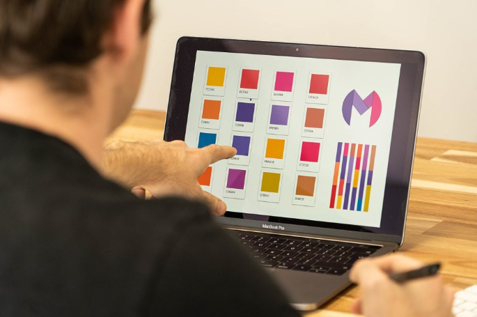
Figure 1.20. Logo Design. Image attribution: Claireneon, Colour palette selection for logo design, CC BY-SA 4.0
Many studies and articles you will find online about how colours affect our emotions and mood are anecdotal – that means they are not based on reliable research or factual evidence. However, there is significant evidence in marketing research that colour plays an important role in what we buy and how we are attracted to different products.
For example, it’s no coincidence that popular fast-food companies like McDonald’s or Hungry Jack’s have red and yellow logos and packaging designs – these colours are said to stimulate appetite.
Other well-known colours in advertising include Coca-Cola red, Facebook blue, Cadbury purple, Fanta orange, Android green, and Barbie pink. These colours have become iconic in contemporary culture, and it is easy to associate the colour with the product. See Figure 1.20 for some examples of well-known logo designs arranged by colour. Do you notice any patterns? Do certain types of businesses prefer certain colours?
Learn more about the psychology of colour in marketing.
Logo design
Colour in logo design can be used to communicate meaning about a particular brand or product and what an organisation/individual represents or how they want their customers to perceive them. Some logos may have different colour versions depending on usage, many iconic logos use consistent colour and have strict rules about usage. For example, have you ever seen a green Coca-Cola can with pink text? Probably not!
If you are designing a logo for yourself or a client, you may need to create a style guide or brand guide which is a way of controlling and communicating how your logo and other graphics must be used. Colour information is very important in a style guide. You should include information about the colours that can be used in the logo and background, how much space should be around the logo, the relative size and scale of the logo, and where it can be positioned on printed or screen media.
For example, Google’s Material Design colour system (Figures 1.21 and 1.22) give very clear instructions for the correct ways to develop colour schemes and palettes that work with branding to create well-designed and accessible interfaces for screen devices.

Figure 1.21 Google Material Design – examples of colour usage. Image attribution Google Material Design, Apache licence 2.0. Select images to enlarge
 Figure 1.22. Google Material Design – examples of colour usage. Image attribution Google Material Design, Apache licence 2.0. Select images to enlarge.
Learn more about colour and logos from these online resources:
Colour, psychology and art therapy
Colour, personality and pseudoscience
Colour has also historically been linked to human psychological traits and personality types, although these theories are now outdated and have no basis in current psychology. One of the better-known examples of this is from the work of Carl Jung who was a Swiss psychiatrist and psychoanalyst in the early 20th century. He is quoted as saying “colours are the mother tongue of the subconscious” and “colours express the main psychic functions of man”.
Although greatly influenced by Sigmund Freud (the founder of Psychoanalysis), Jung did not agree with all of Freud’s theories. He founded Analytical Psychology in 1913 after breaking with Freud. One of Jung’s theories was the classification of psychological personality types linked to four colours: red, blue, green and yellow. These colours were placed in a grid with X and Y axes.
- X represents the line between Introversion and Extroversion,
- Y represents the line between Thinking and Feeling.
This theoretical way of determining a person’s psychological type is now dismissed by today’s psychologists as it’s not based on any proven evidence of how our brains work. Personality is far more complex than Jung’s limited classification system can describe – which Jung also acknowledged himself.
However, Jung’s book Psychological Types (1921) was further developed in the 1940s by Katherine Cook Briggs and her daughter Isabel Briggs Myer (neither had formal training in psychology) into the Myers-Briggs 16 personality types, which also has colour associations and is a popular personality test that is still used today. It is important to note that there is no evidence that the Myers-Briggs personality test is an accurate or useful tool for determining a person’s personality, or success in career or life choices.
Art Therapy
Where Jung’s theories about colour and creativity have found greater practical use is in the emergence of art therapy as a field of practice that helps people deal with trauma and illness through creative work. Colour can be used effectively in art therapy as part of a process of expressing troublesome thoughts and feelings in a visual way.
Learn more from these online resources:
- What color psychology really means
- What is Art Therapy?
- Hogan, Susan. Healing arts : the history of art therapy, London: Jessica Kingsley, 2001.
- Hogan, Susan ed. Feminist Approaches to Art Therapy, Routledge 1997
- More publications by Susan Hogan on Art Therapy
- Why the Myers-Briggs test is totally meaningless
Colour and medical therapy
Chromotherapy – therapy or quackery?
It is important to note that chromotherapy (colour therapy) has been scientifically rejected due to a lack of evidence. It is regarded by the medical field as fraudulent and not having any measurable value. It is mentioned here from a historic perspective only.
Light and colour have been used in many attempts at healing therapy since ancient times. There is evidence from Ancient Egypt, Greece and India of sunlight, coloured light and coloured materials claimed to be used for healing. The Persian scholar and philosopher Ib Sina (Avicenna)(c. 970–1037 CE) also promoted the idea of using colour for healing.
These practices formed the basis for later theories of chromotherapy by practitioners such as American physician Edwin D. Babbitt who developed a range of light therapies including a thermolume – a cabinet that was able to project coloured light onto various parts of the body. He also ‘irradiated’ water with sunlight filtered through coloured lenses. Dinshah Ghadiali was another inventor who claimed that colour therapy was the key to health. He invented a box with a 1000-watt light and coloured filters called a Spectro-Chrome which he claimed was able to produce twelve different colours to be used for different therapeutic purposes. He was labelled a fraud by the medical establishment of the day.

Figure 1.23. Image attribution Skin58, Blue Light acne phototherapy iClear, on Wikimedia Commons, CC BY-SA 4.0
Phototherapy today
Despite the debunking of these claimed ‘alternative’ therapies, there has been a recent rise in light therapy with the use of coloured LED lights for treatment of skin conditions such as acne or aging skin (Figure 1.23). The theory is that certain wavelengths of colour can promote healing and skin regeneration. Research in this area is recent and largely inconclusive. There are also concerns that incorrect use of these devices which have strong LED lights, may cause eye damage.
There is a type of evidence-based light therapy (phototherapy) for babies that may have Newborn Jaundice (Hyperbilirubinemia). These newborns are placed under a blue light (420–470 nm wavelengths) to treat the condition (Figure 1.24). The blue light helps to remove bilirubin from the blood. This kind of phototherapy has been used for many decades.

Figure 1.24. Newborn Jaundice treatment with a “Bili-lite”. Image attribution: User Jeremykemp on Wikipedia, Bili light with newborn, marked as public domain, on Wikimedia Commons
Learn more from these online publications:
- Edwin D Babbitt, The Principals of Light and Colour 1878, Babbitt and Co.
- Quackwatch.org “Colourful Nonsense: Dinshah Gladioli and his Spectro-Chrome Device”
- Harvard Health Publishing, Harvard Medical School, 2019, “LED lights: are they a cure for your skin woes?”
- Mohr, C., & Jonauskaite, D. (2022, February 8). Why links between colors and emotions may be universal ... And the enduring debate over the meaning of red [Journal]. Psychology Today. < psychologytoday.com [www.psychologytoday.com] >
Colour symbolism in different cultures
Symbolic colour meanings have been associated in art and anthropology with different cultural, spiritual or religious groups throughout our recorded history. In many ancient cultures, colour symbolism was related to the natural elements – earth, water, fire, air, etc.
For example, traditional Chinese colour symbolism associates the elements and primary colours shown in Table 1.2.
| Colour sample | Definition |
|---|---|
| Red (Zhusha Hong) = fire | |
| Yellow (Ming Huang) = earth | |
| White (Chun Bai) = metal | |
| Black (Xuan Se) = water | |
| Blue (Qing Se) = wood |
In other cultures, certain colours that were made from rare pigments were highly prized and thus came to have symbolic meaning. Here are two examples:
Tyrian purpl
In ancient Roman culture, purple (Tyrian purple or Phoenecian red/purple) was a special colour reserved for the clothing of emperors and senators. This was because the vibrant purple dye was made from a particular species of sea snail (Murex or Muricidae) and it was expensive and very difficult to create.

Figure 1.25. Minerva as the goddess Roma. Image attribution: Dennis Jarvis from Halifax, Canada, Italy-0540 – Dress is not painted…. (5168496402), on Wikimedia Commons, CC BY-SA 2.0
Deep red porphyry from Egypt (Imperial Porphyry) is an igneous rock that was also valued by the Romans because it was very close to Tyrian purple in colour. Figure 1.25, shows a statue of Minerva (as Goddess Roma) from Capitol Square in Rome (c 300 CE). Her dress is made from red porphyry to represent the Tyrian purple dye of imperial Roman clothing. (Read more about dyes in 3.4 Colour systems: pigments and dyes)
Ultramarine (lapis lazuli)
Blue was used symbolically in Christian religious imagery during the Renaissance – partly because the blue pigment was very rare. The cloak of the Virgin Mary was often coloured with ultramarine blue (Figure 1.26). The colour blue also represented the heavens and the celestial, so it had more than one symbolic meaning in this context.

Figure 1.26. Madonna del Cardellino by Raffaello Sanzio shows the Madonna with a blue cloak painted with ultramarine pigment. Image attribution: Raphael artist QS:P170,Q5597, Raffaello Sanzio – Madonna del Cardellino – Google Art Project, marked as public domain, on Wikimedia Commons
Ultramarine pigment was made from a deep blue precious stone –lapis lazuli, said to be worth more than gold at the time. It has been claimed that Michelangelo couldn’t afford enough ultramarine blue for the Virgin’s cloak, and so never completed his painting The Entombment.
Johannes Vermeer put his family in debt to acquire the pigment for his paintings such as The Milk Maid (Figure 1.27).

Figure 1.27. The Milk Maid by Johannes Vermeer. Image attribution: Johannes Vermeer artist QS:P170,Q41264, Johannes Vermeer – Het melkmeisje – Google Art Project, marked as public domain, on Wikimedia Commons
Flags of the world
In contemporary international culture, we see symbolic colour all around us in fashion, products and media. Flags of the world are also an obvious example of symbolic colour (Figure 1.28). Colours used in national flags have symbolic meanings related to a country’s culture and history.

Figure 1.28. Flag-map of the world. Image attribution: Transparent 6lue, Flag-map of the world, marked as public domain, on Wikimedia Commons. Select image to enlarge.
Australian First Nation flags
Our Australian Aboriginal flag (Figure 1.29) has three colours in a design that represents:
- the earth (red),
- the people (black), and
- the sun (yellow)

Figure 1.29. Australian Aboriginal Flag Image attribution: Aboriginal artist Harold Thomas (Vector graphics image by Trisreed), Australian Aboriginal Flag, marked as public domain, on Wikimedia Common
The Torres Strait flag has the following colour symbolism:
- Green – the mainlands (Papua New Guinea and Australia)
- Black – the people of the Torres Strait Islands
- Blue – the waters surrounding the islands
- White Dhari – the Dhari is a traditional headdress made and worn by men. The white colour symbolises peace.
- White Five-Pointed Star – the five major island groups and their ties to navigation by sea
View the Torres Strait Flag here (copyright permission to reproduce the flag must be obtained from the TSIRC).
Pride flags
Pride flags of the LGBTIQA+ community use colours symbolically to represent various groups. There is one overarching rainbow flag for the whole community (Figure 1.30) (and a Progress Pride flag – Figure 1.31), but each subgroup also has their own flag with symbolic use of colour.

Figure 1.30. Pride flag. Image attribution: Philadelphia City Council and Tierney, Philadelphia Pride Flag, marked as public domain, more details on Wikimedia Commons

Learn more about Pride flags and colour symbolism from these online resources:
Colour symbolism in Australian Indigenous culture

Figure 1.32. Image attribution: Aboriginal rock art in ochre colours, Graeme Churchard from Bristol (51.4414, -2.5242), UK, Aboriginal rock art on the Barnett River, Mount Elizabeth Station, on Wikimedia Commons, CC BY 2.0
Traditional Australian Aboriginal artists used the materials at hand – ochres from the ground (Figure 1.32), plants and other substances used to make dyes. Different language groups across the continent developed their own symbolic uses for colour to represent the earth, sky, animals, people, waters etc. There isn’t one set of meanings that covers the whole country, and some meanings and colour making methods may be protected knowledge of certain groups.

Figure 1.33. Image attribution: Esther 1721 pixabay.com [pixabay.com], Aboriginal-art-503444 960 720, CC0 1.0
Since European colonisation, many Indigenous artists have embraced a wider range of colours in their work – partly due to the availability of ready-made paints, or the use of digital media. In particular, since the 1970s and the beginnings of painting movements by groups in central and western Australia, materials like acrylic paints have become popular because they are available in a variety of colours, are easy to use and quick to dry. Brighter colours have been incorporated into many Indigenous artists’ practices (Figure 1.33). These colours are symbolically used to represent the intensely coloured and vibrant features of diverse landscapes across the country. Learn more about pigments and dyes in Chapter 3 – Colour systems: paint pigments and dyes
Learn more about colour in indigenous culture from these resources:
- Aboriginal Art Australia: The story of Aboriginal art
- Japingka Aboriginal Art: How Aboriginal colours and group art styles develop
- Kate Owen Gallery: Aboriginal-colours-in-art
- RMIT News: Louisa Bloomer tree artwork
- RMIT News: Mark Cleaver, Indigenous artwork Luwaytini
Colour and language
Naming colours

Figure 1.34. Image attribution: Homer, Odyssey manuscript. Date: 3rd quarter of the 15th century. Odyssey-crop, marked as public domain, on Wikimedia Commons
Research in the field of cognitive science over the last 150 years has included investigations into how language might influence thought and conversely, how thought might influence language. Many of the studies undertaken with different language groups around the world have analysed descriptions of colour as a way of testing these theories.
Some of this research has noted that many language groups have more descriptions for warmer colours (red, orange, purple) and less for cooler colours (blue, green, yellow).
Some language groups like those from Papua New Guinea don’t have separate words for blue and green, while others like Russian speakers have two words for blue (siniy [синий] – dark blue and goluboy [голубой] – light blue).
Studies also show that learning a new language alters your perception of colour.
It was speculated that in the past people couldn’t see the colour blue because there weren’t examples of words representing “blue” in ancient texts (Figure 1.34). An example of this proposition was made by politician and historian William Gladstone in his 1858 publication Studies on Homer and the Homeric Age[1] with regard to Homer’s texts The Iliad andThe Odyssey.
Gladstone noticed that Homer never described the sky or sea with a word that could mean “blue”, so he speculated that people from ancient times couldn’t see the same colours.
However, scientists have concluded that people from ancient times did see blue – they saw the same spectrum of colours that we can see now, but perhaps they didn’t differentiate between blue and green, or used different relational and descriptive words to describe colours like Homer’s “wine-looking sea”. It was an issue of linguistics, not optics[2].
Colour Atlases
Around the time of Charles Darwin, descriptive language standards – also called taxonomies – for colour used by naturalists were published as ‘colour-atlases’[3] which described colours by hue and value based on natural objects such as plants, animals, and landscape features, not ‘spectral colours’ (colours such as red, blue, yellow, violet, green or orange).
Darwin was said to have a copy of such an atlas – Werner’s Nomenclature of Colours Adapted to Zoology, Botany, Chemistry, Minerology, Anatomy and the Arts by Patrick Syme, 1821)(Figure 1.35), during his voyage on the Beagle[4] (1831-1836). This colour atlas book is still in print today.

Figure 1.35. A page from Werner’s Nomenclature of Colours: Greys. Image attribution: Werner, Abraham Gottlob, 1749-1817; Syme, Patrick, 1774-1845, editor; Blackwood, William, 1776-1834, bookseller; Cadell, Thomas, 1773-1836, bookseller; James Ballantyne and Co., printer, Werner’s nomenclature of colours: greys, marked as public domain, on Wikimedia Commons
This method of colour classification using language standards came about because of the problem of making spectral colours with pigments and dyes at that time. See Chapter 3.4 Colour systems: paints and pigments for more information on pigments and dyes.
The way you think about colour may depend on your language even if we see the same spectrum of colours. Naming conventions in our language for colours may also influence how we think about colour.
If you’re an artist who uses common art materials, you might associate colour with the names of paint pigments like ‘Prussian Blue’, ‘Burnt Sienna’, ‘Alizarin Crimson’, or ‘Cadmium Yellow’. If you’re a fashion designer, you might think about colour according to popular colours used in textiles such as denim or navy blue, khaki, charcoal grey, beige or fuschia.
Today, we have seemingly endless and non-standard ways of naming colours – some of them are strange or even humorous like these AI-generated colour names. Paint colour charts are good examples of this and they are easy to find online or in hardware stores. Descriptive language is used to classify, differentiate and market thousands of colours that have very slight variations between them.
What colour is “Elephant’s breath”? Or “Velvet dream”?
What’s the difference between “Natural white” and ‘Antique white”?
Learn more from these resources:
Colour idioms in English
What is an idiom? How do we use colour expressively in the English language?
An idiom is a phrase that uses figurative language to express an idea or concept. The meaning of an idiom is more than the words mean: it’s an extended meaning.
Seeing Red
The idiom “seeing red” is a good example: we don’t actually mean that we see the colour red, but we understand it to mean “being angry” because that’s how the phrase has developed meaning over time through common use.
The phrase “seeing red” now has its own meaning in the English language. It might not have the same meaning in other languages (although some colour idioms can be similar across languages).
English has lots of colour-related idioms. Some relate to emotions and moods, but others are more descriptive.
Green fingers
Saying someone has “green fingers” or “a green thumb”, means they are good at gardening and growing plants.
Read this article for some common examples of colour idioms in English.
- Gladstone, W. 1858, Studies on Homer and the Homeric Age, gutenberg.org [www.gutenberg.org]
- Bellos, Alex, 2010, "Through the Language Glass: How Words Colour Your World by Guy Deutscher", The Guardian, 12/06/2010, theguardian,com [www.theguardian.com]
- (Gage, J. Colour and Meaning, Thames and Hudson, 2002, p.26
- Darwin, Voyages of the Adventure and Beagle, 1839, darwin-online.org [darwin-online.org.uk]
Here are some useful links to library subject guide resources and other online resources to further your research.
Books held at RMIT Library
- John Gage, Color and Meaning: Art, Science, and Symbolism University of California Press – 1st edition, 2000
- John Gage, Color and Culture: Practice and Meaning from Antiquity to Abstraction University of California Press – 1st edition, 1999
- Color – Messages & Meanings: A PANTONE Color Resource, Paperback – November 29, 2006, by Leatrice Eiseman (Author)
- Pantone Guide to Communicating With Color, Paperback – October 16, 2000 by Leatrice Eiseman (Author)