
6.5: How to Lie with Statistics
- Page ID
- 24352

(The title of this section, a lot of the topics it discusses, and even some of the examples it uses, are taken from Huff 1954.)
The basic grounding in fundamental statistical concepts and techniques provided in the last section gives us the ability to understand and analyze statistical arguments. Since real-life examples of such arguments are so often manipulative and misleading, our aim in this section is to build on the foundation of the last by examining some of the most common statistical fallacies—the bad arguments and deceptive techniques used to try to bamboozle us with numbers.
Impressive Numbers without Context
I’m considering buying a new brand of shampoo. The one I’m looking at promises “85% more body”. That sounds great to me (I’m pretty bald; I can use all the extra body I can get). But before I make my purchase, maybe I should consider the fact that the shampoo bottle doesn’t answer this simple follow-up question: 85% more body than what? The bottle does mention that the formulation inside is “new and improved”. So maybe it’s 85% more body than the unimproved shampoo? Or possibly they mean that their shampoo gives hair 85% more body than their competitors’. Which competitor, though? The one that does the best at giving hair more body? The one that does the worst? The average of all the competing brands? Or maybe it’s 85% more body than something else entirely. I once had a high school teacher who advised me to massage my scalp for 10 minutes every day to prevent baldness (I didn’t take the suggestion; maybe I should have). Perhaps this shampoo produces 85% more body that daily 10-minute massages. Or maybe it’s 85% more body than never washing your hair at all. And just what is “body” anyway? How is it quantified and measured? Did they take high-precision calipers and systematically gauge the widths of hairs? Or is it more a function of coverage—hairs per square inch of scalp surface area?
The sad fact is, answers to these questions are not forthcoming. The claim that the shampoo will give my hair 85% more body sounds impressive, but without some additional information for me to contextualize that claim, I have no idea what it means. This is a classic rhetorical technique: throw out a large number to impress your audience, without providing the context necessary for them to evaluate whether or not your claim is actually all that impressive. Usually, on closer examination, it isn’t. Advertisers and politicians use this technique all the time.
In the spring of 2009, the economy was in really bad shape (the fallout from the financial crisis that began in the fall of the year before was still being felt; stock market indices didn’t hit their bottom until March 2009, and the unemployment rate was still on the rise). Barack Obama, the newly inaugurated president at the time, wanted to send the message to the American people that he got it: households were cutting back on their spending because of the recession, and so the government would do the same thing. (This sounds good, but it’s bad macroeconomics. Most economists agree that during a downturn like that one, the government should borrow and spend more, not less, in order to stimulate the economy. The president knew this; he ushered a huge government spending bill through Congress (The American Reinvestment and Recovery Act) later that year.) After his first meeting with his cabinet (the Secretaries of Defense, State, Energy, etc.), he held a press conference in which he announced that he had ordered each of them to cut $100 million from their agencies’ budgets. He had a great line to go with the announcement: “$100 million there, $100 million here—pretty soon, even here in Washington, it adds up to real money.” Funny. And impressive-sounding. $100 million is a hell of a lot of money! At least, it’s a hell of a lot of money to me. I’ve got—give me a second while I check—$64 in my wallet right now. I wish I had $100 million. But of course my personal finances are the wrong context in which to evaluate the president’s announcement. He’s talking about cutting from the federal budget; that’s the context. How big is that? In 2009, it was a little more the $3 trillion. There are fifteen departments that the members of the cabinet oversee. The cut Obama ordered amounted to $1.5 billion, then. That’s .05% of the federal budget. That number’s not sounding as impressive now that we put it in the proper context.
2009 provides another example of this technique. Opponents of the Affordable Care Act (“Obamacare”) complained about the length of the bill: they repeated over and over that it was 1,000 pages long. That complaint dovetailed nicely with their characterization of the law as a boondoggle and a government takeover of the healthcare system. 1,000 pages sure sounds like a lot of pages. This book comes in under 250 pages; imagine if it were 1,000! That would be up there with notoriously long books like War and Peace, Les Miserable, and Infinite Jest. It’s long for a book, but is it a lot of pages for a piece of federal legislation? Well, it’s big, but certainly not unprecedented. That year’s stimulus bill was about the same length. President Bush’s 2007 budget bill was just shy of 1,500 pages. (This is a useful resource: http://www.slate.com/articles/news_a...er_weight.html) His No Child Left Behind bill clocks in at just shy of 700. The fact is, major pieces of legislation have a lot of pages. The Affordable Care Act was not especially unusual.
Misunderstanding Error
As we discussed, built in to the logic of sampling is a margin of error. It is true of measurement generally that random error is unavoidable: whether you’re measuring length, weight, velocity, or whatever, there are inherent limits to the precision and accuracy with which our instruments can measure things. Measurement errors are built in to the logic of scientific practice generally; they must be accounted for. Failure to do so—or intentionally ignoring error—can produce misleading reports of findings.
This is particularly clear in the case of public opinion surveys. As we saw, the results of such polls are not the precise percentages that are often reported, but rather ranges of possible percentages (with those ranges only being reliable at the 95% confidence level, typically). And so to report the results of a survey, for example, as “29% of Americans believe is Bigfoot”, is a bit misleading since it leaves out the margin of error and the confidence level. A worse sin is committed (quite commonly) when comparisons between percentages are made and the margin of error is omitted. This is typical in politics, when the levels of support for two contenders for an office are being measured. A typical newspaper headline might report something like this: “Trump Surges into the Lead over Clinton in Latest Poll, 44% to 43%”. This is a sexy headline: it’s likely to sell papers (or, nowadays, generate clicks), both to (happy) Trump supporters and (alarmed) Clinton supporters. But it’s misleading: it suggests a level of precision, a definitive result, that the data simply do not support. Let’s suppose that the margin of error for this hypothetical poll was 3%. What the survey results actually tell us, then, is that (at the 95% confidence level) the true level of support for Trump in the general population is somewhere between 41% and 47%, while the true level of support for Clinton is somewhere between 40% and 46%. Those data are consistent with a Trump lead, to be sure; but they also allow for a commanding 46% to 41% lead for Clinton. The best we can say is that it’s slightly more likely that Trump’s true level of support is higher than Clinton’s (at least, we’re pretty sure; 95% confidence interval and all). When differences are smaller than the margin of error (really, twice the margin of error when comparing two numbers), they just don’t mean very much. That’s a fact that headline-writers typically ignore. This gives readers a misleading impression about the certainty with which the state of the race can be known.
Early in their training, scientists learn that they cannot report values that are smaller than the error attached to their measurements. If you weigh some substance, say, and then run an experiment in which it’s converted into a gas, you can plug your numbers into the ideal gas law and punch them into your calculator, but you’re not allowed to report all the numbers that show up after the decimal place. The number of so-called “significant digits” (or sometimes “figures”) you can use is constrained by the size of the error in your measurements. If you can only know the original weight to within .001 grams, for example, then even though the calculator spits out .4237645, you can only report a result using three significant digits—.424 after rounding.
The more significant digits you report, the more precise you imply your measurement is. This can have the rhetorical effect of making your audience easier to persuade. Precise numbers are impressive; they give people the impression that you really know what you’re talking about, that you’ve done some serious quantitative analytical work. Suppose I ask 1,000 college students how much sleep they got last night. (This example inspired by Huff 1954, pp. 106 - 107.) I add up all the numbers and divide by 1,000, and my calculator gives me 7.037 hours. If I went around telling people that I’d done a study that showed that the average college student gets 7.037 hours of sleep per night, they’d be pretty impressed: my research methods were so thorough that I can report sleep times down to the thousandths of an hour. They’ve probably got a mental picture of my laboratory, with elaborate equipment hooked up to college students in beds, measuring things like rapid eye movement and breathing patterns to determine the precise instants at which sleep begins and ends. But I have no such laboratory. I just asked a bunch of people. Ask yourself: how much sleep did you get last night? I got about 9 hours (it’s the weekend). The key word in that sentence is ‘about’. Could it have been a little bit more or less than 9 hours? Could it have been 9 hours and 15 minutes? 8 hours and 45 minutes? Sure. The error on any person’s report of how much they slept last night is bound to be something like a quarter of an hour. That means that I’m not entitled to those 37 thousandths of an hour that I reported from my little survey. The best I can do is say that the average college student gets about 7 hours of sleep per night, plus or minus 15 minutes or so. 7.037 is precise, but the precision of that figure is spurious (not genuine, false).
Ignoring the error attached to measurements can have profound real-life effects. Consider the 2000 U.S. presidential election. George W. Bush defeated Al Gore that year, and it all came down to the state of Florida, where the final margin of victory (after recounts were started, then stopped, then started again, then finally stopped by order of the Supreme Court of the United States) was 327 votes. There were about 6 million votes cast in Florida that year. The margin of 327 is about .005% of the total. Here’s the thing: counting votes is a measurement like any other; there is an error attached to it. You may remember that in many Florida counties, they were using punch-card ballots, where voters indicate their preference by punching a hole through a perforated circle in the paper next to their candidate’s name. Sometimes, the circular piece of paper—a so-called “chad”—doesn’t get completely detached from the ballot, and when that ballot gets run through the vote-counting machine, the chad ends up covering the hole and a non-vote is mistakenly registered. Other types of vote-counting methods—even hand-counting (It may be as high as 2% for hand-counting! See here: https://www.sciencedaily.com/release...0202151713.htm)—have their own error. And whatever method is used, the error is going to be greater than the .005% margin that decided the election. As one prominent mathematician put it, “We’re measuring bacteria with a yardstick.” (John Paulos, “We’re Measuring Bacteria with a Yardstick,” November 22, 2000, The New York Times.) That is, the instrument we’re using (counting, by machine or by hand) is too crude to measure the size of the thing we’re interested in (the difference between Bush and Gore). He suggested they flip a coin to decide Florida. It’s simply impossible to know who won that election.
In 2011, newly elected Wisconsin Governor Scott Walker, along with his allies in the state legislature, passed a budget bill that had the effect, among other things, of cutting the pay of public sector employees by a pretty significant amount. There was a lot of uproar; you may have seen the protests on the news. People who were against the bill made their case in various ways. One of the lines of attack was economic: depriving so many Wisconsin residents of so much money would damage the state’s economy and cause job losses (state workers would spend less, which would hurt local businesses’ bottom lines, which would cause them to lay off their employees). One newspaper story at the time quoted a professor of economics who claimed that the Governor’s bill would cost the state 21,843 jobs. (Steven Verburg, “Study: Budget Could Hurt State’s Economy,” March 20, 2011, Wisconsin State Journal.) Not 21, 844 jobs; it’s not that bad. Only 21,843. This number sounds impressive; it’s very precise. But of course that precision is spurious. Estimating the economic effects of public policy is an extremely uncertain business. I don’t know what kind of model this economist was using to make his estimate, but whatever it was, it’s impossible for its results to be reliable enough to report that many significant digits. My guess is that at best the 2 in 21,843 has any meaning at all.
Tricky Percentages
Statistical arguments are full of percentages, and there are lots of ways you can fool people with them. The key to not being fooled by such figures, usually, is to keep in mind what it’s a percentage of. Inappropriate, shifting, or strategically chosen numbers can give you misleading percentages.
When the numbers are very small, using percentages instead of fractions is misleading. Johns Hopkins Medical School, when it opened in 1893, was one of the few medical schools that allowed women to matriculate. (Not because the school’s administration was particularly enlightened. They could only open with the financial support of four wealthy women who made this a condition for their donations.) In those benighted times, people worried about women enrolling in schools with men for a variety of silly reasons. One of them was the fear that the impressionable young ladies would fall in love with their professors and marry them. Absurd, right? Well, maybe not: in the first class to enroll at the school, 33% of the women did indeed marry their professors! The sexists were apparently right. That figure sounds impressive, until you learn that the denominator is 3. Three women enrolled at Johns Hopkins that first year, and one of them married her anatomy professor. Using the percentage rather than the fraction exaggerates in a misleading way. Another made up example: I live in a relatively safe little town. If I saw a headline in my local newspaper that said “Armed Robberies are Up 100% over Last Year” I would be quite alarmed. That is, until I realized that last year there was one armed robbery in town, and this year there were two. That is a 100% increase, but using the percentage of such a small number is misleading.
You can fool people by changing the number you’re taking a percentage of mid-stream. Suppose you’re an employee at my aforementioned LogiCorp. You evaluate arguments for $10.00 per hour. One day, I call all my employees together for a meeting. The economy has taken a turn for the worse, I announce, and we’ve got fewer arguments coming in for evaluation; business is slowing. I don’t want to lay anybody off, though, so I suggest that we all share the pain: I’ll cut everybody’s pay by 20%; but when the economy picks back up, I’ll make it up to you. So you agree to go along with this plan, and you suffer through a year of making a mere $8.00 per hour evaluating arguments. But when the year is up, I call everybody together and announce that things have been improving and I’m ready to set things right: starting today, everybody gets a 20% raise. First a 20% cut, now a 20% raise; we’re back to where we were, right? Wrong. I changed numbers mid- stream. When I cut your pay initially, I took twenty percent of $10.00, which is a reduction of $2.00. When I gave you a raise, I gave you twenty percent of your reduced pay rate of $8.00 per hour. That’s only $1.60. Your final pay rate is a mere $9.60 per hour. (This example inspired by Huff 1954, pp. 110 - 111.)
Often, people make a strategic decision about what number to take a percentage of, choosing the one that gives them a more impressive-sounding, rhetorically effective figure. Suppose I, as the CEO of LogiCorp, set an ambitious goal for the company over the next year: I propose that we increase our productivity from 800 arguments evaluated per day to 1,000 arguments per day. At the end of the year, we’re evaluating 900 arguments per day. We didn’t reach our goal, but we did make an improvement. In my annual report to investors, I proclaim that we were 90% successful. That sounds good; 90% is really close to 100%. But it’s misleading. I chose to take a percentage of 1,000: 900 divided by 1,000 give us 90%. But is that the appropriate way to measure the degree to which we met the goal? I wanted to increase our production from 800 to 1,000; that is, I wanted a total increase of 200 arguments per day. How much of an increase did we actually get? We went from 800 up to 900; that’s an increase of 100. Our goal was 200, but we only got up to 100. In other words, we only got to 50% of our goal. That doesn’t sound as good.
Another case of strategic choices. Opponents of abortion rights might point out that 97% of gynecologists in the United States have had patients seek abortions. This creates the impression that there’s an epidemic of abortion-seeking, that it happens regularly. Someone on the other side of the debate might point out that only 1.25% of women of childbearing age get an abortion each year. That’s hardly an epidemic. Each of the participants in this debate has chosen a convenient number to take a percentage of. For the anti-abortion activist, that is the number of gynecologists. It’s true that 97% have patients who seek abortions; only 14% of them actually perform the procedure, though. The 97% exaggerates the prevalence of abortion (to achieve a rhetorical effect). For the pro-choice activist, it is convenient to take a percentage of the total number of women of childbearing age. It’s true that a tiny fraction of them get abortions in a given year; but we have to keep in mind that only a small percentage of those women are pregnant in a given year. As a matter of fact, among those that actually get pregnant, something like 17% have an abortion. The 1.25% minimizes the prevalence of abortion (again, to achieve a rhetorical effect).
The Base-Rate Fallacy
The base rate is the frequency with which some kind of event occurs, or some kind of phenomenon is observed. When we ignore this information, or forget about it, we commit a fallacy and make mistakes in reasoning.
Most car accidents occur in broad daylight, at low speeds, and close to home. So does that mean I’m safer if I drive really fast, at night, in the rain, far away from my house? Of course not. Then why are there more accidents in the former conditions? The base rates: much more of our driving time is spent at low speeds, during the day, and close to home; relatively little of it is spent driving fast at night, in the rain and far from home. (This example inspired by Huff 1954, pp. 77 - 79.)
Consider a woman formerly known as Mary (she changed her name to Moon Flower). She’s a committed pacifist, vegan, and environmentalist; she volunteers with Green Peace; her favorite exercise is yoga. Which is more probable: that she’s a best-selling author of new-age, alternative- medicine, self-help books—or that she’s a waitress? If you answered that she’s more likely to be a best-selling author of self-help books, you fell victim to the base-rate fallacy. Granted, Moon Flower fits the stereotype of the kind of person who would be the author of such books perfectly. Nevertheless, it’s far more probable that a person with those characteristics would be a waitress than a best-selling author. Why? Base rates. There are far, far (far!) more waitresses in the world than best-selling authors (of new-age, alternative-medicine, self-help books). The base rate of waitressing is higher than that of best-selling authorship by many orders of magnitude.
Suppose there’s a medical screening test for a serious disease that is very accurate: it only produces false positives 1% of the time, and it only produces false negatives 1% of the time (it’s highly sensitive and highly specific). The disease is serious, but rare: it only occurs in 1 out of every 100,000 people. Suppose you get screened for this disease and your result is positive; that is, you’re flagged as possibly having the disease. Given what we know, what’s the probability that you’re actually sick? It’s not 99%, despite the accuracy of the test. It’s much lower. And I can prove it, using our old friend Bayes’ Law. The key to seeing why the probability is much lower than 99%, as we shall see, is taking the base rate of the disease into account.
There are two hypotheses to consider: that you’re sick (call it ‘S’) and that you’re not sick (~ S). The evidence we have is a positive test result (P). We want to know the probability that you’re sick, given this evidence: P(S | P). Bayes’ Law tells us how to calculate this:
\[\mathrm{P}(\mathrm{S} | \mathrm{P})=\frac{\mathrm{P}(\mathrm{S}) \times \mathrm{P(P|S)}}{\mathrm{P(S)} \times \mathrm{P}(\mathrm{P} | \mathrm{S})+\mathrm{P}(\sim \mathrm{S}) \times \mathrm{P}(\mathrm{P} | \sim \mathrm{S})}\]
The base rate of the sickness is the rate at which it occurs in the general population. It’s rare: it only occurs in 1 out of 100,000 people. This number corresponds to the prior probability for the sickness in our formula—P(S). We have to multiply in the numerator by 1/100,000; this will have the effect of keeping down the probability of sickness, even given the positive test result. What about the other terms in our equation? ‘P(~ S)’ just picks out the prior probability of not being sick; if P(S) = 1/100,000, then P(~ S) = 99,999/100,000. ‘P(P | S)’ is the probability that you would get a positive test result, assuming you were in fact sick. We’re told that the test is very accurate: it only tells sick people that they’re healthy 1% of the time (1% rate of false negatives); so the probability that a sick person would get a positive test result is 99%—P(P | S) = .99. ‘P(P | ~ S)’ is the probability that you’d get a positive result if you weren’t sick. That’s the rate of false positives, which is 1%— P(P | ~ S) = .01. Plugging these numbers into the formula, we get the result that P(S | P) = .000999. That’s right, given a positive result from this very-accurate screening test, you’re probability of being sick is just under 1/10,000. The test is accurate, but the disease is so rare (its base rate is so low) that your chances of being sick are still very low even after a positive result.
Sometimes people will ignore base rates on purpose to try to fool you. Did you know that marijuana is more dangerous than heroin? Neither did I. But look at this chart:
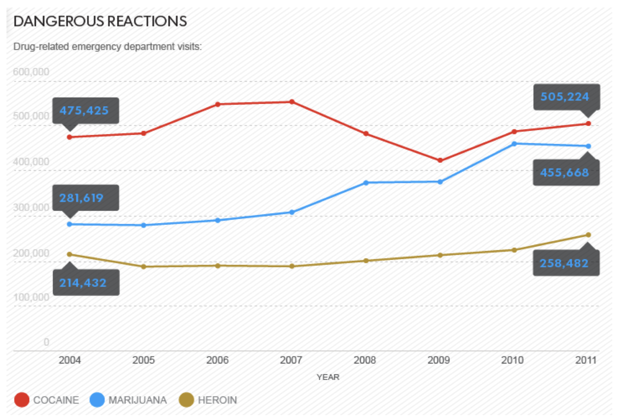
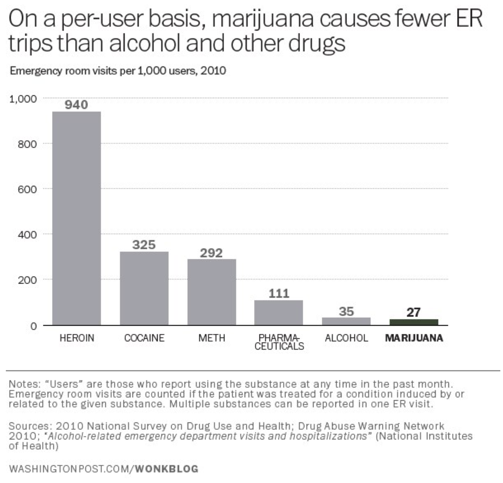
That graphic published in a story in USA Today under the headline “Marijuana poses more risks than many realize.” (Liz Szabo, “Marijuana poses more risks than many realize,” July 27, 2014, USA Today. http://www.usatoday.com/story/news/n.../?sf29269095=1) The chart/headline combo create an alarming impression: if so many more people are going to the emergency room because of marijuana, it must be more dangerous than I realized. Look at that: more than twice as many emergency room visits for pot than heroin; it’s almost as bad as cocaine! Or maybe not. What this chart ignores is the base rates of marijuana-, cocaine-, and heroin-use in the population. Far (far!) more people use marijuana than use heroin or cocaine. A truer measure of the relative dangers of the various drugs would be the number of emergency room visits per user. That gives you a far different chart (from German Lopez, “Marijuana sends more people to the ER than heroin. But that's not the whole story.” August 2, 2014, Vox.com. http://www.vox.com/2014/8/2/5960307/...roin-USA-Today):
Lying with Pictures
Speaking of charts, they are another tool that can be used (abused) to make dubious statistical arguments. We often use charts and other pictures to graphically convey quantitative information. But we must take special care that our pictures accurately depict that information. There are all sorts of ways in which graphical presentations of data can distort the actual state of affairs and mislead our audience.
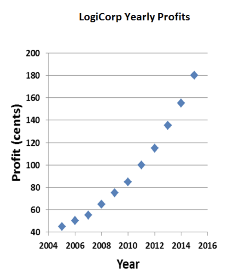
Consider, once again, my fictional company, LogiCorp. Business has been improving lately, and I’m looking to get some outside investors so I can grow even more quickly. So I decide to go on that TV show Shark Tank. You know, the one with Mark Cuban and panel of other rich people, where you make a presentation to them and they decide whether or not your idea is worth investing in. Anyway, I need to plan a persuasive presentation to convince one of the sharks to give me a whole bunch of money for LogiCorp. I’m going to use a graph to impress them with company’s potential for future growth. Here’s a graph of my profits over the last decade:
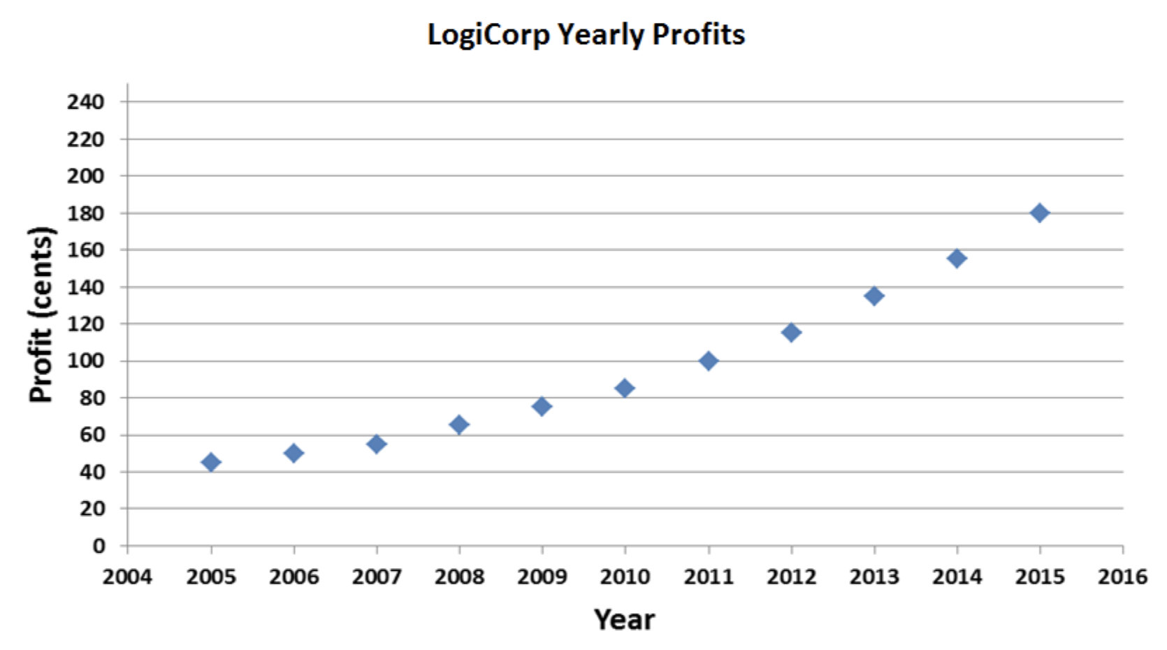
Not bad. But not great, either. The positive trend in profits is clearly visible, but it would be nice if I could make it look a little more dramatic. I’ll just tweak things a bit:
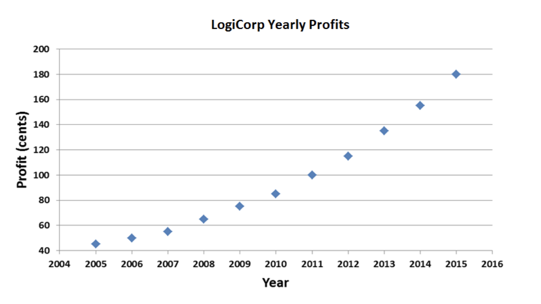
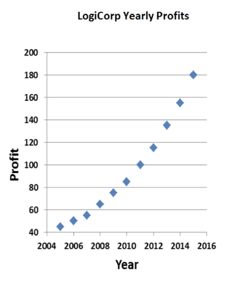
Better. All I did was adjust the y-axis. No reason it has to go all the way down to zero and up to 240. Now the upward slope is accentuated; it looks like LogiCorp is growing more quickly.
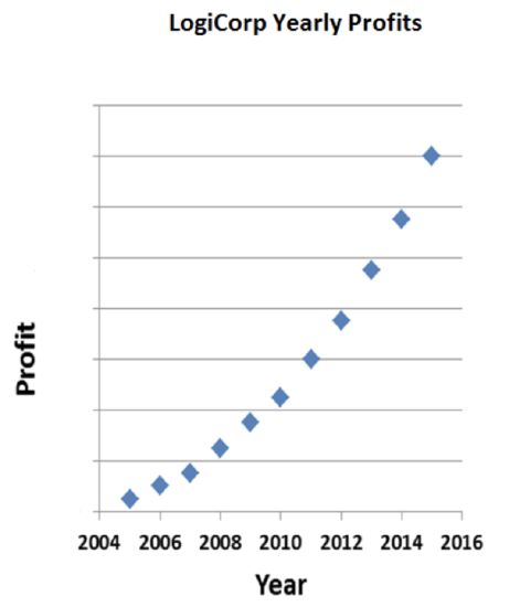
But I think I can do even better. Why does the x-axis have to be so long? If I compressed the graph horizontally, my curve would slope up even more dramatically:
Now that’s explosive growth! The sharks are gonna love this. Well, that is, as long as they don’t look too closely at the chart. Profits on the order of $1.80 per year aren’t going to impress a billionaire like Mark Cuban. But I can fix that:
There. For all those sharks know, profits are measure in the millions of dollars. Of course, for all my manipulations, they can still see that profits have increased 400% over the decade. That’s pretty good, of course, but maybe I can leave a little room for them to mentally fill in more impressive numbers:
That’s the one. Soaring profits, and it looks like they started close to zero and went up to—well, we can’t really tell. Maybe those horizontal lines go up in increments of 100, or 1,000. LogiCorp’s profits could be unimaginably high.
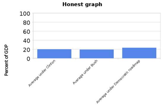
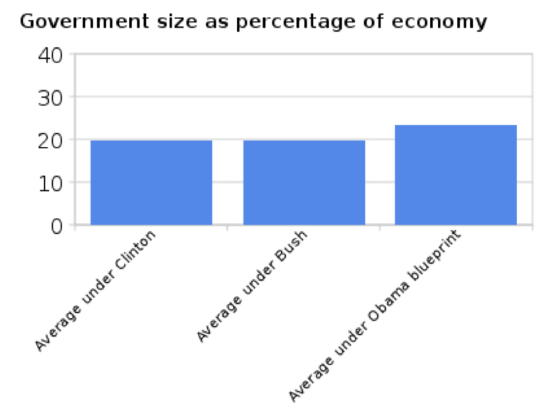
People manipulate the y-axis of charts for rhetorical effect all the time. In their “Pledge to America” document of 2010, the Republican Party promised to pursue various policy priorities if they were able to achieve a majority in the House of Representatives (which they did). They included the following chart in that diagram to illustrate that government spending was out of control:
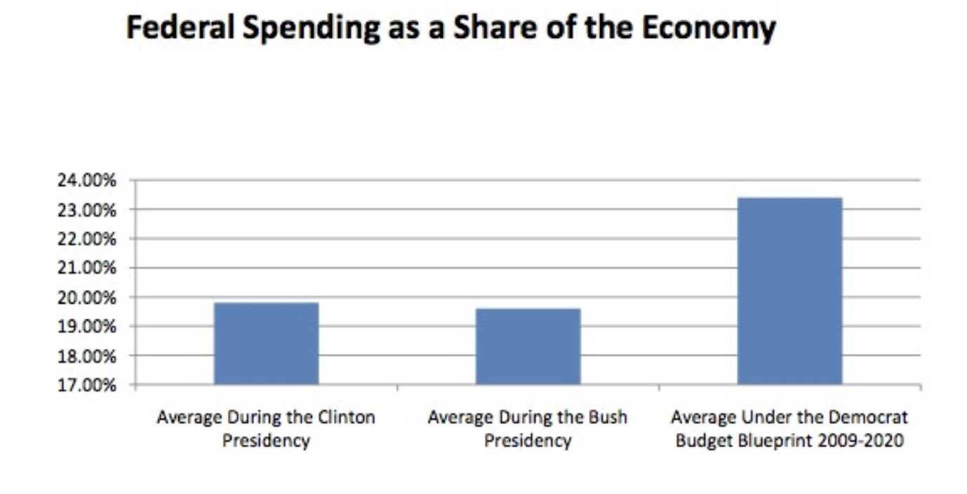
Writing for New Republic, Alexander Hart pointed out that the Republicans’ graph, by starting the y-axis at 17% and only going up to 24%, exaggerates the magnitude of the increase. That bar on the right is more than twice as big as the other two, but federal spending hadn’t doubled. He produced the following alternative presentation of the data (Alexander Hart, “Lying With Graphs, Republican Style (Now Featuring 50% More Graphs),” December 22, 2010, New Republic. https://newrepublic.com/article/7789...publican-style):
Writing for The Washington Post, liberal blogger Ezra Klein passed along the original graph and the more “honest” one. Many of his commenters (including your humble author) pointed out that the new graph was an over-correction of the first: it minimizes the change in spending by taking the y-axis all the way up to 100. He produced a final graph that’s probably the best way to present the spending data (Ezra Klein, “Lies, damn lies, and the 'Y' axis,” September 23, 2010, The Washington Post. http://voices.washingtonpost.com/ezr...he_y_axis.html):
One can make mischief on the x-axis, too. In an April 2011 editorial entitled “Where the Tax Money Is”, The Wall Street Journal made the case that President Obama’s proposal to raise taxes on the rich was a bad idea. (See here: http://www.wsj.com/articles/SB100014...67113524583554) If he was really serious about raising revenue, he would have to raise taxes on the middle class, since that’s where most of the money is. To back up that claim, they produced this graph:
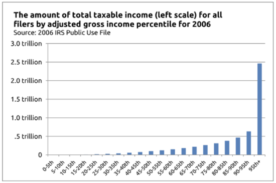
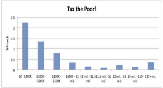
Using The Wall Street Journal’s method of generating histograms—where each bar can represent any number of different households—you can “prove” anything you like. It’s not the rich or even the middle class we should go after if we really want to raise revenue; it’s the poor. That’s where the money is:
There are other ways besides charts and graphs to visually present quantitative information: pictograms. There’s a sophisticated and rule-based method for representing statistical information using such pictures. It was pioneered in the 1920s by the Austrian philosopher Otto Neurath, and was originally called the Vienna Method of Pictorial Statistics (Wiener Methode der Bildstatistik); eventually it came to be known as Isotype (International System of TYpographic Picture Education). (See here: https://en.Wikipedia.org/wiki/Isotyp...ture_language)) The principles of Neurath’s system were such as to prevent the misrepresentation of data with pictograms. Perhaps the most important rule is that greater quantities are to be represented not by larger pictures, but by greater numbers of same-sized pictures. So, for instance, if I wanted to represent the fact that domestic oil production in the United States has doubled over the past several years, I could use the following depiction (I’ve been using this example in class for years, and something tells me I got it from somebody else’s book, but I’ve looked through all the books on my shelves and can’t find it. So maybe I made it up myself. But if I didn’t, this footnote acknowledges whoever did. (If you’re that person, let me know!)):
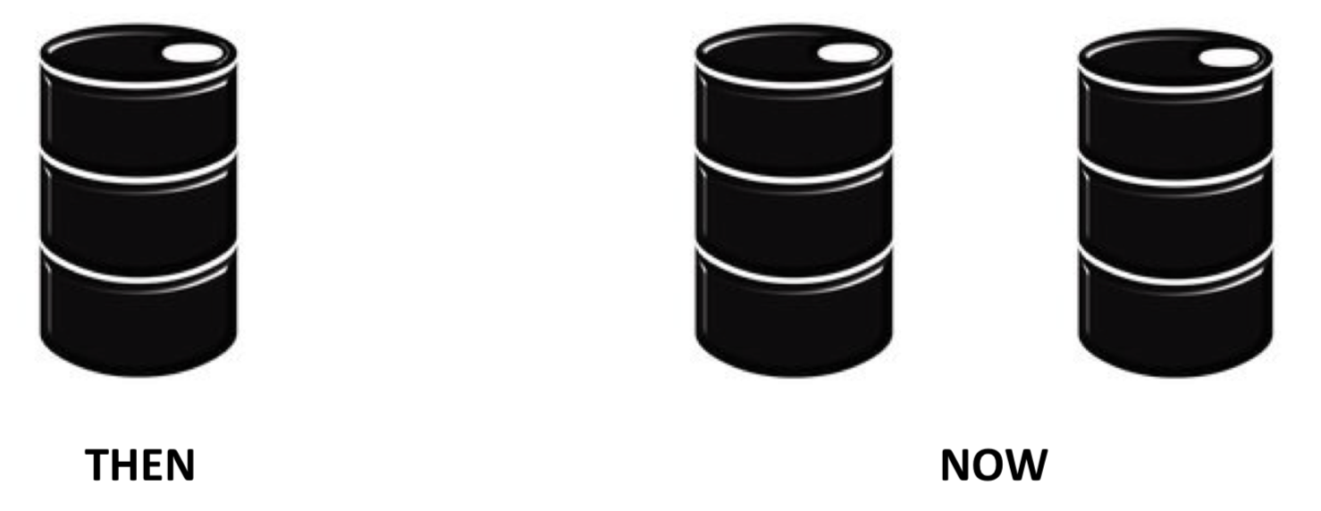
It would be misleading to flout Neurath’s principles and instead represent the increase with a larger barrel:
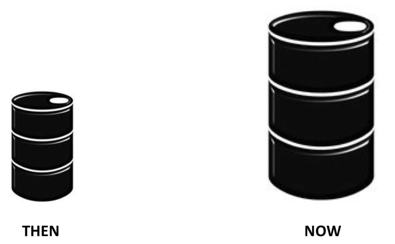
All I did was double the size of the image. But I doubled it in both dimensions: it’s both twice as wide and twice as tall. Moreover, since oil barrels are three dimensional objects, I’ve also depicted a barrel on the right that’s twice as deep. The important thing about oil barrels is how much oil they can hold—their volume. By doubling the barrel in all three dimensions, I’ve depicted a barrel on the right that can hold 8 times as much oil as the one on the left. What I’m showing isn’t a doubling of oil production; it’s an eight-fold increase.
Alas, people break Neurath’s rules all the time, and end up (intentionally or not) exaggerating the phenomena they’re trying to depict. Matthew Yglesias, writing in Architecture magazine, made the point that the housing “bubble” that reached full inflation in 2006 (when lots of homes were built) was not all that unusual. If you look at recent history, you see similar cycles of boom and bust, with periods of lots of building followed by periods of relatively little. The magazine produced a graphic to present the data on home construction, and Yglesias made a point to post it on his blog at Slate.com because he thought it was illustrative. (See here: http://www.slate.com/blogs/moneybox/..._shortage.html) Here’s the graphic:
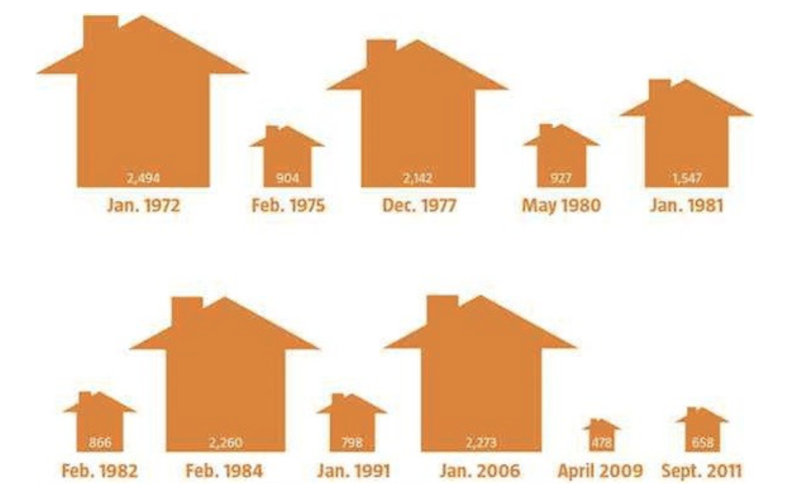
It’s a striking figure, but it exaggerates the swings it’s trying to depict. The picograms are scaled to the numbers in the little houses (which represent the number of homes built in the given months), but in both dimensions. And of course houses are three-dimensional objects, so that even though the picture doesn’t depict the thrid dimension, our unconscious mind knows that these little domisciles have volume. So the Jan. 2006 house (2,273) is more than five times wider and higher than the April 2009 house (478). But five times in three dimensions: 5 x 5 x 5 = 125. The Jan. 2006 house is over 125 times larger than the April 2009 house; that’s why it looks like we have a mansion next to a shed. There were swings in housing construction over the years, but they weren’t as large as this graphic makes them seem.
One ubiquitous picture that’s easy to misinterpret, not because anybody broke Neurath’s rules, but simply because of how things happen to be in the world, is the map of the United States. What makes it tricky is that the individual states’ sizes are not proportional to their populations. This has the effect of exaggerating certain phenomena. Consider the final results of the 2016 presidential election, pictured, as they normally are, with states that went for the Republican candidate in red and those that went for the Democrat in blue. This is what you get (Source of image: https://en.Wikipedia.org/wiki/Electo...United_States)):
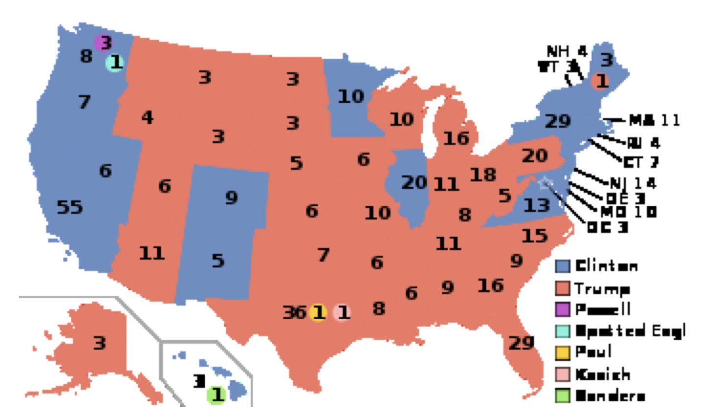
Look at all that red! Clinton apparently got trounced. Except she didn’t: she won the popular vote by more than three million. It looks like there are a lot more Trump votes because he won a lot of states that are very large but contain very few voters. Those Great Plains states are huge, but hardly anybody lives up there. If you were to adjust the map, making the states’ sizes proportional to their populations, you’d end up with something like this (Ibid):
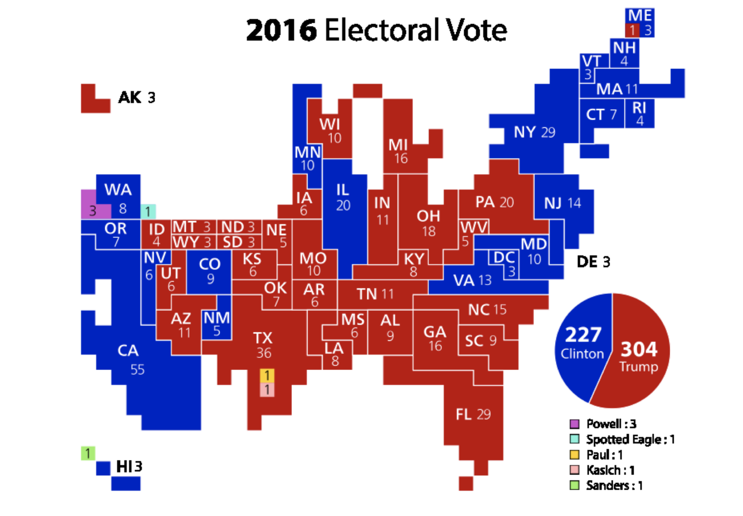
And this is only a partial correction: this sizes the states by electors in the Electoral College; that still exaggerates the sizes of some of those less-populated states. A true adjustment would have to show more blue than red, since Clinton won more votes overall.
I’ll finish with an example stolen directly from the inspiration for this section—Darrell Huff’s How to Lie with Statistics. (p. 103) It is a map of the United States made to raise alarm over the amount of spending being done by the federal government (it was produced over half a century ago; some things never change). Here it is:
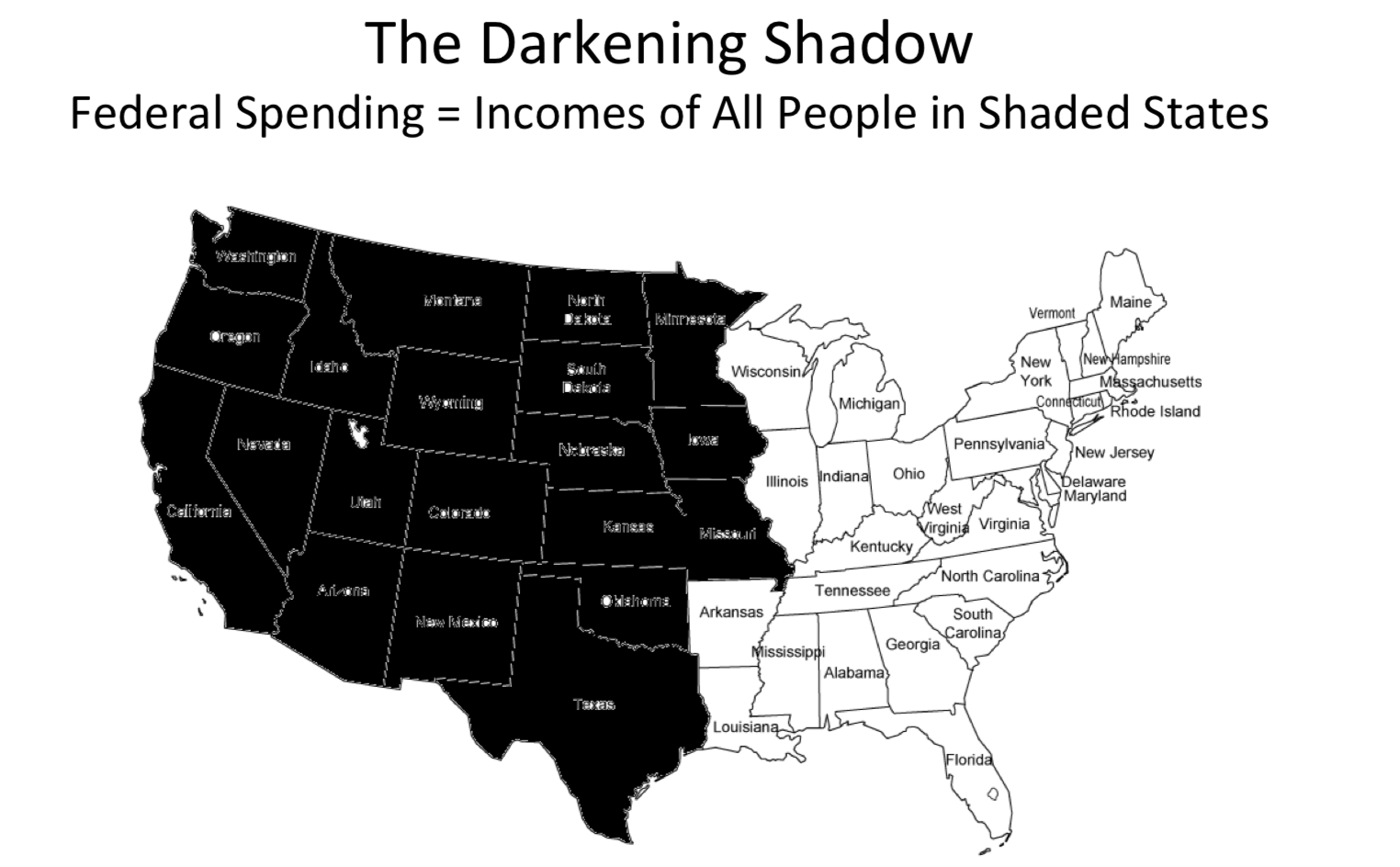
produced his own map (“Eastern style”), shading different states, same total population:

Not nearly so alarming.
People try to fool you in so many different ways. The only defense is a little logic, and a whole lot of skepticism. Be vigilant!