
4.4: Attributes of Fonts
- Page ID
- 50702

Attributes of Fonts
When we look at fonts, we often use the most basic of distinctions to decide the difference between two different competing typefaces. One may simply look better than the other to our eyes, but fonts have any number of fairly universally recognized attributes that we can discuss, as well as distinct personalities. Moving beyond simply liking a font to choosing a font based on its attributes and personality gives us even more ability as technical writers to shape the way our texts impact readers and the way that we research our projects.
First and foremost we can divide fonts by whether or not they have serifs, tiny little embellishments on the letters, often referred to as feet. Serif and sans-serif fonts as they are usually referred to, have different aesthetics that can be traced in any number of directions. Below you’ll find an example of the two types of fonts, with serifs highlighted in red:
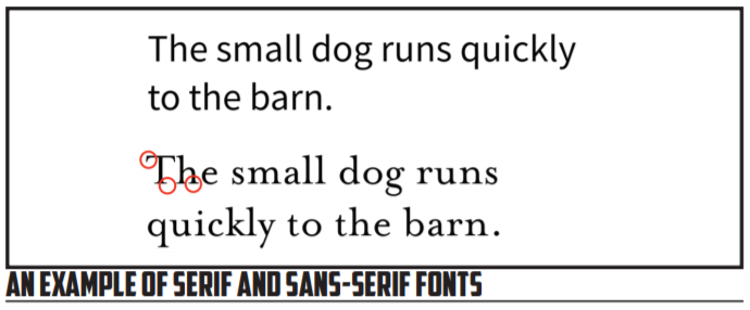
In the first sentence above, we see a sans-serif font. The letters terminate with solid blocky forms with no extra embellishment. In the second example, we see a serif font, one that has the small feet on the edges of the letters.
There are any number of claims made by various sources that about whether serif or sans-serif fonts are superior for different usages. The traditional line is that serif-fonts are best used for body text because the feet allow the text to flow together well. Sans-serif are used in this line of thinking as the headings and headers because they are stark and each letter stands out crisply. Some will also claim that electronic screens are best suited to sans-serif fonts, but there is conflicting research on this subject.
For our purposes, we want to be aware of these differences and use them rhetorically—to persuade and inform our readers. Because sans-serif and serif fonts have a clear visual difference, we want to use that difference to our advantage. We can use serif fonts for one type of information and sans-serif for another, correlating font type with the information type available. We can also think about the cultural character of each choice—serif fonts tend to feel more formal and bookish whereas sans-serif fonts tend to be more minimalist and high-tech in their feel in our current culture (that can change). We can take advantage of these differences and use the font family that best fits the aesthetic and audience we have chosen.
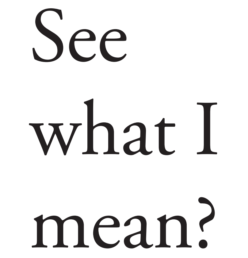
Going beyond serifs, we can also look at the x-height of a font and the behavior of ascenders and descenders in the typeface. As we mentioned previously, x-height refers to the relative height of the lower-case letter x compared to the upper-case letters of the font. The x-height of a font can be used to judge how well the font will perform at small sizes; in addition, a shorter x-height may look less imposing at a larger size if you’re wanting a larger font without overwhelming the reader. Ascenders and descenders are, as perhaps the names suggest, the elements of a font that ascend and descend from the normal line of text. Letters like “q” and “p” and “t” can be tricky with fonts that have substantial amounts of descending and ascending characters. See the image below for examples of each of these elements:
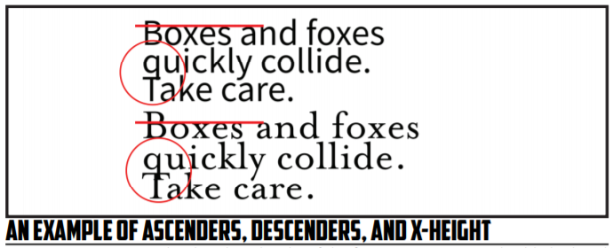
You can see in our two examples that the x-height of the first sentence is considerably higher than the x-height of the second. This creates a font that takes a good bit of room on the line and page. At smaller sizes this can be very useful, though it can feel cramped at larger sizes. With each font you see the ascending “t” and the descending “q.” When the line spacing is tighter, as you see in the example, these ascenders and descenders with more exaggerated lengths can cause issues of legibility that we need to be aware of. The more ornate and exaggerated these elements, the less a font can be condensed with tighter line spacing on the y-axis. (Hint: this is called the leading and we’ll get to it soon).
In addition to the letters, we need to focus on how numbers are presented in fonts. There are generally two types of font that are of importance to us as technical writers, those with lining and those with non-lining numerals. As perhaps the name implies, non-lining numerals are those that don’t stay in an even line with each other. Lining numerals, on the other hand, line up nicely. The difference in readability is incredible and you’ll almost always want to go with lining numerals for technical writing that conveys a lot of numerical data. Compare the two examples below:
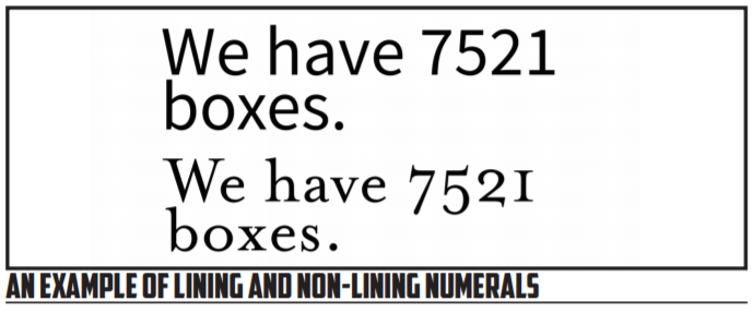
In this example, the first sentence makes use of lining numerals and the second uses non-lining numerals. You can immediately see the difference, with the second example using numbers that vary in their height and line placement. The first example is much more regular, creating a figure that can be referenced a bit easier. Lining numerals are to be generally preferred for passing along large quantities of data since they make reference easier. Non-lining numerals can be more effective for an aesthetic effect or to convey smaller amounts of numbers.
In addition to these attributes, some typefaces have what is referred to as a small caps font within the family. These small caps are a condensed version of the font in all caps that creates a more compressed yet readable variant of the font. You often see small caps in texts that will reference things like the scientific name of a particular species such as vulpes vulpes for a fox. With that said, not every font has an explicitly designed small caps—those that don’t are restricted in their access to this format or have a fake version created by the word processor you’re using. These fake version of small caps are often less legible and less distinct. See the example below for what small caps looks like when designed explicitly:
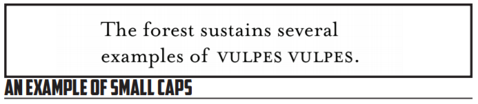
As illustrated above, small caps make sure of a smaller and slightly stylized version of the regular upper case font characters. These characters are sized close to the x-height of the font while maintaining the same general feel of the larger characters. You can see in this example that also lends itself to a slightly wider character as well.
Small caps can be useful for aesthetic reasons as well as practical and conventional uses. In the case of species names, you will often find the usage of small caps appropriate and superior to italics. Compared to italics, small caps stand out more and have more distinct characters. They are also more subtle than all caps, which in the present day are often associated with screaming or HIGH LEVELS OF EMOTION IN WRITING.
Having looked at the various attributes of fonts, we finally need to look at the collected impact of those attributes—the personality of a given font. In addition to having particular characteristics, fonts have an overall feel that makes them work in some situations and not work in other situations. Script-style fonts tend to feel more formal and antiquated or intimate whereas more bold and blocky letterforms seem convey an entirely different aesthetic. Decorative fonts, at the furtherest extreme, sacrifice paragraph-level readability for a particular look and feel. Compare the fonts below and the messages they convey:
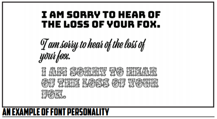
In the example above, the message is one of general sympathy that you might find in a card that would be sent after the loss of a fox. Each of the fonts above conveys the message in a different way with varying levels of appropriateness. The first example is blocky and modern feeling, attributes we don’t normally associate with sympathy. The middle example is a script-style font and conveys the aesthetic we’d associate with grief communications. The final example is a decorative font that simply feels out of place and difficult to read—this font may have its uses, but full sentences of text is likely not the ideal choice!
Before we move on, I want tack on one additional note about fonts and symbols, and specifically symbol-oriented font families. You may have wondered in the past, like many of us no doubt, about the purpose behind the Wingdings family of fonts. Why do they exist? Who can possibly read them? The answer is simple: they aren’t designed to be read. Wingdings and other symbol-based fonts, such as stylized fonts of the Greek alphabet that you might use in creating content for a fraternity or sorority, exist to provide high-quality and scalable graphical indicators that don’t have to be embedded as an image. Instead, they scale in the same way that a font would and provide access to certain images without the need for embedding other content. They may not always have immediate uses to us, but be aware they exist and that you can browse them using the symbol insertion feature of most design and word processing tools.
Kerning and Tracking and Leading, Oh My!
Having looked at the various attributes of fonts, we now want to turn our gaze to the ways that we can manipulate fonts for different effects. As with the attributes and personalities of a font, all of this work is done in service of the use we have in mind for a font and the way we plan to implement the font in our documents. Just like the attributes of a font, these manipulations of fonts can impact the way the fonts are received and the readability of the text that results from their usage.
Each of these attributes of fonts has to do with the relationship between individual characters and lines vertically and horizontally. By adjusting these characters, we can often fit a particular font into a particular use for a particular goal. Kerning and tracking and leading aren’t necessarily something you’ll be tweaking all the time—just like you won’t need to constantly obsess about the x-height of a font. But, being aware of these options for font adjustment can be the difference between a deliverable that is good or okay and one that is excellent for a particular usage.
We’ll start with kerning, the spacing between individual characters in a particular font. Kerning is something that is often hidden from us when we’re working with fonts in a standard word processor. Unlike other options that we’ll eventually look at, kerning works on a letter-by-letter basis, adjusting the spacing of different letters until we’re entirely happy with the way they’re spaced. One reason that kerning is often overlooked is because the choices regarding kerning are normally baked into any given typeface that you make use of. The designer of the font, in laying out the different glyphs, will have chosen what the natural kerning will be of the font.
The most likely scenario where you’d want to regularly adjust kerning would be when you’re going to be using a font in a way that it wasn’t designed to be used—often at a very large size. This isn’t always the case—some fonts are designed for signage rather than paragraph blocks of print—but, more often than not you’ll find yourself wanting to tweak kerning after you’ve made something excessively large. With programs that are more design-friendly, you’ll be able to choose between optical and metric kerning. Metric kerning is the basic kerning baked into your font, whereas optical kerning applies math to the spacing to give you a better spacing at larger sizes. The idea behind the optical option is that the default kerning just won’t work as well at larger font sizes where everything gets exaggerated—especially letter spacing.
As in the example text on the previous page, you start to see more issues with kerning using letters that need a good deal of elbow room, letters like “R” and “W.” These letters can be a real bear to work with because they have a larger spacing to begin with in the font’s internal calculations, and the larger sizing means that those calculations get exaggerated effects at larger sizes. Some fonts will do better than others, but you’ll likely need to switch to optical kerning or manually kern the letters to get the impact you want—-usually a tighter text profile.
Take a look at the examples below: two different font options will be presented for the same font and the same text, one with tighter kerning at a larger size and another with a looser kerning at a larger size. See which you prefer for a headline:
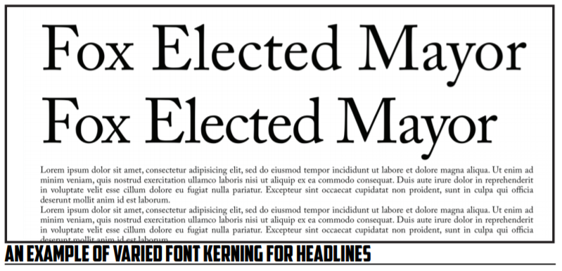
In the above example, you have two different amounts of kerning between the two text groups, though my kerning isn’t perfect in the second. The top example is the default kerning of the font I’m using at 150pt or so. Below it I have some placeholder text that you can use to see how well these would go with a body of text as a headline. Notice that the second example is much tighter and looks a bit more impactful—the lack of extra spacing gives the text more weight. The wider kerning doesn’t work as well—it looks a bit too airy for a headline. Now, my kerning could be better: I’m not 100% happy with the gap between “F” and “o” in “Fox,” but the difference I think is fairly clear.
Besides using kerning to adjust for larger sizing, you may also want to use kerning for creative effect, altering the spacing on words to make them convey something different than they would with traditional spacing. An example will likely make this use a bit clearer, though my example won’t be the best:
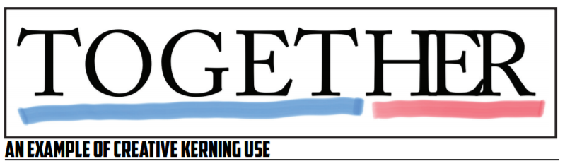
Here, you have the “her” of “together” kerned manually to create an emphasis on the “her” part of things. You might be able to use this perhaps in an instance where you’re naming a brand or a product and you want to have an iconic wordmark that you can use for identification. It might look something like this:
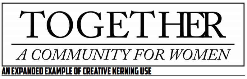
Now, you may have already seen some issues with the way that I’ve done this. For me, I see that when you separate “her” from the rest of the word, “together” can be read as “To get her,” due to the way that the spacing makes us more aware that there are individual smaller words in “together.” So, in this case it might not be the best idea to separate “her” with kerning because the final result might run afoul of my goal. That’s the risk we run into when we start kerning things to emphasize certain parts of words.
Having looked at kerning, we next want to take a step up to tracking, an approach to modifying text that takes the concept of kerning and applies it across a full word or more. Tracking is the adjustment of the space between all letters at once—instead of taking a one at a time approach, you do everything all at once. Tracking can be useful for tightening up a loose headline or header that has gotten too wide or for spacing out something that needs to fill a bit more space. Be warned, however, that tracking is a fairly blunt approach to spacing letters. You will sometimes find that tracking changes will make most letters look good while leaving a few letters looking awkward. These issues you’re running into with tight or wide tracking that becomes awkwardly wide or narrow for certain letters, they’re why kerning exists and why fonts are kerned in the first place! As a head’s up—many word processors will hide tracking under the term letter spacing.
As we’ve already noted, tracking can be useful to tighten up headlines as needed. I’ll even let you in on a little secret: I used tracking in my example above with the mayor-based headline. Practically speaking, it can be very hard to see differences between tracked headlines and manually kerned ones. In my case, as I noted above, the “F” gave me away slightly.
You can also use tracking in the other direction to give yourself more space when you need it to make sense. You may have seen this type of approach in certain word-based designs or posters that use extra space between letters to give an individual word the ability to fill an entire space. Below you’ll see an example of what that looks like with and without the extra spacing:
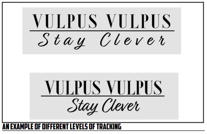
In the above examples, you see two different approaches to the same wordmark design, one using tighter tracking, and the other using looser tracking. You’ll see in the top example there is an airy feel to things and the two different text selections hold the same general width. In the case of the second line, this takes a script that flows together and makes it much more spaced and less obviously a tight script font. Personally, I’m a fan of the first item—I think it works better as a brand as the letters stand out and are more aggressive in their presentation (though breaking up a script font that connects can be dangerous). The tighter presentation of the second example simply looks like text to me, text that has been made larger. What do you think?
Much like kerning, tracking can be used for these creative endeavors, or simply to fix the natural spacing of your fonts as you work with larger sizes. As technical writers you won’t be placed, normally, in the demanding position of a graphic design professional, folks who take knowledge like this of font design as a mere starting place for all that they do. However, having an awareness of the ways that you can tweak even down to the character and line spacing opens up so much more for you when you’re doing design work. There really is just about as much you can do with fonts and spacing as you can do with paragraphs and headings!
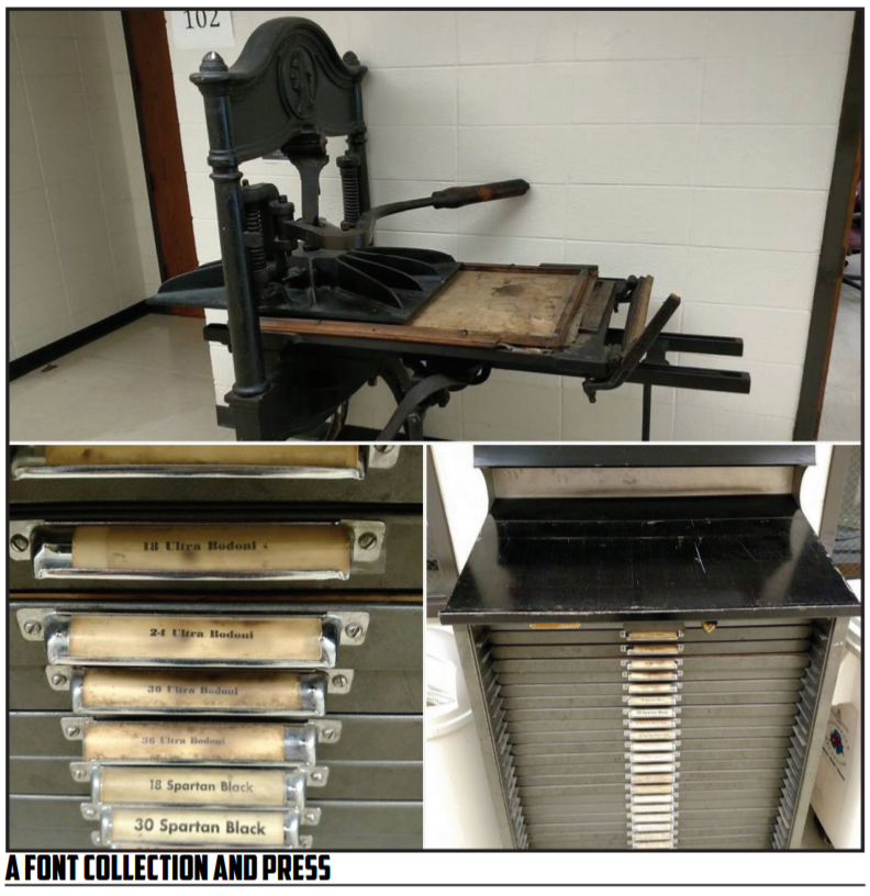
The final spacing term that we’ll discuss is leading, pronounced like the metal not the action. Leading refers to the space between lines, also known as line spacing. The classic term leading comes from the actual lead that would have been used in a printing press between the different lines. For a fun font fact, upper and lower case letters are simply those found in the upper and lower case of a font collection. The name is based on the physical placement of those images. Here’s an example of a simple press and font bin:
Leading, like tracking and kerning, can be used to shape the way our texts are perceived as well as the ways that they inhabit a space. As you create more space between lines, you give more space for ascenders and descenders to freely reach. Some fonts may well require you to manually adjust leading if they have an aggressive script that juts below and above the baseline, the invisible line that all type on a given line is oriented to. More space between lines can reach a point, however, where the lines cease to appear like they are part of the same text—they begin to break up into paragraphs or other structures. When you’re using leading to give yourself more room, take care that you don’t pass this invisible point of no return. See the example below for what different amounts of leading do to the same text:
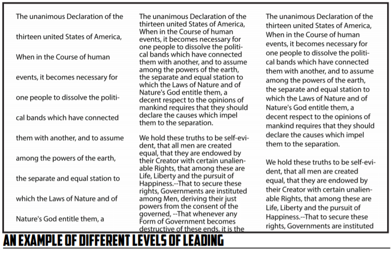
Here we have three different takes on leading—the first example has aggressive leading, to the point that we barely get any text on the screen, the second example has an incredibly tight leading, almost getting to the point we don’t want to read, and the third example has normal leading. Each has its own impact on the text.
In the example above, notice that one primary facet of leading is that it makes paragraphs more distinct as visual units when the leading gets smaller—you see the larger spaces between lines a bit better when the leading is tight, but those blur and almost fall away when you start dealing with larger amounts of leading. A slight reduction of the leading can tighten up a visual design, but larger amounts can have the opposite effect.
Practically speaking, you can use more leading in places where you may want to have a text annotated and worked on. Think about double-spaced papers that you might have been required to submit in the past: the number one reason these papers are useful from a practical standpoint is that if you’re doing handwritten markup on a paper, grading with pen and paper if you will, then you have room for comments and changes. The same holds true for any type of editing work. However, outside of those constraints, tighter leading is more pleasant to read (at least to me!) and wastes less space and paper.
One point of caution regarding all of the types of typographical manipulation we’ve discussed: do not use these tools to simply make something fit where it won’t normally fit. When you go to great lengths to wedge a text into a small space using tracking or leading, you’re getting your text into a place it wasn’t designed to fit, literally. In this equation you save space at the cost of readability, and the folks who bear the brunt of that readability will be your users. Don’t do that to them, please.