
3.3: Signs, Safety, and Visual Rhetoric
- Page ID
- 50694

Signs, Safety, and Visual Rhetoric
When you’re working with visuals and visual communication, one important aspect of this type of work to keep in mind is the presence of safety and warning signage and their associated conventions and representations. As with any type of visual rhetoric, there are conventions that will come into play and conventions that can be flouted or adapted. Think about this section as an extended addendum to the previous, one that goes over a few issues that are of note when we’re working with visual conventions and rhetoric that involve safety and signage.
Warnings and Color Systems
One ever-present part of almost any instruction manual or poster is the warning and caution system. These warning systems are so regular for some of us that we almost ignore/internalize them, but they are worth focusing on specifically as technical writers. When you have any sort of technical process, you have some aspects of that process that are more dangerous or more important than others. You may have some steps, for example, that are particularly troublesome or have just historically caused issues (even if you wouldn’t think they would—people are weird). In those cases, you may need a warning note or signage.
Coloration is one important part of warnings and cautions. When we think about the Western use of such colors, we often resort to the colors red and yellow for our work—these colors map onto our streetlights and are used in any number of areas. The visual rhetoric behind these choices is fairly universal—when you see red, you’re expected to stop or expect some serious consequences that should be avoided or that you should be made aware of. When you see yellow, you’re going to expect to slow down or realize that there is a particularly tricky step or issue about to happen. In each case, color gets recognized before the text.
Even though we use color, we should be aware that all colors don’t mean the same thing in all situations and cultures. Colors that have one association in the United States may have entirely different meanings in other cultures! Part of understanding how to use colors in signage and visual rhetoric is to understand the meaning behind your choices or the meanings you’re trying to connect to your choices (which we’ll focus on more in document design). For example, Halloween is my favorite holiday of all time, but it is a holiday that isn’t universal. Invoking Halloween with orange and black won’t work everywhere because the tradition is not one that is immediately apparent to some groups.
Warnings and Signage Conventions
When we create any sort of visual rhetoric that is designed to warn or caution folks, first and fore more realize that these signs often have mandated rules and regulations behind them. You don’t simply create your own chemical safety poster/signage—you use the mandated and approved signage. These mandates are important because the diverse groups may need to use them quickly, such as first-responders going through a burning building. The flexibility of some visual rhetorical choices is limited simply because more flexibility would introduce the chance that misunderstandings could happen.
As a brief aside, this is also true of auditory warnings. A few years ago a film got into trouble for using the Emergency Broadcast System tone for a trailer. You simply can’t do that—it is illegal. The whole goal of that tone is to prepare citizens for emergency information. If it was allowed in any other case, it would lose its value. Because of that, it is protected vigorously.
Developing Visual Rhetoric for Safety with Signs
For our purposes, we need to be acutely aware of what existing laws apply to any signage that we might use. While it may be amusing to read those faux signs that warn something akin to, “If you touch this, it will kill you and it will hurt the whole time,” there are many times government or institution-mandated choices that have been made for us already.
For signs that involve harm to the process being carried out or to individuals, we can follow a fairly direct workflow, in addition to what is noted above:
Signs and Safety Workflow
1) What are the dangers of this task?
a. To people
b. To property
c. To other stuff™
2) What needs to be communicated to folks involved?
3 )What official signage already exists?
4) What signage exists that covers similar territory that could be adapted?
5) What legal or regulatory constraints control the signage or its presence?
1) What are the dangers of this task?
First and foremost, establish what dangers exist. You want to first of all know if someone might become injured or perhaps even lose their life. You also want to know how something could be damaged, potentially catastrophically. Finally, think about the types of dangers that exist that aren’t necessarily either—such as risks to appearance or reputation or relationships. (Medical records are private for these exact reasons.)
2) What needs to be communicated to the folks involved?
There is a difference between knowing what is dangerous and knowing what someone needs to know. Figure out what someone must know about the situation. It might be that there is a live wire involved. It could be that installing a certain part is a one-way process that can’t be reversed. It could be that no lifeguard is present. It depends really. But, figure out what is absolutely needed.
3) What official signage exists?
If something official exists, you’ll need to use it. Find out what examples are out there and what templates you can use. In some cases, you need a specific sign, such as with material labeling.
4) What signage exists that covers similar territory that could be adapted?
Because of the way that visual conventions work, you may have something that exists out there that you can adapt. If there is a common way of signaling something that isn’t legally mandated, you can draw on your audience’s knowledge of that format to get your point across. The same is true if there is an institutional equivalent that is often used in these situations.
5) What legal or regulatory constraints control the signage or its presence?
In some cases, you may have some legal rules around when signs must be present, though the signs may not be mandated to have a particular design. You need to be aware of those needs and design accordingly. For example, theme parks have ride-heights that are enforced via signage. The conventions vary between parks, but they are regulated to prevent accident and injury and are often easily understood by audiences because of their shared visual conventions.
The Visual Rhetoric of Context with Signage
When it comes to creating signs in particular, think about the users that will encounter those signs. As with the above section, think of this as a focused addendum to the visual rhetoric drafting process from earlier. Signs should rely on visuals that make sense to readers within the context they are deployed. Signs, more than any other type of visual rhetoric, relay information with visual shorthand. Too much information and a sign is useless, or it becomes an infographic or directory or map. Too little information in a sign and ambiguity and confusion reign.
Signs and the power of context
Think about the signage in a library, such as the library I’m drafting this text in. Library signage can do things that other signs can’t because of the way that we read them. In a library, we’re expecting to find things in the way that you find them in a library. For some collections, that means the Dewey Decimal System or whatever equivalent might exist. In other situations, it means alphabetical listings. In either case, signs in the library can reference alphabetical lists or a numerical reference system without explanation because the situation of the library explains what those elements mean:
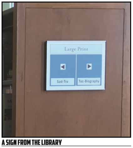
Take the example sign above—You have 7 major areas that are conveying information to the audience/user. You have a major block at the type labeled “Large Print.” This block, from the context, we would assume refers to large print books. There really aren’t a lot of other options in a library for this to have another meaning! Below that are two large blue blocks, each with arrows within them and smaller blocks as well. The arrows, from the context, we interpret as one side or another of the bookshelf. The arrows function that way from the context—there isn’t room for much else to make sense. Finally, there is the smaller box that starts with one short snippet and ends with another, such as the amusing choice of “Sad-Tru.” Because the context of the library, we can understand these terms to likely reference alphabetical ordering. If we want something that falls between “sad” and “tru” in the alphabet, we’ll look on the left side of the shelf. If we want something beyond, we’ll need to look at the other side or further along.
For your own work, think about context. What can someone be expected to know? What will they not know? What visuals will make sense within this context? Which won’t?
Section Break - Signs and Conventions
- What are some signs that rely heavily on location for meaning? How does the association work?
- What are some examples of excellent signs? Why are they great?