
10.7: Analyzing Visual Arguments
- Page ID
- 108860

Listen to an audio version of this page (12 min, 49 sec):
What is a visual argument?
Many of the arguments that we encounter daily aren’t textual, and we often don’t even register them as arguments. Drive along the freeway or leaf through a magazine, and we are bombarded by visual arguments in the form of advertisements, instructions, PSAs, and infographics. Images, unlike text, can hit us immediately, right in the gut, because our minds process and respond to images much faster than they process language. Consequently, many advertisements rely on non-rational appeals such as scare tactics, lifestyle promises, allusions to sexuality or status, satire, and FOMO to sell their claims. Consider the image below, which endeavors, without text, to raise awareness about the dangers of smoking cigarettes (fig. 1):
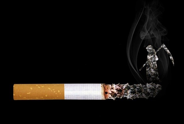
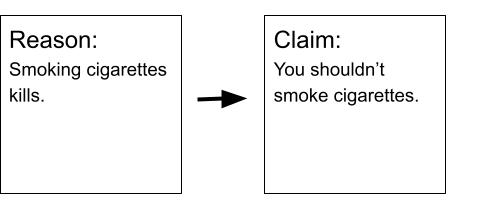
The above image makes an argument in purely visual terms, and relies on blunt, recognizable images, one common and one mythical, juxtaposed in a surprising and uncanny way. An oversized cigarette on a black background already plays with our expectations about scale. This object is huge, and unanchored to anything else around it, seeming to float in space. The background is pure and textureless black, providing no refuge for the eye. The cigarette, burned more than halfway down with a long ash hanging off its end, terminates in the grim reaper as an extension of the ash, moving upward with the smoke. The figure of the reaper is facing toward the butt of the cigarette, where the implied smoker’s face would be. Because images strike our brain with non-rational appeals almost instantaneously (in the above case by conceptually linking smoking with death), they operate faster than text alone, and with more emotional impact. If we created an argument map for this image, it might look like this:
All without using a single word. But the image evokes a much stronger and more visceral reaction than the written claim and reason pair. When images are paired with text, the text often reinforces or completes the implied message of the image itself. Let's look at an example:

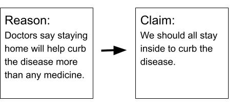
Like the smoking ad, this image plays with scale, but it doesn’t use scare tactics (after all, its purpose is much more encouraging since it is asking us to adopt a behavior rather than discontinue one). A doctor’s pill bottle rests on a soothing peach background (with a drop shadow beneath it, so unlike the cigarette ad we get a sense that this bottle exists in three-dimensional space). Inside the pill bottle, however, there is a tiny chair and cushion like we might find in a living room. This image alone doesn’t provide enough context for us to interpret it, however, and requires the text below it, which is laid out like the label on a pill bottle. The text reads: “PRESCRIPTION: STAY AT HOME” and beneath that, “Disease: Covid-19 / Patient Name: Everyone / Take: Daily.” The image and text together generate an interesting juxtaposition of two ideas—a doctor’s orders on the one hand and the comfort of home on the other. An argument map of the visual argument might look like this:
The argument relies on our associations with the images it combines. A pill bottle might generate alarm since it suggests the hazards of ill-health, but it is paired with a symbol of home and comfort, a chair. Similarly, Covid-19 itself is likely to bring up fears of ill-health and economic instability, but the image of the chair soothes those fears too, since implied experts (doctors) are the ones recommending the course of action, inviting us to relax and wait out the duration of the disease in relative comfort.
Elements of a visual argument analysis
Just as we begin an analysis of a written argument with a summary, we should describe a visual argument and summarize its intended messages before we analyze its appeals and evaluate their effectiveness. The analysis should discuss the image’s ideas, its appeals to emotion, and its appeal to trust and connection (review Chapter 10). How do the visuals come together with the text to generate the argument? How are viewers supposed to react to the combination of text and images? To begin, describe and analyze, as outlined below:
Description of the image
Even though a visual argument analysis will usually feature the image itself so readers can see it, describing it draws readers' attention to the main elements of the image. We can dive deep into how the elements work together; the way the colors, objects, people, shapes, arrangement, and tone interact with the text, if there is any. This prepares us to analyze the intended effect of these elements later. Here, we will only consider the explicit and obvious components of the image, saving interpretation of its implicit message for our analysis phase. Consider the following questions:
-
Colors: What colors does the creator choose? Are the hues warm or hot (reds, oranges) or cool (blues, greens). Are the colors bright or muted?
-
Objects and shapes: What are they? How are they arranged? Do the images play with scale or catch our attention with cognitive dissonance?
-
People and places: Are there recognizable people or places in the image?
-
Arrangement of elements: Where does your eye go first and where does it travel after that?
-
Text: If the text is short, you will want to quote it in your description. What kinds of fonts did the author select?
Summary of the argument
Once we have described the image, we can tease out any implied messages. Does any text included in the image reinforce, contradict, or complicate the visual messages? What is the overall argument, and what is the underlying reasoning? To come up with the summary, we might want to try to make an argument map as we did for the examples above.
Analysis of the appeals
The analysis should explain how the image's elements are intended to affect the viewer and convince them of the argument. Below are questions adapted from Section 10.2: Generating Ideas for an Argument Analysis Paper that we can ask about a visual argument:
-
Colors: What about the color choices elicits a response in the viewer? What would change with another color scheme? Do the colors appeal to emotion, self-interest, or sense of identity?
-
Objects and shapes: Why and how do the objects and shapes operate upon the viewer the way they do? How do they generate emotion, appeal to self-interest or sense of identity, or establish urgency?
-
People and places: Why and how do the people and places implied or explicit in the combination of text and images generate emotion, appeal to self-interest or sense of identity, or establish urgency?
-
Arrangement of elements: How do these contribute to the viewers’ reaction? Would a different arrangement convey a different sense of urgency or emotion?
-
Tone: What is the overall tone of the image? How do the image’s elements contribute to that tone and what effect does the tone have on viewers?
-
Audience: Who is the primary audience for this visual argument? Does it have a secondary audience (for instance a toy commercial might entice children with the product while still addressing the safety concerns for the person with the credit card)? Does the target audience have a specific age, socio-economic status, gender?
-
Emotions: Does the combination of text and images appeal to particular emotions to further its argument? What values does the image seek to appeal to? How does it establish a sense that the image is important, urgent, relevant or somehow worth the viewers’ attention?
-
Trust and connection: How does the combination of text and images seek to gain viewers’ trust? How does it establish good will? Does it appeal to a shared sense of identity?
-
Overall effect: How do all these intended effects work together? How do the authors of the work want viewers to react to all of the above as a whole?
The argument's context
In our analysis, we will want to consider the larger purpose of the argument, and the constraints it has to work with, or the factors limiting it.
Purpose
Visual advertisements have perhaps the most obvious purpose: to persuade viewers to purchase the product or service being advertised. However, public service announcements, from anti-smoking ads to Smokey the Bear, have a more virtuous purpose of promoting public health and safety. Even street signs and traffic lights are visual arguments urging us to stop, go, slow down, or turn on green; their purpose is to safely conduct the flow of traffic. When you format your essay according to MLA guidelines, with 1-inch margins, double-spaced text, and a Works Cited page, that is a kind of visual argument that asks your reader to take you seriously as a scholar. That said, not every image necessarily implies an argument. A flag, for example, may be a recognizable image and may refer to a country and carry associations with national values, but taken on its own does not necessarily convey an argument. Consider the following questions when thinking about purpose:
-
What does the piece want from us? Is it asking us to purchase something, or to choose a particular brand over a competitor? Is it a call to action, or is it trying to educate?
-
Who designed the piece? Did a company or organization sponsor its creation and dissemination? What are the organization’s motives in disseminating it?
Constraints
The imagery featured in a magazine or billboard advertisement is at once as boundless as the advertiser’s imagination but, at the same time, limited to what can be printed in a given magazine or roadside billboard. Even the example of street signs and traffic lights, mentioned above, must be conveyed using a familiar, shared set of symbols (red for stop, green for go). One can imagine how confusing or hazardous driving would be if every road or town used a different set of symbols or signs to conduct traffic. Consider the following questions when analyzing visual arguments:
-
When was the material created? Where was it created? What are the important cultural and social movements, discoveries, or events of that era?
-
What kind of media is it? Does it appear in a magazine, newspaper, billboard, or online? How much average time would we spend looking at it (different, say, if we are passing a billboard in a moving car or leafing through a magazine, or watching a television spot)?
-
Does this piece fall into a particular genre (i.e. the appeal from a celebrity, the promise of status or safety, the appeal to fear, or the family appeal)? What are the limitations of the genre?
Assessment of the argument's effectiveness
Is the visual argument well constructed to achieve its goal? Once we have summarized the intended message and made explicit any implied claims, we can assess the strengths and weaknesses of the reasoning as we did in Chapter 4: Assessing the Strength of an Argument. What are the underlying assumptions? Are they sound?
The next question is whether the argument will appeal to viewers in the way it intends. Will the visual elements affect viewers emotionally as intended? Will they succeed in gaining viewers' trust? Does the author make assumptions about the audience that damage the argument?
Explain any ways the material might fail to get the reaction it is going for. You can use your own reactions as examples but can also speculate about likely reactions from other viewers. Will different groups of readers likely respond to the use of images and text in different ways? If so, we can argue that the visual argument will convince some and not others.