
2.4: Form and Composition
- Page ID
- 10118

When looking at art, many people today take a holistic or gestalt approach to understanding it. In this approach, the work of art is experienced as a single unified whole and an intuitive con- clusion is drawn. This approach to art is a good place to start, but it can also be useful to examine the individual parts of an artwork and the relationships those parts have to the whole. When we examine an artwork by taking it apart, we are looking at its design. Design is divided into two broad categories: the elements of design and the principles of design. The elements of design are the physical parts of the artwork, or the form. The principles of design are the ways in which those parts are arranged or used, or the composition.
2.4.1 Elements of Design
A design is a governing plan or approach by which various parts of an artwork are created and assembled. It is rare to find a work of art that is entirely accidental or has come wholly out of the unconscious intuition of an artist. Further, looking at the way in which various parts of a work of art are arranged—even an intuitive or accidental work—can reveal clues to the goals and beliefs of the artist, the community in which the artist has worked, and the problems the work of art was meant to address.
There are six basic elements of design: line, shape, mass/volume, perspective, texture, and color. One way to think of these elements of design is to “walk up the ladder” of dimension. Our perceived world has three dimensions of space and one of time. Mathematically, a point has zero dimensions. A line has one dimension, length. A shape has two dimensions, length and height. A form with mass or volume has three dimensions, length, height, and width. In moving from points to volumes, we have “walked up the ladder” of dimension from zero to three. In addition to the three dimensions of physical space, there are two more things artists can incorporate into a given work. They can introduce texture, and they can introduce color.
Here is a brief explanation of the definition and dynamics of each element of design.
2.4.1.1 Line
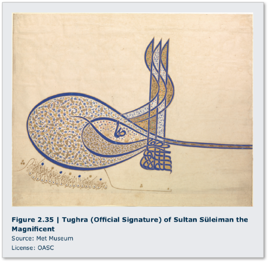
Line is the first order element of design. A line is an infinite series of points that are arranged in a direction. The direction of a line may be straight (unchanging) or curved (changing). All kinds of objects are linear, or predominantly formed by using lines. Calligraphy, or “beauti- ful writing,” is one popular use of line. The character of line in writing has two main functions. First, the linear figure or shape of a written symbol denotes its meaning. Second, the manner in which the figure is created can be seen as expressive in itself. A tughra, or the calligraphic sig- nature of a sultan, and the re- fined text of Arabic calligraphy are renowned for their expres- sive beauty, as are many works of Asian script. In many writing cultures, the beauty of the script is as important as the message the script contains. (Figure 2.35)
One quality of line is gesture. Gesture is the line produced by the movement of the artist’s hand, arm, or body, of a kind of dance with the material, as can be seen in this photograph of Jack- son Pollock in the midst of painting. (Jackson Pollock: upload.wikimedia.org/wikipedia/ en/b/b7/Jackson-Pollock.jpg) For example, short, uneven staccato lines may be read as impatient, or lacking in confidence or grace. Evenly drawn horizontal lines express calm. Straight lines can represent rigidity, which is neither good nor bad, but depends on context. A rigid bridge is a good thing for those who depend on it not to give way. A rigid tree in a windstorm will sometimes be uprooted.

Contour is the line where differing areas meet and form edges. Human visual perception includes an enhanced ability to detect edges in nature. Contour lines follow the shapes of objects where they stand out from backgrounds. In mapmaking, contour lines indicate the shape of the landscape in regular increments of vertical height. On contour maps, lines that appear close together indicate a rapid change in height. Lines that are far apart indicate more gentle slopes. (GroundTruth Contours: http://wiki.openstreetmap.org/w/imag...urs_Detail.png)
Crosshatching is the use of uniformly spaced intersecting lines that create the perception of value or light and dark. These crosshatching lines generally follow the shape of an object. (Fig- ures 2.4 and 2.36)
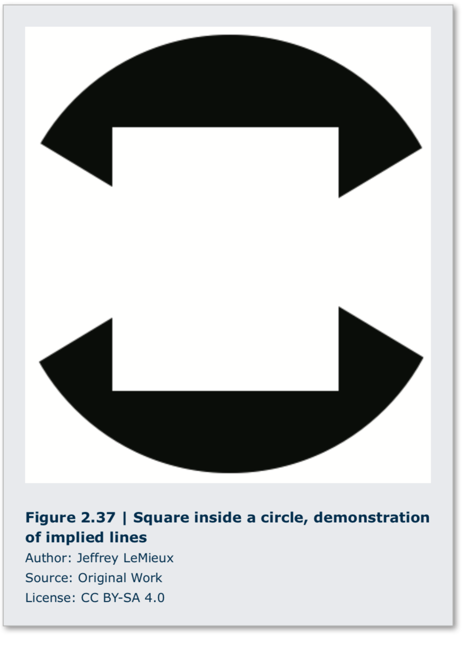
Some lines are not drawn at all. Instead, they are implied or suggested by an inten- tional alignment of shapes. The image of the square inside the circle is an example of im- plied line. (Figure 2.37) Lines that converge beyond the edge of an artwork are another because they imply a distant intersection. A third example of a line that is not actual- ly there is psychic line. Two people looking at one another in an artwork create a psychic line between them.
Line has expressive content. By its nature, a line compels the viewer to follow along its path. The character of the line can control the direction, speed, and attention of the viewer. The movement of a line can be curved or angular. It can progress smoothly or with a staccato rhythm. A line can be thick or thin, pale or bold. These qualities are “read” rationally and emotionally; thus, line can have an expressive and emotional content that can often be found by viewer introspection.
Line is not just a two-dimensional design element. For example, wire is a linear medium that can be extended into three dimensions. Alexander Calder’s wire sculptures and portraits are fine examples of the expressive power of line in three dimensions. (Acrobats, Alexander Calder: www.calder.org/system/post_im.../medium/A00504. jpg?1352222725) Another example is Pablo Picasso drawing in space with light for photographer Gjon Mili (1904-1984, Albania, lived USA) for Life magazine in 1949. (Light Drawings, Pablo Picasso: http://www.designboom.com/art/pablo-...ngs-from-1949/)


2.4.1.2 Shape
The design element of shape is the next element in the walk up the ladder of dimension. Shape has two dimensions, length and width. Shapes can be regular or irregular, simple or complex. Shapes can have hard or soft edges. Hard-edged
shapes have clearly defined boundaries, while soft-edged shapes slowly fade into their backgrounds. There are two broad categories of shape: geometric and organic. Geometric shapes are regular and ordered shapes using straight lines and curves. Organic shapes are generally irregular and often chaotic. Hans Arp (1886-1966, France, lived Switzerland), in his work Untitled, used torn paper and cut shapes to create an abstract composition. While squares are geometric objects, Arp’s torn and irregular edges transform them into organic shapes. The orientation of those shapes roughly approximates a grid structure, but again, their deviation from a regular order implies a chaotic and accidental arrangement. In this work, Arp is dancing on the “edge of order.” (Figure 2.38)
In two-dimensional artworks, shapes are figures placed on a two-dimensional surface that is known as a ground. This creates a relationship between foreground and background known as the figure/ground relation. The figure is the object that appears to be in front of the ground. In some artworks this relationship is intentionally unclear. In this case, an effect known as figure/ ground reversal can occur. In figure/ground reversal, what was seen as the positive shape of the figure can also be seen as the negative space of the ground. This effect disrupts the sense of space in an artwork and disorients the viewer. (Escher Woodcut II Strip 3, Maurits Cornelis Escher: http://www.tau.ac.il/~tsurxx/FigureGround/Escher2.GIF)
2.4.1.3 Mass/Volume
The next and final step up the dimensional ladder is volume or mass. Volume has three dimensions: length, width, and height. Volumes may have interior or exterior contours, and they may be closed or open in form. Mass is the quantity of matter, often meaning its weight. A closed form is a volume that is not pierced or perforated. One goal of ancient Egyptian sculpture was to last for eternity. Therefore, they used closed sculptural forms, which are more structurally robust and more resistant to wear or breakage. (Figures 2.26 and 2.39) Empty space surrounds a closed form but does not move through it. Conversely, empty space surrounds but also moves through an open form. Open form sculptures are closer in shape to the figures they represent and thus are more lifelike or “true” to the original reference.
Modern sculptors such as Henry Moore (1898-1986, England) have explored the abstract use of closed and open forms, as well as negative and positive space. (Reclining Figure 1969-70, Henry Moore: upload.wikimedia.org/wikiped..._Israel_12097_ reclining_figure_by_henry_moore_in_tel_aviv.jpg) In three-dimensional art, positive space is the space occupied by a given volume, while negative space is the empty space within that volume. Notice how the figure twists around an imaginary boundary. The “saddle” in the middle suggests an invisible weight pressing down on the form there. This sculpture depends as much on the empty space around it as it does on the volume occupied by the bronze. In addition, its mass is lessened by the openness of its form, especially when compared to ancient Egyptian sculpture, an entirely closed form.
To convey the three dimensionality, mass and volume, of forms on a flat surface, artists use chiaroscuro (Italian: “clear-dark”) or varying shades of light and dark. As a form turns toward a light source it appears brighter, and as it turns away from the light source it appears darker; the shift in light and shadow creates the illusion of volume in space. The face and hands of Leonardo’s Mona Lisa are considered masterpieces of chiaroscuro. (Figure 2.7)
2.4.1.4 Perspective
Perspective in art is the illusion of space on a flat surface. Before the discovery of the geo- metric system of linear perspective in fifteenth-century Italy, the illusion of space was created by using three main visual cues to the recession of space. These three cues are height, scale, and over- lap. Objects that are higher on the drawing surface, objects that are smaller in scale, and objects that are partially obscured by other objects all appear further away in space. (Figure 2.40)
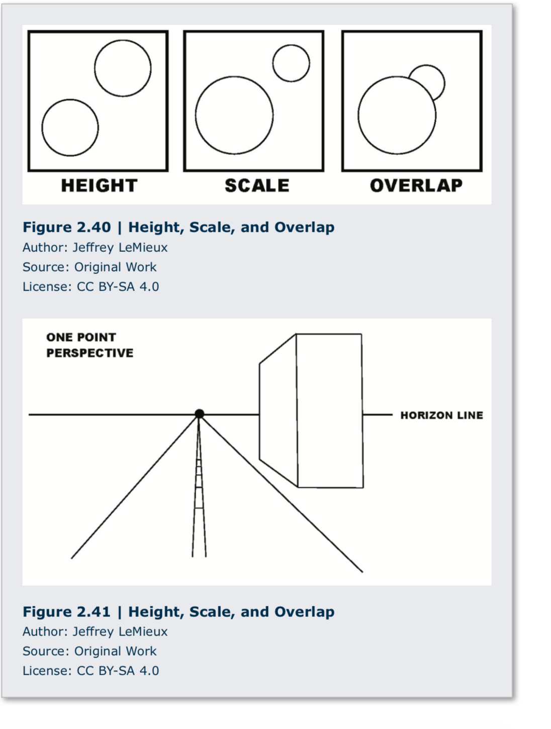 Linear perspective is based on the regular geometric recession of space. Linear perspective uses a vanishing point and horizon line. The vanishing point is the spot where all receding lines seem to converge on the horizon line.
The horizon line is the set of all possible eye-level vanishing points. (Figure 2.41) Orthogonal lines are the lines that appear to meet at the vanishing point and imply the regular recession of space. Horizon lines and vanishing points can provide clues to the artist’s intent. In Leonardo’s Last Supper, for example, the artist has located the vanishing point directly behind the head of Jesus. (see Figure 1.25) Because the vanishing point is the viewer’s vision extended infinitely in one direction, Leonardo’s placement of the vanishing point behind the head of Jesus associates Him with the infinity of the Christian God.
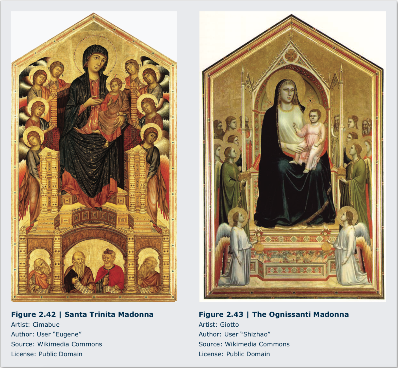
Before linear perspective was formulated as a coherent geometric system, painters used intuitive per- spective to portray receding space. Intuitive perspective acknowl- edges that receding lines converge, but does not recognize that they converge at a single horizon line and vanishing point. Nonetheless, even when paintings lack a rigorously coherent geometric system of linear perspective, determining where the horizon would be can inform us about how the artist views the subject. Compare two paintings of the same name, Madonna Enthroned, one by Cimabue (1240-1302, Italy) and the other by Giotto (1266/7-1337, Italy). (Figures 2.42 and 2.43) Both paintings use intuitive perspec- tive. In Cimabue’s painting of 1285, the implied horizon is low and the viewer sits at the foot of the throne, while Giotto’s image, painted in 1310, has the horizon higher, and thus the viewer is on the same level as the Madonna. This difference of viewpoint signifies changing ideas about the Madonna’s relation to the individual. Cimabue’s painting places the viewer in subservient homage, while Giotto’s painting may be seen as more approachable, indicative of a tiny but significant shift in European thought that eventually blossomed into the Italian Renaissance.
There are different types of linear perspective. The main types are one-, two-, and three-point perspective. The distinction is in the number of vanishing points used. One-point perspective uses a horizon line and one main vanishing point and is normally used when simple views are
depicted, such as a railway track disappearing into the distance directly in front of the spectator. Two-point perspective uses a horizon line and two separated vanishing points to present the illusion of a space that recedes in two directions. (Figure 2.44) Three-point perspective incorporates the recession of space in a third, vertical direction above or below the horizon line as well as the two horizontal directions in two-point perspective. As tall buildings recede upward from street level, they also diminish in apparent size in the same way railroad tracks appear to converge in the distance toward the horizon. (Figure 2.45)

Many people make the mistake of thinking that lin- ear perspective gives a completely accurate picture of the world. It does not. Linear perspective is a limited tool for representing how the world looks. It is considered sufficiently “accurate” only within a limited “cone of percep- tion” of about 60 degrees. So while linear perspective is an excellent tool to represent our experience of space, it has limitations that should be recognized.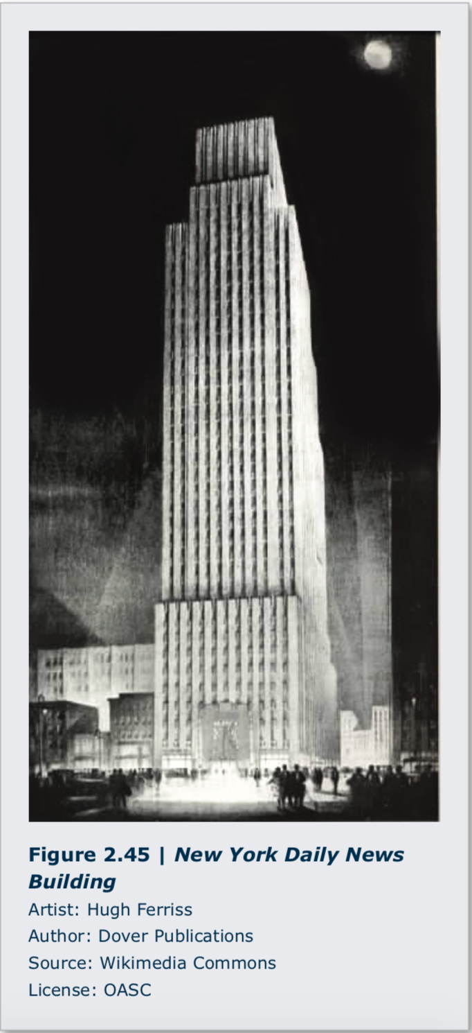
Atmospheric perspective is the way in which the illusion of distance is created on a flat surface through the use of color and focus. In a landscape that extends into the distance, the haze of the intervening air alters the colors and clarity of objects. The further away an object is from the viewer, the more it approaches the color of air, which is a light blue-gray tone. Dark objects become lighter and more blue as they recede from the viewer. Ad- ditionally, the contrast between light and dark colored objects and the perception of detail decrease with in- creasing distance. Albert Bierstadt (1830-1902, Germa- ny, lived USA) used this effect in his painting The Rocky Mountains, Lander’s Peak to give a sense of monumental space. (Figure 2.46)

2.4.1.5 Texture
The term texture describes the surface quality of an artwork. Texture is an important element of design because it engages the sense of touch as well as vision. Objects can be rough or smooth, wet or dry, sticky or slick, hard or soft, brittle or flexible. The two main approaches to texture are actual texture and implied or simulated texture. Actual texture is primarily—though not exclusively— sculptural, while implied texture is primarily used in two-dimensional works of art.
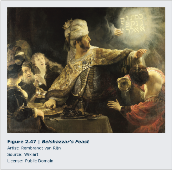
The painters of the Northern Renaissance and the Dutch Golden Age, the fifteenth to the seven- teenth centuries, were very interested in the simulation of a wide variety of textures. One main goal of artists from those periods was to excel at telling the truth about the material world. They worked to capture the full visual range of the sense of touch. Rembrandt van Rijn (1606-1669, Netherlands) is well known for his use of impasto, or very thick application of paint, in order to heighten the sense of reality in many of his paintings by adding actual texture. This can be seen in his handling of flesh on some of his self-portraits, as well as his rendering of metal and jewelry in his painting of Belshazzar’s Feast. (Figure 2.47)
 2.4.1.6 Color
Color is the most prominent element of design and is one of the most powerful and yet subjective el- ements in art. The nineteenth-cen- tury American transcendentalist Ralph Waldo Emerson noted this subjective quality of color when he wrote, “nature always wears the col- ors of the spirit.”1 Ideas about color can be grouped into three broad categories: the histo- ry of color, physics of color, and perception of color.
The earliest use of color was limited to what kinds of pigments or coloring agents could be found in the local environment: ochres (yellow-browns) from various colors of earth, blacks and grays from ashes and burned wood or charcoal, reds and yellows from minerals, plants, and insects. Paleolithic cave paint- ers used these materials for their murals. In addition to natural pigments, ancient Egyptians formulated synthetic pigments such as powdered glass to cre- ate Egyptian blue, a distinctive hue used on statues, walls, and monuments. In the Roman Empire, a rare form of purple was extracted from a particular kind of snail and, because of its rarity, was used primarily for royal garments. During the Renaissance, a deep blue was made from a finely ground gemstone, lapis lazuli.
Egyptians associated colors with the gods; the god Amon had blue skin, and Osiris had green. The ancient Greeks took a more scientific approach to color. The ancient Greek philosopher Empedocles thought that color fell into four categories: white/light, dark/black, yellow, and red. The ancient Chinese associated color with the five elements taught in traditional physics: water (black), metal (white), wood (green), earth (yellow), and fire (red). In a number of Asian traditions, black is the col- or of heaven and white is the color of death or mourning. In western culture the opposite is the case.
Modern ideas about color were greatly refined beginning in the fifteenth century by architect and art theorist Leon Battista Alberti (1404-1472, Italy). In his treatise Della pittura (On Paint- ing), published in 1435, Alberti stated:
Through the mixing of colors infinite other hues are born, but there are only four true col- ors from which more and more other kinds of colors may be thus created. Red is the color of fire, blue of the air, green of the water, and grey of the earth . . . white and black are not true colors but are alterations of other colors.2
- C. A. Bartol, Ralph Waldo Emerson: A Discourse in West Church (Boston, Mass: A. Williams & Co., 1882), 14.
- Leon Battista Alberti, On Painting, trans. John R. Spencer (New Haven, Connecticut: Yale University Press, 1956), 49-50.
From this early framework, others made further discoveries.
The term “color” describes the sensation caused by variations in the wavelength and intensity of light as it interacts with the human eye. Visible light is the small portion of the electromag- netic spectrum that can be seen by humans. When the white light of the sun is passed through a prism, it is refracted into the colors of the rainbow from red through orange, yellow, green, and blue to violet. (Figure 2.48)
Color as perceived by humans can be bro- ken into three discrete parts: hue, saturation, and brightness. (Figure 2.49) Hue is the wave- length of a given color. Longer wavelength col- ors appear on the red end of the spectrum, while shorter wavelength colors are on the violet end. Hue is the color “name,” e.g., red, yellow, blue, green, etc. Color can be either subtractive or ad- ditive. Saturation is the purity of a color and ranges from a neutral gray to the pure color while holding brightness as a constant. Brightness is the lightness or darkness of a color and ranges from fully illuminated (the pure hue) to fully darkened (black). Each pure hue also has a relative brightness, for example, pure yellow has a greater brightness than pure blue.
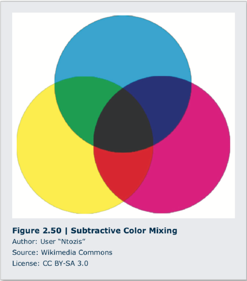
Subtractive color, or reflective color, occurs when white light is reflected off a surface, and all the colors of the spectrum are absorbed by that surface except for the color that is reflected back to the viewer. Subtractive color mixing starts with the primary colors of red, yellow, and blue. When these colors are mixed, the secondary colors of green, orange, and purple, are created. Mixing yellow and blue makes green, mixing red and yellow makes orange, and mixing red and blue makes purple.
The English mathematician and physicist Sir Isaac Newton demonstrated in the seventeenth century that white light, when refracted through a prism, could be separated into the visible spectrum. In the nineteenth century, writer and statesmen Johann Wolfgang von Goethe and chemist Michel Eugène Chevruel separately published research that concluded that red, yellow, and blue were primary colors and that all other colors could be mixed from them. At the beginning of the twentieth century, industrial chemists further refined the understanding of printing inks and derived the CMYK (cyan, magenta, yellow, and black) subtractive color model: beginning with white, as one adds color, the mixture moves toward black. (Figure 2.50)


With the advent of television, comput- ers and digital imaging, the additive model of RGB (red, green, blue) in which colors are added together and the HSB (hue, saturation, and brightness) color system, based on human perception, have become industry standards. Additive color, or transmission color, occurs when light of different colors is projected. The primary hues of additive color are red, green,and blue. This is the RGB color model. (Figure 2.51) When red and green lights overlap, yellow is seen. When red and blue lights overlap, ma- genta is seen, and when green and blue lights overlap, cyan appears. These are the secondaryhues of additive color. When red, green, and blue lights all overlap, white light is seen. Tele- vision screens are actually tiny dots, or pixels, of red, green, and blue glowing lights. The colors we see coming off those screens are additive.
Our RGB model of additive color is directly dependent on how human eyes function. The human retina is a sheet of neurons that coats the inside of the eye. Within this sheet of neurons, there are specialized neurons called rods and cones. Rods are neurons that are sensitive to changes in light intensity, and cones are sensitive to red, green, or blue light. The reason we have RGB computer monitors is because we have RGB eyes.

Artists sometimes intentionally exploit the physiology of human vision. Because human vision is limited by unique biology, certain effects become possible. Neurons store chemical neurotransmitters to send signals. If a neuron must continually “fire” because it is being continuously stimulated, it can deplete its supply of neurotransmitter. There is a slight delay between the depletion and restoration of this chemical supply within the neuron. In the interim, an afterimage occurs. Look at the green, orange, and black flag for 10 seconds, then look at a blank wall or empty white space. (Figure 2.52) For a few moments, you will see the complement, or opposite, of green (red), the complement of orange (blue), and the complement of black (white) in their correct place on the American flag. The fading of this image indicates that the neurotransmitters in the retina have been replenished.
This effect was regularly used by artists during the Impressionist movement (c. 1870-1886). Consider Impression Sunrise by Claude Monet (1840-1926, France), one of the first Impressionist paintings. (Figure 2.53) Looking for more than a moment at the expanse of blue in the painting “exhausts” the sensation of blue and creates a complementary afterimage response, which is orange. Then when we look at the orange of the rising sun, we see not only the orange pigment on the painting itself, we also have the additional effect of “tired blue” in our retina. For this reason, the orange paint of the sun looks brighter than it would if we saw that color by itself. Many Impressionist artists intentionally used this effect, and this is one reason why Impressionist paintings tend to look so vibrantly colored.
In his Homage to the Square series of paintings that he began in 1949, the Bauhaus artist Josef Albers (1888-1967, Germany, lived USA) experimented with the relative perception of color. (Homage to the Square, Josef Albers: upload.wikimedia.org/wikiped...0/Josef_Albers’s_ painting_’Homage_to_the_Square’%2C_1965.jpg) His main interest was to demonstrate how a color can be affected by other colors that surround it. His book, Interaction of Color (1963), showed that perception of a single color can change depending on context. To demonstrate this, look at the accompanying image. (Figure 2.54) The band of gray in the center is one single color, but it appears to shift when placed on a contrasting background.
Contemporary artists employ specific terms for different uses of color. Natural, or local color, describes the body color of a given object. Observed color, on the other hand, is how the perception of that local color changes as light shifts on an object. In Monet’s series of paintings of the Rouen Cathedral, his de- pictions of different lighting conditions are a good example of the difference between local color and observed color. The color of the stone of the Cathedral is a medium gray. But at different times of day, such as the waning light of sunset, it will reflect the oranges and blues of the lingering sun and the growing shadows. (Figure 2.55)
 The Fauves were a group of artists in the early twenti- eth century who used intuitive color as the basis of theirapproach to making art. They were more interested in the expressive power of color than robotically reporting the local or observed color of their subjects. Consider this portrait by Henri Matisse (1869-1954, France) of his wife, Amélie Matisse. (Figure 2.56) Clearly she did not in reality have a green stripe running down the center of her face. The colorschosen by the artist were meant to express something other than simple visual observation.

Another aspect of color used by artists is color temperature. Colors can be either warm or cool. The warm end of the spectrum includes red, orange, and yellow. The cool end of the visible spectrum contains green, blue, and purple. That said, even yellow can be cool, and even blue can be warm. Warm and cool colors interact in different ways and artists are trained to notice and use this difference; for example, warm colors seem to “advance” while cool colors “recede” in space and consequently shapes represented in those colors appear to be at different depths.
In organizing ideas about color, artists and art theo- rists have evolved a series of color schemes, or ordered relations between different colors. A monochromatic color scheme uses a single color. The Old Guitarist by Picasso is a good example of a monochromatic color scheme. (Figure 2.57) The pose of the figure, the texture of the ragged clothing and hair, and the dominating use of blue work together to create a unified emotional response of weariness and loneliness to the image.
A complementary color scheme uses colors opposite to each other on the color wheel. As mentioned earlier, Impressionist painters exploited the effect of complementary color schemes to heighten the brilliance of their color palettes. While not an Impressionist, in his painting The Starry Night, Van Gogh (1853-1890, Netherlands, lived France) uses the blue of the night sky to charge the orange of his crescent moon. (Figure 2.58)
An analogous color scheme uses only one area of the color wheel. If the color green is chosen as the anchor color for the scheme, for example, the artist will use colors that occur between the yellow and blue points on the wheel. Still Life with a Glass and Oysters by Jan Davidsz. de Heem (1606-1684, Netherlands, lived Belgium) is a good example of an orange/yellow/green analogous scheme. (Figure 2.59) There are many other color schemes that are used for various applications, but these three suffice to illustrate the idea.


2.4.2 Principles of Design
The elements of design are the visual components that artists use to make artworks. The principles of design are the various ways in which those elements or components are arranged to produce a desired effect. There are as many ways to approach the arrangement of the elements of art as there are artists. Each work of art is unique in its conception, design, and execution. Recent developments in the visual arts have introduced accidental and irrational approaches to artmaking. In these approach- es, the outcome of the work of art is not planned. While these works of art may be said to lack conscious design, sometimes they are successful. It is often possible to attribute the success of irrationally or accidentally produced works of art to one or more operating principles of organi- zation. Becoming aware of the principles of design in a work of art allows the viewer to add depth to the analysis of those works. What follows are five principles of design. The list is not exhaustive but is a good place to start.
2.4.2.1 Unity/Variety
Unity is found in similarity, while variety is found in difference. A design that shows unity is one in which the elements of the work or relations between the elements are similar or identical. Leon- ardo’s Mona Lisa (see Figure 2.7) is considered a breakthrough in Italian Renaissance art because the soft edges of the figure are similar in approach to the soft tones of the muted background, thus unifying the image. A design that shows variety is one in which the elements of the work are varied in size, color, shape, or some other attribute. One concern with the overuse of unity in design is visu- al monotony. Visual unity may occur on a conceptual level as well as a physical one. Elements that are chosen based on a theme can display conceptual unity and yet display a variety of form. A work ofart that lacks variety may be monotonous and lack interest. Many artists introduce variety into their compositions by making sure that no two intervals are the same. An interval is the space between elements, figures, or objects in a work of art.
 The design principle of scale and proportion is the issue of size of elements both individually and in relation to other elements. A famous example of the subtle use of scale is the relative size of the figures in Mi- chelangelo’s Pietà. (Figure 2.60) The sculpture is a depiction of Mary hold- ing the body of her son Jesus after His crucifixion. If we measure the bodies of Jesus and Mary from heel to knee, knee to hip, and so on, and then compare them, we find that Mary is larger than Jesus. In addition, the figure of Mary is out of proportion, that is, the siz- es of the parts of her body are not in alignment. This unusual use of scale and proportion serves to infantilize Jesus in order to subtly emphasize the mother/child relationship. Another use of scale and proportion is the use of forced perspec- tive. (Figure 2.61) Forced perspective is the arrangement of figure and ground that distorts the scale of objects, making small objects appear large or large objects appear small by juxtaposing them with opposites. Forced perspective is most convincing when done photographically.
2.4.2.3 Balance
The design principle of balance is the issue of visual “weight.” Design elements like lines and shapes can attract our attention in a number of ways. For example, they can be brightly colored, they can be large in relation to other similar shapes, or they can be textured in unusual ways. Compositional balance is achieved when these competing visual weights are roughly equivalent. There are two kinds of compositional balance: symmetrical and asymmetrical.
The lines and shapes in a composition that uses the principle of symmetrical balance are usually equally arranged around an axis, or central line. In The Sacrament of the Last Supper by Salvador Dali (1904-1989, Spain), notice the balance of like forms to the left and right of the central figure of Jesus. (The Sacrament of the Last Supper, Salvador Dali: upload. wikimedia.org/wikipedia/en/f/f1/ Dali_-_The_Sacrament_of_the_Last_ Supper_-_lowres.jpg) Vertical and horizontal axes are generally reserved for very stable compositions, and this strategy is often used in a religious context to imply unchanging truth.

Asymmetrical balance is achieved when visual weights do not correspond to one an- other in shape, size, or placement; they are not distributed equally in a composition. The woodblock print The Great Wave off Kanagawa by Katsushika Hokusai (1760-1849, Japan) and Still Life with Apples and a Pot of Primroses by Paul Cézanne (1839-1906, France) are good examples of asymmetrical compositions. The large space to the right of the Hokusai’s Great Wave “offsets” the approaching wave in the left half of the composition. (Figure 2.62) In a similar way, the large gray wall to the left in Cézanne’s Still Life with Apples serves to offset the visually complex flowerpot on the right. (Figure 2.63) In each work, nearly one third of the composition (the sky and the wall) is unoccupied, so to speak; there are no objects in those areas. Within the two-dimensional space of the work, however, we “read” each blank area as having a visual weight that counterbalances the forms in the remainder of the compositional space.
It is not always necessary for an artwork to be balanced. An obvious imbalance can produce the effect of unsteadiness, disorientation or distress, which can become a useful part of the larger idea within the work of art. The large empty spaces in the painting by Odd Nerdrum (b. 1944, Norway) carry substantial visual weight and imply both physical and psychological isolation. (Man and Abandoned Landscape, Odd Nerdrum: s-media-cache-ak0.pinimg.com/736x/27/ a3/3b/27a33b6c5d3c9e087d20f7cb3c34296a.jpg)
2.4.2.4 Emphasis/Movement
The design principle of emphasis or movement is the intentional use of directional forces to move the viewer’s attention through a work of art. When we see a color shift within a shape, this implies movement. And, when we see a line in a work of art, we are compelled to follow it. For example, arrows of any shape will signify direction and are widely used in advertising to attract and direct the attention of potential customers.
There are more subtle means of moving a viewer’s attention through a work of art. Descent from the Cross by Rogier van der Weyden (1404-1464, Belgium) uses the positions of the fig- ures’ arms, legs, and heads to trace the infinity symbol, which resembles the number 8 laying on its side. (Figure 2.64) This subtle reminder of Christ’s everlasting life is meant to reassure and give hope to the faithful gazing upon this scene of death and grieving.
2.4.2.5 Rhythm/Repetition
The design principle of rhythm is the repetition of visual elements to establish a pattern. This pattern can then be used to provide a stage for a special object, or the pattern can be interrupted to direct attention to the change. In his commentary of mass consumer culture, Andy Warhol’s use of repetition compels us to notice the small differences between the apparently identical elements of his installation of paintings, 32 Campbell’s Soup Cans. (Figure 2.65)
