
2.2: Principles and Considerations of Design
- Page ID
- 24181


The elements of design that we’ve just examined act as the artist’s building blocks. They work together in an arrangement that follows basic principles and considerations. That combination is known as the composition.

Unity and Variety
What makes one artwork better than a similar one? While personal taste is certainly a factor, this sort of judgment devolves upon the artist successfully balancing unity and variety within a composition. If the elements of design are not unified by some means, they will seem to have been randomly included, without visual cohesion. Varied shapes might be united through a similar use of line or via color, or an all-over texture might unite disparate forms (Figure 1130.
Too much unification, however, can be boring. If a work is dominated by rectangles, for example–a unifying element–they might vary in size to provide variety. If color unifies, as in a monochromatic painting, it might vary in its saturation, or through a spectrum of tints and shades. Sometimes the individual components of a piece can be well-executed, but if the delicate balance of unity and variety is not achieved, it can seem lacking.
Balance
There’s another kind of balance artists consider: a balance of elements that avoid making a work seem visually lopsided. This can be achieved in varied ways.
Symmetry
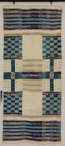
One of the most effective ways to achieve a balanced composition is through symmetry, a principle of identical or similar forms that balance each other around an axis. There are various types of symmetry, but bilateral symmetry is the most standard choice, perhaps because our own bodies follow this kind of organization. In bilateral symmetry, the objects on one side of an imaginary axis are the mirror image of those on the other. That is, if you drew a line from the middle of your head to the space between your evenly spaced feet, one side is exactly like the other: one eye on either side of the axis, half a nose and half a mouth, an arm on each side, a hip on each side, a leg similarly placed. In art, that imaginary line can be vertical or horizontal (or, in square compositions, diagonal) in order to create bilateral symmetry (Figure 114).
In African art, symmetry is not always a precise mirror, but more often a close approximation (Figure 115).

Although bilateral symmetry is the most common kind of formal balance in African art, it is not the only type. Radial symmetry radiates from a central point, with forms or motifs balancing each other around that point Figure 116).
While symmetry is an effective manner of achieving balance and, particularly in the case of bilateral symmetry, achieving stability, it can appear bland to Western eyes because we have been trained to favor a more informal balance in many media. Symmetry, however, has certain advantages if a traditional artist is trying to convey, for example, a sense of dignity and permanence in a carved or cast figure. His choice has less to do with producing an “exciting” composition than it does with a result that satisfies societal requirements.
Asymmetry or Informal Balance
In an asymmetrical composition, any two halves of a work are not the same. If poorly done, the work loses appeal and seems unfinished and unbalanced, but if done well it can be a dynamic choice. The artist’s challenge is to satisfy the eye and mind by balancing through the use of shapes, color, tone, or texture. A large dull area, for instance, might be offset by a small bright section, or a large smooth area with a small textured section. Our eyes are caught by the area that is different, that contrasts with its surroundings in some way.
Sometimes informal balance works with elements that appeal to the mind. Our brains are trained to recognize faces, and a composition full of a variety of plain geometric shapes might be balanced by one face placed elsewhere in the composition, since that stands out to us. Likewise, we are trained to be attracted by text, and the appearance of one relatively small word might prove an effective counterbalance to a large area of complex texture.
If we look at Victor Ekpuk’s temporary installation below (Figure 117 and video), you’ll notice a large dark shape at right, enclosing an abstract figure. That dark area is the largest, darkest shape in the work, and it’s placed off to one side. How is informal balance achieved? Three figures are needed to balance its visual weight. The one at the extreme left works hardest–it is differentiated by the second largest black expanse, its filled-in body, and by the large white shape that backs it. In addition, it’s placed on a diagonal, unlike the other figures, which draws the eye.

vimeo.com/36424841
The Focal Point and Moving through the Composition

An artist might distribute shapes or colors or textures or tones evenly throughout a symmetrical composition. Without contrast, our eye tends to look at the center of such a work. The artist, however, may wish to force the viewer to look at a particular area first. That is called a focal point, and it can be anywhere within a composition. Artists use the elements of design to direct our eyes to the focal point. Often it is an area of contrast, or our eye is led to it through line or shape. After the focal point attracts our attention, other elements may lead us to explore different points of the composition. How? we may move along a directed path of lines, colors, shapes, or textures, or randomly search for like elements elsewhere in the composition (Figure 118).
Ekpuk’s “Mickey on Broadway” accomplishes this by using the large dark shape and its enclosed figure as the focal point. We may next look at the white shape and its enclosed figure at left, because it has both a large black and a large white expanse. Next, we probably look at the two figures in the middle, because human shapes continue to draw our eye. After that, where? The black marks on the background may make us bounce through the composition, but the likelihood that the first set of these that we notice consists of the slightly larger circular shapes with radiating lines is fairly high–from like to like, the surrounded outlet, sun-like spiral at the middle of the top, smaller sun-like line drawings at the upper left and the mid-right.

Ekpuk (Figure 117) unifies the work with similar line widths, though he varies their length, spacing, and direction. His drawn shapes are echoed in various parts of the background and the overall small patterns are all black, unifying the total. The four similarly-shaped figures vary in size, placement, and color. Notice other ways Ekpuk unifies the work. A dull red wash is behind the dots that fill the body of the second figure from the right, uniting it with color to the head of the figure on the extreme right. Larger dots of the same dull rod act as buttons on the figure to the extreme left. More dots (same kind of line) unite it to the second figure from the left, but this time they’re placed in the white surround. While those dots are blue, they shift in color from top to bottom; the top blue is that of the extreme left figure’s head, while the bottom blue dots are those of the body on the extreme right. The only two colors that appear once are those of the yellow and green heads, but they’re placed in the middle of the composition and don’t throw it off balance.
Rhythm
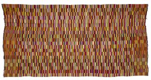
When similar shapes, colors, or textures reoccur in a work, our eye movements as we move from one to another create a kind of rhythm. Some rhythms have absolute regularity (Figure 119), with equal intervals, intensity, and size. Others build to a crescendo or diminish to a descrescendo, while still others appear in an irregularly staggered, syncopated manner (Figure 120). We look at from one rhythmic component to the next, again to the artist’s manipulative tune. Rhythmic components aren’t necessarily prominent or even apparent in every artwork, but when they are, they employ one or more elements of design.
Scale
Scale is a term that relates to size, particularly to the size of a human being. That is, a small-scale artwork
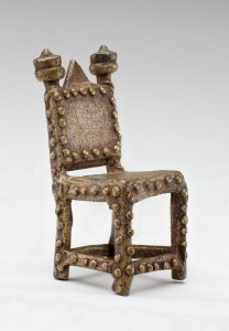
Akan chair from Ghana is actually a brass miniature counterweight for gold dust–it’s only 1.5″ high. Detroit Institute of Arts, 2014.1029. Gift of Douglas H. Mayhew and Roberto J. Caballero in memory of Catherine Baker Mayhew.

is small in comparison to a person (Figure 121), while a large-scale piece is something an adult would consider big. In reproductions, this concept has little meaning. In person, however, size means a great deal. Large objects tend to have a greater visual impact than small ones, no matter other considerations. Like many design elements and principles, scale can add to the mood or personality of a work. Does it impose on the viewer or is its diminutive size admirable for the artist’s ability to create a detailed miniature?