
7.2: Photorealism (late 1960s -1980)
- Page ID
- 120769

Introduction
Photorealism is based on the concept of an image closely resembling a photograph. The artists incorporated multiple types of media, including painting, drawing, or mixed media, to create the same view as a camera. As one of the many art styles during this time, Photorealism developed from Pop Art and rejected the ideals of Abstract Expressionism or Minimalism. The camera and photography were more refined, and as the cost of colored photos became affordable, the camera became a popular object. Photorealists used the basis of the actual photos for information and tried to recreate the image. The artist had to be very precise and generally copied the outlines by projecting the photo onto the canvas or using traditional grid lines. The results were detailed and precise. Most of the artists were male, and they frequently focused on machinery or industrial regions. Only one female, Audrey Flack, was considered one of the Photorealist artists, and she incorporated more emotion into her works.
Photorealists accepted the realism of the popularity of photographs while still acknowledging their dependence on photographic images as the basis for their exceptionally realistic work. The artists also focused on the interplay between light and color and captured how light reflected surfaces, especially steel, glass, and chrome. Their work brought the return of deliberate planning and exact workmanship. The movement began in the United States, and most of the paintings were scenes of nostalgia depicting everyday objects or familiar scenes and portraits. Generally, the paintings were large and painted or airbrushed. Unlike other movements of the period, the Photorealist artist produced very smooth surfaces without brushstrokes to retain the photo-like image. To create the detail in their finished work, they made small images to detail color placement and the total look of the composition. Then they redrew the work on the large canvas and added oil or acrylic paint.
Chuck Close
Chuck Close (1940-2021) was born in the state of Washington. His family was considered lower class, his father only had an eighth-grade education, and his mother studied to be a pianist. However, during the depression, neither was very successful, and his father died when Close was eleven. When he was a child, he suffered from multiple physical conditions forcing him to miss much of his early education. His parents did recognize his interest in art, buying him supplies and providing lessons. In one interview, Close even told the New York Times he used a magnifying glass when looking at magazines to understand how the images were made.
Close attended the local community college before receiving a degree from the University of Washington and an MFA from Yale. He was even granted a Fulbright grant to study in Europe and taught at the University of Massachusetts when he returned to America. By 1967, he went to New York City and established his studio and success as an artist. In 1988, while attending a ceremony to honor artists, Close suffered chest pains. At the hospital, he had a seizure, leaving him paralyzed from the neck down. After completing physical therapy, he was able to gain some movement in his arms, becoming wheelchair-bound for the rest of his life. Close adapted his artistic world and painted by strapping a brush to his arm. Over time, he developed a process aided by a two-story easel with a remote control he could use in his wheelchair. Close was one of the first artists to focus on realistic images in the midst of Abstract Expressionism as the major movement in art. His work with photographs, grids, and portraits changed the direction for other artists.
Early in his career, he worked with multiple media to draw, paint, or print, in black and white followed by color. He believed his concepts and ideas were timeless while materials were usable in any form to create his images. Close often stated he suffered from prosopagnosia or face blindness and did not recognize people even after spending time with the person. He started focusing his art on portraiture. Close was able to remember images perceived as flat and used photography and the flat image as the source for his work. He stated, "with photographs, I can memorize a face. Painting is the perfect medium, and photography is the perfect source because they have already translated three dimensions into something flat. I can just affect the translation."[1] Close used the photographs and made intricate grids before enlarging them on the canvas square by square. Close also worked by placing colors next to each other instead of layering them. He did not feel his work was like Seurat, instead of more like Byzantine mosaics, as bits of mosaic was placed by each other, it formed an image. Close said, "I discovered about 150 dot is the minimum number of dots to make a specific recognizable person."[2] His color made his paintings seem to be covered by thick glass or rippling water, the paintings changing when viewed at different distances.
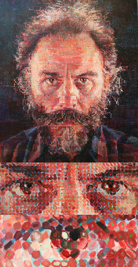
Lucas (7.2.1) is a depiction of an artist friend of Close. The images under the portrait demonstrate the visual information of how Close painted the component parts. He used a photograph of Lucas to draw the grid and then defined the incredibly small dashes and dots visible when standing directly in front of the painting. The viewer has to stand back to correctly view the focused image of Lucas.
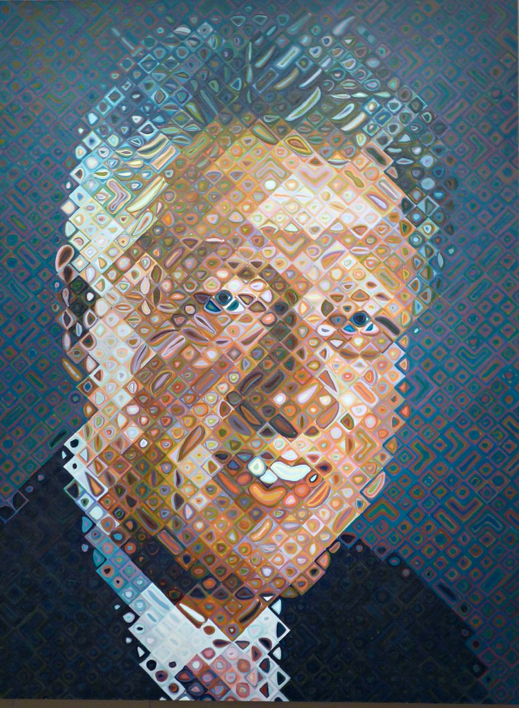
The painting of William Jefferson Clinton (7.2.2) is 2.74 meters high, a portrait for America's Presidents exhibition. The image depicting only Clinton's shoulders and head was as high as the full-body images of the other presidents. Although Close used his usual grid method, the small sections of the painting are diamond-shaped instead of squares, each segment only 6.3 centimeters. He filled the segments with circles, rectangles, or raindrop shapes and nested colors inside each segment. Oddly, there is a small bean-like segment within the area of the president's teeth. The colors Close used are vibrant, and clearly, skin colors are different from the rest of the colors. The entire image appears to be covered with rippling water.
To celebrate the opening of one of New York's major subway lines in 2017, the governor had commissioned artists to create public art installations. Four artists were chosen to create art for the four main new stations. Close was selected to produce the works for the 86th Street station, and he made twelve artworks, each almost 2.74 meters tall, of all different images of people. Close said, "I wanted the images to reflect the ridership on the floor below. I wanted African Americans and Asians, old people and young people."[3] Using pictures he had taken over several years, he made the images from mosaics so people could touch and feel them, bringing a physicality to his work. He used his friends as models because he didn't want to audition to find subjects. Ten of the portraits were made of mosaics and two of ceramic tiles. One of the images included Close (7.2.3) himself and Tara Walker, (7.2.4) a well-known artist.
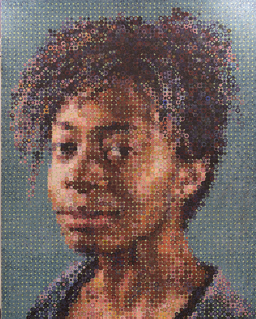
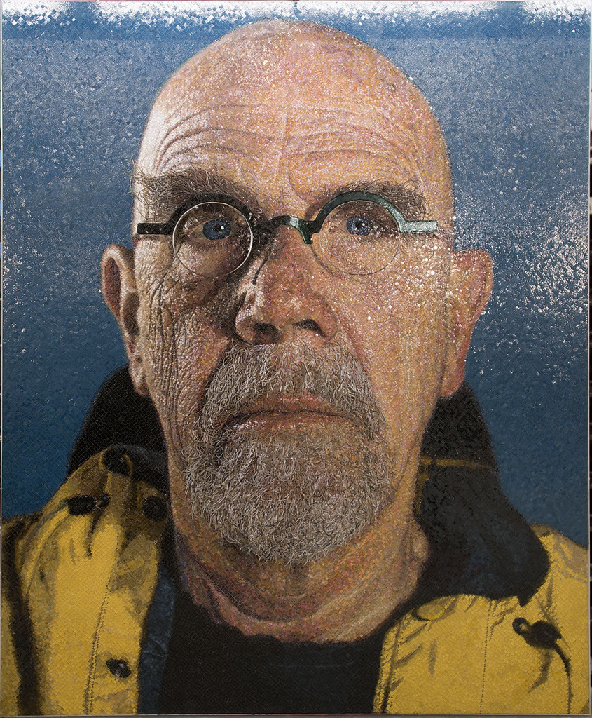 Figure \(\PageIndex{4}\): Chuck Close image at 86 St. Subway, by MTAPhotos, CC BY 2.0
Richard Estes
Richard Estes (1932-) was born in Illinois and studied art at the Art Institute of Chicago. Most of his time was devoted to studying realistic painters, and when he moved to New York City, he worked in advertising as a graphic artist, painting in any extra time he had. Estes moved to Spain in 1962 and was finally could afford to paint full time. He always followed his interest in realistic works and used photographs for his inspiration. Although working on a two-dimensional canvas, Estes tried to create the concept of three-dimension based on the use of reflective images from glass, metal, or the time of day. Estes always tried to paint exactly what he saw in the photograph. He focused on the activities of the typical city resident as they moved around the city, the main elements recognizable among the myriad of visuals seen in the town. However, the people were not included in the painting. A viewer needs to carefully examine the paintings to understand the multiple details Estes added in each image.
Este's paintings and prints reflected the geometric sights of New York, focusing on neighborhoods and the reflections of life seen in the windows and metallic surfaces. He also developed a screen-printing process to apply the inks perfectly, whether part of the image was deep and dark or light and reflective. Estes followed a specific method of painting, applying sections of color with diluted acrylic paint and adding the shadows or needed highlights. The final step was the application of oil paint to create the fine details, a calculated and challenging process. Because of all the detail he painted, Estes did not produce many paintings in a year. He liked to hide his signature in unusual places, a menu or sign of some sort. Estes displayed the panoramas of New York City through the reflective beauty of glass and metal. However, the scenes are filled with ambiguities, including where are the people?
In The Candy Store (7.2.5), Estes characterizes the sugary merchandise and display signs found in a local candy shop. The image also contained reflections of the building facades in the outside neighborhood, even the van parked across the street. The viewer has the vicarious experience of the wonderful choices when they seem to be looking through the window.
 Figure \(\PageIndex{5}\): The Candy Store (1969, oil and acrylic on linen, 121.9 x 174.9 cm) by hermien_amsterdam, CC BY-NC-SA 2.0
Nedick's (7.2.6) brought a view of the local hamburger café, the expansive glass reflecting the neighborhood. The side windows allowed the viewer to see the side street. Estes painted the short street depth of the café and the distant length moving down the perpendicular street. In the 1970s, Estes became one of the leading artists of Photorealism.
Ralph Goings
Ralph Goings (1928-2016) was born in California, living during the Great Depression. He always remembered his father's difficulty finding work; most jobs were temporary with very low pay. Fortunately, Goings took an art class as a high school freshman and became inspired by books Goings read about Rembrandt. One of his aunts helped buy him books and supplies, and he used old sheets for canvases. Goings was in the military, then enrolled in the California College of Arts and Crafts, particularly studying Photorealist artists. He also completed an MFA from Sacramento State College, studying the San Francisco Bay Area artists, especially Nathan Oliveira and Wayne Thiebaud. Goings focused on painting photorealistic images when he decided Pop Art was poorly done. He believed if an artist was painting something realistic, the object should closely resemble actuality. Along with Audrey Flack, Richard Estes, and Robert Bechtle, he helped create the Photorealism movement.
Goings' early life influenced his work and focused on ordinary American life and the environments of working-class people. He had rejected Abstract Expressionism in favor of realism. He stated, "My paintings are about light, about the way things look in their environment and especially about how things look painted. Form, color, and space are at the whim of reality, their discovery and organization are the assignments of the realist painter."[4] Goings used multiple photographs he assembled into one finished image. He projected the image onto the canvas before painting. Goings became noted for his paintings of trucks, diners, and other working-class environments he found throughout California.
In Amsterdam Diner (7.2.7), the stools and counter move across the diagonal of the painting. Metal reflections bounce throughout the image, the omnipresent coffee urns, shelving, and the backless, banded stools. The lone person wears simple workman clothing and is seated at the end of the diagonal movement, anchoring the painting. Windows on the opposite wall gave strong shadows of the stools and reflected off the cabinet in the middle. The objects of the diner are reflected on the counter as the single bottle of ketchup waits in front of the man. Goings frequently painted diners and the fixtures inside, especially exploiting the reflective characteristics. Goings was always interested in the unique parts of Sacramento in California, especially empty buildings, the ideas of fast-food places, and the types of transportation he found in the region.
The painting of the Sacramento Airport (7.2.8) was one of the interesting local buildings. The rows of windows across the front and the unique tower provided the perfect vertical and horizontal image. The small plane anchors the front sitting on the tarmac across the bottom of the painting. A viewer can see right through the waiting room windows and the tower windows, demonstrating Goings’ attention to the realism of the image.
Duane Hanson
Born in Minnesota, Duane Hanson (1925-1996) was the son of a dairy farmer. He graduated from Macalester College in Minnesota and taught in high schools in Iowa and Idaho before receiving his MFA in 1951. During this period, he also married, his wife an opera singer. In 1957, Hanson went to West Germany to teach in an army high school and met the sculptor George Grygo who was experimenting with different sculptural materials. When Hanson returned to Miami in 1960, he started working with plaster of paris to build realistic statues. By 1967, he perfected his abilities made in polyester resin, fiberglass, and vinyl. His sculptures of dead soldiers in the Vietnam War, abortion, and race riots created a great deal of controversy and made his work well-known. Later, Hanson destroyed many of these early works because he wanted to be known for later more subtle work and focused on less violence instead of creating parodies based on life in America. Although Hanson did not use photographs to create his work, the hyperrealistic style overlapped with Photorealism.
By the 1970s, Hanson's work was very realistic, life-sized, fully clothed figures. The figures were usually disengaged from any emotions, looking bored, world-weary, or uninterested. The figures were placed without boundaries in the space of the viewers. The sculptures are exceptionally life-like, and viewers frequently interact with the image, not realizing it is a statue. Based on the natural poses of a live model, he made a plaster mold of the model's body and used polyvinyl or fiberglass resin to create the basic statue. Hanson was exceptionally detailed, adding natural hair and fingernails or giving the skin blemishes, warts, or raised veins. His figures were meticulously dressed in representative clothing he bought at thrift stores, along with appropriate props. Hanson stated, "My art is not about fooling people; it's the human attitude I'm after—fatigue, a bit of frustration, rejection. To me, there is a kind of beauty in all this."[5]
Executive (7.2.9) portrays the man with his briefcase appearing to be resting in the chair, worn by his job responsibilities. His clothing reflects the times; the highly contrasted brown and yellow tie represented the 1970s, a hat still part of the workday clothing. His briefcase is worn and nicked, a symbol of the length of his working career. He sits alone, the concerns of his job left behind. Still, the image makes the viewer hesitate; why is the man sitting by himself, is he merely reviewing his day, or has exhaustion overcome him?
The Bowery Derelicts (7.2.11) depicts three men, probably homeless, lying or sitting slumped over; each figure has an alcohol bottle, trash-strewn around the men. The scene demonstrates the low point of the alcoholics and their discomforting existence. What happened to these men to end up in this position, and how does society handle the complex and challenging issues? Hanson's attention to detail demonstrates the dire conditions these men face.
Audrey Flack
Audrey Flack (1931-) was born in New York City and received her bachelor's degree in art from Yale University. As with many artists at the time, Flack's work followed the concepts of Abstract Expressionism in the 1950s. During the 1960s, she moved to a photorealistic style working with Richard Estes and Ralph Goings. Flack used photographs as her model for the painting; however, she did not paint one entire scene. She incorporated different images and ideas based on an integrated concept. Some parts of the painting might have portraits and other components included inanimate objects. Flack was the only woman in the Photorealist movement. She discarded their ideas of cars, trucks, or empty street images and instead wanted to add more emotional and symbolic imagery. Flack also brought a more feminine perspective to the works, using idealized symbols overlaid with assertive female objects. Although she was criticized for her feminist subject matter, critics often calling her work vulgar, Flack remained committed to her ideals.
Marilyn (Vanitas) (7.2.13) is one of a series of oversized paintings Flack painted and focused on the realistic presentation of the layered symbols of contemporary and historical feminism. She had a photographer capture each object with a camera and then make 35 mm slides, combining the images for the painting's base. The photograph of Marilyn Monroe was the focal point. Most of the high contrast objects are rounded, following concepts of female curves; only the photograph of the children has the hard edges of the rectangle. Many of the objects reflect light with a noticeable gloss, while the mirror reflects Monroe's face. The cosmetics are elements Monroe was expected to use as other objects like the calendar or watch, indicating the passage of time.
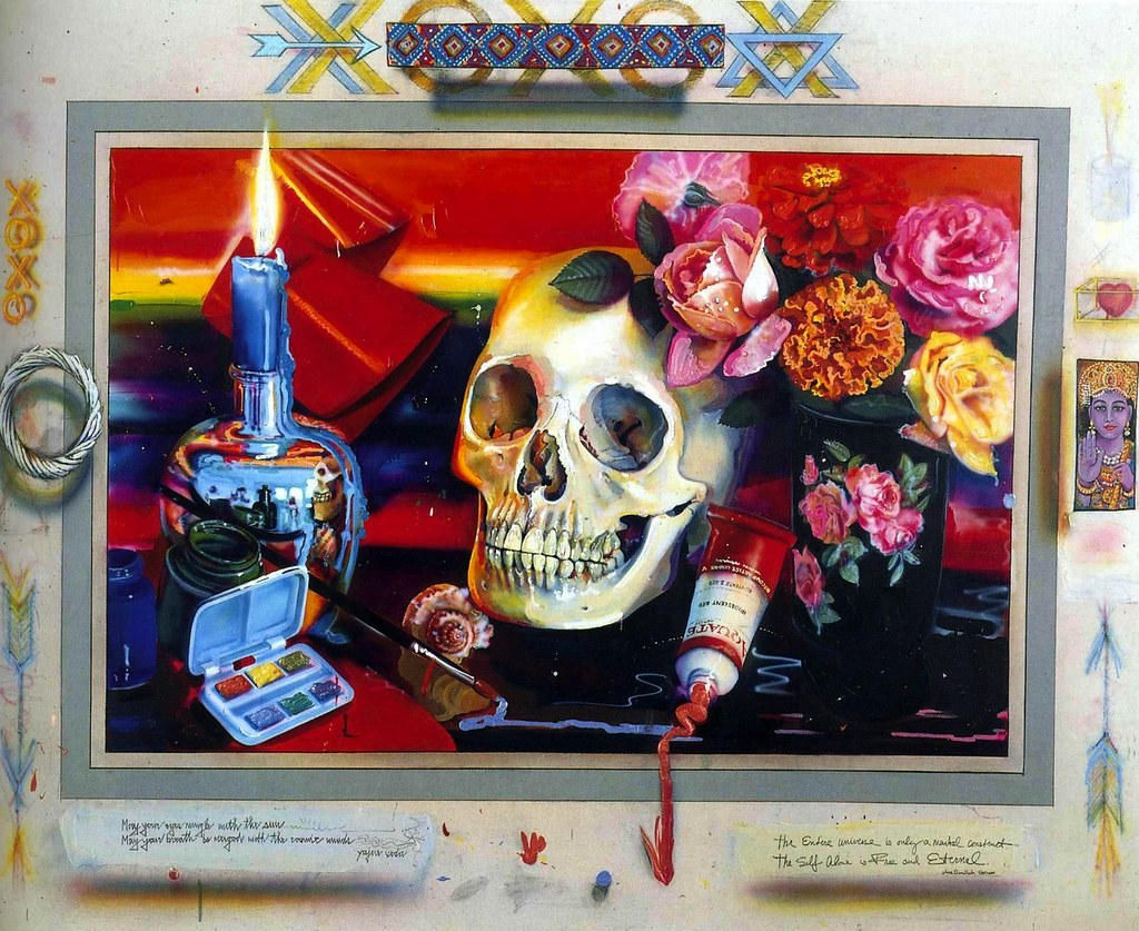
Invocation (7.2.14) demonstrates how Flack used vibrant, saturated colors to paint a compilation of objects and form a unifying composition. She stated, "My colours are bright, my subject matter passionate and humanist, the opposite of cool and restrained, the opposite of the other Photo Realists''."[6] Flack used the skull to represent the fragility of life and the inevitable death. Flowers and candles also decay with time.
Vija Celmins
Vija Celmins (1938-) was born in Latvia. During World War II, after the Soviet invasion of Latvia, her family fled to Germany. After the end of the war, the family lived in a refugee camp before relocating to Indiana in America. At this time, Celmins was ten years old and did not speak English, so she turned to drawing to communicate her feelings. She received a degree from John Herron School of Art, including an internship at Yale, where she met Chuck Close. She received an MFA from UCLA in 1965 and taught at some of the local colleges. In 1981, Celmins moved to New York City and returned to painting and printmaking. In the 1960s and 1970s, she stopped painting to focus on images made with a graphite pencil based on photographs. Throughout the following decades, Celmins painted, created sculptures, and made different types of prints.
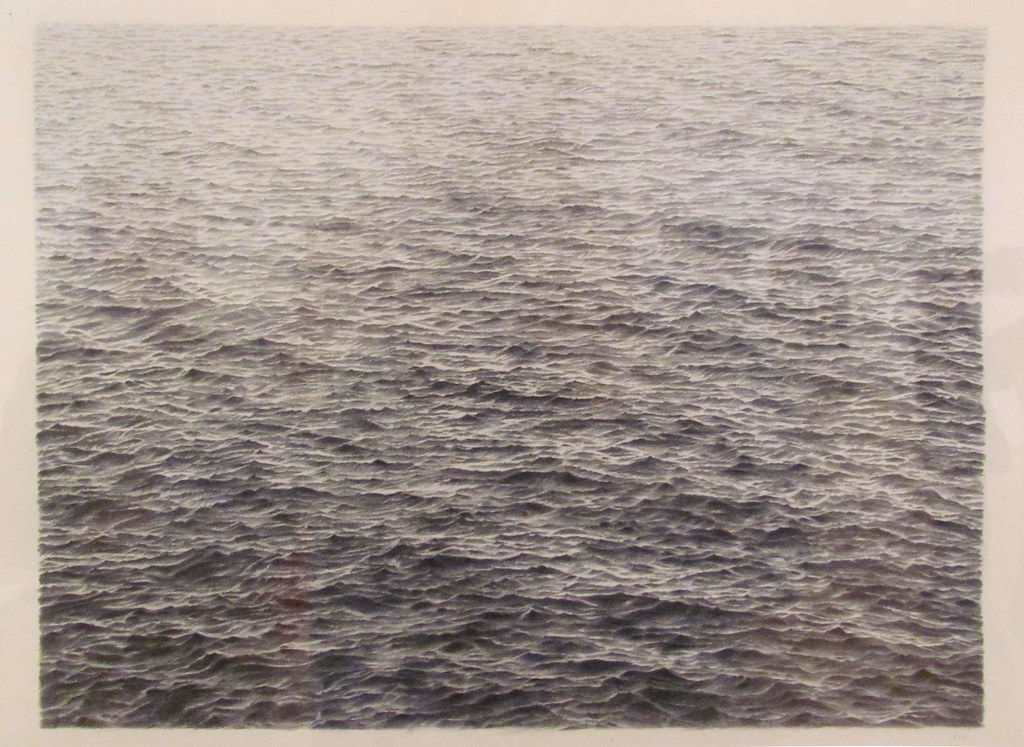
Untitled (Ocean) (7.2.15) demonstrated her attention to detail and how she developed the ocean and waves' surface, bringing the water's luminosity into the horizon. The grayness of the work is impersonal, a neutral palette. Her laboriously made untitled series of oceans earned her early recognition. She explained, "Part of what I do is document another surface and sort of translate it. They're like translations, and then part of it is fiction, which is invention."[7]
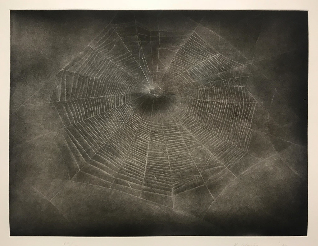
Web #3 (7.2.16) is one of Celmins' monochromatic images. She used photographs as the base for the spider web. The web is a glimpse in time as captured by a camera, her work developing the translucence and fragility of the web. Celmins said she identified with spiders because they worked on something over and over again. She became well known for her spider web, the night skies, or the unending waves. Unlike other Photorealistic artists, her work did not have any reference point making it impossible to determine any context or location.
Robert Bechtle
Robert Bechtle (1932-2020) was born in San Francisco, California, where his mother taught school and his father worked as an electrician. He started drawing at an early age and was encouraged by his parents and the schools. Bechtle received a BFA and an MFA from art schools and was drafted into the army after graduation. He was stationed in Berlin and worked as a graphic designer, exploiting the opportunity to visit multiple European museums. From 1956, Bechtle taught at some of the California universities and switched from commercial work to painting. He also met some of the Bay Area Figurative painters, heavily influenced by the work of Richard Diebenkorn. In the 1960s, Bechtle started working from photographs to create his paintings, and Bechtle mainly focused on family, local street scenes, and cars, all part of ordinary common life. He was considered one of the founding Photorealists, and by 1966 he took his photographs to und se as the basis for his work. Although influenced by Diebenkorn and other bay area artists, he wanted an objective style of realism. He worked masterfully in both oil paint and watercolors.
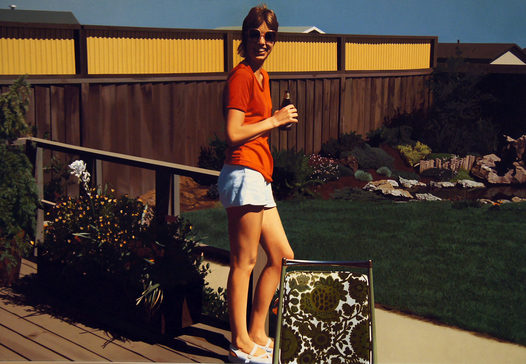
Watsonville Olympia (7.2.18) was a snapshot taken of Bechtle's cousin in the backyard, a very ordinary image. It demonstrates a frozen moment in time, never to be precisely reproduced in another photograph. The brown and white-flowered chair denoted the time as the 1970s, the beer in her hand the Olympia brand, a familiar scene in anyone's backyard. The photograph captured the person in the middle of the scene, her white shorts and red shirt the focus in the middle of the browns in the background.
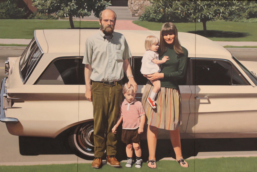
61 Pontiac (7.2.19) depicts not only the all-American family, but the painting also underlines the concept of the automobile as a representative of status and affluence. The station wagon covers the width of the painting, demonstrating its ability to hold the family in comfort. The whole artwork resembles an actual photograph; however, close examination reveals minuscule brushstrokes and the lines of three panels. The glare of the sun flattens the colors, almost resembling an old, faded photo. His son said Bechtle painted what was around him, and he drove station wagons, a familiar theme in his paintings. In this painting, he even included his wife and children.
Some images from the Photorealist artists were based on the environments people lived in, painted in exacting form as though the camera caught the specific view. Other Photorealist artists used the same concepts of capturing multiple images and compiling them into one cohesive image different from the actual setting. All of the artists created the exact realism of their work regardless of the medium used.
[1] Close, C., & Yuskavage, L. (1995). Chuck Close. BOMB, 52, 30–35. http://www.jstor.org/stable/40425606
[2] Retrieved from https://www.theartstory.org/artist/close-chuck/
[3] Retrieved from https://www.architecturaldigest.com/...nst-public-art
[4] Retrieved from https://www.theartstory.org/artist/goings-ralph/
[5] Retrieved from https://nga.gov.au/hyperreal/artists...rtistirn=48374
[6] Retrieved from https://www.kingsnews.org/articles/audrey-flack
[7] Retrieved from http://www.artnet.com/artists/vija-celmins/